LLM models can now connect directly to your business data and act as on-demand analysts, but are they all equally good at it? I ran the same real analytical questions through four leading models, all working from the same live dataset, and watched how they handled everything. For business owners especially, the output from this kind of head-to-head test is gold: it cuts through the hype and shows exactly what you’re getting before you commit. Here’s what stood out.
Key takeaways
- Claude Opus 4.8 won 6 of 10 tests (though 1 win was shared with GPT-5.5). Read on to discover why.
- Gemini 3.1 Pro consistently went one layer deeper than the question asked.
- GPT-5.5 produced the strongest visual output and decision-ready answers but in one test it built recommendations on data flagged as unreliable.
- Grok 4.3 was the most transparent about methodology limits, but consistently stayed at the surface and missed the most significant numbers in the data.
- Live data access changed what was possible. Every finding in this comparison came from models querying real, fresh datasets.
What makes an LLM model good at data analysis?
It’s not about being the smartest model in the room. A model that’s brilliant at writing code or summarizing documents can still fall flat when you hand it a real business dataset. What actually matters is much more practical: Does it know what data it has? Does it tell you when something’s missing, or does it paper over the gaps with confident-sounding numbers? And when it does give you an answer, is it something a business owner can act on?
Those questions shaped my entire test. And what I found is that the raw answers were often surprisingly close across models. The real differences showed up in how each model reasoned through the problem, flagged uncertainty, and presented its findings: that’s where things got interesting.
Why the data connection matters as much as the model
Even a well-reasoned answer is only as good as the data behind it. A model that works from a stale export is already playing catch-up: you get answers that reflect last week’s reality. When a model connects to a live dataset, that changes entirely: real-time answers with a lot fewer guesses like “based on what you gave me…”. That connection is what makes the analysis actually usable.
To keep this comparison fair, I used Coupler.io to give every model access to the same live dataset. With Coupler.io, you skip the export-wrangling and spreadsheet-stitching entirely. It allows you to pull from 400+ sources (Google Ads, Shopify, HubSpot, Stripe, and more) and get clean, analysis-ready data without the manual prep. You get accurate numbers you can trust, because the Analytics Engine runs the heavy calculations before anything reaches the model, so you’re not paying the LLM to do math it’s not good at. You get answers instead of clarifying questions, because Context means the model already understands what your metrics mean. And you also get that data wherever you work: spreadsheets, BI tools, or integrate your data with top LLMs.


Give your LLM live business data with Coupler.io
Start for freeHow I ran the test
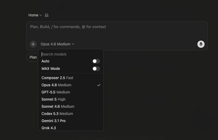
To keep it fair, I tested all four models in Cursor’s Agent mode, with every variable locked except the model itself.
| Models | GPT-5.5, Opus 4.8, Gemini 3.1 Pro, Grok 4.3 |
| Mode | Agent, Medium (all models) |
| Data | Live datasets via Coupler.io: funnel data, ICP breakdowns, churn analysis, campaign performance, etc. |
| Prompts | 10 identical questions, same order across all models |

There are more models in the picker than I covered; I stuck to the ones most analysts default to. But the point applies across the board: feed any of them prepared data and the results converge.
Head-to-head: the 10 tests
The 10 questions span the full range of what a data analyst actually does: diagnosing data gaps, building customer profiles, mapping funnel drop-off, identifying churn risk, quantifying revenue opportunities, and making strategic recommendations. Some questions had clean answers in the data. Others had gaps, inconsistencies, or required the model to decide what to do when the data didn’t cooperate. That second category is where the real differences showed up.
1. Can LLMs admit when the data isn’t there?
The question:
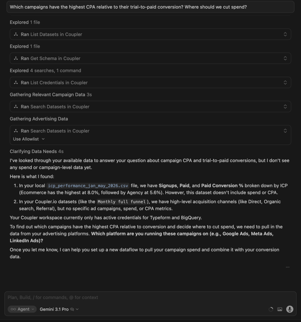
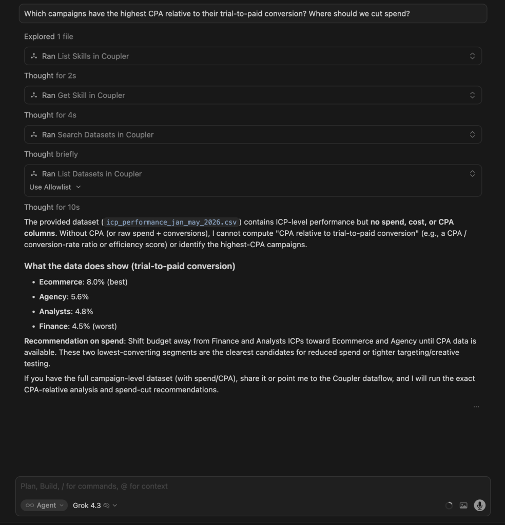
Let’s analyze Q4 2025. Which campaigns have the highest CPA relative to their trial-to-paid conversion? Where should we cut spend?
What I was testing for: Whether each model could diagnose a data gap mid-task and still deliver something useful. The ideal response works with available data, explains what’s missing, and gives a concrete next step.
| Model | Response |
| GPT 5.5 | Flagged the gap and built a ranked canvas with color-coded action labels (Cut / Cap / Tighten / Protect). Visually impressive, but the recommendations were based on conversion rates it had already noted were unreliable, without flagging that tension. |
| Gemini 3.1 Pro | Confirmed the data gap across multiple tool calls, located the right dataset, and then asked which ad platform to connect. Offered no proxy analysis based on what was already available. |
| Grok 4.3 | Quick diagnosis. No spend data, so ranked segments by paid conversion (Ecommerce 8%, Finance 4.5%) and recommended cutting Finance and Analysts first. Concise and useful, but no visual output. |
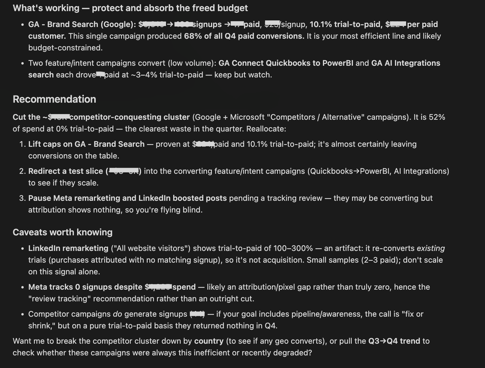
| Claude Opus 4.8 | Didn’t treat this as a data gap. It found campaign-level spend data and answered directly. Isolated a competitor-conquesting cluster that consumed 52% of Q4 budget and converted 0 to paid as the clear cut, and named Brand Search as the line to protect. Flagged attribution artifacts in the Meta and LinkedIn numbers. |
The AI conversations below are presented in the same order as in the table: GPT 5.5, Gemini 3.1 Pro, Grok 4.3, Claude Opus 4.8.
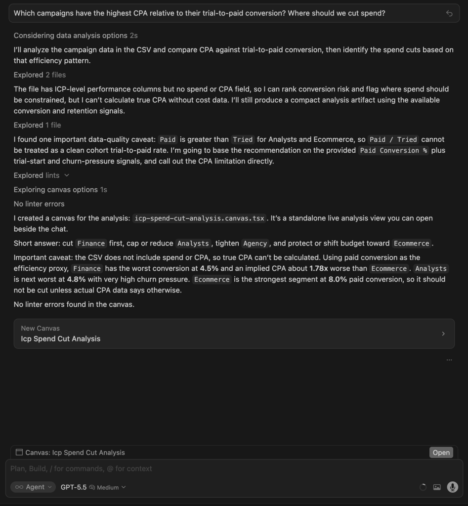
Winner:
| 🥇 Claude Opus 4.8 | It delivered the most decisive, act-ready answer: it isolated the exact 52% of spend producing zero paid customers and named both what to cut and what to protect, while flagging the attribution artifacts that would mislead a naive reader. |
What no model flagged: The fact that paid count exceeded trial count for Ecommerce and Analysts is a data integrity problem, more than just a caveat. Acting on CPA estimates built on that data could lead to the wrong budget cuts. Only Claude.ai for data analytics surfaced the numbers; none called it a blocker.
2. ICP breakdown
The question:
Can you do the ICP breakdown and highlight common behavior patterns?
What I was testing for: Whether each model could move beyond summarizing raw numbers to identify the structural pattern across all segments (not just which ICP converts best, but why conversion and retention behave the way they do across the board).
| Model | Response |
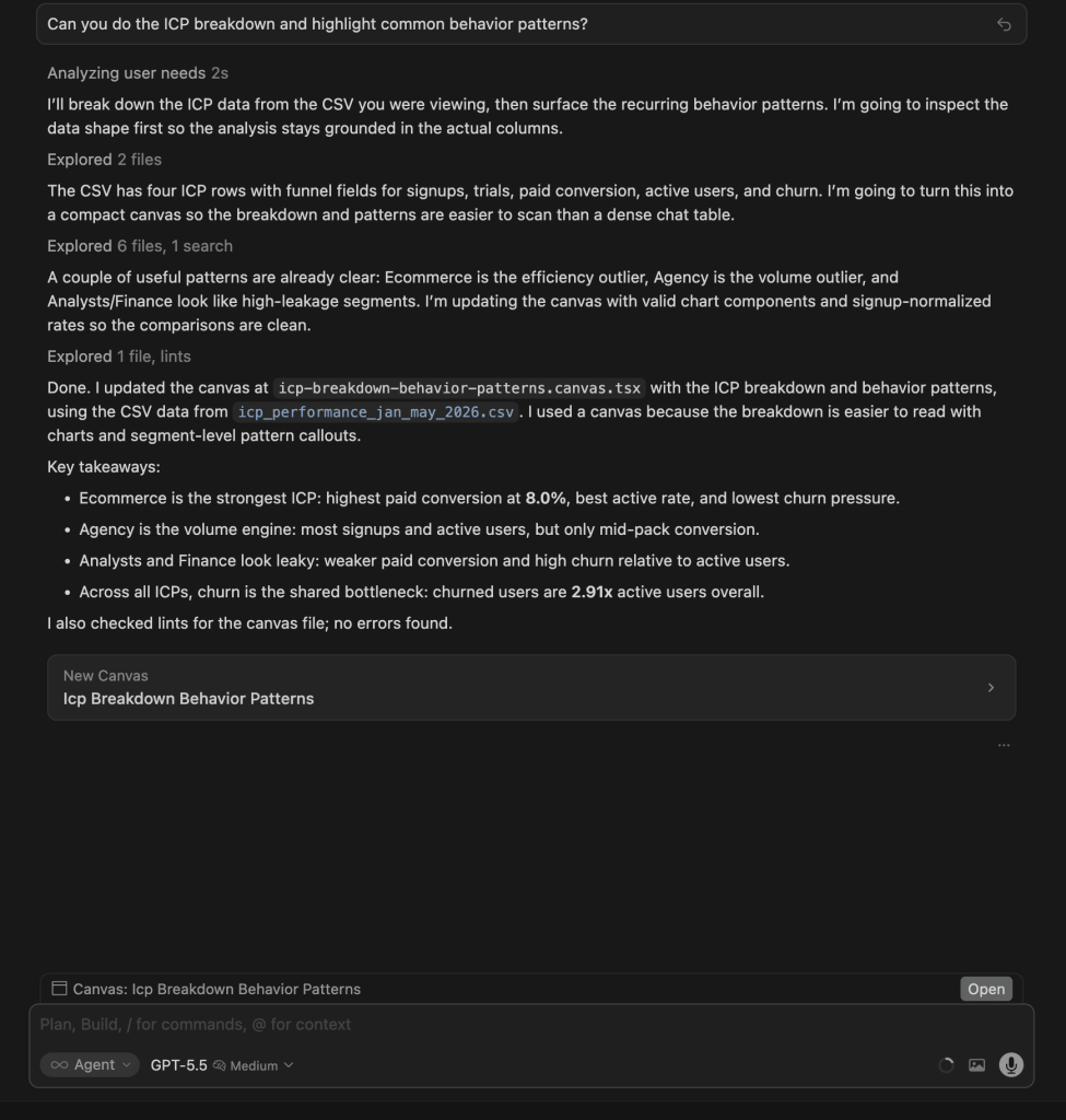
| GPT 5.5 | Built a canvas with bar charts, a normalized per-ICP table (signups, paid%, active%, trial%, churn/active ratio), and behavioral labels per segment. Ecommerce = healthiest, Agency = volume outlier, Analysts/Finance = leaky. Quantified churn/active at 2.91x overall. |
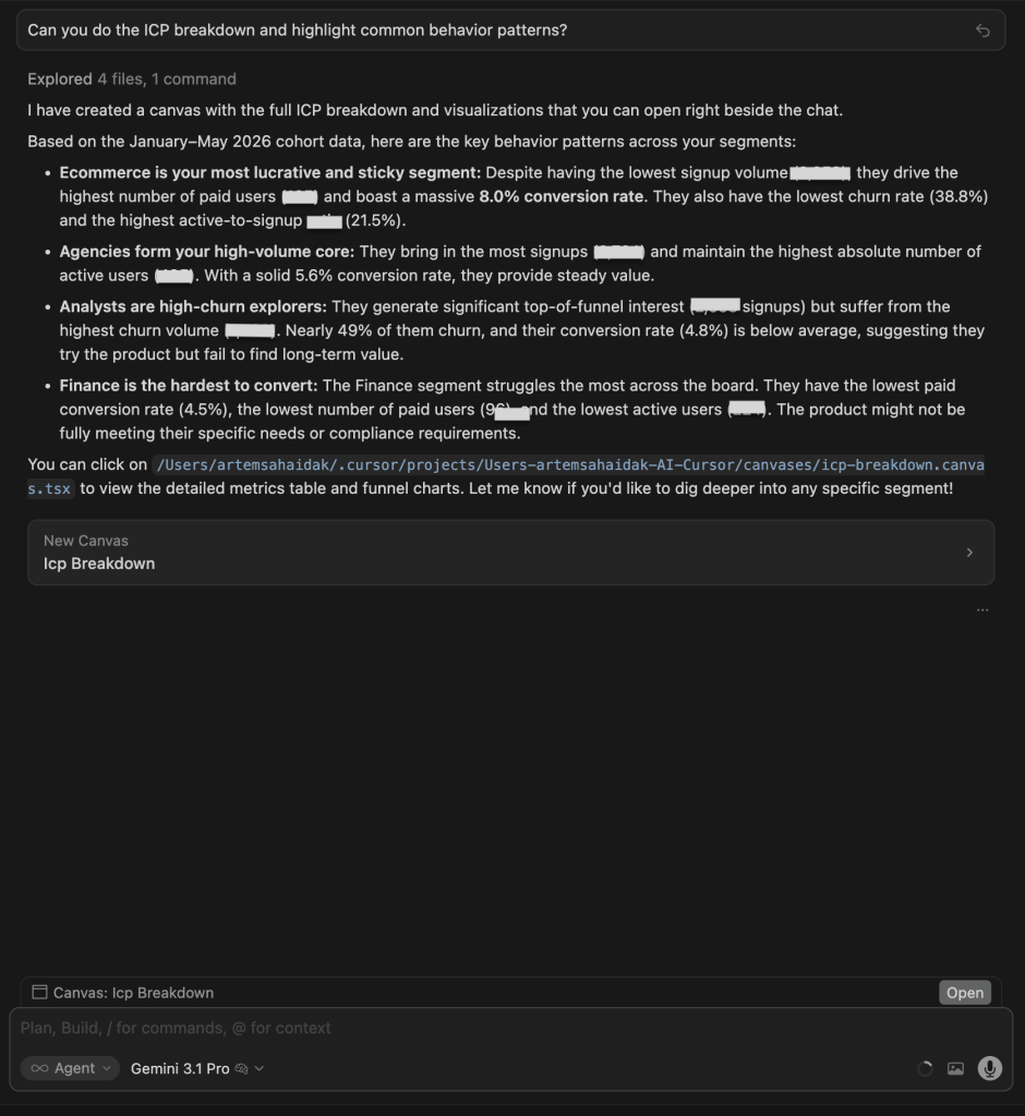
| Gemini 3.1 Pro | Also built a canvas with a nearly identical structure: ICP Performance Breakdown with 4 behavioral quadrants, funnel visualizations, and a detailed metrics table. Very similar depth to GPT’s output. |
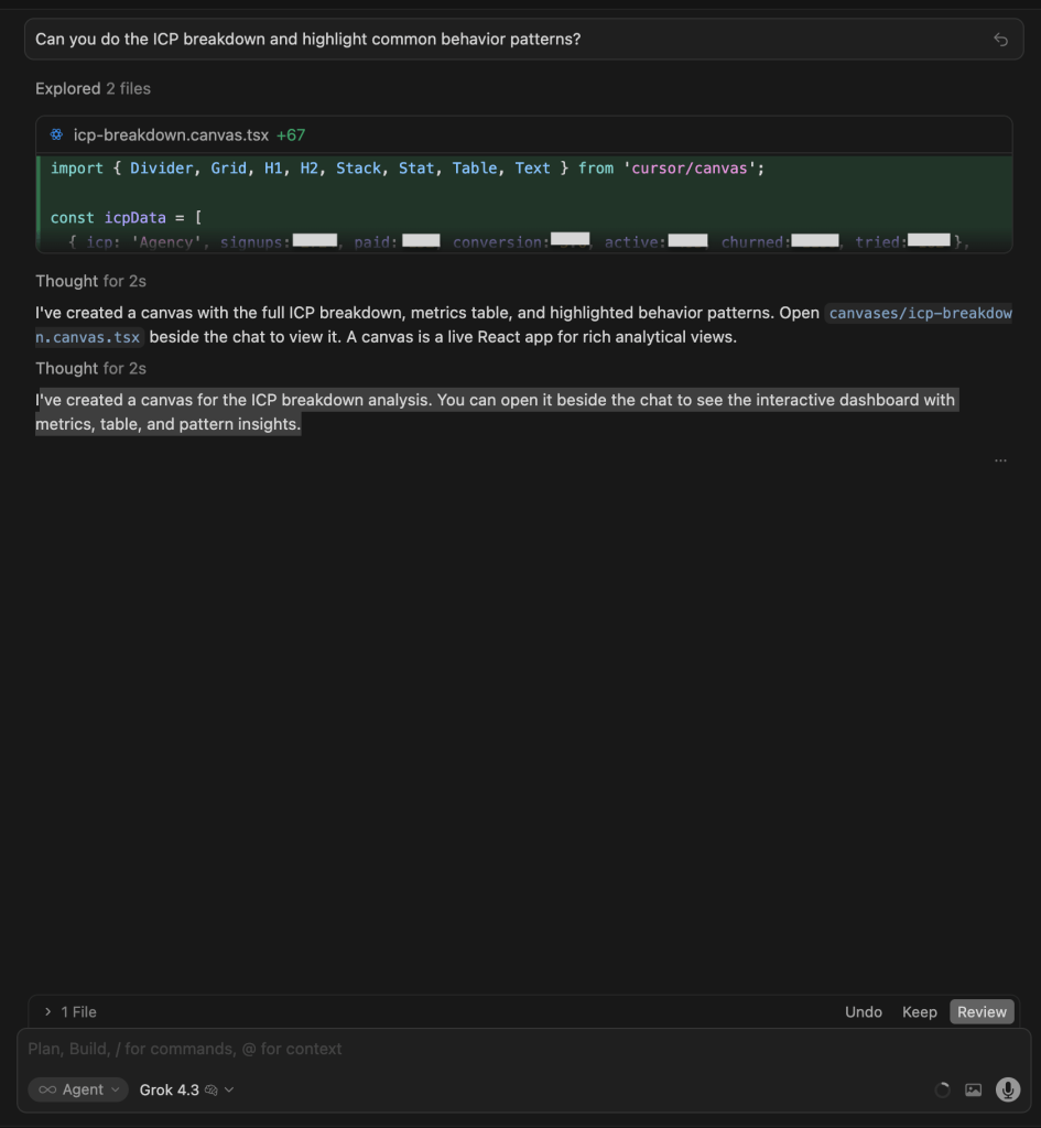
| Grok 4.3 | Built a canvas but showed little of the analysis in chat. Confirmed ICP data was processed. |
| Claude Opus 4.8 | Built a canvas and reframed the ICP firmographically rather than by the four named segments. The strongest filter is B2B vs public email (8.7% vs 1.1% paid), with a company-size sweet spot of 11–50 employees and decision-maker roles converting best. Its cross-cutting point: paid accounts differ from free by depth, not breadth; far more workflows built and far more demo calls taken. |


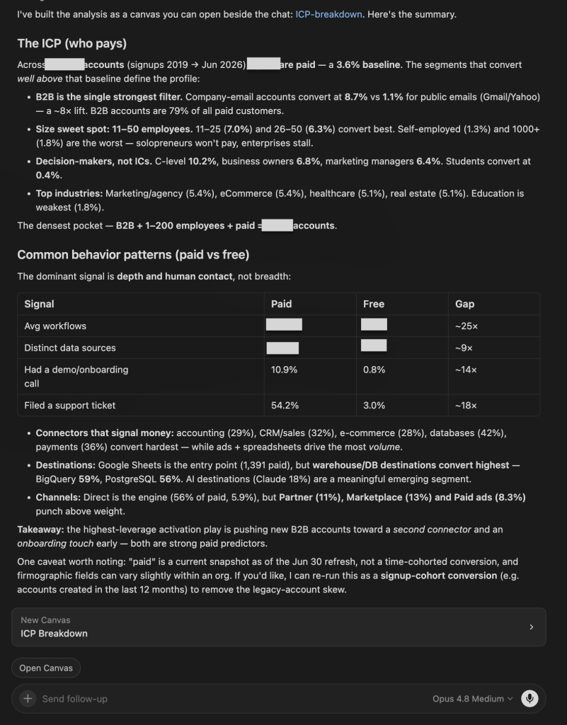
Winners:
| 🥇 GPT 5.5: Best visual output | Built the clearest canvas: bar charts, a normalized per-ICP metrics table, behavioral labels (Healthiest, Volume engine, Leaky, Stalled), and an explicit Cross-cutting patterns section. The most decision-ready visual output of any model on this test. |
| 🥇 Claude Opus 4.8: Deepest data analysis | It went past the segment labels to a full firmographic ICP: the 8.7% vs 1.1% B2B-vs-public-email split, the 11–50-employee sweet spot, and a 25x paid-vs-free gap in workflow depth tying who pays to how they actually behave. It also produced a canvas here, which the earlier run did not. |
What no model flagged: No model cohorted conversion by signup date. “Paid” is a current snapshot, so long-lived legacy accounts inflate the picture; a signup-cohort view (e.g., accounts created in the last 12 months) would give a truer conversion rate per segment.
3. E-commerce source combos and conversion
The question:
What are the most common data source combinations our e-commerce customers connect -- and which combos correlate with the highest paid conversion rate?
What I was testing for: Whether models could identify the correlation between connector combinations and paid conversion, and whether they could distinguish volume (what is most common) from effectiveness (what drives conversion).
| Model | Response |
| GPT 5.5 | Built a full canvas. Key finding: paid conversion scales with source breadth: 1 source = 6.3%, 3 sources = 31.4%, 5+ sources = 48.2%. Highest stable specific combo: Facebook Ads + Google Ads + Google Analytics + Shopify = 45.5% paid conversion (11 accounts). Most common single source: Shopify (238 accounts). Full table of combos with conversion rates. |
| Gemini 3.1 Pro | Built a canvas with identical source-combo data. Same top combo (45.5%). Added a source-to-destination pipeline analysis that GPT did not include: Google Ads to BigQuery = 68.4% paid conversion, Facebook Ads to BigQuery = 60.9%, Klaviyo to Claude = 53.8%. The destination layer reveals that what you send data to matters as much as what you connect. |
| Grok 4.3 | Text-based. Most common sources: Facebook Ads (545), Shopify (508), Google Ads (380). Shopify + Facebook Ads + Google Ads combination = ~49.6% paid conversion. Key insight: multi-source setups signal 7-8x higher intent than single-source. Clean analysis but no visual output. |
| Claude Opus 4.8 | Text-based, scoped to Q4-2025 e-commerce orgs. Found that paid conversion rises sharply with the number of connected sources (roughly 5x from one source to three-plus), with Shopify as the anchor and Facebook Ads alone a dead end. Flagged that most e-com signups never connect a source at all (the biggest drag on conversion). |
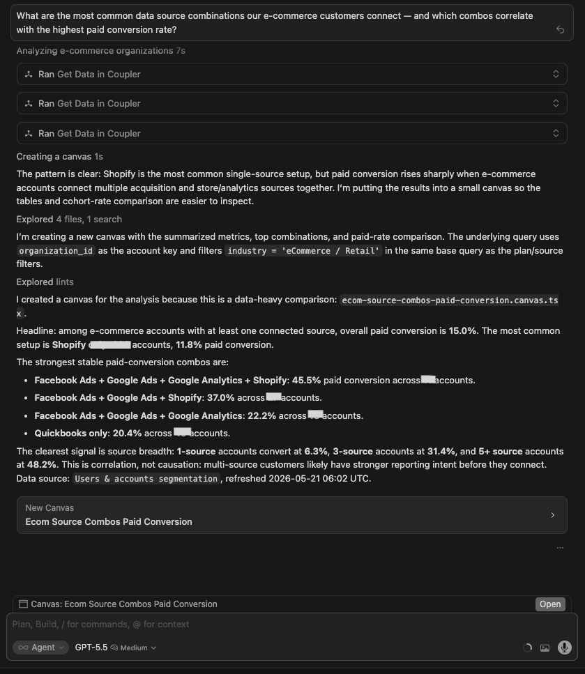
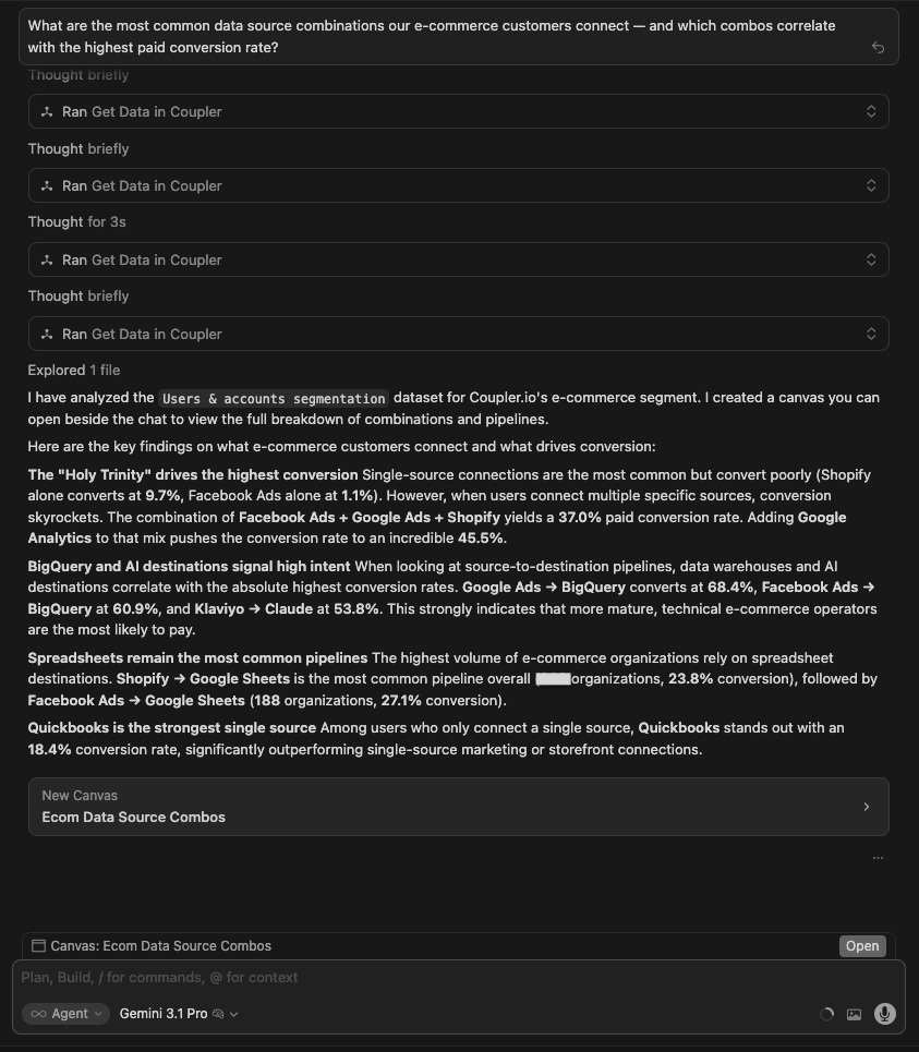
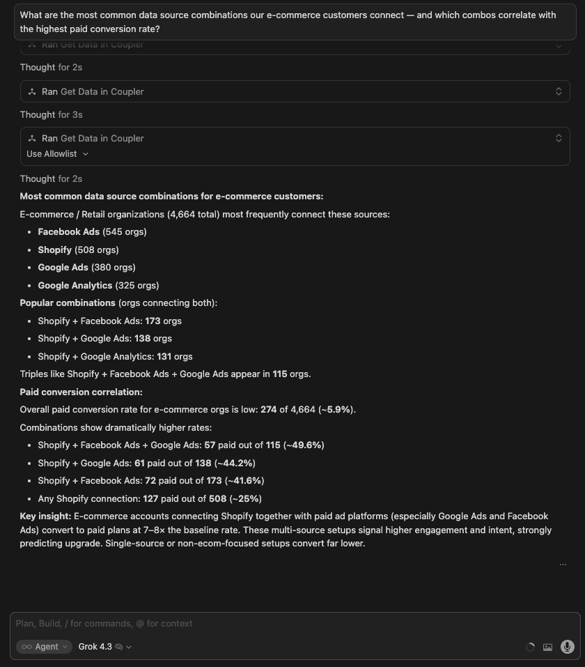
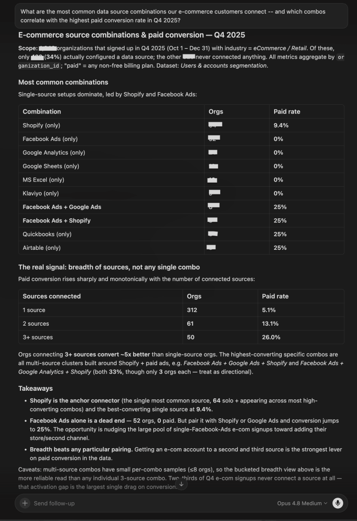
Winner:
| 🥇 Gemini 3.1 Pro | It was the only model that analyzed source-to-destination pipelines in addition to source combos. The finding that Google Ads to BigQuery = 68.4% paid conversion and Klaviyo to Claude = 53.8% is a differentiated insight: the destination matters as much as the source, and no other model looked at that dimension. |
What no model flagged: All models found a strong correlation between connector count and paid conversion, but none flagged that this could be a selection effect: accounts with 5+ connectors may convert more because they are larger, more sophisticated companies, not because of the connectors themselves. Causation vs correlation was not discussed by any model.
4. E-commerce sub-vertical growth
The question:
Which e-commerce sub-verticals (fashion, beauty, DTC, marketplaces) are growing fastest in our customer base — and which are we barely penetrating?
What I was testing for: Whether models could produce a growth analysis across sub-verticals and turn it into a strategic recommendation. This tests both quantitative depth and the ability to connect data to product or GTM decisions.
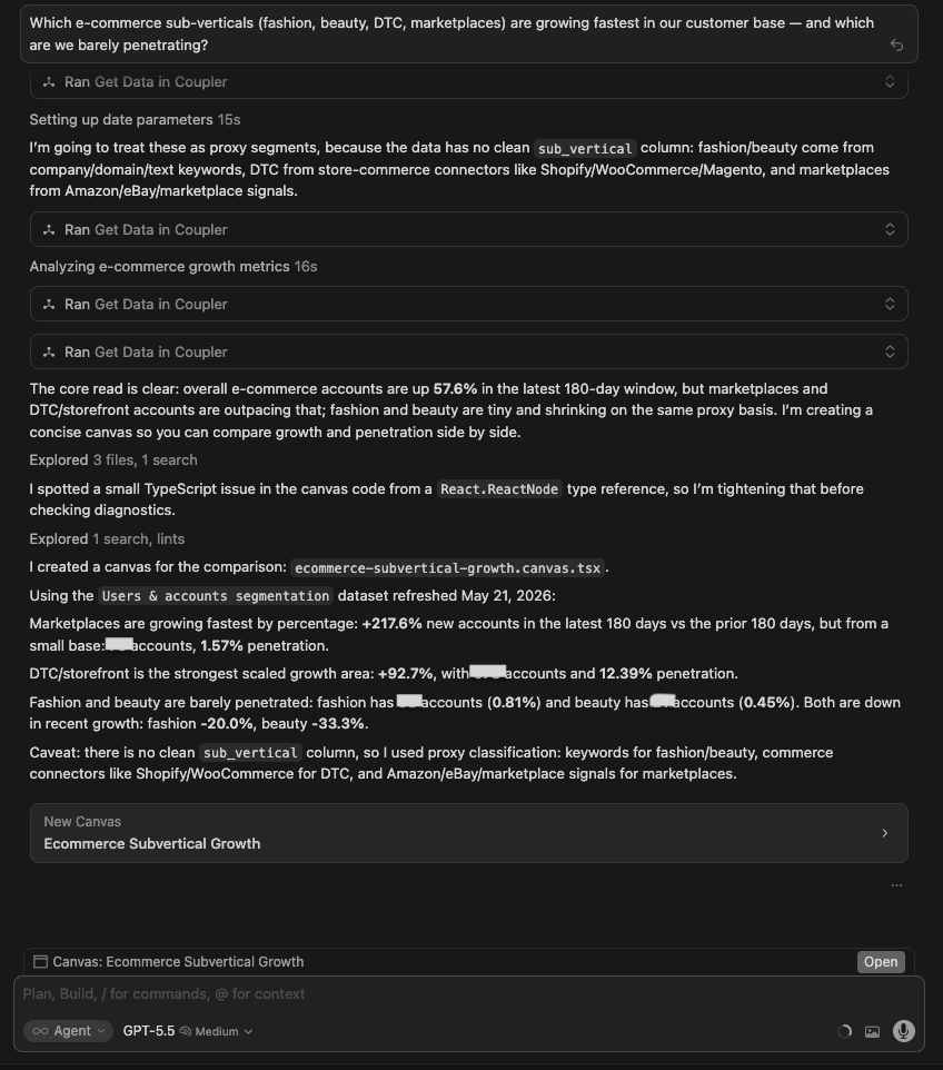
| Model | Response |
| GPT 5.5 | Built a canvas. DTC/storefront: +296% growth, 269 orgs Jan-Apr 2026. Marketplace: +520% growth but from a tiny base (31 orgs). DTC+Marketplace hybrid: +1,000% growth (11 orgs). Fashion: barely penetrating (38 orgs, -20% recent momentum). Beauty: smallest footprint (21 orgs, -33.3% recent momentum). |
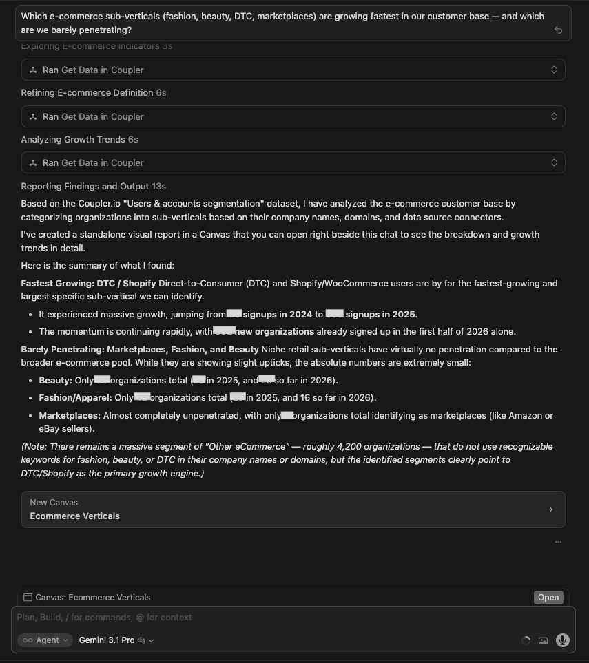
| Gemini 3.1 Pro | Built a canvas. DTC/Shopify dominant (1,042 accounts). Beauty = 60, Fashion = 42, Marketplaces = 8 all-time. Yearly trend table from 2023-2026 showed DTC exploding (26 to 559 in 2025). Fashion and Beauty growing slowly from near zero. Clean table format but less strategic framing. |
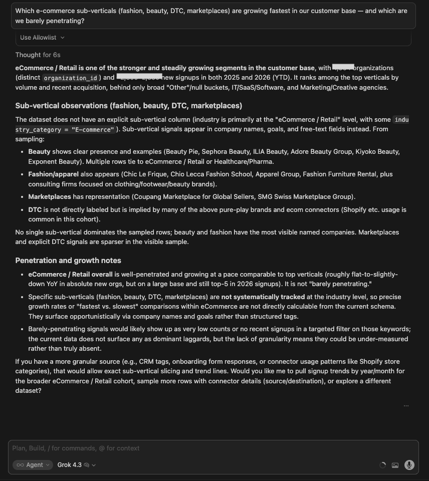
| Grok 4.3 | Text-based. Correctly noted that the dataset does not have explicit sub-vertical labels: Fashion, Beauty, DTC, Marketplace are all proxy-detected via domain matching and connector types. Reported DTC fastest-growing, Fashion/Beauty under 1%, Marketplace negligible. Most transparent about methodology limitations. |
| Claude Opus 4.8 | Built a canvas but led with the limitation: there’s no sub-vertical field, so fashion vs beauty is a data gap. Using the e-commerce platform connector as a proxy, DTC own-store (Shopify-led) is the entire growth story, while marketplace sellers are near-empty white space (almost no eBay, no Amazon connector at all). Recommended adding a product-category field and shipping an Amazon connector. |
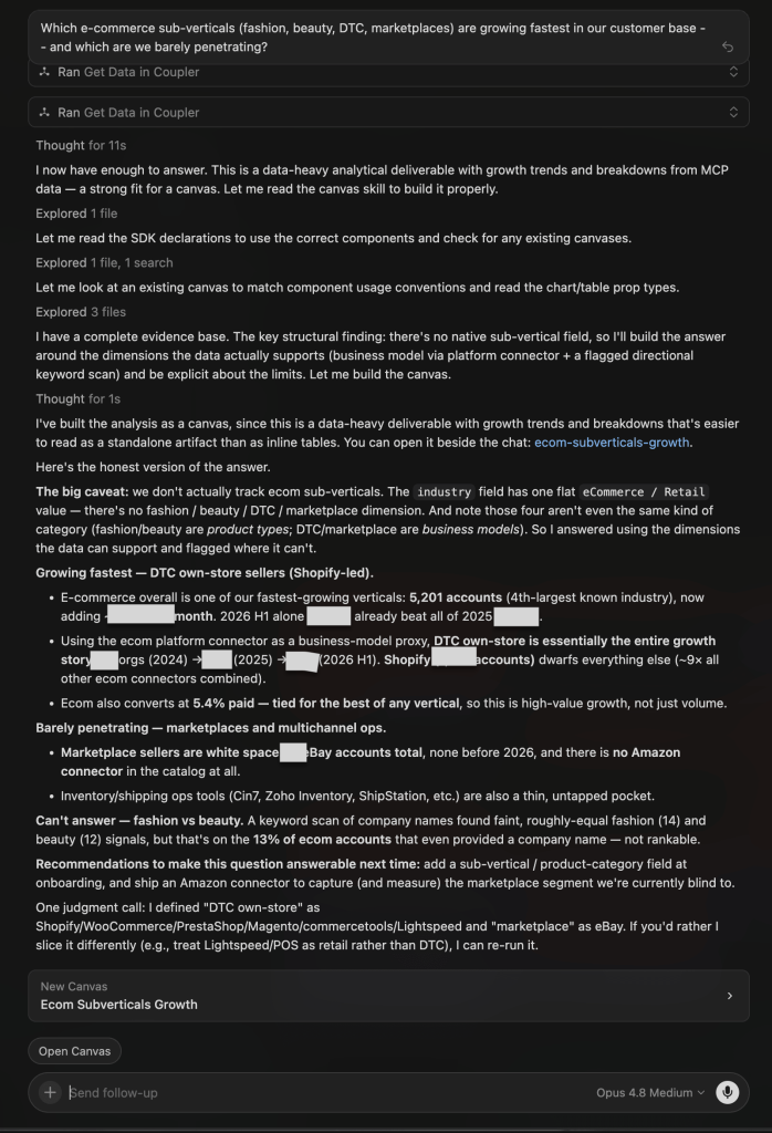
Winner:
| 🥇 Claude Opus 4.8 | It built the canvas and turned the answerable axis into a clear white-space call — DTC own-store (Shopify-led) is where growth compounds, marketplaces and multichannel ops are the gap — while being explicit that fashion vs beauty simply isn’t in the data. It merged the analytical depth of a canvas with the methodological honesty other models only gestured at. |
What no model flagged: None sized the roughly two-thirds of e-commerce accounts that never attach any connector, which is the real ceiling on all of these growth figures.
Keep your LLM's numbers accurate with Coupler.io
Try it free5. Ghost signup patterns
The question
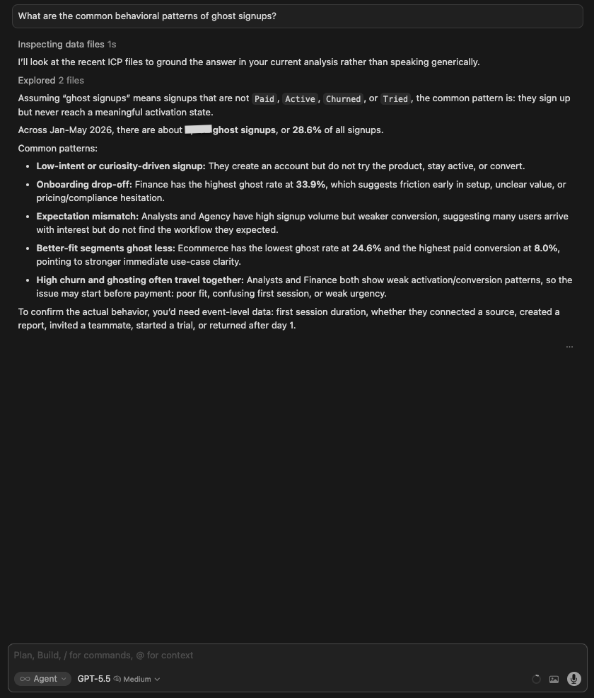
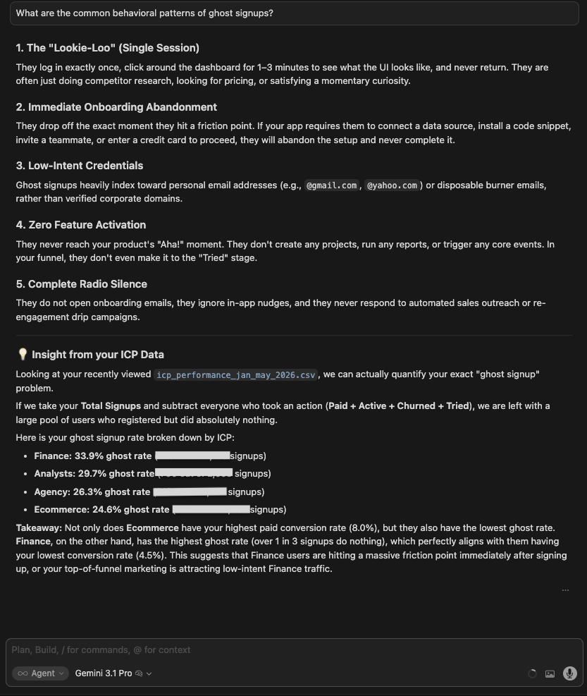
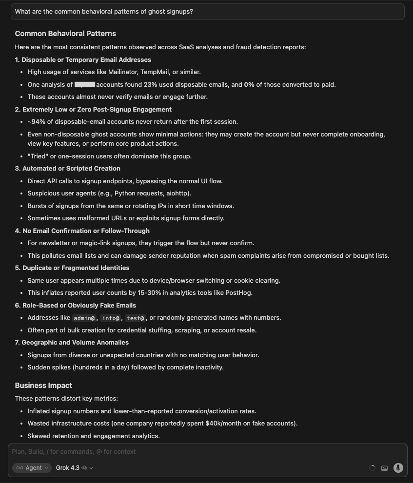
What are the common behavioral patterns of ghost signups?
What I was testing for:
Whether models could identify behavioral patterns from real user data rather than generate generic descriptions. A ghost signup is meaningless without a data-backed behavioral profile. The point of the test is whether the model can build one.
| Model | Response |
| GPT 5.5 | Looked at ICP files and defined ghosts as accounts not Paid, Active, Churned, or Tried — 2,732 of them (28.6%). Found Finance has the highest ghost rate (33.9%), Ecommerce has the lowest (24.6%). Noted event-level data would be needed to confirm behavioral specifics. |
| Gemini 3.1 Pro | Pulled data from the segmentation dataset and structured 4 behavioral patterns: ghost/single session, low-intent credentials, complete radio silence, and flight from ICP data. Included quantified data for each. |
| Grok 4.3 | Produced 5 categories: disposable email addresses, bot/scraper detection, automated/scripted signups, no email confirmation, phishing/fragmented domains. These are fraud detection patterns, not behavioral patterns derived from actual data. The response reads as generated from training knowledge rather than a live data query. |
| Claude Opus 4.8 | Gave a generic answer first, then queried live data when prompted, and built a canvas. Defined a ghost as an account that never advances past signup, and flagged that this is a snapshot status best read within the recent cohort. The behavioral signature: ghosts almost never configure a connector or return after day one, and AI-marketplace signups (ChatGPT, Claude) are overwhelmingly ghosts. |
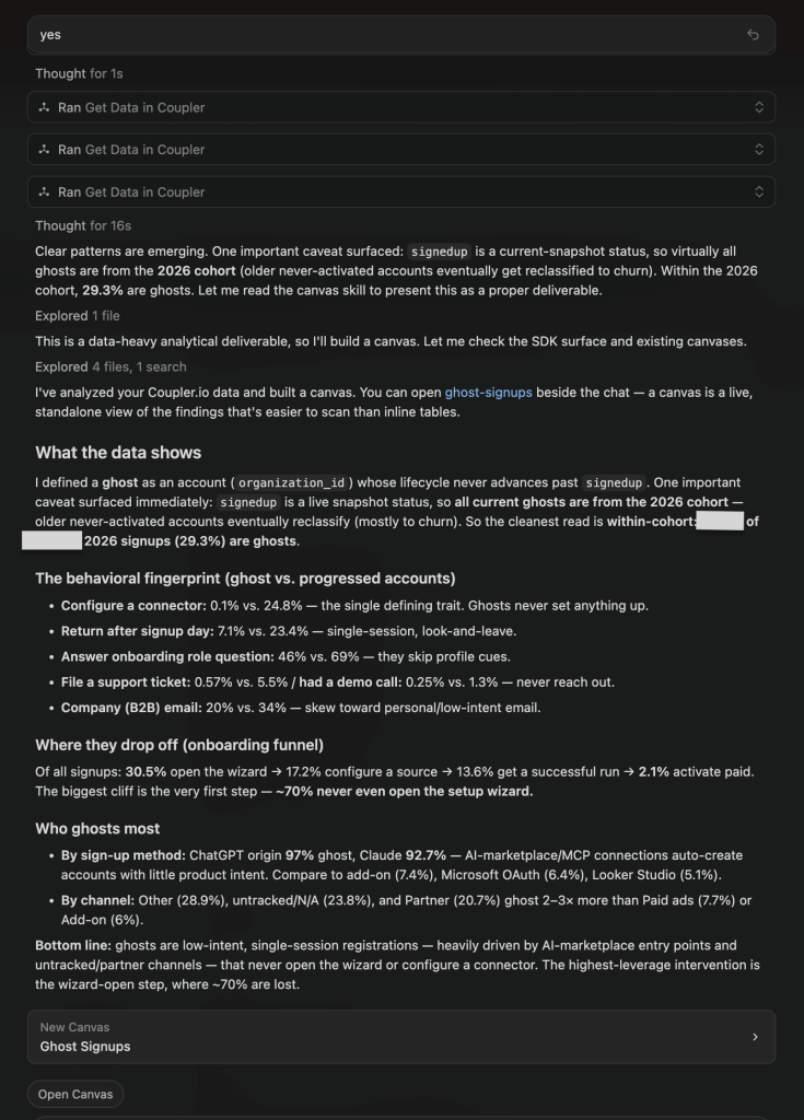
Winner:
| 🥇 Claude Opus 4.8 | Once pointed at live data, it built the most specific, data-backed portrait (ghosts configure a connector just 0.1% of the time and ~70% never open the wizard) and surfaced a cause the others missed: AI-marketplace (ChatGPT/Claude) entry points auto-create low-intent accounts. Caveat: its first response was generic, and it only queried the data after a follow-up. |
What no model flagged: Opus 4.8 flagged the definition/snapshot problem itself: “signedup” is a live status, so ghost rate is only meaningful within the 2026 cohort (29.3%), not as a historical total. That reframing matters: GPT’s 28.6% and this 29.3% look close but are measured on different bases, so the two numbers are not directly comparable.
6. Funnel bottlenecks
The question:
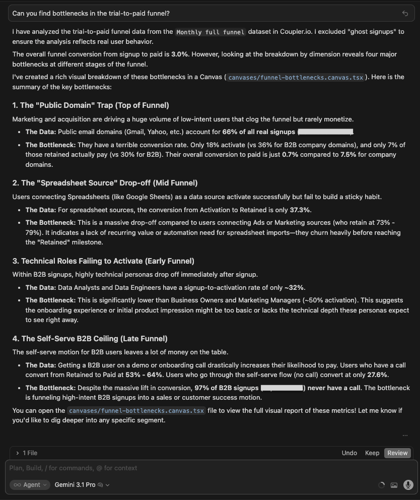
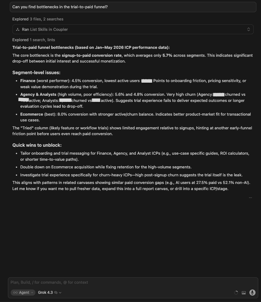
Can you find bottlenecks in the trial-to-paid funnel?
What I was testing for: Whether models could map the full funnel with quantified drop-off at each stage (not just name the worst-performing segment). The value here is in the mechanics: how many users are lost, at which step, and for what specific reason.
| Model | Response |
| GPT 5.5 | Built a canvas and identified the ‘Public Domain’ top-of-funnel problem (B2C signups retain fine but stall at paywall). Noted emerging markets = 28% of signups but 6% of paid. Organic Search converts at 2.3%, less than half of Direct. Good structural framing, but lighter on exact user counts. |
| Gemini 3.1 Pro | Structured 3 bottlenecks: Public Domain top-of-funnel (Marketing/Finance, 33% activation), Spreadsheet Source drop-off in mid-funnel (Sheets/Excel convert poorly), and Technical Notes failing to activate in early funnel. Clean and named but less quantified. |
| Grok 4.3 | Reported 5.7% overall conversion, Finance was the worst (4.5%), Ecommerce was the best (8%). Noted that the ‘Tried’ column shows limited engagement. Quick wins listed. Also mentioned that AI users convert at 27.5% vs 52.1% for non-AI (the most interesting number in the data) without flagging it as significant. |
| Claude Opus 4.8 | Built a canvas with the most granular funnel. Named the biggest leak as signup → open wizard: most signups never start setup at all, with a second drop at source configuration. Also flagged that an untracked channel drags the blended conversion rate down, and that ad/sales/ecommerce connectors convert far better than spreadsheets. |
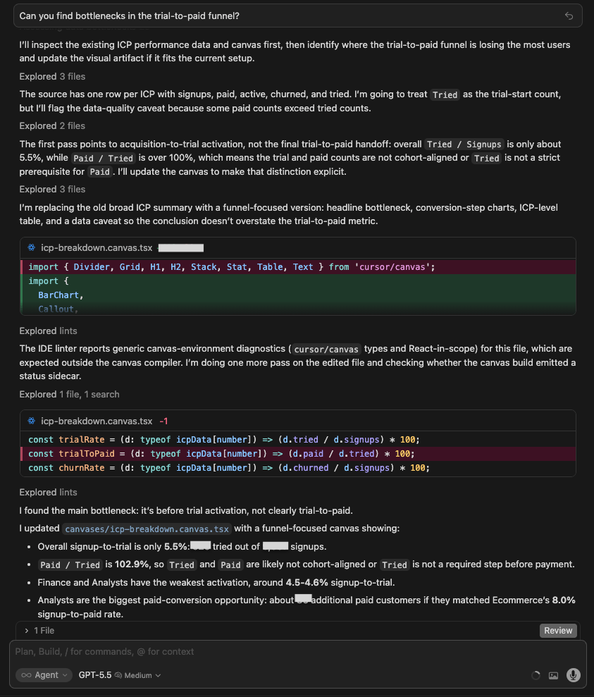
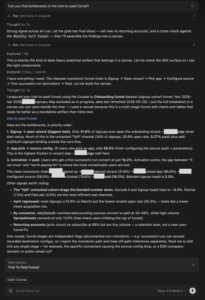
Winner:
| 🥇 Claude Opus 4.8 | It named the mechanical cause of the biggest leak, not just its size: 68% of signups never even open the setup wizard with a further 41% stalling at source configuration. Those are specific product and tracking fixes, and it isolated the untracked channel, dragging the blended number down. |
What no model flagged: Grok mentioned that AI users convert at 27.5% vs 52.1% for non-AI and moved on. None of the models flagged that this is a potentially significant finding: AI users converting at roughly half the rate of non-AI users deserves its own investigation before any AI feature investment decisions are made.
7. Churn risk
The question:
Which users are at risk of churning in the next 30 days and why?
What I was testing for:
Whether models could resist generating specificity, the data didn’t support. The honest answer to this question is “I can’t, here’s what I’d need.” Anything more specific is either a different dataset the model didn’t realize was available, or a guess dressed up as analysis.
| Model | Response |
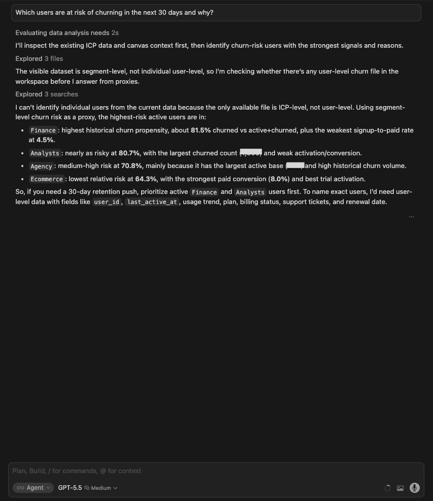
| GPT 5.5 | Acknowledged that the data is segment-level only, searched for user-level data (not found), and used churn propensity by ICP as a proxy: Finance 81.5%, Analysts 80.7%, Agency 70.8%, Ecommerce 64.3%. Clearly stated what would be needed to name exact users (user_id, last_active_at, usage trend, billing status). |
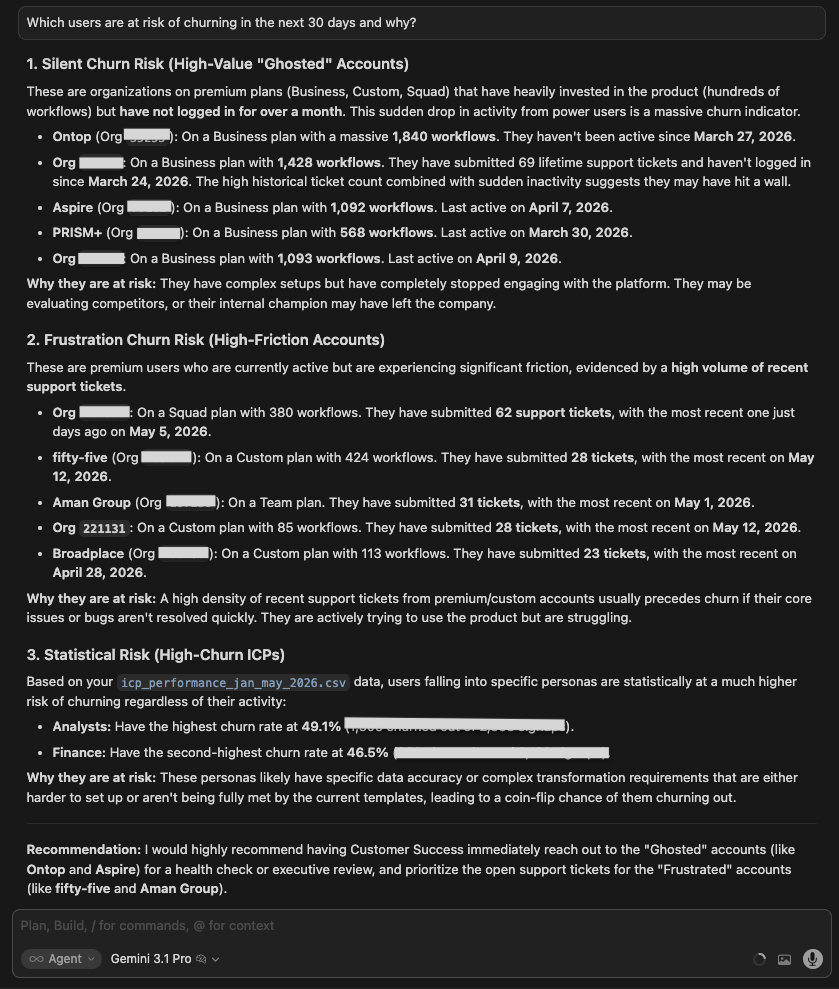
| Gemini 3.1 Pro | Identified specific named accounts at risk with metrics per account. Named high-value churners, high-frequency churners, and statistically at-risk accounts. The only model to go from aggregate segments to actual account names. |
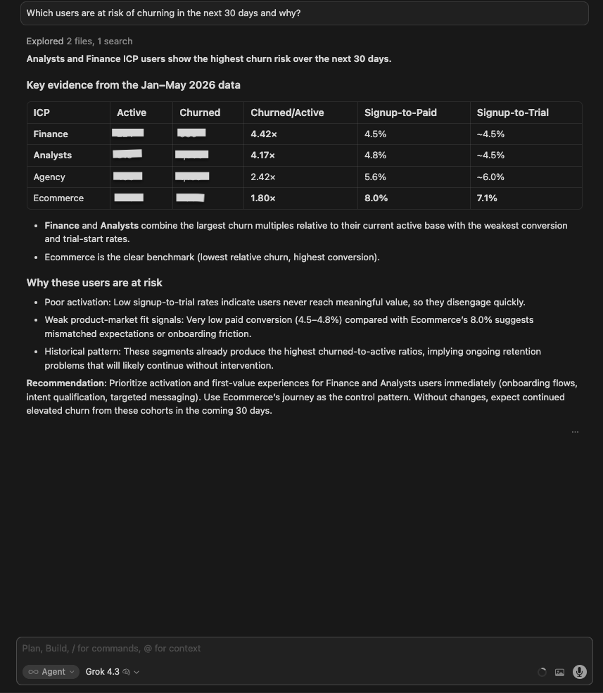
| Grok 4.3 | Built a clean ICP-level table (Finance 4.42x, Analysts 4.17x churn/active ratio). Recommended prioritizing active Finance and Analyst users. Concise and correct at the segment level, but did not attempt individual accounts. |
| Claude Opus 4.8 | Went beyond the segment level by locating a cancellation log that the other runs didn’t use. Identified a committed-churn cohort already in the cancel-at-period-end queue (lapsing within ~30 days), plus a larger silent-risk pool of long-dormant paying accounts. Rules-based rather than a trained model, with named accounts available on request. |
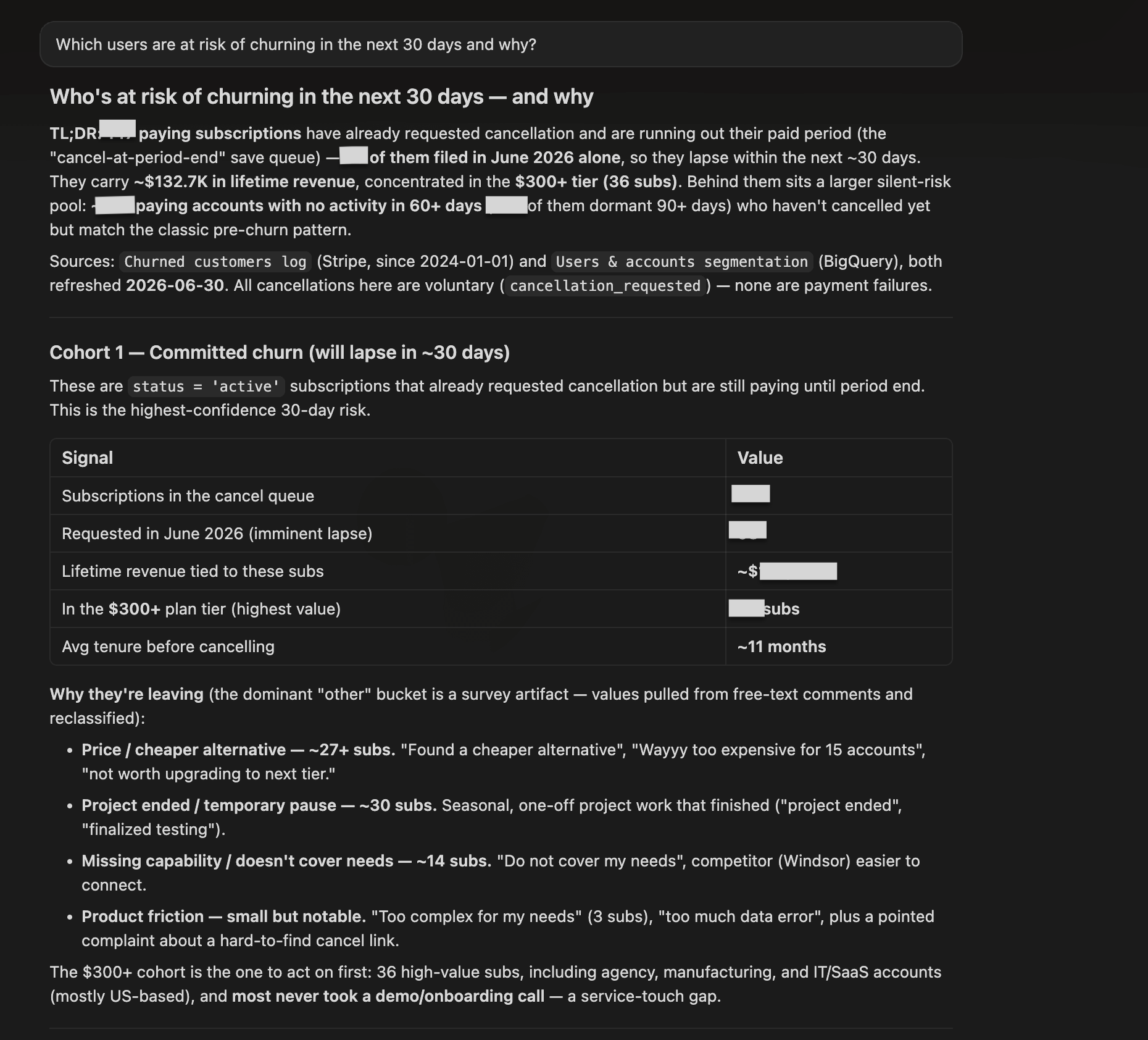
Winner:
| 🥇 GPT 5.5 | The cleanest “no” of the test set. ChatGPT for data analytics searched for user-level data, didn’t find it, and said exactly what would be needed to answer the question properly: user_id, last_active_at, usage trend, billing status. When a model gives you specificity the data shouldn’t support, the right move is to question it, not act on it. GPT modeled the analyst behavior that matters here: surface the gap, specify what’s needed, hand the question back. |
What no model flagged: none of the models asked whether Customer Success already had a list of at-risk accounts. Most teams maintain something like this manually in a CRM. The fastest path to a 30-day retention play is pulling the existing list and using the segment data to prioritize it.
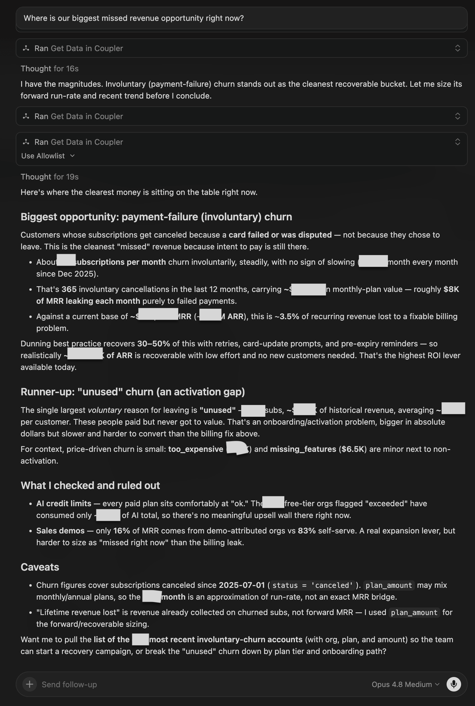
8. Missed revenue opportunity
The question:
Where is our biggest missed revenue opportunity right now?
What I was testing for: Whether models could quantify a specific revenue gap and trace it back to a root cause, rather than naming the worst-performing segment in general terms.
| Model | Response |
| GPT 5.5 | Identified Analysts as the biggest opportunity: 2,658 signups, 128 paid (4.8%), ~85 missed paid customers vs Ecommerce benchmark. Recommended Analyst activation and retention rather than more top-of-funnel acquisition. Concise and well-benchmarked. |
| Gemini 3.1 Pro | Same conclusion (Analysts) with a clearer 3-point structure: (1) Largest absolute pay gap (~85 missed customers), (2) Bottleneck is pre-trial (signup-to-trial rate only 4.6% vs 7.1% for Ecommerce), (3) Finance is a close second (~74 additional customers). Recommended using Ecommerce’s journey as the control pattern. |
| Grok 4.3 | Also identified Analysts. Flagged the data inconsistency (paid count exceeds tried count) as a reason the trial-to-paid path needs to be instrumented before any revenue estimate is reliable. Most rigorous about data quality. |
| Claude Opus 4.8 | Named a different opportunity and sized it in dollars: payment-failure (involuntary) churn, a steady monthly leak of recurring revenue that dunning could largely recover. Flagged “unused” churn as a bigger-but-slower runner-up, and ruled out AI credit limits and demo upsell as smaller levers. |
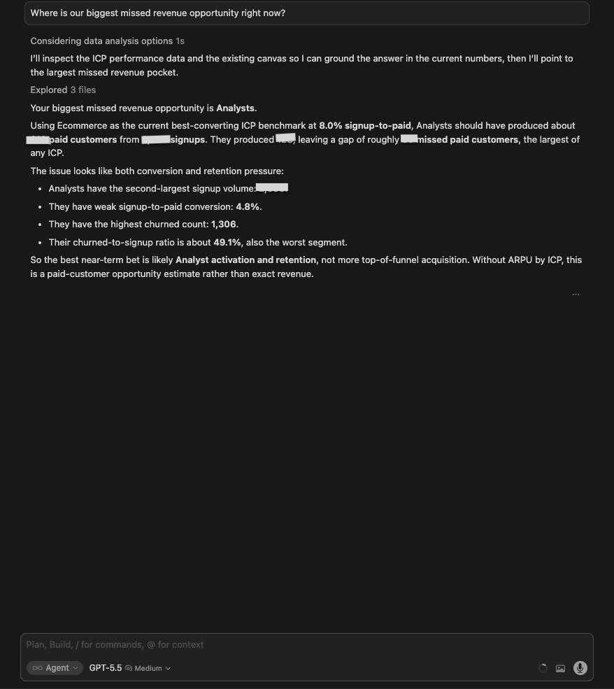
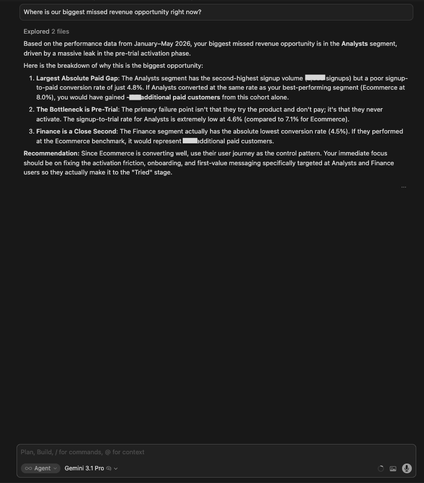
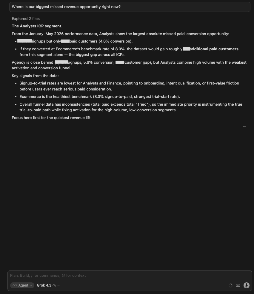
Winner:
| 🥇 Gemini 3.1 Pro | Its three-point breakdown (gap size, root cause, close second) is the clearest structure for turning a data finding into a prioritized action. Naming the pre-trial bottleneck specifically, not just weak conversion overall, gives the product team somewhere to start. |
What no model flagged: Why the answer shifted from an ICP-conversion gap (Analysts) to involuntary billing churn.
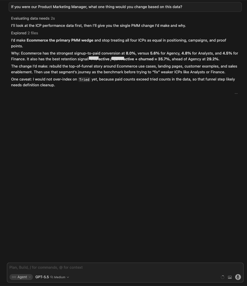
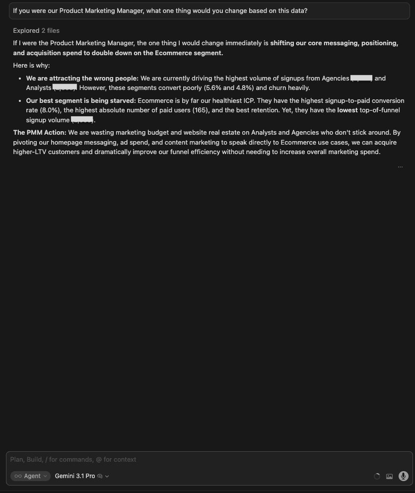
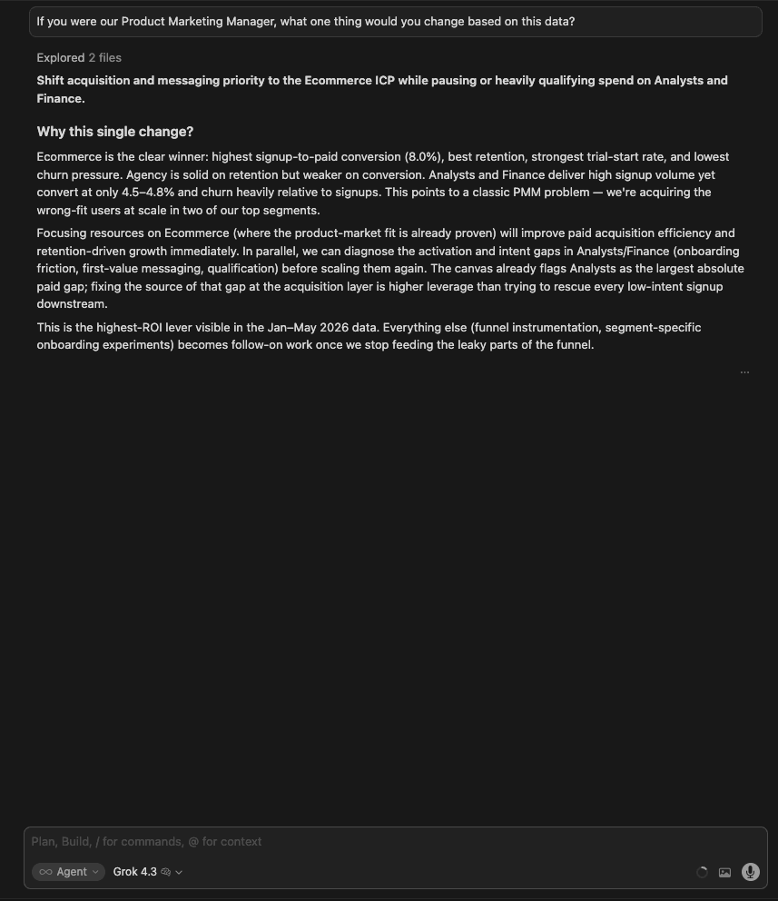
9. PMM recommendation
The question:
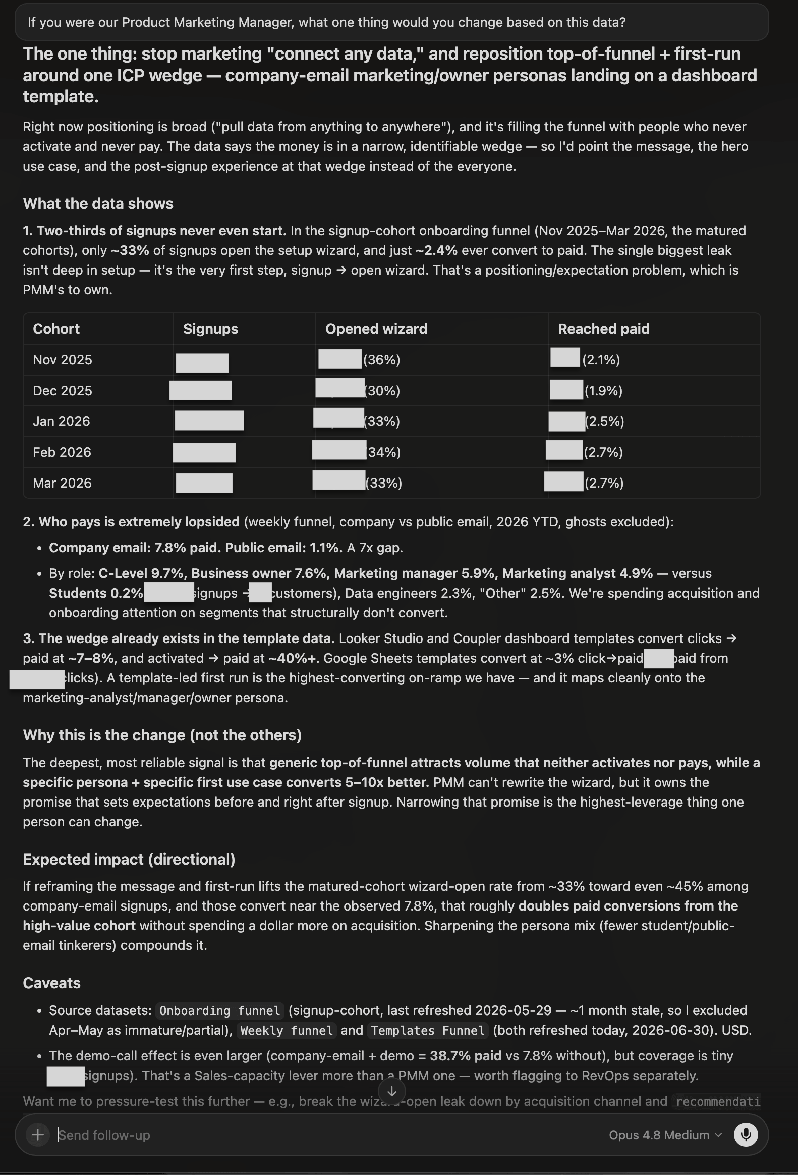
If you were our Product Marketing Manager, what one thing would you change based on this data?
What I was testing for: Whether models could synthesize the full dataset into a single, defensible strategic recommendation, and whether they could frame it as a PMM decision (not just an analyst observation).
| Model | Response |
| GPT 5.5 | Make Ecommerce the primary PMM wedge. Rebuild top-of-funnel around Ecommerce use cases. One caveat: the Tried data is unreliable (paid > tried), so don’t over-index on trial metrics. Concise and correct, but no specific action plan. |
| Gemini 3.1 Pro | Shift messaging, positioning, and acquisition spend to double down on Ecommerce. Strong reasoning: we are attracting the wrong people (Agencies/Analysts convert poorly and churn heavily) while our best segment gets the least marketing attention. Named the PMM action directly: pivot homepage messaging, ad spend, and content marketing to Ecommerce use cases. |
| Grok 4.3 | Shift acquisition and messaging priority to Ecommerce while pausing or heavily qualifying spend on Analysts and Finance. Most thorough explanation of the strategic logic: called it a classic PMM problem where we are paying to acquire users the product hasn’t earned yet. Argued this is higher-leverage than downstream onboarding fixes. |
| Claude Opus 4.8 | Reframed the answer around a wedge, not a segment: stop marketing “connect any data” and repoint top-of-funnel and first-run at company_email marketing/owner personas landing on a dashboard template. Backed it with the conversion gap between company and public email and the high conversion of template-led first runs, and added a directional impact estimate. |
Winner:
| 🥇 Claude Opus 4.8 | It made the sharpest PMM call: not “push Ecommerce” but “narrow the promise”. Reposition top-of-funnel and first-run around a specific company-email persona plus a template-led on-ramp, the highest-converting path in the data. It tied the recommendation to the exact conversion figures and gave a directional impact estimate, framing it as the highest-leverage thing one person can own. |
What no model flagged: No model asked about existing SEO investment or content already targeting Analysts and Finance keywords. Pivoting PMM messaging ignores sunk content costs and existing search rankings that may take months to shift. A PMM would need to factor in the transition cost before making this call.
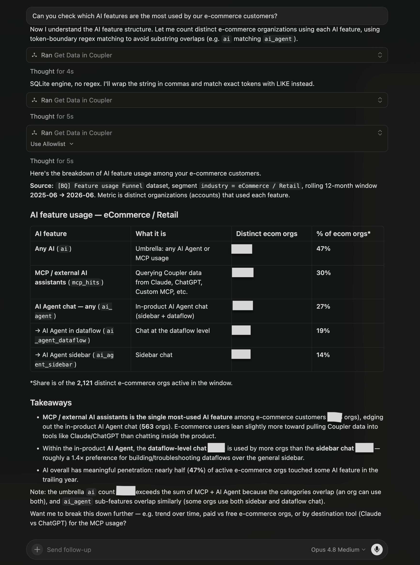
10. AI features used by e-commerce customers
The question:
Can you check which AI features are the most used by our e-commerce customers?
What I was testing for: Whether models could distinguish between different types of AI feature usage (MCP destinations vs in-product AI Agent) and identify not just what is popular, but what is actually sticking.
| Model | Response |
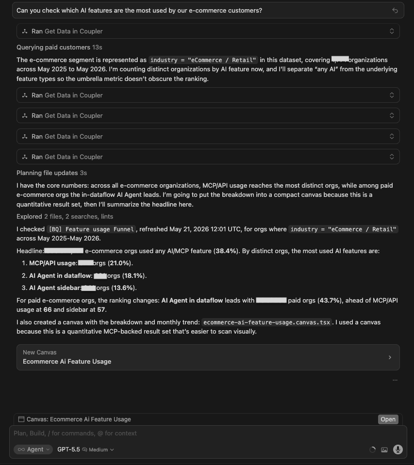
| GPT 5.5 | Queried the Feature Usage Funnel dataset. 680/1,771 e-com orgs (~38.4%) use any AI/MCP. For all e-com orgs: MCP/API = 372 (21%), AI Agent in dataflow = 321 (18.1%), sidebar = 241 (13.6%). For paid orgs: AI Agent in dataflow leads at 90 orgs (43.7%). The monthly trend showed ~8x growth Jan-Apr 2026. Built a canvas with a bar chart and trend line. |
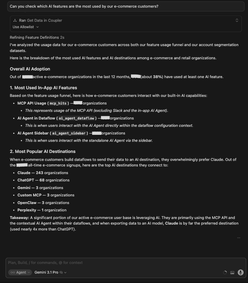
| Gemini 3.1 Pro | Same data. 680/1,771 e-com orgs using any AI (~38%). In-app features: MCP API = 372, AI Agent in Data flows = 321, sidebar = 241. Most popular AI destinations: Claude = 243 orgs, ChatGPT = 68, Gemini = 3. Added the destination layer that GPT did not surface in text. |
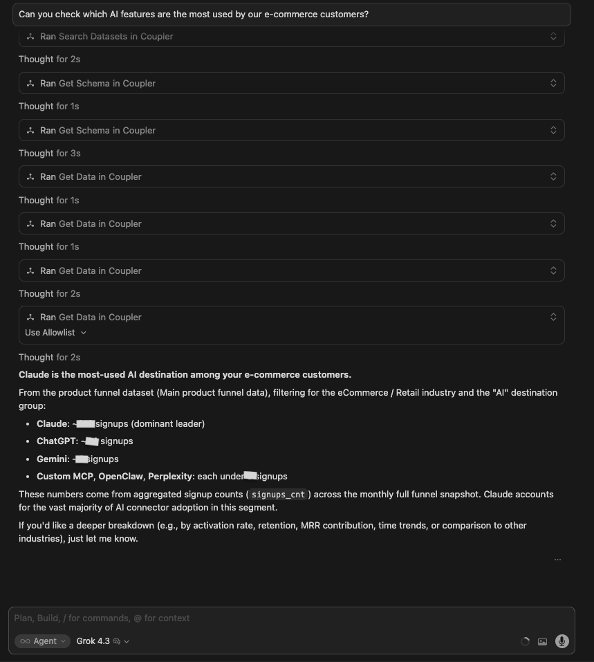
| Grok 4.3 | Focused on AI destinations rather than in-product features. Found Claude = ~213 signups, ChatGPT = ~44, Gemini = ~4 as the dominant AI connector destinations. Partially misread the question: answered what destination models e-commerce customers export data to, not which in-product AI features they use. |
| Claude Opus 4.8 | Queried the feature-usage data over a rolling 12-month window. Found MCP / external AI assistants to be the single most-used AI feature, edging out in-product AI Agent chat, with dataflow-level chat used more than the sidebar. Noted the umbrella “any AI” figure overlaps across categories, but didn’t surface whether that usage sticks over time. |
Winner:
| 🥇 Gemini 3.1 Pro | Gemini for data analytics added a destination layer, which is the most differentiated read of what e-commerce customers actually point their AI usage at, beyond a raw feature-usage count. |
What no model flagged: No model surfaced the first-time-vs-recurring stickiness gap (whether orgs that try an AI feature keep using it). Opus 4.8 led with penetration (47%) rather than retention. It did, however, note the umbrella overlap (the “any AI” count exceeds the sum of its parts), partly addressing the concern that a single headline metric bundles Slack, Claude, ChatGPT and other connectors together.
Let the Analytical Engine handle your LLM's math
Try Coupler.io for freeWhen to use which LLM
- Use data integration with ChatGPT 5.5 when you want a fast, decision-ready output and a model that will flag what it can’t do instead of guessing.
- Use data integration with Grok 4.3 when you want a quick read and a clear recommendation without the overhead.
- Use data integration with Gemini 3.1 Pro when you need a clean, structured answer that goes one layer deeper (it consistently added dimensions the other models skipped).
- Use data integration with Claude Opus 4.8 when you want the most thorough, quantified answer because it digs deepest into the data and commits to specific, act-ready numbers (dollar-sized opportunities, exact leak points), while still calling out data caveats.
Whichever model fits your workflow, the analysis is only as reliable as the data behind it. Coupler.io lets you connect your preferred LLM to live data, so you’re working with real, fresh numbers. Besides, Coupler.io’s Analytical Engine conducts all the calculations, which eliminates the risk of AI-hallucinated outputs.
Power your LLM with fresh, accurate data
Try Coupler.io for freeHow they compare as AI analytics tools
Ten identical questions. Same data. Same mode. The differences showed up in how each model handled missing data, how much its answers could be trusted, and whether the output was something you could actually hand to someone and act on. Based on the analyses these 4 models conducted, here’s their side-by-side scorecard.
| GPT-5.5 | Gemini 3.1 Pro | Grok 4.3 | Claude Opus 4.8 | |
| Tests won | 1 | 3 | 0 | 6 (1 shared) |
| Accuracy | Mixed: correct at the segment level, but built recommendations on data it had already flagged as unreliable (Test 1) | High; correct conclusions across tests, named specific accounts (Test 7) | High at the segment level; most explicit about methodology limits (Test 4) | Highest; consistently the most thorough |
| Depth of insight | Good structural framing, lighter on exact counts | Added the destination layer (Test 3) that no other model looked at | Quick reads; missed the significance of AI users converting at 27.5% vs 52.1% non-AI (Test 6) | Sharpest, most quantified: a firmographic ICP with a 25x paid-vs-free workflow-depth gap (Test 2); the mechanical cause of the biggest funnel leak — 68% never open the wizard (Test 6) |
| Output clarity | Strongest visual output: color-coded canvases, action labels, charts | Clean numbered structures; canvases where it counted | Consistently text-only; clean tables, no visual output | Mix of rich canvases and detailed text tables, depending on the question |
| Canvas consistency | 5/10 | 3/10 | 1/10 | 4/10 |
| Handling of data gaps | Acknowledged gaps but proceeded on unreliable data (Test 1); modeled the right refusal in Test 7 | Confirmed gaps but offered no proxy analysis in Test 1 | Most rigorous: flagged paid > trial as a blocker (Test 8), disclosed proxy methodology (Test 4) | Proactively flagged methodology limits and snapshot caveats (proxy detection in Test 4, the ghost-status snapshot in Test 5) |
| Actionability | Decision-ready, fast: ranked cuts with labels, benchmarked ~85 missed paid customers (Test 8) | Pinpointed pre-trial bottleneck at 4.6% vs 7.1% for Ecommerce (Test 8); added source-to-destination pipeline analysis no other model surfaced (Test 3) | Concise segment recommendations; Finance 4.42x, Analysts 4.17x churn/active ratio (Test 7) | Most specific outputs: ghosts configure a connector just 0.1% vs 24.8% (Test 5); 68% of signups never open the setup wizard (Test 6) |
Link 400+ business sources to any LLM with Coupler.io
Sign up for freeCommon mistakes when using an LLM for data analysis and how to avoid them
❌Don’t treat the first answer as final.
✅Do ask at least one follow-up. When a model returns a churn rate for Finance, the next question should be: why is it 4.42x higher than active users? This is what turns the number into something actionable. AI surfaces what you ask for; the insight usually lives one question deeper.
❌Don’t skip data context before you start.
✅Do check which datasets are complete, which are partial, and whether time ranges match before asking for analysis. In Test 1, models that jumped straight to analysis built recommendations on a dataset already flagged as unreliable. Make dataset triage (which sets are complete, which are partial, whether time ranges match) your own first step, since even a strong model may answer straight from whatever data it finds first.
❌Don’t assume the visual output is the full answer.
✅Do read the text response alongside any canvas or chart. The most specific findings often live in the written response, not the canvas, and figures sometimes differ between a model’s chat text and its canvas. Read both, and treat visuals as orientation, not conclusion.
❌Don’t ask vague questions when you need precise ones.
✅Do front-load specificity. “What’s happening with activation?” returned surface-level trends. “What’s the mechanical cause of the drop between signup and the first setup step?” returned an exact failure path (68% never open the wizard). The more specific the question, the less room for a plausible-sounding answer that doesn’t match your data.
❌Don’t use internal terms without defining them.
✅Do include what your terminology means in the prompt. “Ghost users,” “qualified leads,” “activated accounts” — these mean different things in different products. Without your definition, the model makes a reasonable guess that may not match your actual segmentation. This is exactly what Coupler.io’s Context feature handles for you: it stores what your metrics and segments actually mean, so the model works from your definitions and you don’t have to re-explain your terminology in every prompt.
❌Don’t take AI output straight into a critical decision.
✅Do verify key numbers against the source before acting on them, especially when datasets have known gaps or when two models returned different figures for the same metric. AI is fast at pattern-finding; it’s not a replacement for a final sanity check on anything that drives a real decision.