
Dashboard reporting tools have emerged as the frontrunners in unlocking the full potential of your data. Whether you are a business owner making important decisions or an analyst seeking clarity, join us as we explore the exciting world of the best dashboard reporting tools in 2026.
15 best dashboard reporting tools
Start with these top 15 dashboard reporting tools to speed up data-driven decision-making. These tools provide real-time data updates, customizable dashboards, and advanced analytics capabilities. Here are the top 3 tools for dashboard reporting from our list:
| Features | Pricing | Pros & cons | |
|---|---|---|---|
| Coupler.io | – Full ETL toolset – Automated data transfers – Blending data from different sources – Data transformation – Ready-to-use report templates | From $24/month. Free plan is available | + Supports 60+ data sources + User-friendly and easy to set up + Automates data import and saves time + No need for coding skills – Limited to 11 destinations |
| Looker Studio | – Robust library of report templates – Data connectors – Looker Studio API – Report embedding | Free | + Collaboration and sharing tools + Powerful data visualization + Supports third-party integrations – Can be complex for beginners |
| Google Analytics 4 | – Web and app analytics – Event tracking – E-commerce tracking – Real-time reporting – Data export and integration | Free Standard account/ $50,000 annually | + Advanced tracking and analysis capabilities + Improved cross-platform tracking + Enhanced user privacy controls + Free to use for basic analytics – Can be complex for beginners – Some features may require technical skills |
1. Coupler.io
Coupler.io is a reporting automation platform that turns raw data into simple reports. With just a few clicks, users can extract data from 60+ applications, including Facebook Ads, Airtable, HubSpot, GA4, and more. The platform’s advanced transformation capabilities allow the user to combine data, filter it, and add or remove columns — in other words, get the data in shape for a smooth analysis.

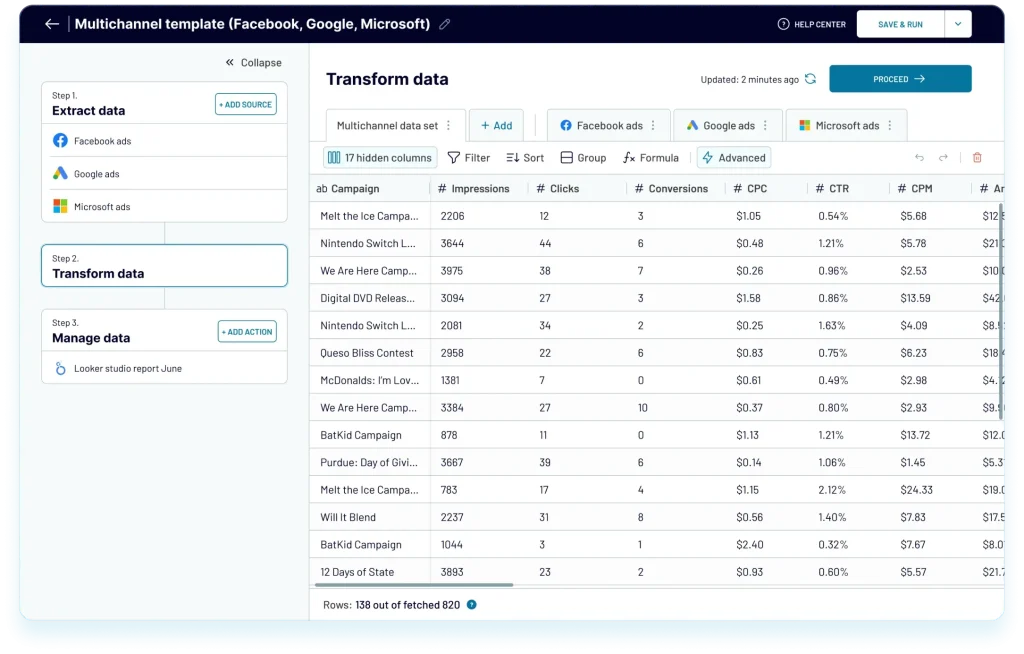
In the final stage, they can load data into one of the supported destinations — these include spreadsheet apps (Google Sheets, Excel), a data warehouse (BigQuery), and a data visualization tool (Looker Studio). Indirectly, the data can be plugged into virtually any visualization or reporting tool, too!
All data transfers happen automatically and run according to a custom schedule — for example, daily or hourly. The platform requires no coding whatsoever, and you can have an automated importer set up within minutes.
Moreover, the platform offers data analytics services that can help you with advanced data management cases, such as creating automated dataflows and analytics, data visualization, and generating custom reports and business dashboards.
Key Features
- 60+ integrations
- Full ETL toolset
- Automated data transfers
- 70+ white-label report templates
- Blending data from different sources
- It’s easy to connect imported data to dataviz tools like Looker Studio, Tableau, Power BI, etc.
- Excellent user support
Pricing
Coupler.io offers a free version that enables you to try out the service to see if it meets your needs. For additional features, you have a choice of the following pricing plans (all rates monthly when billed annually):
- Free: 1 user, 1 data connection, 100 rows per run, and manual data refresh.
- Personal: $24/month, 1 user, 5 data connections, unlimited rows per run (1,000 rows for high-volume sources), and daily data refresh.
- Professional: $49/month, 5 users, 20 data connections, unlimited rows per run (10,000 rows for high-volume sources), and daily data refresh
- Team: $99/month, unlimited users, 50 data connections, unlimited rows per run (100,000 rows for high-volume sources), and data refresh every hour.
- Business: $249/month, unlimited users, 250 data connections, 20 data connections, unlimited rows per run, and updates every 15 minutes.
Who can benefit from it?
Any business that requires a mechanism to interpret data from many sources should strongly consider Coupler.io. Businesses can extract raw datasets from multiple apps to produce personalized reports and use visual dashboards to acquire a broader perspective and make decisions based on actionable insights.
2. Looker Studio

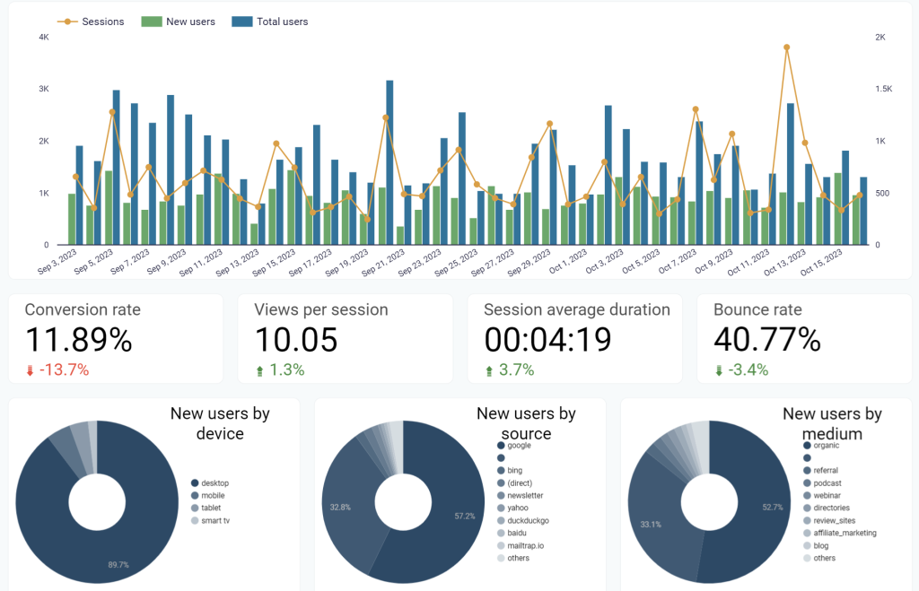
Looker Studio, previously known as Google Data Studio, is one of the best dashboard reporting tools. This free dashboard reporting tool allows you to collect raw data from hundreds of different sources and transform it into engaging and insightful reports and dashboards.
The biggest selling point of Looker Studio is that it is fully integrated with Google’s ecosystem, so if you’re someone who works with Google Analytics, YouTube Analytics, etc., you’ll find it extremely easy to move data and generate reports.
Furthermore, the dashboards built with Looker Studio are fully customizable and can be shared with teams and stakeholders.
However, they lack real-time updates. Instead, they offer a 15-minute refresh for its core sources (mostly Google apps), which should be enough for most. In hindsight, it isn’t a big real deal, considering it’s a completely free tool.
Key Features
- Offers a large collection of pre-built reports and dashboard templates to quickly and easily generate outstanding data visual representations.
- More than 650 connectors and over 800 data sources provide simple data collection or import from numerous sources with a single click.
- Option to select from a variety of visualization tools, including Gantt charts, gauges, and waterfalls, or develop your own.
- Real-time collaboration between teams or individuals is made simple when sharing data and dashboards.
- Using a short code, you can embed reports on any website.
Pricing
Looker Studio is completely free to use.
Who can benefit from it?
Looker Studio is a good dashboard reporting tool to begin with for anyone. Individuals who want to create dashboard reports for their Google Analytics or YouTube Analytics can use this tool. Also, marketing and social media teams of businesses not willing to spend a lot of money can benefit from this free dashboard software.
3. Google Analytics 4

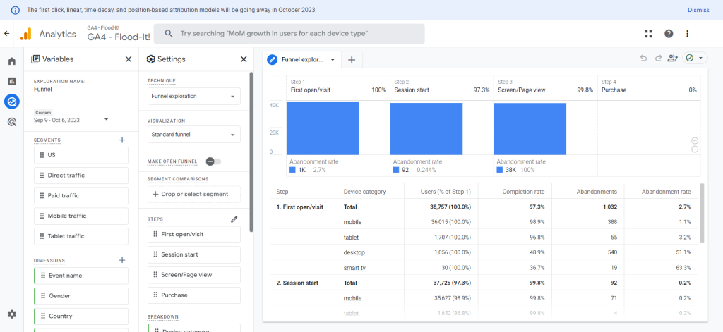
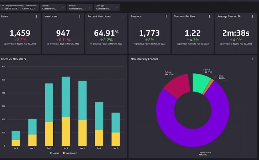
Google Analytics 4 (GA4) is Google’s latest analytics platform that offers innovative features and capabilities for a more complete understanding of your customers’ journey across all devices and platforms.
With GA4, you can track website traffic, app usage, and offline interactions to get a 360-degree view of your customer lifecycle. But with all of this data, it can be difficult to know where to start. That’s where its dashboards come in. GA4 dashboard is a collection of visualizations that display your website data in a well-organized and digestible format (charts, tables, maps, and scorecards).
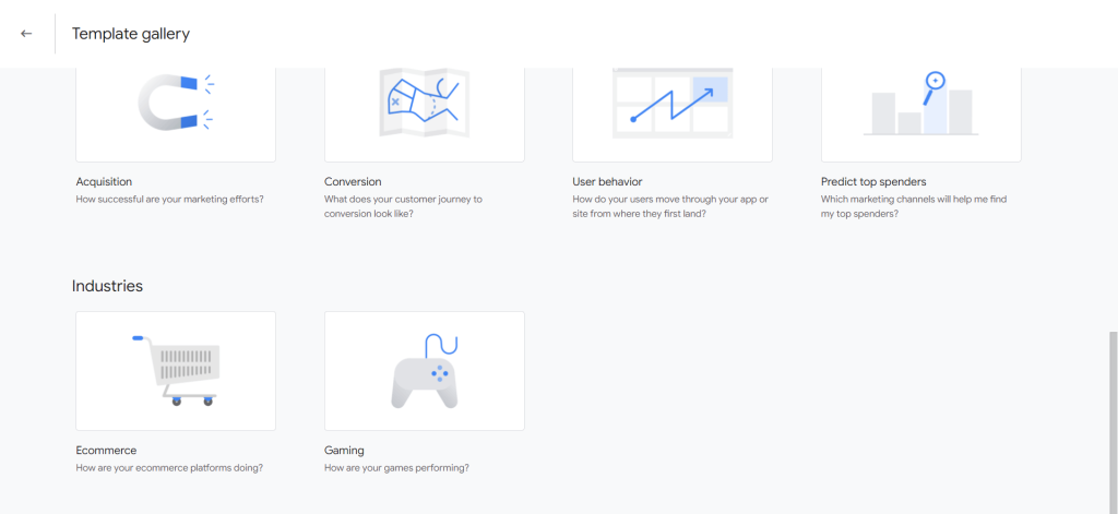
You’ll also find pre-designed dashboards based on techniques like funnel and path explorations. GA4 also offers templates based on use cases (acquisition, conversion, etc.) and industries (E-commerce and gaming), allowing you to start tracking data right away.
Key Features
- Custom reports tailored to specific needs
- Predictive analysis of actions customers may take
- Event-based data, unlike the session-based data collection in previous versions
- Ability to create and track up to 500 events per visitor and up to 30 conversions
- Possibility to detect anomalies in the data
- BigQuery integration
- Custom automated tables
Pricing
It’s free for Standard Analytics accounts that don’t need higher data credits. Pricing starts at $50,000 annually or $4,166 monthly for Google Analytics 360 plans with up to 25 million monthly events.
Who can benefit from it?
It’s handy for marketing professionals who want to optimize their data analysis efforts. By embracing GA4, businesses can gain a more holistic view of user engagement, create more targeted marketing strategies, and better understand and optimize each aspect of the user experience.
4. Tableau

Tableau is a classic dashboard reporting tool at a fairly reasonable price. With its user-friendly interface, you can easily create graphs and charts and customize them according to your needs.
Tableau has been in the business for a long time, and it’s not surprising that it supports integration from various data sources such as Salesforce and Google Analytics. This makes it fairly easy for users to import data from all the different sources and generate a report that displays a detailed view of the business.
This all-in-one dashboard reporting tool makes data easily accessible and readable. Furthermore, it encourages team collaboration so all the business departments work together to achieve the business’s goals.
Key Features
- Offers interactive graphs, charts, and other data visualization aids without requiring coding knowledge.
- One of the fastest dashboard reporting tools with a huge library of templates to set it up quickly.
- An active global community to collaborate and share templates.
- Easy to share and export dashboards in various formats such as Excel, CSV, and Google Spreadsheets.
Pricing
Tableau viewer with limited features priced at $15/month
Tableau Explorer priced at $42/month
Tableau Creator priced at $70/month
Who can benefit from it?
Tableau is mainly for data nerds, tech, and business teams who want to collaborate, share, and translate vast amounts of data into useful information.
5. DashThis

DashThis is an automated and easy-to-use marketing reporting tool. It is trusted by various organizations worldwide, provides customizable dashboards, offers easy integration with major data sources, supports various marketing platforms, offers white-label options, and includes top-notch customer service.
Key Features
- 34+ native integrations: Facebook, Google Ads, Google Analytics 4, Twitter, Ahrefs, Moz, Google Business Profile, YouTube, Instagram, and many more
- Automatically updating dashboards
- Custom data sources
- Unlimited users and client accounts
- Wide selection of report templates, custom templates, and preset widgets
Pricing
DashThis pricing starts at $38 per month, paid yearly, for the Individual plan. It includes 3 dashboards. Other plans are:
- Professional at $119 per month for 10 dashboards
- Business at $229 per month for 25 dashboards
- Standard at $349 per month for 50 dashboards
A free trial is available.
Who can benefit from it?
It suits marketing teams, agencies, small businesses, and freelancers. DashThis provides a range of report templates for social media, SEM, e-commerce, digital advertising, PPC, analytics, email marketing, and SEO.
6. Domo

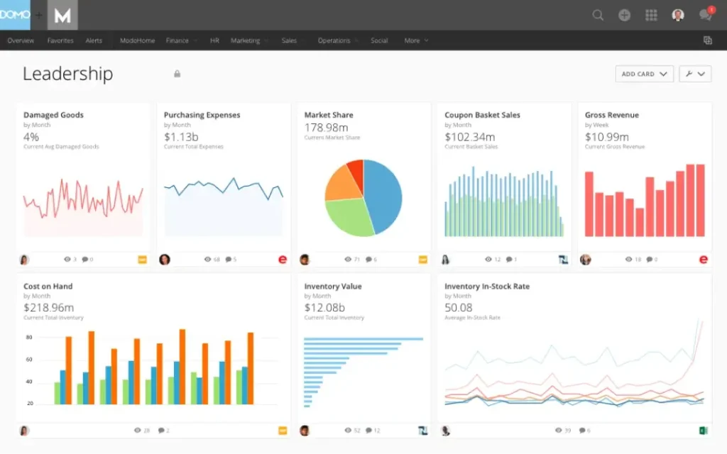
Domo is a cloud-based business intelligence platform that helps transform data into contextual insights. The platform provides real-time, cloud-based dashboards.
You can create pie charts, graphs, interactive maps, and more with just a few clicks. Once a dashboard is built, it becomes instantly available on any device. Domo allows you to create custom layouts, choose colors, and add commentary without coding.
Key Features
- Chat-enabled AI insights and data exploration
- Flexible model creation, model management and governance, and seamless deployment
- Customizable, real-time, interactive dashboards
- App creation tools
- 1,000 connectors and built-in, drag-and-drop ETL
Pricing
Domo’s pricing is based on several components related to your platform usage, including data storage, data refresh rates, volume of data queries, and the number of users. They offer packages with specific features to meet your needs in different stages. A trial version is available.
Who can benefit from it?
Domo is beneficial for business executives to make faster, well-informed decisions. The platform is designed for businesses seeking enterprise-scale solutions. It is ideal for partner analytics, self-service analytics, data integration, application development, predictive analytics, data science, data governance, and security.
7. Whatagraph

Whatagraph is another dashboard reporting tool that offers all the key features you need to visualize, monitor, and analyze your marketing data. It offers dashboard templates as well as the flexibility to customize them according to your specific business needs. You can use its drag-and-drop feature to effortlessly add or remove widgets from the dashboard that meet your business needs.
Furthermore, Whatagraph enables you to track data in real-time and archive it as well. This empowers you to monitor and analyze your business performance over a long period. Additionally, it has an automated report generation feature that delivers performance reports on the given schedule.
Key Features
- Automate report sharing
- Automatically pull data from 40+ native integrations plus custom APIs
- Effortless report creation and ready-to-use templates
- Smart builder with endless customization with editable widgets
Pricing
Whatagraph has two paid plans: the professional version with 25 data sources and 5 users costs 199 pounds/month. The premium version, with 50 data sources and 10 users plus all the features is priced at 299 pounds/month. You can also get a quotation for a custom version on request.
Who can benefit from it?
Whatagraph can help marketing teams of medium and large businesses stay updated on marketing efforts and allow them to predict future trends.
8. MetricsWatch

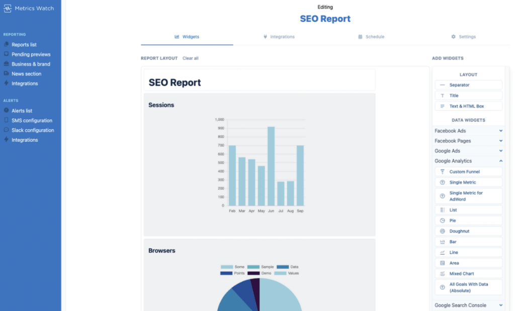
MetricsWatch is an email-based marketing reporting tool designed to automate compiling and sending reports. The platform can pull KPIs from the most popular marketing platforms, compile the data automatically, and send daily, weekly, or monthly reports. It can also provide instant alerts via email, SMS, and Slack.
Key Features
- Integration with popular marketing platforms.
- White-label reports on all plans.
- Custom schedules for different thresholds. As soon as MetricsWatch notices a metric crossing your threshold, it alerts you.
- Access to all metrics & dimensions. You can also segment any of these metrics to fit your needs.
- Codeless drag-and-drop report builder.
- Concierge service on all plans.
Pricing
MetricsWatch offers several pricing plans starting from $29.00/month ($290/year) for the Starter plan, including two reports. Other plans include the Pro plan at $50/month for ten reports, Premium plans at $100/month for 25 reports, and Enterprise plans for API creation of hundreds or thousands of reports. A 14-day trial is available.
Who can benefit from it?
MetricsWatch is designed to reduce friction between marketers and their data. It eliminates the need for PDFs or third-party dashboards.
9. ClickUp

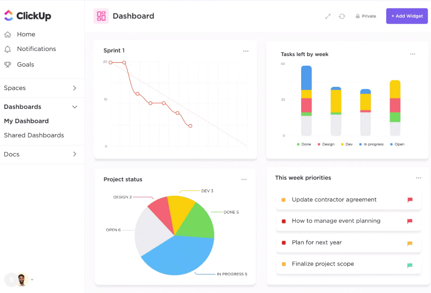
ClickUp is an all-in-one productivity tool built for teams of all types, designed to provide real-time progress tracking with fully customizable dashboards. It offers a unique hierarchy that helps you create the perfect structure that scales with your needs.
Key Features
- 15+ different views for you to choose from
- Customization with no code or add-ons required
- Powerful collaboration features
- Real-time reporting
- Native time tracking capabilities
- Hundreds of templates for team use cases, views, tasks, checklists, docs, and more
- Integrations with team calendars, messaging apps, cloud storage, etc.
Pricing
ClickUp offers a free plan for personal use. The two predefined plans (Unlimited and Business) cost $10 and $19 per member per month (if paid monthly).
Who can benefit from it?
ClickUp helps organizations efficiently allocate and visualize resources through dashboards, making it easy to identify underutilized or overutilized assets and personnel while tracking progress.
The platform provides insights through completed tasks, project time tracking, and workflow bottlenecks, making it a valuable tool for teams.
10. SiSense

Sisense is a robust business intelligence tool that combines advanced analytics with a user-friendly interface, making it easy for you to create and share interactive dashboards. This business dashboard software allows you to collect data from several sources and transforms it into an interactive online dashboard using numerous visualization options.
With its drag-and-drop interface, you can pull in data to one place and generate visual reports that provide an overview of key metrics that are important for your business. Furthermore, the web-based dashboard enables multiple users to work together and removes the need to download files individually, meaning you can avoid multiple copies and data corruption.
Key Features
- User-friendly drag-and-drop interface
- Exports data to various formats (PDFs, Excel, Images, and CSV)
- Data unification and stitching
- Embedded analytics
- Accurate data analysis in real-time
- Robust dashboards that are accessible on any device
Pricing
Quotation is available on request.
Who can benefit from it?
Sales, marketing, and digital teams of medium to large businesses can greatly benefit from the software.
11. Grafana

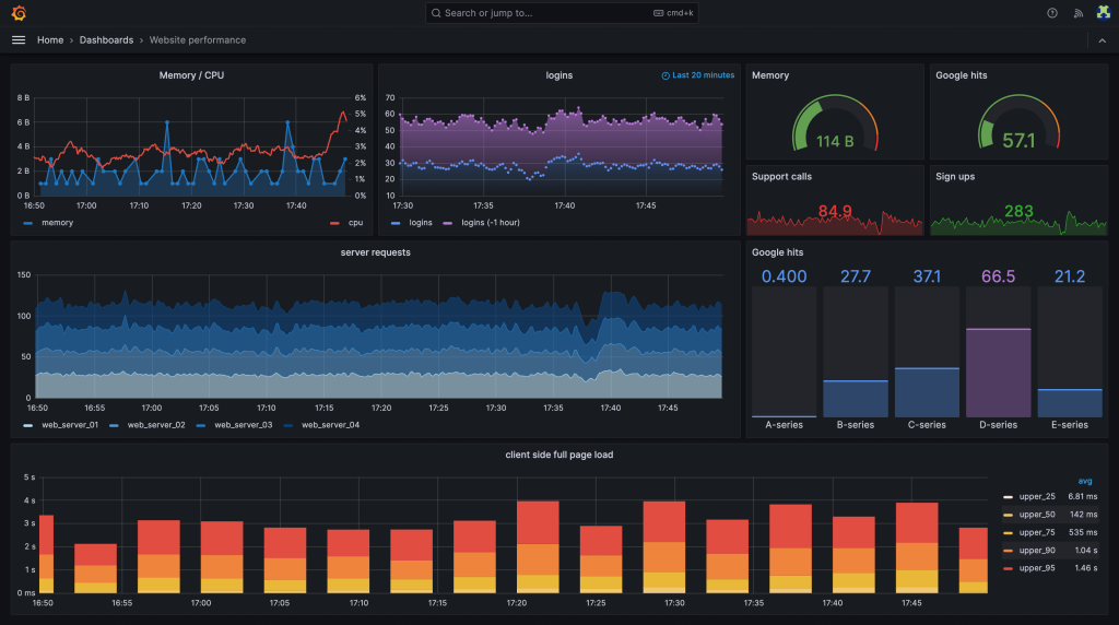
Grafana is a cloud-based open-source analytics and dashboard tool that allows businesses to import, track, and visualize data. It doesn’t matter where your data is stored, with 100+ APIs, you can easily create and explore all the information through flexible and professional-looking dashboards.
On top of highly customizable dashboard reporting, Grafana makes information sharing and collaboration easy amongst different teams. With its extensive security options, you can seamlessly manage who has access to what. For example, you could set up specific permissions for the marketing department so they can view the relevant reports but can’t, for example, look into the company’s financials.
Key Features
- Unifies the data in a single dashboard
- Versatile and flexible dashboard reporting tool with thousands of customizable templates
- Advanced dashboard sharing options to empower teams and encourage collaboration in the organization
- Offers scalable cloud service
Pricing
Grafana’s open-source and cloud versions are free with limited usage. Its paid plan Cloud Pro is priced at $29/month plus usage, and Cloud Advanced at $299/month plus usage. An enterprise-level solution is also offered to manage big data; you can get in touch with their team for a quotation.
Who can benefit from it?
Grafana hosts 10M+ users from all around the globe, including Intel, PayPal, and eBay. It is an excellent dashboard reporting tool for startups and small businesses (because of its free version and scalability) as well as for large enterprises.
12. Zoho Analytics

Zoho Analytics is one of the leading data analytics and business intelligence platforms. It allows you to build interactive business dashboards with its drag-and-drop user interface. With the option to customize it with widgets, charts, pivot tables, and more of your liking.
The reason why this business analytics software made it to this list is because of its smart AI assistance, which generates automated insight with a single click. This feature allows you to predict trends and analyze different scenarios, taking your decision-making to new heights.
Additionally, Zoho analytics enables collaboration within teams through secured sharing and fine-grained permissions, which also prevents business data leaks.
Key Features
- 500+ integrations, including Salesforce, Google Ads, HubSpot CRM, Mailchimp, etc. for your business app
- Offers an intuitive drag-and-drop interface
- Robust set of APIs that enable elaborative customization
- Automated insight with predictive and cognitive analytics
- Highly extensible low-code/no-code integration
Pricing
The Zoho analytics cloud version has four different plans.
- Cloud Basic is priced at $24/month
- The standard version is priced at $48/month
- The premium version is priced at $155/month
- The enterprise version is priced at $455/month
Who can benefit from it?
Zoho Analytics is used by Amazon, KPMG, Renault, HP, and Facebook. It is ideal for businesses that need artificial intelligence assistance to gain insight into their marketing and sales operations.
13. Yellowfin

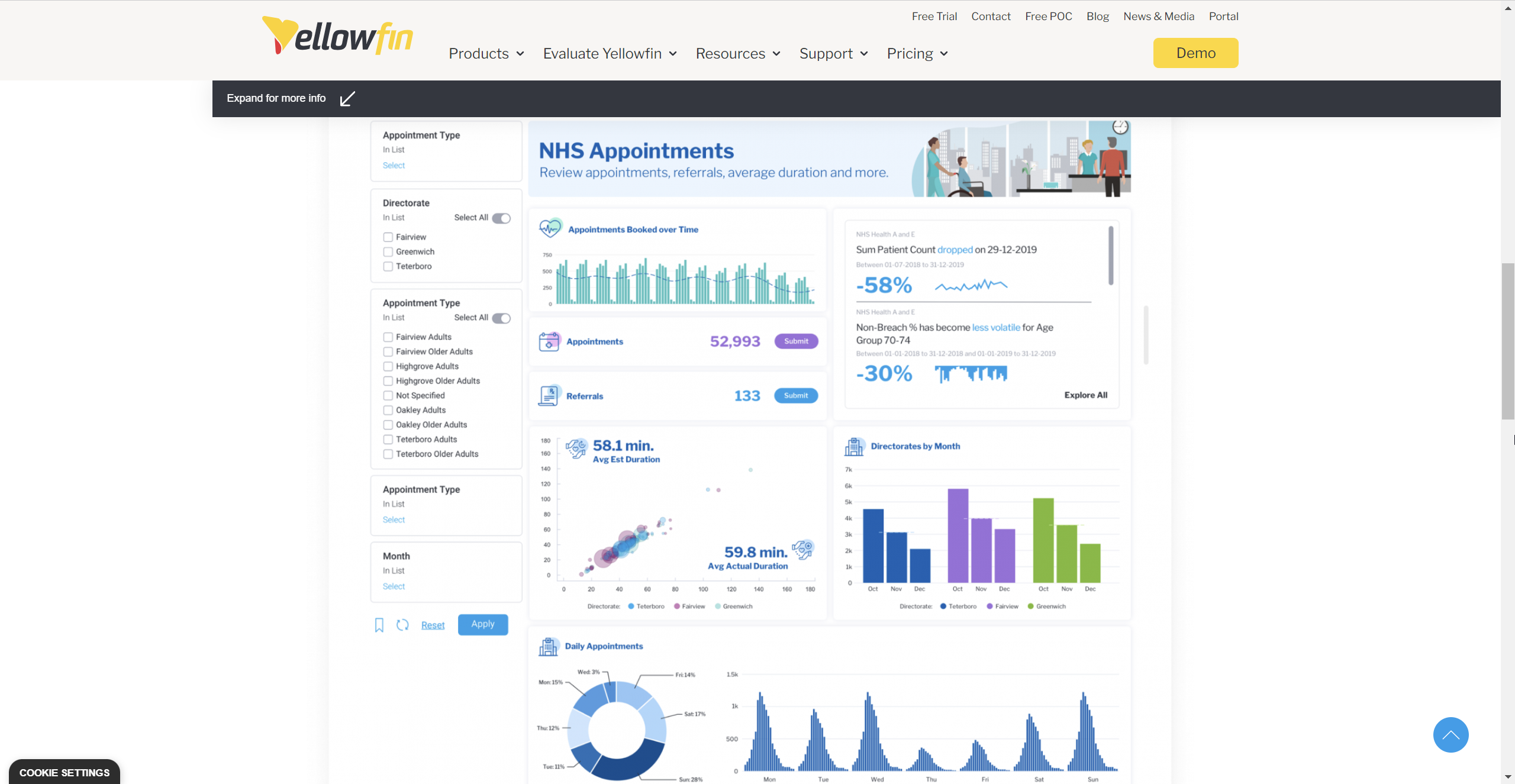
Another business intelligence software that enables users to track Key Performance Indicators (KPIs) and communicate information is Yellowfin. It allows business users to import data from multiple sources and create impactful action-based business dashboards using all the visualization options available. Yellowfin dashboard reporting tool offers a user-friendly design and flexible developer tools to customize your analytics experience to suit your business needs.
Additionally, its AI and machine learning capabilities can help you introduce data-driven decision-making in your business operations. However, to fully benefit from this dashboard reporting software, you will require some technical skills.
Key Features
- Smart AI generates automated real-time analytics for your data
- Data stories widget to keep track of changes and predict future trends
- Advanced dashboard customization using APIs to add widgets, charts, graphs, etc.
Pricing
A quotation is available upon request.
Who can benefit from it?
Yellowfin is a more advanced solution that is ideal for big enterprises which have in-house technical teams capable of integrating its advanced features. It has 29+ thousand users, including the likes of Coca-Cola, xerox, and the NHS.
14. Cyfe

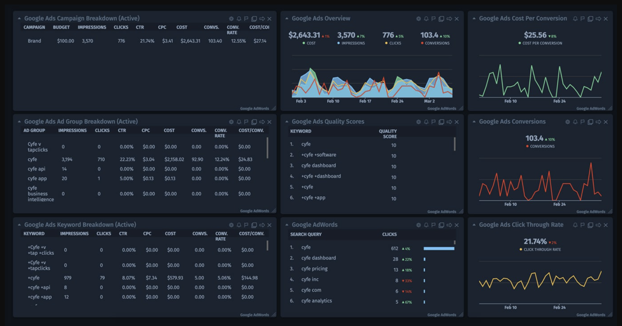
Cyfe is a relatively cheap option when it comes to dashboard reporting tools. It is an all-in-one business dashboard software that enables you to monitor and visualize your business on one easy-to-use, real-time dashboard. It can bring social media, analytics, marketing, and sales data together to provide you with an overview of your business. It offers pre-built dashboard templates for Facebook ads, Google Ads, Web analytics, etc., which makes it easy for new users to get started.
Additionally, it can export data reports in JPEG, PNG, CSV, and PDF formats, which makes it easy to share your dashboard with the team, clients, and other stakeholders.
Key Features
- Easy to set up and use
- Real-time data updates and archiving of data history
- Pre-built dashboard templates
- Custom widget library
- Can import data from popular services like Google and Salesforce with over 100+ integration
Pricing
Cyfe offers four different pricing plans:
- Starter priced at $19/month
- Standard priced at $29/month
- Pro priced at $49/month
- Premier priced at $89/month
Who can benefit from it?
Cyfe is a great option for startups and small businesses to create KPI dashboards at such a low price.
15. Klipfolio

Klipfolio is a data analytics platform that offers a huge library of dashboard templates. It allows you to connect to multiple data sources to extract the most out of your dashboards. The reason why Klipfolio stands out in this list is because it allows you to track your data history, which enables you to identify trends and keep track of performance over time with ease.
There is more, Klipfolio enables you to put your technical knowledge and skills to use as well. You can greatly benefit from its complex formulas, data modeling, and machine learning functionality if you have the skills.
Key Features
- Customized dashboard builder
- Data visualization tools
- Report sharing and collaboration
- Data presentation and storage
Pricing
Klipfolio offers four different pricing plans:
- Agency Starter priced at $49/month
- Agency Lite priced at $99/month
- Agency Pro is priced at $199/month
- Agency Premier priced at $399/month
Who can benefit from it?
Sales, marketing, you name it. Small business to enterprise level.
What is a dashboard reporting tool?
A dashboard reporting tool is any software that takes large amounts of data as input and transforms it into useful information using a visual aid. A good dashboard reporting tool provides its users with real-time information and trends using graphs and charts. This empowers them to monitor performance and make well-informed decisions.
For instance, managers can track business health and pinpoint areas of concern using a project dashboard. The best part is that you don’t need a data analyst to break it down for you! Operational teams can use operational dashboards to proactively address bottlenecks before they affect productivity. Financial teams can analyze the data to predict sales and revenue.
The benefits of using dashboard reporting software
Dashboard reporting tools offer several advantages for businesses looking to improve their data-driven decision-making processes and accelerate growth. Here are some key advantages of using dashboard reporting tools:
- Breakdown of complex information through visualization: It is really difficult to make sense of raw data in itself. With dashboard reporting tools, you’re empowered with the ability to visually represent complex data in an easily understandable format. Charts, graphs, and other visual elements transform the raw data and make it easier to identify patterns, trends, and outliers in the data, helping decision-makers like yourself gain insights and make informed business decisions more quickly.
- Well-informed decisions backed by real-time data access: Dashboard reporting tools allow you to visualize data in real time, providing you with up-to-date information on key metrics and performance indicators. This real-time access to data enables you to respond swiftly to changing market conditions, identify emerging opportunities, and address potential issues promptly.
- Centralized data management: Dashboard reporting software makes it simple to consolidate data from various sources into a single location, eliminating the need for manual data gathering and analysis. This centralized data management system makes it easier to track and analyze data, saving you time and effort while ensuring data accuracy and consistency.
- Improved data collaboration: Another benefit of these dashboard solutions is that they facilitate collaboration among your team members. It enables them to share reports, dashboards, and insights easily. This promotes data-driven decision-making across the organization, fostering a culture of transparency and knowledge sharing.
- Customization and personalization: Dashboard reporting tools offer customization options, allowing you to tailor the reports and dashboards to your specific needs. You can choose the metrics, visualizations, and layout that best suit your requirements, ensuring that the information is presented in a way that is most meaningful to you. This level of customization and personalization enhances user experience and increases engagement with the data.
What features should I look for in a dashboard reporting tool?
There are several key features you should consider when choosing the best tool for dashboard reporting for your business. These characteristics can have a great impact on the effectiveness and efficiency of your data-driven decision-making process. Here are some important traits you should look for:
Choosing between an out-of-the-box solution or flexibility
Before you pick a dashboard reporting tool, you need to decide on the data reporting approach. The main choice relies on adopting an out-of-the-box solution such as Grafana, which fetches data and does reports on its own, or embracing flexibility through a combination of data integration and data visualization tools (e.g. Coupler + Looker Studio), offering you more flexibility.
The quick out-of-the-box solutions are ready to use and require minimal configuration. This easy adoption makes it an ideal choice for non-analysts to get going instantly.
However, you’ll be constrained by the tools’ features and limited to their functionalities. For example, they might not offer a certain chart that you need or cannot import data from a specific application.
On the other hand, we have the data integration and data visualization tools combo that offers you full flexibility. You’re not restricted by the limitations of your data visualization tool. For example, Coupler enables you to be more versatile with your reporting and analysis. You can easily export to BigQuery and then use any visualization tool you want (Tableau, PowerBi, and more). Additionally, you get to export raw data, process it, and use it for any other purposes (e.g. sending some data alerts to Slack).
However, this approach means setting up and managing two different tools, requiring you to invest a little extra time and effort.
Data integration capabilities
A good dashboard reporting tool should be able to connect to a wide range of data sources, such as databases, spreadsheets, and cloud storage. It should also offer seamless integration with popular data analytics platforms to ensure you can access all your relevant data in one central location.
Customization options
Every business has unique reporting needs. Look for a tool to customize your dashboards to suit your specific requirements. This includes the ability to choose and arrange different types of charts, graphs, and visualizations. Bonus! You get to add your own branding elements to give a more professional look.
Real-time data updates
Timely data is crucial for making informed decisions. Ensure the dashboard reporting tool you choose can provide real-time or near-real-time updates so you can have the most up-to-date information at your fingertips. This will help you stay agile and respond quickly to changing market conditions.
This is one of the key features you shouldn’t compromise on. Let’s say you have been sharing financial data with your team by manually loading it every Monday morning, and you miss out on one week. Just imagine the disastrous consequences it can have on your business reporting and planning.
Now, with the abundance of data integration platforms, you can fully automate the process. And can easily connect virtually any data to visualization tools to avoid such incidents.
Interactive and drill-down capabilities
Your dashboard should not only present data but also allow you to interact with it. Look for a tool that supports drill-down functionality, allowing you to dive deeper into specific data points for a more thorough analysis. Interactive features like filtering, sorting, and highlighting can also enhance the usability and effectiveness of your reports.
Harnessing the power of dashboard reporting tools
Businesses must make decisions fast and precisely to stay ahead of the competition in today’s data-driven world. The tools for dashboard reporting provide a powerful solution for accelerating data-driven decision-making. By presenting key insights and metrics in a visually appealing and easily understandable format, these tools enhance business outcomes and drive growth.
Considering the significance of data-driven decision-making, it is essential to select the ideal dashboard reporting solution for your business. In this blog post, the top 15 tools are evaluated. They offer a range of features and functionalities to cater to various business needs. Whether it is real-time data analysis, predictive analytics, or performance tracking and KPIs, there is a tool for every requirement.