Even now, in 2026, most teams are still using Gemini for data analysis like a fancy calculator: Export CSV → Upload → Ask → Repeat. But Gemini without fresh data might resemble a Ferrari on training wheels. The winning move? A reliable middle layer (between your data and AI) that pipes in clean, up-to-date data automatically, so Gemini stays sharp across sessions and surfaces insights you’d otherwise miss. Here’s how you can break the cycle and turn Gemini into your daily analytics accelerator.
Can Gemini do data analysis?
A brief answer is “Yes”. At the same time, you need a secure middle layer (between your business data and the model) that can provide accurate results. Coupler.io fills that role, because it:
- performs calculations and cleanups
- automates connections to 400+ sources
- always keeps your data up-to-date.
With this foundation, Gemini’s strengths translate into accurate, decision-ready outputs.
Well-prepared data = Accurate Gemini insights
Try Coupler.io for freeGemini AI data analysis capabilities and core strengths
Gemini brings a suite of powerful, no-fuss tools directly into the environments data analysts already live in (especially for Google Cloud users). The following Gemini AI capabilities for data analysis let you move from raw data to actionable understanding in minutes:
| Gemini capability | Description |
| Analysis Tool / code execution sandbox (similar to Claude’s REPL) | For advanced users, Gemini (via Google AI Studio or the Gemini API) includes a built-in code execution tool: a secure Python sandbox in which the model generates, runs, and iterates on code using libraries like Pandas or NumPy. Enable it as a tool, and Gemini autonomously writes scripts for custom calculations, data transformations, statistical tests, or visualizations. |
| Creating visualizations on the fly (bar, line, scatter, combo charts) | For example, in Google Sheets, simply prompt Gemini with something like “Build a line graph of monthly revenue trends with combo elements for spend vs. budget” and it generates the chart instantly (with bar, line, scatter, pie, donut, or combo styles). It often suggests enhancements (like color coding or axis adjustments) and inserts the fully editable chart directly into your sheet. |
| Working with different data formats and structuring smart prompts | Gemini works smoothly with a wide range of data formats (including CSV, XLS/XLSX, JSON, and Google Sheets exports, up to 100 MB per file), which lets you focus on analysis rather than format friction. Gemini can also combine your files and prompts with external context ( e.g., industry reports or competitor pricing) via Deep Research for more comprehensive analysis. |
| Python sandbox | Gemini’s secure code execution environment (available in Google AI Studio or via the API) lets it autonomously write, run, and iterate on Python code using Pandas, NumPy, and other libraries. This delivers mathematically precise results for custom transformations, complex calculations, or iterative refinements (e.g., hyperparameter tuning in simple models). |
| 2M-token context window | Gemini can ingest and “remember” very large datasets when the data is properly structured and fed in one go or across a session. This enables deep longitudinal analysis (seasonality detection, long-term trend modeling) without losing earlier context, which reduces the need to re-prompt or summarize previous findings. |
| Native Google fit | Gemini lives inside Google Sheets for lightweight, in-place queries and instant chart insertion, and integrates tightly with BigQuery to handle massive, scalable datasets. |
Conversational AI data analysis with Gemini
Powered by advanced generative AI, Gemini makes data analysis tasks feel like a natural conversation rather than a technical exercise. You don’t need to master formulas, pivot tables, or query syntax. Just describe what you’re looking for in everyday language, and Gemini responds with clear, context-aware insights.
Data insights with Gemini enable you to:
- Spot trends: Highlight a sales column and ask, “
What are the trends in this data?” Gemini identifies rising patterns, seasonal cycles, or steady growth across regions or products. - Catch anomalies: AI model flags outliers (sudden drops, spikes) and suggests causes (error? one-off event?) so you skip manual hunting.
- Discover smart next steps: e.g., based on your numbers, Gemini suggests to “Pause underperforming Channel X keywords” or “Reallocate 20% budget to Channel Y for higher ROAS.”
- Get concise summaries: Ask for an executive overview or “
Why did spend rise 15%?” and get readable, metric-focused answers in natural language.
Gemini excels at fast insights, but larger datasets, frequent refreshes, or recurring tasks reveal limits. Below are the top scaling roadblocks for Gemini users and how Coupler.io eliminates each one to keep your workflow smooth and reliable.
How to use Gemini for data analysis: Overcoming common pain points with Coupler.io
When you use Gemini for data analysis, it delivers impressive results for a wide range of everyday and mid-level tasks that data analysts face. However, as your datasets grow, refresh needs increase, or analysis becomes recurring, several practical limitations surface, primarily around upload mechanics, processing scale, and lack of persistent connectivity. Below are the main challenges data analysts encounter and how Coupler.io directly addresses each one to keep your Gemini-powered workflows smooth and reliable.
Challenge #1: File upload size and count caps
In the Gemini app, uploads are generally limited to around 10 files per prompt, with most data files capped at ~100 MB each. Full-year transaction logs, high-volume logs, or complex multi-sheet workbooks quickly exceed these thresholds, which forces you to split files or lose granularity. In this case, there’s a risk of incomplete or less accurate analysis.
Solution: Coupler.io bypasses upload limits because it imports and consolidates data from 400+ sources (Google Ads, Salesforce, GA4, QuickBooks, databases, APIs, and more). Coupler.io handles large volumes natively, applies any necessary aggregations or filters during import, and delivers clean, manageable tables that fit comfortably for Gemini’s processing.

Challenge #2: Row and complexity handling
When you conduct data analysis with Gemini, very wide tables (hundreds of columns) or extremely high row counts can push against Gemini’s context window and cause sampling, approximations, or missed subtle patterns in dense data.
Solution: Coupler.io lets you pre-transform data at the source level (apply filters, joins, custom calculations, data blending, or column selection) before the data goes to AI. This delivers Gemini a focused, optimized dataset tailored for quick, precise interpretation and visualization, which avoids token overload and keeps responses relevant.

Challenge #3: No scalable storage or live connections
Manual uploads when using Gemini AI for data analysis are temporary and session-based: files don’t carry over automatically, and there’s no native live connection to CRMs, ad platforms, databases, or other systems. Every refresh requires re-uploading, which creates version mismatches, stale snapshots, and repetitive busywork.
Solution: With Coupler.io, you can automate data imports according to the schedule you need (as often as every 15 minutes) from a variety of business tools or databases. Your data is continuously refreshed. Gemini then analyzes the most recent state, which enables timely trend detection, anomaly alerts, and proactive recommendations without any manual refresh steps.

Ready to get your data analysis-ready for sharper insights?
Get started for freeGoogle Gemini data analysis features in real-world examples
Google Gemini has rapidly become a powerful ally for data analysts who need fast, contextual insights without spending hours in spreadsheets or BI tools. With Gemini AI for data analysis, you simply combine natural language prompts with your Coupler.io-prepared data, and Gemini delivers structured analysis, visualizations, flagged issues, and even actionable recommendations. Below are the most typical use cases of how Google’s AI assistant enhances data analytics processes.
Marketing: Paid Ads + Google Analytics
Performance marketers often juggle fragmented data from multiple ad platforms and analytics tools. Manually combining and cleaning this data is time-consuming and error-prone, which makes fast, accurate campaign decisions difficult.
Data sources: Paid Ads platforms (e.g., Facebook, TikTok, Snapchat, Twitter/X, LinkedIn) + Google Analytics 4 (GA4).
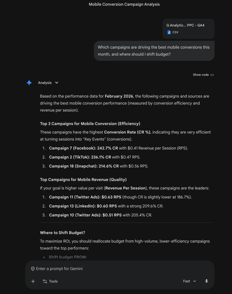
Scenario: A performance marketer wants to quickly understand which paid campaigns are delivering the strongest mobile conversions this month and decide where to reallocate budget.

Prompt for Gemini: “Which campaigns are driving the best mobile conversions this month, and where should I shift budget?”
Gemini’s output highlights: Gemini scanned the uploaded GA4 + PPC export (CSV) and focused on mobile-specific metrics (conversion rate for “Key Events” and revenue per session). It ranked the top campaigns by efficiency and quality with a detailed explanation. Also, Gemini suggests maximizing ROI by shifting 15–20% of the budget from underperforming Campaigns 1 and 17 into high-efficiency drivers like Campaign 7 (Facebook) and Campaign 11 (Twitter).

Sales: CRM Pipeline Analysis
Sales teams usually struggle with fragmented pipeline visibility across quarters. Manual comparisons take hours, and stalled high-value deals can slip through unnoticed without proactive flagging and actionable recommendations.
Data source: HubSpot
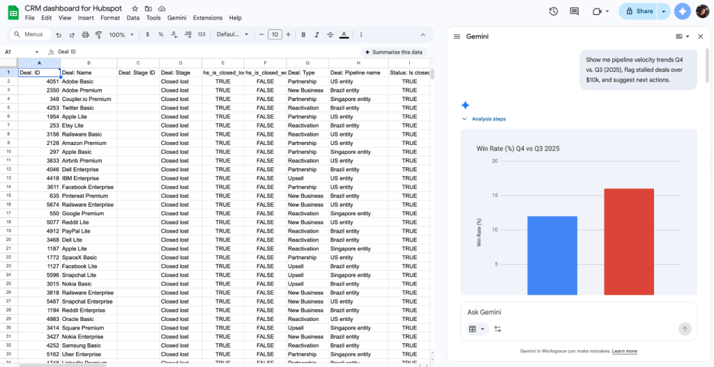
Scenario: A sales operations analyst needs to compare pipeline health between quarters, spot stalled high-value deals, and receive next-step suggestions. They use Coupler.io to make their HubSpot data clean and well-structured for efficient Gemini analysis.

Prompt for Gemini: “Show me pipeline velocity trends Q4 vs. Q3 (2025), flag stalled deals over $10k, and suggest next actions.”
Gemini’s output highlights: Gemini synthesizes complex sales data into a strategic performance comparison between Q3 and Q4 2025 and highlights a significant trend toward operational efficiency despite a dip in total revenue. It identifies that the Average Sales Cycle improved by 7.8 days and the Win Rate climbed nearly 4% and suggests a more agile sales force. However, it also provides a critical diagnostic on pipeline health: 1,233 stalled deals over $10k. Gemini pairs these metrics with prescriptive actions (e.g., re-qualifying the top 5 largest stalled deals and investigating the $1.08M drop in closed value) and shifts the focus from mere reporting to active pipeline recovery for Q1 2026.

Finance: Operating Expense Variance
Finance teams frequently face unexpected expense variances that are hard to trace. Manual reviews of categorized transactions, invoices, and status changes across months are tedious, and without clear visibility into amounts over time or breakdowns by status, root-cause insights stay hidden and corrective actions get delayed.
Data source: QuickBooks
Scenario: The finance team notices a $32k unfavorable variance in operating expenses last quarter and wants to drill into total invoice amounts over time to pinpoint where the money went, spot patterns in delayed payments or open liabilities, and understand possible root causes. With Coupler.io, they effortlessly prepare their QuickBooks data before it lends in Gemini for data analysis.

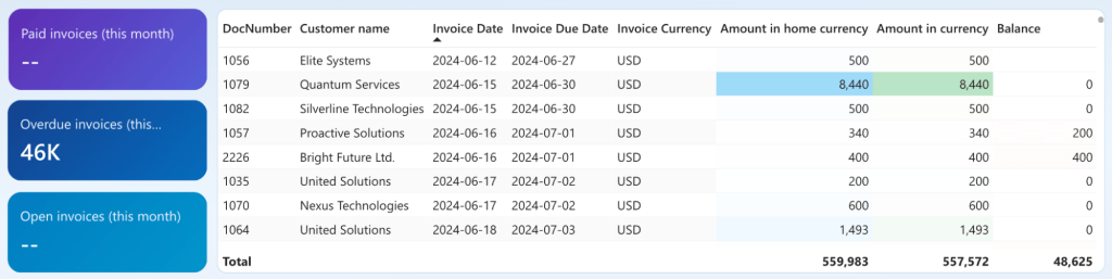
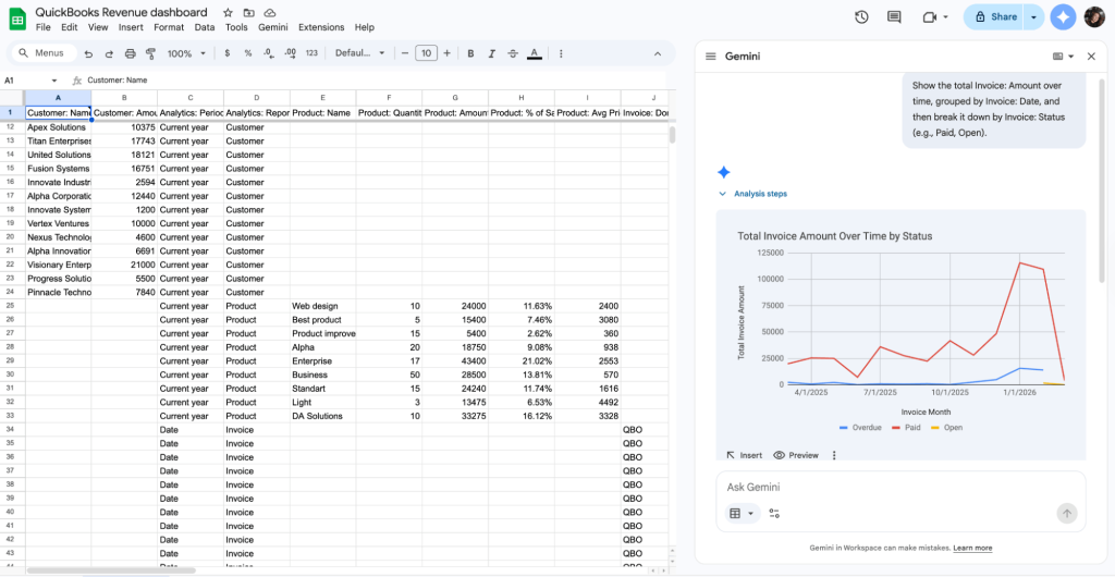
Prompt for Gemini: “Show the total Invoice: Amount over time, grouped by Invoice: Date, and then break it down by Invoice: Status (e.g., Paid, Open).”
Gemini’s output highlights: Gemini instantly visualizes complex billing data from a QuickBooks Revenue dashboard. It automatically parses generates a multi-series line chart that tracks Total Invoice Amount Over Time, segmented by status such as Paid, Overdue, and Open. This visual output identifies a significant revenue spike in January 2026, where paid invoices exceeded $100,000. Simultaneously, Gemini flags a rising trend in Overdue amounts during the same period.

E-commerce: Product Performance
E-commerce managers frequently waste time manually sifting through sales, margin, and return data across hundreds of products. As a result, they leave winning SKUs under-promoted and lose ones that clog inventory for far too long.
Data source: Shopify
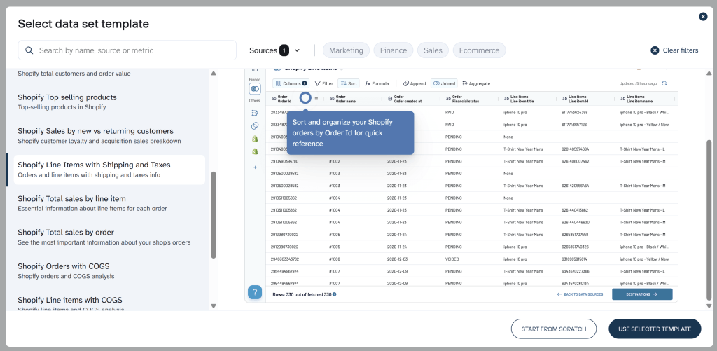
Scenario: An e-commerce manager wants data-driven decisions on which products to push in upcoming promotions and which to quietly retire. They use Coupler.io’s data set templates for Shopify to make their data analysis-ready with minimal effort.

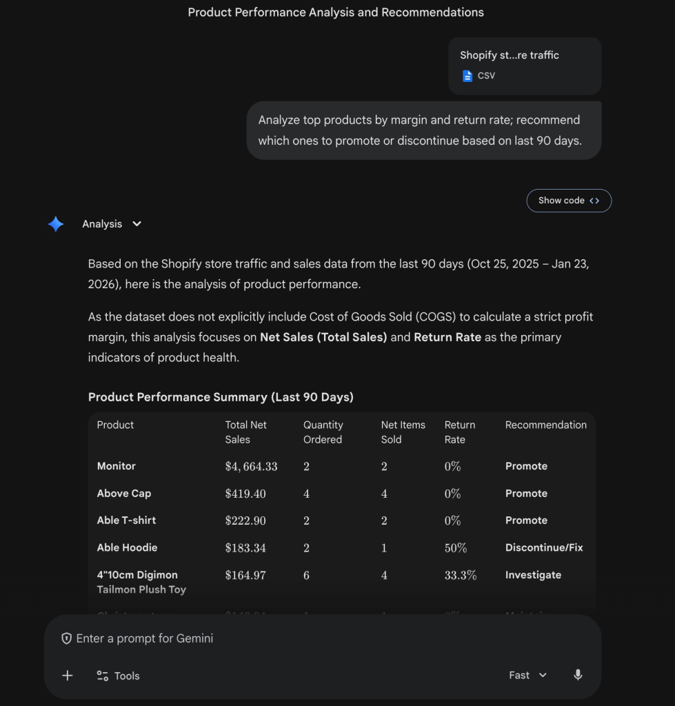
Prompt for Gemini: “Analyze top products by margin and return rate; recommend which ones to promote or discontinue based on the last 90 days.”
Gemini’s output highlights: Because the export did not explicitly contain COGS, Gemini transparently switched to Net Sales and Return Rate as proxies for health. Gemini oultined the model top performers to promote (Monitor — $4,664 net sales, Above Cap — $419 net sales, 0% returns) and red flags to discontinue or investigate (Able Hoodie — 50% return rate, Digimon Tailmon Plush Toy — 33.3% returns).

How to create a high-quality prompt in Gemini for data analysis
Getting the most precise, insightful, and reliable results from data analysis with Gemini starts with how you ask the question. Vague one-liners like “analyze this data” often lead to generic or incomplete responses. Instead, treat prompting like briefing a sharp colleague: the more structured, specific, and contextual your request, the better Gemini understands your intent and delivers spot-on analysis.
Here are the key elements of a high-accuracy prompt for Google’s powerful LLM, drawn from real-world best practices:
✓ Be specific about the task → Start with a clear action verb (e.g., “Identify,” “Summarize,” “Create,” “Highlight,” “Forecast,” “Compare”) so Gemini knows exactly what to do.
✓ Provide relevant context → Mention key columns, data types, time periods, business goals, etc. (e.g., “This is monthly sales data from Jan-Dec 2025, columns include Date, Region, Channel, Revenue, Spend”). Gemini reads your selected range or uploaded file, but guiding it prevents misinterpretation. To make your data structure even cleaner and perfectly tailored for Gemini analysis, use Coupler.io.
✓ Define the output format → Specify what you want back: bullet points, table, chart suggestion, executive summary, step-by-step explanation, or even a ready-to-use formula with breakdown.
✓ Add constraints or focus → Include phrases like “only consider last 6 months,” “ignore outliers unless explained,” “use simple language for non-technical stakeholders,” or “prioritize actionable recommendations.”
✓ Encourage reasoning → For complex analysis, add “think step by step,” “explain your reasoning,” or “show calculations” to get transparent, accurate logic.
✓ Iterate conversationally → Follow up on the response (e.g., “Drill deeper into Region East” or “Add a what-if for +20% spend”). Gemini remembers context, so refine without repeating everything.
Strong prompt example (for ROAS analysis):
Act as a performance marketing analyst. Analyze the selected data range (monthly ad performance: columns Date, Channel, Impressions, Clicks, Conversions, Revenue, Spend). Calculate ROAS by channel for the last quarter. Identify trends, flag any anomalies or underperforming channels, create a bar chart comparing ROAS, and suggest budget reallocation ideas with estimated impact. Output in bullet points with clear explanations and an embedded chart suggestion.
Building an AI-ready foundation with Coupler.io
The core philosophy is straightforward:
Don’t ask Gemini to clean your data; ask it to analyze it.
The moment you stop forcing Gemini to wrestle with inconsistent column names, mismatched formats, duplicate records, or outdated figures, its true strengths (deep pattern recognition, accurate calculations, contextual recommendations) start to deliver exponentially better results.
Coupler.io simplifies the data preparation process, because it allows you to:
- Rename and standardize columns across sources (e.g., turn “Order Date” in Shopify and “Purchase_Date” in Facebook Ads into a single consistent field)
- Join datasets intelligently (merge daily sales from Shopify with ad spend and impressions from Meta or Google Ads)
- Apply filters to remove noise (exclude test orders, internal transactions, or incomplete records)
- Enrich data with calculated fields (e.g., ROAS, customer lifetime value proxies, or cohort tags) without writing a single line of code or manual copy-paste. Coupler.io handles these calculations precisely during the flow and feeds verified, accurate data to your AI tools. This pre-calculation step ensures Gemini receives clean, consistent, and mathematically reliable inputs, which eliminates hallucinations, approximations, or errors in downstream analysis for truly trustworthy insights.
The payoff is exactly what Head of Communications at the Cherie Blair Foundation, Lulu Nunn, describes as the “gift of time and confidence”. When your data arrives in Google Sheets or BigQuery already clean, unified, and refreshed on schedule, your team stops spending hours on prep work and start spending minutes (or seconds) getting meaningful answers from Gemini.
How to use Gemini for data analysis with Coupler.io
Coupler.io manages the entire process of getting your business data ready for Gemini analysis (handles import, data blending, cleanup, and structuring). Create your free account in Coupler.io and start the data analysis process:
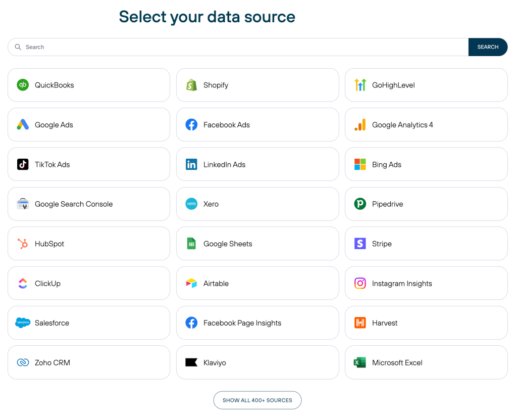
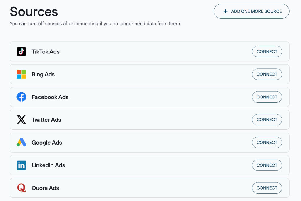
1. Connect your data sources
In Coupler.io, select from 400+ solutions (Google Ads, GA4, Salesforce, HubSpot, QuickBooks, SQL databases, APIs, CSV/Excel files, and many more).
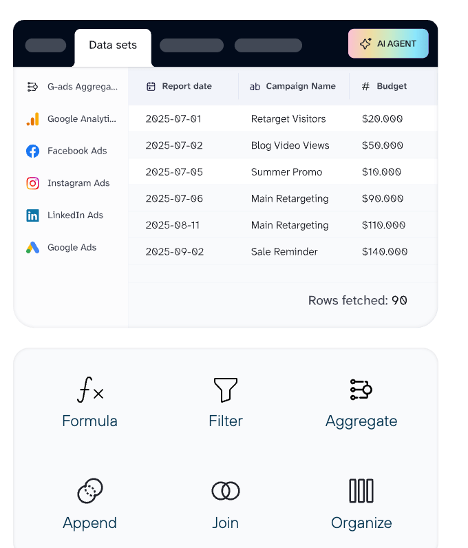
2. Prepare your data for analysis
Apply in-platform transformations: filter rows, join datasets from different sources, aggregate (sum, average, count), add custom formulas, rename columns, or reorganize structure. This ensures the output is clean and analysis-ready.
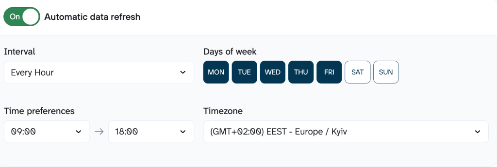
3. Export to Gemini-compatible formats
Choose CSV, JSON, or Excel as your destination format. Schedule automatic exports (daily, hourly, or as frequently as every 15 minutes) so your files stay up-to-date without manual intervention.
4. Upload and analyze in Gemini
In the Gemini app, attach the latest Coupler.io-exported file and prompt naturally (e.g., “Summarize key trends in this ad performance data” or “Calculate ROAS by channel and suggest budget shifts”). Gemini handles the file processing instantly. With Gemini AI for data analysis, you get metrics extracted, patterns spotted, charts generated, basic code executed in its sandbox, and summarized insights or full reports returned.
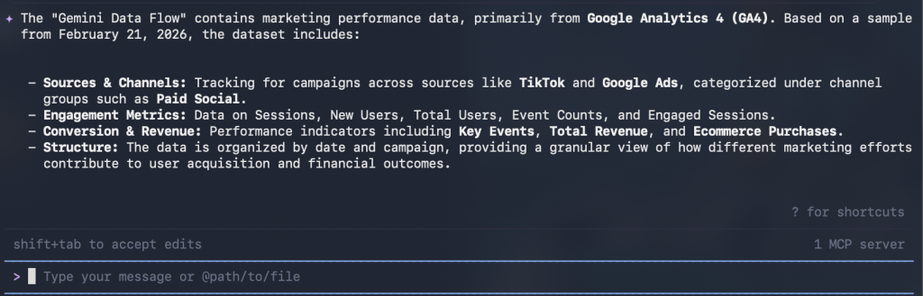
And if you are a tech-savvy user, Coupler.io provides one of Gemini integrations: Gemini CLI. Follow the instructions to set up the integration and ask Gemini CLI questions about your well-organized data in Coupler.io without any uploads.


Gemini CLI will search for the necessary data in your Coupler.io account and provide an accurate analysis according to your query.

Increase Gemini’s data analysis accuracy with Coupler.io
Start your free trial