You have the data. Now you need a way to make sense of it — quickly, visually, and in a format your team can actually act on.
That’s what a good dashboard does. It turns scattered numbers into a clear picture: what’s working, what’s not, and where to focus next. But the path from “I need a dashboard” to a working one varies widely. It can take you minutes or months, depending on the approach you choose.
This guide walks you through three practical ways to create a dashboard. You’ll learn how templates get you started fast, when building from scratch is worth the effort, and why handing it off to experts might be the smartest move for your team.
How to build a dashboard: Explore three different options
You have three main ways to create a dashboard:
Use pre-built templates
This is the fastest way to get a dashboard live. You begin with a pre-designed layout that typically includes commonly used KPIs and visualizations for a specific use case. After connecting your data sources, you can adjust metrics, formatting, filters, or layout elements to match your business needs. You save time on structure and design while still keeping room for customization.
Best for: Speed and standard reporting needs like marketing performance, sales tracking, ecommerce analytics, or financial summaries.
Many templates you’ll find online look virtually the same, showing the same boring metrics on the same charts over and over again. But you’ll also find real gems out there. At Coupler.io, we interview domain experts to understand what actually matters for their reporting. Then we give them a working template to test in practice, gather their feedback, and iterate. Only then is the template ready for release.


Build custom dashboards from scratch
This approach gives you full control over both structure and logic. You choose the tool, define the data model, connect your data sources, create calculated fields, select chart types, and design the dashboard layout yourself. You are also responsible for ongoing maintenance, data validation, updates, and troubleshooting.
Best for: Unique reporting requirements, complex calculations, or situations where your KPIs don’t fit standard templates.
Hire experts
This option brings in specialists who handle what your team can’t. You define what you need while experts handle the technical execution: data integration, advanced modeling, dashboard design, automation setup, and ongoing optimization.
Best for: Multi-source reporting, complex data transformations, automation-heavy workflows, or when your team lacks the technical and analytical skills for custom dashboard development.
Request expert guidence from our Coupler.io data analysts
Contact usWhich option fits your case?
| Templates | Build from scratch | Hire experts | |
| Time to launch | Minutes to hours | Weeks to months | Days to weeks |
| Technical skill needed | Low — connect data, adjust visuals | High — data modeling, tool proficiency, design | None — you define the goal, experts handle execution |
| Flexibility | Moderate — adjust metrics, filters, and chart types within the template structure | Full — complete control over data model, layout, and logic | Full — custom-built to your specifications with professional-grade execution |
| Ongoing maintenance | Minimal — automated refresh handles most updates | High — your team owns updates, validation, and troubleshooting | Optional — experts can manage it for you or hand it off |
| Cost | Low — included with your Coupler.io plan | Tool costs only, but significant time investment from your team | Service fee, but saves internal time and reduces risk of rework |
| Best for | Standard reporting: marketing performance, sales tracking, financial summaries | Unique KPIs, complex calculations, or full control over every detail | Multi-source reporting, tight timelines, or teams without dedicated data resources |
Most teams start with templates and move to custom builds or expert help as their reporting needs grow. You can also combine approaches, for example, use templates for standard reports and bring in experts for the dashboards that require deeper work.
Option 1: Get your dashboard ready in minutes with pre-built templates
Pre-built dashboard templates let you skip building from scratch and go straight to insights.
Instead of starting with a blank canvas, you get a structured layout designed for your specific use case, whether that’s marketing, sales, finance, or ecommerce.
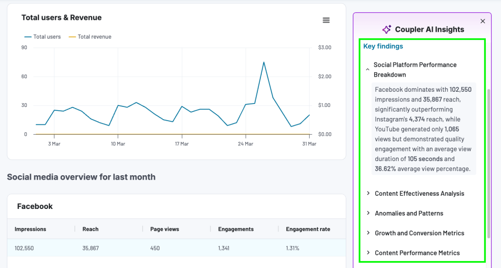
Coupler.io offers ready-to-use dashboard templates that are also equipped with AI insights. It’s a feature that generates a summary to highlight key trends, opportunities, and anomalies from the dashboard data.

In addition to native dashboards, users can benefit from templates designed for the most common data visualization solutions, such as Looker Studio, Power BI, and Google Sheets. Each template is backed by Coupler.io connectors to automate data load from the respective business apps.

Why dashboard templates are a practical choice
| ✅ Why it works | ❌ Why it might not |
| Save time — No need to design layouts, build from scratch, or structure KPI sections manually. Just connect, verify, and adjust. | May not fit unique KPIs — If your metrics are custom or complex, a pre-built layout might not match your reporting logic. |
| Follow design best practices — Visual hierarchy, grouping of related metrics, and logical filter placement are already built in. | Limited flexibility for custom data models — You can adjust charts and filters, but deep structural or calculation changes are out of scope. |
| No coding required — Create dashboards without writing a single line of code. | Design customization has a ceiling — Colors and chart types are adjustable, but you can’t fully control the layout the way you can when building from scratch. |
| Customizable — Adjust chart types, colors, filters, and metrics without complex edits. | Limited automation — Refresh schedules work well for most use cases, but teams that need dashboards to update based on specific events or actions rather than a fixed schedule may find this limiting. |
| Automated refresh — Dashboards update on your selected schedule, keeping metrics up-to-date without manual work. | Layout may need adjustments — Pre-built designs may require tweaks to match your brand or internal reporting standards. |
Coupler.io dashboard examples cover common business reporting scenarios:
- Marketing: Track paid campaigns, GA4 web analytics, SEO performance via Google Search Console, social media metrics, email marketing, and multi-channel campaigns. Connect your Google Ads, Meta Ads, or LinkedIn Ads accounts and your marketing data flows in automatically.

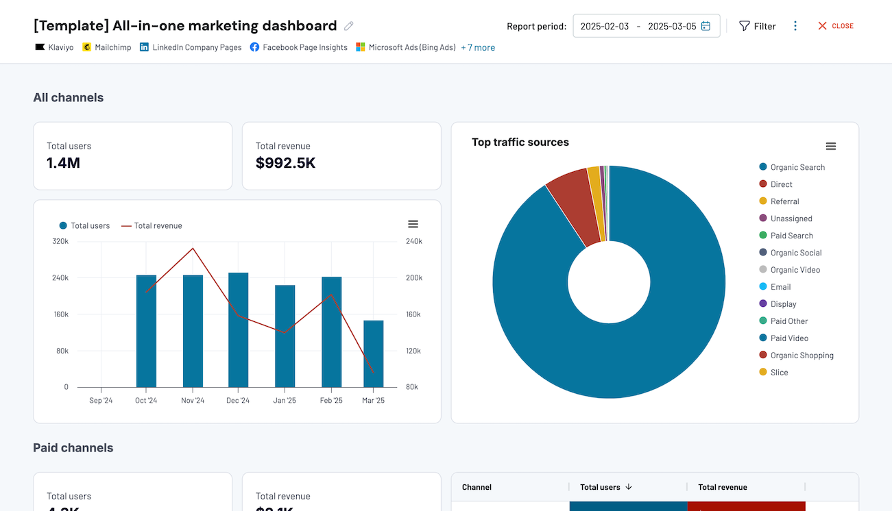
All-in-one marketing dashboard
Track performance across multiple marketing channels in one interface, comparing data from Google Analytics, Search Console, advertising platforms, social media, email, and YouTube to optimize your marketing strategy and maximize ROI.


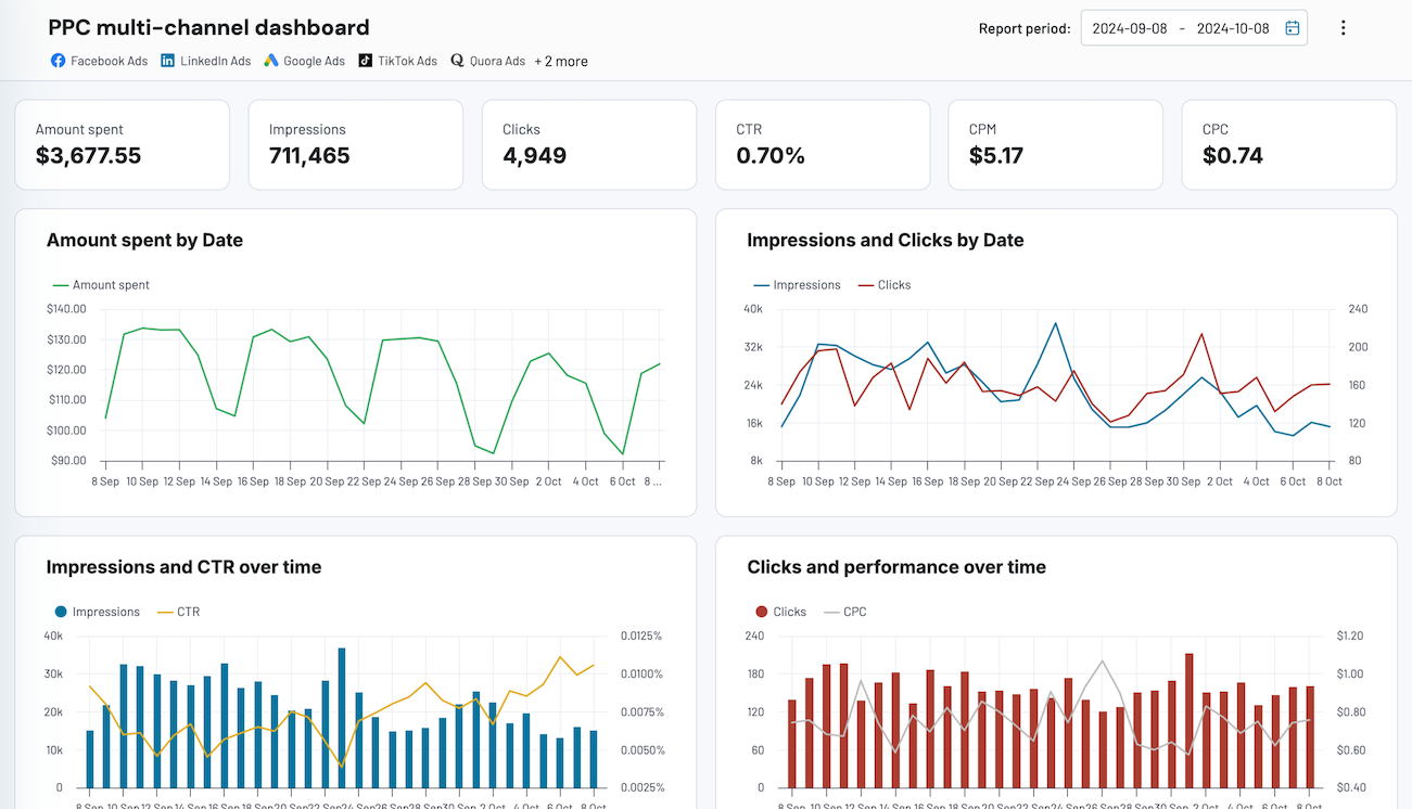
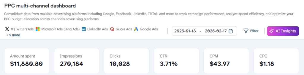
PPC multi-channel dashboard
Consolidate data from multiple advertising platforms including Google, Facebook, LinkedIn, TikTok, and more to track campaign performance, analyze spend efficiency, and optimize your PPC budget allocation across channels.
- Sales: Monitor pipeline visibility, team performance, and revenue tracking. You can pull data directly from systems like Salesforce, HubSpot, or Pipedrive.

Sales KPI dashboard for Pipedrive
Analyze the critical sales metrics and key performance indicators from Pipedrive to make smart strategic decisions.
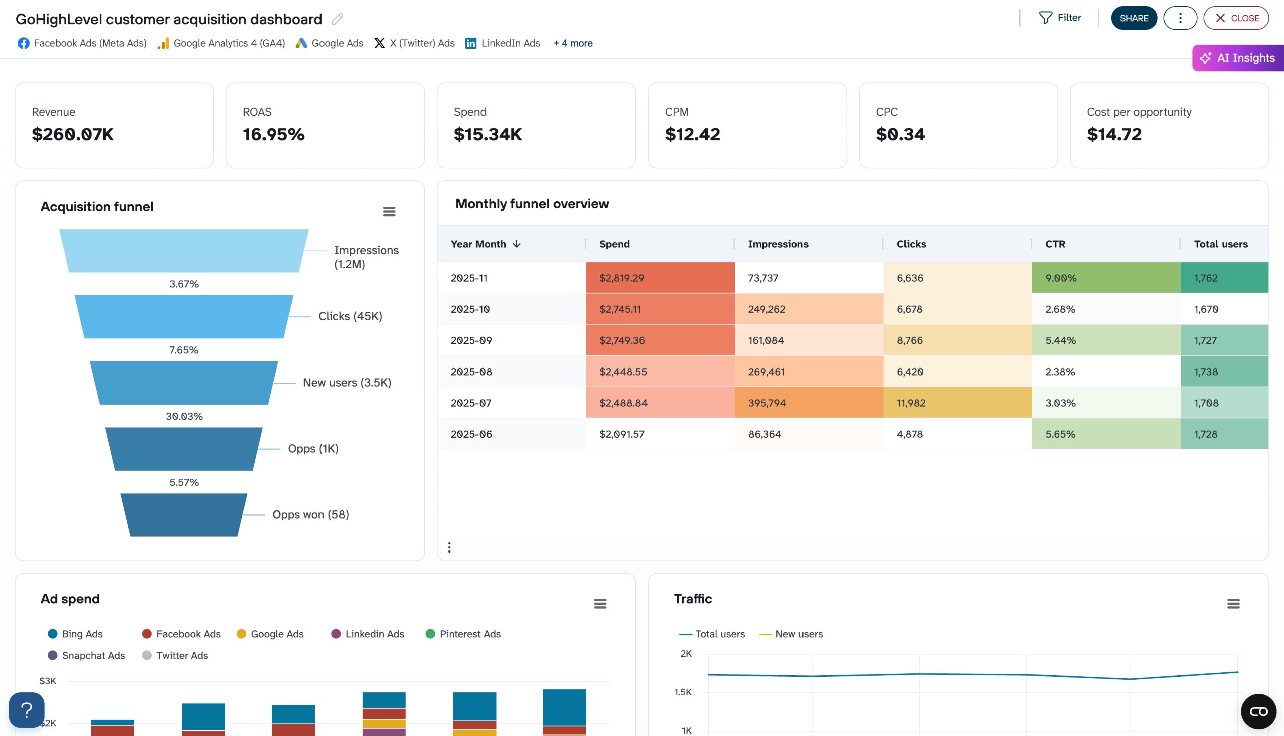
GoHighLevel customer acquisition dashboard
Visualize your complete lead generation funnel from advertising platforms to GoHighLevel conversions. Track ad spend across multiple channels, monitor funnel progression from impressions to opportunities, and analyze cost efficiency metrics to optimize acquisition costs and improve conversion rates throughout your marketing pipeline.


- Finance: Support profit and loss overviews, cash flow tracking, revenue breakdowns, and balance sheet summaries. You can connect to financial data sources such as QuickBooks, Xero, or Stripe.
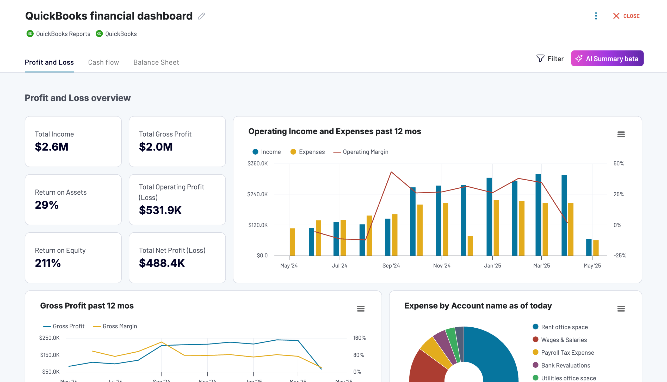
QuickBooks financial dashboard
Tracks earnings, monitor cash flow, and analyze balance sheet changes with a dedicated dashboard that provides a clear picture of your business finances.
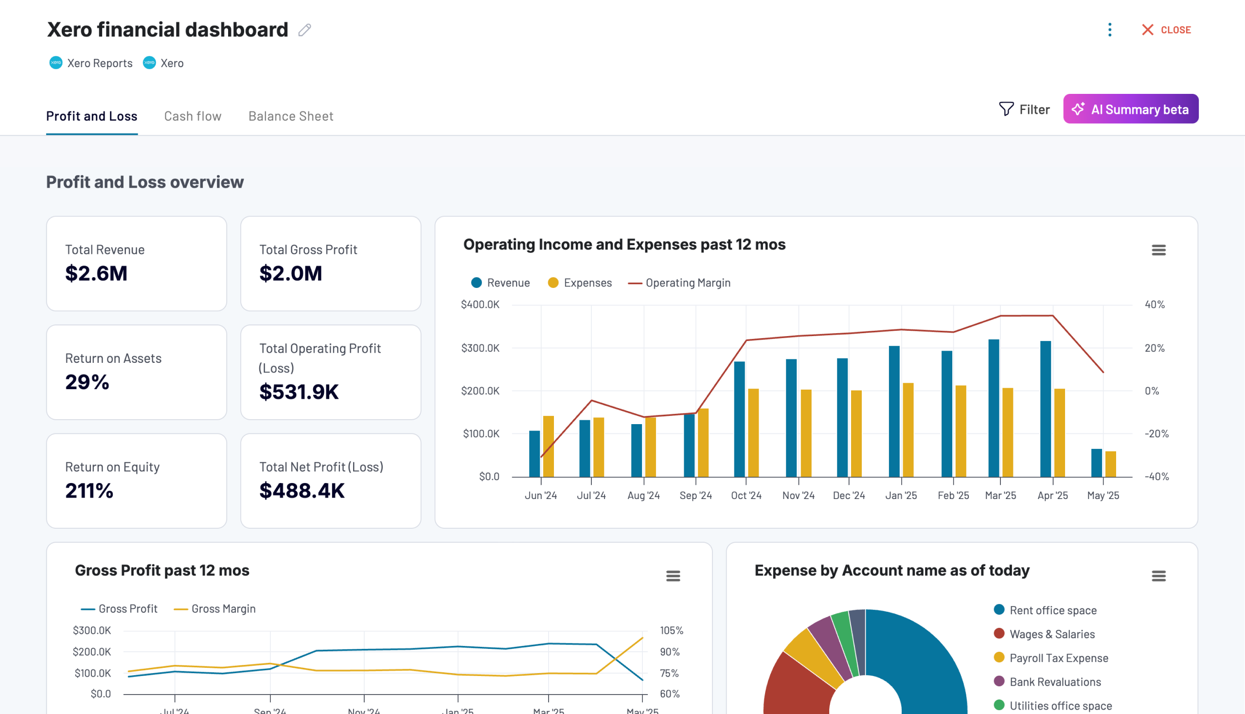
Xero financial dashboard
Get comprehensive financial insights from your Xero account with key performance metrics, balance sheet analysis, and cash flow projections. Quickly assess your business health and make informed financial decisions.
- Ecommerce: Monitor store analytics, acquisition channels, conversion funnels, and revenue performance for platforms such as Shopify or WooCommerce.

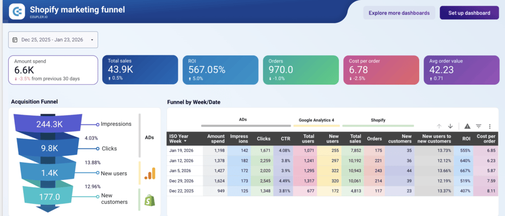
Shopify marketing funnel dashboard
Analyze the performance of the traffic to your Shopify store using data from advertising platforms and Google Analytics 4, all consolidated on a single dashboard.
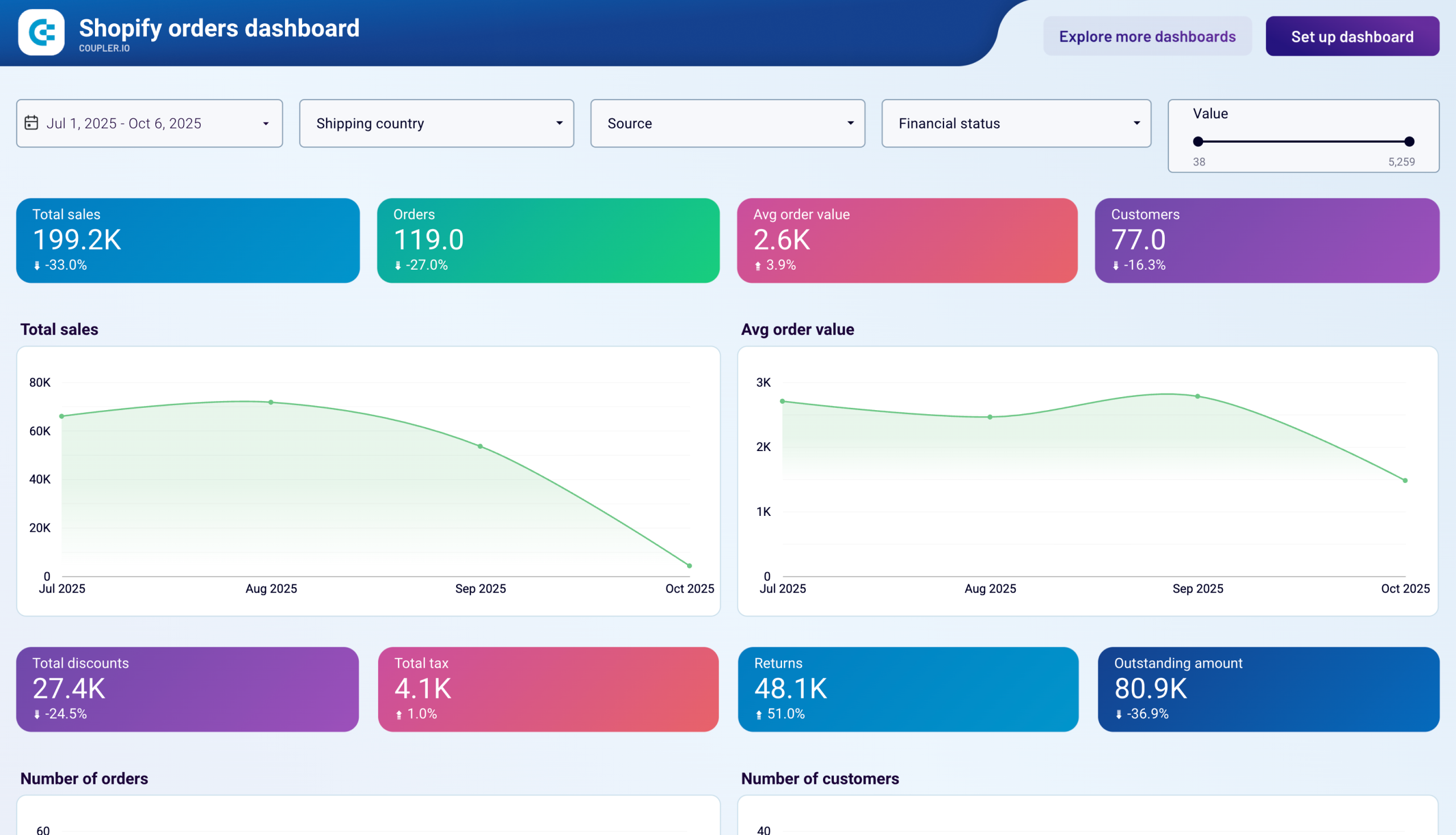
Shopify orders dashboard
Monitor your e-commerce order flow with comprehensive insights into sales patterns, customer behavior, and fulfillment metrics.
- Operational and productivity: Track time usage, meeting patterns, and customer support performance through apps such as Clockify, Harvest, or Google Calendar.

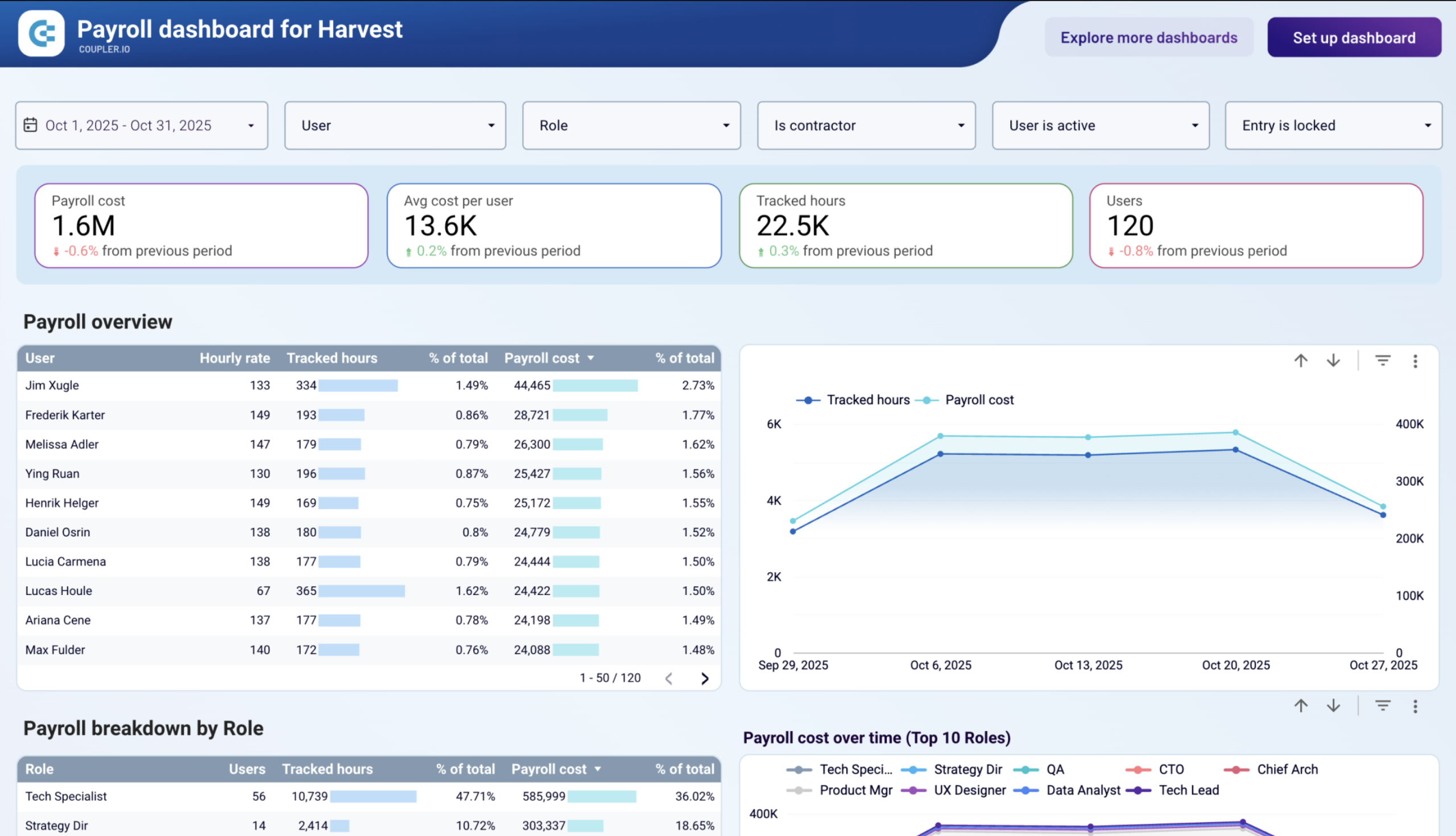
Payroll dashboard for Harvest
Manage payroll operations with detailed tracking of employee hours and costs from Harvest. View payroll breakdowns by user and role, analyze cost trends over time, monitor daily work patterns, and make informed decisions to optimize team efficiency and labor expenses.
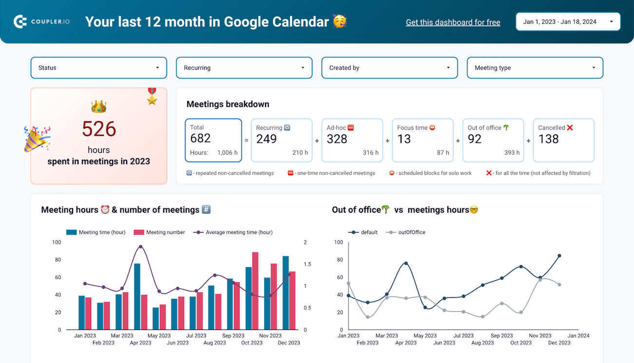
Google Calendar dashboard
Use the Google Calendar dashboard to analyze your meeting-related information and derive time insights
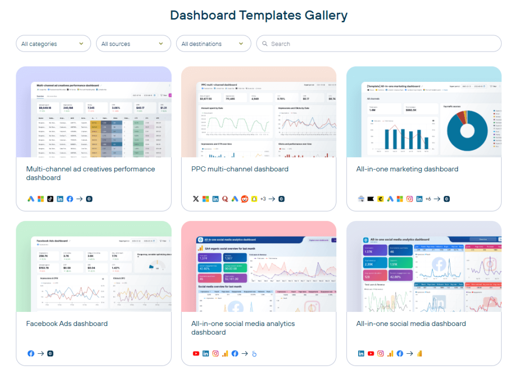
Explore all dashboard templates
Get started for freeOption 2: How to build a custom dashboard from scratch in 6 steps
Templates cover many common reporting scenarios. However, not every situation fits a pre-built solution.
You may need a custom dashboard if:
- You track metrics that are unique to your business model
- You combine multiple data sources with custom calculations
- You require advanced interactivity or features not available in pre-built solutions
- You need full control over the data model and visualization logic
This approach works best when your team has the technical skills and time to handle both initial development and ongoing maintenance.
Custom dashboards offer complete flexibility, but the process is time-consuming. Expect to invest weeks in development and refinement.
If you decide to build a new dashboard from scratch, follow these steps:
Step 1: Define your dashboard’s goal
A good dashboard starts with a clear goal.
Avoid vague goals like “A marketing dashboard” or “A finance overview.”
A good goal clearly defines:
- Who will use it — for example, the paid media team, leadership, a sales manager, or the ecommerce team.
- What decision they need to make — such as adjusting ad spend, improving margins, reallocating budget, or fixing drop-offs in the funnel.
- What business objective it supports — for example, to improve profitability, increase retention, grow revenue, or reduce acquisition costs.
Good examples:
- A campaign performance dashboard to help the paid media team optimize cost per acquisition and improve marketing efficiency.
- A profitability dashboard to help leadership monitor margin trends and cost drivers to strengthen overall profitability.
- A conversion funnel dashboard to help the ecommerce team identify drop-offs and reduce cart abandonment to increase revenue.
In each example, the user, the decision, and the business outcome are clearly defined.
Defining the goal may require an extra conversation at the start. However, it reduces rework during development and increases the likelihood that the dashboard will actually be used.
Step 2: Choose the key dashboard metrics
In many teams, the person building the dashboard isn’t the one deciding what it should show. If you’re working from stakeholder requirements, take time to clarify the brief before you start. A request like “I need a PPC performance dashboard” can mean very different things depending on who’s asking. Agree on how performance is measured, which metrics matter most, how the data should be visualized, and how far back the data should go. Removing ambiguity upfront prevents rework later.
Once the goal is clear, select the metrics that directly measure progress toward it.
The most common mistake is adding too many. A strong dashboard highlights what reflects impact, not everything available.
A dashboard is a decision-making tool, not a data warehouse. If everything makes it onto the screen, nothing will stand out. Select the few metrics that clearly signal progress and remove everything else. You can always add some later if you realize you need some deeper insights.


As a practical rule, limit your dashboard to five to seven high-impact indicators. This keeps it readable and decision-focused.
Metrics vs. KPIs — worth knowing the difference
- Metrics (or raw metrics) are general measurements such as impressions, sessions, total spend, or orders. They describe activity.
- Key Performance Indicators (KPIs) — often referred to as key metrics — are metrics tied directly to business objectives.
Not every metric deserves equal attention. Your dashboard should prioritize KPIs that directly reflect the decision it supports. Include supporting metrics only when they help explain changes in those KPIs.
Align metrics with the dashboard goal
Your key metrics must connect directly to the dashboard goal, meaning the specific decision the dashboard is built to support.
For example:
- If the goal is to optimize cost per acquisition, focus on CPA, ROAS, and conversion rate
- If the goal is to reduce churn, focus on churn rate, retention rate, and customer lifetime value.
- If the goal is to improve funnel performance, focus on conversion rate, add-to-cart rate, and drop-off rate by funnel stage.
When metrics align tightly with the dashboard goal, the result is a focused and actionable dashboard.
Without that alignment, you risk building a collection of numbers that may look impressive but does not guide decisions.
Step 3: Identify your data sources
Now that you know which KPIs you’re tracking, you need to figure out where each metric comes from.
Start by mapping each metric to its source system. Your data sources may include:
- Databases and warehouses: PostgreSQL, MySQL, BigQuery, Snowflake, or Redshift.
- CRM systems: Salesforce, HubSpot, or Pipedrive.
- Marketing platforms: Google Analytics for website traffic, Google Ads for search campaigns, Meta Ads for social advertising, email platforms like Mailchimp or Klaviyo.
- Ecommerce platforms: Shopify or WooCommerce.
- Finance tools: QuickBooks, Xero, or Stripe.
- Social media: Native analytics from LinkedIn, Facebook, Instagram, or TikTok.
- Other sources: Project management tools, customer support platforms, survey tools, even CSV files sitting in shared drives.
Your KPIs might require data from multiple systems.
For example, look at the following PPC multi-channel dashboard. Key metrics like Amount spent, Impressions, Clicks, and CTR are displayed as unified totals. But the underlying data comes from different advertising platforms such as Google Ads, Microsoft Ads, LinkedIn Ads, and others.

One thing worth knowing upfront: when your KPIs live across many different platforms, getting that data into one place becomes its own project. That’s something your tool choice in Step 4 will need to account for.
Step 4: Select your dashboard tool
Tools help you create dashboards faster, manage your data model properly, and support interactive dashboards without constant troubleshooting.
Choose the ones that match your team’s technical skills, reporting needs, and long-term growth.
Spreadsheets
Spreadsheets work well for lightweight dashboards when you need something quick and functional. Many teams export data from business apps like Google Analytics, Stripe, or Shopify into a spreadsheet, then build charts and pivot tables directly in a worksheet. It’s also a natural choice if you’re already using spreadsheets as your database or tracking system.
- Google Sheets works well for simple datasets and collaborative reporting. It supports real-time collaborative editing. However, it has a 10 million cell limit, and performance can slow down with complex formulas or large datasets.
- Excel offers advanced features like PivotTables, Power Query, and Power Pivot for deeper analysis and local data modeling. It is strong for individual or finance-focused analysis, especially in Microsoft-based environments.
This Shopify marketing funnel dashboard shows what’s possible in a spreadsheet. You can build a Google Sheets dashboard yourself, or grab a template to cut your setup time.
Shopify funnel dashboard in Google Sheets

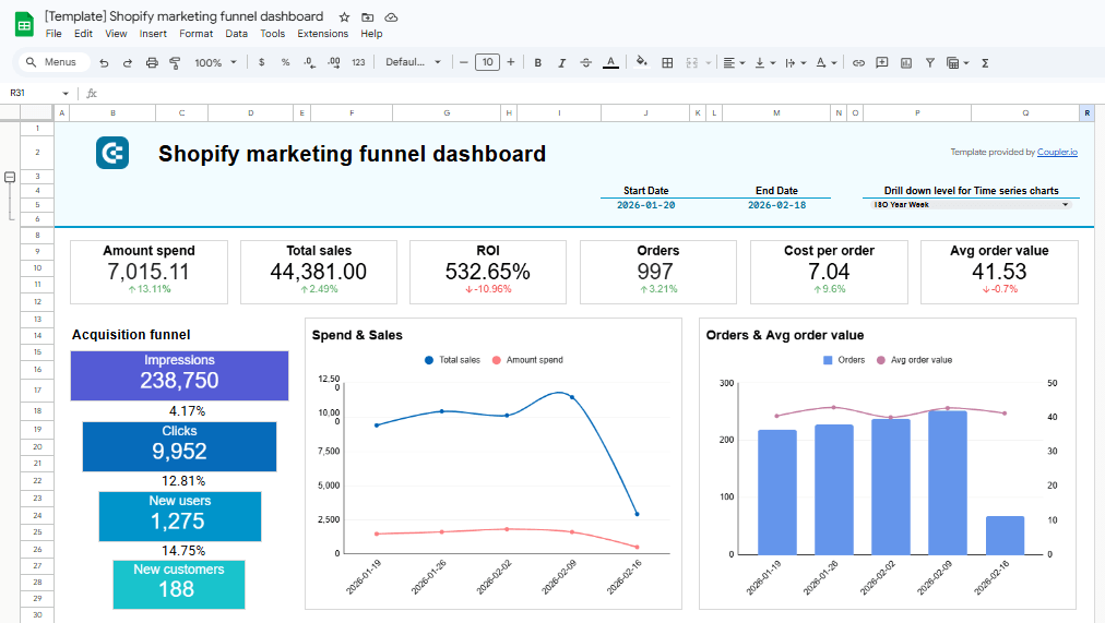
Shopify funnel dashboard in Google Sheets
Preview dashboardIf you’re pulling data from multiple apps into spreadsheets, consider automating the data flow entirely. Manual exports create errors, eat up time, and leave your data outdated. A data automation tool like Coupler.io can pull data directly into Google Sheets or Excel on whatever schedule you set., so your dashboard stays fresh.
Spreadsheets are flexible and familiar. But as your datasets grow or reporting becomes more complex, BI tools such as Power BI or Looker Studio typically provide better scalability.
Explore ready-to-use Power BI templates for your reporting.
Business intelligence (BI) tools
For anything beyond basic spreadsheet dashboards, BI tools give you more power. Most businesses use one of these three when their reporting needs grow:
- Looker Studio: Free for core functionality and works seamlessly with Google’s ecosystem. It includes 21 native Google connectors (Google Ads, GA4, Search Console, YouTube, BigQuery) at no cost, plus access to 1,000+ third-party connectors through the community gallery.
Explore ready-to-use Looker Studio templates by Coupler.io.
- Power BI: Offers the best value for Microsoft-centric organizations. It handles complex data modeling through DAX functions and integrates deeply with Excel, SharePoint, and other Microsoft products.
- Tableau: Delivers the most sophisticated interactive visualizations. Best for data analysts who need advanced drill-down capabilities and custom calculations across large datasets.
All three are solid choices. Pick the one that makes the most sense for your team.
If you’d rather not handle the technical work yourself, Coupler.io’s data analytics consulting team works with all these platforms. You define what you need and which BI solution you prefer. Our data experts handle everything else.
Data integration tools
A data integration platform can work alongside your spreadsheet or BI tool to automate data extraction and preparation across systems. You still build your dashboards in the BI tool you prefer. The integration platform delivers clean and structured data for your visualizations.
Coupler.io connects to 400+ data sources. These include CRMs like Salesforce, ad platforms like Google Ads and Meta, ecommerce tools like Shopify, and databases like BigQuery. It extracts your data, handles the transformations, and sends clean datasets directly to your chosen BI tool: Power BI, Looker Studio, or Google Sheets.
Coupler.io complements your existing tools. Your BI platform remains the environment where you define the data model, apply calculations, and design visualizations. Coupler.io focuses on collecting, organizing, and delivering reliable data so your dashboards stay consistent and up to date.
Businesses using Coupler.io for data integration see measurable improvements in how quickly they can work with their data and reporting:
- Bulungula Incubator was losing hours every week to manual reporting. Once their data collection and reporting workflows were automated, they got back approximately two full weeks of manual work every month.
- Habitium had 10 employees spending 40 to 50 hours monthly just on stock optimization reporting. After Coupler.io redesigned their data infrastructure and built automated dashboards, that workload dropped to 10 hours with only 2 people needed.
- SellThru needed faster client onboarding and more reliable analytics. After Coupler.io built automated data pipelines and custom dashboards for them, their onboarding time dropped by 5 to 7 times while tracking accuracy climbed above 95%.

Connect your business data to dashboards with Coupler.io
Get started for freeStep 5: Design and build
Effective dashboard design is not about adding more charts. It’s about organizing information so decisions happen faster.
Below are the core principles that guide high-performing dashboards.
1. Start with the dashboard layout
Most teams jump straight into adding charts. A bar chart here, a pie chart there, and a table in the corner because there’s empty space. Weeks later, they have a dashboard that works but nobody uses.
Layout comes first. It determines whether someone finds their answer in five seconds or gives up entirely.
Follow the inverted pyramid: critical KPIs at the top, trend charts in the middle, detailed tables at the bottom. Add a header with the dashboard name and probably a date filter right where everyone can see it.
The Coupler.io Shopify marketing funnel dashboard below is a good example of this structure in practice.
Shopify marketing funnel dashboard in Power BI

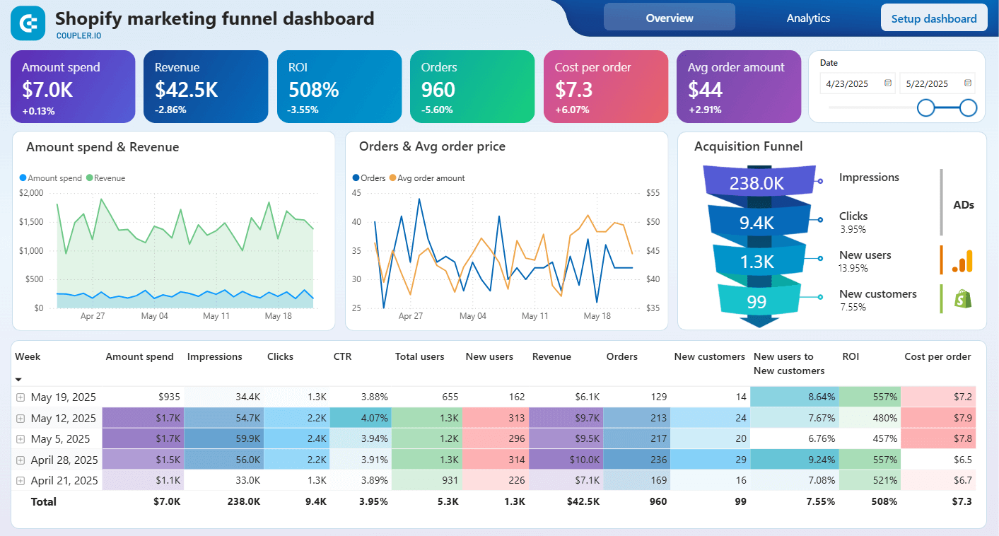
Shopify marketing funnel dashboard in Power BI
Preview dashboardWhen you define the layout before adding visualizations, every element has a purpose. The result is a dashboard that guides decisions instead of bringing distractions.
2. Use the right chart
Not all charts serve the same purpose. The chart type should match the business question you are answering, for example:
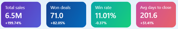
- Scorecards display a single key value, such as total sales, CPA, or win rate. Use them for high-priority KPIs that require immediate visibility, especially when paired with period comparisons.

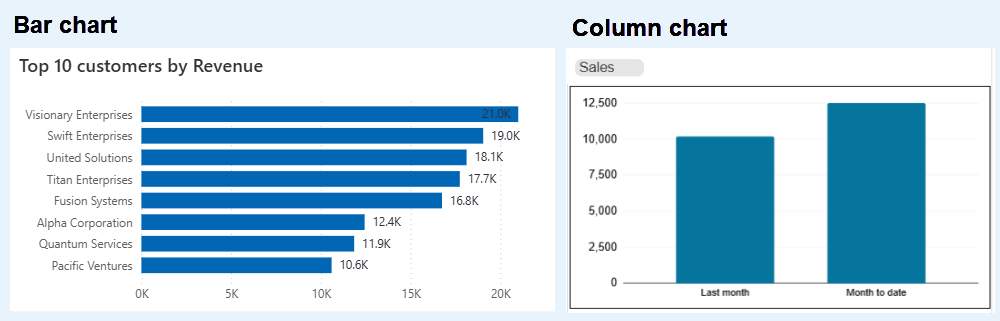
- Bar charts and column charts compare values across categories.
Bar charts run horizontally. Use them when your category names are long or when you’re comparing many items at once. “Revenue by product line” or “Leads by channel” usually work better as bar charts.
Column charts run vertically. They’re the better choice for time-based comparisons like monthly revenue or quarterly performance.

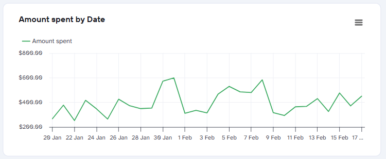
- Line charts track how something changes over time. Examples are “Monthly website traffic”, “Daily conversions”, or “Year-over-year growth”. If your X-axis is a date, you probably want a line chart.

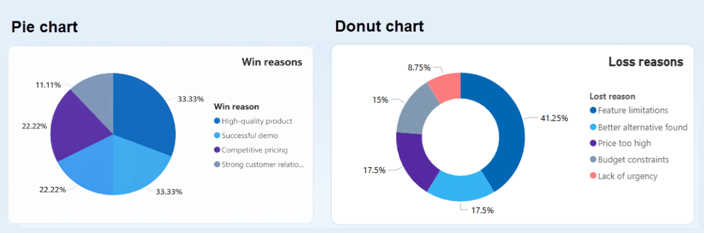
- Pie charts and donut charts show how parts add up to a whole. They work the same way, but donut charts have a hole in the middle, which gives you space to put a label or total in the center.
Some people find donut charts cleaner and easier to read. Others prefer the simplicity of a traditional pie chart; either works fine.
More than five to eight slices quickly becomes hard to interpret.

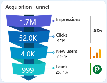
- Funnel charts show progression through stages. In the example below, the chart shows the progression from Impressions to Clicks, New users, and finally Leads, along with conversion percentages between each step. This type of chart helps you quickly identify where drop-offs occur
Funnel charts work best for marketing, sales, and product journeys where conversion between stages is the primary focus.

When you build from scratch, you make decisions for each chart type. Should this be a bar chart or a line? Does a donut work better than a pie? You can spend an hour on decisions like that.
Dashboard templates solve this. The chart types are already aligned to the metrics they display. You can customize them if you need to, but you don’t start from zero.
3. Group related insights meaningfully
Metrics that answer the same question should be visually grouped.
When related numbers are scattered across a dashboard, users are forced to search, compare mentally, and piece the story together themselves. That increases cognitive load and slows decision-making.
In the CRM dashboard below, the grouping follows business logic. The top KPI cards answer “How are we performing?” Metrics below them show what is currently in progress. Trend charts explain how performance is changing over time. And the donut charts highlight where deals sit and why they are lost.

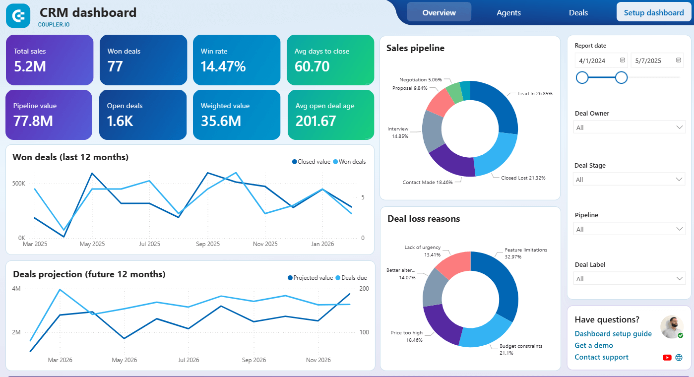
When grouping is intentional, the dashboard tells a coherent story. Users can scan, compare, and interpret quickly.
4. Design for your specific audience
Different roles make different decisions, so your dashboard design should reflect that.
- Executives need clarity and speed. Give them 5–7 high-level KPIs with clear trend indicators and comparisons. Keep visualizations simple. They should understand performance in seconds without drilling into detail.
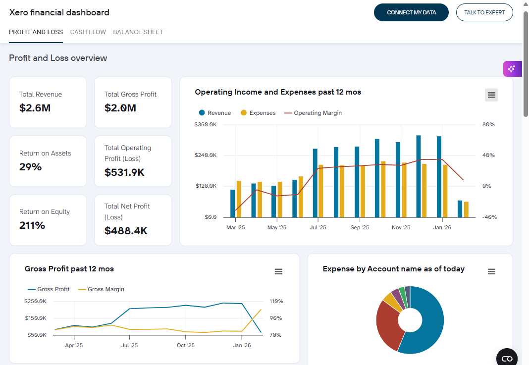
Example: This Xero Financial dashboard for a CFO presents a clean summary layout with top-level indicators and supporting trend charts.

- Analysts need depth. Provide filters, drill-down capability, and access to granular data. They are comfortable exploring trends, segments, and edge cases to uncover insights.
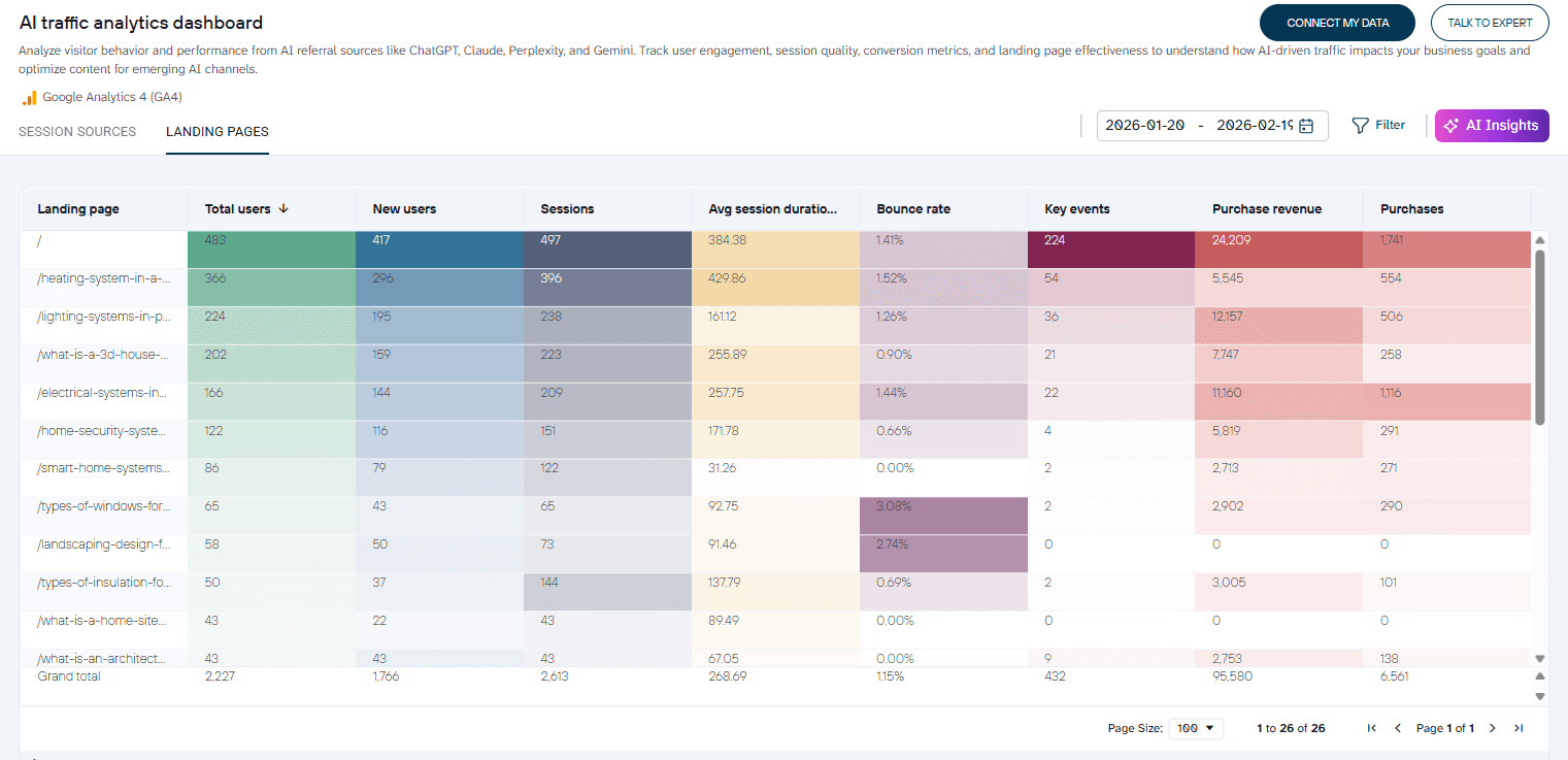
Example: With this AI Traffic Analytics dashboard, analysts can evaluate performance at the landing page level and sort each column to identify top or underperforming pages.

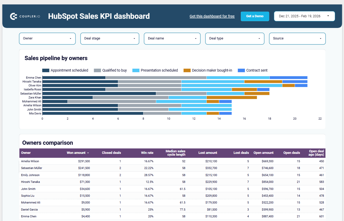
- Managers sit in between. They need daily performance metrics, weekly trends, and the ability to filter by team, region, or pipeline stage. They require operational visibility, not just summaries.
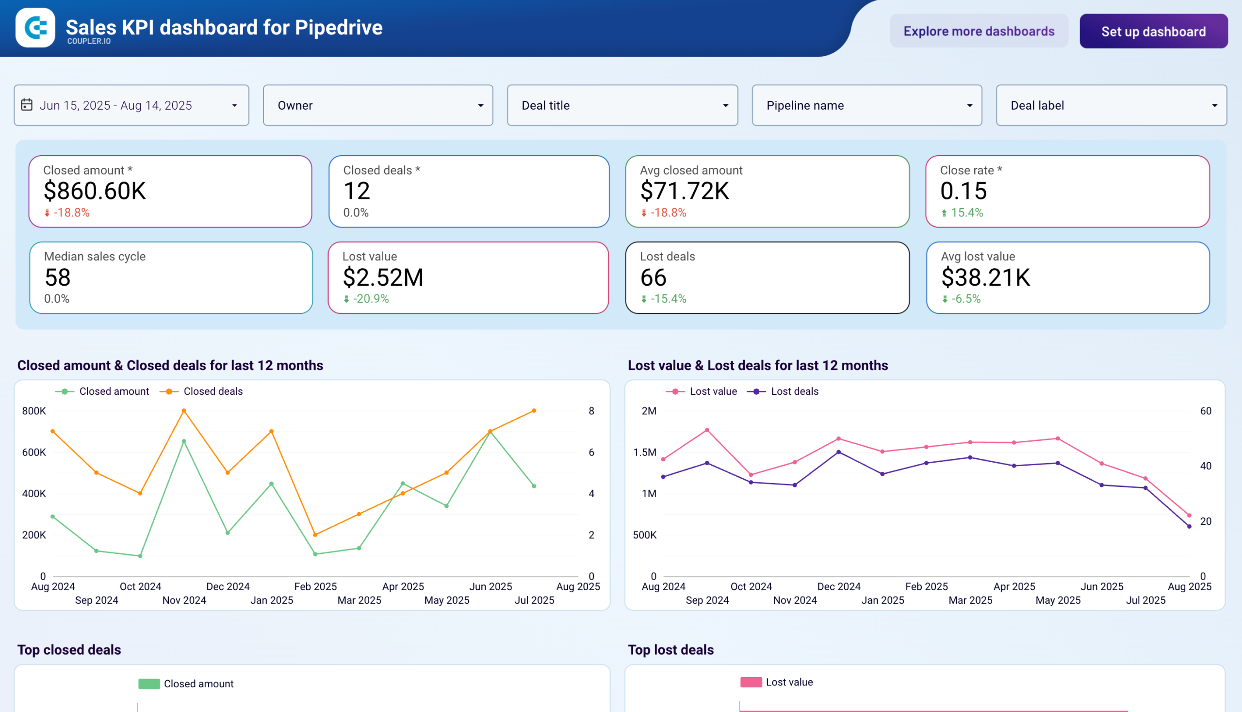
Example: This Sales KPI dashboard allows sales managers to track performance by team members, compare win rates, monitor deal stages, and review open versus closed amounts. The filters at the top make it easy to analyze from multiple perspectives.

One dashboard for everyone rarely works well. Too much detail overwhelms executives, while too little depth frustrates analysts.
5. Make comparisons easy
Numbers without context are just numbers.
An amount spent of $6.6K means little by itself. Add “+30.4% from previous month”, and suddenly it means something. Directional arrows and percentage changes make performance obvious at a glance.


Where possible, pair your key metrics with at least one comparison, such as month over month, year over year, or versus target.
6. Make dashboards interactive with filters
Filters turn a static dashboard into an interactive tool. They let users slice the data however they need it.
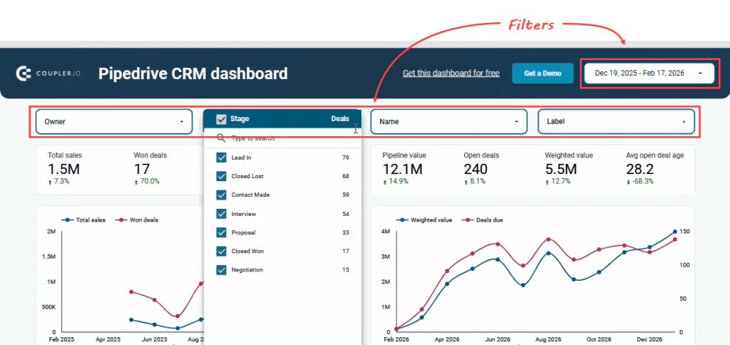
Add filters for dimensions that matter. For example, the Pipedrive CRM dashboard below uses a date range filter in the top right corner alongside four drop-down filters for owner, stage, and other dimensions. Users can instantly narrow results and explore performance without leaving the page.

Filters should support real business questions. Five useful filters is usually enough; too many options create confusion.
7. Highlight what matters most
Use size, position, and color with intention, not decoration.
- Size signals priority. Larger KPI cards or charts naturally draw focus.
- Position matters. Users typically scan from top-left to right and then downward. Place your most important metrics where eyes land first.
- Color should communicate meaning. Use it to highlight change, risk, improvement, or exceptions. Avoid using bright colors just to make the dashboard look attractive.
When emphasis is clear, users understand what requires attention without searching.
8. Keep it simple and clean
Remove anything that does not communicate insight. Every element should serve a purpose and help users understand the data faster.
Focus on:
- Eliminate visual noise, for example delete decorative borders, reduce unnecessary grid lines, remove redundant labels, and avoid background colors that add distraction
- Use white space intentionally to give charts room to breathe and separate sections clearly.
- Limit what appears on one screen. Too much information in a single view overwhelms users and slows decisions.
Let’s look at examples of what a clean vs. cluttered dashboard looks like.
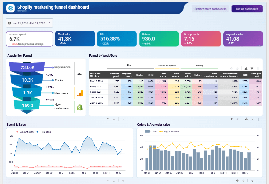
A clean dashboard example: This Shopify marketing funnel dashboard puts the most important metrics at the top. It has a soft background, consistent colors, and spaces between elements keep it clean. Moreover, all the elements are easy to scan.
Shopify marketing funnel dashboard

Shopify marketing funnel dashboard
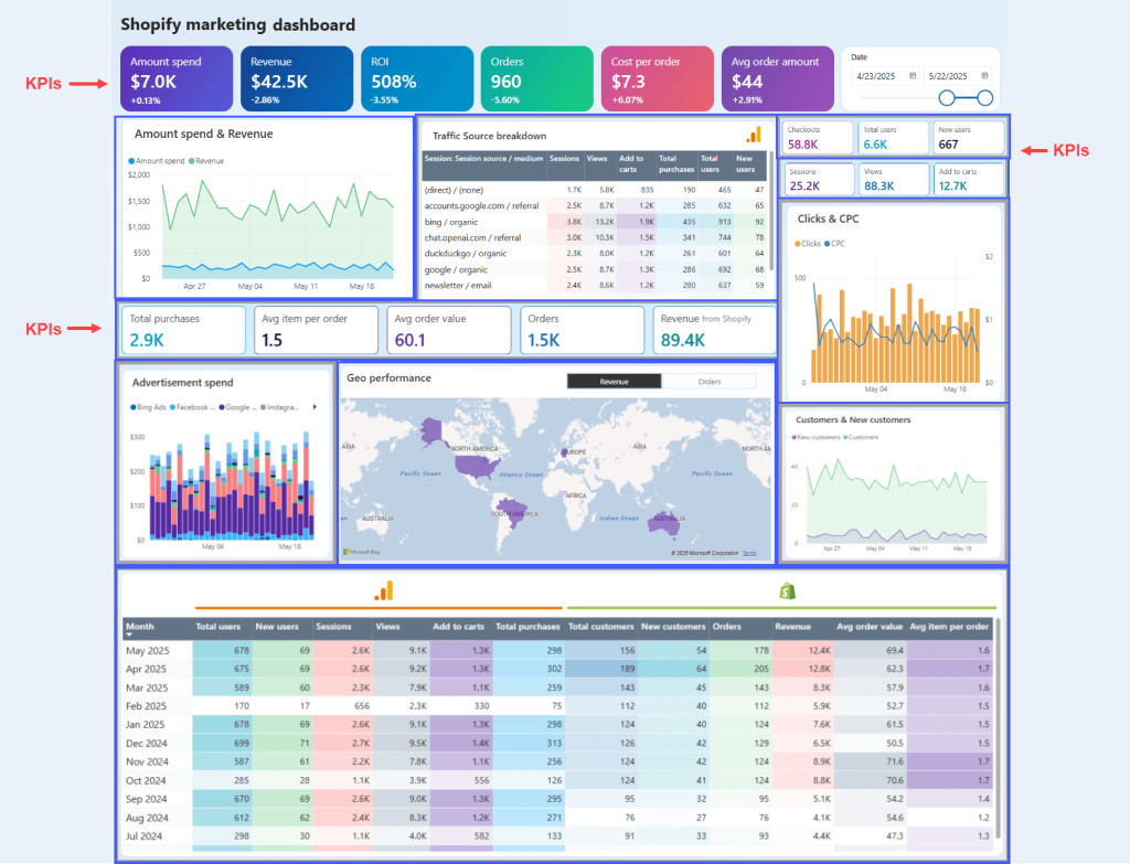
Preview dashboardA cluttered dashboard example: This marketing dashboard tries to show everything at once. KPI scorecards sit at the top, on the right, and again in the middle, with different sizes and formats. It is unclear which metrics matter most and what the dashboard’s actual purpose is. All the charts compete within a single screen with almost no space. Nothing stands out. Nothing guides the eye.

Simple does not mean plain. A clean dashboard reduces distractions, improves readability, and makes information easier to process.
Step 6: Review and publish
Before you share your dashboard, validate it carefully. A visually polished dashboard means nothing if the data is inaccurate or confusing.
Check data accuracy. For example, compare totals and KPIs against the original source systems. Confirm that revenue matches your finance tool and conversion rates align with your CRM or analytics platform. Small calculation errors can undermine trust quickly.
Test interactions. Click every filter, slicer, and drill-down. Change date ranges. Resize the screen. Make sure charts, tables, and comparisons update correctly.
Review with stakeholders. Share the dashboard with a small group first. Observe how they use it. Identify what feels unclear or difficult to find, then refine the layout or labeling.
Set permissions before you share the dashboard. Before sending your dashboard link, decide who should have view access and who should have edit access. Most BI tools, such as Looker Studio and Power BI make permission settings easy to configure. However, it is just as easy to skip this step.
Give most users view-only access. This prevents accidental changes to metrics, filters, or calculations that others rely on for daily decisions.
Provide basic documentation. Create a short guide that defines each metric, explains filters, and probably includes a contact person for data questions. A few pages is enough. It saves you from answering the same questions on repeat.
Once validated, share the dashboard through direct links, Slack, or PDF exports.
Improve continuously based on feedback.
Option 3: Let experts build your dashboard
Templates save time. Building from scratch gives you full control. But both assume your team has the capacity, the technical skills, and the bandwidth to handle it.
If that’s not where you are right now, that’s perfectly fine — and it’s exactly why this option exists.
When expert help makes sense
You don’t need to have everything figured out before reaching out. In fact, most teams that work with dashboard specialists start in one of these situations:
- You know what you want to track, but not how to get there. You have a list of metrics, such as cost per click, conversion rate, churn, etc. However, connecting four different platforms into one automated dashboard is beyond what your team can do.
- You’ve tried building it yourself, and it’s not working. The dashboard exists, but the data doesn’t match your source systems, filters break, and nobody trusts the numbers enough to make decisions from them.
- You don’t have the time. Your team is already stretched. Spending weeks learning a BI tool, debugging data connections, and iterating on layout isn’t realistic when there are campaigns to run and targets to hit.
- Your reporting needs have outgrown your current setup. What started as a simple spreadsheet tracker now needs to pull from multiple platforms, support different teams, and update automatically.
In all of these cases, the most valuable thing you bring is a clear idea of what the dashboard needs to do. Gie answers to who will use it, what decisions it supports, and what data matters. The rest is execution, and that’s what specialists handle.
What to expect from the process
Working with a consulting team is not a black box. Here’s what the process typically looks like:
- You share your goals. What do you need to track? Who will use the dashboard? What decisions should it support? You don’t need a technical spec — a conversation or a rough list of metrics is enough to start.
- Experts validate and refine. The consulting team reviews your inputs, identifies gaps, and recommends adjustments. Sometimes the metrics you think you need aren’t the ones that actually drive decisions. A good team will challenge your assumptions constructively.
- Data connections are built. The technical work of pulling data from your platforms, transforming it, and structuring it for the dashboard is handled for you. No CSV exports, no manual imports, no broken links.
- The dashboard is designed and built. Layout, chart types, filters, comparisons, and interactivity are all configured based on your specifications and best practices.
- You review, refine, and launch. You see the dashboard before it goes live. Feedback rounds ensure it matches what your team actually needs.
- Ongoing support (optional). Some teams want the experts to manage updates and maintenance long-term. Others prefer a handoff after launch. Both options are available.
The most common issue we see is not a lack of data, but a lack of trust in it. Teams come to us when their numbers don’t align across platforms and decision-makers stop relying on the dashboard altogether.
What Coupler.io’s consulting team delivers
Coupler.io’s data analytics consulting services cover the full scope of dashboard projects:
- Custom dashboard development: Auto-updating dashboards built to your specifications, displaying the exact metrics your team needs to make faster decisions.
- Strategic analytics guidance: Help identify which KPIs actually matter for your goals and build comprehensive reports that show the complete business picture, not just isolated data points.
- Data infrastructure: Expert recommendations and implementation for databases, data warehouses, and BI solutions that handle your data efficiently and scale as your business grows.
- End-to-end automation: Automated data flows between your applications, eliminating repetitive manual tasks and reducing errors. No more CSV exports or copy-paste between systems.
The consulting team brings 15 years of experience across various industries and includes over 100 data specialists.
Ready to get started?
If you have a dashboard idea, even a rough one, that’s enough. Share it with the Coupler.io consulting team, and we’ll help you turn it into something your team can actually use.
Request expert guidence from our Coupler.io data analysts
Contact us