Every modern business runs on dozens of tools: ad platforms, CRMs, analytics apps, finance software, support systems, and more. Each one captures a slice of the story, but none of them show the full picture on their own.
At Coupler.io, we work with thousands of data flows, and we’ve seen one thing consistently. The teams that focus on multi-source data integration outperform the ones that keep it siloed. When your campaigns, conversions, and revenue speak the same language, decisions become faster, reporting becomes clearer, and optimization becomes a lot more accurate.
After managing thousands of data flows, we’ve identified the methods that actually work for multi-source integration and the pitfalls that waste your time. Here’s what you need to know.
What is the value of multi-source data integration?
Multi-source data integration brings data from different tools and formats into a single, consistent view. The goal is simple: centralize your data, transform it when needed, analyze it holistically, and extract insights you can confidently act on.
Let’s walk through a practical example from a marketing campaign.
If you run ads across platforms like Google Ads, LinkedIn Ads, and Facebook Ads, each one gives you its own isolated report. Viewed separately, metrics like CPC or ROAS may look fine on their own. But when you want to understand which channels actually drive the best conversions and ROI overall, comparing siloed reports becomes almost impossible, unless you integrate data from multiple sources into a common structure.
So you combine them.
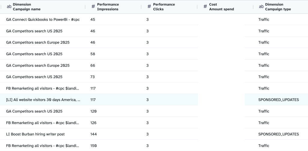
Below is what a unified dataset looks like when PPC data from different sources is integrated into a single table.

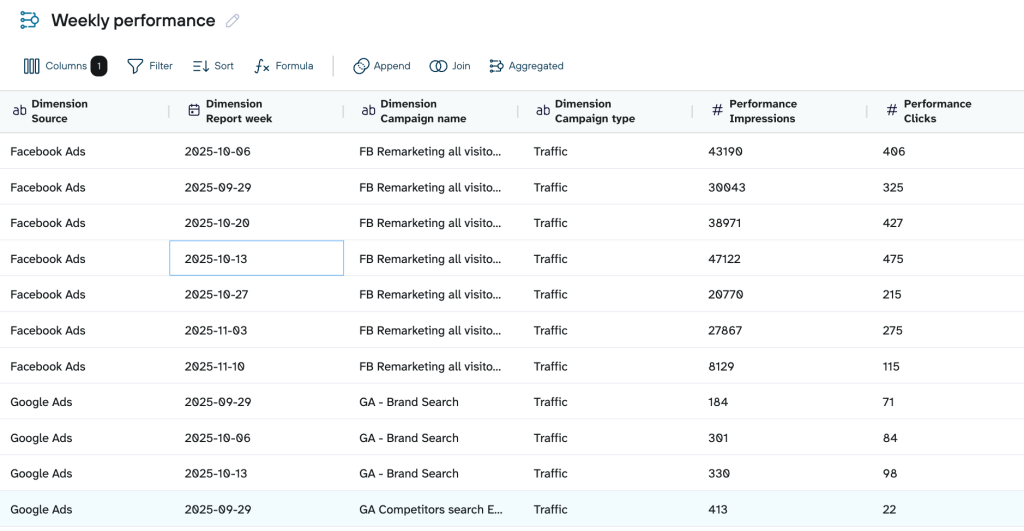
With this unified table, you can instantly identify insights like:
- Which platforms deliver the lowest CPC and strongest ROAS when viewed side by side
- Which campaigns are overspending while generating little to no conversions
- How performance shifts across weeks or seasons for each platform
But raw tables only get you so far. To make it easy to spot patterns, integrate data from multiple sources, and visualize it in a dashboard.
Here’s an example of how the same combined dataset looks once visualized in a PPC multichannel dashboard.
PPC multichannel dashboard in Looker Studio

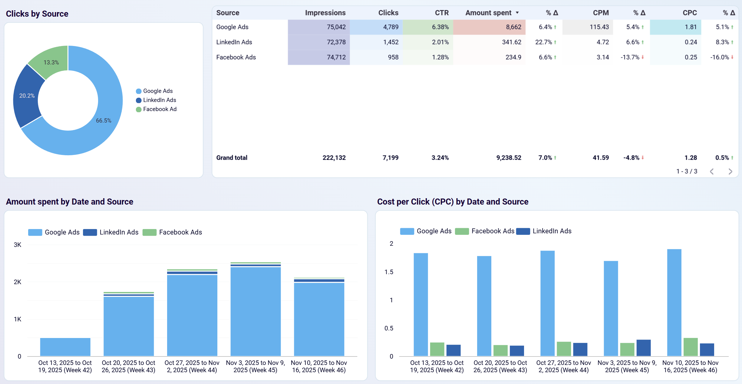
PPC multichannel dashboard in Looker Studio
Preview on dashboardFrom dashboards like this, you can quickly identify:
- Spend spikes and dips by date
- Trends in impressions, CTR, and CPC over time
- Performance differences across ad platforms at a glance
- Whether the cost efficiency is improving or slipping
While integrating data from disparate sources makes these insights possible, visualization makes them easier to interpret.
Methods of integrating data from multiple sources
When you need to combine data from different systems, there isn’t one best method. But there’s a method that fits your scenario. Below are common approaches for combining data from different sources.
Manual exporting
Many teams start with simple CSV exports because it’s the easiest way to bring data together. If you need quarterly financial reports, CRM lead exports, or logs from an internal tool, downloading the files manually is the fastest way to get the data. It’s also helpful when you only need the data once. For example, preparing a board presentation or validating numbers in a one-off audit.
The limitations show up as soon as the process repeats. CSVs quickly go out of date, different team members export data using different filters, and errors show up when files are copied or merged manually. Scaling becomes painful as weekly performance reviews, monthly P&L analysis, or daily operations dashboards can’t depend on exports.
Manual exporting is a practical entry point, but not a sustainable long-term method for data integration from multiple sources. Once data volume or frequency increases, you’ll have to automate the process.
ETL (Extract-Transform-Load)
ETL is your go-to method when your data needs serious cleanup before it reaches the destination. For example, CRM tables with inconsistent naming, finance tools with varying date formats, or product databases that require deduping before analysis. ETL helps you fix these issues upfront by standardizing fields, validating records, merging duplicates, and structuring the data into clean tables.
Coupler.io uses ETL principles without any code. You pull data from 380+ sources, add transformations like renaming fields, normalizing formats, or combining datasets , and then load the clean output into spreadsheets, BI tools, databases, or AI destinations. This gives you the reliability of traditional ETL with a far lighter setup and simplifies many scenarios of data integration from multiple sources.
ELT (Extract-Load-Transform)
ELT is useful when speed matters more than upfront cleaning. Instead of transforming everything beforehand, raw data is loaded directly into your destination, typically a cloud warehouse like BigQuery, Snowflake, or Redshift, and transformations happen afterward. This approach is suitable for teams that handle large volumes of data or iterate frequently on their models.
A product analytics team is a good example. They might load raw event data from their app, combine it with user attributes from a CRM, and refine the transformation logic as questions change. Marketing teams analyzing multi-touch journeys, support teams blending ticket histories, or executives reviewing real-time KPIs benefit from ELT because it minimizes delays. The warehouse handles the heavy lifting, and analysts can adjust transformations using SQL.
Native connectors
Native connectors work well when your data is already structured in a compatible way and you only need to get metrics from one source into a destination without joining, cleaning, or standardizing anything. For example, GA4 → BigQuery, Shopify → Sheets, or HubSpot → Looker Studio.
They’re a practical option for simple integrations where the goal is to collect data rather than combine it. For instance, exporting raw GA4 events into BigQuery lets you unify all analytics data into a single warehouse, where you can later join it with ads, CRM, or product data. The limitation is control. Native connectors rarely allow renaming fields, aligning schemas, or blending multiple sources. So if you need cross-platform integration, you’ll quickly outgrow native connectors.
API integration
API integration is the option you turn to when you want full control over your data. Instead of relying on preset connectors, you pull information directly from the API of platforms like Meta, Google Ads, HubSpot, or GA4. You choose what you need, like specific fields, custom metrics, or deeper campaign details.
Teams often API when their reporting needs move from standard to custom. For example, you might pull ad-level spend from Meta, match it with GA4 events, and layer in HubSpot lifecycle stages to build your own attribution view. APIs let you mould the data in whatever way supports your strategy.
APIs give you flexibility, but you need to put in effort to handle pagination, rate limits, and scheduling. Or, you may also consider hiring an expert in API integrations to handle the technical part.
How to integrate data from different sources with Coupler.io
You’ve seen all the ways data can be integrated, and the limitations that come with each one. If you want a no-code solution that still gives you flexibility and maintains accuracy, Coupler.io is the one for you.
This data integration platform offers two options to integrate data from multiple sources using no-code transformations.
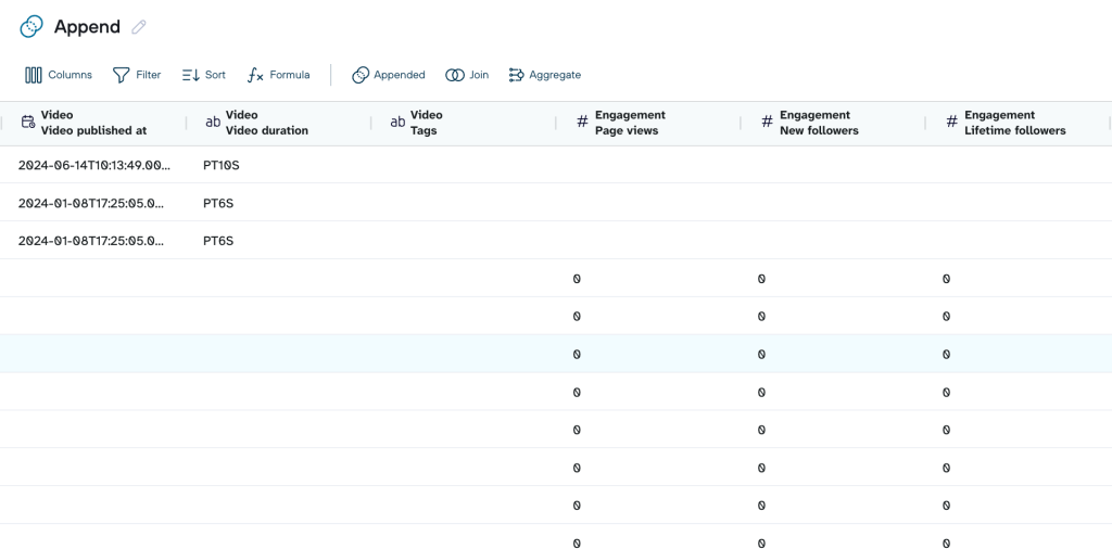
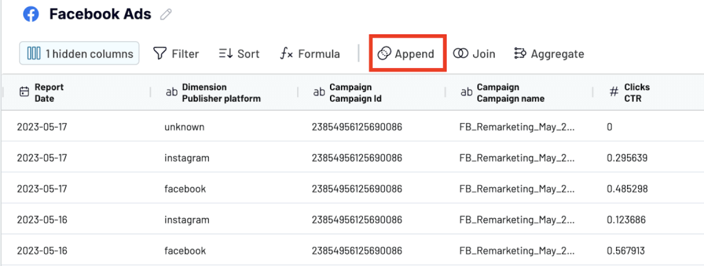
Append
It combines multiple datasets by stacking them on top of each other. All rows from one source are placed below the rows from another source, as long as they share similar column names. Columns with the same name line up automatically, and any extra columns stay in the table as separate fields.
In the preview below, we combined YouTube and Facebook performance data. Since the two sources don’t share the same column names, the Facebook-specific fields appear as separate columns in the final table.

For example, when you run PPC campaigns on Google Ads, Facebook Ads, and LinkedIn Ads, they have similar metrics (impressions, clicks, spend, conversions, etc). Instead of analyzing each one separately, you can append – blend your ads data into a single table. The final dataset shows all campaigns across all platforms in one place.

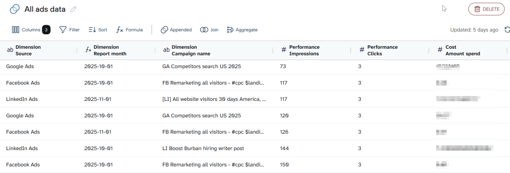
Append is especially useful when you’re integrating data from multiple sources that share similar metrics, such as impressions, clicks, or conversions.
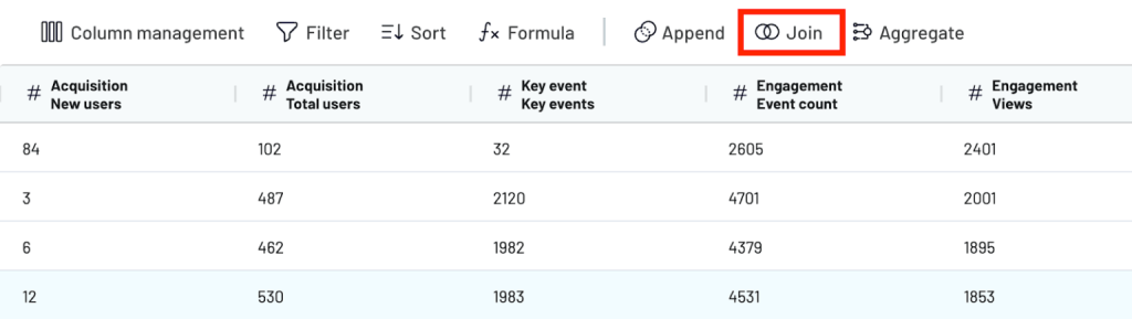
Join
It lets you merge datasets horizontally using a shared key. Instead of stacking rows, it enriches one dataset with fields from another. This is useful when your sources measure different things but refer to the same entity, like a landing page, date, campaign, or product.
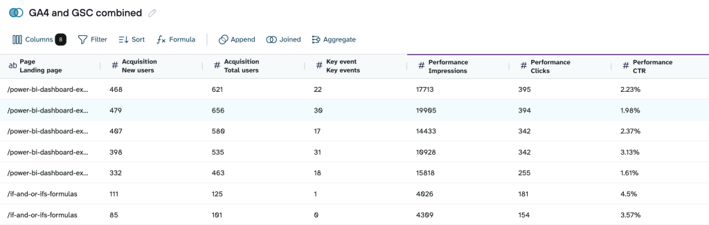
For example, Google Search Console and GA4 don’t report the same metrics, but they both track the same landing pages. By joining them on the Page field, you can see search visibility (GSC) and on-site engagement (GA4) in one table.

Now, let’s dig in to see how to use these features in a data flow.
Step 1: Connect sources
Sign up for Coupler.io for free and create a dataflow by selecting the sources of your data.
As per our example, for append, we select Google Ads, Facebook Ads, and LinkedIn Ads as sources.

For join, we chose Google Search Console (GSC) and Google Analytics (GA4)

Step 2: Transform data
Once your sources are connected, it’s time to shape the data so it works as a unified dataset. This is the part where real data integration from multiple sources happens.
In the Data Set step, choose how you want to combine your sources.
Append
Use append if your datasets have similar metrics and you want to stack them into one unified table.

This stacks the datasets from all connected sources into one table.
You’ll see a preview of the combined data. Columns with identical names will line up automatically. If some platforms use slightly different labels for the same metric, like Campaign vs. Campaign Name, rename them so everything matches correctly. This keeps the final table clean and consistent.

Join
Join is useful when your datasets track the same entity (like a landing page or date) and you want to merge their metrics side-by-side.

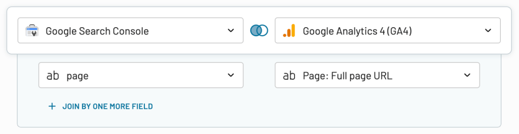
Choose your main dataset (left table). This is the one you want to keep fully. Choose your secondary dataset (right table). Only the matching rows from this table will be added.
Next, select your join key. For GSC and GA4, this is usually Page (URL). If needed, standardize the join field first (e.g., lowercase URLs, remove query parameters) so the match is clean.

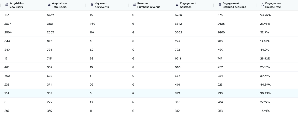
After the join runs, you’ll see a combined preview of a single landing page with:
- GSC metrics (Clicks, Impressions, Avg Position)
- GA4 metrics (Sessions, New Users, Total Users)

You can also hide unnecessary fields, reorder columns, or add basic calculations.
When everything looks aligned, move to the final step to send this transformed dataset to your destination.
Step 3: Load the transformed data to the destination app
Coupler.io supports destinations like BI tools, data warehouses, spreadsheet apps, and AI integrations. Select the app you want to use, connect your account, and pick the appended dataset as the output.

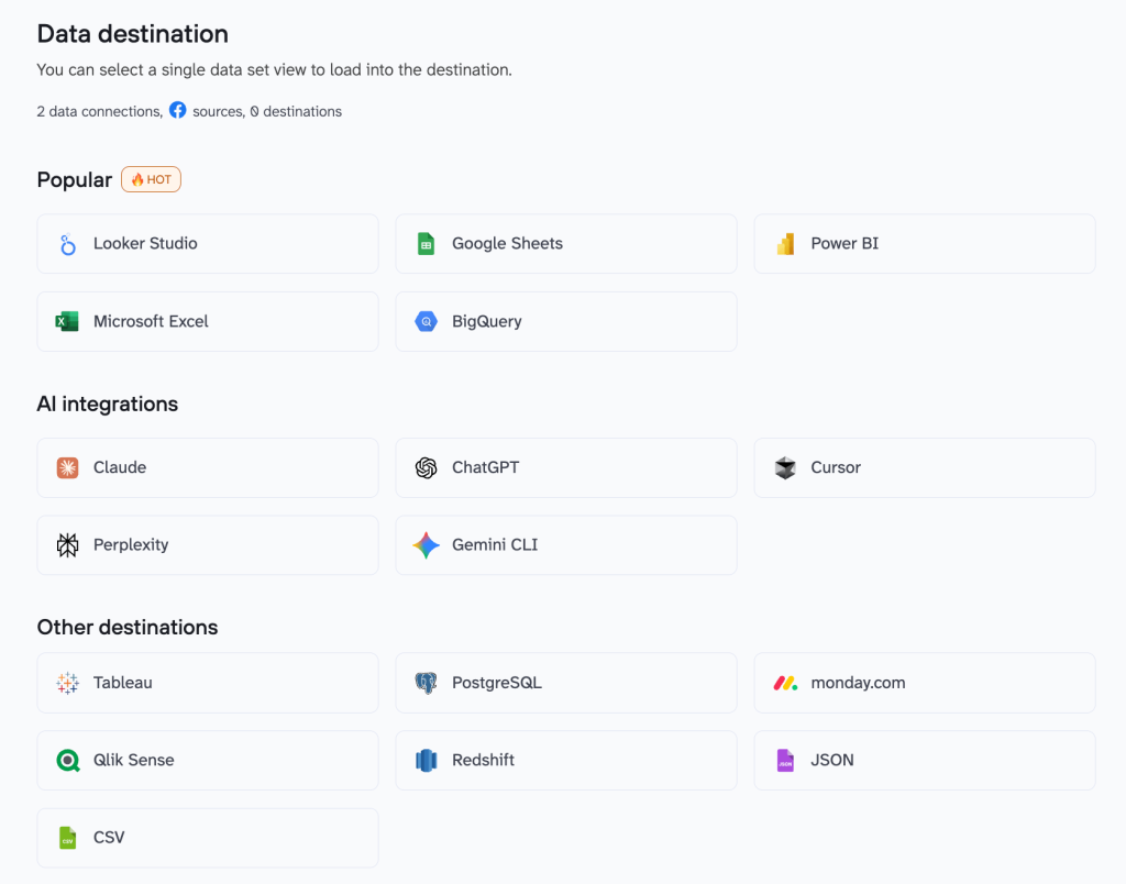
In the destination app, the data will appear as a single source, which keeps the reports and dashboards fast even though the data originally came from multiple platforms.
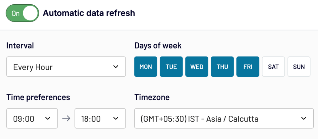
Once the destination is set, go to Flow settings and turn on automatic refresh. Choose how often you want Coupler.io to pull new data (every 15 minutes, hourly, or daily). This keeps your dataset updated without manual work.

Your dataset is now ready to use.
Integrate data from 400+ data sources with Coupler.io
Get started for freeExamples of preset multi-source data integration templates
Multi-source reporting usually starts with hours of prep: connecting tools, cleaning fields, fixing naming issues, and aligning structures. Coupler.io’s preset templates replaces all of that. They are built specifically for integrating data from multiple sources without manual prep. You get ready-to-use combined datasets and dashboards with the right fields and transformations already applied so that you can focus on insights.
Data set templates
If you build reports regularly, you know the real time sink is the setup you’re forced to repeat for different reports. You pull data from three or four tools, delete half the columns, fix naming issues, convert dates, aggregate daily rows, and then blend everything just to get a table you can actually use.
Coupler.io’s data set templates cut out that entire prep cycle. They give you a ready-to-use dataset with the right fields, structure, and transformations already applied, so you can skip straight to insights.
Below are a few examples of data set templates that help in real reporting scenarios.
1. PPC campaign performance
This template brings all your PPC campaign metrics into one table so you can compare performance across Google Ads, Meta Ads, TikTok Ads, Bing Ads, and LinkedIn Ads without building the setup manually.

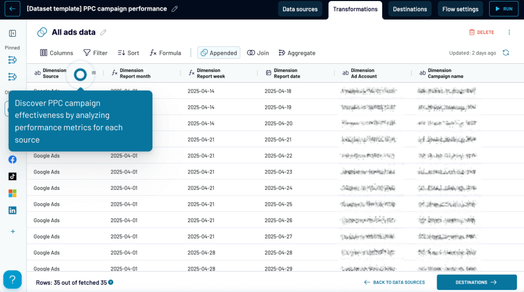
Data sources
Google Ads, Facebook Ads, TikTok Ads, Bing Ads, LinkedIn Ads. You can connect any combination depending on what you run.
Data integration method
Append: All campaign-level rows from each platform are stacked into one dataset. Shared metrics like impressions, clicks, cost, CTR, and CPC line up automatically.
Use cases
- Compare campaign performance across channels in one view
- Track spend, CPC, CTR, and click trends daily, weekly, or monthly
- Identify high- and low-performing campaigns quickly
- Review performance by ad account or campaign type
- Build cross-channel PPC dashboards in Looker Studio, Sheets, or BI tools without manually blending data
2. Multi-channel creative performance
This template helps you understand which creatives actually drive results across platforms. Instead of bouncing between ad managers to compare images, videos, and variations, you get one table that shows how every creative performs.

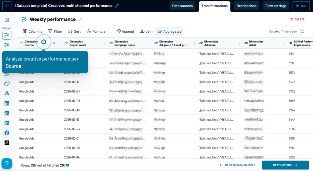
Data sources
Google Ads (assets), Facebook Ads (creatives), TikTok Ads, LinkedIn Ads, Bing Ads
Data integration method
Append: Each creative (image, video, asset group, or ad) is pulled as its own row so you can compare formats and message angles across channels.
Use cases
- See which platforms your creatives perform best on (source-level insights)
- Filter by campaign, ad group, asset group, or individual ads to understand context
- Track short-term shifts in performance using Weekly performance view
- Review broader creative trends using Monthly performance view
- Compare CTR, CPC, impressions, clicks, and video views across different creative versions
- Identify creative fatigue early before it affects spend efficiency
This template is ideal when you’re testing multiple creative formats or running the same message across several channels and want a fast way to see what’s resonating.
3. Multi-channel ad group performance
Ad groups often behave differently across platforms, even when the targeting or message is similar. This dataset brings all those groups into one table so you can compare performance side-by-side instead of piecing it together manually.

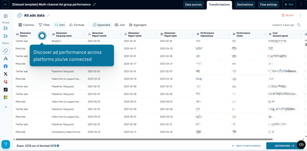
Data sources
Google Ads (ad groups), Meta Ads (ad sets), TikTok Ads, Bing Ads, LinkedIn Ads, Quora Ads, Twitter Ads
Data integration method
Append: Each ad group or ad set is added as its own row, making it easy to line up shared metrics like impressions, clicks, cost, CTR, and CPC.
Use cases
- Compare how the same theme or targeting performs across platforms
- Sort by ad group to see which groups consistently lead or lag
- Switch to Weekly performance for short-term optimization
- Check Monthly performance to understand long-term shifts
- Spot where budget is wasted or where scaling makes sense
4. Multi-channel age & gender performance
Audience behavior looks different on every platform, and this dataset shows you those differences clearly. Instead of checking demographic tabs in Google Ads, Meta, TikTok, or Bing one by one, you get a single table that breaks performance down by age group and gender across all channels.

Data sources
Google Ads, Meta Ads, TikTok Ads, Bing Ads, LinkedIn Ads, Twitter Ads
Data integration method
Append: Platform-level demographic breakdowns are stacked together so you can compare them side by side.
Use cases
- See which age groups show the strongest response on each platform
- Compare how gender segments perform across channels (e.g., Meta vs. TikTok)
- Adjust targeting or budgets based on real demographic performance
- Use the Weekly view to track short-term shifts in audience behavior
- Switch to the Monthly view to identify broader demographic trends
- Understand which audience segments drive clicks or impressions at the lowest cost
This dataset is useful when you want to go beyond general campaign metrics and understand who is engaging with your ads and where.
5. Multi-channel GEO performance
Geography can influence campaign results as much as targeting or creatives. This dataset brings together geo-level data from different platforms so you can see which countries deliver strong engagement and which ones drain budget.

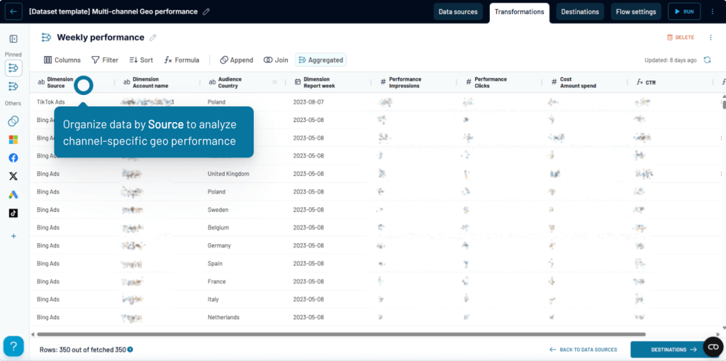
Data sources
Google Ads, Meta Ads, TikTok Ads, Bing Ads, LinkedIn Ads
Data integration method
Append: Country-level performance metrics from each platform are combined into one table, making cross-channel comparison straightforward.
Use cases
- Compare GEO performance by source to understand which channels dominate in specific regions
- Review performance by country to identify high-value markets and low-performing locations
- Track short-term changes using the Weekly performance view
- Get a broader understanding of regional trends with the Monthly performance view
- Adjust geo-targeting, bids, and budgets based on real cost and engagement data
This dataset is helpful when you need a clear and consolidated view of how your campaigns perform across different countries and want to fine-tune your regional strategy.
6. Multi-channel device performance
Different devices can completely change how users interact with your ads. This dataset puts all device-level metrics from multiple platforms into one place so you can see whether mobile, desktop, or tablet users drive better engagement and lower costs.
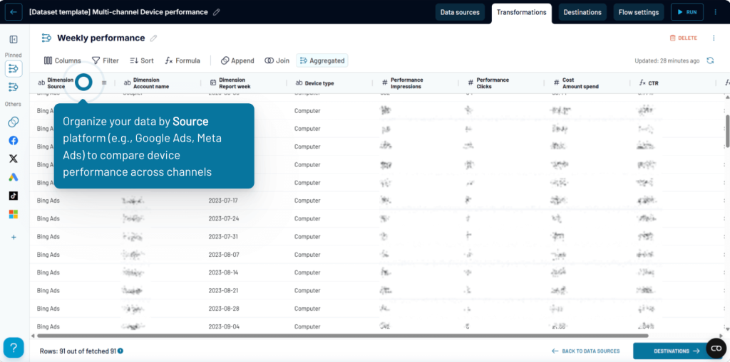
Data sources
Google Ads, Meta Ads, TikTok Ads, Bing Ads, LinkedIn Ads
Data integration method
Append: Device-level rows (mobile, desktop, tablet, etc.) from each platform are combined into a single table.
Use cases
- Compare performance by device type (e.g., mobile vs. desktop) across all your channels
- Check which platforms lean more heavily toward mobile or desktop traffic
- Use the Weekly performance view to spot sudden changes in device behavior
- Evaluate how device differences impact CTR, CPC, impressions, and clicks
- Improve landing page and user experience decisions based on real device-level data
This dataset is useful when you want to refine device targeting, fix device-specific drop-offs, or tailor your ads based on how users behave on each device.
7. Landing page performance from search to conversion
Most teams track search visibility and on-site behavior separately, which makes it hard to see the full journey. This dataset brings GA4 and Search Console together so you can understand how each landing page performs, from impressions → clicks → sessions → engagement → conversions.

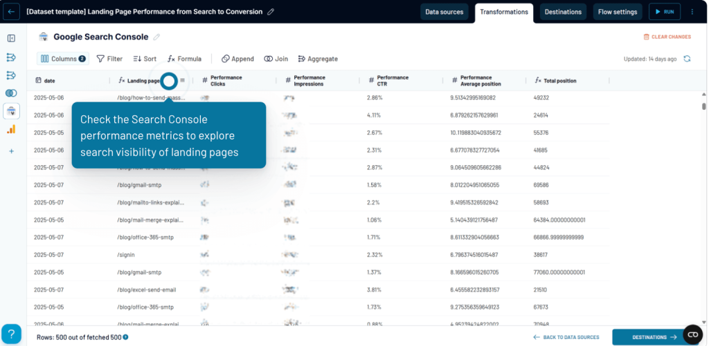
Data sources
Google Search Console, Google Analytics 4 (GA4)
Data integration method
Join: Search visibility data from GSC and engagement/conversion data from GA4 are joined by landing page URL for a complete view.
Use cases
- See how search visibility (impressions, clicks, CTR, average position) translates into actual user activity
- Review GA4 metrics like new users, engaged sessions, key events, or purchase revenue for each landing page
- Switch to the combined GSC + GA4 view to track the full funnel in one table
- Use Weekly or Monthly views to identify seasonal patterns or shifts in landing page performance
- Spot pages that get strong search traffic but fail to convert and vice versa
This dataset is ideal when you want a single place to analyze both top-of-funnel visibility and bottom-of-funnel behavior for every landing page.
Explore over 80 data set templates for instant analysis
Try Coupler.io for freeDashboard templates
If you prefer visual insights over raw tables, Coupler.io also offers dashboard templates that turn multi-source data into clear and interactive views. These dashboards are built for specific workflows. Just connect your data sources, and the dashboards populate automatically with unified views of your channels, funnels, users, and revenue.
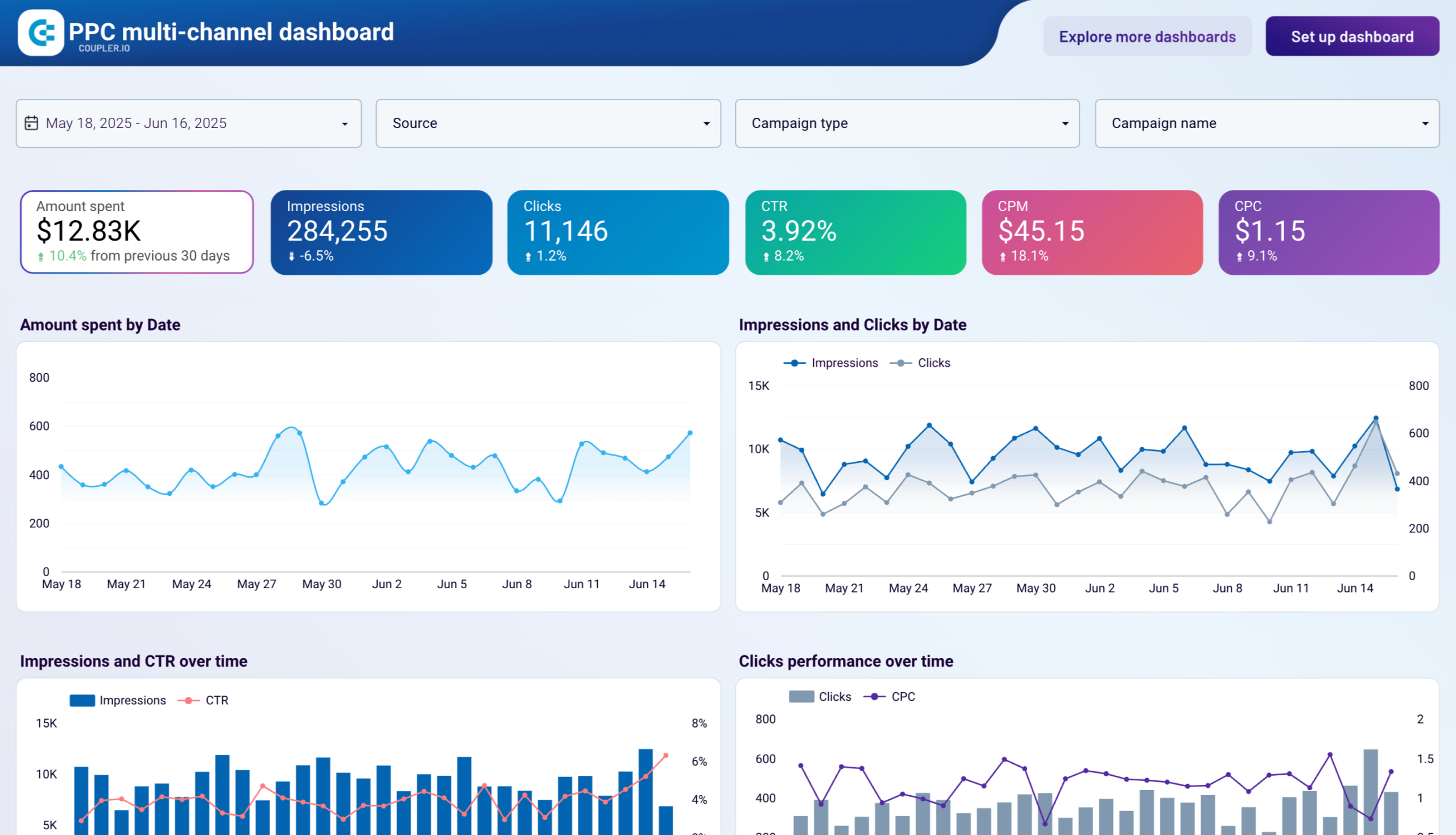
1. PPC multi-channel dashboard
The PPC multi-channel dashboard gives you a complete view of all your PPC performance across Google, Facebook, LinkedIn, TikTok, Bing, Twitter, Quora, and more. You can compare channels side by side without jumping between ad managers. It highlights spend, impression, CTR, and campaign-level trends to quickly spot which platforms are scaling efficiently, which ones need attention, and how performance shifts week over week.


You can drill into spend by source, campaign type, device, and date, inspect CPC and CTR patterns, and review a color-coded summary table that makes it easy to identify high-performing and underperforming campaigns across channels.
To use this template, connect your ad platform accounts in Coupler.io, choose the reports you want to sync, and the dashboard will update automatically with your latest multi-channel PPC data. It’s available in Coupler.io, Looker Studio, Power BI, Tableau, and Google Sheets so you can plug it directly into your preferred reporting tool.

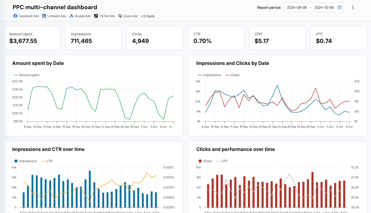
PPC multi-channel dashboard
Consolidate data from multiple advertising platforms including Google, Facebook, LinkedIn, TikTok, and more to track campaign performance, analyze spend efficiency, and optimize your PPC budget allocation across channels.


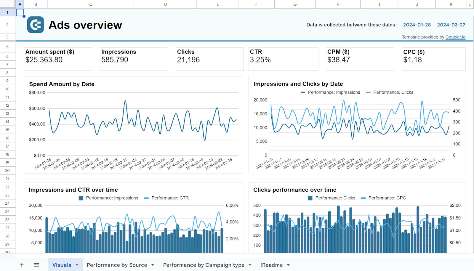
PPC multi-channel dashboard in Google Sheets
Use a PPC dashboard designed for Google Sheets to track the performance of your campaigns across multiple advertising platforms.

PPC multi-channel dashboard in Looker Studio
Get a comprehensive PPC reporting tool to track the performance of your campaigns launched at multiple advertising platforms.


PPC multi-channel dashboard in Power BI
Use a Power BI PPC dashboard for tracking and analyzing your advertising campaigns across multiple platforms.

PPC multi-channel dashboard in Tableau
Track and analyze the performance of your advertising campaigns across various platforms using a one-stop PPC dashboard in Tableau
2. Google Ads and Meta Ads campaign performance dashboard
The Google Ads vs. Meta Ads campaign performance dashboard gives you a side-by-side view of how both channels are spending your budget, driving impressions, and converting clicks.
Google Ads vs Meta Ads dashboard

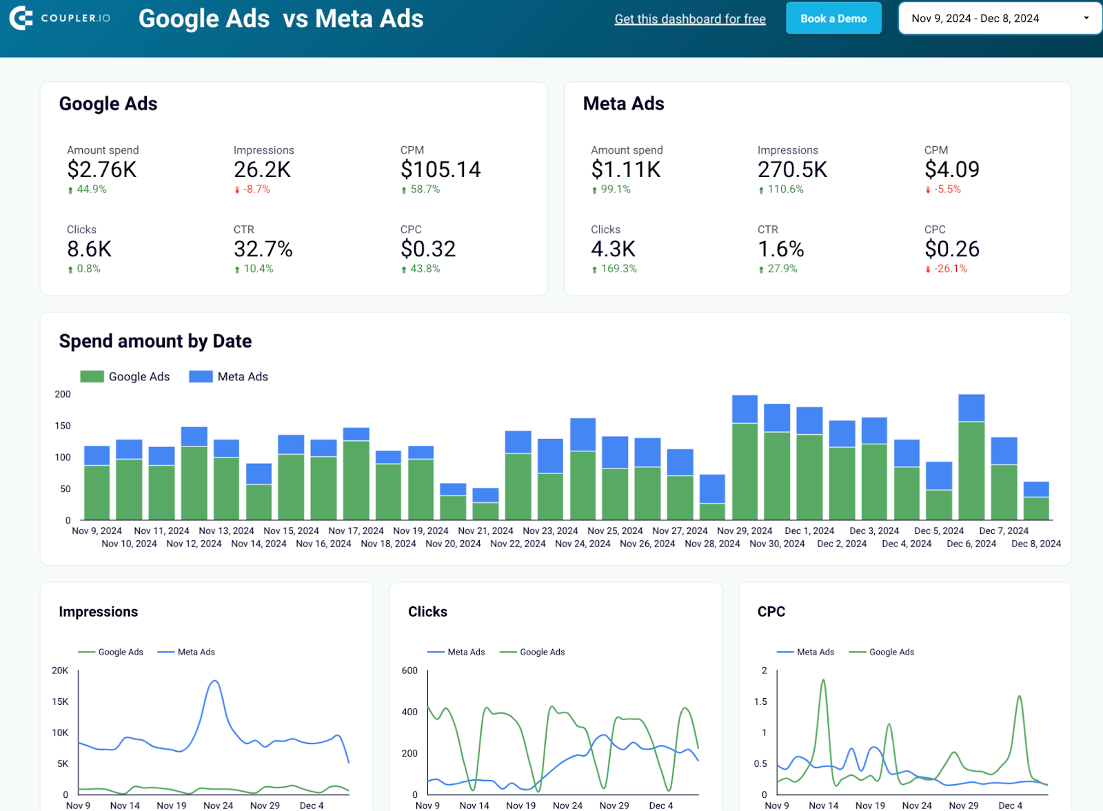
Google Ads vs Meta Ads dashboard
Preview dashboardYou can quickly spot which platform is more efficient, where costs are rising, and how performance shifts over time, both daily and monthly. The breakdown by campaign lets you compare strengths and weaknesses at a granular level, so you know exactly which campaigns deserve more budget and which ones need fixing.
To use this template, connect your Google Ads and Meta Ads accounts, pick the reports you want to pull, and the dashboard will populate automatically with your data.
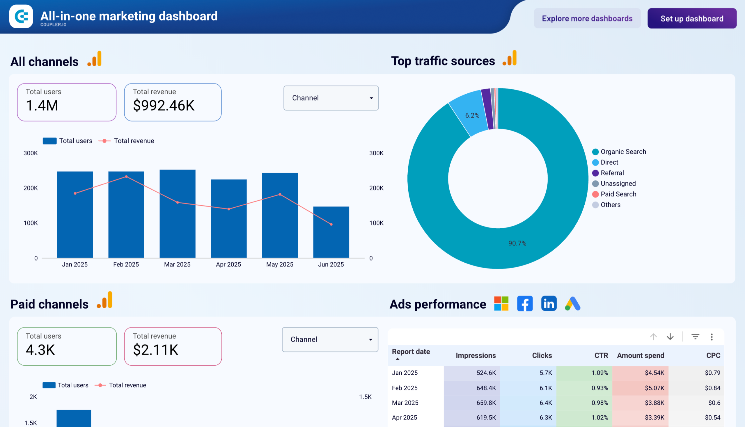
3. All-in-one marketing dashboard
This dashboard brings all your marketing data into one place so you can track users, revenue, and channel performance without switching tools.

It breaks down traffic and revenue across paid, organic, social, video, and email channels, highlights ad efficiency by platform, and surfaces trends through heatmaps, charts, and AI-generated insights. You can quickly compare which channels drive growth, spot inefficiencies, and understand how each touchpoint contributes to your funnel.
To get the all-in-one marketing dashboard for your data, connect your data sources, adjust the date range, review top-level metrics, and dive into each channel section to identify opportunities, refine targeting, and reallocate budget based on performance. Along with Coupler.io interface, this template is also available in Looker Studio and Power BI.
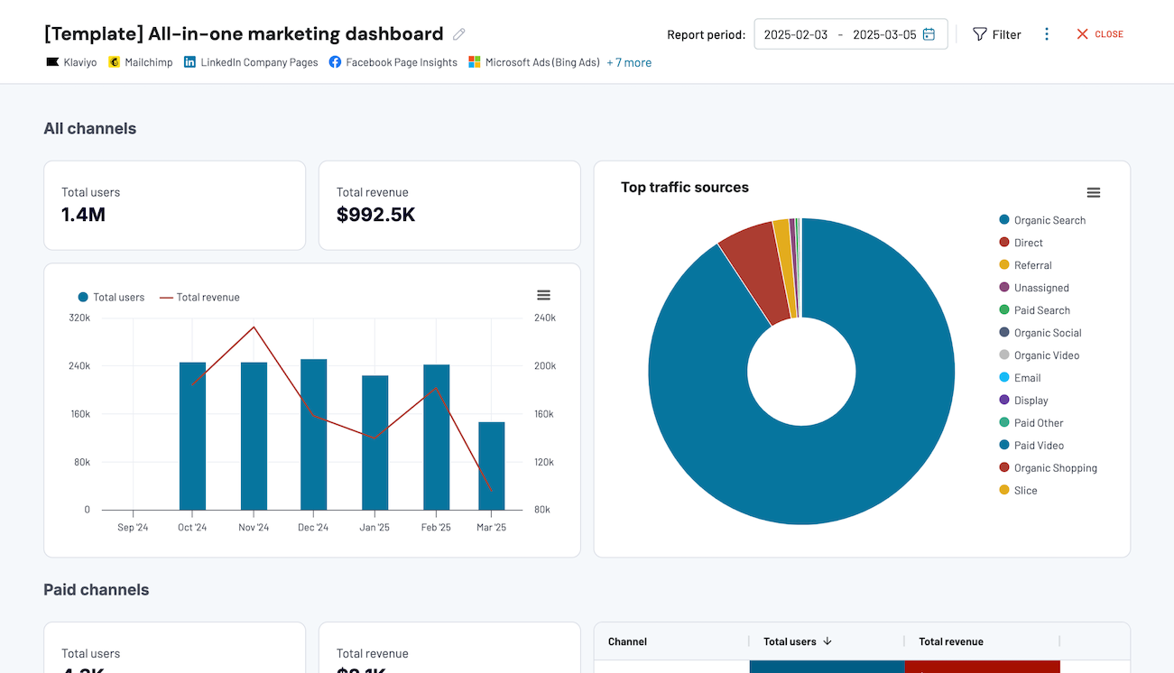
All-in-one marketing dashboard
Track performance across multiple marketing channels in one interface, comparing data from Google Analytics, Search Console, advertising platforms, social media, email, and YouTube to optimize your marketing strategy and maximize ROI.
All-in-one marketing dashboard in Looker Studio
Monitor all your marketing channels with an all-in-one dashboard providing performance overviews of web analytics, ad campaigns, SEO, social media, and emails.

All-in-one marketing dashboard in Power BI
Centralize all your marketing channel performance data, including paid ads, organic search, social media, email campaigns, and website analytics for comprehensive strategy oversight.
4. Google Analytics PPC dashboard
A GA-based PPC report is most useful when it helps you see beyond the numbers like why a campaign is working. This dashboard does exactly that by bringing GA4 engagement, revenue, and ad-spend metrics together in one view.
Google Analytics 4 PPC dashboard

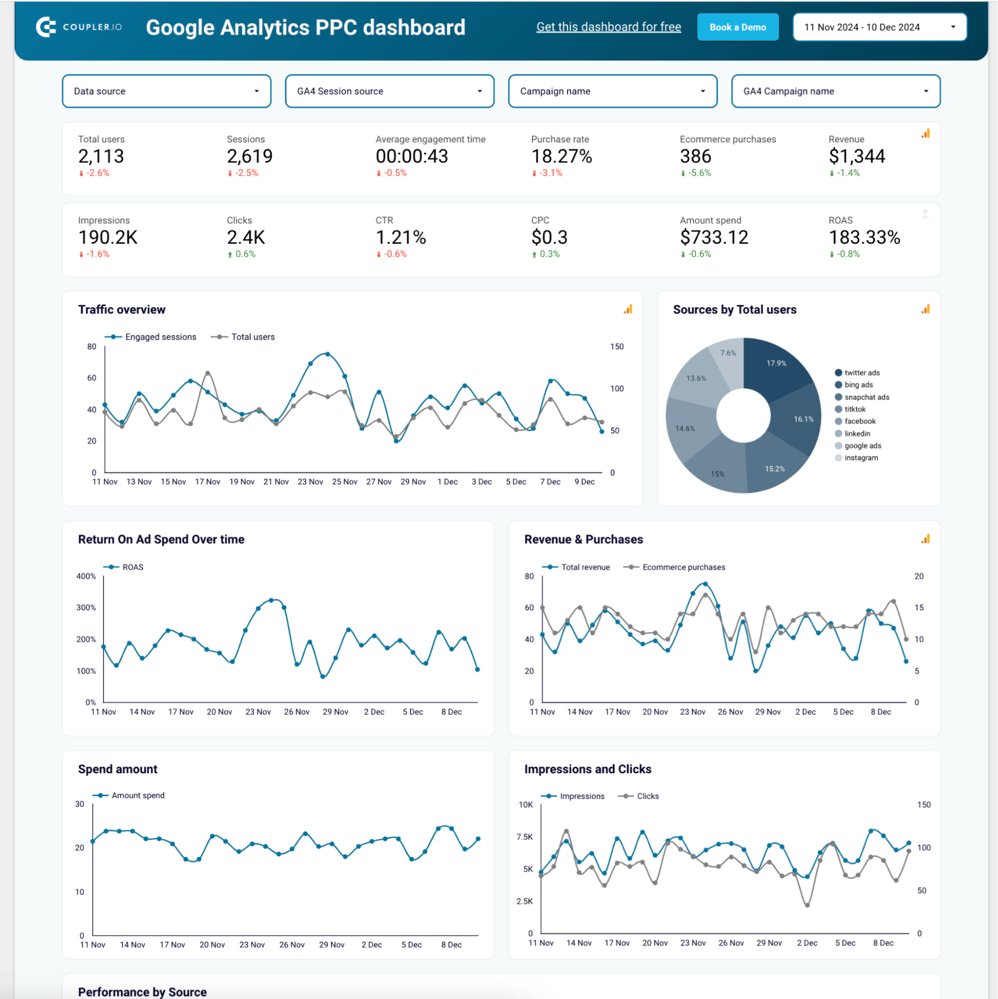
Google Analytics 4 PPC dashboard
Preview dashboardInstead of jumping between GA4 and individual ad platforms, you can compare traffic quality, track ROAS trends, and spot which sources actually drive purchases. Filters for data source, session source, and campaign name make it easy to zoom in on specific channels or campaigns. It’s available in Looker Studio and Power BI, so teams can use it in whichever reporting workflow they prefer.
To use this template, connect your GA4 and ad platform data sources, adjust date ranges and filters to focus on active campaigns, and review ROAS, spend, and engagement together to identify optimization opportunities.

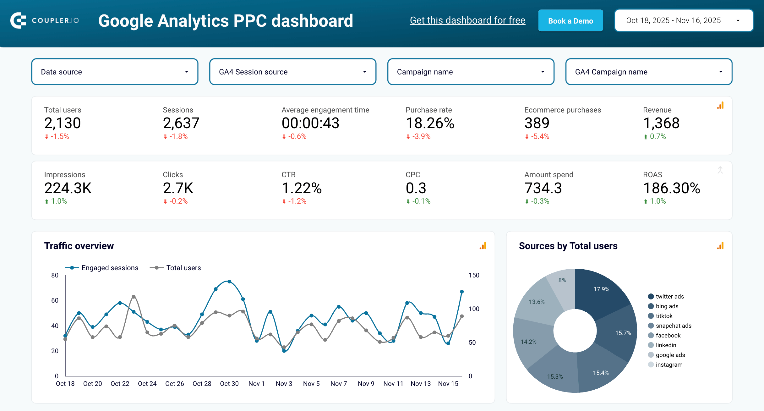
Google Analytcs PPC dashboard in Looker Studio
Get an overview of the traffic performance of your advertising campaigns launched across different PPC platforms.
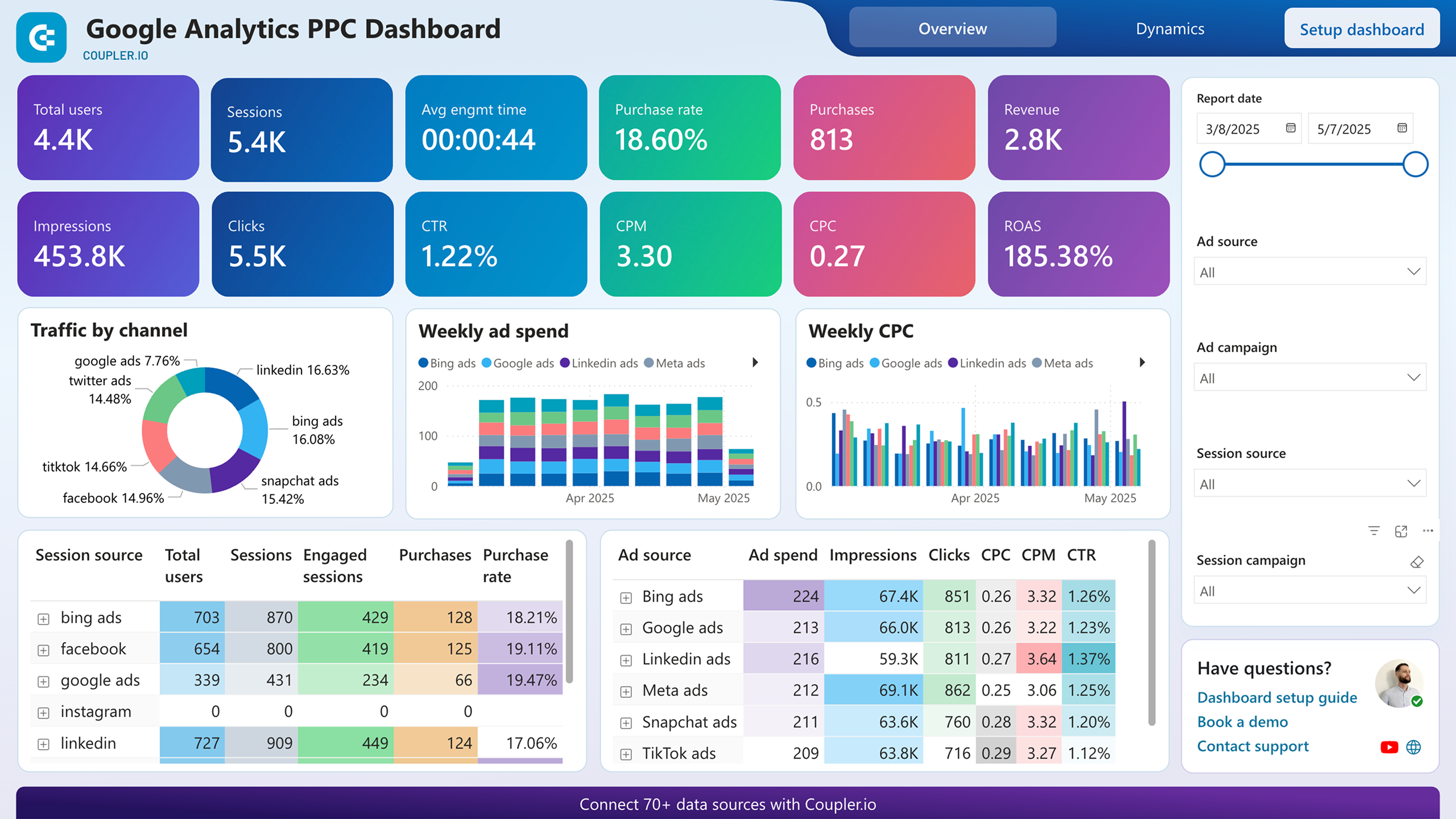
Google Analytcs PPC dashboard in Power BI
Analyze how your paid advertising campaigns drive website traffic and conversions by combining PPC performance data from multiple platforms with user behavior insights from GA4.
5. Shopify marketing funnel analytics dashboard
Instead of piecing together numbers from multiple tools, this Looker Studio dashboard gives you a clear, end-to-end view of how your Shopify marketing funnel actually performs.
Shopify marketing funnel dashboard

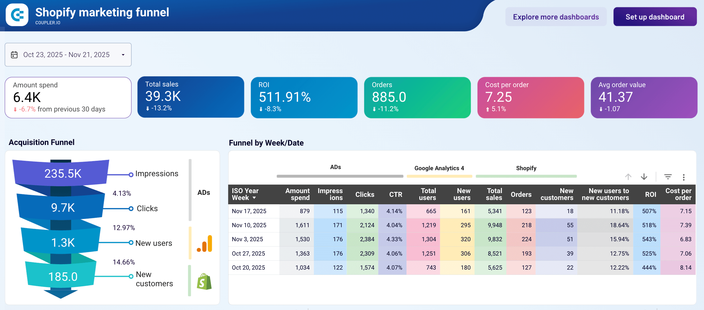
Shopify marketing funnel dashboard
Preview dashboardYou can track how ad impressions turn into clicks, how those clicks convert into new users, and how many of them become paying customers, all in one place. The weekly breakdown helps you compare performance patterns, while trend charts reveal shifts in spend, CPM, CPC, sales, and conversion rates. This makes it easier to understand which channels deserve more budget and which stages of the funnel need improvement.
To get this Shopify marketing funnel analytics dashboard with your funnel metrics, connect your Shopify, GA4, and ad accounts, follow the setup steps to load your data, and the dashboard will populate automatically.
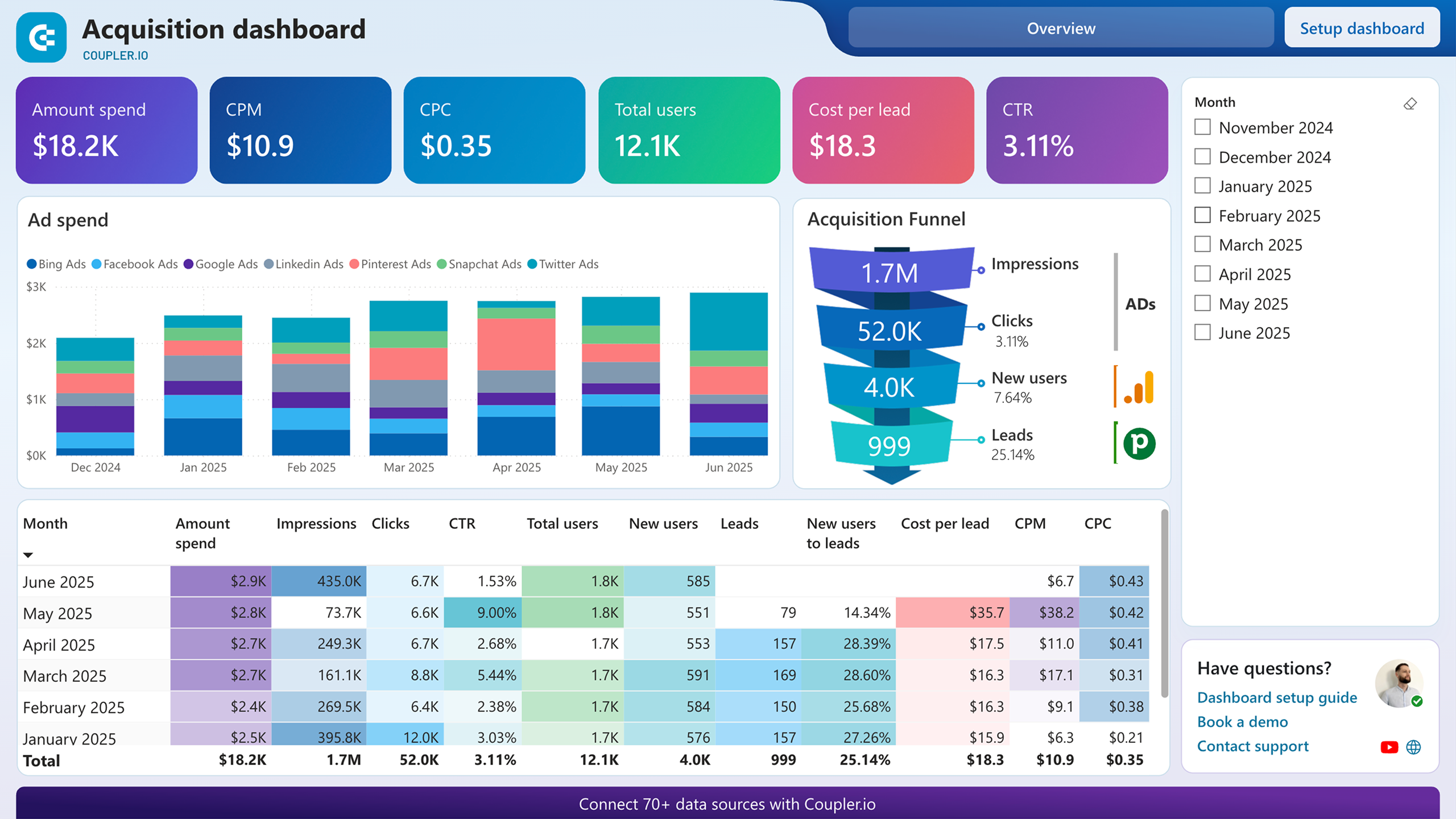
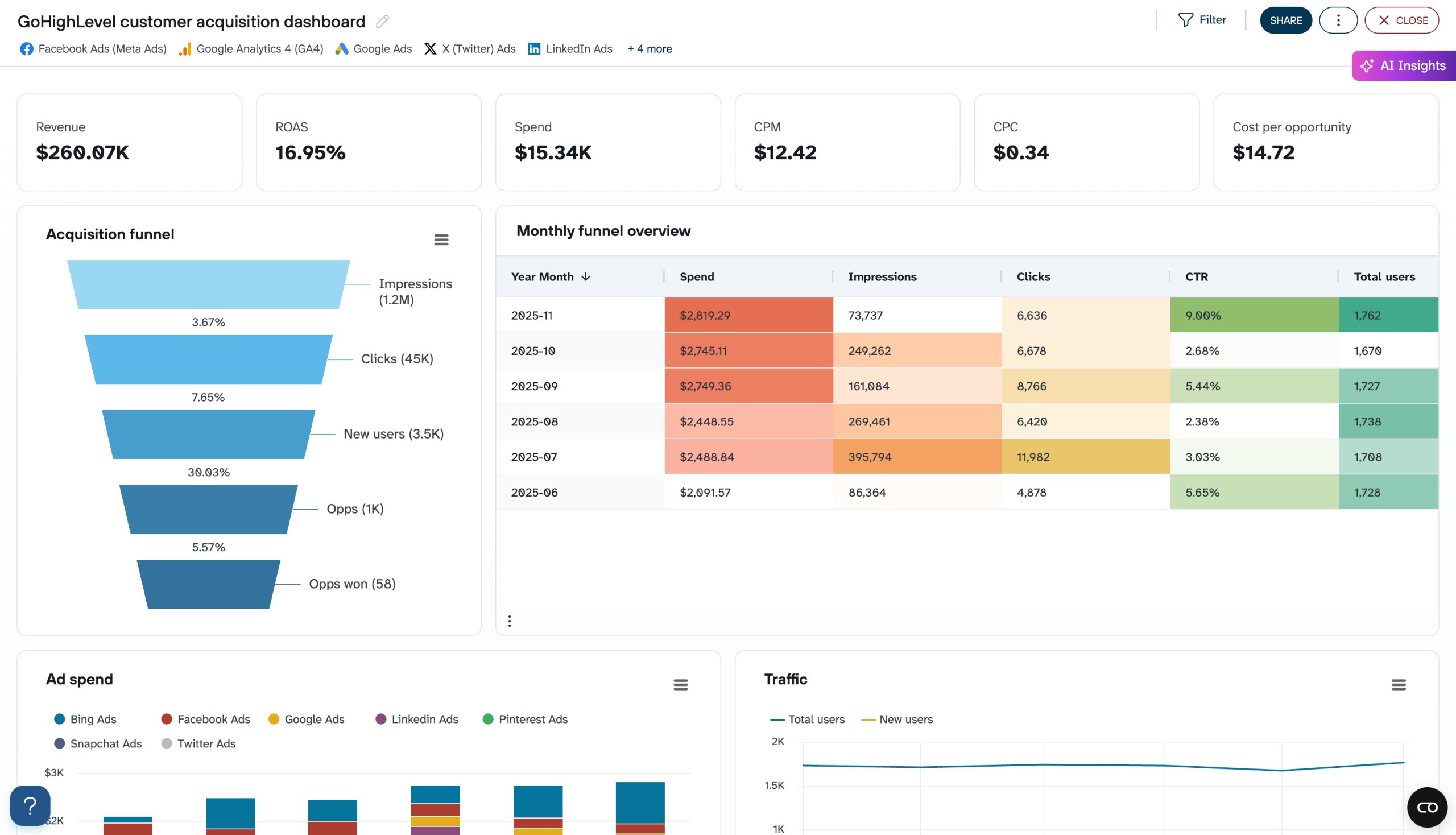
6. Customer acquisition dashboard for Pipedrive/HubSpot/GoHighLevel
The customer acquisition dashboard is designed to give sales and marketing teams a clear view of how paid acquisition turns into leads. It brings together ad performance, GA4 traffic insights, and lead data from your CRM app, so you can track the full journey, from impressions to clicks, new users, and finally qualified leads.
Customer acquisition dashboard for Pipedrive
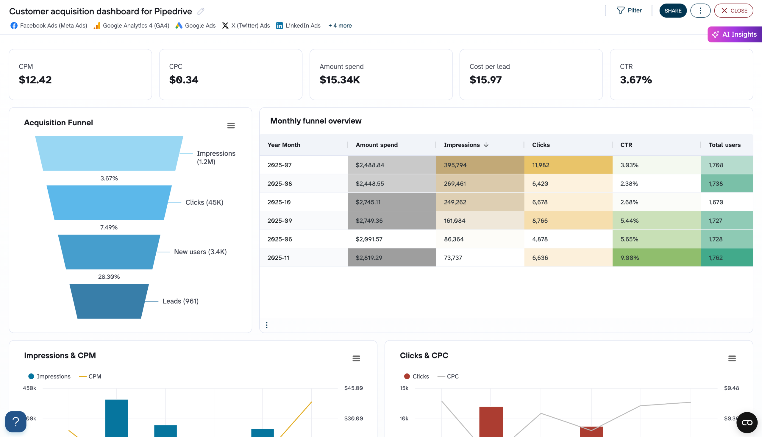
Customer acquisition dashboard for Pipedrive
Preview dashboardYou can quickly see which months delivered the strongest results, how much you spent, and what your cost per lead looked like. The funnel view highlights where drop-offs occur, while trend charts for impressions, CPM, clicks, CPC, total users, leads, and conversion rates make it easy to spot performance shifts.
The dashboard is available for three CRM platforms: Pipedrive, HubSpot, and GoHighLevel. Moreover, some versions have templates for different BI tools. Check them out here. Choose the one you need and follow the instructions to connect your ad platforms, GA4, and CRM, apply filters (like lead creation month or campaign).
Customer acquisition dashboard for Pipedrive in Power BI
Visualize your complete lead generation funnel from initial ad impressions through CRM conversions, enabling data-driven decisions to improve acquisition costs and conversion rates.

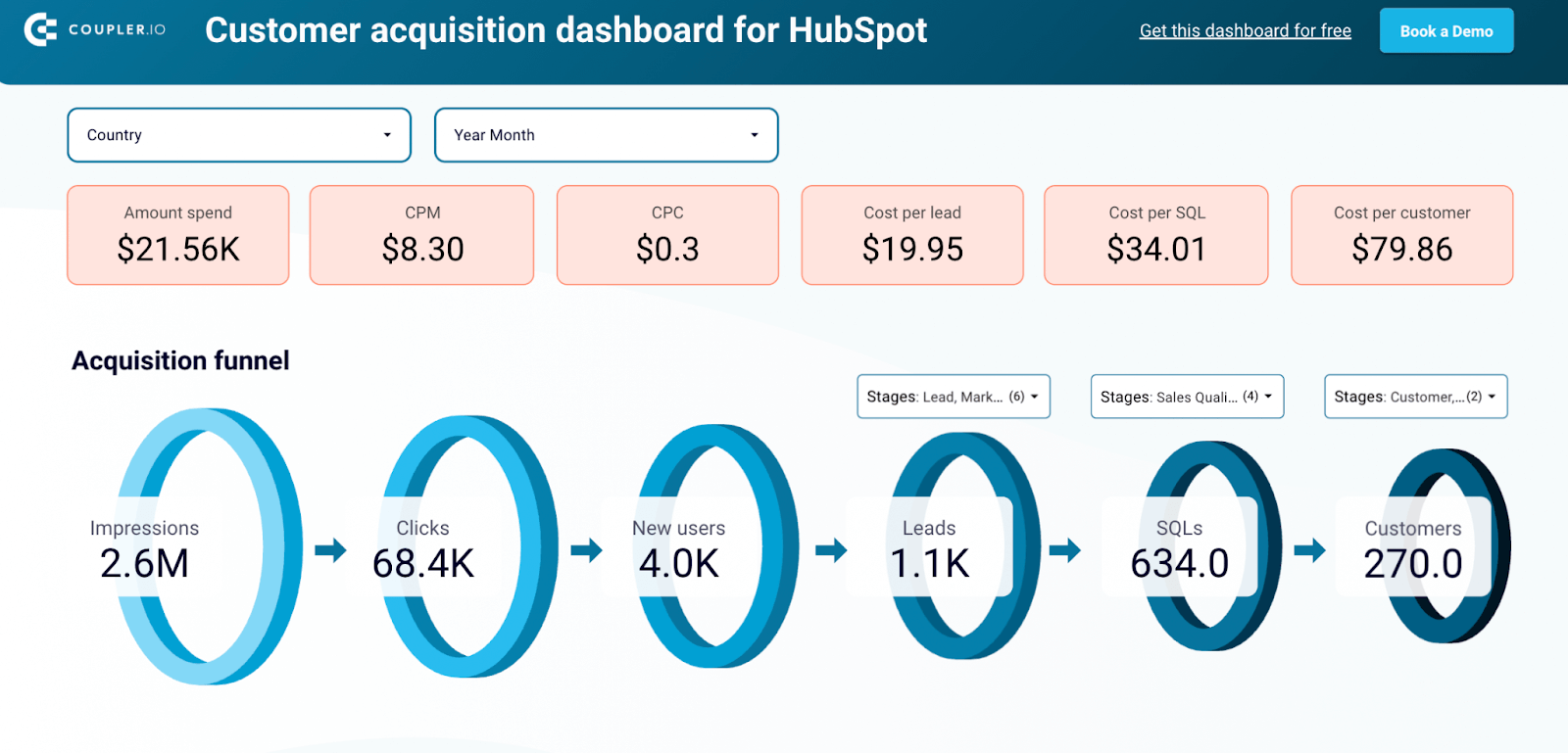
Customer acquisition dashboard for HubSpot in Looker Studio
Monitor your acquisition funnel and analyze its effectiveness using the insights from HubSpot CRM, advertising platforms, and Google Analytics 4.
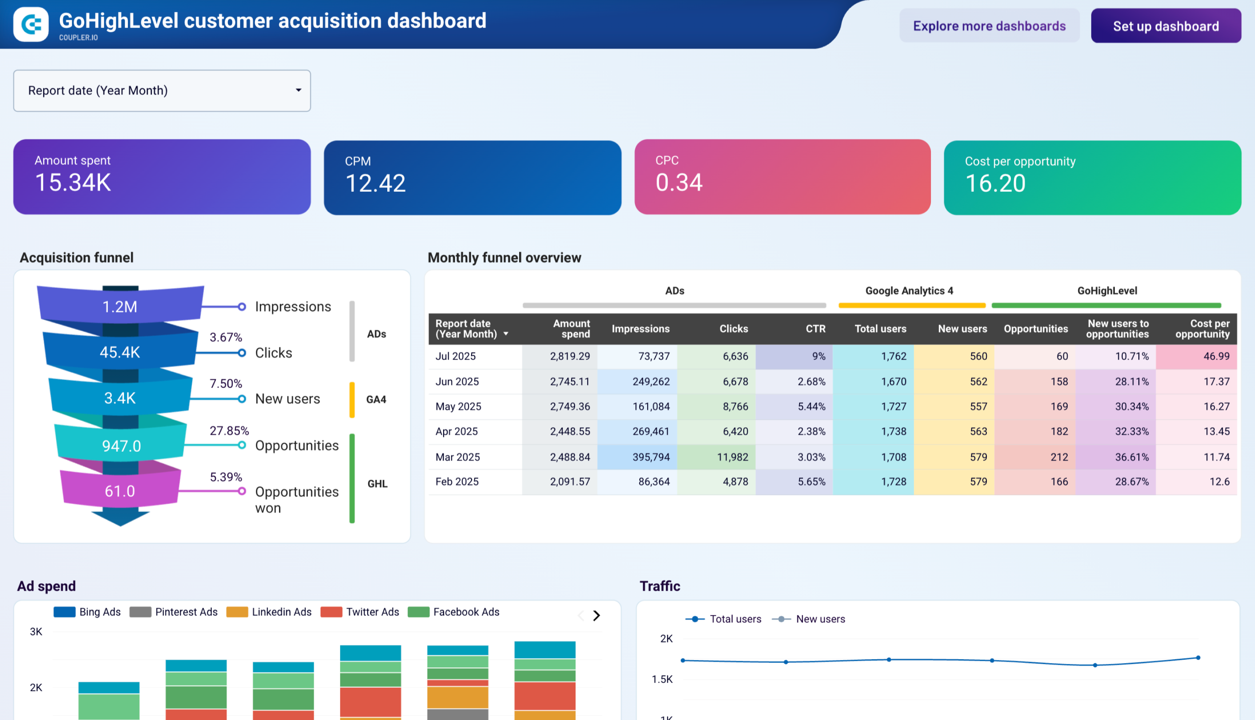
Customer acquisition dashboard for GoHighLevel
Visualize your complete lead generation funnel from advertising platforms to GoHighLevel conversions. Track ad spend across multiple channels, monitor funnel progression from impressions to opportunities, and analyze cost efficiency metrics to optimize acquisition costs and improve conversion rates throughout your marketing pipeline.
7. Landing page performance dashboard
Spotting which pages actually move the needle is easier when everything lives in one place. This landing page performance dashboard brings together impressions, clicks, engagement, conversions, and revenue.
Landing page performance dashboard
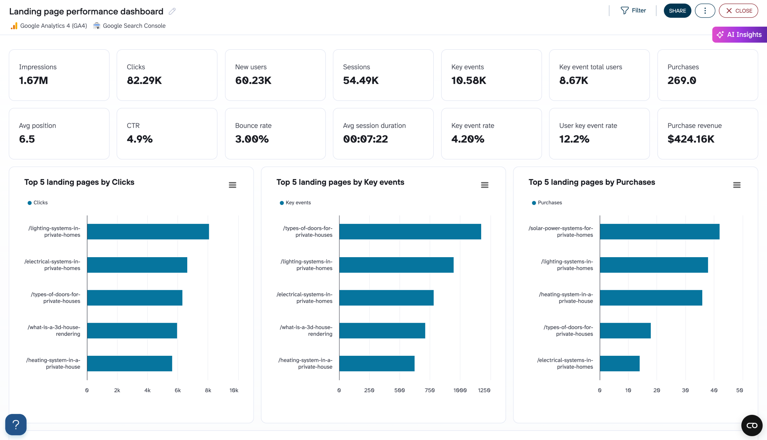
Landing page performance dashboard
Preview dashboardThe blend of Google Search Console and GA4 metrics helps you compare visibility with on-site behavior, while tables and top-page breakdowns highlight high-performing and underperforming content. The dashboard is available in Coupler.io, as well as a template in Google Sheets and Looker Studio
To get started with this template, connect your Search Console and GA4 accounts, set your date range, and apply the landing-page filters. Then review the charts to spot top and underperforming pages, and export or share insights to guide your next optimizations.
Landing page performance dashboard
Evaluate the effectiveness of your landing pages with combined data from Google Search Console and GA4. Track traffic sources, engagement metrics, conversion rates, and bounce rates to identify high-performing pages and optimize underperforming ones for better user experience and higher conversions.
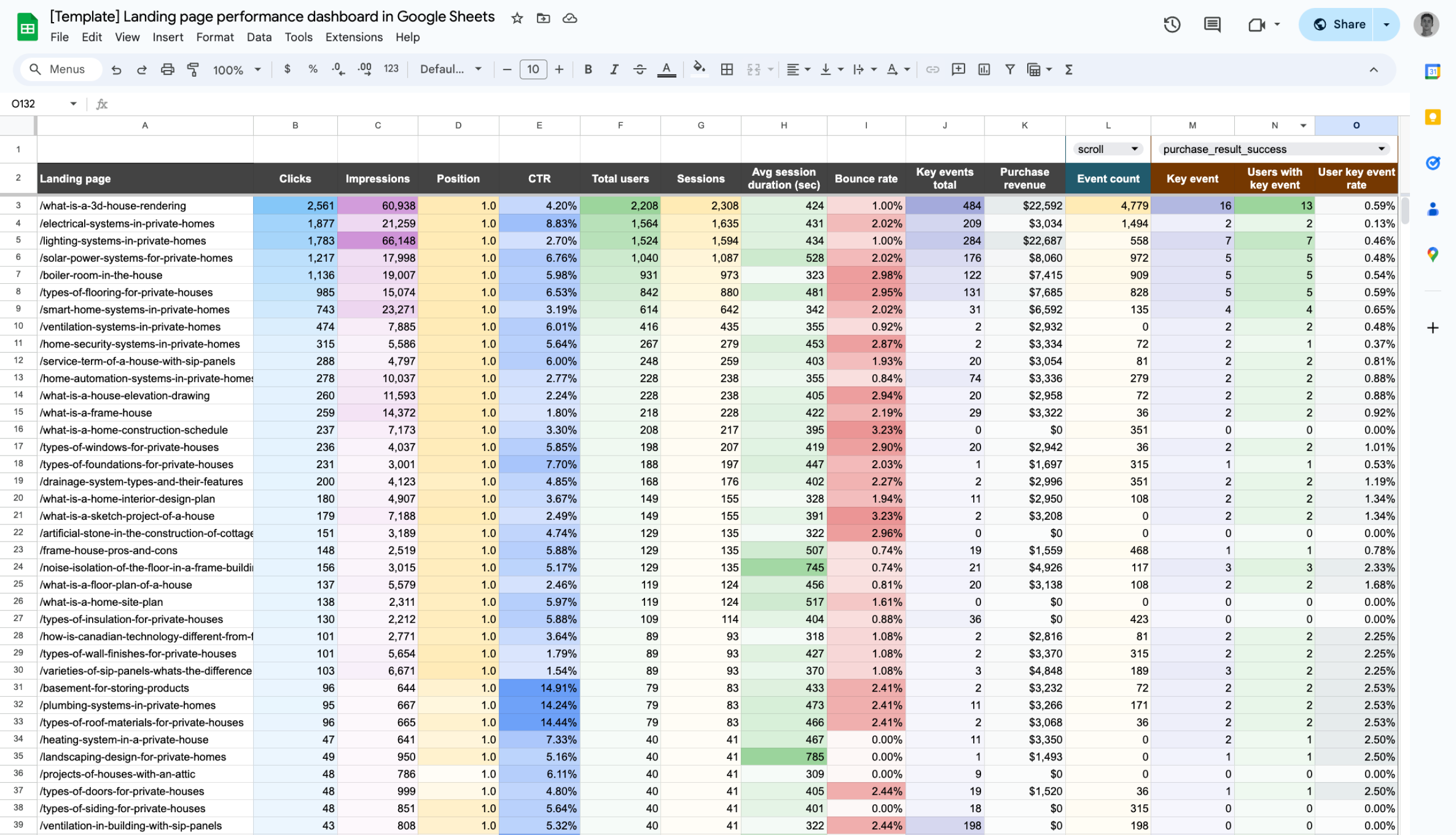
Landing page performance dashboard in Google Sheets
Analyze the effectiveness of your landing pages, from traffic and engagement to conversions, using data from GA4 and Search Console.

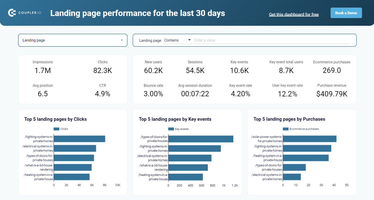
Landing page performance dashboard in Looker Studio
Evaluate the effectiveness of your landing pages such as traffic, clicks, bounce rate, and other metrics collected from GSC and GA4 in one dashboard.
Why is it hard to integrate data from multiple sources
Even though integrating data from multiple sources looks simple at the surface level, the reality hits different. Below are the most common challenges teams face when performing multi-source data integration in real workflows.
Every platform speaks a different data language
When you pull data from multiple tools, nothing matches by default. Ad platforms label campaigns differently. GA4 measures sessions while others measure clicks. UTMs vary by channel, and URLs don’t even share the same structure (GSC uses full URLs, GA4 uses page paths). Without standardization, blending these datasets creates misaligned columns, mismatched metrics, and unreliable reporting.
Solution: Coupler.io standardizes these inconsistencies before the data ever reaches your final table. You can rename fields, normalize URLs, clean UTMs, and map columns across sources using built-in transformations.
Different reporting levels make clean joins difficult
Tools provide data at different levels of detail. For example, GSC reports at page × day, GA4 at session/event level, and ad platforms at campaign × day. If you try joining raw tables, you get duplicates, missing values, or inflated metrics because the granularity doesn’t match.
Solution: Aggregate data to a consistent reporting level (weekly campaigns, monthly pages, device-level, geo-level, etc.) before joining with Coupler.io. You can also normalize join keys by cleaning URLs, extracting paths, or aligning naming conventions. This ensures the joined dataset is clean and analysis-ready.
Conflicting time zones and attribution windows break comparisons
Each platform runs on its own clock. Ad accounts follow their account time zone, GA4 uses property time, and warehouses default to UTC. Attribution windows also vary widely. When you compare them raw, metrics never line up, leading to confusion, mismatched totals, and incorrect conclusions.
Solution: Coupler.io allows you to convert timestamps into a single timezone, apply a consistent calendar format, and define your own attribution window inside the dataflow. The result is a unified dataset where dates align correctly and metrics follow one common definition
Technical limitations create missing or inconsistent data
APIs often throttle requests, GA4 samples data, vendors change schemas without notice, and partial pulls lead to duplicates or gaps. If you’re manually integrating data or using fragile pipelines, these issues accumulate fast.
Solution: Coupler.io handles the engineering layer for you:
- Auto-deduplication with primary keys
- Incremental refreshes that only pull new data
- Schema-change detection that keeps flows stable
- Retries and pagination handling baked in
- Support for unsampled GA4 endpoints where possible
This gives you a reliable data pipeline without any engineering work.
Operational friction slows down analysis
Refreshing everything manually takes hours. BI tools choke on overly wide tables – if curious, check out our guide about Looker Studio multiple data sources. Google Sheets has row limits, and expired credentials silently break your reports. Even when the logic is right, operational overhead makes reporting slow.
Solution: Coupler.io solves these bottlenecks through
- Scheduled refreshes
- Pre-aggregation and column pruning to keep datasets lean
- Credential monitoring so your flows don’t silently break
- Optimized output to spreadsheets, BI tools, warehouses, or AI destinations
This turns multi-source reporting into an automated flow that stays fresh without manual intervention.
Data integration from multiple sources with AI
Even though Coupler.io already helps you combine data with Append and Join, it is possible to analyze multi-source data without blending datasets. AI tools allow data integration from multiple sources. You can load separate datasets (for example: Google Ads as one dataset, Meta Ads as another, GA4 as another) into an AI tool like ChatGPT or Claude and the AI can query across all of them in the same conversation.
This means you can ask questions like
- Compare ROAS across all my ad platforms
- Which campaigns wasted spend last week?
The AI handles the cross-dataset querying on the go.
This approach works best when you want quick insights, exploratory analysis, or follow-up questions that span multiple tools without building a full combined dataset ahead of time.
Why this matters
Most marketers don’t want to spend time joining tables, aligning schemas, or fixing metric names just to get an answer. AI integrations let you skip all of that for many day-to-day questions. You simply share the datasets with the AI, and it interprets them together.
Coupler.io acts as the quality layer in this workflow. It handles all the things AI tools can’t do reliably like calculations, aggregations, joins, time/currency normalization, deduping, and cleaning, so that the AI works only with structured and correct data. This prevents hallucinated numbers and incorrect math, which are common when AI works with raw CSVs.
And, it works on free tiers of AI tools (with limits). ChatGPT + Coupler.io GPT works on free plans, but you’ll hit chat/rate limits sooner. Paid tiers are better for regular analysis. Claude supports both Extension (free but may hit limits) and Connector (paid with Admin Connect) modes.
How to use Coupler.io with AI tools
After adding sources to a dataflow, you can skip the data set organization part and move on to choose an AI destination (ChatGPT, Claude, Cursor, etc).

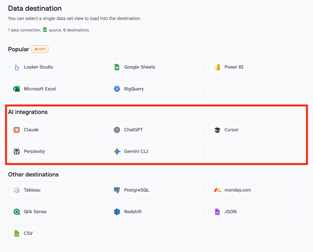
For this example, we’ll choose ChatGPT. Run the data flow and authorize via the Coupler.io setup instructions. You’ll be redirected to Coupler.io GPT inside ChatGPT.

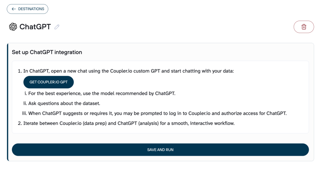
Once authorized, you’ll be redirected to Coupler.io GPT inside ChatGPT, where the AI can access the dataflows you created in Coupler.io.
Ask the GPT to list the dataflows and select the one you want to analyze with AI. You can now ask questions in plain English and follow up naturally.
As an example, here is the conversation we had with ChatGPT on the data flow with multiple PPC sources in Coupler.io.
We asked,
1. Which campaigns wasted the most spend last week?

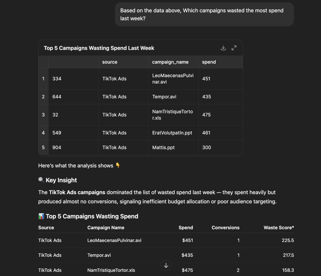
It surfaced the top five campaigns wasting budget and added clear guidance on what to investigate and optimize next.
2. Compare the ROAS of the PPC channels and summarize what’s working

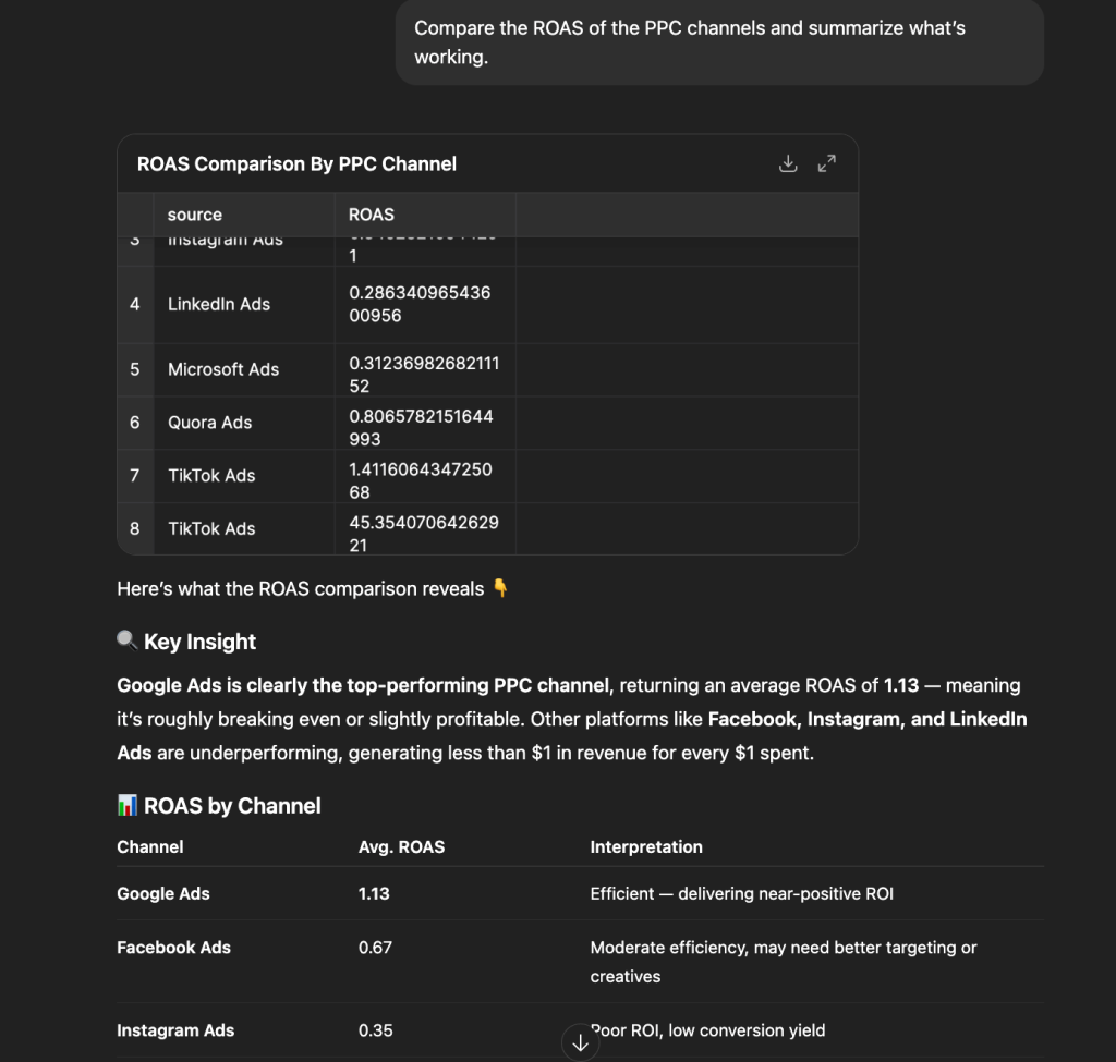
It broke down ROAS by channel, highlighted Google Ads as the only one delivering near-positive returns, and pointed out which platforms are dragging overall performance.
Similarly, you can ask more individual questions like these to get quick actionable insights in no time. Or, follow up on a single question to deep dive into specific data sets.
Integrate data from your sources with AI tools
Try Coupler.io for freeWhen AI alone is not the right choice
AI cannot replace proper transformations or metric construction. LLMs are weak at math, inconsistent with aggregations, and can hallucinate numbers if you rely on raw unprepared data. If your use case requires precise calculations, like building LTV, multi-touch attribution, blended ROAS, CAC payback, funnel stage logic, or custom joins. You shouldn’t expect AI to improvise them safely.
In these cases, you need to prepare those metrics inside Coupler.io first using transformations, calculated fields, Append/Join, and standardized keys. Only then should you let the AI interpret that curated dataset.
AI also struggles with:
- Large raw datasets that exceed the context window
- Conflicting attribution windows
- Unclean UTMs, inconsistent campaign names, duplicate rows
- Granular event-level data (AI performs much better on aggregated views like campaign × week)
- Use cases requiring deterministic, reproducible outputs (LLM answers vary by prompt and temperature)
If your goal is accuracy, compliance, numbers that need to be trusted, or long-term reporting, Coupler.io must do the processing. AI should handle the interpretation.
How to integrate data from multiple sources for better decision making
Integrating data from multiple sources is how teams move from fragmented insights to confident decision-making. When your analytics, ads, CRM, product, and revenue data is in one unified structure, patterns become clearer, trends are easier to trust, and optimization happens faster. Coupler.io streamlines this process by handling the heavy lifting: standardizing fields, aligning schemas, cleaning inconsistencies, and automating refreshes so your reports stay accurate without manual work. If you’re building cross-channel dashboards or analyzing full-funnel behavior, a complete dataset becomes your advantage.