


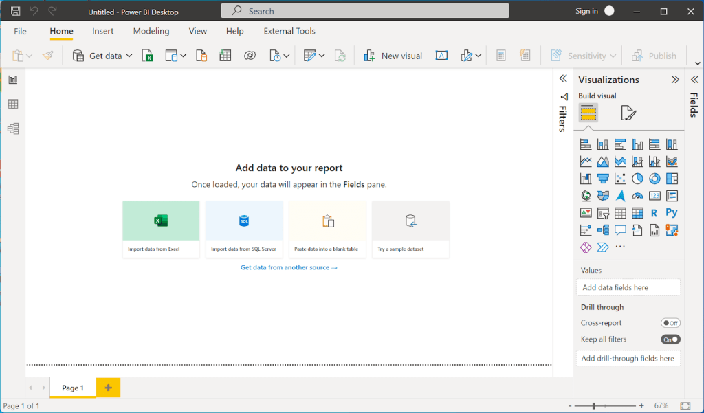
Interactive reports and dashboards are the way to go if you want to make data-driven decisions quickly and easily.
However, you need good business intelligence tools and visualization platforms to build them. And choosing one is no easy task.
The factors to weigh are numerous — from budget and how easy the tool is to use, to how well it integrates with your existing tech stack and the customizations it allows.
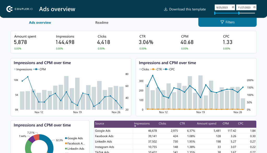
And most importantly, it should be good at visualization to build dashboards like the PPC dashboard below.

Most businesses, after a lot of exploring and eliminating, usually find themselves debating between two major players: Power BI vs Tableau.
Both are robust BI tools that serve most businesses exceptionally well, making the choice even more challenging.
Gathering information for an in-depth comparison can also eat up a lot of your time, as you sift through various resources.
That’s where this article is helpful. We’ve done the heavy lifting to compare Power BI vs Tableau, breaking down their features, pros, and cons to help you decide which one is the ideal fit for your business to make data-driven decisions.
Power BI vs Tableau: a comparison matrix
Before we jump into the details, here is a comparison matrix of all the important features you need to look for when weighing Power BI vs Tableau.
| Power BI | Tableau | |
| Ownership | Microsoft Corporation | Salesforce |
| Collaboration | Good with Office 365 integration. The setup can be complex for Mac users | Collaborate easily with Tableau Server and Tableau Online. It can be used on any OS |
| Functions and their types | DAX and M language | Calculated fields using built-in functions |
| Data Visualization | Robust and easy for beginners. It comes with 41 default visuals | Robust and more flexible to experiment. It comes with 21 default visuals |
| Data modeling | Simplified data models | Complex data models |
| Advanced Visuals | Extensive variety of advanced visuals (~521) | Limited compared to Power BI (~50+) |
| Number of data sources | Supports a wide range of data sources (~185) | Supports a good number (~80+) of data sources |
| Data cleaning | Uses Power Query | Uses Tableau Prep and third-party tools like Alteryx |
| AI | Interactive AI feature – Power BI Q&A generates insights from reports | The Ask Data AI feature allows you to ask a question about the existing database and will answer with a visualization |
| Mobile user interface | Good mobile interface | Strong mobile capabilities – uses different layouts for different phone screens |
| Data size | Limited by the capacity of Power BI service (max: 100 TB) | Handles large datasets better |
| Performance | Faster with smaller datasets | It can be slower but better for large datasets |
| Customization | Limited customization | Highly customizable |
| Software updates | Monthly updates | Quarterly updates |
| Tutorials | Free PowerBI video training modules are available | Free Tableau video training modules are available |
| Pricing | Starts from $10 per month | Starts from $70 per month |
Tableau vs Power BI: pros and cons in a detailed overview
Understanding the pros and cons of both tools can help you assess them better. So, let’s get into the details by comparing the pros and cons of Tableau vs Power BI individually.
Tableau overview
Tableau is a visual analytics platform owned by Salesforce. It manages the data flow and turns data into actionable information. It comes with a limited number of dashboard templates but a wide range of visualization elements encouraging the users to experiment. Tableau is more dynamic and flexible when compared to Power BI.
Tableau Pros:
- You can download the ‘Tableau Mobile’ app to view the reports and dashboards built on Tableau. It is available on Google Play Store and App Store. The best thing about this mobile application is it adjusts the report layouts based on the mobile screen size.
- Tableau easily handles large volumes of data and does not limit the number of data points in a visualization.
- Tableau is flexible and highly customizable. Thanks to this, you can create custom dashboards based on default visuals without even paying for advanced visuals.
- Performance is faster, irrespective of the data volume. The drag-and-drop feature helps you create interactive dashboards and visuals in a few clicks.
- Tableau has no OS restrictions. It works perfectly well on both Windows and macOS. However, the newest Tableau version does not support the M1 Macbook OS. But you can always download the Tableau 2020 version on any OS.
Tableau Cons:
- Tableau has only 24 default visuals, which can be limited for beginners to continue using the platform. The advanced visuals that can be purchased additionally are also offered in less variety compared to Power BI.
- Data cleaning is not very easy in Tableau. You must use tools like Tableau Prep or Alteryx, where you must transform the data before loading it to Tableau for visualization.
- Tableau’s software updates are not as frequent as Power BI’s. You can expect new updates once a quarter.
- It can be more expensive than Power BI as the Creator subscription costs around $70/ month, almost 7x the price of Power BI with similar features.
- Tableau is not easy to use and can take a long time to learn for beginners.
In short, Tableau can handle large datasets with ease, is mobile-friendly, and supports both Windows and MacOS. But it is expensive, with limited software updates and a steep learning curve for beginners.
Power BI overview
Power BI is a business analytics service. It has a robust front end that allows you to visualize data more easily. You can also analyze, visualize, and extract insights to share them across various departments of your organization. As Power BI is built and owned by Microsoft, it can be an excellent choice for someone already using other Microsoft products like Teams, Outlook, Sharepoint, and more.
Power BI Pros:
- Power BI user interface is straightforward and can be easily navigated by anyone, making it a user-friendly choice.
- It is integrated with Microsoft products such as Excel and SQL Server, making it a better fit for Microsoft-centric environments.
- Power BI is easier to learn when compared to Tableau.
- The functions are an added advantage for anyone using Power BI. They are easy to use and help in transforming data and building dashboards.
- Power BI has an in-built tool called Power Query that can transform the data by filtering and removing incorrect and incomplete data.
- Power BI Q&A is an AI feature built on natural language capabilities using machine learning. You can get quick insights just by asking questions.
- The pricing is economical, with the Pro plan starting at $10 per month per user. It is affordable for both small businesses and enterprises.
Power BI Cons:
- Power BI is less mobile-friendly than Tableau. While you can access dashboards built on Power BI through its mobile app, you may need a better experience as it has one standard screen size irrespective of the mobile.
- Power BI Desktop can only be downloaded on Windows 8 or newer versions. It does not support MacOS, and Microsoft does not have plans to launch it anytime soon. But you can use a Virtual Machine to install Power BI Desktop on your Macbook.
- Power BI performance can be slow when handling large datasets, and it can handle only up to 100 TB of data.
To conclude, Power BI is a good choice for beginner data analysts. It will help you get on your feet quickly with its easy-to-use interface, pre-built dashboards, and affordable plans. The major drawback is it cannot handle large datasets, resulting in slow performance.
Tableau vs Power BI: comparison of other factors
By now, you must have a brief idea of what both the tools can and cannot do. In this section, we’ll dig deeper, comparing crucial factors of Tableau vs Power BI – their Products, Visualization capabilities, Pricing, and more.
Tableau vs Power BI: Products
Both Tableau and Power BI have a range of products in the visual analytics and business intelligence space.
Tableau Products
- Tableau AI: It is a generative AI technology inside the Tableau platform. It provides smart suggestions and in-product guidance that can improve the overall productivity of the data analyst.
- Tableau Desktop: It is the primary product to create, analyze, and build visual reports on your computer.
- Tableau Server: It shares the dashboards and reports created on Tableau Desktop within the organization securely.
- Tableau Cloud/ Online: It is a cloud-based service with all the features of Tableau Server.
- Tableau Prep: This is a separate product that helps you clean, organize, and transform your raw data, making it ready for data analysis.
- Tableau Public: This is a free platform to showcase visualizations and dashboards publicly. It can be a great place to build a portfolio and public data projects.
- Tableau Data Management: This product is an add-on to manage your data more effectively, like cataloging and preparation features.
- Tableau Advanced Management: It is an upgrade to the data management product with more advanced tools for handling large amounts of data with additional security.
- Tableau Embedded Analytics: You can embed Tableau dashboards and functionality into your own applications or websites with embedded analytics.
Power BI Products
- Power BI Desktop: It is a desktop application of Power BI that can be installed only on Windows OS. You’ll be using it mainly for all the data visualization activities. It has features like Power Query, Power Pivot, and Power View.
- Power BI Service: It is a cloud-based self-service tool that helps you publish reports and collaborate with colleagues.
- Power BI Pro: This is a subscription plan for Power BI Service. It costs $10 per user per month.
- Power BI Premium: This is another subscription for Power BI Service, especially for enterprises with more users. It costs $4995 per month.
- Power BI Mobile: The mobile application of Power BI is used to view reports and dashboards.
After getting a fair idea of Tableau and Power BI products, let’s jump in to compare Tableau vs Power BI in other aspects like visualization, pricing, ease of use and more.
Tableau vs Power BI: Visualization
Tableau Visualization
Tableau is more customizable, with a fewer number of pre-built templates. But it comes with various visualization formats like heat maps, waterfall charts, bar charts, and network graphs.
In most scenarios, you need to build reports and dashboards from scratch on Tableau. This might take more time, but will help you explore different functionalities of the business analytics software.
For example, assume you are building a sales dashboard with Excel spreadsheets. First, you must import the data from Excel to Tableau and transform it using Tableau Prep or a third-party tool.


Source: Tableau
After that, you create individual visualizations like bar graphs, trends, and more. It is now time to place all these visualizations appealingly and intuitively.

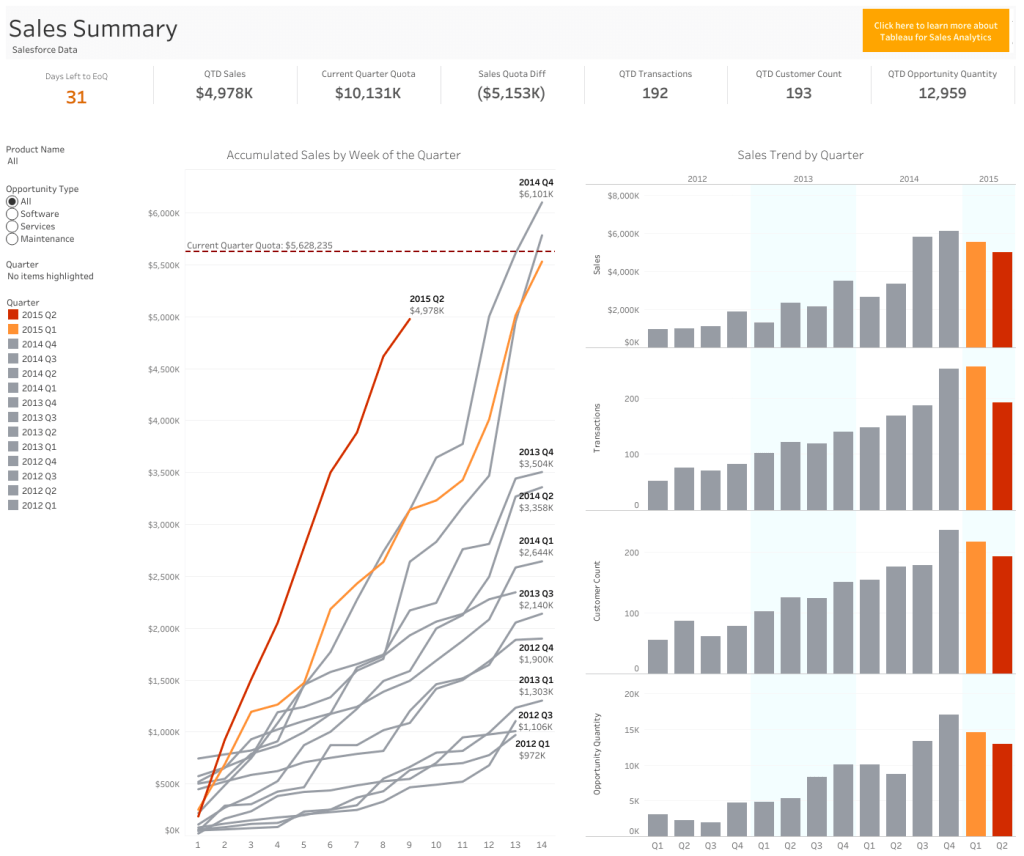
Source: Tableau sales dashboard
The process can eat up a lot of your time – checking for font style, size, and colors and going through multiple iterations to place these visualizations on a dashboard.
On the brighter side, Tableau has advanced mapping capabilities to visualize geographical data. They offer custom visualizations like creating geographical layers, highlighting visual clusters, and showing a path over time.

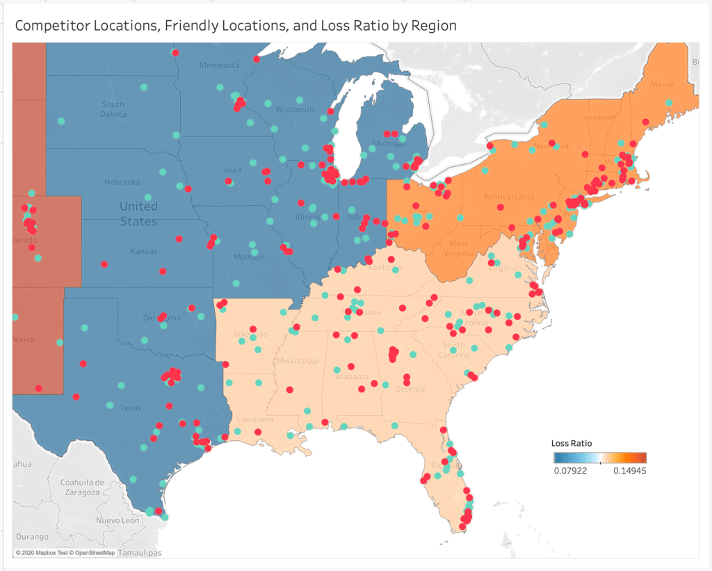
Source: Tableau
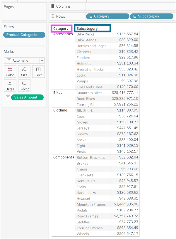
Tableau also has a hierarchical drill-down feature where you dig deep into data within a single chart or map without switching tabs. For example, looking at sales reports, you can dig deep into total revenue → revenue from categories → revenue from subcategories.

Power BI visualization
Power BI has pre-built visualization templates that can be used to create reports and dashboards quickly.
Let’s consider creating a sales report again. Once you load your data into Power BI, click anywhere on the blank canvas to see a Q&A pop-up.
Type in the report you are looking for in the Q&A.


For example, top geo states by sum of revenue.


Another visualization example is the sum of revenue for VanArsdel as a column chart.

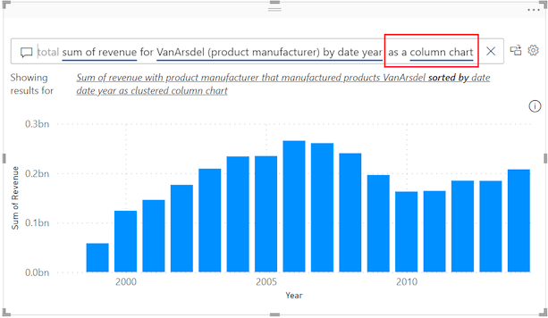
Now, arrange all the Q&A visualizations on the canvas.

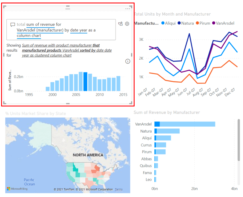
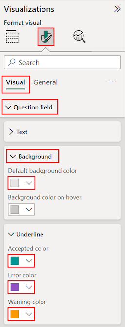
You can also format and customize the complete canvas at once or individual visuals using the settings on the right side of the canvas.

Power BI also has mapping and hierarchical drill-down capabilities but with limited customization. If you are looking to create interactive and intuitive reports quickly and easily, then Power BI is your go-to choice.
But if your priority is to have more flexibility to customize your reports and dashboards, then you can consider Tableau for your data visualization needs. Check out some useful Tableau dashboard examples.
Tableau vs Power BI: Pricing
Tableau Pricing
Tableau hasn’t mentioned its pricing on the website now. Earlier, the subscription plans started from $70 per month. There are three plans:
- Tableau Creator – You can have full access to create and share reports.
- Tableau Explorer – You can interact with these reports and get insights from them but cannot create dashboards.
- Tableau Viewer – You can only view the shared reports.


To subscribe to any of the above plans, contact sales. Tableau does not offer a free version but provides a 14-day free trial.
Power BI Pricing
Power BI pricing plans are less expensive and affordable to small businesses as well. There are five plans:
- Free version – You can create all visualizations and build dashboards but cannot share them.
- Power BI Pro – Along with building reports, you can also share them with departments within your organization. It costs $10 per month per user.
- Power BI Premium – Premium plan has advanced analytics tools along with all the features in Pro. It costs $20 per month per user.
- Power BI Premium per capacity – The same premium plan can be purchased for the complete organization. Here, the number of users will not be counted, and it costs $4995 per month for a complete organization.


Overall, Power BI is more affordable to get started with, whereas Tableau is expensive.
Tableau Market Share
Tableau was launched in early 2003 in California. It currently holds 15.69% of the market share in the data visualization industry, with 70,474 current customers. Geographically, most of Tableau’s customers are from the United States.
Power BI Market Share
Power BI is relatively new in the market. It was launched in 2015 and holds 15.63% of the market share in the data visualization industry, with 70,221 current customers. Similar to Tableau, most Power BI customers are from the United States.
Tableau vs Power BI: Ease of use
Tableau
The workspace layout has ‘shelves’ and ‘cards’, which can be confusing. Unlike Power BI’s ribbon, Tableau has a single-line toolbar. It gives you more space on the canvas, but may take some time to learn the icons and functions.

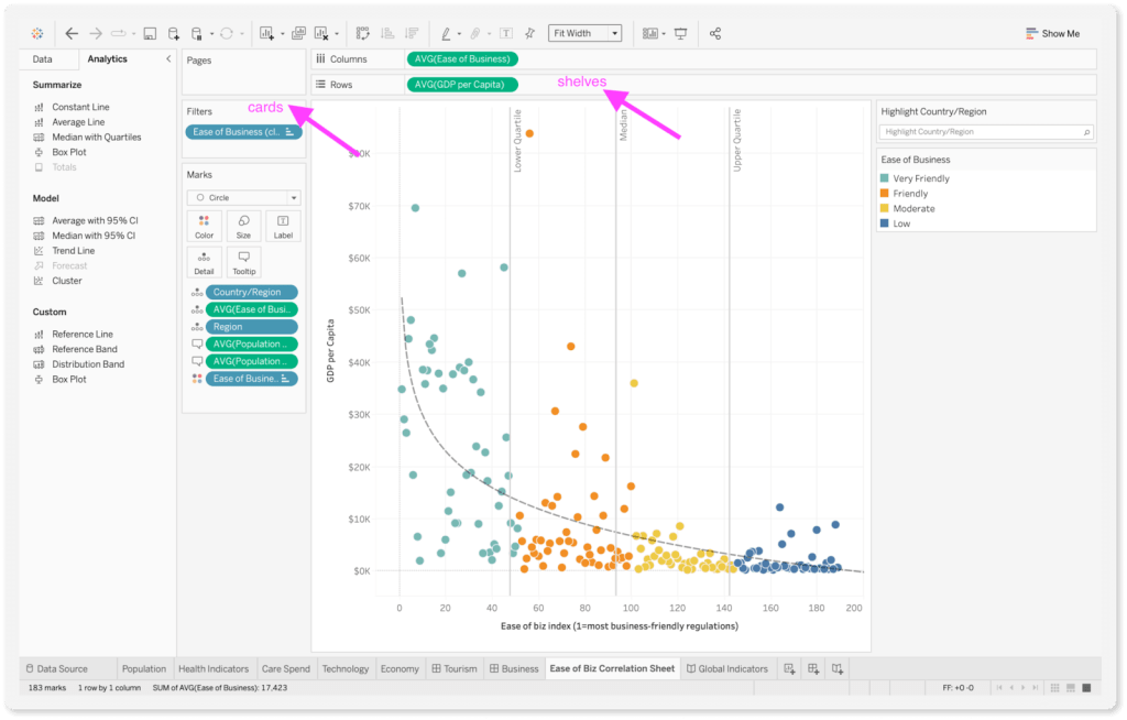
Once you get past the initial learning curve, Tableau has various customization options like parameter control, data blending, conditional formatting, themes, and more.
Power BI
It has a structured environment and is easy to use for beginners. The ribbon interface is similar to Excel and Outlook, making it easy to find options. The tabs and icons are also easy to identify without complexity.

The drag-and-drop functionality is also quite convenient with ‘Fields,’ ‘Visualizations’, and ‘Format’ in the side panes. Additionally, Power BI has templates for reports, which you can edit and customize accordingly.


Finally, when it comes to user-friendly interfaces, the Tableau vs Power BI comparison leans in favor of Tableau.
Tableau vs Power BI: How to automate reporting
Even though both Tableau and Power BI support various data sources like JSON, PDF, CSV, and more, it can be quite a task to pull data manually from different platforms and load it on the data visualization platforms. If you need to do this regularly, it quickly becomes inefficient and too time-consuming.
It can save you time and resources if you automate reporting and build self-updating dashboards.
You can do this with the help of Coupler.io. It is an all-in-one data integration platform that helps you connect data from 50+ data sources to BI tools. These include Power BI and Power BI alternatives such as Looker Studio, Tableau, and Qlik. By the way, you should check out our other comparison article Looker Studio vs. Power BI.
After connecting the data, Coupler.io will automatically update your dashboards and reports on a schedule that you choose. Now, let’s see how you can use Coupler.io with Power BI.
Start by logging in to the Coupler.io account. If you do not have one, you can sign up here. Now add a new importer. Select the source (choose the one you need) and the destination: Power BI.

Then, connect your data source account. You can add more sources a bit later, if you need.
The next step is to preview and transform the data. Here, you can hide unwanted columns, sort and filter your data, perform formula-based calculations, rename columns, and merge data from different apps into one dataset.
Here, we added 3 different data sources (Facebook Ads, Google Ads, and Microsoft Ads) and now blended them into one dataset for a comprehensive ad report.

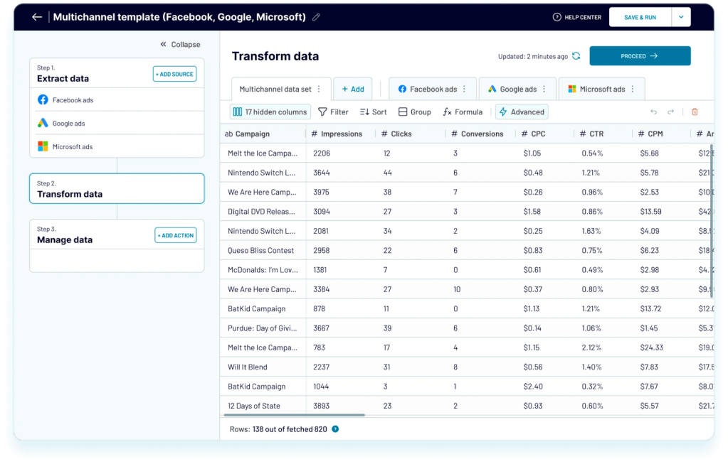
Now, you can add a data refresh schedule as per your requirement, and this Coupler.io importer will automatically update data from the selected data sources.

Once you click on ‘save and run’, you are ready to build your dashboard on Power BI without worrying about updating the data.
You can also refer to Coupler.io’s dashboard templates, for example, PPC multi-channel report.
You can automate reporting for Tableau in a similar way, just select your app and click Proceed:
And then connect Google Sheets to Tableau using Tableau’s native functionality. The data in the spreadsheet will be automatically refreshed on a schedule.
Power BI limitations vs Tableau
Tableau vs Power BI: Performance
Tableau performance
Tableau is primarily launched for teams and organizations. So, naturally, it is built to handle large datasets with ease. The architecture is robust and can quickly perform queries on large datasets.
Moreover, it offers customizations that give flexibility to advanced users to customize their setup and settings to maximize performance.
Power BI performance
When handling smaller datasets, Power BI is pretty agile. However, large datasets with multiple parameters and relationships can slow it down. From loading your data and reports to executing queries, you’ll notice a lag in the performance.
One way to improve the performance of Power BI with large datasets is by working on your data modeling.
- Avoid using many relationships in the dataset and floating data types.
- Switch to the star schema from the snowflake schema.
These practices will reduce the load on Power BI and speed up the performance.
Power BI vs Tableau: Which one is better?
In this article, we analyzed Tableau vs Microsoft Power BI across various parameters like user interface, ease-of-use, and data visualization capabilities. If you’re looking for in-depth data analytics with customization options, Tableau can be a good choice. On the other hand, if you work with Microsoft products and need a data visualization tool that is easy to use and share reports, Power BI is the best choice.
Irrespective of the tool you choose from the Microsoft Power BI vs Tableau comparison, Coupler.io is your go-to for automating the reporting process and helping you create self-updating dashboards. It can save time and optimize resources for your business.