What is a CRM dashboard?
A CRM dashboard is a visual display screen of your sales data and key performance indicators in a customer relationship management system. It lets you track sales activities, monitor essential metrics, and quickly assess your performance. With such a dashboard, you can identify trends and make data-driven decisions to improve sales outcomes.
CRM dashboards convert complex data into easy-to-understand charts and graphs. You can track daily activities (like calls made or emails sent), monitor key metrics (such as conversion rates or deal values), and quickly see how your team is performing against targets.
Types of CRM dashboards
- Standard dashboards: Built into CRM platforms like Salesforce or HubSpot.
- BI tool templates: Created in tools like Power BI or Tableau that aggregate data from multiple sources and offer advanced visualizations.
- Custom dashboards: Tailored specifically to track your company’s unique KPIs and business goals.
With the right dashboard, you can spot trends early and make smarter, data-backed decisions to improve your sales results.
Top CRM dashboard examples
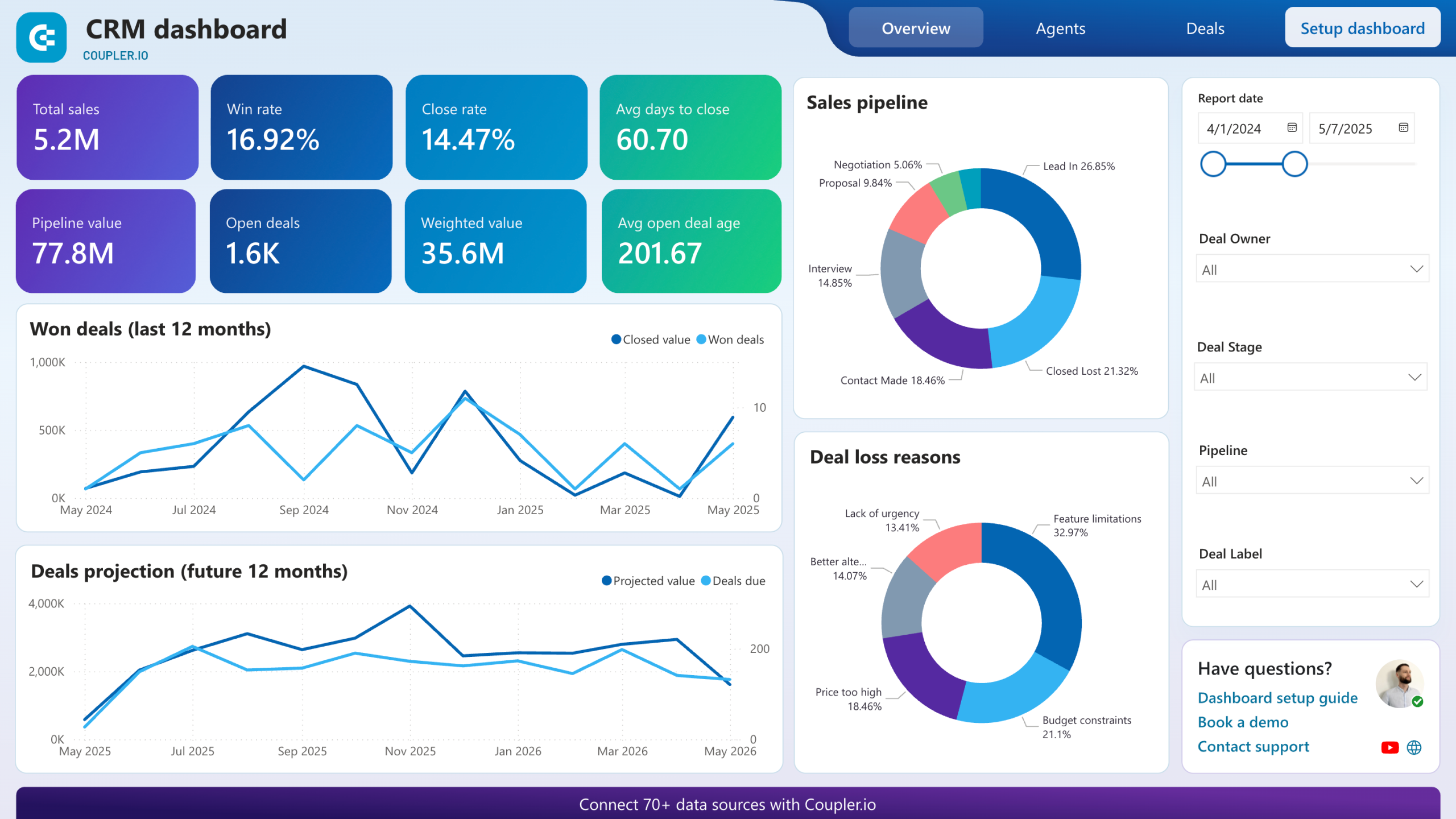
To help you understand what a good dashboard looks like, below are examples based on data from the most common CRMs, including Pipedrive, Salesforce, HubSpot, and GoHighLevel. Most of them are sales and CRM dashboard templates by Coupler.io designed for different BI tools, such as Looker Studio or Power BI. The templates are equipped with a built-in Coupler.io connector, so you can automatically load your data into the dashboard for your use.
1. CRM dashboard for Pipedrive by Coupler.io
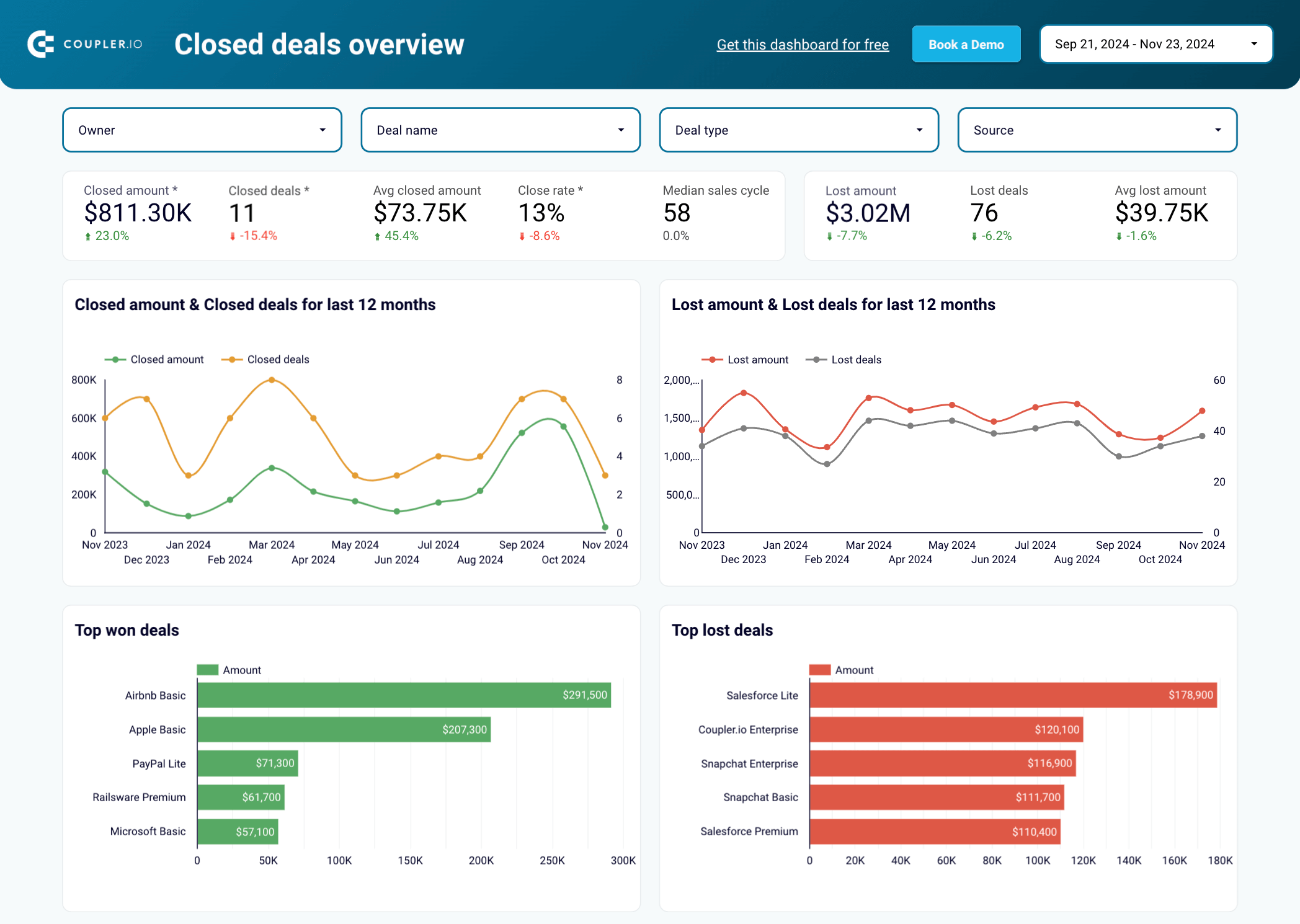
The Pipedrive CRM dashboard provides an overview of your sales pipeline. It consolidates key sales data to help you identify successful patterns, detect roadblocks, and make informed decisions that improve your sales process.

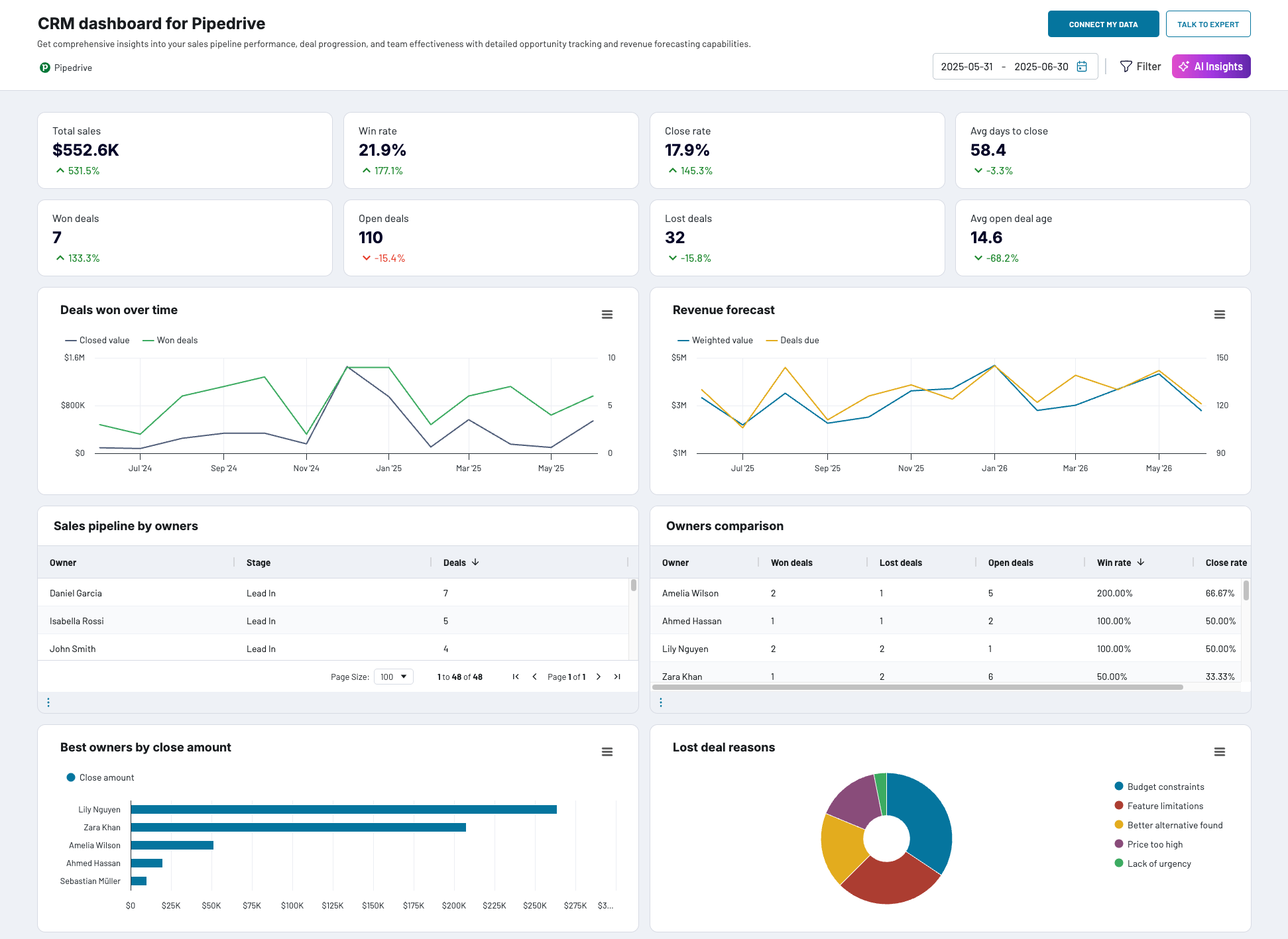
What you can do with this dashboard
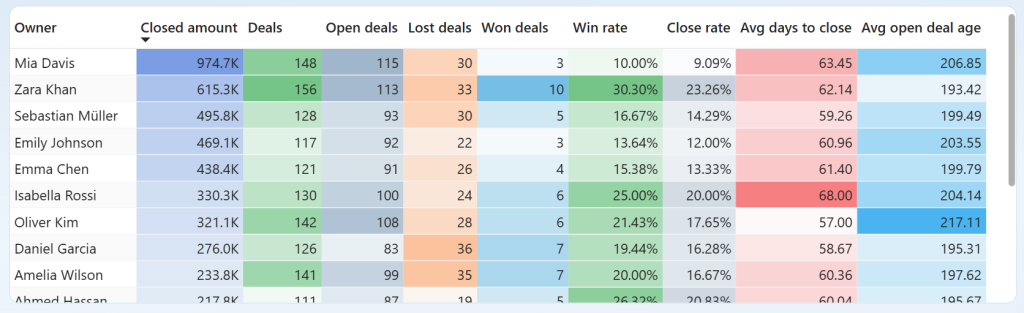
Compare team member performance across closed amount, deals, win rate, close rate, and average days to close to identify top performers and spot those needing support.

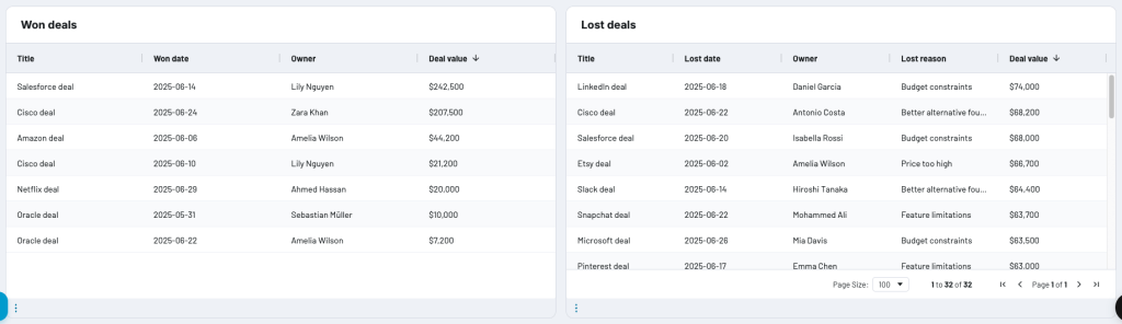
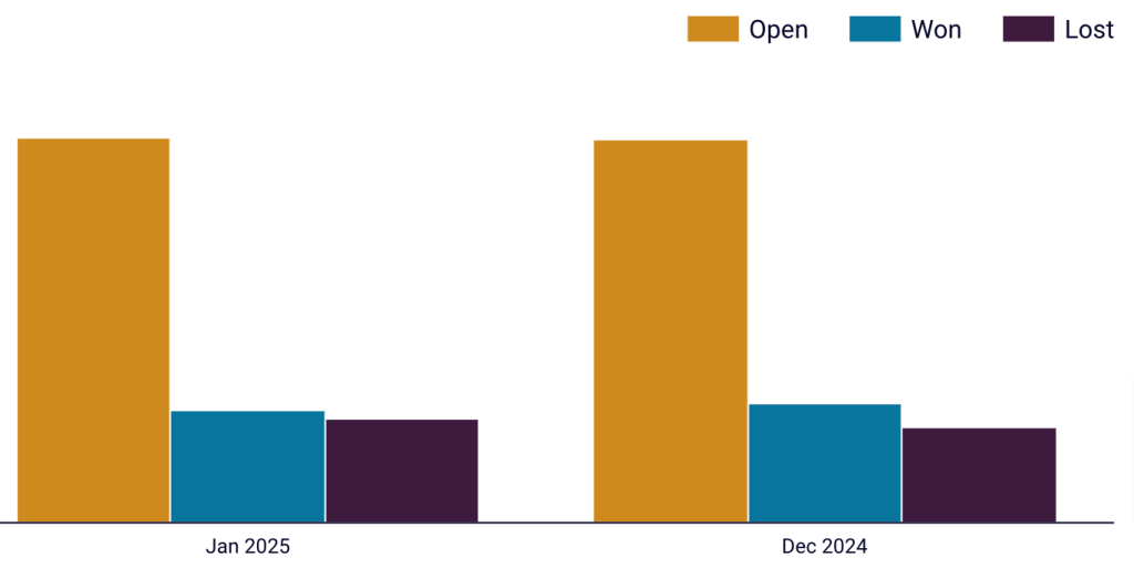
Analyze won and lost deals with detailed tables showing owners, values, and loss reasons to understand success patterns and address common obstacles.

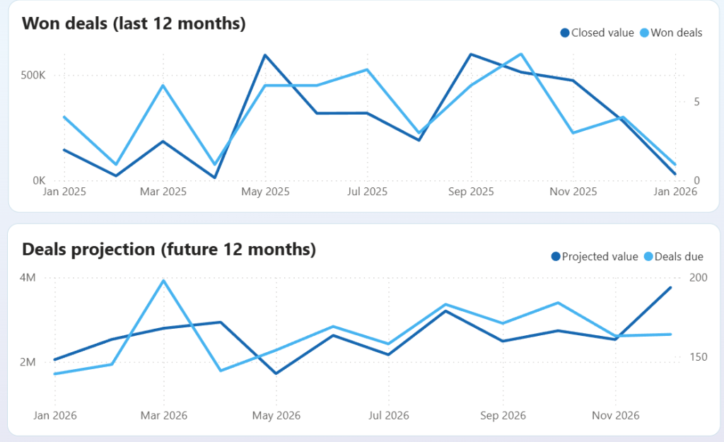
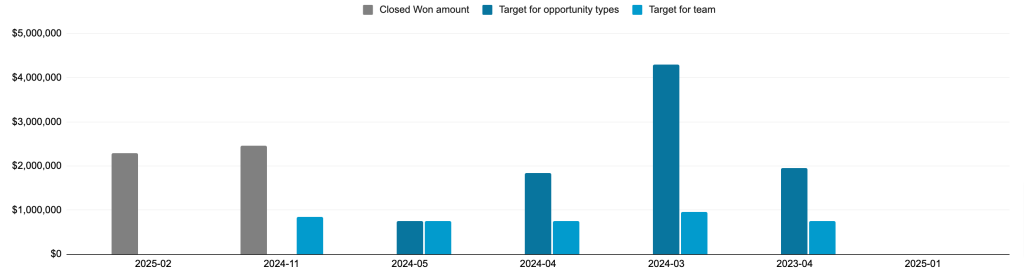
Track historical performance and forecast revenue by monitoring won deals over the last 12 months and viewing projected deal values for the next 12 months to identify seasonal trends and revenue gaps.

And more. The Pipedrive CRM dashboard is available in Coupler.io and as a template in Looker Studio and Power BI. Choose the version you like and follow the straightforward setup guide to start using the dashboard.

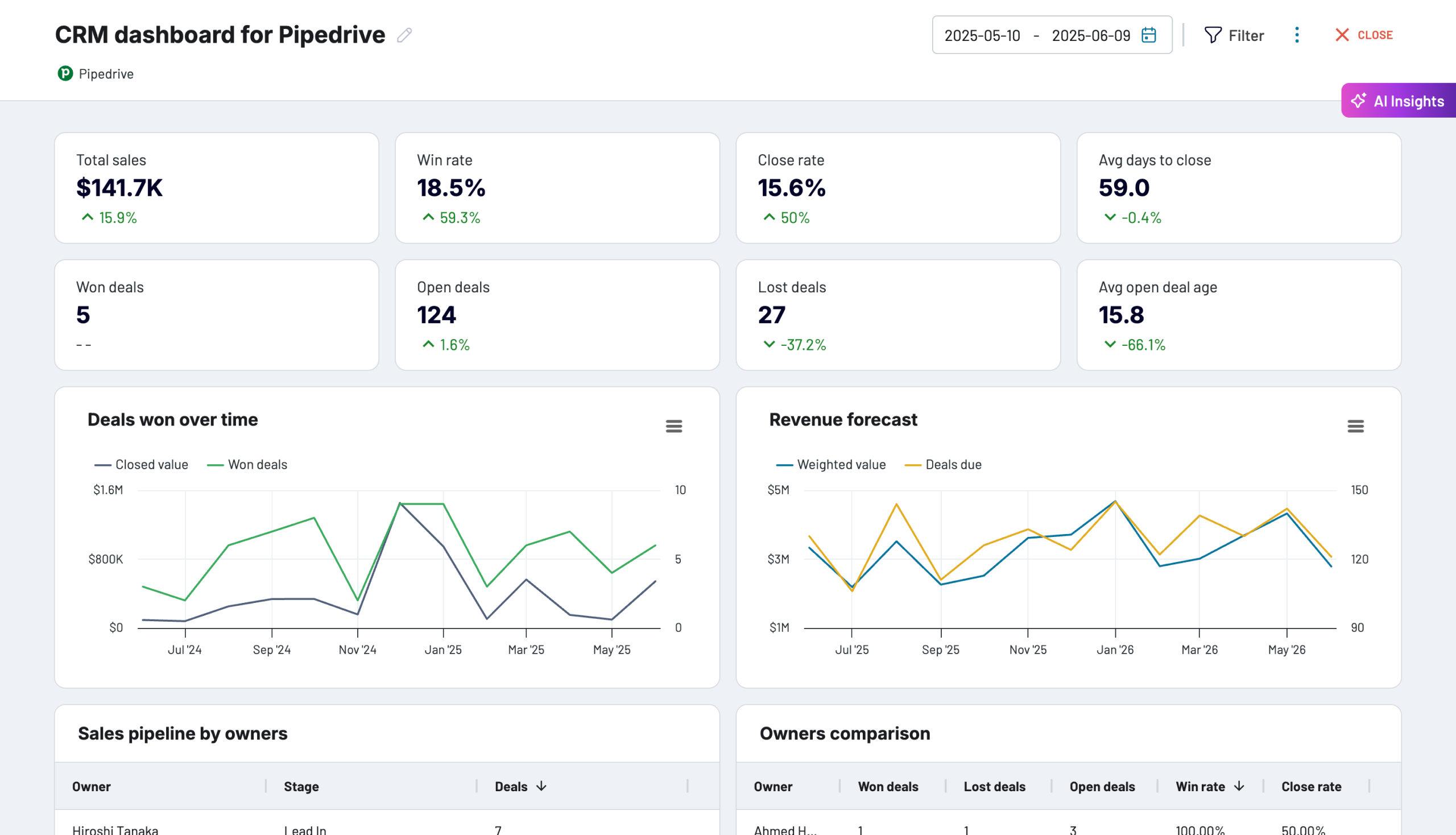
CRM dashboard for Pipedrive in Coupler.io
Keep track of your Pipedrive sales pipeline progress with this CRM dashboard. Get insights into team performance, lost deal reasons, and key sales metrics.


CRM dashboard for Pipedrive in Looker Studio
Stay on top of your Pipedrive sales using our CRM dashboard which allows you to analyze your sales department’s performance.

CRM dashboard for Pipedrive in Power BI
Track sales opportunities, monitor deal stages, and evaluate team performance with interactive visualizations that help identify bottlenecks and optimize your sales process.
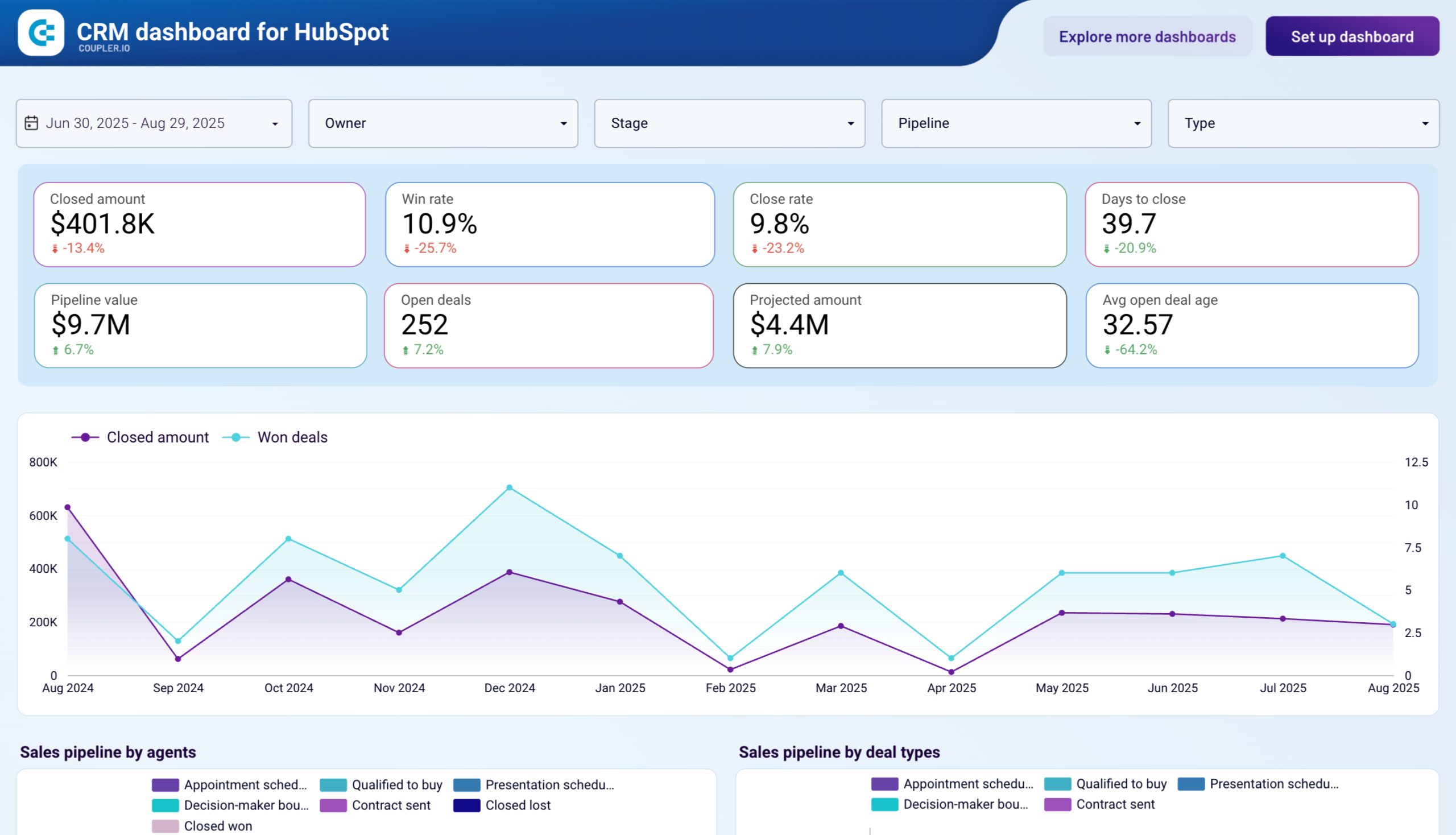
2. CRM dashboard for HubSpot by Coupler.io
The HubSpot CRM dashboard delivers agent-focused sales intelligence with detailed visibility into pipeline distribution, deal categorization, and individual performance rankings. Sales leaders can analyze how different deal types progress through stages, monitor monthly deal flow patterns, and benchmark agent performance to optimize team effectiveness and resource allocation.
CRM dashboard for HubSpot in Looker Studio

CRM dashboard for HubSpot in Looker Studio
Preview dashboardWhat you can do with this dashboard
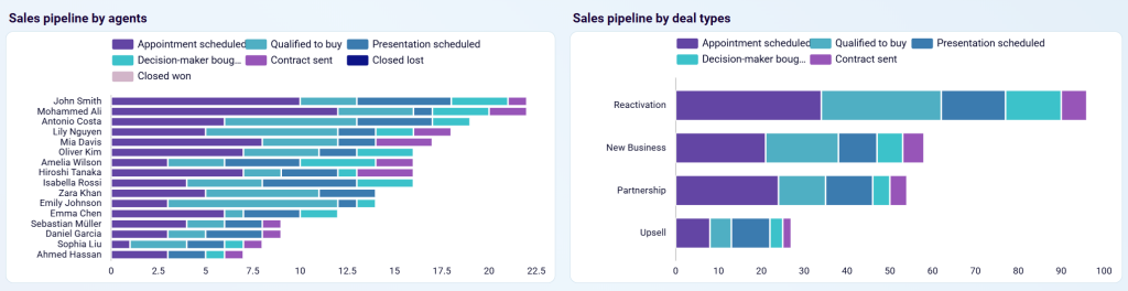
View sales pipeline distribution by agents and deal types with stacked horizontal bar charts showing how deals progress across stages (appointment scheduled, qualified to buy, presentation scheduled, decision-maker brought-in, contract sent, closed lost/won) to identify workload balance and deal category performance.

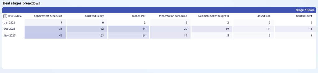
Track deal stage progression over time with a monthly breakdown table showing how many deals move through each stage (appointment scheduled, qualified to buy, closed lost, presentation scheduled, decision-maker brought-in, closed won, contract sent) to identify seasonal patterns and pipeline health.

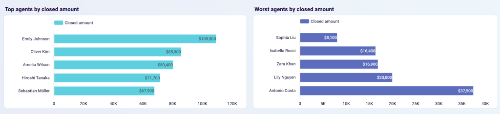
Compare top and worst performing agents with side-by-side horizontal bar charts ranking agents by closed amount to recognize high performers and provide targeted support to those struggling.

And more. The HubSpot CRM dashboard is available as a template in Looker Studio and Power BI. Choose the version you like and follow the straightforward setup guide to start using the dashboard.
CRM dashboard for HubSpot in Looker Studio
Use our CRM dashboard for HubSpot to track key metrics, check how your sales team performs, and understand what drives your revenues.

CRM dashboard for HubSpot in Power BI
Evaluate sales team effectiveness and pipeline health with detailed HubSpot CRM analytics. Track closed amounts, monitor deal stages, analyze win and loss reasons, and compare agent performance to identify best practices and bottlenecks in your sales funnel.
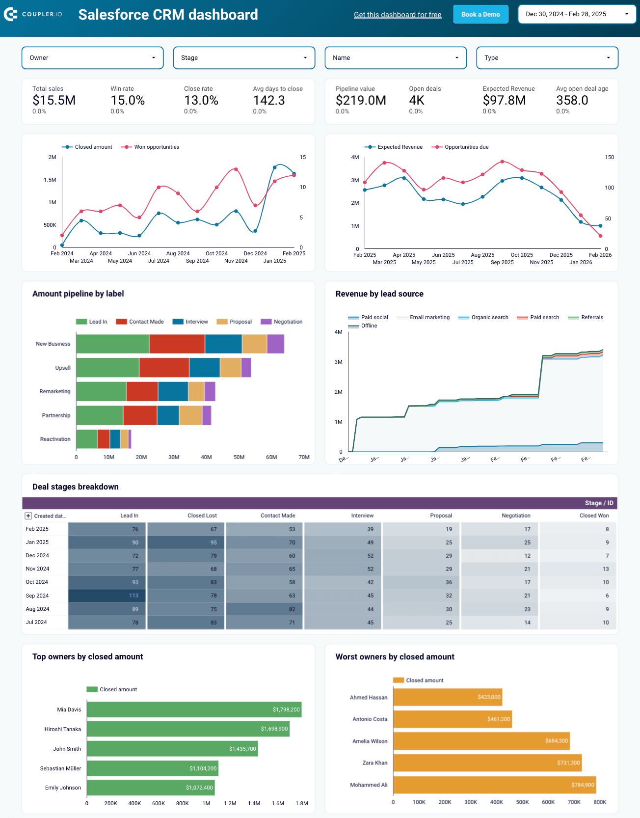
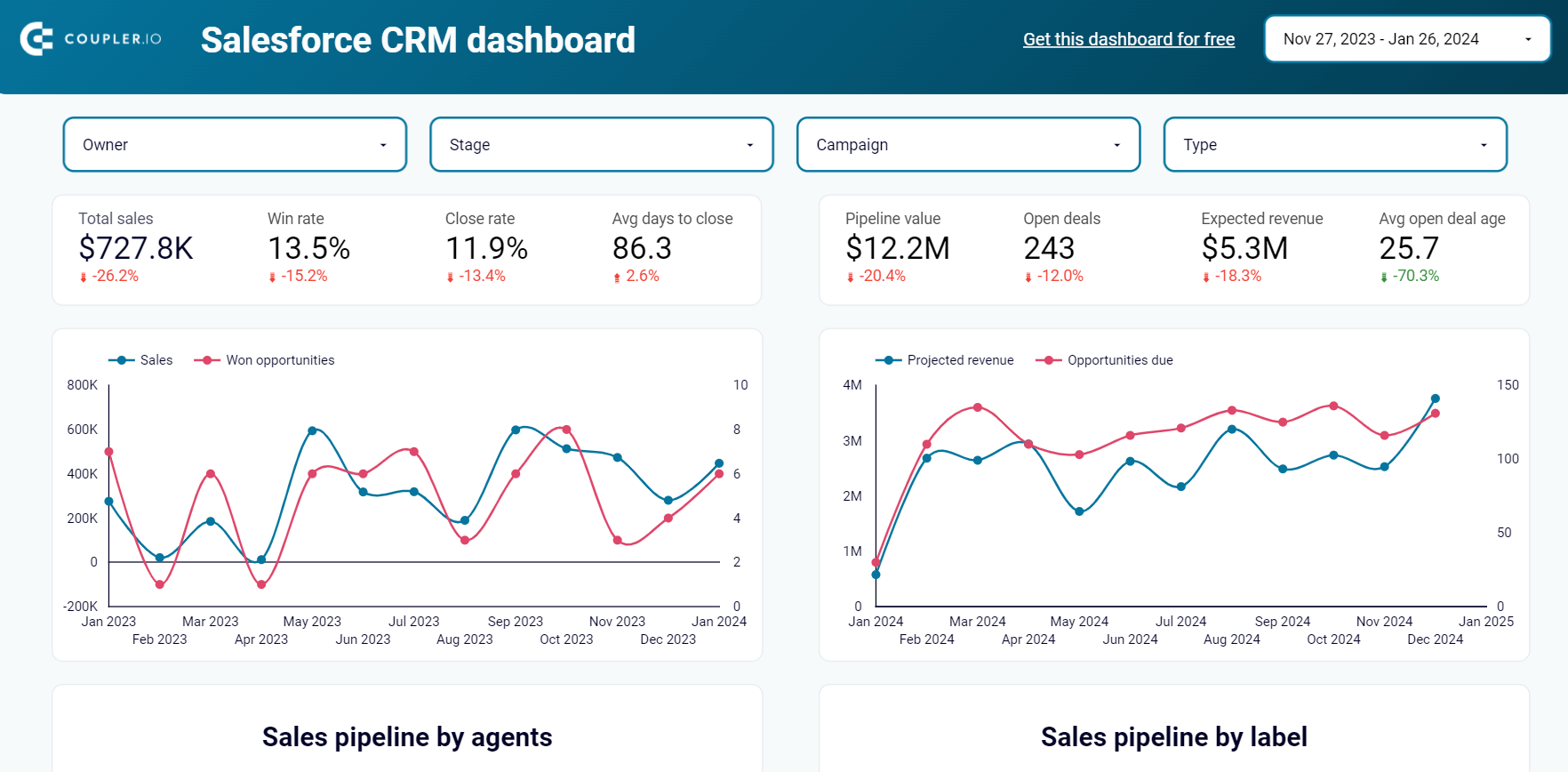
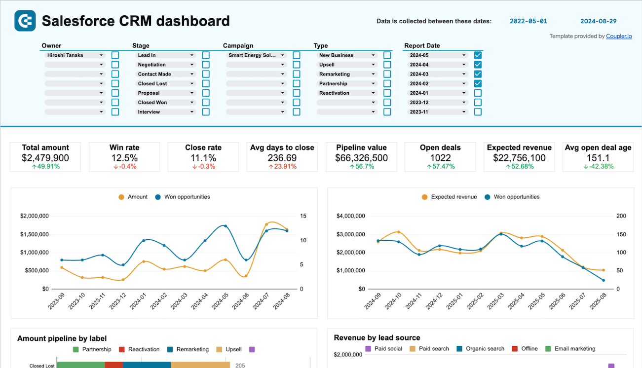
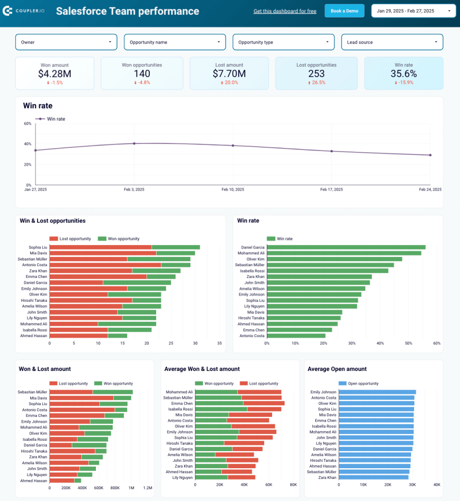
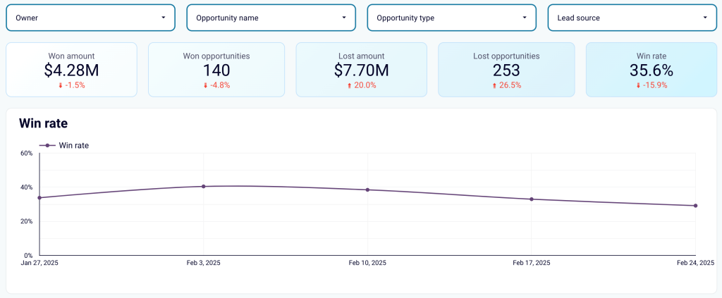
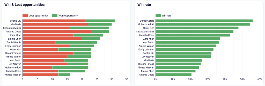
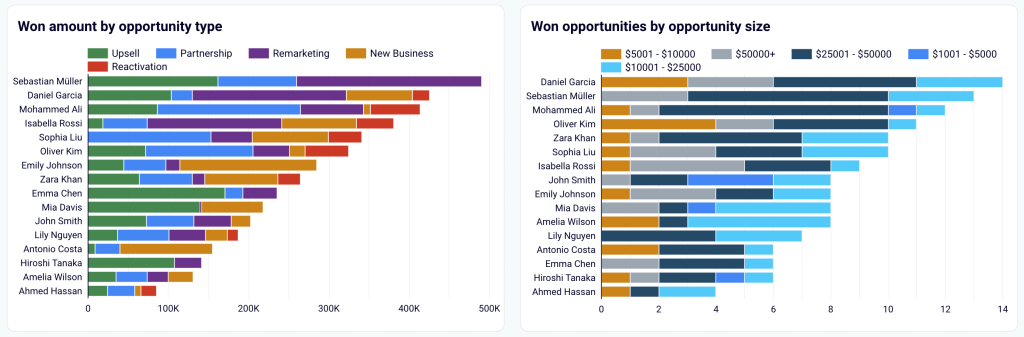
3. CRM dashboard for Salesforce by Coupler.io
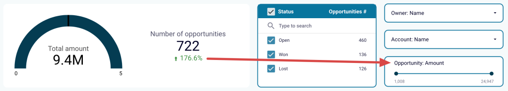
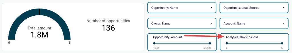
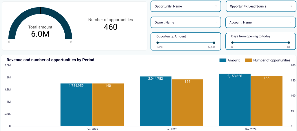
The Salesforce CRM dashboard allows you to analyze your sales opportunities and drill down into the specifics of your pipeline.
CRM dashboard for Salesforce in Looker Studio

CRM dashboard for Salesforce in Looker Studio
Preview dashboardWhat you can do with this dashboard
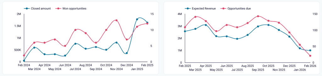
Discover opportunities and expected revenue trends to pinpoint growth trends and prioritize high-potential leads by tracking the correlation between generated revenue and won opportunities, or projected revenue and upcoming opportunities.

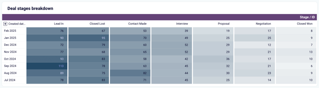
View deal stages breakdown to assess pipeline health by analyzing the distribution and movement of deals across stages from lead-in to closed won/lost.

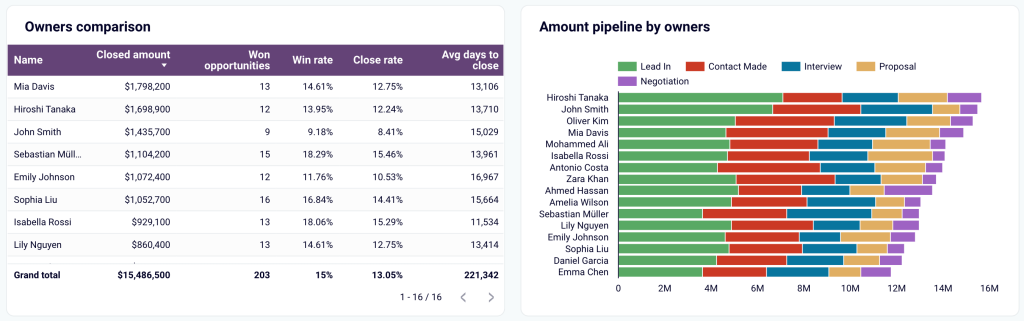
Monitor sales team performance to understand win rates, close rates, and time spent closing deals for effective distribution of high-priority deals among sales reps, plus track each team member’s pipeline progress.

Dive deeper into opportunity-specific insights:
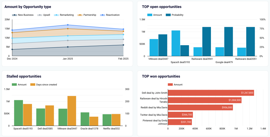
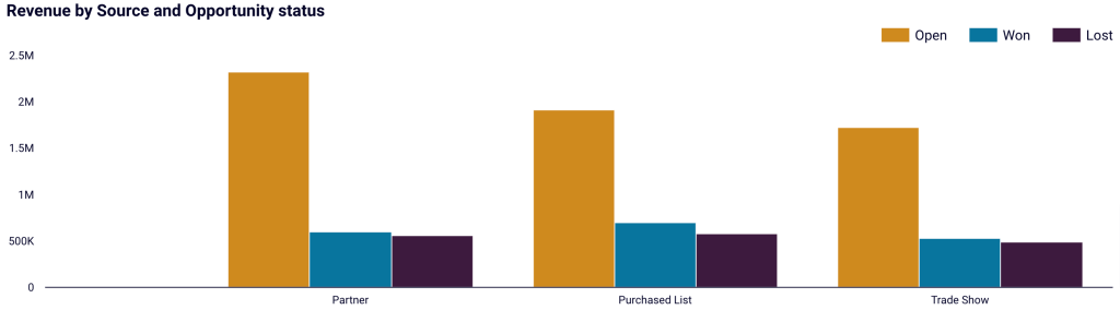
- Amount by opportunity type: Monitor the revenue by opportunity type to evaluate the effectiveness of different sales strategies or campaigns.
- Top open and won opportunities: Identify the highest-value open and won deals, ensuring focus on opportunities with the biggest impact.
- Stalled opportunities: Spot opportunities that have been inactive so your team can take proactive steps to re-engage leads.
- Open opportunities: Get a structured view of all open opportunities, including key details such as stage, owner, lead source, probability, and amount.
- Accounts and campaigns: Go over account and campaign performance to align efforts and measure the success of targeted initiatives.

The Salesforce CRM dashboard is available as a template in Looker Studio and Google Sheets. To get started with this CEO dashboard template, follow the instructions to have your Salesforce data visualized in the dashboard.

CRM dashboard for Salesforce in Looker Studio
Use our CRM dashboard for Salesforce to track key metrics, check how your sales team performs, and understand what drives your revenues.

CRM dashboard for Salesforce in Google Sheets
Get a detailed overview of your opportunities in Salesforce and analyze the performance of your sales team.
Sales KPI dashboards
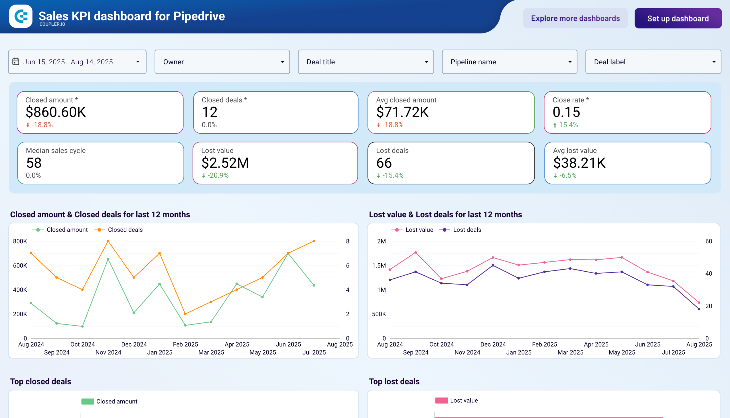
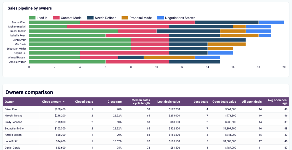
4. Sales KPI dashboard for Pipedrive by Coupler.io
The Pipedrive sales KPI dashboard provides an overview of critical sales metrics and key performance indicators. This dynamic dashboard allows users to identify trends, optimize sales processes, and improve team performance with customizable views and interactive filters.
Sales KPI dashboard for Pipedrive in Looker Studio
Sales KPI dashboard for Pipedrive in Looker Studio
Preview dashboardWhat you can do with this dashboard
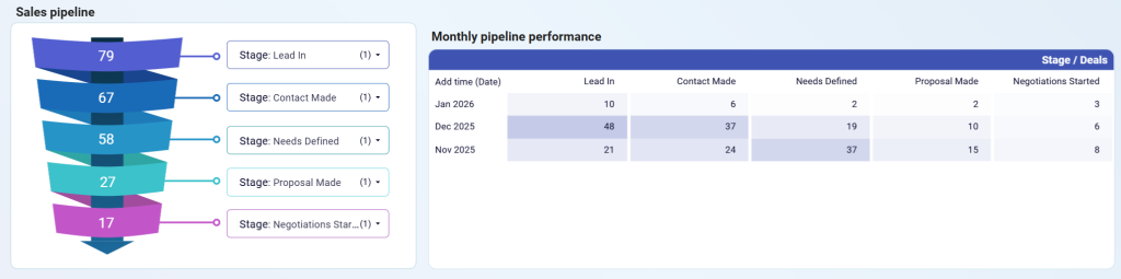
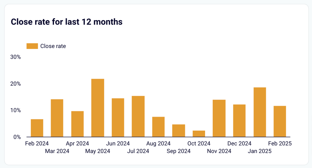
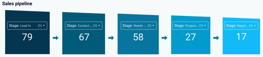
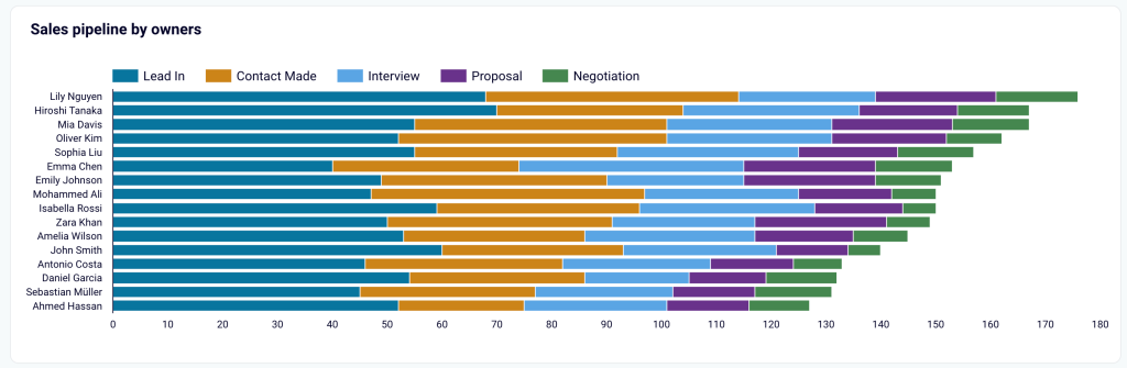
Analyze sales pipeline funnel and monthly performance to understand deal progression across all stages (Lead In, Contact Made, Needs Defined, Proposal Made, Negotiations Started) and track how pipeline composition changes over time to identify seasonal patterns and bottlenecks.

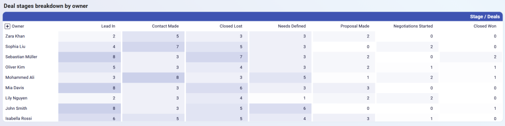
Review deal stages breakdown by owner to see how each team member’s deals are distributed across pipeline stages, helping you identify if specific owners have too many deals stuck in early stages or if workload distribution needs adjustment.

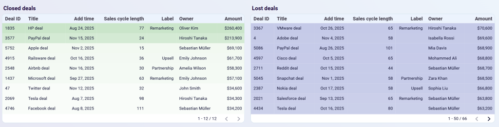
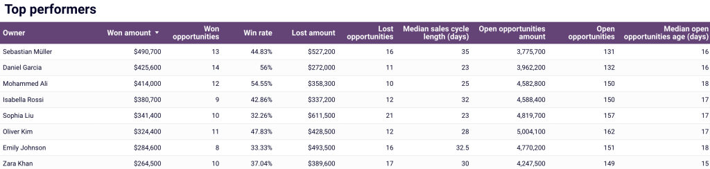
Compare closed deals and lost deals side-by-side with detailed tables showing deal ID, title, add time, sales cycle length, label, owner, and amount to understand success patterns and identify common characteristics of wins versus losses.

The sales KPI dashboard for Pipedrive is available as a Looker Studio template with the Coupler.io connector. Try it yourself right away, following the instructions.
Sales KPI dashboard for Pipedrive in Looker Studio
Analyze the critical sales metrics and key performance indicators from Pipedrive to make smart strategic decisions.
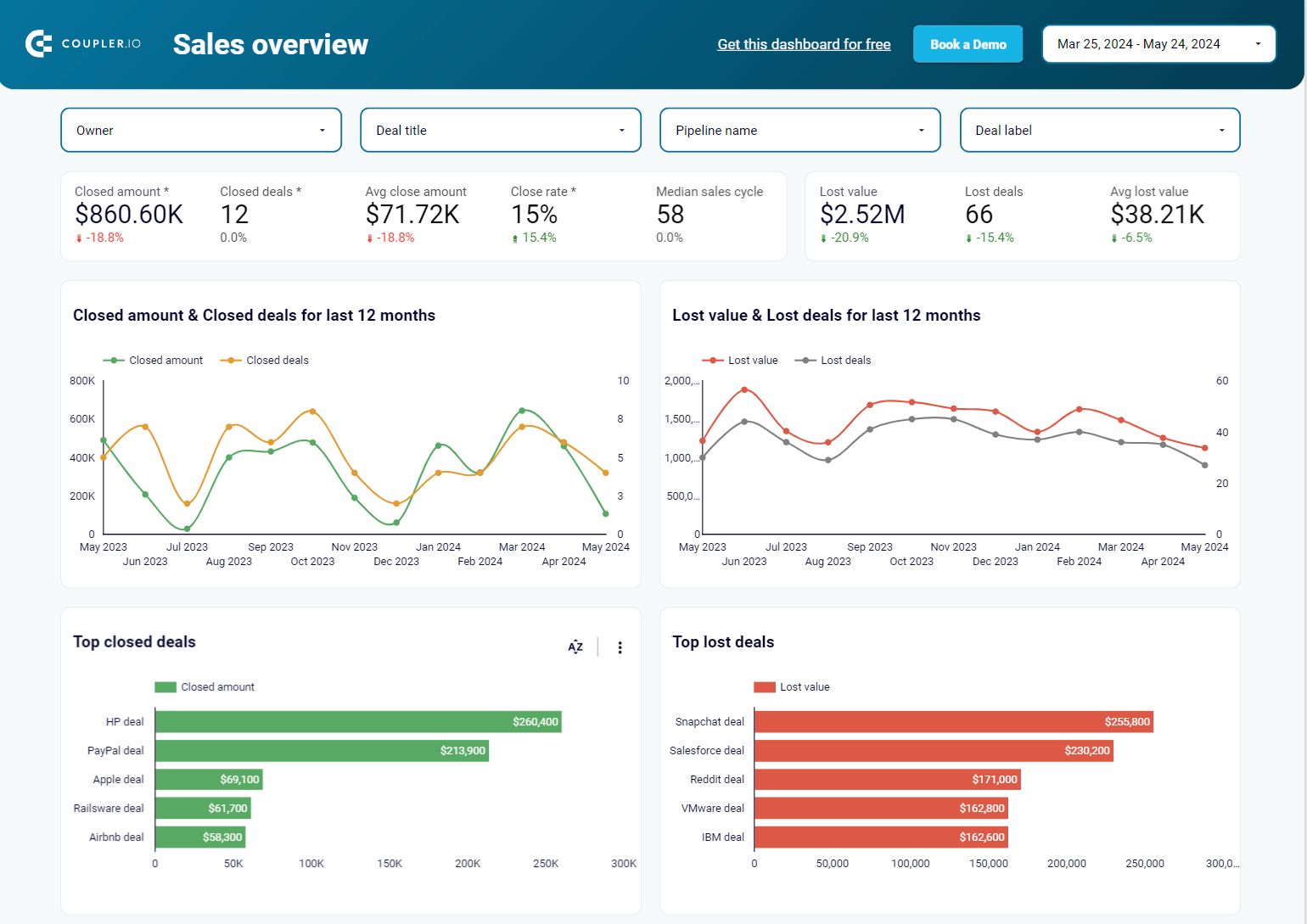
5. Sales KPI dashboard for HubSpot by Coupler.io
The HubSpot sales KPI dashboard provides an overview of key performance indicators and sales metrics from HubSpot. It offers insights into deal progression, revenue trends, lost opportunities, and team performance, and allows users to understand factors that influence overall sales effectiveness.
Sales KPI dashboard for HubSpot in Looker Studio

Sales KPI dashboard for HubSpot in Looker Studio
Preview dashboardWhat you can do with this dashboard
Track deal and revenue trends by monitoring the dynamics of deals and closed deal revenue over time to identify seasonal patterns or dependencies on other activities, such as marketing campaigns, conferences, or team growth, helping you refine your sales strategy based on real-world influences.

Assess sales funnel performance with a customizable pipeline funnel that enables you to define up to 5 sales stages and track their performance, helping you identify points where deals tend to drop off and apply filters such as owner, pipeline, or deal type to focus on specific segments.

Evaluate team performance by assessing performance trends and comparing sales outcomes across different team members, deal types, and pipelines to highlight variations in achievement levels and analyze patterns that contribute to higher success rates or lower-than-expected results.

The sales KPI dashboard for HubSpot is available as a Looker Studio template which you can try right away.

Sales KPI dashboard for HubSpot in Looker Studio
Get an overview of the HubSpot sales metrics and KPIs to derive insights into pipeline health using our sales KPI dashboard.
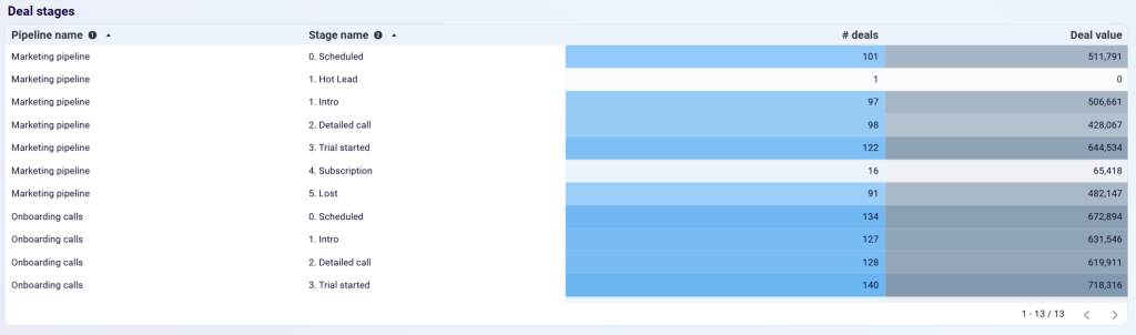
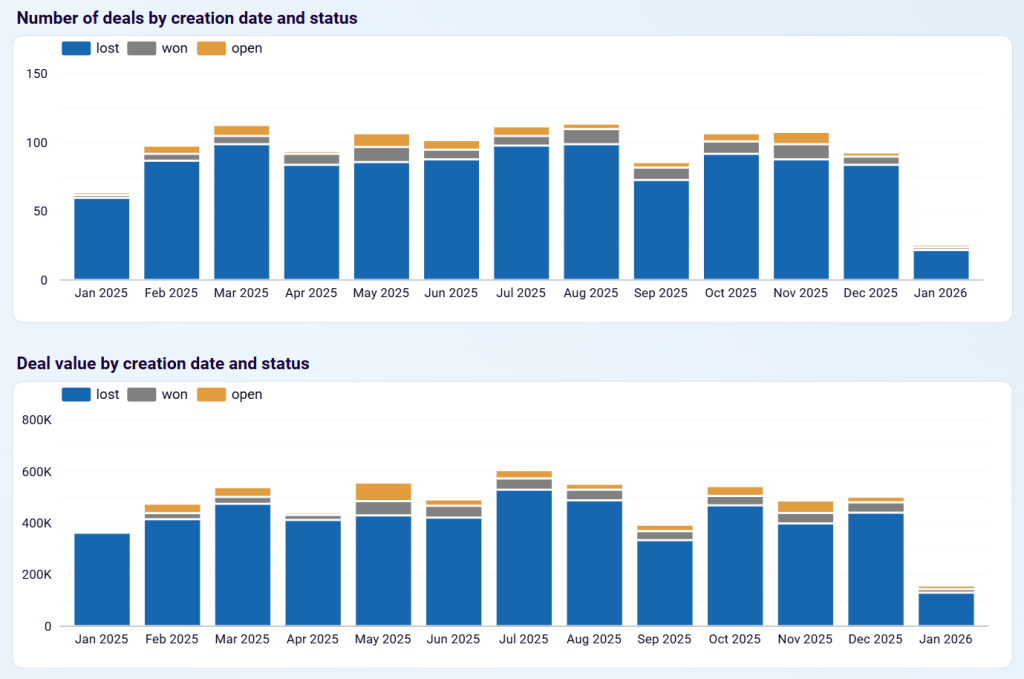
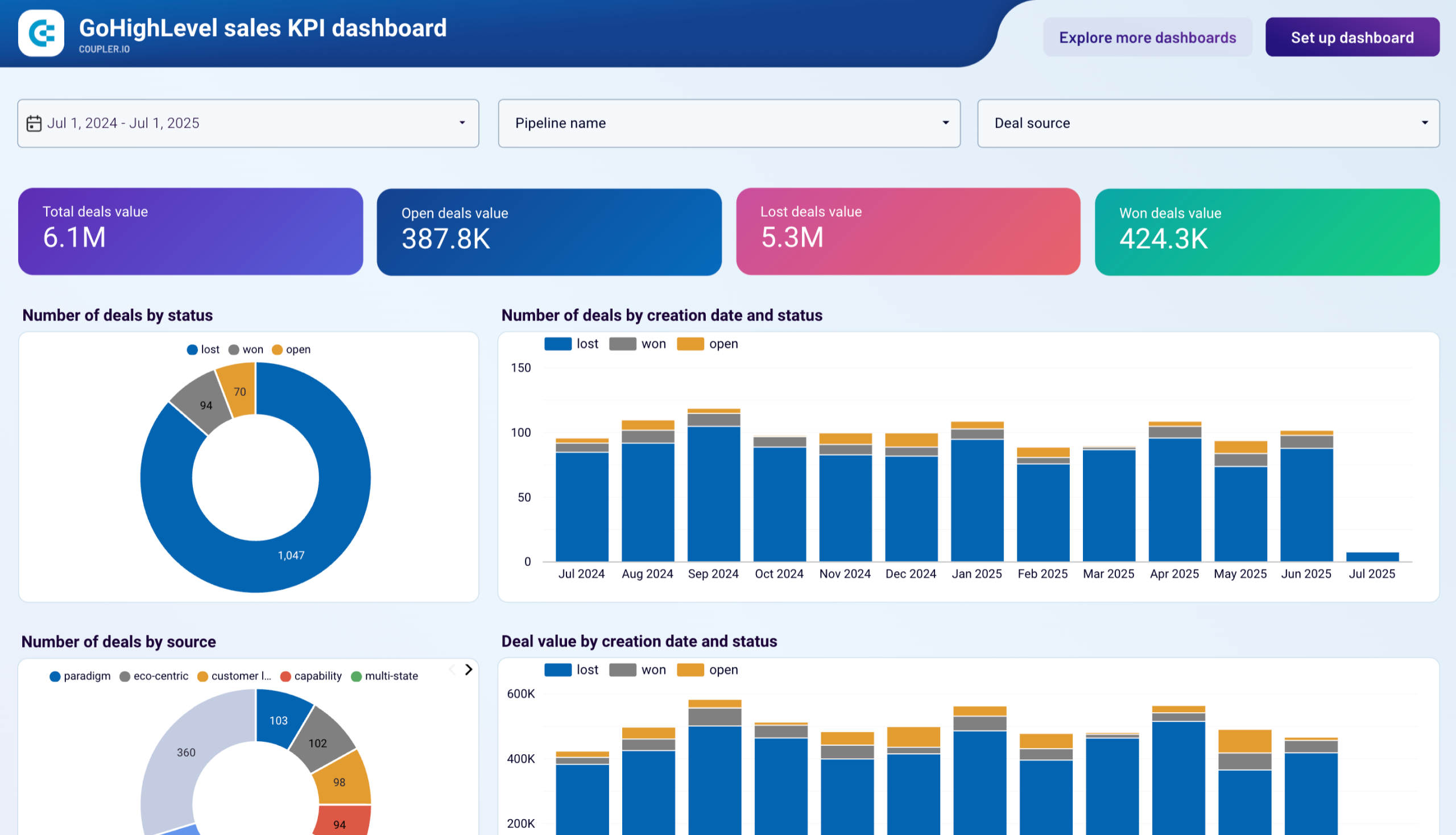
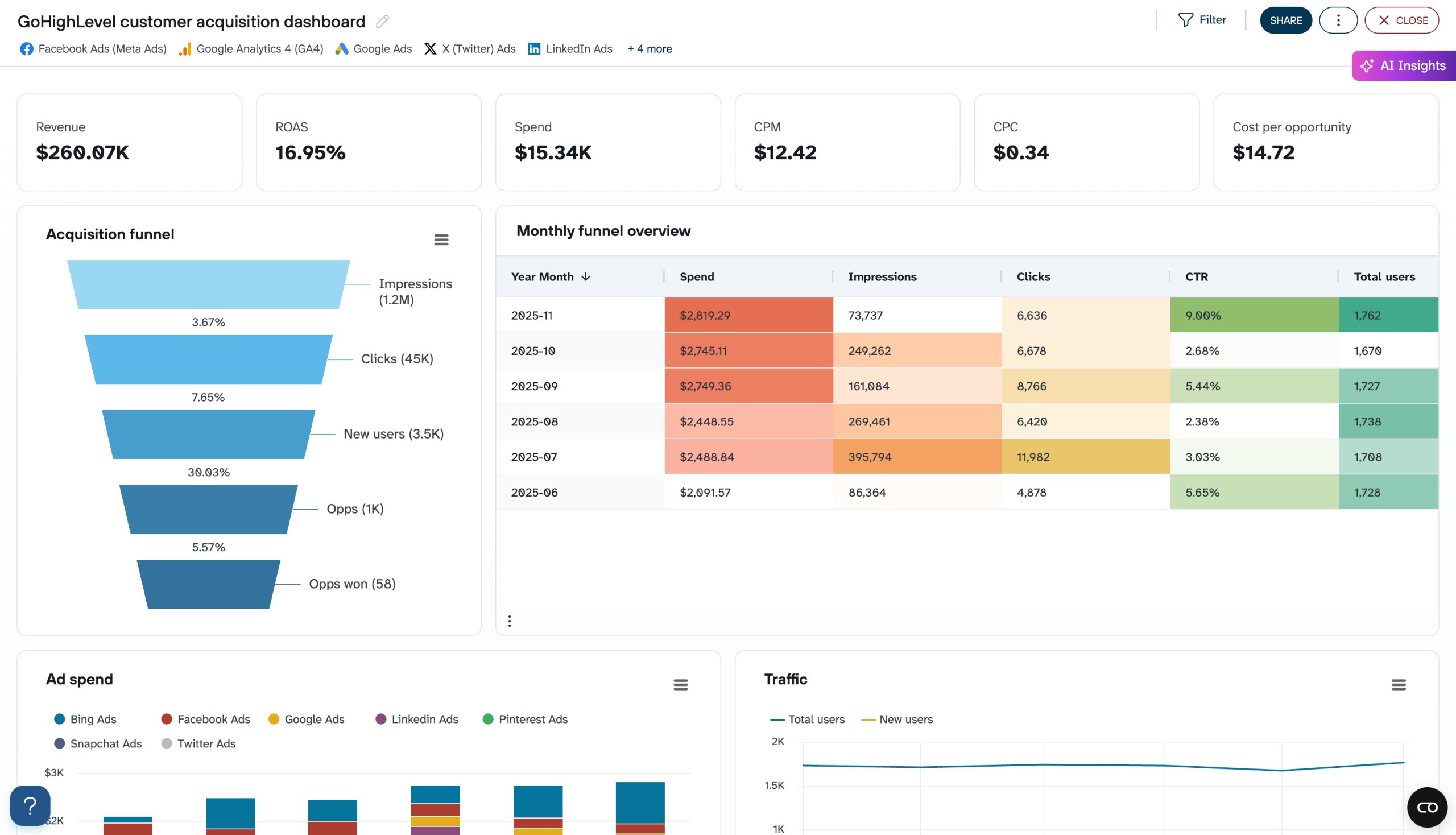
6. Sales KPI dashboard for GoHighLevel by Coupler.io
The GoHighLevel sales KPI dashboard tracks your sales pipeline performance, deal progression, and revenue metrics. It consolidates key sales data from your GoHighLevel CRM to help sales teams and managers make data-driven decisions, identify bottlenecks, and optimize their sales processes.
Sales KPI dashboard for GoHighLevel

Sales KPI dashboard for GoHighLevel
Preview dashboardWhat you can do with this dashboard
Monitor deal stages across pipelines by viewing the distribution of deals by pipeline name (Marketing pipeline, Onboarding calls) and stage name (Scheduled, Hot Lead, Intro, Detailed call, Trial started, Subscription, Lost) with exact deal counts and values to assess pipeline health and identify which stages require attention.

Track deal creation trends over time with stacked bar charts showing the number of deals and deal value by creation date and status (lost, won, open) to identify seasonal patterns, correlate performance with marketing campaigns or external factors, and forecast future revenue based on historical trends.

Review detailed deal information with a comprehensive deals table showing deal name, creation date, status, stage name, deal value, pipeline name, and deal source to prioritize follow-up actions, identify at-risk deals, and understand which sources generate the most valuable opportunities.

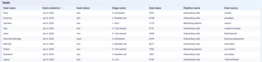
And more. You can use the dashboard in Coupler.io or as a Looker Studio template. Follow the instructions to start analyzing your GoHighLevel sales data.
Sales KPI dashboard for GoHighLevel
Monitor key sales performance indicators from GoHighLevel with tracking of deal values, win rates, and pipeline progression. Analyze deal sources, track status changes over time, and evaluate pipeline stage effectiveness to identify successful patterns and optimize your sales process for better conversion rates.


Sales KPI dashboard for GoHighLevel in Looker Studio
Evaluate sales team performance and pipeline health with key metrics on deal progression, revenue trends, and conversion rates to identify best practices and optimize your sales process.
Customer acquisition dashboards
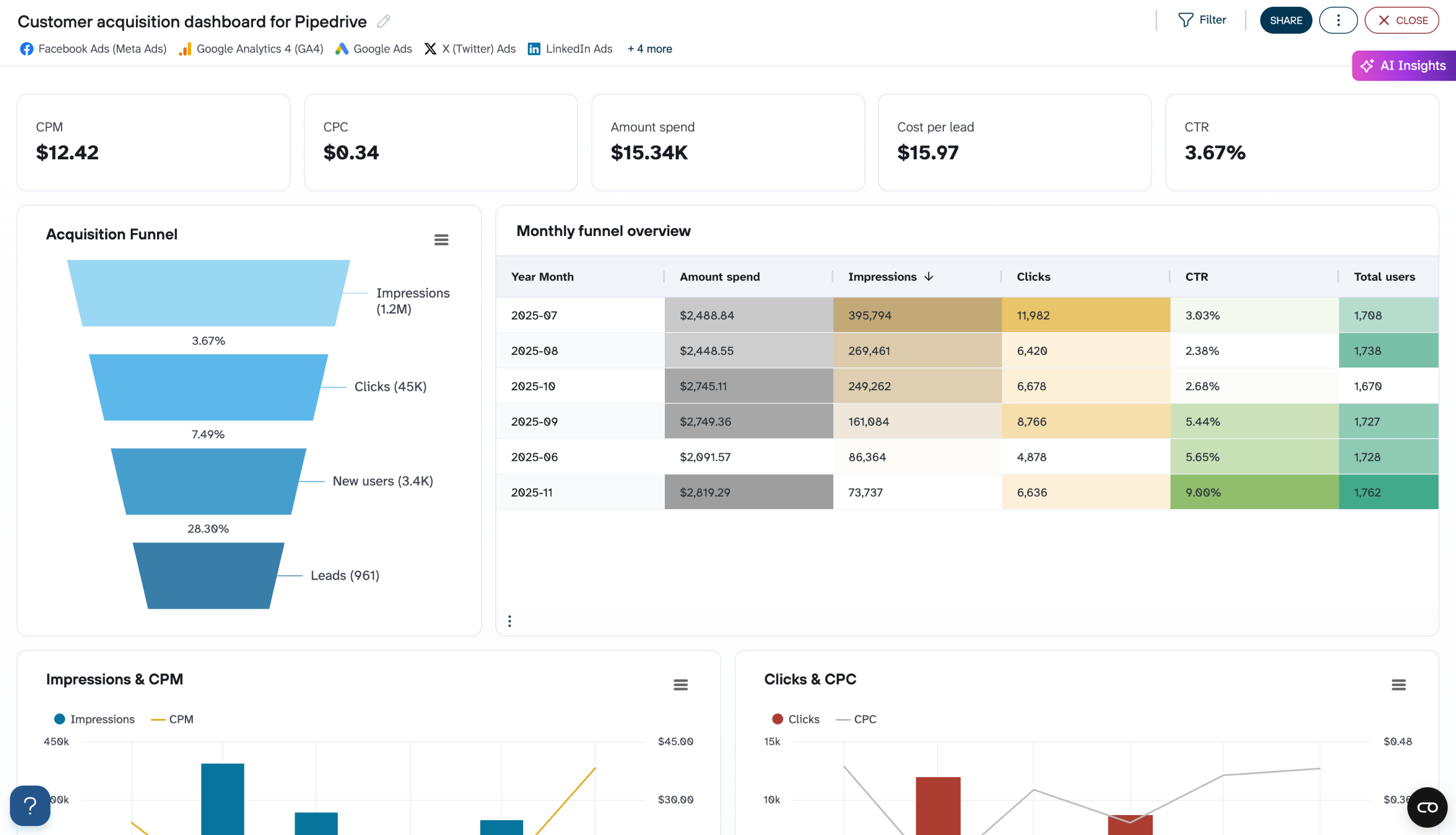
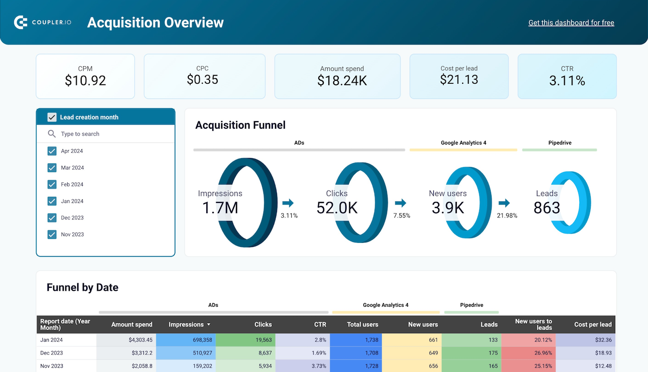
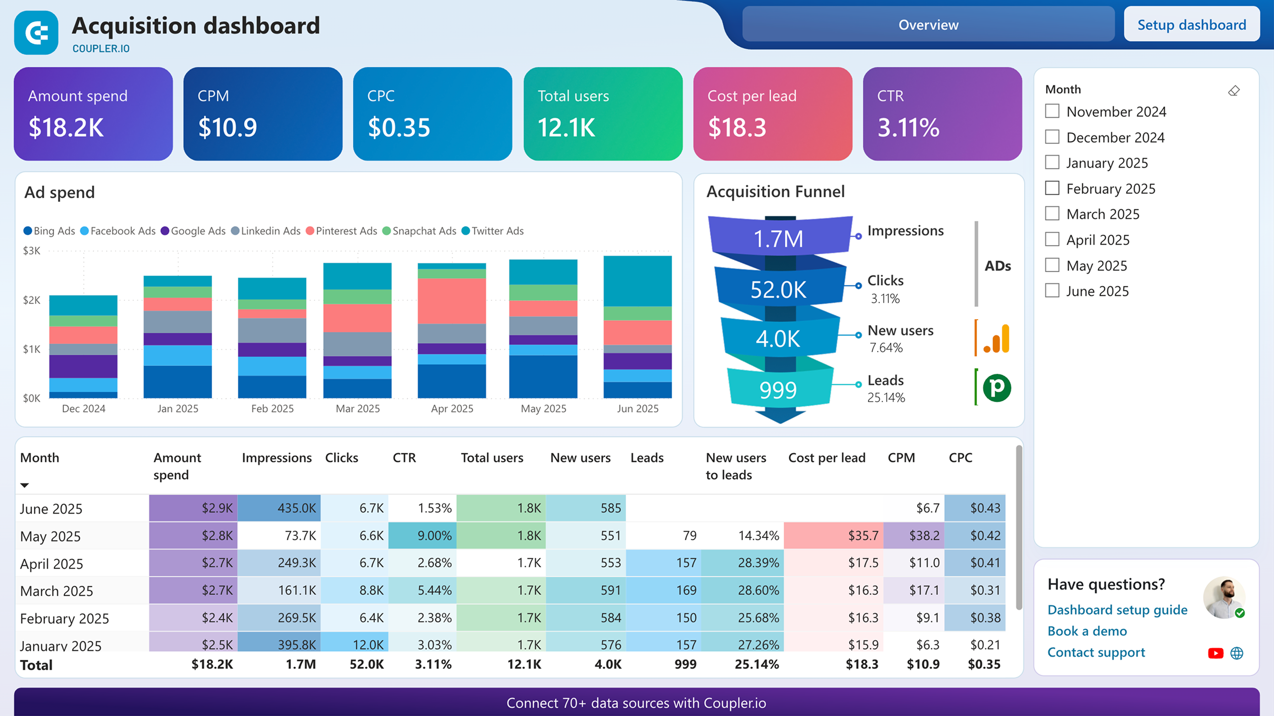
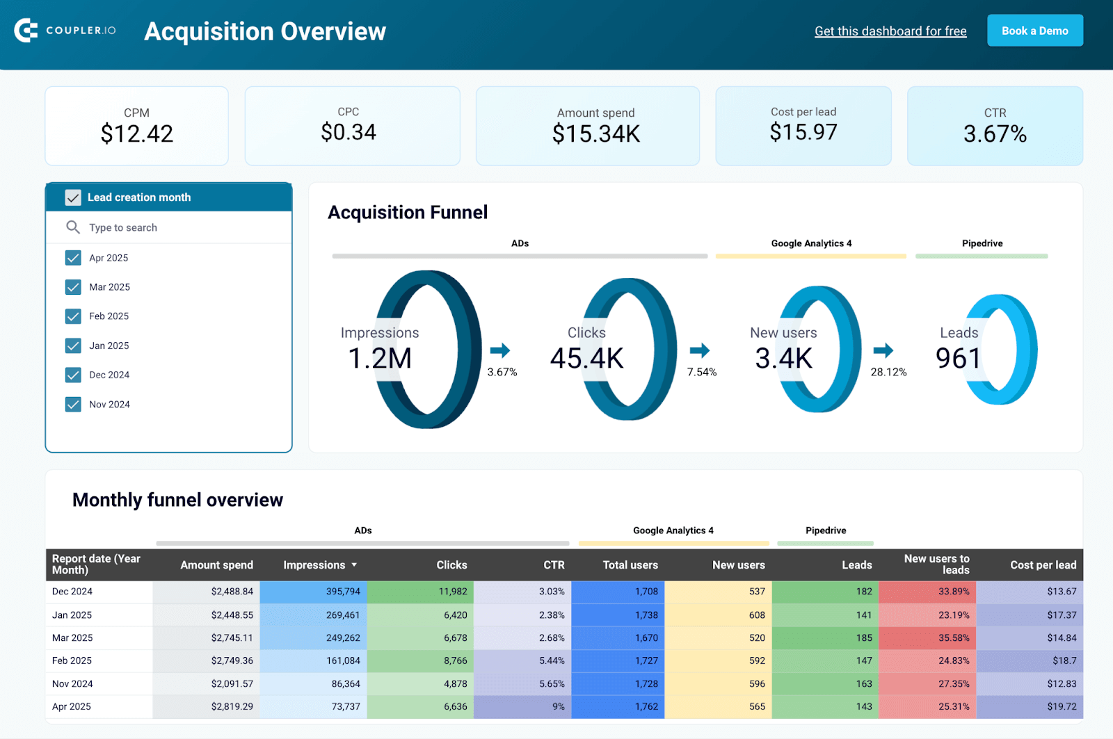
7. Customer acquisition dashboard for Pipedrive by Coupler.io
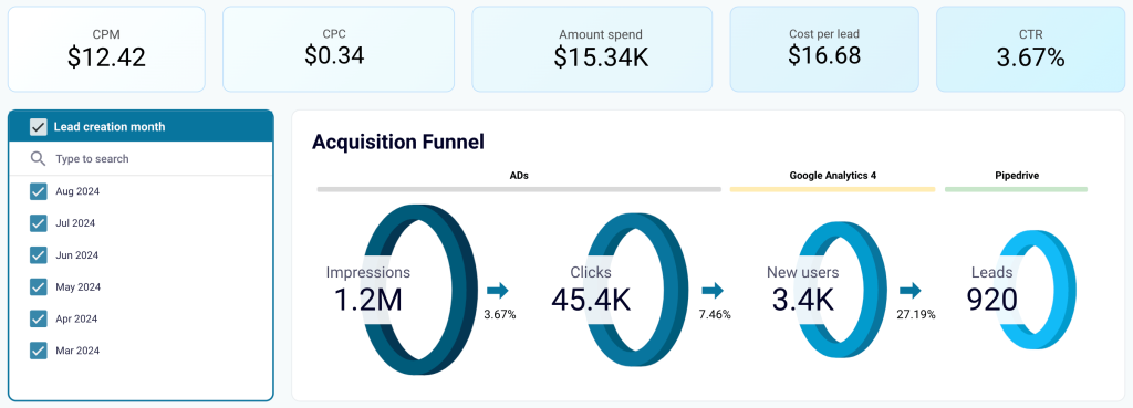
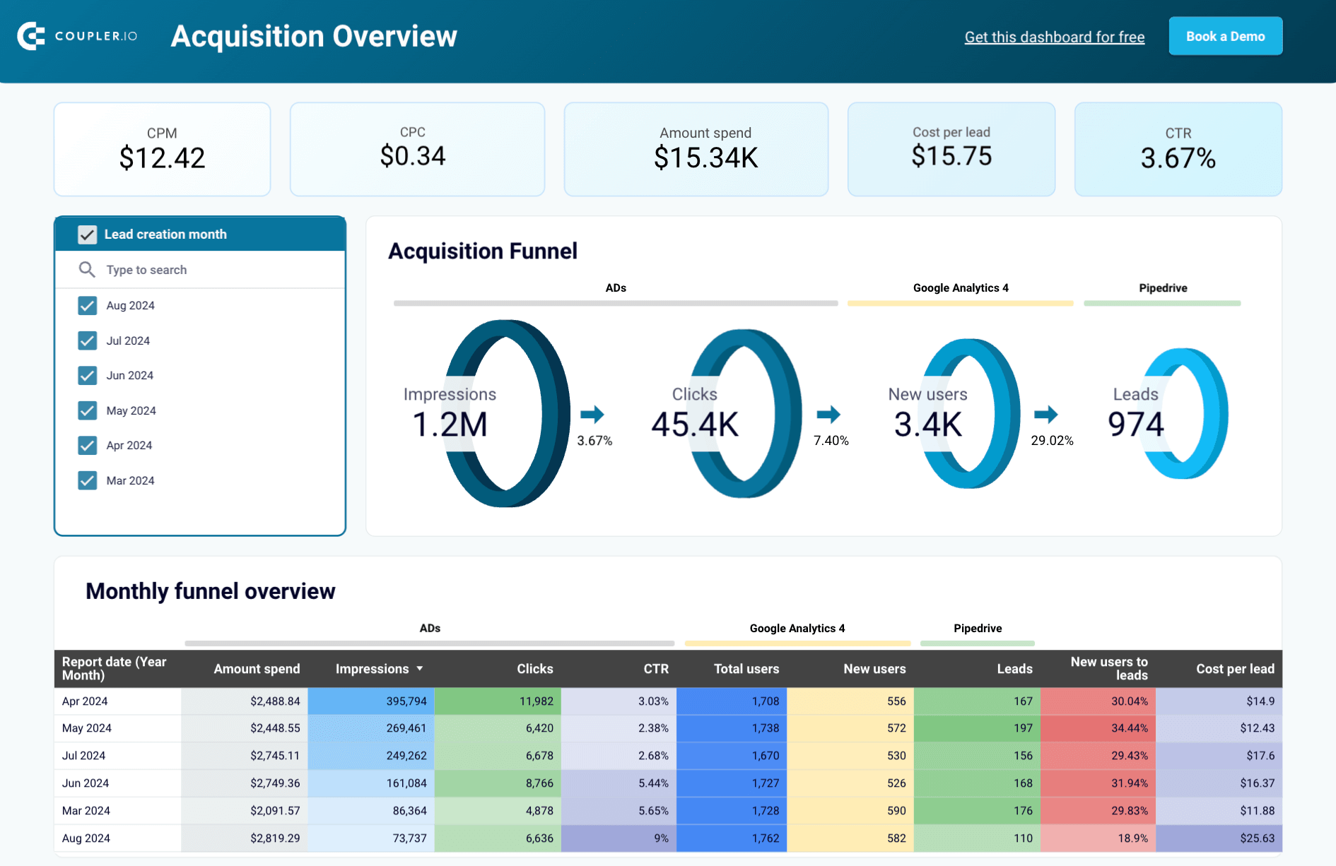
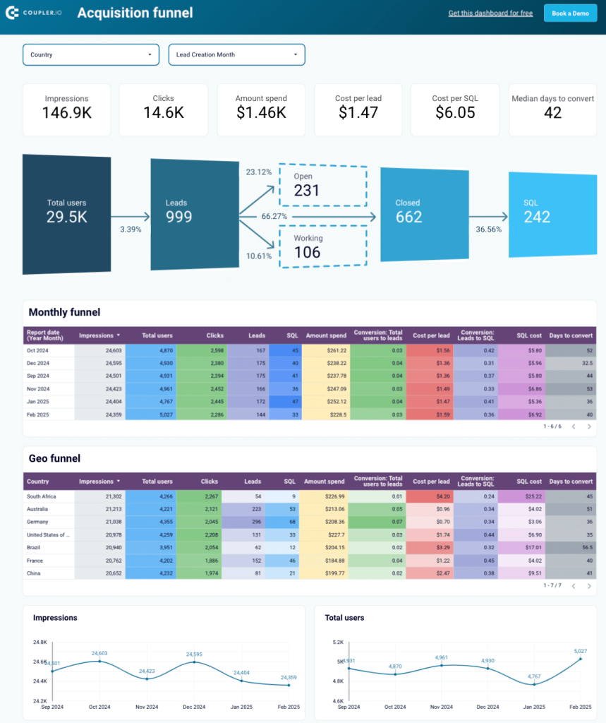
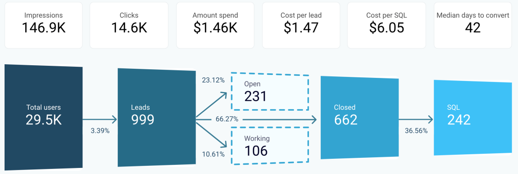
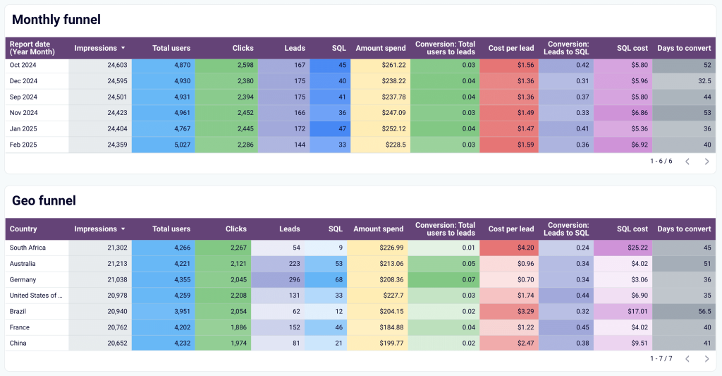
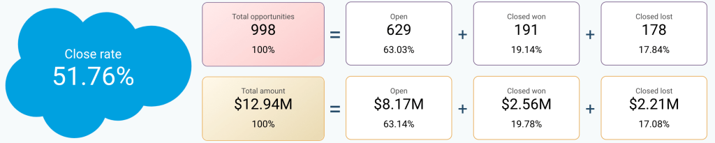
Understanding which marketing channels actually drive qualified leads is critical for scaling efficiently. The customer acquisition dashboard for Pipedrive bridges the gap between marketing activity and sales outcomes by tracking the complete journey from first touchpoint to closed deal. By integrating Pipedrive CRM with GA4 and major advertising platforms, this dashboard helps marketing teams prove ROI, identify bottlenecks, and allocate budget to the channels that truly move the needle.
Customer acquisition dashboard for Pipedrive
Customer acquisition dashboard for Pipedrive
Preview dashboardWhat you can do with this dashboard
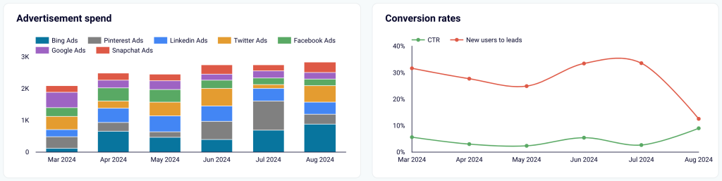
Monitor multi-platform advertising spend trends with stacked bar charts showing monthly investment distribution across platforms (Bing Ads, Facebook Ads, Google Ads, LinkedIn Ads, Pinterest Ads, Snapchat Ads, Twitter Ads) to track budget allocation changes and identify which platforms receive the most investment during different periods.

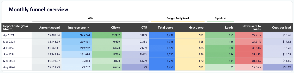
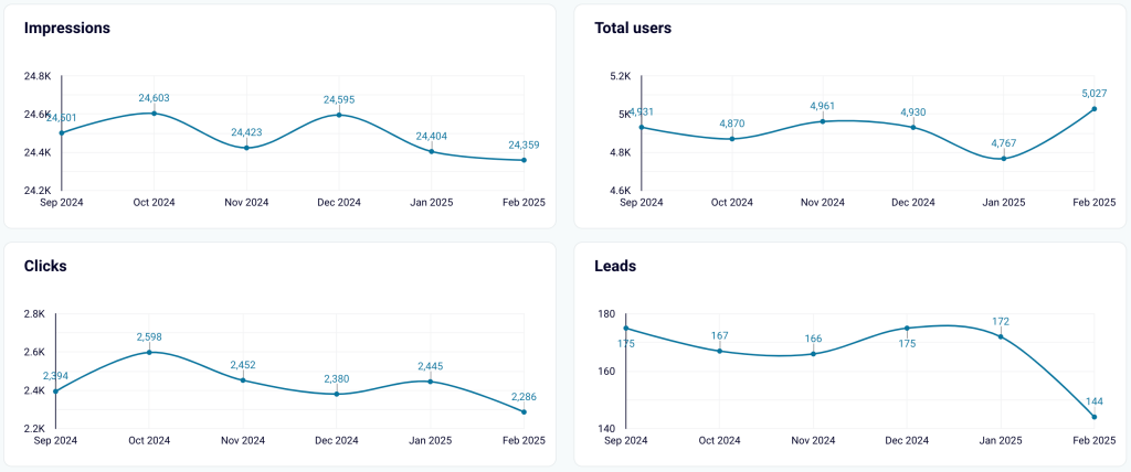
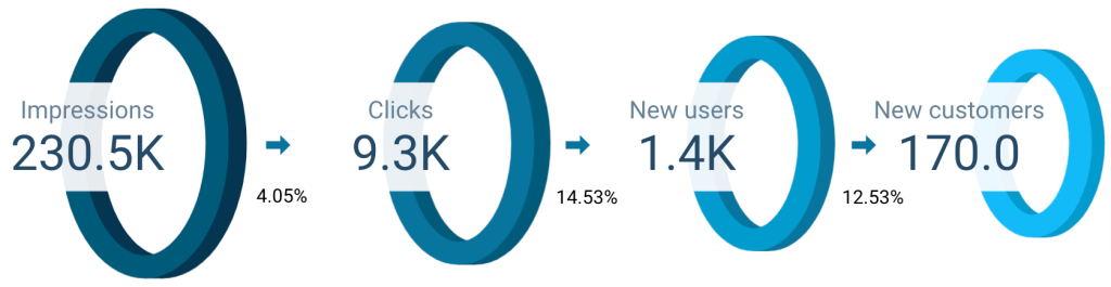
Track acquisition funnel performance by month with a detailed table view showing year-month breakdown of amount spend, impressions, clicks, CTR, total users, new users, and leads to identify seasonal patterns, compare month-over-month performance, and correlate funnel efficiency with specific marketing activities or campaigns.

And much more with the dashboard available in Coupler.io and as a template in Looker Studio and Power BI.
Customer acquisition dashboard for Pipedrive
Track your complete lead generation funnel from advertising platforms to Pipedrive conversions. Monitor ad spend across multiple channels, analyze funnel progression from impressions to leads, and evaluate cost per lead metrics to optimize acquisition efficiency and improve conversion rates throughout your marketing pipeline.
Customer acquisition dashboard for Pipedrive in Looker Studio
Use one dashboard to analyze the effectiveness of your Pipedrive acquisition funnel. Gain insights from data sourced from ad platforms and Google Analytics 4.
Customer acquisition dashboard for Pipedrive in Power BI
Visualize your complete lead generation funnel from initial ad impressions through CRM conversions, enabling data-driven decisions to improve acquisition costs and conversion rates.
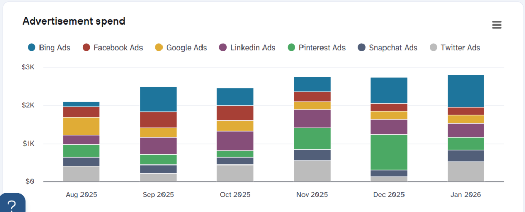
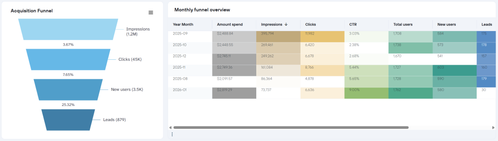
8. Customer acquisition dashboard for GoHighLevel by Coupler.io
For agencies and businesses using GoHighLevel, tracking customer acquisition across multiple ad platforms can quickly become overwhelming. This dashboard simplifies multi-channel attribution by consolidating data from Bing Ads, Pinterest Ads, LinkedIn Ads, Twitter Ads, Facebook Ads, Google Analytics 4, and GoHighLevel CRM into one unified view. It answers the essential question: which platforms and campaigns are actually generating revenue, not just leads?
Customer acquisition dashboard for GoHighLevel
Customer acquisition dashboard for GoHighLevel
Preview dashboardWhat you can do with this dashboard
- Visualize the complete acquisition funnel and monthly performance by tracking the journey from impressions through clicks, new users, opportunities, to won opportunities with conversion rates at each stage.

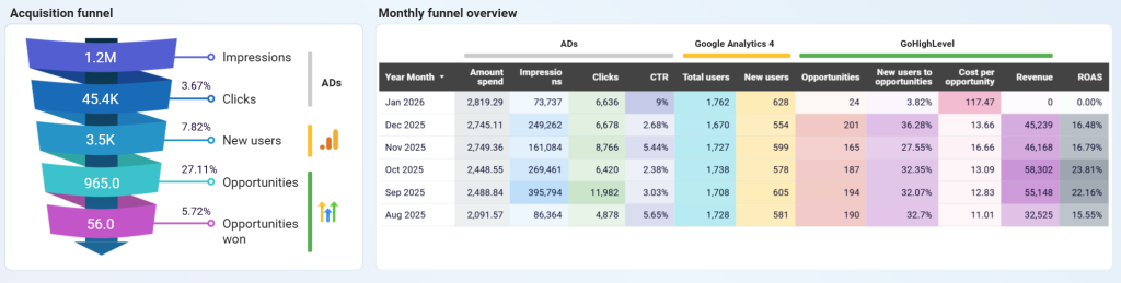
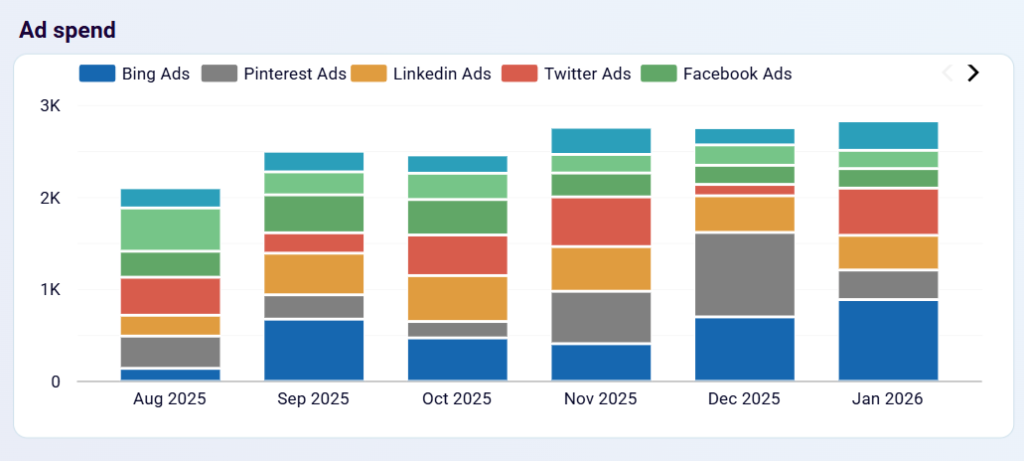
- Track multi-platform ad spend distribution with stacked bar charts showing monthly investment across Bing Ads, Pinterest Ads, LinkedIn Ads, Twitter Ads, and Facebook Ads to identify budget allocation patterns, understand which platforms receive the most investment over time, and optimize spending based on performance trends.

And get more insights using the GoHighLevel customer acquisition dashboard in Coupler.io or as a template in Looker Studio.
Customer acquisition dashboard for GoHIghLevel
Visualize your complete lead generation funnel from advertising platforms to GoHighLevel conversions. Track ad spend across multiple channels, monitor funnel progression from impressions to opportunities, and analyze cost efficiency metrics to optimize acquisition costs and improve conversion rates throughout your marketing pipeline.
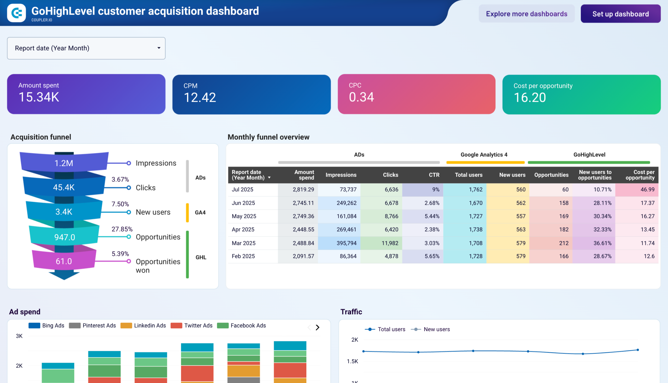
Customer acquisition dashboard for GoHighLevel in Looker Studio
Monitor your lead generation pipeline with comprehensive acquisition funnel analysis from initial contact to customer conversion to optimize lead quality and improve conversion rates.
9. Customer acquisition dashboard for HubSpot by Coupler.io
The customer acquisition dashboard for HubSpot provides insights into how leads move through the acquisition funnel—from ad impressions to CRM conversions. It combines HubSpot data with marketing data from GA4 and all major ad platforms like Facebook Ads, LinkedIn Ads, Google Ads, and more. With these insights, businesses can identify funnel inefficiencies, optimize ad spend, and refine lead-generation strategies to maximize revenue.
Customer acquisition dashboard for HubSpot in Looker Studio

Customer acquisition dashboard for HubSpot in Looker Studio
Preview dashboardWhat you can do with this dashboard
Track your entire lead generation funnel from ad impressions to CRM conversions. Marketing funnel analytics allows you to compare conversion rates at different funnel stages against industry benchmarks to identify funnel leaks and develop hypotheses for optimizing ad targeting, landing page experience, or lead qualification processes.

Detect performance fluctuations over time with month-over-month analysis that helps uncover trends and correlations between marketing efforts and lead generation success. This allows you to identify the best-performing months and link them to specific campaigns, budget shifts, or seasonal factors.

Evaluate ad spend efficiency across platforms by comparing ad spend across different channels with lead conversion rates to assess the effectiveness of each platform and investigate whether performance variations stem from audience targeting, ad creatives, or landing page performance.
The customer acquisition dashboard is designed in Looker Studio. Connect your HubSpot account to the dashboard and get the data visualized.


Customer acquisition dashboard for HubSpot in Looker Studio
Monitor your acquisition funnel and analyze its effectiveness using the insights from HubSpot CRM, advertising platforms, and Google Analytics 4.

Customer acquisition dashboard for Pipedrive in Looker Studio
Use one dashboard to analyze the effectiveness of your Pipedrive acquisition funnel. Gain insights from data sourced from ad platforms and Google Analytics 4.
Customer acquisition dashboard for Pipedrive in Power BI
Visualize your complete lead generation funnel from initial ad impressions through CRM conversions, enabling data-driven decisions to improve acquisition costs and conversion rates.
Specialized Salesforce dashboards
10. Sales team performance dashboard for Salesforce by Coupler.io
This dashboard provides an overview of each sales team member’s performance. It works best for teams with at least two sales managers.

Here’s how you can put this dashboard into practice:
- Sales metrics segmentation by team member (owner): View their performance metrics and the types of deals they handle by geography, stage, and lead source. Understanding the types of deals will help explain performance variations. You can also learn which team members are the most frequently responsible for those types of deals.

- Win-loss comparison: Collate the win and loss rates of all your team members to quickly identify the best and worst performers. This comparison can be based on the number of deals or revenue generated. To maximize profits, assign your best sales managers to deals with the highest potential revenue.

- Types of closed deals per sales manager: Understand what each sales manager is good at. For example, if one closes most partnership deals, it might make sense to reallocate similar opportunities to them from other sales managers. The comparison is available by deal type and revenue size.

- Sales funnel by manager: Check out how each sales manager’s funnel looks at different stages.

- Top-performing sales managers: Highlight the top-performing sales managers based on key metrics like won revenue, won opportunities, win rate, and so on.

The dashboard is available for Looker Studio and Google Sheets. To use it for your needs, visit the template’s Readme tab and follow the setup instructions.
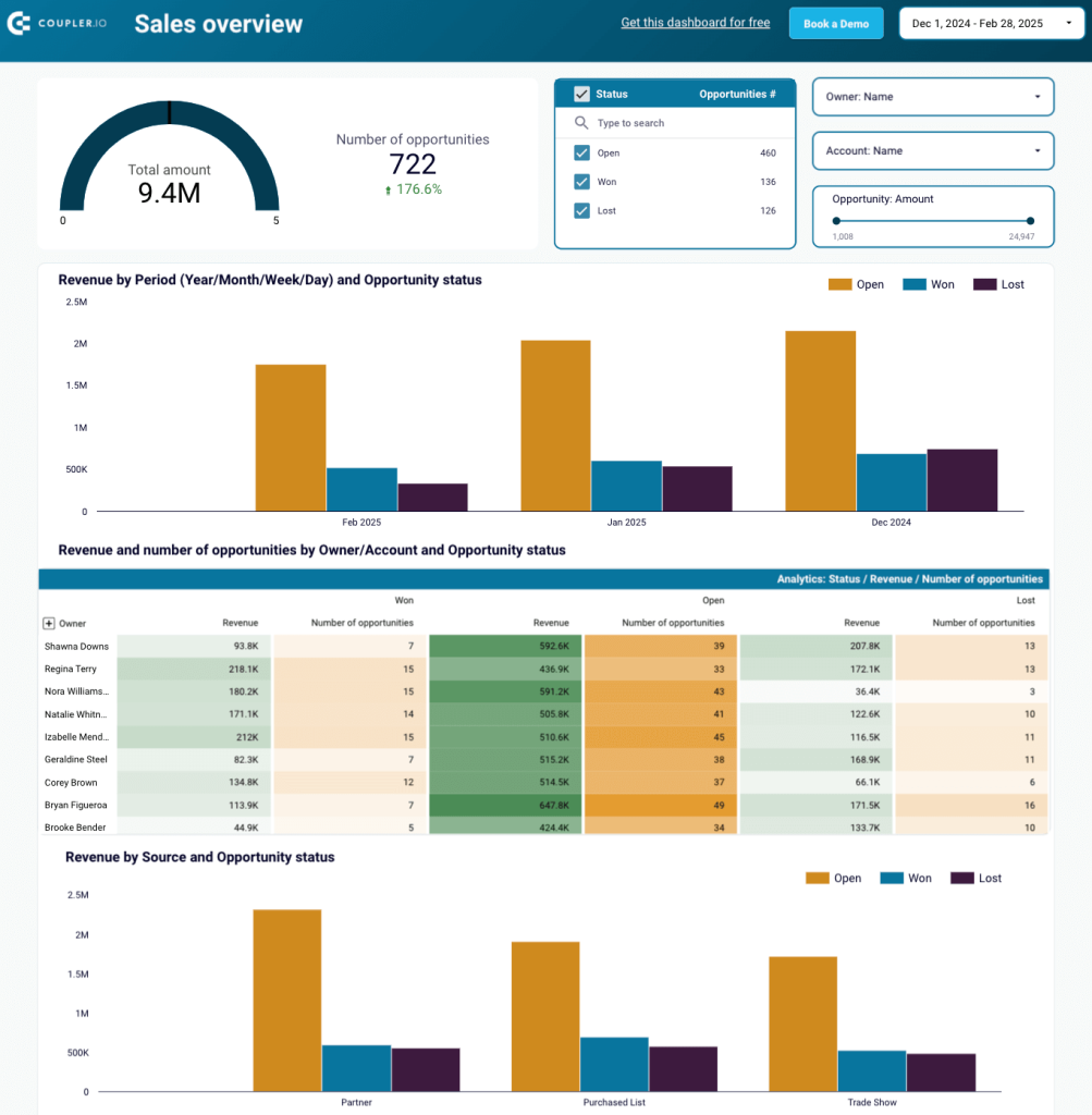
11. Salesforce analytics dashboard by Coupler.io
Here’s one more Salesforce dashboard in Looker Studio, this time allowing you to attribute leads and revenue to specific marketing channels based on data from this CRM and major ad platforms.

The dashboard helps you analyze sales performance in the following ways:
- Visualized sales funnel: Assess the effectiveness of generated traffic (total users) by comparing conversion rates with your industry benchmark. Build hypotheses for underperforming stages to drive more revenue from the existing pipeline.

- Performance comparison: Collate the performance across different periods and regions using table-view funnels. Identify the most successful segments and correlate them with marketing or lead-generation activities to uncover growth opportunities.

- Acquisition dynamics: Track key acquisition metrics over time. Filter data by geography to check prioritized destinations.

- Open deals analytics: Explore a separate tab with a detailed review of open deals to understand where to focus your efforts at the moment. Deals can be segmented by owner, revenue amount, or type.

Follow the instructions in the template’s Readme tab to connect your Salesforce and ad platforms and have the combined data visualized in minutes.
12. Salesforce dashboard by Coupler.io
This dashboard in Looker Studio provides insights into the essential Salesforce analytics data for you to have at hand.

Set up the dashboard to get the following snapshots of sales performance data:
- Data by opportunity amount: Filter all the data by opportunity amount to analyze deals within specific revenue ranges separately. For example, assess the performance of high-profit deals by examining their owner, status, and effectiveness.

- Deal performance comparison: Collate the performance of deals from different lead sources to determine where to focus your marketing and lead generation efforts.

- Won and lost deals analysis: Look at won and lost deals and filter those by owner, lead source, and revenue. Check out days to close to understand the ideal timing for closing deals. Supplement this knowledge with additional information like lead source, owner, deal type, industry, geography, etc.

- Open opportunities review: See opportunities open to identify current challenges and figure out the reasons for unclosed deals.

Just navigate to the template’s Readme tab and take a few simple steps to set up the dashboard.
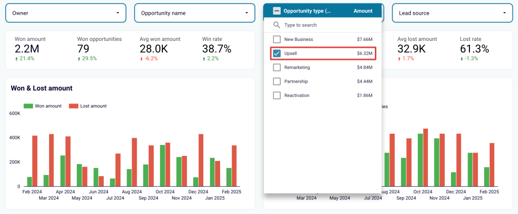
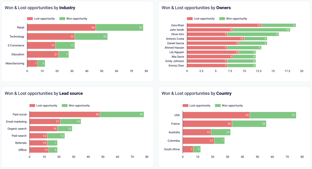
13. Salesforce win-loss analysis dashboard by Coupler.io
This win/loss dashboard enables you to track win rates by team, industry, lead source, etc., and uncover patterns in successful deals. You can also use it to evaluate the number and value of opportunities won or lost.

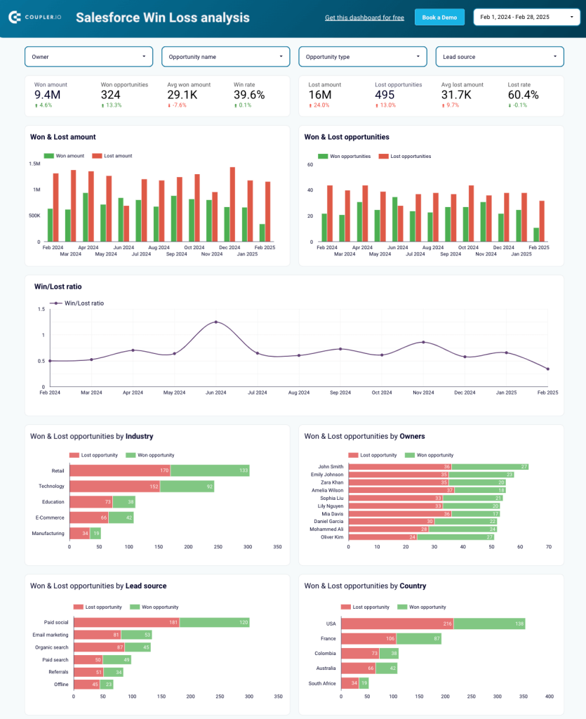
Implement the dashboard to have the following insights available:
- Types of opportunities: Check different types of opportunities to understand their effectiveness. For example, if your team focuses heavily on upsells, you can filter the data to see if these deals generate the expected revenue.

- Won and lost deals: Look at won and lost deals pre-segmented by various categories, such as industry, owner, lead source, country, and others. By identifying the best-performing segments, you’ll be able to focus on specific types of deals. Conversely, by recognizing underperforming segments, you’ll have the option to reduce efforts in those areas.

Refer to the instructions in the template’s Readme tab, set up the dashboard, and have it ready for analysis.
Other CRM dashboard examples
14. Microsoft Dynamics CRM dashboard
Another popular CRM choice is Microsoft Dynamics. One of the main reasons for its popularity is that it natively integrates with the Microsoft ecosystem (Office 365, SharePoint, Outlook, and Azure). Also, it is scalable and provides a high degree of customization and multichannel customer interactions.
If you selected Microsoft Dynamics as your CRM, then you know that it comes with a native dashboard, just like any other customer relationship management system. However, if you want to build your own dashboard and need a bit of inspiration, here’s an example that might help:


You can see various key metrics such as active accounts, revenue, lead type, expected revenue, and costs.
15. Zoho CRM dashboard example
Zoho CRM is one more option for sales managers. Because it natively integrates with Zoho Expense and Zoho Desk, two other platforms used by professionals, it’s easy to have a complete overview of your business growth.


This example of a CRM dashboard from Zoho Analytics is based on data extracted from all three platforms and highlights the most important KPIs, such as conversion rate, total leads, number of tickets, expenses, ROI, and revenue.
With Zoho Analytics, you can create a dashboard from scratch and integrate data from all their apps (Zoho Business Mail, Forms, CRM, Bookings, Desk, etc.). Also, you can choose from a pre-built template and simply customize it.
16. Tableau CRM dashboard
Tableau allows you to choose one of the numerous dashboard templates available on the platform or create your own one from scratch, depending on your needs.
In this example, you can see a CRM dashboard for service and support teams.


It is a great way to have an overview of the support cases your agents are dealing with. In this dashboard, data from Salesforce was extracted, and key metrics were highlighted. For instance, you can check the number of new cases, the closed cases, the average CSAT, and the average response time.
How to create a CRM dashboard
To effectively build a CRM dashboard, you must have the following components in place:
- Types of data to integrate – to ensure the dashboard provides a holistic view of customer interactions, sales performance, and marketing efforts.
- Essential metrics to track – to monitor the performance and health of customer relationships and business operations.
- Data points beyond metrics – to derive insights that provide additional context to CRM metric values.
- Visualization techniques – to present data in a clear, accessible, and actionable format for faster analysis and decision-making.
- Design considerations – to create an intuitive and user-friendly layout that makes the dashboard easy to use and engaging.
Let’s review each component in detail.
Types of data to integrate
Your dashboard should be built on CRM data, sales records, customer interaction logs, and marketing campaign results, each providing unique value.
CRM data
This data is the foundation of any CRM dashboard. It offers a detailed perspective on customer profiles, like contact information, preferences, or transaction history. Based on insights from this information, you can personalize interactions, improve customer service, and increase retention.
Sales records
Sales records are crucial for understanding a customer’s lifecycle, from initial interest to final purchase. With this data on your dashboard, you’ll be able to track sales performance, identify successful strategies, and forecast future trends.
Customer interaction logs
These logs reveal the communication history between customers and your team across different touchpoints. You can use them to monitor engagement, address concerns promptly, and fine-tune your customer service efforts for better results.
Marketing campaign results
Campaign results should be included in your dashboard to measure marketing effectiveness. By analyzing this data, you can refine your strategies, align sales and marketing efforts, and develop a more tailored approach to each customer segment.
Essential metrics to track
The most important figures to display on a CRM dashboard are the following:
- Lead metrics: number of leads, lead source effectiveness, lead conversion rate.
- Sales metrics: average deal size, sales cycle length.
- Customer success metrics: customer retention rate, CLV. ?
Total number of leads
This metric shows the overall count of leads in your CRM system. It helps measure the initial interest generated by your business.
A high number of leads indicates strong marketing efforts. In comparison, a low count will likely reflect a need to improve lead generation strategies.
Lead source effectiveness
It signifies how well different sources (such as social media, referrals, or paid ads) are performing in terms of lead generation.
This metric is calculated using the formula:
Lead source effectiveness = (Leads from a specific source ÷ Total leads) × 100
For example, if 50 leads come from social media out of 200 overall, the calculation would be:
(50 ÷ 200) × 100 = 25%
A high percentage shows that your lead source is working well and should be prioritized, while a low one might suggest that it’s underperforming or ineffective.
Lead conversion rate
This figure is the percentage of leads that convert into paying customers. It illustrates the effectiveness of your sales funnel.
Here’s a formula to calculate it:
Conversion rate = (Number of conversions ÷ Total number of leads) × 100
Suppose 40 out of 200 leads converted into customers. In that case, you’d get:
(40 ÷ 200) × 100 = 20%
If your lead conversion rate is high, this means your sales process is effective. If it’s low, however, it might indicate a need for better follow-up strategies or lead nurturing.
Average deal size
It demonstrates the average value of each closed deal and helps measure revenue per customer.
Below is the formula for calculating this metric:
Average deal size = Total revenue ÷ Number of deals closed
Imagine your total revenue for the month is $10,000 from 20 closed deals. If so, you’ll receive:
10,000 ÷ 20 = $500
A high average deal size indicates larger, more profitable sales. On the contrary, a low number may suggest smaller, less profitable deals or a need to target higher-value customers.
Sales cycle length
This metric expresses the average time it takes for a lead to become a customer, from the initial contact to closing the deal.
You can calculate it as follows:
Sales cycle length = Sum of all sales cycle durations ÷ Total number of closed deals
Let’s say three deals took 30, 45, and 60 days to close. The calculation would look like this:
(30 + 45 + 60) ÷ 3 = 45 days
A longer sales cycle might point to inefficiencies or a complex decision-making process. In contrast, a shorter one could mean that leads convert quickly, which is typically favorable.
Customer retention rate
The customer retention rate is the percentage of those who continue doing business with you over time. It’s a key indicator of customer loyalty to your business.
The formula is:
Customer retention rate = ((Number of customers at the end of the period ? New customers acquired during the period) ÷ Number of customers at the start of the period) × 100
Example: If you start the period with 100 customers, acquire 30 new ones, and end with 120 overall, the retention rate will be:
((120 ? 30) ÷ 100) × 100 = 90%
A high figure demonstrates intense customer satisfaction and loyalty. Conversely, a low rate may imply poor customer experience or a need for better engagement.
Customer lifetime value (CLV)
This number demonstrates the total revenue you can expect from a customer during their entire relationship with your business.
Calculate it according to the formula:
Customer lifetime value = Average purchase value × Purchase frequency × Customer lifespan
To give you an idea, let’s consider a customer who spends $100 per month, makes purchases 12 times per year, and stays with your company for 3 years. Their lifetime value will be:
100 × 12 × 3 = $3,600
A high CLV indicates a profitable customer relationship. However, if it’s low, it may call for increased customer engagement or optimized pricing and offerings.
Data points beyond metrics
To get meaningful insights from CRM data, you must consider more than just basic metrics. Below, you’ll find additional data points crucial for sales tracking and improvement, lead management, performance evaluation, and strategic refinement.
Customer contact information
This information ensures easy access to key details that help personalize outreach, facilitate follow-ups, and maintain accurate records. It enables sales teams to engage with prospects at the right moments and provide a tailored customer experience critical for relationship-building.
Sales funnel stages
Another vital thing to include is a sales funnel, which shows how many people you have at every stage, from awareness to renewal. This will give you a clear picture of where you are losing leads and potential customers.

Customer interaction history
The customer interaction history embraces all past engagements, whether emails, calls, or meetings. This data is essential for understanding the context of each relationship, whether effective or not, and identifying areas for further engagement.
New leads and deals
With new leads and deals on your CRM dashboard, you’ll be able to see a list of opportunities that can be tackled and the future workload for the sales teams. It helps prioritize efforts by focusing on high-potential opportunities to ensure that resources are allocated effectively.
Open/closed deals
The ratio between the open and closed deals allows sales representatives to better manage their workload. You can also include the value of the closed or won deals to have a snapshot of your sales performance.

Goals
Like any other dashboard, a CRM report must feature goals or milestones to know where your business should be heading. This way, you can ensure there are measurable targets in place, making it easier to track progress, assess performance, and adjust strategies when needed.
Sales rep performance
This information helps managers spot and reward top-performing team members. It will also show which sales reps are lagging behind at the moment. As a result, you’ll be able to discover what’s going on with the salespeople and maybe provide help like training.
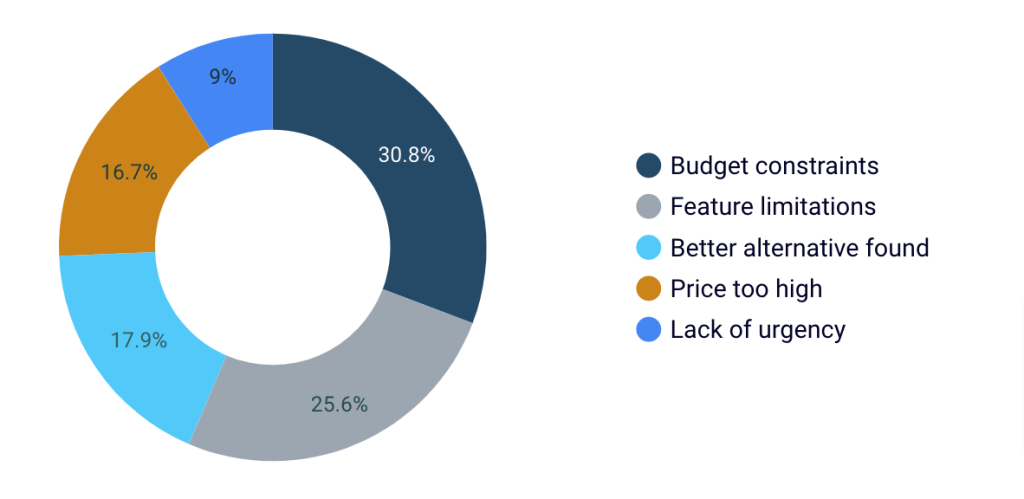
Reasons for lost deals
It would also be valuable for your dashboard to display the reasons why lost leads did not choose your product. This feedback can guide product upgrades and updates to meet customer needs better.

Visualization techniques
Now, let’s dig into some key visualization techniques for your CRM dashboard and see how they help present data in an intuitive and digestible way.
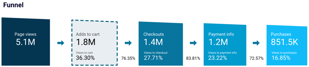
Funnel charts for the sales pipeline
Funnel charts visualize the stages of the sales process and clearly show where prospects drop off. They let you quickly assess conversion rates, identify bottlenecks, and optimize each stage for better sales efficiency.

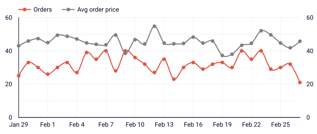
Line graphs for sales trends
Line graphs track sales trends over time and give you a quick view of performance fluctuations. This helps you understand seasonal patterns, forecast future sales, and adjust strategies in real time to align with changing market conditions.

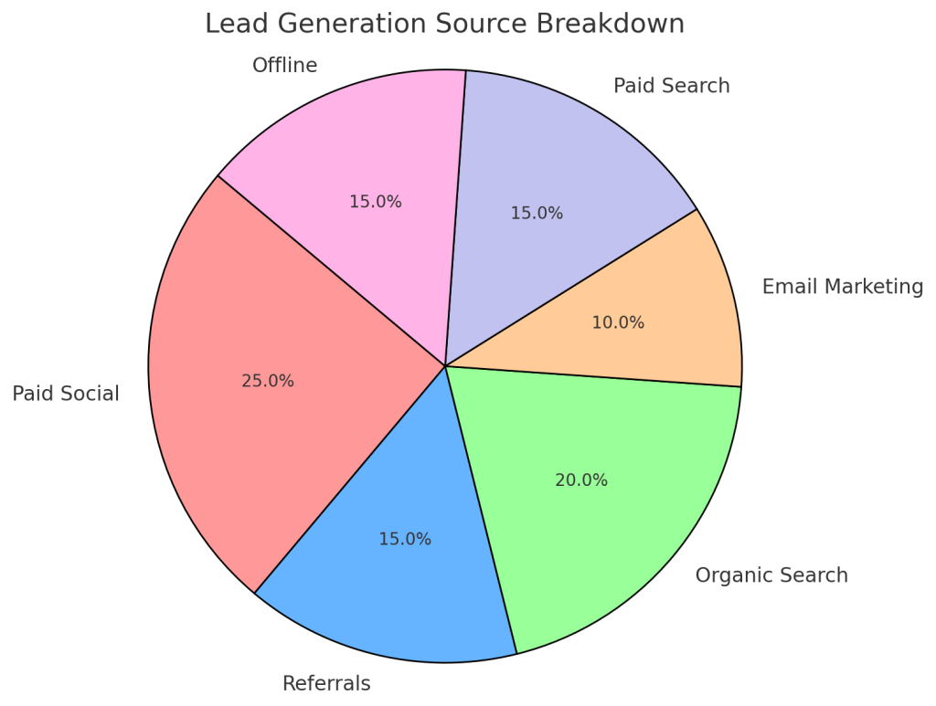
Pie charts for lead sources
Pie charts break down lead sources in a visually engaging way so you can easily assess the effectiveness of different marketing channels. This insight enables you to prioritize resources and focus on the most fruitful lead-generation strategies.

Bar graphs for performance comparisons
Bar graphs offer a straightforward comparison across different metrics or teams. They highlight variances, allowing you to evaluate performance against targets and identify areas that require improvement or further investment.

Design considerations
Certain design considerations are necessary when creating a CRM dashboard to ensure that it provides real-time insights, is intuitive and adaptable, and clearly communicates key metrics through visual cues.
Real-time data updates
Real-time data updates allow you to access the most current and relevant information. This is critical for immediate decision-making and enables quick action based on the insights without delay.
User-friendly interface
A user-friendly interface is vital for navigating your CRM dashboard and interpreting data. By prioritizing simplicity and intuitive design, you ensure that anyone on the team using the dashboard focuses on insights rather than struggling to understand the layout.
Mobile responsiveness
Mobile responsiveness means you can check the dashboard from any device, anywhere. This flexibility provides seamless access to customer data, key performance indicators, and real-time updates, regardless of location.
Customizable views
Customizable views, such as date range controls and filters, allow team members to tailor the dashboard to their specific needs. This way, each user can focus on the data that matters most to them.
Color-coded performance indicators
Color-coded performance indicators offer an immediate visual representation of key metrics so you can spot trends and areas that require attention. With colors implemented strategically, the dashboard helps quickly assess performance without sifting through detailed data.
As you already know how to build a CRM dashboard, the question remains: which tools should you use for it? Let’s take a look at the proper toolset you’ll need for this purpose.
What tools to use to build CRM dashboards
To create a customizable and shareable dashboard, use the following tools:
- Coupler.io – to automatically export data from your CRM to your preferred BI tool.
- BI tool – to build a dashboard based on your sales performance data. ?
Coupler.io
Coupler.io allows you to build a custom report based on data from HubSpot, Intercom, Pipedrive, or Salesforce. You can also enrich it with data from GA4 or ad platforms in a single view, then load it into a BI tool like Looker Studio, Power BI, or Tableau for dashboard creation. Plus, your dashboard will automatically update according to your chosen schedule, reflecting the latest changes in the source.


You can export your sales performance data with Coupler.io in three simple steps:
- Collect your data: Sign up for Coupler.io (no credit card required), add a new data flow, connect to your CRM, and select the data you’ll load. If you need more than one type of data for your dashboard, simply add your CRM as an extra source and follow the same steps. A similar process applies when you need to pull data from other kinds of sources.
- Transform the data: Build a report by transforming your data in various ways. You can sort and filter records, edit columns, create new ones with custom formulas, or aggregate data using operations like sum, average, count, min., or max. If you’ve connected multiple data types or sources, combine the records into a single view.
- Load the data and schedule refresh: Connect to your destination and choose the file where you’ll fetch your report. Then, select a schedule for automated refresh, as often as every 15 minutes, and run the data export.
BI tools
Looker Studio
Google Looker Studio is a BI platform for creating dashboards that turn raw sales data into actionable insights. It allows you to build various visualizations, including line, bar, pie, bubble charts, geo maps, area graphs, and pivot tables. Check out the dedicated Looker Studio tutorial for more information on how to work with this tool.
Tableau
Tableau is a more advanced tool that processes large and complex datasets and transforms them into visual formats. You can organize data into maps, tables, diagrams, and charts. Tableau chart types are pie, bar, line, packed bubble charts, scatter and box-and-whisker plots, histograms, bullet graphs, and treemaps.
Power BI
Microsoft Power BI is another business intelligence tool that is well-suited for working with vast amounts of data. It also offers a more accessible alternative to Tableau and serves as a great option for beginners and non-data analysts. Available visualizations for your data include bar, column, line, pie, and donut charts, as well as maps, tables, matrices, and cards. To learn more about using this tool, refer to our Power BI tutorial.
Best 3 native CRM dashboards
As you already know, all the CRMs we mentioned also come with their native dashboards. Some of them might need a better dashboard design, while others might lack the necessary graphs and widgets to highlight metrics. However, all of them are a better option than monitoring your metrics and processes in a spreadsheet table with no charts or other visualizations.
Let’s take a look at some native CRM dashboards:
1. Freshsales sales dashboard
Another software used by salespeople is Freshdesk. This is a good choice for small businesses that prioritize customer support and service but do not require extensive CRM capabilities. This tool comes with a feature for reporting that allows you to create dashboards to keep an eye on important KPIs.


As you can see in the example, you can monitor various metrics including the number of sales, deal conversion, and sales velocity.
2. Monday sales CRM dashboard
For the purpose of diversity, we wanted to include a popular tool that is not really used as a CRM, but can be a great option for small businesses. Monday is a productivity software that allows you to create workflows for better sales and marketing ops.

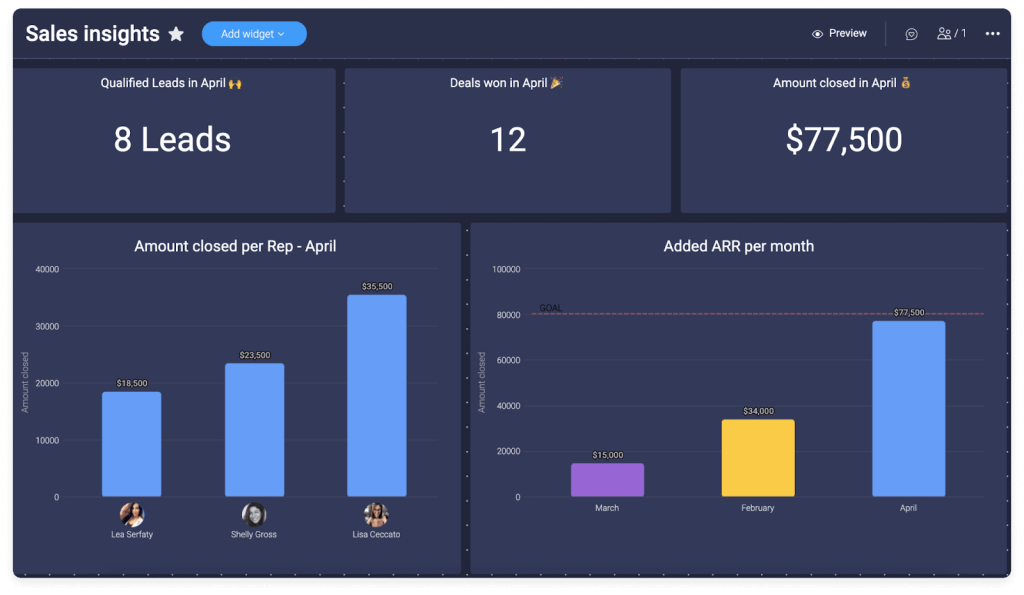
However, Monday also has Monday Sales, a CRM that integrates with the productivity platform. With this, you can build your dashboard from scratch to have a full overview of your sales process.
In this example, you can see many useful metrics, such as qualified leads, deals won, amount closed, amount closed per rep, and added ARR per month.
3. Zendesk CRM dashboard
Zendesk is a cloud-based customer experience and service platform. While it comes with CRM capabilities, it’s important to note that it is designed for support and service teams. However, Zendesk also comes with user-friendly sales dashboards that are a helpful tool for making informed decisions.

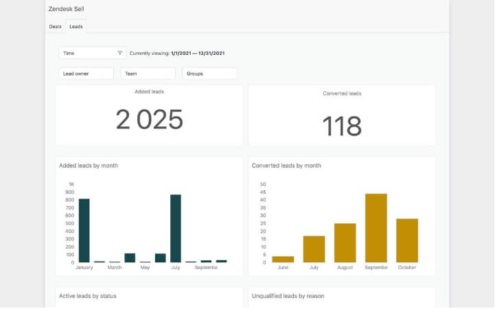
For instance, this leads dashboard highlights important KPIs such as the number of leads, converted leads, and qualified and unqualified leads.
Zendesk provides various types of reports, including funnels, deals, and call dashboards. Depending on your needs, you can select the right report that will display the key metrics you want to track.
FAQ on CRM dashboards
Who uses CRM dashboards?
Customer relationship management (CRM) dashboards are used by many professionals and teams including:
- Sales teams use CRM dashboards to track leads and sales performance. Dashboards help them monitor sales pipelines, set goals, and analyze their progress.
- Marketing teams set up these dashboards to segment customer data, track campaign performance, and measure their effectiveness.
- Customer support or service teams rely on CRM dashboards to view customer histories, track service requests, and manage customer inquiries.
- Management and executives implement dashboards to get an overview of the overall business performance and keep an eye on important KPIs.
- Customer success teams can easily monitor customer satisfaction, retention, and churn rates.
- Business analysts find CRM dashboards helpful in reporting and trend analysis, essential for decision-making and strategy development.
As you can see, CRM dashboards can be used by a variety of professionals and teams to monitor different KPIs or key metrics. However, they are most commonly used by sales professionals to keep track of leads and potential customers.
Why CRM dashboards are important
CRM dashboards are important for several reasons:
- Centralized data: These dashboards provide a 360-degree view of customer interactions and history. All of the data you have of a certain customer can be seen in one place.
- Enhanced collaboration: Using a CRM dashboard in Looker Studio or Tableau allows teams to work together. Sales, marketing, customer support, and other teams can collaborate and share valuable customer insights.
- Sales and lead management: Sales teams can use CRM dashboards to track leads, opportunities, and sales pipelines.
- Data analysis and insights: A CRM dashboard helps you stay updated with the most significant metrics and analyze various insights.
- Patterns or trends: Analyzing data with a CRM dashboard lets you discover trends or patterns in customer behavior. This helps you provide a better experience to your customers.
- Customer retention: By monitoring various crucial metrics, such as customer satisfaction, product usage, and engagement, organizations can implement strategies to retain existing customers and reduce churn.
Benefits of CRM dashboards
Utilizing CRM dashboards comes with many benefits, including:
- Time saving: Using a dashboard, especially an automated one, allows professionals to save time because they no longer need to collect data and introduce it manually.
- Clear overview: Many businesses have data in various tools and apps. This makes it harder for them to have a complete overview of business performance. With a CRM dashboard, they can monitor the most important KPIs in near real-time, at any moment, in one single platform.
- Efficient reporting: A customizable CRM dashboard allows you to monitor only the key metrics you want to focus on, which allows you to analyze data and create comprehensive reports.
- Data accuracy: Manual imports come with many disadvantages, one of them being data corruption or errors. With an automated integration between your CRM and the app you use to create the dashboard (e.g., Looker Studio), you can ensure data accuracy.
- Scalability: Automated CRM dashboards can scale with business growth, handling increased data volumes efficiently.
- User-friendly, customizable assets: A wide range of data visualization tools allows you to customize dashboard and report templates. You can also use these tools to create dashboards from scratch.
- Forecasting and planning: Reliable data maintenance through automated imports improves sales forecasts and business planning accuracy.
Use dashboards to analyze your CRM data
Dashboard creation would typically require you to export data from your CRM into a business intelligence tool and build visualizations from scratch. However, working with BI tools this way can be lengthy and complex. To save time and effort, Coupler.io offers free white-label dashboard templates that you can use. Each template includes a built-in Coupler.io connector, ensuring your data is automatically loaded, visualized, and refreshed on schedule.
Try Coupler.io’s CRM dashboard templates to keep your sales data at your fingertips and focus more on driving business success! If you require a tailored solution, contact our data experts to craft a dashboard for you.
Automate CRM reporting with Coupler.io
Get started for free