

Data aggregation transforms the overwhelming noise of daily business metrics into clear, actionable insights that drive smart decisions. Instead of drowning in scattered daily sales figures, website clicks, and campaign stats, savvy business owners use aggregation techniques to look at the bigger picture. This allows them to spot hidden trends, catch declining performance before it’s too late, and quickly pivot their strategies.
In this article, you’ll learn how to use aggregation to your competitive advantage, eliminating the chaos of raw data.
What is data aggregation?
Think of data aggregation as summarizing or zooming out on your data. Instead of looking at every single transaction or click, you combine them to see the bigger picture through totals, averages, and trends. With this in mind, the concept of data aggregation consists of three key elements:
- Metric – This is what you’re actually measuring. Think of it as the “thing” you want to track, like sales revenue, website visitors, or customer satisfaction scores.
- Dimension – This is how you’re grouping or organizing your data. It’s the “by what” part—like by time (daily, monthly), by location (city, country), or by customer type (new vs. returning)
- Mathematical operations – This is what you do with the numbers once you’ve grouped them. Common operations include adding them up (sum), finding the average (mean), counting how many there are, or finding the highest/lowest values.
Data aggregation can be done on any scale, from a small business to a large corporation that has terabytes of data to analyze. No matter the size of a business, data aggregation helps to see the big picture, for example, total monthly sales across different platforms.
Why is data aggregation important?
Each business or a solopreneur can actually benefit greatly from a couple of simple data aggregation techniques. If you are using a data aggregation solution for your business, you can do the following:
- Gain aerial view insights to better understand your data, track trends, compare it over time, notice abnormalities, and so on. A good example can be summarizing daily traffic data with individual user sessions, bounce rates, etc. for an e-commerce site. After aggregating this data by week or month, you get insights about unique visitors, average session duration, and so on.


- Reveal surprising trends — for example, with daily sales numbers jumping up and down, it’s difficult to spot trends or meaningful takeaways. However, when you aggregate this data, for example, by month, you will be able to notice your sales declining steadily month after month. And this can next lead you to coming up with some useful ideas and actions to remediate the situation.

- See the larger picture of sales, marketing, and other areas of business. For example, observe totals of your revenue/costs for a better assessment of your business condition, etc.

- React more quickly and make faster & data-backed decisions. For example, if, based on aggregated data for paid ad campaigns, you notice that some campaigns perform worse than others, you can quickly reallocate your ad budget and stop wasting money on ineffective ads. Looking just at daily stats, you wouldn’t be able to spot differences in performance.

Types of data aggregation
While data aggregation is mostly a straightforward process of combining data values across large sets, there are two main types of it. The distinction is based on what dimension we summarize stats for.
Time-dimension aggregation
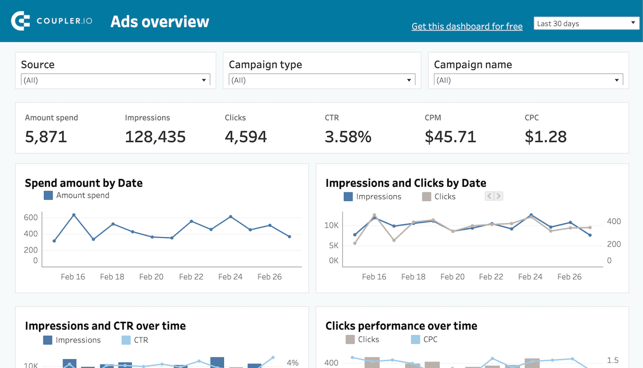
Aggregation in the time dimension involves summarizing metrics for a selected period of time. Very often, every single data item (e.g., a sales transaction record) has some kind of date/time field. Using information from this field as a temporal dimension, you can aggregate the records by week, month, or quarter to gain aerial-view insights or get trends that require time to observe. An example can be this data set template in Coupler.io, our data reporting tool, that offers aggregated monthly performance view for popular paid ad services:


Non-time dimension aggregation
While time-based aggregations are the most popular, you can also summarize stats for non-temporal dimensions, for example, countries, ad campaigns, and so on.
Let’s assume you have hundreds of records from Meta Ads Manager, where each includes information about the like event for your Facebook profile,e together with the country of the ‘liker’. To see the most common geographies for your followers and channel your marketing efforts to those countries (e.g., by preparing content in their languages), you need to aggregate the stats by country and get the global values.
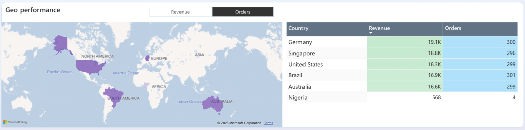
The following interactive map and table in one of Coupler.io’s data visualization dashboards show examples of summarization of stats by country:

How you can aggregate data for your business needs
OK, so how can you practically aggregate data for your entire dataset? What data aggregation tools to use? Consider these approaches:
- Spreadsheet software — if you work with rather small datasets, you can use the pivot table feature available in popular spreadsheet apps like Google Sheets or Excel. When you configure such a table, you can aggregate each metric. With an aggregation applied, the view of the entire table will adapt accordingly, saving you unnecessary manual labor.

- Business intelligence (BI) software — in the case of popular BI tools, you have several data aggregation options:
- Measures (Power BI) / Calculated Fields (Looker Studio) — these features let you define your custom aggregated ‘measures’ (e.g., Total Sales = SUM(Sales[Amount])) and then use them as visualizations on your visual reports (dashboards).
- Power Query (Power BI) — when you load your data to Power BI, you can use the Group By operation and apply it to column(s) to turn/them into dimension(s).
- SQL Queries — this pro-code method is useful if your data resides in a database. So, if you’re familiar with SQL, you can create a query that combines aggregate functions (e.g., SUM) with the GROUP BY clause to return a table with aggregated data. Here’s a sample code:
SELECT
    Region,
    Product,
    SUM(Revenue) AS TotalRevenue,
    AVG(Quantity) AS AverageQuantity,
    COUNT(OrderID) AS NumberOfOrders
FROM
    SalesData
GROUP BY
    Region,
    Product;
Unlike these methods, Coupler.io flips the process entirely. Instead of downloading terabytes of raw data and then aggregating it, Coupler.io performs aggregations at the source level—before the data ever reaches your destination. This data integration and reporting platform allows you to extract data from 70+ sales, marketing, financial, and other apps/services and turn it into a meaningful report. Here’s why this approach is game-changing:
- Massive data volume reduction — Instead of exporting 100,000 individual transaction records, you might export just 12 monthly summaries. This means faster transfers, lower storage costs, and quicker analysis.
- No infrastructure overhead — You don’t need powerful databases or expensive BI licenses to handle massive datasets, because the heavy lifting happens before the data reaches your automated reporting tools.
- Instant insights — Skip the time-consuming “extract-then-aggregate” workflow. Your aggregated data arrives ready for immediate analysis and visualization.
- Cost efficiency — Many cloud storage and BI tools charge based on data volume. By aggregating first, you dramatically reduce these ongoing costs.
This approach is particularly powerful when dealing with high-volume data sources like e-commerce transactions, web analytics, or advertising campaigns. Exports from these data sources can easily contain millions of records, but your actual business questions only require summarized insights. Being a 100% no-code solution, Coupler.io requires no scripting or SQL querying to aggregate your data—everything’s simple & UI-based.
How to aggregate your data with Coupler.io
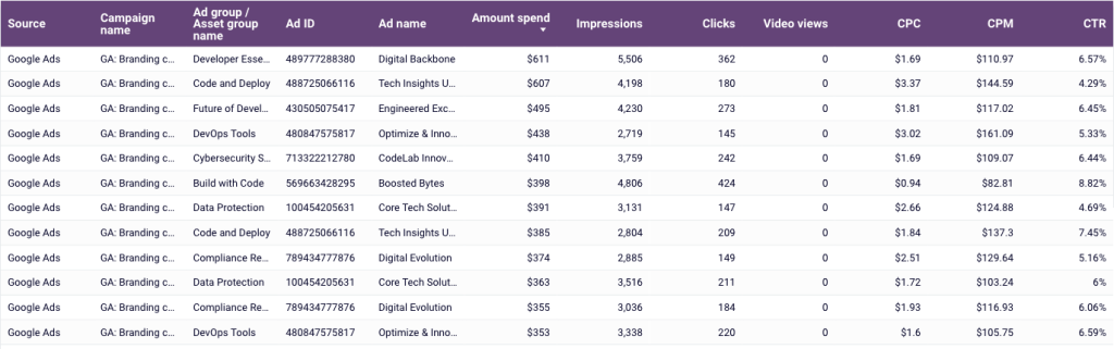
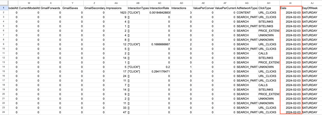
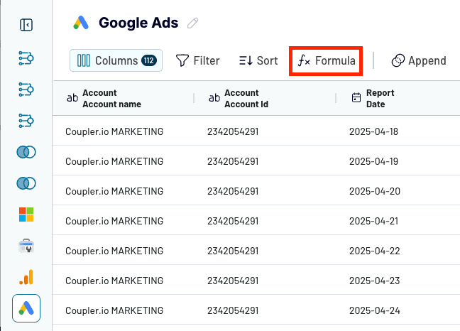
Let’s assume that you have raw data from Google Ads. It includes hundreds of records for individual events for each day, making it impossible for you to gain any meaningful analyses or insights. If you export it from Google Ads manager to, let’s say, Google Sheets, it will look like this:

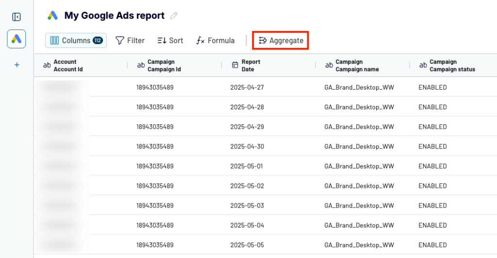
With Coupler.io, you can aggregate your data to make your dataset more meaningful and shorter. To do this, click Aggregate above the data preview in Coupler.io.

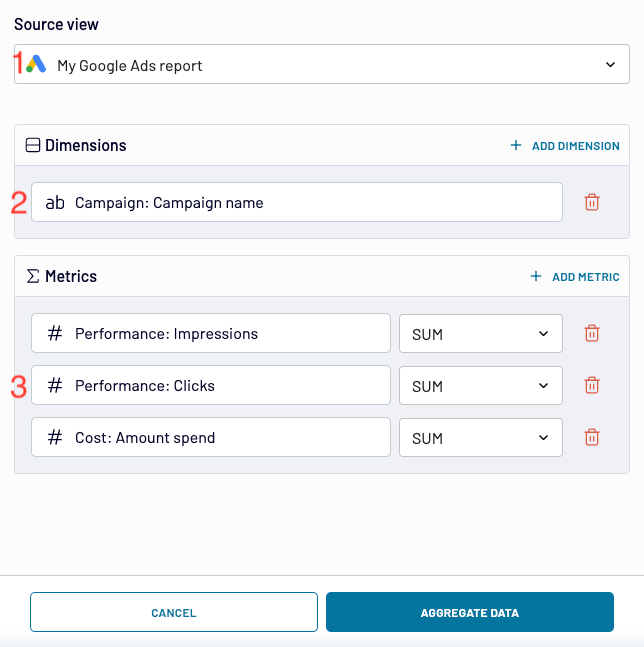
In the window that opens, you need to configure 3 settings to make your aggregation live:
- Select the data source you want to aggregate — it can be a single data source (e.g., Google Ads, Instagram Ads) or a few of them combined using data blending features.
- Choose a dimension or dimensions as the basis for the aggregation operation. For example, you can select the ad campaign name to get accumulated data for each campaign that you run or the country (to summarize stats for countries).
- Choose metrics and mathematical operations (e.g., SUM, AVERAGE) that will be applied to them to return aggregated values.

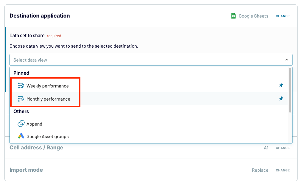
Once you click Aggregate data, you’ll create a new view in Coupler.io with the aggregated data. You can switch to the view using the left-hand pane.

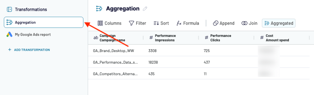
You can also easily rename your aggregated view for easy identification. Just click the pencil icon next to its name, above the table with data.


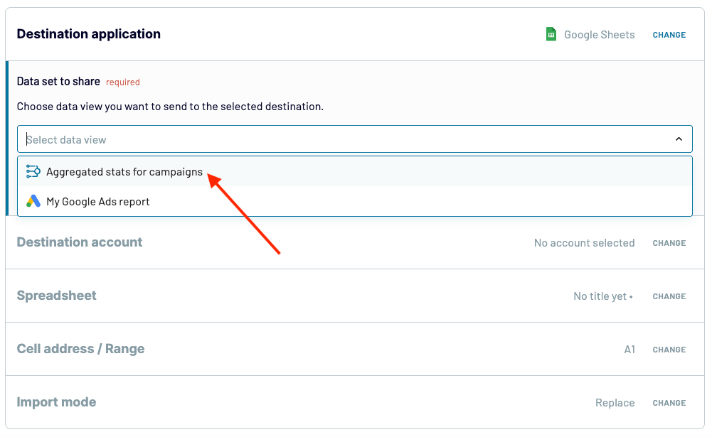
Last but not least, if you want to turn the aggregated view into a report, remember to choose it under Data set to share when you configure your destination app/service in the next step of the Coupler.io data flow wizard.

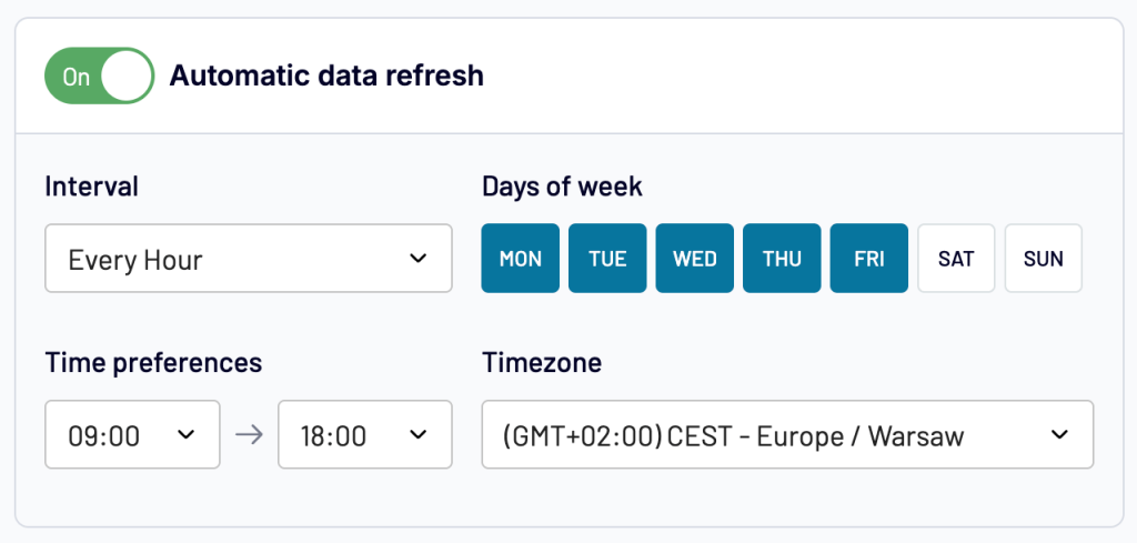
To use all the possibilities that Coupler.io offers to you, you can enable and configure auto data synchronization in the last step of the wizard to always enjoy the freshest data in your aggregated data report.

Now, let’s have a look at a more automated data aggregation approach in Coupler.io, data set templates. It’s better to check them out in practice, so create a free Coupler.io account and try them out while reading. No credit card is required!
Coupler.io data set templates — easy data aggregation for businesses of any size
Data set templates are ready-made configurations that include carefully selected data sources, metrics, and transformations (including aggregations). Go for these if your primary goal is reporting and you want to produce a report in the quickest and easiest way possible.
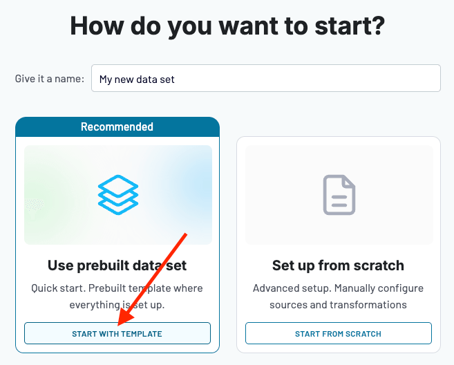
Using a data set to your advantage is really simple. Once you sign in (or up) to Coupler.io and choose to create a new data flow, just choose Start with template.

Then you need to choose a data set template that fits your scenario. You can filter out data set templates through text search, metrics, data sources, and fields.

At the moment, there are multiple data set templates to choose from, with more and more new ones added weekly by our data analysts. See examples of some popular ones:
- PPC campaign performance — includes weekly/monthly aggregations for paid ad services like Google Ads, LinkedIn Ads, etc.
- Multi-channel Geo performance — includes paid ad performance data aggregated by country.
- Top pages performance — includes total, weekly, and monthly aggregations for tracking your SEO performance
- QuickBooks P&L Annual — includes aggregated financial data for quick performance snapshots of net profit, gross profit, and operating profit.
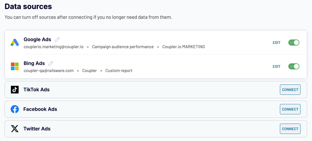
Once you’ve selected a template, you need to connect your data sources. If you don’t use all of the sources in a template, you can just skip them — no worries!

Next, you need to adapt your template. This includes applying pre-defined aggregations and more. We’ll discuss it in more detail in the section focused on data aggregation examples.
Aggregating metrics of ratio type
Aggregating ratio-type metrics can be tricky. These represent a relationship between two separate metrics. For example, CPC (cost per click) is calculated by dividing Cost by Clicks. Or CTR (click-through rate) is obtained by dividing Clicks by Impressions.
To aggregate such ratio-based metrics, you can’t simply average them during an aggregation operation, because you’ll get inaccurate results.

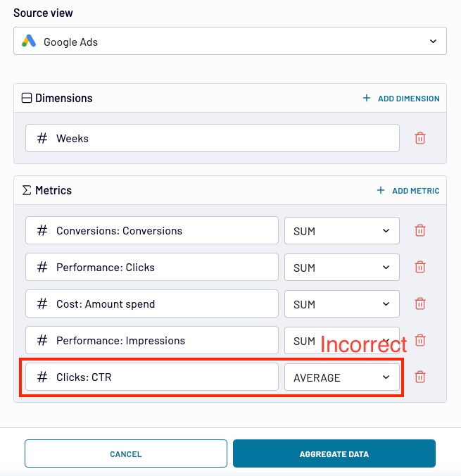
Here’s an explanation why such an approach is wrong that uses CTR as an example:
| Ad campaign | Clicks | Impressions | CTR (clicks/impressions) |
| Campaign 1 | 20 | 80 | 25% |
| Campaign 2 | 5 | 50 | 10% |
Averaging CTR (incorrect approach):
25% +10% / 2 = 17.50% (incorrect result)
Totalling and dividing CTR constituents (total clicks & total impressions); then turning the result into percents (proper calculation):
((20 + 5) / (80 + 50)) * 100 = 25 / 130 * 100 = 19.20% (correct result)
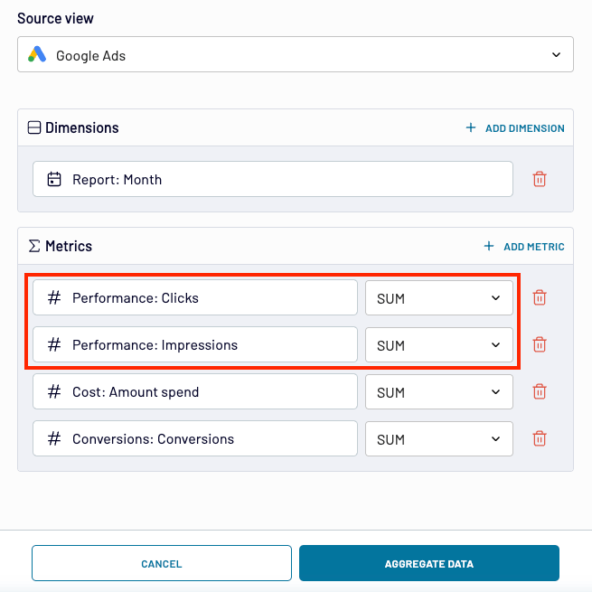
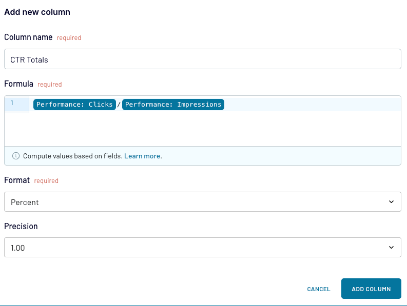
To reflect this proper calculation in Coupler.io, you need to first apply the SUM calculation to the constituents of your ratio-based metric to get totals.

Then, with the aggregated data, you need to use a function in Coupler.io to recalculate your ratio-based metric by dividing the totals. Remember also to choose your preferred Format (e.g., percent or decimal, and set the desired Precision:

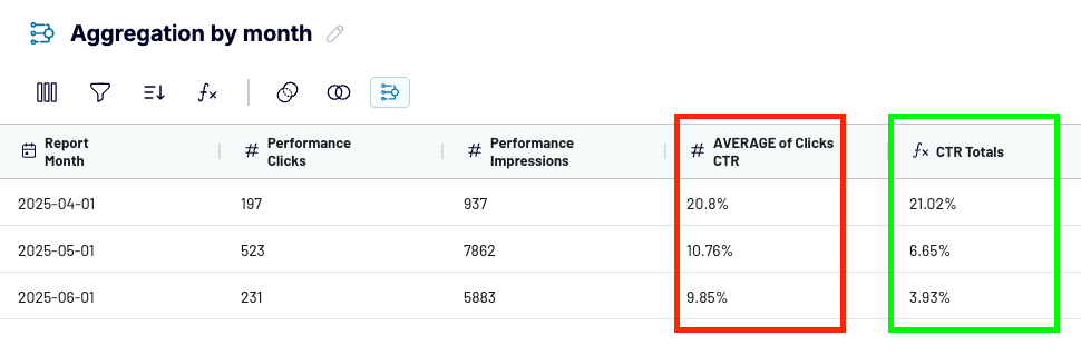
Compare the results from two columns:
- The left one includes incorrect results obtained through simply averaging CTR.
- The right one shows correct results obtained through the calculation of totals.

Examples of data aggregation
Now let’s go through several examples of how to aggregate data in Coupler.io. We’ll show examples of both:
- Automated aggregation that you get out of the box by using Coupler.io data set templates (see sections marked with [Data set template])
- Customized/manual aggregation that you can configure by yourself according to your needs. No worries, everything’s simple and requires you just to click options available in the tool (see sections marked with [Custom configuration])
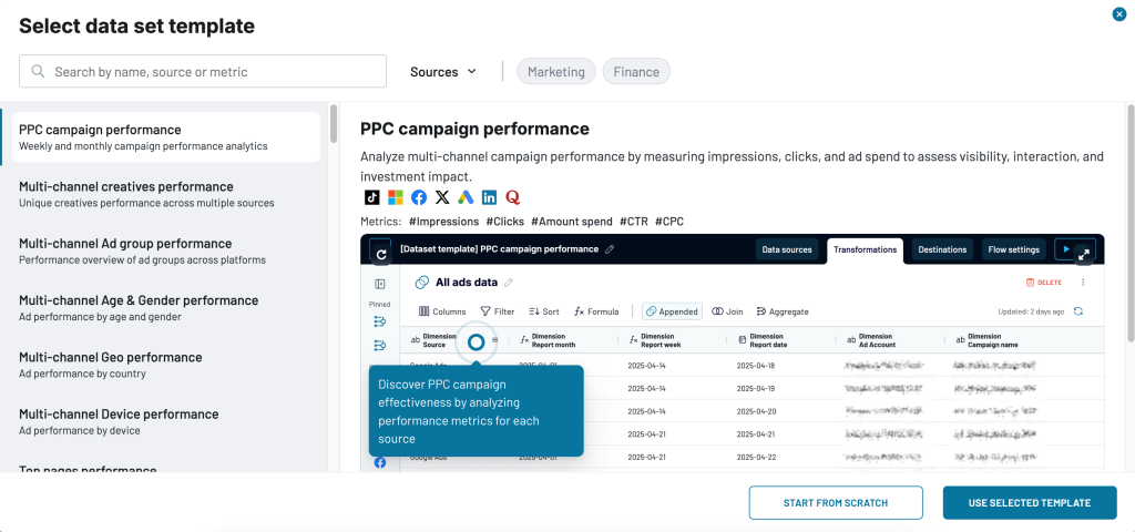
[Data set template] Time-dimension aggregation: Weekly and monthly performance for PPC campaigns
Paid ad services like Google Ads often show stats broken down by day. This is inconvenient for analyzing bidding strategies or the long-term performance of ad campaigns.
With the ‘PPC campaign performance’ template, you get your performance stats aggregated by week or month out of the box. To see the aggregated views for each ad campaign, simply choose the desired option in the left-hand panel:

Next, when sending your finished report to a destination of your choice (e.g., Google Sheets, as shown below), remember to choose the right aggregated view under Data set to share.

As you can see, using the pre-defined data aggregation operation with Coupler.io data set templates is really simple.
Of course, Coupler.io capabilities are not limited to aggregations. Using the tool, you can enhance raw data extracted from supported sources in many ways. You can:
- Manage columns by reordering, renaming them, or creating new ones based on calculations with custom formulas.
- Filter out data to skip irrelevant or faulty data items.
- Sort data items to fit your analytic needs.
- Blend data from multiple sources by one or more columns, depending on the sources’ data structures. Explore other data blending platforms of our choice.
All to make your data more readable and meaningful.
Coming back to data set templates, check out a comprehensive guide on how to use these preset data solutions in our dedicated blog post.
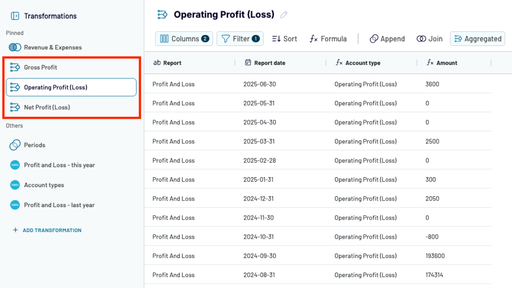
[Data set template] Summarization: Xero Profit & Loss Report
Xero is a powerful accounting tool that brings you a multitude of financial data. However, the raw data in its basic form (e.g., individual transactions, invoices, warehouse items) doesn’t provide you with quick performance snapshots.
Fortunately, the ‘Xero P&L’ data set template in Coupler.io offers pre-defined aggregations that let you quickly assess your key financial performance indicators. With a click, you can switch between:
- Gross Profit — revenue calculated after deducting costs related to producing and selling goods/services.
- Operating Profit (Loss) — calculated by deducting operating expenses (costs related to running business daily) from gross profit.
- Net Profit (Loss) — total amount of money a business has left after all expenses have been deducted from its total revenue.

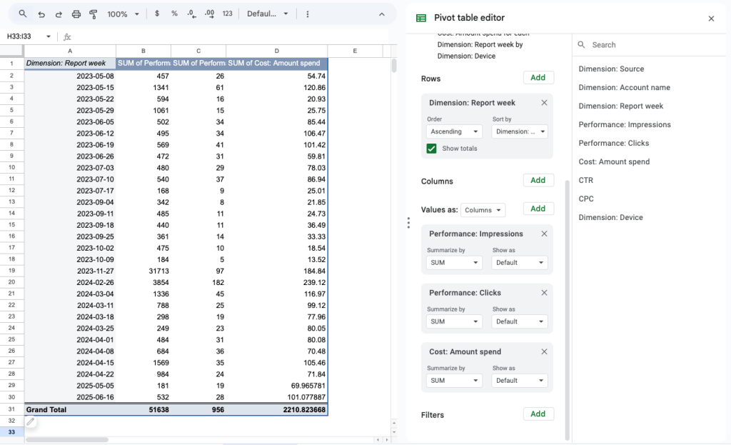
[Custom configuration] Time-dimension aggregation example: Weekly stats for Google Ads
As you could see above, many Google Ads reports (the raw data) will give you multiple rows for each date—one for each device, country, campaign, etc. Such a data density is too big to easily gain insights about overall campaign performance, see trends, or get values for testing bidding strategies. So, it makes sense to aggregate these to see, for example, the weekly overview of your campaign performance. You can do it as follows:
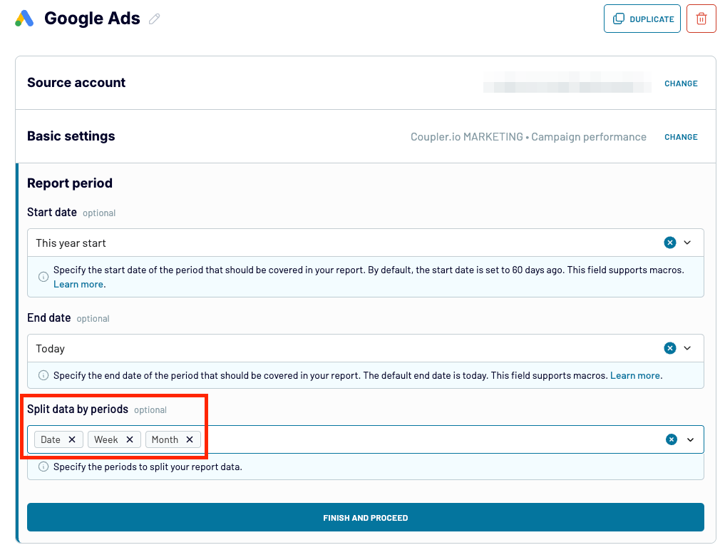
- Because the date field is imported from popular paid ad services like Google Ads, Coupler.io will show data aggregated by day (as shown earlier in this article) by default. To import other temporal dimensions like week or month, select them when configuring your paid ad data source in Coupler.io (the first step of the data flow wizard). The option can usually be found under the report period settings, as shown below:

- When you proceed to the next step of the data flow wizard, click Aggregate above your data preview, as shown earlier.
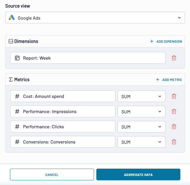
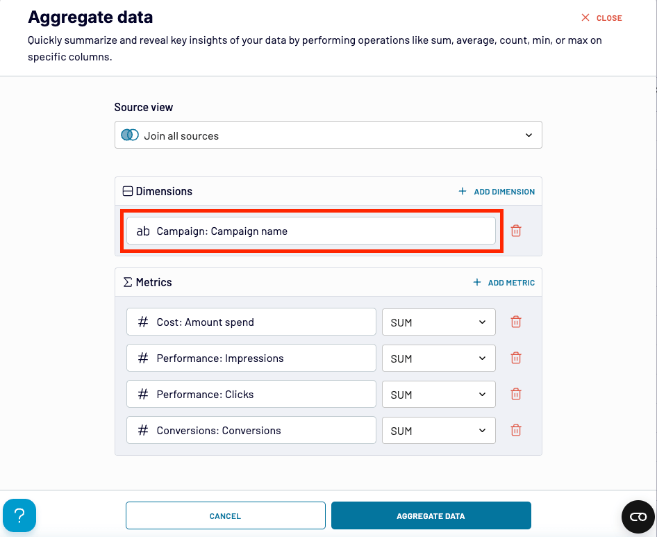
- In the Aggregate data window, configure your aggregation as follows:
- Choose Google Ads as the source.
- Choose Report: Week as dimension — it should be available because you selected it when configuring the Google Ads source.
- Include metrics you want to aggregate weekly. The example below shows basic ones like amount spent on ads, impressions, clicks, and conversions. You can decide to include some more. Note: if you intend to include ratio-based metrics like CPC or CTR, first consult the section below to learn how to get accurate results for them.

When you click Aggregate data, you’ll see the table with your aggregated data. For an even clearer picture, you can use the sort feature in Coupler.io to order stats from the oldest to the newest ones or vice versa.

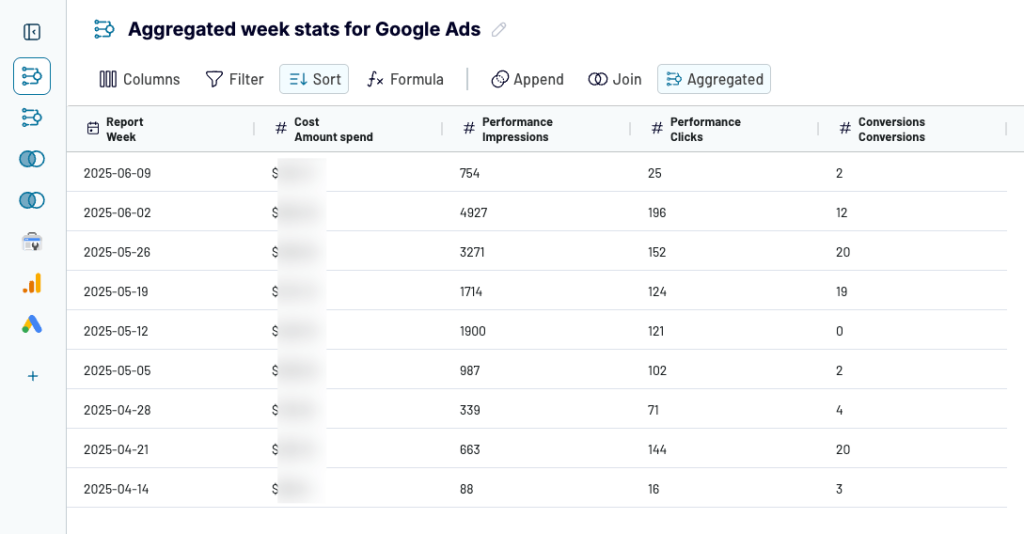
As indicated before, you can also:
- Rename your aggregated view for easier identification.
- Turn it into a report that you can manage in one of the 10+ destination apps/services supported by Coupler.io, such as Looker Studio, Google Sheets, Microsoft Excel, or Power BI.
- Enable auto data sync to always see the freshest version of your aggregated data in the report.
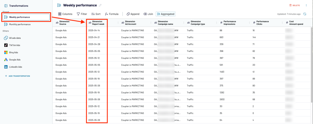
For more advanced users: Create a custom column with weekly/monthly temporal dimension
If you’re a more advanced user, instead of choosing temporal dimensions during data source configuration, you can also create a custom column with a relevant data split period (week or month) and then use this column as the dimension in the data aggregation settings.
Here’s how to create such a column in Coupler.io:
- In your paid ads data source view, click Formula above the data preview.

- Name your column the way you like, for example ‘Week (number)’ or ‘Month’.
- Copy and paste the following formula code (learn more):
- For the column with the weekly periods:
WEEKNUM({replace_with_date_column_name})
- For the column with the monthly periods:
DATETIME_FORMAT(START_OF_TIME({replace_with_date_column_name}, "MONTH"), "YYYY-MM-DD")
Note: Remember to replace {replace_with_date_column_name} with the actual name of date column name, e.g. Report Date.

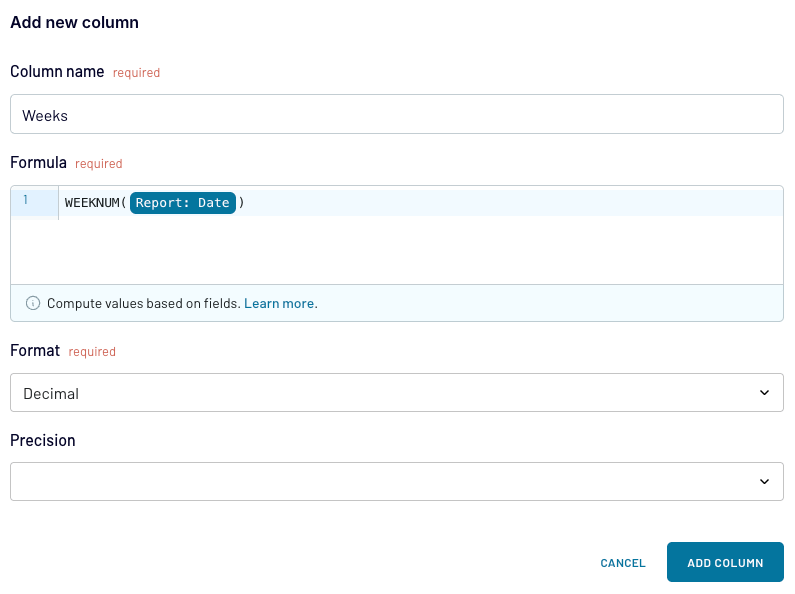
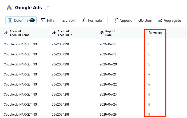
- Click Add column. You’ll see the new custom column with week numbers (see below) or monthly dates.

- When you next configure your aggregation, simply set this column as the dimension:


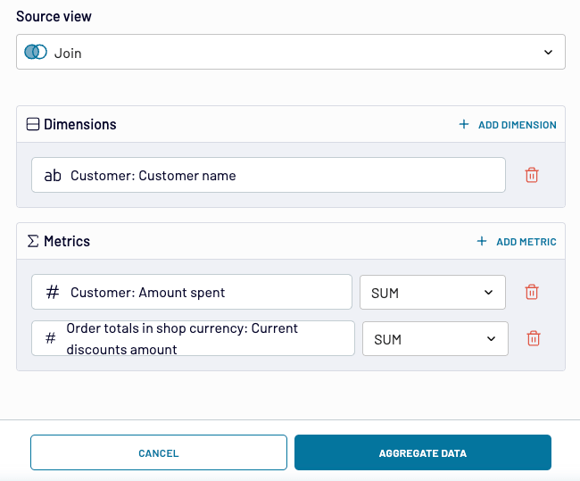
[Custom configuration] Non-time dimension aggregation examples
With Coupler.io, you can also easily aggregate data for non-temporal dimensions. To create your summarization, in the aggregation configuration window, simply choose the desired non-temporal dimension. This can be a campaign name (as in the example below), a country, and whatever other dimension you want to get an aggregated data view for.

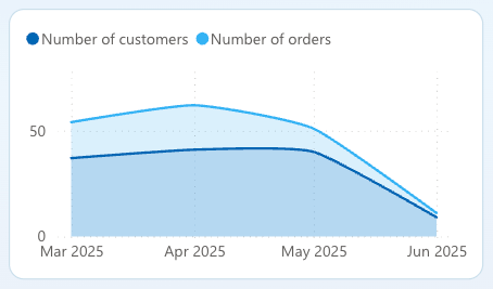
When you run a Shopify store, it might be beneficial to combine Customer and Order data. Then, sum the amount spent for each customer to see which customers order the most from you. Or sum the discounts to discover which customers benefit the most from your discounts.

Coupler.io dashboard templates — data aggregation for visualization purposes
The free dashboard templates that come with Coupler.io are designed to instantly turn your data into insightful visual reports. The reports provide you with meaningful feedback and greatly facilitate data-backed decision-making processes.
Actually, each dashboard template prepared by the Coupler.io data analytics team extensively uses data aggregation operations behind the scenes to render charts or tables that show you insights or trends.
Let’s have a look at some examples.
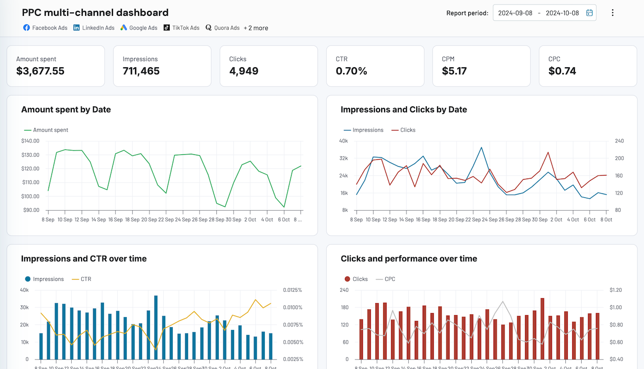
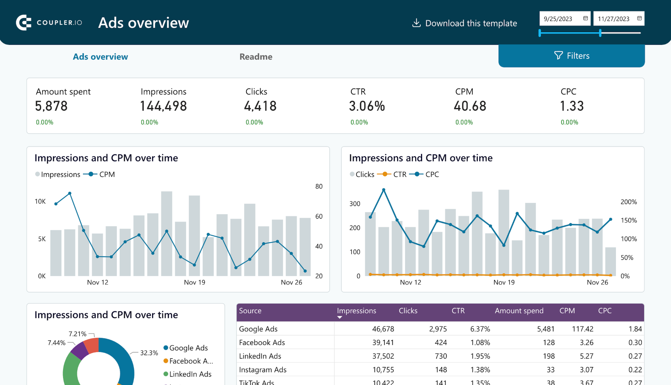
PPC multi-channel dashboard
This ready-made dashboard consolidates data from multiple PPC platforms like Facebook Ads, X Ads, or Google Ads. With it, you no longer have to switch between multiple browser tabs to download and paste data for each platform. If you’re tasked with analyzing marketing data, it will not only save you plenty of time and eliminate the risk of manual data handling errors but also allow you to spot insights or trends (with help from AI) and make data-backed decisions much faster.

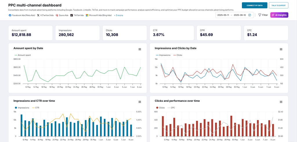
This dashboard makes use of plenty of data aggregations, some of them being:
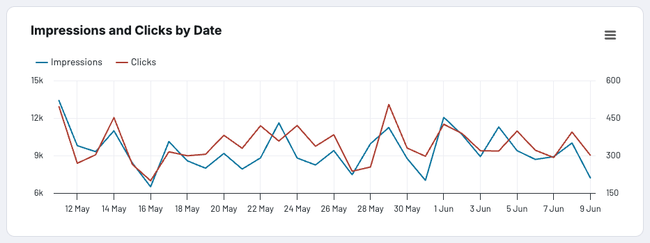
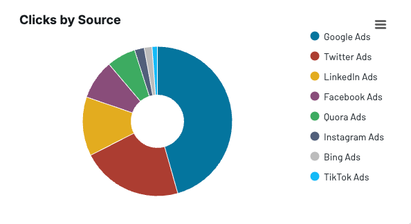
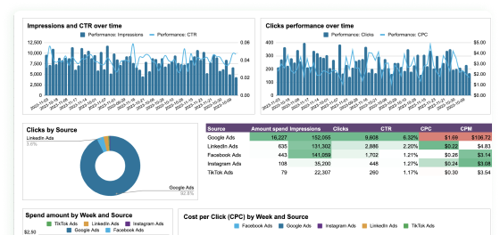
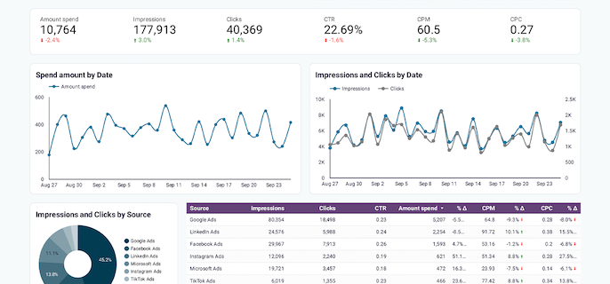
- Totals for impressions and clicks across all your PPC platforms to see your overall paid ads performance:

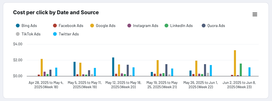
- Aggregated weekly stats for cost per click (CPC) to easily test your CPC strategy and see if it works.

- Aggregated clicks from each source to discover which ad channel is the most effective for you and brings you the most website visitors.

If you believe that you could greatly improve your work and business performance thanks to the data aggregations of this free dashboard template, start configuring it in Coupler.io by clicking the button below. Then click Connect my data in the top right corner and complete the easy setup to boost your data analytics in no time.

PPC multi-channel dashboard
Consolidate data from multiple advertising platforms including Google, Facebook, LinkedIn, TikTok, and more to track campaign performance, analyze spend efficiency, and optimize your PPC budget allocation across channels.


PPC multi-channel dashboard in Google Sheets
Use a PPC dashboard designed for Google Sheets to track the performance of your campaigns across multiple advertising platforms.

PPC multi-channel dashboard in Looker Studio
Get a comprehensive PPC reporting tool to track the performance of your campaigns launched at multiple advertising platforms.

PPC multi-channel dashboard in Power BI
Utilize a Power BI PPC dashboard for tracking and analyzing your advertising campaigns across multiple platforms.
PPC multi-channel dashboard in Tableau
Track and analyze the performance of your advertising campaigns across various platforms using a one-stop PPC dashboard in Tableau
Read the guide to marketing data management for advice on how to properly organize, transform, and store your marketing data for analysis.
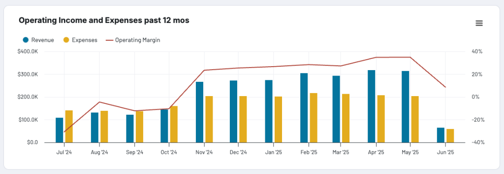
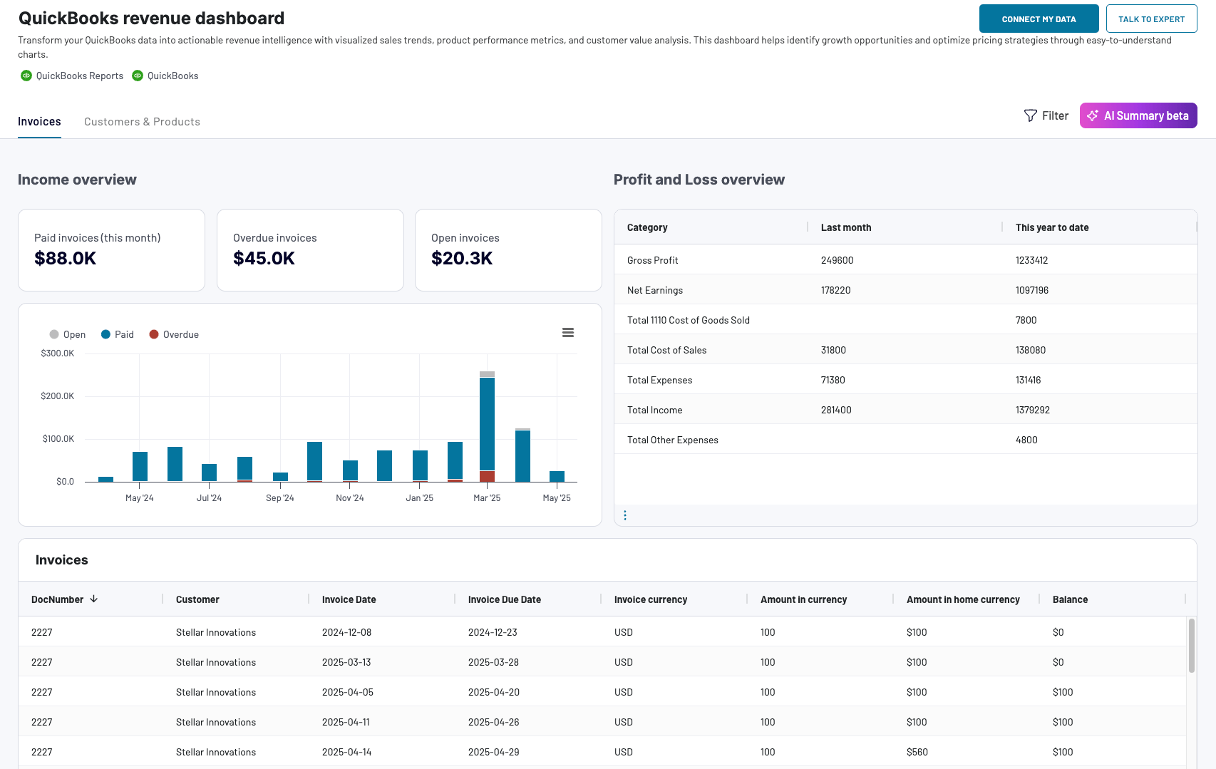
QuickBooks revenue dashboard
This dashboard will be of great help to anyone who wishes to monitor business income and expenses in an ongoing fashion. It uses data aggregation operations to present the revenue distribution by customers and products, show best selling products, and more.

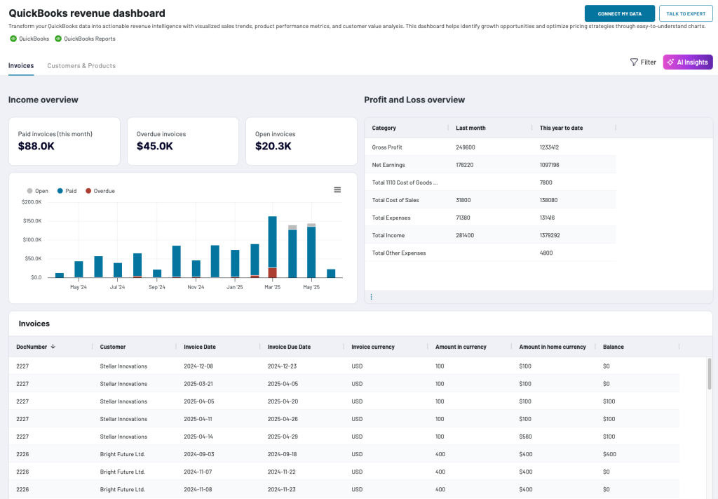
Here’re the examples of handy aggregations used by our analysts when preparing this dashboard:
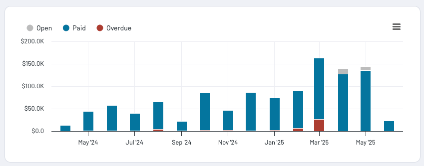
- Summarized statuses and amounts for invoices let you easily notice your income fluctuations, peak revenue periods, or any unexpected dips.

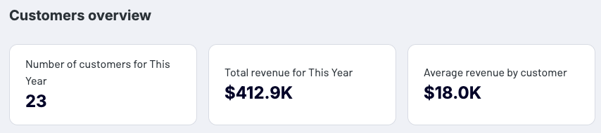
- The customers’ overview summary section uses the aggregations to calculate totals for customers and revenue. It also shows the average revenue by a customer to bring you the summary of your business performance.

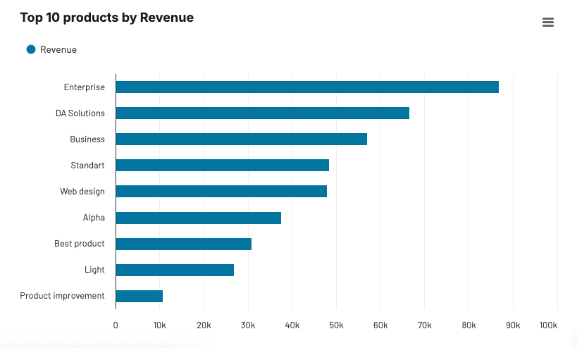
- The ‘Top 10 products by Revenue’ chart shows totals for your best-selling products to help you see which products bring the most profit and decide which ones to promote.

If you’re a business owner or an accounting officer who doesn’t have time to all do the calculations and visualizations manually, this dashboard might be the way to go. An added value is the in-built AI Insights feature that uses artificial intelligence to generate analytic feedback based on your data. To start using the dashboard, click the button below and connect your QuickBooks data source.

QuickBooks revenue dashboard
Transform your QuickBooks data into actionable revenue intelligence with visualized sales trends, product performance metrics, and customer value analysis. This dashboard helps identify growth opportunities and optimize pricing strategies through easy-to-understand charts.


QuickBooks revenue dashboard in Google Sheets
Analyze your revenue through a set of reports collected from QuickBooks Online on a single dashboard.


QuickBooks revenue dashboard in Looker Studio
Get an overview of your revenue based on the data from QuickBooks and unlock in-depth insights to drive informed business decisions.


QuickBooks revenue dashboard in Power BI
Monitor your income and expenses on an all-in-one revenue dashboard connected to your QuickBooks Online account.
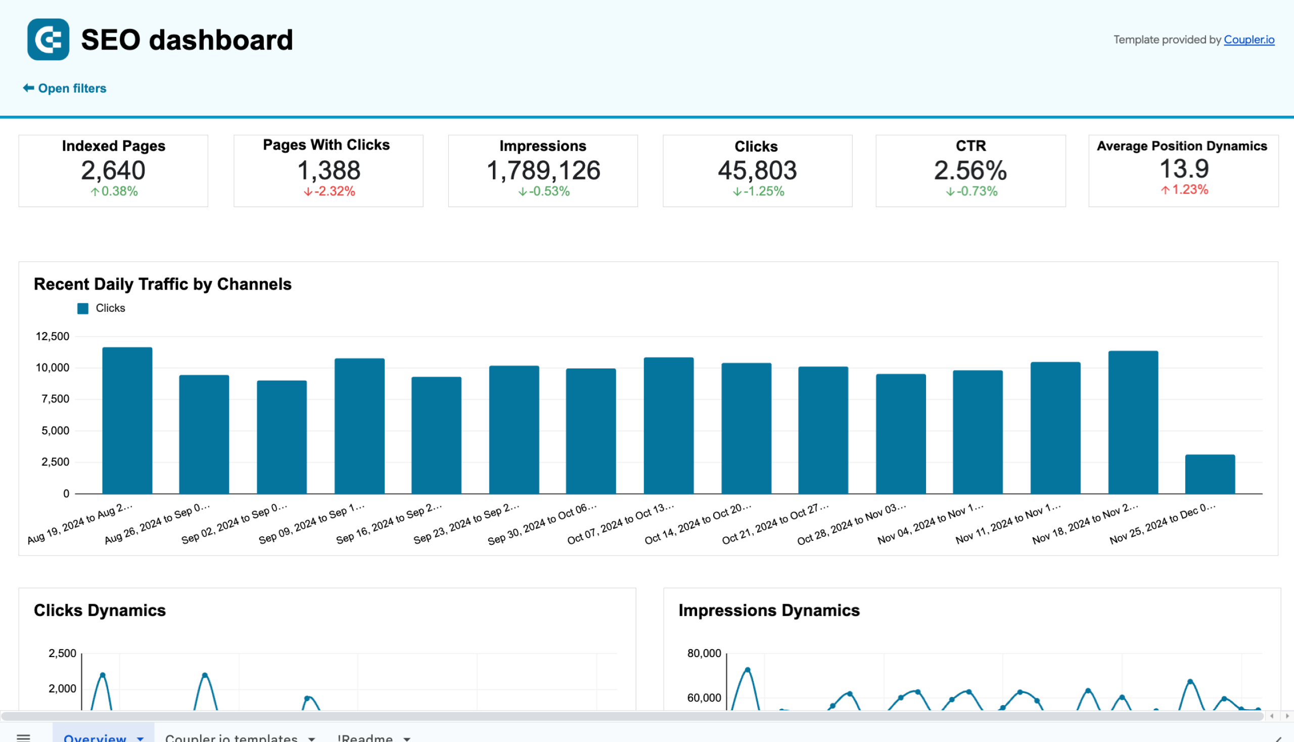
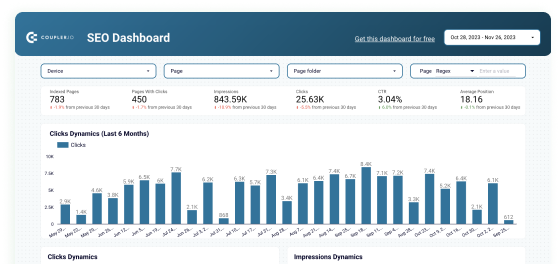
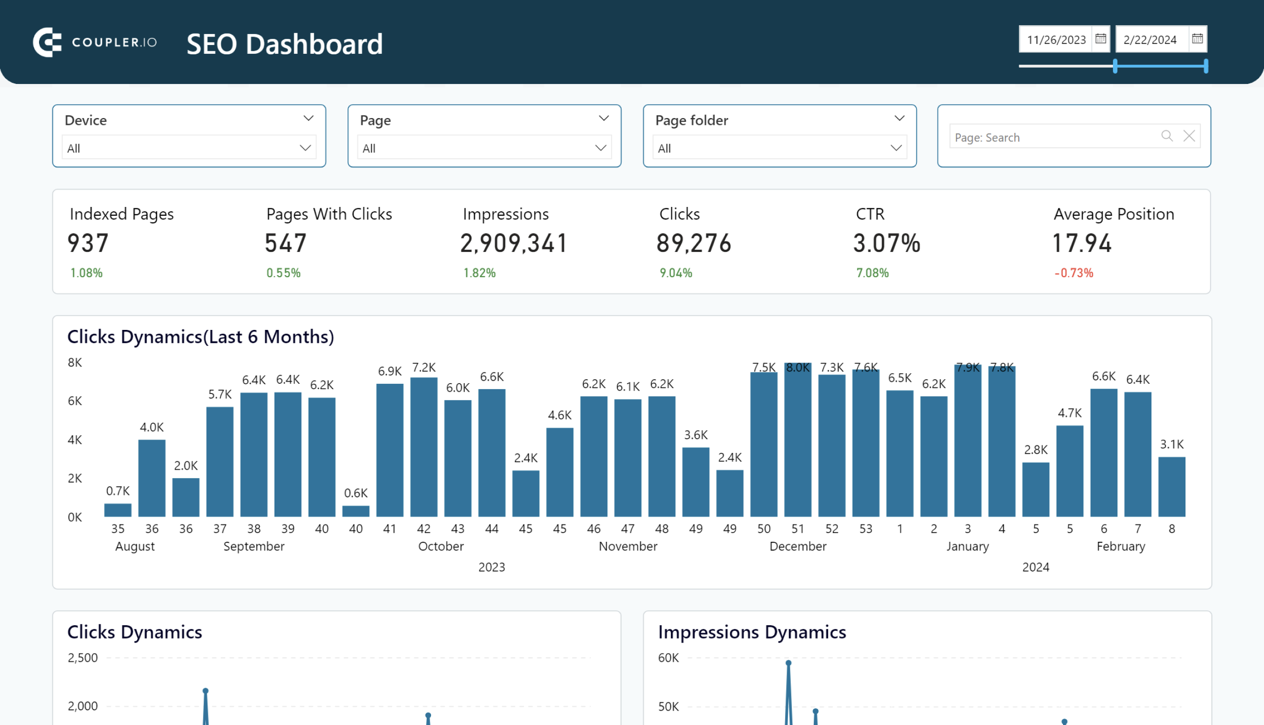
SEO dashboard for Google Search Console
If you track your website’s organic search performance, Google Search Console (GSC) is your best friend. However, raw data from GSC can be complex and difficult to analyze at first glance. Use the aggregations offered by this dashboard to turn the data into actionable insights and make informed decisions about optimizing your website, content strategy, and more.

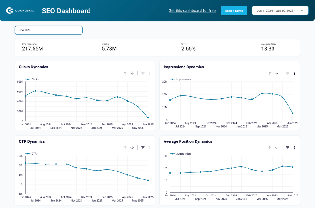
Let’s take a look at some meaningful insights you can get from the aggregated data:
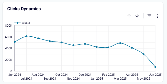
- See how numbers of clicks aggregated for each month change in time to monitor performance and see correlations between click drops/rises and changes to your content.

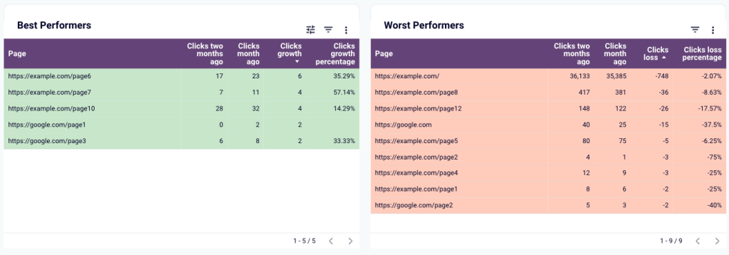
- See the best and the worst performing pages of your website in each of the last two months to see trends and make decisions about content updates, optimizations, etc.

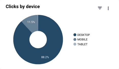
- See the share of visits for each device type to make optimization decisions and ensure the smoothest experience to boost your stats.

If you’re interested in ensuring the best organic search performance of your website, but you’re time-limited, use this insightful dashboard to make better and data-backed decisions in no time. To use it, click the button below and follow easy steps on the dashboard’s Readme tab.
SEO dashboard for Google Search Console in Google Sheets
Get an overview and details of the key performance metrics from Google Search Console required for SEO of your websites.
SEO dashboard for Google Search Console in Looker Studio
Optimize SEO with Looker Studio’s dashboard for Google Search Console. Track and enhance page rankings, CTRs, and organic traffic efficiently.
SEO dashboard for PowerBI
Optimize SEO with PowerBI’s dashboard for Google Search Console. Track page rankings, CTRs, and organic traffic efficiently.
How to boost your business decision-making with data aggregation
Data aggregation may sound intimidating for a smaller business, but you don’t need to be a large corporation with millions of dollars to spare on this. You can start really small to look at the most basic aggregate data. This does not require any coding skills or knowledge of databases and costs little to nothing, especially when you make use of ready-made aggregations available through Coupler.io data set templates and dashboard templates.
Whether you’re looking for a reporting solution or want to find insights in customer data, data aggregation features in Coupler.io are the way to go.
Collect and aggregated data with Coupler.io
Get started for free