Google Data Studio (formerly Looker Studio) handles a basic dashboard well. The trouble starts when your reporting expands. You’re combining six sources instead of two. The metrics need to be consistent across a dozen reports. For every new client, you are rebuilding the same logic from scratch.
So you end up cleaning and stitching data together inside Google Looker Studio. And every time a new source is added, or a data connector changes its refresh behavior, the whole setup needs patching. These aren’t separate bugs. They happen when a data visualization tool is asked to do data preparation.
Read on to learn where Data Studio custom reporting and analytics hit their limits and how Coupler.io helps you solve them by preparing data before it reaches the report.


Data Studio connector for over 400 business data sources
Get started for freeWhat are the Google Data Studio (Looker Studio) capabilities for custom reporting
Looker Studio is good at four things: the last mile of custom logic, stakeholder interaction, simple joins, and dashboard delivery. The trick is knowing where each one stops working as your reporting scales.
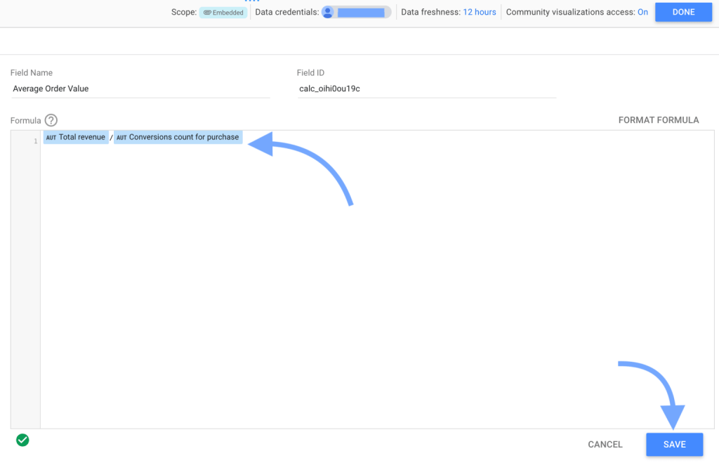
- Calculated fields handle the last mile of custom metrics. If your dataset already has total revenue and conversion count columns, a calculated field like (total revenue) / (conversion count) gives you average order value cleanly. The same logic applies to a blended ROAS calculation that combines spend and revenue from multiple sources in the way only this dashboard requires.

They work when the data underneath is already clean, and you’re doing simple math on top. They stop being the right tool when you have to clean messy data, reshape it, or store definitions used across many reports.
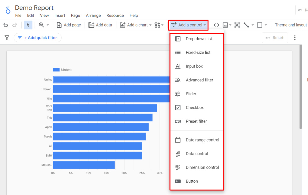
- Control parameters allow stakeholders to change inputs without editing the report. Let’s say your team wants to model what their dashboard looks like at a $40 target CPA instead of $50, a parameter handles it perfectly. They adjust the value, the calculations recalculate, and the dashboard updates in place. The same works for conversion value assumptions, date range controls, or any other input someone might want to test on the go.

They are good when the input is something a stakeholder should control directly, and the underlying data doesn’t need to change. Parameters can be limiting if it requires different data, like a new source, a different time grain, or a refresh outside the report’s normal cycle.
- Data blending works well for simple and same-grain joins. For example, you have Facebook Ads and LinkedIn Ads data, both at the campaign-day level, both with the same date format. A blend joins them on a shared campaign ID and gives you spend and revenue side by side. The same works for two or three clean sources that share a key and a grain.

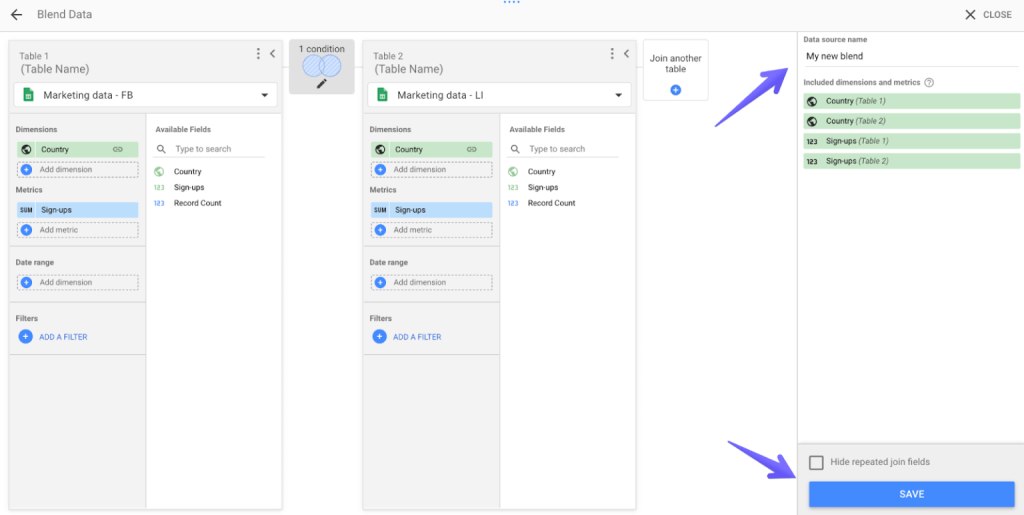
The setup holds up when the sources line up cleanly out of the box and the blend doesn’t need to do any cleaning or reshaping along the way. Blends start to break when sources don’t share a grain (campaign-level vs. session-level), when the join needs more than five sources, or when you find yourself adding a transformation logic inside the blend itself.
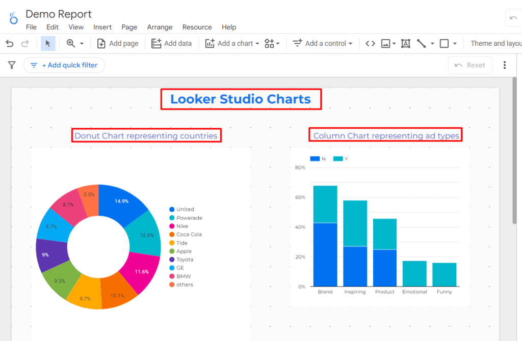
- Visualization, templates, and sharing are where Looker Studio’s real strength lies. Reports run on a free Google account, embed cleanly into any web page, and share reports with stakeholders the same way a Google Doc does. Whether you analyze data in Data Studio (Looker Studio) for executive reviews or quick team check-ins, the default chart library (bar charts, line charts, pie charts, scorecards, time series) covers most reporting needs. When it doesn’t, community visualizations like Sankey diagrams, funnel charts, and custom tables fill the gaps.
There are plenty of options to visualize your analytics data in Data Studio (Looker Studio) at almost any level of complexity.

Limitations of Data Studio for custom reporting and analytics (+ solutions)
While Looker Studio handles those four jobs well, reporting rarely stays inside them for long. Once it expands to Data Studio for custom reporting and analytics, limitations show up. Let’s tackle each one of them with a fix.
The five-source blending cap
A single blend in Looker Studio can combine up to five data sources. It works for small setups, but most marketing stacks (Google Ads, Meta, LinkedIn, TikTok, GA4, and a CRM) have more tools. Past the five-source cap, you’re either splitting one report into several or maintaining multiple blends to cover the same picture.
How to fix this?
Combine sources before they reach Looker Studio. When the join happens outside LS (in a data prep tool, a warehouse, or any layer that sits between your sources and the report), the Google Data Studio only sees one clean combined dataset. The five-source cap no longer serves as a ceiling because the joining work no longer occurs within the blend.
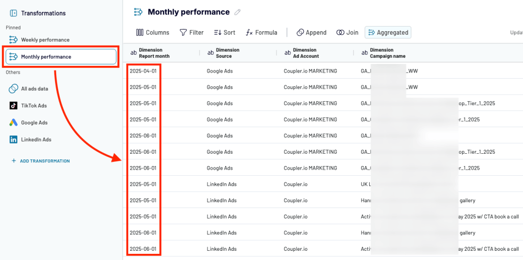
Coupler.io does this with append, join, and aggregate modes. You connect your sources, combine them into a single dataset, and send the result to Looker Studio. The report gets one table instead of five separate connections.
Learn more about how to connect data to Looker Studio.
Blends are embedded and cannot be reused
A blend in Looker Studio is created inside a report. There’s no way to define it once and reuse it across dashboards. So the same join logic gets rebuilt by different people in different reports, drifts over time, and turns into a source of disagreements when one team’s ROAS doesn’t match another’s. If you have to update the blend, you’ll have to hunt for every report that uses it and fix each one by hand.
How to fix this?
Define the join once, in a layer outside the report. When the joined dataset lives in a shared, named place, every report reads from the same logic. If the definition changes, the change propagates automatically. The hunt across dashboards goes away because there is only one place to edit.
In Coupler.io, that place is Data sets. You build the transformation logic once with connections, joins, field mappings, etc. Every Looker Studio report that reads from that dataset pulls the same definitions. Update it once, and every downstream report reflects the change.
Performance hits as reports get complex
Looker Studio dashboards slow down as the work piles up inside them. Stacked blends, dozens of calculated fields, and growing data volumes all add to what the report has to compute every time someone opens it. Google’s own documentation is candid about this. Performance depends on query complexity, data volume, and freshness behavior, and there is no in-report setting that fixes it. This results in a dashboard that takes fifteen seconds to load, and stakeholders quietly stop opening it.
How to fix this?
Reduce the work the report has to do at query time. When data arrives pre-joined, pre-aggregated, and clean, Looker Studio just renders the results, not computing them on every load. The blends, joins, and transformations happen once outside LS, on a schedule, instead of repeatedly inside the dashboard. Load times often drop by a noticeable margin once the report stops doing pipeline work, which is the most direct way to optimize analytics in Data Studio.
Coupler.io runs that work before the data reaches the report. Sources are combined and transformed on a schedule, and Looker Studio receives a prepared dataset that only needs to be displayed. Less computation at query time means faster load times and dashboards that people actually keep opening.
Refresh and freshness depend on the connector
In Looker Studio, how often a dashboard updates and how recent its data is depends entirely on the connector pulling it in. Each Google Data Studio connector handles caching and refresh intervals differently, and Google does not guarantee the quality of third-party connectors. So a dashboard might show data from this morning, last night, or two days ago, depending on which source you’re looking at and how that specific connector behaves. “Why is this number different from the source?” turns into a regular conversation no one wants to keep having.
How to fix this?
Control the refresh schedule outside Looker Studio, in the same layer where the data prep happens. When an upstream system owns the refresh, pulling from each source on a defined schedule and pushing a unified dataset to the report, freshness becomes predictable. Every dashboard reading from that dataset shows data from the same point in time, regardless of how each underlying connector behaves.
Coupler.io lets you set the refresh cadence per source, as often as every 15 minutes, close to real-time for most reporting needs. Every data flow updates on the same schedule, so the data in your Looker Studio report is consistent across all channels. No more guessing which connector last refreshed when. This small change goes a long way to improve Data Studio dashboards that depend on.
The solution to most Looker Studio limitations
The fix for each of these limitations points to the same place: a layer outside Looker Studio, where data gets combined, transformed, and refreshed before it reaches the report.
That layer is Coupler.io, a no-code data integration & AI analytics platform. It connects to 400+ sources, handles the prep work, and sends clean datasets to Looker Studio on a schedule. Your reports stay in Looker Studio. The pipeline work moves to where it actually belongs.

United Way Northwest Indiana made exactly this shift. They were losing hours every month pulling CRM and social media data into Looker Studio manually. After moving the consolidation to Coupler.io, their reporting work dropped by roughly 80 hours a month, which is around $20,000 a year in saved manual labor.
Connect and prepare data with Coupler.io before it hits Data Studio
Get started for freeHow you can build a Google Data Studio custom report with Coupler.io
So what does building a Google Data Studio custom report with Coupler.io actually look like? It depends on how custom your reporting needs are. There are three realistic paths. Let’s look at each one of them.
Build a custom report from scratch
This path fits when you need to build custom reports in Data Studio that don’t match anything off the shelf. A custom source combination, non-standard logic, or a data shape that no template covers. You’re building the entire pipeline and the report on top of it.
The workflow runs end-to-end inside Coupler.io:
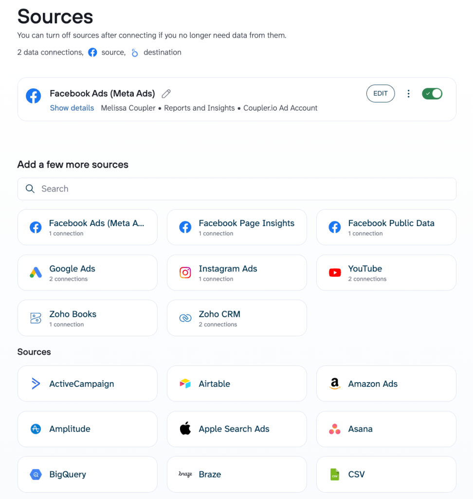
- Connect your sources: Select from a library of 400+ Google Data Studio integrations covering ad platforms, CRMs, finance tools, custom Airtable apps, Google Sheets, BigQuery, databases, and more

Try it yourself right away. Choose the needed data source from the drop-down in the form below and click Proceed. You’ll be offered to get started for free with no credit card required.

- Combine and transform the data: Use append, join, and aggregate modes to stitch sources together, normalize field names, convert currencies, and filter out noise
- Stage it in a Coupler.io dataset: Preview, modify, and adjust the logic before any of it reaches the report. Definitions and transformations can be accessed and reused here

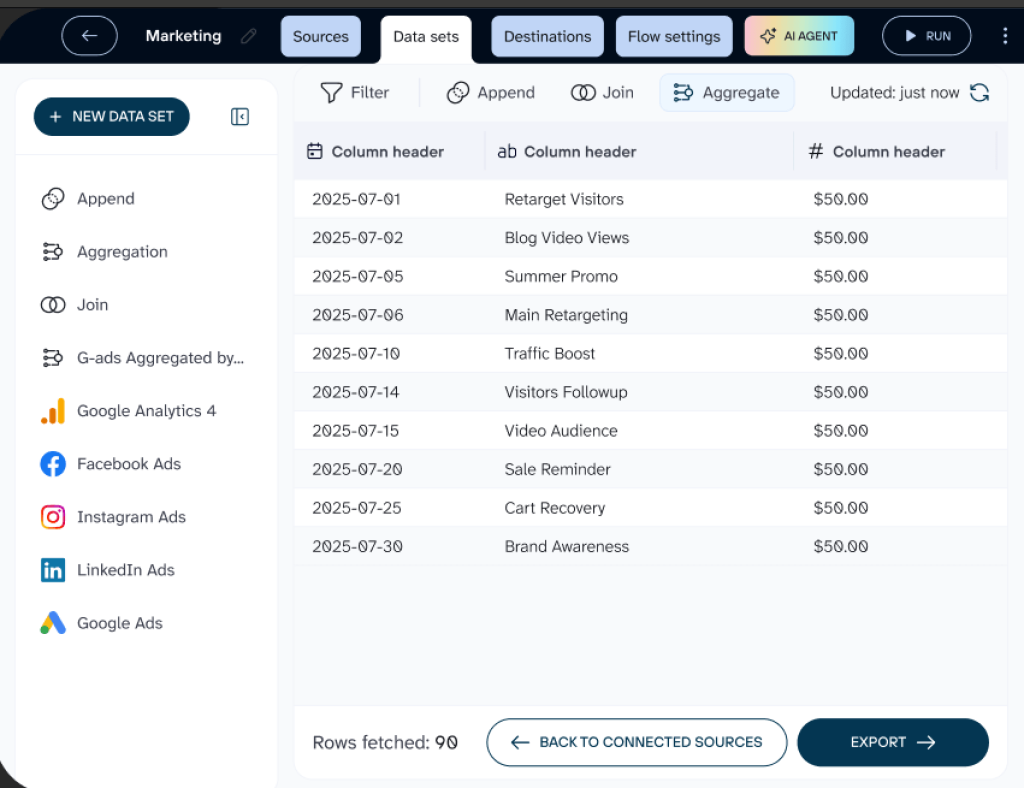
- Schedule the refresh: Set the cadence you need, as often as every 15 minutes
- Load to Looker Studio: The prepared dataset lands in Looker Studio as a clean data source. The report layer only handles presentation from here on.

This path takes more setup than the other two, but it’s the only one that handles advanced reporting in Data Studio (Looker Studio) without compromise. ULTRA\OPS needed exactly that for their reporting, which ran on a custom Airtable application where standard connectors didn’t reach. Coupler.io automated the Airtable-to-Looker Studio pipeline, and their interactive dashboards were live in a single day.
Bulungula Incubator had a similar starting point but a more layered stack. They used Coupler.io to move data from multiple Airtable bases into BigQuery, which then fed Looker Studio dashboards. The result is a full pipeline from raw operational data to finished reports, with close to zero manual work.
Start with a dataset template
This path fits when the data shape you need is common, like PPC metrics across Google, Meta, and LinkedIn, Shopify orders, Xero revenue, and Google Analytics 4 web analytics, but the report design is yours. You skip the work of figuring out the data shape and spend your time on what the dashboard actually shows.
Here’s how it works:
- Pick a prebuilt dataset template: Coupler.io’s dataset gallery includes prebuilt dataset configurations for common reporting patterns, with the source connections, transformation logic, and dataset shape already defined

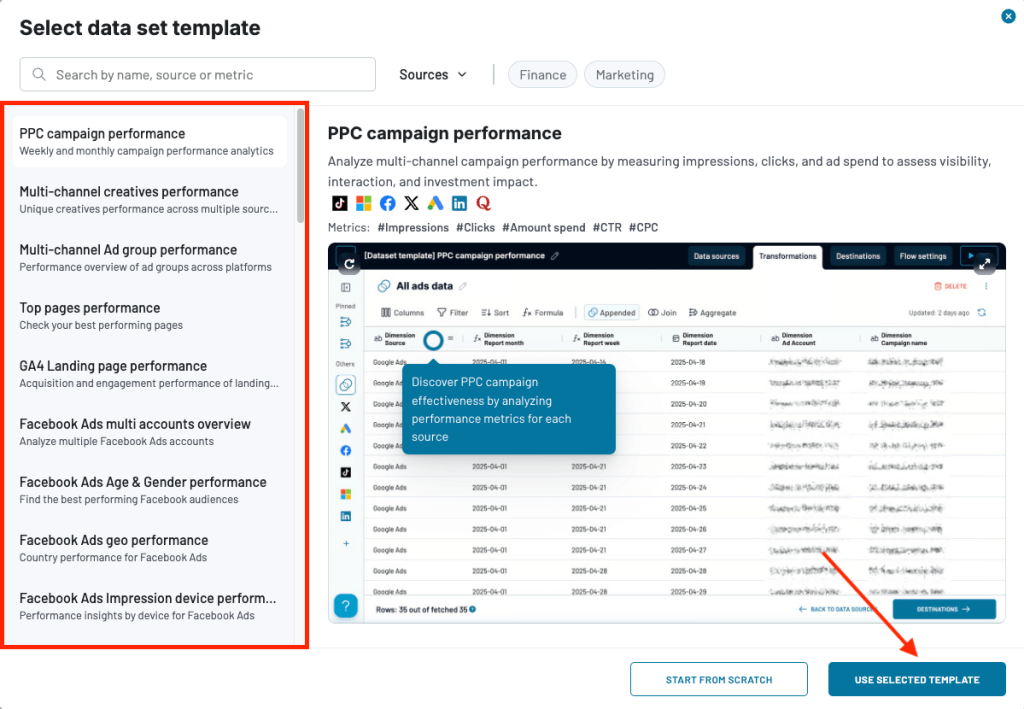
- Connect your accounts: Plug in your specific source credentials. The dataset logic is already configured, so you’re only authorizing access
- Customize if needed: Adjust transformations, add or remove fields, change the aggregation. The template is just a starting point
- Build your Looker Studio report: Connect the prepared dataset to Looker Studio and design the report from there. The data is already clean and combined, so the report layer only handles presentation.
This method is the right call when standardizing the data isn’t where you want to spend your time, but the report itself needs to be built around your team’s priorities.
Set up reusable reporting logic with Coupler.io Data sets
Get started for freeStart with a dashboard template
If the report you need is standard and speed matters more than custom design, dashboard templates are your go-to option. The data shape and the report layout are both already solved problems, so there’s no reason to build either from scratch. Some examples include weekly PPC reports, monthly SEO updates, agency client snapshots, and finance roll-ups.

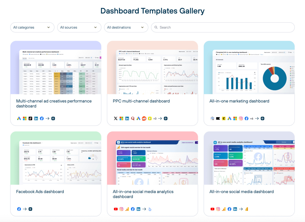
Here’s how it works:
- Pick a dashboard template: Coupler.io’s template gallery covers the common reporting patterns end-to-end – multi-channel marketing, social media, sales, finance, e-commerce. Google Data Studio templates include both the prep logic and the Looker Studio layout
- Connect your accounts: Plug in your source credentials. The pipeline and the dashboard are already wired together.
- The dashboard is live: Usually within minutes. Customize on top if needed. For example, adjust branding, rearrange components, and add a few calculated fields for the last mile
Best use cases for custom analytics dashboards in Data Studio
The prep-first (data preparation outside LS) approach helps with most reporting work. It shows its value most clearly when teams build custom analytics reports in Data Studio for specific situations. Below are four common reporting use cases explained with Coupler.io dashboard templates.
Multi-channel marketing reporting
Marketing teams running ads across multiple platforms hit a familiar wall in Looker Studio. Each platform (Google Ads, Meta, LinkedIn, TikTok) reports its own metrics in its own format, with its own date ranges and its own definitions of cost, conversions, and attribution. Pulling them into one report means either managing multiple blends or accepting that “channel performance” looks different depending on which dashboard you open.
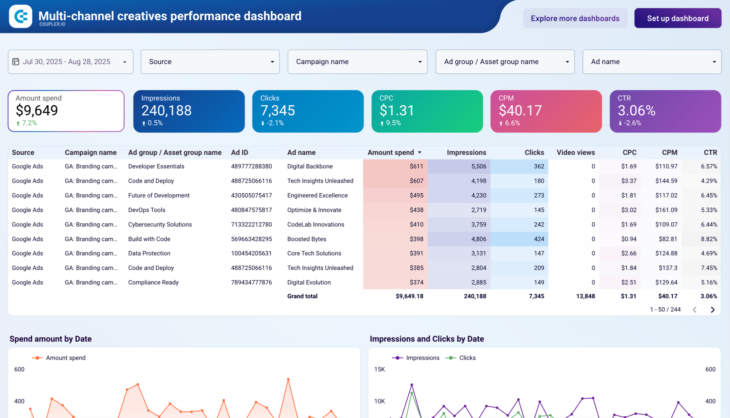
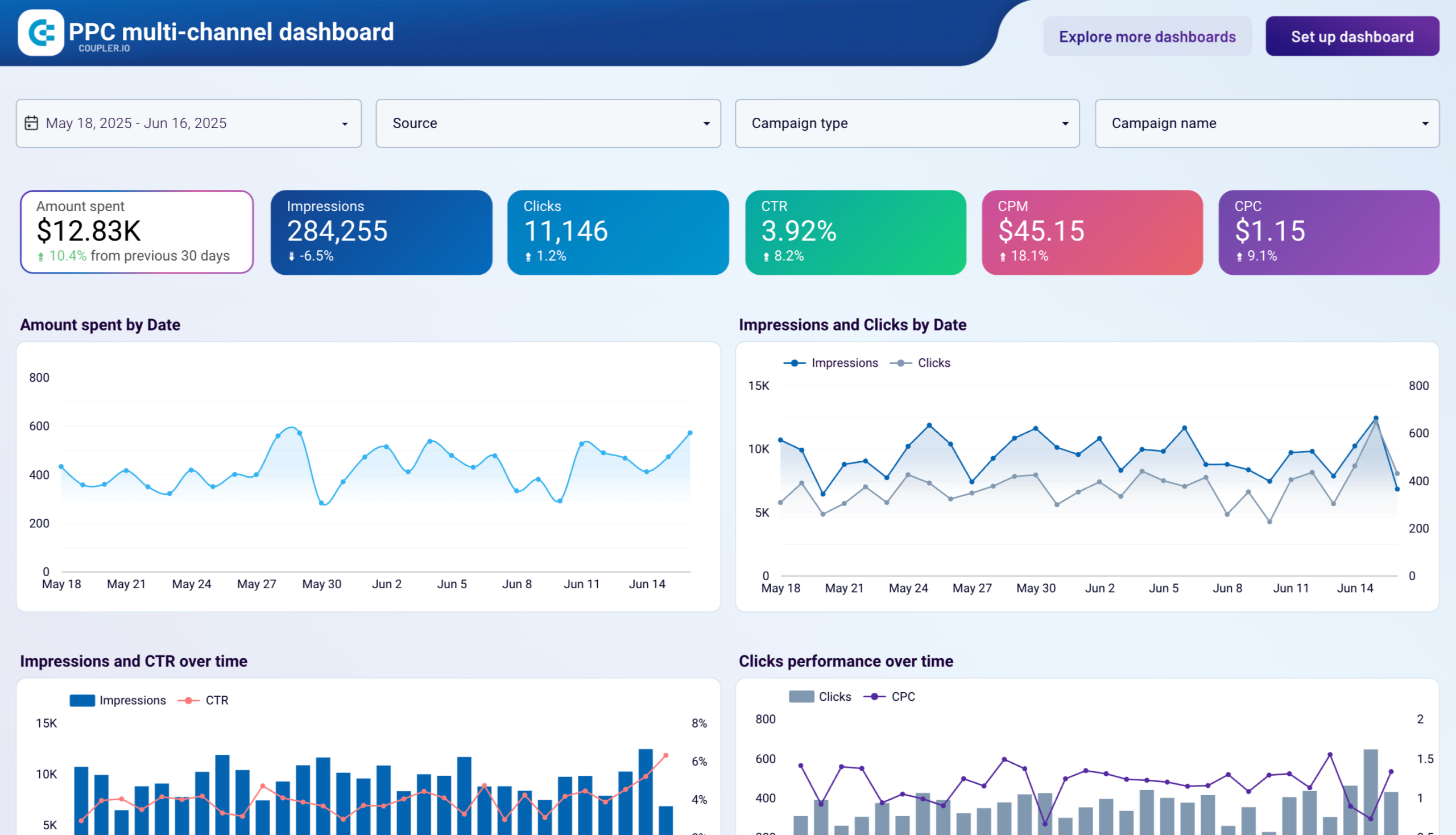
The PPC multi-channel dashboard fixes that headache. It’s a Google Data Studio custom report that pulls campaigns from different PPC sources into one ranked table — spend, performance, and how things changed versus last period, all in the same view.

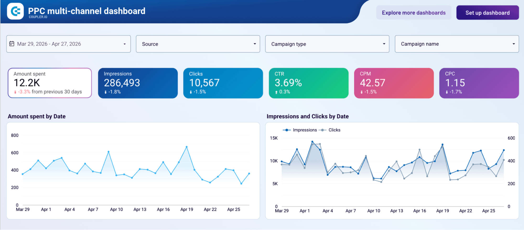
Instead of opening three tabs to figure out which channel drove the most spend last week, you just look. Channels sit next to each other, the same filters apply across all of them, and you can actually tell which one is working. It’s the kind of dashboard that ends up being what the team opens for weekly reviews and monthly reports.
Other dashboards that support multi-channel marketing reporting:
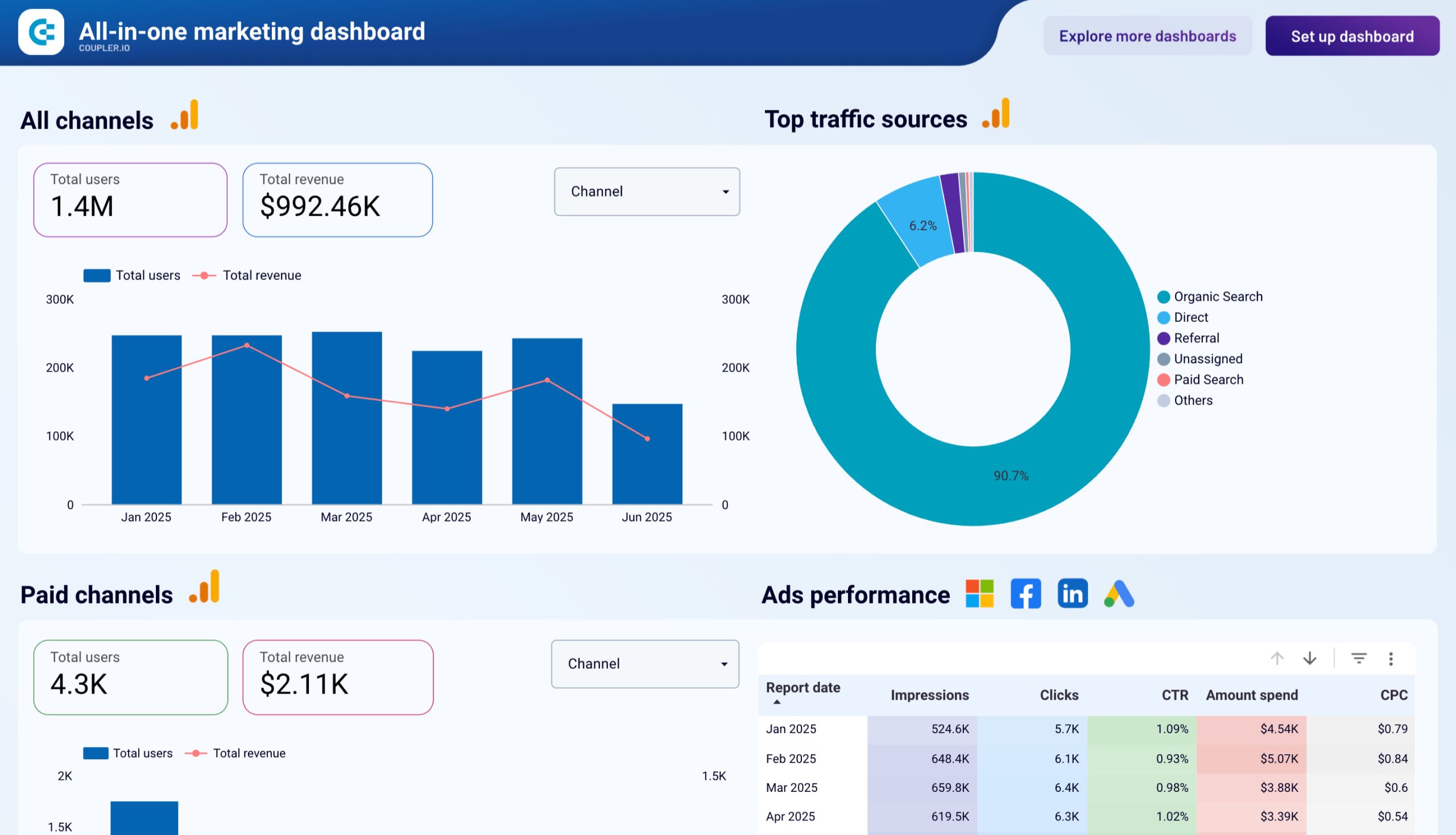
- All-in-one marketing dashboard: combines PPC, web analytics, and SEO in one report for a fuller marketing view
- Multi-channel ad creatives performance dashboard: looks at performance at the creative level across platforms, for when the question is which ads are working, not just which channels
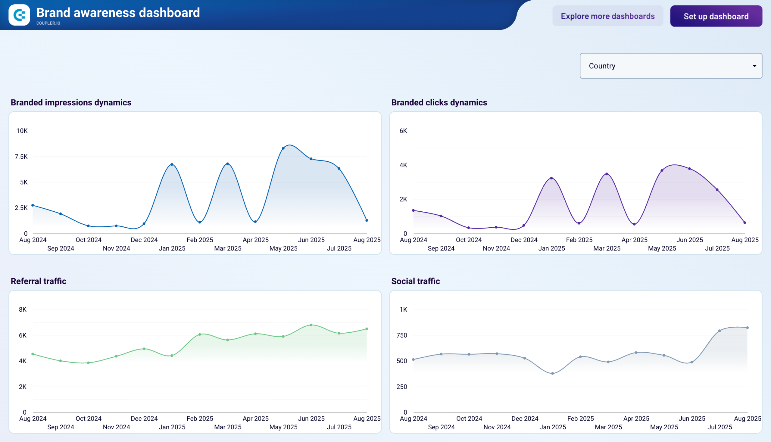
- Brand awareness dashboard: connects paid impressions across platforms with branded search data from Google Search Console


Agency and client reporting at scale
For agencies, the pain isn’t building one good report. It’s building the same good report twenty times for twenty clients, keeping the metric definitions consistent across all of them. Every client has slightly different goals, slightly different platforms, and a slightly different idea of what “engagement” means. The work of standardizing all of that, at the agency level, is what makes scaling reporting possible at all.
The all-in-one social media analytics dashboard is built for exactly this. It pulls together different social media sources into a single client-ready view. It comes with engagement, reach, growth, content performance metrics, all laid out in a format you can repoint at a new client without rebuilding from scratch.
All-in-one social media analytics dashboard

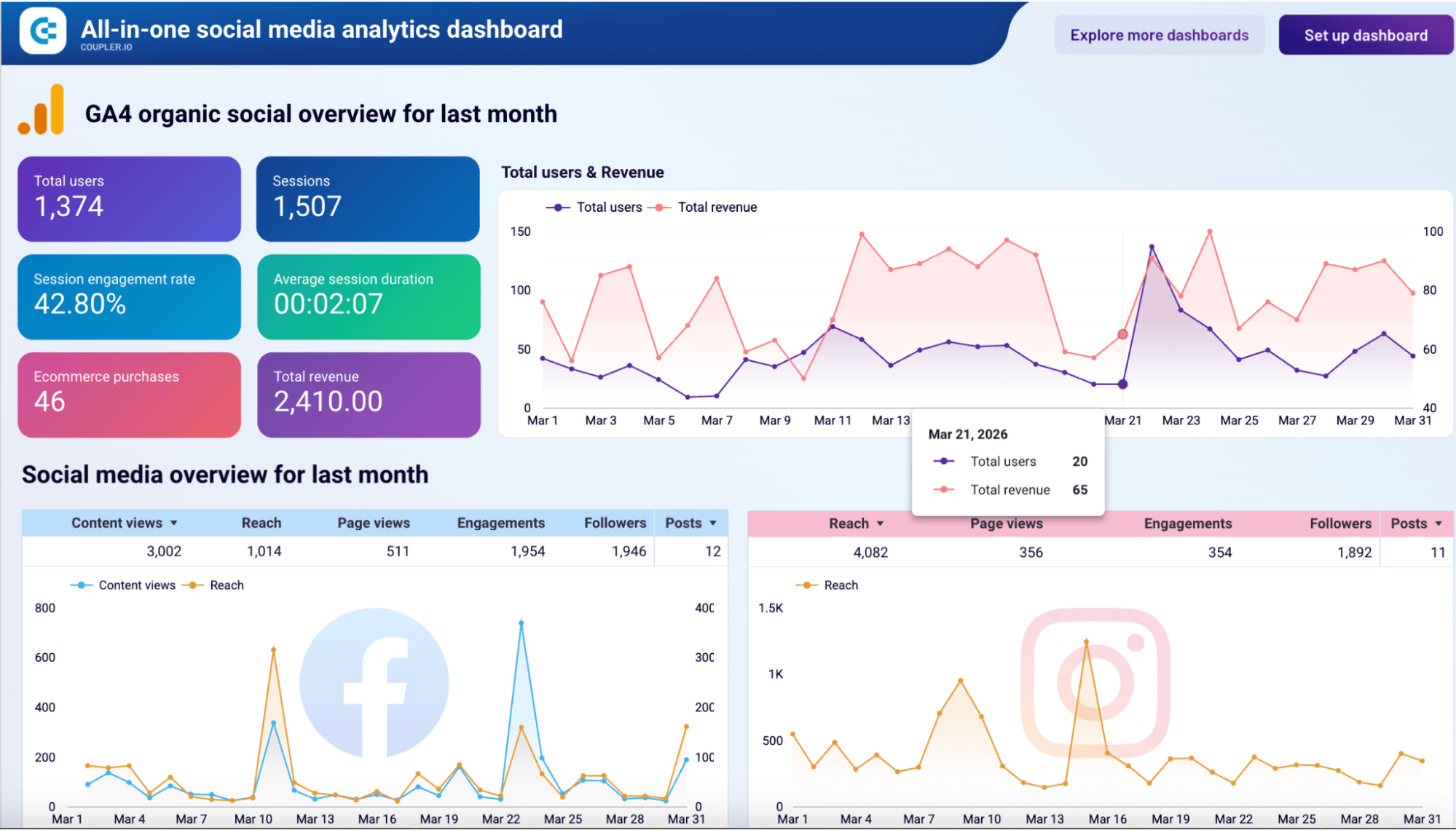
All-in-one social media analytics dashboard
Preview dashboardIt comes with engagement, reach, growth, and content performance metrics, all laid out in a format you can repoint at a new client without rebuilding from scratch.
SellThru runs exactly this kind of setup across 35+ client dashboards. What used to take two weeks to onboard now takes two or three days, tracking accuracy sits above 95%, and the team saves over 20 hours a month on reporting work.
Social Unit took a different angle on the same problem. By automating cross-channel analytics into Looker Studio for their clients, they cut client questions about results by 60%. When the numbers are easy to read and clearly trustworthy, clients stop asking what they mean.
Other dashboards that support agency and client reporting:
- PPC multi-channel dashboard: the repeatable ad reporting template agencies deploy per client
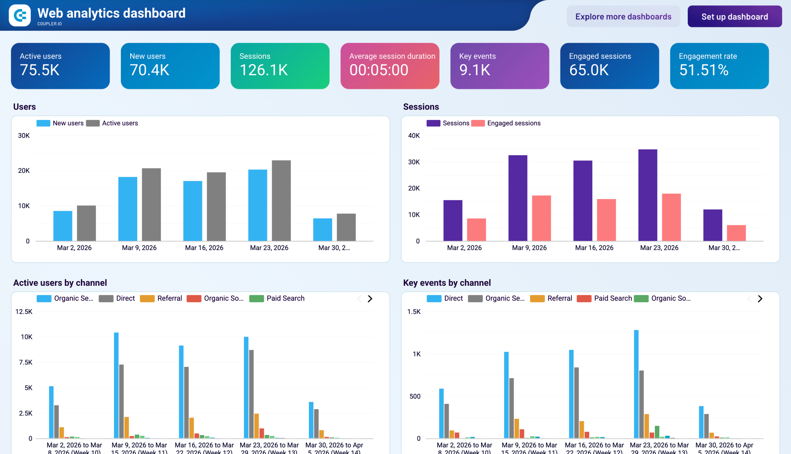
- Web analytics dashboard: standardized GA4 view across accounts, useful when traffic and conversions are the main client conversation
Finance and revenue reporting
Finance reporting has less room for “close enough” than most other reporting work. When the number is going to leadership or onto a board deck, it has to be right. Currency conversion has to be consistent. Period alignment has to match the books. The trouble is that the data is in QuickBooks or Xero, payments come from Stripe, and customer information lives in the CRM. None of them agree on how to format a date or what to call a transaction.
The QuickBooks revenue dashboard for multi-currency accounts is built for the messiest version of this.

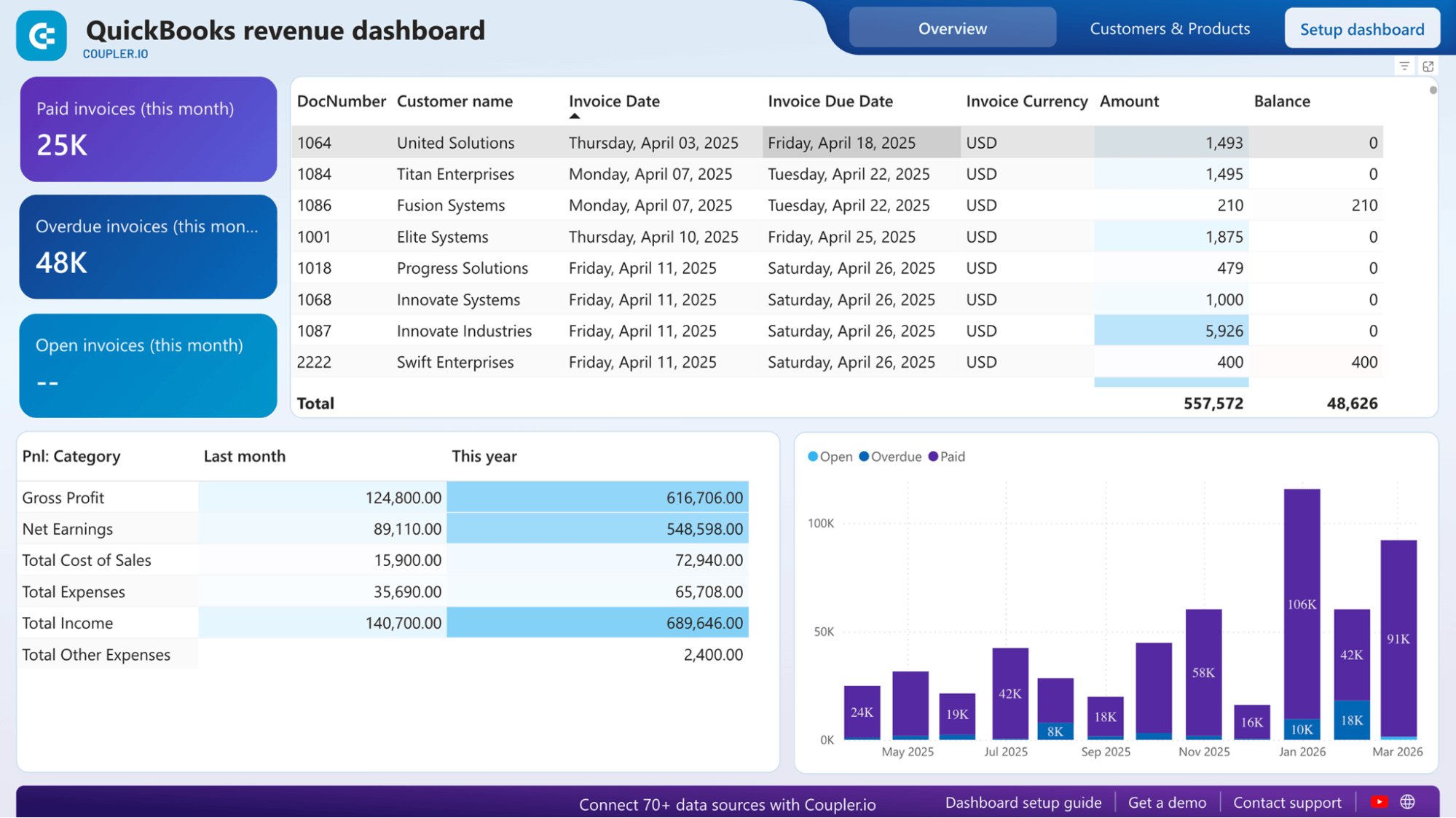
It pulls revenue from QuickBooks across whatever currencies your business operates in, converts everything into one normalized view, and lays out month-over-month performance in a way that actually matches your books. For finance teams that close monthly or report on revenue by region, this turns a fragile spreadsheet exercise into something you can trust on a recurring basis.
Other dashboards that support finance and revenue reporting:
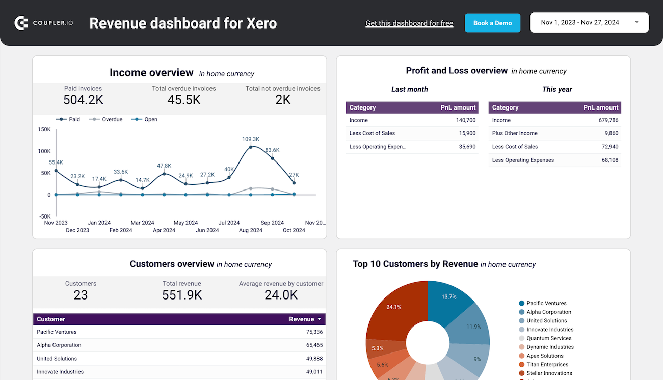
- Revenue dashboard for Xero: the equivalent setup for teams running their books on Xero
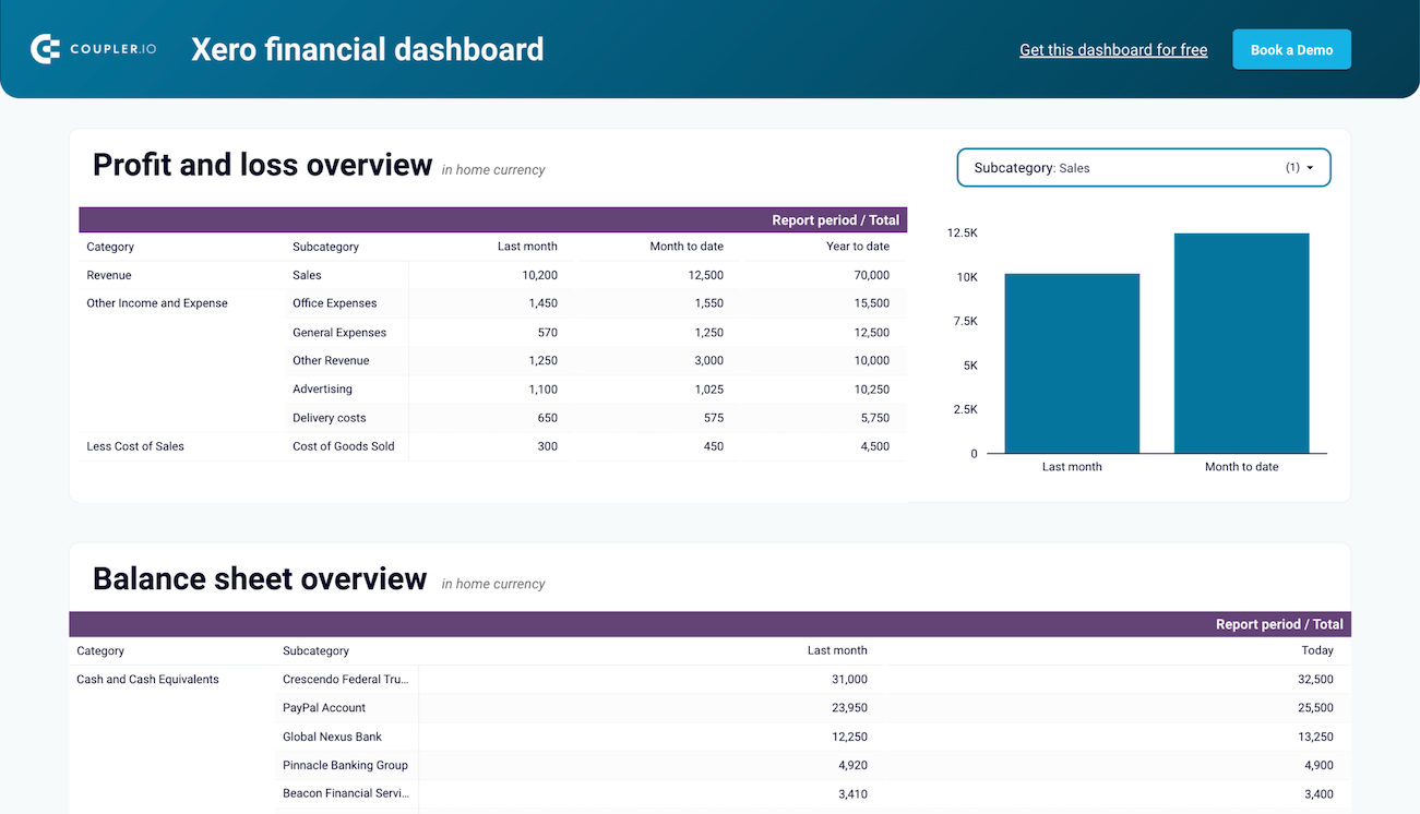
- Xero financial dashboard: broader financial view covering more than just revenue

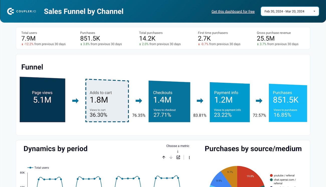
E-commerce reporting
For e-commerce teams, the most useful questions cut across multiple sources.
“Which traffic sources actually convert?”
“Is paid spend driving real revenue or just sessions?”
“Where does the funnel break down between landing on the site and finishing checkout?”
You can’t answer any of these by looking at Shopify alone or GA4 alone. They each tell half the story.
The Shopify store traffic dashboard puts both halves in one view.

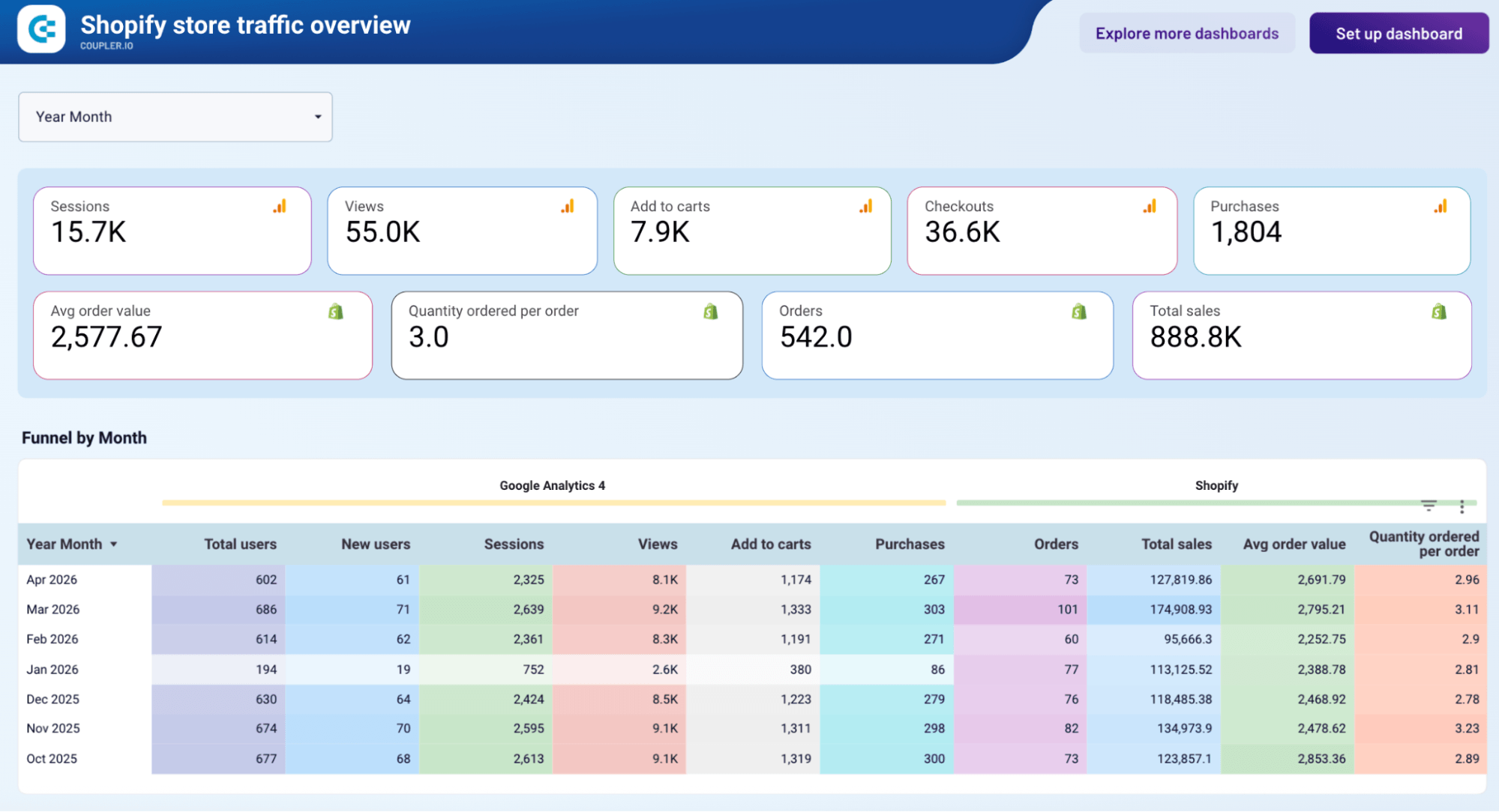
Sessions, traffic sources, and behavior come from GA4. Orders, revenue, and conversion data come from Shopify. They sit at the same grain in the same view, so you can see a campaign’s full path, from the channel that brought someone in, to whether they added to cart, to whether the order actually closed. For teams trying to understand what’s driving sales (not just what’s driving traffic), this is the dashboard that makes that conversation possible.
Other dashboards that support e-commerce reporting:
- E-commerce sales funnel dashboard for GA4: focused specifically on funnel-stage analysis when you want to see where drop-off happens
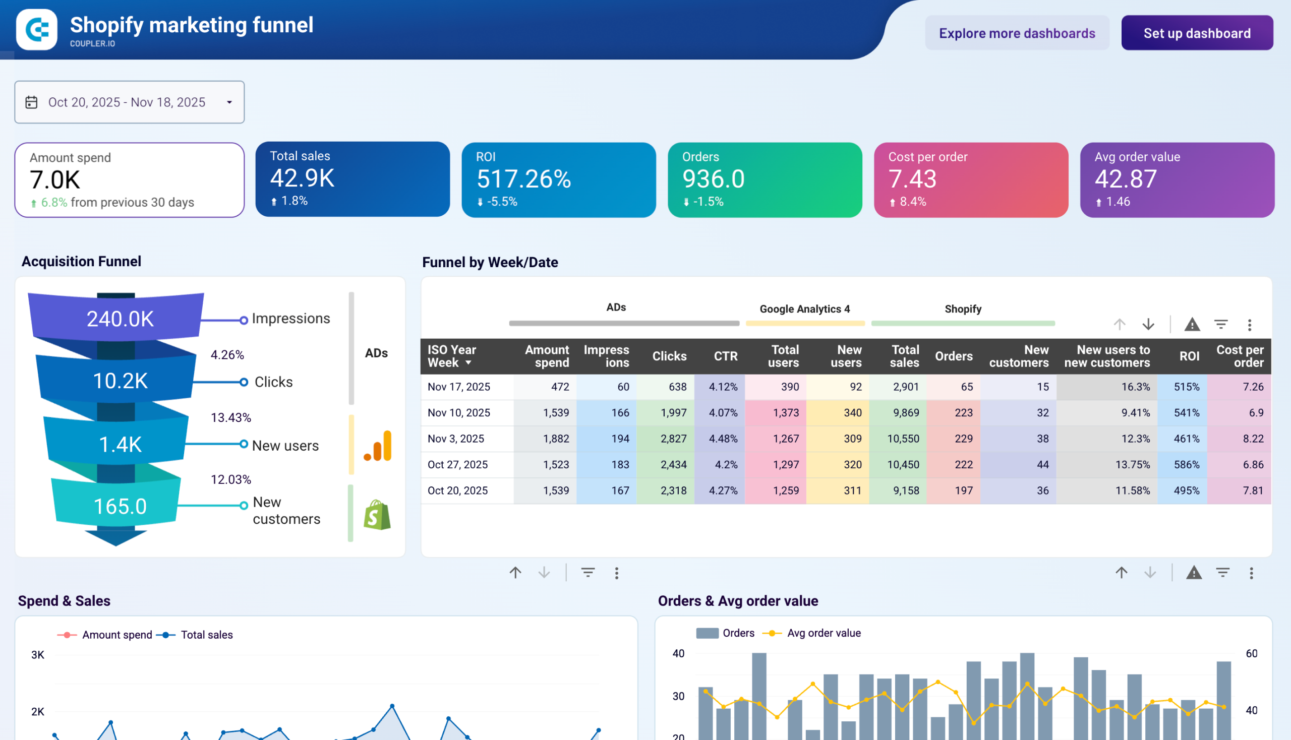
- Shopify marketing funnel dashboard
When a native dashboard beats a Looker Studio build
Not every report needs a Looker Studio build behind it.
For standard, repeatable reporting like weekly PPC reports, monthly SEO updates, and agency client snapshots, a native Coupler.io dashboard gets you live faster and stays easier to maintain. You give up some of Looker Studio’s customization in exchange for showing up Monday morning with the report already done.
So when does each one make sense? Here’s a quick comparison:
| Native Coupler.io dashboards work better | Stick with Looker Studio |
| The report is standard and repeatable across accounts or clients | The dashboard is highly custom or heavily branded |
| The audience cares about the numbers, not the design | Stakeholders need parameter-driven interactivity, drill-throughs, or advanced filtering |
| You’re setting up the same view across many accounts | The report has executive or client-facing polish requirements that go beyond template-level styling |
For some reporting patterns, a Looker Studio build is over-engineering for the job. For others, it’s the only way to get the polish and interactivity stakeholders actually need. The trick is knowing which situation you’re in before you start building.