Google Data Studio (Looker Studio) Blend Data Tutorial: Combine Data From Your Sources Easily

What does blend data do in Google Data Studio (Looker Studio)?
Blending data in Google Data Studio (formerly Looker Studio) is about combining different sets of data. It can be data coming from different source apps (for example, aggregating stats from different advertising channels), but it’s not uncommon to be merging data from the same app too (e.g. fetching business metrics from different spreadsheets for a joint overview).
Looker Studio data blend allows you to:
- Easily compare data from different sources or, for example, periods of time
- Extract valuable insights that wouldn’t be easy to spot by looking at each source separately
- Understand the relationships between data
- And save plenty of time you would otherwise have to spend manually blending data
Different types of data joins
When you blend data in Looker Studio or other data blending tools, you use a joint dimension called a join key. For example, to merge customer data from different marketing channels, the email address can be the join key. The tool used for blending will then combine data associated with each email address and present it to you through a joined chart or table.
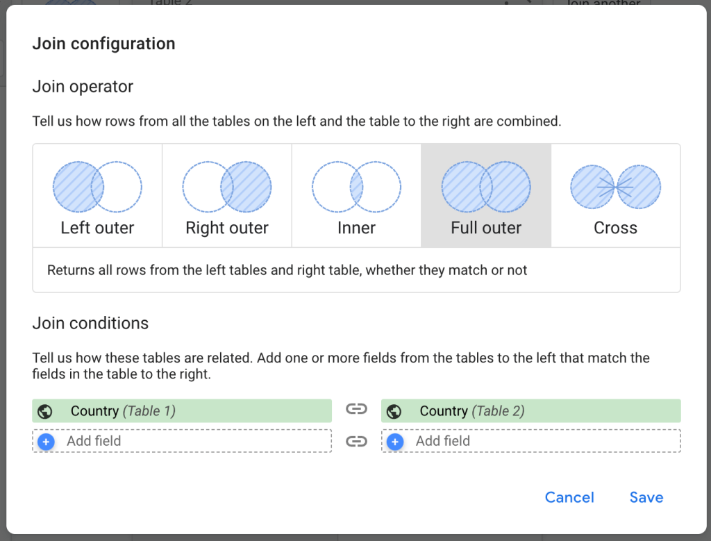
How exactly the data will be joined is determined by the join type you choose. Looker Studio supports five types of joins:
- Left (outer) join
- Right (outer) join
- Inner join
- Full outer join (or) union
- Cross join
Let’s have a look at what’s possible in Looker Studio with the help of an example.
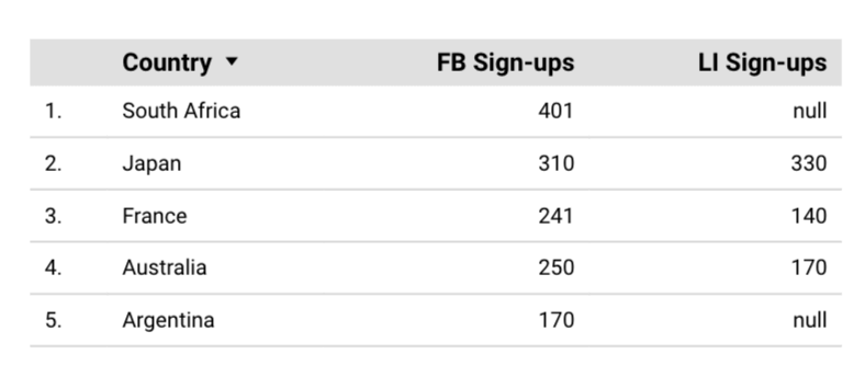
The idea is to merge the sign-up numbers from both channels so the marketing team can compare the performance of channels in every country. This helps to optimize the budget and prioritize regions and channels.
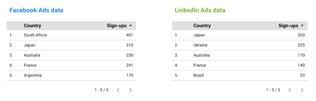
In the tables above, notice that only Japan, Australia, and France are present in both datasets, while the other two countries are different in each set.
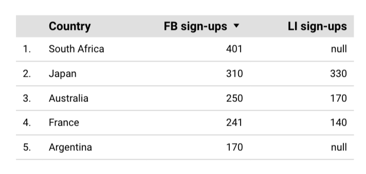
- Left (outer) join combines all data from the left table and only the data from the right table that matches the join keys present on the left. For that reason, only the countries from the Facebook Ads set were fetched. Since South Africa and Argentina don’t exist in the LinkedIn set, they return null values.
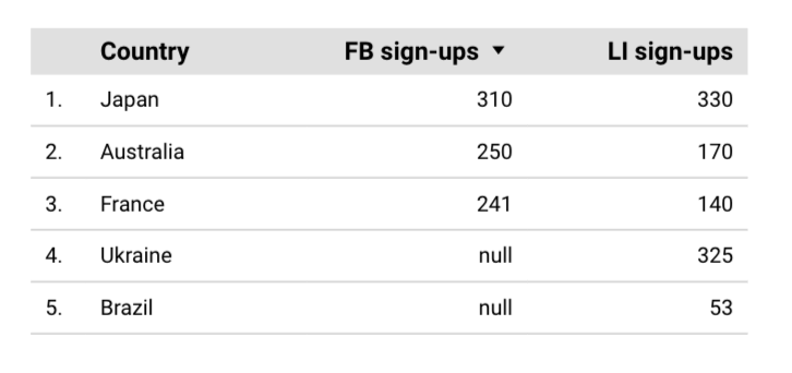
- Right (outer) join works in the opposite fashion to the left (outer) join. It combines all data from the right table and only the data from the left table that matches the join keys present on the right. Here, Ukraine and Brazil return null values because they don’t exist in the Facebook set. In reality, right joins are rarely used as it’s often easier to just place the main source of data on the left and go with the left join for the same effects.
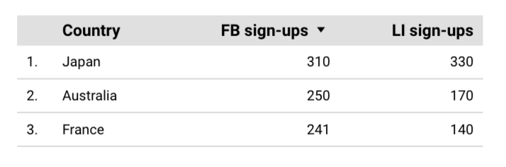
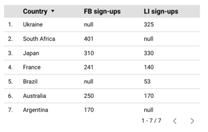
- Inner join combines data from both tables only if a join key exists in both data sets. For that reason, only the three countries present in both sets were returned this time.
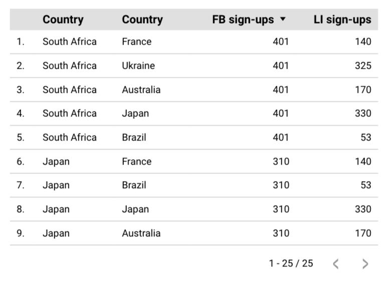
- Cross join returns every possible combination of data from the left and right tables, without the need for setting a join key. In this particular context, cross join is rather useless but it can prove valuable when, for example, you compare different combinations of marketing campaigns and hope to choose the top-performing pair. Here, there were 5 rows in each column, thus 25 possible combinations (the table here would be pretty long, so I cut it a bit, but I hope you get the idea).
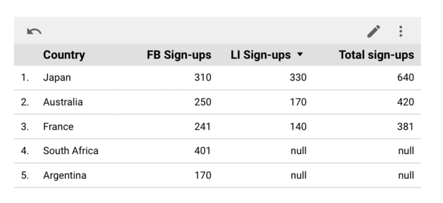
- Full outer join combines all data from both tables, regardless of whether the join keys match. It can result in many nulls like in the example below but guarantees you won’t miss out on any data.
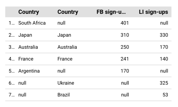
Now, you must have noticed that something is wrong with the chart above – the ‘Country’ columns are repeated. Looker Studio seems to have some issues with merging these two fields when an outer join is in play, even if you have the “Hide repeated join fields” field checked in the settings. To overcome this, I used a workaround – I created a chart-specific calculated field with the following formula:
COALESCE(Country (FB data),Country (LI data))
COALESCE() here picks the first non-null values from the two columns which works perfectly for me. I hid the existing dimensions and used the calculated field instead for the following outcome:
Note: It’s common for users to use the term “formulas” when referring to “calculated fields”. This is because all calculated fields in Looker Studio are built using formulas. Yet, it’s important to note the distinction between the two for accurate understanding.
Moreover, in Looker Studio Pro, you can use AI to help you create formulas. Learn more about this in our blog post where we’ve compared Looker Studio vs Looker Studio Pro.
How to blend data in Looker Studio?
Now let’s talk about how Looker Studio data blend works. There are, in fact, three ways you can get started. The best option is to connect data to Looker Studio with Coupler.io and blend data before loading it to Looker Studio
Method 1 – Blend data within your data source using the partner connector by Coupler.io
Coupler.io is a data integration platform that provides over 400 data connectors for marketing platforms, accounting software, and numerous business applications.
Add your data source in the ‘source’ field in the form below and click on Proceed.
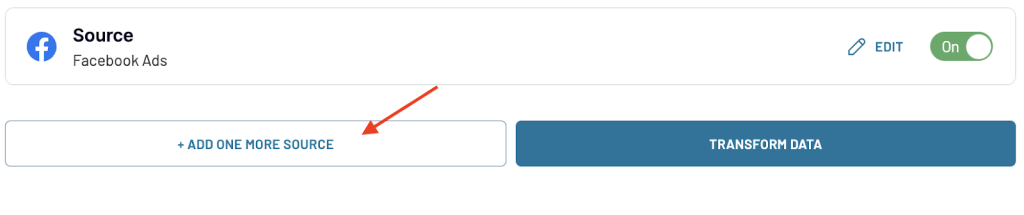
Now, create a free Coupler.io account and set up data connectors following the in-app instructions. To blend data, you need more than one data source, so click Add one more source and connect it as well.
Once you click Transform data, you’ll be prompted to choose how to blend the data from both sources.
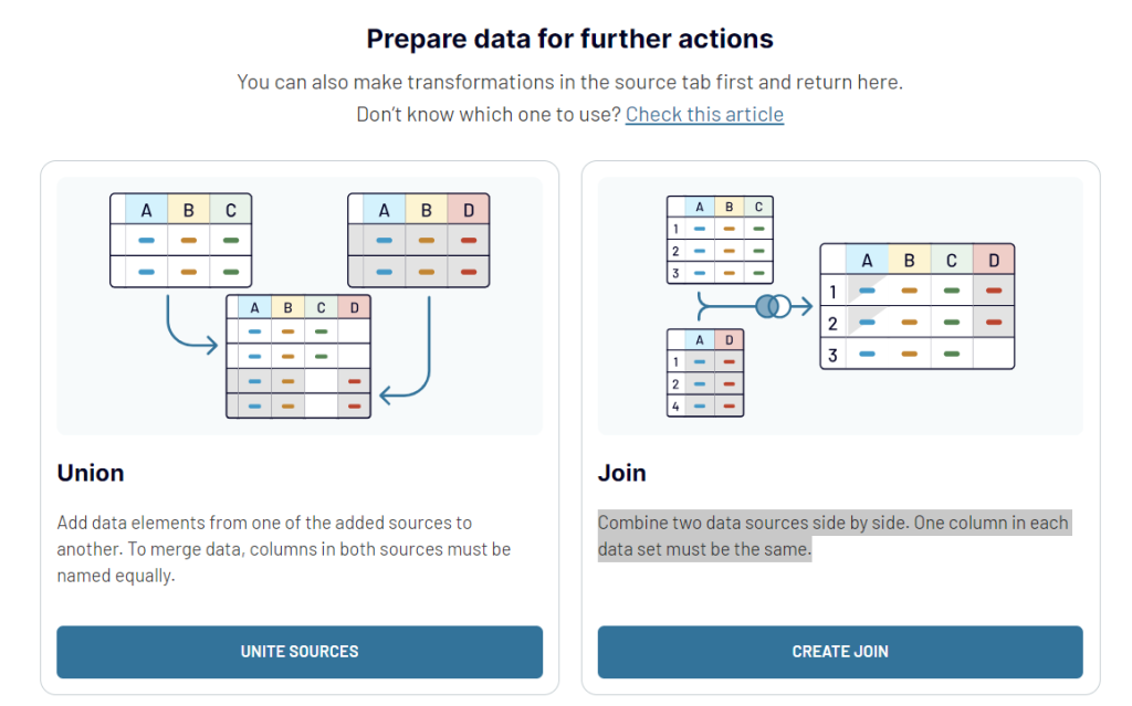
- Union – This is similar to Outer Join or Union in Looker Studio. Once you click on Unite Sources the data will be combined from sources into a single table.
- Join – This method corresponds to Left Join in Looker Studio where you combine the data from the left table and only match data from the right table based on the join keys in the left table. Click on Create a Join to get started. Note that at least one column in each data set must be the same.
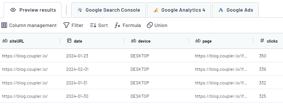
Using other data transformation features like column management, sorting, filtering, and custom columns, you can organize the data systematically.
Once the data is ready, follow the instructions to authorize the Looker Studio connector and load the blended data to Looker Studio. To keep your data in Looker Studio near real-time and ready for analysis, set up a data refresh schedule to update it automatically.
Method 2 – One-click data blending
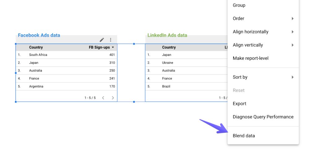
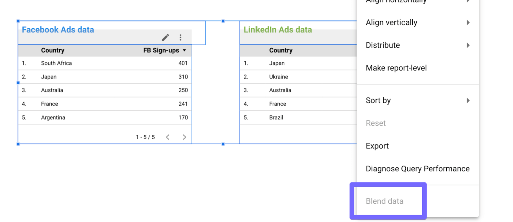
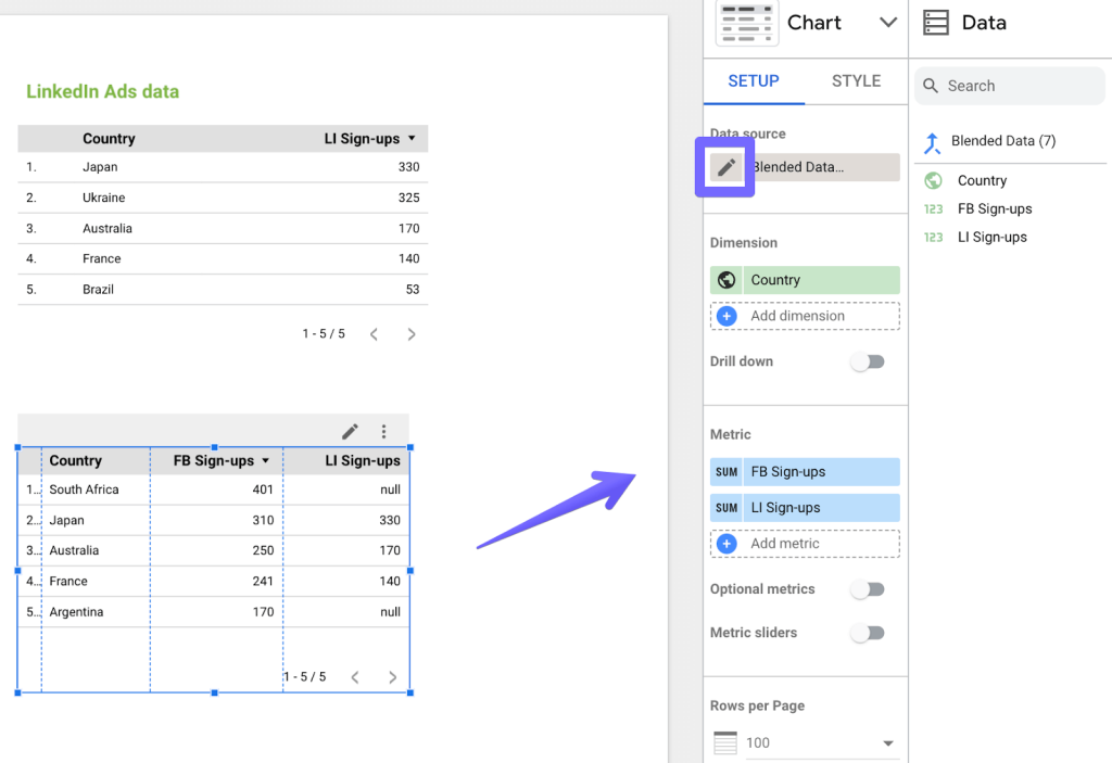
The second method is probably more intuitive, but it requires you to already have the data you want to blend on the same page. It can be, for example, two tables or line charts that you want to merge into one. To do that, select the data you want to blend and right-click on any of the charts. From the menu, select Blend data.
If the option isn’t available, it means the data cannot be blended together, most likely because the chosen options aren’t compatible with each other. Here, for example, I added the labels “Facebook Ads data” and “LinkedIn Ads data” as separate text blocks and aligned them with tables. When I selected the tables, I accidentally captured also the text blocks which, obviously, can’t be blended with my advertising data.
If you find yourself unable to blend data this way, double-check if you didn’t capture more than you meant to. To help you determine that, you should see a descriptive error message when you hover on the disabled Blend data option (here: “text cannot be used in a blend”).
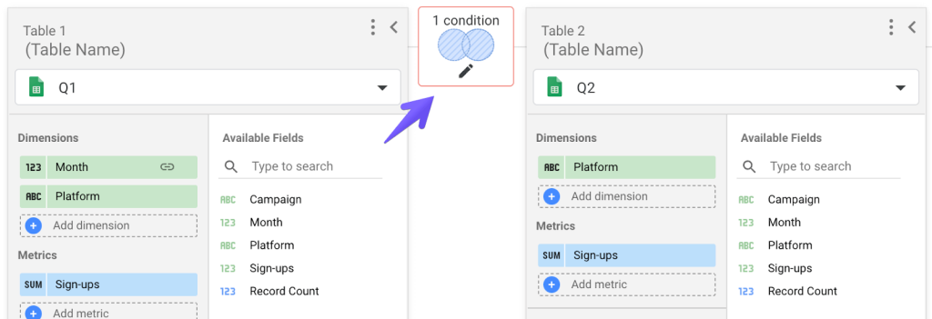
If everything went smoothly, Looker Studio will aim to figure out the right key to join the data on as well as a meaningful set of dimensions and metrics. Often, however, it doesn’t precisely return what you had in mind. You can make quick adjustments in the menu to the right or click the pencil icon next to the data source name for more advanced settings, such as changing the join type (by default, left join is used) or updating the join key. We’ll cover this next.
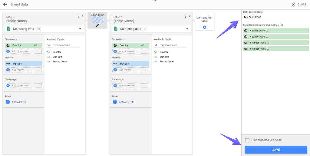
Method 3 – Add a blend step by step
A more sophisticated method sits in the Looker Studio menu. Click Resource -> Manage blends. You’ll see an overview of all blends in your projects and the number of charts that use each. Choose to Add a blend.
Now, add and configure the tables you want to blend. Choose the dimensions and metrics for each. Determine the type of join that will work best for you and adjust the join conditions if you need to.
It’s probably a good idea to name the blend in the top-right corner of the screen so you can easily find it later. Once you’re finished, click the Save button and close the window.
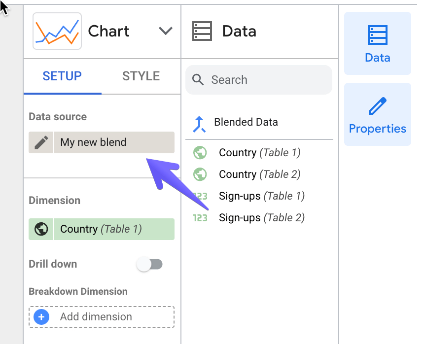
When you want to use the blended data, start adding a chart as usual. Open the data source dropdown list and find the Looker Studio data blend created earlier.
We covered this method of blending data in this video tutorial, check it out!
Limitations of data blending in Looker Studio
Blending data in Looker Studio is absolutely possible, and many users rely on it heavily. However, there’s also a big group of users who would rather avoid this activity at all costs, as it comes with many limitations that force them to look for workarounds or even abandon certain plans. For them, blending data prior to importing it to Looker Studio is the way to go, and it’s a very viable approach too. I’ll talk about it shortly.
I’ve had a chat with a few of our analysts who work with Looker Studio on a daily basis, and here are some of the limitations that came up in these conversions:
- Blending data makes Looker Studio slow. You may have noticed that the platform sometimes takes a fair bit of time to load your data even without blending. Things get tougher when you start using Looker Studio with multiple data sources, especially if you choose to do so for more than two sources at a time. For each source, Looker Studio needs to connect to a different API which requires additional computing power it doesn’t always have at the moment. Blending two sources is usually fine, but the more you add, the slower your dashboard will likely get.
- It’s hard to verify the accuracy of blended data. When blending data in Looker Studio, all operations occur under the hood. It’s a wonderful experience, of course, for as long as everything blends as expected. Things get more problematic if your data blends with errors here or there. If you connect an app data directly to Looker Studio, you can’t usually look at the raw data to determine what causes the problem.
- You can’t add more than 5 data sources and more than 10 dimensions from a single data source (e.g. a Google Sheets table). Both numbers may seem like a lot, but they not always are. In a typical business setup, you may sometimes need to fetch data from many different sources using more Looker Studio connectors. For example, marketing metrics from several different apps, financial data from another, certain pieces of information from different spreadsheets, etc. When you hit either limit, you may be forced to split data into several charts or dashboards.
- Data range filter doesn’t work for all chart types. For example, it works just fine with line charts, but if you opt to show some data on scorecards, you’re out of luck.
- Errors of all sorts may hinder your work. Unfortunately, Looker Studio isn’t free of bugs of all sorts, and it may affect your data blending too. For example, a colleague of mine had a data source properly set up, but the connection got broken at some point – it happens. The chart using the blended data would stop working but wouldn’t display any error message. Instead, an empty table would appear, making it really difficult to figure out what the problem really is. On the other hand – while writing this article, I’ve put together some time series charts to represent how user sessions change over the course of a month. The data on charts looked fine until I chose to change the metric label on a chart. Out of nowhere, Looker Studio chose to reset the x-axis to a single day, turning my line chart into a single dot. A quick refresh would help, but it nevertheless left me wondering what just happened. This is not to say that errors appear all the time – they don’t – but it’s something to be aware of.
If you think that these limitations may make your work harder, consider alternative approaches to integrate data from multiple sources. Use Coupler.io to blend data before importing it to Looker Studio.
Blending data sources in Looker Studio – frequently asked questions
I wanted to talk now about some common questions that appear among those getting started with Looker Studio data blend.
How to blend null data with a number in Looker Studio
Working with joins, you’ll quite frequently come across null values. If you choose to process these fields further, for example, to calculate outcomes in other fields, you may not get the results you were hoping for. For example, continuing with my earlier example – I used left join to blend tables with Facebook and LinkedIn signups.
Now, I want to add a column that will count the total number of signups for each country. Normally I would just create a calculated field and insert as a formula FB Sign-ups + LI Sign-ups. The outcome, however, wouldn’t be as expected. Whenever a null value appears in either of the sign-up columns, null is also returned in the totals column.
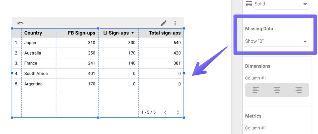
Why? Null, by definition, indicates a missing value, not a 0 value. Since one of the values is missing, Looker Studio is unable to calculate a sum so it returns a null again.
To fix this, I need to change nulls to zeros. One approach that would seem intuitive is going to the Style settings of the blended chart and setting the Missing Data parameter to Show “0”. This will nicely swap all nulls into zeros, but it won’t change the result. Why? This setting is only suitable for making cosmetic changes. Under the hood, the values still remain null, and thus the null (0) results again.
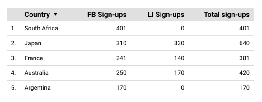
To get the desired result, you’ll need to modify values directly in the calculated field’s formula. You can do it with NARY_MAX() function that returns a higher value of the two provided arguments. COALESCE() I used earlier would work here too. Here are the sample formulas you can use in a calculated field:
NARY_MAX(FB Sign-ups,0) + NARY_MAX(LI Sign-ups,0)
or
COALESCE(FB signups,0)+COALESCE(LI signups,0)
When null appears, it’s swapped for 0. And here’s the outcome:
How to calculate a sum of sessions in Looker Studio data blend?
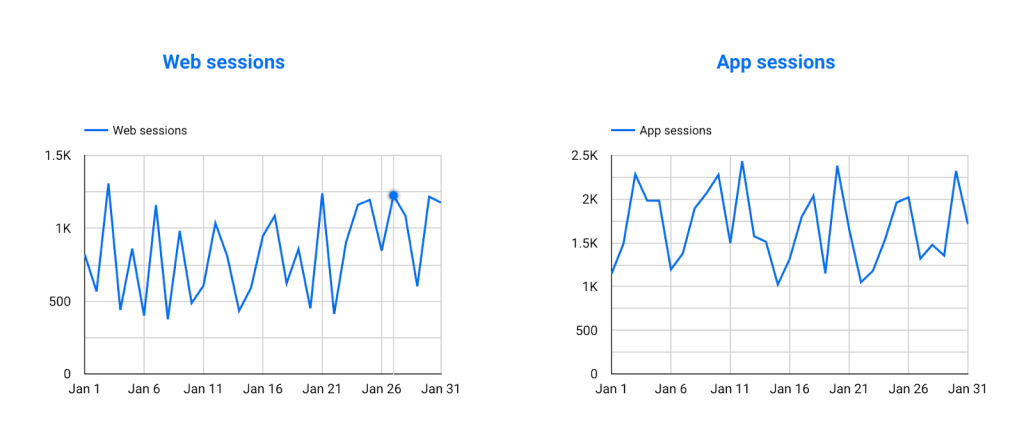
As you blend data in Looker Studio, you’ll often want to sum values from different sources. For example, you may have a mobile app, and most certainly, you have a website. Perhaps you want to blend analytics from both sources and see the total number of sessions recorded every day. It’s very easy to do.
Here are sample charts demonstrating sessions recorded both in the app and on the web.
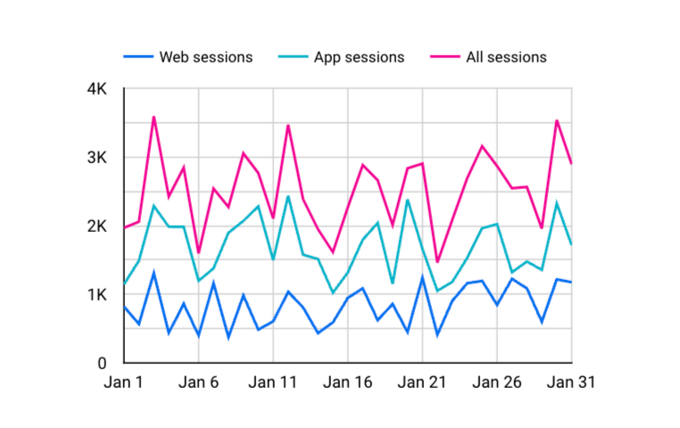
To blend them and calculate the totals, select both charts and choose to blend data in Looker Studio as I did before. Then, add a new calculated field as a metric to the newly created chart with a formula that goes like this: Web sessions + App sessions. You may, of course, remove the previous metrics and leave just the totals for better readability or leave all three as I did below.
How to separate data sources in a chart when blending data in Looker Studio?
What if you blended the data correctly, but you also want to see which piece of data is coming from which source? For example, by blending all the advertising data you managed to calculate the total number of signups they generated. However, now you want to see which platform is the biggest contributor to these numbers.
To do that, you’ll need to do two things:
- Find a suitable chart that will be able to showcase such a breakdown. For example, for a classic column chart, a stacked column chart will do the job perfectly.
- Make sure that each of the data sources features a column indicating where the data is coming from – in other words, it’s got a field you can use to break down a chart. This is easiest to do if you connect spreadsheets or databases as you can simply add, for example, a column “Source,” and for each record in the Facebook Ads table, add… “Facebook Ads.” Repeat for all other sources you’re blending, and you’ll have an easy time separating the data.
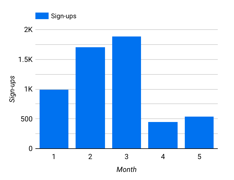
I prepared a few sample tables where I gathered results from advertising campaigns between January and May, blending data in Looker Studio from different advertising platforms I use. Here’s the outcome in a column chart.
It’s useful, but I’m curious about which platforms contribute the most to each of these columns. So using the same dimension (Month) and metric (Sign-ups), I created a stacked column chart. Then, I added the Platform column into the Breakdown Dimension field for the following outcome:
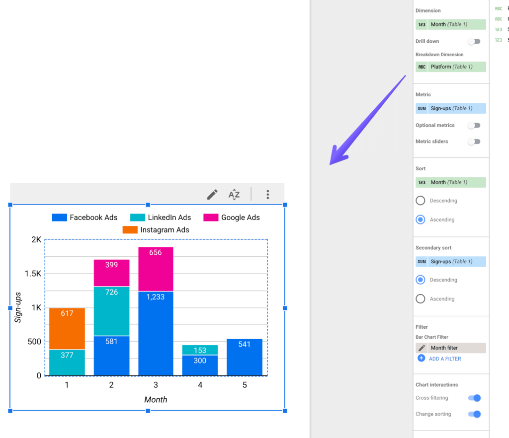
That’s it, I´ve got both the blended data and a clear split into where each piece of data is coming from.
Why is Looker Studio blend data not working?
At times, you may find yourself confused as to why something doesn’t work in the Looker Studio data blend. General Looker Studio bugs aside, there are several common causes that may affect blending.
- You may have misconfigured a join. As you go to the blend settings, check if you don’t see a red overlay around the join configuration that indicates an error. Make sure that every source you´re blending has a join condition set up, including the join key that matches the other keys.
- There may be issues with the data sources. Double-check if each source was added correctly and reconnect if needed. If the data returned after blending doesn’t quite match, hit the Refresh data button in the top-right menu and see if it changes anything.
- Finally, the issue can be with the blending results themselves and the underlying data. Now, as I mentioned in the chapter on limitations, things get tricky when you know something is wrong but Looker Studio doesn’t really tell you what that is. When that happens, your only option is to jump into the data sources and look for the root cause. For example, if you have your data in BigQuery, blend the identical sources there and see what the outcome will be. If there are errors in your data, you should be able to isolate and fix them at this point.
As a reminder, if you need any help with your Looker Studio dashboards or any custom data projects at all, don’t hesitate to reach out to Coupler.io’s data team. Thanks for reading and let’s stay in touch!