Explore a selection of marketing dashboard templates in Google Sheets to improve your campaign management. Learn what insights they provide and how to make your dashboard near real-time.
In this article, we’ve organized the dashboard templates by marketing function to help you quickly find the tools that address your specific needs:
- Campaign performance dashboards to measure advertising effectiveness across channels and platforms.
- Budget management dashboards focused on spending control, forecasting, and budget allocation.
- Traffic attribution dashboards that reveal where your visitors come from and analyze user behavior.
- Search visibility dashboards that show how well you appear in search results and technical SEO health.
- Creative & content performance dashboards for evaluating your ad creative elements and analyzing the effectiveness of your website pages.
- Audience targeting dashboards that help you understand and reach specific audiences.
- Reputation management dashboards to monitor reviews, ratings, and online presence.
Dashboard templates for PPC campaign performance
1. PPC multi-channel dashboard in Google Sheets
First comes Coupler.io’s PPC multi-channel dashboard for Google Sheets. It illustrates PPC advertising expenditures and performance across the multiple ad channels:
- Facebook Ads/Instagram Ads
- TikTok Ads
- Quora Ads
- LinkedIn Ads
- Google Ads
- Microsoft Ads
- X Ads (formerly Twitter)

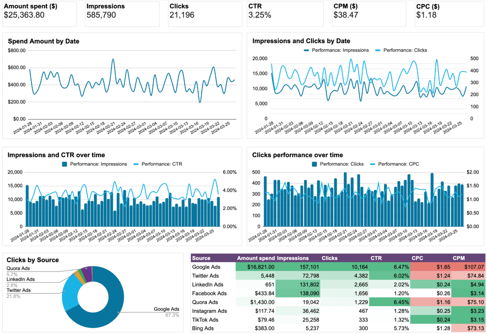
What you can do using this dashboard:
- Track performance variations and assess the impact of seasonal trends or campaign changes.
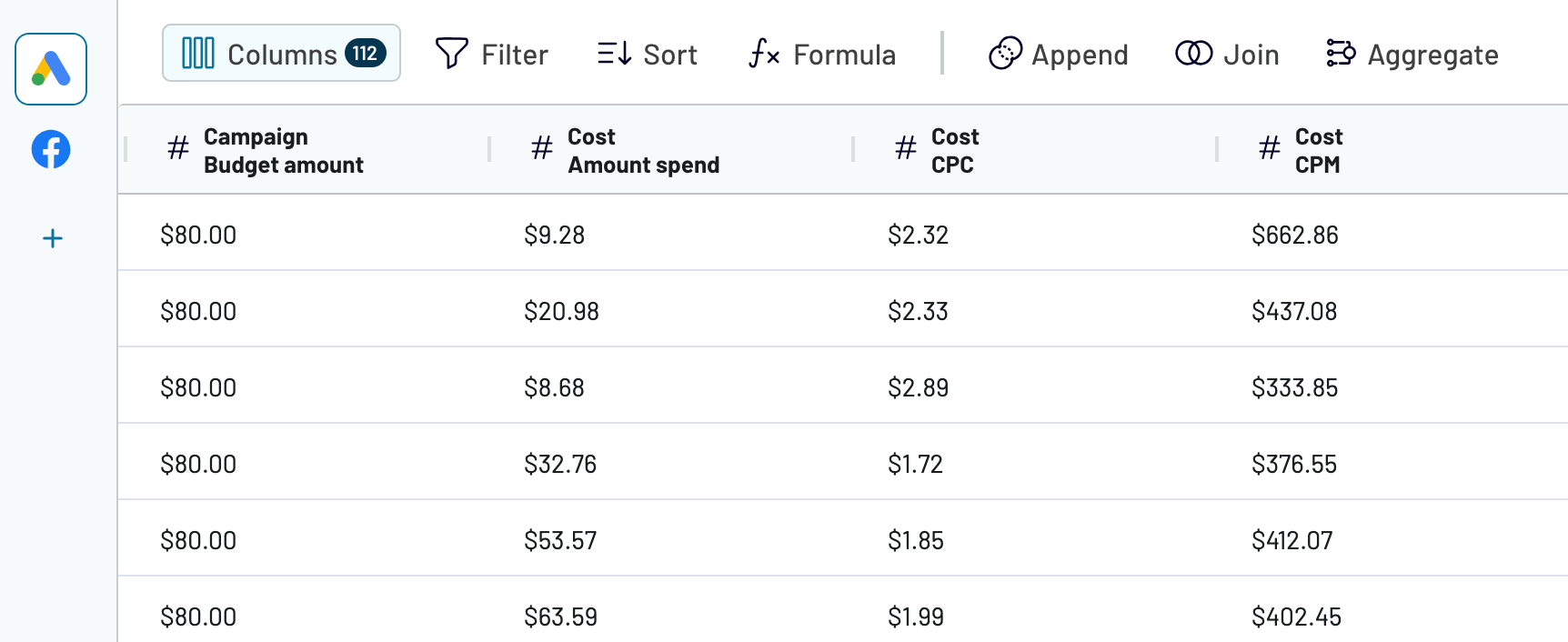
- Monitor the amount spent, cost per click (CPC), and cost per mille (CPM) to stay updated on ad spending and evaluate each campaign’s cost efficiency.
- Compare metrics such as click-through rates and impressions for a more straightforward assessment of each channel’s effectiveness.
- Evaluate which campaigns deliver the best ROI and identify opportunities for optimization by analyzing performance side-by-side.
Navigate to the Readme tab inside the template to set up the dashboard using the Coupler.io connector.
2. Facebook Ads dashboard in Google Sheets
The Facebook Ads dashboard lets you track campaign results to know how effective they are and whether any changes are needed. As a result, you get a complete overview of your campaign’s performance through the most important metrics.

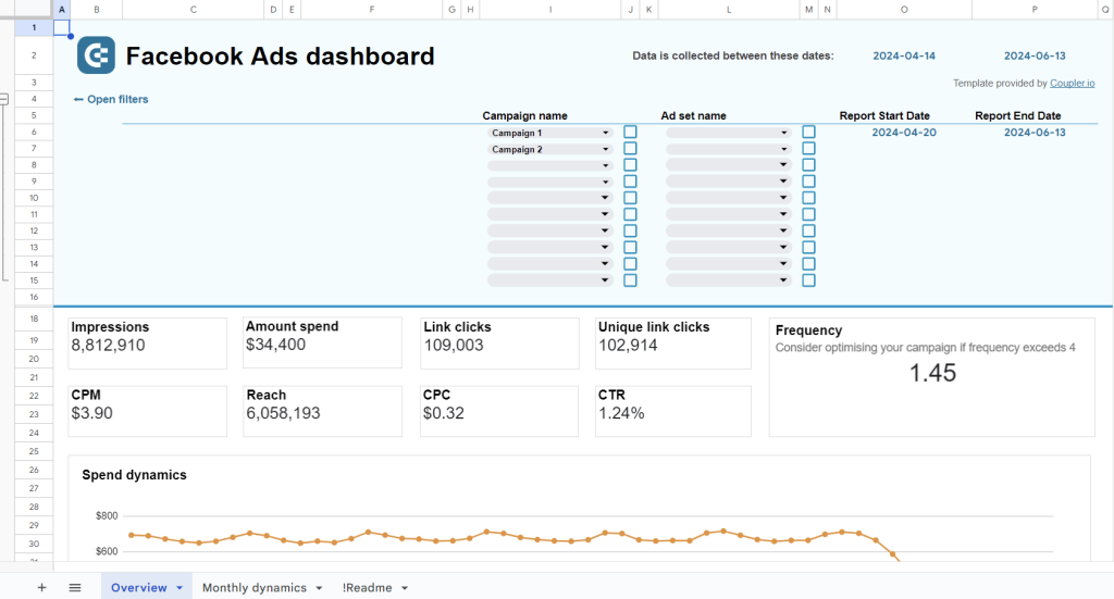
What you can do using this dashboard:
- See the progress of all your key metrics, including spending, impressions, CTR, clicks, etc.
- Track the frequency of ads across your entire account, or filter by campaign, ad set, or time period.
- Gain quick insights into which audience segments click on your ads the most.
- Identify the countries where your Facebook ads generate the most traffic (clicks).
To make this dashboard work for you, check out the breakdown of the setup process with the Coupler.io connector in the template’s Readme tab.
3. Google Ads dashboard in Google Sheets
Google Ads dashboard template by Coupler.io allows you to monitor the performance of display, video, and search ad campaigns in one place. It offers a detailed view of crucial advertising metrics and trends.

What you can do using this dashboard:
- Review the current values of your metrics with those from a selected period.
- Delve into your Google Ads performance data from a month-to-month perspective.
- Explore a funnel based on all conversions set up for your campaigns.
- Identify your top-performing campaigns and analyze your conversions by demographics.
Configure the dashboard with the Coupler.io connector using the instructions in the template’s Readme tab.
4. Google Search Ads performance tracker + editor in Google Sheets
This Google Search Ads template lets you track campaign outcomes and evaluate their performance. It’s a handy tool for optimizing campaigns based on the latest results and key performance indicators.

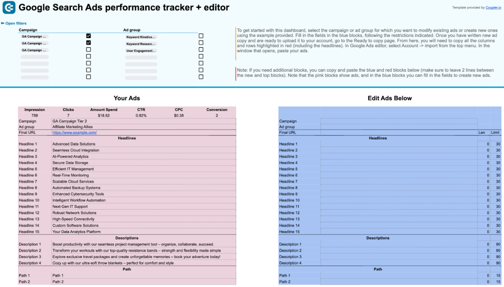
What you can do using this dashboard:
- Track impressions, clicks, CTR, CPC, amount spent, and conversions.
- Monitor advertising performance by campaign and ad group.
- Modify your ads or create new ones with the editor feature.
In the template’s Readme tab, you can find a full set of instructions on how to set up this dashboard with the Coupler.io connector.
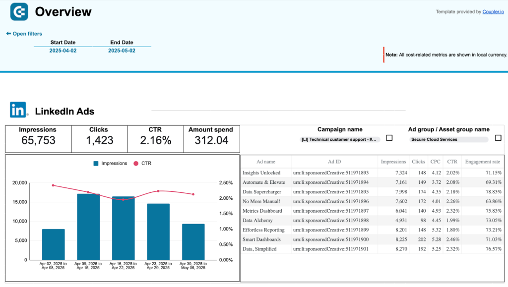
5. LinkedIn Ads dashboard in Google Sheets
The LinkedIn Ads dashboard by Coupler.io is a simple one-source template for quick, automated reporting. It simplifies the analysis of campaign performance and conversions compared to the native LinkedIn Campaign Manager.

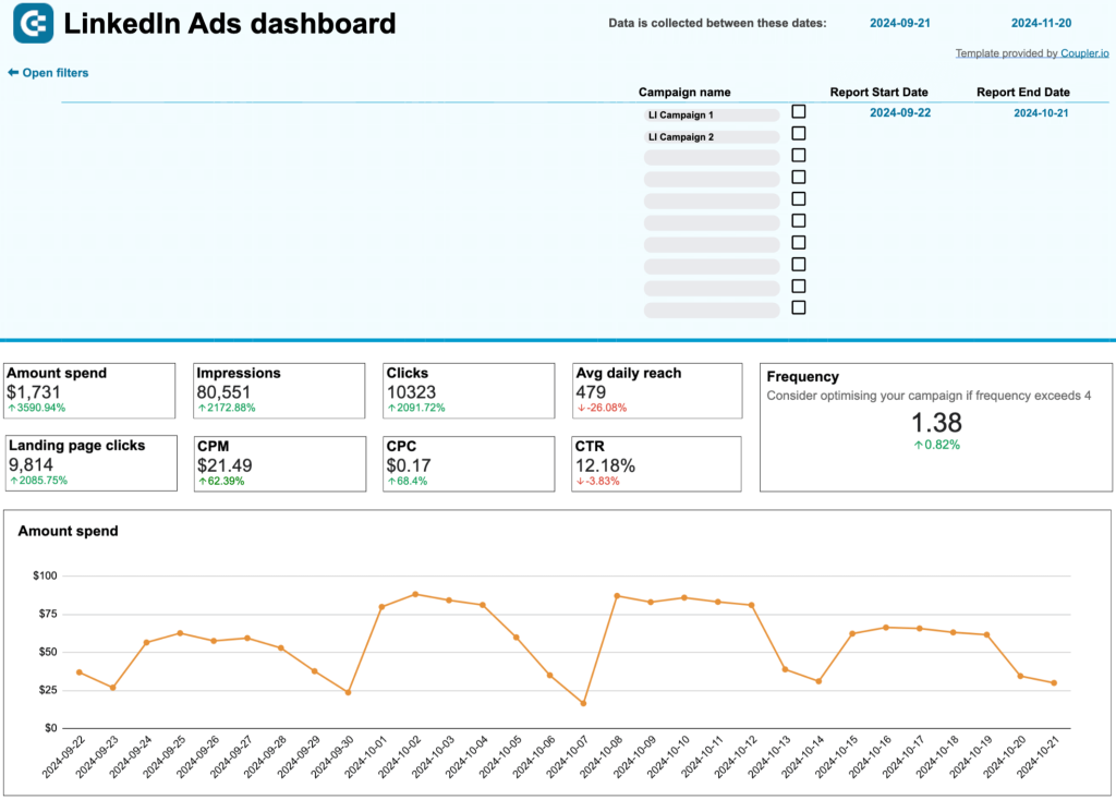
What you can do using this dashboard:
- Check out all your key LinkedIn Ads metrics, with their values compared to the previous period.
- Stay updated on when to increase or decrease your ad campaign frequency.
- Review each campaign based on key metrics, such as impressions, clicks, conversions, CTR, etc.
- Track conversion dynamics over time and follow the journey from impressions to lead form opens and, ultimately, leads.
Turn to the guidelines in the template’s Readme tab to configure this dashboard using the connector by Coupler.io.
Dashboard templates for budget management
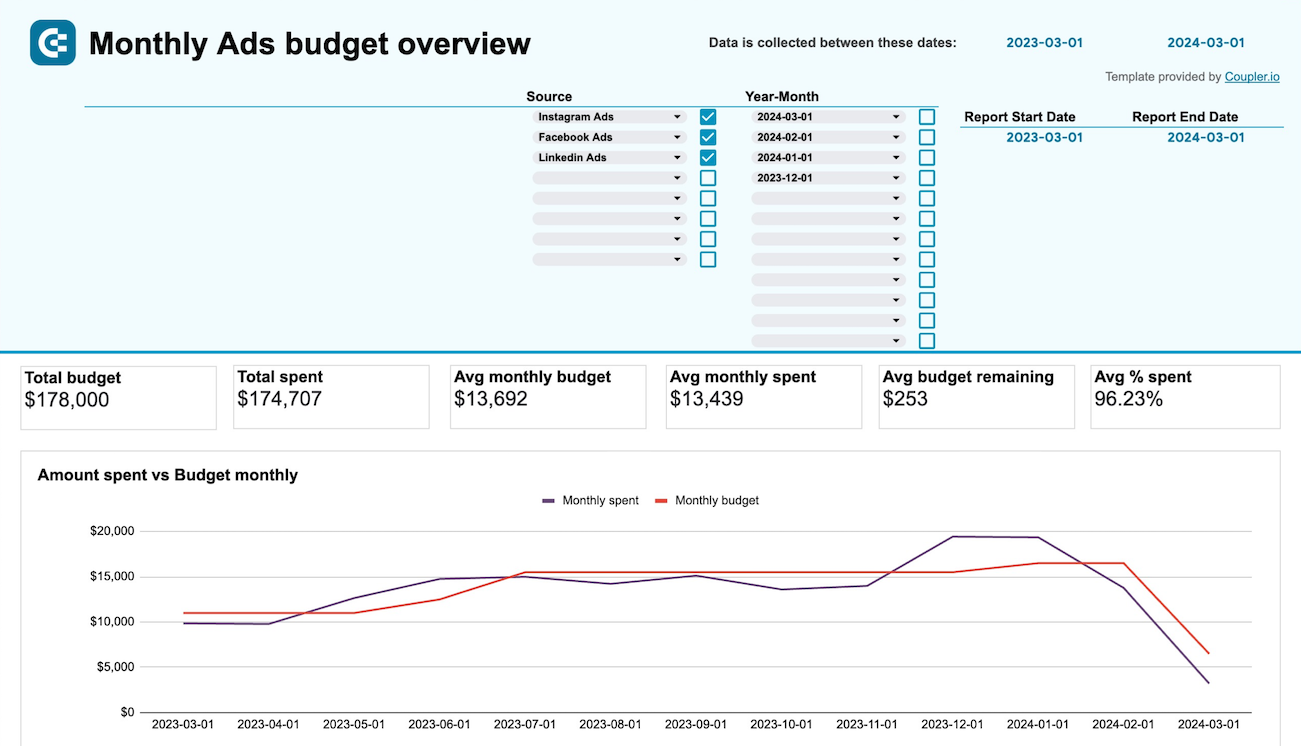
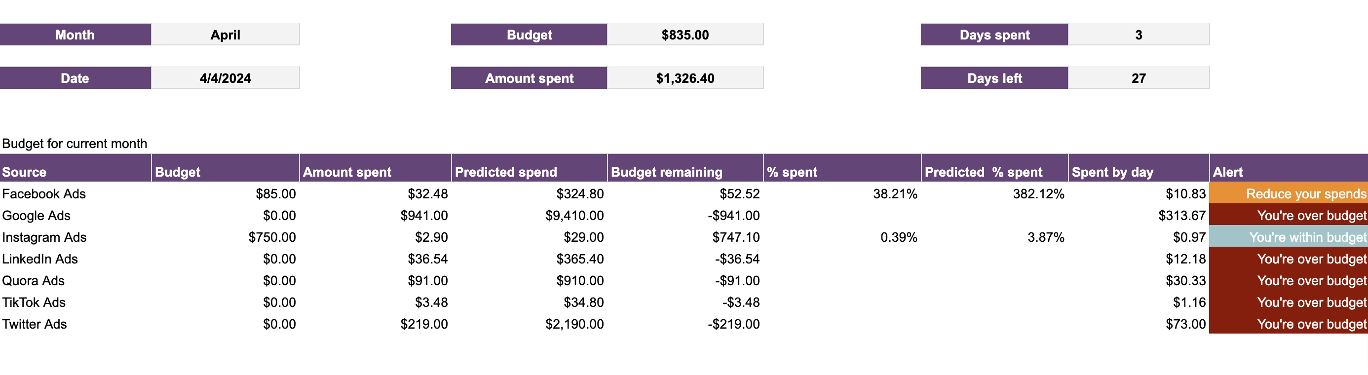
6. PPC monthly budget dashboard in Google Sheets
The PPC monthly budget dashboard template for Google Sheets by Coupler.io offers a detailed overview of PPC advertising expenses and performance. It helps you analyze data from Facebook Ads/Instagram Ads, TikTok Ads, Quora Ads, LinkedIn Ads, Google Ads, Microsoft Ads, and X Ads (formerly Twitter).

What you can do using this dashboard:
- Explore the budget and costs by ad platform in detail.
- Track the monthly dynamics of advertising spending and how it correlates with your budget.
- Understand your over/under budget throughout the year and monitor average daily costs.
- Review the current month’s budget with spending predictions and alerts to avoid overspending.
There’s also another similar template that, in addition to this one’s capabilities, lets you analyze data by specific campaign group.
You can set up either dashboard using the built-in Google Sheets connector by Coupler.io. To do this, go to the template’s Readme tab and follow the instructions.


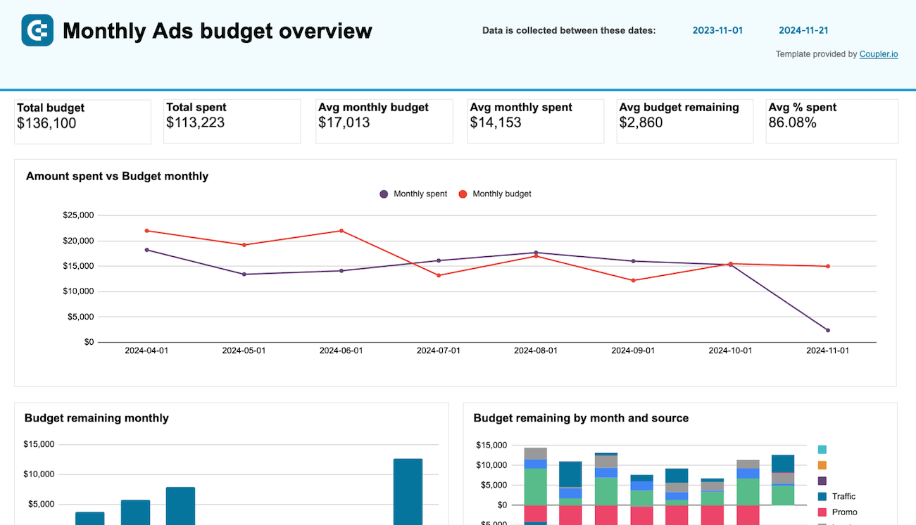
7. PPC multi-channel dashboard with budget in Google Sheets
Coupler.io’s PPC multi-channel dashboard with the budget for Google Sheets extends the capabilities of the previous template. It does so by providing an enhanced focus on budget management across multiple channels.

What you can do using this dashboard:
- Track the total budget for each ad platform.
- Monitor daily spend and your remaining budget for the month.
- Predict your ad spend for each channel.
- Control your expenses with alerts for overspending.
To implement this dashboard for your needs, visit the template’s Readme tab and follow the guide to set it up with Coupler.io.
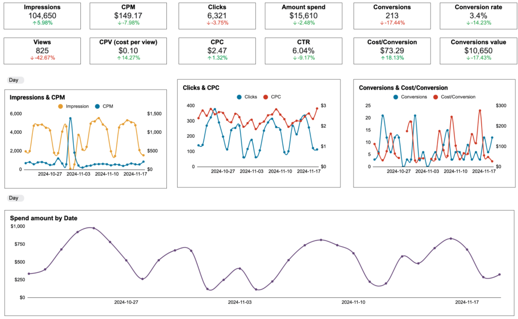
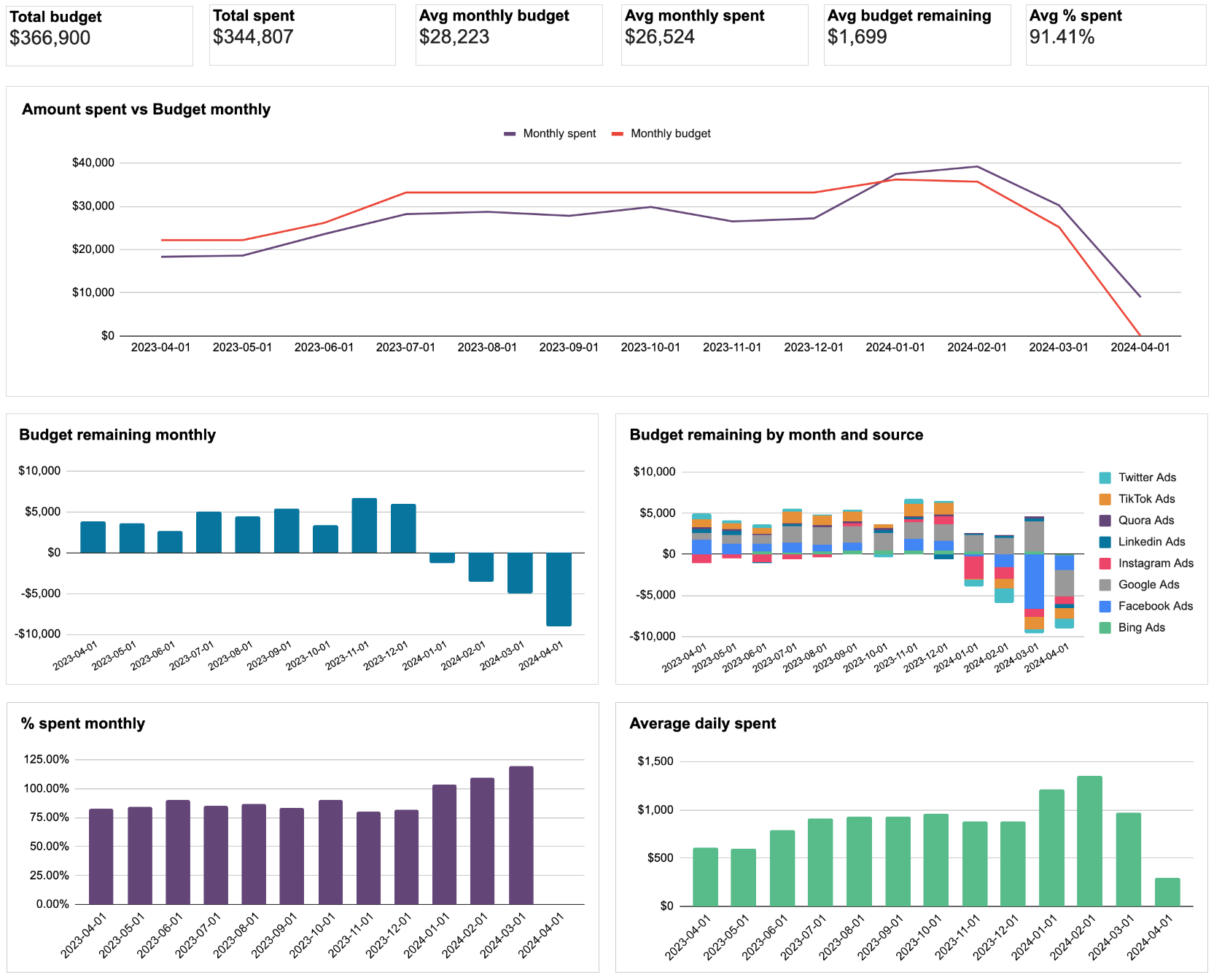
8. Advertising budget forecast dashboard in Google Sheets
This 4-page dashboard is designed for marketers who want to closely monitor their ad spending and make optimizations on the go. It tracks budgets, audience engagements, and overall PPC performance across multiple platforms, such as Facebook Ads, Google Ads, TikTok Ads, and LinkedIn Ads.

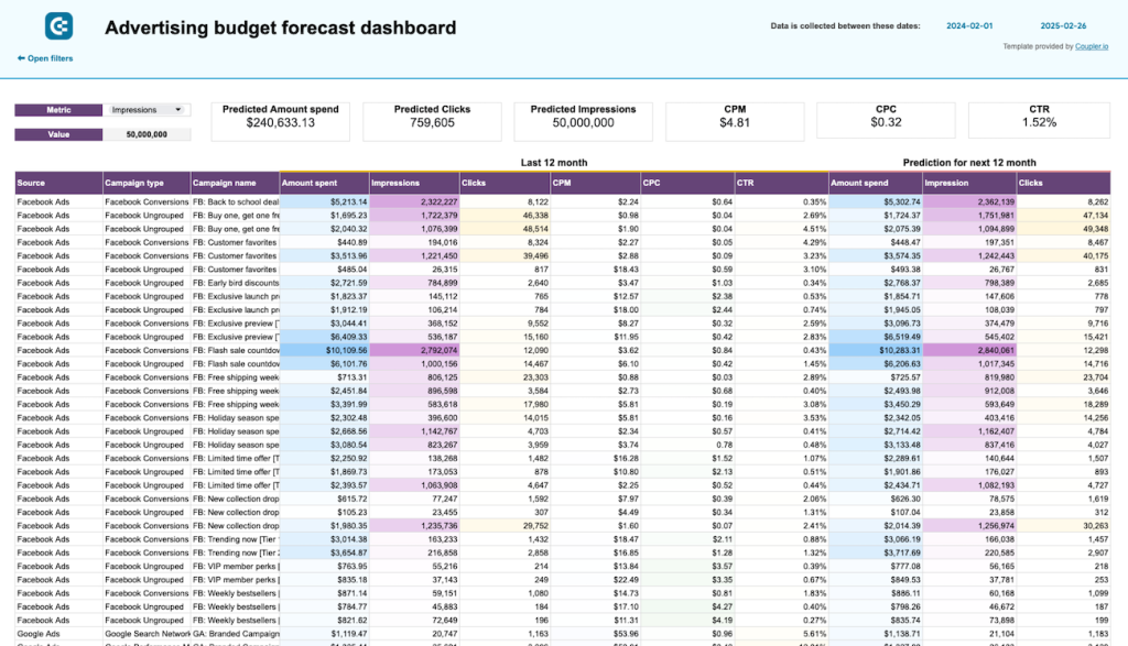
What you can do using this dashboard:
- Explore the amount spent, impressions, and clicks for the next 12 months to refine campaign planning and allocate budgets better.
- Analyze the performance of clicks by source, amount spent by month, CPC by campaign type, and more.
- Compare the current month’s budget vs. the actual amount spent to assess cost-effectiveness.
- Check out remaining budget, percentage spent, predicted spend, and daily amounts.
- Quickly identify and resolve instances of overspending thanks to the dashboard’s alerts.
Refer to the template’s Readme tab for instructions on setting up the dashboard using the Coupler.io automated connector.
Dashboard templates for traffic attribution
9. Web analytics dashboard in Google Sheets
Coupler.io’s web analytics dashboard template by Coupler.io is designed to provide an overview of daily updates on essential product and marketing metrics. You can open this dashboard each morning to track traffic growth and conversions based on data from GA4.

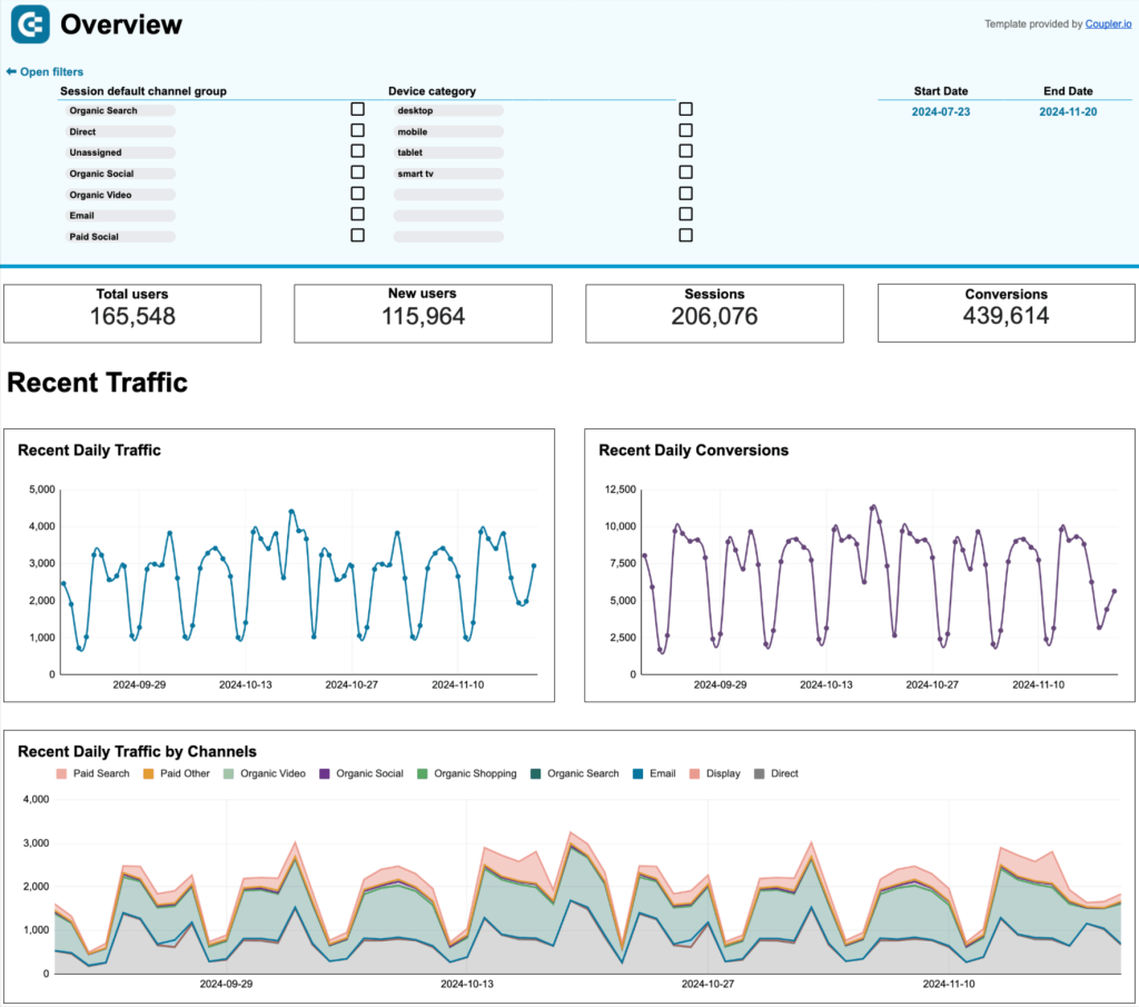
What you can do using this dashboard:
- Identify where your audience originates, covering marketing channels, countries, devices, and more.
- Gain insights into user behavior and engagement through metrics such as average engagement time, views, and engaged sessions per user.
- Track user conversions with metrics like total users, conversion rates, and total revenue.
- Monitor conversions from a timeline perspective.
To get started, click on the template’s Readme tab and set up the dashboard with the Coupler.io connector in a few steps.
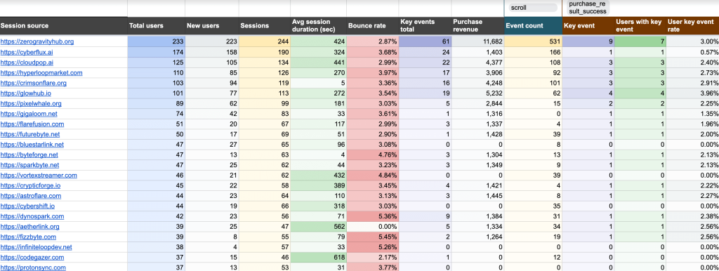
10. AI traffic performance dashboard in Google Sheets
Coupler.io’s AI traffic performance dashboard displays the performance of website traffic originating from AI tools based on Google Analytics 4 data.

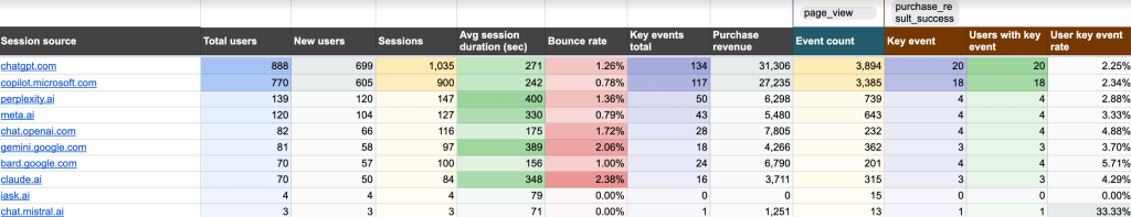
What you can do using this dashboard:
- Compare traffic from various AI tools using metrics like total users and sessions.
- See which pages of your site bring in the most visitors from AI tools.
- Assess traffic engagement through average session duration and bounce rate values.
- Identify the AI tools driving the most conversions and revenue, as indicated by the purchase revenue metric.
To leverage this dashboard, open the template’s Readme tab and set it up with the Coupler.io connector in minutes.
11. Referral traffic performance dashboard in Google Sheets
The referral traffic performance dashboard by Coupler.io displays the performance of referral traffic to your website based on GA4 data.

What you can do using this dashboard:
- Identify which referral sources are most effective at attracting first-time visitors.
- Compare average session duration and bounce rate across referral sources to determine which ones need improvement in session quality.
- Figure out which referrals contribute the most to sales based on purchase revenue value.
- Track the “Key events total” metric to see how users interact with your website.
To start, configure the dashboard with the Coupler.io connector, following the template’s Readme instructions.
12. Website traffic from YouTube – performance analysis dashboard in Google Sheets
The website traffic dashboard template by Coupler.io shows traffic to your site from YouTube using GA4 data. It helps you assess the effectiveness of your YouTube content in driving visitors and the revenue generated from this traffic.

What you can do using this dashboard:
- View how users coming from YouTube interact with specific pages on your site, such as how long they stay and whether they make a purchase or take other actions.
- See which pages generate the best results based on purchase revenue.
- Identify the most effective content by analyzing which YouTube videos link to your top-performing pages.
To try this yourself, go to the template’s Readme tab and load your own data into the dashboard using the Coupler.io connector.
13. GA4 acquisition overview report in Google Sheets
With this Two Minute Reports template, the GA4 acquisition overview report by Solomon Vineeth, you can analyze user acquisition by loading data through the mentioned built-in connector. The dashboard enables you to track new users, total users, scrolled users, and sessions to learn about user engagement and behavior.

What you can do using this dashboard:
- Compare total users, new users, and active users over time to monitor user growth.
- Explore session trends by medium to track the performance of different traffic sources.
- Discover session statistics by medium to analyze source distribution.
Search visibility dashboard templates
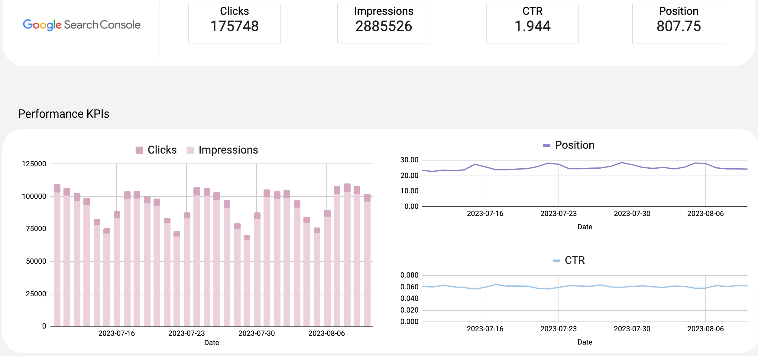
14. SEO dashboard for Google Search Console in Google Sheets
The SEO dashboard displays key performance metrics from Google Search Console that are essential for optimizing your website for search engines.

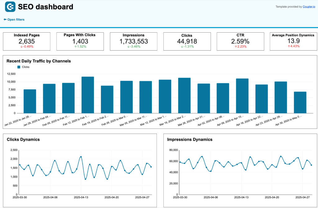
What you can do using this dashboard:
- Monitor changes in clicks and impressions for your website, as well as the average CTR and position of all your pages.
- View the website pages that generate the most clicks, as well as those that receive the least, to prioritize your marketing efforts.
- Understand the device share among your audience, including desktop, mobile, and tablet users.
- Check clicks, impressions, and CTR for each URL across different devices.
Stick to the instructions in the Readme tab to link your Google Search Console through Coupler.io and have the dashboard ready to use.
15. Technical SEO dashboard in Google Sheets
Coupler.io’s technical SEO dashboard template connects to Google Search Console and derives insights into your website’s health. You get an overview of your pages by coverage state, robots.txt, fetch state, verdict, etc.
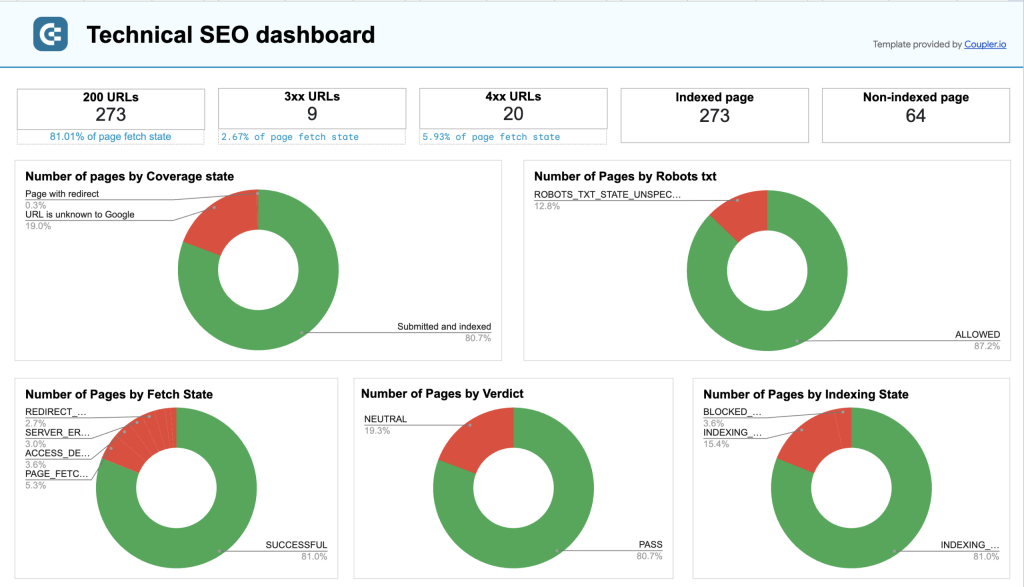
What you can do using this dashboard:
- Take a snapshot of your URLs to quickly assess the general picture of your website’s health.
- Identify pages blocked by robots.txt or robots meta tags, as well as submitted and un-indexed pages.
- Monitor page rendering status and Accelerated Mobile Pages (AMP) status.
Follow the template’s Readme instructions and populate the dashboard with your own data using the Coupler.io connector.
16. Google Search Console – page and query analysis in Google Sheets
Now, let’s check out the Google Search Console – page and query analysis template by Solomon Vineeth, offered by Two Minute Reports. This dashboard demonstrates the website’s visibility and engagement on search engine results pages.

What you can do using this dashboard:
- Identify the top 10 pages with the highest clicks.
- Easily compare clicks and impressions over time and explore trends in position and CTR.
- Spot top-performing keywords and areas for improvement.
- Track country-wise performance to highlight regions of strength and weakness.
Creative & content performance dashboard templates
17. Multi-channel creatives dashboard in Google Sheets
The multi-channel creatives dashboard is a tool for evaluating the performance of advertising campaigns across Google, Microsoft, Meta, LinkedIn, and TikTok Ads. You can analyze, compare, and refine your creatives by considering their performance based on key metrics.

What you can do using this dashboard:
- Compare the performance of campaigns across platforms to identify trends.
- Pinpoint top-performing creatives based on CTR and clicks.
- Monitor spend, impressions, and clicks over time to adjust strategies effectively.
- Analyze the cost-efficiency of your campaigns with detailed CPC data.
- Make data-driven decisions to enhance creative outcomes and ROI.
Instructions for configuring the dashboard with the Coupler.io connector are found in the template’s Readme tab.
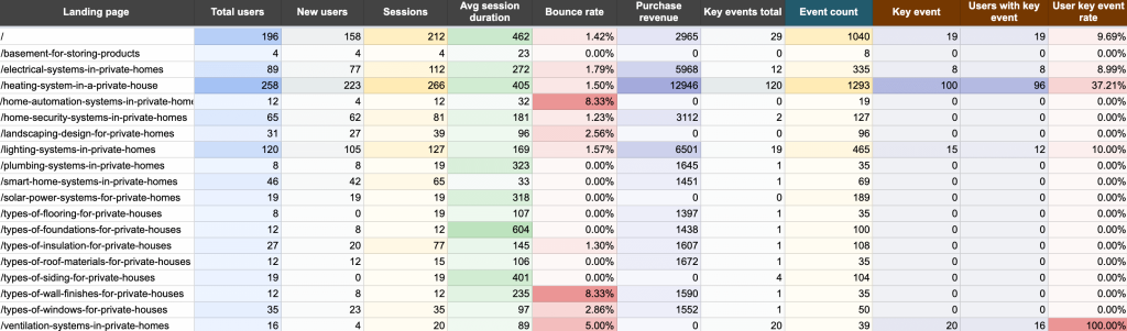
18. Landing page performance dashboard in Google Sheets
This Coupler.io dashboard template allows you to analyze the effectiveness of your landing pages using data from GA4 and Google Search Console.

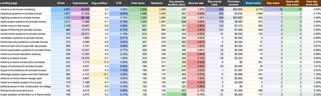
What you can do using this dashboard:
- Measure the visibility of your landing pages in search results based on impressions, clicks, CTR, etc.
- Track each page’s total users and sessions to understand which ones drive the most traffic and engagement.
- Analyze how users interact with different pages by checking out metrics like bounce rate and average session duration.
- Assess how your landing pages contribute to business outcomes by tracking users with key events, user key event rate, and purchase revenue.
- Pinpoint pages with high traffic and low clicks or conversion rates to investigate potential issues in user experience or content alignment.
It will only take a few steps to set up this dashboard using the Coupler.io connector, as per the instructions in the template’s Readme tab.
Audience targeting dashboard templates
19. LinkedIn Ads companies’ reach dashboard in Google Sheets
This dashboard helps you track all the companies that have seen your LinkedIn Ads, not just those displayed in native reports. Based on data pulled directly from LinkedIn’s API, it provides a complete company reach overview, so you can analyze engagement at a granular level.

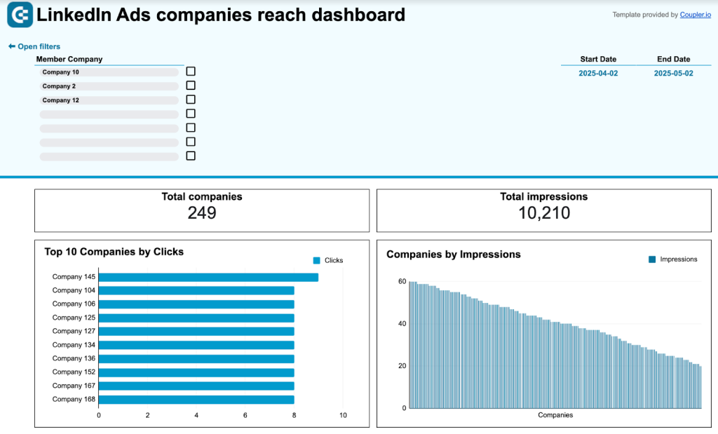
What you can do using this dashboard:
- Track impressions, clicks, CTR, engagements, and conversions for each company.
- Identify high-engagement companies by filtering and sorting your metrics.
- Explore a ranked list of the top 10 companies by clicks.
- Compare ad spend vs. engagement to make informed budget decisions.
Get this dashboard to serve your needs by setting it up through the Coupler.io connector, as outlined in the template’s Readme instructions.
Reputation management dashboard templates
20. Google My Business – review rating and location media insights
Google My Business – review rating and location media insights by Solomon Vineeth is a Two Minute Reports template for analyzing a business’s online presence and customer feedback. This dashboard displays your business performance on Google Maps and search results.

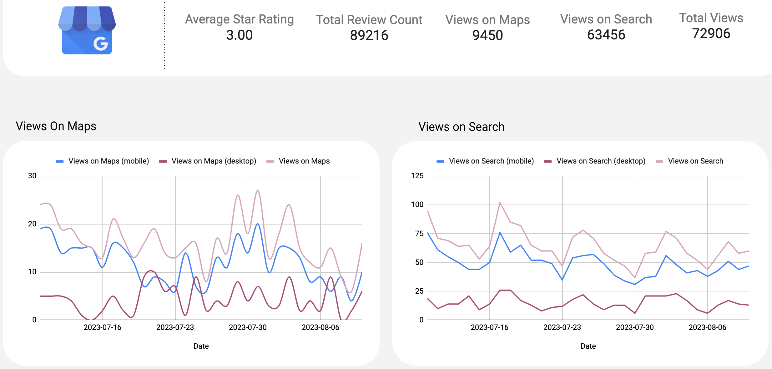
What you can do using this dashboard:
- Explore user reviews and star ratings, as well as location and media insights.
- Track views on maps and search over time by mobile, desktop, and overall to learn about fluctuations in user engagement with your business’s location.
- Monitor total views by view source, total actions by action type, and total views by view medium.
Check the alternative version of this dashboard in Looker Studio by Coupler.io.

How to create a custom marketing dashboard in Google Sheets
If ready-to-use templates don’t meet your specific analytics needs, consider creating a custom dashboard from scratch. Marketing dashboards vary by purpose, such as PPC performance tracking, customer acquisition analytics, or SEO overview, and the required data sources will differ as well. So, it makes sense to use a tool that supports multiple sources. Coupler.io allows you to automatically pull data from 60+ business apps, build reports on the go, and import them into Google Sheets for visualization.
It only takes a few simple steps to get this done:
Step 1. Collect data
- To start, use the interactive form below. Choose the data source from the dropdown list and click Proceed.

- Now, you’ll be prompted to sign up for Coupler.io. If you’re already a Coupler.io user, you’ll be taken directly to the data flow. Authorize your source account, choose what kind of data you’ll export, and adjust other settings if necessary. You can also add and set up additional sources.
For example, you can connect Google Ads and Facebook Ads accounts to compare campaign performance across these two major ad platforms.

Step 2. Organize and adjust data
- Then, proceed to prepare your report. At this step, you can adjust your data in multiple ways. For instance, Coupler.io allows you to rename, rearrange, hide columns, or create new ones with custom formulas. It’s also possible to apply filters, sort your data, and aggregate it to extract key insights, as well as combine it from several accounts or apps.

Step 3. Load data and schedule refresh
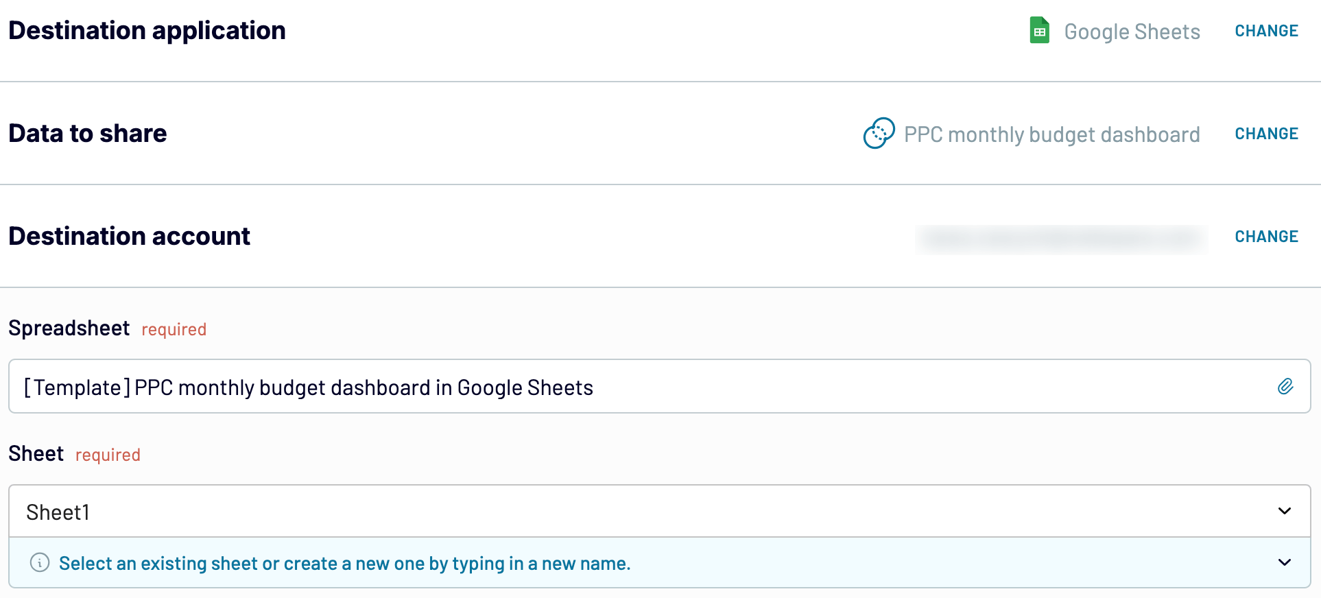
- Once you’re ready with your report, move forward to select the Google Sheets destination account. You’ll also need to specify the spreadsheet and sheet where you want to import the data.

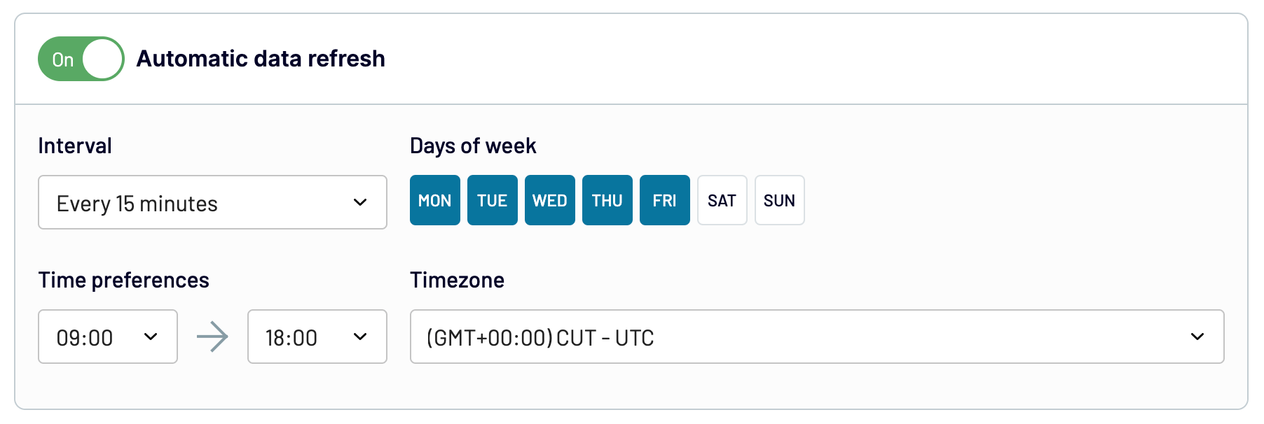
- Your next step is to turn on and customize the data refresh schedule. By default, the dashboard will be updated automatically every day. If you’d prefer a more frequent interval, you can opt for hourly, every 30 minutes, or even every 15 minutes, depending on your needs.

Finally, run the data export. In seconds, you’ll get a report in Google Sheets, which you can then transform into a dashboard using charts, graphs, and tables.
Limitations of marketing dashboard templates made in Google Sheets
Building Google Sheets dashboards may seem like a viable solution for data analysis and visualization. Nevertheless, there are a few limitations related to this spreadsheet application itself:
- Limited functions and formulas: The first thing you may not be okay with is functions and formulas in Google Sheets. For example, they might come across as overly complex or insufficient. On top of that, certain functionalities may require installing add-ons.
- Lack of visual elements for dashboards: Google Sheets falls behind when it comes to creating highly customized or complex visualizations. It offers limited chart types and customization features, leading users to seek external tools.
- Performance with large datasets: It may be challenging to build dashboards based on large datasets in Google Sheets. This issue originates from the web-based nature of this application. For instance, it can lead to longer response times or potential inaccuracies in analysis. Not to mention that complex calculations or functions may cause freezes or crashes.
Would you like to take advantage of Google Sheets marketing dashboard templates and avoid the pitfalls? If so, Coupler.io’s dashboards are what you’re looking for. In addition to Google Sheets templates, you can explore Looker Studio dashboards and others designed by Coupler.io.
Connect your source apps, organize data on the go, and import it to Google Sheets to finally get a ready-to-use report. What’s more, you can schedule auto-updates to keep your dashboard in sync with the latest changes to the source data. Give it a try – get started with Coupler.io for free, and let it do the work for you!


Create dynamic marketing dashboards in Google Sheets
Try Coupler.io for free