Teams use Microsoft Power BI for data analysis because it connects their sources, runs the calculations, and delivers reports the whole team can act on. But the real challenge starts when your data lives in apps Power BI cannot reach natively. Read on to see what Power BI data analysis looks like in practice and how Coupler.io closes the Power BI connector gap with real use cases for marketing, e-commerce, sales, and finance.
Power BI capabilities for data analytics
Power BI data analysis capabilities span data preparation, modeling, calculation, and visualization. Each one handles a different stage of the analytical workflow.
Power Query
Power Query is the data preparation layer inside Power BI. It connects to your data sources and lets you clean, reshape, and transform raw data before it reaches your report, without writing code. For sources that Power Query cannot connect to natively, use Coupler.io. It connects over 400 business apps to Power BI and allows you to get analysis-ready data right in Power BI.
Power Query uses a language called M under the hood, but most transformations are handled through a visual, point-and-click interface. Common tasks include merging tables, removing duplicates, renaming columns, filtering rows, and changing data types.

Data modeling
Data modeling is how Power BI connects multiple tables into a structure it can query accurately. In practice, this means defining which tables relate to each other and how.
A Sales table might connect to a Customer table, a Product table, and a Date table so that any visual you build can filter across all of them correctly.

DAX
DAX stands for Data Analysis Expressions. It is the formula language Power BI uses to build calculations for your reports. DAX functions are pre-built formulas organized into categories like aggregation, filtering, and time intelligence, and you use them mainly to create measures and calculated columns.
Power BI has over 500 built-in DAX functions. For a beginner, common aggregation functions like SUM, MIN, MAX, AVERAGE, and COUNT are enough to get started.
One of the Power BI data analysis best practices is to define your DAX measures before building any visuals, so calculations stay consistent across the report.
Data visualization
Power BI reports are interactive by design. Slicers let users filter the entire report by date, category, region, or any other field. Select a data point in one visual and the others on the same page update automatically. The result is a set of interactive visualizations your whole team can explore without building a new report for every question.

Real-time connection
Power BI gives you two main ways to connect to your data:
- Import mode copies your data into Power BI and refreshes it on a schedule you set.
- DirectQuery queries your source live each time someone interacts with the report, so the numbers stay up-to-date without waiting for the next refresh.

DirectQuery is what most teams use when they need Power BI for real-time data analysis.
The right choice depends on your data source and how frequently your data changes. Not all connectors support both modes.
Power BI’s native connector library covers Microsoft tools and databases well, but leaves gaps for many popular business apps. Coupler.io fills those gaps by connecting 400+ sources to Power BI and keeping the data fresh on an automated schedule.


Get your business data into Power BI with Coupler.io
Get started for freeWhat data analytics with Power BI looks like
Data analysis and visualization with Power BI cover more than creating charts or graphs.
You can model relationships between tables, write calculated metrics, and build reports that update automatically on a refresh schedule.
Where Microsoft Excel works well for individual analysis, data analytics with Power BI is designed for teams. Any data analyst gets a shared workspace with live data connections, role-based access, and scheduled refresh, so everyone works from the same up-to-date numbers.
It is also one of the most established business analytics platforms on the market. Gartner has placed Power BI in the Leaders quadrant for 18 consecutive years, and it has more than 30 million monthly active users across 350,000+ organizations worldwide.
That covers what Power BI is. Here is what working with it actually looks like.
Get data in Power BI
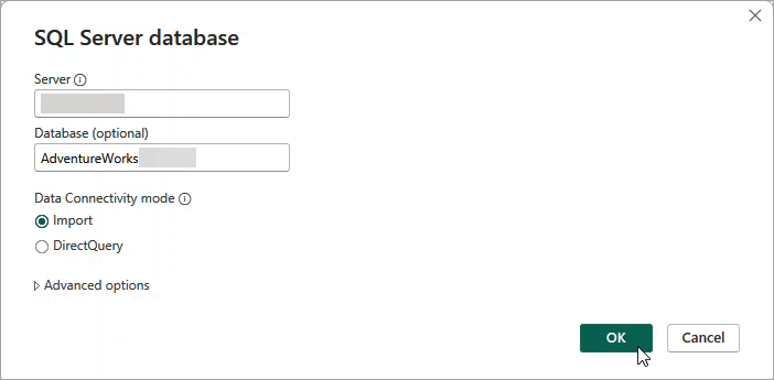
The Get Data button in the Home tab is where every report starts. You can import data from 190+ sources natively, and the Microsoft ecosystem is covered well. SQL Server, Excel, SharePoint, Azure, and Dataverse all connect smoothly and are fully supported in both Power BI Desktop and the Power BI Service.

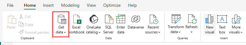
For sources outside that list, such as Shopify, HubSpot, ad platforms like Meta Ads, and the deprecated QuickBooks connector, use Coupler.io. It supports over 400 business apps and sources you can connect to Power BI and automate data refresh on a schedule.

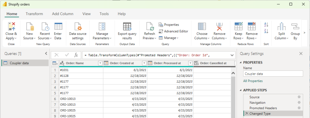
Prepare and transform data
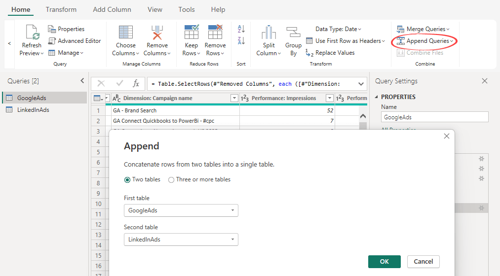
You prepare data for analysis with Power BI inside the Power Query Editor, before anything loads into the model. Power BI shows a data preview at this point so you can confirm everything looks right before applying. Common transformations include filtering rows, removing duplicates, renaming columns, formatting dates, and changing data types.
When your report needs data from multiple sources, you add each one and combine them using Append Queries or Merge Queries. Append stacks tables with the same structure into one unified table, useful for combining separate ad platform exports or monthly data files. Merge combines two tables using a shared column, the same way a JOIN works in SQL.

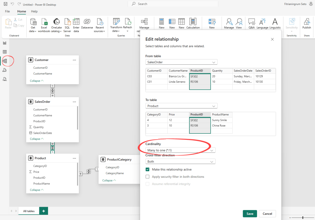
Model the data
After closing the Power Query Editor, Power BI loads your data into the data model. You can switch to the Model view from the left sidebar to check and adjust relationships between tables if needed.
The data model is where you handle the analytical side. Power BI applies a default aggregation like SUM automatically when you use a numeric field. For anything more specific, you write explicit DAX measures. As one of the core Power BI tools for data analysis, DAX gives you full flexibility over how numbers are calculated and aggregated.
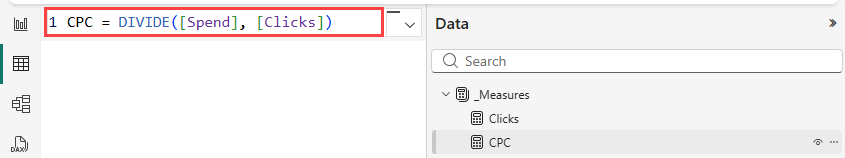
You add measures directly in Power BI Desktop using the New Measure button available in the Report view, Table view, or Model view.
For example, CPC is not a field that exists in raw ad data. You calculate it by dividing total spend by total clicks.

This step requires some analytical thinking and familiarity with DAX. For learners and those just getting started, a dashboard template can help. They come with pre-built DAX measures already written.
Visualize
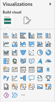
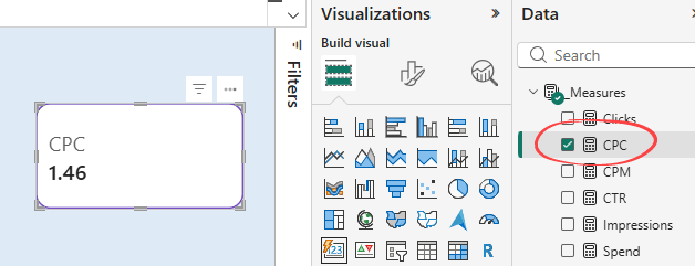
The report canvas is where your data model becomes visible. You choose from 30+ built-in visual types including column charts, line charts, bar charts, KPI cards, and tables. DAX measures appear in the field list alongside your raw data columns. You can drag-and-drop them onto any visual, or simply tick the field to add it.
A CPC measure, for example, can be displayed as a KPI card showing the calculated value directly on the canvas.

How to use Power BI for data analytics when your data is scattered across apps
Most businesses today work with data spread across multiple tools Marketing runs ads on Google, Meta, and LinkedIn. Sales tracks deals in HubSpot or Pipedrive. Finance uses QuickBooks. E-commerce runs on Shopify.
To analyze data with Power BI and see the full story, you need all of it in one place.
Power BI’s native connectors do not cover all of these. Most third-party connectors often require technical setup and a separate subscription per source.
Coupler.io is a no-code data integration platform that connects 400+ business apps to Power BI, including those Power BI does not support natively. It handles data preparation before anything loads into your report, and keeps the pipeline running on an automated refresh schedule .
From that point, you run data analytics in Power BI the same way you would with any native connector. Coupler.io handles the following for you:
- Data preparation: blend, transform, and filter data across sources before it reaches Power BI
- Automated data refresh: schedule data flows without manual exports as frequently as every 15 minutes
- No-code setup: create data flows in a few clicks with no M language, custom connectors, or engineering required
- Multiple destinations: use one connector to load data to Power BI, spreadsheets, data warehouses, and AI tools
- AI agent: ask questions about your Power BI reports using the built-in AI agent
- Dashboard templates: turn data into reports with free Power BI .pbix templates
Explore Power BI dashboard examples.
Connect your data to Power BI with Coupler.io in 3 steps
The step-by-step setup below shows how Coupler.io connects your apps to Power BI.
Step 1: Connect your data sources
Select your data source from Coupler.io’s catalog of 400+ apps and connect your account.
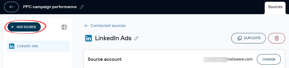
Specify what data you want to pull. For LinkedIn Ads, that might be campaign metrics and a date range. For HubSpot, it could be deal records or pipeline activity. You can add multiple sources to a single data flow using the Add Source button.

Coupler.io shows a live preview of up to 500 rows once your sources are connected, so you can confirm everything looks right before moving forward.
Step 2: Blend and transform your data
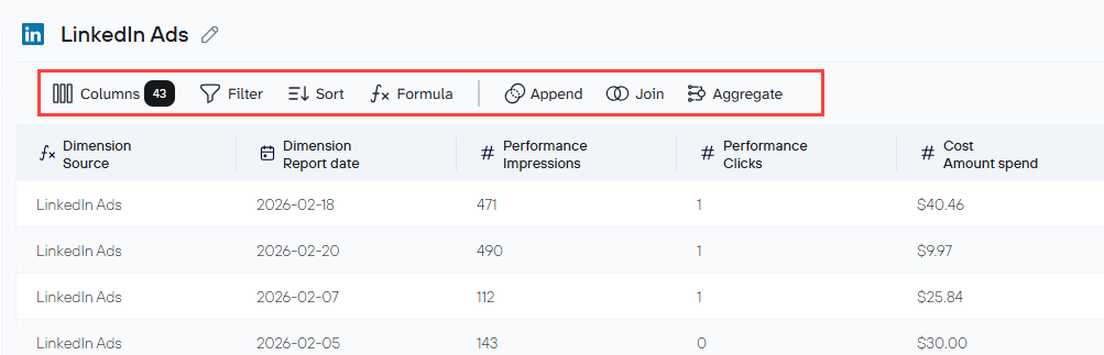
In the Data Sets tab, you can filter rows, rename columns, change data types, and create calculated fields. These transformations apply to all datasets in your data flow before anything reaches Power BI.
For combining data from multiple sources, you use Append or Join. Append works the same way as Append Queries in Power Query, while Join is the equivalent of Merge Queries. Append stacks rows from multiple sources into one unified table. Join connects two tables using a shared field.

If you prefer to skip the transformation setup, Coupler.io has data set templates for popular sources and common reporting combinations. When creating a new data flow, you can choose to start from a template instead of building from scratch. A PPC campaign performance template, for example, pulls from Google Ads, Meta Ads, and LinkedIn Ads simultaneously with the Append logic already configured and columns aligned across sources.
Step 3: Load to Power BI
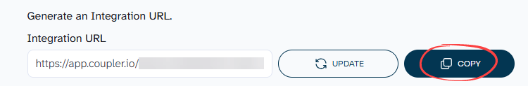
Select Power BI destination and generate an Integration URL for your output dataset.

Save and Run your data flow.
In Power BI Desktop, click Get Data, select Web, and paste the URL.

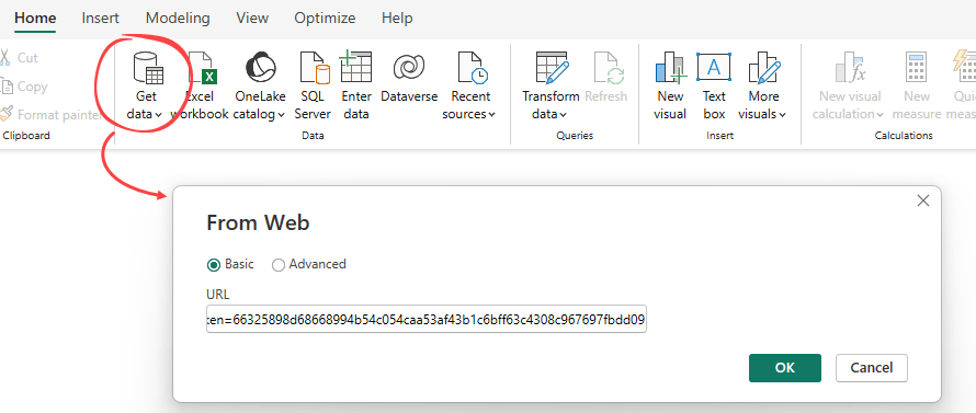
Your data loads into Power Query Editor where you can review the structure before applying. Click Close and Apply if your dataset is ready for analysis and reporting.
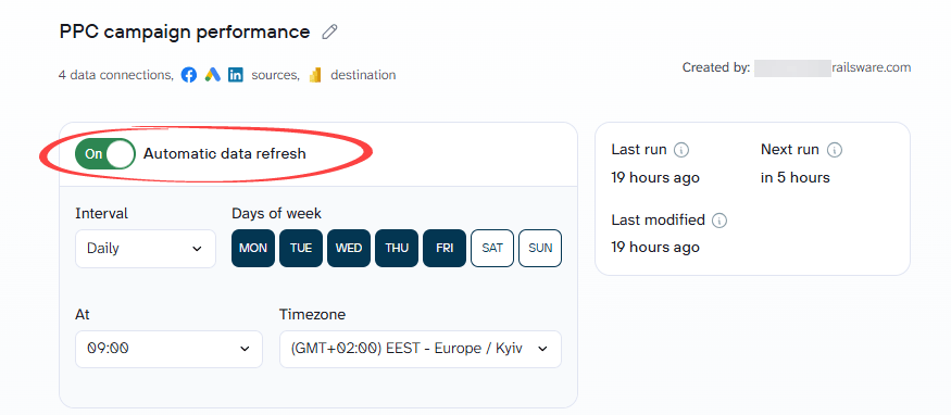
Once your data is loading correctly, it is worth setting up an automatic refresh schedule. Head to the Flow settings tab, enable the Automatic data refresh toggle, and choose how often you want Coupler.io to pull fresh data from your sources. Refresh frequency ranges from once a month to every 15 minutes depending on your plan.

Connect 400+ apps to Power BI with Coupler.io
Get started for freePower BI data analysis examples – use cases by team
The use cases below show what Power BI data analysis looks like with real-world data for marketing, e-commerce, sales, and finance teams.
A note on data sources: some of the tools used in these examples do not have native Power BI connectors. So, use cases below use Coupler.io to connect and prepare data before it reaches Power BI.
Use case #1. Marketing: Cross-channel campaign analysis
The first Power BI data analysis example covers marketing teams running paid ads across multiple platforms.
Data sources: Google Ads, Facebook Ads, LinkedIn Ads, and other ad platforms.
Each ad platform has its own reporting interface, its own metric definitions, and its own attribution logic. To get a cross-channel view, you have to log into each platform and pull the numbers separately. By the time that report is ready, the data is already a day old.
Load and blend data in Coupler.io before loading to Power BI
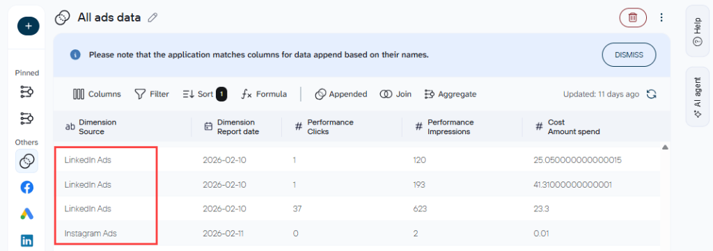
One way to simplify cross-channel analysis in Power BI is to combine your ad platform data before it loads. In Coupler.io, connect each ad platform and use the Append feature to stack them into a single table.
Column names need to match across sources for this to work. If one platform labels a field “cost” and another calls it “amount spent,” rename both to the same name before appending. The same applies to date fields, click counts, and conversion metrics.

Analytics and visualization in Power BI
Once the data loads into Power BI, write your DAX measures before you build any visuals. Power BI can calculate aggregate values on its own, but defining measures explicitly gives you more control and keeps calculations consistent across the report.
Examples of the key measures:
- Spend =
SUM('Coupler data'[Cost: Amount spend]) - Impressions =
SUM('Coupler data'[Performance: Impressions]) - Clicks = Clicks = SUM(‘Coupler data'[Performance: Clicks])
- CTR =
DIVIDE([Clicks], [Impressions]) - CPM =
DIVIDE([Spend], [Impressions]) * 1000 - CPC =
DIVIDE([Spend], [Clicks])
To show period-over-period comparison on KPI cards, you need an additional measure for the prior period value. For example, to compare current spend against last month, you would need the following as part of your formula:
- Spend last month =
CALCULATE([Spend], DATEADD('Coupler data'[Dimension: Report date],-1,MONTH))
With those measures in place, here are the visuals you can build:
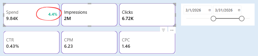
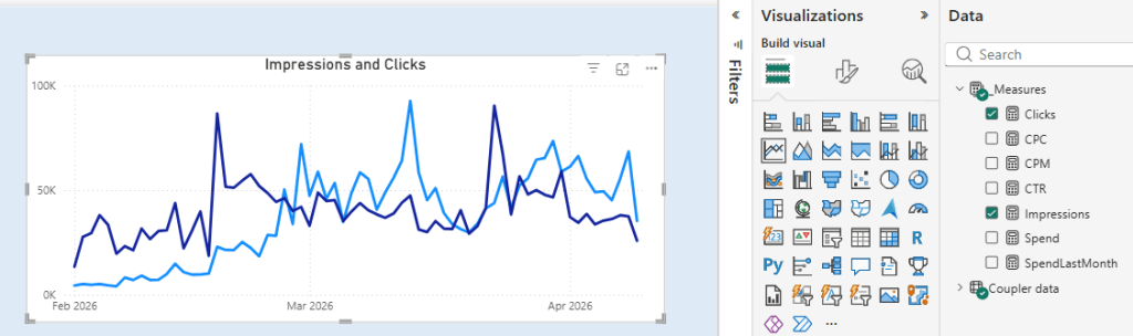
- KPI cards for Spend, Impressions, Clicks, CTR, CPM, and CPC. The Spend card shows a percentage change indicator next to the current value. In the example below, it displays in green, meaning Spend is higher compared to the prior month.

- In addition, you can add slicers for date range or other fields such as source, ad type, or campaign name to filter the entire report.
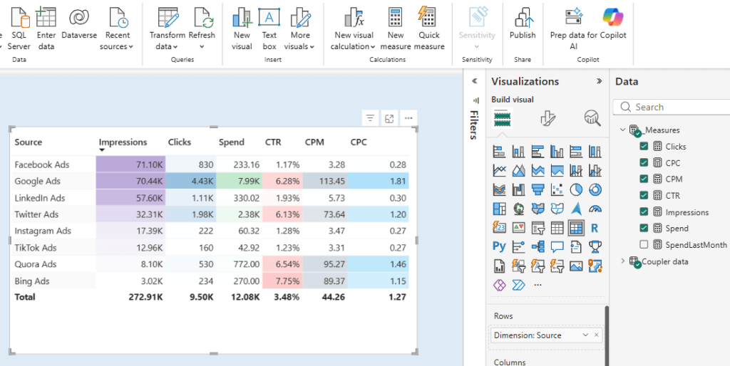
- Table for a detailed breakdown of Impressions, Clicks, Spend, CTR, CPM, and CPC by source. This gives you a side-by-side comparison of all platforms in one view, making it easy to spot which source is driving the most value and which is underperforming.

- Line chart for Impressions and Clicks over time. This is useful for spotting trends and identifying periods where engagement spiked or dropped across all platforms combined.

The PPC multi-channel dashboard template handles the setup for you. Connect your ad platforms in Coupler.io, load the data via the Integration URL, and you have a live cross-channel view ready to go.
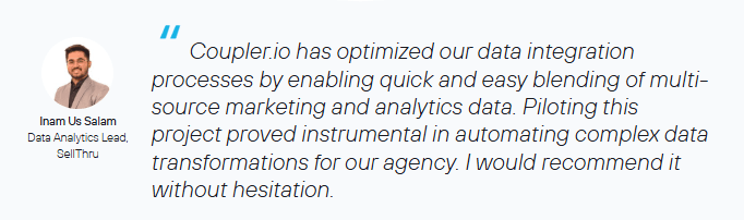
SellThru, a digital marketing agency, had the same problem. After switching to Coupler.io, their client account setup time dropped from two weeks to a couple of days, and the team saved over 20 hours a month on manual reporting.

Use case #2. E-commerce: Sales performance and customer analysis
Data sources: Shopify
Most Shopify store owners know their top-line numbers. What they often cannot see is which channels bring customers who actually come back, how retention holds up across different cohorts, and how average order value breaks down across those segments.
Data analytics with Power BI gives them a retention and revenue view that the platform itself cannot produce.
Load Shopify data to Coupler.io before loading to Power BI
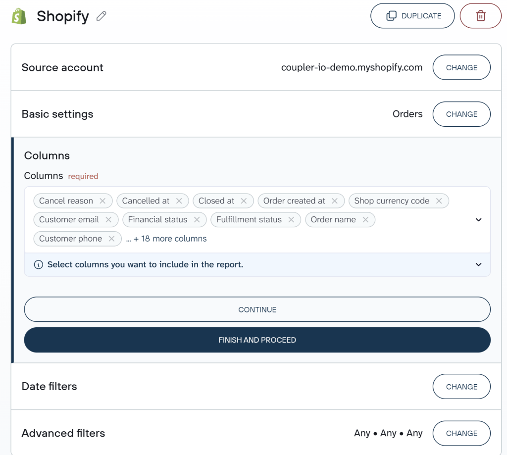
All the visuals below rely on order-level data from Shopify including order ID, total sales, order source, customer ID, and order date.
Connect your Shopify account in Coupler.io and select the Orders data you want to pull. If you want to skip the manual setup, Coupler.io also has a data set template for Shopify that comes with the fields and structure already configured.

Analytics and visualization in Power BI
You may need to create a few DAX measures for metrics that do not exist as raw fields or to ensure calculations stay accurate and consistent when users filter or slice the report.
For example, you may want to set up the following measures:
- AOV =
DIVIDE(SUM([Total Sales]), DISTINCTCOUNT([Order ID])) - The calculations for the cohort matrix
With the measures in place, you can build visuals that give you a clear picture of your store’s sales performance and customer behavior.
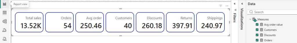
- KPI cards for Total sales, Orders, Average order value, Customers, Discounts, Returns, and Shipping. This is a full store snapshot at a glance.

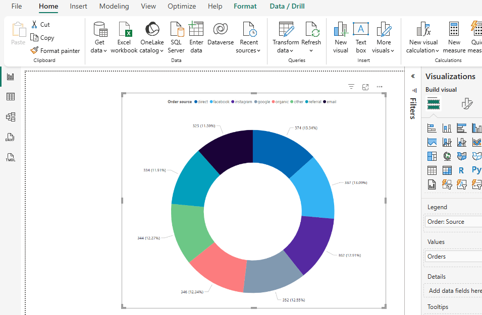
- Donut chart for Order source. The chart reveals which acquisition channels drive the most purchases (direct, Facebook, Instagram, email, etc.).

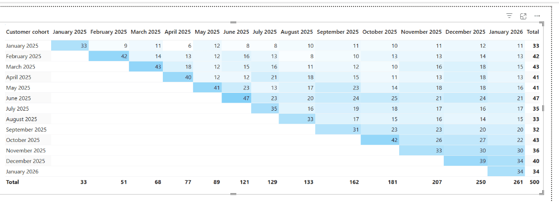
- Cohort matrix for customer retention. The cohort matrix groups customers by the month they placed their first order. Each subsequent column shows how many customers from that cohort placed another order in the following months. The darker the cell, the higher the number of returning customers.

The Shopify orders dashboard template gives you a complete store report the moment your data loads in. The AOV measure, order source breakdown, and cohort matrix are all ready to use.
Use case #3. Sales: Pipeline health and agent performance
Data sources: HubSpot, Pipedrive, or any CRM tool.
Sales managers need a live view of pipeline health and rep performance, but most CRM reporting tools are limited to what the platform itself can show. Exporting and cleaning CRM data manually to build reports in Power BI can take hours every week.
Load data in Coupler.io before loading to Power BI
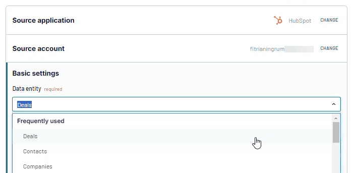
To track pipeline health and agent performance, you need deal-level data from HubSpot including deal stage, amount, closed amount, deal owner, and close date.
Connect your HubSpot account in Coupler.io and select the deals data you want to pull.

Analytics and visualization in Power BI
After loading the HubSpot dataset into Power BI, set up the DAX measures your visuals need. Some of the key measures are win rate, average days to close, and projected amount.
If you have Won Deals and Total Deals already defined, you can just calculate win rate as shown below.
- Win Rate =
DIVIDE([Won Deals], [Total Deals])
With all the measures ready, you can build visuals such as:
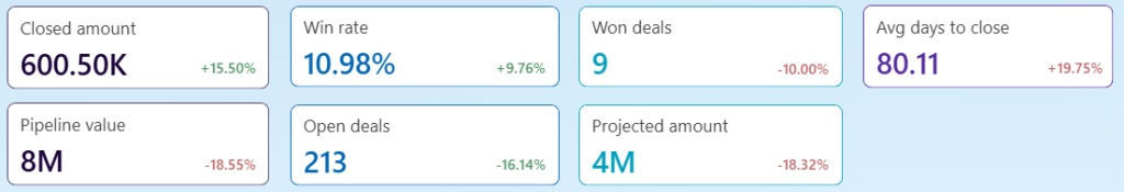
- KPI cards for Closed amount, Win rate, Won deals, Average days to close, Pipeline value, Open deals, and Projected amount. Each card shows the current value and percentage change vs the prior period.

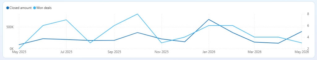
- Line chart for Closed amount and Won deals over time. This shows whether revenue and deal volume are moving in the same direction or diverging.

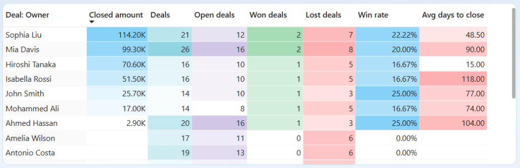
- Agent performance table showing each rep’s Closed amount, Total deals, Won deals, Lost deals, Win rate, and Average days to close. This gives sales managers a clear side-by-side view of team performance.

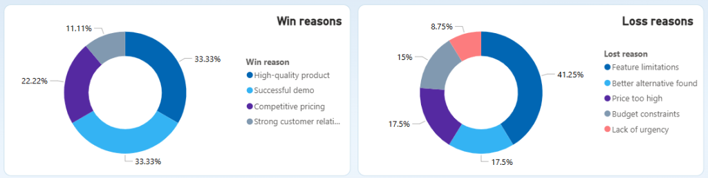
- Donut charts showing the reasons behind won and lost deals. Sales teams can use this to identify the most common objections and adjust their approach accordingly.

The CRM dashboard for HubSpot template gives your team a live pipeline view they can access outside of HubSpot, without waiting on a weekly export. The measures are ready and so is the layout.
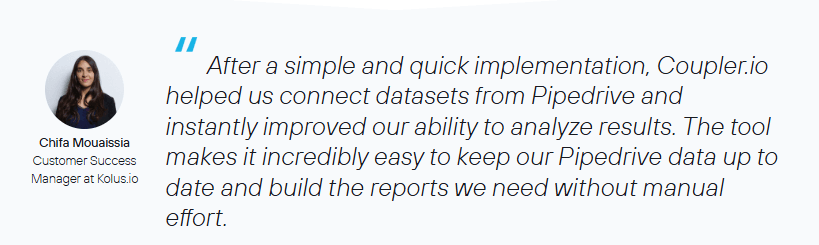
Kolus.io, a SaaS company using Pipedrive, had this exact workflow problem. After connecting to Coupler.io, their dashboards started updating daily and the team saved 12 to 20 hours of manual work per month.

Use case #4. Finance: Revenue reporting and invoice tracking
Data sources: QuickBooks
QuickBooks has built-in reports, but they are hard to customize and the only way to share them is as a static Excel or PDF export. Stakeholders who need a live view of revenue, invoices, or P&L have no way to access it without a paid QuickBooks seat.
The Power BI setup can give you the same outcome with a live dashboard your whole team can access.
Load data in Coupler.io before loading to Power BI
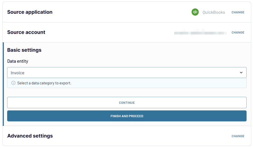
To track revenue performance, monitor invoice status, and analyze customer and product data in one place, you need data from multiple QuickBooks entities. Connect your QuickBooks account in Coupler.io and select the invoice, customer, and other data you want to pull.

Analytics and visualization in Power BI
To analyze data with Power BI from QuickBooks via Coupler.io, start by defining the measures your visuals need. Here are a few to set up.
- Total invoices=
COUNTROWS(Invoices) - Overdue invoices=
COUNTROWS(FILTER(Invoices, Invoices[Invoice: Status] = "overdue")) - Overdue rate=
DIVIDE([Overdue Invoices], [Total Invoices])
Once your measures are ready, here are some of the visuals you can build:
- KPI cards for Paid invoices, Overdue invoices, and Open invoices this month. These give finance teams an immediate view of cash position without opening QuickBooks.


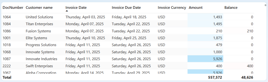
- Invoice detail table showing document number, customer name, invoice date, due date, currency, amount, and outstanding balance. This table is useful for tracking which invoices are still open or overdue.

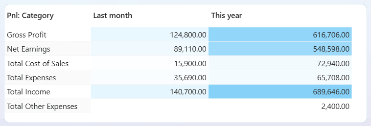
- P&L summary table comparing last month vs this year across Gross Profit, Net Earnings, Total Cost of Sales, Total Expenses, and Total Income.

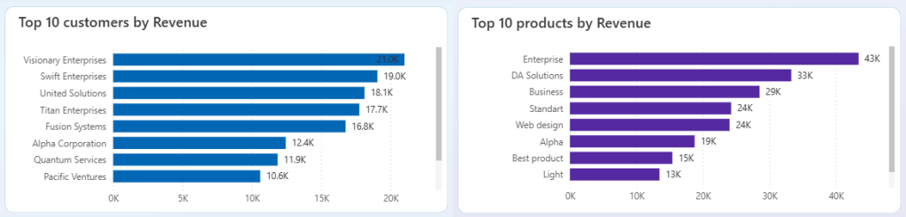
- Bar charts for Top 10 customers by revenue and Top 10 products by revenue. These highlight which accounts and products contribute the most to the bottom line.

With the QuickBooks revenue dashboard template, your revenue, invoices, and P&L populate the moment your data loads in. No manual exports, no layout work.
DE-YAN, a production company managing 10 to 20 active client projects, used to export QuickBooks data and format reports by hand. After connecting to Coupler.io, the team saved roughly 15 hours of admin time per day across all active projects.


Get analysis-ready data for Power BI with Coupler.io
Get started for freePower BI data analysis without starting from scratch
If you use Power BI for data analytics, you already have the building blocks:
- DAX handles your calculations
- Power Query prepares and transforms your data
- The visualization layer turns everything into interactive reports that support faster decision-making across your team
The gap appears when your data lives in tools Power BI cannot natively connect to.
Coupler.io solves this in one no-code setup. It connects 400+ business apps directly to Power BI, handles data preparation before it reaches your report, and keeps everything updated automatically on a schedule.And you do not have to start from scratch. Coupler.io also provides a free Power BI dashboard templates gallery built for the most common reporting use cases across marketing, e-commerce, sales, and finance. Each template comes with a pre-built data connection, DAX measures already written, and a report layout ready to use from day one.