Building a Power BI dashboard from scratch takes hours. Figuring out which metrics belong on it takes even longer. I put together 32 Power BI dashboard examples across marketing, sales, finance, ecommerce, and operations so you can skip both steps. Nineteen of them are ready-made templates: connect your data through Coupler.io and start reporting immediately. The rest are worth studying for layout ideas and metric choices when you build your own.
Two types of Power BI dashboards ahead:
- White-label Power BI dashboard templates. Connect your data through Coupler.io and start using the reports right away. Each comes with built-in connectors that automate data loads from your apps.
- Dashboard examples that are not reusable. You can’t plug your data into these, but they show smart approaches to dashboard design, data visualization, and metric selection across industries.
The best Power BI dashboard examples for marketing
1. All-in-one Power BI marketing dashboard (+ template)
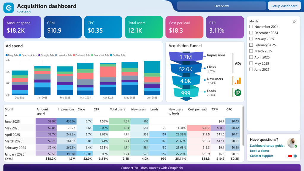
If your marketing data lives in six different platforms, this is the dashboard that pulls it together. It connects Google Analytics, Search Console, ad platforms (Google Ads, Facebook Ads, LinkedIn Ads, TikTok Ads, Microsoft Ads), social media, email marketing tools, and YouTube into one analytical view.
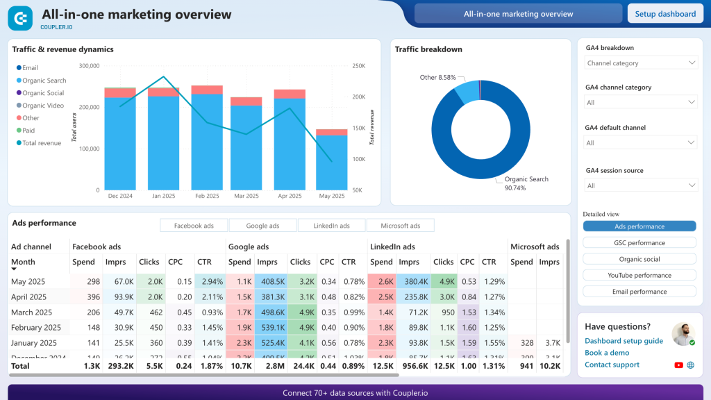
The real value here is cross-channel comparison. Instead of checking each platform separately, you see how paid ads, organic search, social, and email campaigns perform side by side. Marketing directors use it for budget allocation decisions. When you can compare cost per acquisition across every channel in one place, it becomes obvious where to shift spend. The dashboard also integrates GA4 data for full-funnel visibility, from ad impression to revenue attribution.
The Power BI dashboard template uses multiple Coupler.io connectors to automatically aggregate data, with scheduled refreshes keeping your marketing analytics up to date.
2. Google Analytics Power BI dashboard (+template)
This web analytics dashboard gives you a full view of your GA4 data: active users, sessions, engagement quality, event tracking, channel acquisition, geographic distribution, and landing page performance. Trend charts let you compare traffic and engagement patterns across periods and catch shifts early.
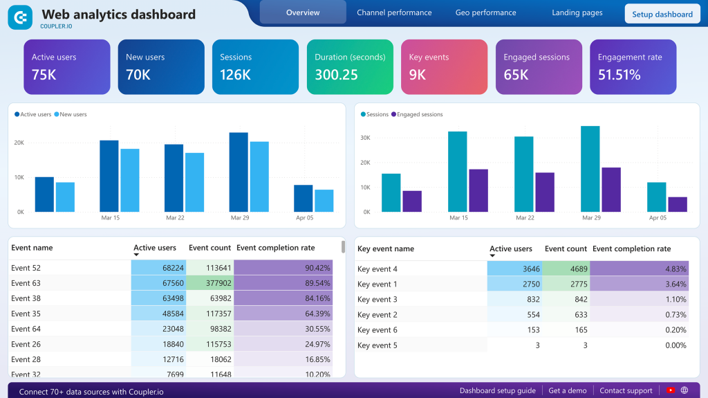
You can track active users, new users, sessions, and engagement rate. The channel performance breakdown shows how organic search, direct, referral, paid search, and other sources compare on both volume and engagement quality.
The key events table is particularly useful as it isolates the events that matter most to your business and shows completion rates. As a result, you can monitor whether visitors are actually converting rather than just browsing.
A built-in Coupler.io connector automates GA4 data extraction directly to Power BI, so your analytics stay fresh without manual exports.
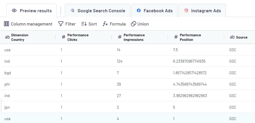
3. SEO dashboard in Power BI (+ template)
Built on Google Search Console data, this Power BI template gives SEO specialists and marketing managers a detailed view of organic search performance. It tracks impressions, clicks, average position, and click-through rates across your pages and queries.
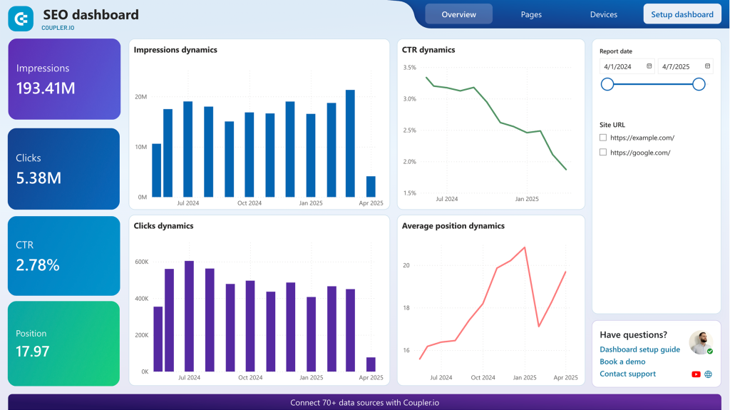
What I find most useful: the dashboard highlights queries where you appear in search results but have low CTR. These are your quick-win opportunities. Pages that already rank but aren’t getting clicked. You also get week-over-week and month-over-month trend tracking, device-specific performance (mobile vs. desktop), and page-level position changes. It’s the kind of data that turns “our SEO improved” from a vague claim into something measurable.
The Coupler.io connector pulls data from Search Console automatically, eliminating manual exports.
4. Brand awareness dashboard in Power BI (+ template)
Measuring brand awareness is notoriously difficult in standard analytics platforms. This dashboard takes a practical approach. It bridges data from Google Search Console and major ad platforms (Google Ads, Facebook Ads, Microsoft Ads) to show how advertising impressions correlate with branded search behavior.
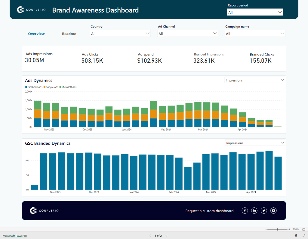
The core idea is simple: when you run ad campaigns, do more people search for your brand name afterward? The dashboard puts ad impression data and branded search volume on a unified timeline so you can spot correlations. You can filter by specific campaigns to isolate their impact. For marketing teams that need to justify brand-building spend with actual data, this fills a real gap.
Coupler.io connectors automate data extraction from both Search Console and your ad platforms, bringing datasets that normally live in separate systems into one view.
Instead of switching between Facebook, Instagram, LinkedIn, and YouTube dashboards, this template consolidates social media performance data into one Power BI report. It also pulls in GA4 data, so you can see how social channels drive website traffic and conversions, not just engagement metrics.
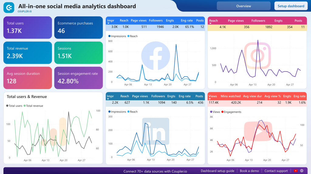
Cross-platform comparison is the main draw. You can track reach, engagement, and follower growth across all connected channels. Compare audience demographics and engagement rates side by side to figure out where your content resonates most. The GA4 integration adds a layer most social dashboards miss: connecting social traffic to actual website conversions and revenue.
Built-in Coupler.io connectors automate data extraction from each social platform and GA4 with scheduled refreshes.
6. Instagram business dashboard in Power BI (+ template)
This Instagram analytics dashboard supports multi-account management, which makes it especially useful for agencies handling several clients. It consolidates metrics from multiple Instagram accounts into a single interface.
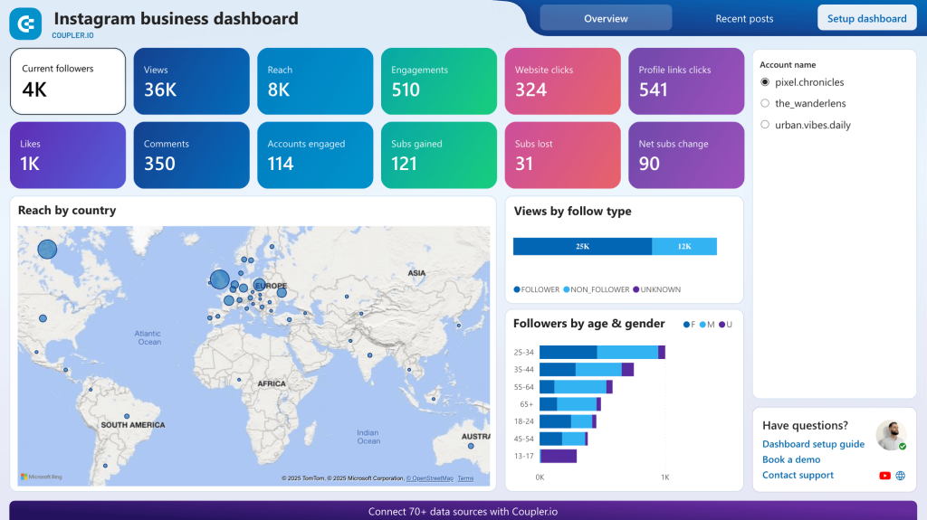
The geographic audience distribution map is one of its stronger features. It shows reach by country on an interactive world map, which is hard to get from Instagram’s native analytics. You also get demographic breakdowns by age and gender, with a separate view of follower vs. non-follower engagement. Post-level performance metrics (views, likes, comments, shares, saves) let you identify what content types actually work rather than relying on gut feeling.
Automated Instagram Insights connectors through Coupler.io keep the data fresh.
7. YouTube analytics dashboard in Power BI (+ template)
For content creators and marketing teams managing YouTube channels, this dashboard connects to YouTube Analytics through Coupler.io and consolidates viewership, engagement, and audience data in Power BI.
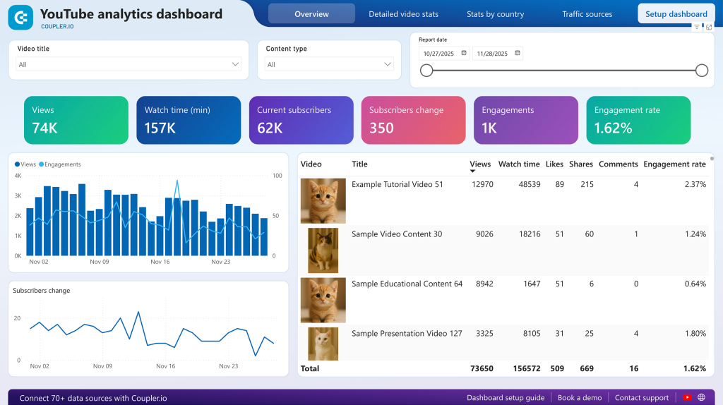
The traffic source analysis is where this gets interesting. You can see exactly how viewers discover your content: YouTube search, suggested videos, external websites, or social platforms. Compare that against subscriber growth to understand which discovery paths actually build your audience. Top search keywords driving traffic to your channel help optimize future content for discoverability. Geographic viewership data can guide decisions about language, subtitles, and regional content strategies.
The Coupler.io connector pulls YouTube Analytics data automatically into Power BI.
Power BI dashboard templates for PPC
8. PPC dashboard in Power BI (+ template)
This is the multi-platform PPC dashboard. It pulls advertising data from Google Ads, Facebook Ads, LinkedIn Ads, TikTok Ads, Microsoft Ads, and others into one unified view. No more switching between ad platforms to compare performance.
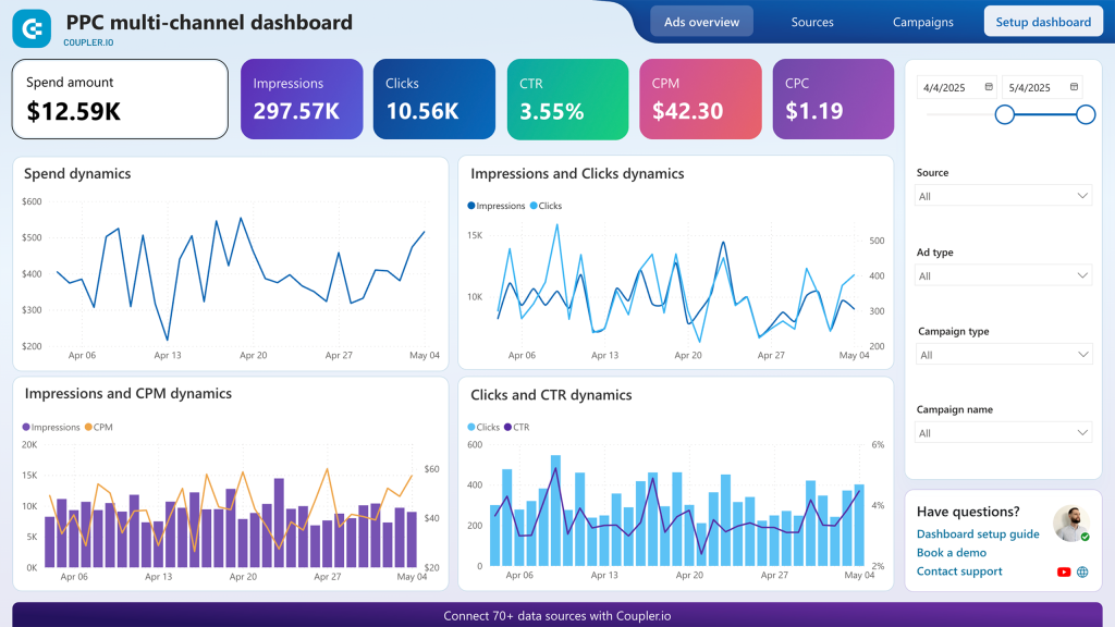
You can analyze performance at the aggregate level or drill down by ad type, campaign type, specific campaign, or data source. The dashboard tracks spend, impressions, clicks, CTR, CPM, and CPC across all connected platforms. Daily and monthly line charts show correlations between spend and engagement, and a frequency monitor helps catch ad fatigue before it tanks your performance.
The Power BI dashboard has detailed instructions for connecting additional ad accounts and customizing the report. Coupler.io automates data loads from all your ad platforms with customizable refresh intervals.
9. Google Analytics PPC dashboard in Power BI (+ template)
Most PPC dashboards stop at campaign metrics. This one bridges the gap between ad performance and what happens after the click by combining PPC data from major platforms with GA4 behavioral insights.
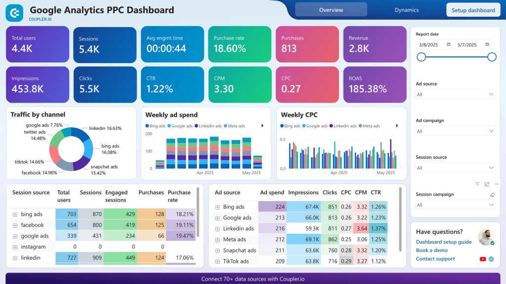
The practical benefit: you can track the full user journey from ad impression through landing page engagement to conversion. Landing page performance analysis by campaign shows which creatives bring quality traffic (long sessions, goal completions) versus which ones bring clicks that bounce. You also get cost-per-conversion metrics and ROI calculations that connect actual ad spend to website revenue.
Automated Coupler.io connectors for Google Ads, Facebook Ads, LinkedIn Ads, and GA4 keep both advertising and behavioral data in sync.
10. Facebook Ads dashboard in Power BI (+ template)
A dedicated Facebook Ads dashboard with one standout feature: a frequency meter that visually indicates when your audience is seeing your ads too often. Ad fatigue is one of the most common (and most expensive) problems in Facebook advertising, and most native reports make it easy to overlook.
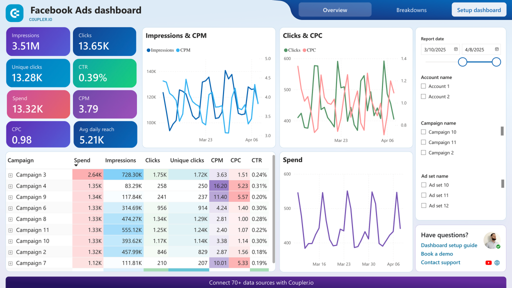
Beyond frequency monitoring, you get the standard metrics (impressions, clicks, CTR, CPC, CPM, and total spend per campaign) plus demographic breakdowns by age, gender, and location. Monthly trend visualizations help spot seasonal patterns and long-term performance shifts. The campaign comparison table puts all relevant metrics side by side for quick optimization decisions.
The Coupler.io connector supports refresh intervals as frequent as every 15 minutes, so your Facebook Ads data stays close to real-time.
11. Google Ads dashboard in Power BI (+ template)
This dashboard extracts Google Ads data through Coupler.io and visualizes campaign performance, ad group metrics, and conversion data. A separate monthly dynamics page shows trends over longer periods, which helps identify seasonal patterns and measure year-over-year growth.
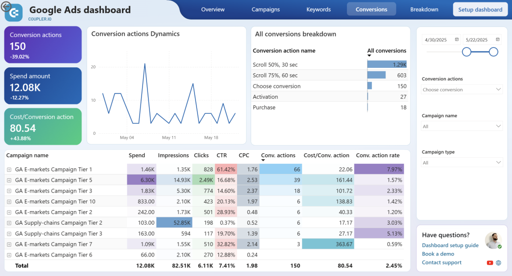
You can track impressions, clicks, spend, conversions, CTR, CPC, and conversion rate at the campaign level. The geographic performance view is useful for local businesses and regional campaigns. It shows which areas generate the best results per dollar spent. Conversion efficiency metrics (cost per conversion, conversion rate by campaign) make it straightforward to spot underperforming campaigns that need pausing or restructuring.
Built-in Coupler.io connector automates data extraction with scheduled refreshes.
12. LinkedIn Ads dashboard in Power BI (+ template)
LinkedIn advertising is different from other platforms. The audience is professional, the CPCs are higher, and lead generation (not just clicks) is usually the goal. This dashboard reflects that by focusing on lead form performance alongside standard campaign metrics.
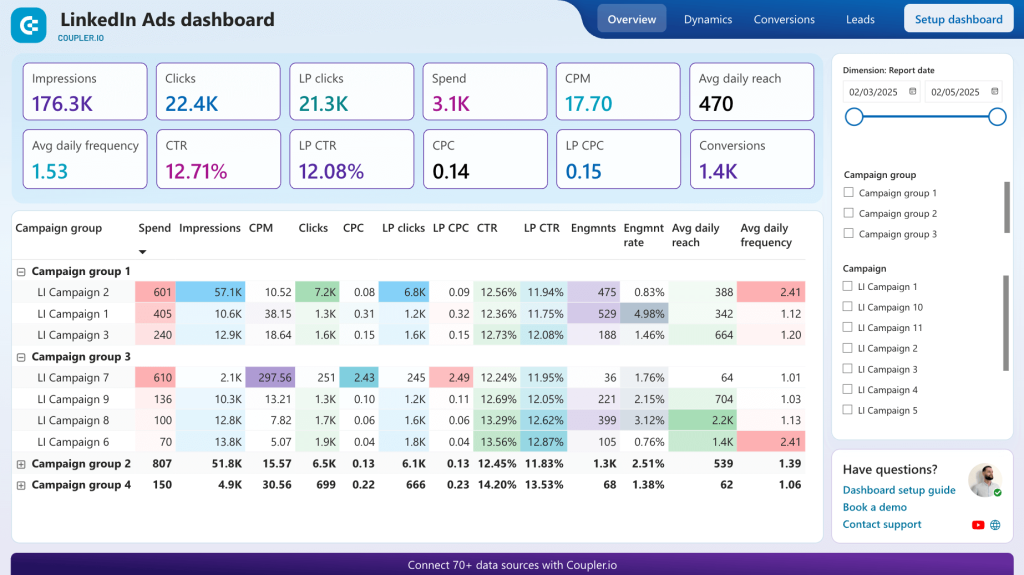
The lead funnel tracking goes from impressions to lead form opens to completions, showing conversion rates at each stage. This makes it easy to diagnose low lead volume. Is it a targeting problem (low impressions), a creative problem (low form open rate), or a form design problem (low completion rate)? Daily spend tracking and campaign-level comparisons help with budget allocation across multiple LinkedIn campaigns.
Coupler.io automates LinkedIn Ads data extraction with scheduled refreshes.
Power BI sales dashboard templates
13. Customer acquisition dashboard for Pipedrive in Power BI (+ template)
This dashboard connects what marketing spends with what sales closes. It integrates advertising data from GA4 and major ad platforms with Pipedrive CRM conversion data. The result is a full acquisition funnel view, from ad impression through website visit to qualified lead in your pipeline.
The funnel visualization shows conversion rates at each stage, which helps pinpoint where leads get stuck. You can compare lead quality across different ad platforms using actual Pipedrive deal progression data, not just click metrics. For sales directors, the ability to connect today’s ad spend to pipeline value helps forecast future revenue based on historical conversion patterns.
Coupler.io connectors pull data from Pipedrive, GA4, and your ad platforms, so your Power BI dashboard refreshes automatically.
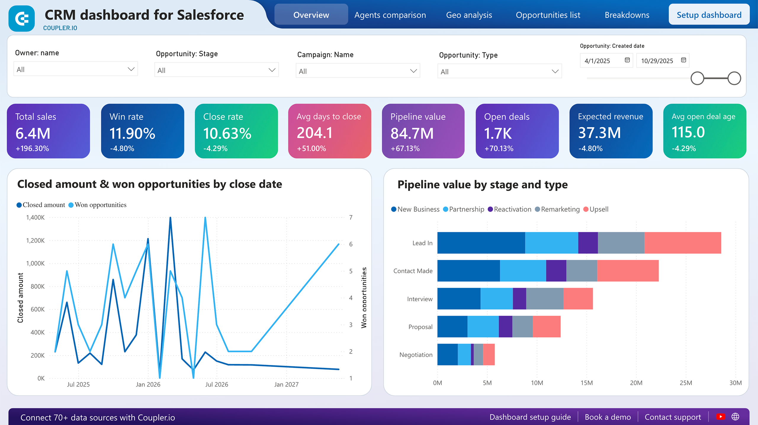
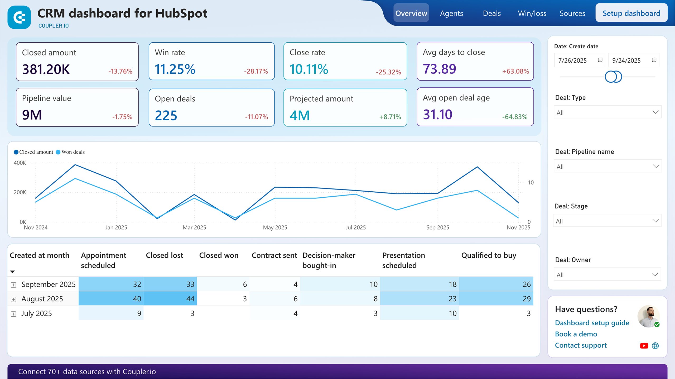
14. CRM dashboard for Pipedrive/HubSpot/Salesforce in Power BI (+ template)
A sales pipeline dashboard that goes beyond what your CRM’s native reporting offers. It’s available for three CRM tools (Pipedrive, HubSpot, and Salesforce), each with its own version and built-in Coupler.io connector.
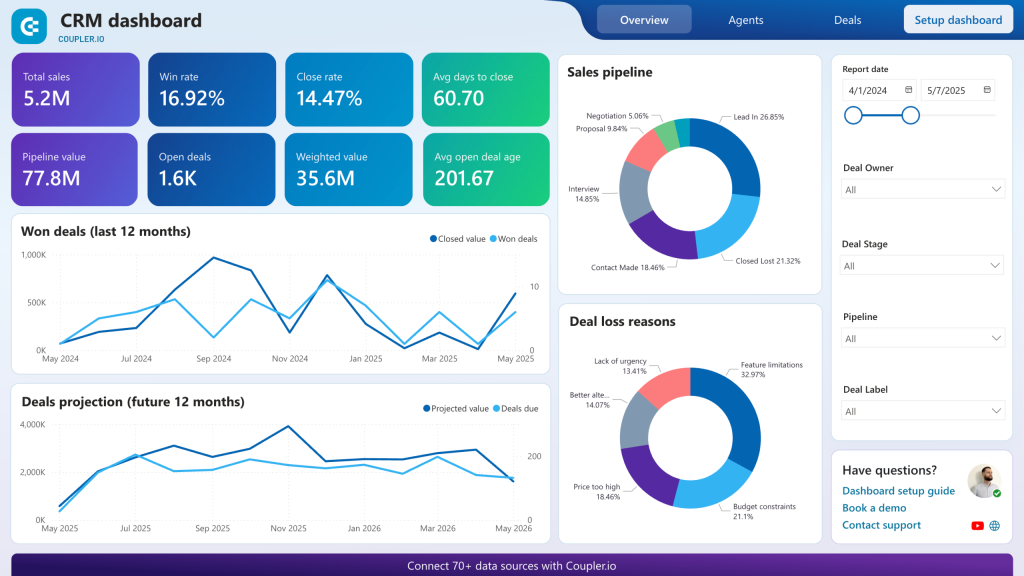
The Power BI dashboard provides deal stage analysis, win rates, deal velocity, and quota tracking at both the team and individual rep level. For sales managers, the pipeline health view surfaces bottlenecks. If deals stall at a specific stage, that’s visible immediately. Revenue forecasting based on live pipeline data and historical conversion patterns gives a more grounded projection than gut-feel estimates. Lead source analysis connects deal outcomes back to their origin channel.
Choose the report template for your CRM app and try it for free.


Power BI financial dashboard templates
15. Time-tracking dashboard for Harvest in Power BI (+ template)
For service businesses, the gap between billable and non-billable hours is the gap between profit and waste. This dashboard connects to Harvest time-tracking software and turns raw time data into a clear picture of team productivity and project profitability.
You get total hours, billable hours, and billable amounts broken down by project, client, and team member. A calendar view highlights individual workloads, useful for catching overwork or underutilization before it becomes a problem. The actual-vs-budget comparison helps prevent scope creep on projects that are quietly eating more hours than planned. Agency principals and project managers tend to get the most out of this one.
Coupler.io extracts Harvest data directly to Power BI with automated refreshes.
16. Revenue dashboard for QuickBooks in Power BI (+ template)
This financial dashboard connects to QuickBooks Online and visualizes transaction data, customer revenue contribution, and product sales performance. It’s built for small business owners and financial officers who need a clearer view of financial performance than QuickBooks’ native reports provide.
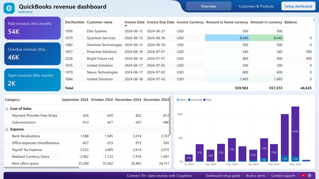
The 12-month revenue trend view helps spot seasonal patterns and growth trajectory. A profit and loss breakdown compares revenue against expenses over time. Customer analysis identifies which accounts drive the most revenue, useful for prioritizing key account management. Product performance tracking shows which offerings contribute most to total revenue. Cash flow visibility through payment method and invoice status analysis rounds out the financial picture.
Coupler.io automates QuickBooks data extraction to Power BI with scheduled refreshes.
Power BI business dashboards for an ecommerce store
17. Shopify orders dashboard in Power BI (+ template)
This ecommerce dashboard pulls order data, customer information, and product analytics from Shopify into Power BI through Coupler.io. It covers the full picture of store operations: geographic sales patterns, payment status tracking, customer behavior, and product performance.
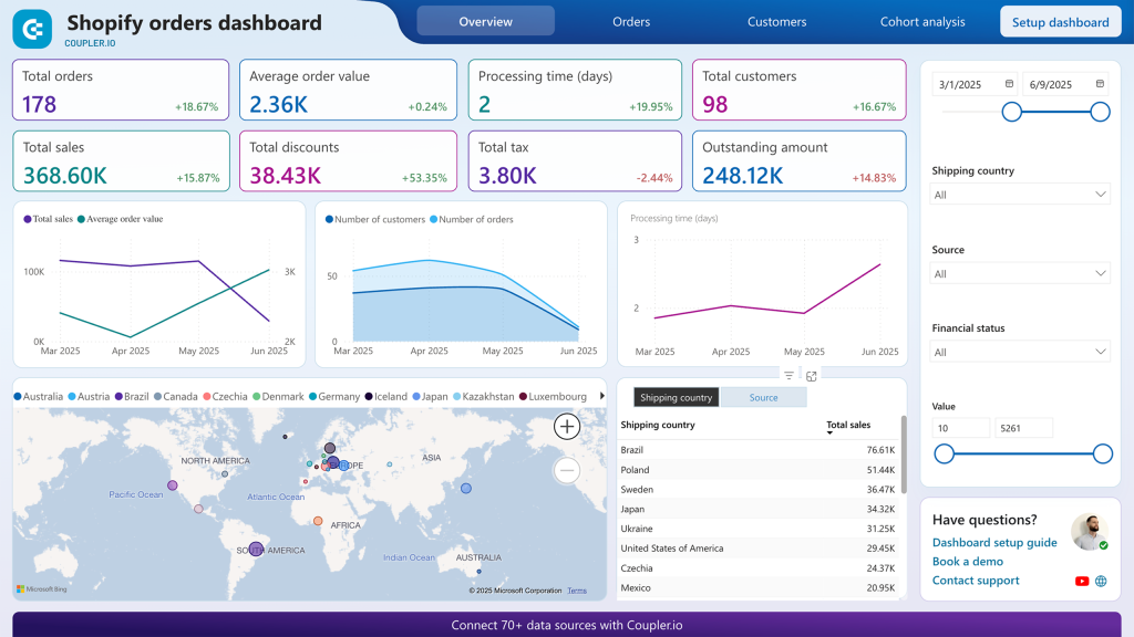
The interactive world map shows sales by country, which helps with shipping strategy and market expansion decisions. Cohort analysis of new vs. returning customers feeds directly into retention strategy planning. Product performance gets two views (by quantity and by revenue) because your best-seller by units isn’t always your best-seller by profit margin. You can also filter by product category to compare segments. Payment status tracking (pending, refunded, partially paid) helps catch cash flow issues quickly.
Coupler.io connectors automate Shopify data extraction to the Power BI dashboard template.
18. Shopify marketing funnel analytics dashboard in Power BI (+ template)
Where the orders dashboard focuses on what happened in your store, this one tracks the full journey from ad impression to Shopify purchase. It integrates advertising platform data with GA4 and Shopify analytics to show how marketing investment converts into actual sales.
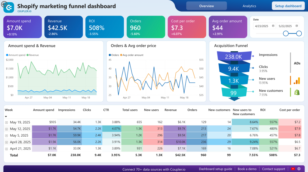
The funnel visualization maps the complete path: ad impressions → website visits → purchases, with conversion rates at each step. Customer acquisition cost and ROAS metrics connect directly to Shopify revenue data, so you’re measuring actual sales, not just ad platform conversions that may overcount. Weekly and monthly trends help with seasonal planning and spend timing. Platform-by-platform comparison identifies your most cost-effective advertising channels.
Pre-built Coupler.io connectors for Shopify, GA4, Google Ads, and Facebook Ads keep the funnel data fresh automatically.
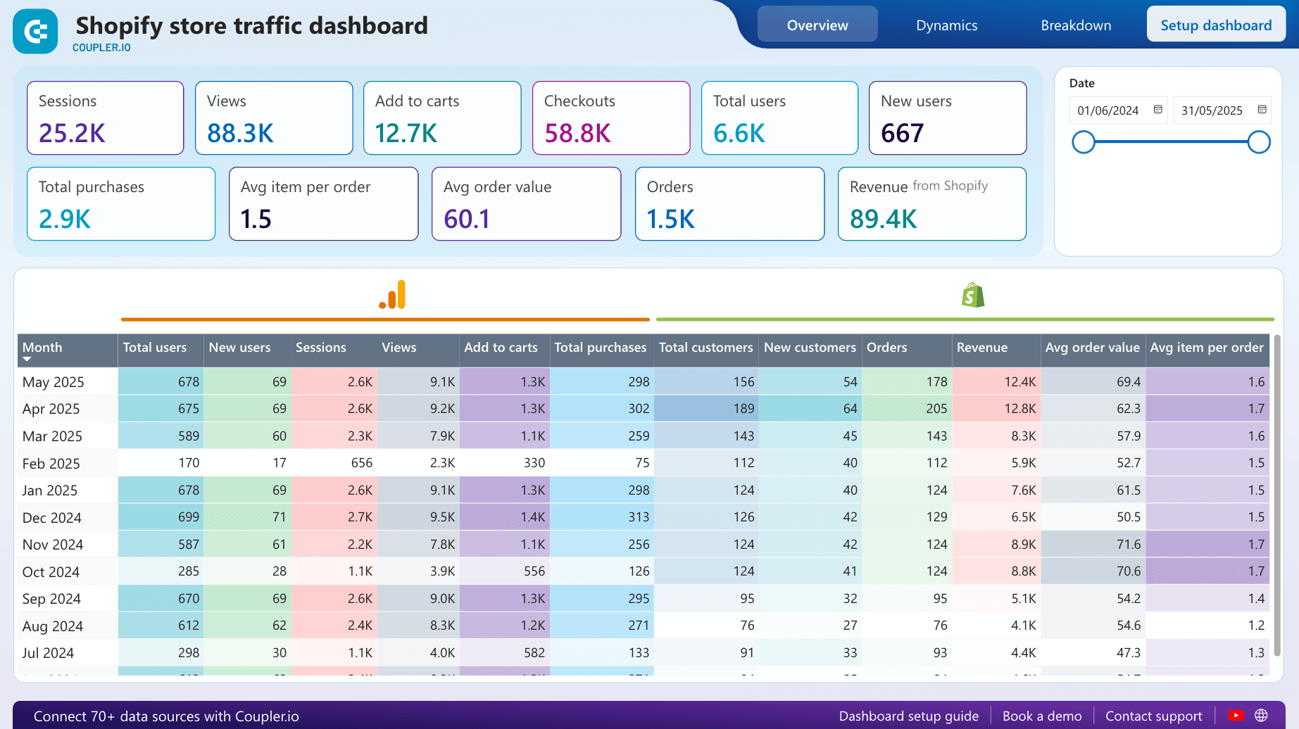
19. Shopify store traffic dashboard in Power BI (+ template)
Combining Shopify and GA4 data, this dashboard tracks the metrics that matter most for ecommerce: views, purchases, checkouts, add-to-cart actions, revenue, and average order value. The goal is to understand how visitors interact with your store and pinpoint where they drop off.
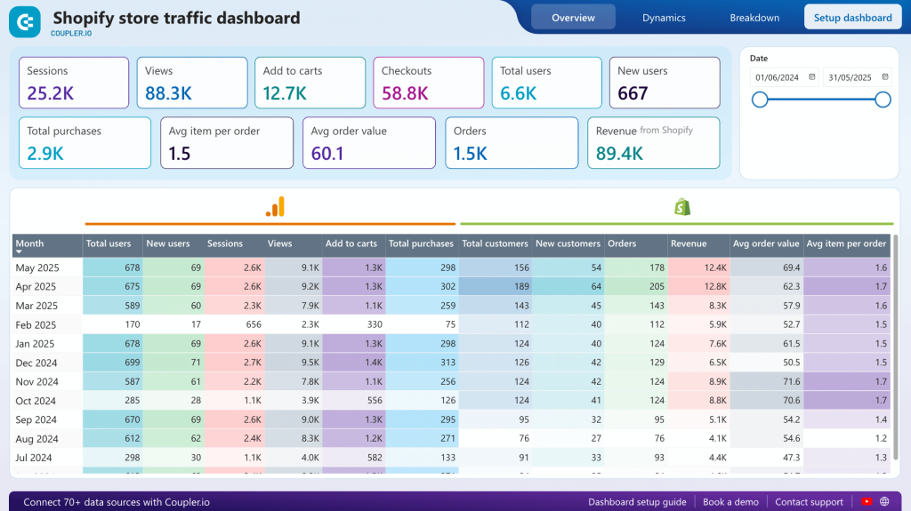
The sales funnel visualization shows exactly which step loses the most visitors, whether it’s add-to-cart, checkout initiation, or payment completion. Monthly financial comparisons help spot growth opportunities and address declining periods early. Geographic revenue data guides content localization and targeted marketing campaigns. Seasonal analysis informs inventory planning and promotional timing.
This Power BI template is free with a Coupler.io account. Setup takes under 5 minutes: copy the template, connect Shopify and GA4, and set up automated refreshes.


The dashboards above are all available as templates. Connect your data sources through Coupler.io and start reporting right away. The Power BI dashboard examples below are not reusable templates, but they show smart approaches to dashboard design across different business functions that are worth studying.

Create your Power BI dashboards with Coupler.io
Get started for freePower BI executive dashboard examples
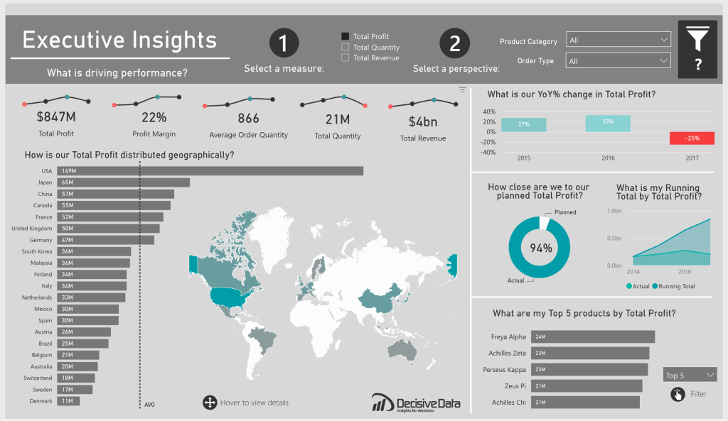
20. Power BI executive dashboard
This dashboard by Decisive Data gives executives a single-page overview of business performance across orders, geography, time periods, and products. The level of detail is right for stakeholders who need to assess company health without wading through operational data. It uses a solid mix of bar charts, line charts, donut charts, and custom visuals. Hover-over details and interactive filters let you drill down when something catches your eye.
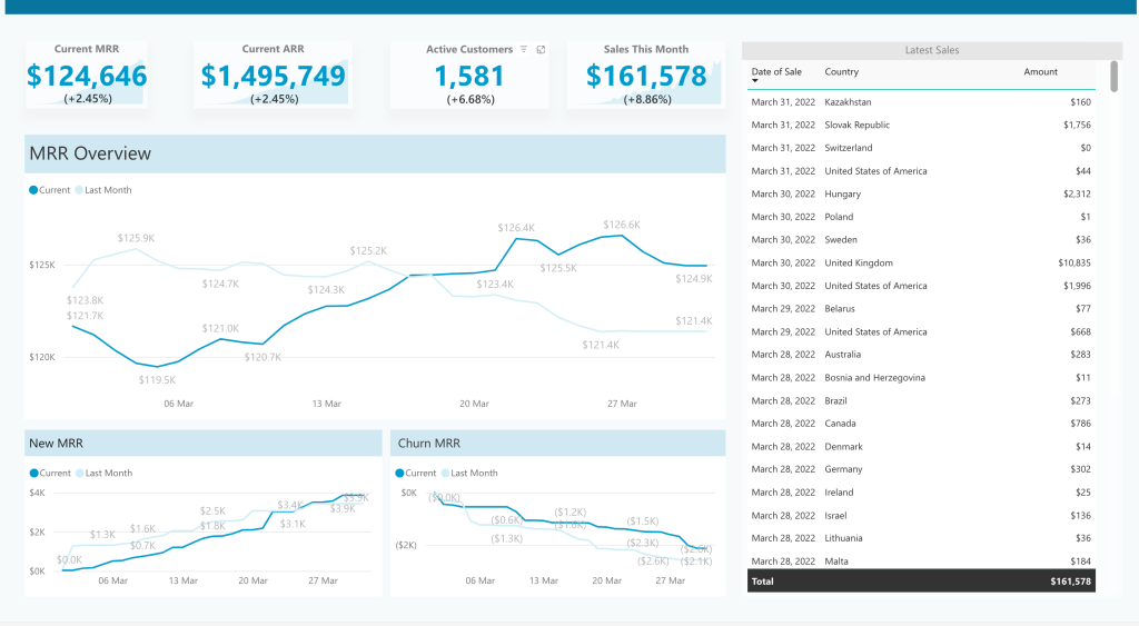
21. KPI dashboard in Power BI
Focused on a single key performance indicator (monthly recurring revenue), this dashboard shows how to go deep on one metric rather than wide on many. It displays MRR alongside ARR and total sales, then breaks MRR dynamics into new MRR and churn MRR line graphs so you can see what’s driving the changes. Everything fits on a single page. The previous-month comparison line on the main chart is a small touch that makes trend analysis easier. A good reminder that not all key performance indicators need a sprawling multi-tab report.
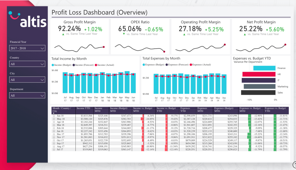
22. Power BI financial dashboard
This financial performance dashboard covers income, expenses, and profitability of operations. Bar graphs and combo charts let you compare actual figures against forecasts and planned budgets over time. It includes the standard financial KPIs (revenue, profit margins, cash position), but the budget-vs-actual comparison is what makes it practical for day-to-day financial management.
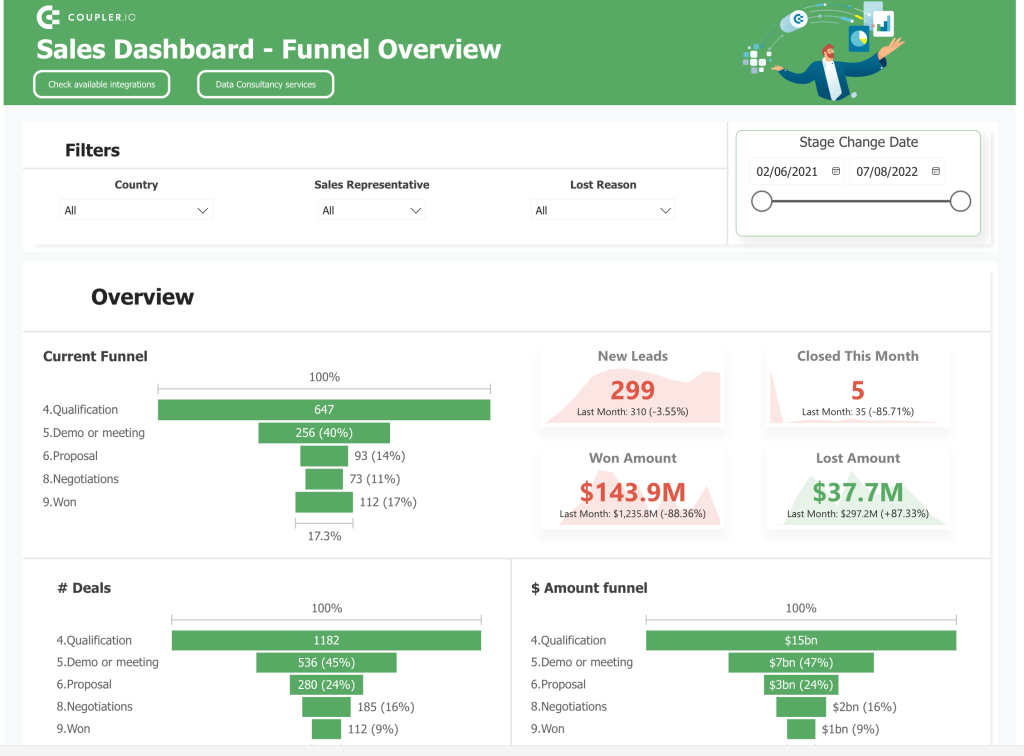
23. Sales dashboard in Power BI
Interactive funnel charts walk through each stage of the sales process, from lead to won deal. The filters for country, sales representative, and lost reason give the dashboard analytical flexibility. You can define which regions produce the best results, identify which reps may need support, and analyze lost-deal patterns to adjust your strategy.
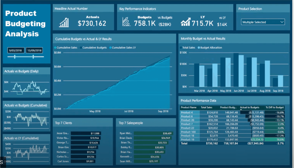
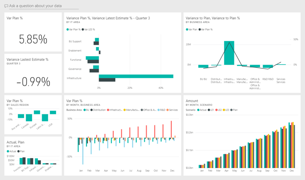
24. Power BI budget dashboard
A product budgeting dashboard from the Microsoft Power BI community. It compares actual spending against budgeted amounts across products and time periods, with a variety of charts, graphs, and tables. The cumulative budget tracking view is useful for spotting overspend trends before they become year-end surprises. DAX capabilities power the calculated metrics behind the scenes.
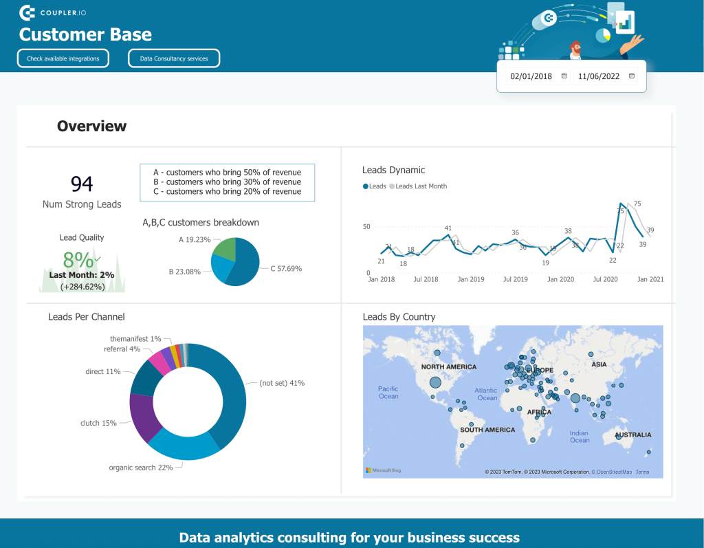
25. Sales lead overview dashboard in Power BI
This dashboard tracks lead sources, conversion dynamics, and customer analysis patterns. It’s a practical tool for sales teams who want to understand where leads come from, how they move through the pipeline, and which sources produce the best conversion rates. The demographics breakdown adds a layer of customer analysis that helps refine targeting.
More examples of Power BI dashboards across industries
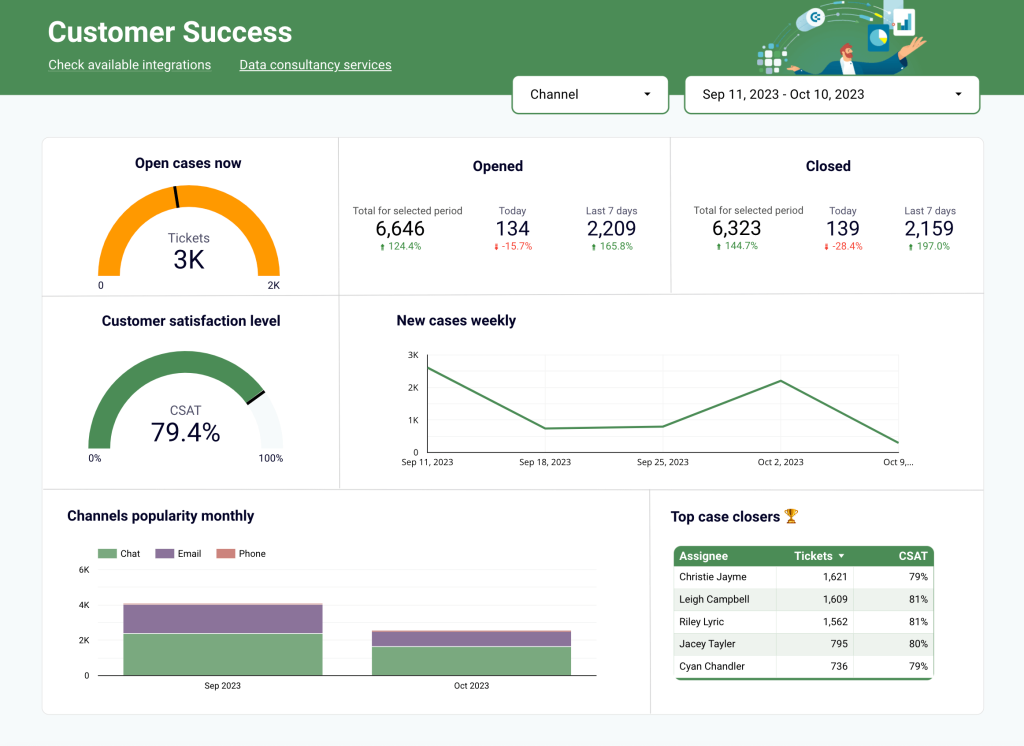
26. Power BI operations dashboard
A customer support operations dashboard that tracks open cases, channel popularity, and team member performance in real time. It shows how many users contacted support, which channels they prefer, and how individual agents perform on resolution. This one is automated with Coupler.io and can be adapted for other departments beyond support.
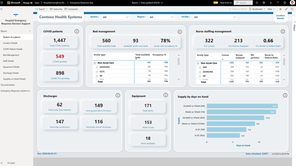
27. Power BI healthcare dashboard
A hospital emergency response dashboard that collects data from hospital administration and staff reports. It displays available beds, equipment in use, and patient status across the facility. The kind of at-a-glance view that healthcare operations teams need during busy shifts. Patient segmentation by condition (including COVID tracking) adds clinical value on top of the operational metrics.
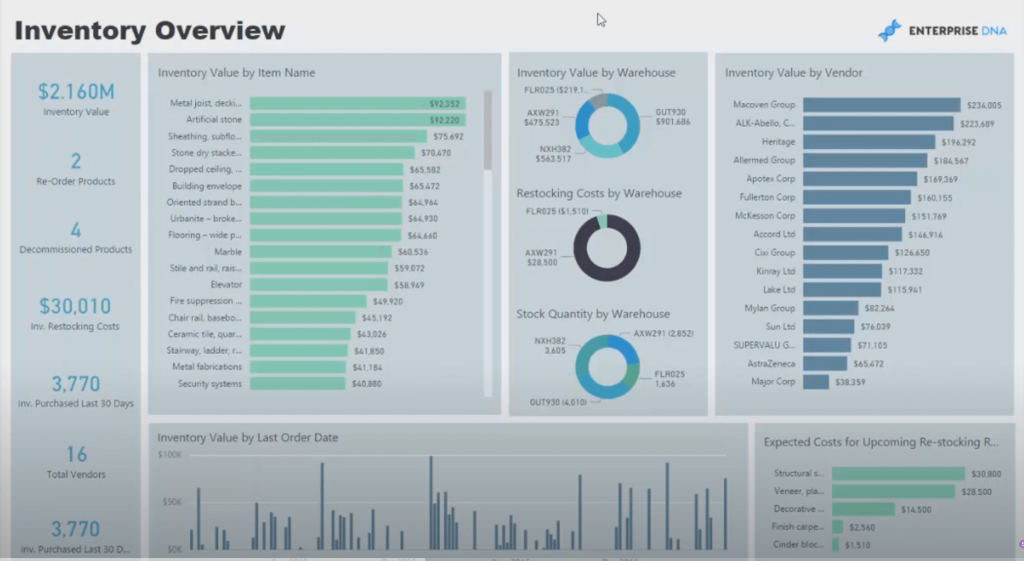
28. Power BI inventory dashboard
Built by Enterprise DNA, this inventory management dashboard tracks costs, turnover rates, and stock levels across locations and product categories. The historical data view helps forecast how much inventory you’ll need for upcoming periods, keeping outlets properly stocked. Good example of using line charts and bar charts together for trend analysis in an operational context.
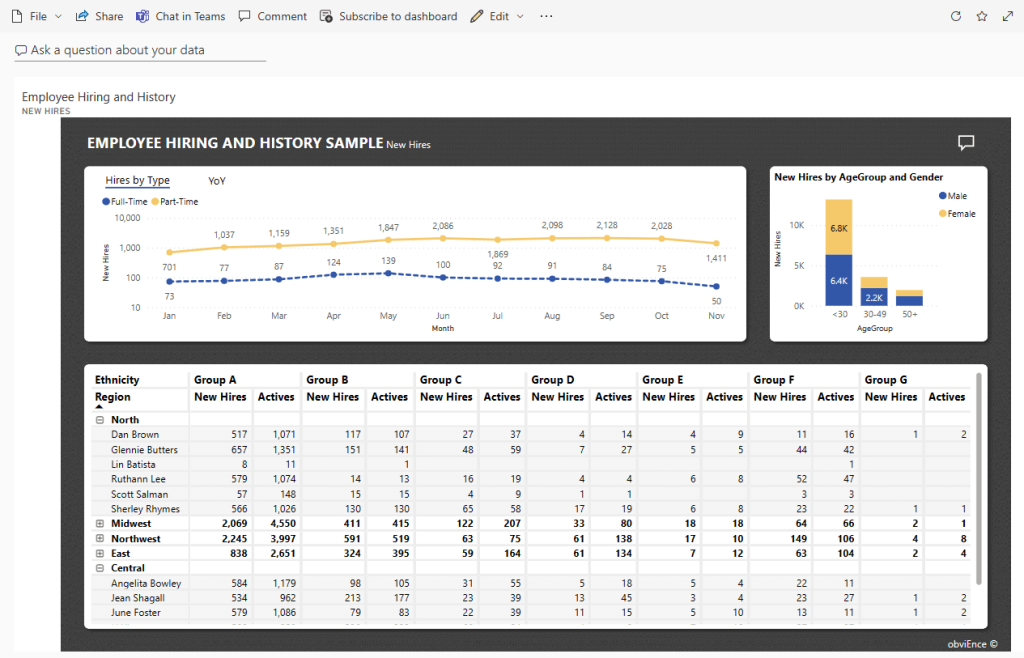
29. Power BI HR dashboard
Created by ObvEnce, this human resources dashboard explores employee hiring and history using sample datasets. Its main purpose is to reveal trends and potential biases in hiring by visualizing hires across age, gender, and ethnicity dimensions. An interactive dashboard like this can be useful for ensuring balanced hiring practices and tracking workforce demographics over time.
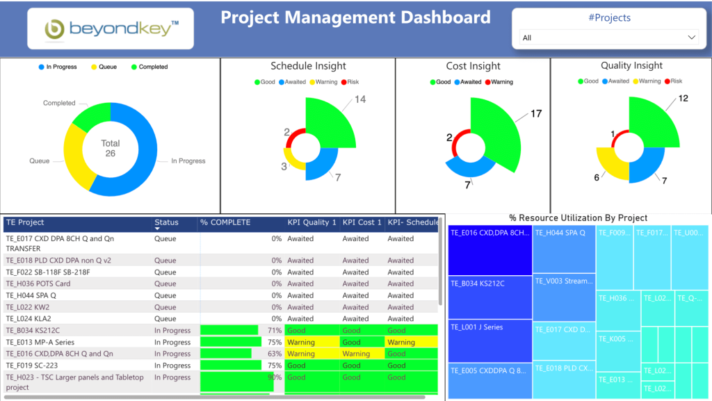
30. Power BI project management dashboard
Project management involves juggling multiple contexts at once, and this dashboard reflects that complexity in a clean visual layout. It tracks project status, schedule adherence, and resource allocation. The actual-vs-planned resource comparison helps project managers catch capacity issues early and redistribute work before deadlines slip.
31. Power BI IT dashboard
This IT Spend Analysis dashboard is an official sample from the Microsoft Power BI team. It compares planned vs. actual IT department costs across projects and categories. Since Microsoft provides the template and dataset, you can download it and explore the data yourself. A good learning resource for understanding Power BI’s DAX functionality and report-building features.
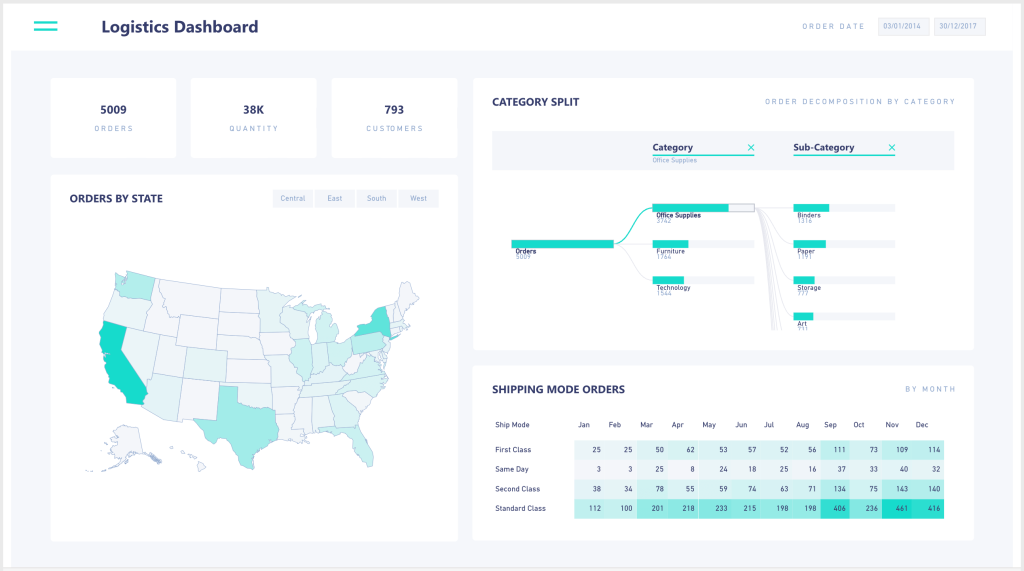
32. Power BI logistics dashboard
A logistics dashboard designed for monitoring goods flow and resource allocation. It organizes order data by product, delivery method, and location, with carrier performance comparisons across shipping modes and routes. The geographic distribution view helps optimize inventory placement and distribution networks.
Use Power BI templates or create custom Power BI dashboards?
Templates save you from building your Power BI dashboard design from scratch. No adding charts, tables, and filters one by one. Connect your data source through the Coupler.io connector and get visualized insights immediately.
But not every template will match your exact requirements. If you need a custom reporting solution, Coupler.io still handles the hardest part: automating the data flow so your dashboard stays up-to-date with fresh data.
How to automate data flow for a custom Power BI dashboard
You don’t need a technical background for this. Any business user can connect a data source to Power BI through Coupler.io in minutes.
1. Collect your data
Use the form below to select your data source and click Proceed. Sign up for Coupler.io for free (no credit card required), then connect your source and specify what data to extract.
2. Preview and transform data
Before loading, you can edit your data:
- Hide, rename, and rearrange columns.
- Add new columns.
- Split and merge columns.
- Use formulas and perform calculations.
- Blend data from several accounts or sources into one dataset.
- Sort and filter data.
Check out our video tutorial on the data transformations in Coupler.io.
Then, follow the instructions to connect your Power BI account.
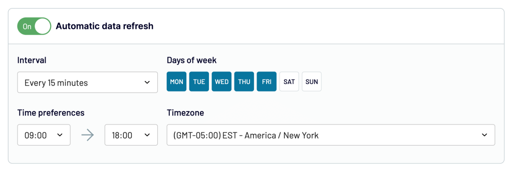
3. Schedule data updates
Toggle on Automatic data refresh and pick an update interval, from once per month to every 15 minutes for near-real-time monitoring.
Run the data flow, and in a few moments, your data appears in Power BI, ready for visualizing data with whatever custom layout you need.
What if the best Power BI dashboard examples are not enough?
If you’re coming from Excel or Tableau, you’ll find that Power BI handles large-scale data analysis with less manual work. Combined with Coupler.io’s automated data integration, you can turn scattered data points from dozens of apps into Power BI reports that drive real data-driven decision-making.
The dashboard examples in Power BI above show what’s possible when you combine the right data analytics approach with solid visualization. Whether you start with a ready-made Power BI template or build a custom dashboard, the key is getting your data sources connected and your metrics updating automatically.
Each dashboard offers a different angle on your data. The best ones don’t just display numbers; they surface valuable insights that change how you act. Focus on user experience when building yours: if the person reading the dashboard can’t find actionable insights within seconds, the design needs work.
If you want to sharpen your dashboard design further, check out my article on data visualization best practices for tips on making your Power BI dashboards more effective.