
Although SaaS reporting may initially appear to be a straightforward, step-by-step process, there are key pitfalls to be aware of – and avoid.
SaaS startups tend to prioritize product development and market entry, reporting only after launch. As a result, they fail to address emerging issues proactively.
Imagine you charge an annual subscription for your product but don’t report on customer retention throughout the year. Some users may stop engaging with your product after just two months of subscription. By the time you notice, 10 months later, it’s almost always too late to re-engage them. So, you must report on your performance right from the start.
Besides that, there are other challenges in SaaS reporting, so let’s review those next.
Other reporting challenges for SaaS companies
SaaS reporting complexity
Due to its complexity, SaaS reporting requires more than just basic metrics. Suppose you’re preparing a monthly report for stakeholders and realizing your MRR has been declining for the third month in a row. Looking at new sign-up rates, you see they’re relatively stable. With only these fundamental metrics on hand, you’re guessing about the causes of the decline, with little insight into what happened or how to reverse the trend.
So, what could be going wrong? A change in the interface could make it harder for new users to find the feature they signed up for. As a result, many could have abandoned their accounts and opted out of purchasing a subscription. Or, perhaps users arriving through Facebook Ads remain high in volume, but their quality has dropped due to algorithm changes on Facebook. These and many other issues would only be noticed with an advanced set of metrics in front of you.
Lack of data
The challenge that follows from the previous is the need for more data. In the early stages of a startup, limited user interactions often result in small data sets. To address this, you should use multiple data sources to aggregate more information and gain a broader view of customer behavior. Examples of such sources include CRM systems, analytics tools, payment platforms, and user activity logs.
No web analyst on the team
You’ll struggle to make data-driven decisions without a dedicated web analyst. However, SaaS tools like Coupler.io can help by allowing you to create custom reports without coding expertise. Consider using it to automatically pull data from multiple sources, build reports on the go, and import them into spreadsheets or BI tools for analysis.
Types of SaaS reports
Let’s explore the reports you can create to evaluate critical areas of SaaS business performance, such as finance, product usage, customer success, sales, marketing, support, and service.
Financial report
A report like this builds on financial metrics, such as customer acquisition cost, lifetime value, and monthly or annual recurring revenue. It also helps you estimate profitability by covering the LTV/CAC ratio so that you can see whether you’re growing revenue without overspending.

Product usage report
You can create this report to monitor users’ activity and evaluate their engagement with your product. It covers metrics like the activation rate mentioned previously and the feature adoption rate, which measures how often users engage with a particular functionality.

Customer success report
This kind of report focuses on customer success metrics, such as the retention rate, the customer satisfaction score, and the net promoter score. You can use this data to identify issues that may lead to customer churn and solve them afterward.

Sales and marketing report
The sales and marketing report covers the lead generation funnel, showing a potential customer’s path to becoming a lead, e.g., a signed-up user, or the conversion funnel, which outlines their journey to a subscription. This helps you identify successful marketing activities and highlight areas that need optimization.

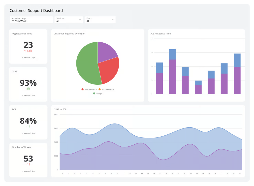
Support and service report
Such a report revolves around metrics like response time, which indicates how quickly your team responds to customer inquiries, and resolution rate, which reflects how efficiently issues are resolved.

How to build a SaaS dashboard + example
If you’re not looking for just a single report but rather a collection of them presented in one place, a dashboard is the solution. Various BI tools are available for this purpose, such as Google Sheets, Looker Studio, Power BI, Qlik, and others. To give you an idea of the process, see how to create a high-level SaaS dashboard in Looker Studio to analyze your website performance.
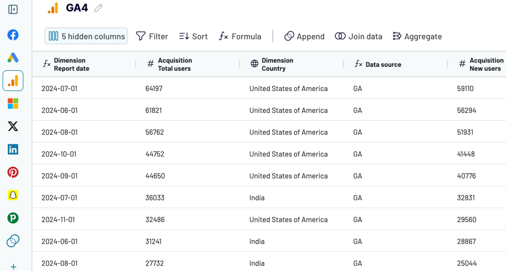
The first thing to complete is to load source data for your dashboard. You can export SaaS data from different sources, such as marketing apps, CRM systems, accounting platforms, and more. In our case, the data source will be GA4, which is commonly used to track conversions from your traffic.
One way to connect GA4 with Looker Studio is through the native connector, but it has some pitfalls. First, you can’t select a reporting period. Second, it returns all metrics (100+) and destinations (300+), so you’ll need to manually hide irrelevant ones. Third, if you require data from additional sources, you can only connect them to Looker Studio separately, not all at once.
To avoid these pitfalls, consider using a partner connector by Coupler.io. It allows you to select metrics and dimensions to load from GA4, configure the reporting period, filter data, and more. Besides, Coupler.io supports many other data sources and BI tools we’ve mentioned above.
It only takes three steps to turn your raw data into insightful reports.
Step 1. Collect data for the report
Connect your data source and select the data you want to derive insights from. For this, identify the key metrics you want to track on your dashboard. Additionally, consider who will be viewing the data and determine the appropriate level of detail and accessibility based on your audience’s needs.
As we want to create a high-level dashboard for our example, we’ll select key metrics such as Total users, New users, Sessions, and Key events. Next, choose basic dimensions like Session default channel group, Device category, and Date to filter data by channel, device, and date, respectively.

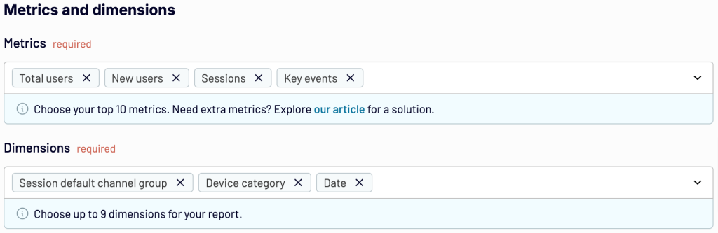
When you’re ready, proceed to collect data, and then you’ll be taken to the next step.
Step 2. Transform your data into a custom report
Review your data and make any necessary transformations. Coupler.io allows you to:
- Rename, rearrange, hide, or add columns
- Apply filters and sort your data
- Create new columns with custom formulas
- Combine data from several accounts or apps

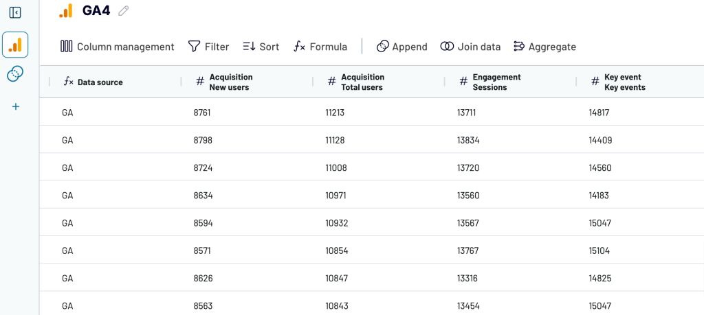
Once your report is ready, proceed to load it into the selected spreadsheet or BI tool.
Step 3. Load your data and visualize it
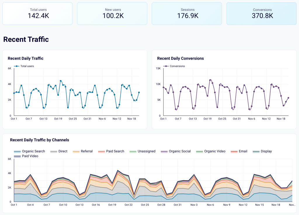
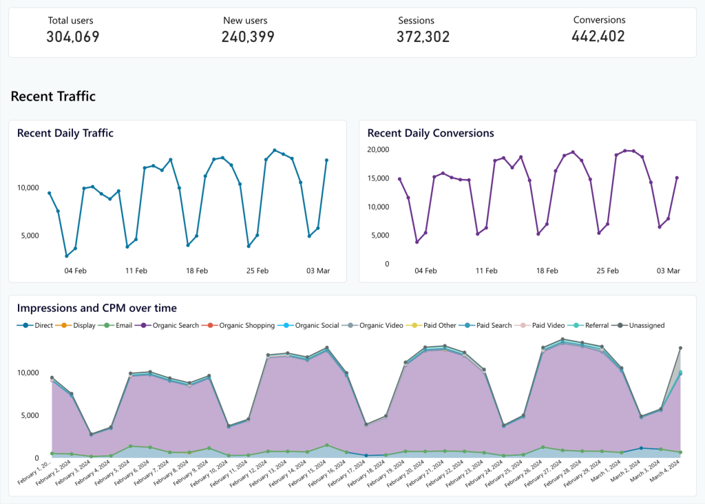
Authorize the Coupler.io connector and generate a data source in Looker Studio by following the in-app instructions. As soon as you import the data, transform it into an insightful dashboard. For instance, display key metrics first to have them readily available. Then, visualize recent overall daily traffic and conversions to stay updated on the latest developments. Next, present recent daily traffic by channel to see which brings more visitors to your website. Here is what it may look like:

Bonus: Set up alerts and monitor KPIs in real time
Data alerts are a feature in BI tools that automatically notify you when data meets specific conditions. For example, if you’re using the Pro version of Looker Studio, you can create alerts on your charts with your chosen frequency. It’s possible to set Looker Studio to check your conversions daily, and if a conversion falls below a certain level, you’ll be notified by email.
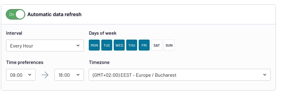
To ensure your dashboard remains up-to-date and reflects any changes in the source, you need to set up automated data refreshes. Coupler.io allows you to do this with a couple of button clicks. Choose intervals ranging from monthly updates to as frequent as every 15 minutes for near real-time reporting.

You can get started with Coupler.io for free to try all the available features and then decide which subscription fits your reporting needs.
SaaS report examples
Let’s look at different forms and types of SaaS dashboards you can rely on depending on your reporting needs:
SaaS marketing dashboard + template
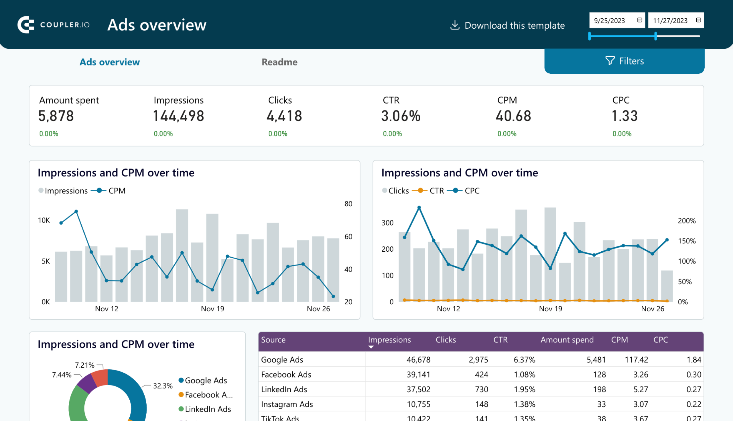
A SaaS marketing dashboard provides insights into various marketing metrics. It displays performance per channel and offers an overview of the marketing activities within your SaaS product. In this example, we’ve chosen Coupler.io’s PPC multi-channel dashboard.

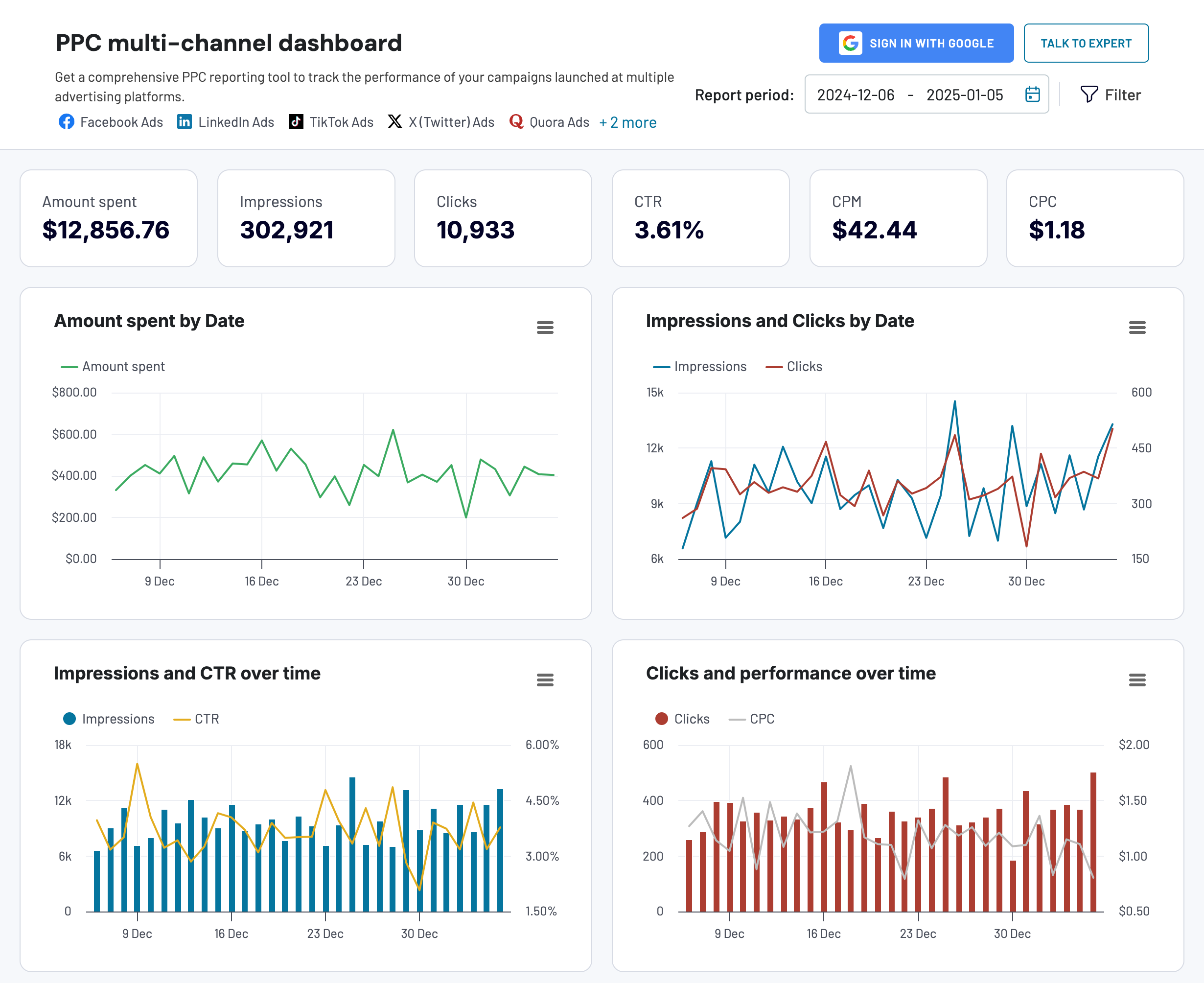
This marketing dashboard is designed to optimize your PPC strategy by analyzing campaign performance across specific channels, such as Google Ads, Facebook Ads, TikTok Ads, and more.
Critical metrics for a SaaS marketing dashboard:
- Amount spent – the total amount spent on running ad campaigns
- Total impressions – the number of times your ad was shown to users
- Total clicks – the number of times users clicked on your ad
- CTR (clickthrough rate) – the ratio of clicks to impressions
- CPM (cost per mille) – the cost for every thousand impressions
- CPC (cost per click) – the cost for each click on your ad
This dashboard template is available in Google Sheets, Looker Studio, Power BI, and Tableau. Go to the readme/setup guide to discover how to get started using it.

PPC multi-channel dashboard
Consolidate data from multiple advertising platforms including Google, Facebook, LinkedIn, TikTok, and more to track campaign performance, analyze spend efficiency, and optimize your PPC budget allocation across channels.


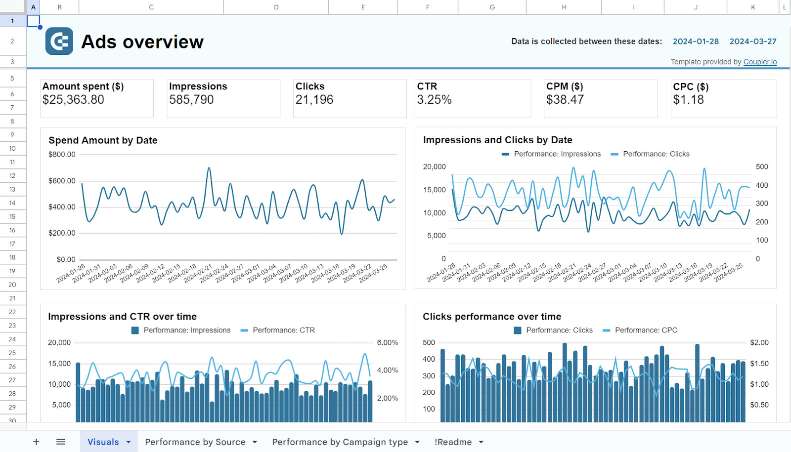
PPC multi-channel dashboard in Google Sheets
Use a PPC dashboard designed for Google Sheets to track the performance of your campaigns across multiple advertising platforms.


PPC multi-channel dashboard in Looker Studio
Get a comprehensive PPC reporting tool to track the performance of your campaigns launched at multiple advertising platforms.

PPC multi-channel dashboard in Power BI
Use a Power BI PPC dashboard for tracking and analyzing your advertising campaigns across multiple platforms.


PPC multi-channel dashboard in Tableau
Track and analyze the performance of your advertising campaigns across various platforms using a one-stop PPC dashboard in Tableau
SaaS analytics dashboard
A SaaS analytics dashboard is a broad term, as each SaaS dashboard serves an analytical purpose. However, you can get a detailed overview of your SaaS business through such a dashboard, with all your critical metrics in one place.
For example, here’s what Vizalytix’s SaaS analytics dashboard in Tableau looks like:

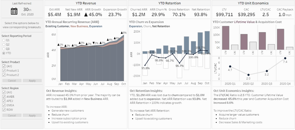
This dashboard allows you to track high-level metrics and compare them against your company’s historical performance.
Critical metrics for a SaaS analytics dashboard:
- Churn rate
- Monthly recurring revenue
- Customer acquisition cost
- Customer lifetime value
- Conversion rate – the percentage of converted users to the total users
- Average revenue per user (ARPU) – the average revenue generated per active user
SaaS sales dashboard + template
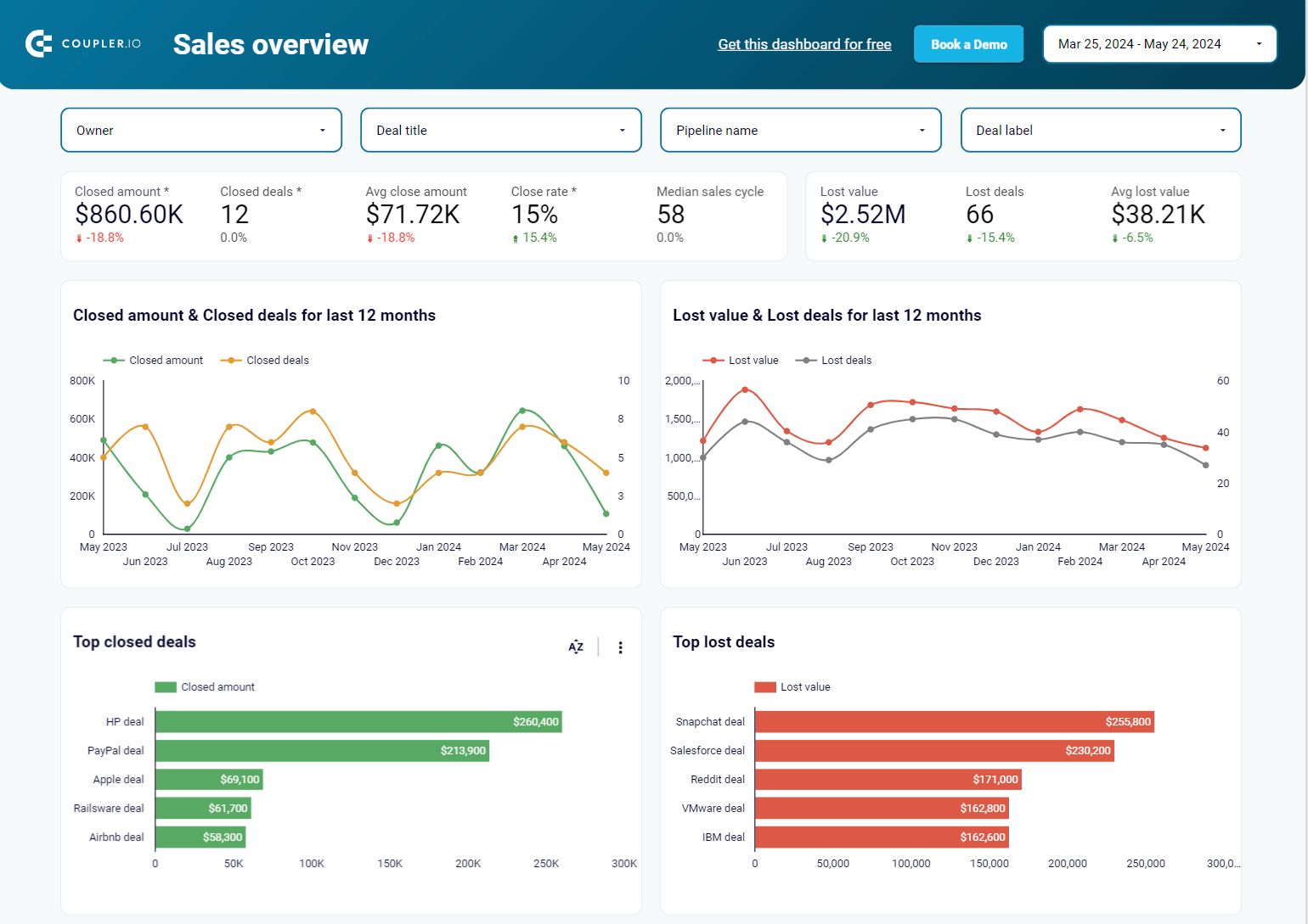
A sales dashboard reveals the revenue of your SaaS business. You can use it to monitor and analyze metrics such as sales by region, lead conversion rate, sales-to-date, and more – all of which are critical to your operational success. Here’s an example of a sales overview dashboard in Looker Studio, designed by Coupler.io.


Critical metrics for a SaaS sales dashboard:
- Sales pipeline value – the total value of all deals currently in your sales pipeline
- Sales win rate – the percentage of successfully closed deals
- Sales conversion rate – the percentage of leads converted into paying customers
In addition to the dashboard designed for Pipedrive, there is also a version available for HubSpot. To begin using the template, check the readme tab for instructions.

Sales overview dashboard for HubSpot in Looker Studio
Get an overview of the HubSpot sales metrics and KPIs to derive insights into pipeline health using our sales KPI dashboard.
Sales overview dashboard for Pipedrive in Looker Studio
Analyze the critical sales metrics and key performance indicators from Pipedrive to make smart strategic decisions.
Finance SaaS dashboard + template
A finance SaaS dashboard offers up-to-date financial information, including profit and loss, earnings, cash flow, etc. For example, here’s the QuickBooks financial dashboard built by Coupler.io in Looker Studio.

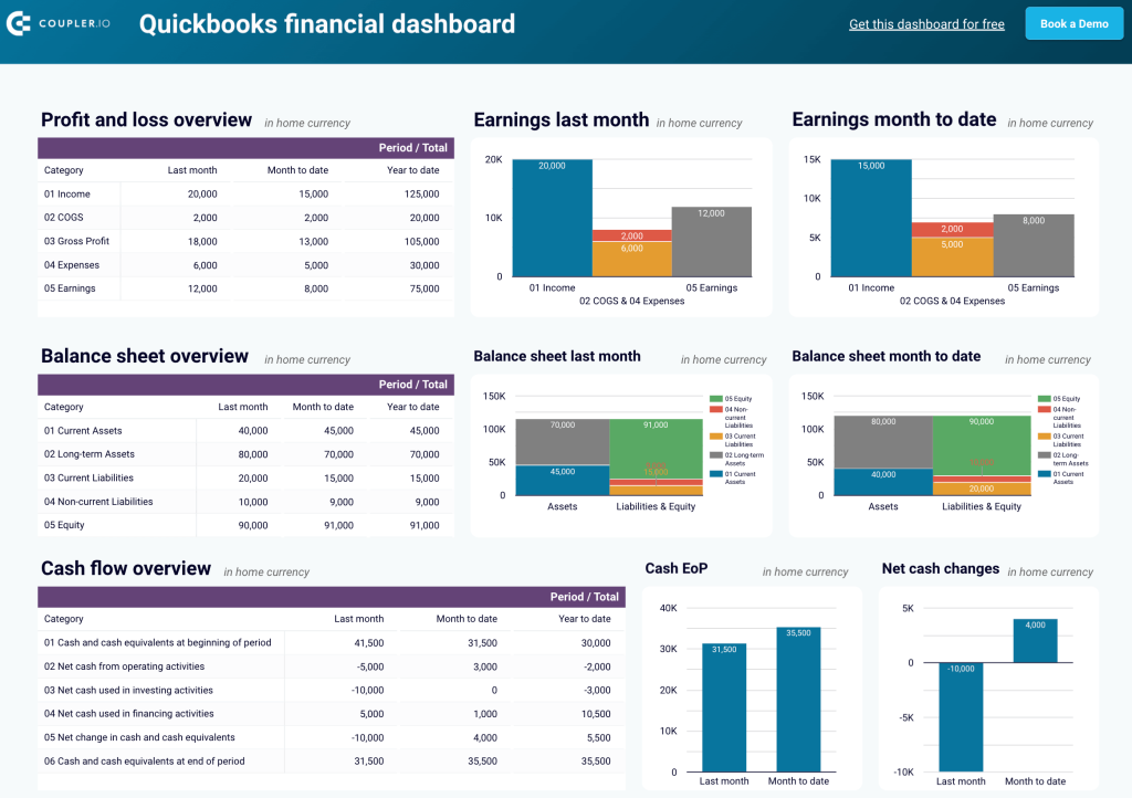
Critical metrics for a finance SaaS dashboard:
- Profit and loss (P&L) – a financial statement that summarizes your revenues, costs, and expenses over a specific period
- Earnings – your net income or profit, typically after taxes and other expenses are deducted from total revenue
- Cost of goods sold (COGS) – the direct costs of producing goods or services sold by your company, including materials, labor, and manufacturing costs
- Cash flow – the total amount of money being transferred into and out of your company
- Cash at the end of period (EoP) – the total cash you have at the end of a specified period
- Net cash changes – the difference between cash inflows and outflows during a specific period
SaaS executive dashboard
A SaaS executive dashboard typically provides high-level data on the company’s sales, expenses, and inventory. Here’s a simple example prepared by a Tableau Public user.

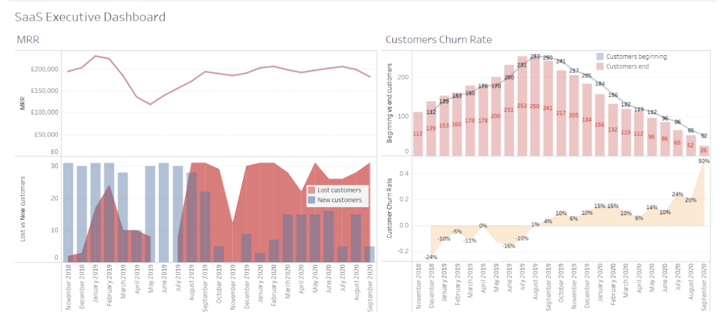
Critical metrics for a SaaS executive dashboard:
- Monthly recurring revenue
- Customer acquisition cost
- Customer lifetime value
- Churn rate
- Net promoter score
SaaS MRR dashboard
A SaaS MRR dashboard lets you track and predict your monthly recurring revenue. It provides a detailed view of your business’s wins and losses so you can forecast the total revenue generated over a monthly period. Let’s take a look at the example below.

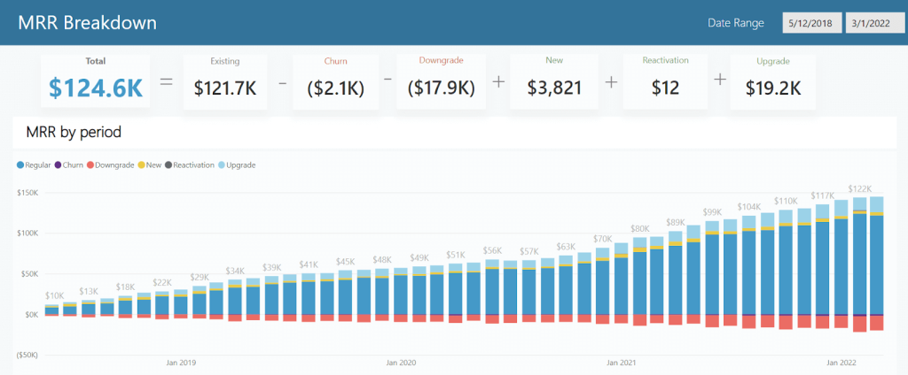
Critical metrics for a SaaS MRR dashboard:
- Total MRR
- New MRR
- Expansion MRR
- Contraction MRR
- Churn MRR
- Net MRR growth – the net change in your MRR after accounting for new, expansion, contraction, and churned MRR
SaaS customer dashboard + template
A customer dashboard allows you to assess the overall health of your customer base. It should display metrics such as the total number of leads, leads per channel, progress in lead generation, and more. For example, check out the customer acquisition dashboard for Pipedrive prepared by Coupler.io in Looker Studio.

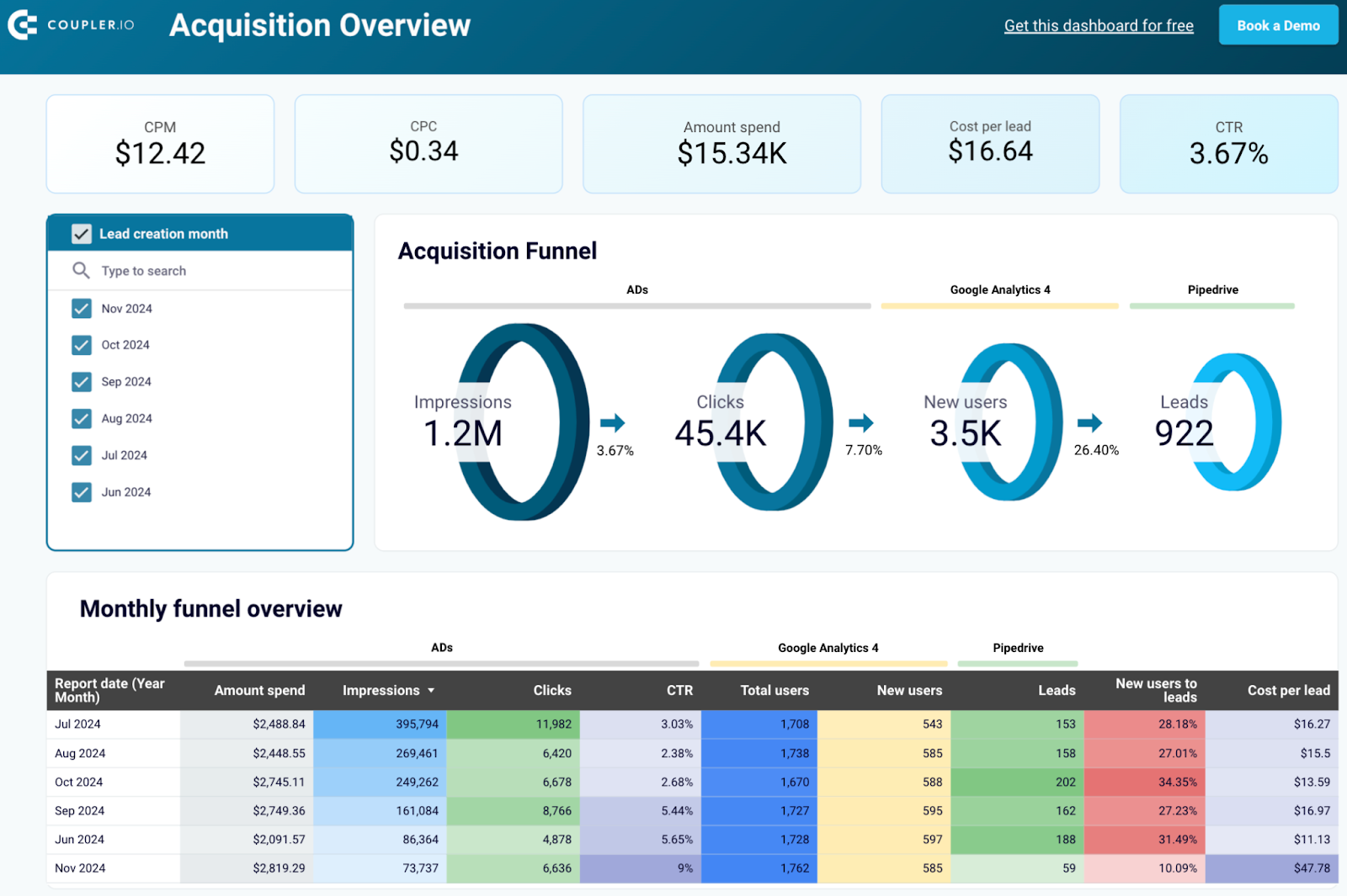
Critical metrics for a SaaS customer dashboard:
- Customer count – the number of active customers of your SaaS product
- Customer acquisition rate – the rate at which you’re adding new customers to your SaaS product over a specific period
- Customer churn rate
- Customer lifetime value
- Net promoter score
- Customer engagement – how actively customers are using and interacting with your SaaS product. This metric can include other ones such as the number of logins, feature usage, session duration, etc.
Apart from Pipedrive, this dashboard is also available for HubSpot. Follow the steps outlined in the readme tab to get started with the template.

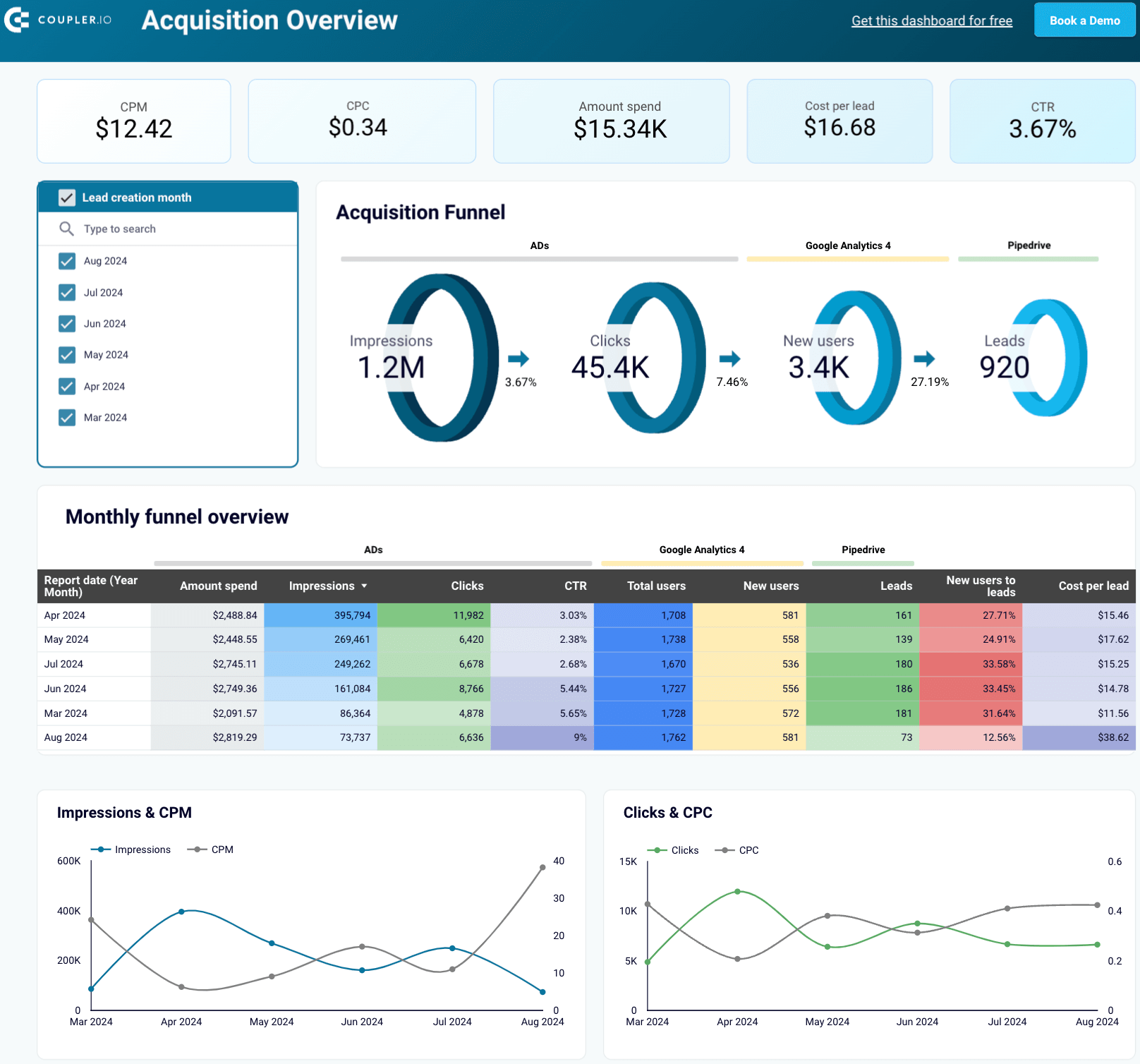
Customer acquisition dashboard for Pipedrive
Use this dashboard to analyze the effectiveness of your Pipedrive acquisition funnel.


Customer acquisition dashboard for HubSpot
Monitor your acquisition funnel using the insights from HubSpot CRM, advertising platforms, and Google Analytics 4.
Key metrics to track in SaaS reporting
Building your first report, pick a few metrics that will give the most meaningful insights about the state of a business. Then, you can gradually expand it with additional metrics you see fit. While there’s no fixed set of metrics that will make sense for every SaaS business, several make sense to start with. Below, we’ve provided a summary of each.
MRR/ARR
Arguably, the most important metrics for SaaS businesses are MRR, which is monthly recurring revenue, and its annual equivalent, ARR. Both tell you how much recurring revenue you generate in a given period. If MRR is growing over time, the business is growing, which is always good news. Stagnating or, worse, shrinking MRR can be a sign of trouble.
MRR = The sum of recurring revenue accumulated in a given month
ARR = MRR × 12
For example, if your business earns $50k between July 1st and 31st, $50k is your July MRR. Thus, the ARR is $600k.
There are a few other metrics that break down MRR into more specific categories:
- New MRR refers only to the recurring revenue generated by new users.
- Churn MRR is the revenue you lose because of the users that churned (canceled their subscriptions or no longer renewed).
- Expansion MRR counts the additional purchases by existing customers – add-ons, upgrades to their plans, etc.
- Contraction MRR is the decrease in revenue from existing customers. This metric opposes expansion MRR since users can downgrade their subscription plans or reduce usage.
- Reactivation MRR measures revenue from returning customers.
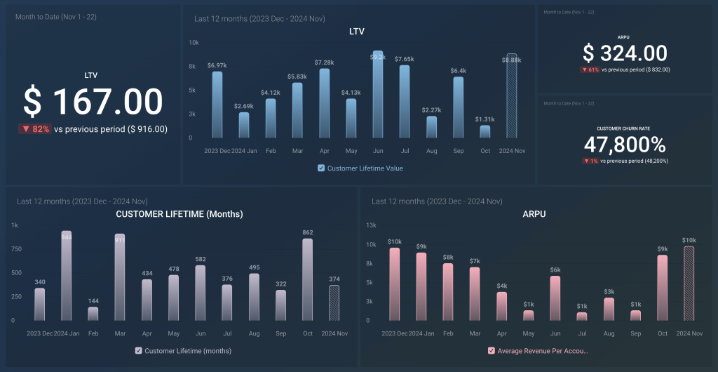
Customer LTV
Customer LTV (lifetime value) is a popular metric that predicts how much a customer will spend on a product from the moment they sign up until one day (perhaps never) resign. Knowing what a new customer may bring in the long run can predict future revenues and help justify spending financial and human resources on acquiring new clients.
Customer lifetime value = Predicted total amount a customer will spend throughout their tenure with a product
For example, if an average customer stays with a business for three years, paying $1,000 for an annual subscription and not purchasing anything else, the customer’s LTV is $3,000.
LTV works well with another metric worth monitoring – customer acquisition cost. We’ll discuss it next.
CAC
Customer acquisition cost (CAC) gives you the average price of acquiring a new customer, including all the sales and marketing efforts. There can be one overall CAC for all customer acquisitions, but often, it makes sense to break down CAC into individual acquisition channels. You may find that, for example, a CAC is much lower on Facebook Ads, while users generated through Google Search cost a lot more. In such a case, you may have good reasons to justify higher spending on Facebook advertising.
Customer acquisition cost = The average cost of acquiring a customer
Suppose you acquire 100 users from Facebook Ads at the average cost of $25/user and another 100 from LinkedIn Ads at the average cost of $15/user. In that case, the overall CAC is $20 (assuming you don’t acquire users through other channels).
Once the LTV and CAC are ready, you can calculate another metric – the LTV/CAC ratio. This tells you about the profitability of your acquisition efforts. A ratio higher than 1 indicates that the efforts are profitable and the gains outweigh the costs. On the other hand, a ratio below 1 means that you’re (at least) paying more than you will gain in the long run.
Churn rate
The churn rate indicates how many paying customers canceled their subscriptions as compared to the total number of paying customers. At the early stages of a business, churn is not something to be overly worried about. After all, recruiting a few new users is fairly easy to make up for the losses.
However, as the business and user base grow, high churn becomes challenging to mitigate. That’s why it’s worth monitoring it regularly and picking up any spikes if they occur. A sudden increase in churn rate often indicates a problem with a product that needs to be addressed as soon as possible. It could be failing payments, bugs that derail user’s efforts, and many other scenarios.
Churn rate = Number of customers that canceled their subscription ÷ Number of all paying customers
For example, if your product has 1,000 paying users and 20 of them cancel their subscriptions in May, the churn rate for May is 2%.
As mentioned earlier, churn can also be expressed as churn MRR. Here, you don’t analyze how many users dropped out but how much in recurring revenue that cost you.
Retention rate
The retention rate measures the percentage of customers a company retains over a specified period. If high, it indicates customers find value in the service and are likely to continue using it. This leads to increased customer lifetime value and reduced acquisition costs.
In contrast, low figures suggest issues such as inadequate customer support, product dissatisfaction, or better offerings from competitors. Accordingly, this results in revenue loss and higher churn rates.
Retention rate = (Customers at the end of the period ? New customers acquired) ÷ Customers at the start of the period × 100
Let’s say your company starts the month with 1,000 customers. During the month, you acquire 200 new customers and end up with 950. As a result, you have a 75% retention rate. This means your company retained most of its customers, but improvements are needed to reach a more favorable retention level.
Net promoter score
The net promoter score (NPS) helps you understand how likely customers are to recommend your services to others. This score stems from a simple survey question: “On a scale of 0 to 10, how likely are you to recommend our product to a friend or colleague?” Respondents fall into three categories based on their scores:
- Promoters (9-10): Loyal customers who will likely recommend your service.
- Passives (7-8): Satisfied customers who are unlikely to promote your service but not likely to detract from it.
- Detractors (0-6): Unhappy customers who may share negative feedback and harm your brand’s reputation.
A good NPS falls above 0, indicating more promoters than detractors. However, it’s just the minimum level of progress. To be above average, you need a score greater than 50.
NPS = % Promoters ? % Detractors
Let’s consider a hypothetical example. Out of 100 surveyed customers:
- 60% are promoters
- 20% are passives
- 20% are detractors
In this case, your net promoter score is 40. It suggests your business is doing well, but there’s room for improvement to increase the number of promoters and reduce detractors.
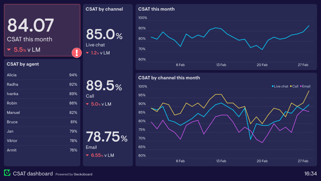
Customer satisfaction score
Customer satisfaction (CSAT) score shows how happy customers are with your service. Customers are typically asked to rate their satisfaction on a scale of 1-5 or 1-10.
A high CSAT score of 75% or above signifies intense customer satisfaction, loyalty, and a positive experience. On the contrary, figures below 50% indicate dissatisfaction and potential churn risks.
CSAT score = Number of satisfied responses ÷ Total number of responses × 100
?Here, satisfied responses are those ratings that meet or exceed a chosen threshold (often 4 or 5 on a 5-point scale).
Suppose your company receives the following feedback from a recent survey, where customers rated their satisfaction on a 5-point scale:
- 50 customers rated 5 (extremely satisfied)
- 30 customers rated 4 (satisfied)
- 10 customers rated 3 (neutral)
- 5 customers rated 2 (dissatisfied)
- 5 customers rated 1 (extremely dissatisfied)
Your CSAT score will be 80%, meaning most customers are generally happy with the service.
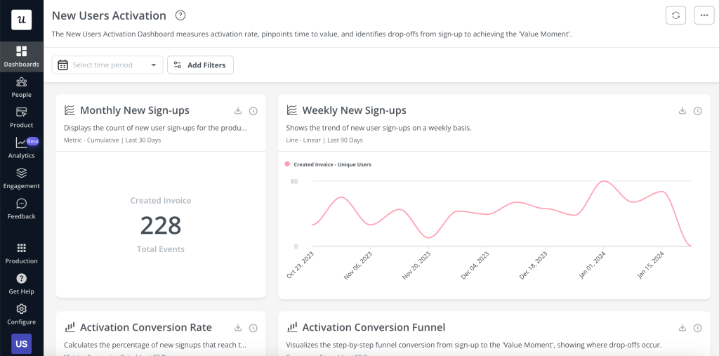
Activation rate
??The activation rate defines how effectively new users experience the value of your product within a set time after signing up. It indicates the percentage of users who reach a specific milestone, like completing an onboarding step or using a core feature.
If the activation rate is high, your users quickly learn to use key features and are likelier to continue engaging. Conversely, low numbers suggest onboarding challenges, possibly due to a confusing user experience or unclear product value. This can lead to high churn rates and lost revenue.
Activation rate = Number of activated users ÷ Total number of new users × 100
Imagine your SaaS platform gained 1,000 new users this month. Of those, 400 users completed a key activation step so that the activation rate would be 40%.
Data sources for SaaS reporting
You can draw data from multiple platforms and applications to build a SaaS performance report. Here’s a breakdown of the critical data sources:
CRMs
Customer relationship management (CRM) platforms provide data like customer contact information, interaction history, lead and opportunity details, purchase history, and customer segmentation. They also track feedback, satisfaction levels, engagement with marketing campaigns, service requests, and case resolutions. Analyze this data to improve your sales, marketing, and customer service efforts.
Popular CRMs: Salesforce, Pipedrive, HubSpot, Zoho
Analytics tools
Various analytics platforms let you monitor and understand user activity. For example, Google Analytics 4 is widely used for tracking website traffic. It records user actions as individual events, together with information about the source of users and sessions. In comparison, Amplitude shows how each individual interacts with your application or website, making it particularly helpful for product analytics.
Popular analytics tools: Google Analytics 4, Amplitude
Payment platforms
Systems like Stripe, Chargebee, and Braintree capture critical billing data, which is especially valuable for monitoring MRR. They provide detailed invoice and subscription records, which are ideal for tracking revenue streams. If you’re running a B2B business with larger invoices and longer billing cycles, you can use accounting platforms like QuickBooks or Xero to collect transaction data.
Popular payment platforms: Stripe, Chargebee, Braintree, QuickBooks, Xero
User activity monitoring tools
These tools provide user activity logs, which capture actions taken by both external customers and internal users. To track user actions, you can use built-in logging tools provided by your platform or cloud provider, such as AWS CloudTrail and Amazon CloudWatch for AWS services, as well as Google Cloud Audit Logs and Logs Explorer for Google Cloud resources.
Additionally, you can set up custom logging in your application to monitor specific actions through API calls. Tools like Microsoft Clarity and Hotjar can also record user sessions, providing heatmaps and video recordings to analyze user behavior.
Popular user activity monitoring tools: AWS CloudTrail, Amazon CloudWatch, Google Cloud Audit Logs, Google Logs Explorer, Microsoft Clarity, Hotjar
Tools and platforms to automate SaaS reporting
To run proper SaaS reporting, you’ll need the appropriate toolset. It should be automated and accessible, requiring zero effort on your side apart from the initial setup. You may find yourself in a meeting or running to one, urgently needing to look up a relevant metric so you can plan on improving it right away. If you don’t have that data in front of you or it’s inconsistent, you’re missing out on a critical context.
Now, look at some of the top tools commonly used for reporting in SaaS.
Coupler.io
Coupler.io allows you to build custom reports for your needs. You can draw data from 60+ applications, adjust it on the go, import it into spreadsheets or BI tools, and set up automated report scheduling. In addition, Coupler.io offers free templates for visualized reports, such as Google Sheets dashboards and templates for Looker Studio, Power BI, and Tableau.

BI tools
BI tools help turn your metrics into actionable insights about SaaS performance and trends. Here, you can build dynamic interactive dashboards to present complex information understandably and share it with teammates or stakeholders. Options vary from Google Sheets to more advanced options like Looker Studio, Tableau, Qlik, or Power BI.

Using APIs for automated data collection
You may build a simple dashboard demonstrating just the key metrics or opt for a SaaS dashboard encompassing entire product funnels, different marketing channels, detailed website analytics, and more.
Most SaaS connectors use APIs from the data sources and destinations they support. Still, there might be instances where your connector doesn’t integrate with certain apps. Or you may need to export more than just the reports and metrics the connector allows.
In these cases, you can create a custom API integration tailored to your reporting needs. However, this requires certain technical and coding skills in Python, Apps Script, JavaScript, or other programming languages. If you lack these skills, you’ll need the assistance of data analysts or developers. Custom integrations also require regular maintenance to ensure compatibility with updates to platform APIs.
The benefits of this approach are that you can connect any sources and destinations you need, expand the variety of data you can export, and configure custom triggers or alerts.
Advanced SaaS reporting techniques
Cohort analysis for understanding retention
Cohort analysis is a data-driven approach that lets you track and analyze specific groups of users, known as cohorts, based on shared traits or behaviors over time. This allows you to understand how users’ engagement changes, spot patterns in their activity, and identify critical points when users may be more likely to churn or stay engaged.
There are two primary types of cohort analysis: acquisition-based and behavior-based. Both offer insights into user retention, yet each type organizes users differently, answering distinct questions about their journey with your product:
- Acquisition cohorts group users by the time they first sign up for your service. This approach is used to track how new users engage over time. For instance, you can analyze whether users who joined during a specific period are more likely to continue using your service than those from other periods.
- Behavioral cohorts are based on specific in-app actions, such as completing onboarding or using a particular feature. This analysis helps you understand how specific behaviors impact user engagement and retention, as well as which actions drive the most long-term value.
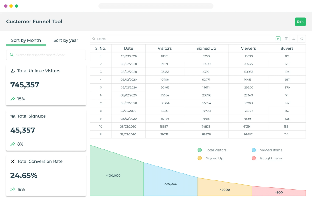
Funnel analysis for conversion optimization
Conversion funnel analysis is a technique for understanding the flow of customers from initial engagement to final conversion. This reveals insights into customer behavior and highlights where improvements can make the most significant impact. Let’s break down how funnel analysis can be helpful:
- Identifying the problems: Funnel analysis lets you pinpoint exactly where potential customers are dropping off and detect bottlenecks that prevent conversions. This visibility is needed to optimize each stage and minimize loss.
- Removing friction: Once you’ve identified problem areas, you can take steps to eliminate any friction in the funnel. By smoothing transitions from one stage to the next, you can significantly enhance user experience.
- Finding out what’s working: Funnel analysis not only reveals weaknesses but also highlights strengths. By identifying effective practices – such as messages or ads that resonate most with your audience – you can replicate these to maximize performance.
Customer segmentation with behavioral data
Behavioral segmentation involves analyzing customer behavior data to enhance SaaS marketing strategies beyond demographic information. This approach focuses on how customers engage with your product to anticipate future needs and boost satisfaction.
Five essential types of behavioral segmentation in SaaS:
- Segmentation by customer journey stage: Users engage differently depending on where they are in their journey. By segmenting based on the journey stage, you can deliver relevant messages that align with their current needs.
- Segmentation by product usage and engagement: This allows you to adapt your strategy to each user’s activity level. Segments based on engagement can differentiate active users from those who may need additional support.
- Segmentation by customer loyalty: Customer loyalty data, such as NPS, lets you identify advocates likely to refer others and help identify detractors at risk of churn.
- Segmentation by customer satisfaction: Customer satisfaction metrics like CSAT score and CES help you tailor the user experience by addressing friction points.
- Segmentation by job-to-be-done (JTBD): Behavioral segmentation is further strengthened by understanding the specific goals users aim to achieve or their “jobs to be done.” By identifying these goals, you can proactively support users.
Implementing machine learning for predictive insights
Machine learning allows systems to autonomously learn from data and continuously refine their performance through experience rather than relying on pre-set instructions. This capability enables predictive analytics, which is about forecasting future trends, unlike traditional analytics, which focuses on past performance. By implementing machine learning in SaaS analytics, you can proactively navigate market dynamics, anticipate customer preferences, and manage risks.
SaaS reporting best practices
Set up regular reporting cycles
With regular reporting cycles, you can maintain consistency and clarity in your SaaS business performance analysis. For example, monthly reports allow for more frequent updates, ensuring timely action, while quarterly reports help you assess long-term goals and strategies. Determine the right reporting cadence based on your business needs and the pace at which data changes.
Balance detailed vs. high-level metrics
Detailed metrics, such as those related to user engagement or product usage, offer insights that help you make precise, data-driven decisions. However, they can be overwhelming if presented to stakeholders who need a high-level overview. On the other hand, high-level metrics, such as MRR or churn rate, offer quick insights into the business’s overall health. Tailor the level of detail based on the audience and the goals of each report, ensuring clarity without losing important information.
Customize reports for different stakeholders
Different stakeholders require different perspectives on the data. Executives, for example, focus on high-level strategic metrics like revenue growth and customer acquisition costs. Product teams, however, may need more granular data on user behavior, feature usage, and product adoption. Marketing teams often look for metrics related to lead generation, conversion rates, and campaign performance. Customizing reports for each group ensures they get the most relevant information in a digestible format.
Reporting for SaaS – summing up
There are many different ways to get started with reporting in SaaS. You can manually import critical metrics from various data sources into spreadsheets or BI tools. Alternatively, if you have the skills or qualified assistance, you could create a custom API integration.
There’s also a third option: with Coupler.io, you can automate your data reporting and schedule report updates. Additionally, Coupler.io offers pre-designed dashboard templates for various areas, ranging from SEO dashboards to marketing and sales dashboards. You can use them to bring your data into visual insights automatically and within minutes.
Try Coupler.io for free and see how it optimizes your SaaS reporting!
Automate SaaS reporting with Coupler.io
Get started for free