There are plenty of top client reporting tools competing for your attention. The hard part isn’t finding one. It’s figuring out which one actually fits how you collect data, build reports, and share with clients.
I’ve broken them down by type, from built-in CRM reporting and marketing dashboards to BI and data integration platforms, so you can narrow down the right category first and then compare the best tools within it.
What are the best client reporting tools in 2026 (by categories)?
Client reporting tools generally fall into four categories: CRM software, marketing reporting tools, BI platforms, and data integration tools.
CRM built-in reporting
If most of your data already lives in your CRM, or your client reporting mostly tracks customer and sales data, CRM built-in reporting is enough. CRM built-in reporting tools give you standard sales, pipeline, and customer metrics directly from live CRM data. And CRMs also natively integrate with some popular outside sources, so you can bring that data into the same dashboards as well.
The customization options are limited here. You can’t deeply transform the data or do much advanced analysis.
Marketing reporting tools
Client reporting tools for marketing gather data from different advertising, analytics, and social media channels into clean dashboards and reports.
They’re useful for marketing teams and agencies who report on campaign performance across multiple channels or clients. However, these are specially designed for marketing data, so they’re less suitable when your client reports need comparison with broader sales, finance, or operational data.
BI platforms
While CRMs and marketing reporting tools center around specific use cases like customer or marketing data, BI tools are much broader. They natively connect to different types of data sources, bring the data together, and give you much more flexibility in how you build the reports.
You can start with prebuilt templates or build more advanced reports programmatically. So technical users generally get the most out of these tools.
Data integration reporting platforms
Data integration platforms take that flexibility a step further. A BI platform may not directly connect to every source you need. When that happens, your engineering team has to build the missing connection and maintain it. Instead, use a data integration platform to set up those connections through its UI. And you’re not limited to sending data to just BI destinations. You can schedule data flows to data warehouses, CRMs, AI tools, and other destinations you need.
If you don’t have a specific destination in mind, some data integration platforms also let you analyze the connected data and build reports directly inside the platform.
So, consider this category if you’re a non-technical user who needs to connect multiple data sources, automate data flows in UI, and build reports.


Get a Coupler.io walkthrough for your reporting stack
Book a demoTop client reporting tools compared
| Tool | Category | Best for | Key strength | Pricing | G2 Score |
| HubSpot Reporting & Dashboards | CRM-native reporting | Teams already using HubSpot | Consistent reporting UI across every hub | Free plan; paid plan from $20/seat/month | 4.4/5 |
| Pipedrive Insights | CRM-native reporting | Sales teams that want simple pipeline reporting | AI-generated reports from text prompts | From $14/user/month | 4.3/5 |
| Salesforce | CRM-native reporting | Enterprise CRM reporting at scale | Dynamic dashboards tied to user access | Free plan for 2 users; paid from $25/user/month | 4.4/5 |
| Coupler.io | Data integration & reporting | Combined reporting from multiple data sources | Analytical Engine for accurate AI analysis, Connects to 420+ data sources | 7-day free trial; paid from $24/month | 4.8/5 |
| Adverity Connect | Data integration & reporting | Managing standardized marketing data at scale | Advanced data mapping and governance | Custom pricing only | 4.4/5 |
| AgencyAnalytics | Marketing & agency reporting | Agencies managing many clients | White-labeled dashboards | $20/client/month | 4.7/5 |
| Whatagraph | Marketing & agency reporting | Marketing teams building cross-channel client reports | Client-ready reporting without a separate BI tool | From $812/month | 4.5/5 |
| Databox | Marketing & agency reporting | Teams that want dashboards, targets, and forecasting together | Dashboards combined with KPI and OKR tracking | Free plan; paid from $71/month | 4.4/5 |
| Supermetrics | Marketing & agency reporting | Moving marketing data into spreadsheets or warehouses | Unlimited data volume on every plan | From $39/month | 4.4/5 |
| Google Data Studio (ex Looker Studio) | BI & data visualization | Solo marketers and small teams reporting mostly on Google data | Completely free | Free | 4.4/5 |
| Power BI | BI & data visualization | Microsoft-stack teams | Advanced data modeling and DAX transformations | Free version; Pro from $14/user/month | 4.5/5 |
| Klipfolio | BI & data visualization | Agencies managing customizable dashboards across many clients | Reusable dashboards and data sources shared across clients | From $160/month | 4.5/5 |
CRM platform-native reporting
1. HubSpot Reporting & Dashboards

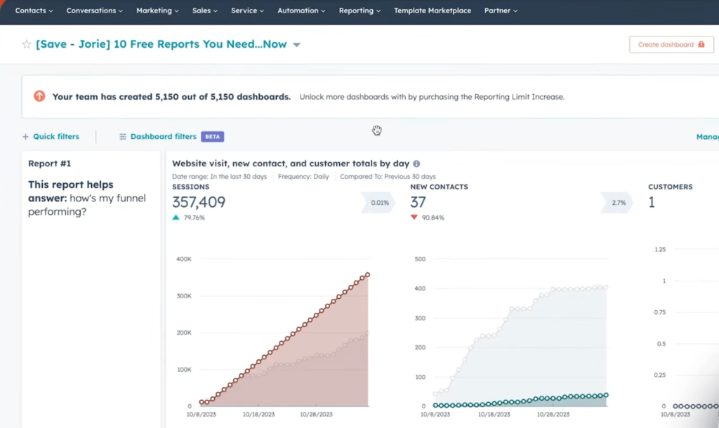
HubSpot is an all-in-one platform with dedicated hubs (software) for marketing, sales, service, content management, and operations.
HubSpot Reports is the main feature relevant to client reporting. There are both prebuilt report templates and custom reporting options. The prebuilt method is straightforward: choose a template, save it to your report library, and add it to a dashboard. These reports are also customizable, so you don’t necessarily always start from scratch to get the view you need.
For more specific reporting needs, HubSpot’s custom report builder lets you build reports from scratch.
Pros
- The UI stays consistent across the hubs, so you don’t have to learn a different reporting interface every time you move from sales to marketing or customer data.
- HubSpot’s free CRM tier goes well beyond a typical trial with up to 1 million contacts and unlimited free users. If you are a small team or individual, you get to send 2000 free emails per month for outbound sequences.
- HubSpot Academy goes beyond teaching how to use the platform. Its courses cover broader sales and marketing concepts and how to apply them with HubSpot.
Cons
- HubSpot reports primarily work with data available across its hubs. So, if you use external tools like Mailchimp, Google Analytics, Salesforce, or Semrush, you can’t simply bring all that data into HubSpot reports.
- The Free and Starter plans only offer basic reporting. You need a Professional or Enterprise plan to build custom reports from scratch.
Pricing: HubSpot offers a free plan for up to 2 users with core CRM, marketing, sales, and service tools. Paid plans start at $20 per seat/month at the standard rate, with higher tiers adding advanced automation, customization, and higher usage limits.
2. Pipedrive Insights

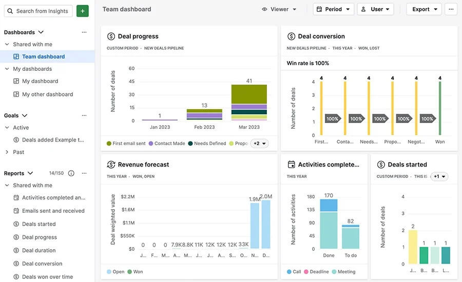
Pipedrive is a CRM built around a visual sales pipeline. Every deal appears as a card on a Kanban-style board, so you can see at a glance which stage each deal is in and what needs to happen next. Its “Insights” feature adds reporting on top of this pipeline data.
Insights has three main sections: reports, dashboards, and goals. The reports section contains customizable templates that let you create visual charts and graphs of your sales performance. The dashboard is the combined view of these reports.
Pipedrive also offers forecasting reports features that project future sales and revenue based on your pipeline data. You then use the Goals section to set and track sales targets.
Pros
- The visual pipeline with Kanban cards provides a clear overview of all your deals, helping you track progress at every stage.
- AI-based reporting lets you create reports from text prompts.
- 300+ native integrations help bring Pipedrive into a broader sales and reporting stack.
Cons
- Forecasting reporting features require higher-tier plans.
- Workflow automation is less extensive than what HubSpot or Salesforce offers.
Pricing: Pipedrive has four tiers, lite, growth, premium, and ultimate, ranging from $14 per user/month to $69 per user per month. Forecast reports and full email sync features are only available from the Growth tier up, and usage limits on seats, reports, and automations increase as you move up the tiers.
3. Salesforce

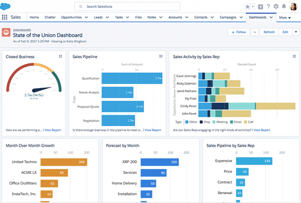
Salesforce is a popular CRM for managing customer data, sales operations, and marketing campaigns. Its reporting tools let you analyze this data directly within the platform.
Salesforce provides standard reports for accounts, contacts, leads, opportunities, campaigns, activities, products, and cases. Depending on what you need to show, pick from different report types. For example, tabular reports for straightforward lists, summary reports for grouped and aggregated metrics, or joined reports to bring multiple report blocks into one view.
A useful feature for client reporting is report duplication. Once you have a report, you can duplicate it and quickly create variations for different clients or audiences.
Pros
- Dynamic dashboards show different views of the same dashboard based on each user’s access permissions.
- It has strong community support and is easy to find sales reps who know how to use this software.
- Rich integrations with Salesforce AgentExchange. It is the official enterprise cloud marketplace to install third-party apps and integrate with salesforce.
- Historical trend reporting lets you compare how opportunity, forecast, and other supported data changes over time.
Cons
- Salesforce reporting remains tightly tied to its data model and reporting architecture.
- Salesforce has a steep learning curve. With so many features and configuration options, users need proper training to use it well.
Pricing: Salesforce has a free plan for up to two users, and its paid plans run from $25 to $550 per user/month. You get the essentials with Starter, while Pro gives you more room for automation and customization. Once you move into Core ($195/user/month) and above, you’re mainly paying for more advanced AI, analytics, security, and enterprise-level capabilities.
Data integration/automation tools for client reporting
4. Coupler.io

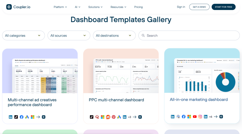
Coupler.io is a no-code data integration and AI analytics platform that connects 420+ data sources. Basically, anyone without coding experience can connect sources, transform the data, and send it to their reporting destination.
The transformation layer supports filtering, sorting, joining, appending different datasets, and formulas to derive custom metrics, giving you good control over how the data is prepared before reporting.
If you don’t have a separate reporting destination, build dashboards directly in Coupler.io and analyze the data with Coupler AI. It includes AI Agent for asking questions about your data inside the platform, AI Integrations for analyzing prepared data in Claude, ChatGPT, Gemini, and other MCP-compatible tools, and Skills for running repeatable analytical workflows.
Coupler.io is also platform agnostic. You can keep existing dashboards in Power BI or Data Studio automatically updated on a schedule, along with the same data integrated with AI for further analysis and reporting.
Pros
- Simple UI flow to connect almost any source to destination without needing technical skills.
- Field mapping is there when you need more control over how data is standardized, but it’s optional, so simpler workflows don’t become unnecessarily complex.
- The Analytical Engine keeps calculations out of the AI model, reducing hallucinated numbers in the AI-powered insights.
- Supports both built-in AI analysis and external AI workflows without requiring you to move raw data manually between tools.
Cons
- Highly complex or unique API transformations might still require manual scripting or data warehousing.
Pricing: Coupler.io offers a 7-day free trial with no credit card required. For paid plans, it starts at $24 per month for up to 3 accounts. Its max plan is Pro at $199 per month for unlimited users, hourly data refreshes, unlimited destinations, and more. If you want even less latency for refreshes or additional feature requests, there’s a custom enterprise plan.
Explore the full Coupler.io platform in a walkthrough
Book a demo5. Adverity Connect

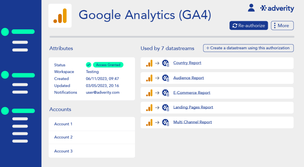
Adverity Connect is an ETL platform that brings marketing data from different sources together for reporting. It connects client data from advertising, analytics, CRM, and other platforms, transforms it, and sends it to reporting destinations such as Looker Studio, Power BI, or Tableau.
Where Adverity goes deeper is data standardization. Its Data Mapping and Data Dictionary features need you to map fields from different sources to common target field definitions. That’s useful when you’re reporting across multiple clients, channels, or markets and need everyone working with the same definitions. But this also adds another layer to the setup.
Pros
- Adverity combines no-code transformations with custom scripts, so technical teams aren’t limited by the UI features when reporting logic gets complex.
- Adverity has a dedicated Data Dictionary with reusable target fields available across all workspaces. This helps organizations establish standardized definitions for consistent reporting.
- Its built-in data quality tools automatically catch anomalies before they reach client-facing dashboards.
Cons
- Adverity doesn’t publish pricing. You need to contact the company before you compare its actual cost with other client reporting tools.
- Data mapping, target fields, and governance give technical teams flexibility, but they also introduce complexity for marketers.
- Its advanced mapping and transformation workflows require technical expertise.
Pricing: Adverity doesn’t publish its pricing publicly, so you need to contact its sales team for a quote.
Client reporting tools for marketing & agency reporting
6. AgencyAnalytics

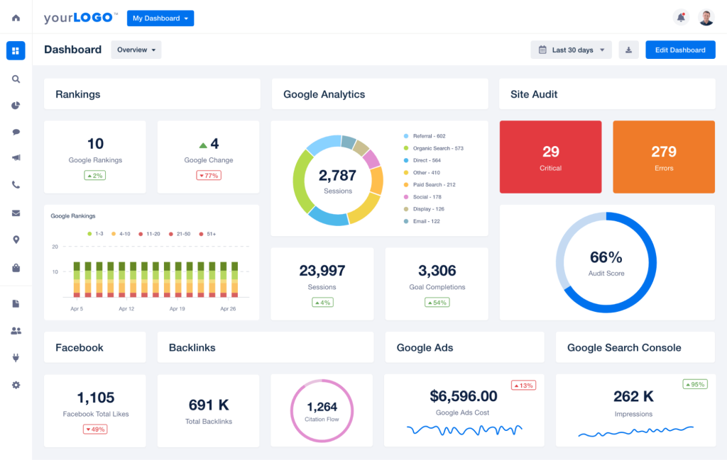
AgencyAnalytics is built for marketing agencies that handle various clients for reporting. It connects with 80+ marketing data sources across SEO, PPC, social media, and analytics, then pulls that data into the reports and dashboards you build.
The main advantage is that you don’t have to build every client dashboard from scratch. Agencies standardize dashboards across clients, populate each one with client-specific data, and schedule reports for automatic delivery. If one template doesn’t work for everyone, group similar clients and use different templates for each group. This cuts repetitive work without sacrificing personalization.
AgencyAnalytics also has built-in SEO tools such as rank tracking and site auditing. So, if your clients only need basic SEO reporting, you don’t necessarily need another SEO platform just to collect those metrics.
Pros
- AgencyAnalytics allows agencies to customize dashboards and reports with their own logos, custom color schemes, and custom domains for a branded client experience.
- Its rank tracking and site auditing reduces the need for separate tools for basic SEO reporting.
- The overall platform experience is easy to set up and start using.
- Higher-tier plans include AI-generated performance summaries.
Cons
- Per-client pricing scaling adds up cost with every new client.
- Less flexible than dedicated BI tools for complex analysis.
Pricing: AgencyAnalytics charges $20 per client/month, so the cost scales with the number of clients you manage. The good part is that data sources, reports, dashboards, and staff and user seats are unlimited. If you manage 25+ clients, there’s an Enterprise plan with custom pricing and volume discounts.
7. Whatagraph

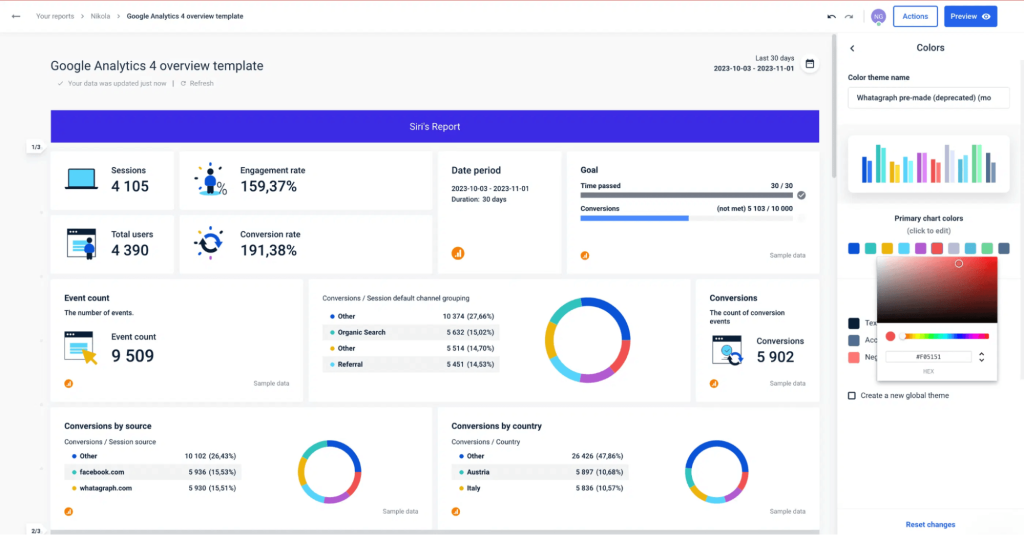
Whatagraph focuses on creating and delivering cross-channel marketing reports without needing a separate BI tool. Its drag-and-drop builder and pre-built templates make setup relatively quick for first-timers.
Reports combine data from multiple marketing channels with text, images, and branding to add context around the numbers. Once ready, schedule recurring delivery instead of rebuilding and sending reports every cycle.
Pros
- Whatagraph works for both agencies and in-house marketing teams, unlike AgencyAnalytics, which is more specifically built for agencies.
- No need for separate BI, white-labeling, or report delivery tools.
- You can build reports from text prompts, chat with your data, and automatically generate insights.
- It supports 303+ connectors, which is a broader connector coverage than Supermetrics and close to Coupler.io.
Cons
- Less suitable for agencies managing many clients that need consistent reporting across accounts.
- Not for content-focused teams that need strong built-in SEO tools.
- Very expensive entry price at $812/month.
Pricing: Whatagraph starts at $812/month for the Max plan with 50 source credits. Users and reports are unlimited, but you’ll need more credits as you connect more client accounts. For premium integrations, BigQuery and Looker Studio destinations, API access, and other enterprise features, you need the custom-priced Prime plan.
8. Databox

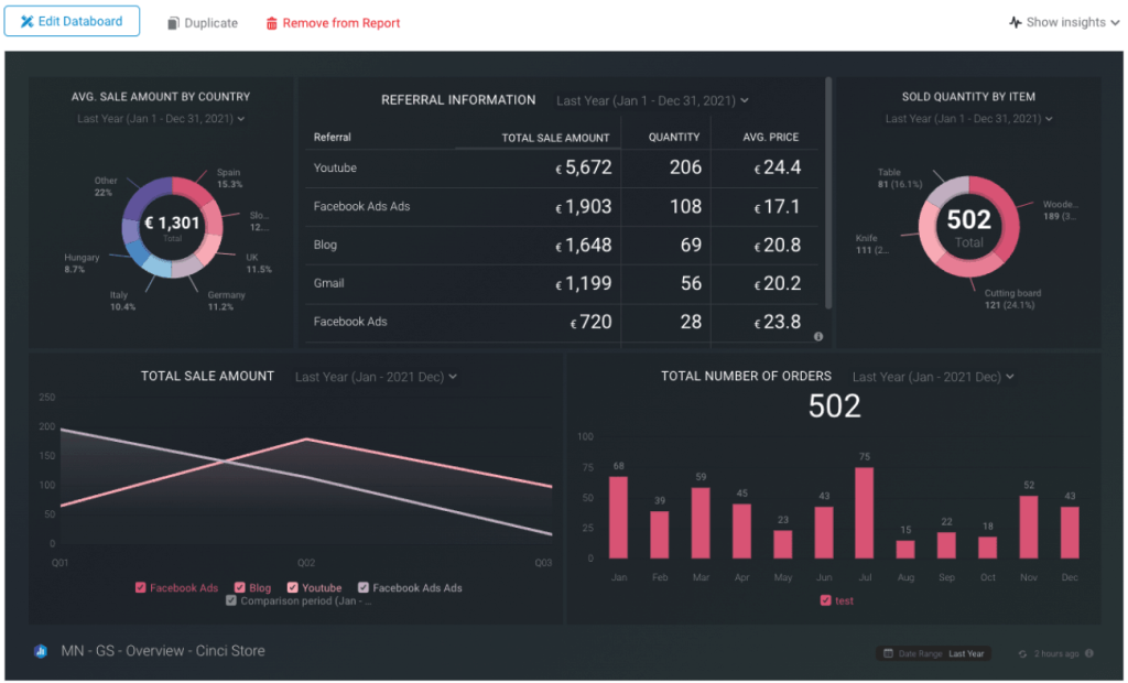
Unlike data connector tools, Databox is a complete analytics platform: it connects to your sources, stores the data, builds dashboards, tracks key metrics against targets, and delivers reports.
On Premium plans, Databox also forecasts future performance based on historical trends. This is useful for goal-setting and budget planning, although forecast accuracy depends on the quality and amount of historical data.
I’d specifically call it over AgencyAnalytics if you need more flexibility and control over dashboard design and performance tracking across clients. That flexibility is primarily at the reporting layer, though. Teams that need highly granular data modeling or advanced custom metrics may still find Databox limiting.
Pros
- Pricing is competitive for small to midsize teams, and onboarding is straightforward.
- No per-seat fees, great for large teams.
- OKR tracking is rare among marketing reporting tools; most competitors in this list stop at KPI dashboards without a strategic goal layer.
- Strong mobile app.
Cons
- No easy way to export raw data to warehouses for external analysis.
- Its broader cross-functional flexibility means you don’t get the same depth of pre-built marketing templates and agency-specific workflows as AgencyAnalytics.
Pricing: Databox has a free plan for one user with three data sources and 50 AI credits per month. Paid plans start at $71/month when billed annually for solo analysts, while Team plans start at $199/month for three users, 10 data sources, and 500 AI credits. As you move up, you mainly get more users, data sources, AI credits, and collaboration features, with custom pricing available for larger or more hands-on setups.
9. Supermetrics

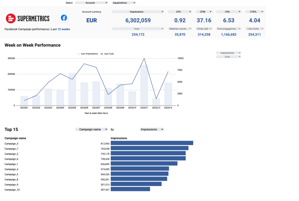
Supermetrics’ main purpose is to move marketing data from multiple sources into the tools you already use. It connects to marketing platforms like Google Ads, Facebook Ads, and LinkedIn. Then you choose your destination from Google Sheets, Data Studio, BigQuery, Excel, Snowflake, or others. Supermetrics then updates destinations with the latest data based on your schedule.
It also introduced Supermetrics Studio for building AI dashboards. It connects with Claude, so you can build dashboards in Claude and push them to Supermetrics Studio for persistent, shareable reporting.
Pros
- Offers intuitive, easy setup for non-technical users.
- Data volume is unlimited on all plans.
- Detailed filters (by campaign, platform, or custom metrics) let you only fetch what matters.
Cons
- Limited data sources connectors; only up to 10 sources in available plans.
- Per-source, destination, and user pricing scales up quickly.
Pricing: Plans start at $39/month and go up to $499/month for Pro. For enterprise plans, you will receive a quote by reaching out to their sales team. All standard plans limit the number of users and destinations. Pro includes up to three users, with additional users costing extra. Each plan also includes only one destination and you have to pay an extra ~$187/month per additional destination.
BI & data visualization platforms
10. Google Data Studio

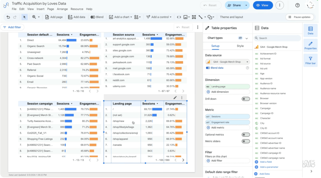
Google Data Studio (formerly Looker Studio) is a free reporting and data visualization tool. It fits naturally if your client data already lives in Google products because Google provides connectors for sources like Google Analytics, Google Ads, Google Sheets, and BigQuery. You can also connect other platforms through partner connectors.
The drag-and-drop editor lets you build reports with charts, tables, filters, date controls, and calculated fields for custom metrics. For client reporting, sharing works much like other Google products. Give specific clients view access, collaborate with other editors, or share the report through a link. This makes Data Studio a good option when you need interactive client dashboards without paying for a full BI platform.
Pros
- The standard version is free, making it an easy starting point for client dashboards.
- Works particularly well with Google Analytics, Google Ads, Google Sheets, BigQuery, and the broader Google ecosystem.
- Reports are highly customizable with charts, filters, calculated fields, branding, and interactive controls.
- Familiar Google-style sharing makes it easy to give clients view access without sending static reports.
Cons
- Advanced data preparation and modeling are limited compared with BI platforms.
- Reporting outside the Google ecosystem often depends on partner connectors, which may come with additional costs.
Pricing: The standard version of Data Studio is free. Its paid version, Looker Studio Pro, costs $9 per user per month and adds enterprise collaboration, administration, and support features for organizations that need more control over reports and users.
11. Power BI

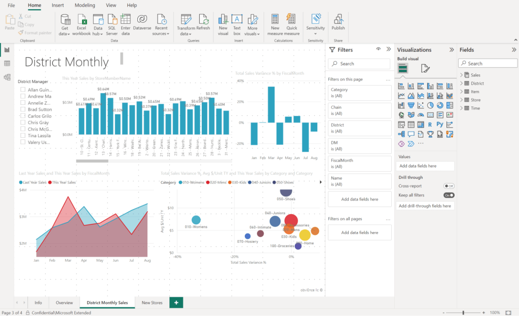
Microsoft Power BI naturally fits in as a data visualization tool if your team lives in the Microsoft stack. The platform sits at the intersection of self-service analytics and enterprise BI. The same platform lets a marketing manager drag-and-drop a traffic report and a technical user write a custom transformation script in M language.
Connect it to your preferred data source from the pool of supported sources like SQL databases, Salesforce, Google BigQuery, and Snowflake. Then clean and transform the data with Power Query UI or M language.
Then you build a data model and create custom metrics using DAX. DAX (Data Analysis Expressions) is Power BI’s calculation language, and it’s where the platform separates from lightweight competitors.
Pros
- At $10/user/month for Pro, Power BI delivers enterprise-grade analytics at a fraction of competitors.
- Power BI desktop version is free.
- You can combine related datasets and use DAX to create custom KPIs, calculations, and more advanced client reporting metrics.
- APIs and Power BI Embedded let technical teams automate workflows and embed reports directly into client portals or applications.
- Integrates well with Excel, Azure, Microsoft Fabric, Teams, and other Microsoft products.
Cons
- Unlike AgencyAnalytics or Whatagraph, Power BI isn’t specifically designed around agency reporting workflows.
- DAX’s learning curve is steep for non technical users.
- Per-user pricing adds up when many clients need report access.
Pricing: Power BI free version supports basic reporting. Once sharing and collaboration come into the picture, Pro costs $14 per user/month, or $24 for Premium Per User if you need larger models and more frequent refreshes. Bigger teams can also go with capacity-based Fabric pricing instead of paying purely per user.
12. Klipfolio
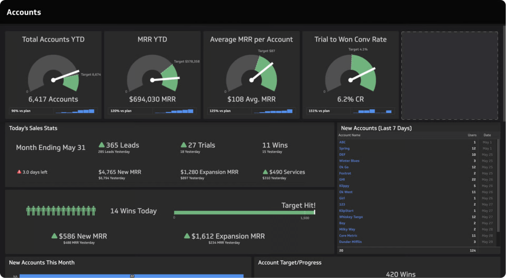
Klipfolio provides two parts: PowerMetrics and Klips. For client reporting, Klips is the more relevant part because it supports automated reports, dashboard sharing, embedding, and white-labeling.
Klips connects to 130+ data integrations, including marketing platforms, spreadsheets, SQL databases, and APIs. Once connected, you can build individual visual components called Klips then combine them into dashboards.
Klipfolio’s real advantage for agencies is how it handles multiple clients. It manages separate client dashboards from a parent account and provides reusable dashboards, Klips, and data sources across client accounts.
Pros
- Unlimited users across all standard plans, so client access doesn’t add per-seat costs.
- Strong customization, from formulas and data modeling to custom queries and REST APIs.
- Reuse dashboards, Klips, and data sources across client accounts instead of rebuilding the same reporting setup.
- Supports dashboard sharing, embedding, and agency-focused white-labeling.
Cons
- White-labeling is a paid add-on rather than a standard feature, currently listed at $299/month when billed annually.
- Standard plans limit the number of dashboards, starting with three dashboards on the Base plan.
Pricing: Klips starts at $160/month for 5 dashboards. As you move up the plans, you mainly pay for more dashboards and faster refreshes, while users remain unlimited. The highest Premium plan costs $900/month for 80 dashboards. If you want white-label dashboards, that’s another $299/month.
Discuss multi-client agency reporting with Coupler.io
Book a demoWhat to look for in automated client reporting tools?
With so many tools offering dashboards, integrations, automation, and now AI, they can start looking very similar on paper. So, when comparing client reporting automation tools, focus on these areas.
Data-connector depth: If your data is scattered across these sources, check whether the tool supports native integrations with them. The more it supports directly, the fewer custom integrations you have to build and maintain yourself.
Automation/scheduling: There’s a difference between refreshing a dashboard every day and automating the entire reporting cycle. Some tools refresh the underlying data on a schedule, generate the report, and send it to clients as a PDF or live link at a set frequency. More advanced options include sending a report only after fresh data arrives, setting different schedules for different clients, requiring approval before a report goes out, or triggering alerts when a KPI crosses a threshold. These features are the real differentiators when comparing the top client reporting tools automation capabilities.
AI-powered Reporting: Coupler.io connects your data to external tools like Claude and ChatGPT, where you can prompt, build the report, and move it back into the client reporting workflow. It also has a built-in AI agent to chat with your data. Look for these AI features to speed up your reporting workflows.
Customization: White-labeling is useful if reports go directly to clients, but customization goes beyond adding your logo. Look at how much control you get over metric definitions, layouts, chart types, filters, and the underlying data. Some tools keep everything in the UI, while others support custom transformation scripts for more control. Pick the level that matches your reporting needs and technical expertise.
Security: If you’re handling sensitive client data, look for encryption, access controls, audit logs, and how the platform handles data when AI is involved. For example, Coupler.io uses its Analytical Engine to run calculations internally and passes only the required results and data samples to the AI. This enables AI-powered analysis without sending the entire underlying dataset to the model.
Coupler.io checks all these boxes to be the best client reporting tools. Try it free with no credit card required and build your first reporting workflow.
Build your first client reporting workflow with Coupler.io
Book a demoHow to build a great client report?
Step 1: Define what the client needs from the report
Before choosing metrics or building a dashboard, be specific about client requirements and what they should be able to do with the report. For example, if a client wants a monthly report on sales performance across regions, clarify whether their focus is on regional sales, revenue, overall buying patterns, or all three. Then you’ll have a clear reporting objective and know what metrics and data you need.
Step 2: Create a reporting template
With the requirements clear, turn them into a reporting template you reuse every month or quarter. Decide which metrics and KPIs need to appear, but don’t show numbers in isolation. Give them enough context to be meaningful, whether that’s the previous reporting period, a target, a benchmark, or a trend over time.
Step 3: Identify and gather the required data
Work backward from each metric to the data required to calculate it. Identify where that data lives, whether that’s a CRM, analytics platform, advertising account, database, or spreadsheet. Then check whether your reporting tool supports those sources directly or how you’ll connect the ones it doesn’t.
Step 4: Connect your data to the reporting workflow
Next build the connection between your data sources and wherever the report lives. That can be connecting sources directly to a dashboard, moving data through a warehouse or integration tool, or feeding it into a reporting template. The point is to avoid exporting, copying, and reconciling the same data every reporting cycle.
Step 5: Schedule and share the report
Once the reporting workflow is in place, decide when the report should refresh and when the client should receive it. Monthly or quarterly reports can populate and go out automatically, while live dashboards refresh more frequently when clients need an ongoing view of performance.
FAQs
What is the difference between a client reporting tool and a BI tool?
A client reporting tool focuses on collecting performance data, turning it into reports, and sharing those reports with clients on a recurring basis. BI tools go deeper into data modeling, custom calculations, and analysis across broader business use cases. So BI tools work for client reporting too, but dedicated client reporting tools are built for that one job.
What are different types of client reports?
Different types of client reports include status reports, KPI dashboards, cash flow charts, or overall performance reports. The right type depends on what the client wants to measure and the decisions they need to make from the data.
Which tools simplify client reporting workflows?
Coupler.io is useful when you need to bring data from multiple sources together and automate how it flows into reports. It also supports built-in AI for generating reporting summaries and connections to AI tools like Claude and ChatGPT. Other good options include AgencyAnalytics and Whatagraph for marketing and agency-focused reporting, while Databox and Klipfolio offer more flexible dashboards.
What should a client report include?
A client report should include the KPIs tied to the client’s goals, comparisons with previous periods or targets, and enough context to explain what changed. More importantly, highlight the main takeaways, what drove the results, and where the client may need to take action next.