How to Use Google Data Studio (Looker Studio) Charts: An A to Z Guide

Can you imagine turning your website traffic data into a vibrant heatmap with user behavior patterns? Or presenting your sales figures in an interactive chart for visitors to explore specific regions? In this write-up, we explore the essential types of Google Data Studio (Looker Studio) charts, their properties, and use cases. Also, we show you how to add them to your reports efficiently.
What is the value of Google Data Studio (Looker Studio) charts?
Looker Studio charts are customizable visual representations of data. They enable dynamic exploration and analysis in reports and dashboards for specific data visualization needs for any sized business.
Presenting data visually is like magic – it turns boring numbers into eye-catching charts and graphs. As a result, users can easily understand and use the data.
Here’s why it’s so important:
Better understanding: Our brains love visuals. Philip Cooper, the ex-president of Computer Pictures Corporation, found that people understand visual information 60,000 times faster than written text.
Remember more: Visuals stick in our minds. We remember visual information much better than text forms of data. Also, we can easily recall and use it later on.
Clear communication: Visuals are a universal language. They make complex data easy to understand for everyone, no matter their language or background.
Smart decisions: Data visualizations also help us make better decisions by highlighting important information and trends in the data.
Booming market value: The global data visualization market is growing fast and is expected to reach $19.20 billion by 2027 with a Compound Annual Growth Rate (CAGR) of 10.2% (Fortune Business Insights™, “Data Visualization Market, 2020-2027“). This proves how important visual data presentation is becoming across different industries.
In the world of data visualization, Looker Studio charts are invaluable. They simplify data representation, provide clear visualizations to improve comprehension and support informed decision-making.
Core properties of Looker Studio charts:
- Represent various data types such as numerical, categorical, or geographical
- Use drag-and-drop on a snap-to-grid canvas with panels
- Divide the data into categories or groupings using dimensions
- Measure and compare quantitative values within dimensions
- Cover data within a specified timeframe, with dynamic selection
- Customize colors, fonts, layouts, legends, and gridlines
- Provide additional data insights through hover-over text boxes
- Alter chart elements based on data or conditions
- Engage users with filters, drill-downs, and custom links
- Save charts as images or data files for later use
Let’s explore how Looker Studio utilizes a variety of chart options to visualize data effectively.
Looker Studio chart types: Quick overview
Looker Studio charts bridge the gap between raw data and meaningful insights. Here is a quick overview of the 17 most common types of Looker Studio (Google Data Studio) charts:
Basic Looker Studio charts
1. Scorecard: A simple overview of key metrics
2. Table: Organizing data for quick analysis
3. Bar charts: Basic comparison of data points
4. Pie/Donut charts: Visualizing proportions and percentages
5. Pivot table: Dynamic Reorganization of Data for In-depth Analysis
Advanced Looker Studio charts
6. Bullet: Displaying performance against targets or benchmarks
7. Time series: Tracking data trends over time
8. Geo: Mapping data geographically for spatial insights
9. Google Maps: Integrating location data with interactive maps
10. Area: Visualizing data distribution across different categories
11. Scatter: Analyzing relationships between two variables
12. Line graphs: Displaying data points connected by lines
13. Gauge: Presenting single value indicators in a simple gauge format
14. Treemap: Hierarchical representation of data using nested rectangles
15. Sankey: Illustrating flow and relationships between entities in data
16. Waterfall chart: Tracking cumulative changes, ideal for financial analysis
17. Combination charts: Merging multiple chart types for clearer insights
Each type of Looker Studio chart comes with specific properties and use cases. Then how do you know which one to use?
Don’t panic! In this segment, we’ll present a comprehensive overview highlighting the versatility and effectiveness of Looker Studio charts.
1. Essential Looker Studio charts to depict visualization
First, we are going to explore the essential Looker Studio charts for effective visualization analysis. These charts offer a structured approach to show data sets to identify trends, patterns, and discrepancies effectively.
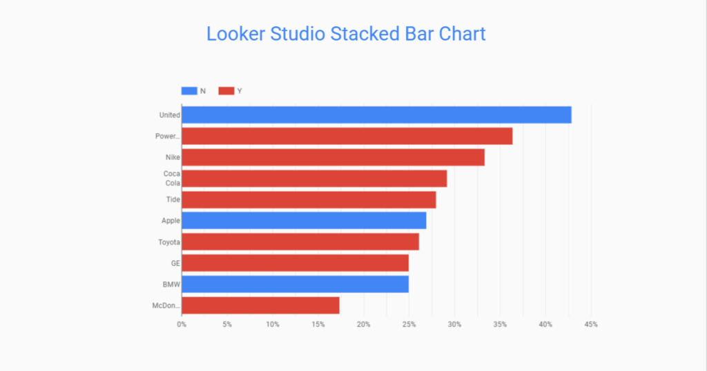
Looker Studio Stacked Bar Chart
The Stacked Bar Chart in Looker Studio is a basic chart that displays multiple datasets as stacked bars. In the Stacked Bar Chart, the height of each segment represents the proportion of the total value.
It’s useful for comparing categories within a dataset. Plus, you can also showcase the contribution of each category to the total in the Looker Studio stacked bar chart.
Properties:
- Stacked bars for easy comparison
- Customizable axes and labels
- Tooltip display for detailed information
Use cases:
- Analyzing sales revenues across different product categories
- Understanding customer preferences across various service offerings
- Evaluating the effectiveness of marketing channels based on website traffic sources
Looker Studio Tables & Pivot Tables
Tables and Pivot Tables in Looker Studio are essential tools for displaying tabular data in a structured format. They provide a clear and concise presentation of data to compare values across rows and columns efficiently.
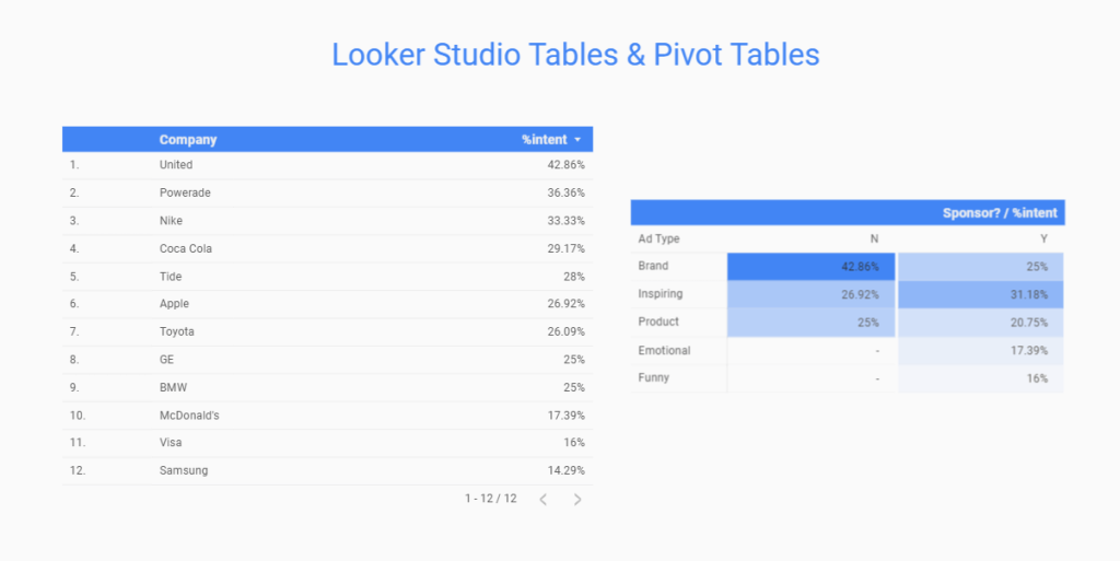
Properties:
- Data showcase in rows and columns
- Sorting and filtering options for data exploration
- Summarize and aggregate data dynamically
Use Cases:
- Presenting detailed sales figures by product, region, and period of time
- Comparing customer demographics and behavior metrics
- Analyzing financial data such as expenses, revenue, and profitability
Looker Studio Time Series Chart
The Looker Studio Time Series Chart is designed to visualize data over time. This type of chart is essential for analyzing conversion trends, cost over time, seasonality, and patterns. It displays data points on a time-based axis to track changes and identify insights.
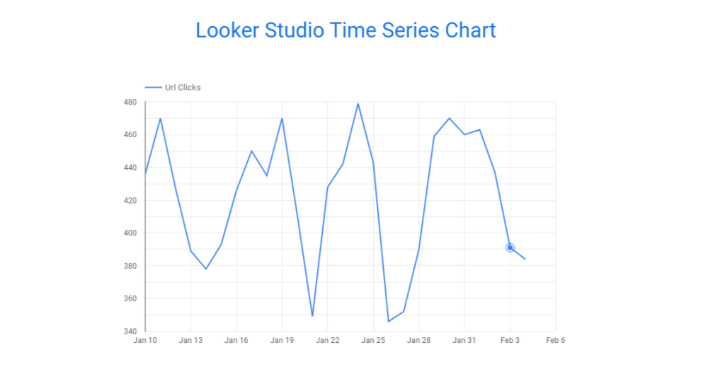
Properties:
- Data points on a time-based axis (e.g., days, weeks, months)
- Line or area representations for visualizing trends
- Comparison of data across different times
Use Cases:
- Monitoring website traffic and user engagement metrics over time
- Analyzing sales performance by month or quarter
- Tracking inventory levels and supply chain metrics
2. Looker Studio charts to visualize comparisons and relationships
In Looker Studio, you will find several types of charts for depicting data comparisons and their relationships. These types of charts help users analyze data sets effectively, identify patterns, and gain insights into the relationships between different variables.
Looker Studio Bar Chart
To represent data using rectangular bars for comparison or relationship, Looker Studio bar charts are the best solution. The length of each bar corresponds to the value of the data.
It’s effective for comparing values across different categories or groups, like best-performing keywords of paid Ad campaigns.
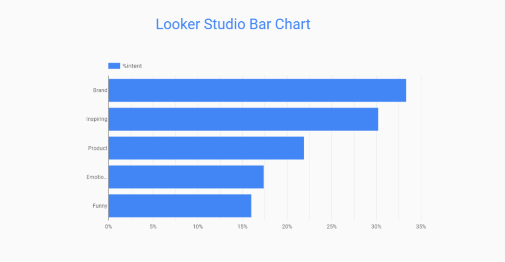
Properties:
- Data showcased in vertical or horizontal bars
- Grouping and stacking options for comparing multiple datasets
- Clear visualization of comparative data
Use Cases:
- Comparing sales reports among different product lines or departments
- Visualizing survey responses by answer choices
- Analyzing customer satisfaction scores across different service channels
Looker Studio Pie Chart
The pie chart is a pretty cool way to show the proportions of your data. In Looker Studio, it’s like this circular thing where your data gets sliced up like a pie. Each slice represents a chunk of the whole. Plus, the size of the slice shows how big that chunk is.
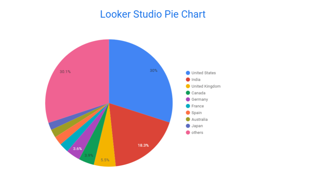
Properties:
- Present data as slices of a circle
- Proportions or percentages of a total
- 2 variations with Pie and Donut charts
Use Cases:
- Visualizing market share among competing products or brands
- Analyzing search console organic traffic across different channels
- Presenting survey responses by answer choices and demographic groups
Can you create a Looker Studio pie chart with multiple dimensions?
A Looker Studio pie chart with multiple dimensions means a pie chart that rests on multiple metrics or columns from your data source. Well, Looker Studio doesn’t directly support pie charts with multiple columns.
However, if you badly need to build a pie chart in Looker Studio using multiple-dimension or multiple-column datasets, check out this thread on StackOverflow.
Combo Chart Looker Studio
In Looker Studio, there is something called the Combo Chart or combination chart. The chart list doesn’t contain the combo chart.
It’s the mix-and-match method of different types of charts—like line charts and bar charts—all in one dashboard. Combination charts in Looker Studio are useful when you’re dealing with different datasets with different scales. Or you just want to see how different variables relate to each other.
Google Search Console dashboard is a perfect example of the Looker Studio combination chart.
Properties:
- Combination of multiple chart types (e.g., line chart, bar chart)
- Dual axes for displaying datasets with different scales
- Flexible visualization of complex data relationships
Use Cases:
- Analyzing impression (line chart) and device categories (bar chart) simultaneously
- Comparing sales revenue (line chart) with marketing expenses (bar chart) over time
- Visualizing temperature trends (line chart) alongside precipitation levels (bar chart) by month
3. Looker Studio charts for mapping the landscape
In addition to comparison charts, you can utilize Looker Studio’s landscape charts to actively display data patterns and relationships. Looker Studio offers Geo Charts and Google Maps for strategic decisions and to gain insights into complex datasets more efficiently.
Geo Chart Looker Studio
Geo Chart allows users to map geographical data onto interactive maps in Looker Studio. It provides a visual representation of data distribution across different geographic regions.
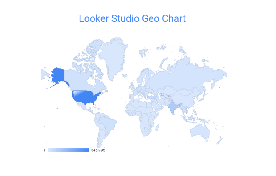
Properties:
- Interactive mapping interface
- Customizable markers and tooltips
- Display data layers based on geographic boundaries (e.g., countries, states, cities).
Use Cases:
- Visualizing regional trends or patterns
- Analyzing customer distribution or market penetration
- Understanding geographic variations in performance metrics
Looker Studio Google Map
Google Maps is essential to navigating the world around us. It offers accurate real-time directions and location-based services.
The Looker Studio or Google Data Studio charts also contain Google Map functionality to visualize data points on dynamic maps. It offers interactive features for exploring spatial relationships within the data.
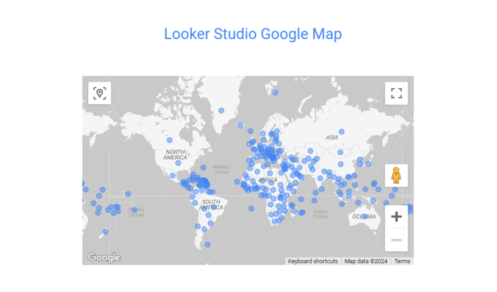
Properties:
- Dynamic and drag-and-drop map interface
- Customizable markers, colors, and 6 map styles
- Overlay data layers on top of the map
Use Cases:
- Displaying location-based insights.
- Analyzing store locations or distribution networks
- Visualizing spatial patterns in demographic data
4. Advanced Looker Studio charts for in-depth analysis
Let’s discover deeper insights effortlessly with Advanced Looker Studio charts like Area, Scatter, Bullet, and Waterfall. These charts are designed for comprehensive data analysis for complex data representation.
Looker Studio Area Chart
The Looker Studio Area Chart is a graphical representation of data where the area between a line and the x-axis is filled with color. You can display the magnitude of change over time using the Area chart in Looker Studio.
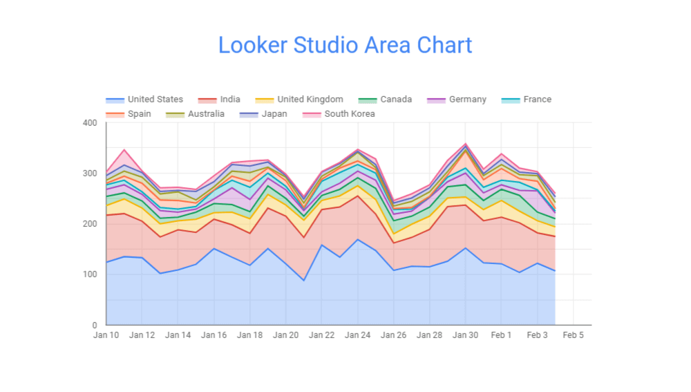
Properties:
- Visualizes cumulative values over time
- Emphasizes changes in magnitude
- 3 default designs for comparing multiple datasets
Use Cases:
- Illustrating trends over time
- Comparing the performance of different product lines or categories
- Analyzing cumulative values such as revenue or sales
Looker Studio Scatter Chart
If you want to vividly portray correlations, outliers, and patterns within your dataset, Looker Studio Scatter Chart is a reliable tool. It can display individual data points as markers on a Cartesian coordinate system to identify relationships between two variables.
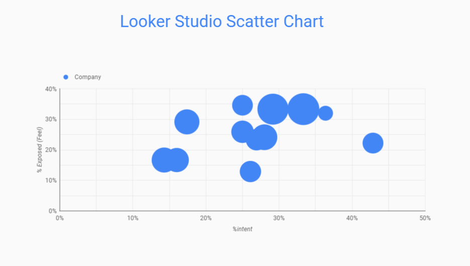
Properties:
- Visualizes relationships between variables
- Marks data points as individual markers
- Supports trend lines for identifying patterns
Use Cases:
- Identifying correlations between variables
- Analyzing clusters or outliers in data
- Visualizing data distribution and patterns
Looker Studio Bullet Chart
You can Experience a powerful tool for visualizing performance metrics and setting targets with the innovative Bullet Chart. This type of Looker Studio Chart is a variation of a bar chart designed to display progress toward a target value.

Properties:
- Displays progress towards a goal
- Includes actual, target, and performance bands
- Supports comparison of multiple measures
Use Cases:
- Tracking key performance indicators (KPIs)
- Assessing progress toward targets or benchmarks
- Comparing performance across different categories or period of time
Looker Studio Waterfall Chart
The Looker Studio Waterfall Chart illustrates sequential data changes like incremental changes or contributions to a total value. It also displays positive and negative changes as floating columns.
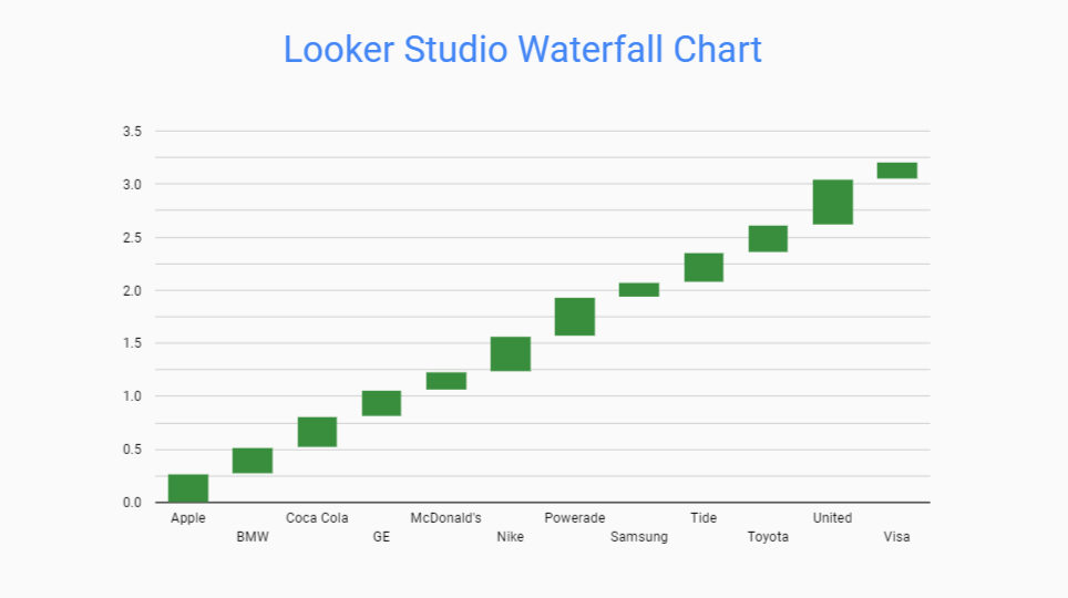
Properties:
- Sequentially displays data changes
- Analysis of data flow and the impact of each component
- Trends and performance fluctuations insights
Use Cases:
- Analyzing financial statements (e.g., income statements, cash flow)
- Understanding the impact of individual factors on a total value
- Visualizing the flow of data or resources across different stages
5. Gauges and progress indicators as Looker Studio charts
Gauges and progress indicators in Looker Studio charts are crucial for providing at-a-glance visualizations of key metrics and performance. You can efficiently monitor various metrics and KPIs.
Also, you can make swift, informed decisions by incorporating gauges and progress indicators into data presentations.
Looker Studio Gauge Chart
The Gauge Chart in Looker Studio displays a single value within a predefined range, typically used to indicate progress or compare performance against a target. It presents data as a dial or needle on a scale to prove a clear indication within the specified range.
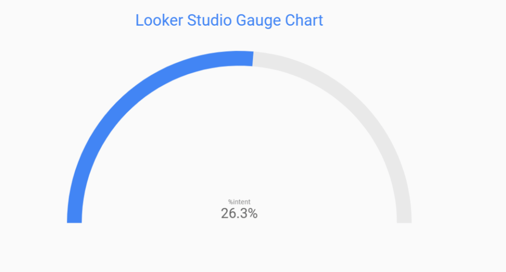
Properties:
- Visualizes a single metric
- Represents values within a predefined range
- Provides a clear indicator of performance
Use Cases:
- Tracking Key Performance Indicators (KPIs) such as sales targets
- Showing operational metrics like inventory levels, production output, or service response
- Displaying quality metrics such as defect rates, customer satisfaction scores, or product ratings
Looker Studio Treemaps
The Looker Studio Treemap shows data as nested rectangles. Each rectangle is a category or subcategory, and its size and color show a specific metric. Treemaps are a simple way to display complex data, helping users spot patterns and trends in big datasets.
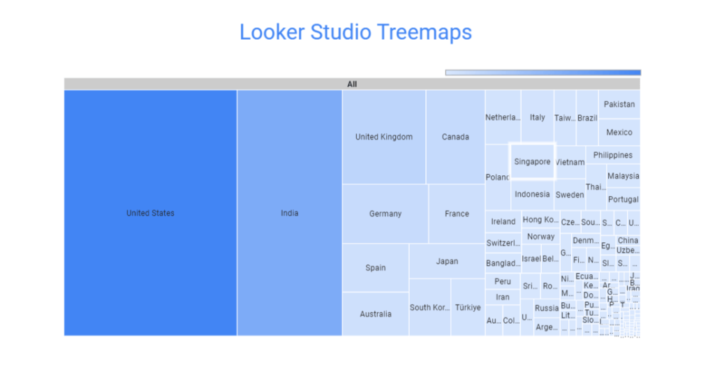
Properties:
- Hierarchical data visualization
- Size and color indicate metric values
- Nested rectangles represent categories and subcategories
Use Cases:
- Presenting organizational structures, product categories, or website traffic sources
- Analyzing the composition of categorical data
- Comparing the contribution of different categories to a total value
6. Looker Studio chats to display flow and connections
Looker Studio charts offer a dynamic platform to explore the flow and connections between datasets. As a result, users can navigate complex data insights and understand trends with clarity and precision.
Here are the Looker Studio (Google Data Studio) charts for displaying flow and connections:
Looker Studio Line Chart
Looker Studio Line Chart provides visual insights and trends for data analysis. It connects data points with straight lines to make it easier to track changes and identify patterns precisely.
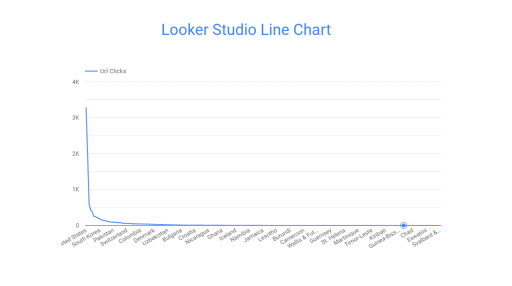
Properties:
- Customizable axes, data point markers, trend lines
- Tooltips and zooming capabilities
- 6 pre-made designs for multiple series comparison
Use Cases:
- Tracking monthly sales figures for a product line
- Analyzing daily YouTube channel traffic data to identify peak visiting times
- Monitoring temperature fluctuations over time to analyze climate change
Looker Studio Sankey Diagrams
Sankey diagrams in Looker Studio are designed to showcase the flow of data or resources between nodes in a system. They use directed arrows to represent the flow and the width of the arrows to represent the flow quantity.
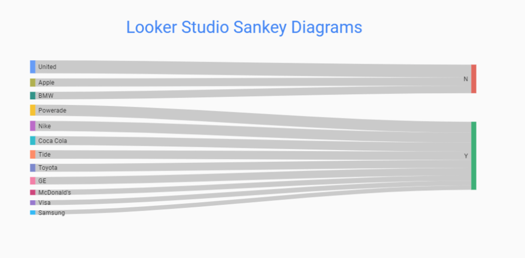
Properties:
- Tracking the effectiveness of paid advertising campaigns across various platforms
- Analyzing the flow of user engagement on YouTube channels or videos
- Mapping the flow of users from search queries to search result pages
7. Third-party visualizations for Looker Studio charts
In addition to these above Looker Studio Charts, you can use Community visualizations, which are developed by third-party developers.
These connectors cover various use cases and industries to design reports and dashboards from your data sources. It can be CRM, HR, Power BI, social media, search, advertising, HR, etc.
- You can see a combined icon option at the right side of the Add a chart option in the Looker Studio canvas
- Click on it to get the default community visualizations
- Or, export other sources from the +Export More option
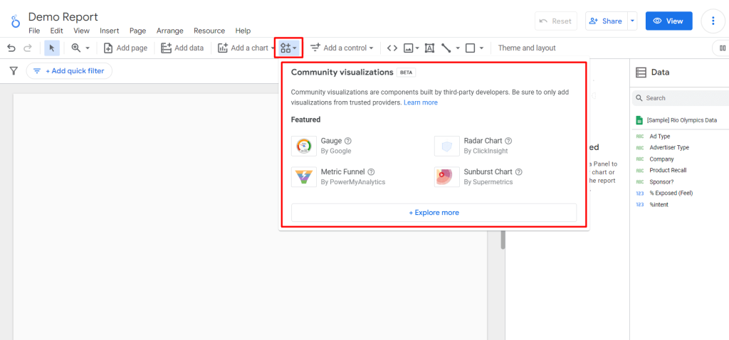
They then adjust them like the default charts of the Looker studio. However, the present functionality of community visualizations is currently in its Beta phase.
Examples of Looker Studio charts on real-life report templates
In this section, we explore a few examples of Looker Studio dashboards to demonstrate how different charts can effectively showcase real-life reports.
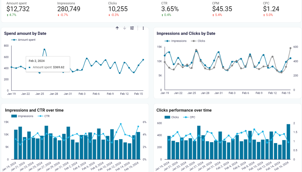
1. Google Ads dashboard template for Looker Studio Charts
Google Ads dashboard gives a complete summary of important performance metrics and insights for Google Ads campaigns. As a result, you can understand, track, and analyze the essential factors for optimizing Google Ads campaigns.
This template includes data on:
- Ad spending
- Clicks
- Impressions
- Conversions
- Cost per acquisition (CPA)
- Click-through rate (CTR), and other relevant metrics.
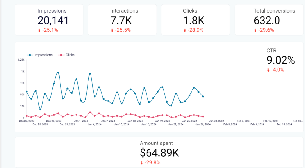
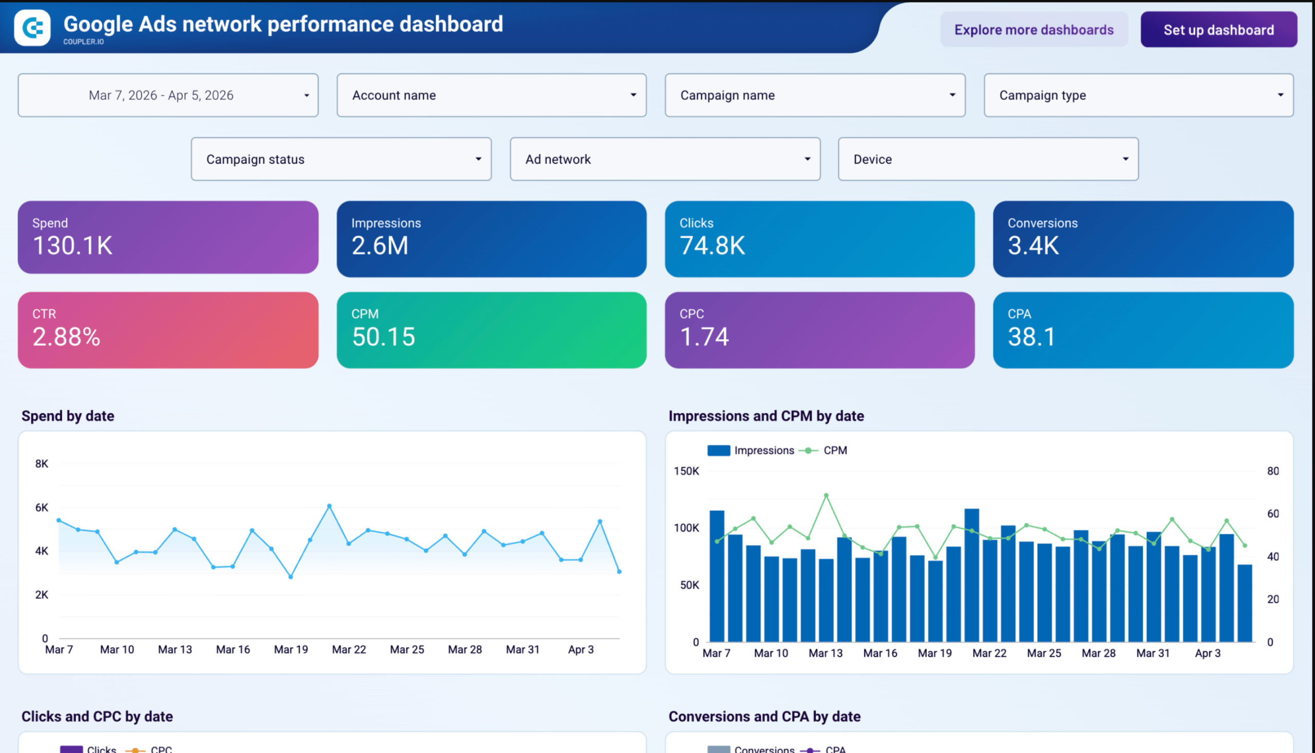
2. Google Ads network performance dashboard for Data Studio
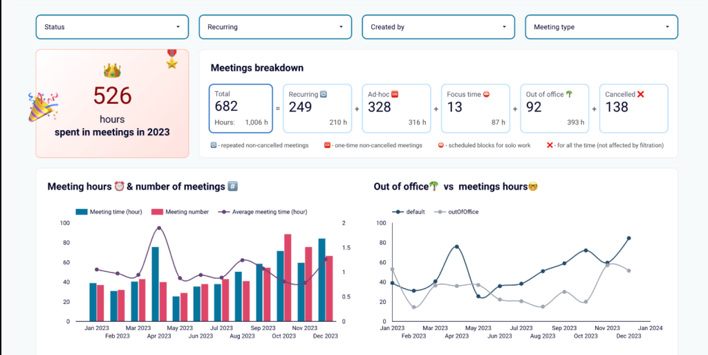
If your Google Ads data spans multiple networks, devices, and geographies, the Google Ads network performance dashboard puts it all in one place across five pages.
Google Ads network performance dashboard
 Preview dashboard
Google Ads network performance dashboard
Preview dashboardThe template includes:
- Ad spending data
- CPM, CPC, and CPA trend
- Sortable campaign and network tables
- A geographic spend map
- Impression share tables
- Video performance charts with quartile completion rates
- A Performance Max asset table with Google’s quality ratings.
3. PPC multi-channel dashboard template for Looker Studio Charts
The PPC multi-channel dashboard template in Looker Studio Charts offers a concise overview of pay-per-click (PPC) performance across various advertising channels.
You can connect data sources like Google ads, Facebook ads, TikTok ads, Instagram ads, LinkedIn ads, Quora ads, and Microsoft ad library to track ROI, optimize budget allocation, and identify performance trends.
This Looker Studio dashboard template provides metrics such as:
- Clicks
- Impressions
- Conversions
- Campaign analysis, etc.
4. Looker Studio SEO dashboard for Google Search Console
Another popular Looker Studio template of Coupler.io is the SEO dashboard for Google Search Console. This will-structured template offers a concise overview of website performance metrics from Google Search Console.
You can track keyword performance, identify trends, and optimize their SEO strategies for improved search visibility.
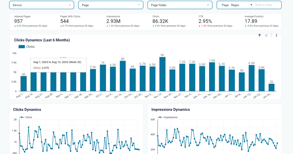
This Google search console provides key SEO metrics such as:
- Clicks
- Impressions
- Click-Through Rate (CTR)
- Average position
- Total clicks by page
- Total Impressions by page
- Average CTR by page
- Total Clicks by query
- Total impressions by query
- Average CTR by query and more
5. Google Calendar dashboard template for Looker Studio
With this stunning Google Calendar dashboard template, you will get a concise overview of calendar events and activities tracked through Google Calendar. Plus, you can analyze scheduling patterns, track productivity, and optimize time management strategies.
The dashboard provides key metrics in the Looker Studio (Google Data Studio) dashboard, including:
- Event frequency
- Event duration
- Attendee participation
- Event categories
- Time distribution, and so on
6. YouTube Analytics dashboard for Looker Studio
The YouTube Analytics dashboard template for Looker Studio presents comprehensive insights into channel performance and video metrics. It includes various charts to visualize key analytics and help to find specific business needs. So that, you can refine content creation, distribution strategies, and audience targeting for maximum impact and ROI.
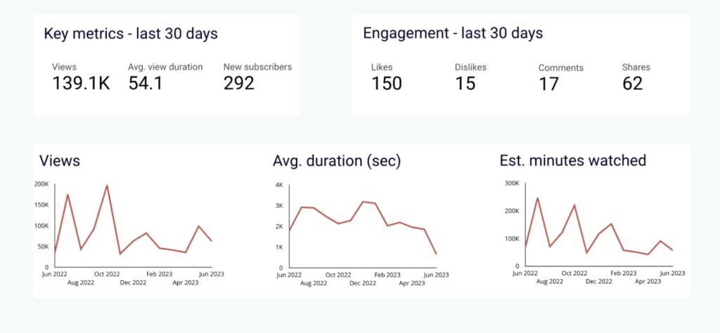
Key metrics included in the YouTube Analytics dashboard template:
- Views
- Watch time
- Likes
- Dislikes
- Comments
- Shares
- Subscribers
- Audience demographics (age, gender, location)
- Traffic Sources
- Top-performing videos, etc.
How to add Looker Studio charts to your reports
Building informative and visually appealing reports often begins with accessing and integrating data from various sources. Looker Studio (Google Data Studio) has connectors, though and you can use third-party connectors to avail more sources.
Opting for a third-party integration tool like Coupler.io is the recommended choice when dealing with multiple data origins. This versatile connector supports over 50 data sources and seamlessly integrates with business intelligence (BI) tools like Looker Studio, Google Sheets, Power BI, BigQuery, Google Ads, and more.
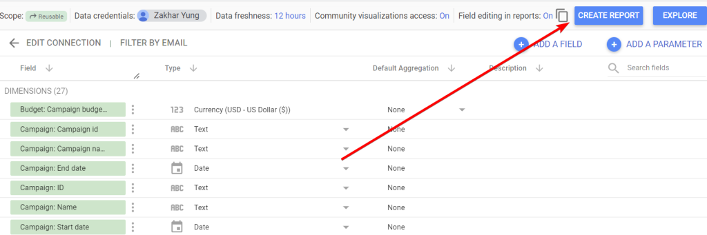
First, you need to create an importer. In the form below, choose the source you want to connect to Looker Studio and click Proceed. You’ll need to sign up for Coupler.io with your Google account. You can start with a free version.
Follow the in-app instructions to load data from the chosen app to your Looker Studio report. After connecting the source, you’ll be ready to add charts to your report. To do so, take the following steps:
Add a chart to the report
To add a Looker Studio (Google Data Studio) chart, you need to navigate to Looker Studio, then:
- Create a Blank Report
- Or, select any pre-made templates and edit your report
- Here we’re using Looker Studio sample data on the Olympics TV Ad Performance Dashboard
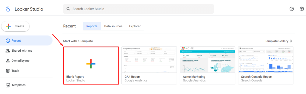
- Write the Looker Studio report name
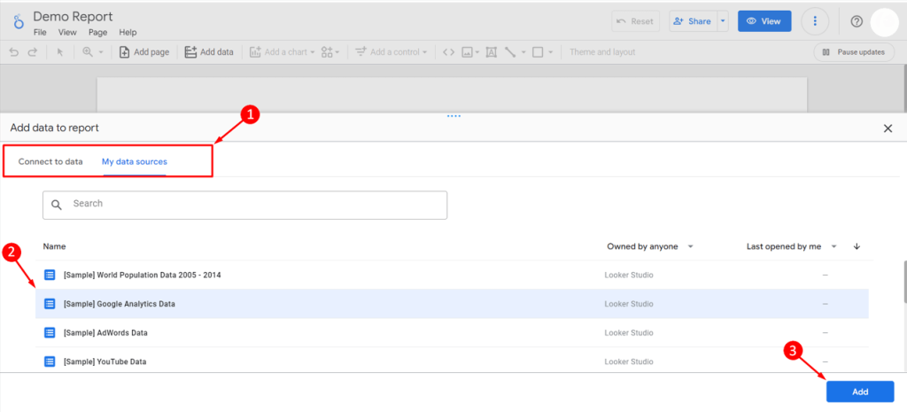
- A window will pop up
- Select data to the report from Google connector or third-party connector i.e. Coupler.io
- Click on ADD
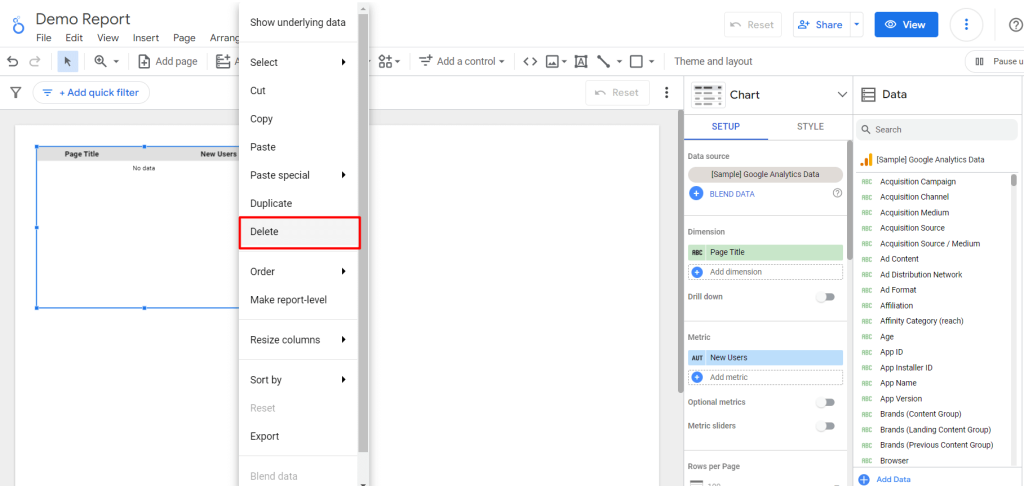
- You can see the Looker Studio canvas.
- Keep or delete the default table by clicking on the three dots
- Now, you can see all the Looker Studio Charts on the Add a chart option
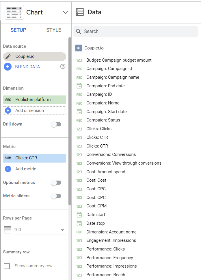
- Choose the appropriate chart (table, bar, line, geo, combo, etc) type and variation based on your data and analysis goals
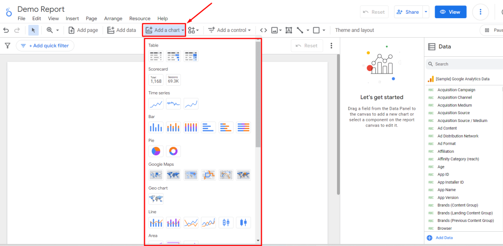
- Click to add and drag and draw the chart based on your preferred size
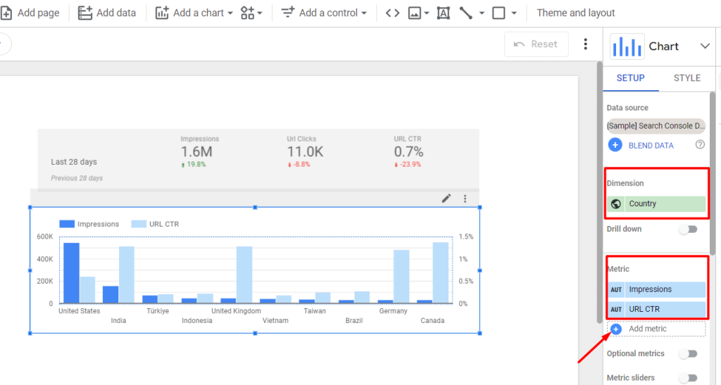
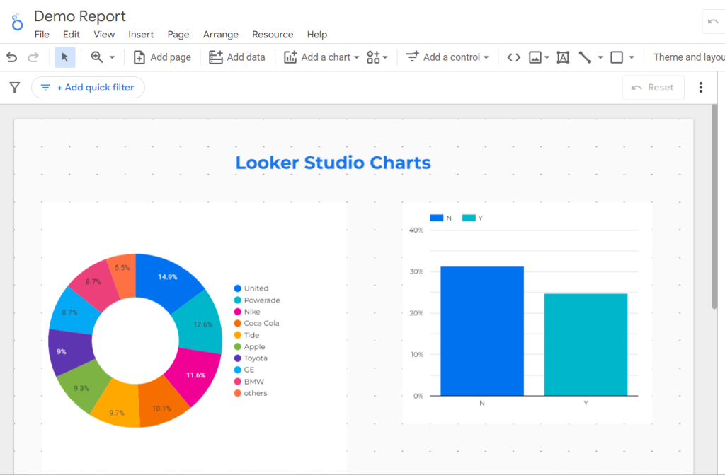
- For instance, we used a column chart here. In that case, you can include dimensions (e.g., the country) or metrics (e.g., impressions, URL CRT, clicks, etc.) for the Google Search Console report.
- To add multiple metrics, click on the “Add metric” option or drag them from your data source
- Select and add one or more charts in the report following the same process
- Replace, move, or resize them as needed
Add control to the report
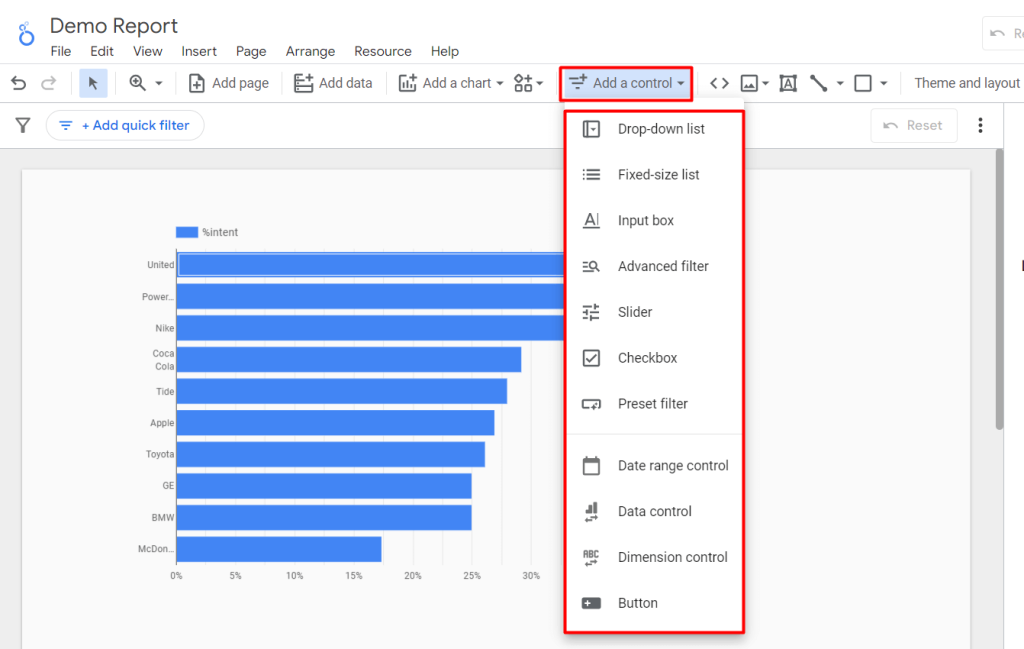
After adding Looker Studio charts to your reports, you can enhance interactivity by adding controls. To do so, you can use Looker Studio’s built-in features and elements in your report, including:
- Drop-down list
- Fixed-side list
- Input box
- Advanced filter
- Slider
- Checkbox
- Preset filter
- Date range control
- Data control
- Dimension control
- Button, etc.
These controls are dynamic and easy to implement. Another impressive benefit of these Looker Studio controls is they will appear with the report canvas for ease of use.
Let’s see how to add various controls to your Looker Studio charts:
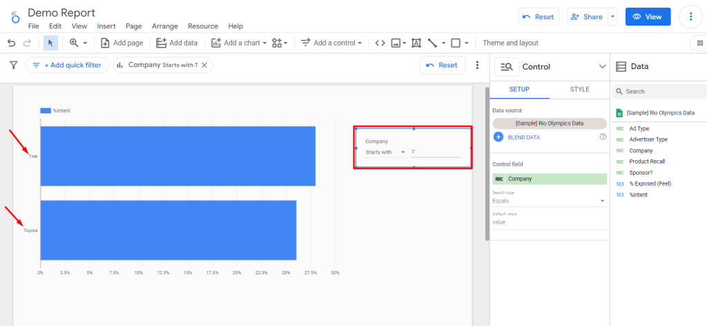
- Go to your Looker Studio dashboard and edit your report
- Click on the Add a control option in the toolbar
- Select the control type for your charts e.g., Advanced Filter.
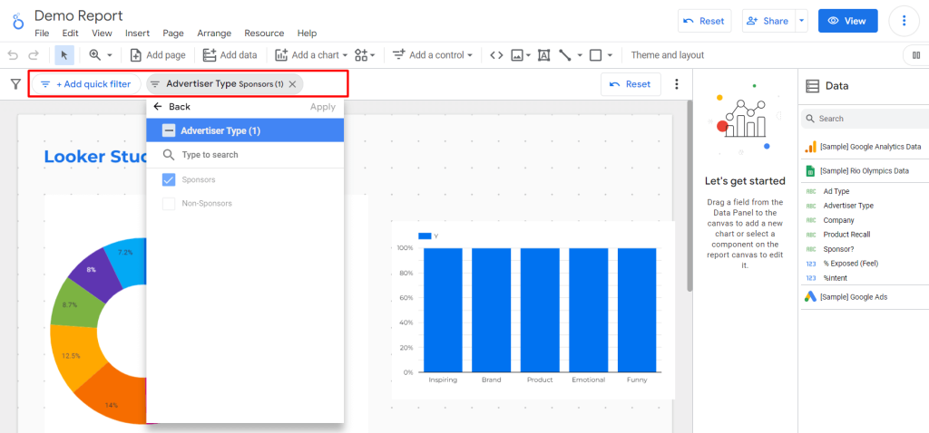
- Use values for parameters for the control field. For our case, we set the filter control parameter as company. Then filter the company names starting with “T”. It shows the results starting with the letter “T” among all the companies. Also, the mini dashboard of the filter will be displayed in the report
For all of these control elements, you can also customize styles and properties as well. For this:
- Navigate to the STYLE tab
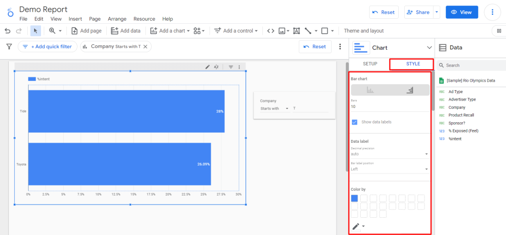
- You can change the bar style/orientation
- Increase or decrease the value of the bar
- hide/show the percentage associated with each bar
- Modify the bar color and border color
- Customize the text, font family, font color, axis, and more
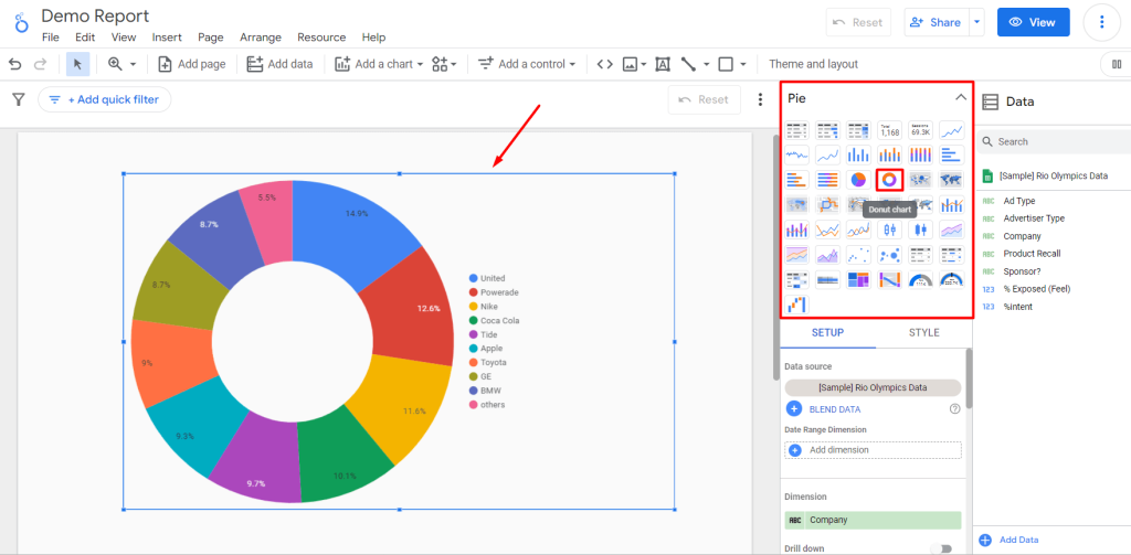
Switch the chart type
Suppose you make a chart, but then find another chart/table form that will be better to represent your data; what will you do? Make a new chart? Thankfully, you can experiment with different chart types to find the most suitable Looker Studio visualization for your data. You will be able to switch swiftly between chart types to present your data in the most effective way possible.
To switch charts:
- Select the chart (e.g., bar chart) you want to change/transform into another
- Click on the Chart from the properties panel
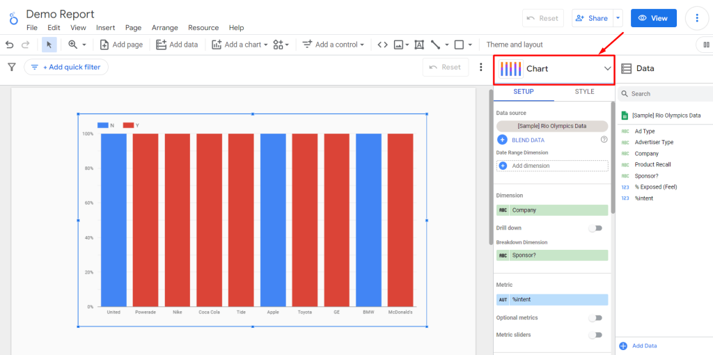
- Select the new chart type, e.g., Looker Studio Pie/Donut chart. And boom! You’ll get your desired chart type within a few seconds
Looker Studio (Google Data Studio) charts have the best match default dimensions and metrics. When you change or switch any one chart from another, the associate parameters will be preserved. As a result, you can switch back anytime and get the originally selected values.
Important Note: Not all chart types allow for switching because they have different data representations. For example, a line chart displays trends over time, while a scorecard shows single values without temporal context. As a result, transitioning between these types may not be feasible.
Add other components
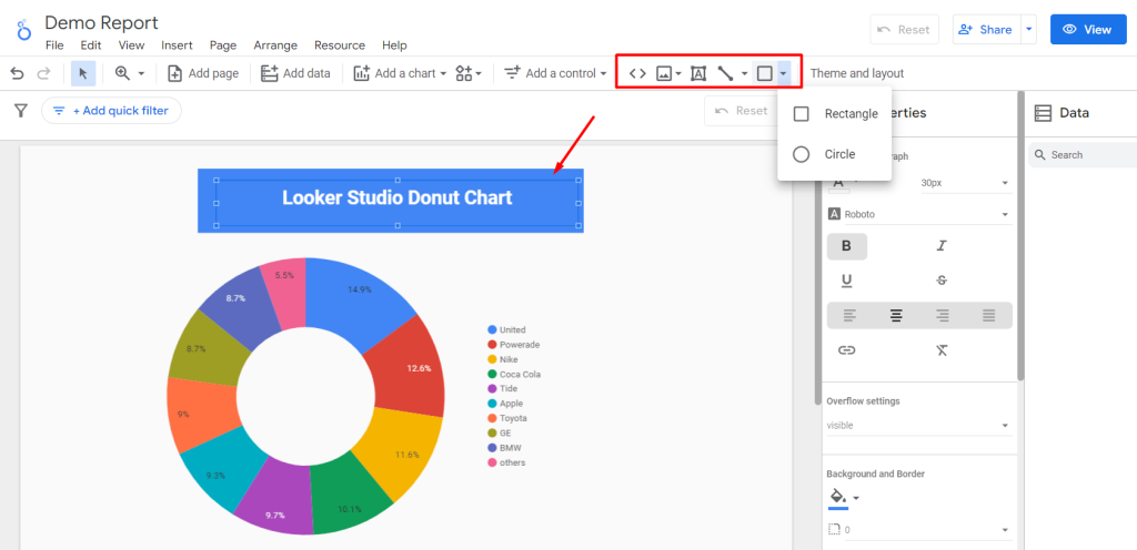
Besides charts and controls, you can add other components to make your Looker Studio report meaningful and easy to understand. You can incorporate images, logos, or annotations to enhance the visual appeal and professionalism of your reports.
Here is a list of components you can add with Looker Studio Charts:
- Text boxe
- Image
- Circle
- Rectangle
- Lines, etc.
All you need to do is select the element icon from the toolbar and drag and drop inside the report.
You can add multiple elements (here, we added a rectangle and text box in the screenshot). You can also customize the color, font, size, position, alignment, and other styling properties for these elements as well.
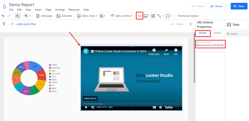
You can also embed external content, such as YouTube videos, Google Docs, and external website links, to make your Looker Studio report more versatile.
To add embed links in Looker Studio charts:
- Click on the URL Embed sign (<>). An empty content frame will be added to Canvas.
- Go to the SETUP tab
- Enter/paste the URL to embed as external content. You can see the content inside the report
- For further customization like color, position, and opacity, you can use the STYLE tab
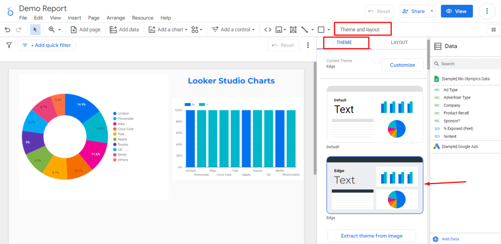
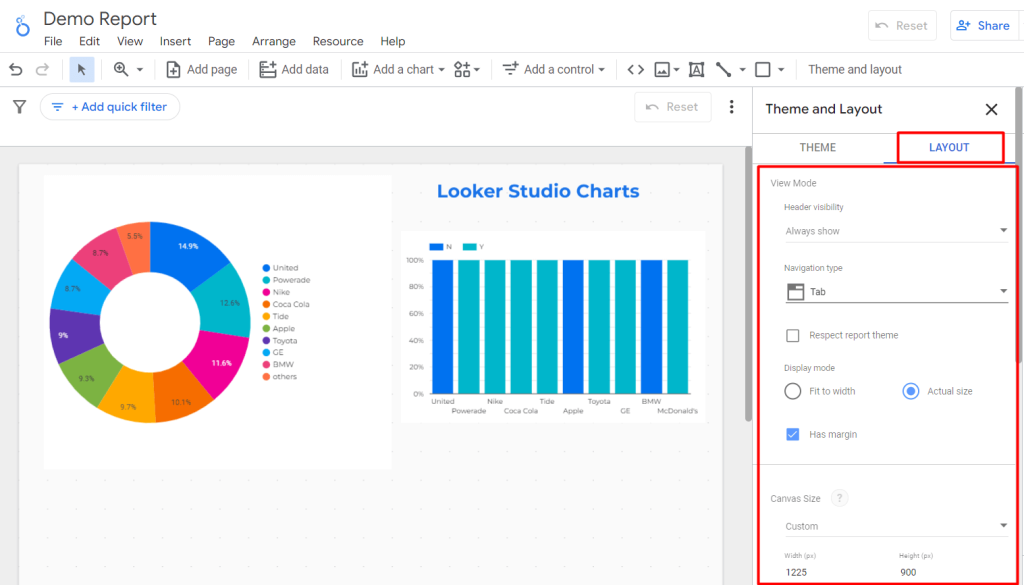
Customize arrangement and layout
In Looker Studio, you can arrange the charts and components in a logical and visually appealing layout. Its drag-and-drop interface easily rearranges elements and creates a cohesive narrative flow within your report.
For this:
- Click on Theme and layout on the toolbar and select your preferred THEME
To adjust and rearrange the elements:
- Click on LAYOUT and Adjust the properties such as view mode, navigation type, display mode, canvas size, etc.
Can I use Looker Studio multiple data sources in one chart?
You cannot directly use multiple data sources for their charts within the Looker interface. To accomplish this, users would need to blend their data. You can do this using Coupler.io or Looker’s data blending feature.
The native Looker Studio blending option means that you blend two existing data sources into one.
Coupler.io allows you to do the blending as well, but before your data loads to Looker Studio. For example, you need to load data from Facebook Ads and Google Ads and blend it. Coupler.io allows you to combine multiple data sources into one outside of Looker Studio, and then connect the blended dataset to your Looker Studio report.
Blend data before it’s loaded to Looker Studio with Coupler.io
Select the first source you’re going to connect to Looker Studio in the form below and click Proceed.
You can sign up for Coupler.io for free using your Google account.
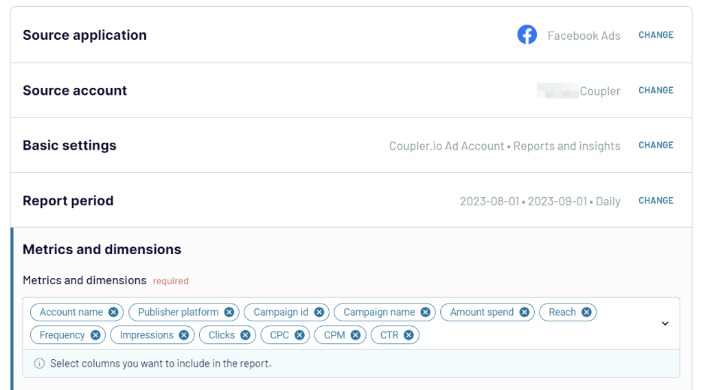
Then, you’ll need to connect your source account and select the data to load to Looker Studio. For example, here is what it would look like to connect Facebook Ads.
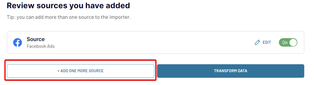
Once you have connected your first source application, you can click ADD ONE MORE SOURCE and select another application to load data from. You can choose another app, spreadsheet, database, and even another Facebook Ads account.
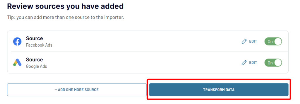
Authorize the connection and select the data to export. Once you have connected all the necessary data sources, click TRANSFORM DATA.
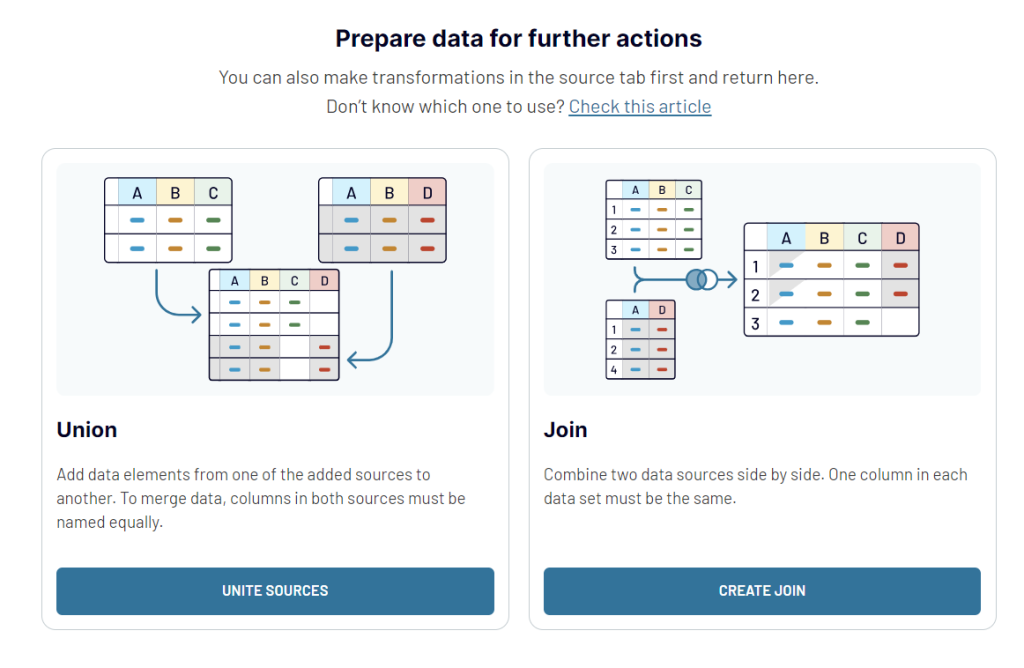
Now you can actually blend data from the selected sources. You have 2 options for blending:
- Union to add data elements from one of the added sources to another
- Join to blend two data sources side by side
Once you combine the data, you can preview it and proceed to loading the blended data set to Looker Studio. Follow the in-app instructions to generate a data source in Looker Studio and connect to it. The final click should be on the CREATE REPORT button.
In the Looker Studio data pane, you’ll only see one Looker Studio data source that contains blended data from your selected sources.

Automate data export with Coupler.io
Get started for freeNative way to blend data in Looker Studio
Data Blending in Looker Studio allows users to create reports that combine data from multiple sources by blending dimensions and measures based on common fields. This enables users to create visualizations with metrics from different data sources within a single chart.
To do so, go to your Looker Studio report:
- Create a Blank report or open an existing one
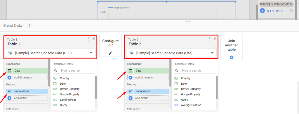
- Select the BLEND DATA option from the SETUP tab
- We can see all of your existing data sources on the left side
- Click on the Join another table option
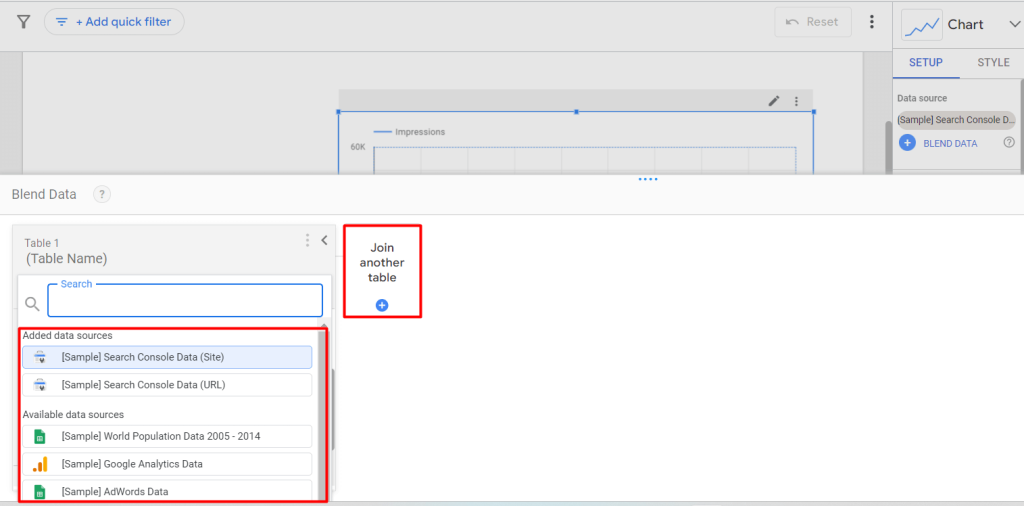
- Next, select the data sources (in our case, it’s Google Search Console). You can rename the report names as per your choice
- Choose the dimension, e.g., “Date” and metrics, e.g., “impressions”. You can use multiple dimensions and metrics if required
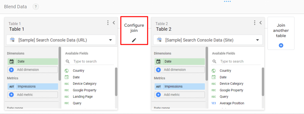
Now, you need a Key or Joint Condition to blend other data sources in Looker Studio. That refers to a common piece of information that is available in all datasets.
For instance, we might use the “Year” or “Date” dimension to combine the data from Google Search Console and Google Analytics reports. After blending data, you can show the total impressions or clicks for all data sources over the year or a particular date range.
- Select the Configure Join option to choose how data should be joined and displayed from the blended tables
- You can see 5 ways to join the table data:
- Left outer
- Right outer
- Inner
- Full outer
- Cross
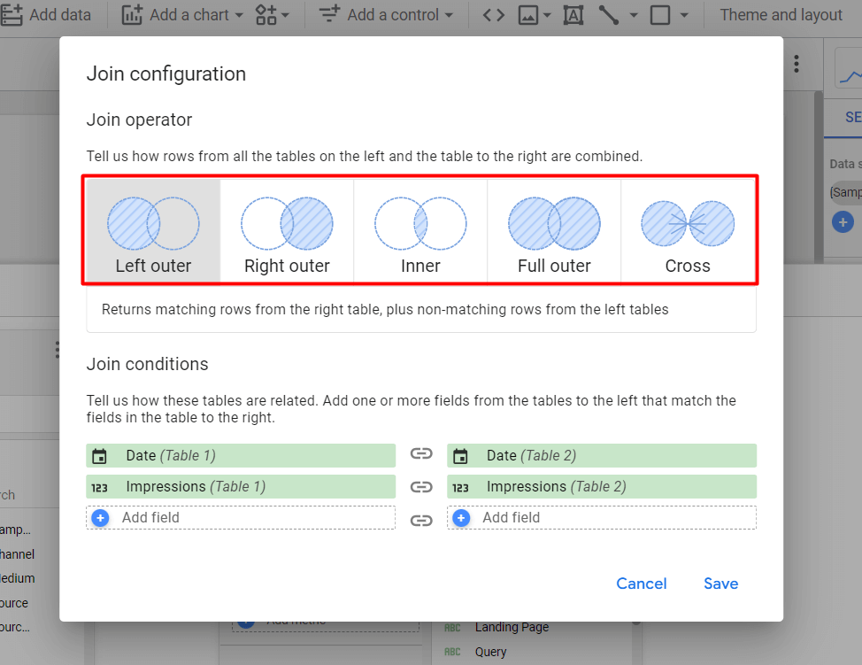
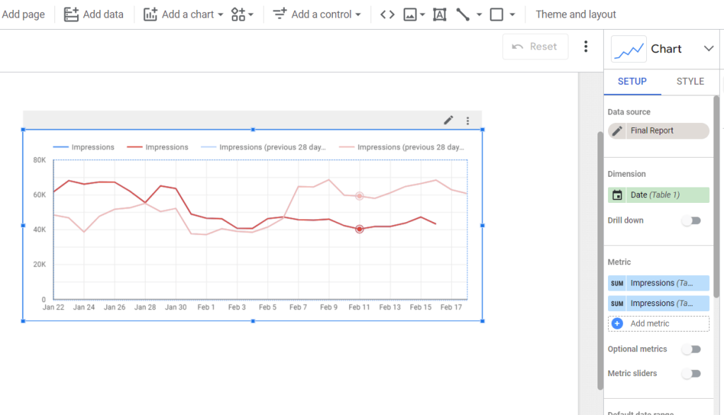
- Select the preferable one and click on Save. Now you can see the combined report showing the impressions over the date
Best practices to add Looker Studio charts
Crafting compelling and insightful charts is crucial. Here, we’re sharing 5 best practices that are essential to maximize the effectiveness of the Looker Studio chart.
Ensure data consistency across charts
- Maintain consistency in the data fields and metrics used across different charts in your report
- Ensure that the data presented in each chart aligns with the overall narrative or analysis being conveyed
Use filters for interactive insights
- Incorporate interactive quick filters into your charts to enable users to explore the data dynamically
- Utilize filter options for dimensions (e.g., advertise type = sponsor), metrics, date ranges, or other relevant parameters
Use color schemes for visual hierarchy
- Choose color schemes that enhance visual clarity and hierarchy within your charts
- Use contrasting colors to differentiate between data categories (e.g., unique color assigned for each country) or highlight key insights (one color for sponsor counties, another for non-sponsors)
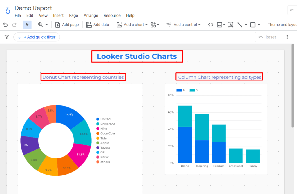
Optimize chart titles for clarity
- Craft clear and concise titles for each chart to communicate its purpose and key insights effectively
- Ensure that the title provides context and guides the viewer in interpreting the chart’s visualizations
Regularly review and refine chart designs
- Continuously review, refine, and experiment with the design of your charts to optimize their effectiveness.
- Stay updated on new features, updates, and best practices in data visualization and incorporate into new reports and data studio dashboards
How to choose a proper Looker Studio chart for my report
Looker Studio (Google Data Studi) charts are powerful tools for communicating data clearly and effectively to mass audiences regardless of the business or industry. As a result, choosing the right chart for the right data is crucial.
When choosing a proper Looker Studio chart for your report, consider the following:
Data understanding
Gain a thorough understanding of your dataset’s characteristics and variables. For example, if analyzing sales data, understand the distribution of revenue across different product categories.
Report objectives
Clearly define the goals and insights you want to communicate through your report. For instance, if the objective is to showcase quarterly performance, identify key metrics like revenue and customer acquisition rates.
Audience consideration
Understand your audience’s familiarity with data analysis and their preferences for visualization styles. Prepare the visual complexity based on the audience; for executives, provide high-level summaries, while analysts might require detailed charts.
Chart selection
Choose appropriate chart types based on the data and insights you want to present. For comparing sales results over time, a line chart could effectively illustrate trends. While a bar chart would be great for displaying sales data by region, website traffic by source, or employee satisfaction by department, etc.
For other data visualization options, learn more about Tableau charts.
Dashboard design
Design the report layout to facilitate easy navigation and comprehension. Organize charts logically to present the data story coherently. You should consider the flow of information and prioritize important insights to guide the reader through the report effectively.
In Looker Studio Pro, users can use a mobile app that is specifically designed for smaller screens with touch-friendly controls and responsive layouts that adapt to different device sizes. Learn more about this in our blog post where we’ve compared Looker Studio vs Looker Studio Pro.
However, designing the Looker Studio dashboard with proper charts, control, data flow, and other elements is not a piece of cake. But here is a reliable and quick solution in Coupler.io. You can use an extensive number of ready templates to design Looker studio dashboards in just the blink of an eye.
To sum up, Looker Studio (Google Data Studio) Charts are beneficial for transforming raw data into actionable insights. With its intuitive interface, customization options, and dynamic visualizations, you can ensure strategic growth and business intelligence.