Dashboards are an essential tool for analyzing the performance of a Shopify store. They transform raw data into insights that help ecommerce entrepreneurs make informed business decisions. Shopify dashboards enable you to track orders, manage inventory, monitor site visits and purchases, analyze customer behavior, and more.
In this guide, we’ll explore various ways to build a Shopify dashboard from using ready-to-use templates to building one from scratch.
Where can you get a Shopify dashboard?
Basically, there are two options for getting a Shopify dashboard:
Option 1. Native Shopify dashboard – Shopify offers a built-in dashboard functionality, available out-of-the-box for all users. It is actually a visual representation of various reports available on Shopify. The dashboard provides basic analytics including total sales, orders, average order value, etc. While convenient, the native option is limited in customization and depth of analysis. You can’t add custom metrics, rearrange elements, or integrate data from other sources.
Option 2. Custom Shopify dashboard – If the native Shopify dashboard does not work for you and you’re looking for something more custom, you can try the following options:
- Get a ready-to-use Shopify dashboard template
- Build a custom dashboard using one of the reporting tools
- Request a service to build a custom dashboard according to your requirements
The native Shopify dashboard is pretty straightforward and you can easily explore it in the Shopify interface. We’ll talk about it later in the article. However, a custom dashboard is what you’ve been looking for and we have what to offer.
White-label Shopify analytics dashboard templates
Shopify dashboard templates are ready-to-use reporting solutions. They do not require you to add visualizations, calculate metrics, and perform other manipulations. You only need to load data from your Shopify store or another related source, and you’ll get insights into your data. Coupler.io provides several ecommerce dashboard templates for Shopify store owners to manage inventory, orders, customer acquisition, and so on. The most important thing is that they all are FREE!
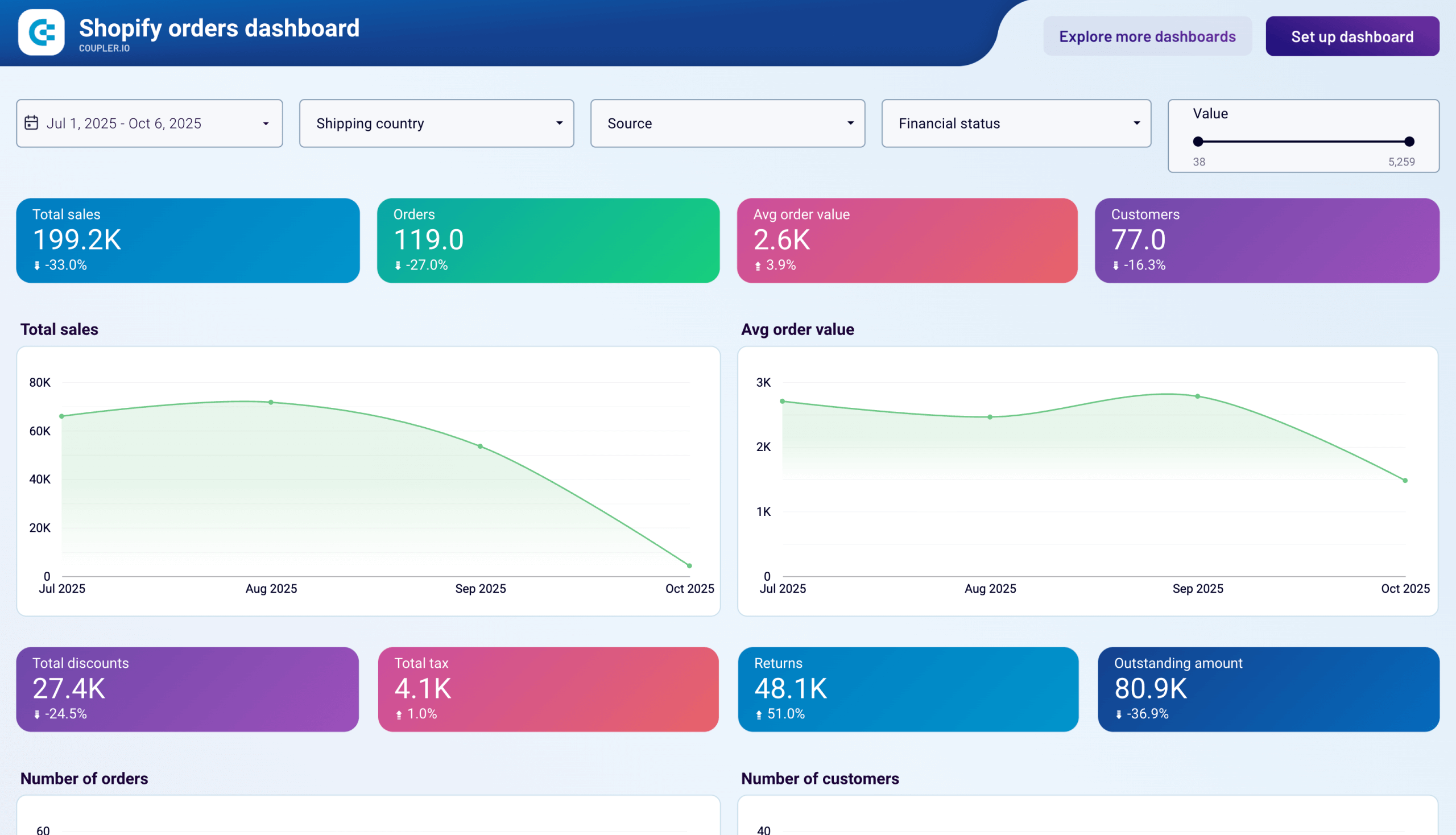
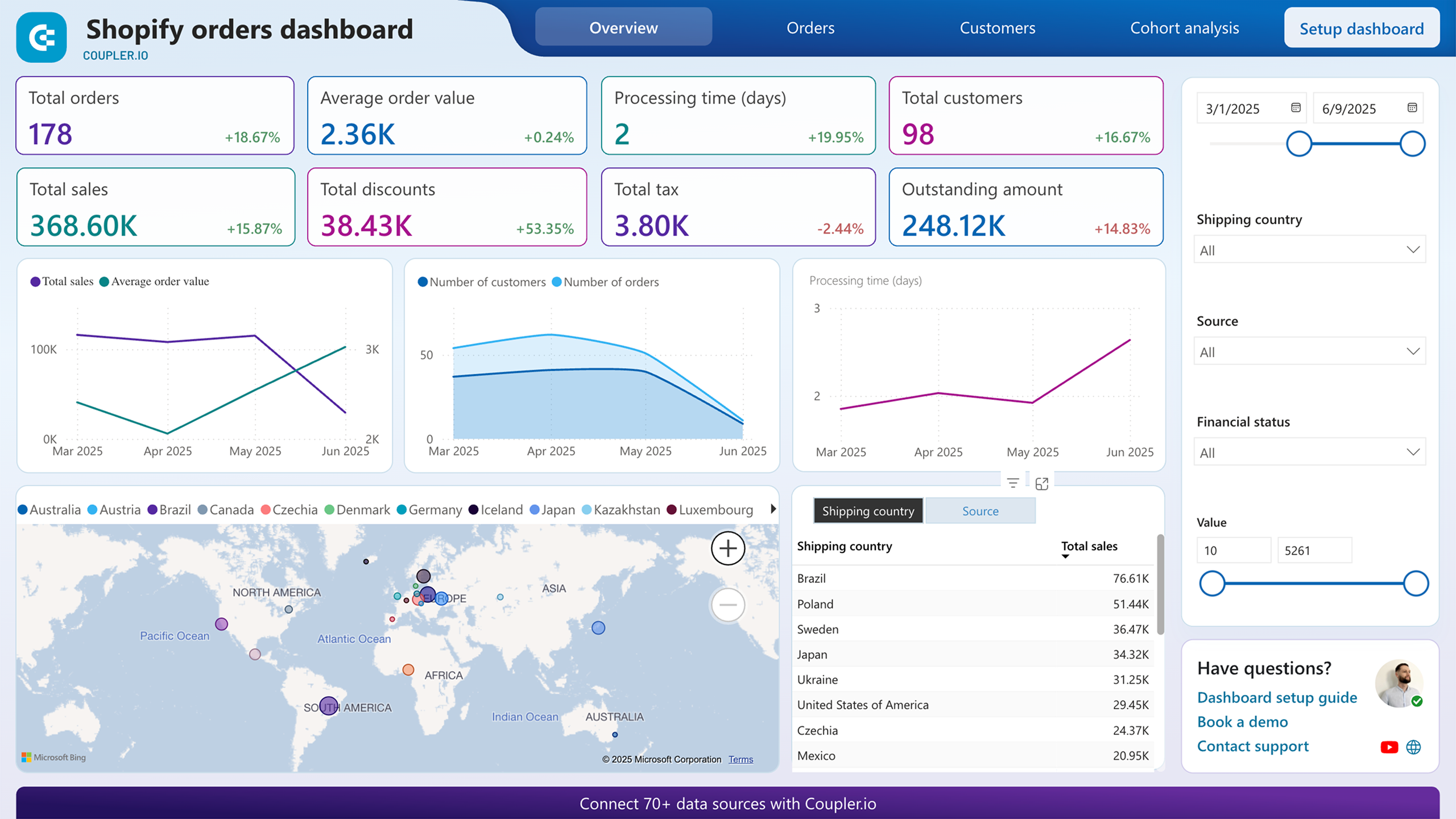
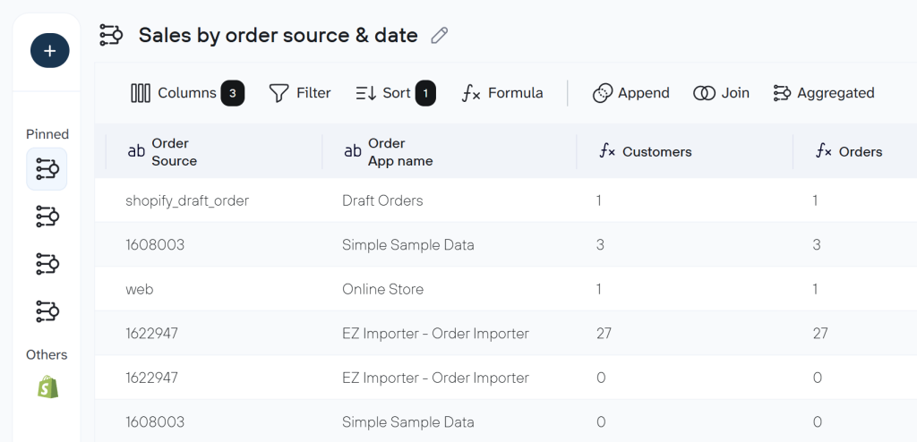
Shopify orders dashboard
The Shopify orders dashboard allows you to access the performance of your Shopify store and provides insights into your sales pipeline, so you can keep track of your orders and sales.
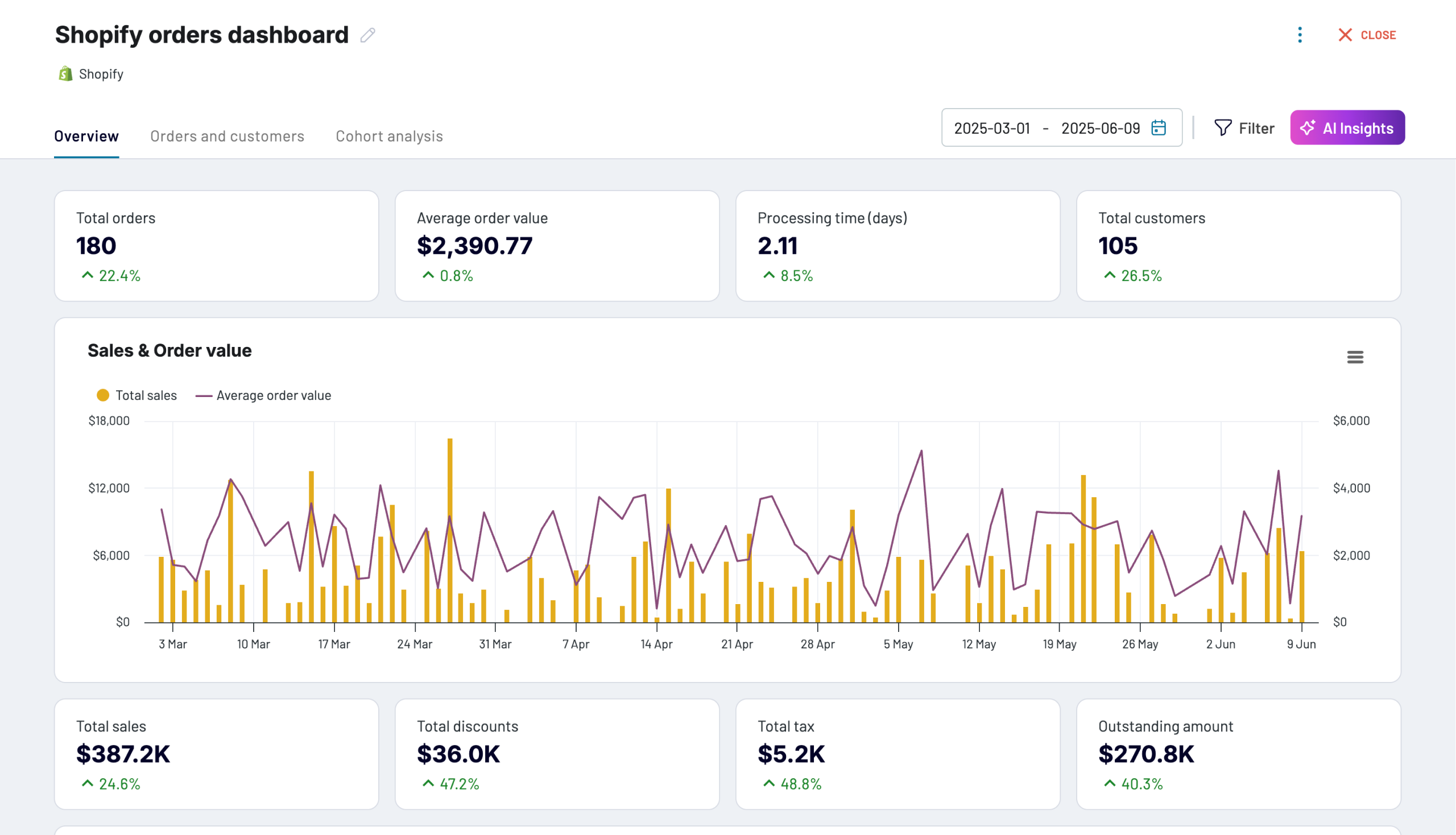
You’ll get different scorecards, charts, and filters to get valuable insights into your Shopify data.
- Breakdown statistics by country to make decisions about shipping
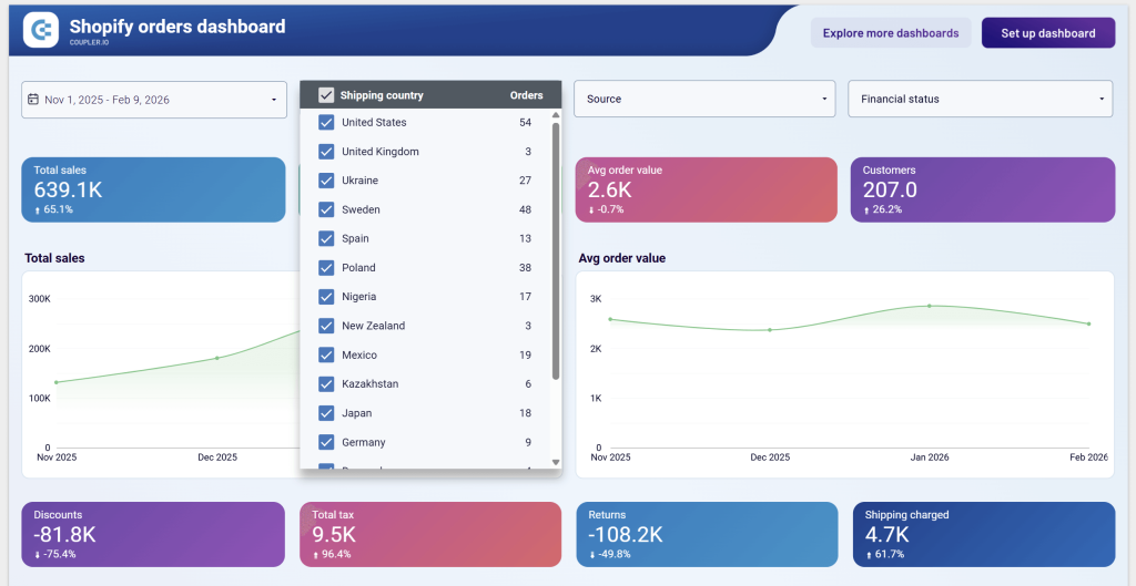
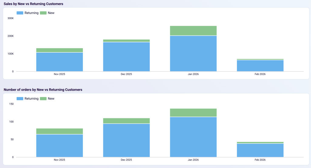
- Analyze the distribution of sales, revenues, and customers by new or returning customers.
Case study example: An apparel retailer used this dashboard to discover that international customers were placing significantly higher-value orders than domestic ones. By reallocating their marketing budget to target these regions more effectively, they increased their average order value by 27% within three months.
You will find more valuable information to monitor the performance of your sales process and identify potential bottlenecks. This Shopify dashboard template is available in Coupler.io, as well as for BI platforms, including Looker Studio, Power BI, and Google Sheets. All options are equipped with a Shopify connector by Coupler.io. You can start using it in less than 2 minutes by completing the steps described in the Readme tab. Try the dashboard for free right away!


Shopify sales funnel dashboard
The Shopify sales funnel dashboard visualizes the journey your visitors take from the first interaction to a completed purchase. Your Shopify store must be integrated with Google Analytics 4 to use the dashboard since it’s based on the GA4 data. As a result, you get an overview of conversion pathways and identify where potential customers are dropping off.
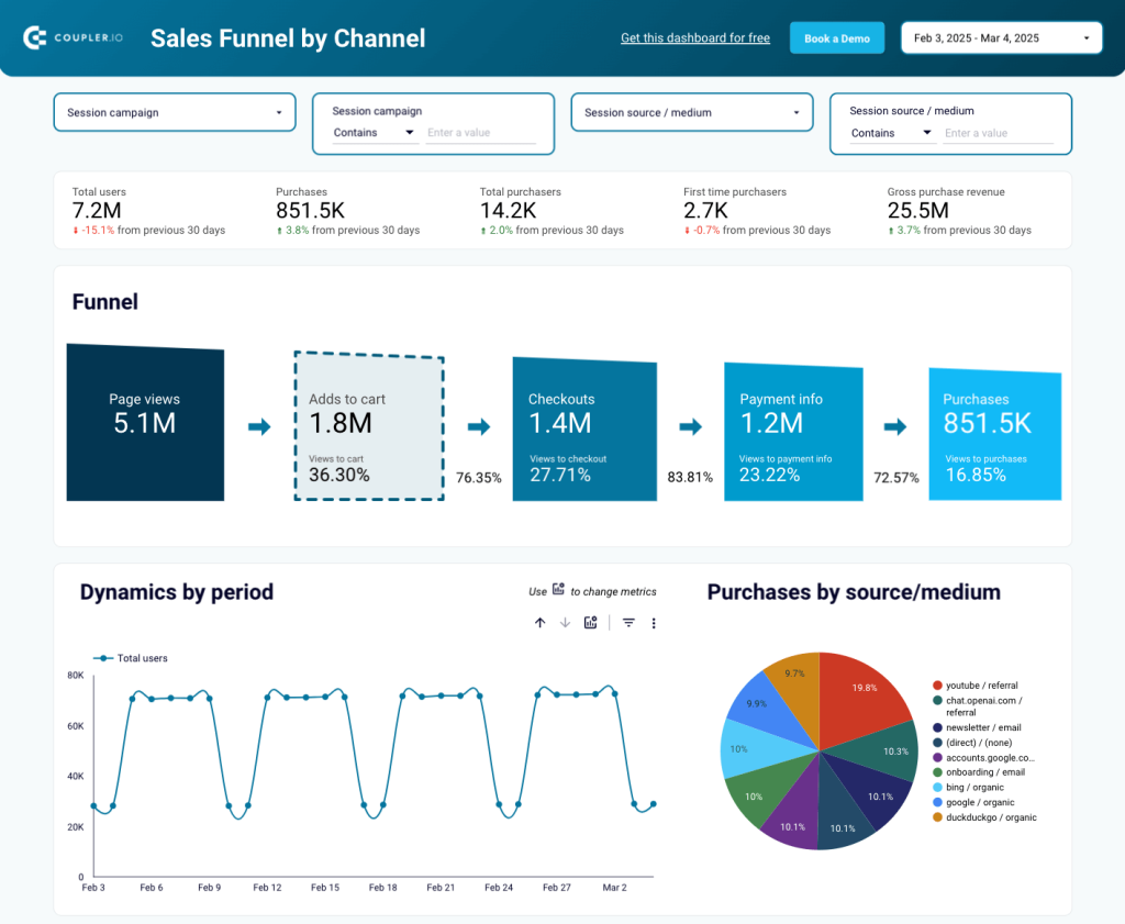
With this dashboard, you can:
- Track the entire customer journey from traffic source to purchase
- Identify conversion bottlenecks at each stage of your funnel
- Compare performance across different traffic sources
- Monitor changes in conversion rates over time
- Spot opportunities to optimize underperforming pages
Case study example: An electronics store discovered through this dashboard that mobile visitors had a checkout abandonment rate 3x higher than desktop users. After implementing mobile-specific checkout optimizations based on this insight, they increased their mobile conversion rate by 42% and boosted overall revenue by 23%.
The dashboard template is designed in Looker Studio and equipped with the Coupler.io connector that automates data load from GA4.
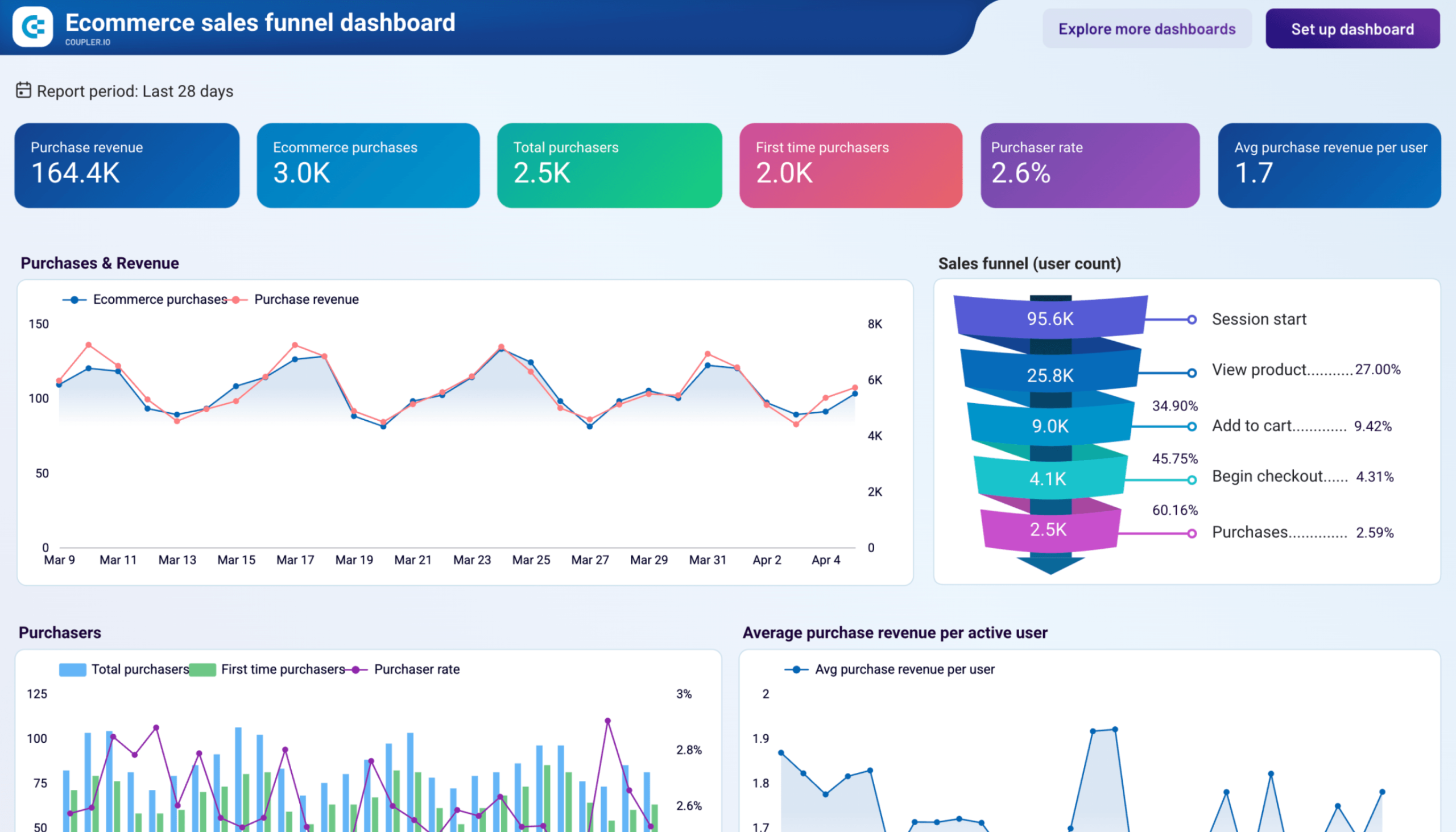
GA4 ecommerce sales funnel dashboard
Ecommerce teams with traffic but plateauing revenue often discover the answer lives in their funnel data. This Data Studio dashboard pulls from GA4 to visualize your full conversion path (session start through purchase) and slices that data by country, device category, and individual product so you can find where shoppers drop off and why.
GA4 ecommerce sales funnel dashboard
 Preview dashboard
GA4 ecommerce sales funnel dashboard
Preview dashboardWith this dashboard, you can:
- Track step-by-step conversion rates across all five funnel stages
- Compare purchaser behavior by country
- Break down funnel performance by device type (to catch situations where mobile checkout conversion lags behind desktop)
- Analyze individual product performance with a per-product table
- Monitor the first-time purchaser share over time
- See which acquisition channels drive new users and how many of those visitors convert
Case study example: The marketing lead at an outdoor gear store noticed traffic and product views were healthy, but revenue had stopped growing. Opening the funnel overview, she saw that while 9.4% of sessions reached add-to-cart, only 4.3% began checkout (a 54% step-to-step conversion rate that pointed to a bottleneck). Filtering by device, she found mobile add-to-cart-to-checkout conversion was 38% versus 62% on desktop. The team prioritized a mobile checkout redesign and, within six weeks, added $22K in monthly revenue.
This dashboard is available as a Data Studio template powered by Coupler.io. Connect your GA4 account, and Coupler.io will extract your data automatically on a schedule.
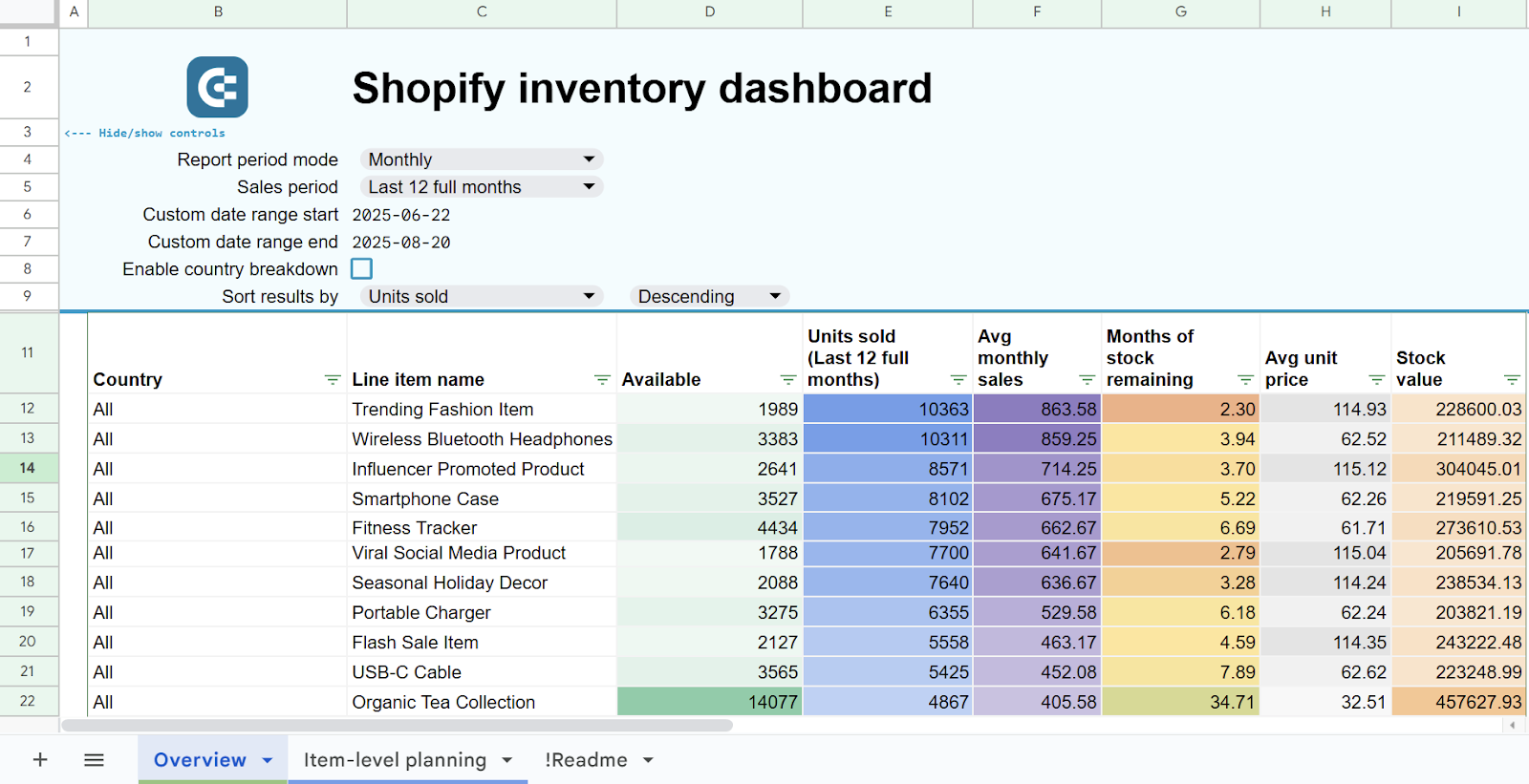
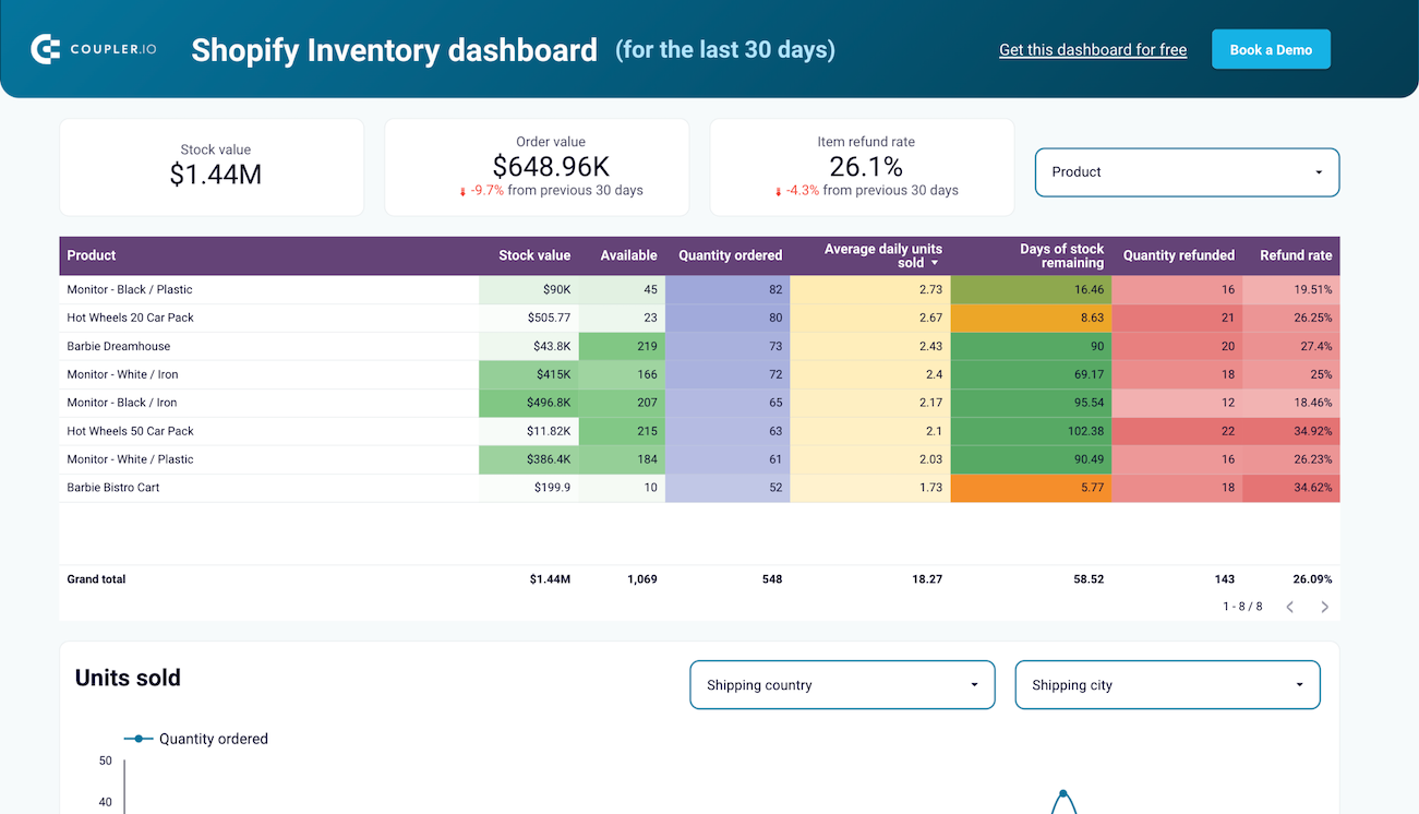
Inventory dashboard for Shopify
The Shopify inventory dashboard gives you clear visibility into your product stock levels, order patterns, and return rates across all locations. It combines inventory and sales data from Shopify to help you maintain optimal inventory levels, identify products with high return rates, and ensure you have the right products available in the right locations.
Inventory dashboard template for Shopify
 Preview template
Inventory dashboard template for Shopify
Preview templateWith this dashboard, you can:
- Track comprehensive inventory metrics including stock value, availability, and turnover rates
- Monitor daily order volumes to identify sales patterns and seasonality
- Analyze return rates by geographic region to address shipping or product issues
- Compare stock availability across multiple warehouse locations
- Track the lifecycle of returned items (restocked, discarded, or resold)
Case study: A multi-brand retailer used this dashboard to discover that products shipped to certain countries had return rates three times higher than the company average. After investigating, they found that sizing descriptions needed improvement for these markets. By adding detailed size guides with country-specific measurements, they reduced their international return rate by 47% in just two months, significantly improving profitability and customer satisfaction.
The dashboard is available as a template in Google Sheets and Looker Studio. Each is equipped with the Coupler.io connector that automates data load from Shopify.
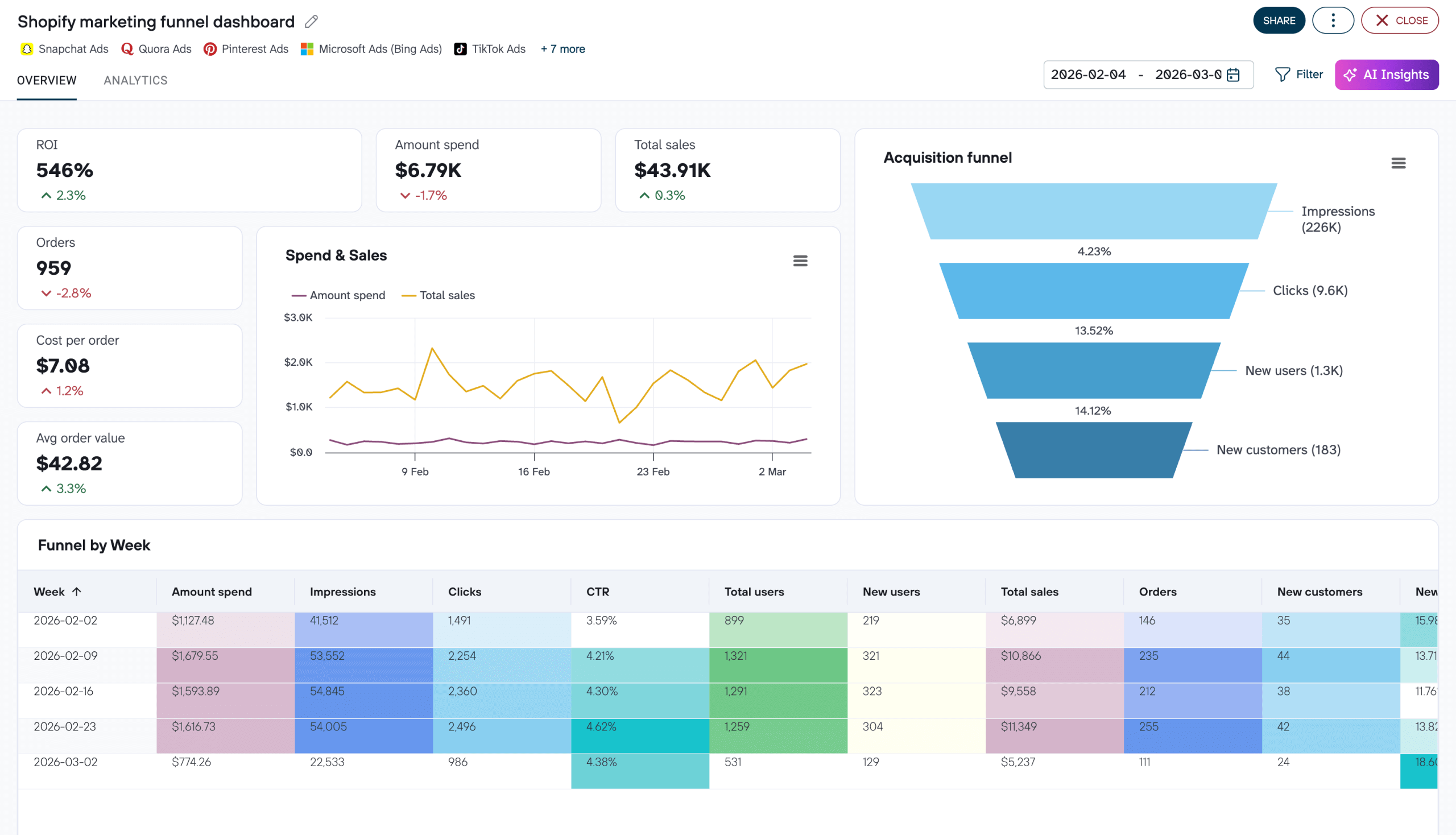
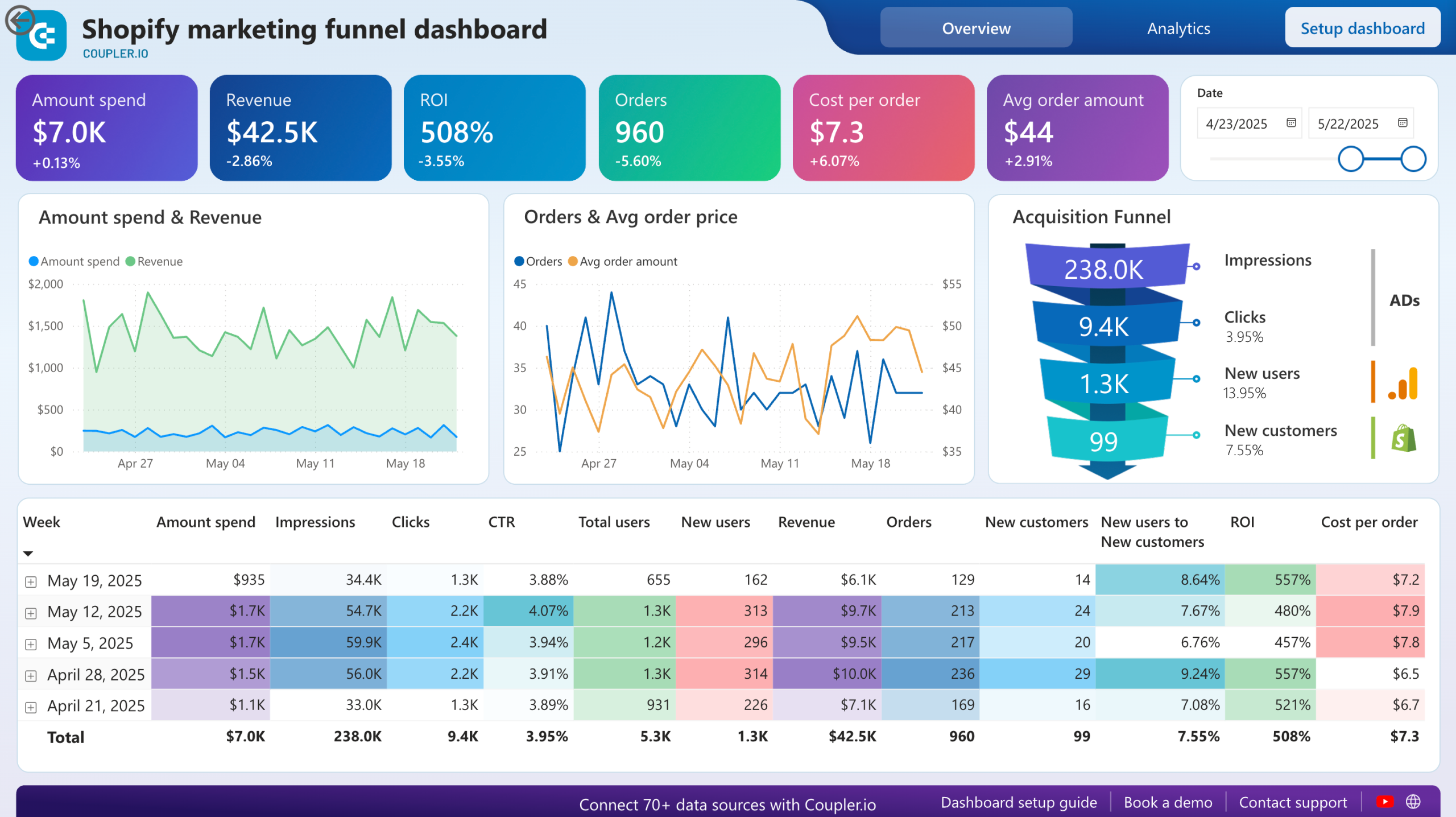
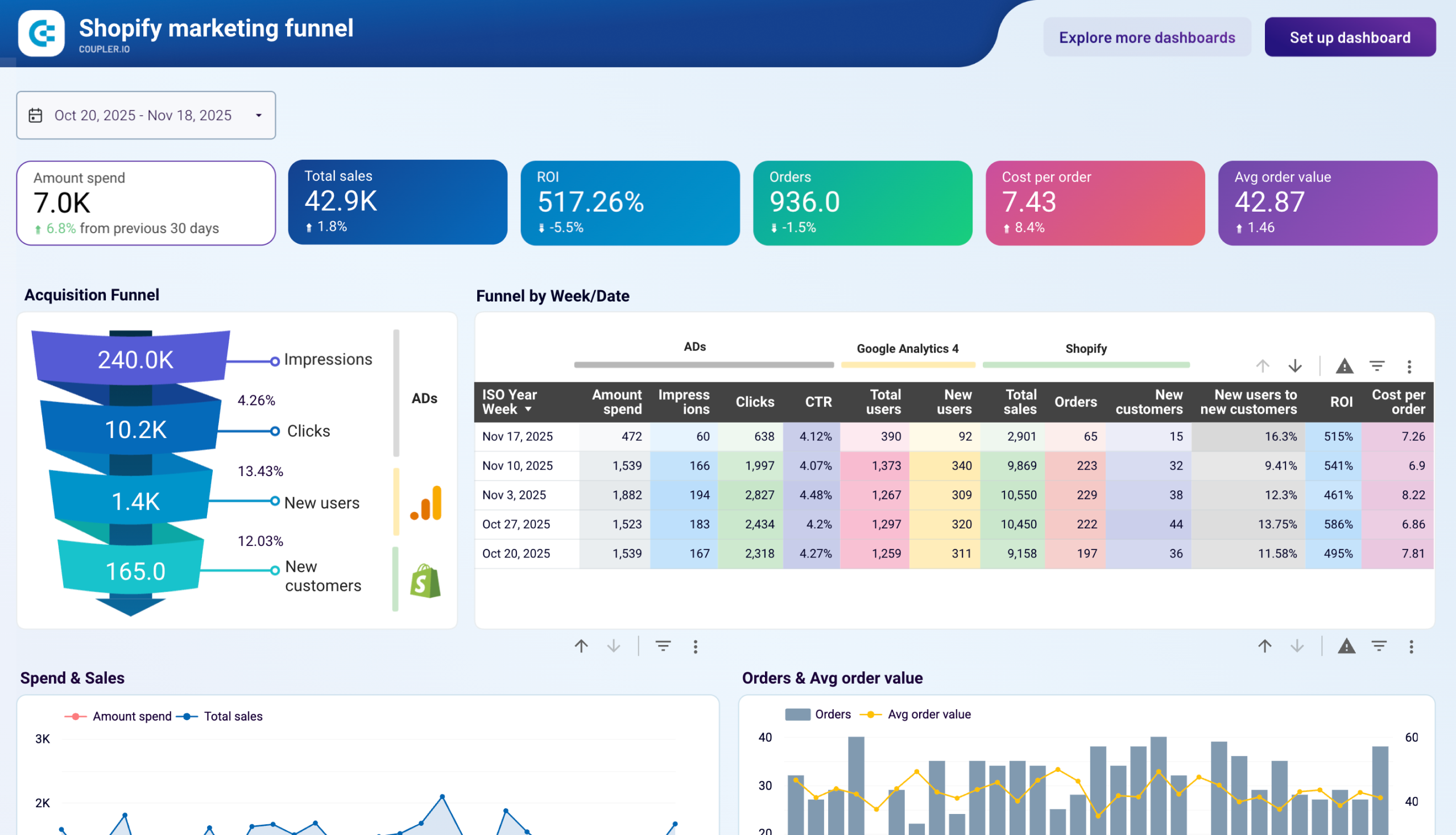
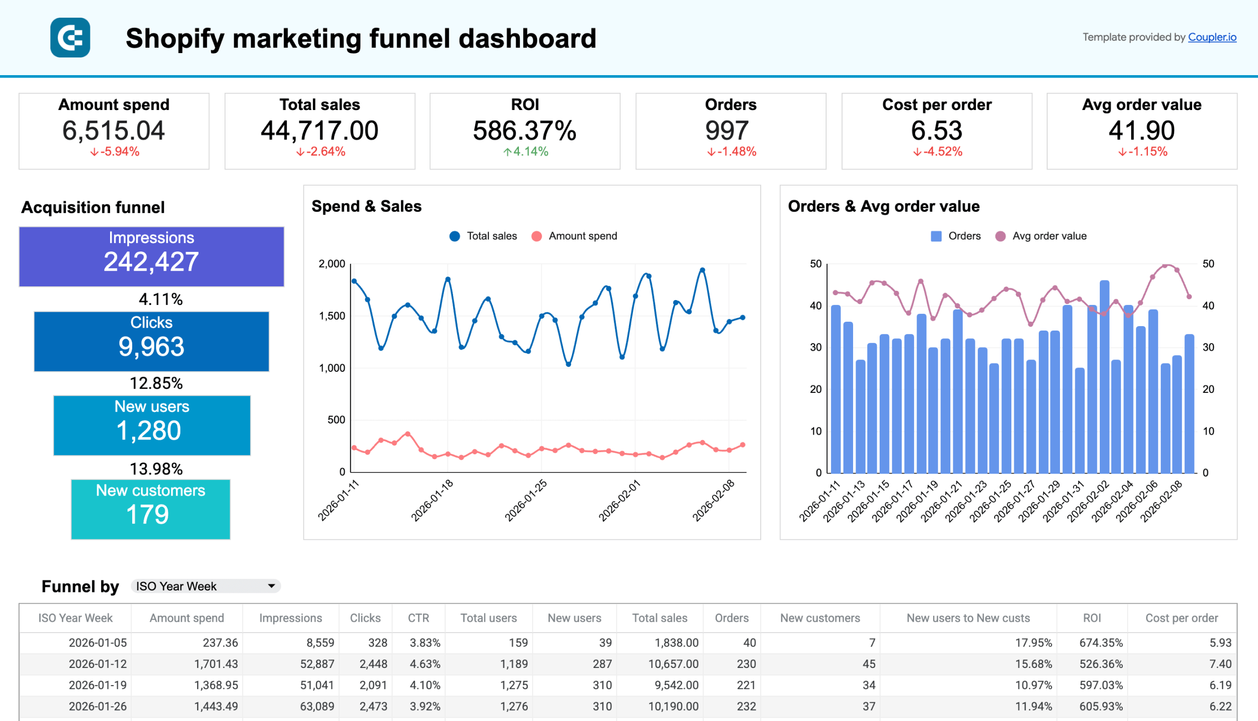
Shopify marketing funnel dashboard + acquisition overview
The Shopify marketing funnel dashboard provides a comprehensive view of your customer acquisition efforts across all channels. It combines data from multiple sources, including Shopify, GA4, and your advertising platforms. This allows you to connect marketing investments directly to revenue and calculate true ROI for each campaign and channel.
Shopify marketing funnel dashboard
 Preview dashboard
Shopify marketing funnel dashboard
Preview dashboardWith this dashboard, you can:
- Compare performance across all marketing channels in one view
- Calculate accurate customer acquisition costs by channel
- Track the complete journey from ad impression to purchase
- Identify which campaigns deliver the highest ROI
- Optimize budget allocation based on actual revenue generation
Case study example: A cosmetics brand used this dashboard to discover that while Facebook Ads generated more traffic, their Google Ads campaigns produced a 38% higher conversion rate and 2.3x higher average order value. By reallocating 30% of their Facebook budget to their top-performing Google campaigns, they increased their overall marketing ROI by 47% within just six weeks.
The dashboard is available in Coupler.io, as well as a template in Looker Studio, Google Sheets, and Power BI. All are equipped with the Coupler.io connector that automates data load from GA4, Shopify, and PPC platforms.


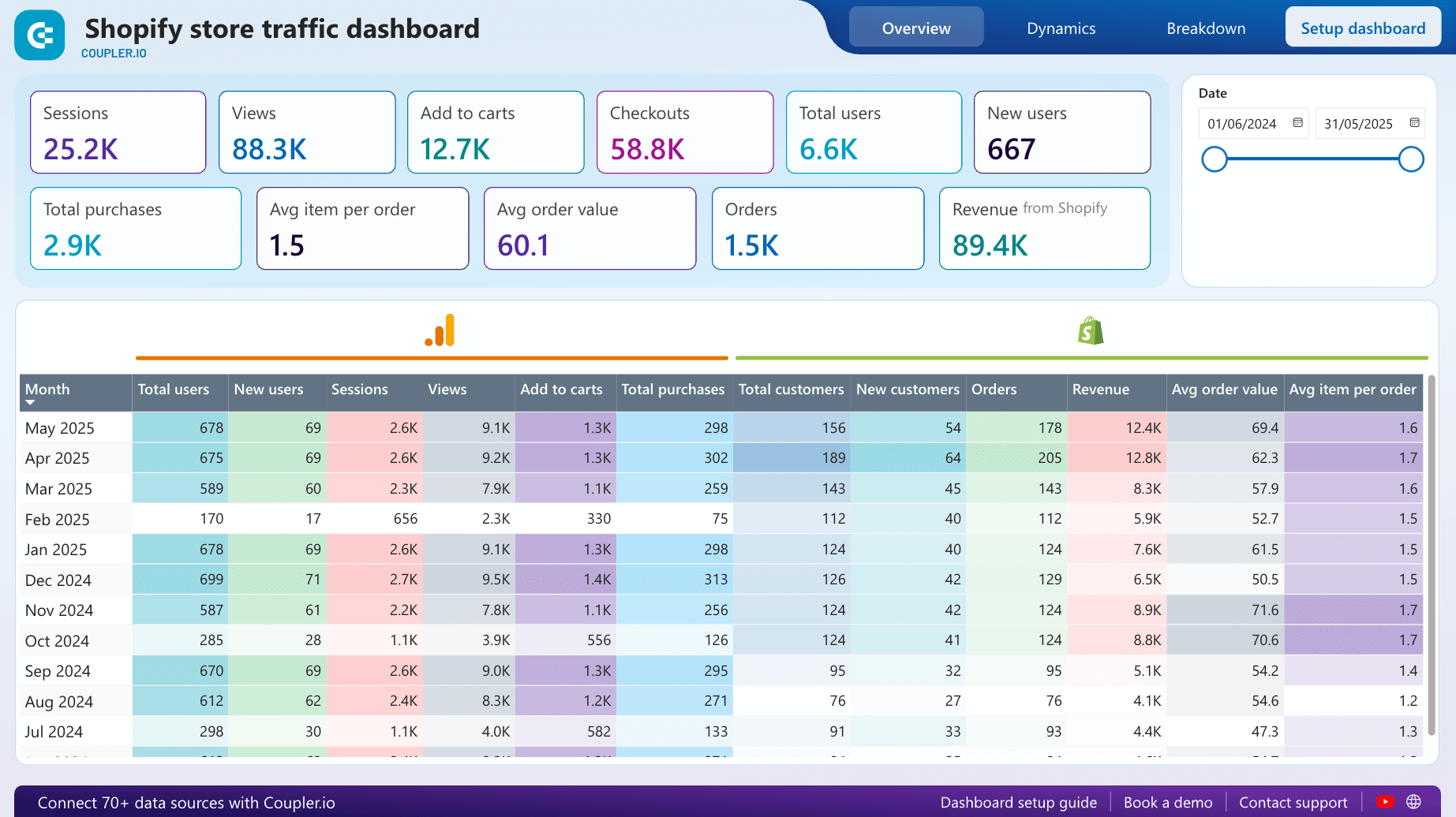
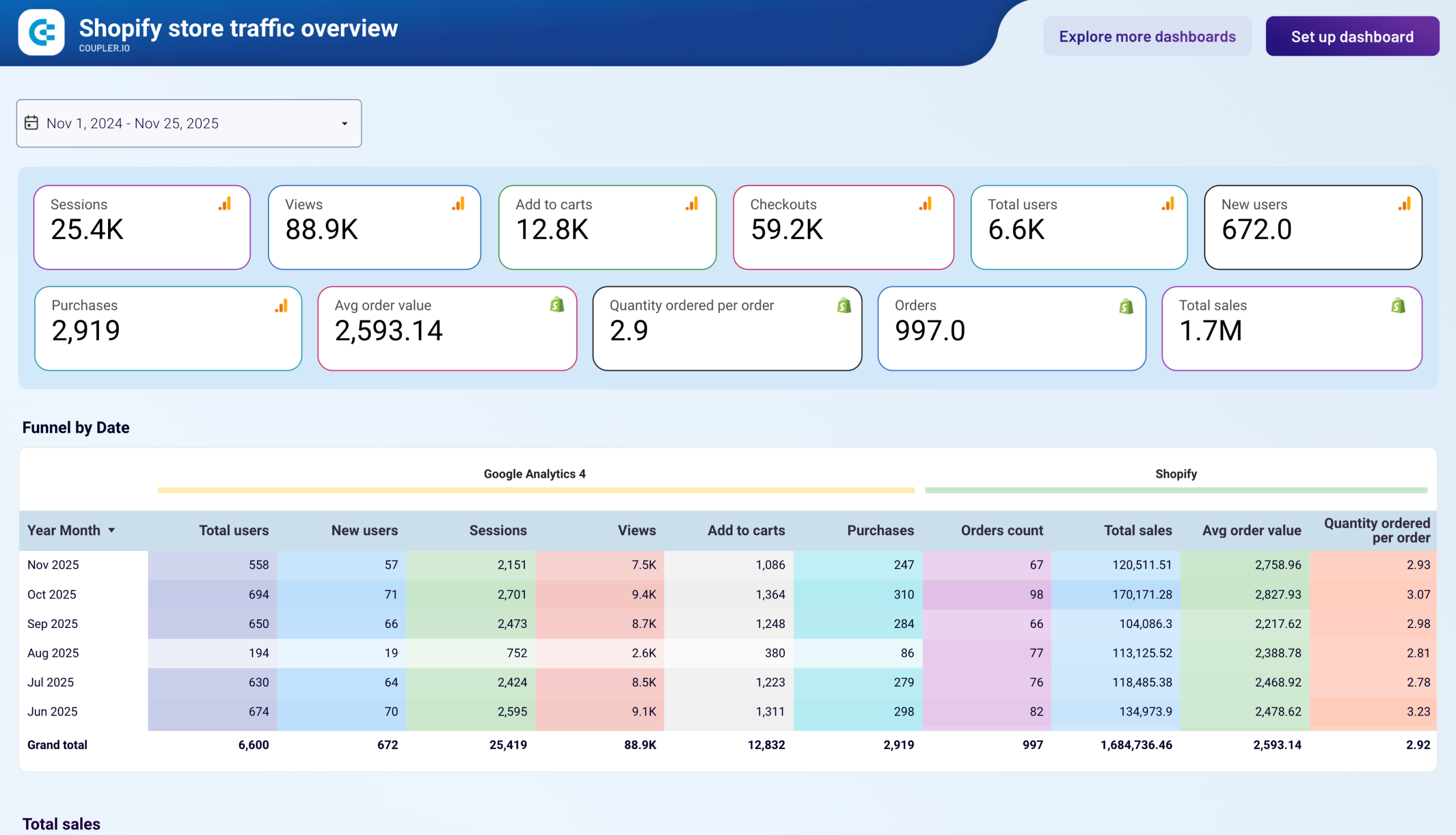
Shopify store traffic overview dashboard
The Shopify store traffic overview dashboard bridges the gap between visitor behavior and purchase activity by merging Google Analytics 4 and Shopify data. This integration provides a 360-degree view of customer interactions that helps you understand not just who your visitors are, but what motivates them to buy.
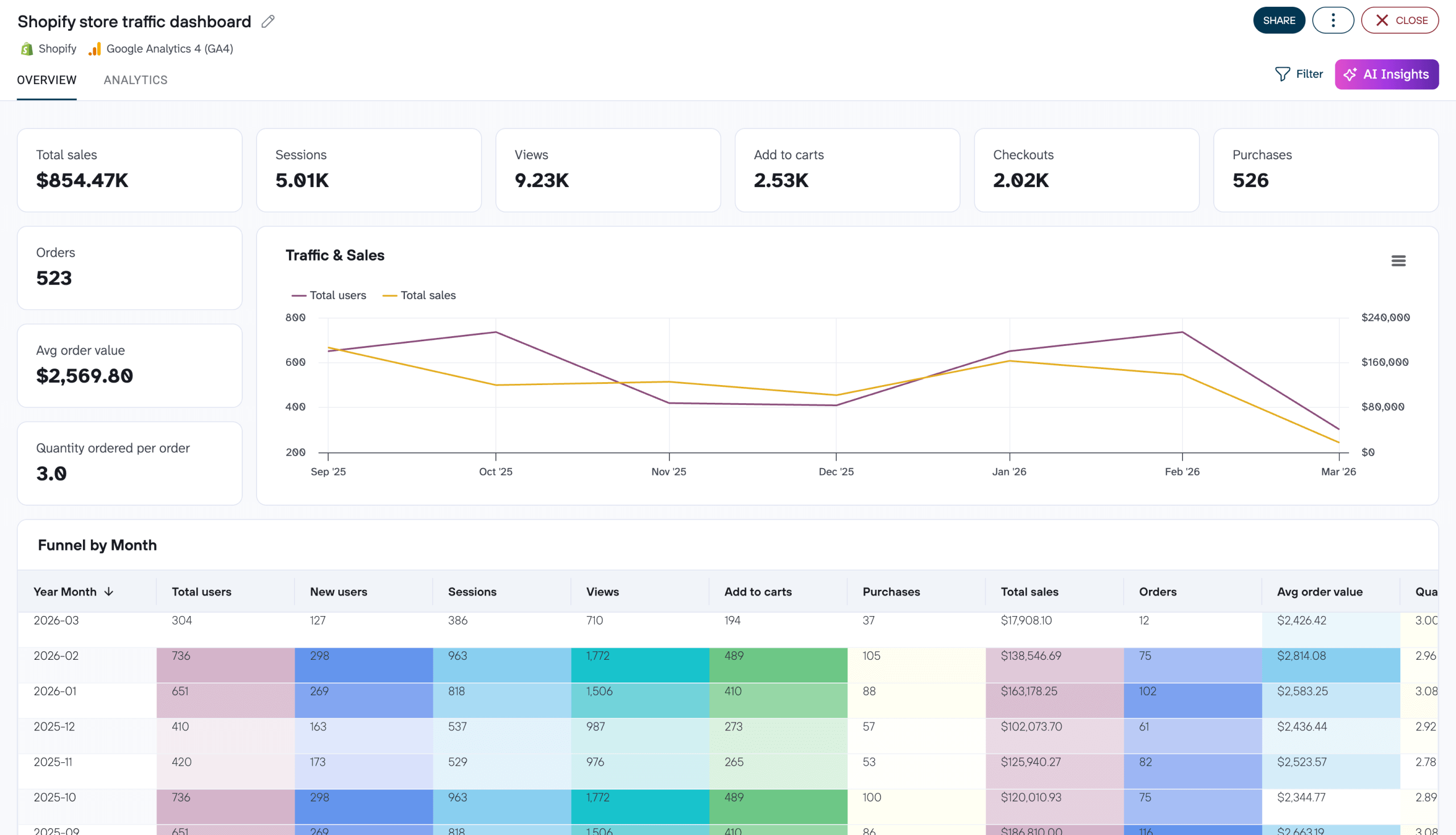
With this dashboard, you can:
- Connect visitor demographics and behavior with actual purchase data
- Identify which product pages have the highest conversion rates
- Track the full customer journey from entry point to purchase completion
- Analyze geographical performance to focus expansion efforts
- Compare device and browser performance to optimize your site experience
Case study example: A home goods retailer used this dashboard to discover which source brings the most visitors. The insight was that the visitors from Pinterest spent 40% more time on the site and had a 78% higher average order value than visitors from other social platforms. By increasing their Pinterest marketing and creating shoppable pins for their best-performing products, they grew revenue by 52% year-over-year while maintaining the same marketing budget.
The dashboard is designed in Coupler.io and can be used as a template in Google Sheets, Power BI, and Looker Studio. It is equipped with the Coupler.io connector that automates data load from GA4 and Shopify. Choose the version you prefer to get started in minutes:
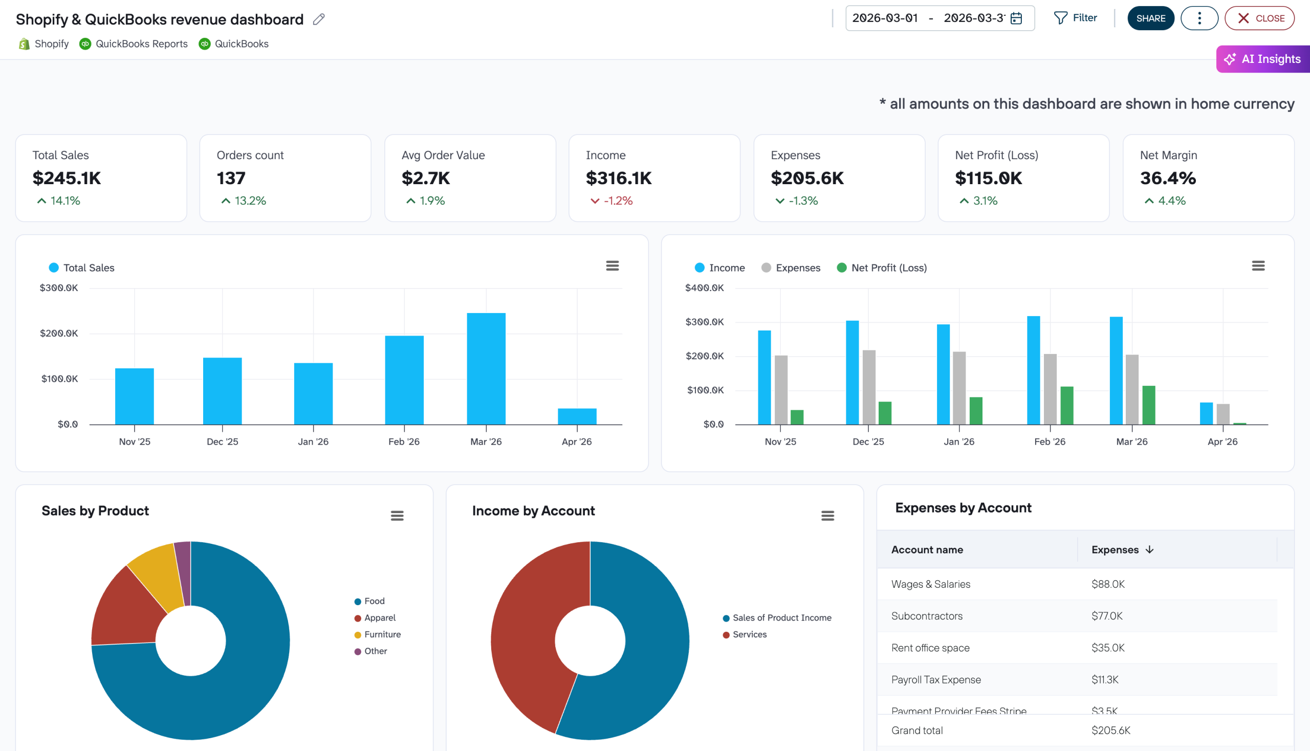
Shopify & QuickBooks revenue dashboard
Shopify’s built-in reports tell you what sold. QuickBooks tells you what you earned. But looking at them separately means you miss the connection between the two. The Shopify & QuickBooks revenue dashboard by Coupler.io merges both data sources into one Looker Studio template so you can see sales performance and financial results together.
Shopify & QuickBooks revenue dashboard
 Preview dashboard
Shopify & QuickBooks revenue dashboard
Preview dashboardWith this dashboard, you can:
- Track total sales, order count, and average order value from Shopify alongside income, expenses, and net profit from QuickBooks
- Compare month-over-month changes across both platforms with side-by-side trend charts
- Reconcile Shopify metrics (gross sales, discounts, returns, net sales) with QuickBooks financials (income, COGS, gross profit, net margin) in a combined monthly table for period-end reporting
- Spot months where sales grew, but profitability didn’t follow, to investigate rising costs or margin compression
Case study example: A home goods retailer noticed through this dashboard that Q4 Shopify sales were up 35%, yet QuickBooks showed net profit had barely moved. The side-by-side view revealed that shipping costs and holiday discounts had eaten into margins. By adjusting their free-shipping threshold and capping discount depth the following quarter, they achieved a 12% improvement in net margin and maintained similar sales volume.
To start using it, create a free Coupler.io account, connect your Shopify and QuickBooks accounts, and follow the instructions. The dashboard is available in Coupler.io and Looker Studio.

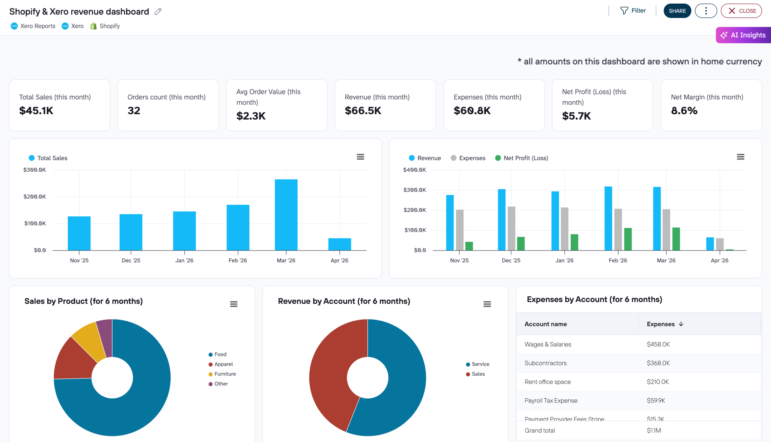
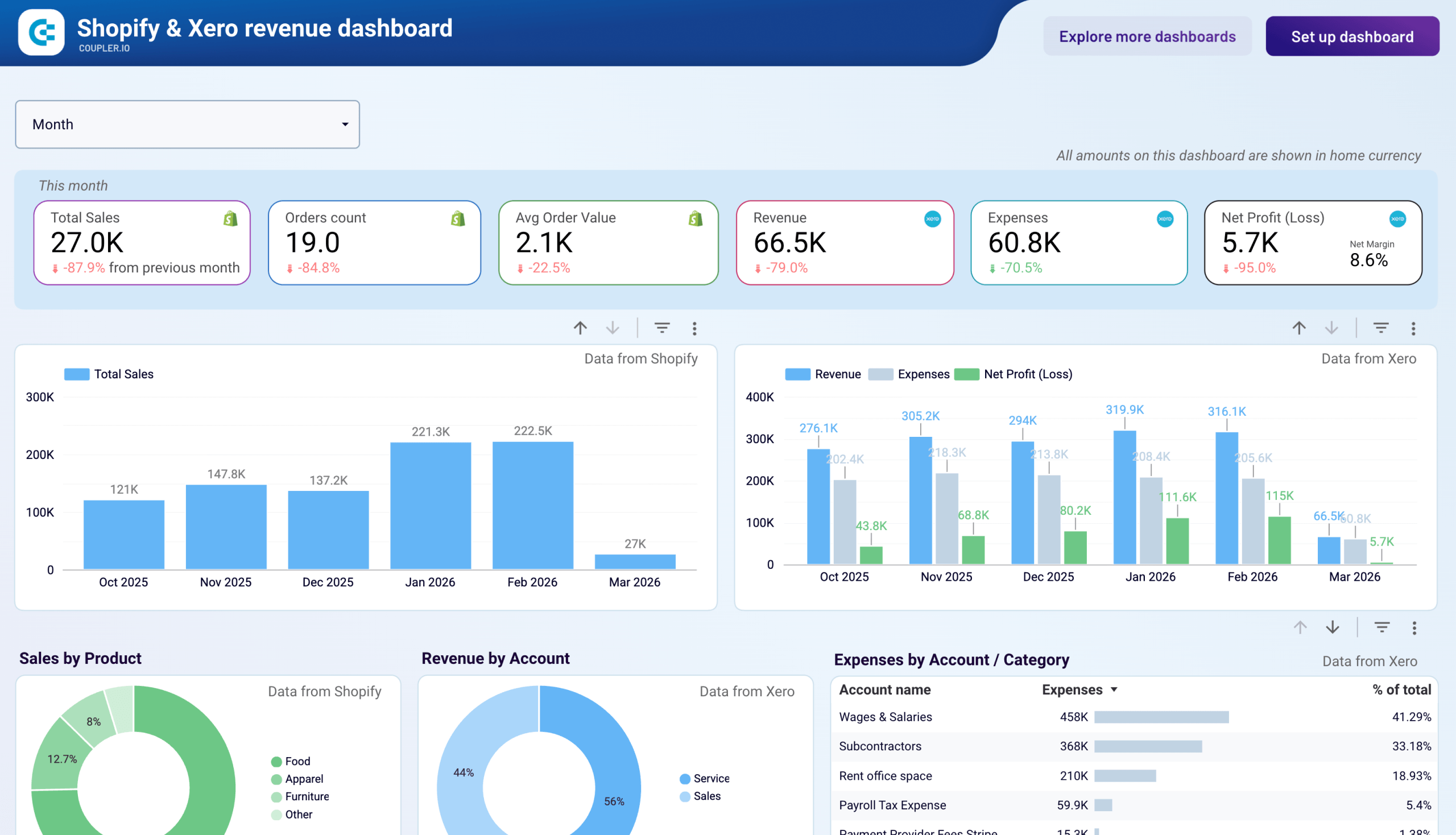
Shopify & Xero revenue dashboard
Teams that run their store on Shopify and their accounting on Xero often end up copying numbers between platforms to build financial reports. The Shopify & Xero revenue dashboard by Coupler.io eliminates that manual step by pulling data from both sources into a single Looker Studio template.
Shopify & Xero revenue dashboard
 Preview dashboard
Shopify & Xero revenue dashboard
Preview dashboardWith this dashboard, you can:
- Compare Shopify sales volume against Xero revenue, expenses, and net profit on the same timeline
- Explore product and account-level breakdowns to see where income concentrates and which cost categories grow fastest
- Monitor cash balance and cash ratio over time, with visual flags for periods when short-term debt coverage dips
- Identify months where storefront activity was strong but financial results lagged, pointing to expense spikes worth investigating
Case study example: A supplements brand used this dashboard to compare Shopify order trends with Xero expense data and discovered that their cost of goods had crept up 18% over six months without a corresponding price adjustment. The account-level breakdown pinpointed a supplier whose rates had increased twice. After renegotiating terms and updating product pricing, they restored their gross margin to the previous year’s level within one quarter.
Sign up for a free Coupler.io account and follow the setup instructions to connect your Shopify and Xero data. Just like the QuickBooks one, the dashboard is available in Coupler.io and Data Studio.

For all of these dashboard templates, follow the instructions in the Setup guide tab. In a moment, you will be redirected to a copy of the Shopify dashboard with your data. The dashboard will be updated automatically every day by default. If you want to have a more frequent data refresh, go back to Coupler.io and tweak the schedule to your liking. Every 15-minute refresh will make your Shopify dashboard live!
If the default dashboard template is too limiting for you, you’ll need to build a custom one. Don’t worry, though – you won’t have to start from scratch or engage a data analyst to do the job for you. You can achieve plenty with the available tools or with just a bit of expertise in working with a spreadsheet.
Build a custom Shopify dashboard for your needs
With Coupler.io, you can turn your raw data from Shopify and other sources into meaningful reports. For this, you only need to take three simple steps. Let’s see how you can create a Shopify dashboard in Google Sheets.
1. Collect data from Shopify
Click Proceed in the form below to sign up for Coupler.io for free and create an automated Shopify importer. We’ve preselected Google Sheets as the destination but feel free to change the destination app if you want to create a report in another place. Alternatively, you can connect Shopify to Excel or fetch the data from Shopify to BigQuery
- Connect your Shopify account to Coupler.io. You’ll need to enter your shop name in the format
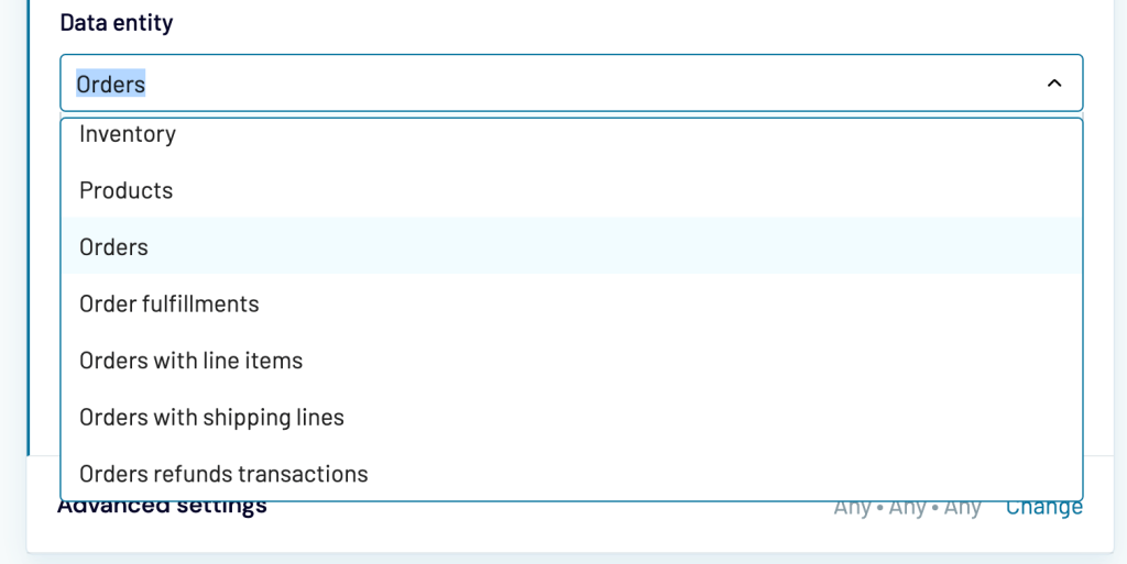
shop-name.myshopify.comand log in to your Shopify account if haven’t done before. - You should have an idea of what you want to show on a dashboard at this stage. Sales data? Stock levels? Shipment or fulfillment details? Or perhaps all of it? Pick the data that interests you the most and select it in the Data entity field. Here’s a sample configuration:
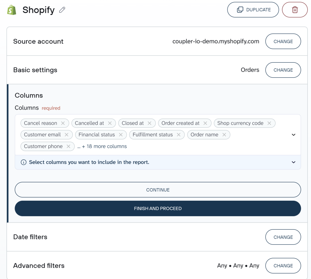
You can also connect multiple sources of data like different stores, CRM apps, Google Analytics, and more.
2. Transform and organize data
In this step, you can actually turn your raw data into a report. Coupler.io allows you to:
- Rename, rearrange, or hide columns.
- Apply filters and sort data.
- Use formulas for custom columns.
- Quickly summarize and reveal key insights of your data by performing operations like sum, average, count, min, or max on specific columns.
- Combine data from several accounts or from different apps.
- Aggregate data to reveal new insights.
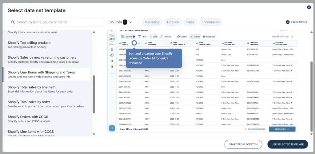
Want to skip the manual setup? Instead of configuring transformations from scratch, you can start with a data set template. It’s a pre-built report configuration with expert-selected metrics, calculations, and aggregations ready to go. Coupler.io offers 20+ Shopify data set templates covering sales breakdowns, customer insights, inventory forecasts, profitability analysis, and more. For example, the Top Selling Products template gives you net items sold, gross/net sales, and returned quantity rate across daily, weekly, and monthly views. No formulas needed.
To use a data set template, create a new data flow and click Start with template instead of configuring everything manually.
3. Load data and schedule refresh
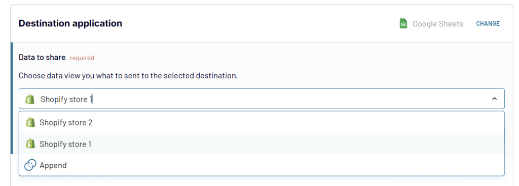
Once your report is ready, you can load it to the chosen destination – in our case, this is Google Sheets. Follow the introductions to connect the destination app and load your report.
If you’ve combined data from multiple sources, you’ll also need to specify the data view to load.
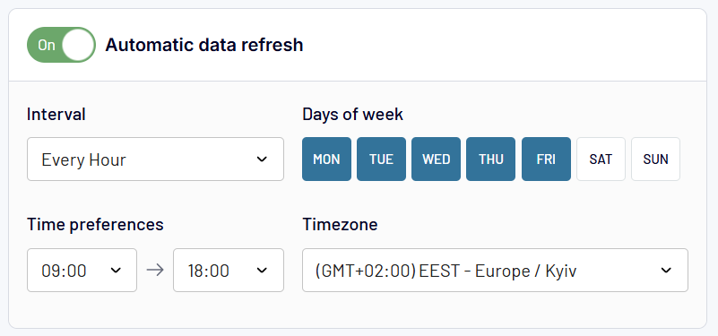
As the final step, choose when and how often the data should be refreshed in the Flow settings.
The Shopify data will be fetched right into your spreadsheet.
4. Visualize data for your Shopify custom dashboard
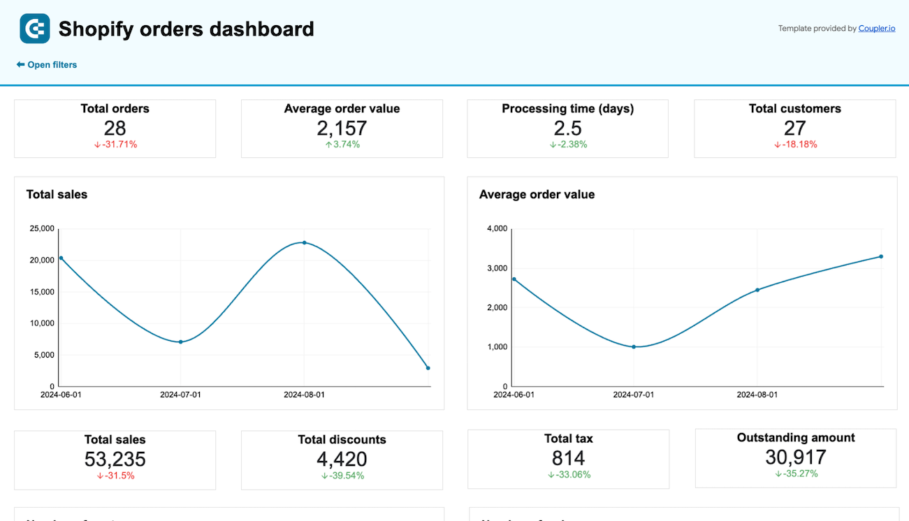
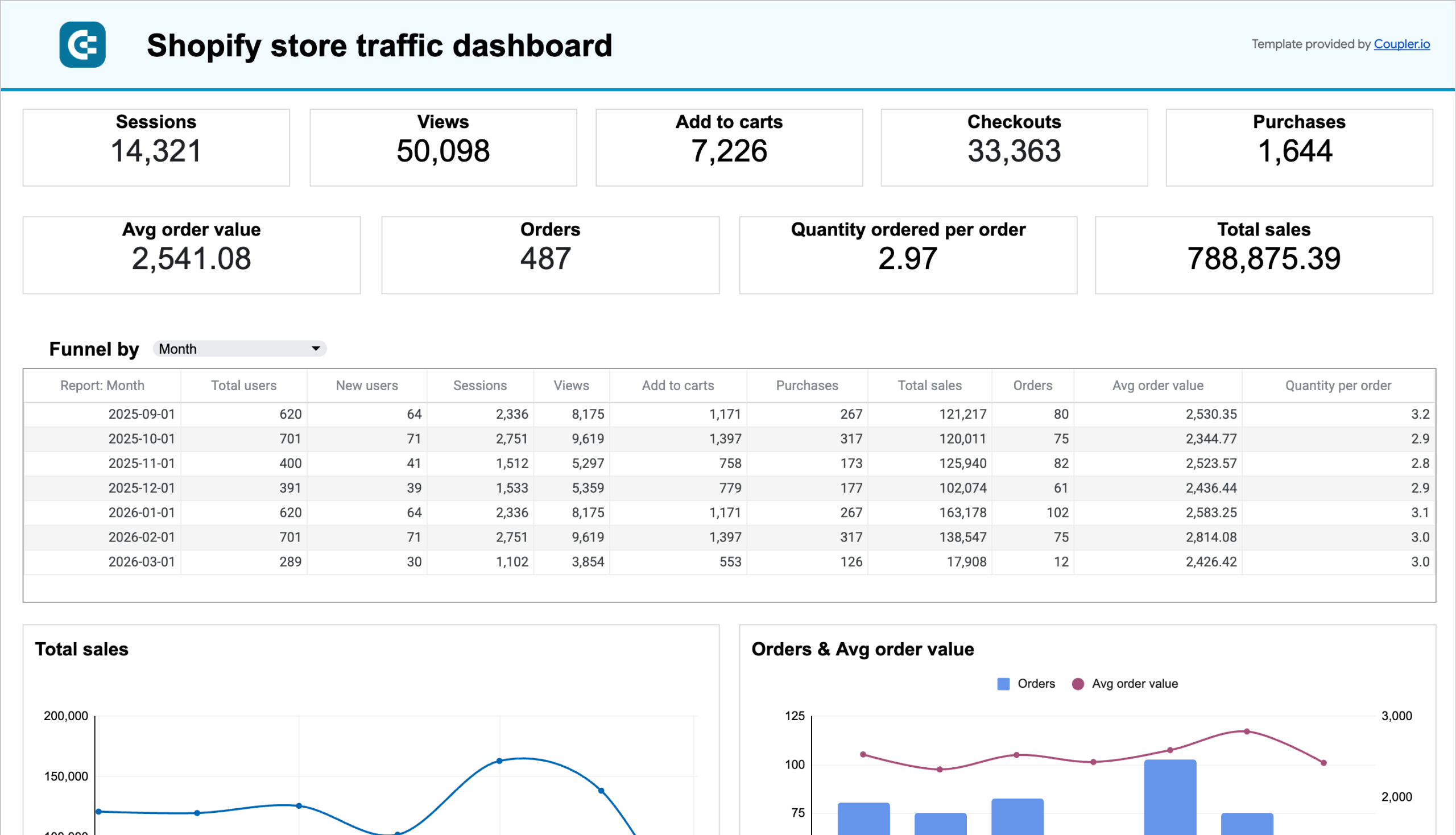
Here is a Shopify dashboard in Google Sheets that we’re going to build. It’s just a simple example to demonstrate what you can create using the combination of Shopify data, Coupler.io, and Google Sheets to monitor your own business.
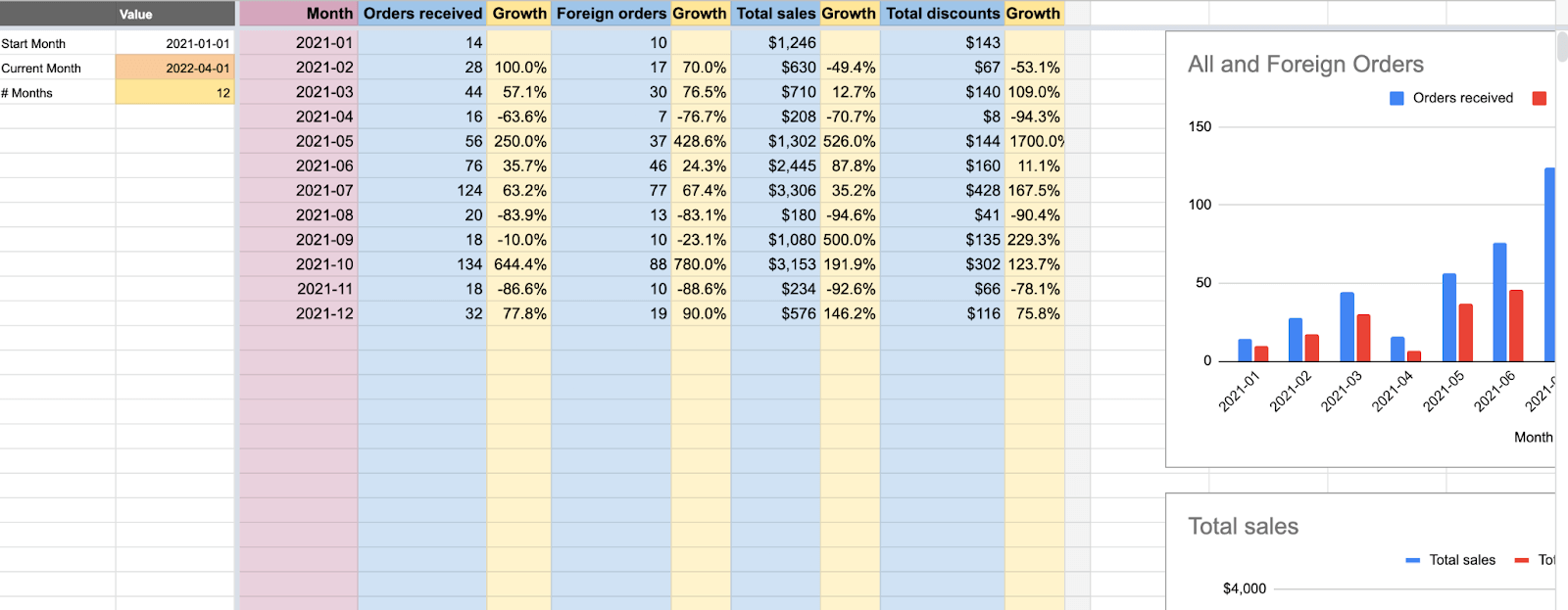
Our dashboard calculates:
- The volume of orders and, separately, the number of orders shipped abroad
- Total sales for each month
- Total discounts applied for orders placed in a given month
If you’d like, you can freely adjust the type of data to be shown in the tables and on charts. We’ll show you how to do that shortly.
For now, open the template, go to File -> Make a Copy. This will create a separate copy of the template that you can freely edit.
In the Orders with shipping lines tab of the template, you’ll find a bunch of sample data exported from our store. It serves solely demonstration purposes so you can remove it at any time.
To the left of the template, you can adjust the start month (B2) and the number of subsequent months to be displayed (B4).
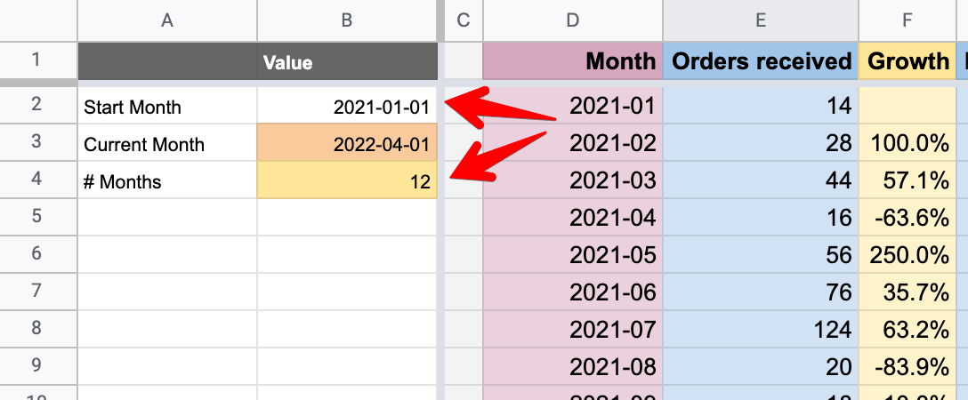
Note that the Start Month field is used solely to determine the start month. Thus, the specific day chosen is ignored. Choosing e.g. January 31st rather than 1st will still fetch all orders placed in January.
Here’s the formula for calculating orders received:
={
"Orders received"; ArrayFormula(IF(LEN(D2:D)=0,, IFERROR(
  VLOOKUP(
    D2:D, QUERY(
      TEXT('Orders with shipping lines'!T2:T, "YYYY-MM"),
      "SELECT Col1, COUNT(Col1) GROUP BY Col1",
      0 ), 2, false))))}
Word of explanation:
Orders with shipping lines'!T2:Tcorresponds to thecreated_atfield in the Orders with shipping lines tab, which tells us when an order was placed.- The QUERY formula returns the month when an order was placed and the total number of orders. We choose to return only the second value, thus 2 towards the end of the formula.
- You can use this formula for summing up any other Shopify data. For example – import only the unpaid or fulfilled orders into another tab and reference this data in the formula above.
We can also add the criteria directly in the formula, and that’s what we do in the Foreign orders column. Here, we refer to shipping_address.country_code field of our import (column ER). We want to count only the orders where the field value is different than US. So we use the following formula:
={
  "Foreign orders";
  ArrayFormula(IF(LEN(D2:D)=0,, IFERROR(
    VLOOKUP(
      D2:D,
      QUERY(
        {TEXT('Orders with shipping lines'!T2:T, "YYYY-MM"), 'Orders with shipping lines'!ER2:ER},
        "SELECT Col1, COUNT(Col1) WHERE Col2 <> 'US' GROUP BY Col1",
        0
      ),
      2,
      false
    )
  )))
}
Here:
- We use the QUERY formula to pull the column with country codes
- We then use a simple SQL to pull only orders
WHERE Col2 <> 'US'
In the Total sales field, we refer once again to the column with dates (created_at – column T). On top of that, we use the column BU (total_price) and sum up the values for all orders placed in a particular month.
=
{"Total sales";
ArrayFormula(IF(LEN(D2:D)=0,, IFERROR(
  VLOOKUP(
    D2:D,
    QUERY(
      {TEXT('Orders with shipping lines'!T2:T, "YYYY-MM"), 'Orders with shipping lines'!BU2:BU},
      "SELECT Col1, SUM(Col2) GROUP BY Col1",
      0),
    2,
    false
  )
 )))
}
We do the same in the Total discounts field, just this time summing up the values in the column BR (total_discounts).
In between the mentioned columns we put simple formulas for calculating month-to-month growth in each column. Depending on your use case, it may make sense to adjust the formulas to, for example, calculate the relations between columns instead (e.g., foreign orders vs. all orders).
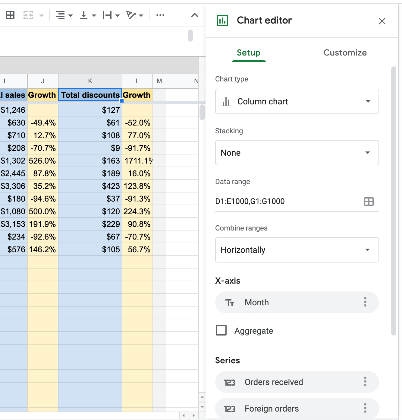
Double-clicking on any charts will open up a configuration panel where you can choose what data should be shown and in which way.
Best practices for creating Shopify dashboards
When creating your Shopify dashboard, consider these best practices to maximize its value:
Focus on actionable metrics – Choose metrics that directly inform business decisions rather than vanity metrics. For example, track conversion rates, average order value, and customer acquisition costs instead of just total visitors or social media likes. To help you with the task, we’ve prepared the list of recommended metrics to use with your custom Shopify dashboard.
Create appropriate timeframes – Different metrics are meaningful over different time periods. Daily sales data may have too much noise to be useful, while monthly trends might be more actionable. Consider using rolling averages for smoother trend lines.
Segment your data – Break down your metrics by important segments like product categories, customer types, or acquisition channels. This helps you identify specific areas of strength and weakness rather than looking only at aggregate numbers.
Use clear visualizations – Choose the right chart types for your data. Use line charts for trends over time, bar charts for comparisons between categories, and tables for detailed breakdowns. Avoid cluttering your dashboard with unnecessary visual elements.
Set benchmarks and targets – Include targets or previous period comparisons to provide context for your metrics. This helps you quickly identify whether performance is improving or declining relative to your goals.
Keep it up-to-date – With Coupler.io’s automatic refresh capabilities, ensure your dashboard displays the latest data. Set refresh intervals that match your decision-making cycle – daily for operational metrics, weekly for tactical decisions, and monthly for strategic planning.
Now let’s talk about the native dashboarding option in Shopify and explore how you can use it.
Which metrics to use in your custom Shopify dashboard
After seeing all those dashboards, you might be overwhelmed with the possibilities, particularly the number of metrics that you can have on your custom Shopify dashboard. But we’re here to help you!
Which metrics to use in your custom Shopify sales dashboard
Check out our top 8 most useful metrics for sales analytics purposes. Here they come:
Total sales
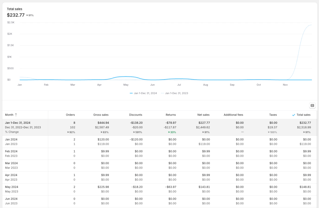
This is the basic yet fundamental metric that shows the actual performance of your Shopify store. The total sales value is shown on a timeline to let you see how your store does over time. The timeline also lets you notice interesting upward and downward trends to correlate them with specific marketing campaigns you run, shopping seasons, etc.
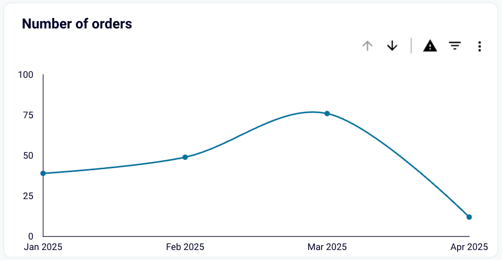
Number of orders
This is another core metric that directly reflects the volume of transactions made by your customers. Similar to total sales, it’s visualized over time, so you can relate its value to campaigns to assess their effectiveness, plan your inventory, identify trends and seasonalities, and more. When it increases, it usually means your sales volume or customer base is growing. Good for you!
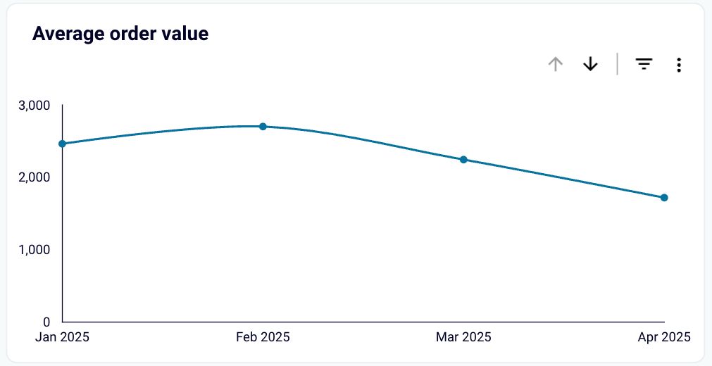
Average order value
This metric lets you see how much each customer spends per transaction at your store. Knowing the average sales value, you can implement strategies to improve it, such as introducing cross-selling deals or setting a free shipment threshold. Then you can observe how these influence AOV.
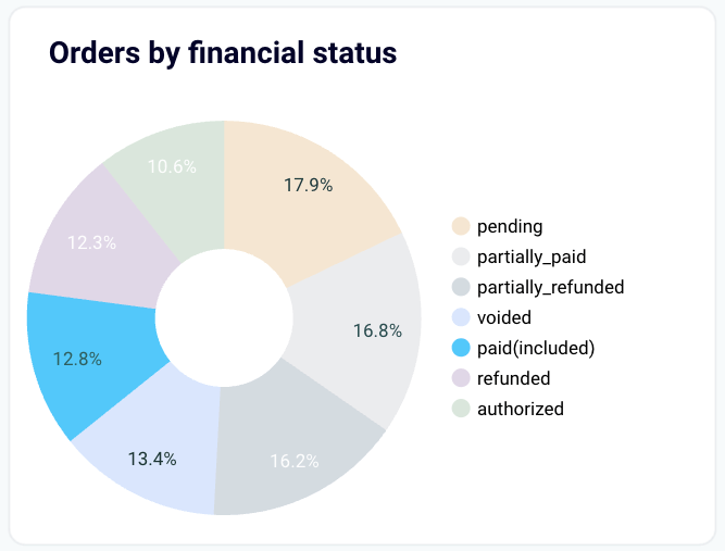
Orders by financial status
While not useful for sales analytics on its own, this metric should definitely make its way to your perfect Shopify sales dashboard. Then, you will be able to filter its values on the pie chart and see the updated values for common sales metrics. For example, show only completed orders to make accurate revenue calculations. Or see how many customers failed to complete a financial transaction successfully to see if your payment vendor performs well.
Other than that, this metric can be useful for a number of obvious reasons related to handling your orders daily, such as order fulfillment, managing refunds, customer service outreach, etc.
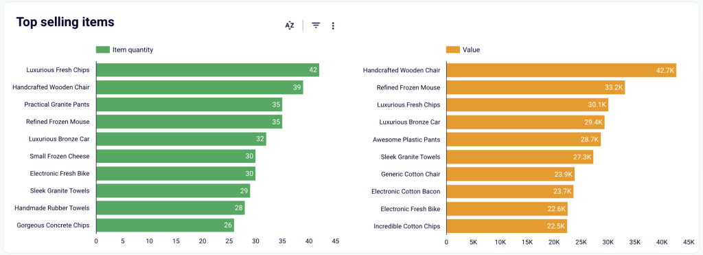
Top selling items
Knowing which goods sell the best, either by quantity or value, can be a source of valuable insights. With such data at hand, you can further promote top selling items to maximize revenue, take care of sufficient stock levels, optimize your listings SEO-wise, and more.
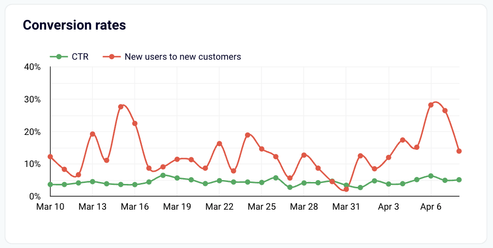
Sales conversion rates
Usually, your users’ journey begins with viewing and clicking your ad somewhere on the web and then continuing into your store website. If you’re looking for a tandem of key metrics that measure the performance of the ads and the website, the Conversion rates chart will be your go-to place. Just connect Google Analytics and the advertising platform(s) that you use in addition to your Shopify data source to get insights on:
- Click-through rate (CTR) — helps you see how effective your ad or listing campaigns are. This metric tells you how many percent of people actually clicked your ads or links after viewing them.
- New users to new customers — with this one, you can easily assess if your Shopify store experience is streamlined and intuitive, effectively turning new incoming traffic into buyers. In other words, it tells you what percentage of new store visitors actually purchased something from you.
Analyzing the sales conversion rates metrics with Coupler.io is really simple. You not only get clear visual representations of the metrics on the chart but also behind-the-scenes data connectors to fetch data from the multiple data sources and keep it up-to-date automatically.
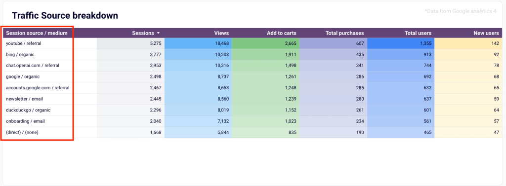
Sales by traffic source
This metric helps you understand which source, for example, YouTube referrals, your newsletter, organic Google search, etc., brings the most visitors to your Shopify store. Even better, it shows you clearly how many visitors from each source reach the next steps of the sales funnel! Being equipped with such valuable information, you can maximize your marketing efforts for the best sources, effectively budget your ad campaigns, and so on.
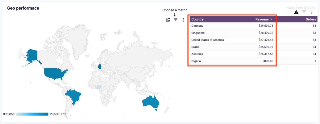
Revenue by country
If you sell to multiple geographies, this metric is a must. Knowing where you have buyers who spend the most, you can take multiple actions. For example, allocate more funds for advertising campaigns targeted at specific countries, find a cheaper shipping vendor to offer cheaper shipments to selected countries, consider running a new language version of your store, and so on.
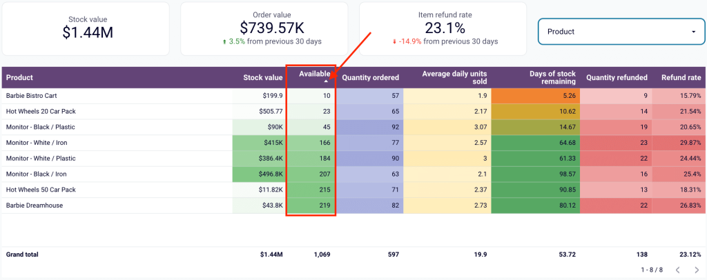
Item availability
Keeping sufficient item stock levels is crucial to avoid misunderstandings, maintain high levels of user satisfaction, and ultimately maximize your sales. With the item availability metric, you can quickly identify items that you’re going to run out of soon. Just sort the Available column by the ascending order to see the exact & color-coded numbers. Then, simply contact vendors to restock soon-to-be-missing items. Peace of mind, satisfied customers, and optimal store performance will be your rewards!
Which metrics to use in your custom Shopify analytics dashboard
If you’re building a custom Shopify analytics dashboard, it’s important to track the right metrics. You must uncover insights that actually drive growth. Here are some key Shopify metrics you should include and why they matter:
- Total Sales: Total sales tell you the overall revenue generated across all channels. It’s your go-to metric for understanding store performance at a glance and tracking revenue growth month over month.
Total Sales = Gross Sales – Discounts – Returns + Shipping + Taxes
On your custom dashboard, you may exclude Shipping costs from the formula and edit it in another way. Here are some other metrics that you can locate on the dashboard:
- Average order value (AOV): AOV shows the average dollar amount spent per order. Monitoring AOV helps you measure the performance of upselling and cross-selling strategies. A higher AOV usually means customers are buying more or choosing premium products.
AOV = (Gross Sales – Discounts) ÷ Total Number of Orders
- Conversion Rate: Your conversion rate tracks how many visitors complete a purchase. It’s a direct indicator of how well your store and checkout process are optimized. A low conversion rate may signal friction points like slow loading times or complicated checkout flows.
Conversion Rate = (Total Orders ÷ Total Sessions) × 100
- Customer Retention Rate: Acquiring new customers is great, but retaining existing ones is even better (and more cost-effective!). Retention rate shows how many customers return to buy again which gives you insights into customer loyalty and the long-term health of your business.
Retention Rate = (Returning Customers ÷ Total Customers) × 100
- Sales by Traffic Source: This metric tells you where your customers are coming from (organic search, paid ads, email, social media, etc). Understanding traffic sources helps you double down on high-performing channels and optimize or rethink low-performing ones.
- Top Products Sold: Tracking your best-selling products reveals what your customers love the most. It helps you plan inventory, run targeted promotions, and even inspire ideas for expanding your product range.
- Cart Abandonment Rate: This shows how many customers add items to their cart but leave without purchasing. A high abandonment rate signals issues like unexpected shipping costs, a lack of payment options, or confusing checkout steps that need fixing.
Cart Abandonment Rate = (1 – (Completed Purchases ÷ Carts Created)) × 100
- Gross Profit Margin: It’s not just about how much you sell — it’s about how much you keep. Gross profit margin shows the percentage of sales revenue you actually profit from after covering the cost of goods sold (COGS).
Gross Profit Margin = [(Total Sales – Cost of Goods Sold) ÷ Total Sales] × 100
- Refund and Return Rates: Monitoring refund and return rates helps you detect product quality issues, shipping problems, or even mismatched customer expectations early on.
Return Rate = (Number of Returned Orders ÷ Total Orders) × 100
- Sales by Customer Location: Knowing where your customers are located lets you customize marketing efforts and plan localized promotions, shipping strategies, or even new product launches.
This is a very plain example of a custom Shopify analytics dashboard. However, the idea is that you can and probably should work with your data without the limitations of Shopify to power up your performance analytics.
Note: For each metric, you’ll need a specific type of data to load from Shopify. For example, to calculate Top products in demand, you’ll need information about products on your Shopify store. And so on.To start using it, create a free Coupler.io account, connect your Shopify and QuickBooks accounts, and follow the instructions on the Readme tab.
How to access the Shopify dashboard in your Shopify account?
You won’t find any mention of a dashboard in the Shopify interface. That’s not to say that it’s not there. You can access the dashboard by clicking on the Analytics tab in the menu.
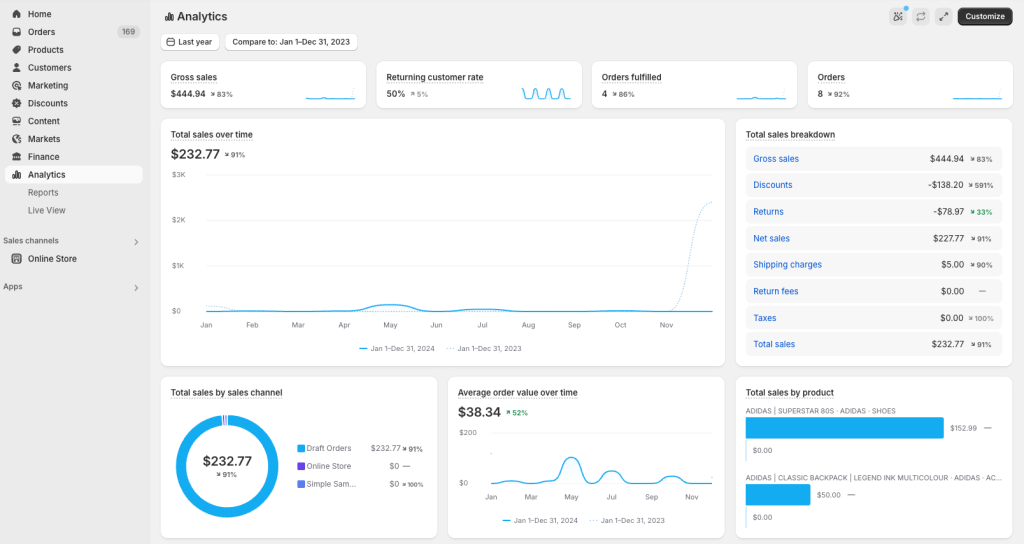
Here, you’ll see about 20 charts and other visual representations of your store’s data. Unfortunately, the set of charts is fixed and cannot be adjusted.
You could not customize the dashboard previously but now you can add, remove, and reorder charts hence reports on your dashboard.
How to change your Shopify dashboard?
To customize the native Shopify analytics dashboard, click the respective button in the top right corner.
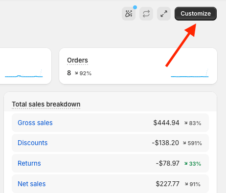
After that, you can:
- Reposition charts on the dashboard by dragging them.
- Remove charts from the dashboard by clicking the X symbol in the top right corner of a chart.
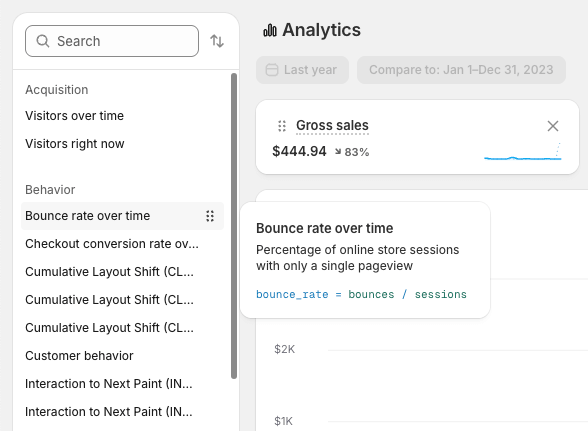
- Add charts (reports) to the dashboard from the left panel. You can either click on the needed report to add it or drag it to the position you want.
Note: To save changes, click the respective button on the top of the dashboard.
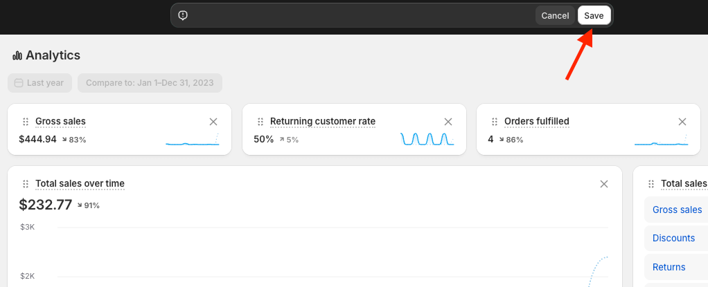
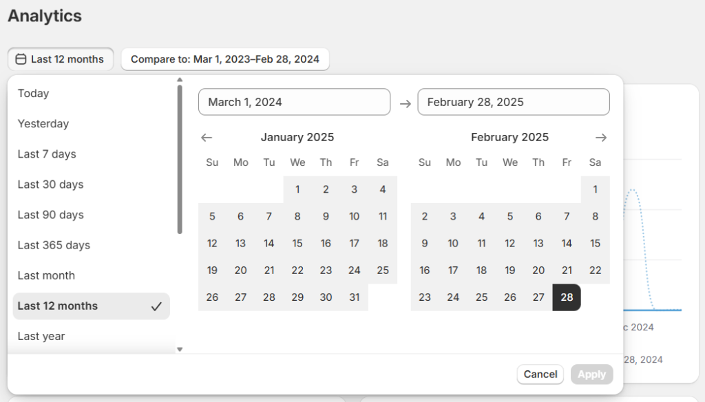
In addition to the mentioned customization options, you can adjust the reporting period in the top-left corner and choose what the data should be compared to. The settings will be saved, so you should also see the previous reporting period on the next visit.
What reports are available for the native Shopify dashboard?
The native Shopify dashboard visually represents various reports available on Shopify. By default, the following reports are featured in the dashboard:
- Gross sales
- Returning customer rate
- Orders fulfilled
- Orders
- Total sales over time
- Total sales breakdown
- Total sales by sales channel
- Average order value over time
- Total sales by product
- Sessions over time
- Conversion rate over time
- Conversion rate breakdown
- Sessions by device type
- Sessions by location
- Total sales by social referrer
- Customer cohort analysis
- Sessions by landing page
- Sessions by social referrer
- Total sales by referrer
- Sales attributed to marketing
- Sessions by referrer
- Total sales by POS location
- Products by sell-through rate
- POS staff sales total
Optionally, you can add more Shopify reports to your dashboard when customizing it. For a complete list, see this Shopify help article.
Shopify live dashboard
Under the Live View tab, you can see what’s happening on your store’s website. You’ve got a map where the locations of your recent visitors and orders are visible.
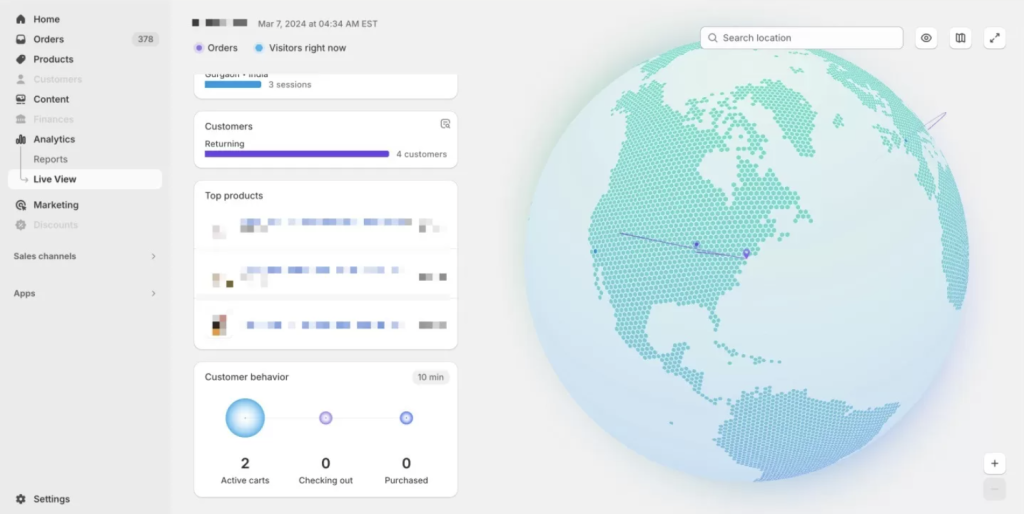
What’s more, you can see the count of visitors and sessions and the volume of orders placed on a given day. Below, you can view the top products, the quantity of returning customers, and the sales funnel. The latter shows the number of active carts, shoppers checking out, and those that already purchased in the last 10 minutes.
How to export the Shopify dashboard?
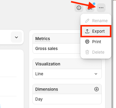
You can’t export an entire dashboard, unfortunately. Instead, you may export particular reports as .csv files if you’d like. Other options like XML, JSONL, and Apache Parquet are also available. To do so, open a specific report. Then, click the menu (three dots) button in the top-right corner and choose Export. Finally, choose the export file format and click the Export button in the popup that opens.
This is probably not the handiest method if you want to export an entire dashboard or a number of reports. This is why, you should consider Coupler.io. It allows you to automate data flows from your Shopify account and load information about orders, customers, and other entities to spreadsheets, data warehouses, and BI tools. With each of these tools, you can build a self-updating dashboard for Shopify and share it with your colleagues.
Shopify Dashboard – frequently asked questions
We’ve browsed through the Shopify community forums and gathered the list of recurring questions related to Shopify dashboards. We’ve decided to put together a brief FAQ section to answer them.
Do you have a Shopify sales dashboard out of the box?
Shopify doesn’t provide a native sales dashboard.
However, you can monitor key metrics in the overview dashboard and access more data in the Reports section. Among other metrics, it provides some basic information on sales. For example, Total sales over time, Orders over time, Total sales by POS location, and Total sales by channel. Here, you can check your sales channels’ performance and monitor sales trends over time. To access the overview dashboard, go to Analytics (as shown in the above section).
If you switch to Reports, you’ll find a list of various sales reports with much more detailed information. However, this is not a sales dashboard, and you need to dive into each report separately to learn the details. You can create a custom report if you click the respective button, but you’ll only be able to get information about sales over time.
With no out-of-the-box sales dashboard available in Shopify, users have two options:
What is Shopify dashboard update frequency?
The data on the dashboard updates along with the reports that are featured there. According to Shopify’s documentation, the information is up to date up to the minute for most reports. So if you received an order 30 seconds ago, it might not be featured on the dashboard yet, but it will be very soon.
The exceptions are the online store sessions reports and the one featuring the online store conversion rate. Shopify analyzes this traffic more diligently to exclude irrelevant data (for example, bots crawling your site for SEO purposes). This may take up to 48 hours, and that’s the delay you can expect.
If you’re analyzing traffic or conversion for a specific period, it’s best to wait for at least two days after the period has finished to get the most accurate numbers.
Naturally, the delays mentioned above don’t apply to the Live View, although from our experience, a lag of a few seconds is to be expected.
Why is Shopify dashboard reporting not accurate?
It’s natural to observe some discrepancies between the data on the Shopify dashboard and in other software – for example, Google Analytics. This is especially true for traffic data.
It happens because every analytical tool approaches tracking in a slightly different manner. Google, for example, can only track visitors with JavaScript and cookies enabled. If they block either or both, they won’t be detected in Google Analytics but will appear on a Shopify dashboard with a high dose of probability.
There are plenty more reasons for potential discrepancies. You’ll find a comprehensive list on the Shopify help pages.
The update frequency mentioned in the previous chapter could also be to blame when it comes to traffic and conversion reports.
How can I combine data from multiple Shopify stores on one dashboard?
If you operate multiple Shopify stores and want to analyze them together, Coupler.io makes this process straightforward. You can:
- Set up separate data sources for each store
- Import them into a single destination (like Google Sheets or BigQuery)
- Create unified reports that show performance across all stores
This consolidated view is invaluable for businesses with multiple storefronts, whether they’re targeting different regions, product categories, or customer segments.
Why is the Shopify dashboard not working?
On some occasions, users report that the dashboard doesn’t work. It’s not a common issue at all, and most of the time, it will be connected to the entire Shopify website being down. Although it’s sporadic, having a dashboard outside of the platform may come in handy.
Another issue users have reported is seeing a black screen when accessing a dashboard. There aren’t many reports of that, and all signs indicate that the mobile connection could have been to blame. If you encounter such an issue, try to reset your router and reaccess the site – it should work!
Back in 2020, some users experienced an issue with the date selector – choosing a certain period would immediately switch the selector to a different period against the user’s will. Since there have been no recent reports of this, we believe it’s fair to assume the issue has been resolved. If you, however, encounter it, be sure to contact Shopify support.
Lastly, check the discrepancies chapters we just discussed moments ago if the Shopify dashboard works, but you’re convinced that something is off with the data. If this doesn’t help, Shopify support or help forums are the way to go.
In any case, to protect yourself from any malfunctions of the Shopify dashboard, it’s often a good idea to maintain a custom dashboard outside of Shopify – perhaps not even as the only option but as a backup and an enhancement of what you already have on the platform.
How to create a Shopify dashboard for specific product sales in Google Sheets
If you need a sales dashboard that is more product-centered, you can do it with Coupler.io as well. To build such a dashboard, make sure to export all product-related data you have in Shopify. When transferring information with Coupler.io, you’ll need to choose such data entities as Products, Inventory, and Orders with line items.
If you have other sources with product information besides Shopify, you can use them for your dashboard as well. In the dashboard templates introduced at the very beginning, we used GA4 and advertising platforms as data sources.
You can have your data from all your sources delivered automatically to the chosen destination for your sales dashboard. This way, you’ll be able to analyze your data across different systems and get a more granular view of your sales.
How to build a Shopify dashboard with high sales volume
If you need to analyze and visualize high sales, you will probably want to see a bigger picture on your dashboard. This way, you won’t get lost in too much detail and will be able to spot important trends and emerging changes. In this case, keep in mind that your dashboard quality will heavily depend on the analysis quality. With high sales, you’ll likely have huge amounts of data, so it makes sense to analyze it in-depth.
For this purpose, you can use BigQuery as a destination for your Shopify data. This is a powerful tool for advanced analysis. It will help you obtain valuable insights and better understand your shop’s performance and prospects. BigQuery’s in-built machine learning algorithms can help you model future business scenarios and determine the best strategy.
You can transfer your data from Shopify to BigQuery using Coupler.io. Click Proceed in the form below to try it right away. In addition to BigQuery, Coupler.io supports other data warehouses: Amazon Redshift and PostgreSQL. Feel free to change the destination app to one of these in the form below if needed.
How to remove shipping fees from sales on the Shopify dashboard
By default, the Shopify overview dashboard in the Analytics section shows you the Total sales over time metric. This number is the sum of your net sales, taxes, and shipping fees. Sadly, native functionality doesn’t allow you to customize metrics on the overview dashboard.
However, you can still exclude shipping fees from your sales reports.
- Click the Total sales over time report heading on the Analytics dashboard.
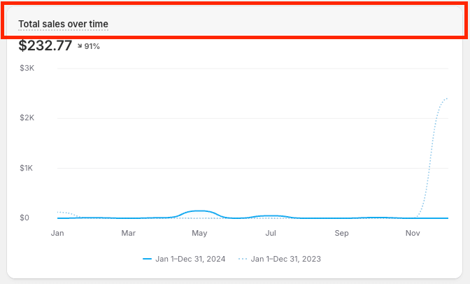
- In the Metrics menu on the right, hover your mouse cursor over the metric you wish to remove (e.g. Shipping charges) and click the trashcan icon.
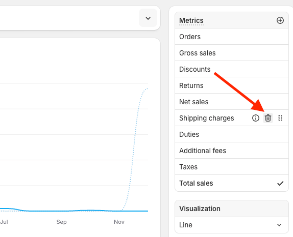
Now, the column for this metric won’t be shown in your report anymore (but this won’t affect the numbers on the overview dashboard). With other sales reports, you can remove the Shipping charges column in the same way.
Some sales reports don’t include shipping fees by default. For example, the Total sales by product report or Total sales by product variant report. Since one order can contain several products, the proportion of shipping fees for each product separately is not calculated. For the same reason, the shipping tax is also not included in these reports
What tools you can use to build a custom Shopify sales dashboard
There’s no denying that the level of customization offered with the default Shopify dashboard (or should we say lack thereof?) is pushing many users to try third-party solutions. With these alternatives, they can calculate advanced business metrics, draw custom charts, obtain insights into their pricing strategy, or even predict future outcomes.
With Coupler.io, you can connect Shopify to different destinations and create a Shopify sales dashboard from scratch.
- Spreadsheet apps – Excel, Google Sheets. With these tools, you can perform advanced calculations and analysis, create new metrics, and fine-tune the numbers in your dashboard. Besides this, their native visualization functionality allows you to build informative dashboards without much effort.
Connect Shopify to Google Sheets or export Shopify to Excel with Coupler.io
- Data warehouses – BigQuery, Databricks, Cloudera. These tools can give you valuable insights into your store’s sales processes, your customer’s preferences, and more. For example, if you export Shopify to BigQuery, you can leverage in-built machine learning mechanisms to analyze your data in-depth and even predict future trends.
- BI tools – Looker Studio, Tableau, Power BI, Qlik. BI tools – Looker Studio, Tableau, Power BI, Qlik. Once your analysis results are ready, you can use these specialized apps to build pro-level dashboards with advanced visual representation. You can read more about this in our article, How to Visualize Shopify Data in Looker Studio.
Connect Shopify to Power BI with Coupler.io
Using the dashboard, you can:
- See the exact number of users who reached each stage of the sales funnel to detect issues and improve customer experience
- Learn which source or medium (e.g. YouTube, newsletter, Google, etc.) brings you the most purchases to optimize your marketing efforts and spending
- Identify the countries the most users come from to invest in campaigns targeted at those countries, consider preparing a new language version of your store, etc.
- See which items fail to be added to a cart to improve their description, photos, etc.
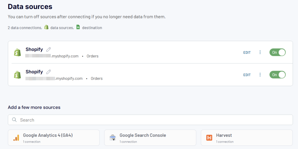
So, you’ve just connected a Shopify data source in Coupler.io. But what if you wish to create a report/dashboard that includes information from multiple Shopify accounts or additional sources like, for example, Google Analytics, Google Ads, or Facebook Ads—similar to some dashboards we’ve shown above? Not a big deal! After you add your first source, simply choose the next one under Add a few more sources and configure it. If needed, repeat it for next sources:There’s no denying that the level of customization offered with the default Shopify dashboard (or should we say lack thereof?) is pushing many users to try third-party solutions. With these alternatives, they can calculate advanced business metrics, draw custom charts, obtain insights into their pricing strategy, or even predict future outcomes.Ecommerce teams with traffic but plateauing revenue often discover the answer lives in their funnel data. This Coupler.io Looker Studio dashboard pulls from GA4 to visualize your full conversion path — session start through purchase — and slices that data by country, device category, and individual product so you can find where shoppers drop off and why.
Use case example:
The marketing lead at an outdoor gear store noticed traffic and product views were healthy, but revenue had stopped growing. Opening the funnel overview, she saw that while 9.4% of sessions reached add-to-cart, only 4.3% began checkout — a 54% step-to-step conversion rate that pointed to a bottleneck. Filtering by device, she found mobile add-to-cart-to-checkout conversion was 38% versus 62% on desktop. The team prioritized a mobile checkout redesign and within six weeks added $22K in monthly revenue.
This dashboard is available as a Looker Studio template powered by Coupler.io. Connect your GA4 account and Coupler.io will extract your data automatically on a schedule.
There are also a number of apps capable of building a dashboard of some sort. Some of the top-rated options include:
- Lifetimely: Profit & LTV. Useful app that in real-time calculates the profitability of your business, deducting all associated expenses. It’s also used for fetching the lifetime value and acquisition costs at any given time.
- Conversific Store Analytics. The app presents various metrics of your store and shows how you stack up against industry benchmarks. It also comes with 10+ custom reports you won’t find in Shopify.
- By the Numbers. This solution offers a customizable dashboard to keep better track of your business. It’s also capable of emailing you weekly reports, including future prognoses and tips.
That’s it for your options to create a custom Shopify dashboard on your own. We’ve also mentioned that you can request a service to build a custom dashboard according to your requirements. It’s so and many of the reporting solutions provide this kind of service. For example, here is what a data analytics consulting service looks like at Coupler.io.
What kind of a Shopify dashboard is best for my needs?
There are many different ways to set up a dashboard for Shopify. The default method is effortless but limiting. It won’t hurt to look it up every now and then, even if you choose to build a great Shopify dashboard elsewhere, as it presents a number of valuable metrics.
The external options, including the use of different Shopify integrations, may take a bit more time to set up but offer a lot more customization. They’re recommended if you’re not getting the data you need from the built-in dashboard and wish to delve much deeper into your store’s information. With a bit of effort, they can offer a lot more insights into your business.
For businesses looking to make data-driven decisions, custom dashboards created with tools like Coupler.io offer the most flexibility and depth of analysis. They allow you to:
- Combine multiple data sources
- Track metrics that matter specifically to your business model
- Set up automated data refresh schedules
- Create visualizations that make data interpretation intuitive
Whether you’re looking for quick insights through pre-built templates or want to create fully customized dashboards, Coupler.io provides the tools and flexibility you need to turn your Shopify data into actionable business intelligence. With automatic data refresh, multiple destination options, and seamless integration with other data sources, you can build comprehensive dashboards that grow with your business.

Create dynamic Shopify dashboards or use ready-to-go templates with Coupler.io
Get started for free