A Comprehensive Guide to Google Data Studio (Looker Studio) Visualization

Data visualization turns complex information into easy-to-understand visuals to quickly identify trends. It simplifies data analytics and makes data accessible to everyone. Organizations that use data visualization are 28% more likely to find the information they need on time. In this article, we’ll walk you through how to visualize data in Google Data Studio (formerly Looker Studio) to make informed business decisions.
What types of data visualization in Google Data Studio (Looker Studio) can you use?
Before we start adding different visualizations to our dashboard, below are the most common types of data visualization in Looker Studio. Let’s see what each visualization can do.
Tables
Description: A simple tabular display of data rows and columns.
When to use: Used for presenting structured data with many rows and columns for easy readability.
Examples of metrics: Click-through rate (CTR), Cost per click (CPC), Impressions, and Conversions.
Scorecard
Description: A single value is displayed prominently, often used for KPIs.
When to use: Ideal for showcasing key performance indicators or summarizing important metrics.
Examples of metrics: Total Clicks, Conversion Rate, Average Position.
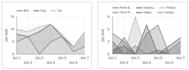
Time series
Description: Shows data points over time, typically in a line graph.
When to use: Effective for comparing discrete data categories or showing rankings.
Examples of metrics: Clicks over the past month, Cost over time, Conversion trend.
Bar charts
Description: Uses bars to represent data values, suitable for comparisons.
When to use: Ideal for showcasing key performance indicators or summarizing important metrics.
Examples of metrics: Ad performance by campaign and top-performing keywords.
Pie charts
Description: Divides data into slices to represent proportions.
When to use: Good for displaying parts of a whole, like market share or distribution.
Examples of metrics: Budget distribution by campaign and ad spend by device type.
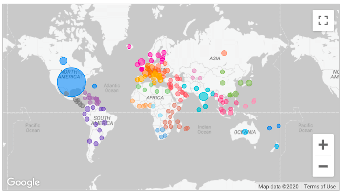
Google maps
Description: Utilizes geographical maps to display data points.
When to use: Perfect for visualizing location-based data, such as store locations or customer distribution.
Examples of metrics: Geographic distribution of ad clicks, Store locations heatmap.
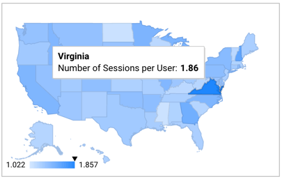
Geo charts
Description: Displays data on geographical regions using color coding.
When to use: Helpful for regional data comparisons or regional trends.
Examples of metrics: Clicks by region, Impressions by city.
Line graphs
Description: Connects data points with lines, useful for trends and patterns.
When to use: Line charts are excellent for showing continuous data changes or fluctuations.
Examples of metrics: Click-through rate (CTR) trend and cost trend over time.
Area charts
Description: Similar to line graphs but fills the area below the lines.
When to use: Use when you want to emphasize the cumulative effect of data.
Examples of metrics: Conversion trend with cumulative effect and impression share over time.
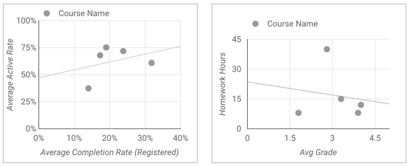
Scatter plots
Description: Represents data points as individual dots on a graph.
When to use: Best for showing relationships or correlations between two variables.
Examples of metrics: Correlation between bid and CTR, Relationship between ad position and CPC.
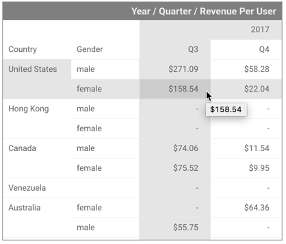
Pivot table
Description: Summarizes and analyzes data in a tabular format with grouping.
When to use: Great for exploring complex data with multiple dimensions and metrics.
Examples of metrics: Campaign performance breakdown by various dimensions (e.g., location, device, time).
Bullet chart
Description: Displays a single primary measure and compares it to one or more other measures.
When to use: Ideal for displaying progress towards a specific goal or target.
Examples of metrics: Actual vs. Target Clicks, Budget vs. Cost.
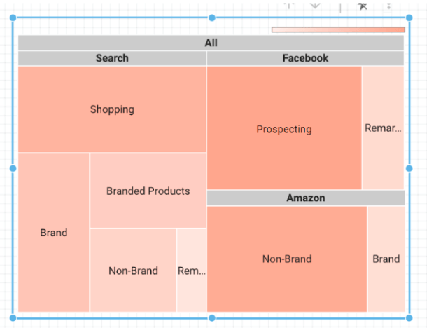
Treemap
Description: Hierarchical representation of data using nested rectangles.
When to use: Helpful for displaying structured data with hierarchical relationships.
Examples of metrics: Campaign hierarchy with performance metrics at different levels.
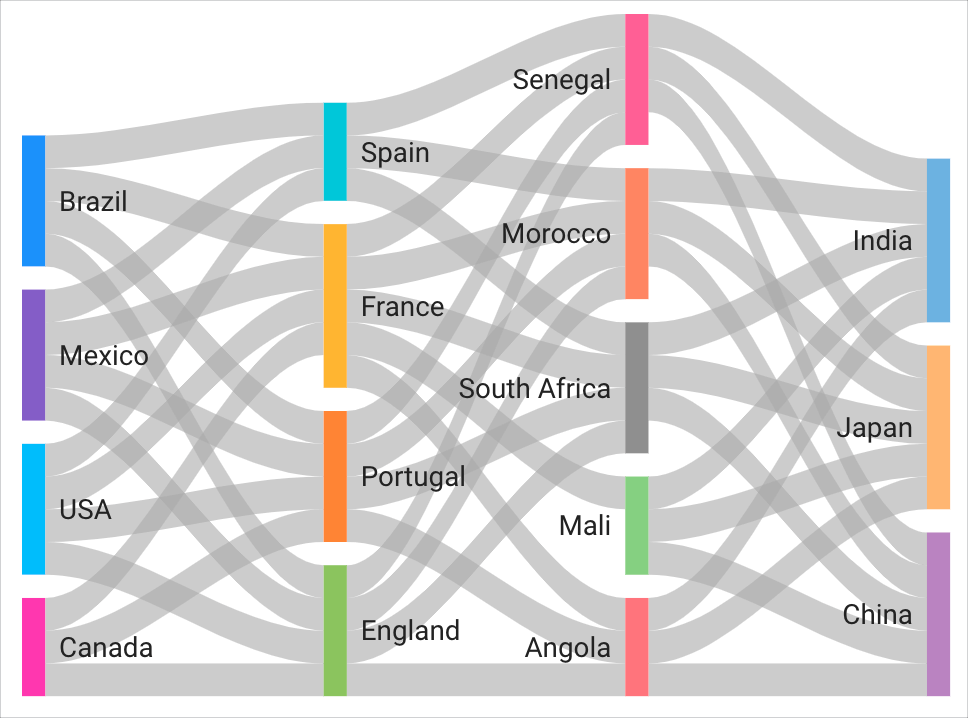
Snakey
Description: A unique visualization type that’s like a snake-shaped bar chart.
When to use: Creative option for displaying data comparisons in a visually engaging way.
Examples of metrics: Creative ad performance comparison and ad type effectiveness.
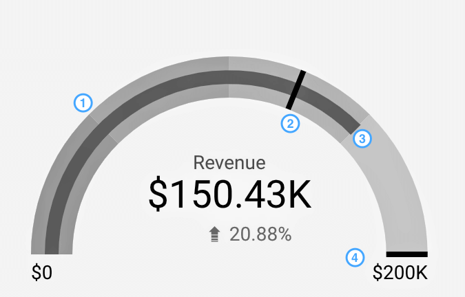
Gauge
Description: Visualizes a single value within a defined range or target.
When to use: Suitable for indicating progress towards a goal or performance against a target.
Examples of metrics: Quality Score gauge and budget utilization.
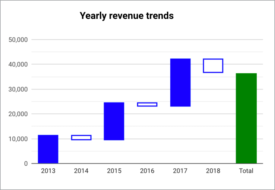
Waterfall chart
Description: Shows the cumulative effect of sequentially introduced data points.
When to use: Effective for explaining data changes step by step or analyzing contributions to a total.
Examples of metrics: Ad spend breakdown by components (e.g., ad group, keyword).
How to visualize data in Looker Studio?
Now, let’s see how to use these visualization types to visualize data in Looker Studio. We’ll use an example of creating a PPC multi-channel report to do this.
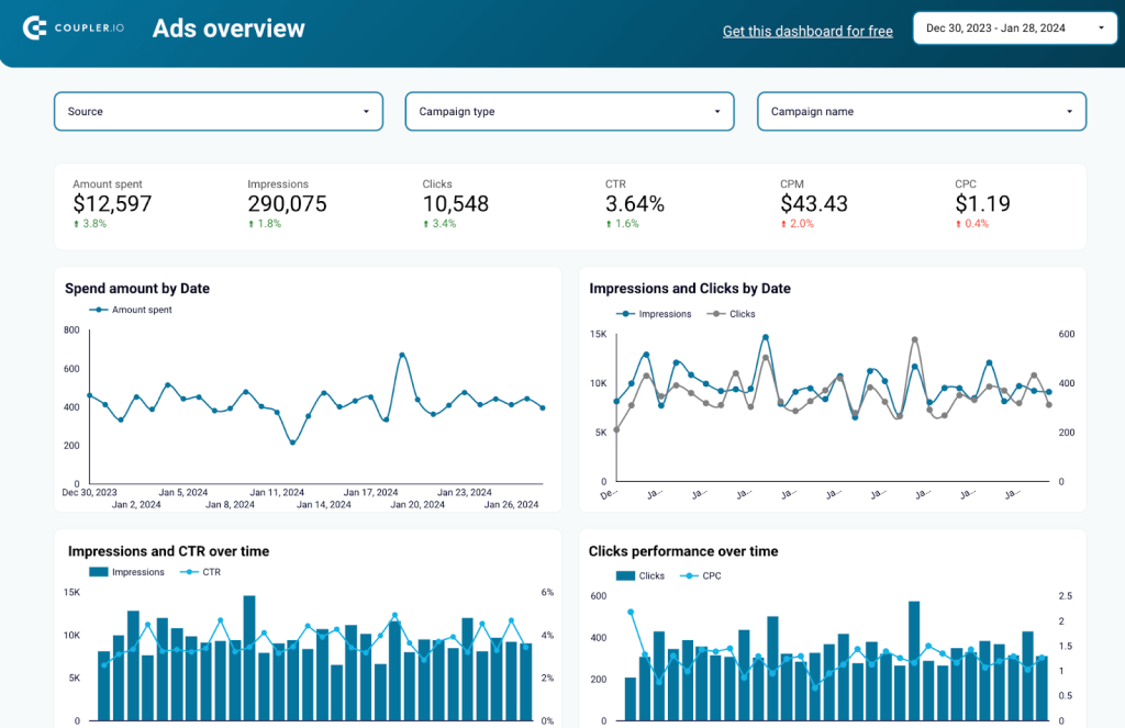
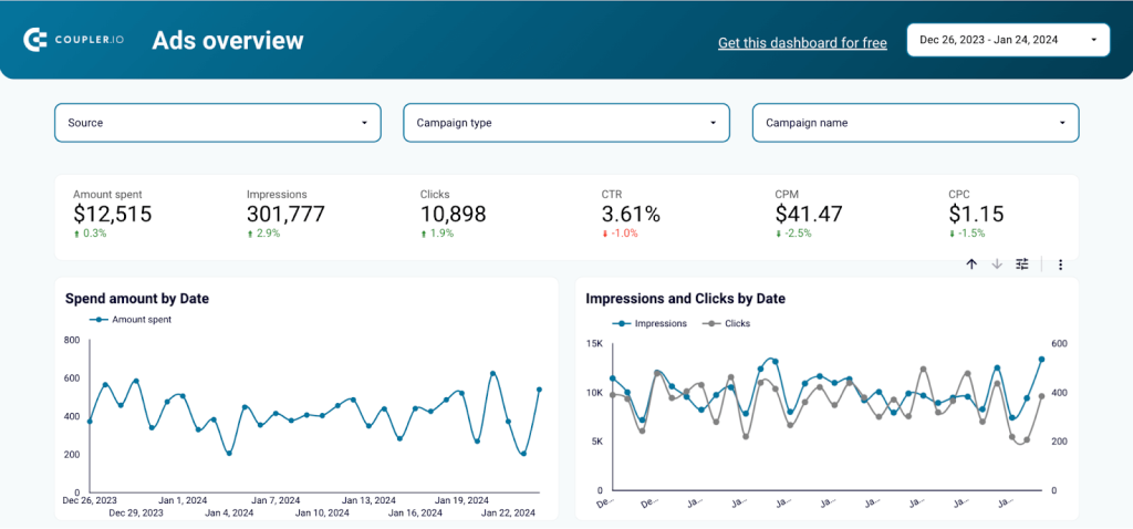
In this dashboard, we used different visualizations for different metrics. Scorecards highlight important metrics like impressions, amount spent, clicks, CTR, CPM, and CPC. The time series and bar charts help you visualize the performance over time and analyze what is working and what is not in your ads.
So, let’s look at how you can add these visualizations to your data.
Step 1: Upload data to Looker Studio
Google Looker Studio (Data Studio) has its own set of Google connectors. However, to load data from other apps or when you use multiple data sources, you should consider the partner Looker Studio connector by Coupler.io. It supports 50+ data sources and is compatible with major business intelligence (BI) platforms like Looker Studio, Power BI, BigQuery, Tableau, and Google Sheets.
First, set up an importer by choosing the source and destination. In our case, for a PPC multi-channel dashboard, you need to integrate multiple PPC data sources such as Google Ads, Facebook Ads, etc. Start by adding one source for now.
You can add more sources on the go!
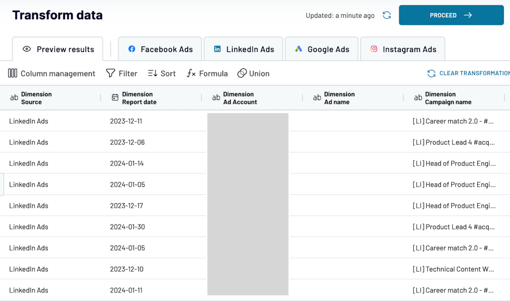
Step 2: Blend and format the data
In this step, you’ll check the data you are going to send to Looker Studio for data visualization. You can:
- Rename, rearrange, and hide columns
- Use filters to focus on specific Google Ads data
- Sort to identify top-performing elements
- Create new columns with custom formulas like return on ad spend and more
After successfully connecting PPC channels and Looker Studio using Coupler.io, you will see the real-time data in Looker Studio. Then, click on ‘Create report’.
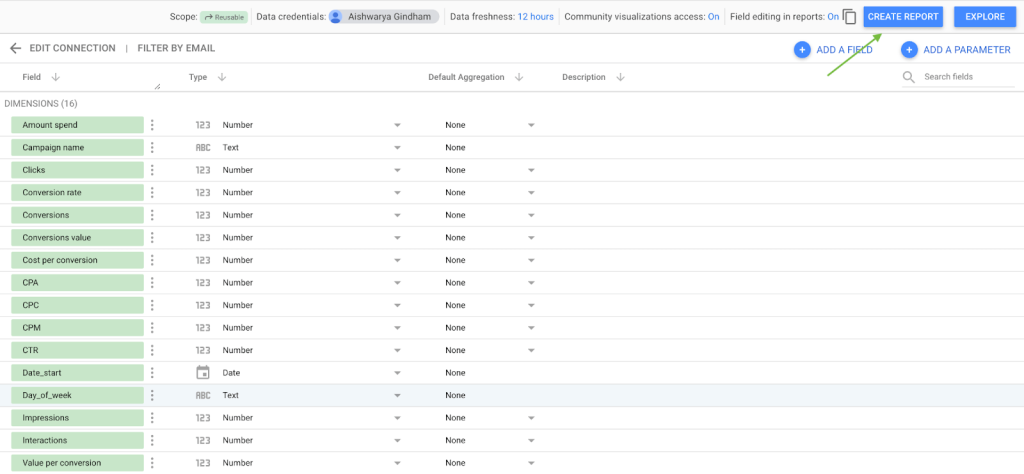
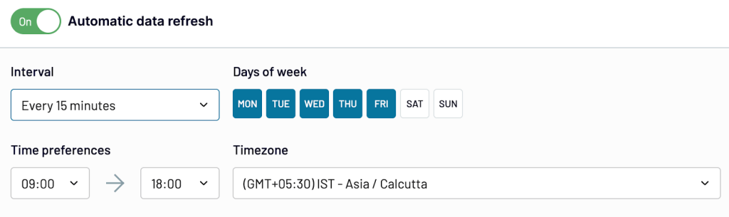
Before creating Looker Studio data visualization, you need to set up a data refresh schedule to automatically update your data in regular intervals as required.
Step 3: Add visualizations to data in Looker Studio
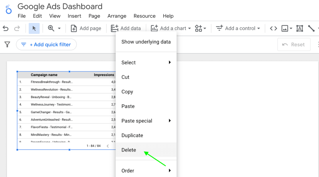
Add the data to your report, rename the dashboard, and delete the default table if you don’t need it.
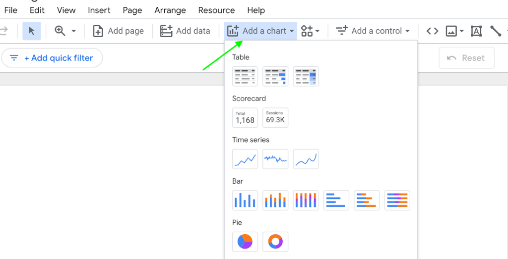
To add any visualization to your data, click on ‘Add a chart’ and select the visualization type from the list.
Now, we’ll go through the steps of adding different types of Looker Studio visualization that will help you make an actionable report.
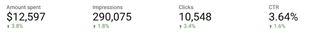
How to create a scorecard visualization in Looker Studio?
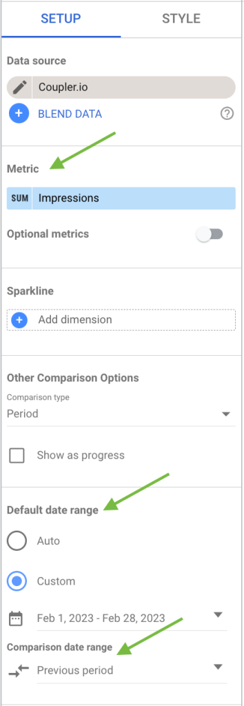
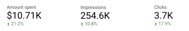
Let’s first create scorecards for impressions. Select the scorecard visualization from the list, and check for the following settings on the right side of the screen.
- Metric – Select the metric and the aggregation for it. For example, here we selected the metric as ‘Impressions’ and the aggregation is ‘sum’. The scorecard will give the sum of all the impressions for a specific period.
- Default date range – Select the date range for which you want the data to be displayed
- Comparison date range – To show the percentage change of each metric, add a comparison data range to which you want the current data to be compared. Here we selected, ‘Previous period’.
You can repeat the same for other scorecards – amount spent, clicks, CTR, CPM, and CPC.
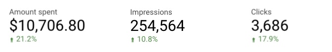
To make these numbers more concise, enable the ‘compact numbers’ option under the style settings.

The scorecards now have a tidy look, and the numbers are much easier to understand.
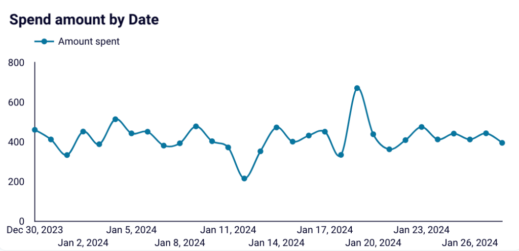
How to create a time series chart in Looker Studio?
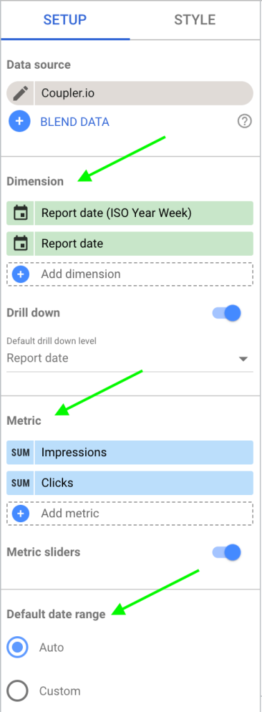
Moving on to the next visualization, let’s create a smoothed time series chart to compare the impressions and clicks of different PPC channels over time. Select the ‘time series chart’ from the list of visualizations and adjust the following settings.
- Dimension: They help in segmenting and organizing the data. In our example, we selected ‘Report Date’ as our dimension, to analyze the data based on the time it was reported and segmented into ISO Year Weeks.
- Metric: Select the metrics ‘Impressions’ and ‘Clicks’ with ‘sum’ as the aggregator. It will display the total (sum) number of impressions and clicks for the specified date range.
- Default date range: Choose the ‘Auto’ option where the system will choose an appropriate date range, mostly the recent data. You can also change this to custom for specific date ranges.
Note: We also added controls like drill down and sliders, which we’ll discuss in the next step.
The final time series chart helps you understand the correlation between impressions and clicks over time.
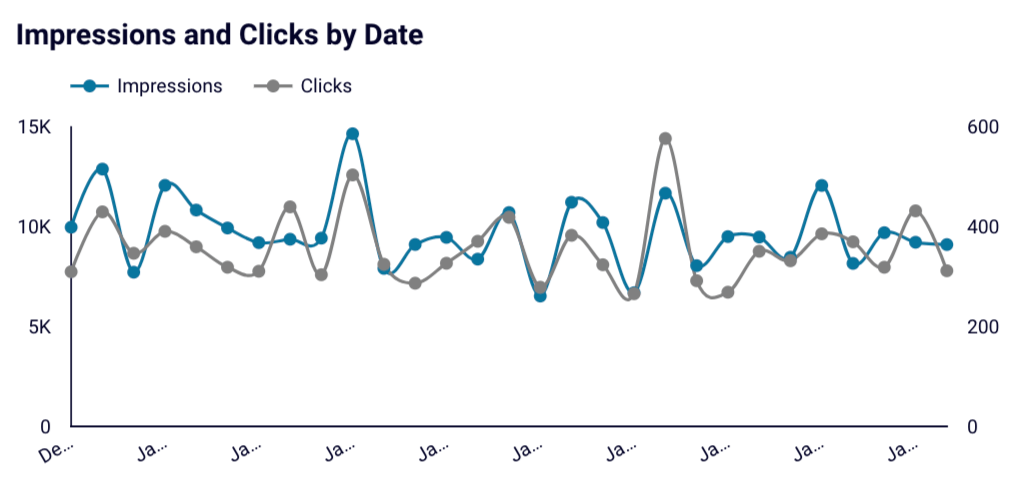
For example, you can see a fluctuating trend in both impressions and clicks over time, with impressions consistently outnumbering clicks.
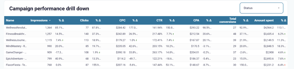
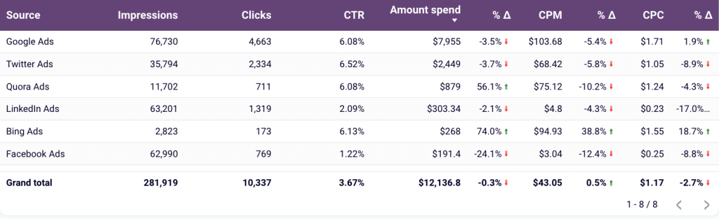
How to create a table in Looker Studio?
For a detailed view of the major metrics of all the PPC channels, using a table visualization is a good way to do it.
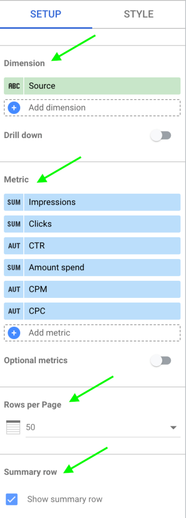
Select the ‘Table’ visualization and add the following settings as below with the metrics you want to show as columns.
- Dimension: As we want to have a look at the metrics of the PPC channels, select the dimension as ‘Source’
- Metric: Add all the metrics you want to track with their respective aggregations as shown in the image below.
- Rows per page: Decide how many rows you want to display in one go.
- Summary row: Enable this option to see a summary of each metric for all the PPC channels.
- Sort: You can select a metric like ‘Amount spent’ to sort the data in descending or ascending order.
Now you can see every detail of the tracked metrics of PPC campaigns – impressions, clicks, CPC, and more.
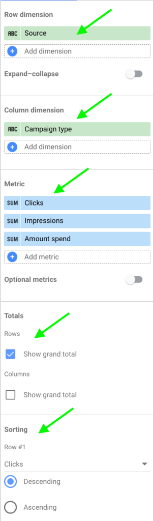
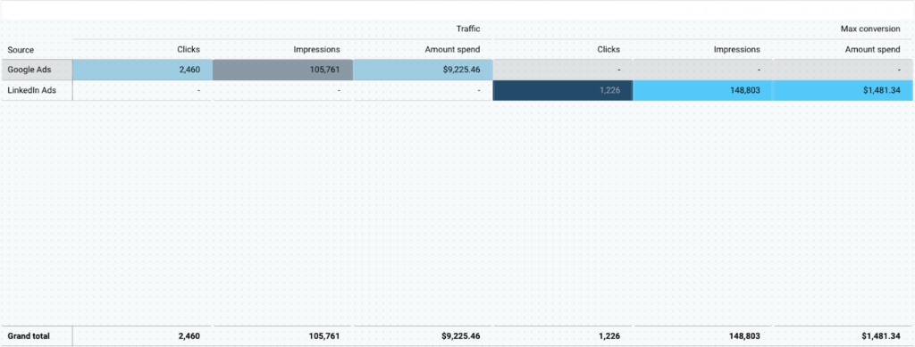
How to create a pivot table in Looker Studio?
Pivot table is a powerful visualization to summarize, sort, reorganize, group, count, total, or average data stored in the table. You can compare different data points in relation to each other. For example, clicks and impressions of each campaign type for different PPC channels.
To create a pivot table, add the following setup settings.
- Row dimension: To understand the performance of metrics for different PPC channels, select the row dimension as ‘source.’
- Column dimension: Select ‘campaign type’ for column dimension.
- Metric: Select the metrics you want to track for the dimensions – impressions, clicks, and amount spend.
- Totals: Enable ‘Grand total’ option for rows to get a sum of each metric for all the channels.
- Sorting: You can sort the pivot table based on any metric. In this example, let’s choose clicks for rows. Similarly, you can select the sorting factor for columns.
You can apply filters, sort data, and adjust the style to make your pivot table clear and presentable.
You can also create different types of pivot tables in Looker Studio like pivot table with bars and pivot tables with heat maps.
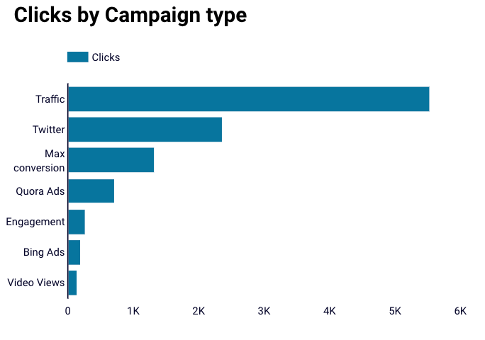
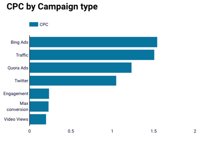
How to create a bar chart in Looker Studio?
When you want to rank your campaigns based on particular metrics, bar charts are your go-to option. In this case, you can create bar charts to identify the top-performing campaign types based on clicks and CPC.
Choose the ‘bar chart’ visualization and modify the settings.
- Dimension: As we want to identify the best-performing campaign types, our dimension will be ‘campaign type.’
- Metric: We’ll be using ‘clicks’ as our metric to compare different campaign types.
- Sort: We’ll also sort based on clicks in descending order.
- Default date range: You can choose ‘auto’ or a ‘custom’ date range.
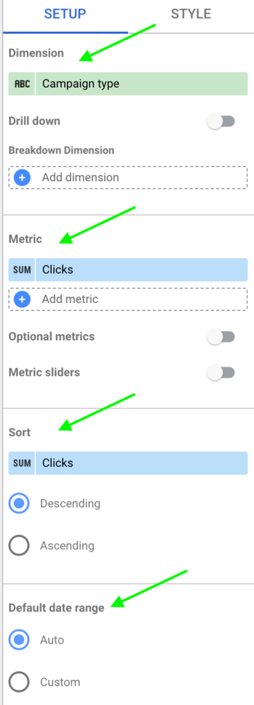
The bar chart visualization shows that the traffic campaigns are the best based on the number of clicks.
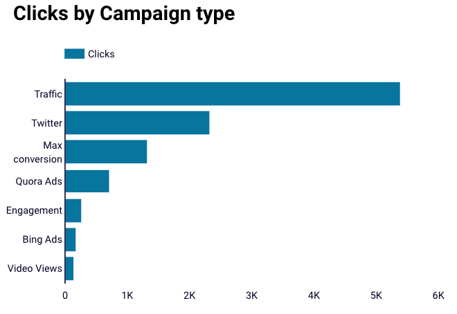
Similarly, you can also find the campaign types that have the highest and lowest CPC with bar charts.
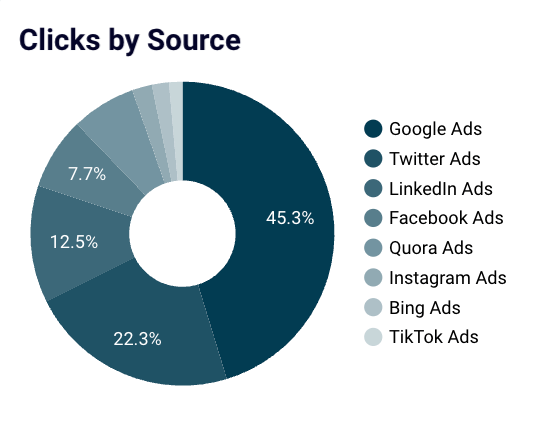
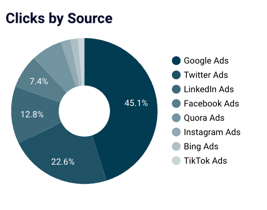
How to create a pie chart in Looker Studio?
Pie charts are used to visualize data in Looker Studio in a proportional manner, showing how each segment contributes to the whole. In this example, they make it easy to see which traffic sources are performing best. You can quickly compare how much each source contributes to your total clicks.
To create a pie chart, use the following setup settings.
- Dimension: To segment the performance of different PPC channels, select the dimension as ‘Source.’
- Metric: To evaluate the performance based on number fo clicks, the metric is the ‘sum of clicks.’
- Sort: Select to sort these metrics in descending order based on the total number of clicks from each channel.
- Default date range: You can choose the ‘auto’ or ‘custom’ option for the default date range.
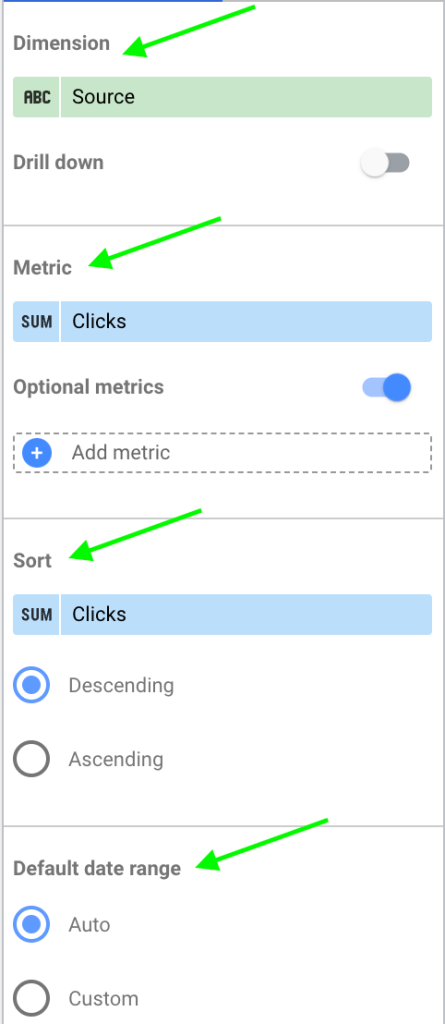
The pie chart shows that Google Ads gets the highest number of clicks compared to other PPC channels.
Step 4: Add controls to data visualization in Looker Studio
Controls help you add interactivity to your reports and dashboards. You can customize visualizations by selecting data you are interested in like date range, location, products, and other dimensions.
To add a control to your data, click on ‘Add a control’ and select one from the list.
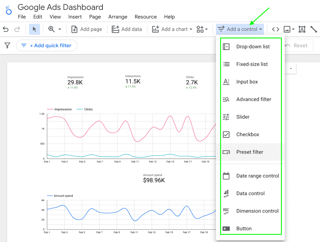
Now let’s add some of these controls to our Google Ads dashboard.
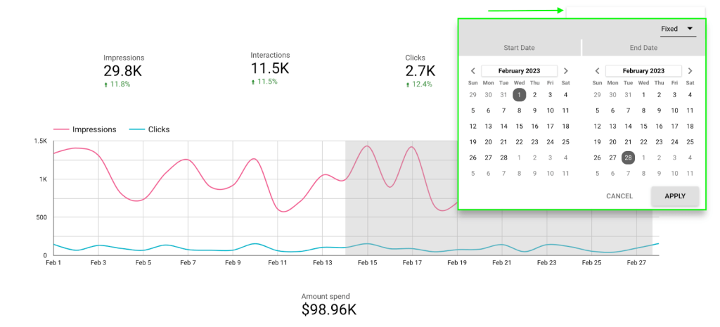
When you want to view all the metrics for a specific time period, you use the ‘date range control.’ The viewer can change these dates and view data for different date ranges.
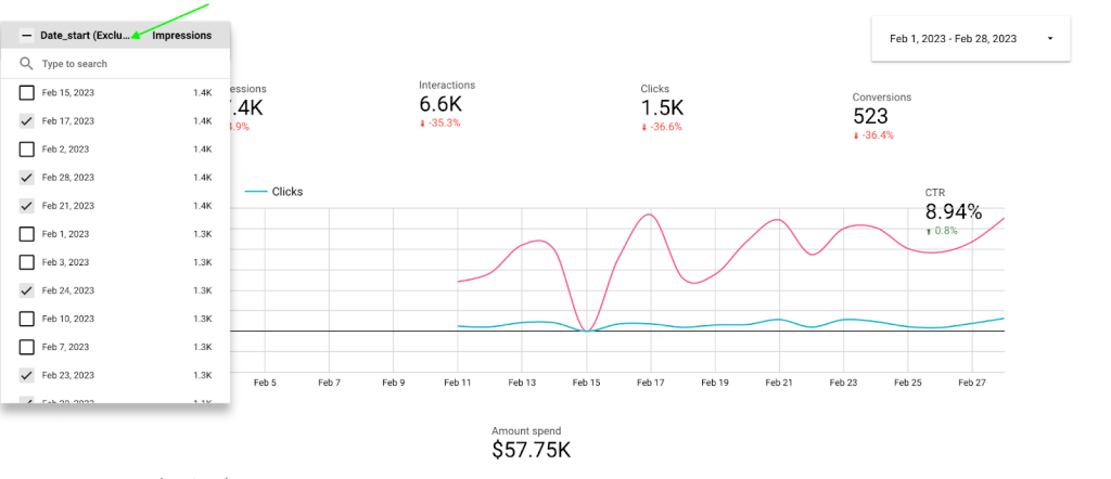
Maybe you want to know the data for specific individual dates rather than a date range, you add the ‘dropdown list control’ with ‘date_start’ as the control field.
Some of the other controls that are helpful to build an interactive dashboard are:
- Fixed List Control: You can add a predefined list of options for viewers to select from.
- Input Box: An interactive text field to enter custom values or queries to search within a report.
- Advanced Filter: A control for complex filtering with multiple conditions and parameters, for in-depth data analysis.
- Slider: A graphical control for selecting a range of values, such as dates or numerical ranges.
- Checkbox: You can enable and disable options with this control. Mostly used for toggling data sets or features on and off within a report.
- Data Control: Users can dynamically switch the data source of a report, particularly useful for reports designed to be used with multiple datasets.
- Dimension Control: A control for selecting or changing dimensions in a report, like switching between different data categories.
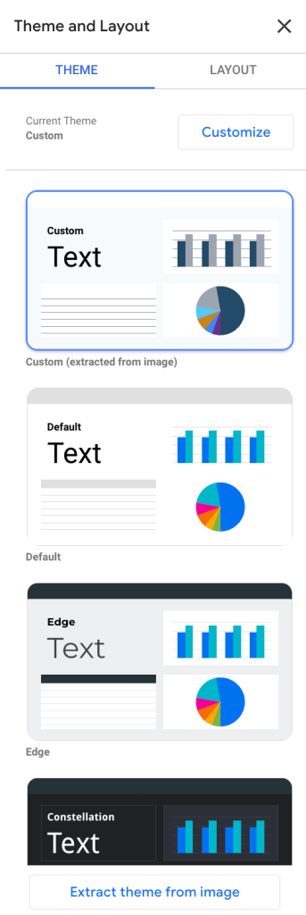
To make the dashboard visually appealing, you can style it with the help of colors, fonts, themes, and layouts. You can find this on the ‘Toolbar’ in Google Looker Studio.

In this example, we used a Looker Studio custom visualization theme but you can select one from the different in-built themes.
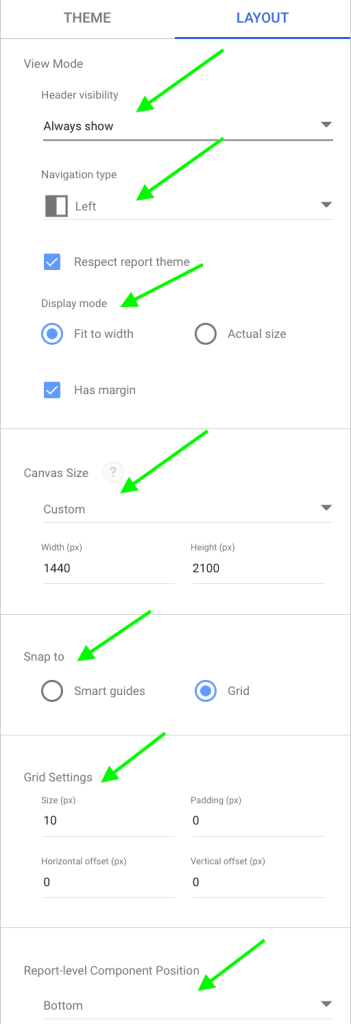
Switch to ‘Layout’ to structure your report and customize how users interact with the Looker Studio visualization. Below are a few layout settings you can add to your reports.
- Header Visibility: Choose if you want the top part of your report, which usually has the title, to be shown or hidden.
- Navigation Type: Decide how users flip through the report’s pages, like using tabs or side arrows.
- Display Mode: Set how your report fits on different screens, to either fill the width, show actual size, or adjust responsively.
- Canvas Size: Define the report’s working area size for displaying content.
- Snap To: Enable aligning objects to a grid or other elements for neat placement.
- Grid Settings: Turn on or off the background grid for easier object alignment.
- Report-Level Component Position: Position elements like headers or filters that you want to show consistently on every page of the report.
That’s it! You just created a detailed PPC dashboard using different types of data visualization in Looker Studio.
Looker Studio data visualization examples in different reports
While adding visualizations to create a dashboard from scratch is fun and a great way to learn about visualizing data in Looker Studio, it cannot be done every time. It can be time-consuming, confusing, and overwhelming at times to find the right visualizations for your data.
So, we created Looker Studio data visualization templates for most of the use cases. All you need to do is add your data source to the template using Coupler.io and your dashboard with Looker Studio visualization will be ready in minutes.
Below are a few examples of data visualization in Looker Studio to use with your data.
1. PPC multi-channel dashboard
This template supports multiple advertising platforms like Google Ads, Facebook Ads, Instagram Ads, LinkedIn Ads, and more where you can get a holistic view of all your PPC marketing efforts. The PPC multi-channel dashboard also helps to monitor the performance of each channel without switching between accounts.
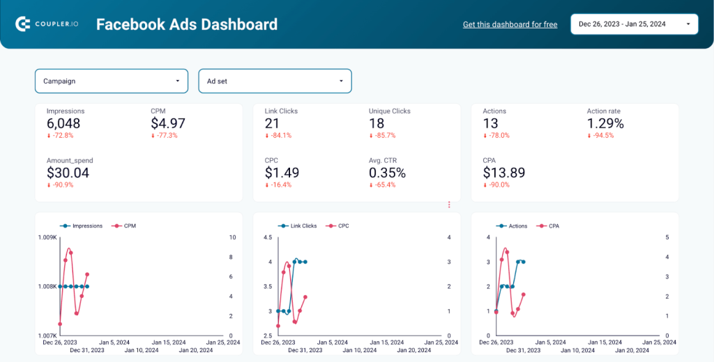
2. Facebook Ads dashboard
The ready-made Facebook Ads dashboard lets you easily check how your campaigns are doing from different angles to help you use your ad money better. It quickly shows you which parts of your ads are working well and which aren’t, so you can spend your budget smarter and get better results. It also keeps an eye on important metrics to help you understand what’s working and what can help make your campaigns better.
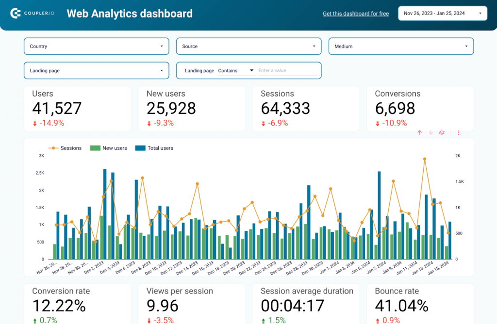
3. Web analytics dashboard
Google Analytics (GA4) collects all the details to analyze the performance of your website. But to understand this data better, you need a web analytics dashboard. The Web analytics dashboard covers all the important metrics like users, sessions, conversions, and more. You can also drill down into each metric to conduct an in-depth analysis. You can understand user behavior, and user journeys to improve user experience across the website.
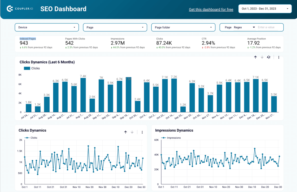
4. SEO dashboard for Google Search Console
While GA4 helps you understand the user behavior on the website, Google Search Console (GSC) helps in analyzing and understanding your site’s performance on Google Search results. The SEO Dashboard includes key metrics like indexed pages, average position, click dynamics, and more to help you understand how Google views your site.
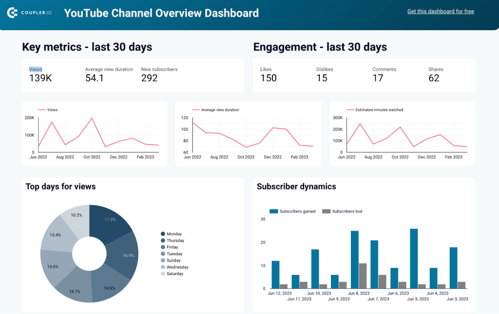
5. YouTube analytics dashboard
With video content on the rise, it is crucial to grow your brand on YouTube to reach your target audience. Along with subscriber growth, the YouTube analytics dashboard template also includes key metrics like views, average view duration, engagement, and more. You can also drill down into the performance of each video to understand which videos influence channel growth the most.
Along with these dashboard templates, you can use many other ready-to-go dashboards or create custom ones as required with Coupler.io.
Why visualize data in Looker Studio?
Our brains are wired to process visual information 60,000 times faster than text, making data visualization crucial for making quick and efficient decisions. It helps in understanding trends and patterns, communicating insights, and making better decisions in various domains. Companies that use data visualization are 5x more likely to make faster decisions and 3x more likely to execute them.
Data visualization is undoubtedly powerful, but how simple is it to actually visualize data in Looker Studio versus other business intelligence tools?
It depends on the tools we use. Looker Studio is an intuitive data visualization tool that makes visualizing data straightforward and easy. It comes with:
- Intuitive web interface: Looker Studio’s report editor is user-friendly, featuring simple drag-and-drop objects, custom property panels, and a snap-to-grid canvas for easy design.
- Report templates: A vast visualization library allows you to start visualizing your data within minutes. Simply connect your data sources and choose the design to fit your specific needs.
- Data Connectors: You can seamlessly integrate with various data sources using prebuilt connectors.
- API: You can automate the management and migration of Looker Studio assets with an easy-to-configure API.
- Report Embedding: Add Looker Studio reports to your website and make it simple to share your data story with your team and customers.
In Looker Studio Pro, you can use AI to turn your charts into Google Slides. Learn more about this in our blog post where we’ve compared Looker Studio vs Looker Studio Pro.
How to master Looker Studio visualization?
Start by familiarizing yourself with the Looker Studio interface and features with this video on Looker Studio tutorial for beginners. Next, you can start experimenting with different chart types to find what best represents your data, use Looker Studio custom visualization for customized reports, and explore controls like filters from this blog post.
Once you are good with the basics, you can then learn advanced methods like data blending and funnel visualization. Finally, to make the most out of Looker Studio, it is important to know about the mistakes to avoid while creating dashboards and reports. As you continue learning and applying these techniques, you’ll improve your ability to create interactive data visualizations in Looker Studio.