How to Connect Shopify to Google Data Studio (formerly Looker Studio) For Ecommerce Reports

To make Shopify and Google Data Studio (formerly Looker Studio) work together, you need a connector to automate data import to Data Studio.
Google Data Studio doesn’t have a native Shopify connector, so a partner connector is the only option.
I’ll show you how to connect Shopify to Data Studio using Coupler.io. It’s a data integration platform to automate data flows from over 400 business apps to spreadsheets, BI tools, data warehouses, and AI platforms.
Connect Shopify to Looker Studio with Coupler.io
Coupler.io allows you to establish the connection between Shopify and Looker Studio and organize your data on the go: add new columns, sort and filter your data, blend data from multiple sources, and more.
1. Collect Shopify data
We’ve already preselected Shopify as a source and Looker Studio as a destination, so click Proceed in the form below. You’ll be prompted to create a Coupler.io account for free.
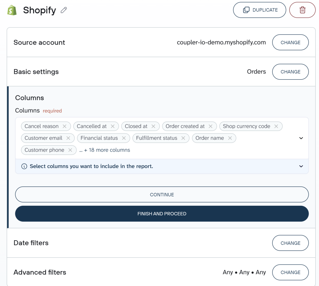
- Click Connect to link your Shopify shop to Coupler.io. You’ll need to enter your shop name in the format
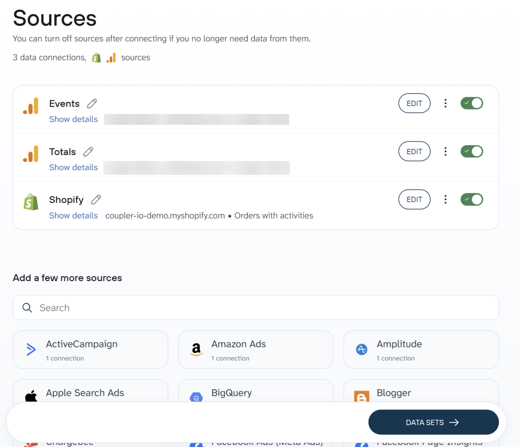
shop-name.myshopify.comand log in to your Shopify account. - Choose a data entity – in our example, we selected Orders. Of course, we’re also interested in other entities but we’ll create separate importers for them. Don’t worry, after the first one is set up, it will be as simple as duplicating the first importer and choosing a different entity.
Coupler.io allows you to extract data from over 400 business apps. Besides Shopify, the list of available sources includes WooCommerce, Salesforce, Airtable, Pipedrive, Hubspot, and more. You can add multiple sources and create multi-source reports in Looker Studio.
2. Organize data set
This step is optional yet quite useful. Here you can preview the data set from Shopify and organize it for your report before exporting from Shopify to Looker Studio. You can do the following:
- Hide, rename, and reorder columns, and change their data type.
- Create new columns using supported calculation formulas.
- Sort and filter data based on the selected criteria and specified values.
- Aggregate and blend data from multiple sources
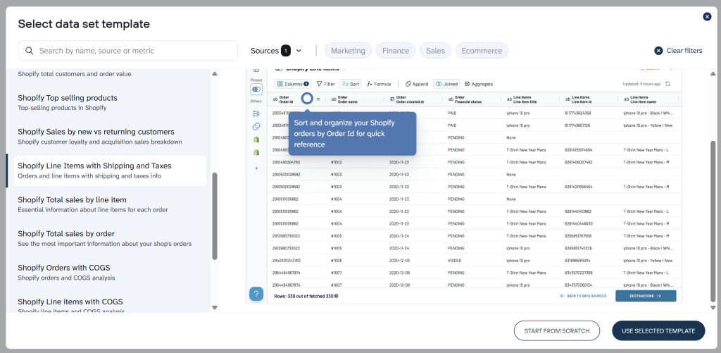
Coupler.io also provides over 20 data set templates for Shopify. These are report-ready configurations of data that already have structured columns, pre-calculated metrics, aggregated views, and so on. So, you get analysis-ready data in Looker Studio right away and can visualize it once the connector is set up.
To use templates, create a new data flow in Coupler.io, click Start with template, and search for Shopify. Select the option you like, connect your Shopify account, and load the data set to Looker Studio.
3. Load Shopify data to Looker Studio and schedule refresh
Follow the instructions to load the Shopify data to Looker Studio. It will require you to authorize the Shopify Looker Studio connector and create a data source in Looker Studio. No complex actions are needed. Just click the buttons on request to finalize the connection to Looker Studio.
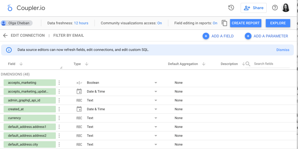
Once your data is transferred, you can check the fields you are about to add to your report. After this, click Create Report in the upper right corner and start visualizing your data. We will explain how to do this in more detail a bit later.
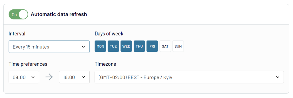
Now, come back to Coupler.io to specify the schedule for the updates – Coupler.io will pull fresh data from Shopify according to your preferences.
As we’ve already mentioned, Coupler.io also offers Shopify to Google Sheets integration. It’s a useful option if you need to perform advanced manipulations and more complex calculations before visualizing your data. Coupler.io can update your Shopify data in a spreadsheet on a schedule, and you can connect this auto-updating worksheet to Looker Studio with either Coupler.io or a native connector. If you’d like to explore the topic in more depth, check out our dedicated Shopify to Google Sheets article.

Connect Shopify to Looker Studio with Coupler.io
Get started for freeWhat data can you export from Shopify to Looker Studio with Coupler.io?
We’ve got the import of Orders sorted out. At the same time, Coupler.io also lets you fetch other Shopify data from your store:
- Customers
- Inventory
- Products
- Orders
- Order fulfillments
- Orders with line items
- Orders with shipping lines
- Order refunds transactions
Besides, you can blend data from multiple sources together or even enrich Shopify information with data from other apps like Google Analytics 4, ad platforms, accounting software, etc.
How to add Shopify data to Looker Studio from multiple stores?
If you operate multiple Shopify stores, you can easily combine information from them in one report using Coupler.io. For this, just connect different store accounts to your data flow.
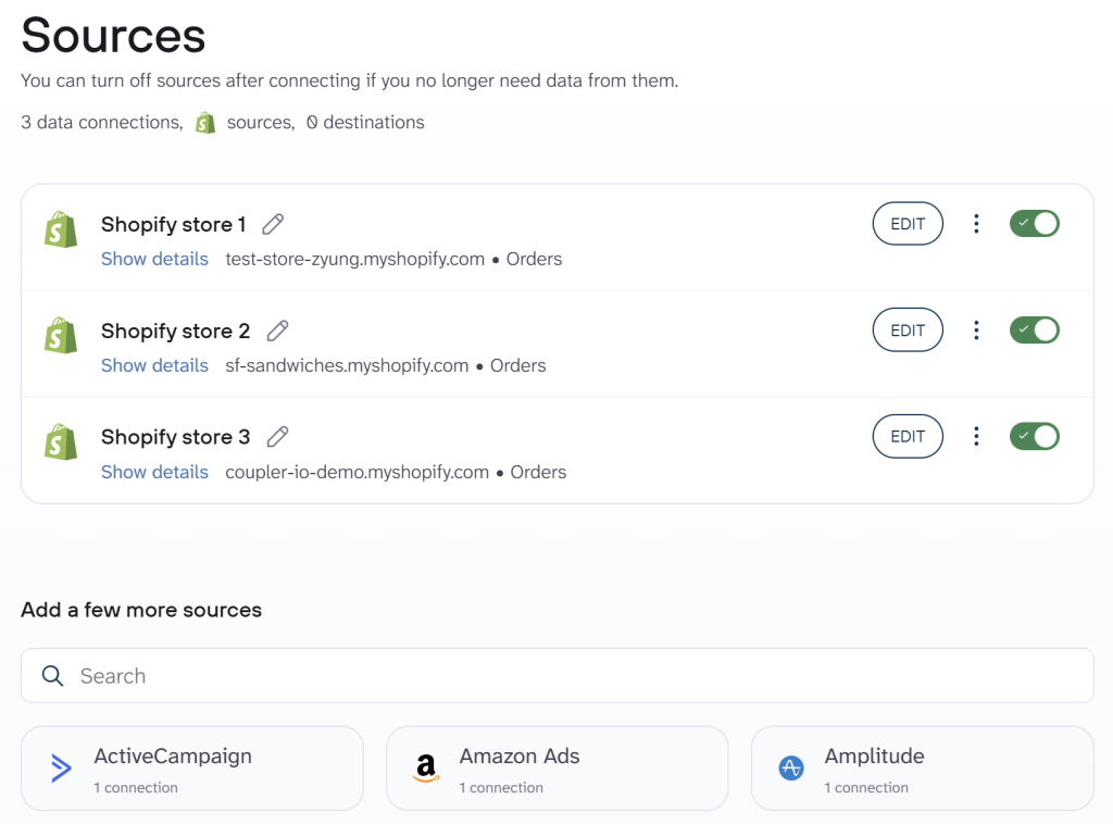
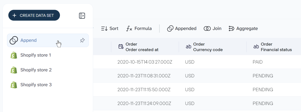
Then, blend data from your stores into a unified data set. If you combine data with the same structure, for example, order information, then use the Append transformation.
You can connect as many stores or other sources as you like; there’s no limitation.
Visualize data using dashboard templates equipped with Shopify Looker Studio connector
Once you have connected a data source (or multiple sources), it’s time to start building a dashboard with the available data. We’ll only explain the very basics of Looker Studio. If you’re new to the tool, check out our Looker Studio tutorial.
The first option to present your Shopify data in the form of a report is a Looker Studio template. It’s a ready-to-use solution that does not require you to add visualizations yourself.
Shopify orders dashboard
Here is an example of a Shopify dashboard template, which already has the built-in Shopify to Looker Studio connector by Coupler.io. This dashboard lets you monitor your Shopify store performance including total sales, customers, orders, and so on.
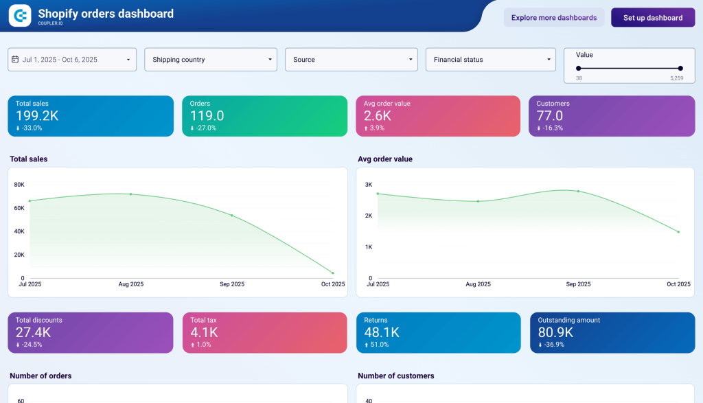
You only need to follow the setup instructions to connect your Shopify account and populate the predesigned dashboard with your data. It will take you less than 3 minutes.
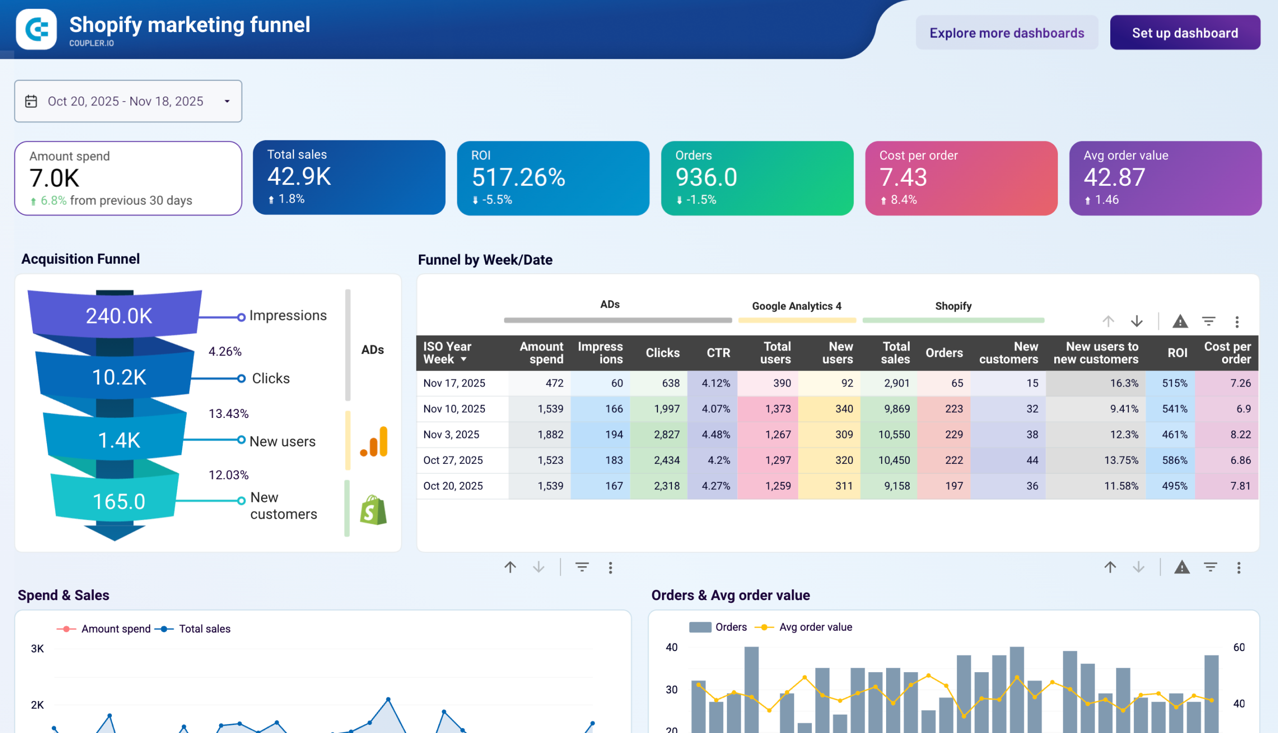
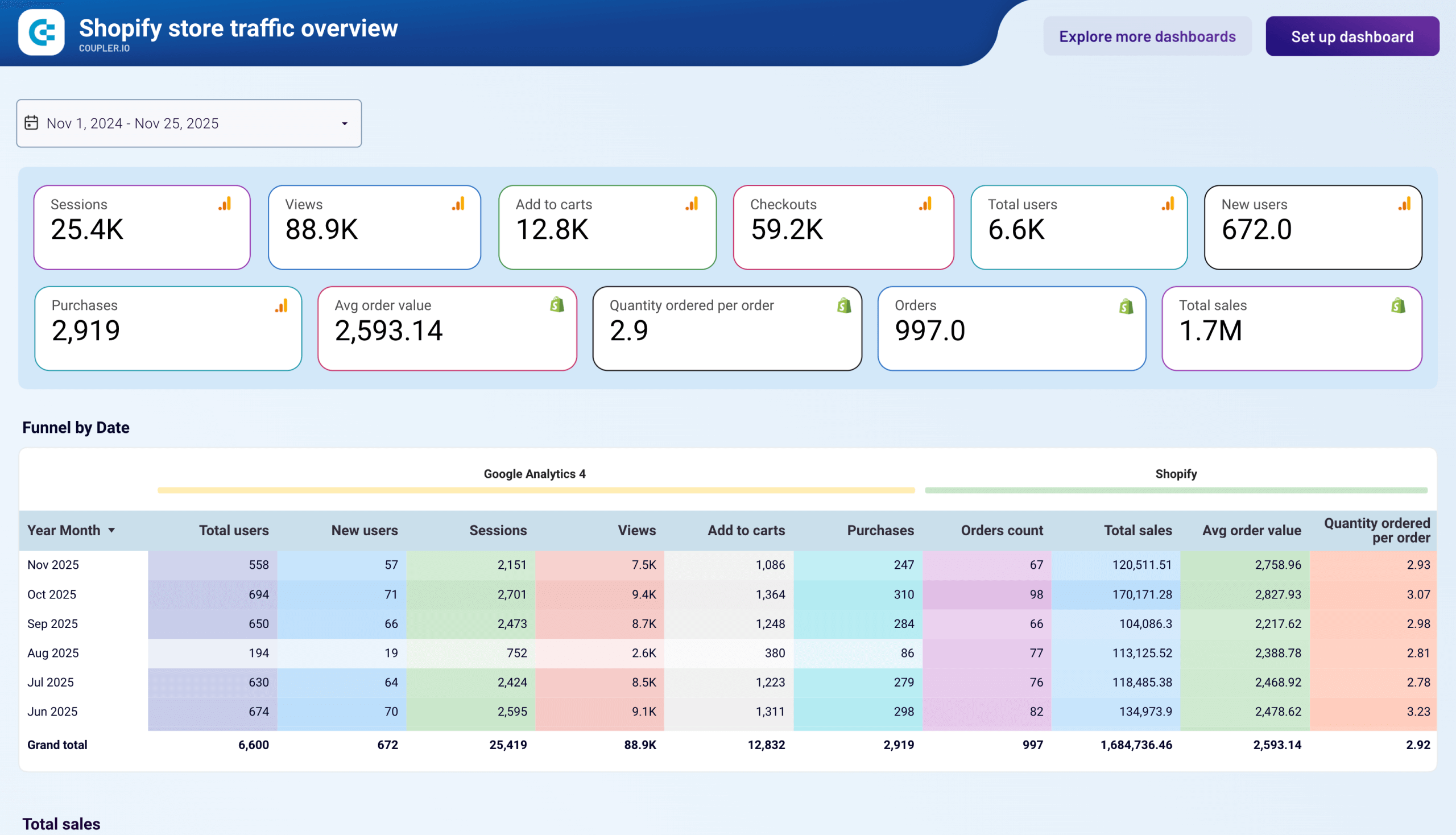
At the same time, Coupler.io also provides dashboard templates to analyze sales funnel, traffic performance, customer acquisition, and other essential metrics for ecommerce activity on Shopify. Check out the top Shopify Looker Studio templates and try the one that fits your needs.


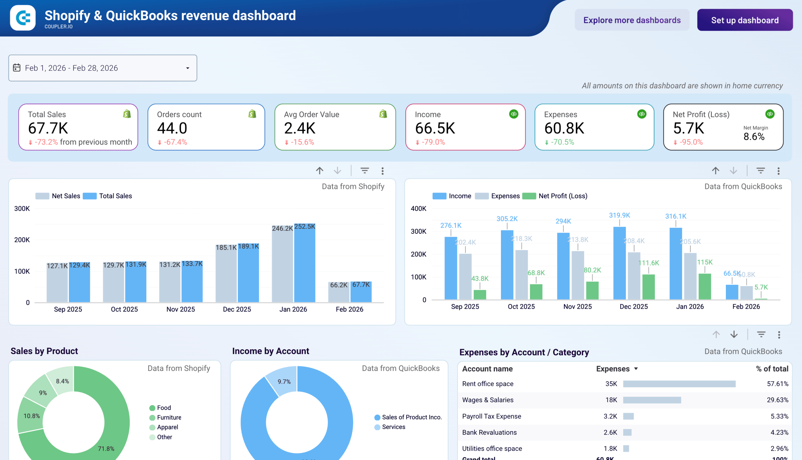
Shopify & QuickBooks revenue dashboard
Once you’ve connected Shopify to Looker Studio, you might want to bring in financial data too. The Shopify & QuickBooks revenue dashboard by Coupler.io does exactly that. It’s a Looker Studio template that pairs Shopify order metrics with QuickBooks income, expenses, and net profit.
Shopify & QuickBooks revenue dashboard
 Preview dashboard
Shopify & QuickBooks revenue dashboard
Preview dashboardMonth-over-month trend charts compare sales with profitability. A combined monthly table reconciles Shopify and QuickBooks data for period-end reporting. The built-in Coupler.io connector handles data refresh from both platforms automatically.
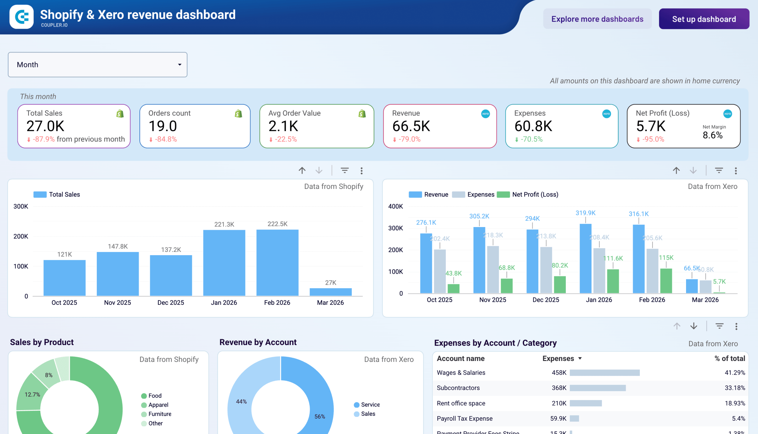
Shopify & Xero revenue dashboard
For teams using Xero instead of QuickBooks, there’s an equivalent template. The Shopify & Xero revenue dashboard by Coupler.io connects your Shopify store and Xero accounting data in one Looker Studio report.
Shopify & Xero revenue dashboard
 Preview dashboard
Shopify & Xero revenue dashboard
Preview dashboardYou can monitor Shopify sales alongside Xero revenue, expenses, and net profit on the same timeline. Product and account-level breakdowns show where income and costs are concentrated. A cash ratio chart highlights when liquidity tightens. The Coupler.io connector automates data refresh from both Shopify and Xero.
Shopify and Looker Studio: Build a report yourself
If you want to build your own Shopify report from scratch, follow these steps.
Load the report you’ve previously created or just create a new one. Make sure you’re in an Edit view, otherwise, you won’t be able to edit much. You switch between views by clicking on the View and Edit blue buttons in the top-right corner of your screen.
There are plenty of options available right off the bat.
The most interesting ones from our perspective are:
- Add data – it’s how you add additional data sources. We’ve already added the data sources so won’t have to use this button in the near future.
- Add a chart – this is our main point of interest. Here, we select from dozens of different chart options and drop them onto the dashboard below.
- Add a control – controls are used to, well, control what’s happening on the chart (on the viewer’s end). Here, we’ll give viewers options to select data, choose from dropdowns, etc.
To the left of the screen, there’s also a toggle for switching between pages. You can create numerous pages, for the same or different data sources.
There are three common phrases that charts rely on that can be somewhat confusing.
Dimensions are things we’re measuring or counting. For example, we may be counting inventory quantity, the financial status of an order, products, customers, or virtually anything else.
Metrics are (usually) numerical values that describe the dimensions. It could be the number of orders meeting certain criteria, it could be sales or refunds for a specific product, or it could be something else.
Once you create a date control (to give your viewers a chance to adjust the time range of a report), the data range dimension of each chart comes into play. With it, you tell Looker Studio which field it should take into consideration when pulling numbers for the specific time period.
A good example is with orders that have created_at and closed_at dates. If you go with the latter and users choose a certain time period, only orders closed between these particular dates will be taken into consideration, regardless of when they were created.
Pie and bar charts
Our goal is to create an ecommerce report for our store that will automatically refresh as the new data flows in. Let’s do it.
Disclaimer: In the examples below we use fields that were named when importing the data with Coupler.io as we explained in the Connecting Shopify with Looker Studio chapter. If you chose to use another tool to connect Shopify to Looker Studio, the field names may differ. The good news, though, is that the naming will likely be very similar.
To add the first chart, press on Add a chart and select the type of chart you want to use. For example, for our first two charts, we picked a very common bar chart.
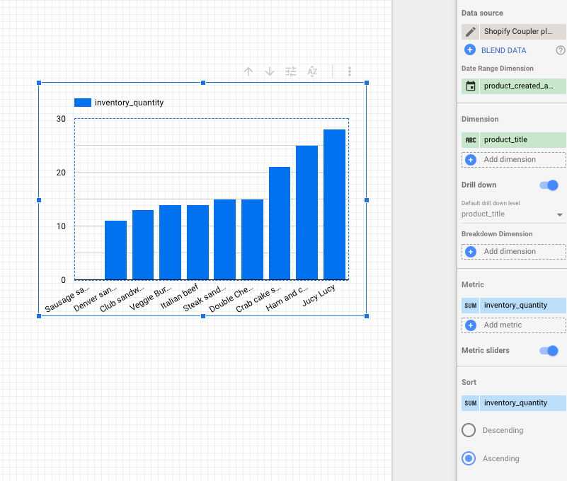
The chart demonstrates the current quantity of products in our warehouses. We used the following setup:
- Data source – here we chose the Products tab of our Google Sheets source
- Data range dimension – product_created_at is applied automatically, it’s an equivalent of created_at for products, let’s keep it
- Dimension – product_title
- Metric – inventory_quantity
- Sort – by default the bars are sorted by the dimension, descending. In our case, it makes sense to sort by inventory_quantity and in ascending order. This way, a chart will start with products with the lowest stock level, including those that have been oversold.
It’s optional but we also enabled metric sliders so that viewers of our report can adjust the range and, for example, only show items with 10 or less in their inventory_quantity.
Note also that all variants of a product are grouped into a single product_title. Our store has, for example, six types of cheeseburgers that won’t be distinguished separately on the chart above.
If you have product variants and want to monitor them in particular, it may make more sense to choose SKU as a dimension and then filter out all the results that aren’t, for example, cheeseburgers.
To do that, click on the chart, then Add a filter and on the following page click on Create a filter at the bottom of the screen.
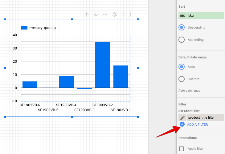
Here you can specify the criteria that each record will have to meet. Let’s choose to include only items that have Cheeseburger value in the column product_title (note that names are case-sensitive). You can also name a filter (or use the default name) to reuse it for other charts.
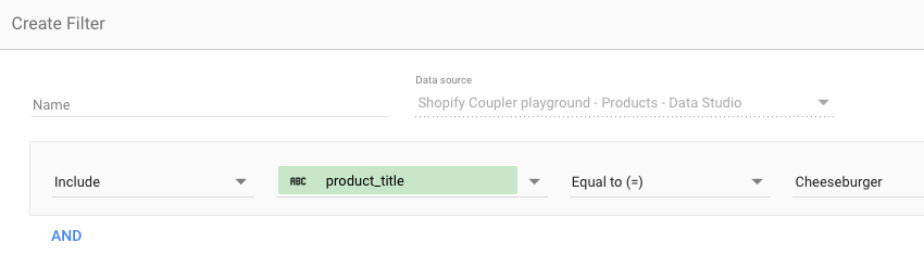
The result is the chart above, ignoring all other products that are not cheeseburgers.
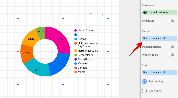
Another chart that we’ve added is a pie chart, demonstrating where our customers are from, split by the order count.
Data source – Customers tab of our source
Data range dimension – created_at
Dimension – default_address.country (here we take the default address saved in customers’ files in Shopify)
Metric – orders_count
By default, the function SUM is used for the metric so all orders are summed up and the countries that placed the most orders are ranked first.
It could make more sense to look at the average order for each country, instead. To do that, click on SUM in the metric field.
Then, choose average (or any other option that works best for you).
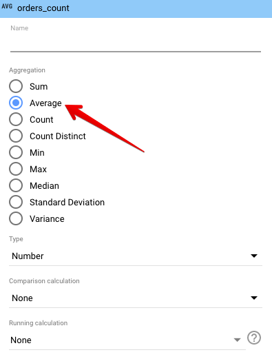
The chart will immediately adjust, showing completely different data.
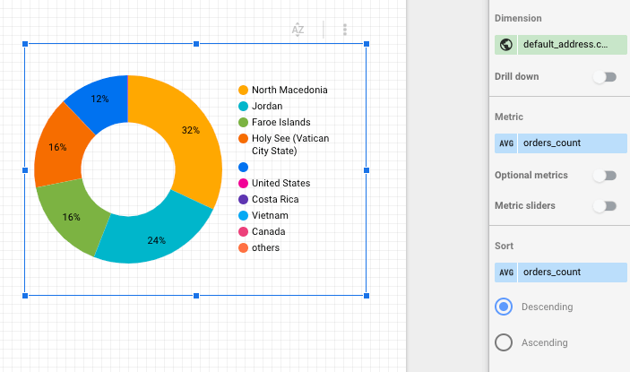
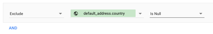
We’ve still got this dark blue piece of a pie, representing null results – those that don’t have any value in the default_address.country field. If we want, we can quickly remove it by creating a filter excluding null entries.
The data entity ‘Orders with line items’ contains much more information on what interests us the most – sales. From there we can export the list of products once again but this time put it as the total sales for each item. We can also break down cheeseburgers into sales for its variants.
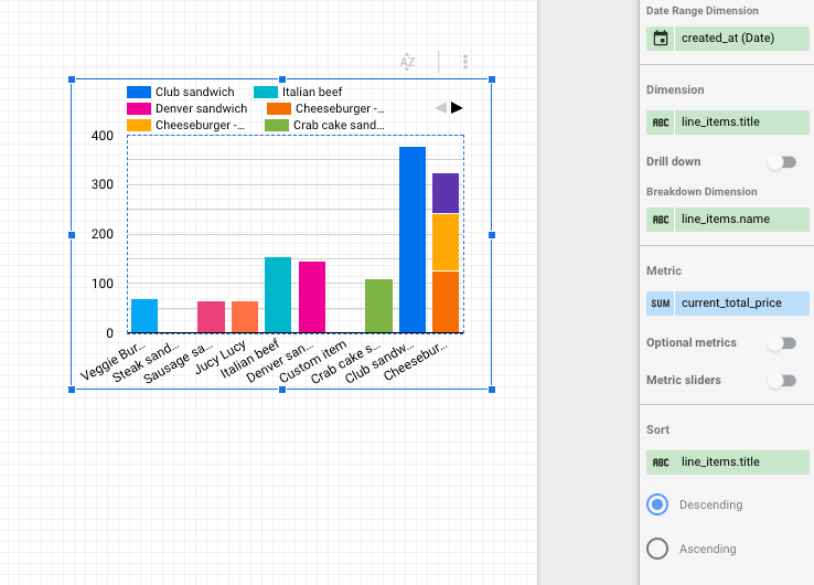
Data source – Orders with line items tab of our source
Data range dimension – created_at
Dimension – line_items.title
Breakdown dimension – line_items.name (these contain an individual name for each of the variants)
Metric – current_total price (we kept SUM but AVG would also make sense).
Tables with multiple dimensions and metrics
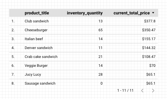
A table is one of the most straightforward types of charts in Looker Studio. Here’s the one we’ve created to show the prices, inventory quantity as well as the price we pay for each product to our supplier.
Data source – Products tab of our source
Data range dimension – created_at
Dimension – product_title and inventory.sku (one would be perfectly sufficient but perhaps the title isn’t sufficient?)
Metric – price, inventory_quantity, and inventory.cost
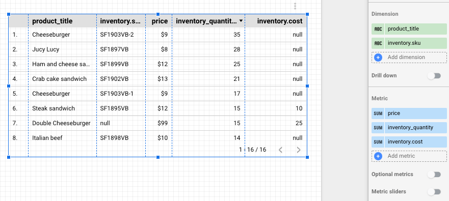
There’s no limit as to how many dimensions metrics you can use, you’re only limited by the space on your report.
Pivot tables
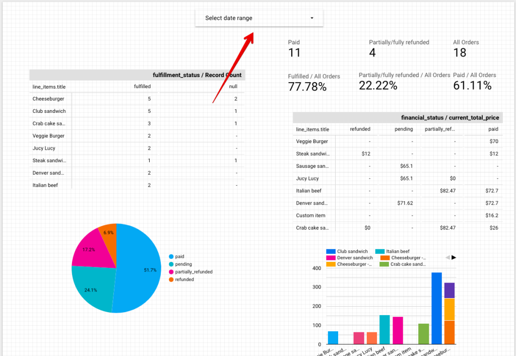
Diving again into our orders data, we’ve created two pivot tables.
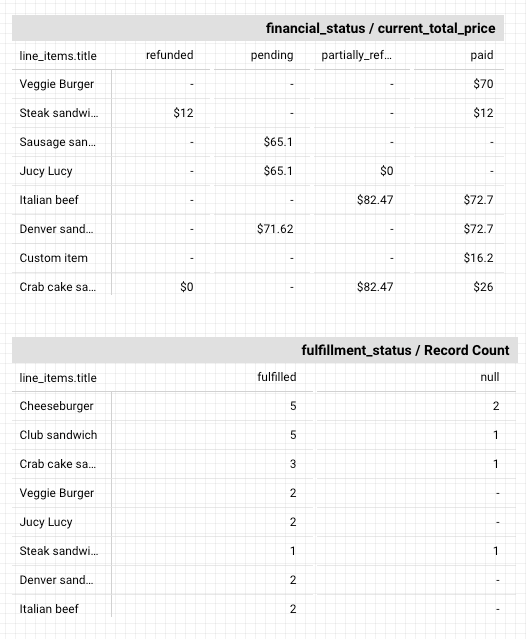
The first table shows the financial status of orders for particular products and the value of orders for each. We see, for example, that lots of crab cake and Italian beef sandwiches are getting partially refunded so it’s probably something to check out. At the same time, the veggie burger is doing just great.
Source – Orders with line items tab from our export
Data range dimension – created_at
Row dimension – line_items.title
Column dimension – financial_status
Metric – current_total_price (we left the default SUM but AVG could make sense here as well)
The second Pivot table is even simpler and it shows the fulfillment status for each of our products. There are only two possible values for fulillment_status – fulfilled or null.
Source – Orders with line items tab from our export
Data range dimension – created_at
Row dimension – line_items.title
Column dimension – fulfillment_status
Metric – Record Count. Record Count is a very common metric, it shows the number of rows meeting certain criteria.
Scorecards and blending data
Scorecards don’t require a dimension – they rely on a single metric. They’re often used in dashboards to demonstrate sales, conversions, and virtually anything else that can be described with a number.
We created a set of scorecards and then blended them together to get the right conversion rates.
The base for all of our calculations is the total number of orders. Based on that we’ll calculate how many of them were paid, fulfilled, refunded, etc.
All of this information sits in the ‘Orders with line items’ Shopify data entity. Add a scorecard and select this source. Record Count will be automatically selected as a metric which is what we want.
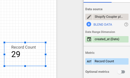
Our store doesn’t yet have 29 orders – it’s got 18 to be exact. There are, however, 29 rows in our source and that’s exactly what a scorecard picked up.
A word on ‘Orders with line items’ – when you import this particular Shopify data entity with Coupler.io (and likely with any other connector), a separate row will be created for each product bought. So if a customer bought from us three different variants of a cheeseburger as well as five thousand veggie burgers, it would result in four rows created in our file.
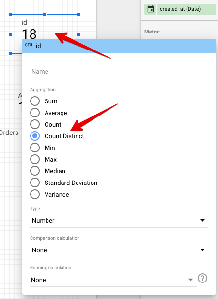
To get the unique records for our calculations, we need to change the metric and, instead of Record Count, use, for example, a field name id. Each order has a unique ID and it’s present in each row created for a particular order.
Change the metric to id. A scorecard will immediately turn into a very long number because each ID has 13 digits and they have just been summed up! To change it to something more meaningful, click on the SUM tab in the Metric block and choose Count Distinct. Our scorecard will update immediately and you can rename it to something more meaningful than id.
Now we’ve got a proper number for orders in our store. To create scorecards for different order statuses (as we did), simply right-click on our scorecard, then copy and paste it elsewhere on the report.
Now, all we need to do is create individual filter criteria for each chart. Same as we did before, click on Add a filter and insert the criteria for a scorecard. For example:
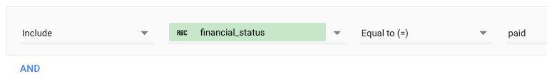
This will filter out all orders that don’t have the financial_status paid which is precisely what we were looking for. Repeat this for each metric you can to fetch and name each scorecard (by clicking to the left of a metric).
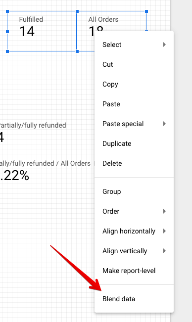
As a final step, we’ll want to blend two scorecards to get, for example, a percentage of fulfilled orders. As math would suggest, to get the rate of fulfilled orders, we need to divide fulfilled orders by all orders and express it as a percentage.
Hold the Cmd key on Mac, Ctrl on Windows, and select the scorecard with the count of fulfilled orders and then the one with all orders. Right-click on either of them and choose Blend data.
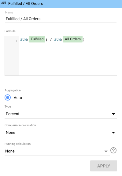
A new scorecard will appear, showing the percentage of fulfilled orders. If something went wrong (for example all orders were divided by fulfilled rather than the other way around), you can look up the formula behind a scorecard. Click on it and then click on the leftmost part of a metric, with an Fx sign.
Here you can see the formula and adjust it, with standard mathematical formulas and more advanced Looker Studio functions. You can also choose for a number to be displayed as a percentage or as a currency, which will probably be your default option for all financial scorecards.
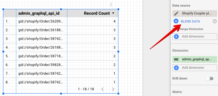
Blending data from different sources
One last chart we wanted to share uses data from two different sources. The inventory quantity is taken from the Products source while the sales of these products are from the Orders with line numbers source. The Current_total_price header may be confusing but, underneath, it’s the price of each order, summed up.
To achieve that we need to approach data blending from a different angle than we did with scorecards. Create a table chart, then click on the Blend data button to the right.
In the leftmost part of the screen, choose the data source, add dimension, and metric as if you were adding a regular chart. Then, select Add another data source.
A new box will appear where you can select the data source of your choice. Notice how the fields change: a new one, named Join Keys, appeared on top. Insert the desired dimension there, then ignore the dimensions field below and insert a metric as usual.
Your setup should look similar to what we’ve got:
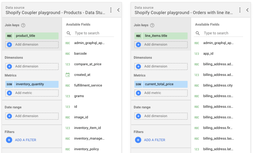
For the blended data to make sense, each source needs to share a joint dimension – referred to as join keys. As the naming in different sources differs, even in those exported only from Shopify, this field is used to tell Looker Studio what it is that we’re actually trying to measure.
Product_title and line_items.title have identical values and they represent precisely the same things so they make for a perfect couple of join keys.
Save and you’ll see a table using data from both sources. You can add more sources, or you can also use the blended data in virtually all charts. It’s all up to you.
Alternatively, you can blend data directly in the Coupler.io interface before transferring it to Looker Studio. We’ve already explained how to do this in the Importing other Shopify data entities section.
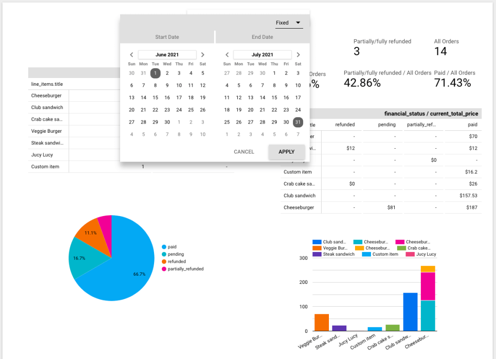
Date control
Last but not least, date control is a vital element of nearly any dashboard. It allows viewers to change the date range and have the numbers auto-update for them.
To add this feature, click on the Add a control button in the menu and then Date range control. Place it on the chart You can leave it as it is or set a default date period – for example, the previous month. Here’s how it looks in the edit mode:
And here’s a view mode:
Why connect Shopify to Google Looker Studio?
Google Looker Studio is a popular platform used for visualization purposes. It connects to virtually any data and turns it into charts, graphs, tables, and other forms.
With those, you can build beautiful dashboards, connect them to multiple data sources, and refresh the data as new information flows in.
You can also check the best Looker Studio connectors in our opinion.
Looker Studio is a perfect companion to Shopify. On your custom Shopify analytics dashboard, you can visualize your sales, monitor the fulfillment time of your orders, draw maps showcasing where purchases come from, and a lot more. The sky’s the limit.
It’s quick and painless to move your Shopify data to Looker Studio. There, you can choose from dozens of charts and can visualize virtually anything you have in mind. Thanks to Coupler.io, you’ll have an easy time analyzing your performance and making data-driven decisions using their no-code Shopify integrations.
We hope you enjoyed our tutorial. Come back to learn more soon. Thanks!
Automate data export with Coupler.io
Get started for free