How to Perform a Sales Analysis to Impact Revenue Growth [+ Free Templates]

Main goals of sales analysis
Performing regular sales analysis will help you gain actionable insights from your sales data. For example:
- Evaluate sales performance: Analyze the results of individual sales reps and your overall sales team. This will help you understand the best-performing products, which strategies impact growth, and who your most successful closers are.
- Optimize pricing: Understand product demand and customer willingness to pay to assess your pricing strategy.
- Forecast sales: Look at market trends and past results to forecast future growth and set sales goals.
- Assess market conditions and opportunities: Understand what impacts sales results and adjust your budget, acquisition channels, and strategies based on real data.
- Identify growth opportunities: Look at top revenue-generating channels and countries and perform trend analysis and market research. This helps influence decision-making when prioritizing leads and opportunities.
How to analyze sales data
Performing different types of sales analyses will help you improve the sales funnel and generate a higher ROI from sales operations and marketing efforts.
Before proceeding, it’s crucial to determine the specific insights you require. This could involve identifying top-performing products, predicting future sales, or assessing your team’s performance. Each of these tasks will necessitate analyzing precise sales data through charts and other visualization techniques.
For a comprehensive overview, merging data from different sources and performing data transformations is essential. This process eliminates data silos and provides a single source of truth for data-driven insights. To make these insights even more accessible, Coupler.io MCP server enables sales teams to interact with their consolidated data through natural language conversations in AI. You can ask questions and get immediate answers without needing to navigate complex dashboards.
Therefore, will LLMs replace dashboards in sales analytics? The short answer is no.
- Sales dashboards visualize pipeline health, track team performance metrics over time, and provide at-a-glance insights into conversion rates across the entire funnel.
- LLMs like those accessed through MCP servers are powerful for answering specific ad-hoc questions. They let you explore “why” behind trends and conduct conversational deep-dives into particular deals or time periods.
The most effective sales analytics approach combines both: dashboards for continuous monitoring and pattern recognition, LLMs for exploratory analysis, and answering specific questions that arise from what you see in your dashboards. Explore the MCP server use cases for conversational analytics of business data across industries.
Let’s look at the most useful approaches to analyzing sales data to make informed decisions.
Sales funnel analysis + free template
A sales funnel analysis helps you visualize the efficiency of your sales pipeline. It offers a segmented view of how you acquire new customers by looking at conversion rates between each step of your sales funnel.
By understanding the percentage of total users who convert from website visitors to leads and become paying customers, you can identify weak steps in your conversion funnel and take action to improve.
You’ll need to track marketing conversion metrics across your sales funnel using traffic and customer acquisition channels (Google Analytics, advertising platforms), and CRM software data.
Take a look at these examples of sales funnel templates.
How to conduct a sales funnel analysis
Let’s look at how to evaluate data from GA4, PPC campaigns, and Salesforce inside one dashboard.
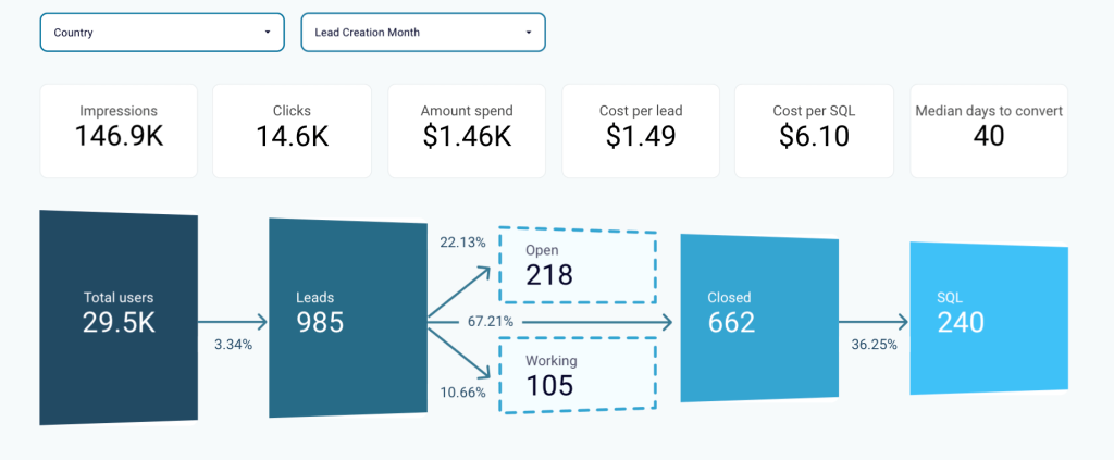
Sales funnel overview
First, analyze the conversion rates at each step of the funnel with a visual graph.
Look at the number of website visitors (Total Users) who convert into Leads and the number who become Sales-Qualified Leads (SQLs). This will help you assess the effectiveness and quality of the traffic generated.
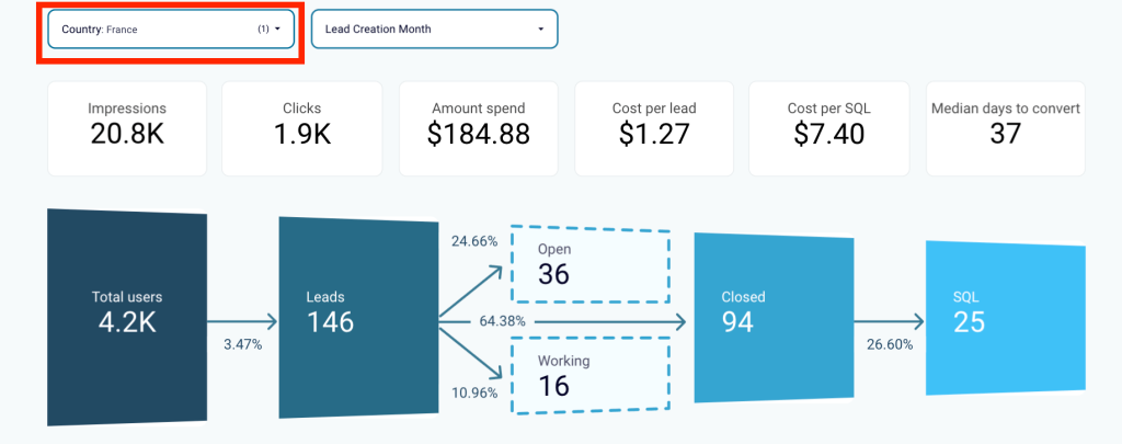
Filter data to identify weak points
Next, build hypotheses for underperforming stages to drive more revenue from the existing pipeline.
You can also apply filters by country to understand the regions bringing in more revenue.
For example, if you have many leads from France but low conversion rates, the issue could be related to language barriers or shipping options.
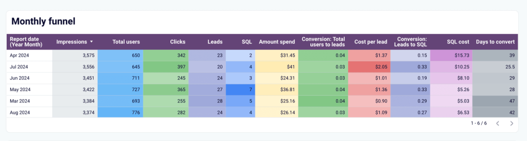
Compare performance across different periods
To discover growth opportunities, analyze performance across different time periods and geographical regions using table-view funnels. These will help you quickly identify the top-performing segments.
Correlate these results with marketing and lead generation activities to understand what generates the best ROI.
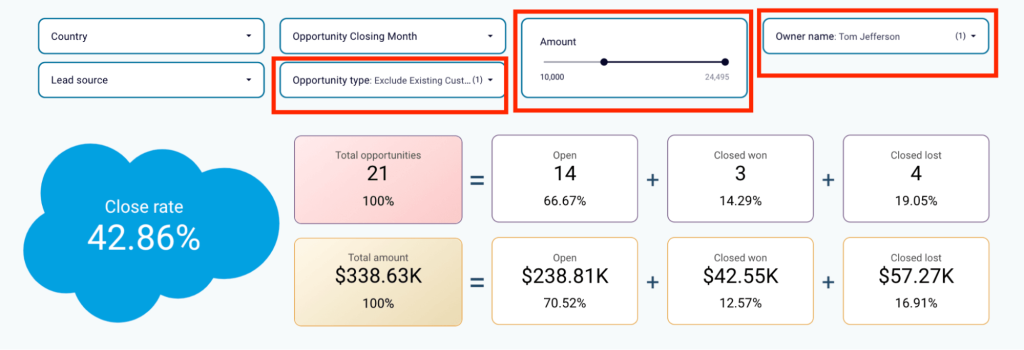
Prioritize sales channels
You can also use a sales funnel analysis to determine where sales reps should focus their efforts at any given moment.
To do this, analyze opportunities in your sales pipeline by owner, revenue amount, or deal type. The latter can also help you understand the top-performing sales channels.
Want to analyze your sales funnel using this reporting dashboard? Sign up for a free Coupler.io account, connect Salesforce, GA4, and ad platform accounts, and generate it in minutes.
Team performance sales analysis + free template
A team performance sales analysis is useful when you have several sales reps and want to understand their performance in comparison or over time.
You’ll want to compare performance metrics such as win rate, won amount, lost amount, won opportunities, and lost opportunities. A sales dashboard that pulls data from your CRM, such as Salesforce, will help you visually analyze these KPIs for different sales reps.
How to conduct a sales team performance analysis
Let’s look at how you can use a team performance dashboard with data from Salesforce. This type of analysis will give you either granular data for individual team member performance or an overall view of your team’s performance. You can segment by sales metrics or specific team members (sales reps) to get this granular view.
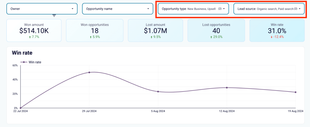
Filter data
First, filter the report by opportunity types and lead sources to see where your team performs best. This can help you set future sales goals.
Compare win and lost opportunities
Next, compare the number of won opportunities versus lost opportunities among your sales reps to quickly determine the top and bottom performers. Analyze metrics based on the number of deals or revenue generated, as different team members may handle different types of deals.”To maximize profits, assign your best sales managers to deals with the highest potential revenue.
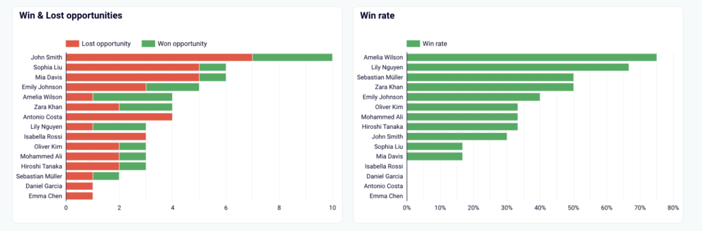
Analyze the won rate
Not all sales reps will excel at closing upsell deals, but they might have a better-won rate with new business deals.
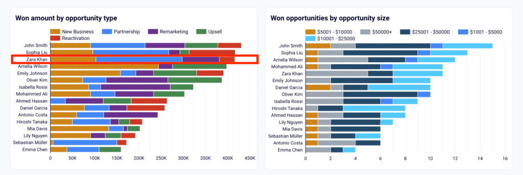
To make data-driven decisions when assigning deals to your team, look at the won amount by opportunity type across individual team members.
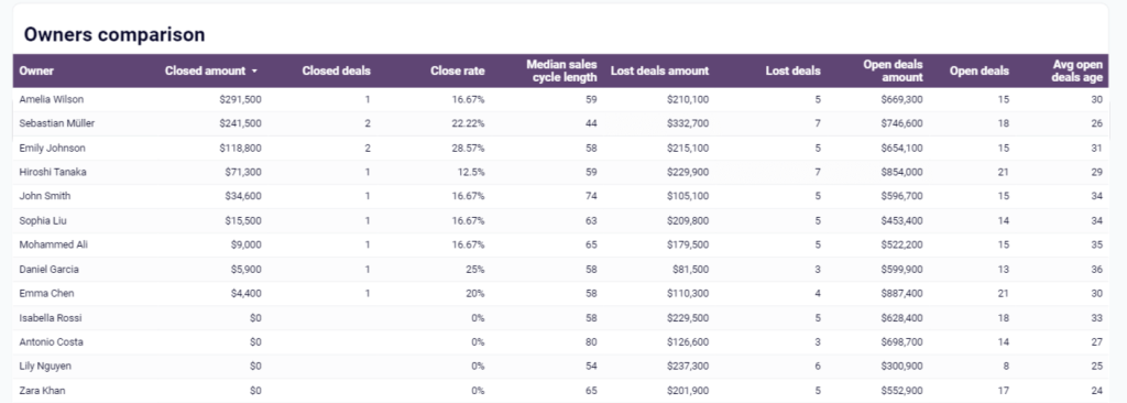
For example, if Zara Khan closes most partnership deals, it might make sense to reallocate opportunities similar to those from other sales managers.
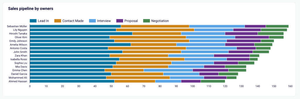
Assess sales reps performance within the pipeline
To go further, check out how each sales rep’s funnel looks at different stages of a sales pipeline. This can help you spot team members struggling to move leads across the pipeline.
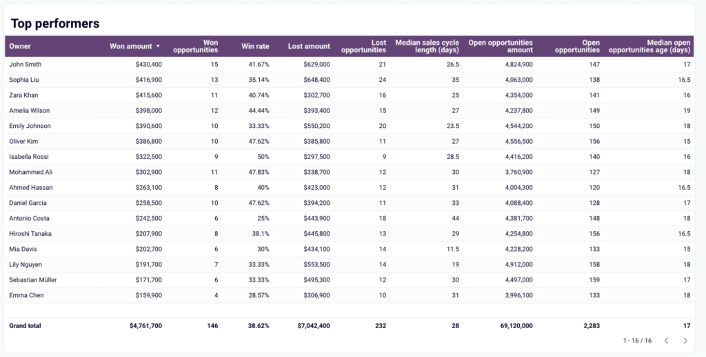
Break down the top performers
To understand your top performers, you can use a table view that summarizes the key metrics for your entire team.
If Salesforce is your CRM, you can use this free sales analytics & KPI dashboard with your data. Sign up for a free Coupler.io account and connect your Salesforce account in just a few easy steps.
Sales attribution analysis + free template
A sales attribution analysis will help you understand how different marketing channels contributed to your sales pipeline and which source generates leads with the highest conversion rate.
To perform this data activation analysis, you’ll need to combine data from your CRM with marketing data from Google Analytics (GA4) and PPC ad platforms you use, such as Facebook Ads, Google Ads, LinkedIn Ads, etc. Some companies also integrate insights from B2B intent data providers to identify leads most likely to convert.
Let’s look at how you can use a lead generation dashboard template that pulls data from Pipedrive, GA4, and major PPC ad platforms.
How to conduct a sales attribution analysis
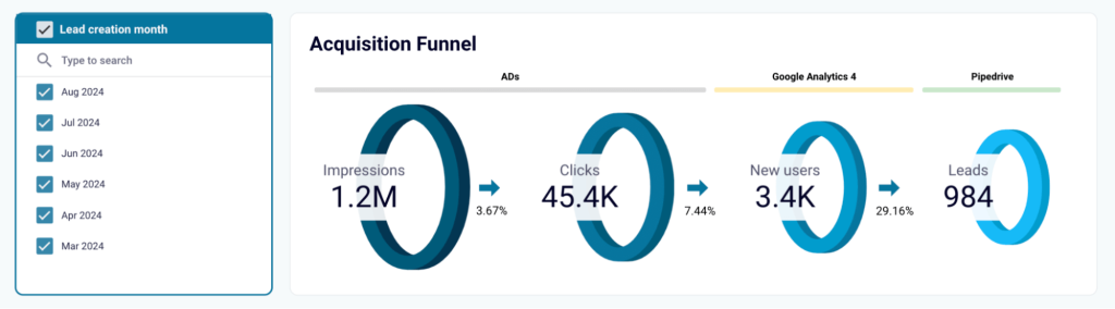
Overview of the acquisition funnel
You should start by analyzing your acquisition funnel. Examine the number of impressions and clicks generated by your ads, as well as the conversion of those clicks into new users who become leads.
Compare conversion rates for each stage with your industry benchmarks to identify funnel leaks.
If your rates are significantly below average, analyze detailed reports to develop hypotheses on how to improve. Testing these hypotheses can help you generate more revenue from your existing pipeline.
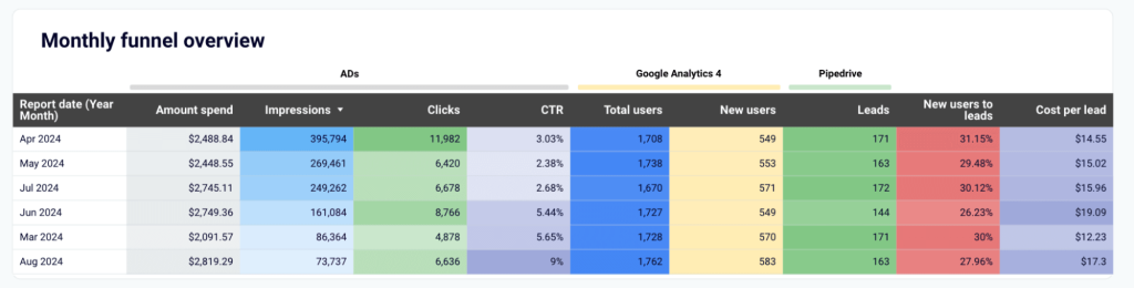
For example, analyze funnel performance changes month by month to uncover correlations with marketing strategies and lead generation activities. Identify the best-performing months and link them to specific marketing campaigns that may have driven higher results.
You can then form and test a hypothesis that increasing ad spend in specific months for specific campaigns will improve your conversion rates across your sales funnel.
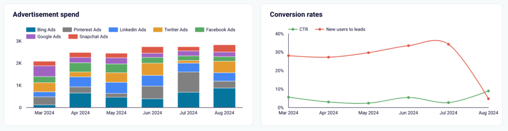
Analyze costs across platforms
Next, compare your spending on different platforms with conversion rates for the same period.
The example below shows that in August, the campaigns on Bing Ads had the largest spending, but lead conversions dropped. Based on this insight, marketing teams can adjust strategies and budgets.
To get started with a sales attribution analysis, you can use this dashboard for free. Sign up for a Coupler.io account and connect your Pipedrive, GA4, and ad platform accounts.
Sales forecast analysis
A sales forecast analysis helps you predict future sales for new products or existing ones based on historical data and industry sales trends.
Predictive sales analysis is useful when making important business decisions, such as expanding into a new market, launching new products, or adding new features to existing products.
How to conduct a sales forecast analysis
One thing to keep in mind is that you’ll need accurate and comprehensive historical sales data for this type of analysis. As most tools use machine learning algorithms to understand trends and predict future sales, the more data you have, the more accurate your predictions will be.
For example, your sales team consists of 2 sales reps who won X number of opportunities in 2023. If you add two more sales reps to handle your pipeline, will the number of won deals increase twofold?
To answer this question and understand the expected outcome, you should analyze the performance of these sales reps in the last year. With this historical data, you can predict whether your team of 4 sales reps will manage to double your sales or whether your expectations should be lower.
You can get this historical data from most of the sales analytics reports. Here is what it looks like on the sales KPI dashboard for HubSpot.
Any historical data will be helpful to forecast future performance and predict the success of new initiatives.
You can use sales intelligence software like Gong for predictive sales analysis or Salesforce CRM, which offers some forecast analysis functionality.
Learn more about sales forecasting in our blog.
KPIs: Key sales metrics and conversion rates to include
David Serna Perez, a Sales Director at Weav.ai, is persuaded that quota is at the core of any sales strategy.
Quota often serves as the North Star, guiding the focus toward objectives like net new logo acquisition, retention, expansion, or a combination of these, depending on the quarterly goals set by the executive team.
Monitoring the number of touchpoints per opportunity is crucial for maintaining momentum within accounts. Data-driven insights allow for strategic adjustments, which are vital in navigating long sales cycles that can range from 6 to 18 months.
It’s also essential to track activity KPIs, such as the number of accounts targeted per week, target leads generated, emails sent, messages and invites sent through social media (e.g., LinkedIn), and cold calls made.
Here’s a more all-purpose list of the KPIs you should be tracking to understand sales results performance:
| Metric | What it measures |
|---|---|
| Lead conversion rate | Overall sales revenue month-to-month growth, calculated as a percentage. |
| Sales opportunities | The number of prospects that are qualified to become paying customers. |
| Win rate | The percentage of qualified opportunities that result in closed deals. |
| Average deal size (ADS) | The average amount of revenue generated per closed deal. |
| Pipeline value | An estimated sales revenue potential based on existing deals in your pipeline and average historical conversion rates for your team. |
| Sales cycle length | The average time it takes leads to become paying customers. |
| Monthly sales growth rate | Overall sales revenue month to month growth, calculated as a percentage. |
| Customer lifetime value (CLV) | Total revenue generated by a customer across their lifecycle before they churn. |
| Monthly recurring revenue (MRR) | Total revenue expected in a month based on active recurring customers paying monthly subscriptions. |
| Churn MRR | The total revenue lost in a month was due to customers who churned. |
If your sales pipeline relies mainly on email outreach, it makes sense to include replies as the key sales metrics. For instance, JM Mallari, the Outbound Sales Lead at Spiralyze, claims that total replies and positive replies are the 2 most important sales metrics for them.
Total replies give your outbound sales team a standard to assess deliverability on a week-per-week basis. If your total replies for the week are below your standard historical volume, then it could possibly indicate that you have a deliverability issue.
Positive replies, on the other hand, give your outbound sales team instant feedback on how their email copy is performing and if there are any changes and improvements you would need to make to increase the said volume.
Tools for sales analytics
To track sales activities and results, you can rely on reports from individual sales automation and sales analytics tools in your stack, or use automation software. These solutions enable you to pull data from multiple sources, transform it, and visualize it in real-time self-updating reports.
Let’s look at the best tools to use for sales data analysis.
Customer relationship management (CRM) tools
CRM tools are great sources of first-party data for sales pipeline analysis reports as they show you where your deals are coming from and conversion rates across the funnel. These tools help track pipeline retention and close deal rates, as well as the amount of revenue generated.
The most popular CRMs include:
- Salesforce
- HubSpot
- Pipedrive
Outreach tools
Outreach tools are primarily used by sales teams for lead prospecting and cold email outreach.
It’s usually best to use an outreach tool in conjunction with a CRM. This will help you prioritize leads based on lead scores, keep one source of truth when it comes to all the deals in your sales pipeline, and better predict sales revenue.
As your sales team grows and expands into new markets, managing international hiring and payroll becomes increasingly important. In such cases, comparing Deel vs other EOR solutions can help you find a solution that better fits your operational and compliance needs.
You can access different analytic reports depending on the tools’ use case when using outreach tools.
The most popular outreach tools are:
- Reply.io – for multichannel sales automation campaigns
- Gong – for outreach and sales intelligence
- Outreach – for sales engagement campaigns
- Lemlist – for outreach email campaigns
- Linked Helper – for LinkedIn outreach campaigns
Web analytics tools
Web analytics tools help you analyze website traffic, customer behavior, demographics, and product engagement.
You can use solutions like Google Analytics (GA4) to understand lead acquisition sources or apps like Amplitude to track lead-to-SQL conversion rates.
Coupler.io
Coupler.io is a reporting automation platform. It provides ready-to-use sales analysis report templates like the ones above. Or you can create custom solutions for sales data analytics in spreadsheets like Google Sheets and data visualization tools like Looker Studio or Microsoft Power BI.
Here’s a quick overview of how it works:
- Set up an importer by connecting the data sources you want in your report. You can add one or multiple data sources, including Google Analytics (GA4), Salesforce, Pipedrive, HubSpot, Ads platforms, and more.
- Transform the data by renaming columns, applying filters, and adding additional columns based on formulas.
- Load your sales report to the selected data visualization tool and set up automatic data refresh so your reports always display fresh data. For conversational analytics, you can integrate your data with ChatGPT, Claude, or other AI integrations and get AI-driven sales insights.
Coupler.io gives you the flexibility to merge data from all your tools in your stack and easily create comprehensive sales analysis reports.
You can also get started with pre-built report templates. Choose from various sales dashboard templates, connect your data sources, and you’ll be ready to analyze your sales performance in minutes.

Automate sales analytics with Coupler.io
Get started for freeMake sales performance analysis part of your sales process
We’ve covered the most essential types of sales reports to monitor performance and analyze your sales pipeline numbers. They can become efficient tools for sales managers to optimize conversion rates at all stages.
Custom sales analysis reports will provide you with valuable insights and create a single point of truth between sales and marketing to ensure everyone is on the same page.
Smash your sales quota with Coupler.io for free and experience the benefits of automated data management for cross-channel sales analytics.