Sales tools typically offer built-in analytics in the form of dashboards, reports, and others. Many users, however, find them quite limiting as they’re often unable to customize them to their liking, let alone connect to data from other sources. This is when building a Tableau sales dashboard becomes an optimal solution to this challenge.
This article is divided into two parts. In the first, we explain step-by-step how to connect to data sources, understand the Tableau interface and start putting up the basic charts on a dashboard. This part is suitable for Tableau novices who want to jump on an exciting journey of visualizing their sales data.
If you’re, however, an experienced Tableau user already, jump directly to the second part, where we showcase various examples of beautiful sales dashboards from Tableau Public. Each of which you can copy to your workspace and adjust to work along with your data.
How to build a sales dashboard in Tableau?
Tableau offers several editions that differ slightly in the features available. For this tutorial, we use Tableau Cloud, although the steps for building a dashboard are similar in other versions too.
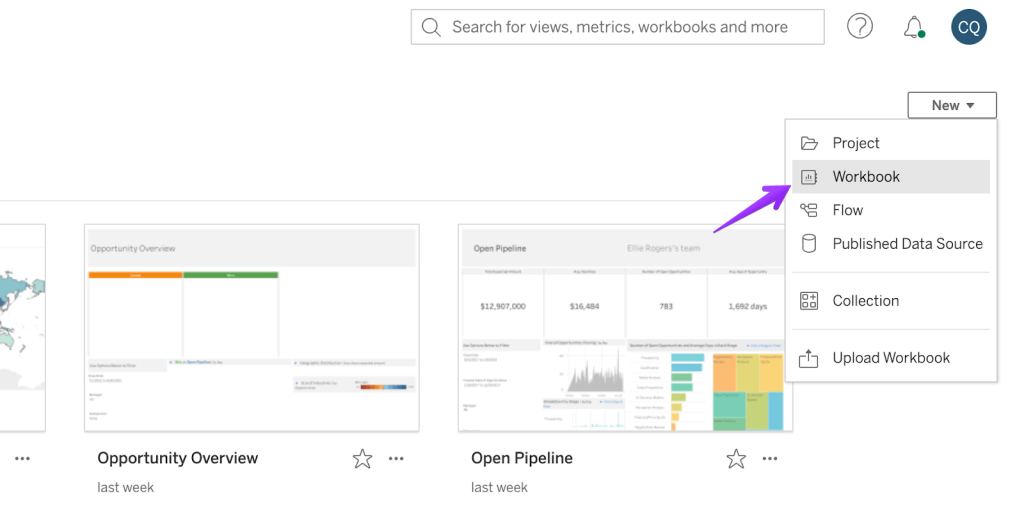
To start building a Tableau sales dashboard, click on New in the top-right corner and then Workbook.
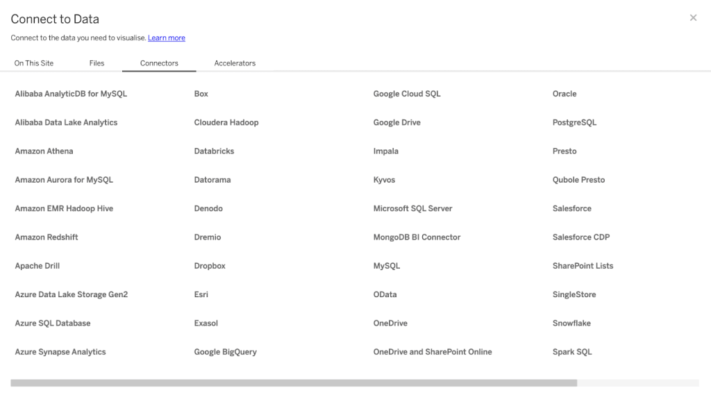
You’ll be immediately prompted to choose a data source. Without one, you can’t really do anything in Tableau, after all! In the On This Site tab, you have all the sources and datasets you have connected thus far. There’s also a Superstore Datasource sample set if you want to play with some sample data.
Via the Files tab, you can upload a data set manually. The supported formats include .csv, .txt, .pdf, JSON, and many others. This option makes sense if you want to work with a fixed data set – for example, to prepare an annual report.
Finally, the Connectors tab allows you to set up a connection with a number of applications and databases.
Once you connect an application, the dashboards in Tableau will update automatically with each new refresh (by default, every 12 hours). This will allow you to work with near-real-time data without uploading new data sets.
And what to do if your app is not featured on the list, but you still want to sync its data into Tableau? It may be pretty straightforward to sync that app into a data warehouse, for example, BigQuery, and then plug that information into Tableau. We’ll explain a simple way to do this in the How to connect my app to Tableau? chapter.
Lastly, Tableau has some so-called Accelerators, which are basically dashboard templates dedicated to working with the apps they were built for. The idea is that you connect an app (for example, Salesforce), pick a template matching your data (for example, Salesforce Sales Cloud Pipeline), and the dashboard will automatically populate with the relevant insights.
It may need some tweaks here and there but it’s an excellent way to get started if you only work with one of the featured apps. At the moment, the available data sources include:
- LinkedIn Sales Navigator
- Marketo
- Oracle Eloqua
- Salesforce
- ServiceNow TSM
Building a sales dashboard
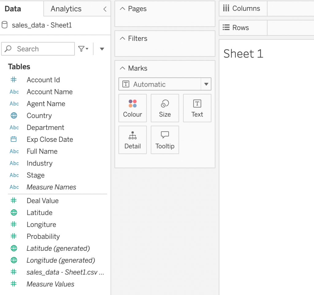
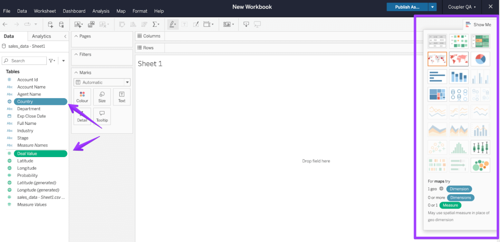
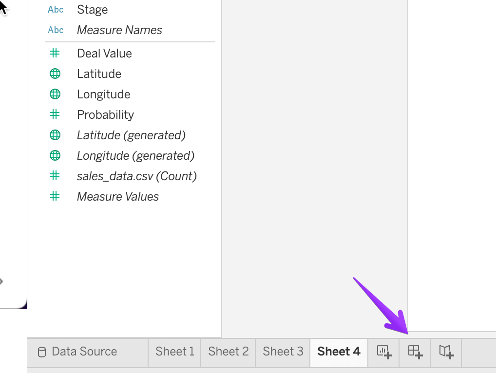
For the sake of simplicity, we’re going to work with a .csv file with sample sales data that we uploaded to Tableau. Once you upload or connect your data, you’ll see the list of fields to the left of your workbook. They’re split into dimensions (blue) and measures (green).
Each field is also automatically assigned a type based on its format – for example, names get a text type, numbers get a numerical type, and things like countries or GPS coordinates are assigned a geographic type. It’s worth verifying those before you proceed, as Tableau sometimes makes mistakes, and so do humans.
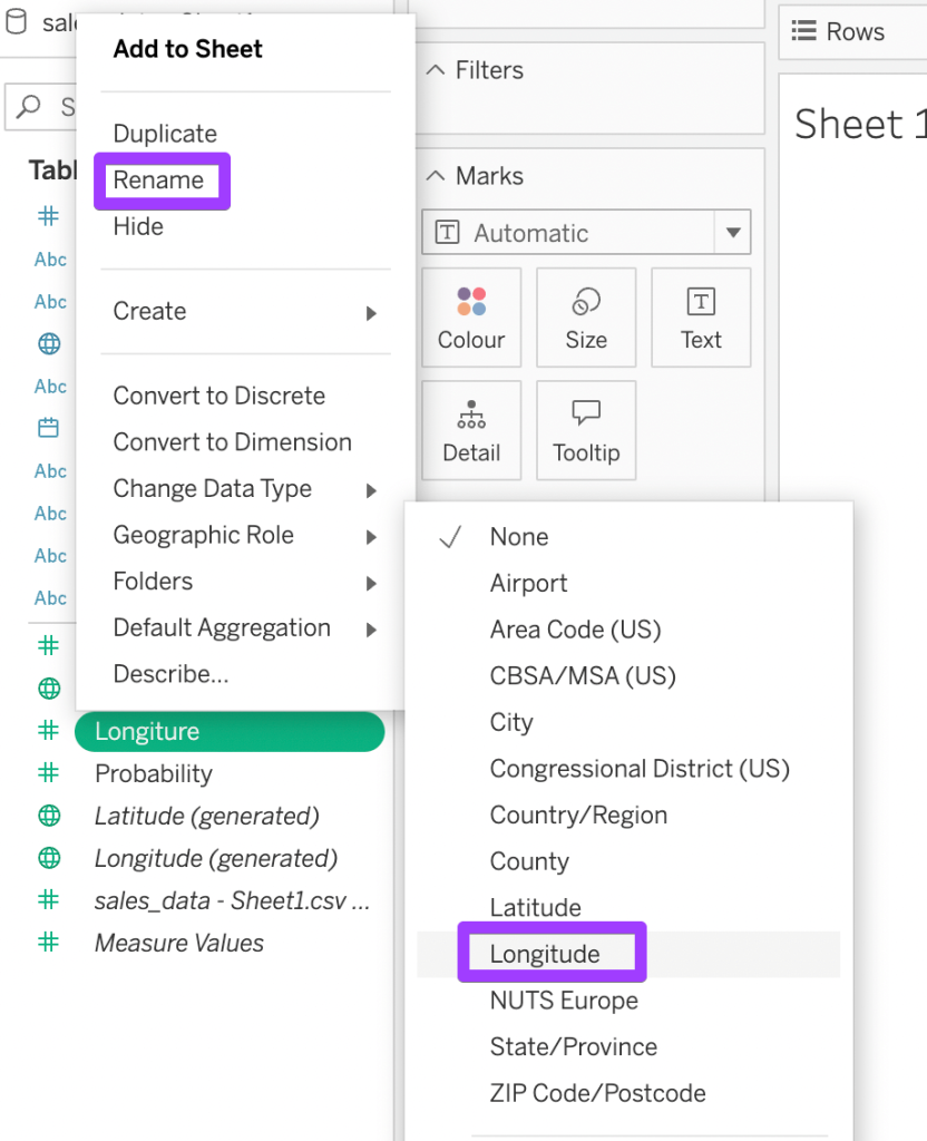
Here, for example, we mistakenly mistyped the word “Longitude,” which gave this field a numerical type instead of its geographical equivalent.
To fix that, hover on the field name, click the triangle icon to the right, and change to the relevant data type. Also consider renaming the field if the mistake resulted from a typo.
Adding first charts
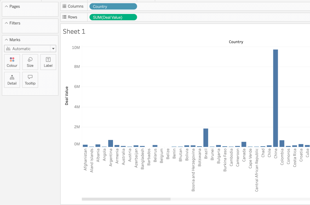
Let’s build some charts. There are several ways to do this in Tableau. One way to do this is by dropping the relevant fields onto the Columns and Rows panes on top of the worksheet. Tableau will draw a default chart type for the given types. For example, we dropped the Country field into the Columns pane and the Deal Value field into Rows.
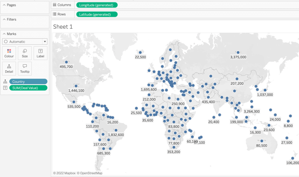
Another method of adding charts involves dragging and dropping fields directly into the sheet view. Select one of the fields you want to add, press and hold the CTRL button (CMD on Mac) and select the other fields. Then, drag and drop them into the view and see what Tableau comes up with. This time, it suggested a map, although not as descriptive as we would have hoped for.
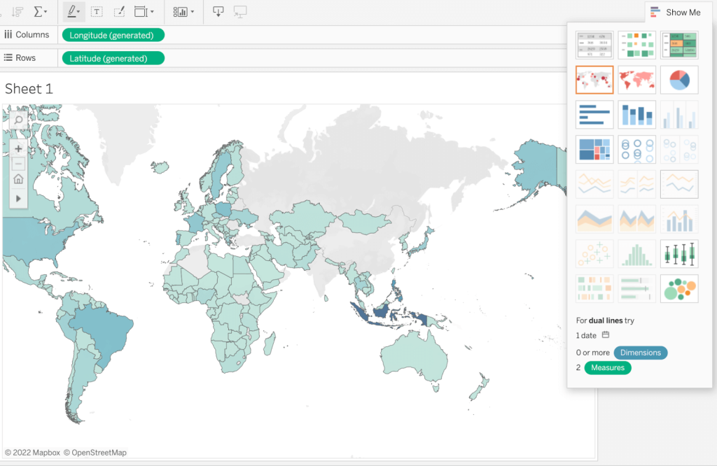
The third and, for many, the most intuitive method is very similar. Select all the fields you want to include on a chart. Then, click the Show Me menu in the top-right corner. Tableau will highlight all the chart types available for the chosen type and the quantity of data types. For each type of chart, it will show the number of dimensions and measures required for it to work.
Pick the chart type that works best for you, and you’ll see the result in a moment. Here’s what Tableau conjured this time for us.
Customizing the charts
Tableau does its very best to create the most relevant charts for the fields you picked. Sometimes, though, it needs a bit of help figuring that out.
You can always swap between different chart types with the Show Me menu.
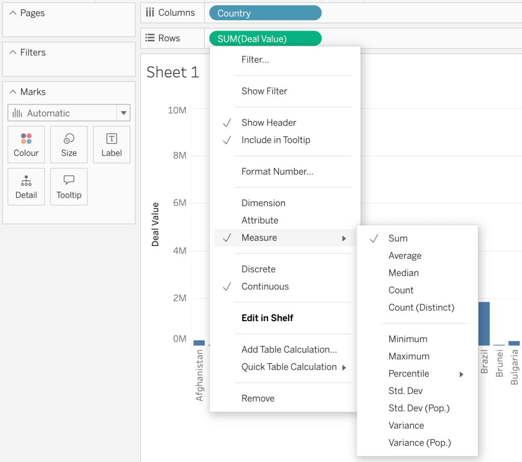
In the earlier example, we dropped the Country and Deal Value fields onto the Columns/Rows panes. By default, Tableau assumed that it was the sum of the numerical field that we were after, so it returned the total deal values for each country.
It will be right in many situations, but not this time! Let’s say we want to see the median deal value for each country. To change that, right-click on the SUM(Deal Value) field and select Measure -> Median. The chart will adjust momentarily.
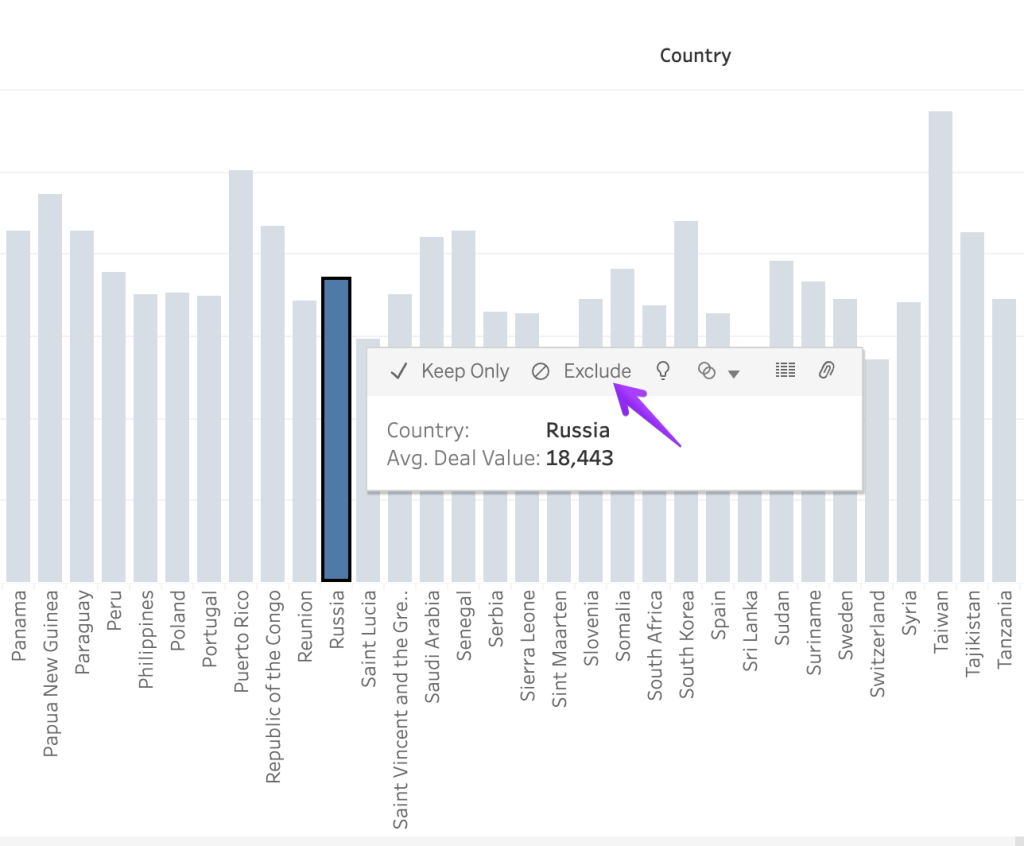
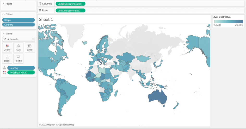
If you wish to exclude some columns from the chart, click on either of them and choose the Exclude button. Repeat this for all the others you wish to exclude. For example, we no longer do business in Russia, so we remove it from the chart.
If you’re working with geographical data, it may be easier to:
- Switch to the map chart
- Highlight only the part of the map you want to analyze.
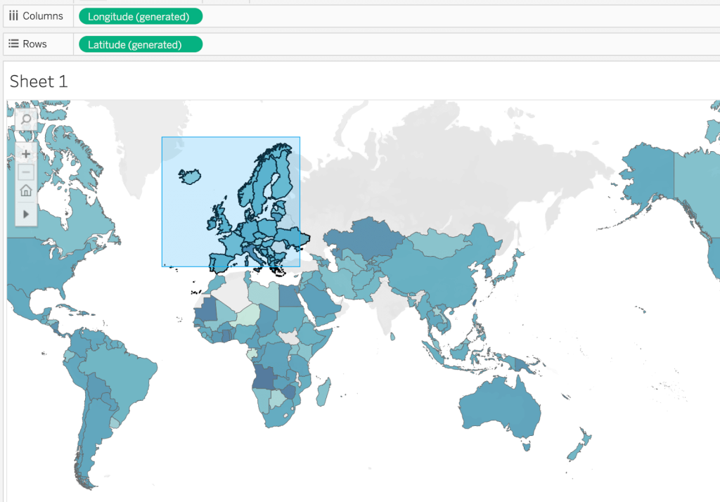
- Then, hover anywhere on the highlighted area and choose Keep Only.
- If you wish, switch back to, e.g., a bar chart or pick any other for your analysis.


Marks is where the magic happens in Tableau. This is used to tweak the design, drill down on specific data, upgrade the visual aspect of a chart, and more.
Here, for example, we had a rather boring chart demonstrating the value of deals according to their expected close date:
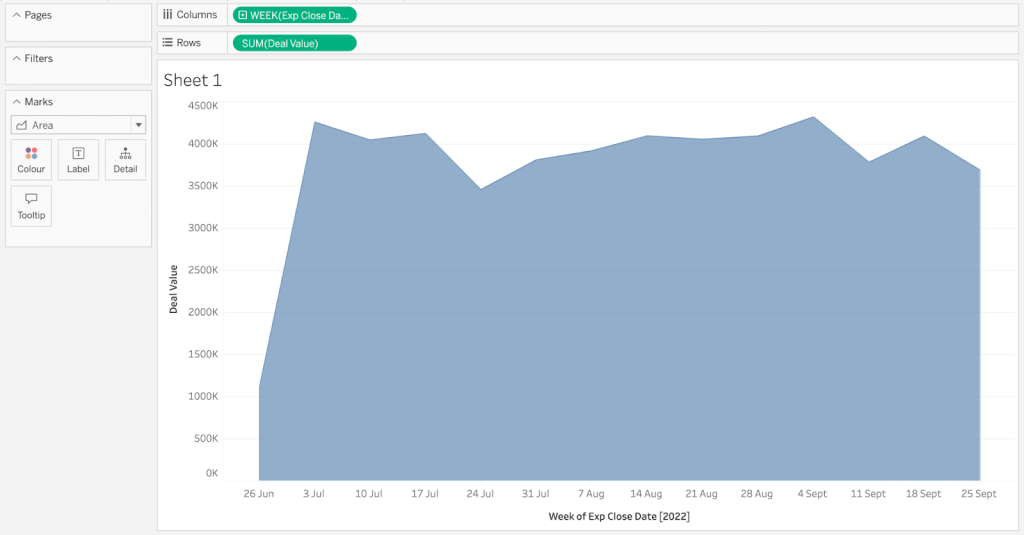
To spice it up a bit, we dragged and dropped the Stage field onto the Colour mark type. Here’s what we got as a result:
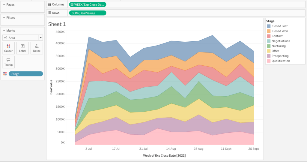
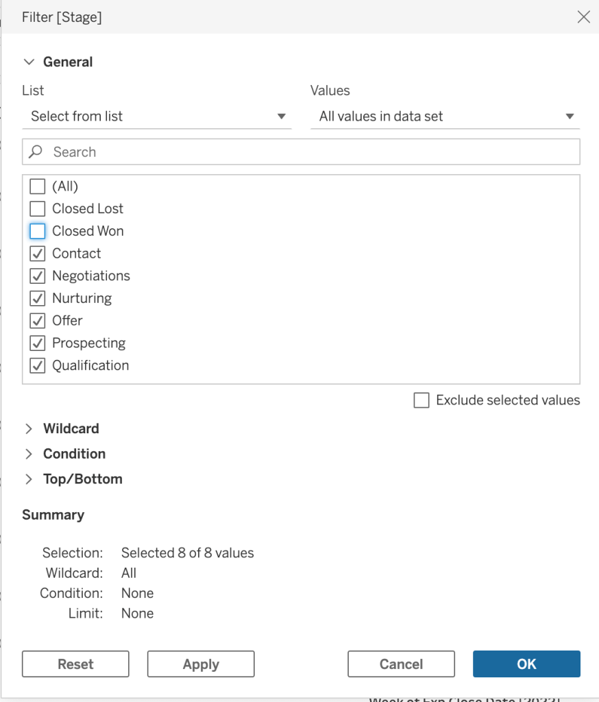
Perhaps for this particular chart, it makes sense to exclude deals that were already closed. We can do this in two ways – click on the respective part of the chart (e.g., the one demonstrating Closed Lost deals on top) and choose Exclude. Or, drag and drop the Stage field onto the Filters pane and uncheck the relevant options.
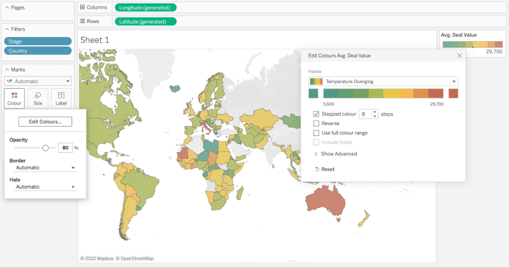
Often, the default view you’ll get won’t be all that much descriptive.
To change it, click the Colour button in the Marks pane. Then, choose Edit Colours. Pick the desired colour palette and, for better effect, choose the stepped up colours.
There’s a lot more you can do to customize your charts. If you ever need help, chances are you’ll find answers on the extensive Tableau help pages.
Building a dashboard
Once you’ve put together at least a few good-looking charts, you can start putting them on a dashboard. To add a new dashboard, click the icon in the menu below.
Jump to that dashboard’s tab and drag the relevant sheets onto the main view. Position them freely on the screen, add objects, customize them to your liking, add a date or other filters, and more.
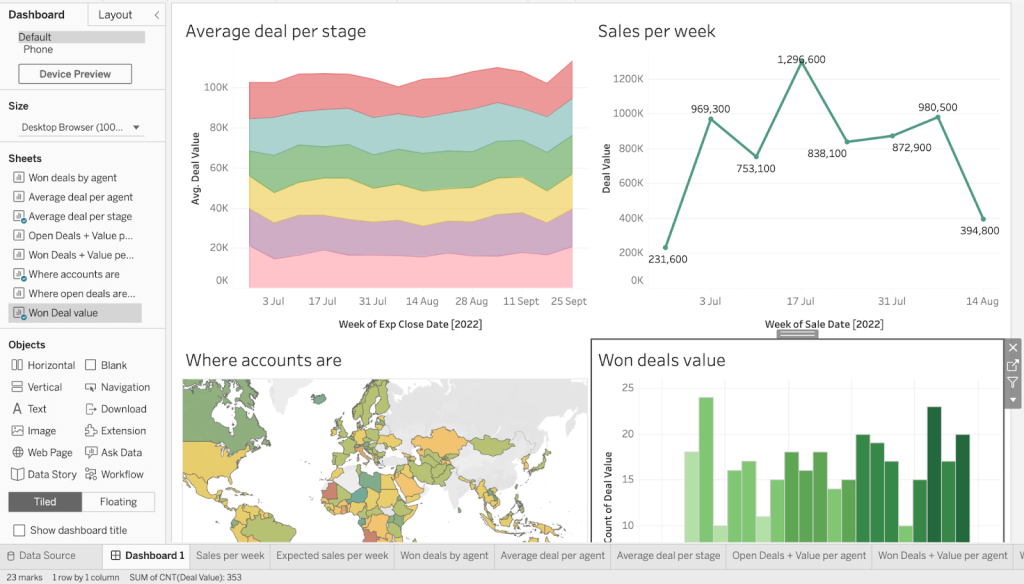
Once you’ve finished, the last step is to click the Publish button on top.
Once you’ve completed your Tableau sales dashboard, you probably want to share it with the world. Or, at least, give it to your stakeholders to start things off.
The latter is very easy. In the top-right corner of the dashboard view, click the Share button. Then, find the people within your Tableau organization with whom you want to share the dashboard and confirm with another click on Share.
Things get more difficult if you want to share a dashboard with someone outside of Tableau. Working with Tableau Desktop, you can upload a dashboard to Tableau Public for everyone to see. But chances are you don’t exactly want to be sharing every detail of your sales pipeline with the world. In Tableau Cloud, this option isn’t even available.
As an alternative, you can export data from Tableau to Excel, for example. Such a spreadsheet can then be freely distributed across your organization or even shared with external stakeholders. It won’t be visually as appealing as the charming Tableau dashboards tend to be, but it will feature all the vital information your team needs.
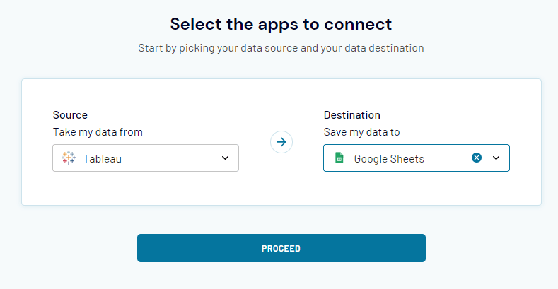
To set up such export, you can use Coupler.io. The tool allows you to automatically export data from Tableau into Google Sheets, Excel, and BigQuery. The data will be pulled according to the schedule you choose – for example daily or hourly – which guarantees that your file will be as up-to-date as the original dashboard.
- To get started, create a free Coupler.io account.
- Click the Add importer button. Then, select Tableau as a source and pick the destination of your choice. We’ll go with Google Sheets.
- Connect your Tableau account using your Personal Access Token. You’ll find instructions in the app.
- Then, jump to your Tableau sales dashboard and copy the page’s URL. Paste it into Coupler.io.
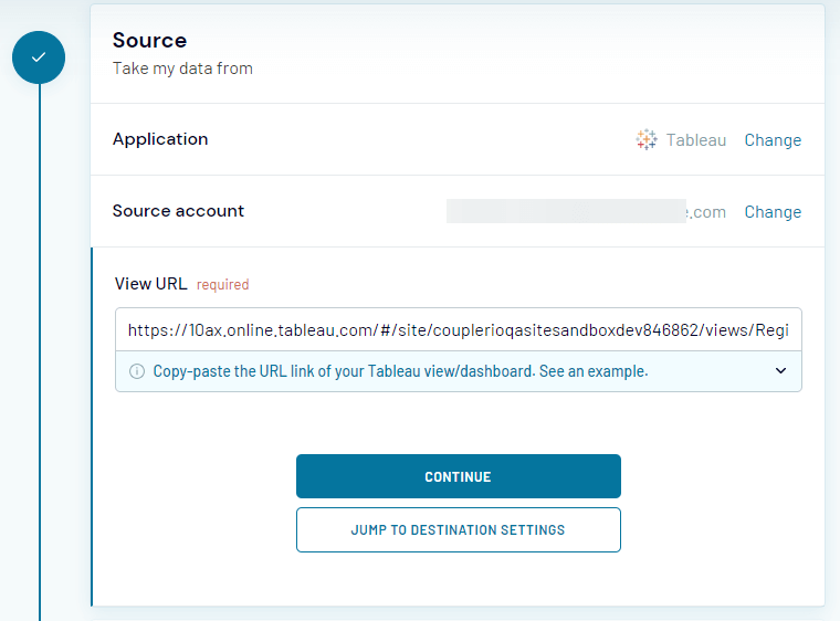
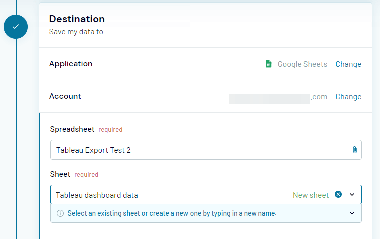
- In the Destination settings, connect your Google or Microsoft account, depending on the destination app you picked. Then, choose where to import the data from Tableau.
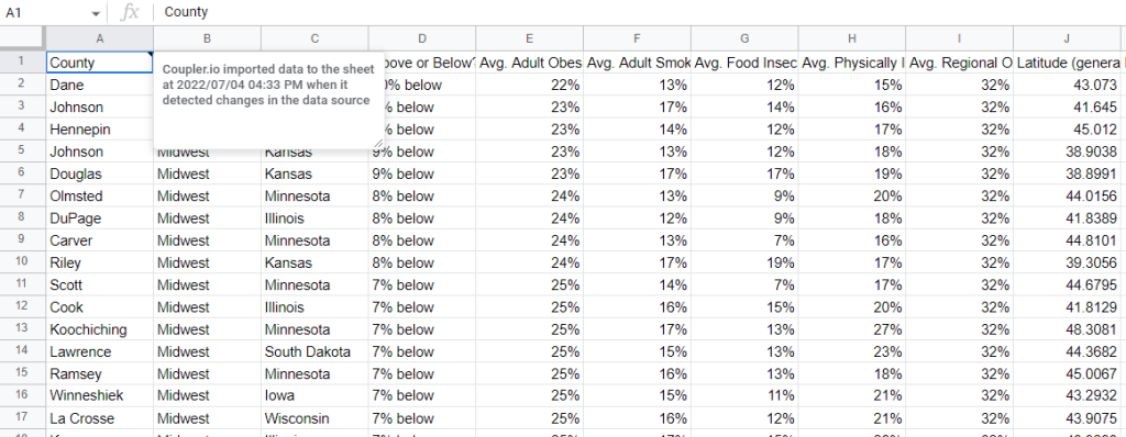
- The Schedule part is optional, but it’s worth setting it up. For example, you may want to export the data every morning at 8 am. When you’re finished, click the Save and Run button to launch the importer. And here’s the sample export in our spreadsheet:
How to connect my app to Tableau?
As discussed earlier, Tableau offers many native integrations, although most of them are with databases of every sort. So, to no surprise, to plug your sales, marketing, or other apps into Tableau, you may need to set them up for automated imports into one of Tableau’s native connectors.
In the previous chapter, we introduced Coupler.io, the tool capable of automatic data imports from your apps. One of the available destinations is Google BigQuery which happens to be also natively connected to Tableau. So the idea of a workflow is simple:
- Set up to automatically export data from each of your apps into separate BigQuery tables or datasets.
- Plug that data into Tableau using the BigQuery connector
- Set the schedule for the imports from the apps into BigQuery. Tableau fetches new data every 12 hours by default, but you can adjust it. It probably makes sense to import data into BigQuery at a similar frequency.
At the time of writing, Coupler.io supports 25+ source apps. These include Pipedrive, Salesforce, Shopify, WooCommerce, QuickBooks, and many more. Find the latest list of sources at https://www.coupler.io/sources.
Tableau sales dashboard examples
Tableau Public is full of wonderful dashboards built by its vast community. We scanned through hundreds of them and picked for you our absolute favorites. Let’s see these Tableau dashboards in action.
Tableau sales performance dashboard
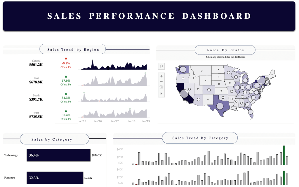
This Tableau sales performance dashboard from Philip Okoampah Kwaning tells you just about everything you would like to know about sales in a particular region. You’ve got an interactive map showing where most sales originate from. On hover, the list of best-performing cities is shown.
In addition, the dashboard allows you to quickly grasp which categories are your best-performing ones and how the trends have shaped up over time. The dashboard drills down further into sub-categories and manufacturers, giving a complete overview of one’s sales performance.
Tableau Sales KPI dashboard
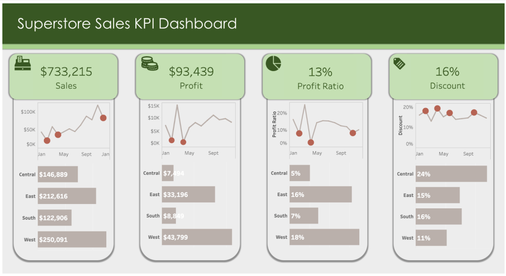
We like this Tableau Sales KPI dashboard from Jacqui Moore because it allows users to grasp the key business metrics literally in the blink of an eye. It demonstrates sales, profits, profit ratio, and discounts applied for a chosen period, and for each offers a relevant chart, showing how this KPI shaped up over the recent months and where the highs and lows were.
The dashboard breaks down each metric further into regions, making it easy to understand where sales exceed expectations and where they need some more attention.
And while we’re at it. If you’re struggling with building a sales dashboard, consider hiring us to build it for you. We offer data consultancy services, through which we can help you transform, organize, and visualize the data already at your disposal. We build sales dashboards, too, and here’s an example of a dashboard demonstrating sales KPIs and performance:
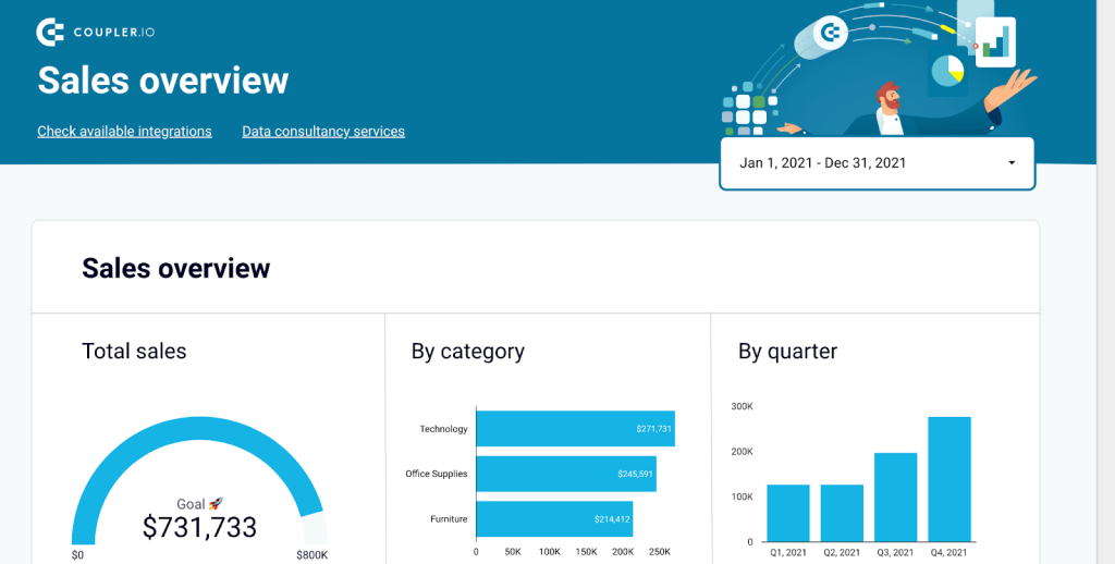
Although the dashboard was originally built in Google Data Studio, we’re flexible in building data visualizations for you in the platform of your choice, whether in Tableau, Power BI, Excel, and more. Contact us for a free quote.
Tableau sales pipeline dashboard
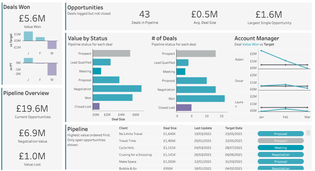
The Tableau sales pipeline dashboard from Carl Allchin may be pretty straightforward, but it offers all the information one needs to know about their pipeline in an accessible form. Your sales are broken down by status and presented based on the total values and the quantity for each.
What’s more, there are stats for each agent, general sales metrics, and a pipeline summary. Last, there’s a long list of the clients in the pipeline with the current status for an easy overview.
Tableau regional sales dashboard
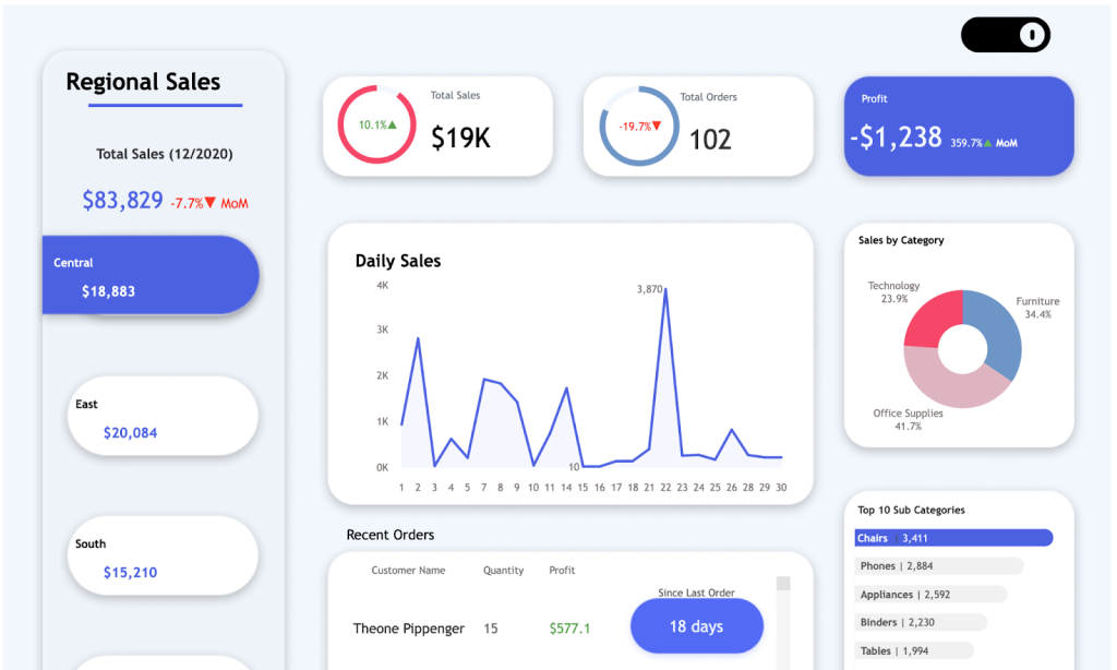
Our pick here goes to Jaswanth Badvelu and their Tableau regional sales dashboard. On the leftmost side of the screen, you can see the sales for each region and quickly swap between them. For each, you’ve got the key sales metrics, a chart for daily sales numbers, and the breakdown of sales by category and subcategory.
The dashboard also pulls up the latest sales and the profit generated by each, making it something worth keeping track of on a daily basis.
Tableau sales forecast dashboard
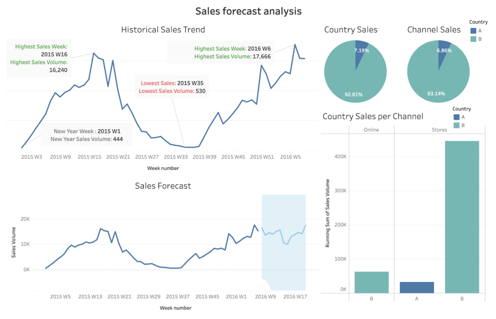
This Tableau sales forecast dashboard from Noura Alblooshi offers plenty of valuable historical insights that one should be aware of. The chart on top demonstrates historical sales over the last several years and highlights all-time highs and lows. Consequently, the following chart predicts how the sales will likely shape up in the upcoming period.
The dashboard also breaks down sales for specific regions and demonstrates an interesting correlation – the impact of the selling price. Such a chart can be invaluable for shaping up the future pricing strategy.
Tableau sales revenue dashboard
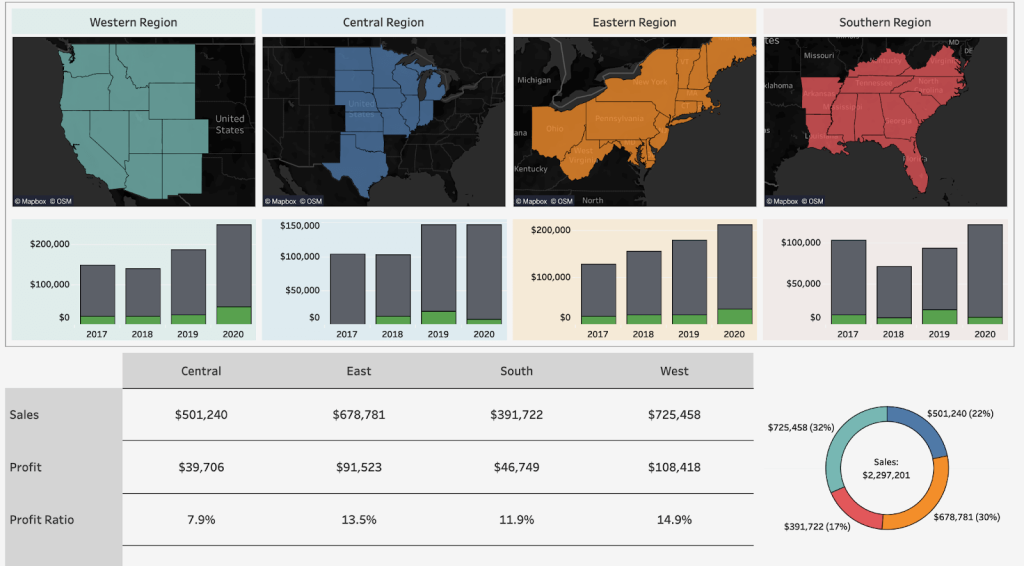
This Tableau sales revenue dashboard from Proximous demonstrates, well, the revenues of a business accumulated in each region it operates in. A user may hover on any of the stages being part of a particular region and see its sales and profit numbers. Historical sales for each area are also shown on charts.
The table below demonstrates all the vital revenue metrics, such as sales, profit ratio, profit per order, etc. The numbers are broken down into regions and are easy to compare.
Tableau daily sales dashboard
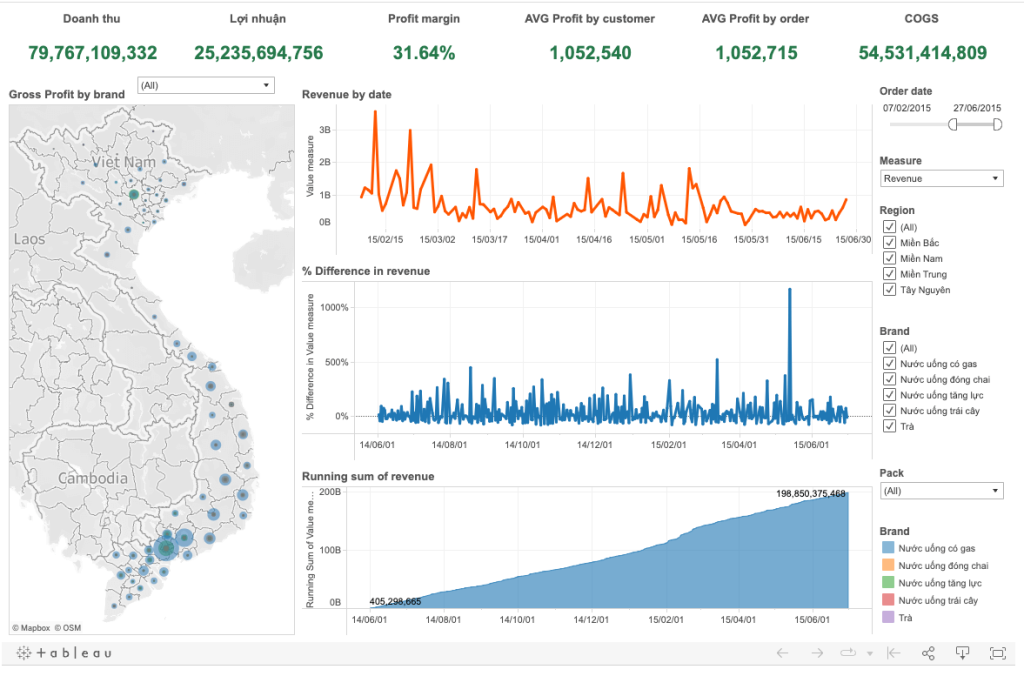
This Tableau daily sales dashboard from user BSD breaks down revenues into individual days and, on another chart, displays the percentage difference from the previous days. Simultaneously, it displays the running sum of revenues, giving you an easy overview of where any spikes are.
The dashboard also features a handy map view, showcasing where most sales occur. Clicking on any spot on the map adjusts the revenue charts for that particular location. You’ll find rich filtering options to further drill down into the sales data in the right-most menu and the set of vital metrics on top.
Tableau sales metrics dashboard
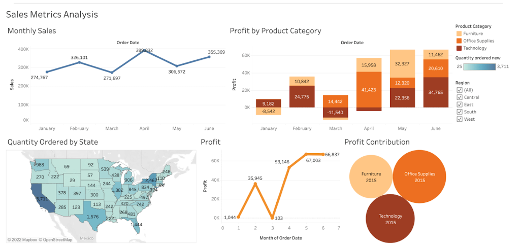
The Tableau sales metrics dashboard from Jayshree W looks at several vital business metrics. Of course, the sales numbers are shown on a monthly scale. Another chart demonstrates profits and losses, further broken down by categories.
A map view shows us the quantity of sales in each particular state while the other charts look at the overall profit values and its most significant contributors.
Tableau sales dashboard – final words
Throughout this article, we’ve tried to show you how to build your first dashboard in Tableau. We also shared some examples of already built Tableau sales dashboards, suitable for every occasion. There are thousands of others available in Tableau public, with more and more added daily. Hopefully, you can contribute some to the community too!
If you’re having trouble plugging in a particular app into Tableau, chances are Coupler.io can be of some help. Same way – if the default sharing options don’t quite work for your needs, exporting data from Tableau may be the way to go. We’ve described both approaches in the How to connect my app to Tableau and How to share a Tableau dashboard chapters, respectively.
Thanks for reading and have a wonderful time visualizing your data.