A sales dashboard is a report with different data that demonstrates whether your business is going well. It contains different sales metrics visualized in an easy-to-read way. Modern sales management software, such as HubSpot or Salesforce, provides this functionality out of the box. It’s quite handy to use built-in sales dashboards. However, they only contain specific metrics and have limited customization capabilities. That’s why those who are looking for custom reporting choose Google Sheets. And today we’ll show how you can build an interactive sales dashboard in Google Sheets.
Why is Google Sheets a great solution for a sales dashboard?
Google Sheets is customizable
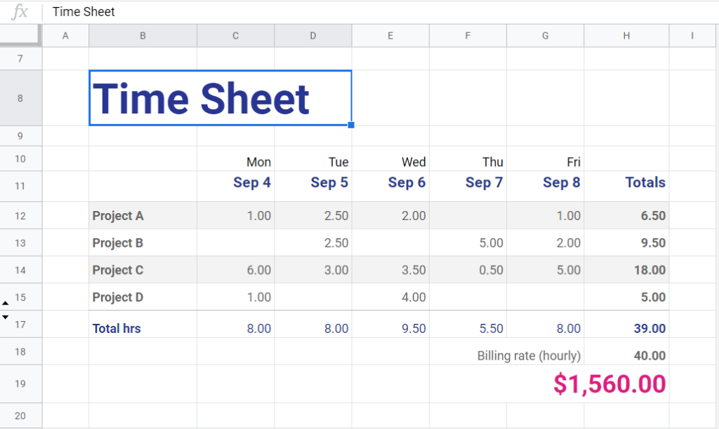
Some people use only basic functions and they see spreadsheets as follows:
However, Google Sheets is a trove of formulas, charts, tables, and other tools for custom reporting. You can do almost everything with this tool:
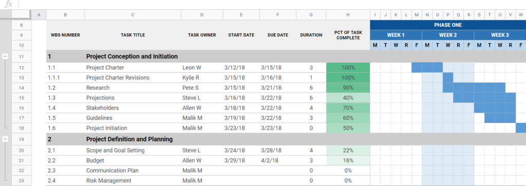
- Gantt charts for product management:
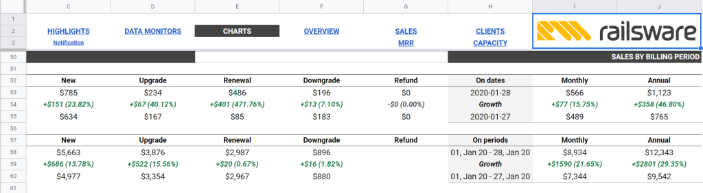
- Data monitors:
and many more use cases.
Google Sheets is calculation-centered
Google Sheets function list is huge, but it allows you to make any manipulation with data. For example, the following formula calculates the number of deals sorted by two parameters (Year and Country):
=IF(
  AND(
    ISBLANK(B1),
    ISBLANK(D1)),
  COUNTA(Deals!A2:A),

 IF(
  ISBLANK(D1),
  COUNTA(
   Filter(Deals!A2:A,Deals!Z2:Z=B1)),

 IF(
  ISBLANK(B1),
  COUNTA(
   FILTER(Deals!A2:A,Deals!CN2:CN=D1)),
  COUNTA(
   FILTER(Deals!A2:A,Deals!Z2:Z=B1,Deals!CN2:CN=D1))))
)
There are also functions to import data from any of various structured data types, link data from other sheets and spreadsheets, return the maximum value selected from a database table-like array or range, and so on.
Google Sheets is cloud-based
Another reason to make a Google Sheets sales dashboard is that you can access your sales tracker from any place and device using your Google account. This allows you to be flexible in your activities.
Google Sheets is free
Small business owners are unwilling to scatter funds on advanced software. That’s why they primarily opt for low-budget solutions. Google Sheets is free, which makes it a titbit for entrepreneurs.
Why can it be troublesome to build a sales dashboard in Google Sheets?
The main challenge associated with spreadsheets is that you have to build your Google Sheets sales dashboard manually. On one hand, this gives you customization freedom. On the other hand, tailoring formulas and formatting data may take a lot of effort. To make this easier you could use a dashboard-building tool like Geckoboard to visualize data from a Google Sheet. But if you’d rather hand-craft your sales dashboard, read on!
Let’s build a ready-to-use sales dashboard in Google Sheets. For example, you can save time by using Google Sheets marketing dashboard templates. And the first thing we need to do is select metrics to put on the dashboard.
Which metrics should I put on the Google Sheets sales dashboard?
Metrics on your sales dashboard built in Google Sheets or another tool shall help you optimize your decision-making. If the information you have on the dashboard won’t let you derive actionable insights, then this data is otiose and you should avoid it.
In our sales dashboard in Google Sheets, we’ll set up the following metrics:
- Conversion rate – the percentage of successful deals.
- Average value per deal – how much money on average you earn per successful deal.
- Average deal lifetime – how much time on average you spend on each successful deal.
- Cumulative revenue – how much money you earned from the first successful deal until today.
- Win ratio – the percentage of won deals to all closed deals.
An essential criterion for choosing metrics you can go with is your source data. For example, if your sales software lacks data about geolocation, you won’t be able to insert geo-based metrics in a spreadsheet.
So, to build your Google Sheets sales dashboard consider what data you have and what you want to derive from it. In our use case, we connect our Google Sheets sales dashboard to Pipedrive. If you leverage Salesforce, HubSpot, Zoho, or another CRM tool, you can import data from there.
Ways to import data for your sales dashboard in Google Sheets
Importing data into your sales dashboard is an essential step. You can do it before actually building your sales tracker. In this case, you’ll understand what data you have and tailor the dashboard’s layout accordingly.
On the other hand, data import can be done for the already created dashboards, for example, templates. The drawback here is that you’ll have to adapt the existing layout to the available data. In any case, you have the following options for feeding data for your sales dashboard in Google Sheets:
- Manual import – you’ll need to upload a CSV file with the data to Google Sheets. This method is simple, but it won’t let you make your Google Sheets sales dashboard self-updating.
- Dedicated no-code connector – this will let you integrate your Google Sheets sales dashboard with your data source, for example, Salesforce to Google Sheets. The main benefit is that you don’t need to be tech-savvy to do the job.
- Custom connector – you can connect your data source to Google Sheets using a custom code written, for example, in Google App Script. This is a free solution, but it requires technical skills to connect to the source API and actually write the code.
For the dashboard we’re building below, we use Coupler.io, a no-code connector that allows us to automate data exports on a custom schedule. As a result, our sales tracker in Google Sheets will refresh data automatically. Let’s see how you can get data for your sales dashboard with this solution.
Make your Google Sheets sales dashboard self-updating
If you work with Salesforce, Pipedrive, HubSpot, or other sales and marketing apps, you can use Coupler.io to automate data exports to your sales dashboard in Google Sheets.
Coupler.io is a data automation and analytics platform. It provides an ETL tool to schedule data flows from multiple sources to Google Sheets, Microsoft Excel, and Google BigQuery.
To automate data import to your sales dashboard, you need to complete the following steps:
- Sign up to Coupler.io, create a new importer by selecting the source and destination apps.
- Configure the source app: connect your account, select the data entity to export, and apply filters if there are any.
- Configure the destination app: connect your Google account, and specify a spreadsheet and a sheet where to load the data.
- Configure the schedule for data refresh: you need to choose interval, days of the week, preferred time and time zone for automatic data exports. For example, your Google Sheets sales dashboard can refresh every 30 minutes from Wednesday to Friday.
You can configure a Pipedrive to Google Sheets importer like we did or choose your source app in the form below and click Proceed. This will create an importer to automate data load to Google Sheets where you can build a sales dashboard with the help of formulas and charts.
Building an interactive sales dashboard Google Sheets
Here is what our interactive Google Sheets sales dashboard looks like. It’s available as a template, so you can make a copy of it and customize it for your project.
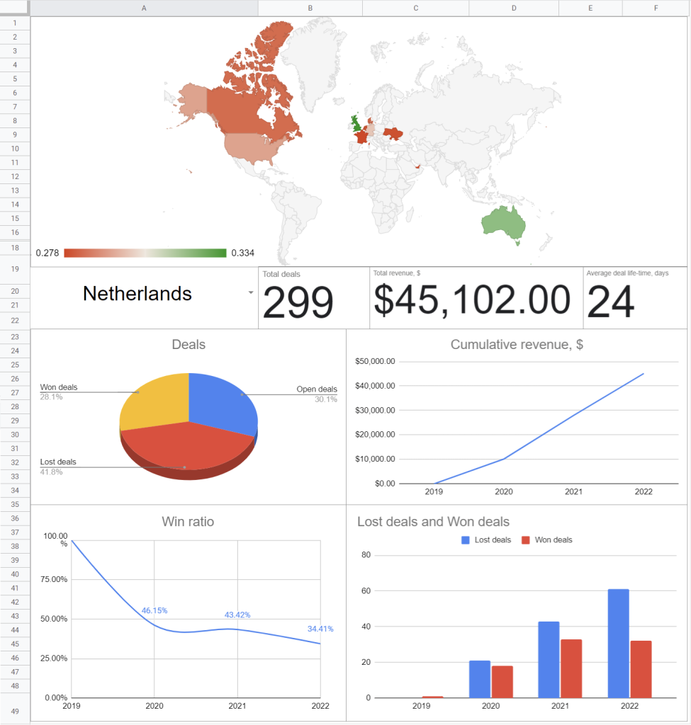
The sales dashboard template consists of the following sections:
- Geo chart with a conversion rate and total revenue of all countries
- Total deals
- Total revenue, $
- Average deal life-time, days
- Deals (won, open, and lost)
- Cumulative revenue, $
- Win ratio
- Lost deals vs. Won deals
Let’s check out what you need for each section.
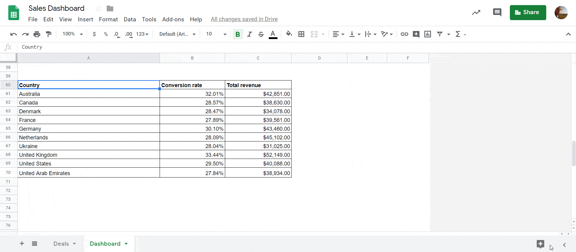
Geo chart
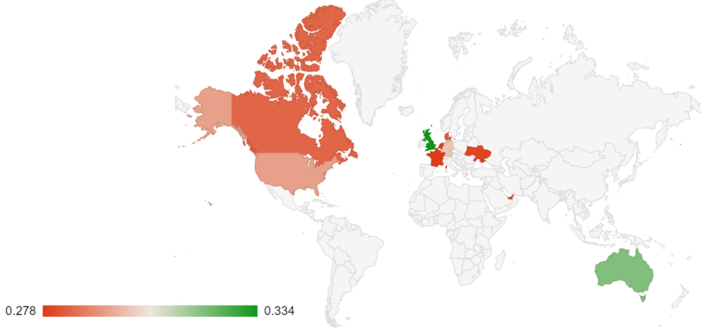
For the Geo chart, we need three columns: Country, Conversion rate, and Total revenue. You can fill in the Country column manually using Data Validation as follows:
Or you can apply the following formula:
={"Country name"; UNIQUE(Deals!Z2:Z)}
Conversion rate is the ratio of won deals to total deals. Since we’re calculating the conversion rate per country, we should use FILTER within COUNTIF and COUNTA functions. Here is the formula we used for the calculations:
=COUNTIF(
  Filter(Deals!$AL$2:$AL,Deals!$Z$2:$Z=A54),"won")/
 COUNTA(
  Filter(Deals!$AL$2:$AL,Deals!$Z$2:$Z=A54))
Deals!AL2:AL– thestatuscolumn of the imported dataDeals!Z2:Z– theorg_id.addresscolumn of the imported dataA61– a cell with the country name
Read the FILTER Function Tutorial to learn more about filtering options in Google Sheets.
Now you can drag this formula to apply it for other countries. Alternatively, you can use a Copy Down shortcut: Ctrl+d. Learn more about Google Sheets shortcuts to optimize your workflow.
Total revenue is simply a sum of all won deals for a particular country. The calculation looks as follows:
=SUM(
  Filter(Deals!$AF$2:$AF,Deals!$Z$2:$Z=A54,Deals!$AL$2:$AL="won")
 )
Deals!AF2:AF– thevaluecolumn of the imported dataDeals!AL2:AL– thestatuscolumn of the imported dataDeals!Z2:Z– theorg_id.addresscolumn of the imported dataA61– a cell with the country name
Drag this formula as well.
Once you’ve set up data for each country, you can add a Geo chart as follows:
Sorting by country
We applied data validation (data range Deals!Z2:Z) to the A19 cell to enable sorting by country. Formulas for the rest of the metrics will contain the following functions:
- IF – returns a logical expression. Check out Google Sheets Logical Expressions with Real-Life Examples for more.
- ISBLANK – checks whether the referenced cell is empty
- FILTER – returns a filtered version of the source range.
Total deals, Total revenue, Average deal life-time
- Formula for Total deals:
=IF(
  ISBLANK(A19),
  COUNTA(Deals!AL2:AL),
  COUNTA(
   Filter(Deals!AL2:AL,Deals!Z2:Z=A19))
)
- Formula for Total revenue:
=IF(
  ISBLANK(A19),
  SUM(
   Filter(Deals!AF2:AF,Deals!AL2:AL="won")),
  SUM(
   Filter(Deals!AF2:AF,Deals!Z2:Z=A19,Deals!AL2:AL="won"))
)
- Formula for Average deal life-time:
To calculate the average deal life-time, we need a value measuring how many days have been spent per deal (either won or lost). So, let’s create an additional column on the Deals sheet (CM). We used the MINUS function to calculate the number of days per deal and ARRAYFORMULA to fill in all the cells in the column:
=ARRAYFORMULA(
  IF(
   ISBLANK(AP2:AP),"",
   MINUS(AP2:AP,AH2:AH))
)
AP2:AP– theclose_timecolumn of the imported dataAH2:AH– theadd_timecolumn of the imported data
Now we can go back to the Dashboard sheet and calculate the average deal life-time, as follows:
=IF(
  ISBLANK(A19),
  IFERROR(
    AVERAGE(Deals!CM2:CM)),
  IFERROR(
    AVERAGE(
     Filter(Deals!CM2:CM,Deals!Z2:Z=A19))))
)
Deals!CM2:CM– theDays per dealcolumn
Once the calculations are done, apply a Scorecard chart to each value separately.
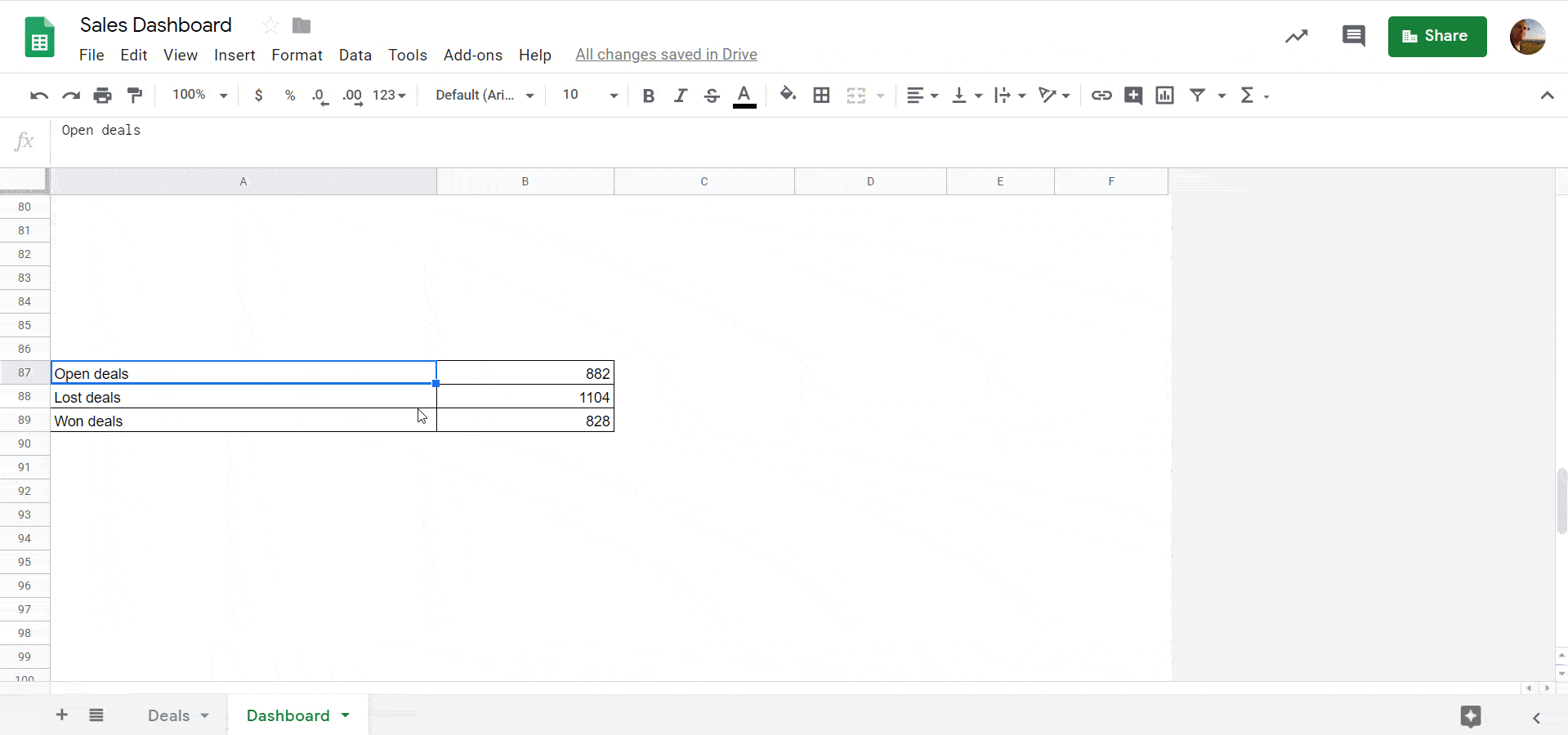
Deals (won, open, and lost)
Now, let’s figure out the number of deals by status: won, open, and lost. Here’s the formula with the use of the COUNTIF function:
=IF(
  ISBLANK(A19),
  COUNTIF(Deals!AL2:AL,"open"),
  COUNTIF(
   Filter(Deals!AL2:AL,Deals!Z2:Z=A19),"open")
)
Deals!AL2:AL– thestatuscolumn of the imported dataDeals!Z2:Z– theorg_id.addresscolumn of the imported dataA19– a cell with the country name
The best way to visualize these values is to use a pie chart. Check out how they look on a 3D pie chart we made:
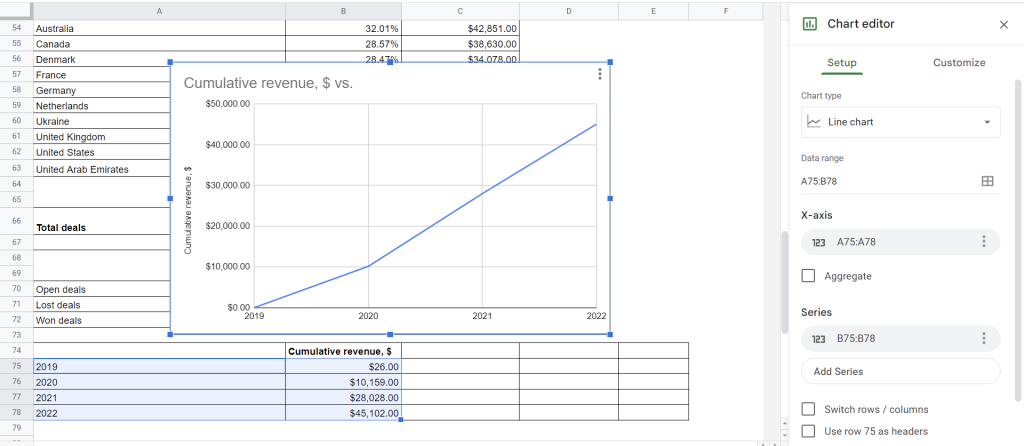
Cumulative revenue, $
This metric will show the cumulative revenue for each year. For example, the third year’s revenue will sum up the revenue in the first, second, and third years. For this, we’ll need to sort our deals by year. First, let’s create a separate column titled Year (CN) on the Deals sheet and apply two functions:
- YEAR – to return the year specified by a given date
- ARRAYFORMULA – to return the YEAR function to the entire column
The formula looks as follows:
=ARRAYFORMULA(
   YEAR(AH2:AH)
)
AH2:AH– theadd_timecolumn of the imported data
Now, build a simple table and apply Cumulative revenue formulas for each year:
2019
=IF(
 ISBLANK(A19),
 SUM(
  IFERROR(
   Filter(Deals!AF2:AF,Deals!CN2:CN=2019,Deals!AL2:AL="won"))),
 SUM(
  IFERROR(
  Filter(Deals!AF2:AF,Deals!Z2:Z=A19,Deals!CN2:CN=2019,Deals!AL2:AL="won")))
)
2020
=IF(
 ISBLANK(A19),
 SUM(
  IFERROR(
   Filter(Deals!AF2:AF,(Deals!CN2:CN=2020)+(Deals!CN2:CN=2019),Deals!AL2:AL="won"))),
 SUM(
  IFERROR(
   Filter(Deals!AF2:AF,Deals!Z2:Z=A19,(Deals!CN2:CN=2020)+(Deals!CN2:CN=2019),Deals!AL2:AL="won")))
)
2021
=IF(
 ISBLANK(A19),
  SUM(
   IFERROR(
    Filter(Deals!AF2:AF,(Deals!CN2:CN=2021)+(Deals!CN2:CN=2020)+(Deals!CN2:CN=2019),Deals!AL2:AL="won"))),
  SUM(
   IFERROR(
    Filter(Deals!AF2:AF,Deals!Z2:Z=A19,(Deals!CN2:CN=2021)+(Deals!CN2:CN=2020)+(Deals!CN2:CN=2019),Deals!AL2:AL="won")))
)
2022
=IF(
 ISBLANK(A19),
 SUM(
  IFERROR(
   Filter(Deals!AF2:AF,(Deals!CN2:CN=2022)+(Deals!CN2:CN=2021)+(Deals!CN2:CN=2020)+(Deals!CN2:CN=2019),Deals!AL2:AL="won"))),
 SUM(
  IFERROR(
   Filter(Deals!AF2:AF,Deals!Z2:Z=A19,(Deals!CN2:CN=2022)+(Deals!CN2:CN=2021)+(Deals!CN2:CN=2020)+(Deals!CN2:CN=2019),Deals!AL2:AL="won")))
)
Deals!AF2:AF– theValuecolumn of the imported dataDeals!CN2:CN– theYearcolumnDeals!AL2:AL– thestatuscolumn of the imported data
Let’s insert a chart:
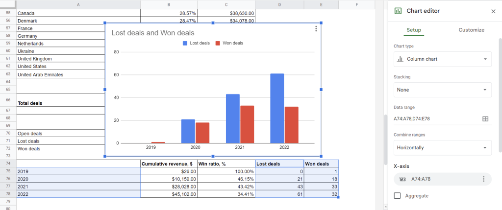
Lost deals vs. Won deals
There is nothing intricate about calculating both lost and won deals. Here’s how it looks:
=IF(
  ISBLANK(A19),
  COUNTIF(
   Filter(Deals!AL2:AL,Deals!CN2:CN=2022),"lost"),
  COUNTIF(
   Filter(Deals!AL2:AL,Deals!Z2:Z=A19,Deals!CN2:CN=2022),"lost")
)
Replace Deals!CN2:CN=2022 with the corresponding year. The formula for won deals is the same, but “lost” should be replaced with “won“.
Let’s apply a column chart for this metric:
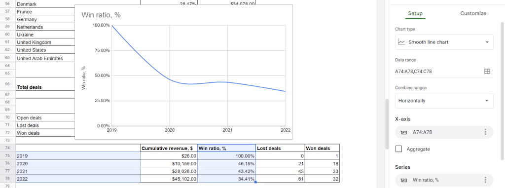
Win ratio
To define the win ratio, we need to divide won deals by closed deals (lost + won deals). You can use a simple or complex formula for this calculation:
Simple formula:
=E75/(D75+E75)
E75– a cell with won deals in 2019D75– a cell with lost deals in 2019
Complex formula:
=IF(
  ISBLANK(A19),
  IFERROR(
    COUNTIF(
     Filter(Deals!AL2:AL,Deals!CN2:CN=2019),"won")/
    (COUNTIF(
      Filter(Deals!AL2:AL,Deals!CN2:CN=2019),"won") +
    COUNTIF(
      Filter(Deals!AL2:AL,Deals!CN2:CN=2019),"lost")),
    "No closed deals"),
  IFERROR(
    COUNTIF(
      Filter(Deals!AL2:AL,Deals!Z2:Z=A19,Deals!CN2:CN=2019),"won")/
    (COUNTIF(
      Filter(Deals!AL2:AL,Deals!Z2:Z=A19,Deals!CN2:CN=2019),"won") +
    COUNTIF(
      Filter(Deals!AL2:AL,Deals!Z2:Z=A19,Deals!CN2:CN=2019),"lost")),
    "No closed deals")
)
Deals!CN2:CN– theYearcolumnDeals!AL2:AL– thestatuscolumn of the imported dataDeals!Z2:Z– theorg_id.addresscolumn of the imported data
Whichever formula you pick, calculate the win rate for each year and build a chart based on those values, as follows:
Here it is! Your sales dashboard is almost done. Now you can apply formatting as you like and arrange charts in an order that’s comfortable for you and your team. Thanks to Coupler.io and its automatic data refresh feature, the dashboard will update on its own!
Do you want a professional sales dashboard Google Sheets?
Building a sales tracker is not a walk in the park. Even if you master Google Sheets or some BI tool, such as Looker (former Data Studio), you will unlikely be able to create a professional-looking sales dashboard like this one:
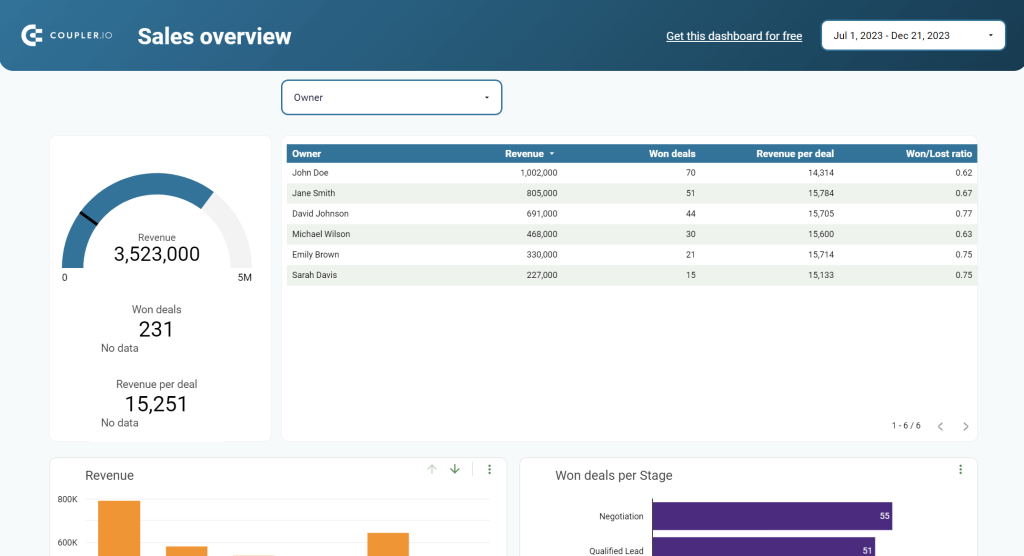
This sales dashboard template was built not in Google Sheets but in Google Data Studio. If you want your dashboard to look like this or even better, you can contact the data experts at Coupler.io. They provide a data analytics consulting service, which creates custom-designed dashboards and solves other advanced data-related tasks.

Automate data export with Coupler.io
Get started for freeSales dashboard in Google Sheets – do it yourself, use a template, or request a custom solution?
So, you approached a road fork and need to choose one of the three ways:
- Get your hands dirty to build a sales dashboard in Google Sheets
- Find a plug&play sales dashboard template and tune it for your needs
- Hire a professional service, which will tailor the sales dashboard for you
Each way has its pros and cons. The DIY method is free at the first glance. However, it does not guarantee that you’ll end up with a top-notch dashboard fast. The template can speed things up for you. However, you may sink into adapting it to your needs and still not get satisfied with the end result. Getting a tailored sales dashboard created by a third-party service is the best choice from the perspective of quality and time, however, it costs money. So, choose wisely considering your resources and goals, good luck!