Explore a selection of marketing dashboard templates in Google Sheets to improve your campaign management. Learn what metrics you’ll be able to track and how to make your dashboard near real-time.
Google Sheets marketing dashboard templates
1. PPC monthly budget dashboard for Google Sheets
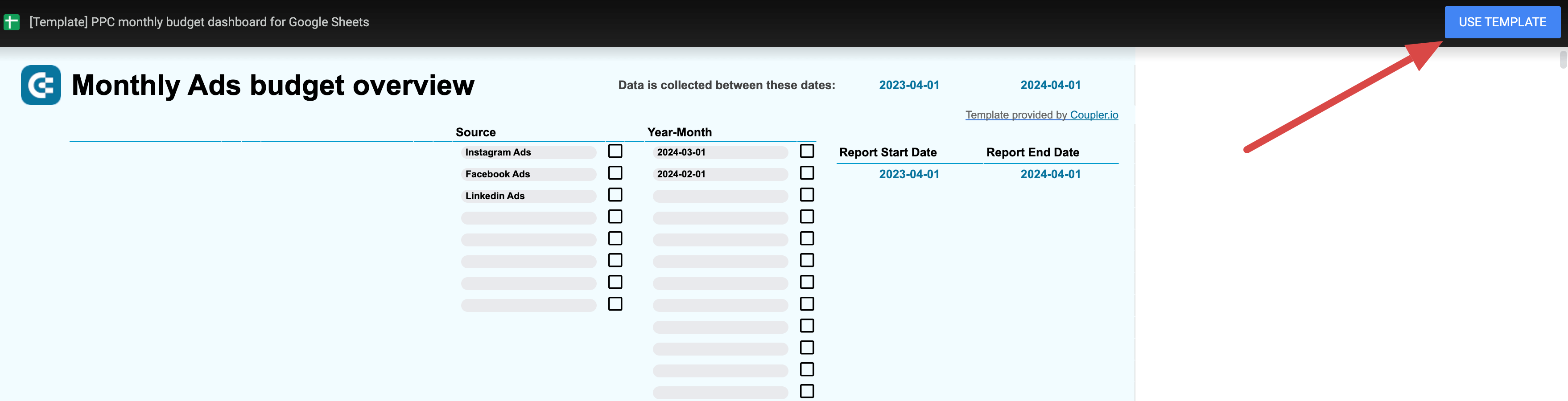
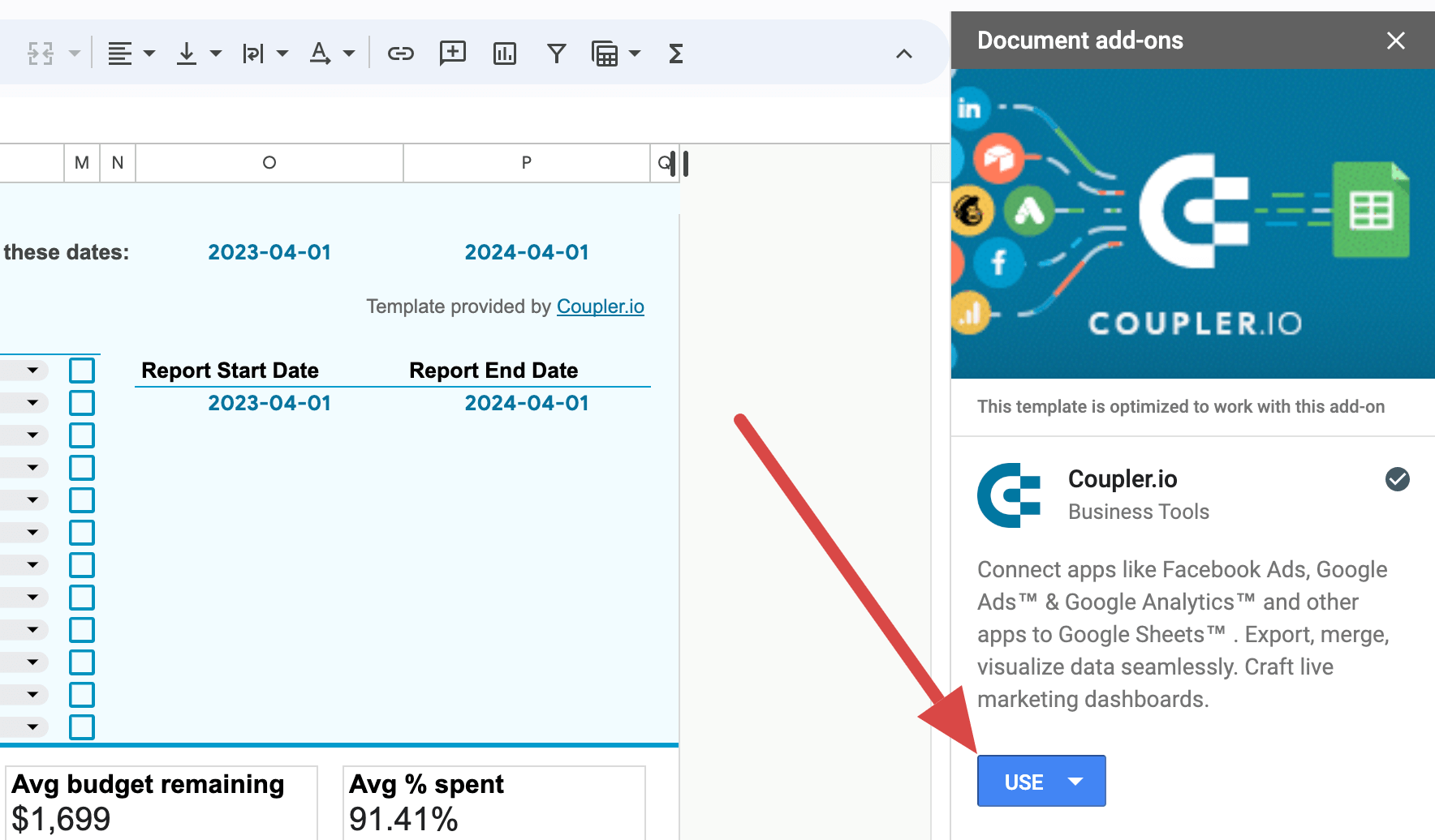
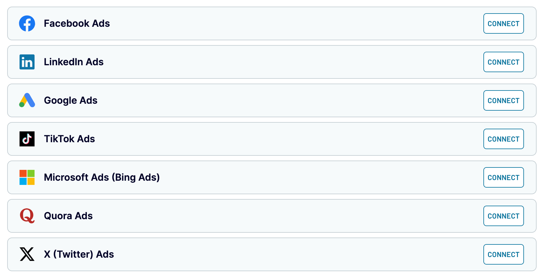
First, look at the PPC monthly budget dashboard template for Google Sheets by Coupler.io, a reporting automation platform. This one offers a detailed overview of PPC advertising expenses and performance. It helps you analyze data from Facebook Ads/Instagram Ads, TikTok Ads, Quora Ads, LinkedIn Ads, Google Ads, Microsoft Ads, and X Ads (formerly Twitter). The template has built-in connectors to automatically load data from the required sources, avoiding the need for manual entry.
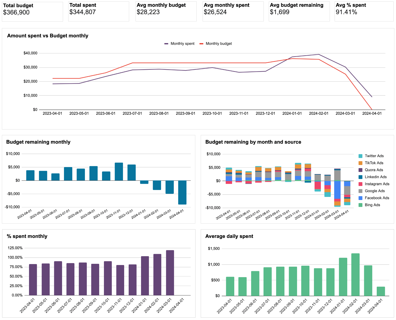
Analyze data based on aggregated numbers or break down the report by specific filters like source and period. As a case in point, you can compare the total budget with the total spent or the average monthly budget with the average monthly spend. Thanks to visualization through a time series chart, it’s easy to draw conclusions about the amount spent and the monthly budget.
Additionally, bar charts display the budget remaining monthly and by month/source, the percentage spent monthly, and the average daily spend.
Key metrics:
- Avg. monthly budget
- Avg. monthly spent
- Total budget
- Total spent
- Avg. budget remaining
- Avg. percentage spent
Pros:
- Dynamic filters by ad source and period
- Budget overview for the current month
- Interactive and customizable interface
- Automated updates on a chosen schedule
- The built-in connector that supports 8 advertising platforms
Cons:
- You can schedule data refreshes at a minimum frequency of every 15 min.
2. PPC multi-channel dashboard for Google Sheets
Next comes Coupler.io’s PPC multi-channel dashboard for Google Sheets. It illustrates PPC advertising expenditures and performance across the same channels as in the previous template. In the same way, you don’t need to enter data from your sources manually but import it automatically with built-in connectors. Use this dashboard to examine budget data, filtering it by period.
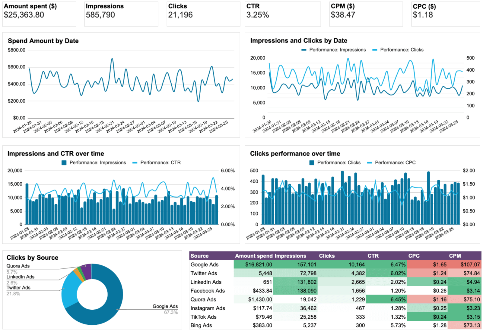
The dashboard includes various charts dedicated to campaign performance over time. Users can get the spend amount, impressions and clicks, or impressions and click-through rate (CTR) visualized by date. Besides, it’s possible to view clicks performance as a time series chart, clicks by source as a pie chart, or the spend amount by week and source as a bar chart.
You can also see cost per click (CPC) by week and source as bar charts, alongside the amount spent by week and campaign type. Furthermore, the dashboard provides insights into clicks by campaign type and CPC by campaign type through line charts.
Key metrics:
- Amount spent
- Impressions
- Clicks
- CTR
- CPM
- CPC
Pros:
- Combined overview of spending and performance
- Straightforward and easy-to-read interface
- Automated data refreshes scheduled to your liking
- Diverse visualizations for analysis
- Multiple comparisons of metrics available
- The built-in connector that supports 8 advertising platforms
Cons:
- It could be even better with additional metrics such as ROAS
3. PPC multi-channel dashboard with budget for Google Sheets
Coupler.io’s PPC multi-channel dashboard with budget for Google Sheets extends the capabilities of the previous template. It does so by providing an enhanced focus on budget management across multiple channels.
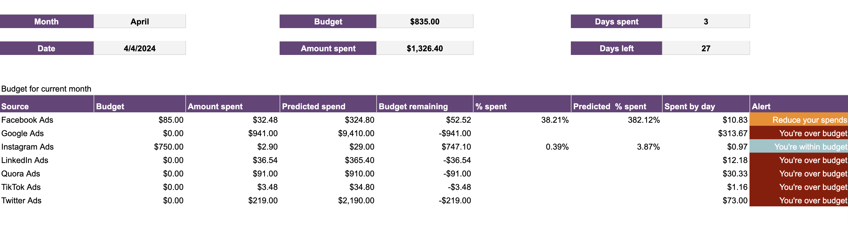
In addition to familiar data visualizations like time series, bar, pie, and line charts, this dashboard introduces the Current month budget overview. Here, you can discover channel-specific results on various financial metrics. These figures include predicted spend, budget remaining, the percentage spent, predicted percentage spent, and spend by day.
Moreover, consider paying attention to alerts to stay updated on your budget status. It could be a suggestion to reduce spend, a warning about exceeding the budget, or a notification that your spending remains within constraints.
Key metrics:
- Budget
- Amount spent
- Predicted spend
- Budget remaining
- Percentage spent
- Predicted percentage spent
- Spend by day
Pros:
- Focus on cross-channel PPC budget management
- Allows you to see the big picture of financial metrics
- Supports automated updates at preferred intervals
- Data-driven alerts about your budget status
Cons:
- Users would also enjoy visualizations of budget-related metrics per channel
4. Google Search Console – page and query analysis
Now, let’s check out the Google Search Console – page and query analysis template by Solomon Vineeth. It’s offered by Two Minute Reports, which provides a built-in connector so you’ll load GSC data to Google Sheets automatically. Through numbers on clicks, impressions, CTR, and position, this dashboard demonstrates the website’s visibility and engagement on search engine results pages. The bar chart allows for easy comparison of clicks and impressions over time, while time series charts visualize the trends in position and CTR.
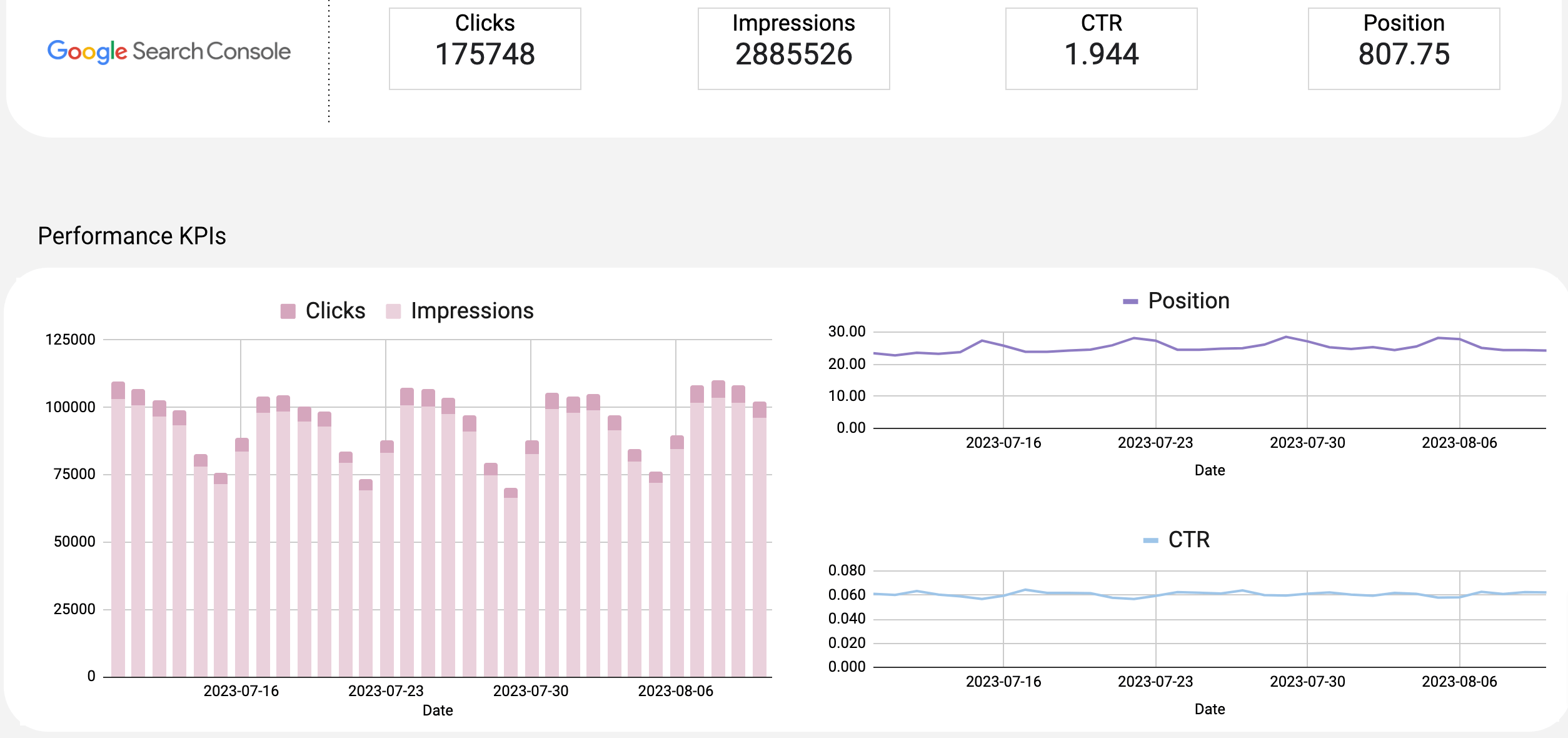
Using metrics on the results of specific queries presented in table format, you can identify top-performing keywords and areas for improvement. Country-wise performance comes both in tabular form and visually on a map, highlighting regions of strength and weakness. Moreover, the dashboard showcases the top 10 pages with the highest clicks and provides data on metrics by device and by hostname.
Key metrics:
- Clicks
- Impressions
- CTR
- Position
Pros:
- Multi-faceted view into Google Search Console data
- Detailed coverage of key performance metrics
- Presents information in an easily understandable format
Cons:
- It would be beneficial to have visualizations for metrics by query, device, and hostname
5. Google My Business – review rating and location media insights
Google My Business – review rating and location media insights by Solomon Vineeth is a template useful for analyzing business online presence and customer feedback. Like with the previous one, you can use the Two Minute Reports connector to import source data. This dashboard displays your business performance on Google Maps and search results by aggregating average star rating, total review count, views on maps, views on search, and total view.
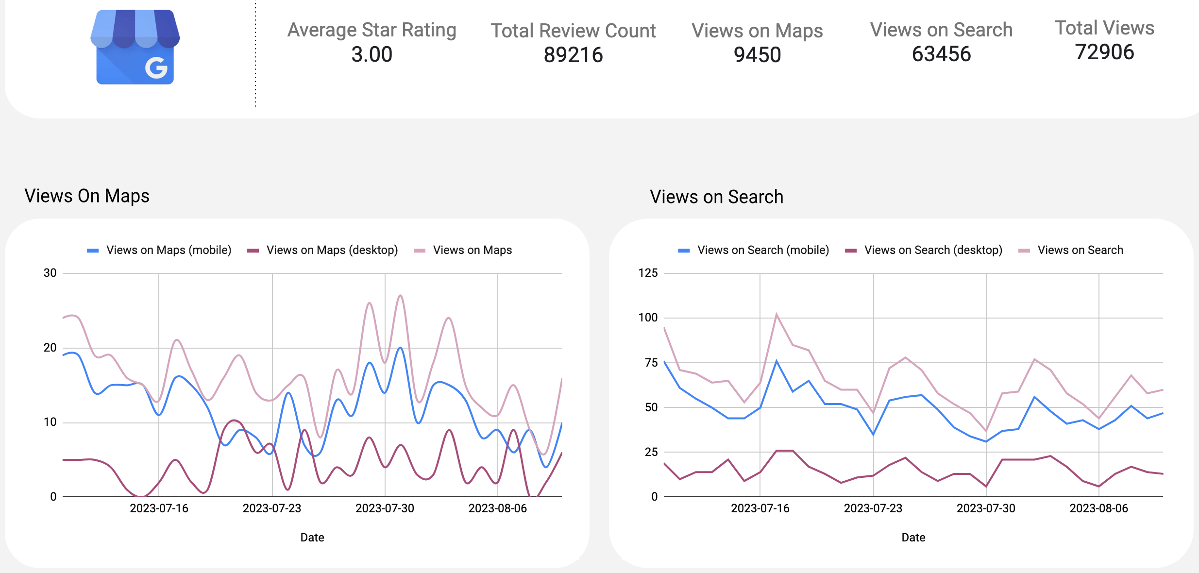
You can track views on maps and search over time by mobile, desktop, and overall through a time series chart. That’s how you learn about fluctuations in user engagement with your business’s location. Additionally, the dashboard visualizes total views by view source, total actions by action type, and total views by view medium as donut charts.
Here, you can also find a table showing user reviews and star ratings, as well as another one dedicated to location and media insights.
Key metrics:
- Average star rating
- Total review count
- Views on maps
- Views on search
- Total views
Pros:
- Visualizes business performance from different angles
- Includes a variety of graphical elements
- Clear design and easy-to-read palette
Cons:
- Charts for trends in star ratings over time would be a worthy addition
6. GA4 acquisition overview report
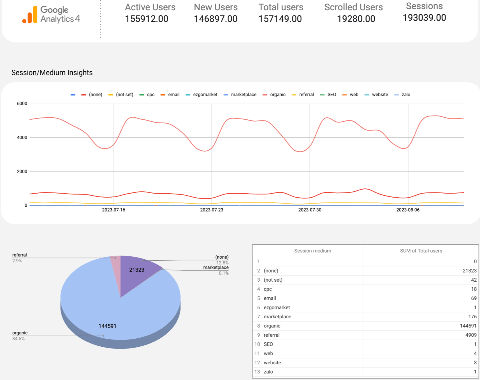
With one more Two Minute Reports template, the GA4 acquisition overview report by Solomon Vineeth, you can analyze user acquisition by loading data through the mentioned built-in connector. The dashboard enables you to track new users, total users, scrolled users, and sessions to learn about user engagement and behavior.
You have session trends visualized by medium over time through a time series chart to track the performance of different traffic sources. At the same time, session statistics by medium are represented as a pie chart to show source distribution.
To monitor user growth, you can use a bar chart to compare total users, new users, and active users over time. It also compares 28-day active users, 7-day active users, and 1-day active users over time through a time series chart.
Key metrics:
- Active users
- New users
- Total users
- Scrolled users
- Session
Pros:
- Allows for analysis of user engagement and behavior
- Visualizes session trends and statistics by medium to illustrate traffic sources and their impact on user activity
- Enables analysis of user growth and retention trends
Cons:
- User segmentation options are missing
7. Monthly sales dashboard
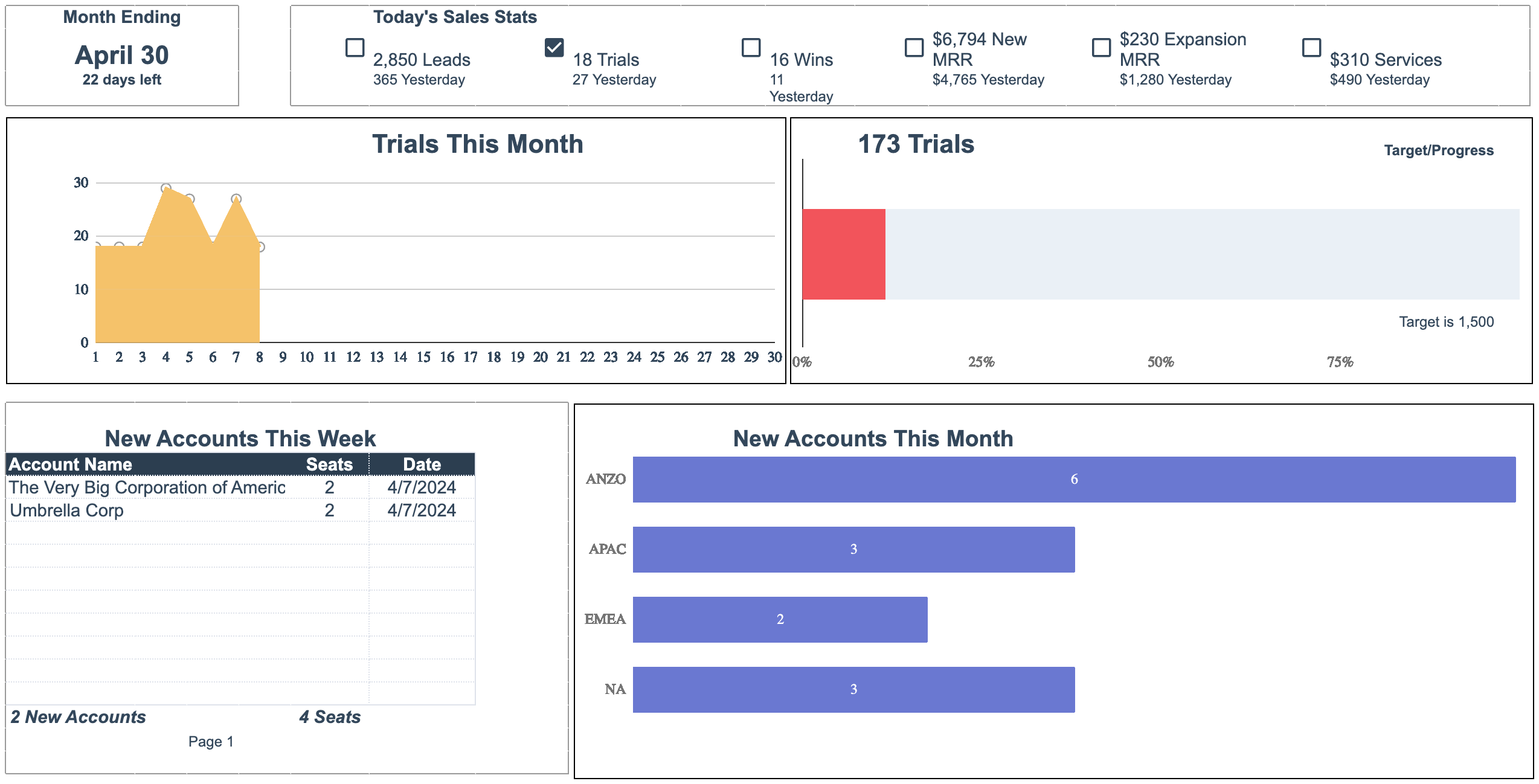
The Monthly sales dashboard by Nathan Ojaokomo from HubSpot lets you dive into sales performance metrics: leads, trials, wins, new monthly recurring revenue (MRR), expansion MRR, and services. It aggregates overall numbers and recently added figures for each metric, explaining the latest trends to the point.
For a good grasp of trial trends over time, the dashboard contains a graph depicting trials started during the current month. There’s also a visualization of the trial number in relation to the target, reflecting progress toward sales objectives. What’s more, the dashboard includes table-format data on new accounts added during the week by account name, as well as a visualization of those added during the month by region.
You can additionally use a bar chart demonstrating MRR by region for the current month. As for revenue distribution, look at a pie chart for the new business MRR and the expansion MRR.
Key metrics:
- Leads
- Trials
- Wins
- New MRR
- Expansion MRR
- Services
Pros:
- Visualizes trends and progress toward targets
- Helps track and analyze various aspects of sales performance
- Facilitates informed decision-making with clear presentation
Cons:
- Lacks visualizations of customer demographics or segmentation
- Requires manual data entry
How do you use an automated marketing dashboard in Google Sheets?
Now, it’s time to discover how to make your Google Sheets dashboard live. By doing so, you ensure your report is ever-updating and provides you with the most recent data. Consequently, you save time and maintain data accuracy by preventing human errors. Let’s try this out using Coupler.io.
It only takes a few simple steps to get this done:
- Follow the link to the chosen Coupler.io dashboard template. For example, let it be the PPC monthly budget dashboard template for Google Sheets. Click Use template in the top right corner.
- On the right panel, click Use and then Launch to start installing the Coupler.io addon.
- Click OK to authorize Coupler.io to run in this document. In a new window, specify your Google account, click Continue, and then press Allow.
- In the next new window, connect the necessary sources according to in-app instructions. You can ignore channels where you don’t run ads.
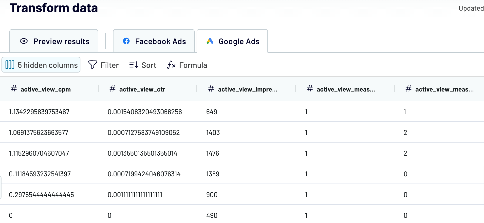
- Click Proceed to preview your data. At this step, you can make multiple transformations. For instance, Coupler.io allows you to rename, rearrange, hide, and add columns or create new ones with custom formulas. It’s also possible to apply filters and sort your data as well as combine it from several accounts or apps.
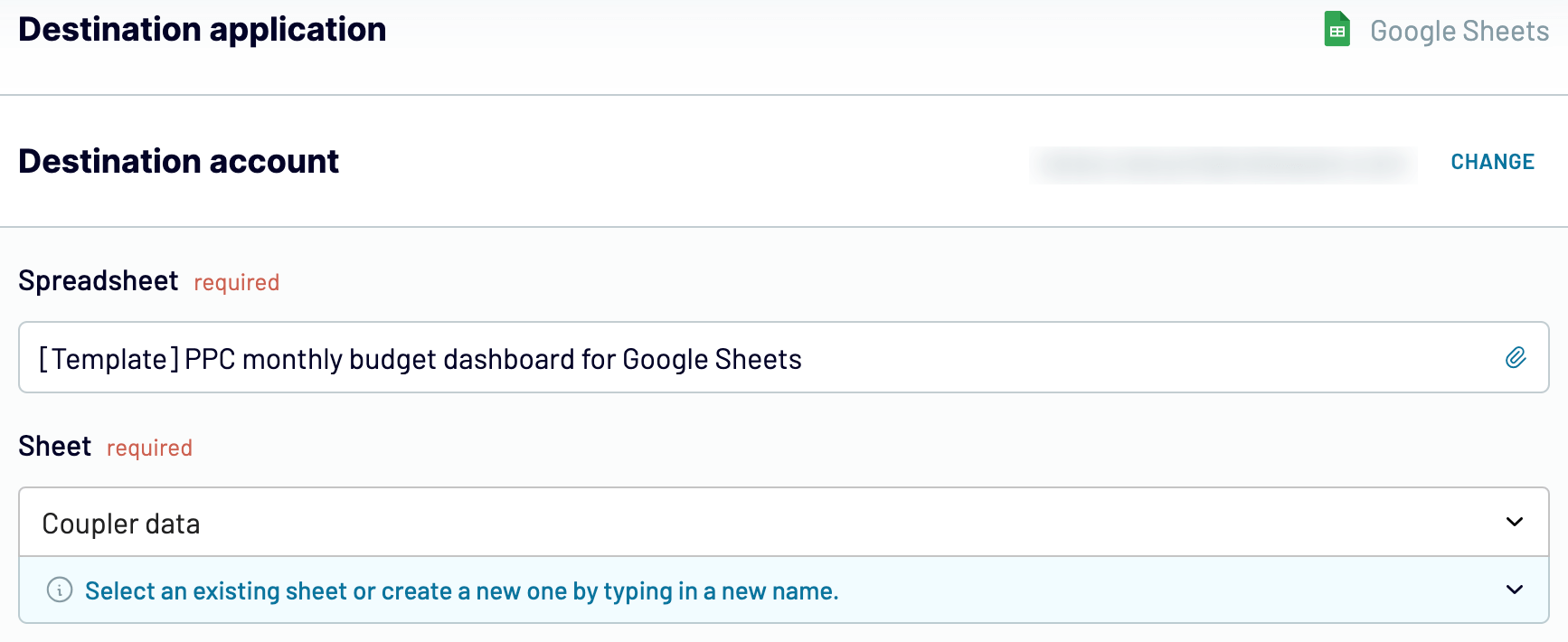
- Once you’re ready with your data, click Proceed to specify the destination account. Click Continue.
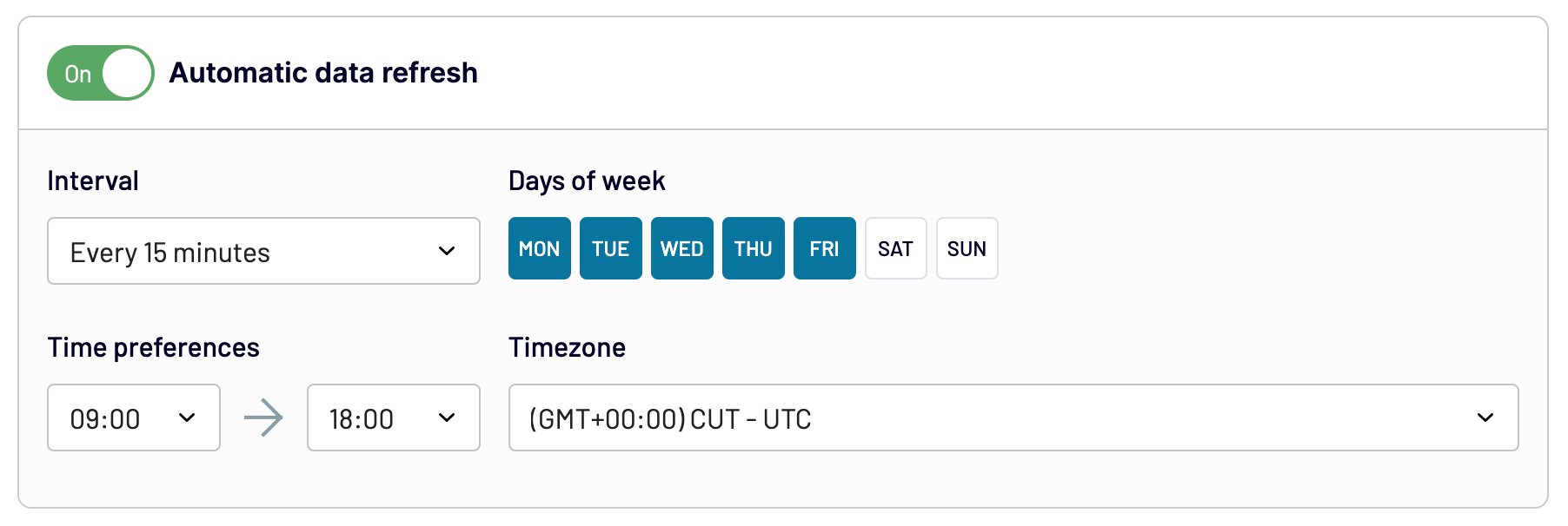
- Next, click Setup a schedule. Then, customize the schedule for data refreshes. By default, the dashboard will be updated automatically every day. If you’d prefer a more frequent interval, you can opt for hourly, every 30 minutes, or even every 15 minutes, depending on your needs.
- Finally, click Run importer. You’ll get an analysis-ready report with your data in a matter of seconds.
Limitations of marketing dashboard templates made in Google Sheets
Building Google Sheets dashboards may seem like a viable solution for data analysis and visualization. Nevertheless, there are a few limitations related to this spreadsheet application itself:
- Limited functions and formulas: The first thing you may not be okay with is functions and formulas in Google Sheets. For example, they might come across as overly complex or insufficient. On top of that, certain functionalities may require installing add-ons.
- Lack of visual elements for dashboards: Google Sheets falls behind when it comes to creating highly customized or complex visualizations. It offers limited chart types and customization features, leading users to seek external tools for their needs.
- Performance with large datasets: It may be challenging to build dashboards based on large datasets in Google Sheets. This issue originates from the web-based nature of this application. For instance, it can lead to longer response times or potential inaccuracies in analysis. Not to mention that complex calculations or functions may cause freezes or crashes.
Would you like to take advantage of Google Sheets marketing dashboard templates and avoid the pitfalls? If so, Coupler.io’s dashboards are what you’re looking for. In addition to Google Sheets templates, you can explore Looker Studio dashboards and others designed by Coupler.io.
Connect your source apps, transform data on the go, and import it to Google Sheets to finally get a ready-to-use report. What’s more, you can schedule auto-updates to keep your dashboard in sync with the latest changes to the source data. Give it a try – get started with Coupler.io for free, and let it do the work for you!
Create dynamic marketing dashboards in Google Sheets
Try Coupler.io for free


