Your Guide to Using Google Data Studio (Looker Studio) Pivot Tables

Traditional tables have a fixed structure that limits their flexibility when it comes to rearranging and customizing your data from different perspectives. If your goal is to summarize, calculate, or aggregate your dataset in order to gain insights and make decisions, then using traditional tables may not be the best approach.
On the other hand, pivot tables offer flexible customization options that allow you to easily manipulate your data based on dimensions and measurements. For instance, you can group sales data by product categories, display revenue figures, or compare sales performance across regions.
Now, if you’re new to Google Data Studio (formerly Looker Studio) and feeling a bit overwhelmed by the concept of pivot tables, there’s no need to worry. In this blog, we will guide you on how to create pivot tables in Looker Studio—covering its structure and setup and how to modify your pivot table according to your specific requirements and needs.
Let’s start with the different variations of the Looker Studio pivot table that we currently have.
Pivot tables variations in Google Data Studio (Looker Studio)
Looker Studio pivot tables have three different variations to cater for your data analysis needs, all available via an Add a Chart menu.
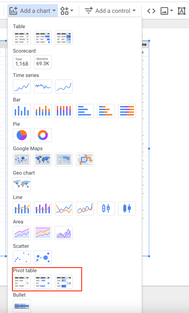
- Standard Pivot Table: This is the default format where you can arrange data by dragging dimensions and measures into rows, columns, and values. You can easily perform calculations like sums, averages, counts, and more on the displayed data.
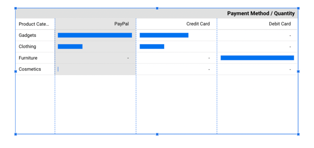
- Pivot table with bars: This version combines tabular data display with bar graphs to provide an overview of your data
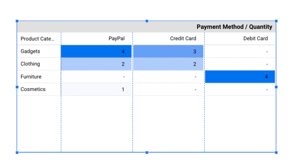
- Heatmap Pivot Table: This type uses colors to represent values within the pivot table. By observing color intensity, you can quickly identify trends and patterns, making it particularly useful for analyzing your data.
How to create pivot tables in Looker Studio
To demonstrate how pivot tables work, first, we need data. In our example, we used Coupler.io to import data from Shopify into Looker Studio. But you can easily connect your desired source to Looker Studio. Pick it in the form below and click proceed
Coupler.io is a data automation and data analytics platform designed to help you turn raw data into meaningful reports. What’s really cool about Coupler.io, is that it keeps our pivot table regularly updated. So, when we add new orders, the pivot table almost instantly includes that new information. This means our analysis is always based on fresh data, making our insights accurate and reliable.
If you want to see the step-by-step process, check out our tutorial on how to import Shopify data into Looker Studio
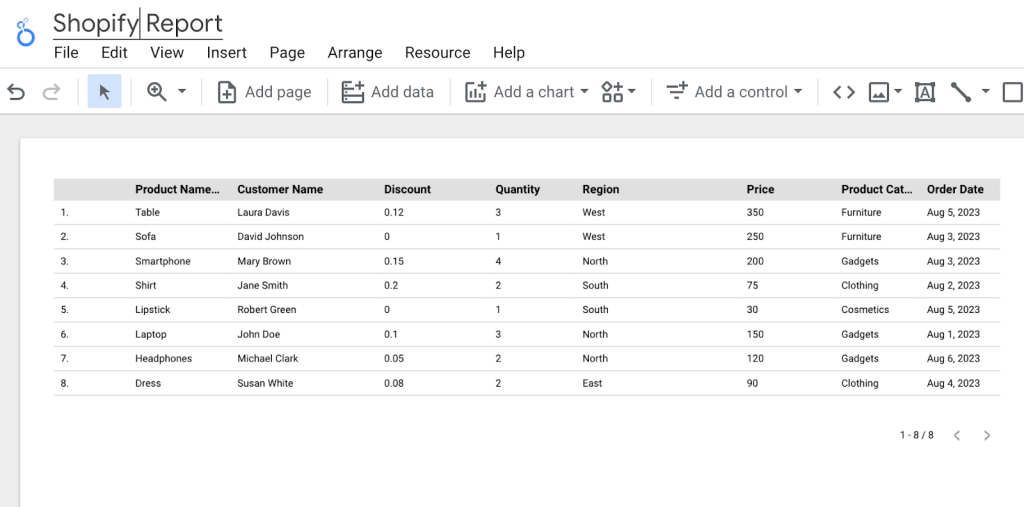
Below is the Shopify data successfully imported into Looker Studio.
Once you’ve connected your data source (or multiple sources) and added Looker Studio calculated fields (if needed), the next step is to create the pivot table, and there are two methods to do this:
By the way, Looker Studio Pro users can use AI to help you create calculated fields. Learn more about this in our blog post where we’ve compared Looker Studio vs Looker Studio Pro.
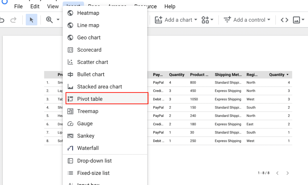
First method
- Navigate to the Insert tab and select Pivot table from the drop-down menu. Expand it on your canvas by dragging it with your mouse.
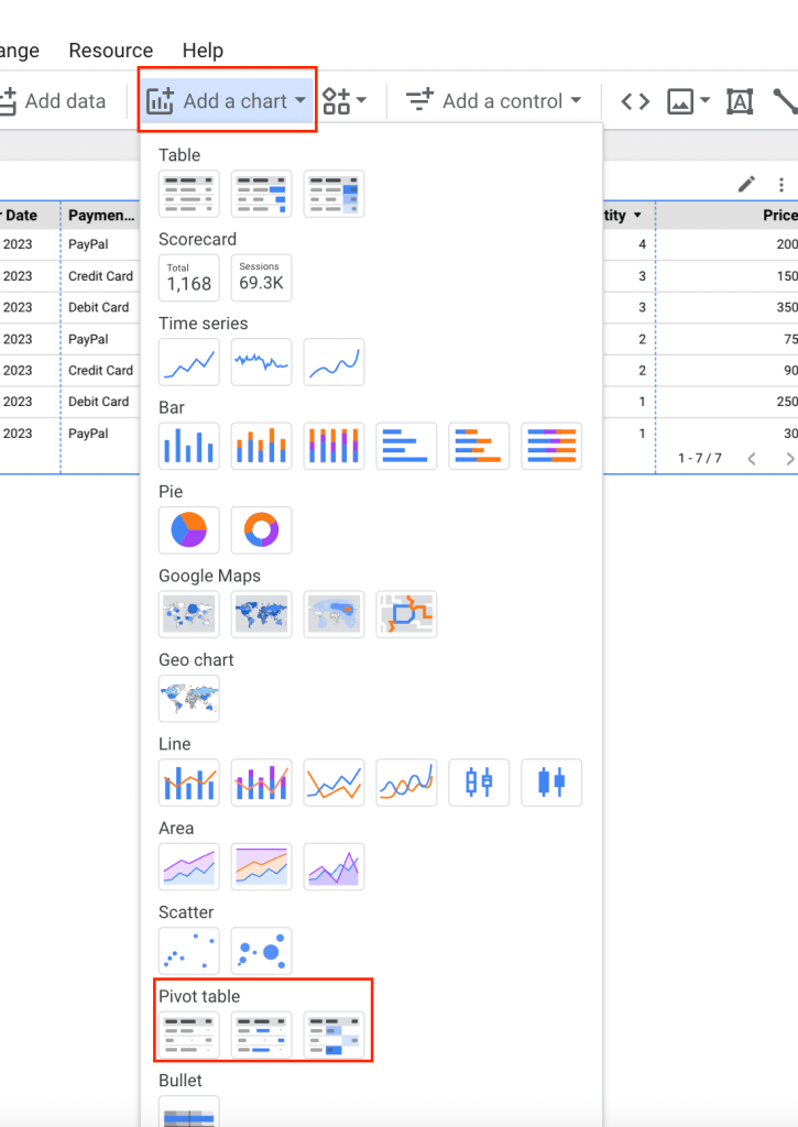
Second method
- Click on the Add a Chart and select your desired Pivot table style.
- Expand the pivot table on your canvas by dragging it with your mouse.
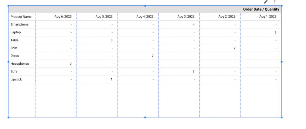
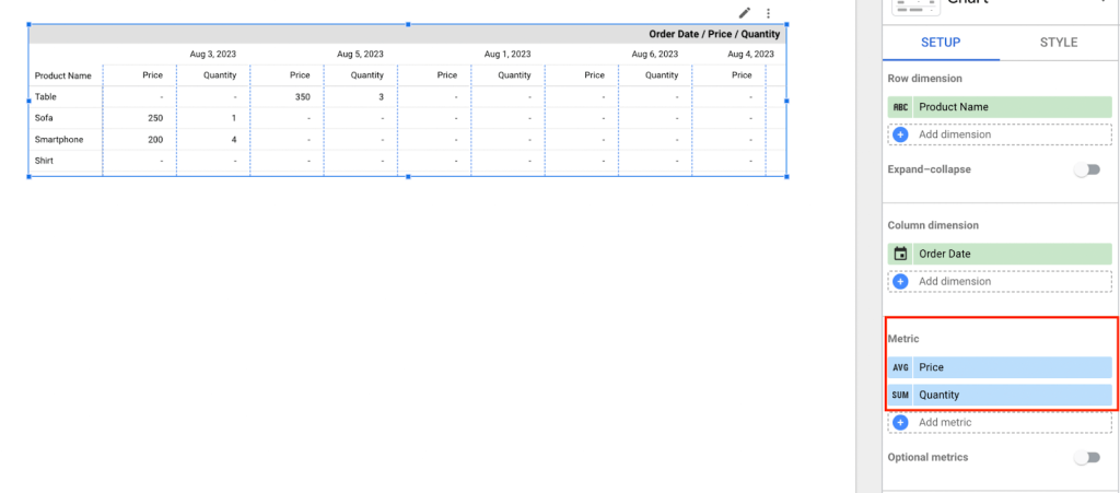
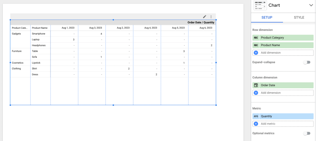
Here’s what our pivot table in Looker Studio looks like:
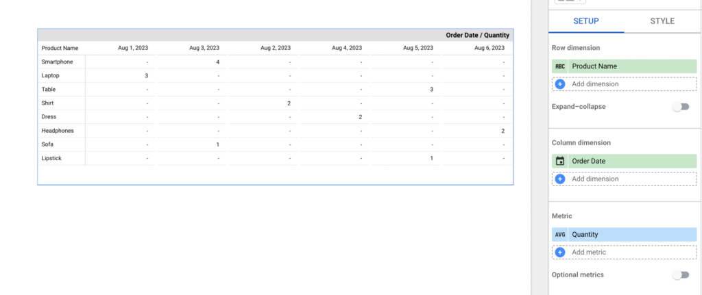
In our Looker Studio pivot table above, we’re analyzing the average “Quantity” (metric) across two dimensions “Product Name” (row dimension) and “Order date” (column dimensions). This is very useful for conducting multi-dimensional analysis, enabling us to explore data patterns, trends, etc. from multiple perspectives. This is in stark contrast to a standard table, which typically presents metrics aggregated by a single dimension.
Also, with the pivot table, you have more flexibility than a regular table. You can pivot (rearrange) data, add more metrics, include additional dimensions, calculate totals, etc. This makes it adaptable to various analytical needs.
In the section Differences between pivot table and regular tables, we dive deeper into their comparison so you can make your choice based on your data analysis needs.
Looker Studio pivot table structure and setup
The setup of a pivot table in Looker Studio involves three key elements that collectively determine how your data is organized, aggregated, and presented.
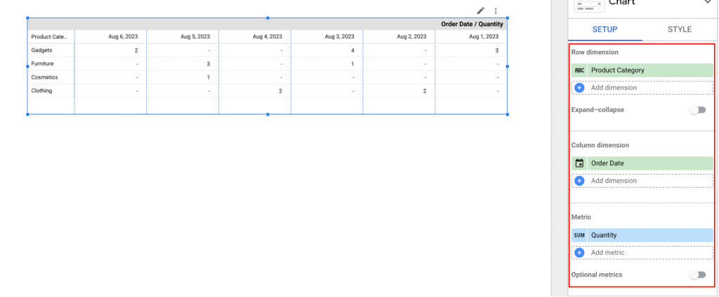
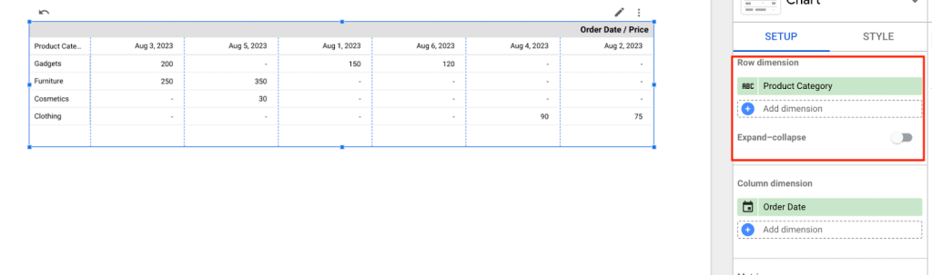
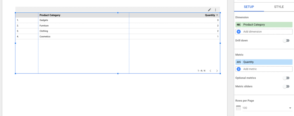
- Row Dimensions: These elements group and organize data vertically. In our example, the row dimension is “Product Category”.
- Column Dimensions: These elements group and organize data horizontally. In our example, the column dimension is “Order date”.
- Metrics: These are the measurements or data points that we want to analyze. In our example, the metric is “Quantity”.
Once these elements are configured you can start analyzing your data within the pivot table. Let’s take a deeper look into these elements and how you can set them up for your analysis.
Metrics
Metrics are typically values that you aggregate and analyze to draw conclusions from your data. These calculations can range from determining the average quantity of goods sold, the average price of products, the total sales revenue, the count of orders, and more.
By default, the metric function used for data analysis is SUM, which adds up values. However, you have the flexibility to select an alternative aggregation function (average, count, count distinct, minimum, maximum, median, standard deviation, and variance) depending on your needs. To do so, simply click on the SUM icon within the metric block.
This will reveal a menu with different settings that can be used to carry out calculations within your pivot table without using any Looker Studio formulas.
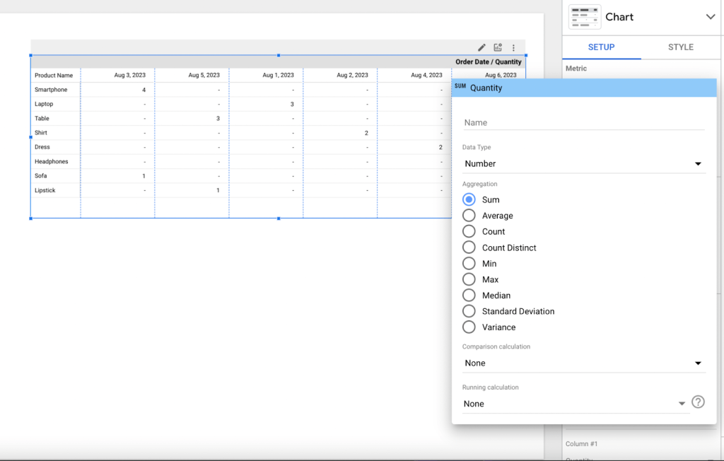
Here’s a breakdown of what each setting allows you to do:
- Name Field: Here, you can change the name of the metric
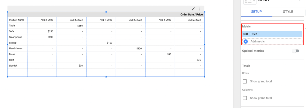
- Data Type: You can specify the data type (numeric or currency) of your metric. For instance, if you choose “currency” and select a currency symbol, this will format the metric accordingly in your pivot table.
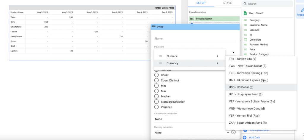
- Aggregation functions: These are operations (such as average, count, count minimum maximum median, standard deviation, and variance) used for calculations.
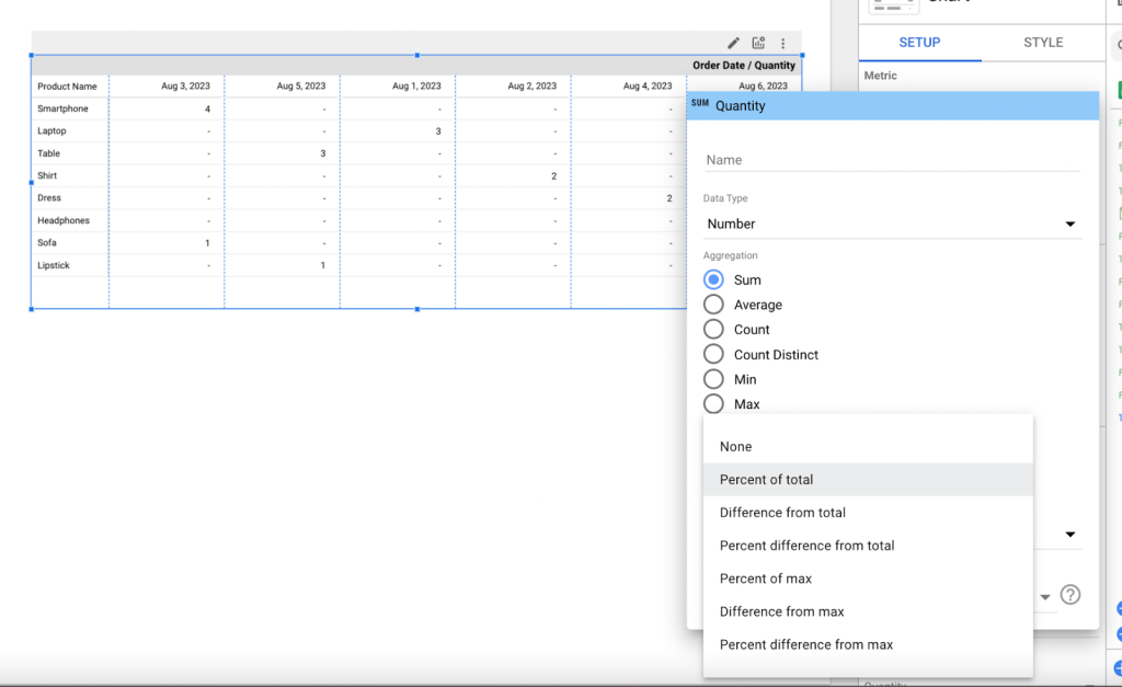
- Comparison Calculations: You can compare your metric values against total and maximum functions.
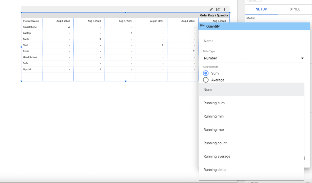
- Running Calculations: You can configure your metrics to compare a single row of data with the dataset for dynamic analysis.
You don’t need to use all of this at the same time, you just need to choose the metric setting that is needed at the moment for your analysis. For instance, if you wish to analyze the average prices of products in our sample pivot table, you would select the “price” metric and apply the “Avg” (average) function.
Pivot table with multiple metrics
Adding multiple metrics in your pivot table enables you to compare different aspects of your data simultaneously. For example, in our pivot table, we have included two metrics “Quantity” and “Price”. By doing so we can gain insights into sales volume and pricing trends. This can be incredibly valuable for making business decisions.
While this is great, it is still important to keep in mind that adding too many metrics may make your pivot table appear crowded.
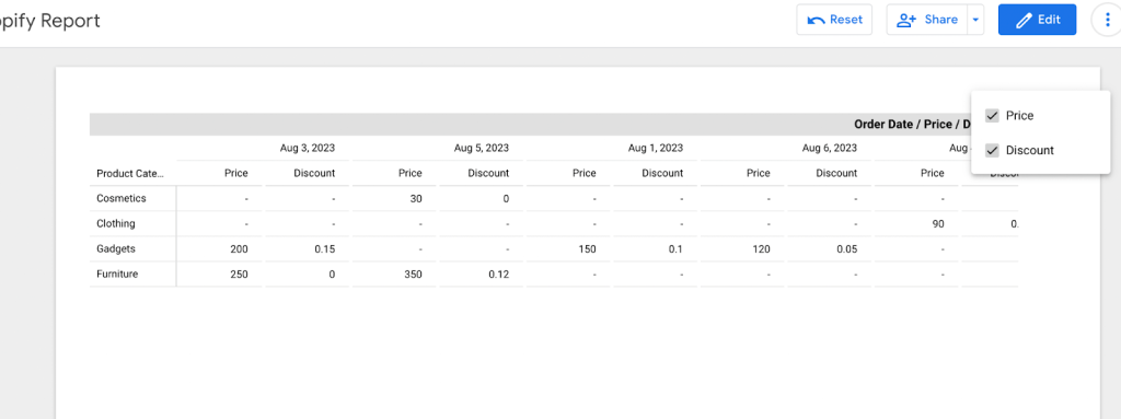
Optional metrics
Optional metrics are supplementary values that can be included in your analysis. Although they might not be crucial for your analysis immediately, they can offer valuable insights down the line. To add an optional metric:
- Toggle on the optional metric
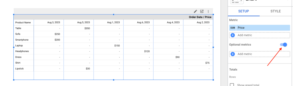
- Add your desired metric. In our case, we used “Discount.”
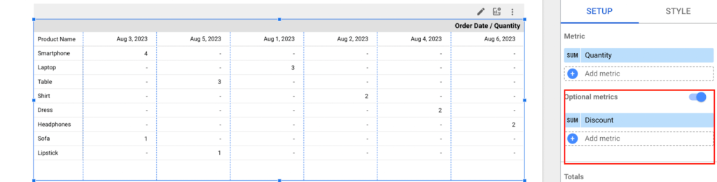
- Click on the optional metric icon
- Then select your optional metrics to be displayed.
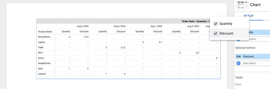
This will update and add your optional metrics in the pivot table.
Optional metrics are also accessible to users in the view mode. Users can customize the displayed information on their own chart without making changes to the chart visible to other users. This feature enhances the flexibility of the dashboard experience.
By selecting or deselecting your optional metric you can dynamically change how your pivot table displays information, offering a more comprehensive view of your data.
Row dimension
Row dimensions help you analyze and compare data across these categories, providing a clearer understanding of trends and patterns within your dataset. They play a crucial role in creating meaningful summaries and insights using pivot tables.
For example, let’s say you want to track how sales in different product categories perform over different time periods. For that, we will use the “Product Category” attribute as our row dimension.
With this you can make decisions from your data and identity trends such as gadgets sales peak during the month of August, cosmetics sold less during the month of August, etc.
Expand-Collapse
Expand-collapse is located in the row dimension and it’s a way for a pivot table to display both summarized and detailed information reducing the need for charts in your reports.
When you have multiple rows, you can enable the expand-collapse feature to treat the row dimensions as a hierarchy. With expand-collapse, you can choose to show or hide levels of information in the pivot table by clicking on the plus (+) and minus (-) signs in the column header.
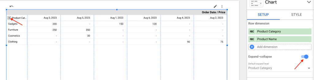
This allows you to explore your data in detail as you want.
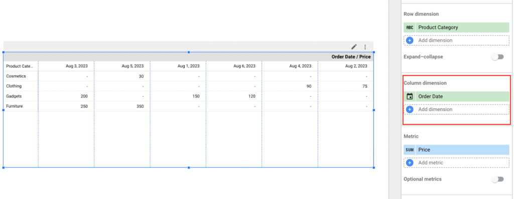
Column dimension
Just as row dimensions group data vertically, column dimensions group data horizontally, allowing you to view data from different perspectives. It provides an additional layer of information for analyzing and comparing data to draw insights and identify patterns.
In our example, we set the column dimension as “Order Date”. Now this will enable us to determine which product categories are driving revenue growth across time periods.
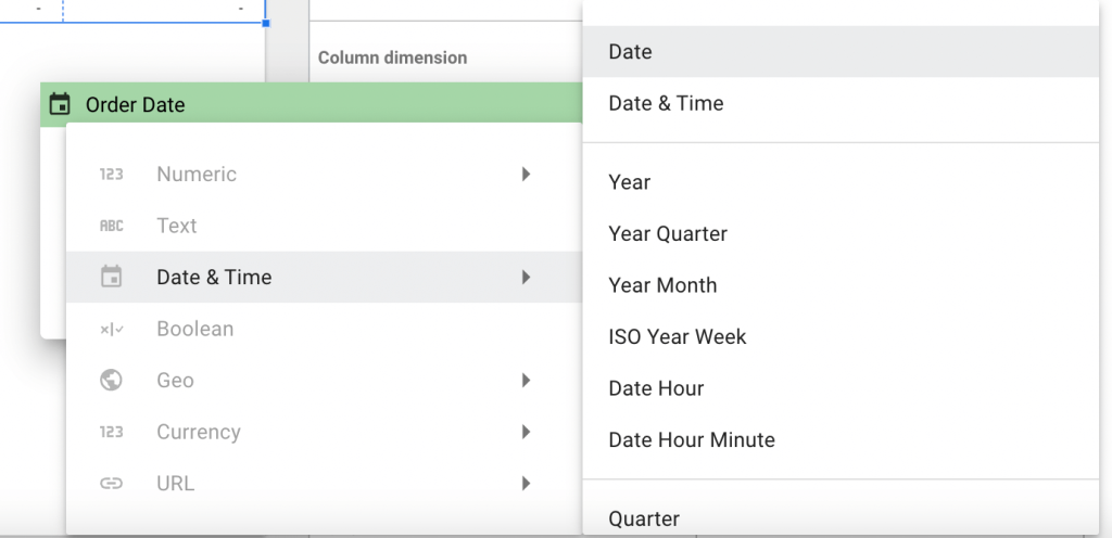
Since we are using date, Looker Studio automatically adds the date data type. However, if you have a preference, for how you want to display your date, simply click on the calendar icon to the column dimension block. This will display the different data types.
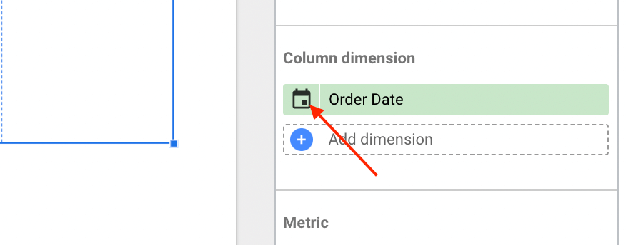
On the “Date & time” data type there are options for aggregating dates by weeks, months, years, minutes, etc. It all depends on how you wish to organize your data.
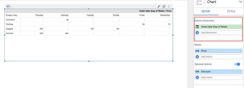
Here is an example of a pivot table aggregated by Days of the week.
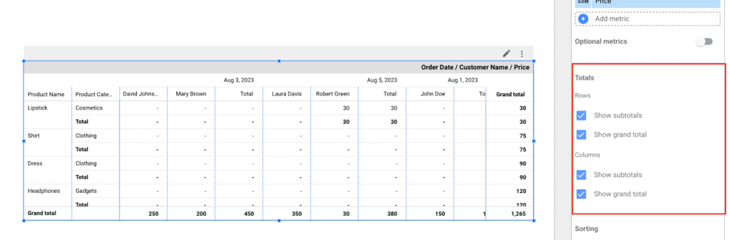
Multiple row or column dimensions
Having multiple row and column dimensions in your analysis allows for a flexible approach to examining data from different perspectives. This enables one to uncover patterns and distinctions that may not be readily apparent when relying on a single dimension.
For instance, let’s say we want to analyze customer purchasing behavior for products on different dates using a pivot table. For our pivot table, in the row dimension, we added the “Product Category” and “Product Name” to provide information about the products purchased and the categories they belong to. While in the column dimension, we added “Order Date” and “Customer Name” to gather information about customers and the dates of their purchases.
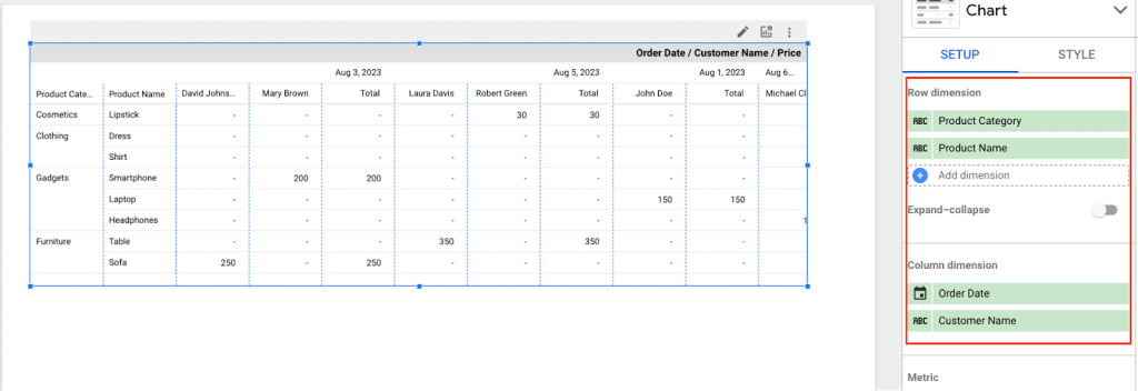
By combining the information from both dimensions, you can analyze which products were purchased among certain customers and the date they occurred. This gives us a more detailed view of customer behavior and their purchase patterns.
Note: In a pivot table, you can only have up to two column dimensions, but you can include more than two row dimensions.
How to edit your Looker Studio pivot table
There might be instances where you may need to customize your pivot table data layout, apply filters, or even make alterations. Fortunately, Looker Studio offers methods to facilitate these adjustments and enhancements within your pivot tables.
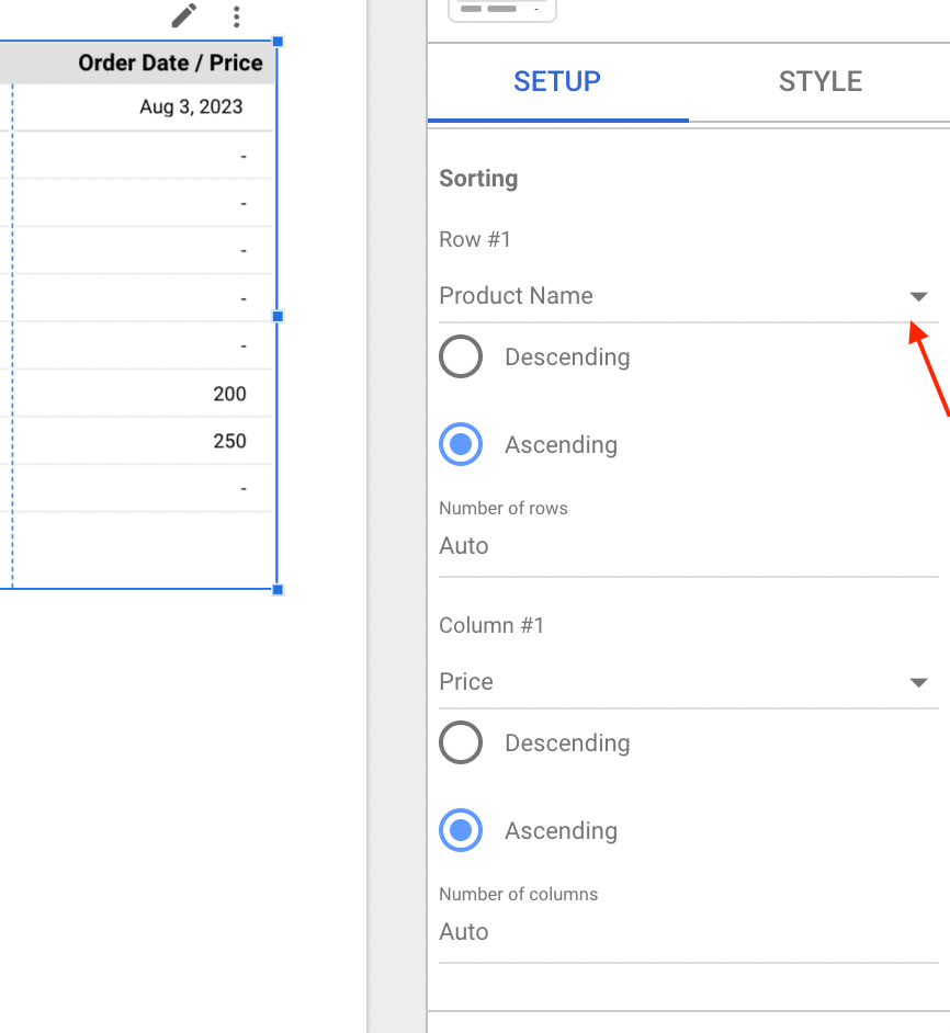
Sorting
Within a pivot table, you have the flexibility to sort data either in ascending order (from smallest to largest) or descending order (from largest, to smallest). There are different instances where you can apply sorting for example, when you want to sort dates in either ascending or descending order, display products by those that sell the most or the least, identify which categories are performing better or worse than others, etc.
For example, in the pivot table below, by sorting the quantity ordered and order dates in descending order, we can identify the products with the highest quantity of sales on each date. This can help us to understand which product sells the most or least.
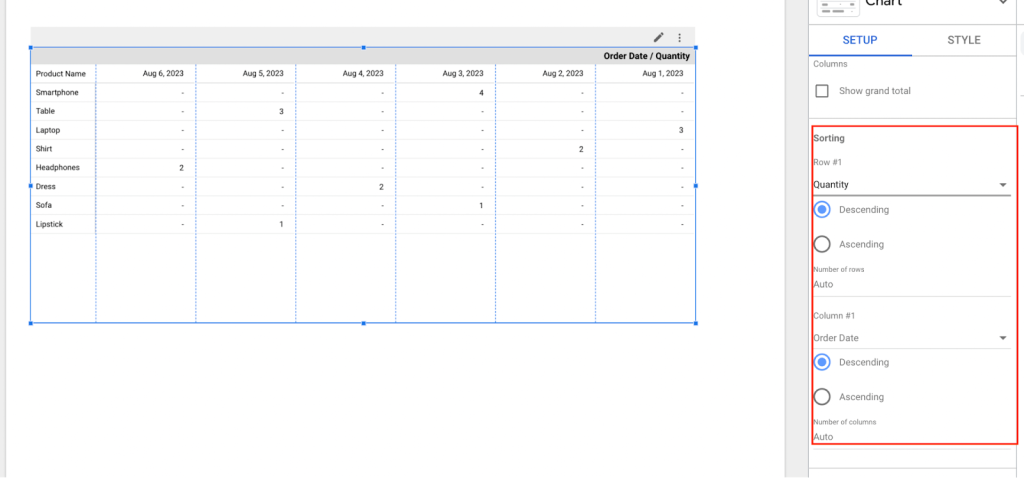
To know what values you can sort, click on the drop-down menu for both the row and column. These values are derived from the data you have included in your dimensions and metrics.
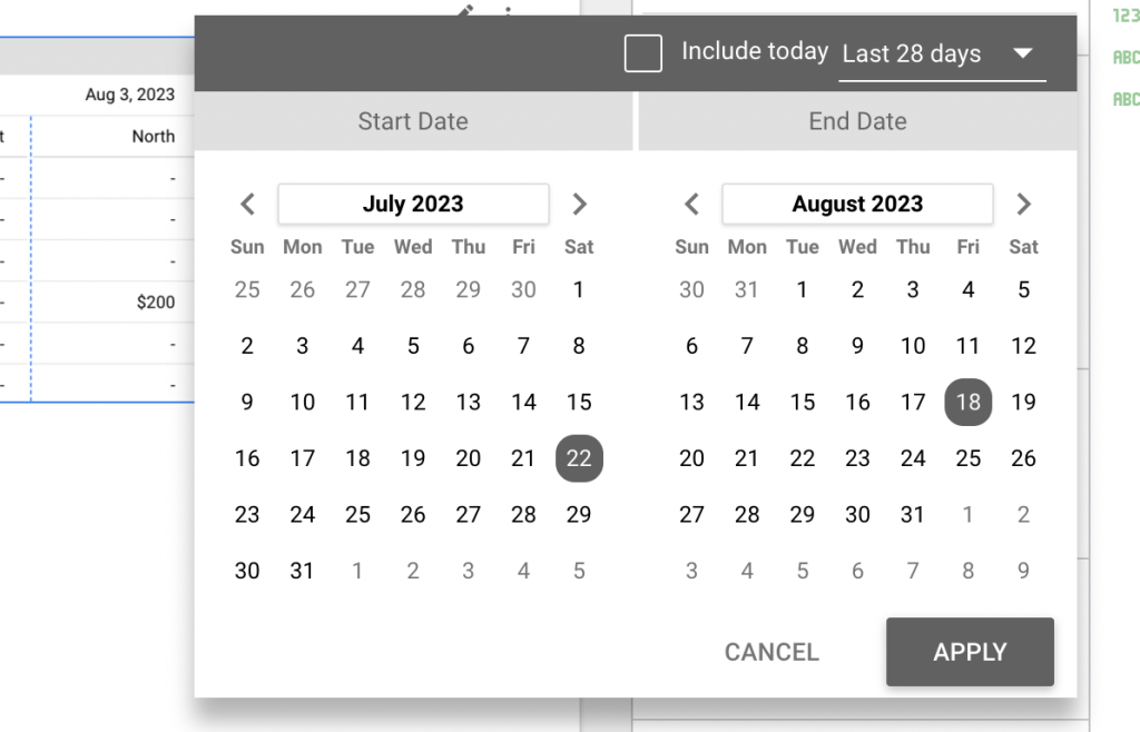
Default date range
Date ranges are used when categorizing or grouping dates into intervals particularly when dealing with large amounts of data over extended time spans. For the date range, you have two options to choose either “Auto” or “Custom.”
Choosing “Auto” will use the date range set on the date range control of the page or (if none) any custom date range you’ve set in report settings (e.g. last month).
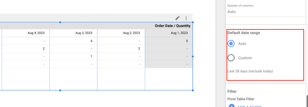
With the “Custom” date range you can easily switch up the date range of your data source based on your needs. You can opt for a ‘custom’ date range and still use predefined intervals, e.g. last 28 days, last week.
Once you’ve chosen a date range the pivot table will display the corresponding data for that period.
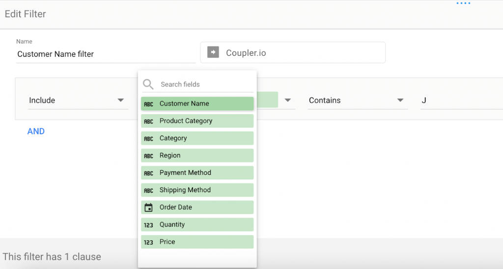
Filter
Filters in a pivot table within Looker Studio are incredibly useful for refining your analysis of data sets. They act as a sieve assisting you in sifting through the data and retaining only what is necessary for your needs.
To filter your data,
- Click on Add a filter.
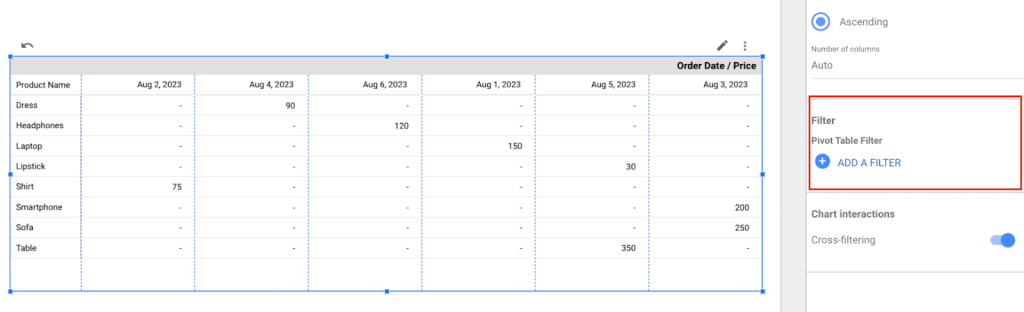
- Select the field you want to filter. Assuming we want to view data for customers whose names contain the letter “J.” We would select the Customer Name field and choose to only include results containing the letter “J”.
The pivot table will update to display only customer names that contain J. From our example you can see that filters enable you to personalize your analysis without altering the underlying data.

Totals
Totals offer a way to summarize and understand your organized and analyzed data. A pivot table typically includes two types of totals: row totals and column totals.
- Row Grand Total: Row Grand totals are calculations that display the sum of values for each row of data in the pivot table. In our example, our pivot table displays the cumulative sales of each product for the entire date range selected.
- Column Grand Total: Column grand totals provide calculations for each column of data in the pivot table. In our example pivot table, the column total aggregates the product sales for each date.
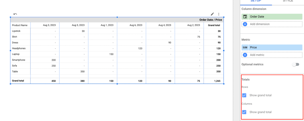
Subtotals
When there is one dimension in a row or column you have an option to display the grand total. However, if you have two or more dimensions present you can choose to include either subtotals or grand totals, or both of them at the same time.
Dashboard controls
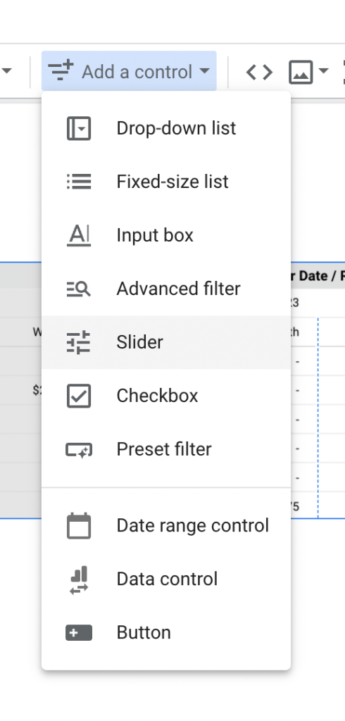
In Looker Studio, you have various controls, at your disposal to interact with and modify the data in your pivot table. Here’s what’s available:
- Drop-down menu: This allows you to choose an option from a list of choices. It comes in handy for filtering or selecting categories or values.
- Fixed-size list: Similar to a drop-down menu. It displays options simultaneously often with a scrollable interface.
- Input box: You can manually enter text or numeric values here which can be used for searching or filtering data.
- Filter: This offers complex filtering options, such as applying multiple conditions or filtering based on specific criteria.
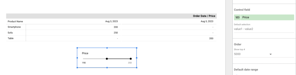
- Slider: With this control, you can set a value within a specified range using a slider interface. It’s useful when selecting values within a range like dates or price ranges.
- Checkbox: This allows you to toggle options on or off making it great, for choices or situations where multiple selections are needed.
- Filter: These are predefined filter options that you can choose from. They come in handy when quickly applying filters without specifying criteria.
- Date range control: Specifically designed for date-related filtering this control enables you to select a date range or period.
- Data control: This feature allows you to interact with the data giving you the ability to switch between data sources or make changes to the data itself.
- Buttons: These buttons can be customized to perform actions or execute commands, such as updating the data or performing calculations.
These controls are designed to be user friendly allowing you to easily adjust and explore the information without impacting the underlying data or report settings.
To add a dashboard control simply click on “Add a control” and choose the type of control you want.
For our pivot table, we have added a slider control for Price. You can use this slider to navigate forward and backward enabling you to select the price range you want to observe. However, it’s important to note, you can’t control individual charts. Adding sliders will affect data on all charts on a page, not just the pivot table.
Difference between pivot table and table in Looker Studio
When it comes to conducting data analysis, there are distinct differences between using a pivot table and a regular table but first let’s look at how the data is organized in both tables using the images below.
Regular tables are primarily designed to aggregate metrics by a single dimension, (e.g. sales by product category). They provide a straightforward view of data, suitable for basic reporting.
On the other hand, pivot tables offer the capability to aggregate data by two or more dimensions simultaneously (e.g. sales by product category, and product name + by order dates). This multi-dimensional approach allows for in-depth analysis and the exploration of intricate relationships within the data.
To throw more light on this, the table below highlights some of the key differences:
| Aspect | Pivot table | Regular table |
| Multiple Dimensions | Pivot tables can easily display data with multiple dimensions and metrics. | Regular tables display data with all dimensions and metrics in a static, tabular layout. |
| Data arrangement | Pivot tables allow you to pivot and summarize data,making it easier to analyze and visualize trends. | Regular tables display data in a flat, tabular format without pivoting or summarization. |
| Rows and Columns | Rows and columns can be dynamically rearranged inpivot tables. | Rows and columns are typically fixed, without dynamic changes in arrangement. |
| Visualization options | Pivot tables may include visualizations like bar charts, line charts, etc. | Regular tables typically do not include built-invisualizations. |
| Use Cases | A Pivot table is ideal for in-depth multidimensional data analysis. | Regular table is suitable for basic reporting. |
Drawbacks of pivot tables in Looker Studio
As with every good thing, there are some restrictions and a few challenges when using pivot tables. We have listed some of the drawbacks you can face when using pivot tables in Looker Studio and how you can handle them.
- Pivot tables can be slow if analyzing large datasets. An effective solution would be to filter and transform your data using tools like Coupler.io before importing them to Looker Studio and analyzing them with pivot tables.
- You cannot include more than 5 pivot tables on one report page. If you want more pivot tables, you have two options:
- You’ll need to divide your analysis across multiple report pages or,
- Use optional metrics to let users decide what they want to see on a pivot table, without the need to create a separate pivot table for each set of metrics.
- Pivot tables allow just 2 column dimensions. If you need to add more dimensions, you then need to try other types of charts like bar or line charts for your visualization needs or swap columns with rows and add more dimensions.
- You can only insert up to 10 metrics in a pivot table. If you need more, you’ll need to consider making extra pivot tables or employing different visualization methods alongside your analysis.
- Unlike regular tables, pivot tables don’t split into pages. If it is important to display data page by page, then it is recommended to use a table or another visualization method to handle your data.
Do you need pivot tables at all?
So far so good, we’ve covered all the aspects to help you get started with your pivot table data analysis journey. We discussed the elements such as row dimensions, column dimensions, and metrics. We have also explored how to customize your pivot table to suit your specific analysis needs.
While pivot tables have their advantages, they may not always be your go-to choice for creating dashboards and generating reports. For example, creating a Power BI pivot table is not so straightforward and has certain drawbacks. In such cases, you can consider other methods of visualizing and presenting data such as charts, graphs, interactive visualizations, etc.
Along the way, if you require expert assistance in designing your dashboards the Coupler.io data team at Coupler.io is readily available to provide their expertise. You can also check out some of the Looker Studio dashboards they’ve created.
In the meantime have fun exploring your data! ?

Streamline your data analytics & reporting with Coupler.io!
Coupler.io is an all-in-one data analytics and automation platform designed to close the gap between getting data and using its full potential. Gather, transform, understand, and act on data to make better decisions and drive your business forward!
- Save hours of your time on data analytics by integrating business applications with data warehouses, data visualization tools, or spreadsheets. Enjoy 700+ available integrations!
- Preview, transform, and filter your data before sending it to the destination. Get excited about how easy data analytics can be.
- Access data that is always up to date by enabling refreshing data on a schedule as often as every 15 minutes.
- Visualize your data by loading it to BI tools or exporting it directly to Looker Studio. Making data-driven decisions has never been easier.
- Easily track and improve your business metrics by creating live dashboards on your own or with the help of our experts.
Try Coupler.io today for free and join 1M+ happy users to accelerate growth with data-driven decisions.
Start for free