A spreadsheet app like Google Sheets or Excel could be the first choice for digital marketing and sales experts to create a sales dashboard. But let’s face it — spreadsheets are not as powerful as any business intelligence tool. So, Looker Studio (former Google Data Studio) is the better option if you want to create an interactive sales dashboard. This data visualization solution offers more benefits in terms of efficiency and scalability. In addition, Looker Studio’s robust data integration capabilities and support for real-time data access are its key advantages over spreadsheets.
This article guides you on how to create a sales dashboard in Looker Studio for your business. You’ll learn how to build your dashboard step-by-step with this practical tutorial. Moreover, we’ll introduce you to handy Looker Studio sales dashboard templates for fast and effective marketing reporting.
Let’s begin.
Exploring options for creating a sales dashboard in Looker Studio
Creating a sales dashboard in Looker Studio can be approached in several ways, depending on your resources, expertise, and specific needs.
Here are the options:
- Using templates
Looker Studio sales report templates may be a handy tool if you don’t have the time to design and build your dashboard from scratch. Using templates as a starting point can help you quickly and efficiently create data visualizations.
However, it would be best if you have basic Looker Studio skills to be able to customize it based on your needs.
- Building from scratch
The second option is building your dashboard from scratch. Nothing can stop you if you have a clear vision of what your Looker Studio sales dashboard looks like and possess the necessary skills. However, this can be time-consuming, even though you have control over every aspect of the dashboard.
- Hiring a data consultancy service
Consider this third option if you need a high-quality result but lack the skill and time to learn. Or if your data needs are complex.
Some companies and professionals specialize in data analysis and visualization. They can help you automate data flows from multiple sources, define the key metrics for your reports, clean and organize your data, and create a custom Looker Studio sales dashboard that fits your business needs.
Now, let’s look at each option in more detail in the next section.
Option 1. Streamline your Looker Studio sales dashboard creation with templates
Several sources offer collections of Looker Studio sales dashboard templates.
- You may want to look at Looker Studio Gallery. It offers templates by the Looker Studio Team and community.
- Data analytics platforms like Coupler.io, Porter, and Windsor.ai also offer curated selections of top templates and Looker Studio marketing dashboards.
Many of those Looker Studio templates are easy to use and designed following data visualization best practices. They also usually include interactive features such as filters and drill-down capabilities.
As for notable examples, let’s look at Coupler.io’s top 3 templates for the Looker Studio sales dashboard, designed to work with different data sources: Salesforce, HubSpot, and PipeDrive.
To use these templates, you’ll need to create a Coupler.io account if you don’t have one yet. A free version is available.
Sales dashboard – Salesforce data source
Take a look at Coupler.io’s dashboard template designed to work with Salesforce. It has a sales overview page and three pages for won, lost, and open opportunities in more detail.
You’ll have visualizations of key metrics such as revenue, revenue by opportunities, and revenue by opportunity status. You can customize the Looker Studio sales dashboard to include additional metrics or modify the existing ones according to your needs.
Sales dashboard – HubSpot data source
Are you using HubSpot? You can use this template to quickly visualize your sales revenue, including details on won and lost deals. This sales dashboard template also offers insights into your team’s performance, such as displaying the total revenue generated by each deal owner.
Sales dashboard – Pipedrive CRM data source
Check out the following Looker Studio sales dashboard template by Coupler.io for the Pipedrive data source. It has neat and wonderful visualizations. The dashboard provides an overview of your sales pipeline, showing metrics like deal progression, sales agent performance, deal performance, and more.
The Coupler.io template gallery is not limited to sales dashboard. You can find Looker Studio dashboard examples for advertising platforms, CRM apps, e-commerce tools, etc.
Option 2: How to create a sales dashboard in Looker Studio
It’s good if you have time to learn and create your own sales dashboard in Looker Studio. This section provides a step-by-step guide to help you start an exciting journey of sales dashboard creation.
Our simple Looker Studio sales dashboard example
We’ll build a simple Looker Studio sales report with minimal formatting and a few charts on it.
To give you an idea about what the finished report will look like, here’s what we will build:
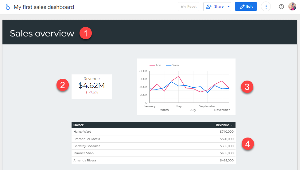
As you can see from the above image, we’ll focus on these elements:
- Page header. Adding a header gives readers a quick context for the information they will view.
- Scorecard. To show readers a quick summary of the total revenue and a comparison with a target revenue.
- Time series. The chart shows how the won vs. lost deal values change over time.
- Table. Here, we’ll show the top 5 deal owners.
Things you’ll need before getting started
You will need a Google account to create a dashboard in Looker Studio. If you already have a Gmail account, then you are all set.
To follow along, we provide a Google Sheet file you can use as a data source. Make a copy of this spreadsheet file to your Google Drive. It contains a dummy dataset that we’ll be using to build a report.
We assume you have a basic understanding of Looker Studio to make the process smoother. Consider going through our tutorial on how to use Looker Studio for beginners to learn some basics, such as Looker Studio’s interface and menus, data sources and data connectors, as well as metrics and dimensions.
Step 1: Automate data flows into your sales dashboard in Looker Studio
Connecting Google Sheets to Looker Studio can be accomplished through two main methods: using the Google Sheets connector or employing a third-party solution.
The first method is the native way. Looker Studio has built-in connectors for various Google products, including Google Sheets. The connector is free and generally simple to use.
However, consider using a third-party solution if you want more advanced functionality and flexibility, including automation capabilities. For example, you may need to get data from sources that are not supported natively. Or if you must transform and blend your data automatically before loading it to Looker Studio. You can solve this task easily with Coupler.io.
Coupler.io is an all-in-one data analytics and automation platform. It can export data from 70+ apps, including Pipedrive, HubSpot, LinkedIn, Shopify, Google Ads, Facebook Ads, Google Analytics 4, and many more! In addition to Looker Studio, you can load your data to BigQuery, Power BI, Excel, and Google Sheets.
In this example, we will show you how to use Coupler.io to automate your data flow into Looker Studio. If you’re looking for an uncomplicated way via the Google Sheets connector, we suggest you look at our other article which explores different options to connect Google Sheets to Looker Studio.
Setting up the data source and destination
Using most third-party tools usually requires a registration process. This is true for Coupler.io as well.
Sign up for Coupler.io and create a new Importer. You’ll be guided through a wizard to select your data source and destination.
For the source and destination, select Google Sheets and Looker Studio.
You will need to connect to your Google account to configure the data source. If you use your Google account when signing up for Coupler.io, it should already be connected, and you can just select it from the drop-down menu.
Then, select the Deals file you copied before and specify the Sheet you will extract as the data source. When done, click FINISH and PROCEED.
If you want, you can perform data transformation and add another data source, but we’ll skip it in this example.
To configure the Looker Studio as your destination, click the Manage data on the left. Then, click the Looker Studio button on the right to create a data source in Looker Studio.
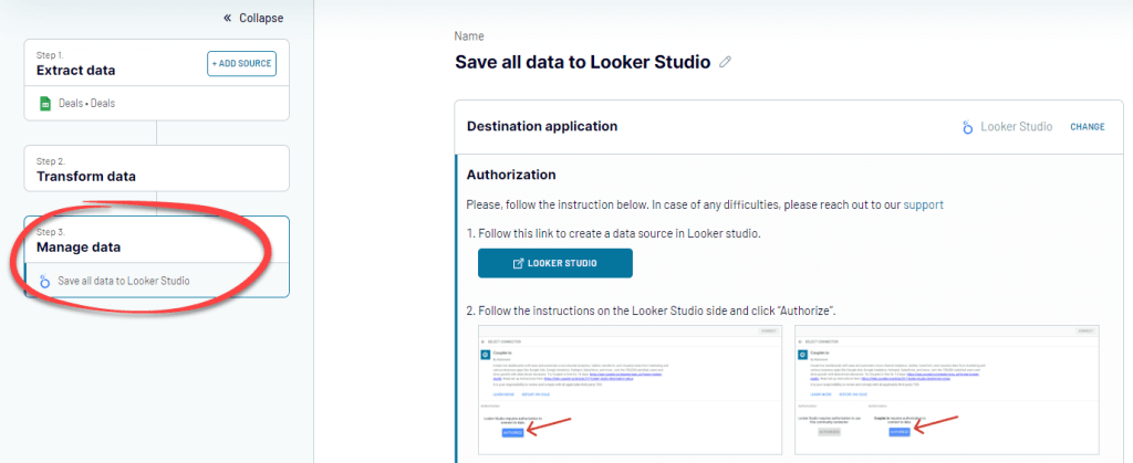
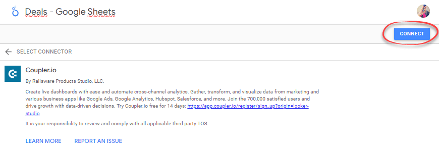
You will be redirected to Looker Studio and see the following screen. Give your data source a name, then click the Connect button.
Once connected, you’ll see a list of your data source fields.
Configuring a data refresh schedule
Go back to Coupler.io and refresh your browser. You’ll see a screen similar to this below:
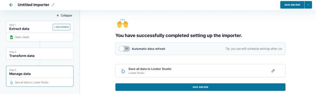
If you want, you can set up an automatic data refresh schedule. To do that, toggle the Automatic data refresh button to ON. You can select an interval of your choice, as short as every 15 minutes.
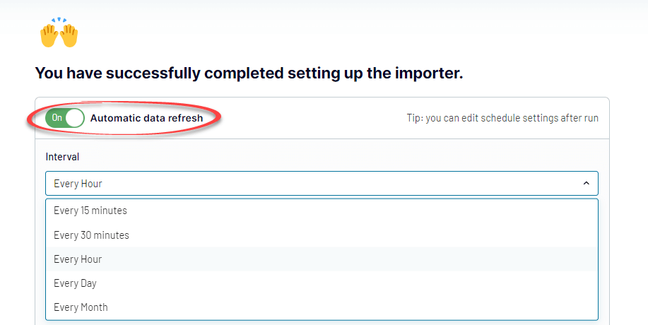
When done, click SAVE AND RUN to run the importer.
Congratulations! You’ve now successfully connected Google Sheets to Looker Studio via Coupler.io.
Step 2: Create a report
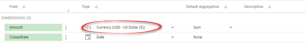
We’re ready to create a Looker Studio sales report. But before that, it is a good idea to review the field settings.
In the Looker Studio data source page, you can change a field’s datatype and aggregation to represent this field in charts better and how its value is grouped.
For example, change the Amount column to a currency field type since it represents monetary values. Do this by selecting Currency > USD – US Dollar ($).
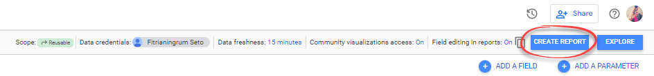
If everything looks OK, create a new report by clicking the CREATE REPORT button at the top.
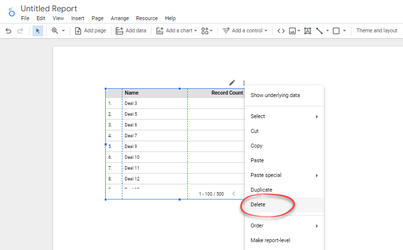
Looker Studio creates a random table based on the fields in your data source. Let’s just delete it for now.
To delete, right-click on the table and select Delete from the menu.
If you want, rename the report by clicking the Untitled Report text and typing a new title.
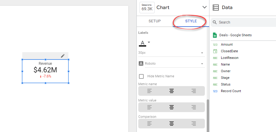
Step 3: Create and modify a scorecard
A scorecard is a great start as it’s like choosing a headline.
This component is very useful to help you see the big picture. They are primarily used to summarize data over the entire time frame of the report.
We’ll add a scorecard that shows the total revenue in compact numbers. We’ll also show how the value compares with a target revenue.

The steps are below.
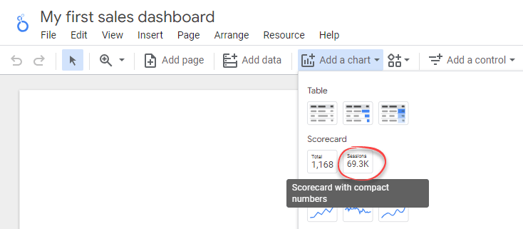
- Click the Add a chart icon in the toolbar, then select Scorecard with compact numbers.
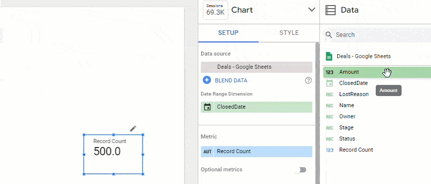
- By default, the scorecard will show the total Record Count metric. To change the metric, drag the Amount field on the Data tab to replace the Record Count field.
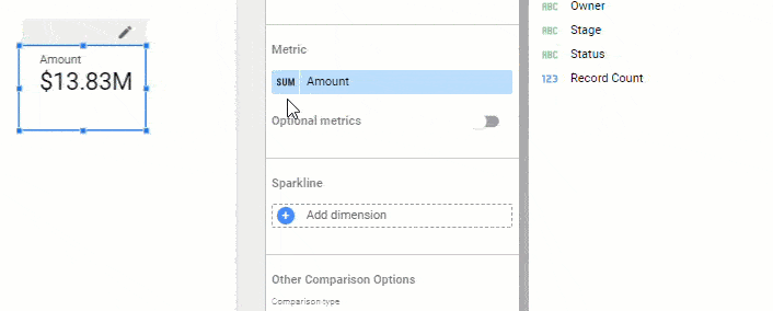
- To change the scorecard label, hover over the first column of the metric until you see a pencil icon. Click it to open a pop-up to edit the metric. Give your new metric a name: Revenue. Then, click anywhere outside the pop-up to close it.
- Click Add a filter to open the Create Filter panel. We’ll add a filter so that the revenue represents only won values. As for now, it actually represents all won and lost.
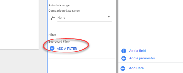
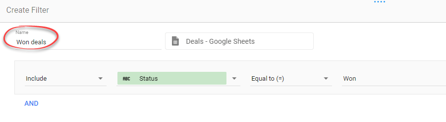
- In the Create Filter panel, create a filter that only includes rows with the Status equal to Won, as shown in the image below. Name the filter Won deals.
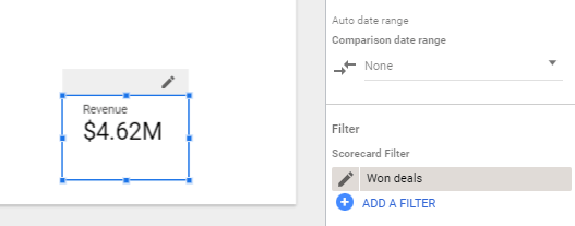
- Click the Save button to apply the filter. You’ll see that Revenue is now showing the total won deal values.
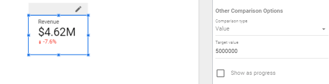
- Modify the scorecard to show the comparison to a target value. Let’s say our target revenue is $5M. To display the comparison, find the Other Comparison Options section. Change the Comparison type to Value and the Target value to 5000000.
- Finally, click the Style tab. You’ll see options to change the appearance of your scorecard. Modify as you like. For example, you can change the alignment and font size of the text inside the scorecard.
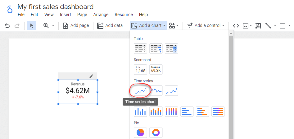
Step 4: Create and modify a time series chart
We’ll add a time series to show how the revenue changes over time and compare it to the lost values.
- Click Add a chart icon in the toolbar, then select Time series chart. Drag it next to the scorecard.
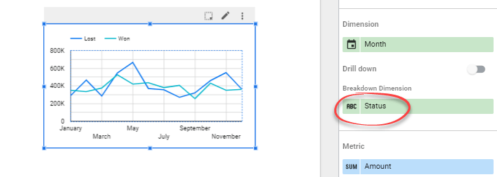
- We’ll change the time series to display monthly data. To do that, hover over the ClosedDate dimension, then click the pencil icon. After that, Change the field’s data type to Month and name it Month.
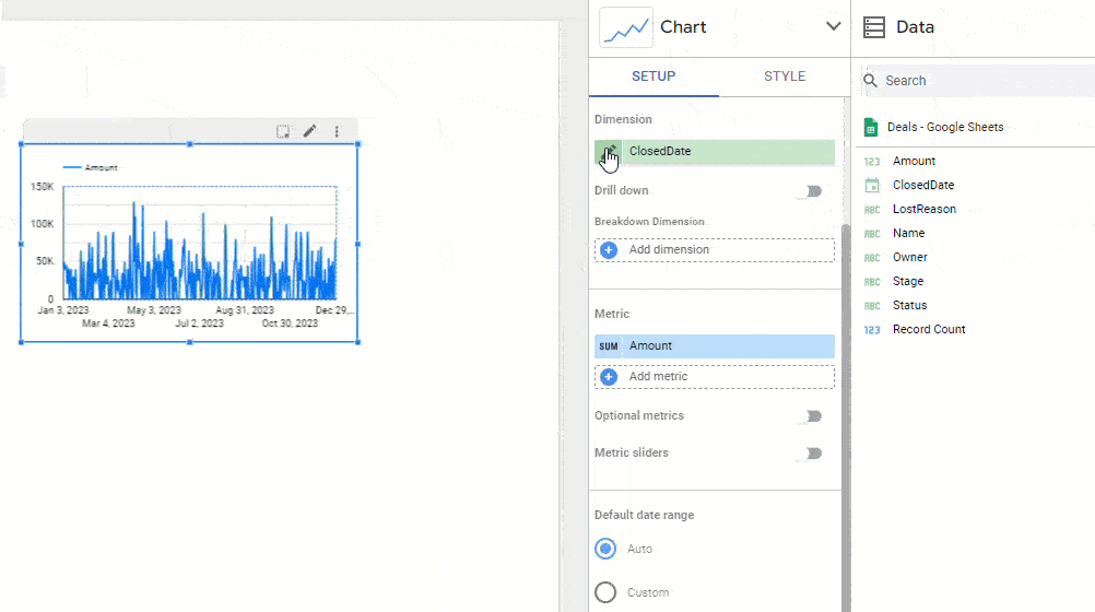
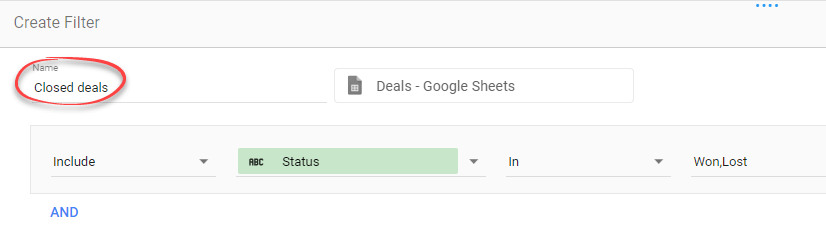
- Click the Add a filter button. In the Create Filter panel that appears, include only the deals with Won and Lost statuses, as shown in the image below. Name the filter Closed deals.
- To break down the metric into won and lost values, add Status as a breakdown dimension. When done, close the pop-up by clicking anywhere outside it. See that the x-axis of your chart now displays the month names.
- Switch to the Style tab and change the Number of Series to 2.
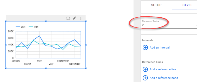
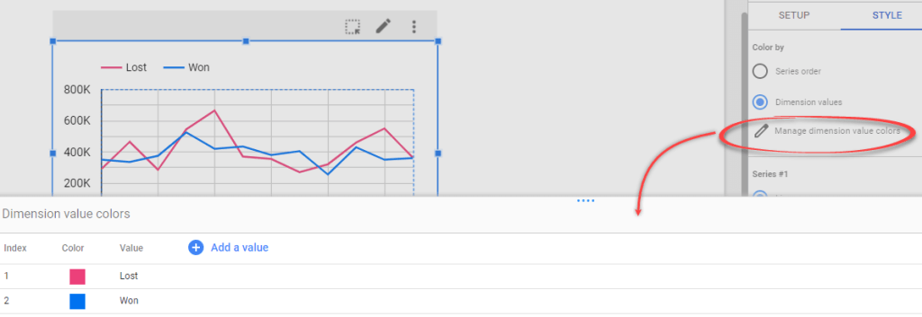
- If you want, change the line colors by clicking Manage dimension value colors and changing the colors as you like.
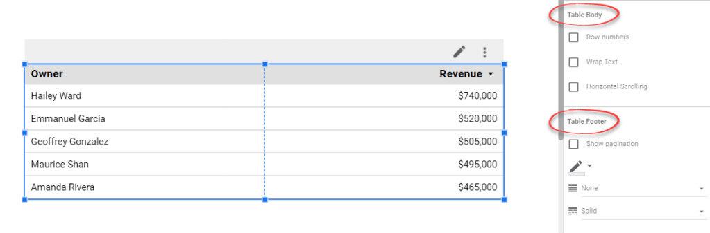
Step 5: Create and modify a table
Now, we’ll add a table that shows the top 5 deal owners. To do that:
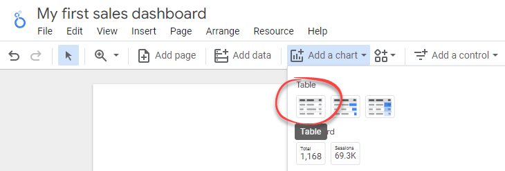
- Click Add a chart icon in the toolbar, then select Table.
- Click on the Dimension field and change it to Owner.
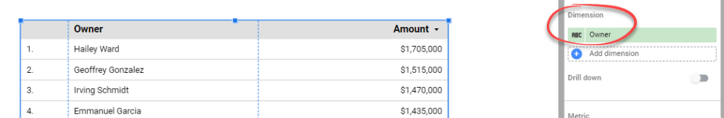
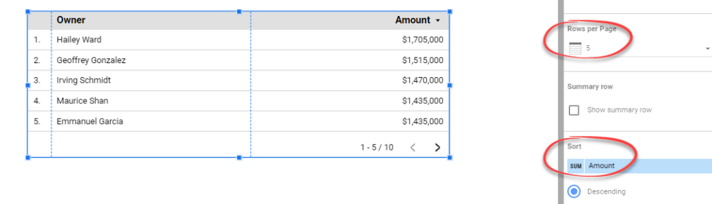
- Set the Rows per page to 5 and ensure the table is sorted by the Amount in descending order.
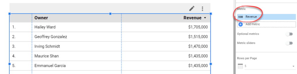
- Hover over the first column of the Amount metric until you see a pencil icon. Click it to open a pop-up to edit the metric. Name the metric to Revenue. Then, click anywhere outside the pop-up to close it. After that, you can see that the third column header is updated to Revenue.
- Add a filter to the table to display only Won values. To do this, click the Add a filter button, then select an existing Won deals filter we’ve created before.
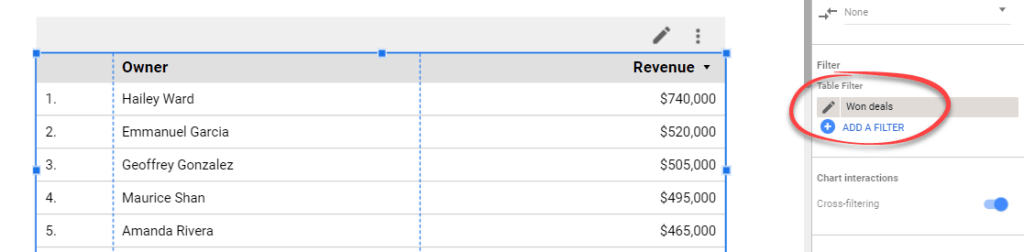
Figure 4.7.5. Adding a filter to the table
- Switch to the Style tab. In the Table Body, untick Rows number to remove numbers in the first column of the table. In addition, you can also remove pagination by unticking the Show pagination checkbox in the Table Footer.
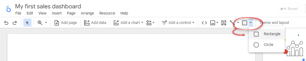
Step 6: Create a header and apply a theme
In Looker Studio, you can add a header to your report by adding a rectangle and a text.
Click on the Shape icon and select Rectangle. After that, draw it to the top of the report page.
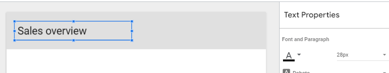
Add text to the header by clicking the Text icon. Give your report a text header you like. You can also change its font size and other settings in the Text Properties panel.
Change the look and feel of your report by clicking Theme and layout in the toolbar. In the Theme and Layout panel that appears, choose a theme that you like.
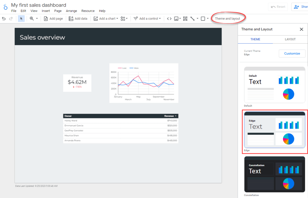
Congratulations! You’ve built a simple sales dashboard in Looker Studio. By following the steps in this article, we hope you’ll feel empowered to create your very own sales dashboards.
Sharing your Looker Studio sales report & dashboard
Ready to share your report with others? Click on the Share dropdown in the header toolbar.
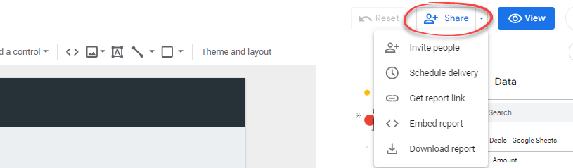
From the dropdown menu, you’ll have different options to share it:
- Invite people. This option lets you directly invite specific people or Google Groups to view or collaborate on your report. Simply enter their email addresses, and they’ll receive an invitation to access the report.
- Scheduled delivery. You can send scheduled reports in PDF format to specific recipients regularly. This option is useful for frequently updated reports, ensuring that stakeholders always have the latest updates.
- Get report link. This generates a unique short URL for your report. You can share this link with anyone you wish to have access to the report.
- Embed report. This option gives you a snippet of code, which you can embed into a webpage, such as a blog post.
- Download report. You can download the report as a PDF and share it with others via email or Slack. This option also allows you to protect the document with a password for added security. Remember you must create a strong password to prevent unauthorized persons from accessing your data and for this, you can use a password generator.
Option 3. Hire data consultancy services for your Looker Studio sales dashboard
Creating a custom sales dashboard in Looker Studio can provide valuable insights to drive your business forward.
However, not every business has the skill and expertise to create effective, tailored dashboards. This is where data consultancy services come in.
Data consultancy services specialize in helping companies to leverage their data for decision-making. Coupler.io offers one such service.
As a data consultancy, Coupler.io provides services for creating custom Looker Studio sales dashboards tailored to your business needs. They can help you integrate data from various sources, including CRM platforms like Salesforce, HubSpot, and Pipedrive to Looker Studio and other BI platforms. They offer Google Ads Looker Studio templates and can also help with data visualization, data automation, and setting up your data infrastructure.
You can also hire freelance professionals on platforms like Fiverr and Upwork who offer Looker Studio dashboard creation services. They often have a range of prices and services, allowing you to find one that fits your budget and needs.
What option to choose to automate sales reporting in Google Looker Studio?
You’ve learned different ways to create a sales and marketing dashboard in Looker Studio from DIY to hiring a consultancy service to do the job. Of course, you can complete all the steps to create a sales dashboard in Looker Studio yourself. You’ll need to spend time setting up a data source, adding charts, applying a theme, etc. This requires certain skills and expertise. If you have these, you can tailor a solid sales performance dashboard on your own.
The opposite option is to hire an expert or a team of experts to automate reporting. This way you can manage other complex data management cases, like analyzing marketing performance, tracking PPC results, and so on.
However, in our opinion, using Data Studio templates is the golden mean option. You get a ready-to-go reporting solution, which can be customized or scaled later on. If you’re using Salesforce, HubSpot, or Pipedrive, we encourage you to try Coupler.io’s top three Looker Studio sales dashboard templates, depending on your data source.
Thanks for reading! And good luck on your sales data management journey!
Automate data export with Coupler.io
Get started for free