Google Data Studio (formerly Looker Studio) – Best Practices to Follow

Companies are always on the lookout for new ways to collect and analyze data because of its growing importance in today’s economy. With the help of a data visualization tool like Google Data Studio (ex Looker Studio), organizations can create dashboards that show growth opportunities and useful data. However, a good dashboard must be understandable in order to utilize the information for decision-making. These guidelines can help you create engaging and informative dashboards, whether you’re a seasoned data analyst or just getting your feet wet in the field of data visualization and BI for marketing.
Why should you follow best practices when using Google Data Studio (Looker Studio)
You can’t simply put together some charts and numbers in Looker Studio and call it a dashboard. If you want your dashboard to be informative and useful, you need to follow some best practices to make the most out of your data. Although there is no silver bullet, adding some of these ideas to your dashboard or reports can make a big difference and help you see your data in a way that is both helpful and informative for your business.
Tips and best practices for Looker Studio
Let’s go over some of the best practices you need to follow when creating dashboards or reports with Looker Studio.
Identify the intended audience for your dashboard
A key tip for creating a successful dashboard in Looker Studio is identifying your audience and understanding their needs. This involves asking questions such as: Who will be using the dashboard? What KPIs and metrics do they need to make informed decisions? etc
For instance, if you are presenting a marketing report that showcases a dashboard with sales performance by region. First, you’ll need to determine who your audience is, which is most likely sales executives, managers, VPs, etc. Next, you’ll need to add the metrics that they want to see. For example, they may want to see what region has the most sales in the period of a year. Once you have identified the goal of your dashboard and your audience, you can now choose the most appropriate data visualization techniques. To analyze sales performance, you can use a bar chart, pie graphs, etc. For Looker Studio funnel visualization, you’ll want to use scorecards, horizontal bar charts, and others.
It is important to note that if you can’t think of a reason for reporting a particular metric or the action that should be taken based on the dashboard, then there is no need to include it. By selecting the right information to convey to your audience, you enable them to make better decisions. Then, you can share Looker Studio report using the option that fits best your needs.
Avoid cluttering your dashboard
When it comes to creating effective dashboards in Looker Studio, it’s important to keep things simple, precise, and short. If your dashboard is too complex or difficult to understand, it won’t have the impact you intended it to have. The purpose of a dashboard is to provide quick and easy access to key metrics and insights. By presenting information in a clear and concise manner, you enable users to make informed decisions quickly and efficiently.
To achieve this, focus on the most critical data points and use visual cues like color, fonts, and size to draw attention to the most important information. Use clear and concise labels to help users understand the data being presented.
Use data connectors to import data
Connectors play a crucial role in streamlining the data import process, ensuring the accuracy and relevance of data to your insights. Looker Studio offers native connectors for popular data sources such as Google Analytics, Salesforce, and MySQL, making it easy to connect directly to your data source and import data into Looker Studio. However, when you need to connect to a specific data source that is not available as a native connector in Looker Studio, you will need to opt for a partner connector or create your own integration with Looker Studio.
Building a custom connector might not be feasible for non-developers or people who require immediate data import. In such cases, third-party connectors such as Coupler.io, Zapier, etc, come in handy. These connectors offer access to multiple data platforms, helping you optimize performance and reduce load times to create a seamless user experience. Choosing the right Looker Studio connector for your data needs can significantly enhance your experience and enable you to make better data-driven decisions.
Gather and manipulate data before loading it to Looker Studio
Manipulating data within Looker Studio is not recommended, as it can lead to inaccurate insights, compromise the reliability of your data and also slow down your dashboard. Looker Studio should be primarily used for data visualization, not data manipulation or transformation. Any necessary data manipulations should be performed outside of Looker Studio, such as in a spreadsheet or data warehouse.
To accomplish this, use the Google Data Studio connector by Coupler.io. This data integration platform and AI analytics automates data blending from over 400 apps like Google Ads, Facebook Ads, HubSpot, Google Analytics, etc. After preparing your data, you connect it to Data Studio. This will significantly improve performance and ensure the accuracy of your insights.
Learn more about how you can use Google Data Studio for custom reporting and analytics.
Blend data before loading it to Looker Studio
While Looker Studio blend data feature can be useful, it may have certain limitations when blending data from different sources, such as slow loading times, difficulty verifying the accuracy of blended data, etc. To overcome these challenges, it’s recommended to use a tool for blending data before connecting it to Looker Studio. Looker Studio should be used primarily for data presentation.
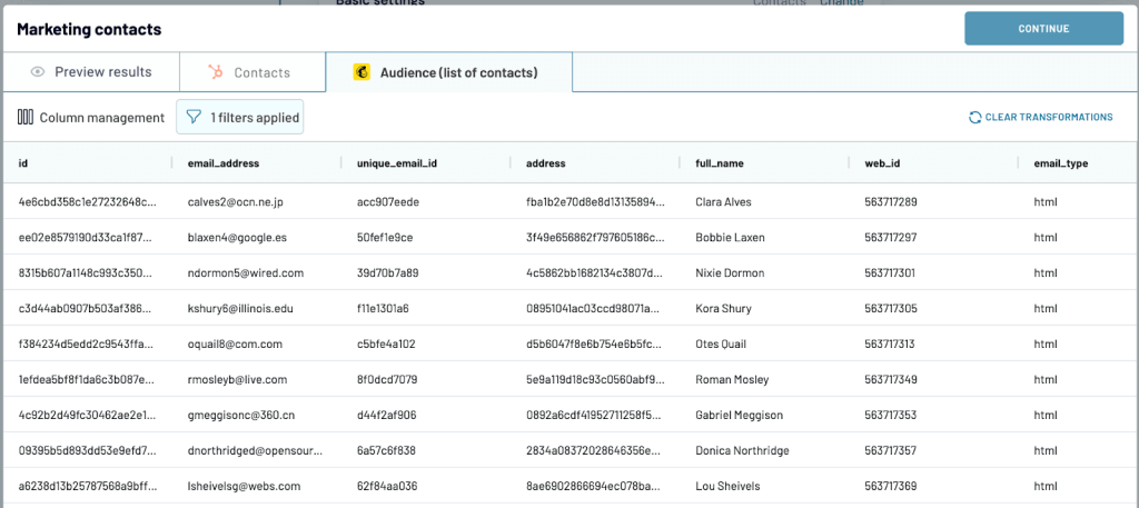
For example, Coupler.io has a handy data stitching feature that enables you to blend data just as you import it from your business apps. You can preview the merged dataset, adjust column names and data types, and even apply filters to only fetch the data relevant to you. Once you’re done, pull it into a spreadsheet, data warehouse, or directly to Looker Studio.
If you’re not comfortable blending or visualizing data on your own, Coupler.io also has a team of data experts who can assist with various data projects, including dashboards, automated workflows, and infrastructure for your data. Learn more about the service and reach out for a free consultation.
Coupler.io’s team of experts are avid Looker Studio users and have extensive experience building dashboards for their own use and clients. Through our experiences, we’ve found that it’s much easier to blend data in apps like BigQuery, Google Sheets, or directly in Coupler.io.
Avoid using too many calculated fields in Looker Studio
One of the features that Looker Studio provides is the ability to create calculated fields also known as Looker Studio formulas. Calculated fields can be useful when you need to perform complex calculations or create custom metrics that are not available in the original data.
However, using too many calculated fields can negatively impact query performance, particularly when dealing with large datasets. The computational overhead of calculating fields at runtime can result in slow query execution times, which can frustrate users and limit the usefulness of your data.
To avoid these issues, it’s important to use calculated fields judiciously and with consideration for the performance of your queries. Whenever possible, it’s a best practice to use pre-aggregated data and derived tables to reduce the computational load on your queries and ensure fast, responsive performance.
Pre-aggregated data is data that has already been computed and stored in a separate table. By using pre-aggregated data, you can significantly reduce the amount of computation needed at query runtime. This results in faster query performance and a more efficient use of system resources.
In Looker Studio Pro, you can use AI to help you create calculated fields. Learn more about this in our blog post where we’ve compared Looker Studio vs Looker Studio Pro.
Use templates to make the dashboard yours
Looker Studio offers a variety of templates that can help you get started on your data visualization journey. These templates are designed to provide a framework for common use cases and can be customized to suit your specific needs. If you’re a beginner and unsure of how to get started on Looker Studio, using templates can be an excellent way to get started. You can explore the template library under the marketing template section, where you’ll find a variety of templates for different use cases, including website traffic, social media, and email marketing. Or look for a collection of templates focused on the app you use – for example, a summary of the best Google Ads Looker Studio templates.
Once you’ve selected a template that fits your use case, you can customize it to suit your specific needs. This includes adding your own data sources, adjusting the layout, and changing the color scheme to match your brand. By using templates, you can save time and effort while still creating a visually appealing and informative report.
Templates can also be useful for teams who need to create consistent reports across different departments or projects. By using a standardized template, you can ensure that all reports have a consistent look and feel, making it easier to compare data and draw insights across different areas of your business.
It can be tempting to add all your charts to a single page in a Looker Studio dashboard, but doing so can lead to a cluttered and confusing display. Spreading related charts out across multiple pages can help reduce complexity and make the data easier to digest for the viewer. It can also help you to organize the data in a more logical and intuitive manner.
For example, you may want to group charts related to website traffic metrics on one page and charts related to user engagement metrics on another page. This will make it easier for users to find and interpret the data they need.
Another benefit of distributing charts across multiple pages is that it allows you to provide more context and explanation for the data. By including descriptive text or other visual elements on each page, you can help users to better understand the significance of the charts and how they relate to one another.
Use interactive features in your dashboards
Embedded links in Looker Studio can contribute to making your dashboard interactive by providing additional context and allowing users to explore related information outside of the dashboard. However, embedding links alone may not be enough to make your dashboard fully interactive. To make your dashboard interactive, it’s recommended to use a combination of tools and techniques such as filters, drill-down functionality, interactive charts and graphs, widgets and buttons, and customization options. These tools enable users to interact with the dashboard by selecting specific data points or ranges, viewing additional details, triggering actions, and customizing the display.
By using a range of interactive features in Looker Studio, you can create a more engaging and useful dashboard that encourages users to explore and gain insights, leading to more informed decision-making and better outcomes.
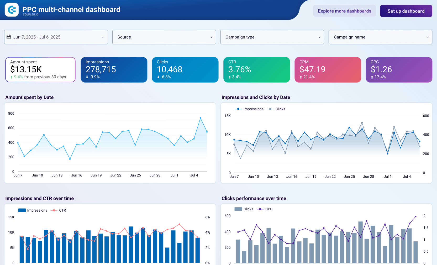
Here’s an example of an interactive dashboard for tracking ad performance that is built into Looker Studio by the Coupler.io team.
Automate scheduling of reports
By scheduling reports to be delivered to stakeholders on a regular basis, you can ensure that data is being delivered in a timely and consistent manner. Looker Studio provides a scheduling feature that allows you to schedule reports to be delivered via email or other channels, such as Slack or Microsoft Teams. Reports can be scheduled daily, weekly, or monthly, and can be customized to include specific data points or visualizations. This can help reduce manual effort and free up time for other tasks.
Implement best practices to achieve maximum value from Looker Studio
While using Looker Studio, it’s crucial to keep best practices for data visualization in mind. Although certain techniques like planning ahead, knowing your audience, using templates, etc are universal, others may be more or less applicable depending on your situation. For small businesses that do not process a lot of data, manipulating data in a spreadsheet, blending data with a tool, etc, may be less beneficial, but they may be very helpful for organizations with a lot of data to process and evaluate.
Give these best practices a try and see how they function for your needs and objectives. They are often simple to adopt. We really hope you find this information useful.