When properly implemented, data visualization has the ability to convey complex information in a way that is easy to understand. While it is true that “a picture is worth a thousand words,” this adage can quickly turn sour if a false image, chart, or graph causes people to draw inaccurate conclusions, make the wrong decisions, and lose trust in a brand or organization.
The unfortunate reality is that misleading data visualizations are widespread, and some brands and companies do this in an attempt to deceive the public.
In this article, we will discuss the impact of misleading data visualization, show some common bad data visualization examples that should be avoided, and then describe how you can avoid these challenges in your own work.
What is considered a misleading data visualization
Take, for instance, company X which provides a graph to indicate how its profits have changed in the period of 5 months.
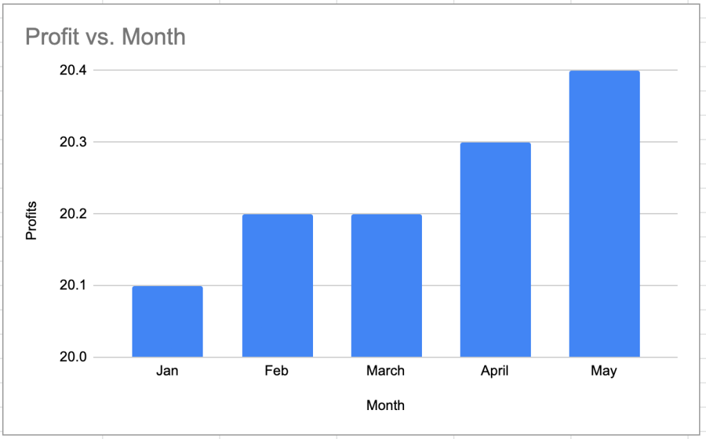
The company’s profits are 20.1M, 20.2M, 20.2M, 20.3M, and 20.4M for the first 5 months respectively. The graph above has the y-axis starting at 20 instead of 0, making this look like there was such a huge profit growth. The increase shows fake rises and can mislead users, stakeholders, and other interested parties, and it may cause them to draw inaccurate conclusions (although, technically speaking, the data shown is correct). This is a good example of a misleading data visualization that might alter people’s perceptions. Now, let’s take a look at the second graph below.
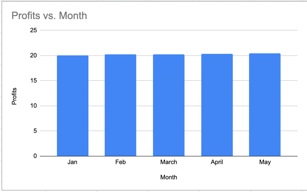
In this second graph, the y-axis starts at 0 and shows that the profit has hardly changed. This graph can be accurately represented like this as it will not exaggerate the data that you want to show.
Graphical ways for displaying information, such as charts, bars, hierarchical diagrams, and others, make it easier to get immediate insights and conduct in-depth analyses of the required data. Wherever we look, we witness the use of data visualization techniques: on billboards, television, the internet, etc.
Unfortunately, there are some individuals who deliberately try to fabricate data in their visualization. However, in some cases, misleading data visualizations arise from mistakes or a lack of knowledge on how data should be presented. Even if the layout is attractive and well-thought-out, there is a possibility that the information may not be communicated properly. As a result, it is really important to be aware of any biases that may be present in the data visualization and to be able to critically evaluate any data visualizations before drawing any conclusions based on them.
Misleading data visualization examples – things to avoid
Looking at bad data visualization examples is the best way to learn from them and avoid including their flaws in your own product’s data visualization. We have compiled a list of the most typical examples of misleading data visualization. The following examples illustrate the kinds of things you should aim to avoid. By understanding and being aware of this, you’ll be able to spot instances when the data display is intentionally misleading.
1. Overloading viewers with too many variables
There has to be a happy medium between giving viewers just enough information and giving them too much information when it comes to data visualization. If your dashboard is jam-packed with too many charts or graphs, viewers may get overwhelmed.
For example, when building a dashboard, It’s not a good idea to have pie charts all over your reports and plenty of descriptive text. This could give the impression that you’ve effectively managed the ever-increasing volume of data when, in fact, you haven’t.
Image source.
Careful thought and prioritization of the visualization to include in your dashboard is something that should be taken into consideration. You can use different visualization techniques for the different metrics you want to represent on your dashboards to make them more readable. Below is an example of a custom dashboard built by the data analysis team at Coupler.io – the data analytics and automation platform used by 24,000+ companies around the world.
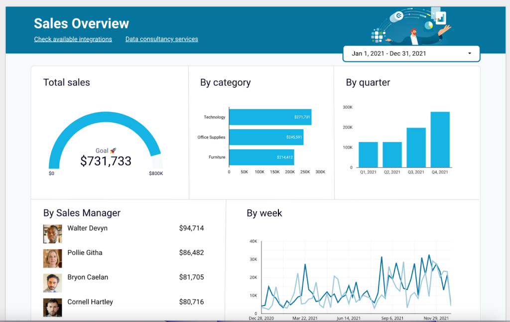
Here, we can see the prioritization of important variables and the use of different visualization methods that makes the sales overview dashboard readable and not overcrowded. When data is shown in context and has clear labels, viewers can understand it better.
If you struggle with visualizing your data or deriving insights from it in the first place, Coupler.io provides you with the opportunity to hire experienced data analytics to build a custom solution for you. It could be a custom dashboard for your company built into the visualization tool of your choice. We can also help with data infrastructure, setting up automated data flows, and much more. Get in touch to schedule a free consultation.
2. Truncating y-axis in graphs
A very common misleading data visualization example is changing the value of the y-axis’s starting point from zero to any other number. This blows up the differences when comparing data. Let’s have a look at the graph below to see how a truncated graph might distort data.
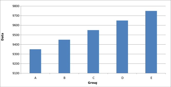
Image source.
From the graph above, all data is in the 9300-9800 range on the y-axis and this tends to show an exaggerated growth. This data can be much more accurately presented in this way:
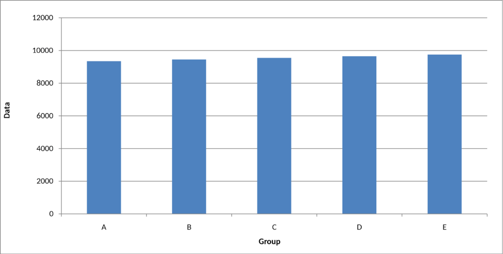
Now we can see that the differences between the data of the different groups are small. This is a more accurate picture of the differences and a fair way to present the information.
3. Extending labels on the y-axis
Extending labels on the y-axis is an example of misleading data visualization It can hide the trends we’re trying to show, which can alter the magnitude of a change. In the graph below, we can see the average yearly global temperature from 1880 to 2015.
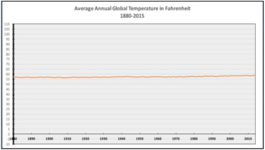
Image source.
This graph is based on NASA data and it displays annual average temperatures dating back to 1880. The issue with this graph is that putting data on the extended y-axis makes it impossible to spot how temperature really changes over the years. This is a common misleading data visualization example. Now, let’s take a look at the second graph.
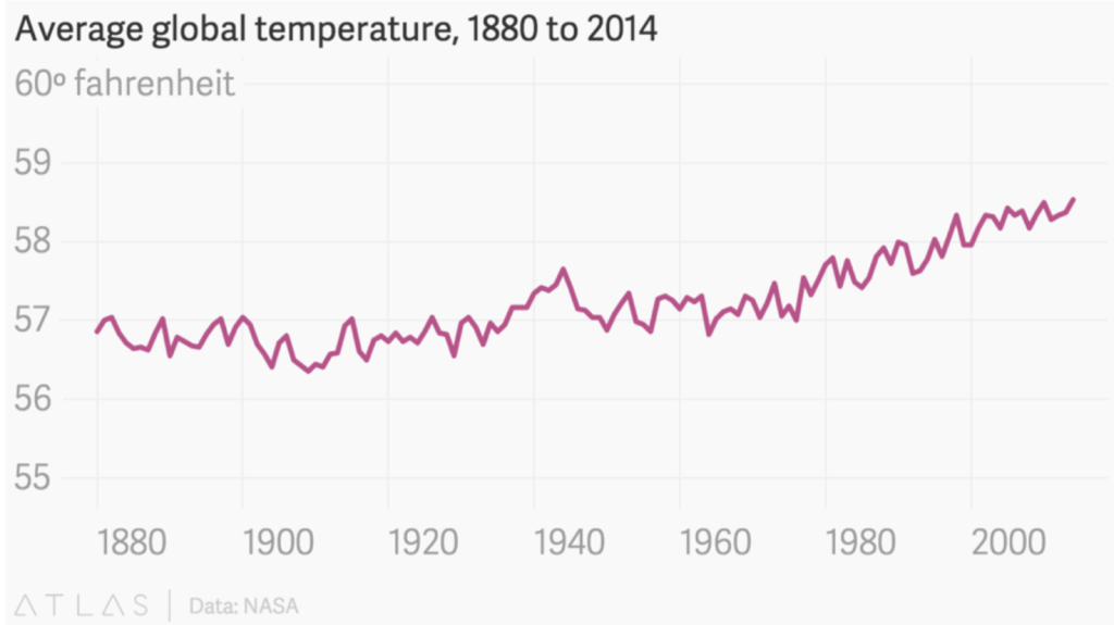
Image source.
The graph above demonstrates how, during the same period of time, average temperatures all around the globe have been gradually increasing. This fits nicely with the predictions of the planet’s warming made by scientific models. There is, of course, no use in displaying temperature labels that range from -110 to 110 degrees because the average temperature in the recorded period never went below 56 and above 59 degrees Fahrenheit.
4. Exaggerated or improper scaling
Some people like to use images (pictograms) in their charts to make the visualizations more interesting to the eye. This can look appealing but, if not done properly can be a bit misleading. Consistent scaling is required for pictorial bar graphs. When the scale is off, it’s simple to mislead the audience. Let’s take a look at the graph below:
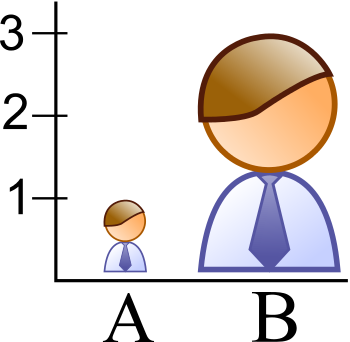
Image source.
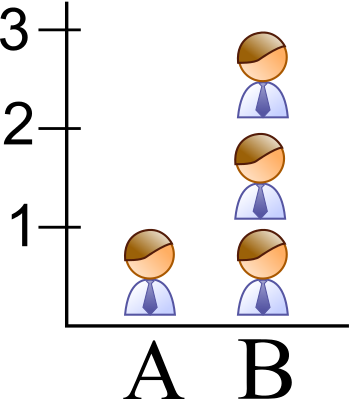
While glancing at the picture on the graphs above, it is difficult to read the data correctly. While the value for column B is indeed 3 times higher than for A, the size of the pictogram makes it look like the difference is much bigger. This graph can be better represented by using a bar chart which is common and easier to read, or by stacking the images on each other as seen below
5. Improper extraction – Cherry Picking
By selecting just certain pieces of information to back up an argument rather than the whole body of evidence, cherry-picking creates the false impression that the story being told is more credible than it really is. Most of the time, details that should have been in the graph are knowingly omitted.
The graph below is a good misleading data visualization example. This graph shows the average global temperature from 1997 to 2012. The goal of this graph is to prove that global warming is not happening.
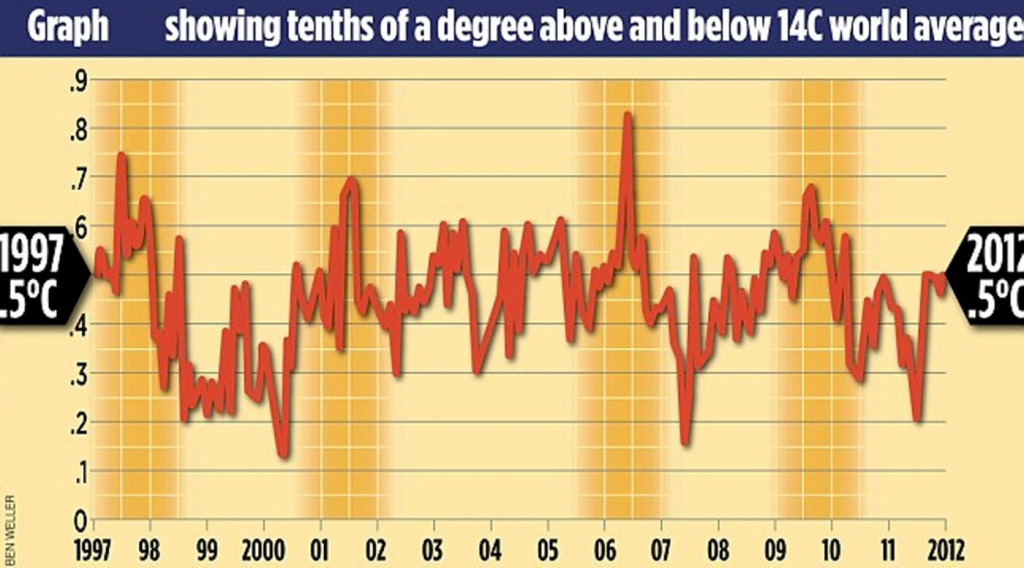
Image source.
Interestingly, the graph suggests that the temperature has been quite stable. In constructing this graph, the authors paid little attention to the 100 years before the time period in question; instead, they focused only on events that gave credence to their claims. Just a small fraction of the information was utilized, so it’s easy to understand how it may mislead readers. Below is how this graph should have been presented:
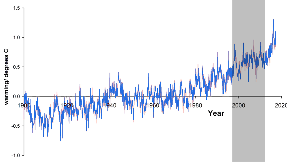
The following chart shows the average temperatures from 1900 to 2020, showing a clear increase in global temperatures.
6. Going against the norm – unusual coloring
Good outcomes (earnings, victories, gains, etc.) are typically associated with the color green, while bad outcomes (losses, etc.) are always associated with the color red. If you deviate from these standard procedures, you increase the likelihood of creating misunderstanding and maybe even intentional distortions of the facts.
Here’s a chart that shows the state-by-state gains and losses. From this chart, using the color red at first glance makes it look like the states are running at a loss which is not the case. A closer look at the graph you’ll see that the states with the red color do not have negative numbers, while the states with the green color have negative numbers.
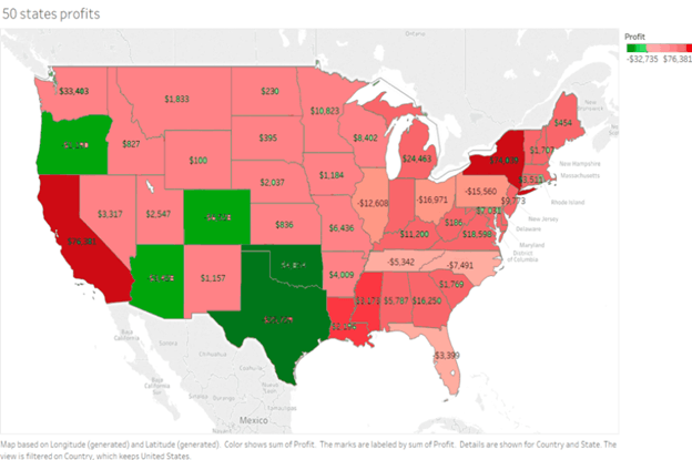
This is a not-too-common misleading data visualization example but it happens every now and then. Let’s observe the second graph below.
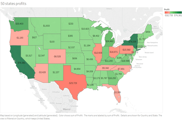
Using the color green makes it easy to observe that the number of profitable states far outweighs the number of those losing money. Looking at the graph, the states with green don’t have negative numbers, while the states with red have negative numbers. We can see that changing standards such as color or order can have a significant impact on how that information is perceived. Data visualizations are meant to swiftly relay information. So stick to the norms to keep things simple.
To make this chart truly meaningful, you can rework the color schema because there’s so much green on the chart that it’s hard to tell the difference between the green states. Typically, you can calculate, for example, the average for all states, and then everything above would be green, everything below red, and of course, the further from the average, the more intense the color.
7. 3D graphs pie chart
A pie chart should always add up to 100%. However, making a pie chart 3D or adding a slant will make interpretation difficult due to the distorted effect of perspective.
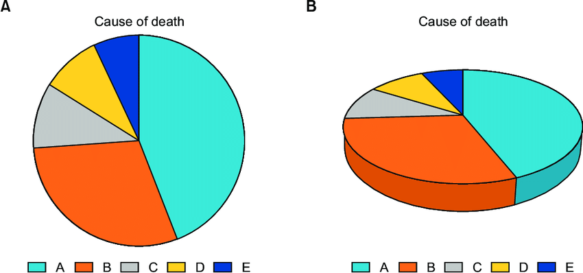
Image source.
On the right-most chart, the A and B values look much bigger than they actually are. This is because values visually closer to the viewer will always appear oversized. This shows how common it is for 3D pie charts to misrepresent angles. 3D pie charts have a tendency to throw off proportions and make things appear larger or smaller depending on their angle; therefore, it’s better to avoid using it.
Impact of misleading data visualization
Misleading data visualization might lead to erroneous conclusions and poor business choices that may not be in the best interest of the company and that may have effects on your business. The following are some of the impacts of misleading data visualization:
- Lead to poor choices based on false information: A distorted and erroneous graph or dashboard of your advertising efforts and yearly income might lead to your company wasting a lot of money marketing in an area where there aren’t enough potential customers to purchase your product or service. While it might be a time-consuming process to build a graph or dashboard that contains the right visuals to properly analyze your advertising goals, you can opt to hire a professional to do it. At Coupler.io we have experts that are able to design custom dashboards for users, which will display the relevant factors, variables, and data in order to assist you in making informed decisions about your business.

Automate data export with Coupler.io
Get started for free- Loss of growth opportunities: When you use misleading data for your business needs, it may be difficult to identify problem areas and find ways to improve them. For example, some marketing methods may not generate the results you want but you may not know this due to the misleading data affecting your understanding. This will result in you wasting money and resources on marketing methods that are futile.
- Lose the trust of co-workers: Using misleading visualization during a presentation for your team will raise more questions than give answers. This might cause them to lose trust in you because you are always presenting them with misleading data.
- Miss out on trends: Using incorrect ways to visualize your data can lead you to draw false conclusions, which can result in your business missing out on some trends in the industry that could have been crucial to the growth of the business.
- Compliance issues: Charts and graphs that have been produced incorrectly might, in the most severe of circumstances, cause compliance and legal problems. This may have an influence on your company, lead to more financial outlays on your side, and dissuade clients from continuing to attend your place of business.
Avoiding misleading data visualization for better decisions
It is very important to avoid misleading data visualizations if you want to be able to make better decisions based on reliable sources of information. By not truncating the y-axis in your graph, overloading your viewers with an excessive amount of information, cherry-picking, using improper scaling, etc., you’ll be able to construct visualizations that are both useful and trustworthy.
When judging data visualizations, it’s important to always be on the lookout and have a critical mind. This is especially true when the visualizations are meant to promote or push a certain story.