
Google Data Studio, also known as Looker Studio, is a free data visualization tool for building reports and dashboards. It’s easy to use, but it can be challenging to learn if you’re just starting out. That’s why I created this Google Data Studio tutorial to help you learn the basics of Looker Studio and get answers to lots of how-tos.
You will see how connectors work, how to write a calculated field, how to share the finished report, and how to build a dashboard from scratch with a few different visualizations. Coupler.io will help with data source connections and Data Studio templates, where relevant, to enhance the capabilities of this popular data visualization tool.
If you prefer watching to reading, check out our Looker Studio video tutorial for beginners.

What is Google Data Studio (formerly Looker Studio)?
Google built Data Studio for people who need a report without needing a data team behind them. The tool is cloud-based, so it works anywhere you have a browser and an internet connection. You don’t need to install anything, write code, or learn SQL.
Is Data Studio the same as Looker Studio?
Google released the tool as Data Studio in 2016 and renamed it Looker Studio in October 2022. Then in April 2026, the name Data Studio came back 😀
The old name will take a while to disappear, though. You’ll still find “Looker Studio” in Google’s own help pages, community threads, and most YouTube tutorials.
Is Data Studio free?
Yes, completely. You can build reports, share them, and use the tool for client work without paying anything.
There’s also a premium version called Data Studio Pro. It adds enhanced enterprise capabilities and technical support for $9 per user per project per month.
Check out our blog post where we’ve compared Looker Studio vs Looker Studio Pro.
Data Studio alternatives
The main alternatives or competitors are business intelligence tools like Tableau and Power BI. For a broader view, our guide to BI for marketing weighs up the main options for marketing teams.
Check out the comparison of Tableau vs. Looker Studio.
Data Studio templates
You don’t have to start from a blank page. The tool includes a library of pre-built templates in Data Studio, so you can have a full dashboard on screen in two minutes and reshape it to fit your data.

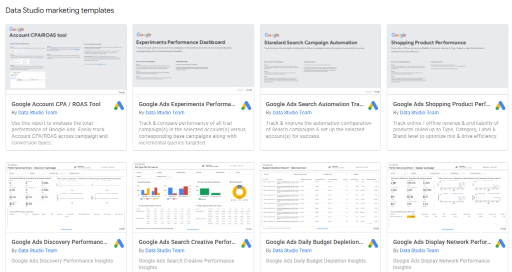
Check out our selection of Looker Studio dashboard examples.
What’s the difference between Looker and Data Studio (Looker Studio)?
Both are Google products, but they serve different purposes.
While Data Studio (Looker Studio) is a reporting and visualization tool, Looker is Google’s business intelligence platform for large companies. Looker adds a layer on top of your warehouse where your data team defines what each number means, in a language called LookML. With each metric defined once, every team in the company sees the same numbers.
| Data Studio (Looker Studio) | Looker | |
| What it’s for | Self-service reports and dashboards | Company-wide business intelligence |
| Cost | Free, with a paid Pro tier | Enterprise pricing, not published |
| Connects to | Google apps, spreadsheets, and partner connectors | Your data warehouse, like BigQuery |
| Best for | One person, or a small to medium-sized team | Large organizations |
Neither product sits inside the other, but they do connect. Data Studio can pull already-approved data from Looker. You can also build and edit Data Studio reports inside Looker itself. Companies with both usually let Looker define the numbers and Data Studio show them.
In my humble opinion, many users confusing the names Looker and Looker Studio led to the brand name rollback in 2026. Otherwise, why else would they need to turn Data Studio into Looker Studio and then back to Data Studio 😀
How to use Data Studio (Looker Studio)
To start using Google Data Studio for reporting and analytics, you’ll need to sign in with your Google account (you can create it for free if you don’t already have one).
After successfully signing in, head on over to https://datastudio.google.com/. You’ll see the following home screen, which is your launchpad into the world of Looker Studio:

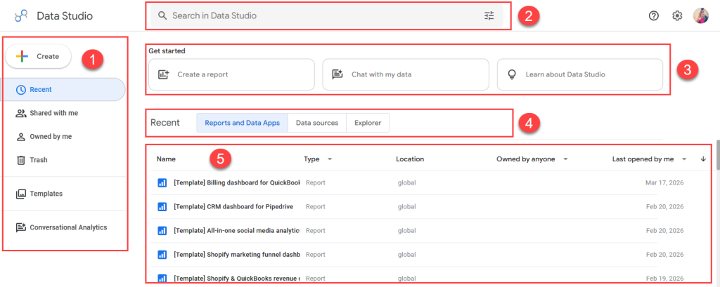
Before creating your first dashboard, let’s get familiar with Looker Studio’s interface. The home page has these key parts:
- The navigation panel on the left gives you a quick way to:
- Create a new report or data source.
- Reopen whatever you’ve used recently.
- Find reports shared with you by other people.
- See everything owned by you, including copies you’ve made.
- Check the trash for anything you deleted.
- Browse templates, a gallery of ready-made dashboards.
- Open Conversational Analytics to ask plain-language questions about BigQuery data and data agents.
2. The search bar lets you:
- Find a report or data source by typing part of its name.
- Open the filter icon on the right for more control. You can narrow the search by other criteria like type, owner, or date modified.
3. Get started offers three shortcuts:
- Create a report opens a blank canvas.
- Chat with my data opens Conversational Analytics.
- Learn about Data Studio takes you to Google’s own help material.
4. The home page tabs let you:
- Access all of your reports and data apps.
- See all the data sources you’ve created.
- Open anything in Explorer, which sits outside any report.
5. The item list sits below the tabs and changes with whichever tab you’ve clicked. On the Reports and Data Apps tab, for example, it shows the name, type, location, owner, and last opened date.
Data Studio: Data sources and connectors
Every report starts with a data source. It’s important to note that data sources are not your original data. To clarify and avoid confusion, see the explanation below:
- A dataset is the original data, such as data in a Google Sheets spreadsheet, MySQL database, LinkedIn, YouTube, or data stored in other platforms and services.
- To link a report to the dataset, you need a data connector to create a data source.
- The data source stores your connection credentials. And it keeps track of all the fields that are part of that connection.
- You can use Looker Studio with multiple data sources connected to a dataset, which can come in handy when collaborating with different team members. For example, you may want to share data sources with different connection capabilities for different team members.
When Data Studio was first released, there were only six Google-based data sources you could connect to. But a lot has changed since then.
Today, there are more than 20 native connectors, built and maintained by Google, and they’re free. These cover Google Ads, Analytics, Search Console, Sheets, and BigQuery, among others. We walked through one of them in the blog post BigQuery to Looker Studio.
Partner connectors pull data from both Google and non-Google apps and sources. That includes LinkedIn, PayPal, Facebook, X, HubSpot, and many more. Most are paid. Currently, there are more than 1,400, and Coupler.io is one of them. However, it’s not limited to one or a couple of sources. Its Data Studio connector brings your marketing, sales, and finance data from over 400 apps into Data Studio.
Connect 400+ data sources to Data Studio with one connector

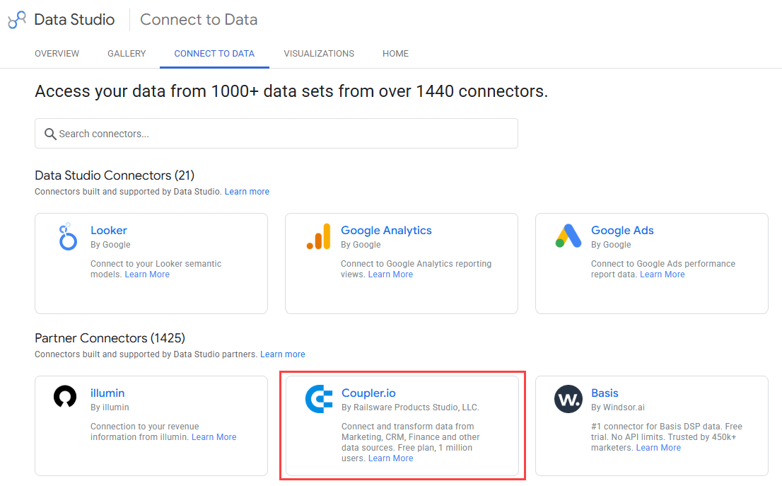
Connect 400+ data sources to Data Studio with one connector
Try Coupler.io for freeYou can see the full list of available connectors here or check out our list of the best 12 Looker Studio connectors.
Data Studio: Metrics and dimensions
In Data Studio, you’ll need metrics and dimensions to create a meaningful report. Your dataset must have at least one of them for your visualization to be insightful.
So, what are the metrics and dimensions in Data Studio?
Metrics are numeric values that measure or count. These values come from implicitly or explicitly applying an aggregation function, such as COUNT(), SUM(), AVG(), etc.
For a product sales report, your metrics might be:
- Sales revenue from selling your product online
- Number of customers who purchased your products
- Highest sales
- Lowest sales
- Average product price
Dimensions are the names, descriptions, or other characteristics of the things you are measuring or counting. There are many different ways to look at your metrics. And with dimensions, you can analyze your data from different angles.
Try breaking down your metrics to see if there is anything else you need to know by using phrases like “broken down by”, “per”, “for each”, etc.
See the text in bold in the following list for examples of dimensions:
- Sales revenue from selling your products online, broken down into sales per month or per order type
- Number of customers by country of origin, as well as understanding their age, gender, and type of device they use
- The name of the product with the maximum sales
- The day of the week with the minimum sales
- Average product price per product type
Before you create a report in Data Studio
Planning is essential to everything.
A little planning saves time. Before you build a report in Data Studio, get your dataset ready and sketch out the layout. This includes deciding which metrics matter and how to show them, whether as columns, rows, or charts.
Prepare your dataset
Data Studio focuses more on data visualization than data transformation. So, make sure your dataset is ready for analysis before loading it. You may need to clean your dataset, remove duplicates, add columns, and so on.
Identify what data you need and where it lives. For example:
- A sales report might come from Shopify and Stripe.
- A marketing report might need Google Ads, Facebook Ads, and Google Analytics 4.
With the Coupler.io Data Studio connector, you can import data from any of those and get your dataset ready for visualization. The connector allows you to combine several sources into one view, aggregate records, fix data types, drop unused columns, and apply other transformations. Moreover, you can simply ask the built-in Coupler AI Agent to prepare the dataset for you!
Let Coupler AI do the data work for you
Tell Coupler AI what you need to know, from which source, and how often. It connects your account, sets up the data flow, keeps it refreshed, and lets you analyze the results inside Coupler.io or another AI tool.
Try for free

Data Studio can do light work once the data is in. You can rename fields and add calculated ones, and both come up later in this tutorial. It isn’t built for heavier transformation, though, so the tidier your data is when it loads, the less work you’ll have later.
Prepare the report layout
Take some time to design the layout of your report before you start building it. Your design doesn’t need to be detailed, but decide three things before you open the tool:
- What information you’re going to present
- Which metrics belong on it
- Which Data Studio charts show each metric best
A rough sketch using a pen and paper is better than nothing. That will help you avoid staring at a blank report for too long.
Ask the people who will read the report what they want to see. Their answers are usually simpler than you expect. A good report gives them easy-to-digest information on key metrics so they can tell whether issues need attention.
How you can create a data source in Data Studio
If you want to follow along with my tutorial, I’ve prepared a spreadsheet of online sales data for you. Or, if you’d like to use your own file or data sources, go ahead. Open the Data Studio home page and follow the steps below:
- Start by adding a new data source by clicking on the Create button, then select Data source from the menu.
Note: If you already have an existing report, you can also add a data source directly from it by clicking Add data in the report toolbar. We’ll cover more about the report toolbar later in this article.

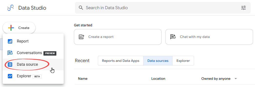
- The first time you use Data Studio, a pop-up asks you to complete your account setup. Just follow the instructions, like entering your country and company name, and accepting the terms. If you’ve used Data Studio before, you won’t see this.
- On the data source list page, select the needed connector to load your dataset into Data Studio.
Create a data source in Data Studio using a native Google connector
As my sample file is a Google Sheet, I’ll use the Google Sheets connector, which Google builds and maintains. Follow the steps below.

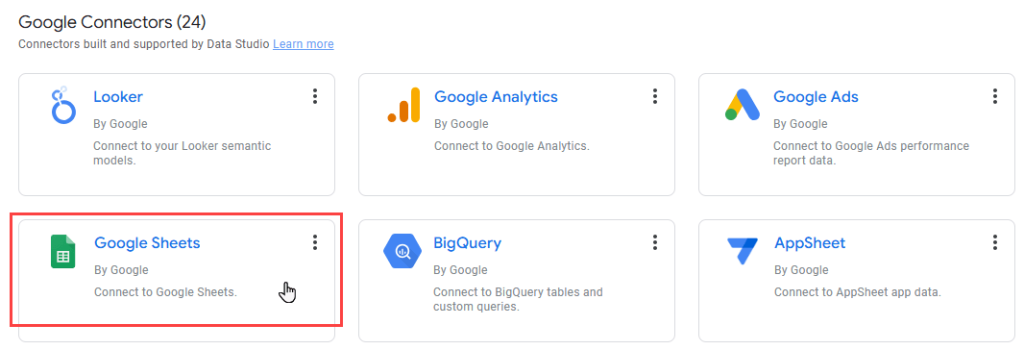
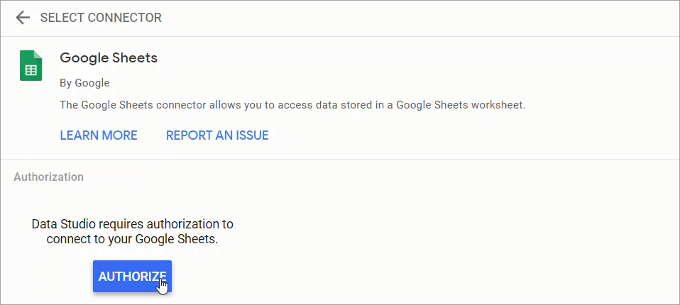
The first time you use this connector, you’ll need to authorize it. Click AUTHORIZE and approve the access request.

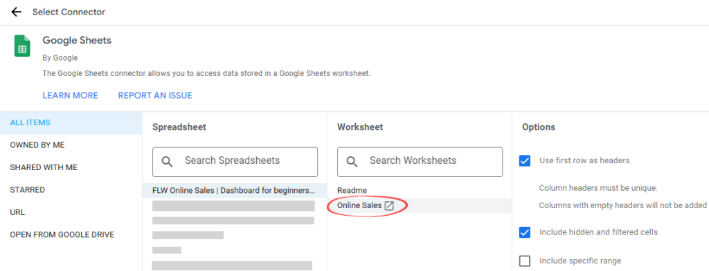
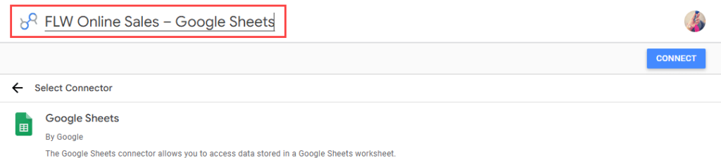
- Select the FLW Online Sales spreadsheet file you copied before. Then, in the third column, select the Online Sales sheet (the second sheet).

- Give your data source a name – for example, FLW Online Sales – Google Sheets. Adding the source name at the end makes it easier to identify that it uses the Google Sheets connector. If everything looks OK, click the CONNECT button in the top-right corner.

After you have successfully set up the connection, the fields in your data source page will look like this:

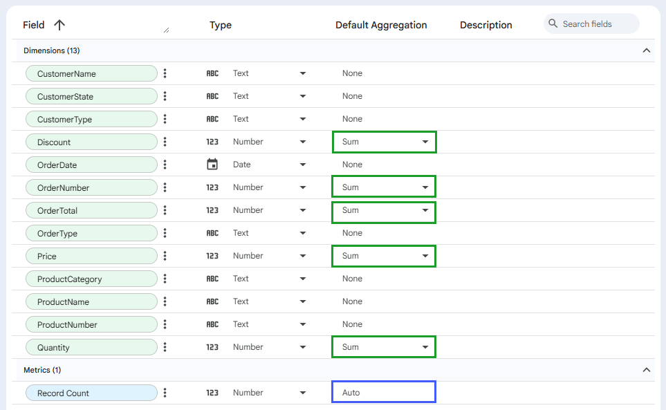
Notice that, by default:
- Data Studio creates one standard metric called Record Count. Metrics are always blue and use an aggregation of Auto, which you can’t change.
- Every field from your spreadsheet arrives green, meaning Data Studio treats it as a dimension. You can still use any dimension as a metric in a chart.
- Some dimensions get a default aggregation of Sum. When you use those as metrics, Data Studio builds the metric on the fly using that aggregation.
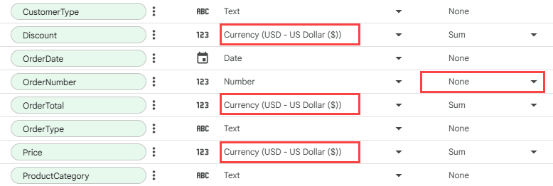
You can change a field’s data type and default aggregation yourself using the two dropdowns on its row.
OrderNumber is a good example. Since adding up order numbers tells you nothing useful, set its aggregation to None. You may also notice that fields formatted as Currency in Google Sheets arrive as Number, which you can fix to Currency.

Create a data source using Coupler.io connector for Data Studio
Your real data probably lives in apps that Google’s native connectors don’t reach. Coupler.io supports over 400 Data Studio integrations and other destinations, including spreadsheets, other BI tools, data warehouses, and even AI.
In addition to the ready-to-use integrations, you can create custom ones. Read how to connect API to Looker Studio.
Try it out right away. Choose your app or software from the drop-down below and in the form below and get started for free (no credit card required).

Then complete three simple steps to connect data to Looker Studio:
1. Authorize your source app and specify the dataset to load. This may include spreadsheets, tables, metrics, reports, and so on, depending on your source application.
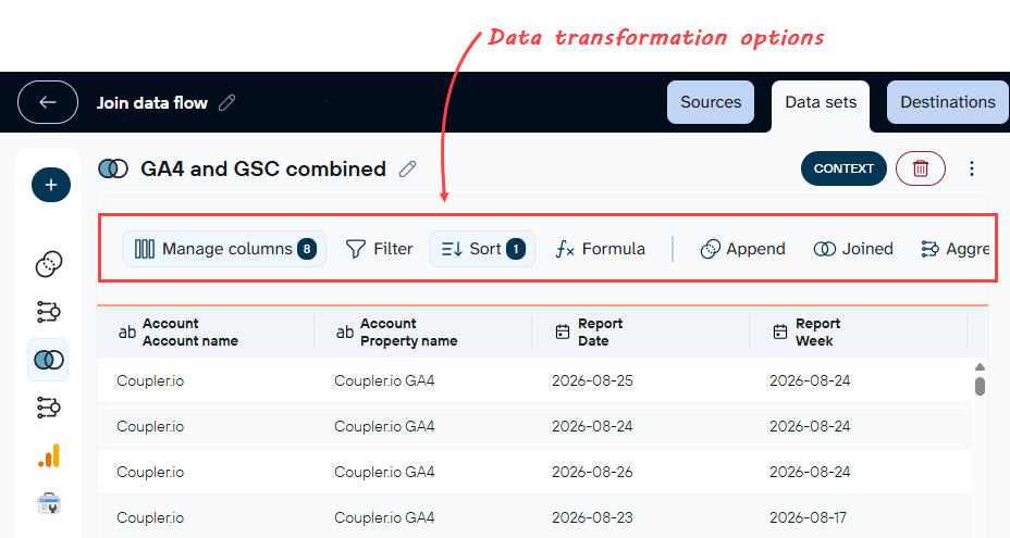
2. Organize and transform your dataset before loading it to Data Studio. You can filter and sort data, change, hide, and add columns. Moreover, Coupler.io allows you to consolidate data from multiple sources into one view.

3. In the Destinations tab, click Generate data source, and you’ll be taken to Data Studio. Follow the instructions there to authorize Coupler.io’s Data Studio connector and load your data into the newly created data source.

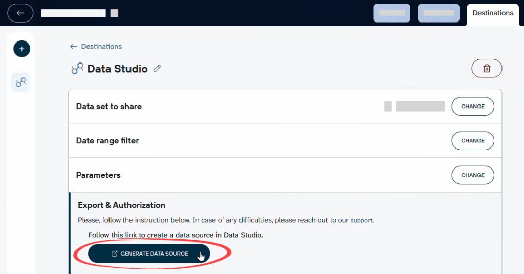
Your Coupler.io data source is now ready. To keep the data fresh, go back to Coupler.io and set a refresh schedule. It can run as often as every 15 minutes, so your dashboard updates itself while you do something else.
The steps above are the manual route. As I said above, you can describe what you need in plain language using the Coupler AI Agent, and it will set up the data flow for you.
- Set up data flows for you. Type a request such as “Pull last quarter’s Facebook Ads into Data Studio,” and the agent picks the source, sets up the fields, and connects the destination. It only asks you questions when it needs more detail.
- Answer questions about your data. Ask something like “Which campaign had the lowest cost per click last month?” and you get an answer straight away, without building a chart first.


Get chart-ready datasets from 400+ sources in Data Studio with Coupler.io
Get started for freeBuild a report in Data Studio from scratch
Now that I’ve covered some basics in the previous chapters, let’s see how you can use Looker Studio visualization to create a simple sales report like this:

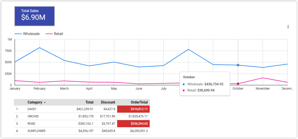
The report will help viewers understand the total sales and its trend over time. It will also show a simple indicator to show which product categories have low or high sales.
For visualization, I’ll be using the following options:
- A scorecard for total sales.
- A line chart for monthly sales split by order type.
- A table for sales by product category.
You’ll learn how to format the table using conditional formatting so you can quickly see which values are low in sales, as well as how to add calculated fields.
How to create your first blank report in Data Studio
You can start a report from the home page using the Create button, which then asks you to add data using Google or partner data connectors. I’ve already done that part, so let’s carry on from the data source page instead.
- On the data source page, click CREATE REPORT in the top-right corner.

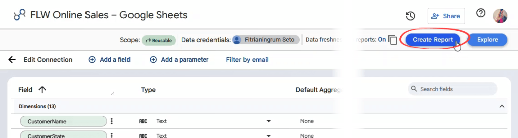
- The report editor opens on a blank canvas with your data source already attached. Rename your report title by clicking Untitled Report. Type a new title – for example, Online Sales – Dashboard.


The report editor tools
You may feel that the tools look quite intimidating at first glance. Don’t worry. I’ll briefly review the main areas of this interface.
Please keep in mind that, in this Data Studio tutorial for beginners, I won’t use every function mentioned below.
The top section on the right contains high-level functions for your report

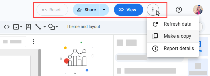
- Reset puts the report back to its default view, clearing any filters or date ranges you’ve changed. It stays grayed out until there’s something to reset.
- Share invites people to your report. The arrow beside it opens a dropdown to share your report in several different ways.
- View switches between Edit mode and View mode. In View mode, the button becomes Edit and shows a pencil. You’ll switch between these two often.
- The three-dot menu lets you refresh your data, make a copy of the report, or open the report details.
Under the menu, you’ll find the editing toolbar. Many of the menu options are also available when you right-click on the report elements. As of this writing, the toolbar has the following functions, from left to right:


- Undo and Redo: Ctrl+Z and Ctrl+Y also work , or Command+Z and Command+Shift+Z on a Mac.
- Selection mode: This pointer icon allows you to select a chart or other elements in your canvas. When you select an element, a configuration tab will open on the right side.
- Zoom: Zoom the canvas in or out.
- Add page: Reports can have as many pages as you need.
- Add data: Set up or add data sources for this report.
- Blend: Combine data from up to five data sources, so you can chart them together.
- Add a chart: It shows all the charts available to be added to your report.
- Community visualizations and components: Third-party charts built by other people.
- Add a control: Drop-downs, sliders, checkboxes, date ranges, and more, so viewers can filter the report themselves.
- URL Embed: To embed a video or another document inside your report.
- Image: To insert an image from your computer or by URL.
- Text: A text box.
- Line: To draw simple lines, with arrows and curves.
- Shape: To insert basic shapes, such as rectangles and circles.
- Theme and layout: Opens a panel on the right for changing the look and feel of your report.
The theme and layout panel
When you click Theme and layout in the toolbar, a panel opens on the right with two tabs:

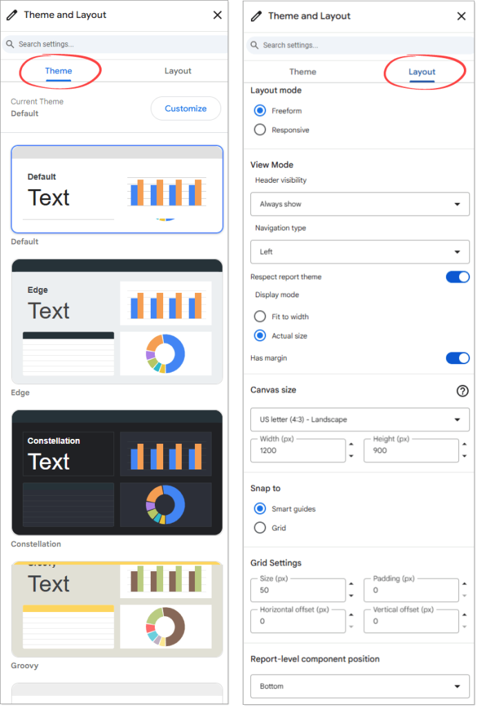
The Theme tab holds a set of ready-made looks. If you want a dark background, try Constellation, Lagoon, or Simple Dark. Picking a theme saves a lot of fiddling with individual colors.
The Layout tab controls how the report behaves in View mode, along with page size, orientation, and grid settings. We recommend experimenting with each option to see what works best for you.
Now for the fun part.
How to add a scorecard in Data Studio
A scorecard is a great start as it’s like choosing a headline. To add a scorecard that shows the total sales to your report:
- Click Add a chart icon in the toolbar, then select Scorecard.

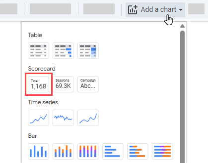
- Drag the scorecard where you want it (ideally in the top-left corner of the report). The scorecard arrives showing the default metric: Record Count.

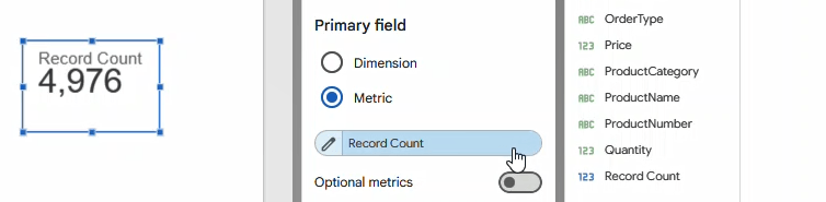
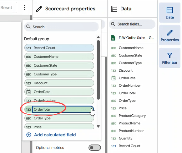
- Click that metric and change it to OrderTotal.

- Hover over the metric until a pencil icon appears. Click it and rename the metric to Total Sales. Then, click anywhere outside the pop-up to close it. Your scorecard should now read Total Sales.

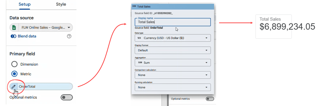
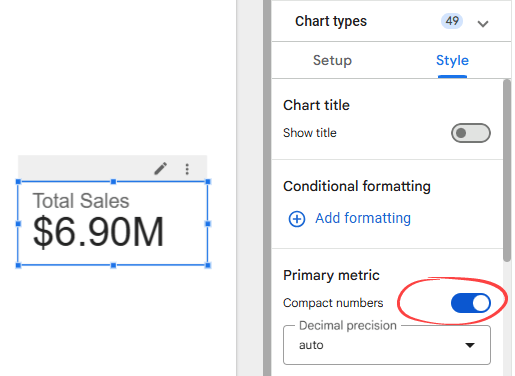
- Since the number looks too long, customize the scorecard to display a compact number. Open the Style tab on the right, and under Primary metric, switch on the Compact numbers toggle.

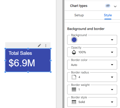
In this Style tab, you can also change other aspects of your chart, such as decimal precision, background color, border color, font, and more.

Scorecards can also be stacked into a funnel. Data Studio has a native funnel chart too, but arranging scorecards by hand gives you more control over the layout. Our guide to Looker Studio funnel visualization walks through the scorecard and a few other options.
How to add a line chart in Data Studio
You have two options for showing sales over time: a basic line chart or a time series. A time series is the better fit here because it understands dates on its own and saves you a couple of steps.
- Click Add a chart icon in the toolbar, then select Time series chart.
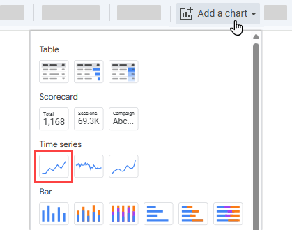
- Drag the time series under the scorecard and resize it as needed. In the Setup tab, find Breakdown dimension. Click Add dimension and choose OrderType. Note: You can also drag and drop a field straight from the Data panel into the Breakdown dimension slot.

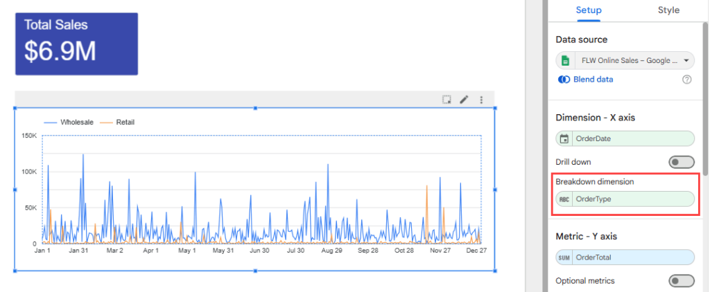
You now have two lines, wholesale and retail. It looks noisy because the chart is plotting every single day.
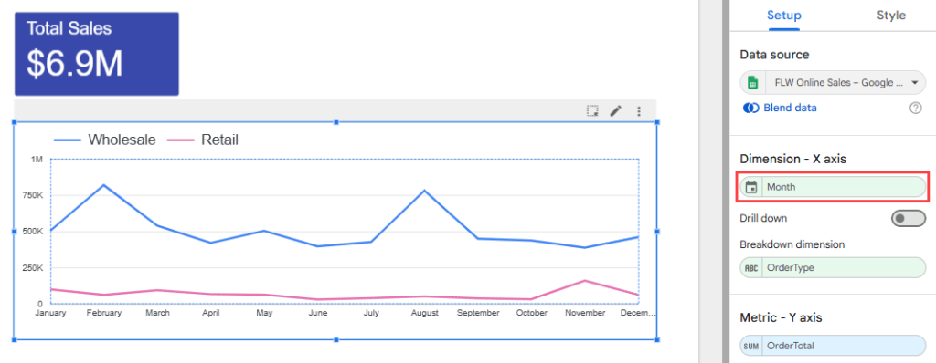
- Hover over the OrderDate dimension, then click the pencil icon. Change the field’s data type to Month and name it “Month”.

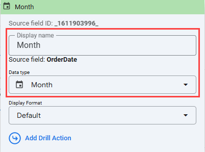
Changing a field’s type inside a chart doesn’t change it in the data source. Keep a full Date or Date and Time field in your data source and adjust it per chart when you need to.
- When done, close the pop-up by clicking anywhere outside it. See that the x-axis of your chart now displays the month names.

How to add a table in Data Studio
To add a table that shows the sales per product category:
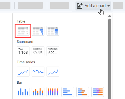
- Click Add a chart icon in the toolbar, then select Table.
- Drag ProductCategory into Dimension, replacing OrderType.

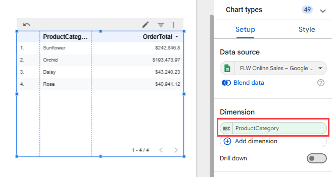
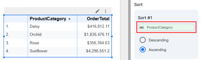
- To make the table nicer, resize the table as needed. If you like, sort the table based on ProductCategory. Scroll down the Setup tab, change the sort field to ProductCategory and select the sort method: ascending or descending.

How to add calculated fields with functions and formula examples in Google Data Studio
Now, what if you want to display the total price before the discount? And also display the product categories in uppercase letters? It’s time to create Looker Studio calculated fields.
You can add a calculated field in either the data source or a chart using Looker Studio formulas. When you add the field to the data source, it will be available in any report that uses the data source.
How to add a calculated field in the data source
Follow the steps below to add a Total field that multiplies price by quantity:
- In the Data panel on the right of your report, click Add a field at the bottom of the field list. Or use the data source page by clicking the Add a field button.

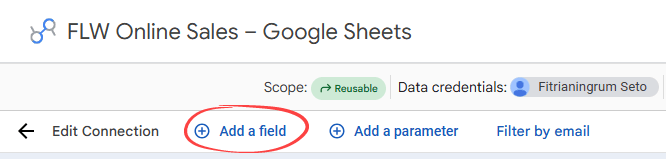
Or click the ADD A FIELD button if you open the data source separately.


- Choose Add calculated field and name the field Total. In the Formula box, type this formula:
Quantity * Price

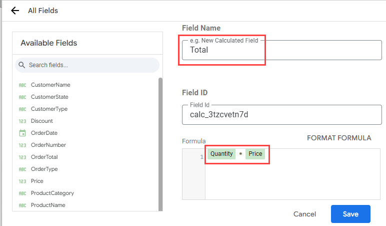
- Click All Fields in the top left to return to the field list.


- Find Total in the list. Change its type to Currency and its default aggregation to Sum.

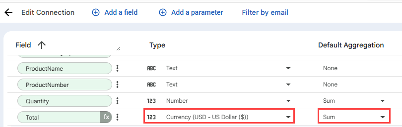
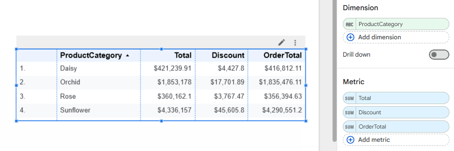
- Click Done to close the field editor and return to your report. Select your table. In the Setup tab, click Add metric in the Metric area and choose Total. Do the same for Discount, so now the table has three metrics. Drag them into this order: Total, Discount, OrderTotal. The table now reads from the price before discount, through the discount, to what the customer paid.

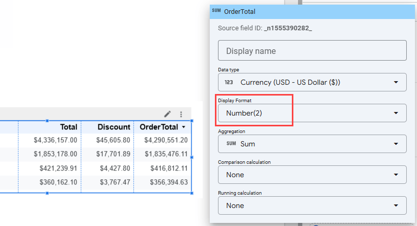
The three columns show decimals inconsistently, so set them to match. In the Setup tab, click the Total metric, and under Display Format, choose Number(2). Repeat for Discount and OrderTotal, and every value will show two decimal places.

How to add a calculated field in a chart
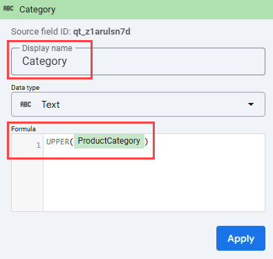
Let’s see another way to add a new calculated field. I’ll add a field Category in the chart to display product categories in uppercase letters. To do this, we’ll use a text function: UPPER.
A field added this way lives in that one chart only. It won’t appear in other charts in the same report.
- Select your table, then click the ProductCategory dimension in the Setup tab. A field list opens. At the bottom, click Add calculated field.

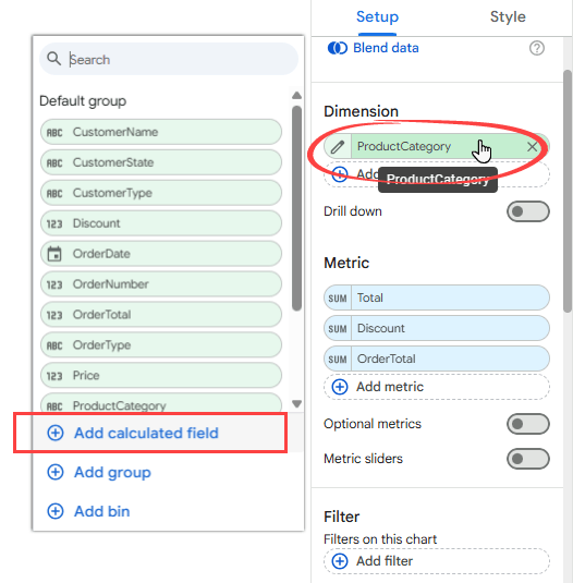
- Set the Display name to Category and enter the formula
UPPER(ProductCategory)in the Formula box. Leave the data type as Text, then click Apply.

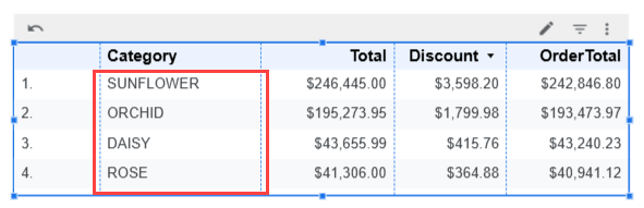
- Click anywhere outside the pop-up to close it. Your table now shows the categories in capital letters.

How to use conditional formatting to format your Data Studio dashboard
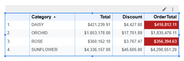
Now let’s format the OrderTotal cells to red for values under 1,000,000 so that you can quickly see which ones are low in sales.
Follow the steps below:
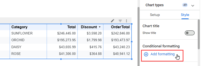
- Select your table, then open the Style tab on the right. In the Conditional formatting section, click Add formatting.

- In the Add conditional formatting pop-up that appears, set the following rule:
- Under Format type, choose Rules.
- Under Format rules, set OrderTotal to LESS THAN and type 1000000.
- Under Appearance, set the cell background color to red and the font color to white.

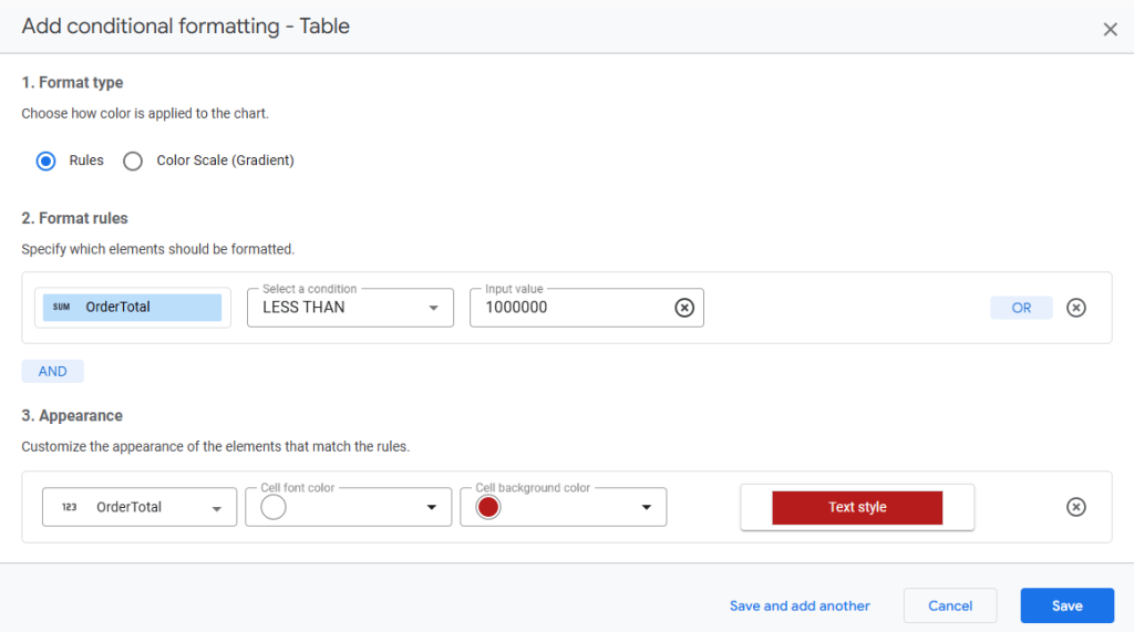
- Click Save. Two categories now show in red.

To share your report, click on the Share dropdown in the header toolbar. This will give you a list of different ways to share it:

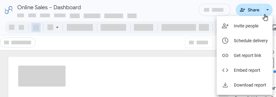
Option 1: Invite people
Use this option to invite specific people or Google Groups and add them as viewers or collaborators on your report.
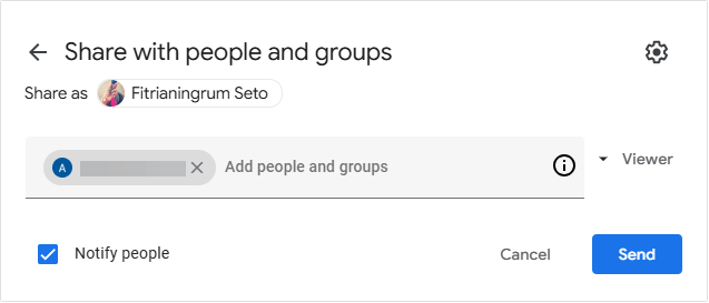
In the Share with people and groups pop-up, type the email addresses of the people you want to share Looker Studio reports with. Use the dropdown on the right to choose whether they can view or edit, then click Send.

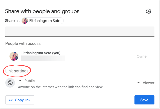
To share more widely, look under Link settings in the same pop-up. Setting it to Public means anyone on the internet with the link can view your report, even without a Google account. Click Save when you’re done.

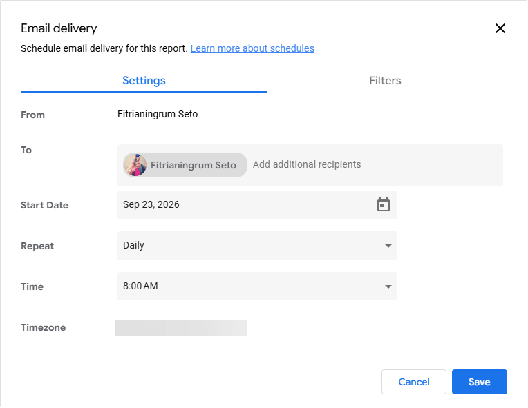
Option 2: Schedule email delivery
Use this option to email your report as a PDF on a regular schedule, to yourself or anyone else.
On the Settings tab, add recipients in the To field. Then pick a start date, how often the report repeats, and what time it goes out.
On the Filters tab, you’ll see the filter and date range controls already on your report, so you can choose what the emailed version shows.

Option 3: Get report link
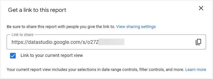
Use this option to generate a short URL for your report, which you can then share with anyone.
Click the copy icon beside the link. Tick Link to your current report view if you want the link to open with your current filters and date range already applied.
If you want to change who is able to access the report, click View sharing settings and adjust them accordingly.

Option 4: Embed report
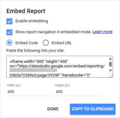
Use this option if you want to add the report to an existing web page.
Tick Enable embedding. You can also choose whether to show the report’s page navigation inside the embed. Then pick an embed mode. If you choose Embed Code, you can also set the width and height.
Click COPY TO CLIPBOARD when you’re done.

How do you know which Embed mode to use?
The process of embedding can vary based on what web authoring system is being used. Some work with just a URL, while others require full code for it to be properly embedded. If you’re not sure, copy both into a text file and try them in turn.
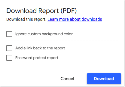
Option 5: Download report
Use this option to download your report as a PDF file. After that, you can distribute it via email or Slack. Additionally, you can protect the document with a password for added security.

Explore more about Google Data Studio with our guides!
I can’t cover everything in one article but, hopefully, you found this Data Studio tutorial to be a helpful starting point. There is so much more that Google Data Studio (Looker Studio) has to offer, and we don’t want you to stop here.
To dive in even deeper, check out our other articles where we cover Looker Studio in many different contexts. For example, you may be interested in connecting Excel to Looker Studio or you may be asking “Why is Looker Studio so slow? If you’re looking for alternative tools, check out Looker Studio vs. Power BI.
We also recommend checking out report gallery templates as well as reading through what people are discussing at the Looker Studio Community. Finally, happy dashboarding!
For more information on the data visualization topic, check out our article about CRM dashboard examples.