Google Data Studio (Looker Studio) Funnel Visualization – Examples and How to Create Guide

How funnels may look like in Google Data Studio (formerly Looker Studio)
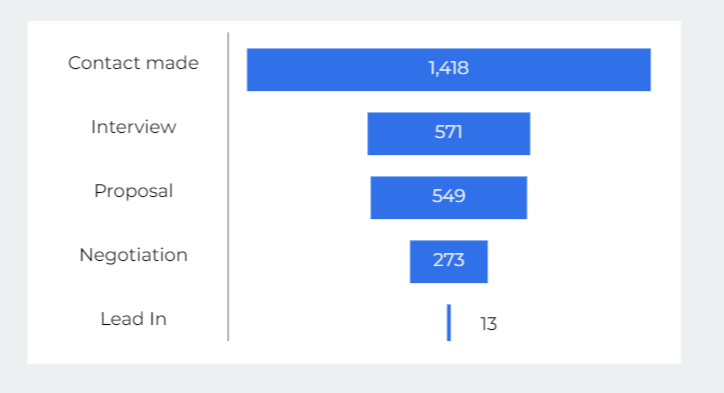
There is no native funnel chart in Looker Studio as, for example, in Power BI? Nevertheless, there are enough options to visualize marketing and sales funnels in Looker Studio. You can get it vertical like this.
Or a horizontal one like this:
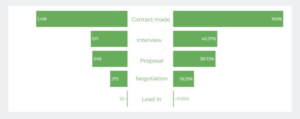
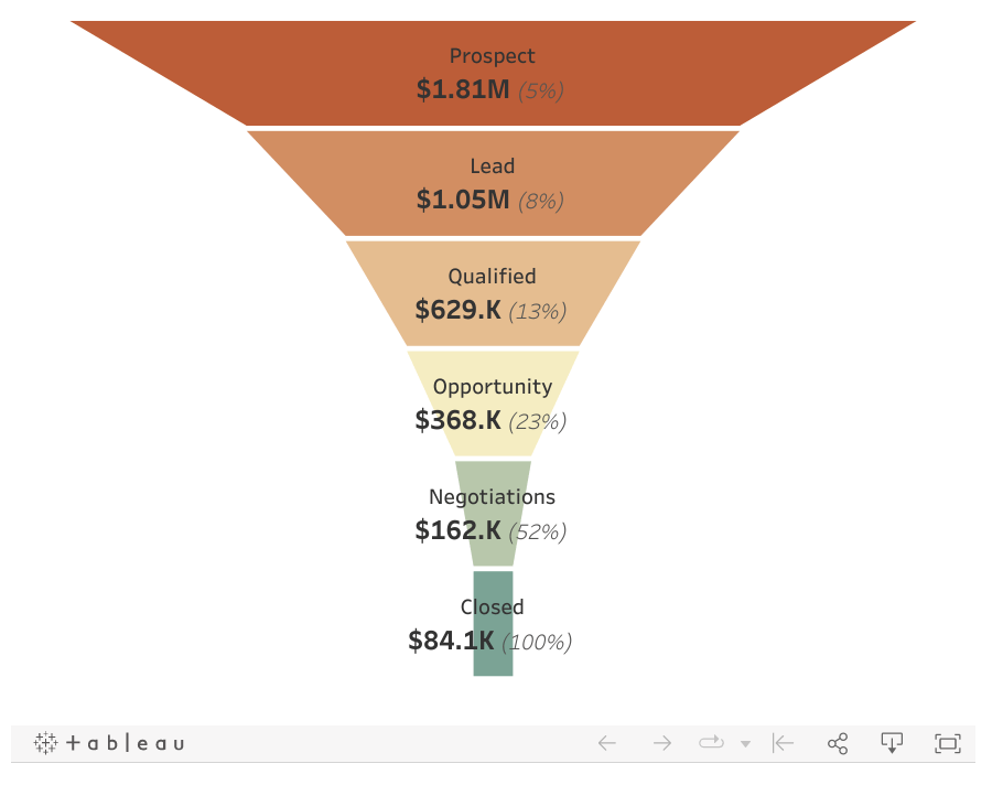
However, I’d put some additional effort into making my funnel look like this:
What are the options to create a Looker Studio funnel?
You’ve probably expected that building funnel visualization in Looker Studio would be kid’s stuff since all you need to do is to add a respective chart… but it’s not. Nevertheless, you can still rest on three options to create Looker Studio funnel visualization (formerly Google Data Studio):
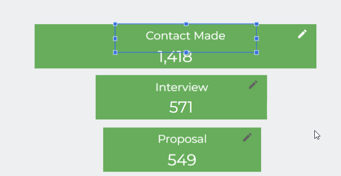
- Scorecards – you can design the Looker Studio funnel by placing scorecard charts in the form of a reversed pyramid. The result may look like this:
- Horizontal bar chart – you can build a Looker Studio funnel using a horizontal bar chart, which is natively supported by the platform. Actually, you’ll need two horizontal bar charts placed together to form a Looker Studio funnel visualization like this.
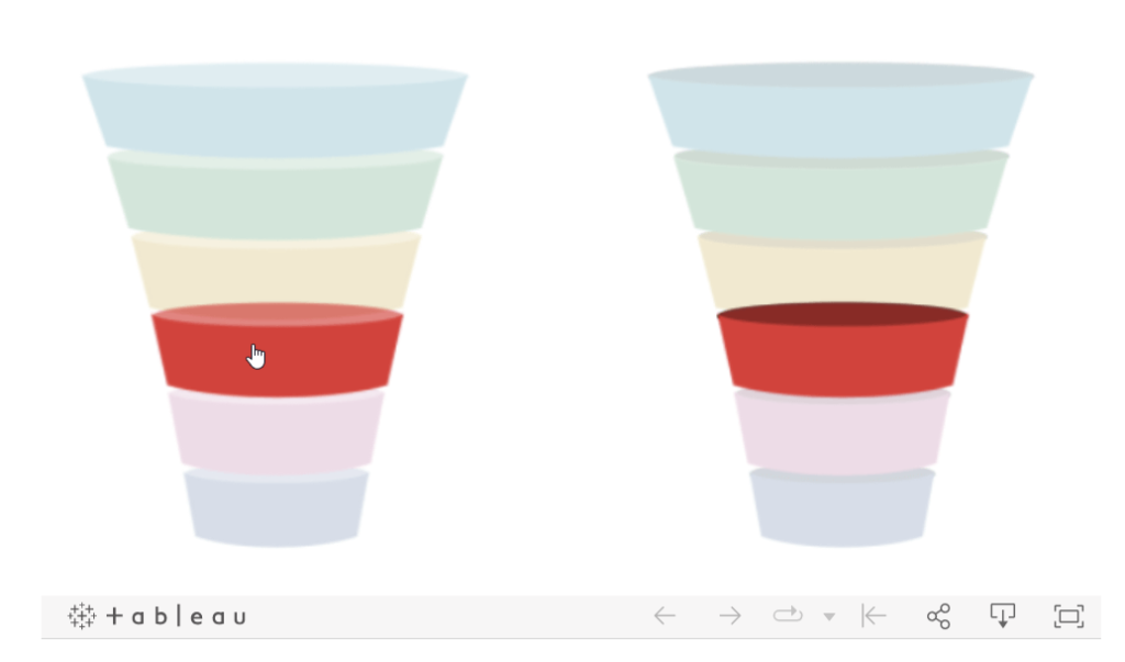
- Community visualization – you can use the visualizations built by third-party developers and shared in the Looker Studio community. It may look like this:
- Custom images + scorecards – to get fancier funnel visualizations, you’ll need to be more creative. For instance, the following visual was created using custom images uploaded to Looker Studio combined with scorecards.
Each Looker Studio visualization option has its benefits and drawbacks, of course. Below you’ll find a guide on how to build a Looker Studio funnel visualization (formerly Google Data Studio) with each of the mentioned methods.
How to build a funnel in Looker Studio
Before you and I get our hands dirty, let’s get some data to use for building funnels. I’m going to build a sales funnel, so I need the data about deals. I chose a sales CRM Pipedrive as a data source and connect it to Looker Studio with the help of Coupler.io. Here is a video guide on how this process works:
You can try it out yourself for free. Just select the required data source in the form below and click Proceed. Follow the guided instructions to collect your data and load it to Looker Studio without any hassle.
Once the data source is connected to Looker Studio, I have the following:
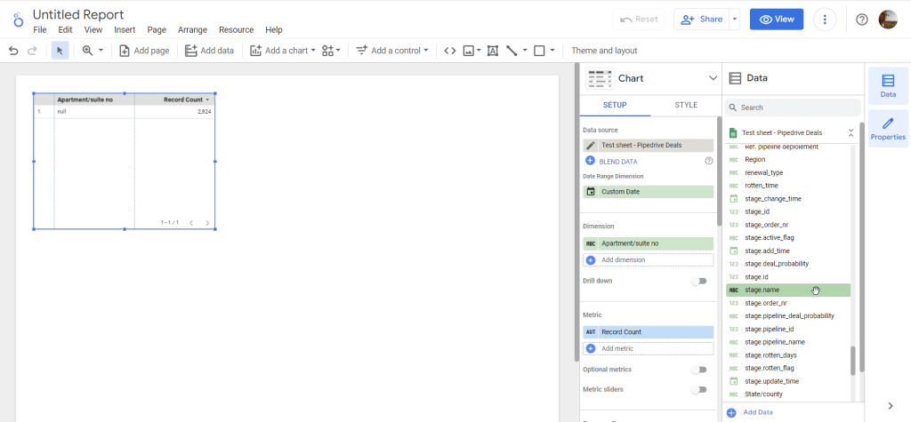
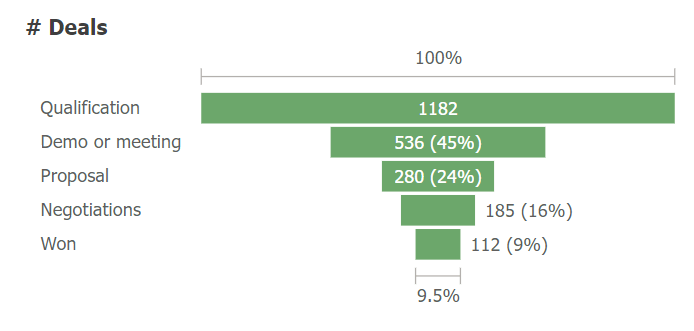
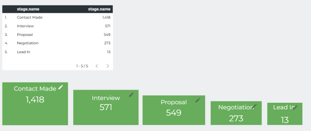
The data contains lots of columns, but for the funnel, I mostly need to know the number of deals per each stage. You can get this information from the column stage.name. Do the following:
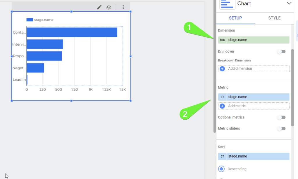
- Click Add dimension then choose stage.name as the dimension.
- Click Add metrics then choose stage.name as the metric.
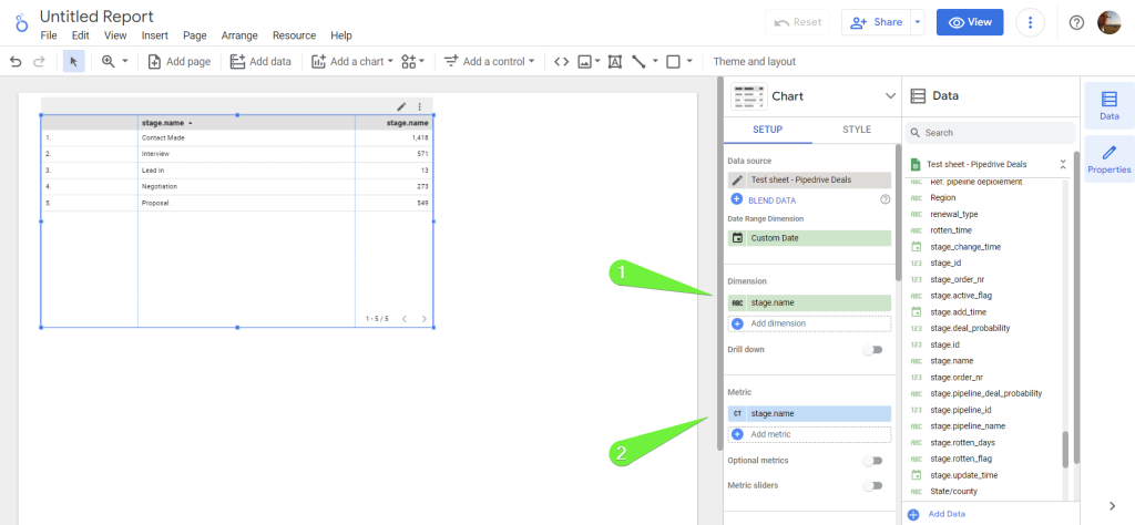
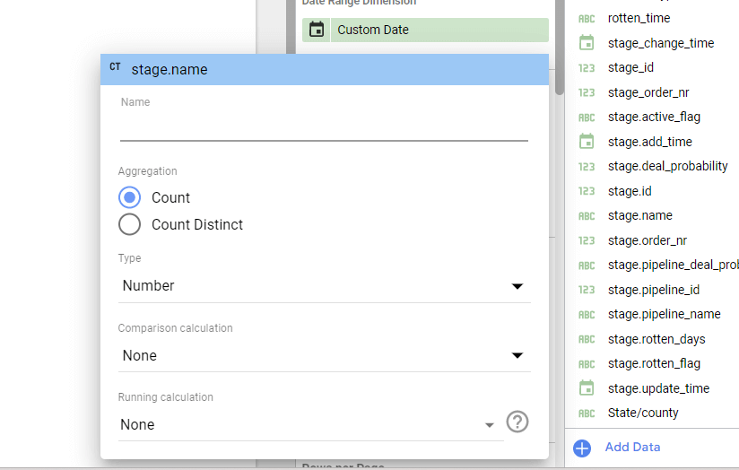
Note: If you already have stage.name chosen as the metric, then make sure to change its Aggregation to Count, not Count Distinct.
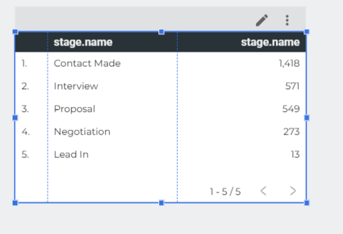
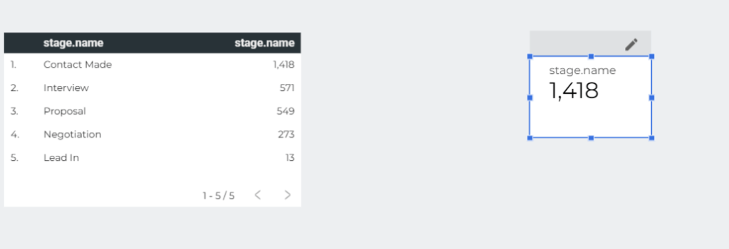
After these manipulations, you should get your funnel stages and the number of deals per each stage in a table like this:
Now I’m ready to show you how to implement a Looker Studio funnel visualization (formerly Google Data Studio).
Funnel visualization Looker Studio using scorecards
The idea of using scorecards to build a funnel visualization in Looker Studio is simple and consists of two steps:
- Create separate scorecards per each stage
- Arrange the scorecards one after the other in the form of the funnel
Create separate scorecards per each stage
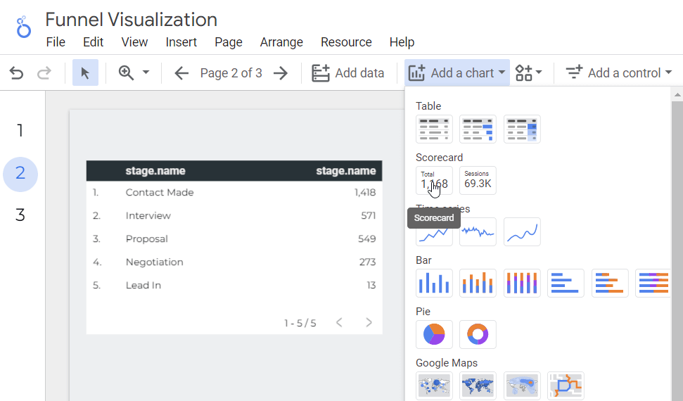
- Click Add a chart, then select Scorecard, and locate your scorecard on your Looker Studio marketing dashboard.
The scorecard will display the total number of deals in your funnel. To fix these, you’ll need to do the following:
- Change the default metrics to stage.name with the Aggregation set to Count.
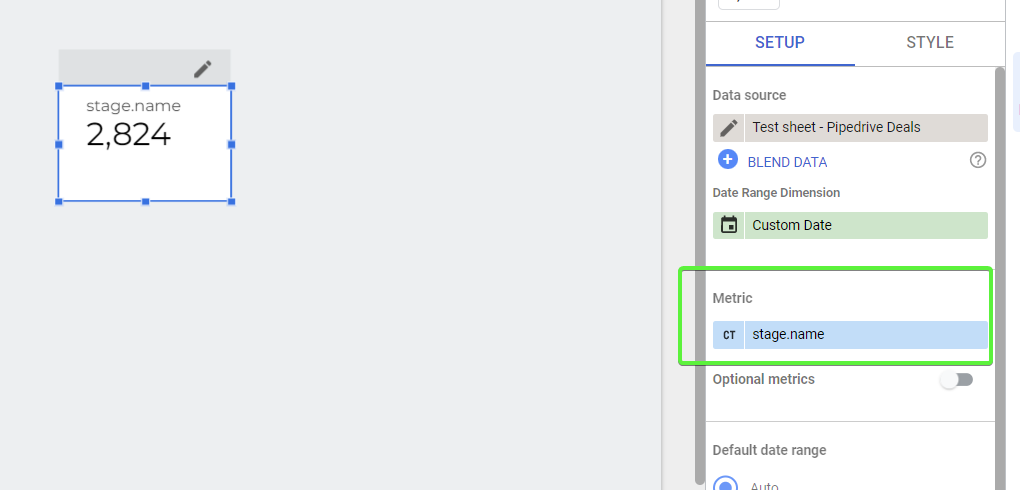
- Scroll down to the bottom of the setup properties and click Add filter. You need to create a new filter with the following configuration:
Include - [column] - Contains - [stage-name]
In my example, it looks like this:
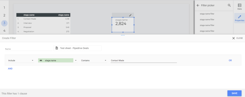
After I click Save, the scorecard value changes:
You’ll need to repeat this process to create a separate scorecard and a separate filter for each stage of your funnel.
Arrange the scorecards in the form of a vertical funnel
In my example, I designed the scorecards and arranged them this way:
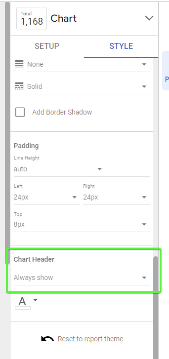
I also want to share one tip on how you can add names to your scorecards. You need to select Always show for the Chart Header option.
Then create a text element with the name of your stage and add it to the header area of the scorecard.
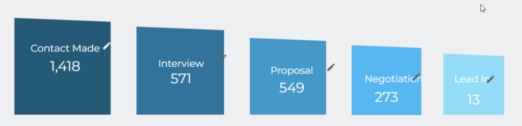
Make a horizontal funnel using scorecards and custom images
Of course, you can opt for a more progressive way of designing a funnel and arrange the scorecards horizontally.
To make the funnel look even better, upload custom visuals and place your scorecards within them. For this, you’ll need to change the background to Transparent. There you go!
We’re done here and can move on to the next method to make a Looker Studio funnel visualization (formerly Google Data Studio), which should be less time-consuming to implement.
Build a funnel in Looker Studio using horizontal bar charts
The idea of using horizontal bar charts to build a funnel visualization in Looker Studio includes the following:
- Create a horizontal bar chart.
- Duplicate the horizontal bar chart.
- Attach two horizontal bar charts together with one of them to be reverted to the x-axis.
Create a horizontal bar chart
- Click Add a chart, then select Bar chart, and locate your chart on your dashboard.
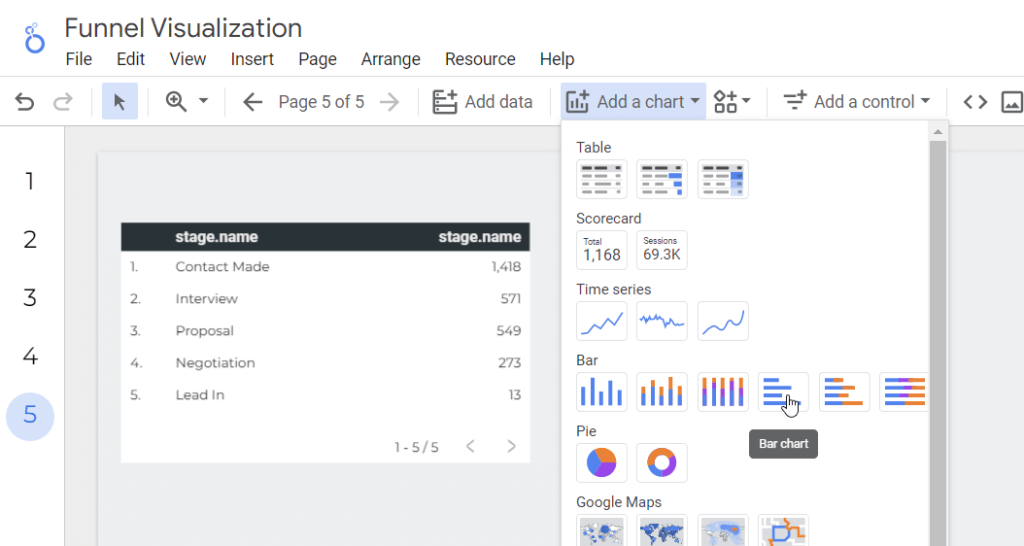
- Change the default dimension to stage.name. Add stage.name as a metric as well, and remove the default metric that you’ve had. Do not forget to change the metric’s Aggregation to Count. As a result, you’ll get the following:
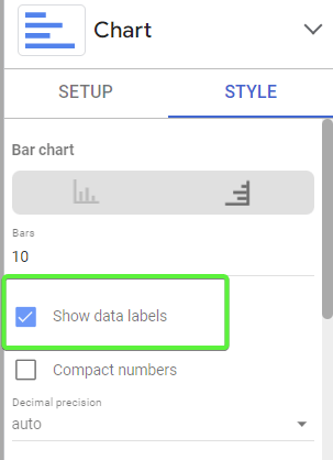
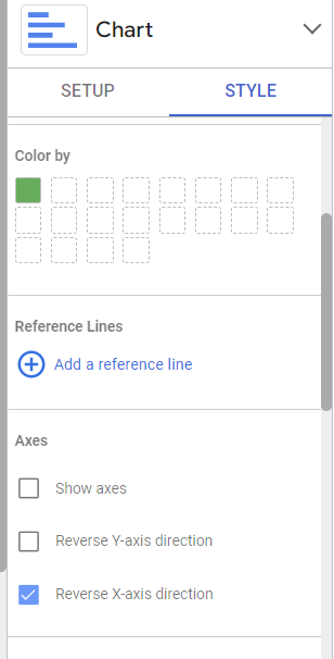
Then customize the chart style to your liking. In my case, I did the following:
- Switched on data labels.
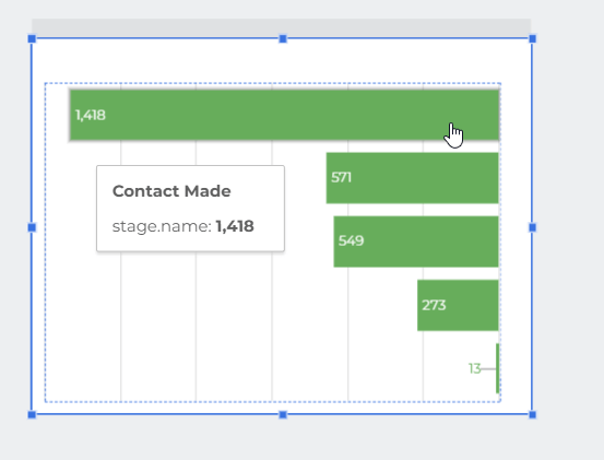
- Changed the color, removed showing axes, and enabled the reverse X-axis direction.
As a result, my chart began to look like half of a funnel chart:
Let’s make the other half then ?
Duplicate the horizontal bar chart
- Right-click on your chart and select Duplicate.
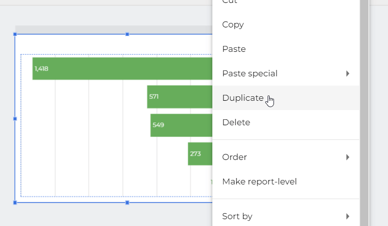
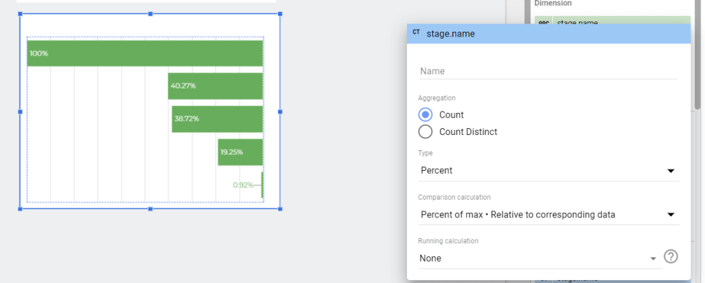
You’ll get a copy of your chart. You can tune it to your liking, which in my case is as follows:
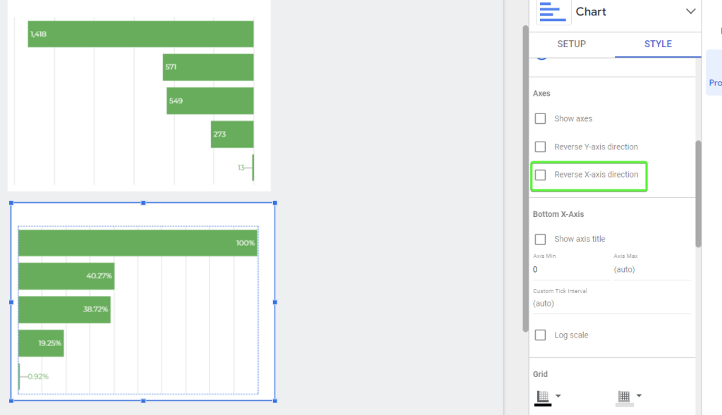
- Change the Type of your metric to Percent; Comparison calculation to Percent of max – Relative to corresponding data.
- Go to the chart Style and unclick Reverse X-axis direction. Here is the second half of the funnel visualization in Looker Studio.
Attach horizontal bar charts together
There is no way to glue both halves together without a gap between them. Here is what it looks like:
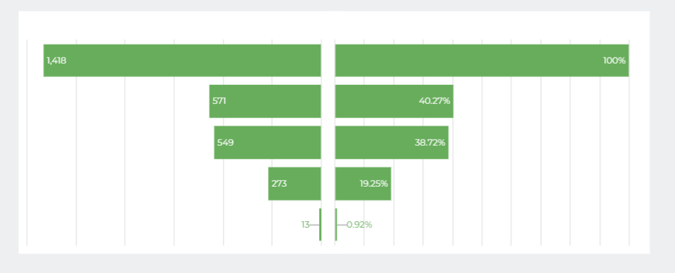
However, in my case, I found a solution by placing textual elements with the stage names in between:
It looks pretty to me, but you can go with the other way around.
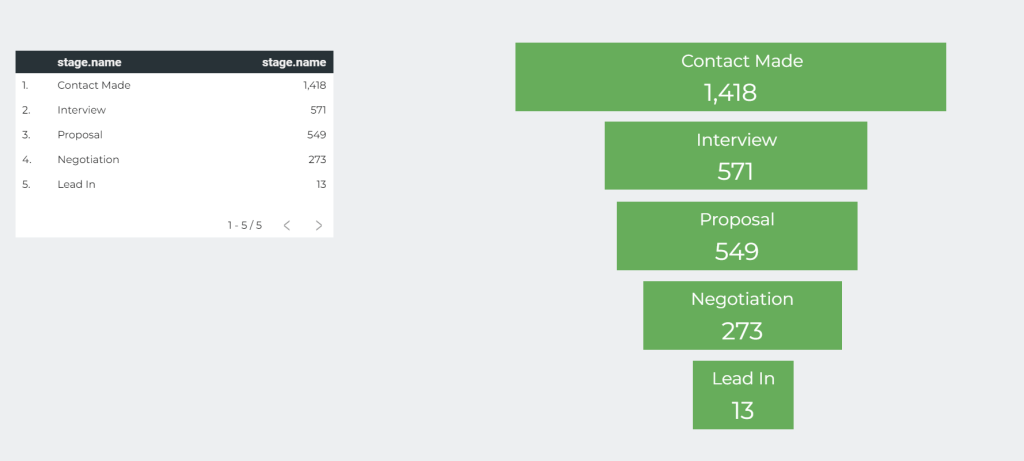
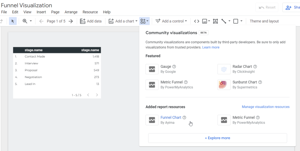
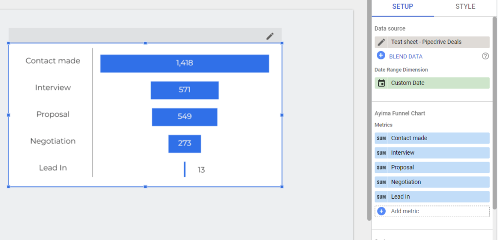
Looker Studio funnel chart from the community
The third option to create a Looker Studio funnel visualization (formerly Google Data Studio) is both the most actionable and the least reliable one. Actionable because it does provide a ready-to-use funnel chart, which was built and is available in the Looker Studio community gallery. So far, there are two funnel charts available: Metric Funnel by PowerMyAnalytics and Funnel Chart by Ayima.
The drawback is, however, that these funnel visualization charts are not officially supported by Google. So, you may face bugs and other issues. For example, in my case, the funnel visualization just disappeared for no reason for a day and then came back. Anyway, let’s see how it works in the example of the Funnel Chart by Ayima. You can add it by clicking the Community visualizations and elements button. I already have it as featured, and you’ll have to proceed to +Explore more and search for it the in the community gallery.
The added funnel chart will display some default metrics which are not what we need. So, let’s tune the funnel chart setup as follows:
- Click Add metric then Create a field
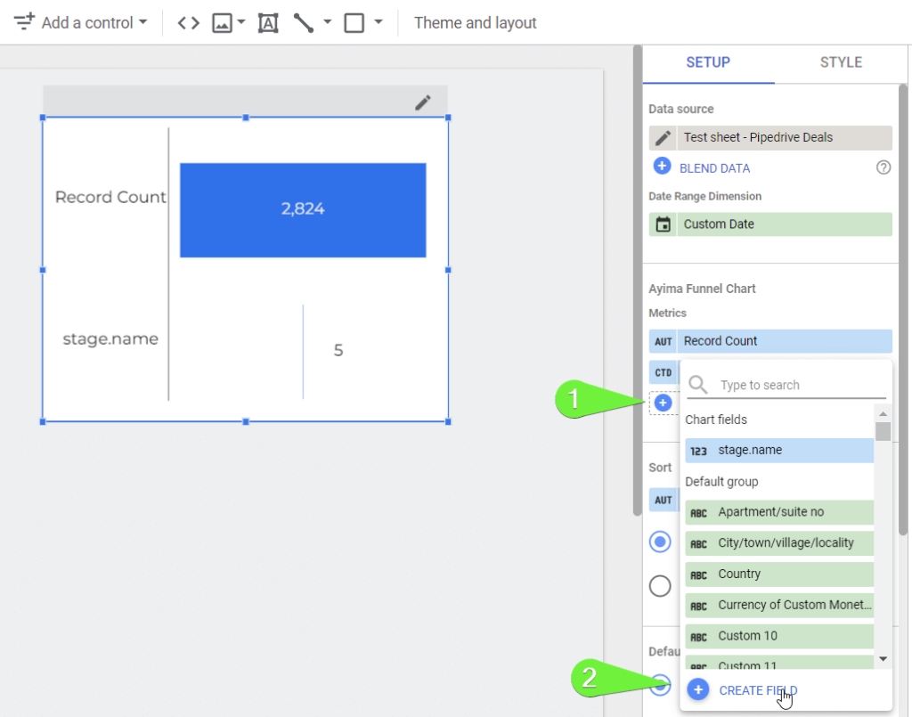
You’ll need to insert the following formula:
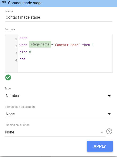
case
when [column]='[stage-name]' then 1
else 0
end
It only returns the records that have a particular stage name, and Looker Studio will shortly sum them up. In my case, it will look like this:
Click Apply and here is what the result is:
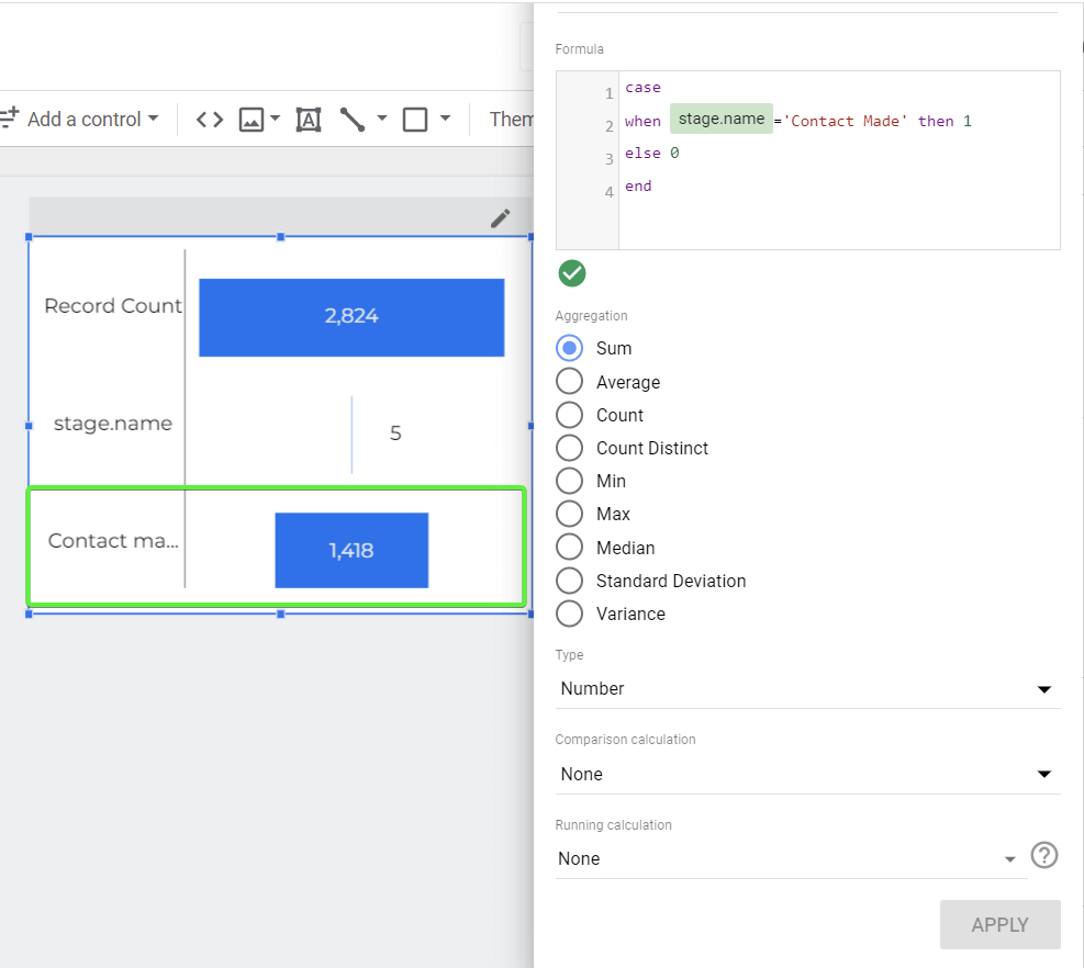
You’ve probably got it that you need to add such metrics for each stage of your funnel and remove the default ones. Here is what it looks like:
Of course, feel free to customize the style of your funnel visualization in Looker Studio as you see fit.
Examples of dashboards with funnels in Looker Studio
Funnels can be used in different cases, and, therefore, they differ by the stages depicted within. For example, a marketing funnel will start with awareness and end with taking action. In sales, the funnel will start with lead generation and end with closing a sale.
Learn more about the difference between marketing vs. sales funnel.
To build dashboards with funnels requires you to connect different data sources and work with various sets of data. At Coupler.io, we know the complexity of creating custom reports and dashboards. Therefore, we offer predesigned Looker Studio dashboard templates that are equipped with Coupler.io connectors. Here are some examples of funnel reporting you should check out.
Shopify sales funnel dashboard
This funnel dashboard was designed for ecommerce business owners who want to track sales funnel performance for their Shopify store. To use the dashboard, your Shopify store must be connected to Google Analytics 4 since the latter is the very source of data.
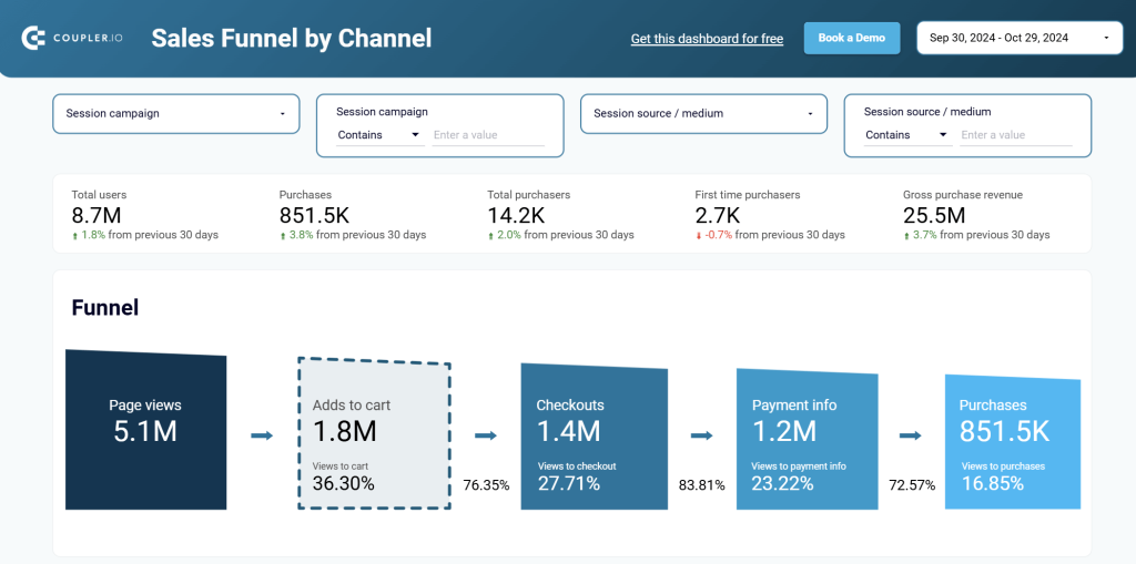
The dashboard consists of 4 pages, 3 of which are dedicated to sales funnels by channel, country, and item.
In addition to funnel visualizations, you can also find line charts, tables, and other visuals that let you analyze how you store visitors get converted into customers.
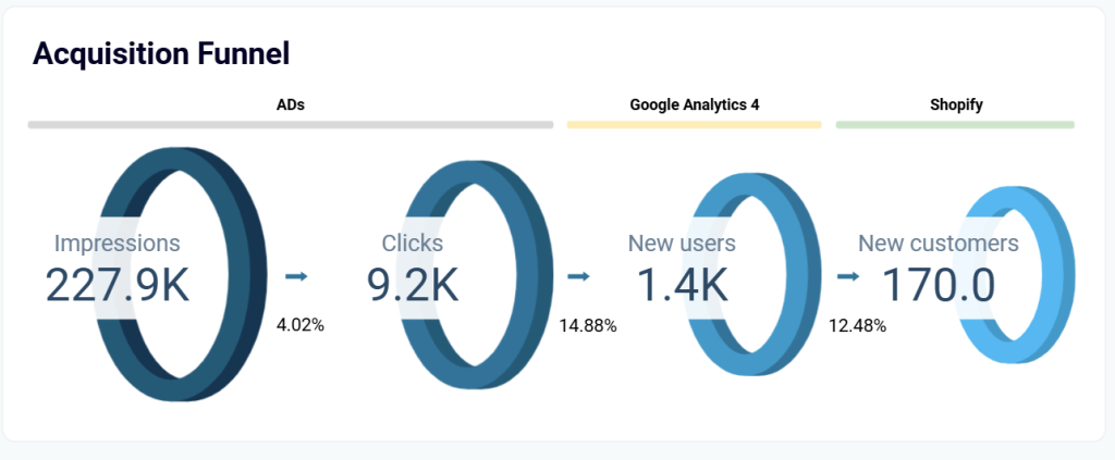
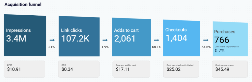
Customer acquisition dashboard for CRM platforms
This dashboard allows you to analyze the performance of your acquisition channels including website traffic and paid advertising. It combines data from CRM apps (Pipedrive or HubSpot) with marketing data from GA4 and all major ad platforms like Facebook Ads, Linkedin Ads, Google Ads, etc.
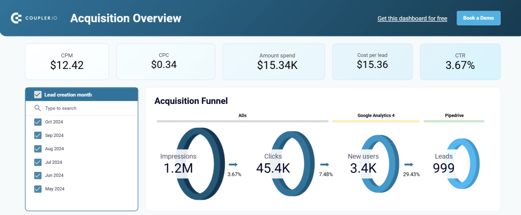
This multi-source lead generation funnel shows how many impressions/clicks your ads generated => how many users made it to your website => how many leads got into your CRM app.
In addition to the funnel, the dashboard shows other charts with valuable marketing insights.
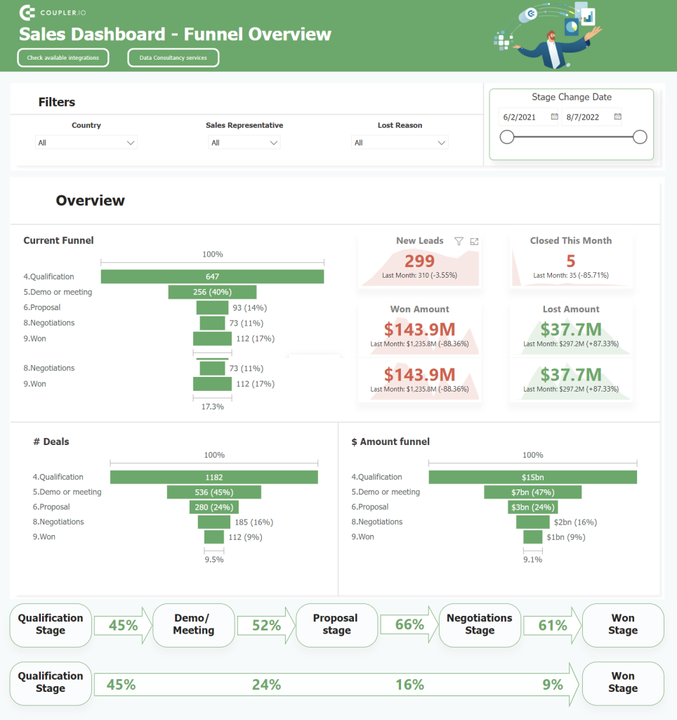
Salesforce sales analytics dashboard
Another acquisition funnel for another CRM app – Salesforce. However, as you can see, the very funnel chart looks different. It shows how many users turned into leads and their current status: open, working, closed => and progressed to sales qualified leads.
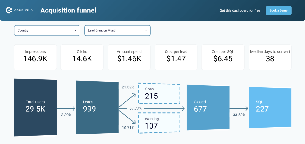
The dashboard also pulls data from GA4, PPC platforms, and aggregates it with information from Salesforce. As a result, you get a comprehensive overview of your sales opportunities in one place.
WooCommerce marketing funnel dashboard
This WooCommerce marketing funnel dashboard provides an overview of the entire customer acquisition process. Unlike traditional sales funnels that focus on internal conversion stages, the dashboard tracks the complete journey from external advertising impressions to actual purchases.
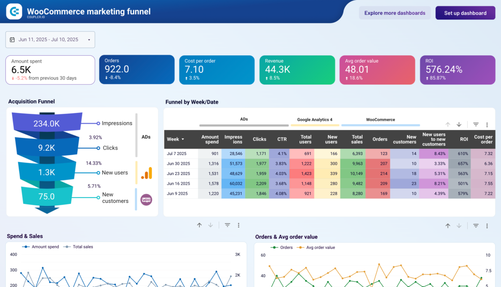
The acquisition funnel shows:
- Impressions ? Clicks ? New users ? New customers
- Conversion rates at each stage
- Weekly performance breakdown with metrics like cost per order, ROI, and platform-specific attribution
The dashboard includes correlation charts showing spend vs. sales, orders vs. average order value, impressions vs. CPM, and clicks vs. CPC to help optimize both reach and cost efficiency across all marketing channels.
This template is available for free and automatically connects to your WooCommerce store, Google Analytics 4, and advertising platforms to provide real-time marketing funnel insights.
WooCommerce store traffic dashboard
Funnel dashboards tell you how many visitors became customers. This dashboard tells you what kind of visitors they were before they entered the funnel. It combines Google Analytics 4 session data with WooCommerce sales metrics to show which acquisition channels, geographic markets, and days of the week produce sessions that are actually worth sending into your funnel — and which ones inflate traffic numbers without contributing to orders.
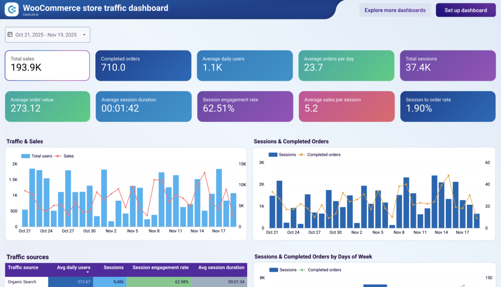
The traffic sources table breaks down each channel by session engagement rate, average session duration, and session-to-order rate. This makes it straightforward to see whether the channels feeding your funnel are sending engaged visitors or quick bounces. The Performance by Country table applies the same view geographically (sessions, completed orders, and average sales per session per market), so you can evaluate whether your funnel is being fed quality traffic from the right places.
This dashboard is available as a free Looker Studio template. To start using it, sign up for a Coupler.io account.
WooCommerce orders dashboard
Most funnel dashboards stop at the moment of purchase. This one starts there. The WooCommerce orders dashboard treats the post-checkout pipeline as its own funnel: orders are placed, and what happens next (whether they complete smoothly, stall in pending, go on hold, or get refunded) determines whether that customer comes back.
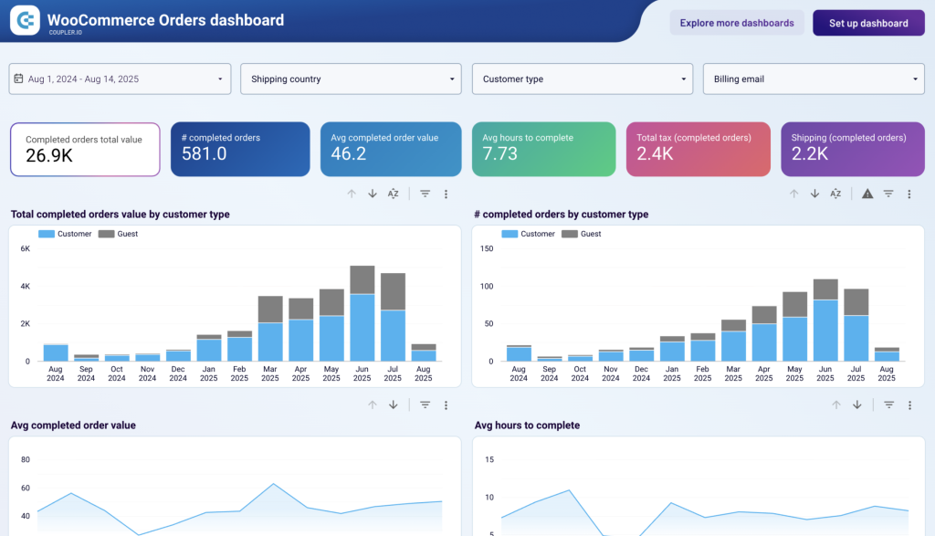
The order pipeline funnel shows:
- Order status distribution across completed, pending, on-hold, and refunded states. This is the core funnel view that reveals how much of your placed order volume makes it through to successful completion.
- Average hours to complete trend over time, which shows where the pipeline slows down, and whether processing bottlenecks correlate with volume spikes or structural inefficiencies.
- Customer type split between registered and guest buyers, which reveals whether your store’s repeat purchase funnel (built on account creation) is actually generating higher-value customers over time.
To start using this free Looker Studio dashboard template, sign up for a Coupler.io account.
GoHighLevel customer acquisition funnel dashboard
This customer acquisition dashboard is built specifically for GoHighLevel users who want to track the customer journey from initial ad impression to closed deal. It combines advertising data from Facebook, LinkedIn, Twitter, Pinterest, and Bing Ads with Google Analytics 4 and your CRM data to show how your marketing budget converts into business results.
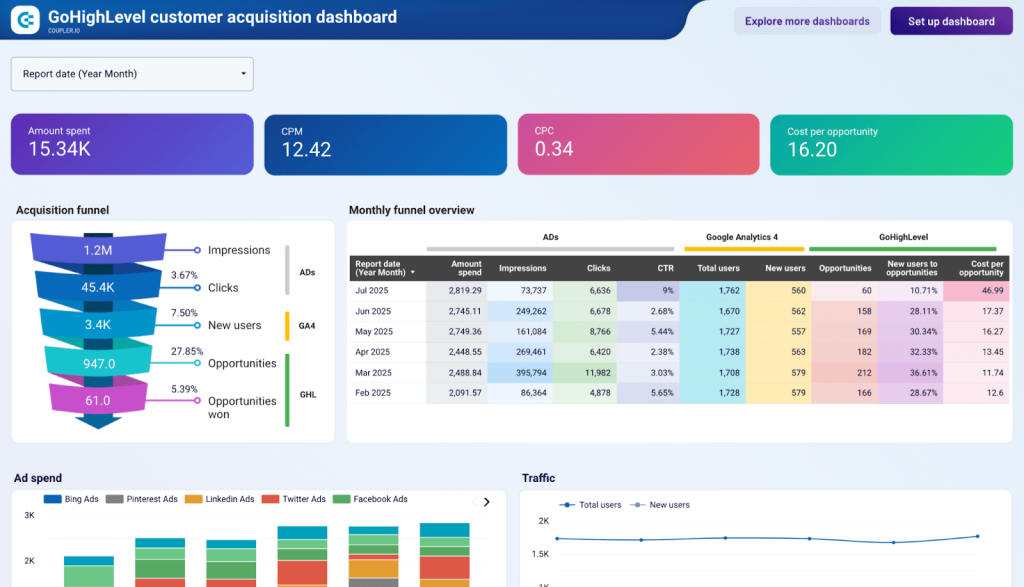
The acquisition funnel dashboard helps you analyze:
- Pipeline flow from Impressions ? Clicks ? Users ? Opportunities ? Won Deals
- Conversion rates and drop-off points at each stage
- Monthly breakdown of metrics, including advertising spend, CTR, website traffic, opportunities, and cost per opportunity
- Platform performance comparison to assess cost efficiency across channels
The dashboard also features correlation analysis charts for tracking impressions vs. CPM, clicks vs. CPC, conversion rates (CTR and opportunity conversion), and opportunities with cost per opportunity. This helps identify relationships between advertising investment, performance, and actual business outcomes.
This dashboard template is available for free in Looker Studio. To make a copy and automatically collect data from your multiple platforms, sign up for a Coupler.io account.
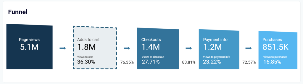
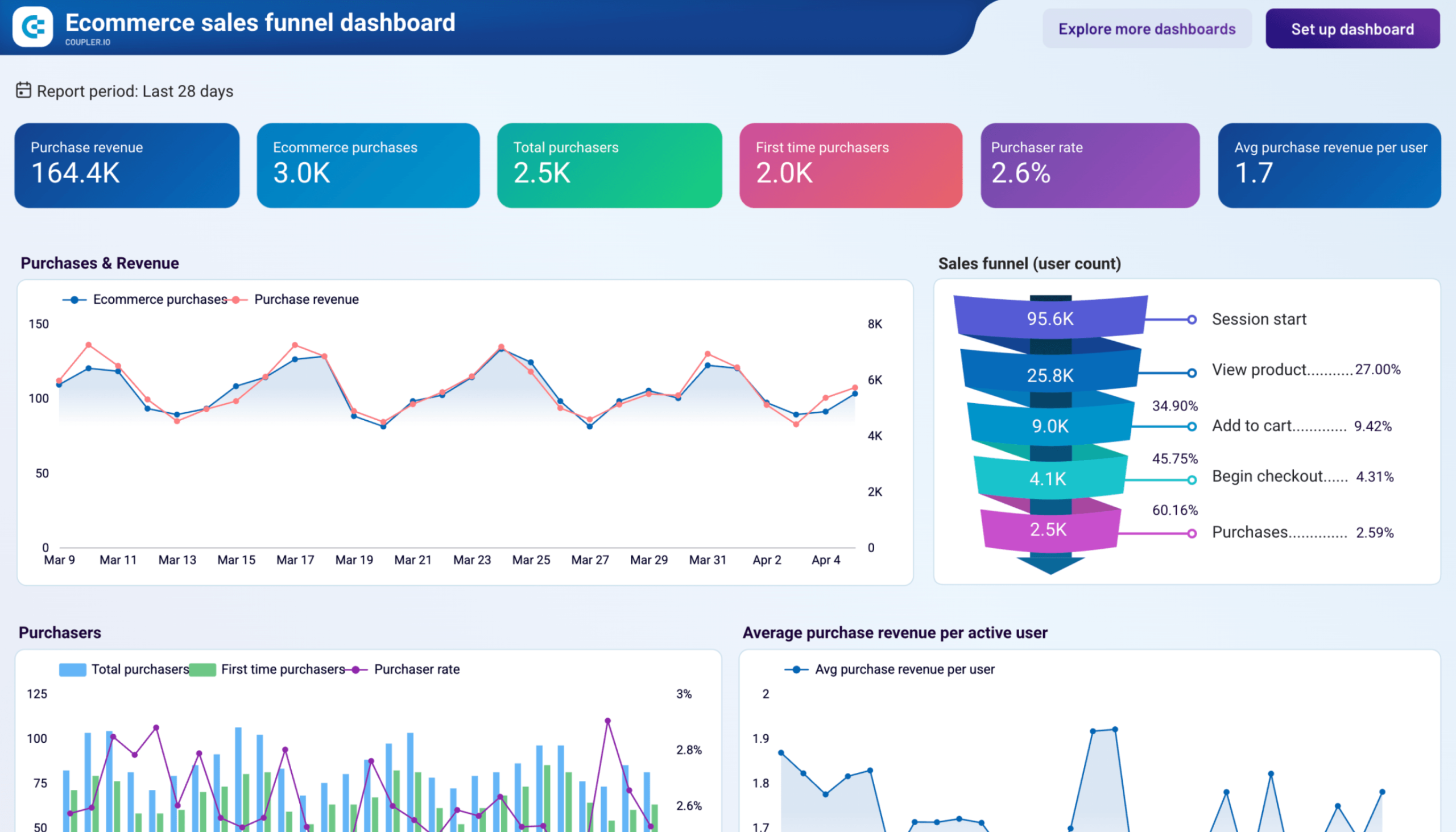
Ecommerce sales funnel dashboard for GA4
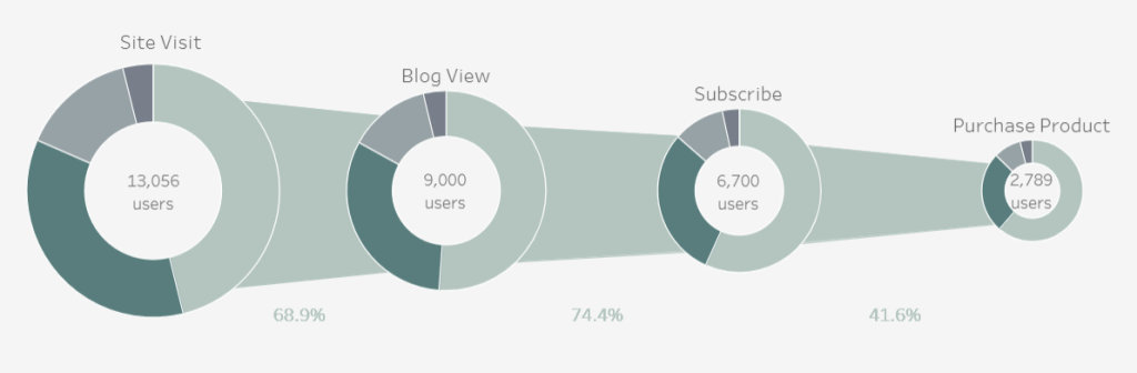
For teams that want a production-ready funnel visualization without building one from scratch, the ecommerce sales funnel dashboard from Coupler.io shows what a fully realized GA4 funnel report looks like in Data Studio. The funnel maps five stages (session start, product view, add to cart, begin checkout, and purchase) with step-to-step conversion rates shown at each transition. Rather than a single funnel chart on one page, the same visualization structure repeats across four separate tabs, each applying it to a different dimension: overall, by country, by device, and by individual product.
GA4 ecommerce sales funnel dashboard
 Preview dashboard
GA4 ecommerce sales funnel dashboard
Preview dashboardWhat’s worth studying in this template is how it pairs the funnel with supporting charts on the same tab. The overview page combines:
- The funnel with a dual-axis time series for purchases and revenue
- A purchaser bar chart separating first-time from returning buyers
- A channel breakdown for new users
This multi-chart layout is typical of production dashboards: the funnel answers “where,” while the surrounding charts answer “when” and “why.” Connect your GA4 account through Coupler.io, and the data populates automatically.
Sales funnel Looker Studio vs. other BI tools
I cracked open the wisdom of building funnels in Looker Studio, and now you can use it. Meanwhile, it’s worth mentioning that some other BI tools offer funnel visualization options as well. For example, in Power BI, this is a built-in feature that doesn’t require any workarounds. In Tableau, however, building a funnel is a trickier process. At the same time, this BI tool provides more design customization options.
Funnel visualization in Power BI
In Microsoft Power BI, you can add a funnel chart to your report by simply selecting the funnel icon from the visualizations option. Then you’ll need to configure columns to be used for the funnel. The funnel visualization in Power BI has one shape:
For example, here is what a sales funnel may look like in Power BI on the sales dashboard built by Coupler.io data experts.
If you want more fancy designs for your funnel visualization, then you should check out Tableau.
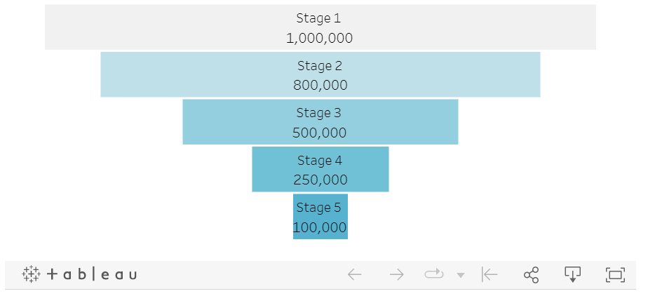
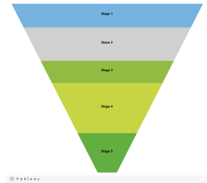
Funnel visualization in Tableau
Tableau offers a lot of design variations for your funnel chart. It can be a regular funnel made of bars:
An inverse pyramid like this:
Or this:
Or even in the form of an interactive 3d visualization:
Are you not a fan of pyramids and bars? In Tableau, you can uncover your inner artist even for data visualizations. For example, here is what a donut funnel looks like:
The funnel charts above are community Looker Studio charts, so you can copy them for your use just like I did in Looker Studio above.
So, which option should you choose to build a funnel visualization for your chart?
In terms of usability, Power BI is a winner since it provides a built-in funnel chart option. A few clicks of a button will let you enjoy a simple yet actionable funnel visualization in your report.
In Tableau, it’s not that easy to build a funnel, but the tool allows you to do this in many creative designs. So, it will be a good choice for those who want to go beyond sampled visualizations in their charts.
As for the main character of this text, Looker Studio, it is a lightweight solution, which works well for simple funnels.
Are funnels really valuable for reports?
Just 10 years ago, a funnel had a clear definition as a pipe that is wide at the top and narrow at the bottom. But now, if you ask Google or chatGPT what funnel is, you’ll get the answer that it’s a marketing concept depicting the customer journey from awareness to conversion (or even retention).
Marketers of all kinds build funnels to focus their marketing efforts on the most efficient strategies. They can use different tools for that. However, you can create a Looker Studio funnel visualization (formerly Google Data Studio) quite easily.
Anyway, it’s up to you to decide which chart or visualization your dashboard requests. And if it’s difficult to make a choice, you can always contact our data experts to get a custom solution for your analytical needs. Good luck!

Create dynamic reports and dashboards in Looker Studio with Coupler.io
Get started for free