Connect BigQuery to Google Data Studio (Looker Studio) in a Few Simple Steps

Google BigQuery allows you to accumulate, store, and process an enormous amount of data about your product. Understanding this data and making informed decisions based on it puts your business in an advantageous position. Combining BigQuery and Looker Studio makes it easy to visualize your data, making it understandable for virtually anyone.
It’s easy to integrate both tools and feed Google Data Studio (formerly Looker Studio) with data. Both on-demand and on-schedule. We’ll explore the best way to pull it off and answer some common questions you may have.
Methods to integrate BigQuery and Google Data Studio (Looker Studio)
There are two main ways to connect BigQuery to Looker Studio. You can either:
- Use the native Google connector in the Looker Studio. This approach is straightforward but requires some manual effort. You will need to search for the BigQuery in the Looker Studio connectors list, authorize the connection, and make several manual adjustments (such as configuring the refresh rate) in the Looker Studio dashboard view.
- Use a partner connector. Coupler.io provides a partner connector to load data from BigQuery to Looker Studio. You can easily make changes to your SQL queries before visualizing them and switch on automatic data refreshes.
To learn more about how each tool works, read our dedicated blog posts:
How to connect BigQuery to Looker Studio with partner connector by Coupler.io
One of the most convenient ways to integrate BigQuery and Looker Studio is with Coupler.io, a data integration platform and AI analytics. You can complete the connection process in a few minutes, all within a single interface.
Use the pre-filled form below to get started. You’ll be prompted to create a Coupler.io account for free with no credit card required. Alternatively, you can find Coupler.io in the Looker Studio partner connectors list and connect your account that way (although it will add some unnecessary steps).
1. Connect your BigQuery data
Link BigQuery to Coupler.io by uploading your Google Cloud key file. Then enter your SQL query under the Basic settings tab. You can compose a custom query in advance or simply select the entire table and apply transformations in the Coupler.io UI.
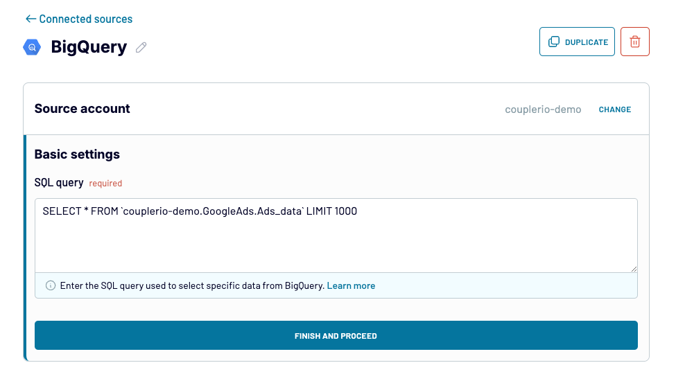
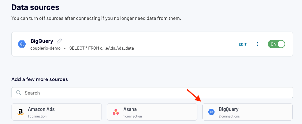
Before moving to the next step, you can also add more data sources to combine data from. These could be other BigQuery queries/tables, apps, spreadsheets, and so on.
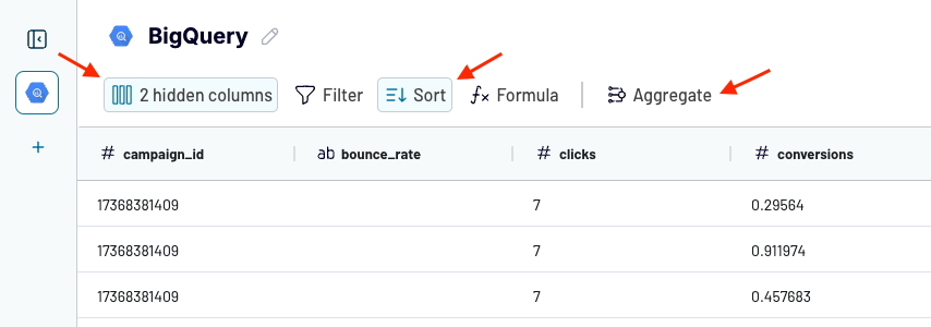
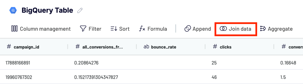
2. Transform and organize data
At the next step – Transformations – you can make changes to your BigQuery data before visualizing it in Looker Studio. For instance, you may want to:
- Hide, reorder, or rename columns
- Filter and sort your data
- Add new columns using a custom formula
- Aggregate data from your BigQuery table
- Combine data if you’ve connected multiple data sources
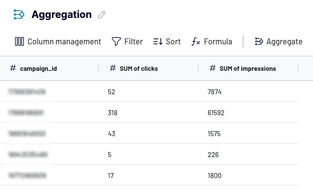
The aggregate feature provides a quick way to summarize data. For example, let’s say you are working with paid advertising data and you want to understand the total amount of clicks and impressions each recent campaign received.
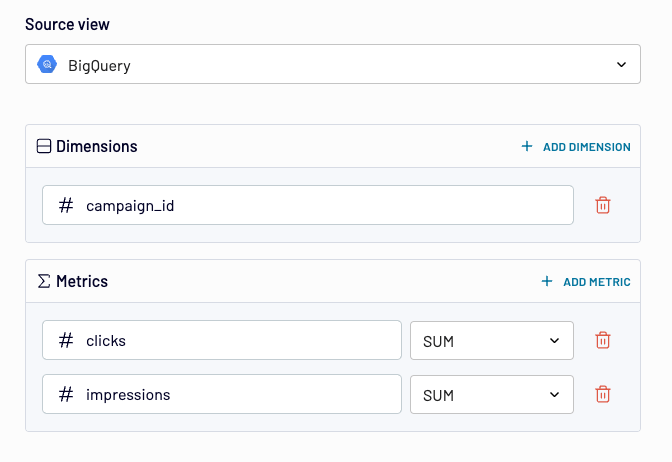
In this case, you can perform the SUM aggregation to get a clear overview of performance. Once you have specified dimensions, metrics, and aggregation type (COUNT, AVERAGE, SUM, etc.), click Aggregate data to generate a simple table with the summarized data.
When all of your transformations are complete, proceed to step 3 – Destinations.
3. Load data and schedule automatic refreshes
At this point, you can choose the destination (Looker Studio) if you haven’t already.
Next, specify the data to share in a Looker Studio view. It could be the original data you imported, the aggregated data you created at the previous step, or a blend of data from BigQuery and other apps (more on that later).
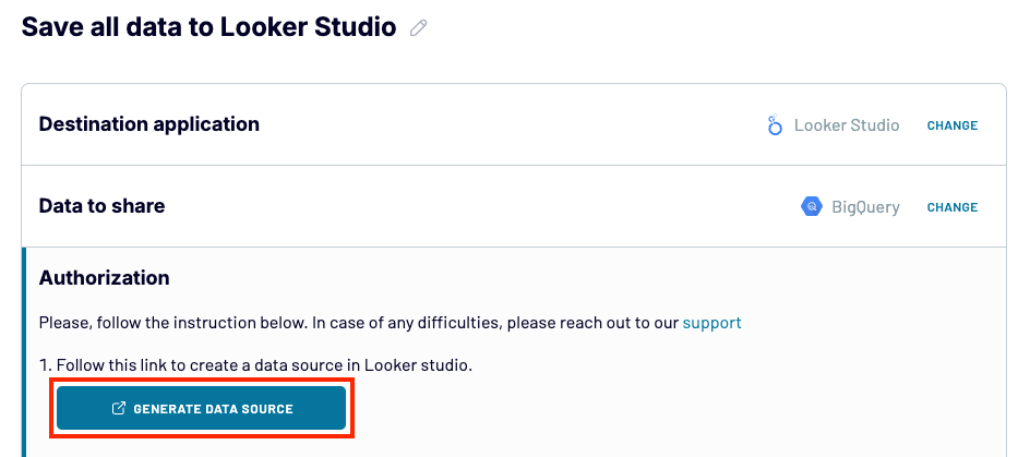
Finally, click Generate data source to create a data source in Looker Studio. Follow the instructions in the external tab to load data from BigQuery to the newly created data source. The last step is to click Create report – this will connect the data source to a new Looker Studio report.
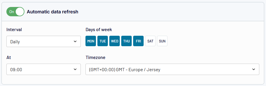
Meanwhile, in the Coupler.io interface, you can quickly set up a schedule for automatic data refresh. Switch it on and customize the interval, preferred days of the week, timezone, and time preferences for fetching data.
Once finished, click Save and Run Importer and you’re good to go!
In addition to BigQuery, Coupler.io offers over 60 Looker Studio connectors. You can import data from Facebook Ads, Xero, Pipedrive, and other apps to Looker Studio. So, with one tool, you’ll have access to all your apps for integral reporting.
Google connector to load data from BigQuery to Looker Studio
You can always use Google’s built-in connector to pull data from BigQuery and load it to Looker Studio.
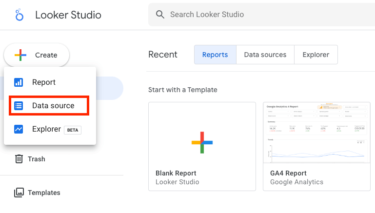
First, log in or navigate to your Looker Studio interface. Then, follow these steps:
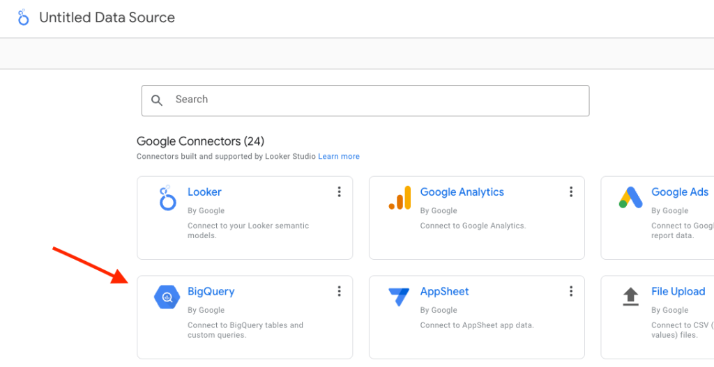
- In the main dashboard, click on Create to the left and pick Data source from the list.
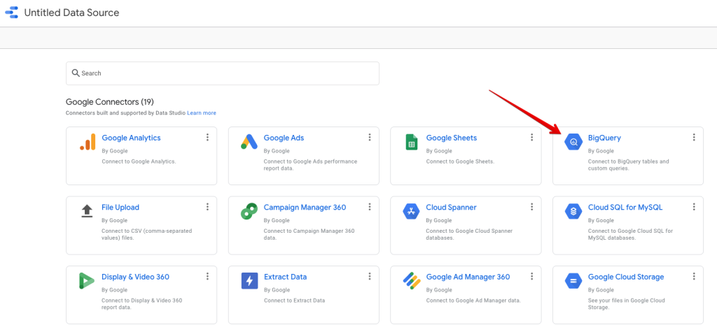
Among Google Connectors, you’ll quickly spot a BigQuery connector. It’s a common method for connecting both services as using BigQuery data in Looker Studio is an activity performed frequently. Pick the BigQuery connector from the list.
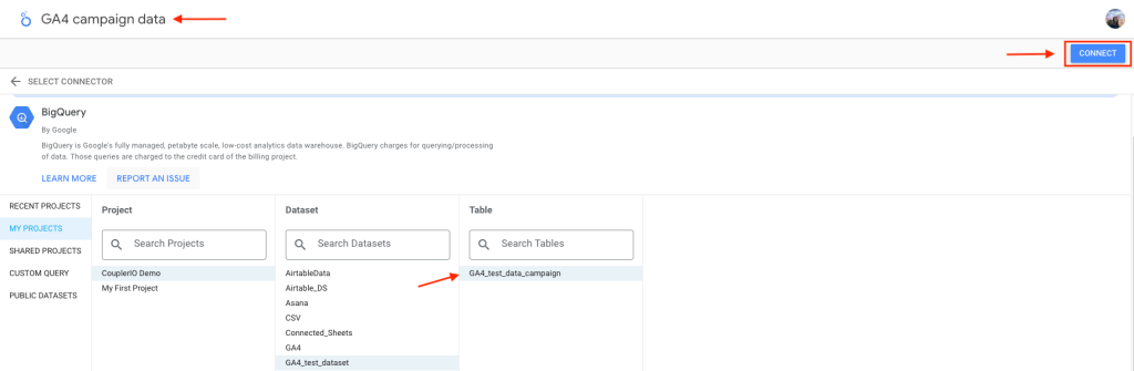
- On the next page, you’ll be prompted to Authorize the Looker Studio connection if you haven’t before. Click on it and select your preferred Google account from the pop-up window.
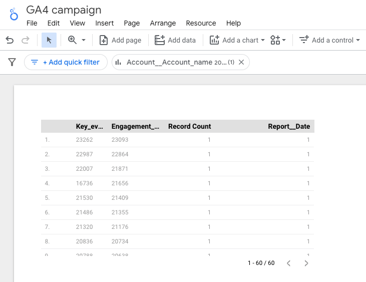
- Navigate the new left-hand menu to find the dataset you want to visualize in Looker Studio. For this purpose, we’ll use a test dataset from GA4 that was loaded to BigQuery.
- Select yours and find it on the list. Before selecting the Table and clicking Connect in the top-right corner, name your data source if you haven’t done so yet.
Configuring the data source
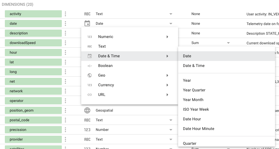
After clicking Connect, the dataset will load and you’ll be welcomed with the list of fields found in your dataset. They’ll be split into dimensions (green fields)
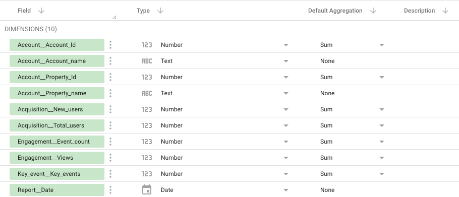
and metrics (blue fields)

A quick recap from our Looker Studio tutorial:
- Metrics are numeric values used for measuring or counting.
- Dimensions are names, descriptions, or other details of the things that we measure/count with metrics.
Looker Studio by default creates one standard metric: Record Count. You can, however, treat any dimension as a metric on your dashboard.
Looker Studio will select a default aggregation for each field – text fields will end up with None, numerical values will likely be set as Sum. You can adjust these values yourself and, for example, for financial values select the currency you want to use.
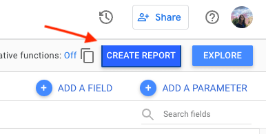
- Finally, click on the Create Report button in the top-right corner.
- A new tab will open. Accept the next popup. Wait for a few more seconds. A new report will be generated. It will feature a pretty ugly and, most of the time, a useless table that Looker Studio randomly generates based on some of your data.
We won’t be surprised if someday Looker Studio can accurately guess what we wanted to demonstrate on the charts before we even considered it. But clearly, it’s not there yet. You may want to delete the table. To do so, highlight it and press the Delete button.
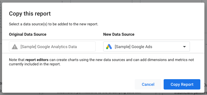
By the way – if you like one of the Looker Studio templates available from the get-go, you may plug in a data source to it to replace the dummy data it comes with.
Select the template of your choice and then press the Use my own data button (or under the three-dot menu, make a copy) in the top-right corner. A popup will appear, letting you choose one of the existing data sources or add a new one the same as we did above.
Coupler.io also has a huge selection of Looker Studio dashboard templates available for free. Explore the dashboard gallery.
BigQuery Looker Studio dashboard – the basics
You can work with dummy data but you could also pull some real data from the services you use and bring it to Looker Studio. This way, rather than theorizing about what you could build in Looker Studio, you could visualize the important metrics of your business right away.
Coupler.io makes it easy to pull data from over 60 apps into BigQuery – automatically, without any coding required. The list of available BigQuery integrations includes Airtable, Xero, Quickbooks, Shopify, and plenty of others. At the same time, you can directly connect your business app to Looker Studio. Check out all available Looker Studio integrations.
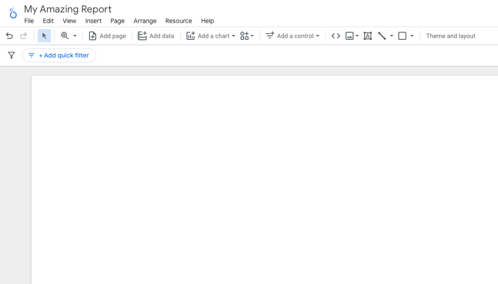
Once you’ve plugged in a data source to a report, it’s time to populate it with some useful information. You may already have some charts if you picked one of the templates. In any other case, your report is probably pretty empty at this point.
For starters, you may want to pick a theme for the dashboard or adjust some settings. At any time, you can also choose from several functionalities available from the menu on top:
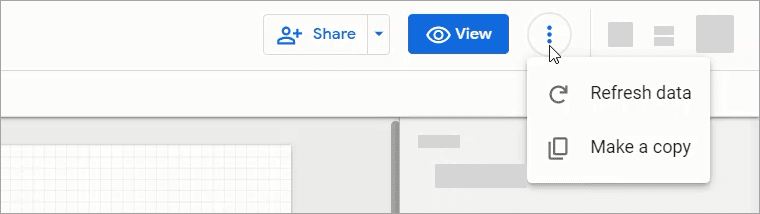
- With the View button, check what a dashboard will looks for the folks you share it with. Go back to the editor by pressing the Edit button.
- With the Share button, you can share the report with your team. If you give the Edit access, they’ll also have the same power as you to edit the report.
- Under the three-dotted menu, you can refresh the data on the spot or make a copy of the report.
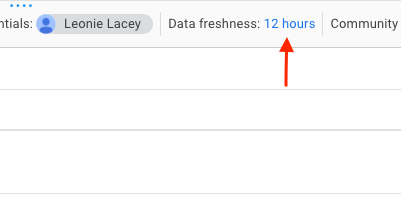
Adjust the refresh rate
One thing about refreshing data. Once you press the button above, Looker Studio will pull the latest version of your data from the source (BigQuery in that case). It’s useful if you made changes to the BigQuery table and need to check right away if the data was retrieved correctly.
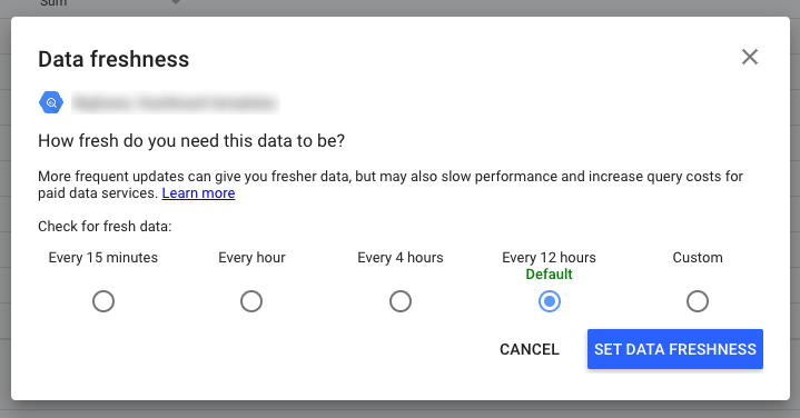
Most often, though, the automatic refreshes will do just fine. To adjust those settings:
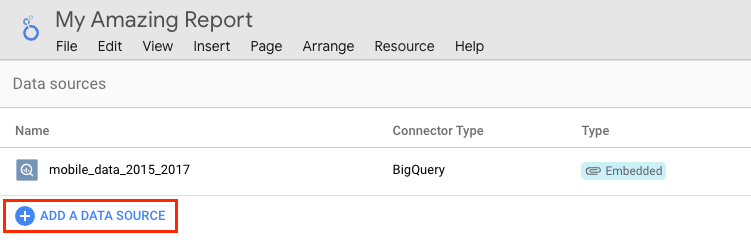
- Pick Resources from the menu and then Manage added data sources.
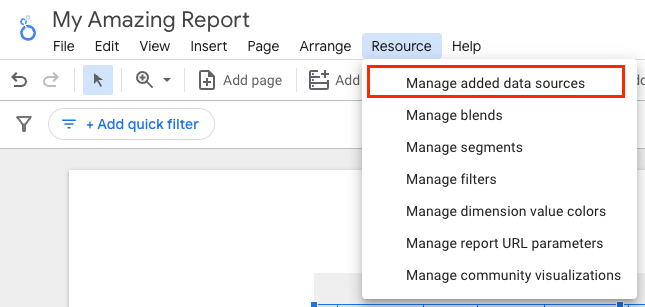
- Then, click on Edit next to your source and find the Data freshness field on the following page.
- Here, select how frequently the data should be refreshed.
Add content from BigQuery to a Looker Studio report
The next step is to finally add some content to our report. The most common way is to use the Add a chart button in the menu. Clicking it will open a long list of available charts, such as pie, bar, line, and geo charts. Choose one and drop it anywhere onto the report page.
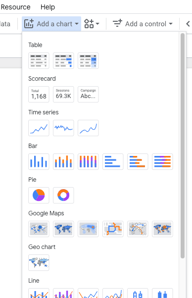
Alternatively, you can click the button directly to the right of Add a chart that features Community visualizations. It’s a selection of more advanced visualization methods, such as Gantt charts, candlesticks, heatmaps, and so on.
Going back to the basics, once you decide on the type of chart you want to use, usually all you need to complete the chart is its dimensions and metric(s). We’ll show you how it works with several examples.
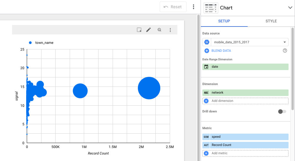
In this case, we’ll use a dataset from BigQuery’s public datasets collection about mobile data coverage in Catalonia, Spain. It has lots of interesting data that we can easily visualize using Looker Studio and BigQuery. For example:
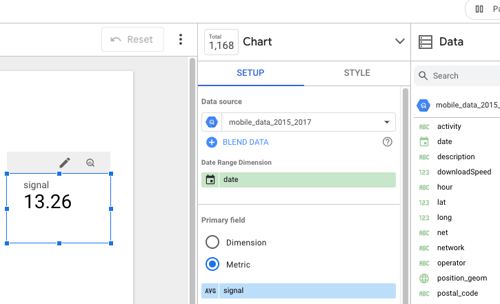
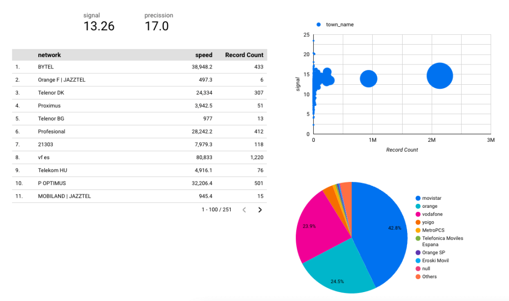
- Each of the millions of records includes a mobile signal strength for a given area. The simplest thing we can do is calculate the average of this data and display it as a scorecard. All we have to do is pick signal as a metric, and on the leftmost side of the field, select average. By default, it will show sum, but that’s not something that would have any value to us.
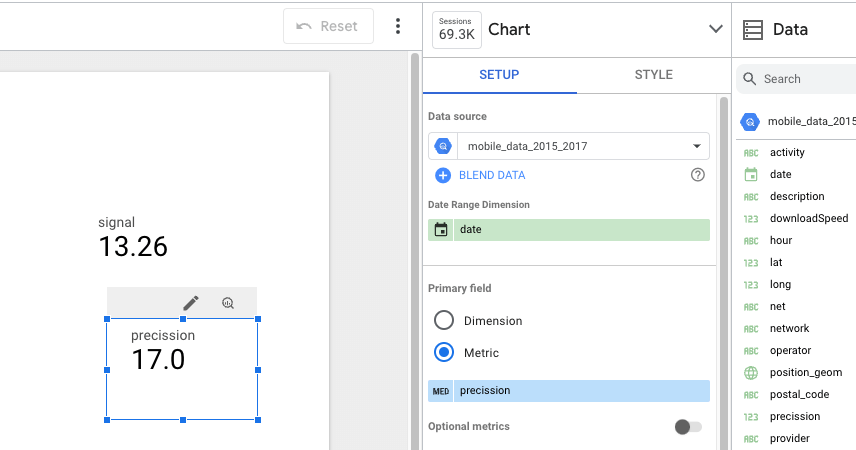
- There are three types of scorecards available out of the box, almost identical. To practice a bit more, we selected precision (probably referring to GPS precision) as a metric, and set it to aggregate as median.
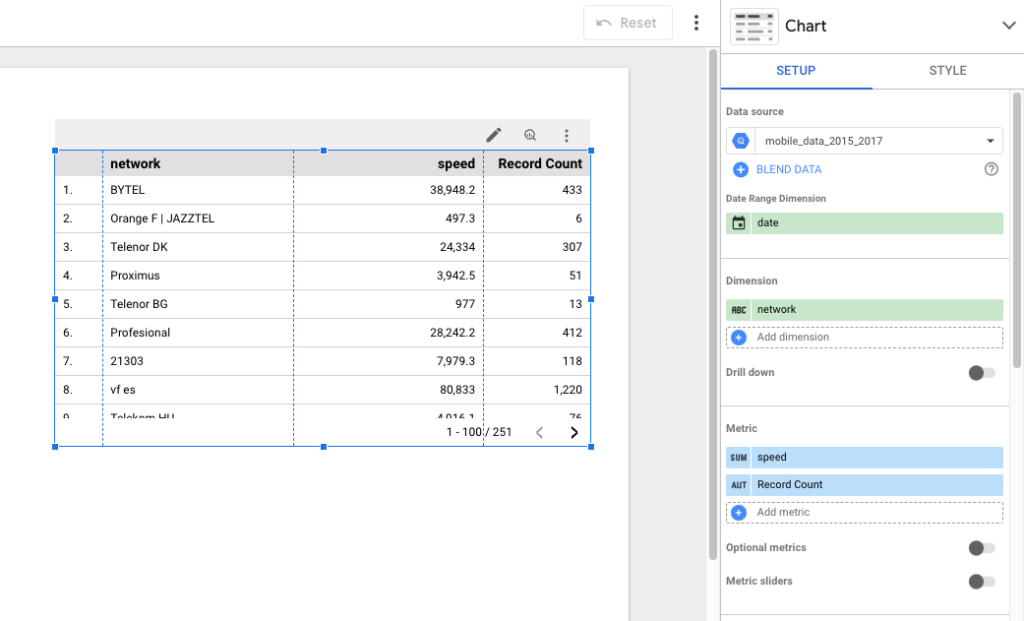
- We also played a bit with a table. Here, we made a list of all network providers in the area (dimension – network) and for each calculated their average (connection) speed and added the number of records for each provider. Thus speed and Record Count metrics. By default, the table is sorted in descending order by the first metric on the list but we can adjust it.
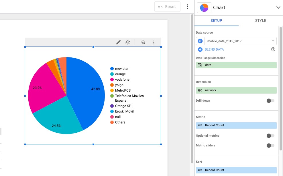
- We’ve added a pie chart to demonstrate the percentages of networks (dimensions) that folks in Catalonia (metric) were connected to while the data was gathered.
- Finally, we created a bubble chart, demonstrating the strength of a signal and the number of records (both are metrics) for each town in Catalonia (dimension) that made it into our BigQuery dataset. Yes, the big dot is Barcelona and the chart could certainly be more meaningful, but you get the idea ;-).
All in all, our BigQuery Looker Studio dashboard that took maybe five minutes to prepare looks like this::
We’re not going to dive deeper into all available options. If you’re interested in exploring the topic further, please check our Looker Studio tutorial.
Google BigQuery & Looker Studio billing details
Looker Studio is advertised as a free service and it technically is. However, using it on large datasets fetched from BigQuery will inevitably lead to some charges as BigQuery is a paid service.
The price you pay for BigQuery depends on how much data you store there and how much you query for. Every time Looker Studio refreshes the data in your reports, certain queries are sent to BigQuery, getting fresh data in return, but this also incurs certain charges.
The storage pricing is more straightforward. The base rate is $0.020 per GB of data, with 10 free GB available for you each month.
If you, however, have tables or table partitions that haven’t been used in over 90 days, the price for them goes down to $0.010 per GB, with another 10GB free.
When it comes to the pricing for querying the BigQuery database, the rate is $5 for each terabyte of data you query for, with 1TB available for free each month. Optionally, you can opt for flat-rate pricing, as detailed on the BigQuery pricing page.
In reality, it’s not simple at all to calculate in advance the query usage needed to maintain your BigQuery/Looker Studio dashboards. You could look into the query history in BigQuery, find the Looker Studio entries, check how many bytes each consumed, and sum it all up. But it’s not feasible at all if you have dozens or hundreds of tables to check each time.
The best idea is to try it out on a single dashboard with a limited amount of BigQuery resources. You can increase resources later when you have a better idea about the associated costs.
How to display date from BigQuery in Looker Studio
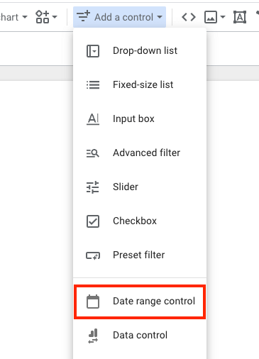
Whatever type of data you export, one or more fields will inevitably include a date and/or time associated with a record. It’s essential for adding a data range control, available from the Add a control menu.
Having it in place lets users select a particular period and see the results only for that period. It also allows you to decide on the default value for this field and, for example, show results for the last seven days at first.
BigQuery supports many different BigQuery data types. The following can be used for expressing date and/or time:
- Date type
- Time type
- Datetime type
- Timestamp type
The great thing about the Looker Studio BigQuery combo is that nearly always Looker Studio will guess correctly which type it’s dealing with and will aggregate it correctly. In case it doesn’t, you can always go back to the list of fields present in your source (Resource -> Manage added data sources -> Edit) and fix it yourself.
How to join two BigQuery tables in Looker Studio
There are two ways you can join tables in Looker Studio.
One method is to use Coupler.io, the data automation tool we introduced earlier. Coupler.io has an in-built Join function which lets you blend data from tables with similarly-named fields. You can configure the blend while setting up your connection, and the modified data will automatically appear in Looker Studio – no need for manual adjustments.
Alternatively, you can join BigQuery tables directly in the Looker Studio interface. However, this option has several steps and configurations which can be confusing to navigate. In any case, we’ll describe how to do it in the simplest way possible.
Joining BigQuery tables in Looker studio with Coupler.io
To join two BigQuery tables with Coupler.io, start by logging in to your account and creating a new data flow in the main dashboard. Connect the first source and configure basic settings – just as we showed in the earlier how-to guide. Click Finish and Proceed and follow these steps:
- Before moving on to the Transformations step, choose the option to add another source. Select BigQuery from the menu.
- Connect and configure basic settings for your new BigQuery source. Once finished, proceed to the Transformations step.
- Make any desired changes to your datasets using the sort, filter, formula, and column management functions. Then select Join data.
- Choose the source and columns you want to join data from. Here’s how it might look if you were to merge a couple of fields from Google ads and Facebook ads tables in BigQuery.
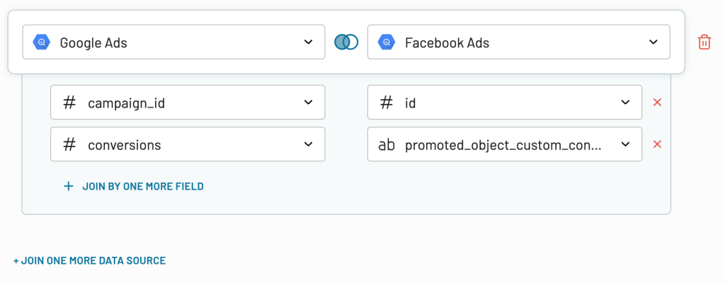
- Once that’s done, click Join data, review the modified table, and proceed to the Destinations step.
- At this point, you simply need to follow the steps outlined in the previous Coupler.io tutorial – choose Looker Studio as the destination, generate the source, and set up a data refresh schedule.
- In your new Looker Studio tab, you’ll find a basic table with your joined data. And that’s it! No need for any further changes, except for any visual modifications (charts, etc.) you wish to apply.
Now, let’s look at the alternative way to join data from two BigQuery tables in Looker Studio.
Joining BigQuery tables with Looker Studio’s native functionality
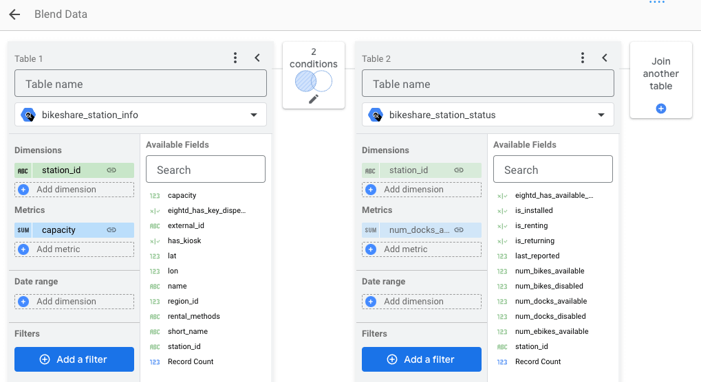
Looker Studio allows you to add and blend multiple data sources in your report. To add more sources, go to Resource ? Manage added data sources. Then click on Add a data source.
Once added, every time you add or edit a chart, you’ll be able to choose the source you want to use.
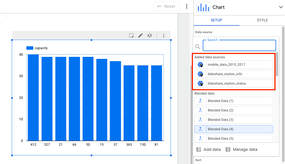
But the power of using multiple sources lies in combining them – in other words, blending data from different sources. In BigQuery it’s very simple to do.
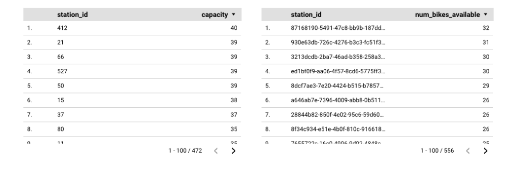
To blend two charts, add them first to a report. In our example, we added two public datasets concerning bike share stations in San Francisco. From one we extracted the table demonstrating the number of bikes at every station. Another gave us the capacity of each station.
To blend the two, we need to highlight them both (click on one, hold Ctrl/Cmd key, and then click on the other), then right-click and choose Blend data.
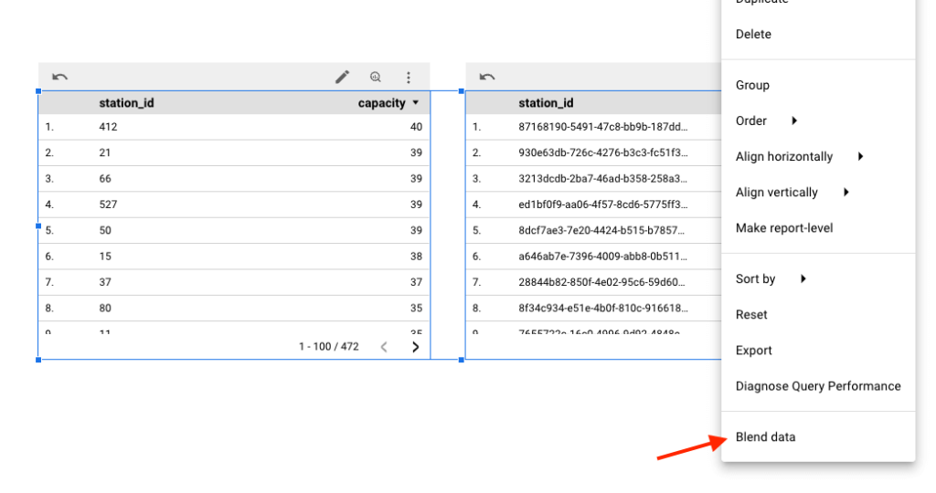
The result will be a new chart combining information from both sources.
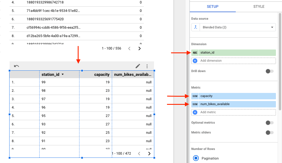
An alternative method for blending two or more datasets is via the Resource ?Manage blended data menu. Here, you need to specify a join key for each source – at least one dimension that each source will share. You complete the rest as usual.
Using BigQuery repeated data in Looker Studio
Having repeated data in a single BigQuery table, and trying to use it in Looker Studio can be a bit problematic. Looker Studio will attempt to cut down on the resources needed to process the query, and there’s nothing you can do about it.
As a result, it will aim to get the desired results in a single query, effectively cross-joining the nested columns. Therefore, most likely, it will result in incorrect data displayed on your Looker Studio dashboard.
Is there a way around it?
You could prepare the data differently in BigQuery itself. For that, use the UNNEST() command to turn an ARRAY into a table with a separate row for each element of the ARRAY.
A viable workaround is also to create two different data sources that will point to the same BigQuery table. By doing that, you force Looker Studio to query both sources separately. It doubles the size of queries but effectively reduces the annoyance of working with repeated data.
Kudos to Felipe Hoffa for sharing the workaround on Stackoverflow pages.
Looker Studio and BigQuery – final words
BigQuery can store an enormous amount of data while Looker Studio can visualize it perfectly, almost in real-time. No wonder using both is becoming more and more common in the business world.
We only touched on the basics of Looker Studio but you should be already able to visualize plenty of your data on beautiful dashboards. If you consider using another BI tool, check out our article on connecting BigQuery to Tableau.
Many thanks for your time and see you around!

Automate reporting in Looker Studio with Coupler.io
Get started for free