“We have a beautiful dashboard nobody looks at.”
That single line from a Reddit thread reflects a common frustration across marketing teams.
Despite the hours spent building dashboards, 75% of them end up being useless, says Data Leadership Coach Tris J Burns. And that explains the average dashboard adoption rate being just 20%.
But why?
Let’s find out why dashboards fail to drive action and how to change that. You will also learn how to design action-oriented dashboards with a practical implementation guide that turns your data into real marketing decisions.
Why dashboards often fail to drive action
Dashboards are meant to turn raw data into clear direction. But in reality, many end up as well-designed dead ends. They are attractive, but unused. Despite having good data and genuine effort being made, most dashboards fail to drive action.
Let’s break down the most common reasons for dashboard failure and the business consequences they create.
Outdated data
A dashboard that doesn’t refresh in real-time (or at least frequently) quickly loses credibility. And, people end up relying only on automation rather than constantly checking a dashboard.
When marketers know the numbers are outdated, they start second-guessing everything. This breaks trust and delays key decisions like pausing an underperforming campaign or reallocating budget to a high-converting channel. And in fast-paced environments, that lag comes at a cost.
Imagine you’re running a paid campaign with a daily spend of $1,000, and your dashboard is expected to update every morning. But due to a delay or sync issue, the latest data doesn’t show up for two days. Or, worse, the dashboard shows an error with no data.
You miss the fact that cost-per-click has spiked, only realizing it after $2,000 has already been spent inefficiently. That’s how outdated data quietly eats into ROI.
Using vanity metrics
We often fall into the trap of filling a dashboard with metrics that are easy to track but hard to act on. Pageviews, impressions, follower counts, and email opens are often the first numbers to appear, and they look impressive. But in most cases, they offer little insight into what’s actually driving growth.
For example, a social media dashboard highlighting 100,000 impressions might look impressive at first glance. But what does that number really tell you? Without knowing if it led to sign-ups or conversions, it’s just surface-level data.
These are classic vanity metrics. They are easy to showcase, but not always helpful when it comes to making decisions. What’s more useful is knowing which touchpoints actually drove results. That’s what helps you prioritize, optimize, and move forward with confidence.
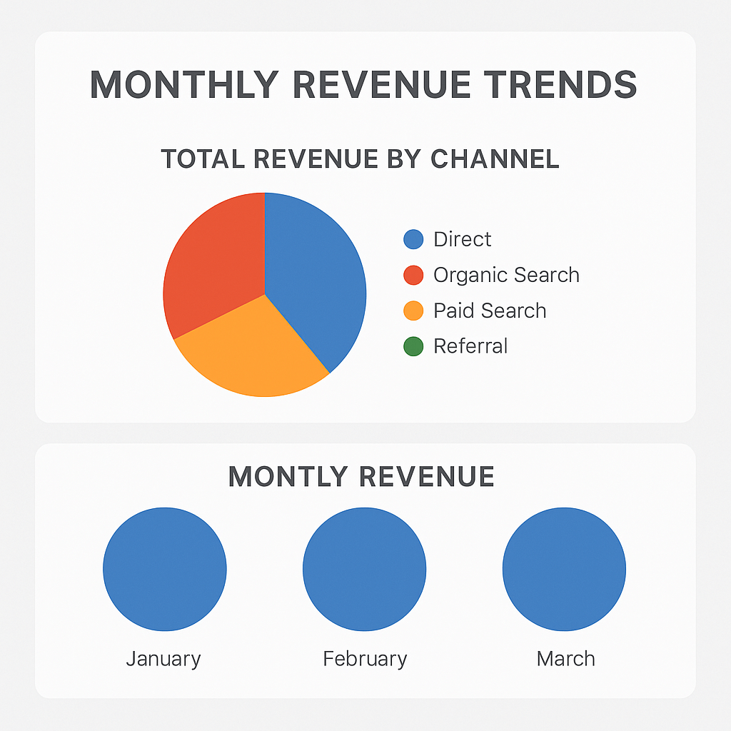
Wrong chart types
Using the wrong chart is like using the wrong lens on a camera. You still capture the data, but what comes through is blurry and hard to interpret.
A classic example is pie charts used to show monthly revenue trends. They are great for showing parts of a whole, like how different channels contributed to total Q1 sales. But when used to compare performance over time, they fall flat. You can’t easily spot growth, decline, or anomalies when you’re forced to interpret slices instead of a line.
Another common mistake with charts is 3D bar charts. They may look flashy in a presentation, but they distort the data, making it hard to compare values. Or, using stacked bar charts to show overlapping campaign performance where it’s nearly impossible to tell which channel outperformed the others.
A good chart should do one thing clearly: make the insight obvious.
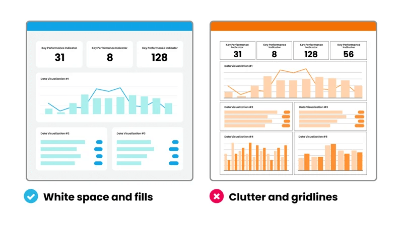
Overcrowded visuals with no hierarchy
When a dashboard tries to show everything, it ends up communicating nothing. Instead of guiding users to what matters, it overwhelms them with too many charts, tables, KPIs, and filters, crammed into a single screen with no clear structure.
Users feel lost. They scan left to right, top to bottom, trying to make sense of what to look at first. But without grouping, a clear entry point, logical flow, it’s a maze of information. Important metrics get buried next to less relevant ones. Everything fights for attention, and nothing wins.
This gets worse when there’s no white space. Dashboards with zero breathing room between elements feel visually noisy and mentally taxing. The best dashboards dedicate 20–25% of the layout to white space to avoid this exact problem, but many treat space like it’s wasted.
Jargon-heavy and broad labels visuals
When dashboards use internal lingo or analyst-speak, they create a silent barrier between the data and the people who need it.
A label like ‘MoM Δ in CPL’ might make sense to a data team, but for a campaign manager trying to hit lead targets, it is unclear if things are getting better or worse and what to do about it. Even common metrics like ‘engagement rate’ can be ambiguous. Is it based on clicks, time spent, shares, or something else?
This lack of clarity is confusing and leads to misinterpretation. Two teams could look at the same number and walk away with completely different takeaways. And once that happens, the dashboard becomes a source of data noise.
Poor color choices
Color should draw the eye to what matters, highlight anomalies, and differentiate clearly between good and bad performance. But in many dashboards, color is used arbitrarily or inconsistently.
Take red and green, for example. In most contexts, red screams ‘alert’ or ‘decline’ while green signals ‘success.’ But if your dashboard uses red to denote a category or uses too many bold colors without hierarchy, it becomes visual clutter.
Accessibility is another issue. Roughly 8% of men and >1% of women are colorblind, primarily red-green deficient. If your dashboard relies solely on red-green coding, you’re excluding a chunk of your users from reading the data correctly.
Heatmaps also backfire when every row is shaded with strong colors, even when the variance is negligible. Users start reacting to the color intensity instead of what the data actually says.
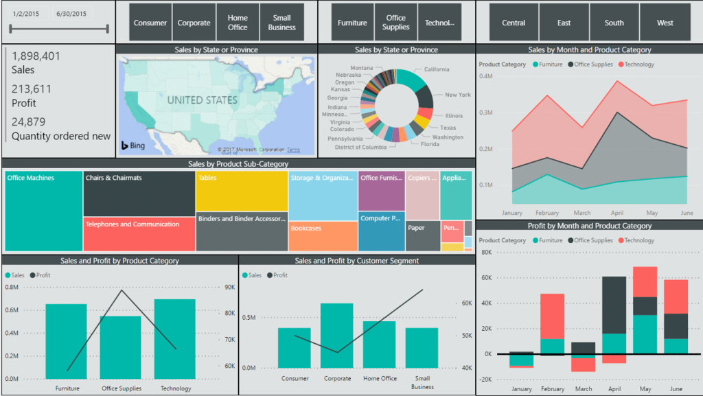
Below is an example of a dashboard with poor color choices.
Principles of designing action-oriented dashboards
Dashboards should do more than display numbers. The best ones tell stories, spotlight problems, and guide action.
But most dashboards fall into one of two traps:
- Too shallow: showing vanity metrics that don’t mean much.
- Too complex: requiring users to decode them like a crime scene.
To fix that, here are six principles with examples to make your dashboards genuinely action-oriented.
#1 Every metric and chart should answer a real marketing question
A dashboard is only as good as the questions it answers. Every chart should help answer a real question, like
- Is this campaign performing better than last month?
- Which channel brought in the most qualified leads?
If not, it only contributes to dashboard overload.
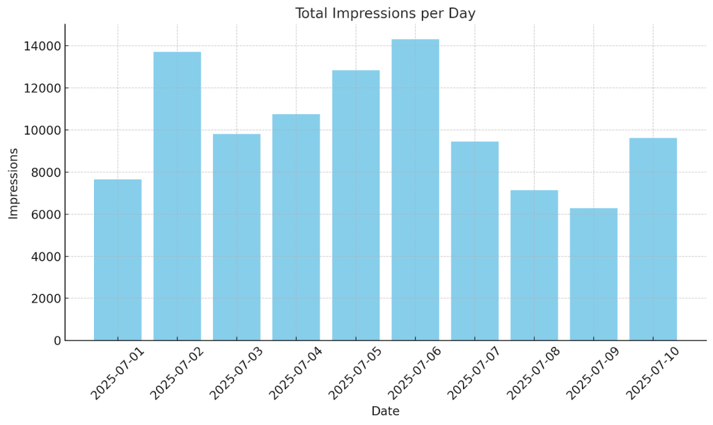
Consider the chart below of an ad campaign performance showing ‘Total impressions per day.’ It looks informative but offers no context, like filters, benchmarks, or a connection to business goals. It’s just data without any insight.
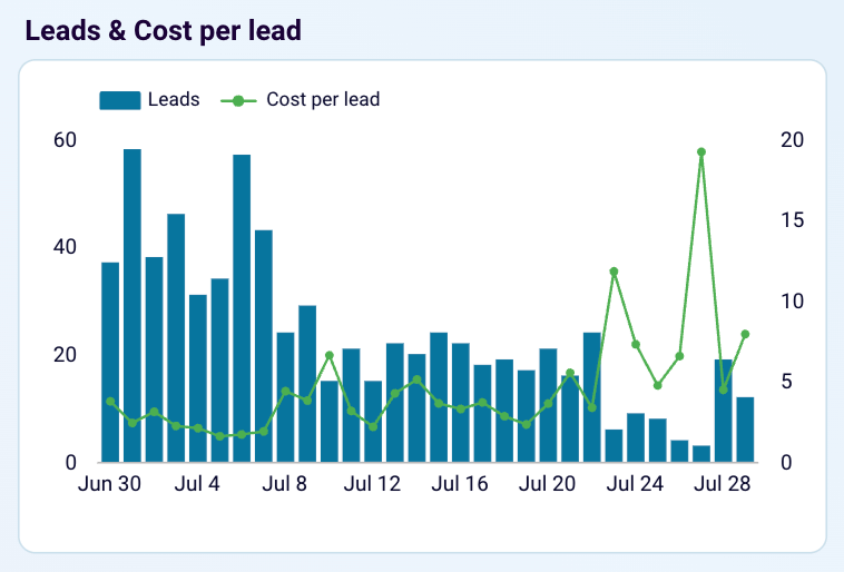
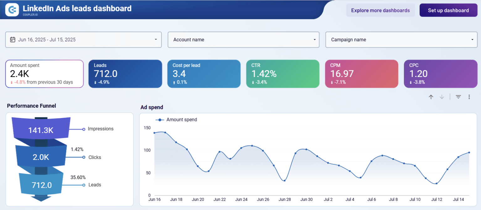
Now compare this with a ‘Cost per Lead’ time series chart from the LinkedIn Ads leads dashboard. It shows how efficiently you’re acquiring leads over time and how often you’re staying within your target. It’s easy to spot trends and take action.
LinkedIn Ads leads & cost per lead
 Preview on dashboard
LinkedIn Ads leads & cost per lead
Preview on dashboardBut not all platforms give you these derived metrics directly. You get total spend, number of leads, impressions, etc. With Coupler.io’s calculated columns, you can create custom columns with formulas like,
Cost per Lead = Total ad spend / Number of leads.
This adds context and helps your dashboard answer real questions like, “Are we spending wisely to get quality leads?”
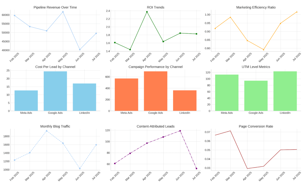
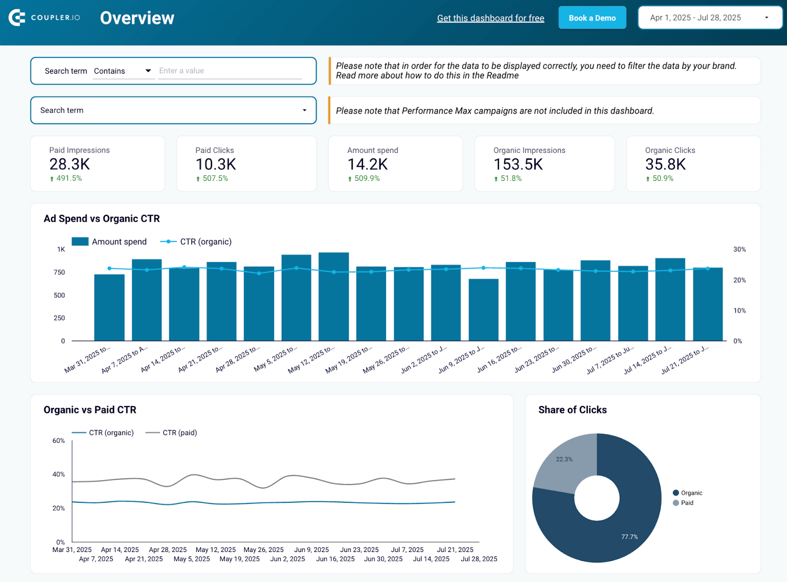
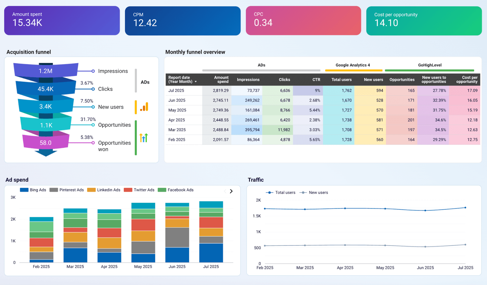
#2 Structure the dashboard the way marketers think and work
Marketers think in funnels: Awareness → Leads → Pipeline → Revenue. Dashboards should mirror this journey. Organizing the dashboard by funnel stages helps users immediately spot where things are working or breaking.
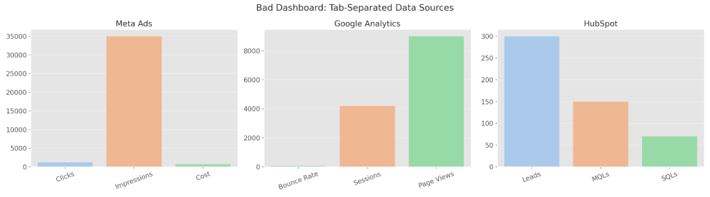
Take a look at the dashboard below. It separates data into three unrelated tabs – Meta Ads, Google Analytics, and HubSpot. Each chart only shows surface-level metrics like clicks, bounce rate, or lead count. There’s no connection between the data, no funnel, and no performance insights. This is a data dump.
Let’s compare this to a thoughtfully structured customer acquisition dashboard. It has:
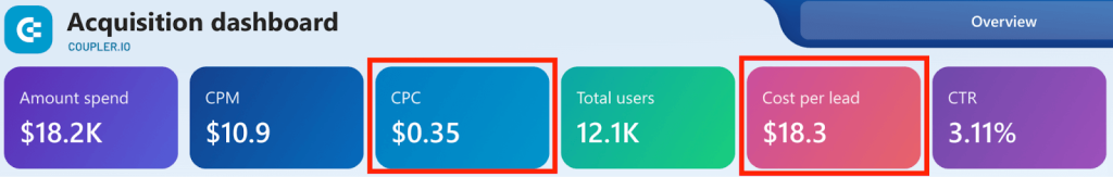
- Overall performance: Amount spent, CPM, CPC, and Cost per Opportunity.
- Funnel view: Impressions → Clicks → New users → Opportunities → Opportunities won.
- Channel performance comparison: Which channel gets the best CPL and quality?
GoHighLevel customer acquisition dashboard
 Preview dashboard
GoHighLevel customer acquisition dashboard
Preview dashboardThis view brings the entire journey together. You can spot where leads drop off, which channels are underperforming, and how to optimize your spend. Now your dashboard is a decision-making tool.
To build a good dashboard like this, you need to blend data from all those sources. This is something most marketers avoid because it’s complex and manual. Coupler.io’s data blending capabilities make it simple with automation. You can pull data from 60+ data sources and blend them with union, join ,and aggregate functions.
#3 Make metrics comparable across channels and time periods
Marketers need to know not just what happened, but how it’s changing over time or how one channel stacks up against another. Without that context, numbers are just numbers.
Take this example: a dashboard shows 3 charts. One each for Meta Ads, LinkedIn Ads, and Google Ads, displaying clicks and leads from last month. At first glance, it feels informative.
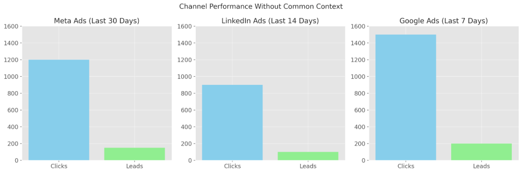
But there’s no common baseline. Different date ranges, no normalized KPIs, and no benchmarks. You can’t tell which channel is improving or wasting spend. It’s like comparing apples to oranges.
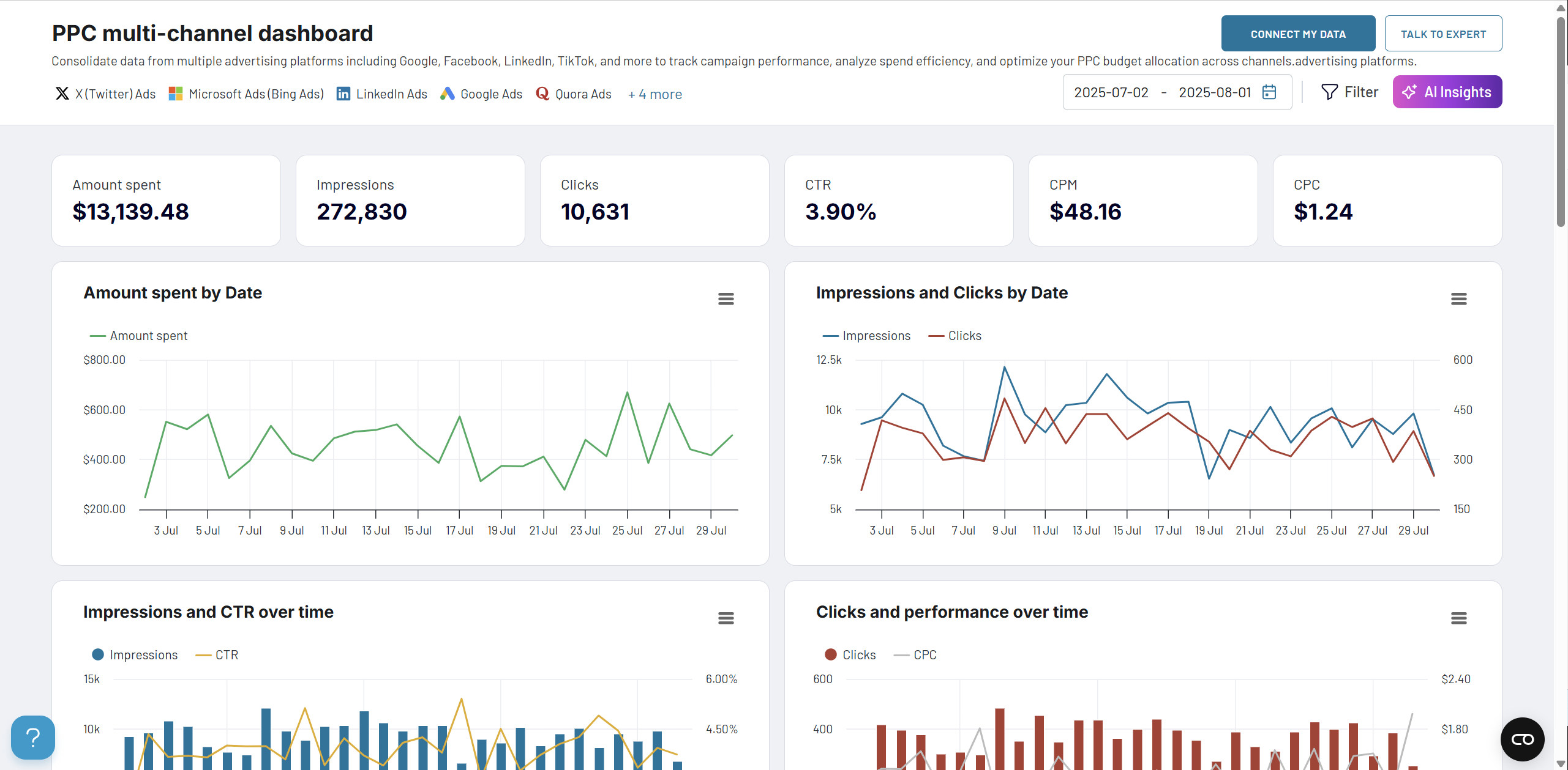
Now compare that to a PPC multi-channel dashboard that brings in:
- A time series chart showing the Amount spent by Date and Source across multiple ad platforms
- A stacked bar chart visualizing the Amount spent by Campaign type, breaking down the cost distribution across campaign goals like Engagement, Traffic, and Max Conversion
- A time series chart of Cost per Click (CPC) by Date and Source, highlighting spikes or dips in ad cost trends over time
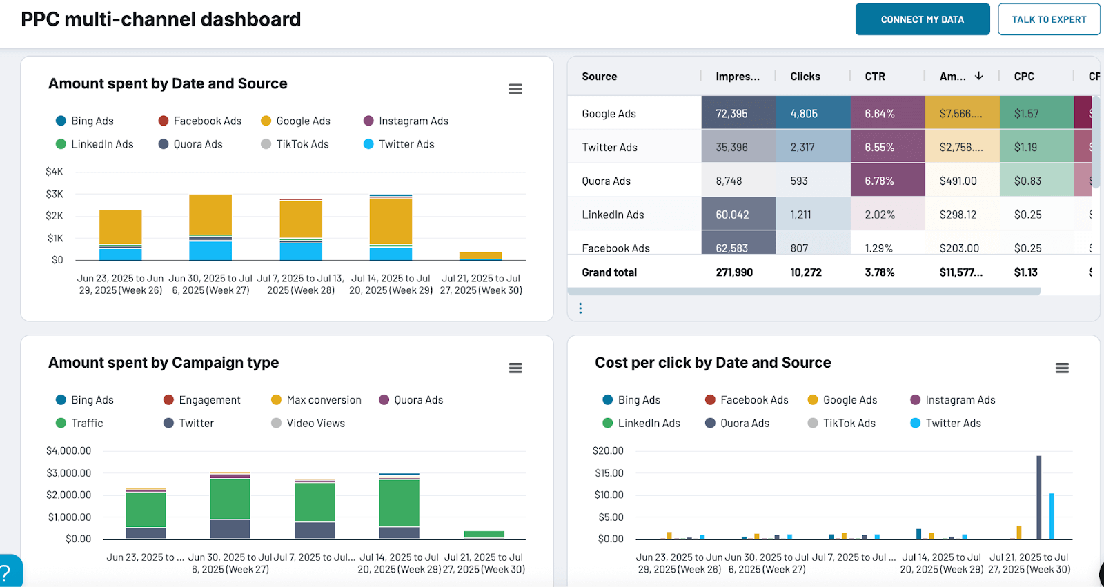
These side-by-side views make it easy to see which campaigns are getting more efficient, which sources are improving in quality, and where to double down or cut back.
But here’s the challenge: platforms often name things differently. One says ‘Form Submissions’, another says ‘Leads’, and a third says ‘Contact Created’. Comparing them directly is tough.
This is where Coupler.io’s data transformation is helpful. You can
- Standardize field names and metrics across data sources (e.g., rename all lead indicators to “Leads”).
- Use formulas to calculate KPIs like CPL, Lead-to-SQL %, and SQL-to-win rate.
- Create unified date fields or normalize time ranges for consistent comparisons.
- Filter and benchmark metrics automatically
Now, you get apples-to-apples comparisons across campaigns, platforms, and time. This makes your dashboard readable and actionable.
#4 Customize the dashboard experience based on the user’s roles and responsibilities
A dashboard that works for everyone usually works for no one.
Different marketers make different decisions, so they need different data. The CMO tracks pipeline and ROI. A performance marketer looks at CPL and creative performance. A content lead wants to know which blog posts drive leads. If everyone is forced to use the same dashboard, it leads to confusion and inaction.
If you create a dashboard that includes ad spend breakdown, content performance, website sessions by device, email open rates, pipeline revenue by region, and more.
At first glance, it looks comprehensive. But for the CMO, it’s too tactical. For the performance marketer, the revenue data feels distant. For the content lead, there’s too much digging to find what matters.
Now imagine a dashboard experience that either has different dashboards for individual roles or different tabs in the same dashboard.
- CMO Dashboard: Pipeline generated by channel, Lead → SQL → Win rates, Marketing ROI by quarter
- Performance Marketer Dashboard: Daily ad spend vs. CPL, Top-performing ad creatives, Lead quality by campaign
- Content Marketer Dashboard: Blog traffic by source, Leads attributed to content, Top-converting landing pages
Each user sees metrics aligned to their work. It’s faster to read, easier to act on, and more aligned with how decisions get made.
Building separate dashboards for each role from scratch is time-consuming and repetitive. With Coupler.io’s marketing dashboard templates, you can skip the setup and recreate custom dashboards for different roles and goals with your own data in just a few clicks.
#5 Make the dashboard fast to load, scale, and act on
A beautiful, insightful dashboard isn’t useful if it takes forever to load or breaks the moment you add a new data source.
As your business scales, so does your data with more campaigns, more tools, and more metrics. If your dashboard slows down, needs frequent manual updates, or crashes with volume, it becomes a bottleneck instead of a decision-making tool.
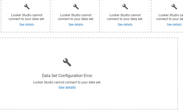
Let’s say your dashboard pulls data from Facebook Ads, Google Ads, LinkedIn Ads, and Microsoft Ads. And someone adds TikTok Ads next quarter. Or you increase the reporting window from 30 days to 6 months. Will the dashboard still load quickly? Will charts still be usable?
Here is what happened when we did the same in our Looker Studio dashboard.
It froze.
Charts took 30+ seconds to load. Some didn’t show up at all. Filters became unresponsive. And every small change, like adjusting the date range or toggling a campaign, meant waiting for a long time. Eventually, the team stopped using it altogether and went back to manual Excel reports.
That’s when we started creating dashboards within Coupler.io. Since then, life has been good because, our dashboards
- Scale with your data volume, whether you’re tracking 100 or 100,000 leads.
- Automate data refreshes on schedule, so no more manual pulls or stale metrics.
- Let you filter by channel, date range, region, or campaign instantly, without lag.
- Are equipped with AI insights – an AI-generated dashboard summary designed to help you quickly make sense of your data
The result is a dashboard that’s always ready, always fast, and always actionable, irrespective of how your marketing grows.
Key elements that make dashboards actionable
You’ve seen the rules. Now let’s talk about the design elements that make dashboards clear, goal-driven, and actually useful.
KPIs that support your marketing goals
Before selecting KPIs for your marketing dashboard, ask yourself: Do these metrics help you make a decision?
If the answer is no, they don’t belong on the dashboard.
Follow the #1 principle: Every KPI should map directly to a marketing objective or decision.
For example, if your goal is to scale paid ads, then focus on Cost per lead, ROAS, Conversion rate by channel, and Customer acquisition cost (CAC).
Charts that spot trends and outliers
Line charts, area graphs, and combo charts are your best friends when it comes to spotting trends over time, spikes, drops, or unusual patterns. These visuals make it easy to answer questions like:
- Are leads from LinkedIn steadily increasing month over month?
- Did email open rates suddenly drop last week?
- Is one campaign driving 5x more MQLs than the others?
For example, this LinkedIn dashboard reveals spikes or dips in spend and correlates them with lead‑generation trends
Key insights first
Dashboards aren’t novels. Your audience won’t read every number. That’s why layout matters as much as the data itself.
Use natural reading behaviors to your advantage. Most people scan screens in a Z-pattern (top-left → top-right → bottom-left → bottom-right) or follow a quadrant layout (dividing the dashboard into four key areas).
Put your most important KPIs like revenue, MQLs, or ROAS in the top-left corner. This is where the eye lands first. Supportive metrics like source breakdowns or campaign comparisons can follow in the next zones.
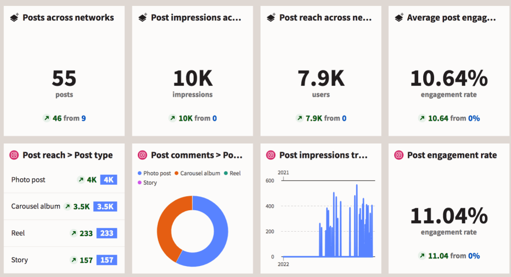
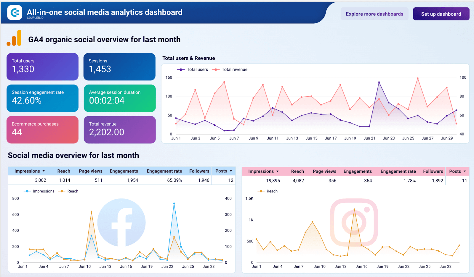
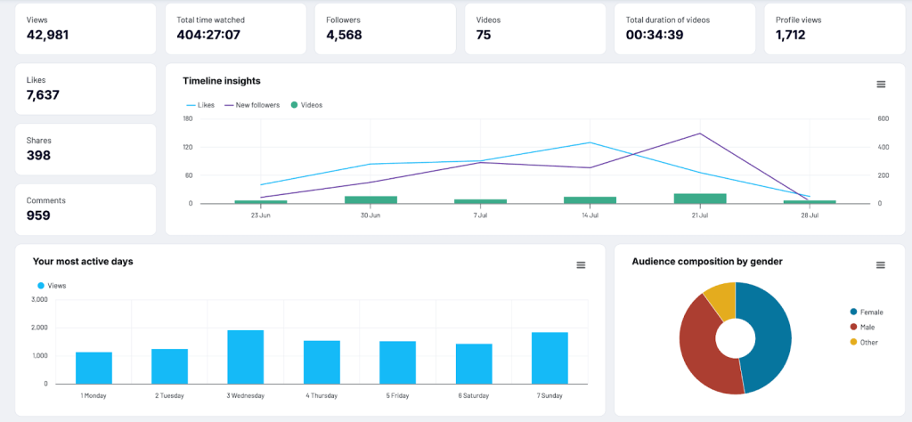
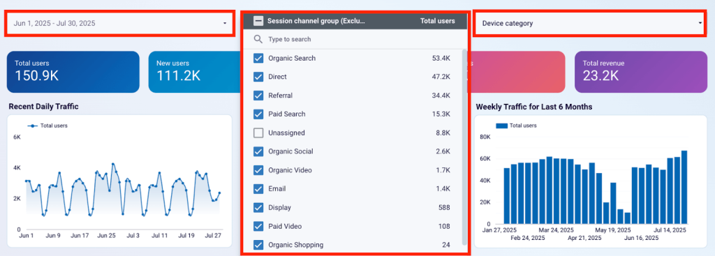
Let’s say you’re building an All-in-one social media analytics dashboard. Here’s how you’d structure it:
- Top-left (high priority): Your core KPI cards like total users, purchases, total revenue, etc.
- Top-right: Combo trend chart shows total users and total revenue over time
- Bottom: Detailed source-wise performance tables for each social media platform
All-in-one social media analytics dashboard
 Preview dashboard
All-in-one social media analytics dashboard
Preview dashboardWhite space and typography for clarity
Whitespace, also called negative space, is the empty space between elements on a dashboard. It gives your content room to breathe, improving clarity and focus.
Good dashboards use 20–25% whitespace to give breathing room between sections. This helps reduce visual fatigue and guides your eye to what matters most.
Typography also plays a huge role; use consistent font styles, scalable sizes, and bold weights to create visual hierarchy.
For example,
- Use larger, bold fonts for section headers like ‘Performance Overview’
- Use medium font weights for metrics like ‘Monthly Revenue: $45K’
- Use smaller, lighter fonts for supporting labels or axis text
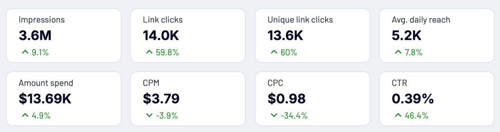
Color and contrast in text
Your eye should land on the most important number first — that’s where high contrast (like bold black or dark blue) works best. Supporting details like labels or comparisons can be in lighter, muted shades to reduce visual noise.
In the example below, each metric is clearly styled for quick readability:
- Metric names appear in subtle gray text (e.g., Impressions, Link clicks, CTR)
- Current values are displayed prominently in bold navy blue (e.g., 3.6M, 14.0K, 0.39%)
- Percentage changes are shown below each value in bright green, with arrows indicating the direction of change (up or down)
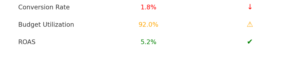
Visual signals to highlight what needs attention
Even the best metrics can go unnoticed if they don’t visually ask for attention. Use conditional formatting (like red for underperformance, green for targets met), up/down arrows, or flag icons to highlight issues. These cues let marketers scan the dashboard and know exactly where to zoom in.
Here’s a simple visual showing how visual signals like color, icons, and arrows can quickly guide attention in a dashboard:
- Conversion Rate is below 2%, shown in red with a downward arrow (↓)
- Budget Utilization exceeds 90%, highlighted in orange with a warning icon (⚠️)
- ROAS is healthy, marked in green with a check mark (✔️)
Choosing your color palette
Limit your palette to five colors max to avoid overwhelming the user. When dashboards are filled with too many shades, users spend more time decoding than deciding.
Each color should have a job:
- Priority: Red signals a drop. Green shows progress. Yellow means “needs attention.”
- Category: Use one color family for Paid, another for Organic, and a third for Email, so users can instantly identify the source.
- Brand alignment: Want to reflect your brand tone? Use your core brand color for headers or KPIs, but don’t overdo it.
For example, the below TikTok analytics dashboard takes a bold approach by moving away from the conventional white backgrounds but still improves visual identity and usability. It adapts TikTok’s brand colors by using a dark theme to reduce eye strain and make the data pop. Here’s how the color palette has been applied mindfully:
- Blue is used for total shares across the timeline and bar charts, ensuring consistency in tracking sharing behavior.
- Pink represents profile views, helping you quickly distinguish between engagement types in the timeline insights.
- White text on black cards creates a strong contrast for key KPIs like views, likes, and comments, enhancing readability.
- Neon cyan and pink dual rings visually differentiate performance metrics such as Likes, Comments, and Shares, echoing TikTok’s brand identity.
- Light blue bars in ‘Most Active Days’ provide a quick glance at peak engagement periods, standing out well on the dark background.
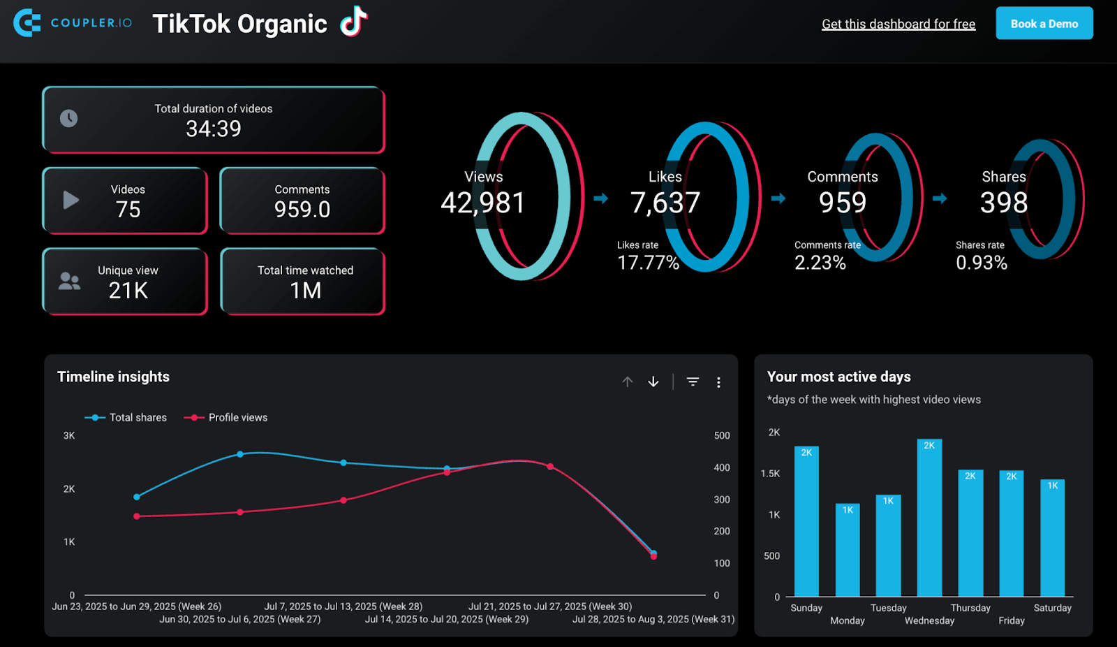
- Teal is used for all Organic channel metrics, offering consistency across charts.
- Purple indicates Paid Ads data, making it easy to scan paid performance.
- Red flags critical issues like when ROAS drops below 2, a red icon immediately draws attention.
- Green highlights top-performing campaigns, helping you quickly identify what’s working best.
- A yellow icon signals when Budget Utilization exceeds 90%, prompting timely budget reviews.
By sticking to just five functional colors, the dashboard avoids visual clutter and ensures that every color signals something meaningful.
Filters to explore data
Filters are like remote controls for your dashboard. They put users in charge of what they want to see. By allowing filtering by channel, campaign, geography, or time period, you turn a static report into an interactive decision-making tool.
Automated data refresh
Outdated dashboards lose trust. Once your team realizes the numbers aren’t fresh, they stop relying on the data and start relying on gut decisions.
That’s why automated data refresh is a foundation element.
With Coupler.io, you can schedule real-time or frequent data syncs from multiple marketing sources like Google Ads, HubSpot, Facebook, or your internal database directly into your dashboard tool, be it Google Sheets, Looker Studio, Power BI, etc.
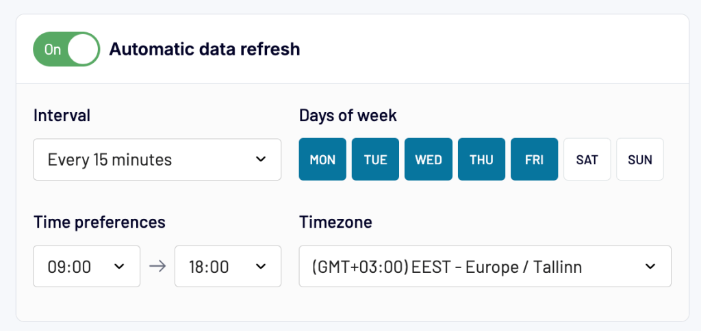
Whether you need a daily refresh at 7 AM before the team logs in or an hourly update for mission-critical campaigns, Coupler.io makes sure your dashboards are updated.
When every data point updates on autopilot, decisions become faster, bolder, and more confident.
Automate your dashboards with Coupler.io
Get started for freeImplementation guide: The 7-step framework to go from metrics to action with Coupler.io
After exploring the principles behind action-oriented dashboards and the design elements that make them useful. Now, it’s time to bring it all together.
This 7-step framework combines everything you’ve learned so far into a practical workflow. One that helps you build dashboards that update in real-time and guide your team towards data-backed decisions.
If your current dashboard feels underused or disconnected from daily work, this framework will help transform it into something teams actively rely on and trust.
Step 1: Define dashboard goals and audience
Before you build a dashboard, you need clarity on its purpose. Broadly, dashboards serve one of two goals:
- Exploratory dashboards: These are built for analysis. They help analysts and marketers slice, dice, and dig into data to uncover patterns, trends, and answers to ad-hoc questions.
- Operational dashboards: These are built for ongoing use by teams and leaders. They provide a consistent view of business performance and are referenced daily, weekly, or monthly to monitor KPIs, spot red flags, and make decisions.
Why does this distinction matter?
Because the goal of your dashboard directly impacts how you approach data selection, design, refresh frequency, and stakeholder engagement. A one-size-fits-all dashboard ends up pleasing no one.
To define the right goal, start by asking:
- What decision or action should this dashboard support?
- Will this dashboard be used regularly or just for one-time analysis?
- Is this for performance monitoring or deep-dive exploration?
Once you’re clear on the goal, shift focus to the audience.
A dashboard’s success hinges on how well it serves its users. That means identifying who will use it, how often, and in what context.
To define and align with your audience, here are 3 questions to guide your alignment:
- What processes will this dashboard help eliminate or simplify?
- How many stakeholders will benefit from this dashboard?
- How will each stakeholder use this data in their day-to-day decisions?
For example, a marketing director may need an operational dashboard that shows weekly lead generation, cost per lead, and ROAS across all campaigns to decide budget allocation. Meanwhile, a data analyst might require an exploratory dashboard focusing on website traffic segments and funnel drop-offs to troubleshoot conversion issues.
Step 2: Select metrics and decide how to visualize each
Once the dashboard’s purpose is defined, the next step is to choose which metrics matter and how they should appear on screen.
A common mistake here is stuffing the dashboard with every possible data point. But more data doesn’t always mean better insights. Each metric should earn its place by answering a specific question or enabling a decision.
Ask:
- What decisions are stakeholders trying to make with this dashboard?\
- Which metrics will help them make those decisions faster?
- Do they need a quick overview (e.g., scorecards), trend over time (e.g., line charts), or breakdown by segment (e.g., bar charts or tables)?
Keep it simple and intuitive. If the audience struggles to understand a chart, they won’t trust or use the dashboard. Your job is to tell a clear story, one metric at a time.
Also, Co-creation improves adoption. Involve stakeholders early when deciding what to include and how to show it. Get their feedback on whether a certain metric is useful, confusing, or unnecessary. This builds trust and makes them more likely to rely on the dashboard.
For example, let’s say you’re building a dashboard for a paid ads team. Instead of dumping raw campaign data, highlight the three metrics they care about most: cost per click, ROAS, and daily spend. Show them as KPIs on top, then add a line chart showing performance over time, and a bar chart comparing campaigns by channel. That way, they instantly know where to look and what to do next.
Step 3: Connect + transform data from marketing tools
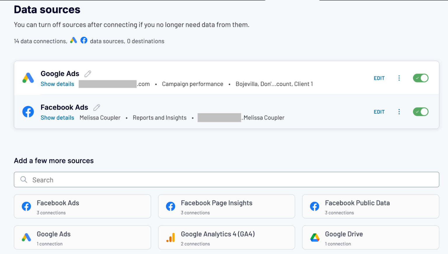
In most teams, data lives in silos. Your CRM knows about leads, your ad platforms know about spend, and your analytics tool tracks conversions. To make better decisions, you need a unified data flow that brings it all together.
Start by identifying which tools you want to pull data from for your dashboard. For example:
- Google Ads for impressions, cost, and conversions
- HubSpot for MQLs and SQLs
- GA4 for session and conversion data
- LinkedIn Ads for campaign performance
Once you know the sources, here’s how to set them up, without needing a developer or writing scripts.
Sign up or log in to a Coupler.io free account. Create a data flow by selecting the data sources and destination of your choice.
Create a data flow right away for free
 Try Coupler.io
Create a data flow right away for free
Try Coupler.ioOnce all your sources are connected and configured, the next step is to combine and clean this data into one usable view. Under the Transformations section, Coupler.io gives you three options:
Append: Combine similar datasets from multiple sources
Use Append when you’re working with data that shares the same structure, like ad performance from multiple platforms.
For example, say you’ve connected both Facebook Ads and Google Ads. They each provide metrics like impressions, clicks, cost, and conversions. With Append, you can stack both datasets into a single table that looks like this:
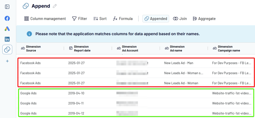
This gives you a unified performance view across ad platforms. It is perfect for campaign comparison.
Join: Merge different data sources using a common key
Use Join when you want to bring together data from two sources that share a common key, like a date or campaign name.
For example, say you’ve connected LinkedIn Ads and Google Search Console. LinkedIn shows ad performance, while GSC shows organic search trends. By joining them on the Date column, you can view clicks and impressions from both sources in a single table:
Left side: LinkedIn Ads (clicks, spend)
Right side: Google Search Console (impressions, CTR)
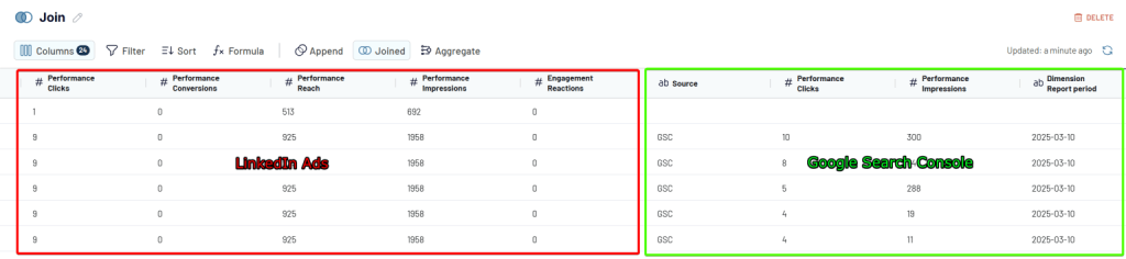
This gives you a blended view of how paid campaigns impact organic visibility. It is a good option for cross-channel performance insights.
Aggregate: Summarize data for high-level insights
Use Aggregate when you want to group your data and apply functions like sum, average, or count.
For example, say you’ve pulled daily performance data from Google Ads. To see total results by campaign, use Aggregate to group by Campaign Name and sum up metrics like clicks, cost, and conversions.
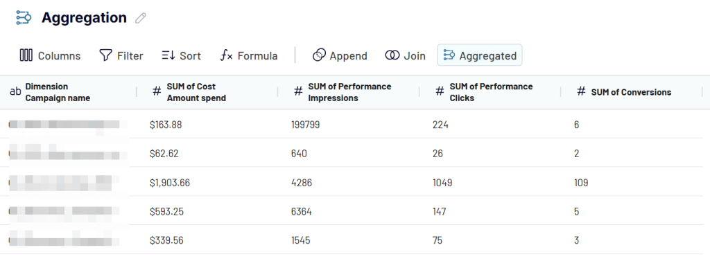
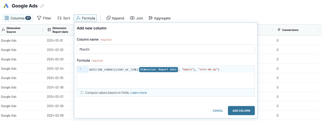
If you need weekly or monthly summaries, just create a custom column for Month using a formula like:
DATETIME_FORMAT(START_OF_TIME({Date}, “MONTH”), “YYYY-MM-DD”)
Then, use that column as your grouping dimension.
For metrics like CPC or CTR (which are ratios), don’t average them. Instead, sum the base metrics (costs, clicks, impressions) and recalculate:
Correct CPC = Total Cost ÷ Total Clicks
Correct CTR = Total Clicks ÷ Total Impressions.
This gives you accurate roll-ups for better decision-making.
Other transformations
Before joining, appending, or aggregating, use these transformations to prepare your dataset:
- Column Management: Remove unnecessary columns and rename them for clarity. This helps simplify your table and makes dashboards cleaner.
- Filter: Include only the rows you care about. For instance, filter Google Ads data to show only active campaigns or a specific country.
- Sort: Arrange your data by any column. You might sort campaigns by highest spend or most conversions to prioritize analysis.
- Custom Columns: Create new columns using formulas. For example, Add a Month column:
DATETIME_FORMAT({Date}, “YYYY-MM”)
Calculate ROAS = Revenue ÷ Cost
This helps customize your dataset to your business logic before building dashboards.
These transformations make your raw data cleaner, more insightful, and ready for analysis in tools like Looker Studio or Power BI.
Step 4: Use your preferred visualization tool and schedule auto-refresh
Now that your data is cleaned, transformed, and ready, it’s time to push it to your selected destination.
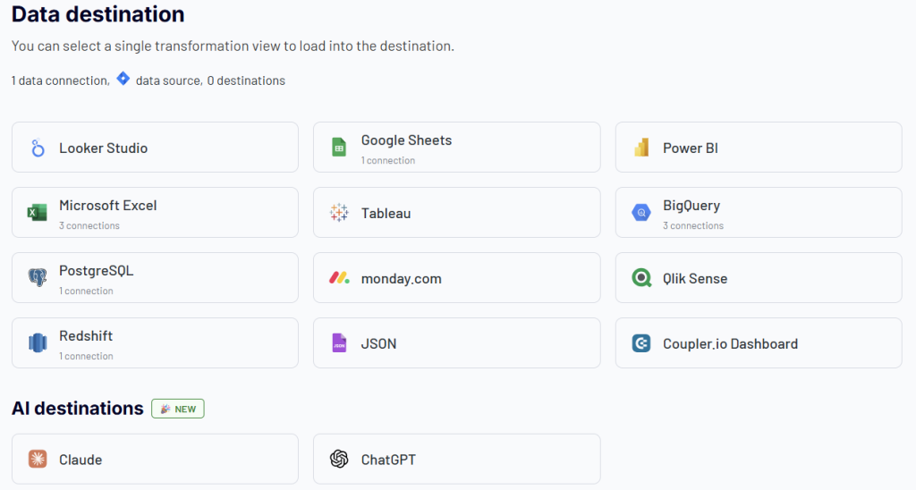
Go to the data destination tab of your dataflow, choose the destination, and fill in the required details. For example, provide the spreadsheet and tab name (Google Sheets), configure dataset names and connection details (LS and Power BI), enter your project ID and table schema (BigQuery), and likewise for others.
Once configured, Coupler sends the most updated version of your transformed data, including any joins, filters, or aggregations, to your chosen destination.
To keep your dashboards and reports always up to date, you can set up an automatic data refresh schedule, hourly, daily, or at custom intervals. That means your data pipeline runs hands-free in the background without any manual updates or CSV uploads.
Step 5: Choose the right charts and advanced analytics for your data
The best chart type is the one that makes your data’s story impossible to misunderstand.
Once your unified dataset reaches the dashboard tool (like Looker Studio or Power BI), it’s time to bring it to life visually.
Let’s break it down with chart types and examples:
- Bar and column charts: For quick comparisons
Use this to compare several categories like different campaigns or several marketing channels
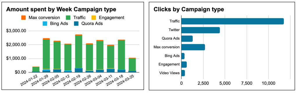
Example: Compare weekly spend and total clicks side-by-side to quickly identify which campaigns (like Traffic or Twitter) are delivering the most value for your budget.
- Line charts: For trends over time
Perfect when tracking growth, dips, or seasonality.
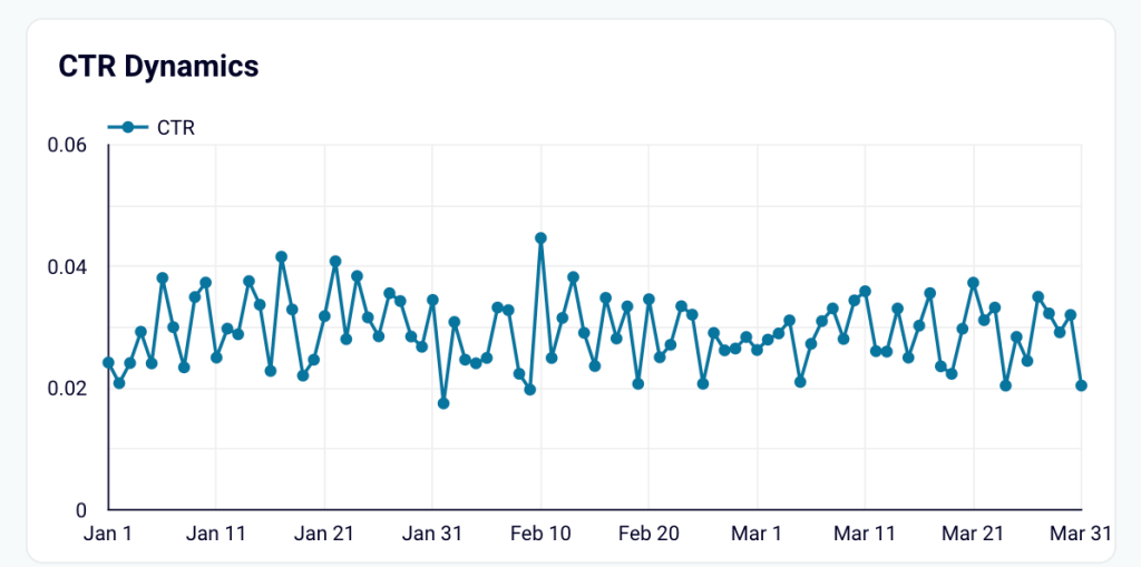
Example: Visualize how the CTR evolved day by day, spikes, dips, and patterns that reflect real user behavior. Instead of scanning through endless rows of dates and numbers, one smooth line tells the entire story.
- Combo charts: For two metrics at once
A hybrid chart is super helpful when you want to show correlation.
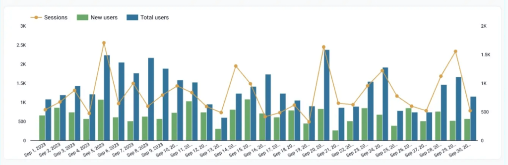
Example: Use bars for new vs. total users and a line for sessions to spot traffic spikes and user growth trends over time.
- Scatter plots: For performance patterns
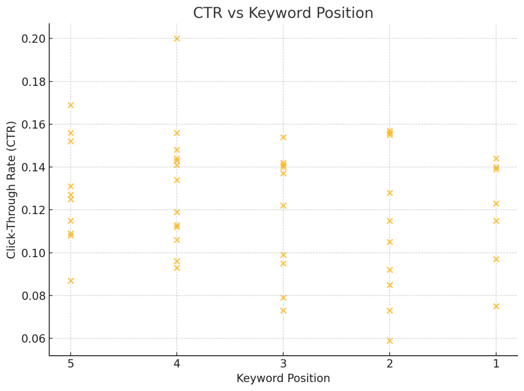
Want to analyze the relationship between average position and click-through rate (CTR)? A scatter plot can help identify sweet spots or outliers.
Example: Spot if keywords in positions 3–5 actually get better CTR than the top position.
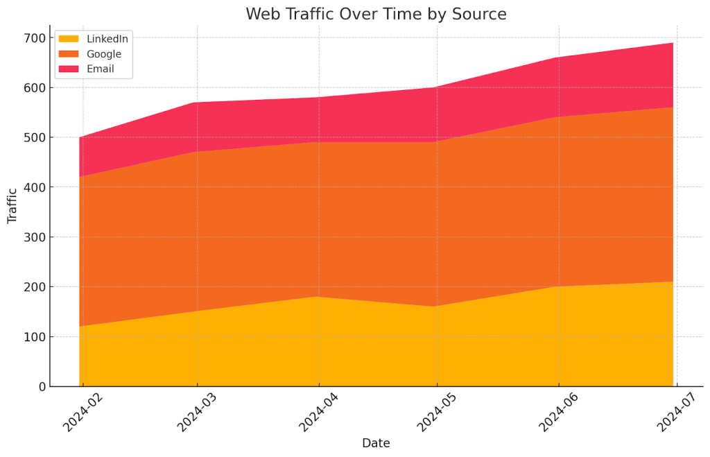
- Stacked area charts: For share contribution
Use this to show how different sources (LinkedIn, Google, email) contribute to total web traffic over time.
Example: One glance and you know which channel is doing the heavy lifting month over month.
To take your dashboards a step further, you can add intelligence to your dashboards with interactive layers, drill-downs, and automated alerts that surface insights without you having to dig for them.
- Drill-downs: Click on a channel to see campaign-level performance. Click again to explore ad groups.
Example: In Power BI, a drill-through from the summary page to detailed performance by keyword.
- Trend lines & forecasts: Add trend lines to highlight performance shifts.
Example: Use Looker Studio’s trend feature to show if your conversion rate is improving week over week.
- Custom alerts: Set rules to notify you when key metrics spike or drop.
Example: Get an alert when your daily LinkedIn spend crosses ₹5,000 or when CTR falls below 1%.
Step 6: Include cues for next steps
After setting up drill-downs, comparisons, and trend views, the final layer of a high-impact dashboard is context—small, intentional cues that nudge the viewer toward the next move.
These are micro-signposts that guide interpretation without cluttering your visuals.
Some smart ways to cue action are:
- Annotations on key data points (e.g., “Campaign launched here”).
- Color-coded alerts when a metric goes above or below threshold (e.g,. CPL > ₹1000).
- Comparative tags that say more than the number (e.g., “+12% vs last month”).
- Callouts or next steps summarizing the takeaway (e.g., “Double down on Google Ads—highest ROAS”).
These subtle cues turn passive dashboards into proactive ones.
Now, instead of manually writing annotations or setting alerts, you can let AI surface the insights for you.
AI Insights, available exclusively on Coupler.io dashboards, give you:
- A summary of what’s happening in the data
- Key performance highlights
- Actionable recommendations based on actual trends in a single click
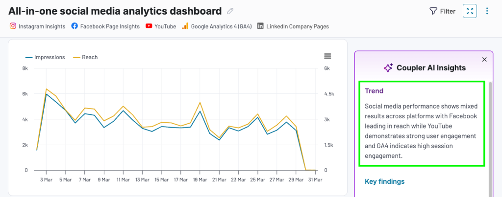
Coupler.io AI delivers insights you’d normally spend hours digging for. For example, you can spot a sudden drop in leads, identify the best-performing campaign, or flag areas for improvement.
Step 7: Monitor dashboard usage and impact
Once your dashboard is live, it is time to track the dashboard usage. Because if no one’s looking at it or acting on it, it’s just a pretty static board.
You’ve put thought into clean visuals, intuitive layouts, and actionable insights. But now it’s time to look under the hood and ask:
- Are people actually using these dashboards?
- Has it saved time or replaced any outdated reports?
- Is it helping teams make faster, better decisions?
If the answer to these questions is fuzzy, usage metrics can bring the clarity you need.
Start with tracking the basics:
- How many users view the dashboard?
- How often do they come back?
- Which pages or filters are most used?
These insights help you pinpoint what’s working and what might need a revamp. For example, if users frequently visit a specific filter or chart, that’s a sign it’s solving a real problem. If another section is never touched? It might be clutter.
Most modern tools are catching up to this need:
- Power BI offers built-in Usage Metrics Reports where you can track total views, unique viewers, and even create custom usage dashboards. It’s available to Pro and PPU users and refreshes daily.
- Sisense has Usage Analytics Dashboards to help you monitor which widgets get attention and who’s engaging.
- Tableau lets you monitor traffic, user activity, and view logs to identify your dashboard champions (and ghost viewers).
If you’re using other visualization tools that don’t track views,
- Embed your dashboards on a tracked webpage and use Google Analytics.
- Add a simple feedback layer like a form, reaction buttons, or emoji-style ratings:
– ❤️ Love it
– 💡 Insightful
– ⚠️ Confusing
– 💬 Needs more detail
To encourage users to give feedback, prompt them to react with a one-word takeaway. Over time, this kind of soft data can show how your dashboard evolves from being “just another report” to a reliable decision-making asset.
Bonus: Examples of action-oriented marketing dashboards
Not every team has the time or resources to build a dashboard from scratch, and that’s okay. If you’re looking for a head start, Coupler.io already offers ready-to-use dashboard templates that are built with action in mind.
These dashboards aren’t just pretty visuals. They apply everything we’ve talked about so far: clear metrics, context-driven visuals, AI insights, and cues for what to do next.
Here are five dashboard examples worth exploring, whether you want to experiment, get inspired, or plug-and-play your own data into them.
All-in-one marketing overview dashboard

If you’re looking for a single source of truth for your marketing performance, the All-in-one marketing overview dashboard is a solid place to start. It brings together high-level KPIs like cost, clicks, impressions, conversions, and ROAS into one clean view to help you understand performance at a glance. The layout places the most critical numbers right at the top, so you can instantly spot what’s working and what’s not without digging through tabs or spreadsheets.
What makes this dashboard action-oriented is how it combines summary metrics with campaign-level drilldowns. You can filter by platform or time period, compare ROAS across channels, and even analyze ad performance trends. This kind of structure makes it easy to decide where to scale, pause, or optimize your campaigns.
It highlights outcomes, reduces mental load, and guides next steps through clean visuals.
You can get this exact dashboard populated with your own data. Just click on Connect My Data, follow the instructions, and your custom dashboard will be ready in minutes.
Web analytics dashboard
The Web analytics dashboard gives you instant clarity on what’s happening across your website. From traffic trends and session quality to bounce rate and top-performing pages, it’s all laid out to help you understand what’s working and what’s not.
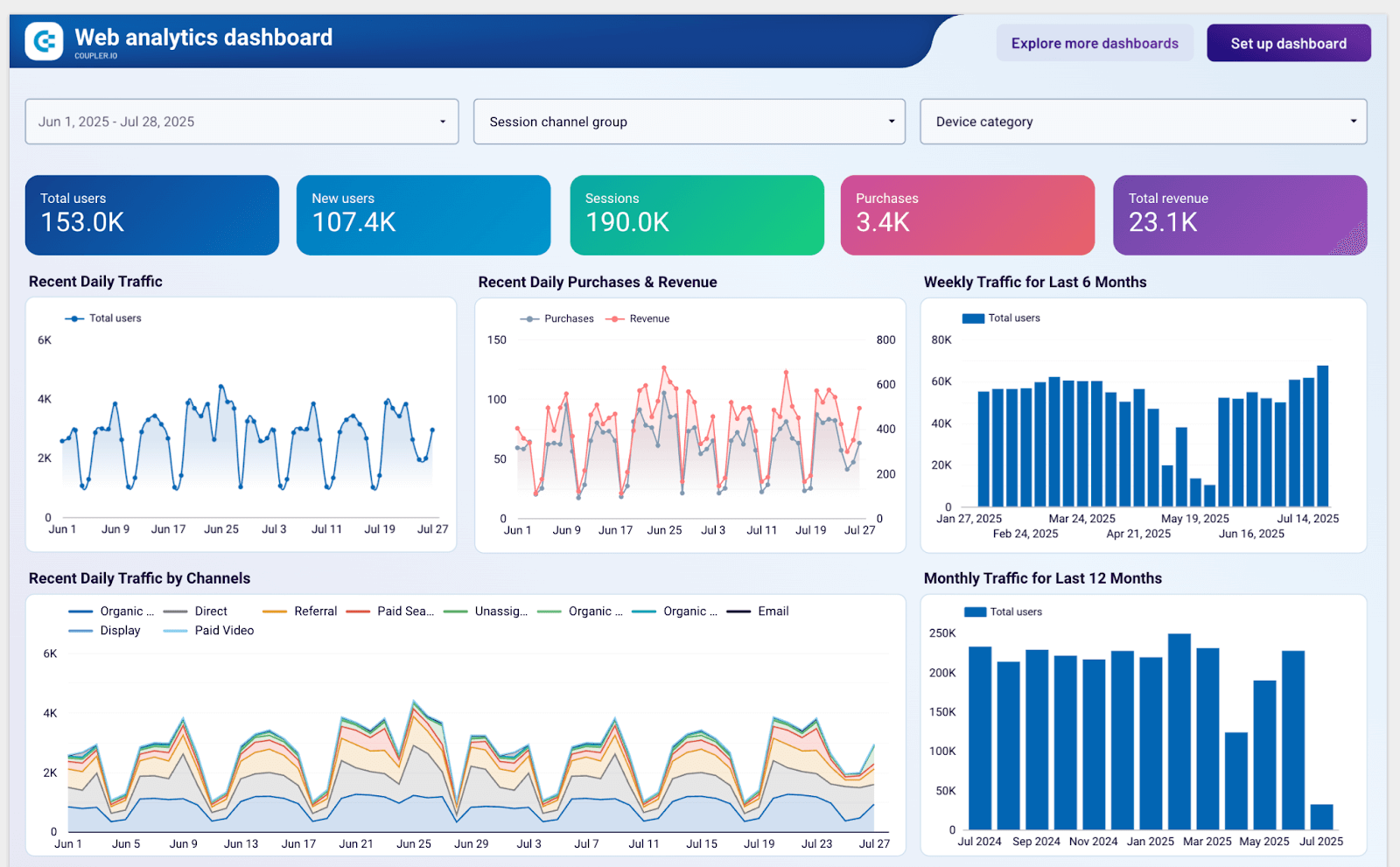
It’s built for action. You can drill down by device or source, identify high-exit pages, and spot traffic dips before they become a bigger issue. It helps you fix leaks, improve user experience, and double down on channels that convert. You’ll notice how it follows the same principles we covered earlier—surfacing key insights, reducing friction, and helping you move fast.
Want to try it with your own website data? Click Set up dashboard and follow the steps. You’ll have a ready-to-use dashboard populated with your site data.
Branded organic search vs. paid campaigns dashboard
This Branded organic search vs paid campaign performance dashboard lets you compare how your brand performs across two critical acquisition channels: organic search and paid ads.
Branded organic search vs. paid campaign performance dashboard for Google
 Preview dashboard
Branded organic search vs. paid campaign performance dashboard for Google
Preview dashboardYou can instantly see whether your branded organic traffic is pulling its weight or if paid campaigns are delivering better ROI. It’s especially useful when you’re deciding how to allocate budgets, prioritize SEO, or double down on high-converting ad creatives.
The layout is action-oriented with side-by-side charts, CTR trends, and performance breakdowns, making it easy to spot gaps and opportunities. You don’t need to dig around for answers; the dashboard surfaces them for you.
To get the same dashboard with your data, go to the Readme tab, follow the instructions, and you’ll have it set up in minutes, ready to guide your next marketing decision.
Go-High Level customer acquisition dashboard
This Go High-Level customer acquisition dashboard gives you an instant pulse check on how your lead generation efforts are converting into paying customers.
GoHighLevel customer acquisition dashboard
 Preview dashboard
GoHighLevel customer acquisition dashboard
Preview dashboardAt a glance, you can track each stage of your funnel, from new leads and opportunities to booked appointments, sales, and revenue. The progress bars and stage-wise breakdown make it super easy to identify where prospects are getting stuck and what’s actually working.
Need to double down on a winning campaign? The source-level performance chart helps you spot top-performing lead sources and channels, so you know where to invest more budget. Want to cut inefficiencies? Quickly filter by funnel name, campaign type, or status to zoom in on underperformers.
Just click on Set up dashboard to plug in your Go High-Level data, and you’ll have this same real-time view to guide smarter growth decisions without digging through spreadsheets.
Shopify marketing funnel dashboard
The Shopify marketing funnel dashboard gives DTC and eCommerce teams a full-funnel view of how their marketing efforts drive revenue, from first touch to final sale.
Shopify marketing funnel dashboard
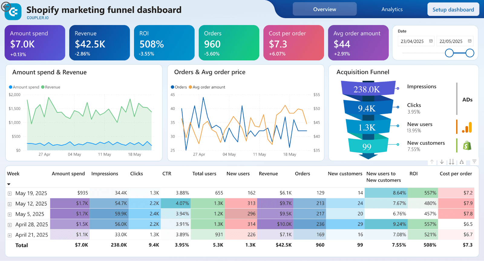 Preview dashboard
Shopify marketing funnel dashboard
Preview dashboardAt the top, you get a bird’s-eye snapshot of your funnel: visitors, leads, orders, and revenue. Immediately see where drop-offs are happening and where to focus next, whether it’s driving more traffic or improving product page conversion.
Each visual digs deeper. Conversion rate charts highlight how efficiently your funnel is turning traffic into transactions. Channel-wise breakdowns help pinpoint which platforms are actually delivering profitable customers, so you can reallocate spend with confidence.
To act fast, use the filters for campaign, product category, or time range to get hyper-specific insights. It’s ideal for spotting winning campaigns, high-performing products, or seasonal trends, and doubling down while it counts.
With real-time funnel visibility, you can move quickly, test smarter, and scale what works. To get this dashboard, click on Set up dashboard, follow the instructions, and you’ll see it populated with your data.
From data clutter to clarity that drives action
We started with a common frustration: marketing dashboards packed with data, but light on answers. Pretty charts alone don’t drive growth; clarity, and action do.
Throughout this piece, we unpacked what separates the noise from the signal. The best dashboards show you what’s working, what’s not, and what to do next. They bridge the gap between strategy and execution.
When built right, a marketing dashboard becomes your team’s decision-making engine. It helps you shift from gut-driven to insight-led, from reactive to proactive. It brings your campaigns, channels, and conversions into one sharp, real-time view, so you can act faster and smarter.
In short, data should never slow you down. The right dashboard makes sure it never does.
Build action-oriented marketing dashboards with Coupler.io
Get started for free