
Choosing the right financial dashboard depends on what you need to track: profitability, cash position, outstanding invoices, recurring revenue, or all of the above. In this article, I cover 14 financial dashboard examples organized by use case, each backed by a ready-to-use template you can populate with your own data from QuickBooks, Xero, Stripe, or Shopify.
Beyond the examples, you’ll find guidance on which KPIs belong on each dashboard type, how to set up automated reporting with Coupler.io, and how to use AI to ask follow-up questions about your financial data in plain language.
Which financial dashboard do you need?
The table below maps each dashboard type to the role it serves, the KPIs it tracks, and when it makes the most sense to use. If you already know what you need, jump straight to the example.
| Dashboard type | Best for | Key KPIs | When to use it |
|---|---|---|---|
| Executive / CFO overview | CEOs, CFOs, board reporting | Total revenue, net earnings, revenue by customer, invoice status | Monthly or quarterly reviews where leadership needs the full financial picture in one view |
| Financial KPI dashboard | Finance teams, controllers | P&L summary, cash flow, balance sheet, bank balances | Ongoing financial health monitoring across all core statements |
| Profit and loss dashboard | Finance managers, accountants | Revenue, COGS, gross profit, operating expenses, net income | Period-end reporting and profitability analysis (monthly, YTD) |
| Budget vs actual | Budget owners, department heads | Planned vs actual spend, variance %, expense-to-income ratio | Mid-period course corrections and budget variance reviews |
| Expenses | Finance managers, ops leads | Operating margin, burn rate, runway, vendor spend rankings | Tracking where money goes and whether spending outpaces revenue |
| Cash flow dashboard | CFOs, treasurers, small business owners | Cash inflows, outflows, net cash change, closing balance | Liquidity planning and avoiding cash shortages |
| Cash flow forecast | Finance teams, business planners | Projected inflows, projected outflows, closing balance forecast | Forward-looking cash planning for daily, weekly, or yearly periods |
| Accounts receivable | AR teams, credit managers | Unpaid invoices, overdue amounts, AR aging, top debtors | Prioritizing collections and managing customer credit risk |
| Accounts payable | AP teams, controllers | Unpaid bills, overdue bills, AP aging, top vendors by spend | Scheduling payments and maintaining vendor relationships |
| Revenue | Sales leaders, finance teams | Revenue trends, top customers, top products, P&L breakdown | Understanding income composition and growth patterns |
| Balance sheet dashboard | CFOs, auditors, investors | Assets, liabilities, equity, debt ratios | Assessing financial position and net worth at a point in time |
| SaaS / MRR | SaaS founders, finance teams, investors | MRR, MRR growth rate, ARPU, churn rate, plan distribution | Tracking subscription revenue health and retention |
| Ecommerce finance | Ecommerce operators, store owners | Sales vs profit, order value, COGS, net margin, cash ratio | Connecting storefront performance to actual financial outcomes |
| Excel financial dashboard | Teams that work in spreadsheets | Depends on data source (P&L, cash flow, revenue, etc.) | Building a custom financial dashboard in a familiar spreadsheet environment |
Financial dashboard examples
1. Executive / CFO overview dashboard
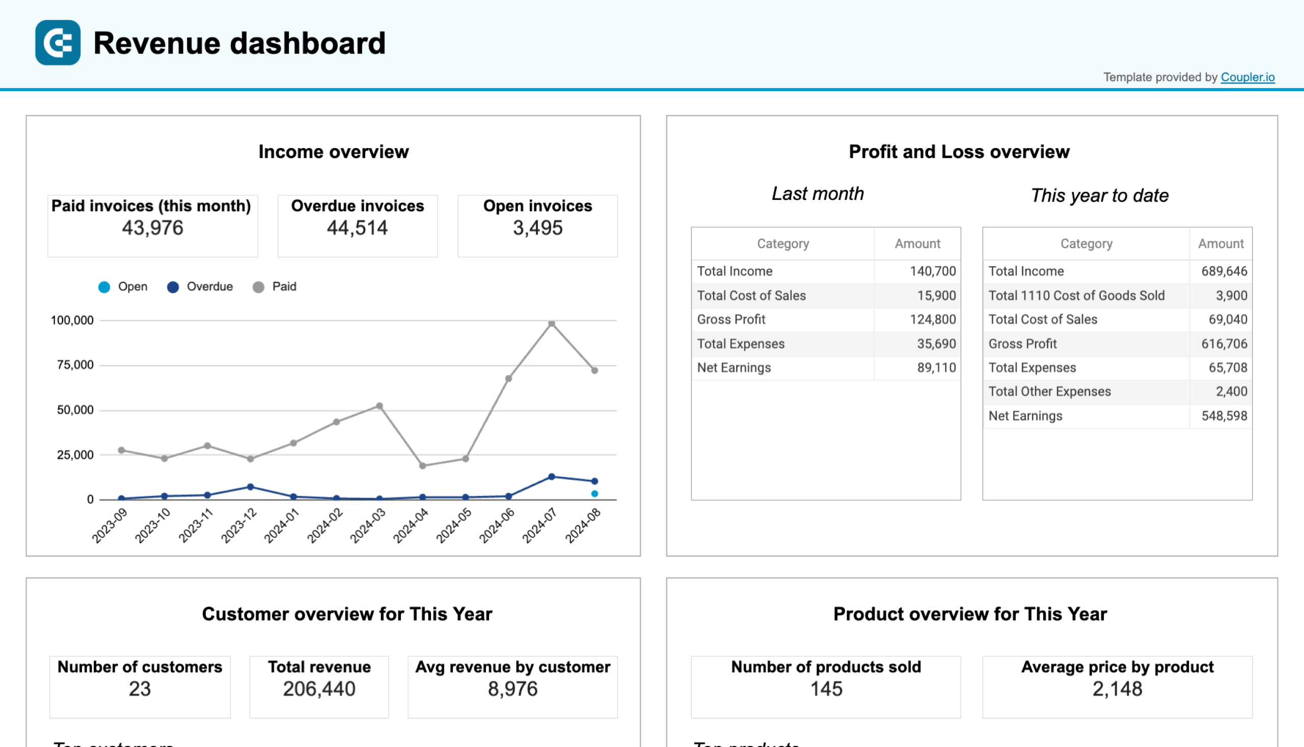
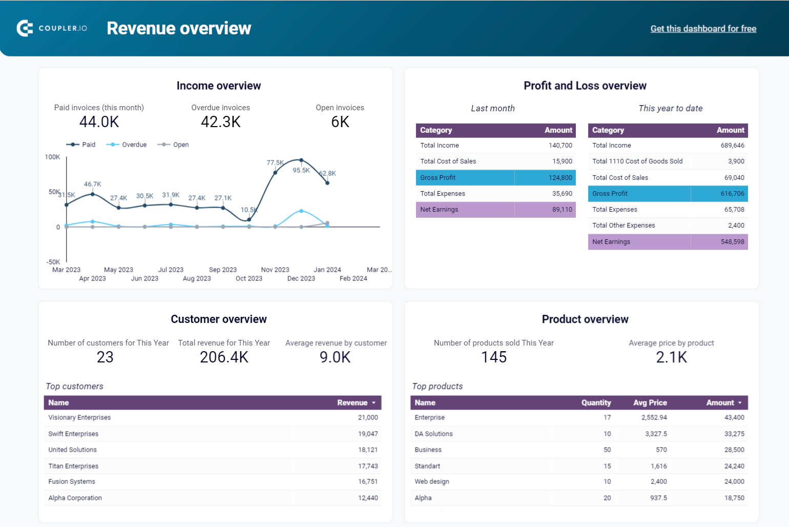
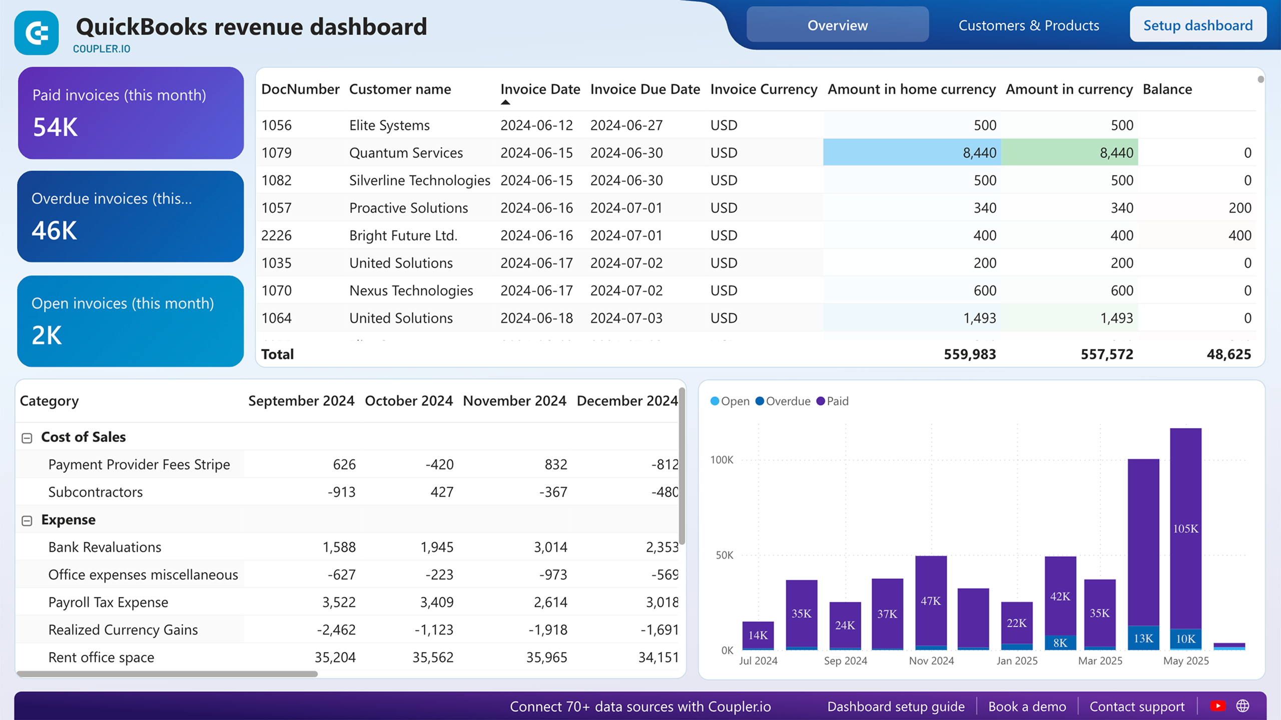
When a CFO or board member needs the full financial picture before a quarterly review, a single dashboard should cover revenue performance, profitability, invoice status, and product-level breakdown without switching between reports. The QuickBooks revenue dashboard by Coupler.io consolidates total revenue, net earnings, average revenue by customer, and P&L data into one view with interactive filters for drilling into specifics.
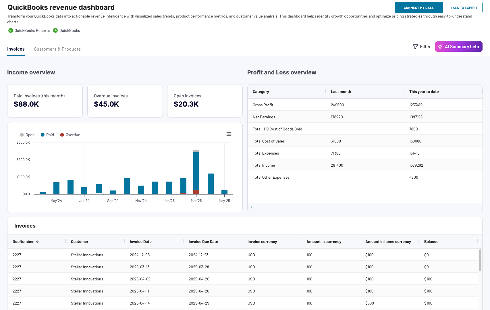
Key KPIs: total revenue, net earnings, gross profit margin, average revenue by customer, invoice aging, product revenue share.
Main decisions it supports: evaluating overall financial health, identifying top-performing products and customers, spotting revenue concentration risks, and preparing investor or board-level summaries.
Available templates: QuickBooks → Coupler.io (with AI Insights), Google Sheets, Data Studio, Power BI.





2. Financial KPI dashboard
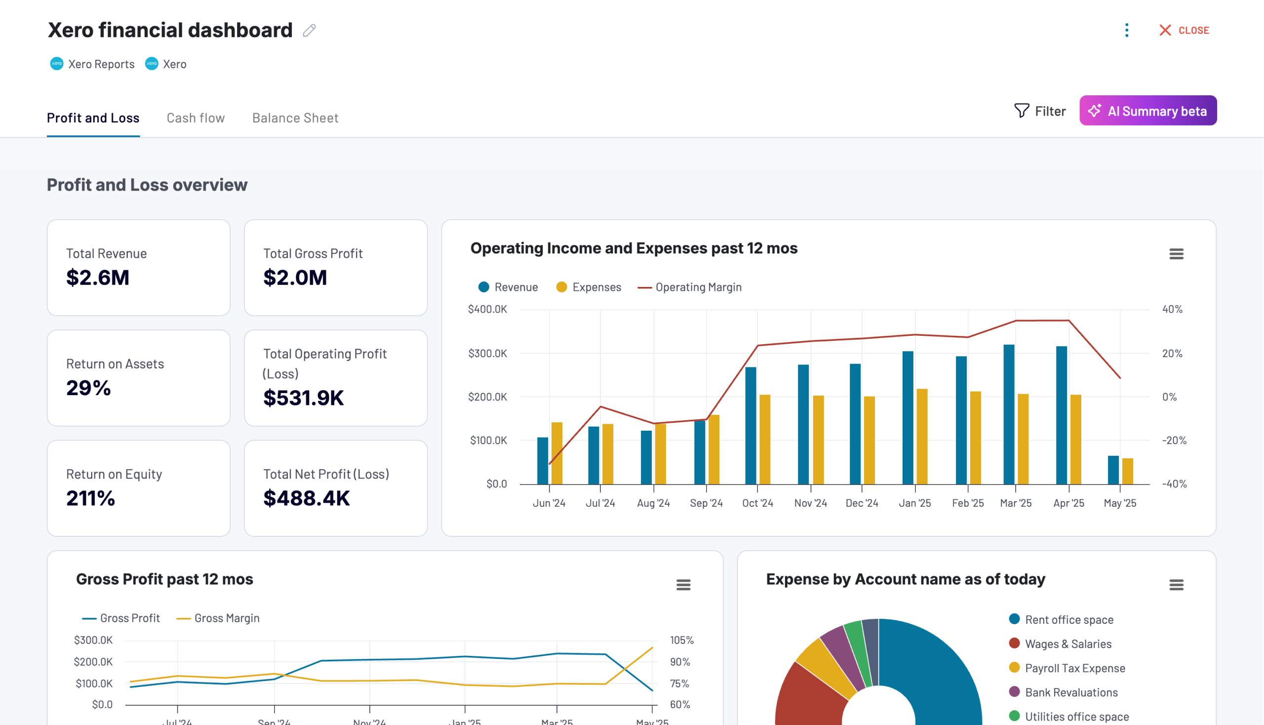
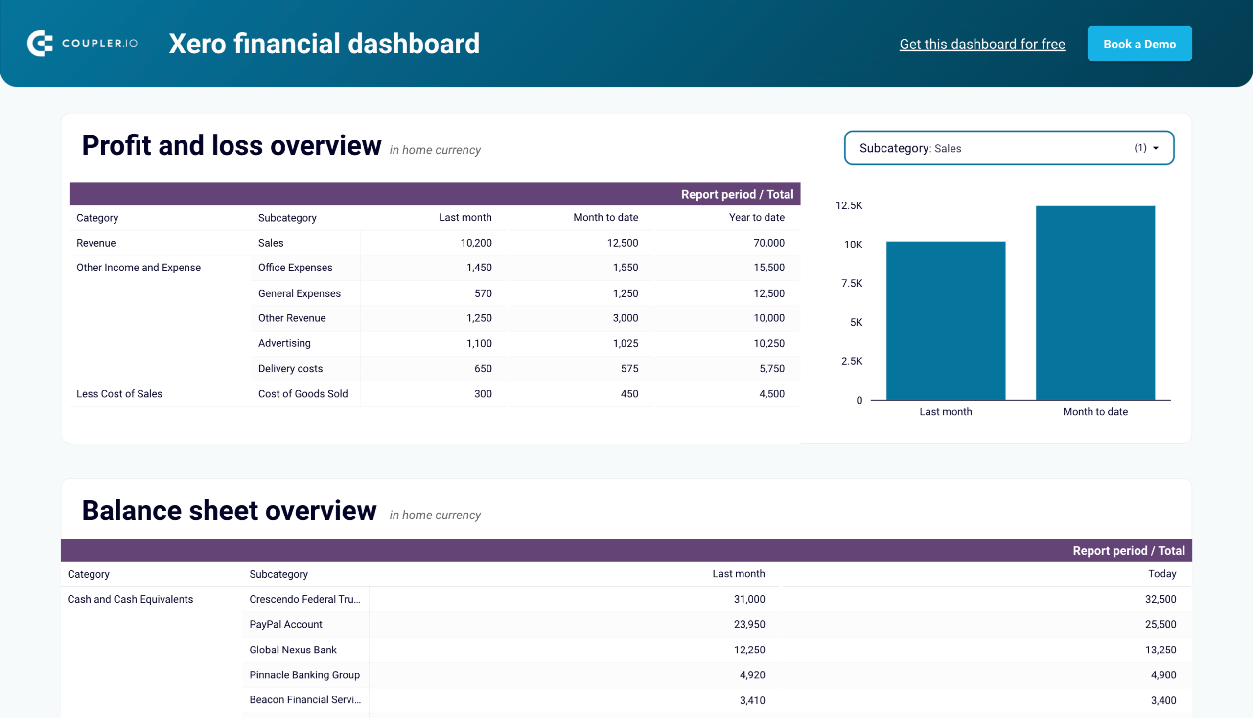
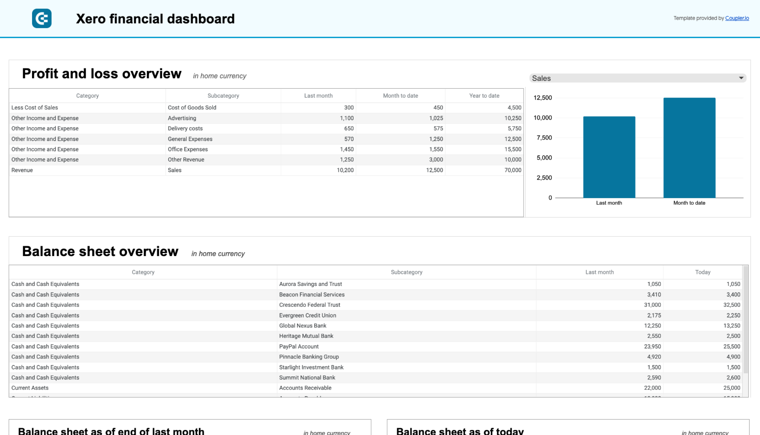
If you need a single view that covers all core financial statements — P&L, cash flow, balance sheet, and bank account balances — a financial KPI dashboard is the starting point. Rather than switching between tabs in your accounting software, it pulls the key numbers into one report with period filters and drill-down options. Coupler.io offers this dashboard for both QuickBooks and Xero, with tabs for each statement and KPI scorecards at the top.
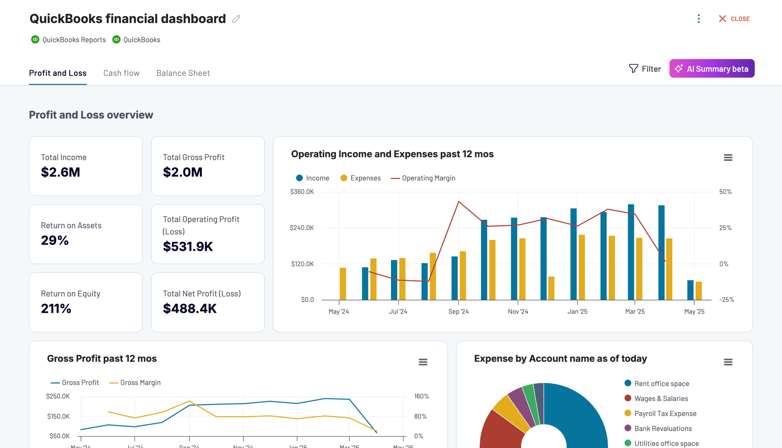
Key KPIs: total income, gross profit, total expenses, net earnings, cash position (end of period), net cash change, current assets, liabilities, equity.
Main decisions it supports: ongoing monitoring of financial health, catching deteriorating margins or cash positions early, preparing month-end and year-to-date summaries for stakeholders.
Available templates: QuickBooks → Coupler.io (with AI Insights), Data Studio, Google Sheets. Xero → Coupler.io (with AI Insights), Data Studio, Google Sheets.
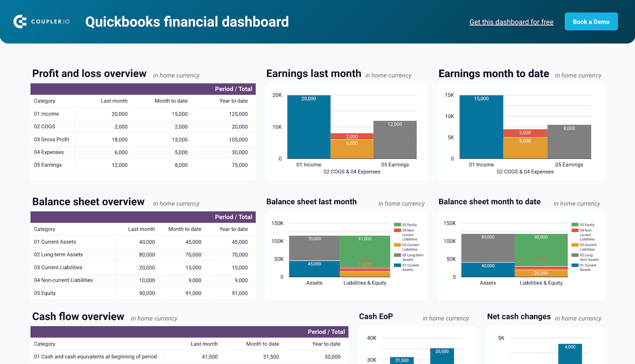
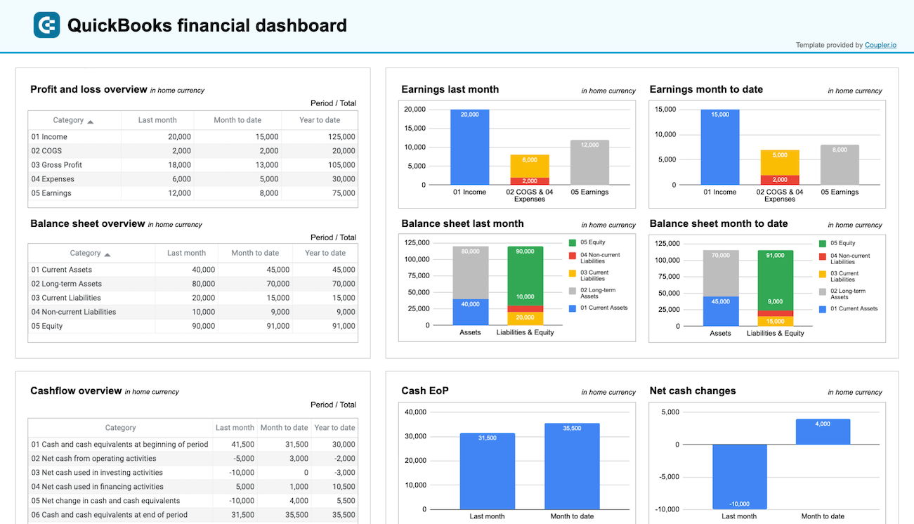

3. Profit and loss dashboard
Month-end closes and board reports often start with one question: how much did we earn, and how much did we spend? A P&L dashboard answers that by laying out revenue, cost of goods sold, gross profit, operating expenses, and net income side by side for the last month, month-to-date, and year-to-date. The QuickBooks and Xero financial dashboards by Coupler.io each include a dedicated P&L tab with this breakdown, so you can spot margin shifts or expense spikes without exporting a report from your accounting reporting software.
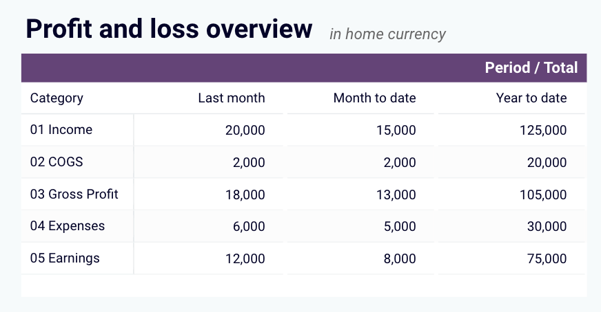
Key KPIs: total income, cost of sales, gross profit, total expenses, net earnings (last month, MTD, YTD).
Main decisions it supports: evaluating profitability trends across periods, catching expense growth before it erodes margins, preparing period-end income statements for stakeholders.
The following financial dashboard templates include a P&L view. Pick the one that matches your accounting software and preferred destination.


4. Expenses and budget tracking
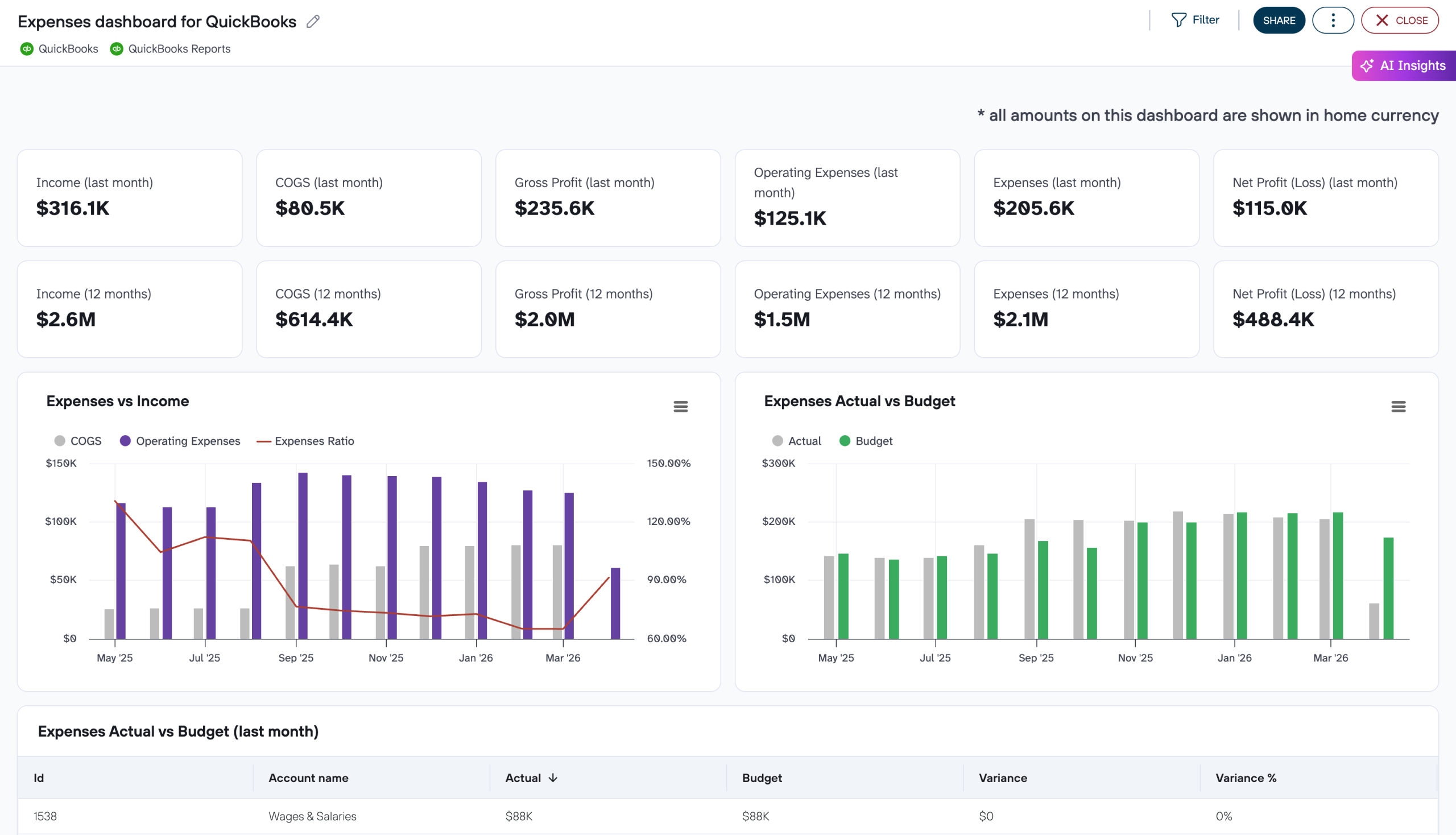
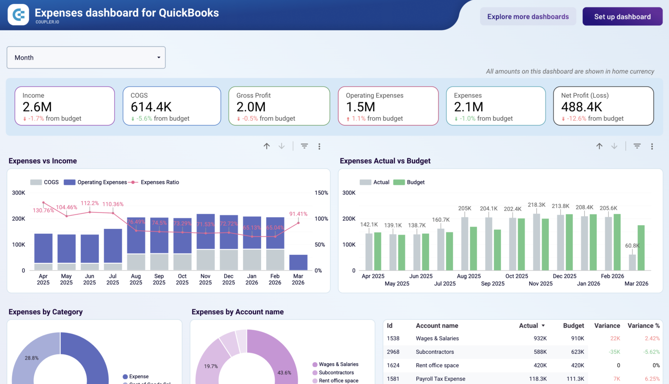
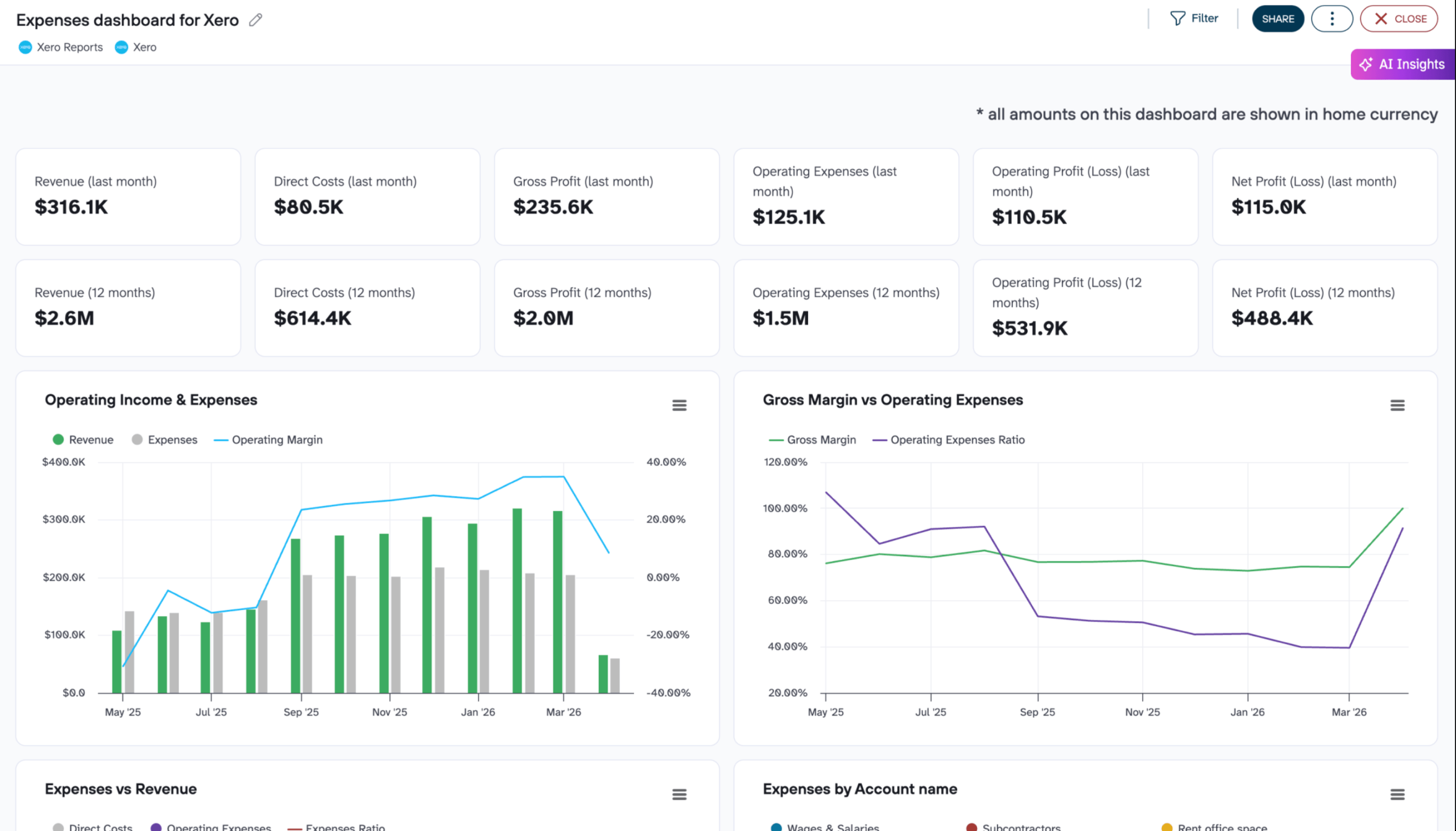
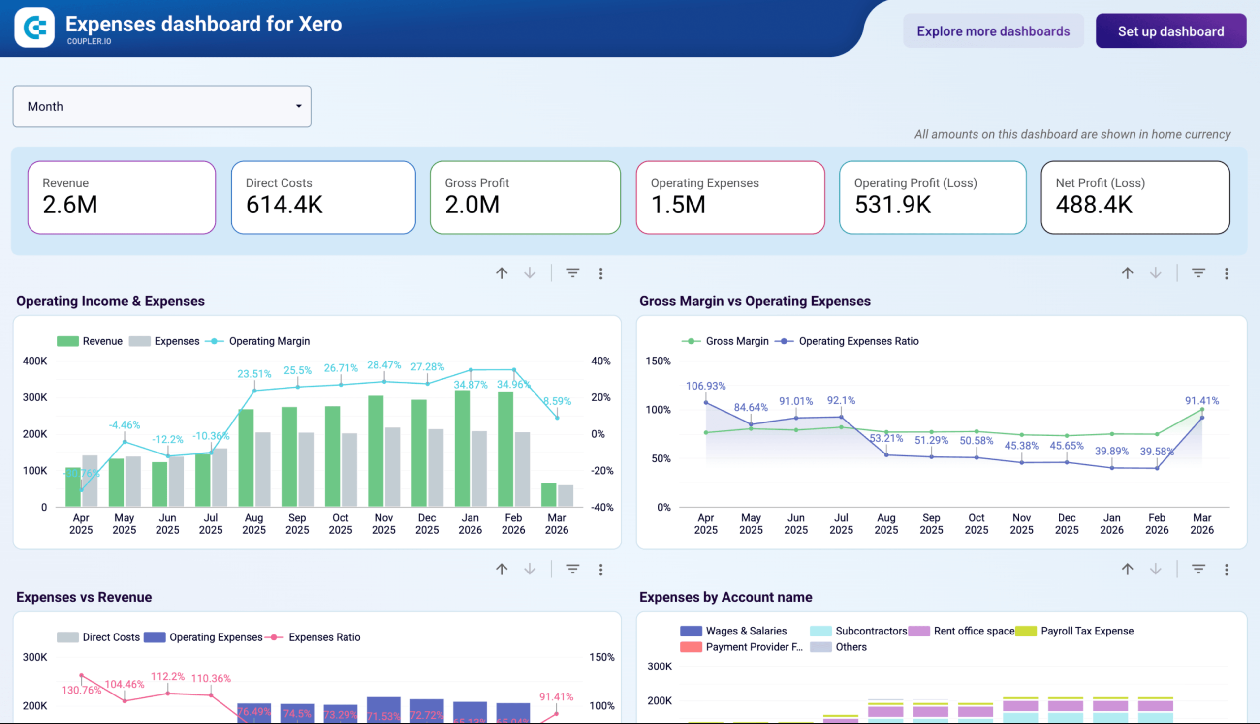
When operating margin drops, the first question is whether costs grew, revenue fell, or both. An expenses dashboard breaks spending down by account category and vendor, tracks burn rate against available cash, and shows whether costs are growing in line with revenue or pulling ahead. The QuickBooks and Xero Expenses dashboards by Coupler.io are built around this view, with operating margin trends, vendor spend rankings, and months of runway in one report.
These dashboards also overlay planned and actual spend by month and by account, showing both the absolute variance and the percentage deviation. That makes them useful for budget reviews too. You can see whether overspend is an isolated event or a multi-month pattern, and pinpoint exactly which cost lines drove the difference.
Expenses dashboard for QuickBooks
 Preview dashboard
Expenses dashboard for QuickBooks
Preview dashboardKey KPIs: operating margin (monthly), planned vs actual spend, variance by account (absolute and %), expense growth by category, vendor spend rankings, cash balance, monthly burn rate, months of runway.
Main decisions it supports: identifying which cost categories are growing fastest, explaining budget variances to leadership, evaluating spending sustainability against available cash, preparing for vendor contract renewals with accurate spend data.
Choose the template that matches your accounting software and preferred destination.
5. Cash flow dashboards
Profitable companies can still run out of cash if inflows and outflows are badly timed. A cash flow dashboard tracks where cash comes from (operating, investing, financing activities), where it goes, and what the closing balance looks like at the end of each period. The QuickBooks and Xero financial dashboards by Coupler.io each include a cash flow tab that breaks this down by last month, month-to-date, and year-to-date, with charts showing position trends and net cash changes over time.
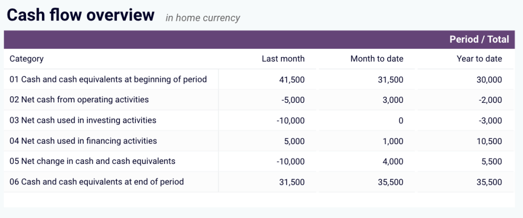
Key KPIs: cash inflows by activity type, cash outflows by activity type, net cash change, closing cash balance (last month, MTD, YTD).
Main decisions it supports: maintaining liquidity, timing large payments to avoid shortfalls, identifying months where outflows consistently exceed inflows, planning short-term financing or collection acceleration.
The following financial dashboard templates include a cash flow view. Pick the one that matches your accounting software.
6. Cash flow forecast dashboard
The dashboards above show where cash stands today. A cash flow forecast answers a different question: will we have enough cash next week, next month, or next quarter? This Google Sheets template lets you build forward-looking projections by entering historical inflows and outflows, choosing a forecasting model (short-term or long-term), and generating daily, weekly, or yearly forecasts. You can feed it with up-to-date financial data from QuickBooks or Xero through Coupler.io, so the historical baseline stays fresh as new transactions come in.
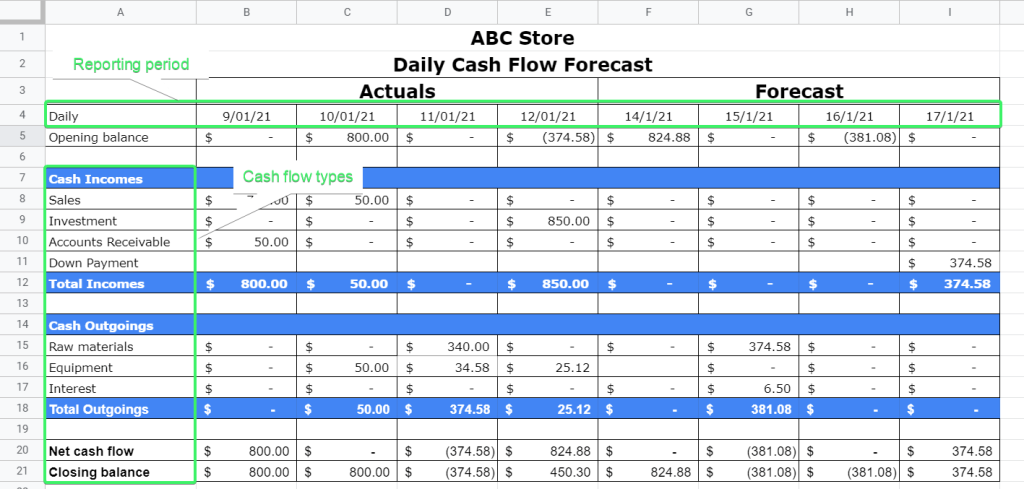
Key KPIs: projected cash inflows, projected cash outflows, net cash flow (forecast), opening and closing balance (forecast), variance vs actuals.
Main decisions it supports: planning for periods of low liquidity, deciding when to accelerate collections or delay payments, sizing short-term credit lines, setting cash reserves.
For a detailed walkthrough on building this forecast yourself, see the guide on preparing a cash flow forecast in Google Sheets.

Get help building a cash flow forecast for your business
Book a demo7. Accounts receivable dashboard
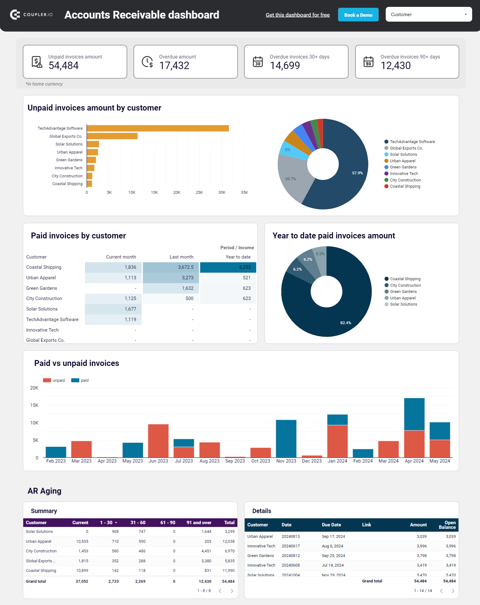
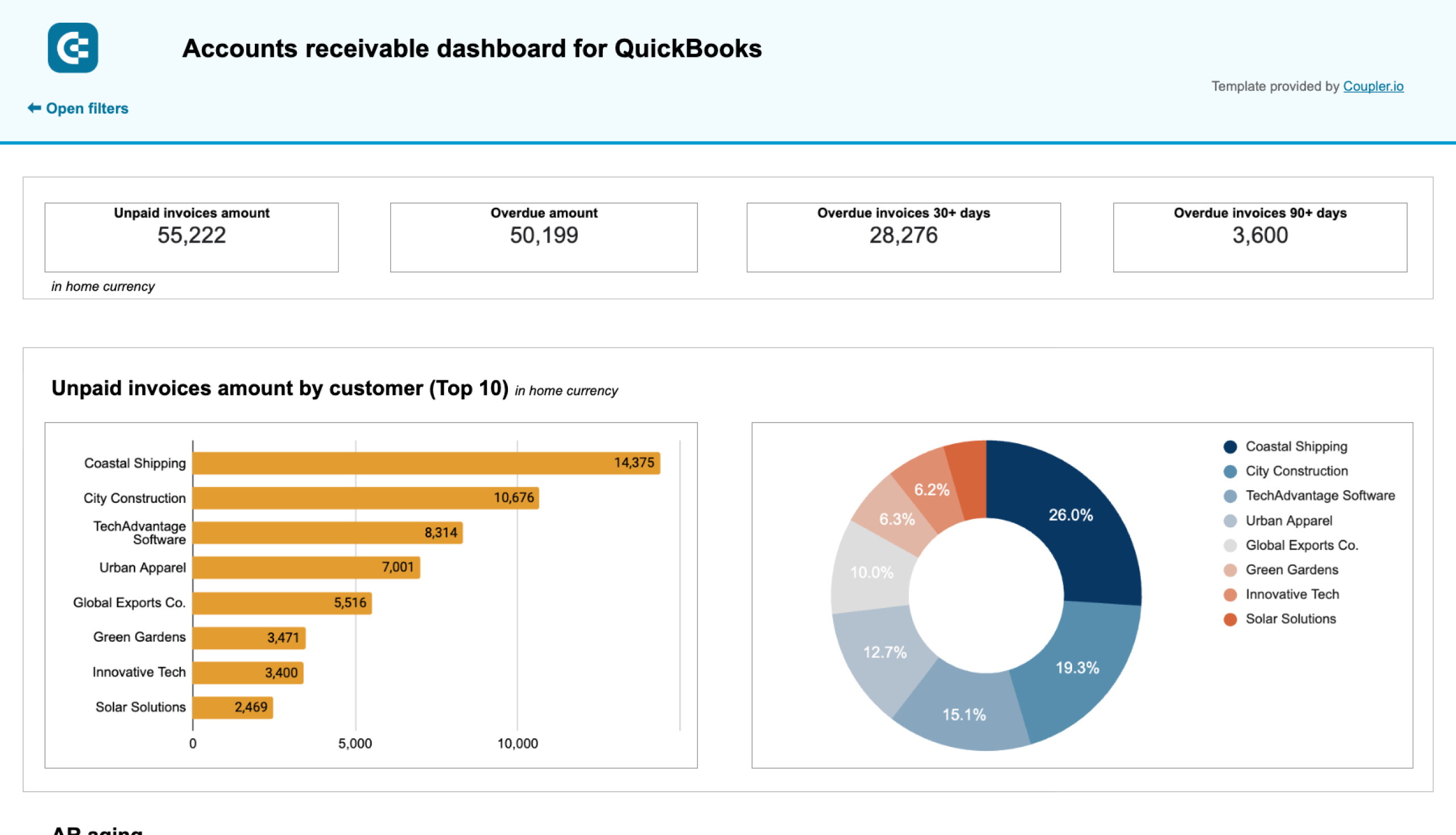
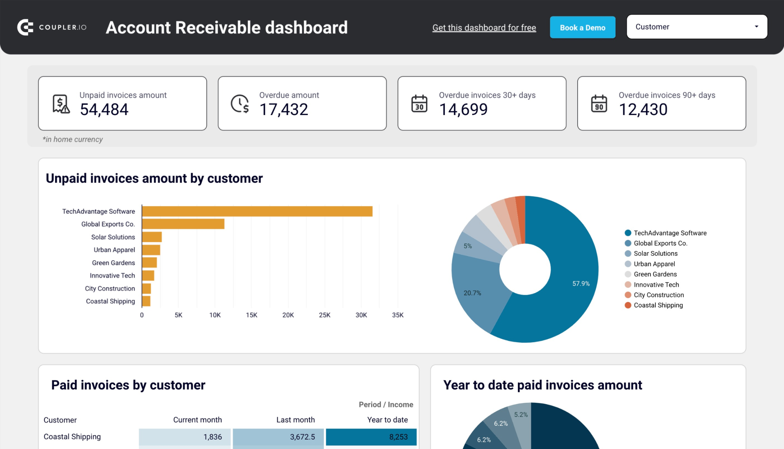
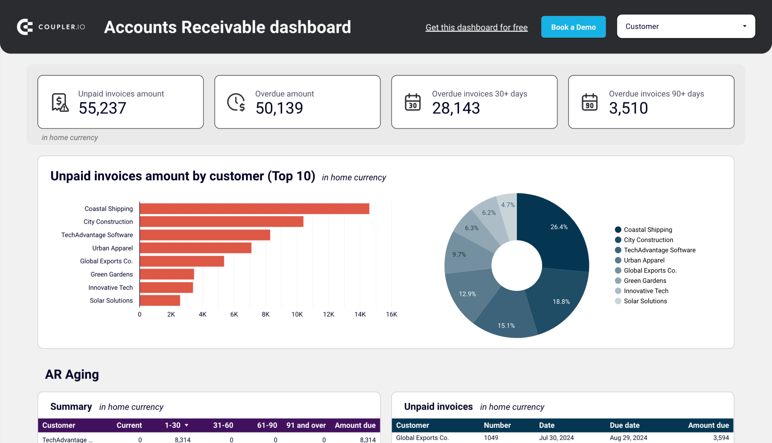
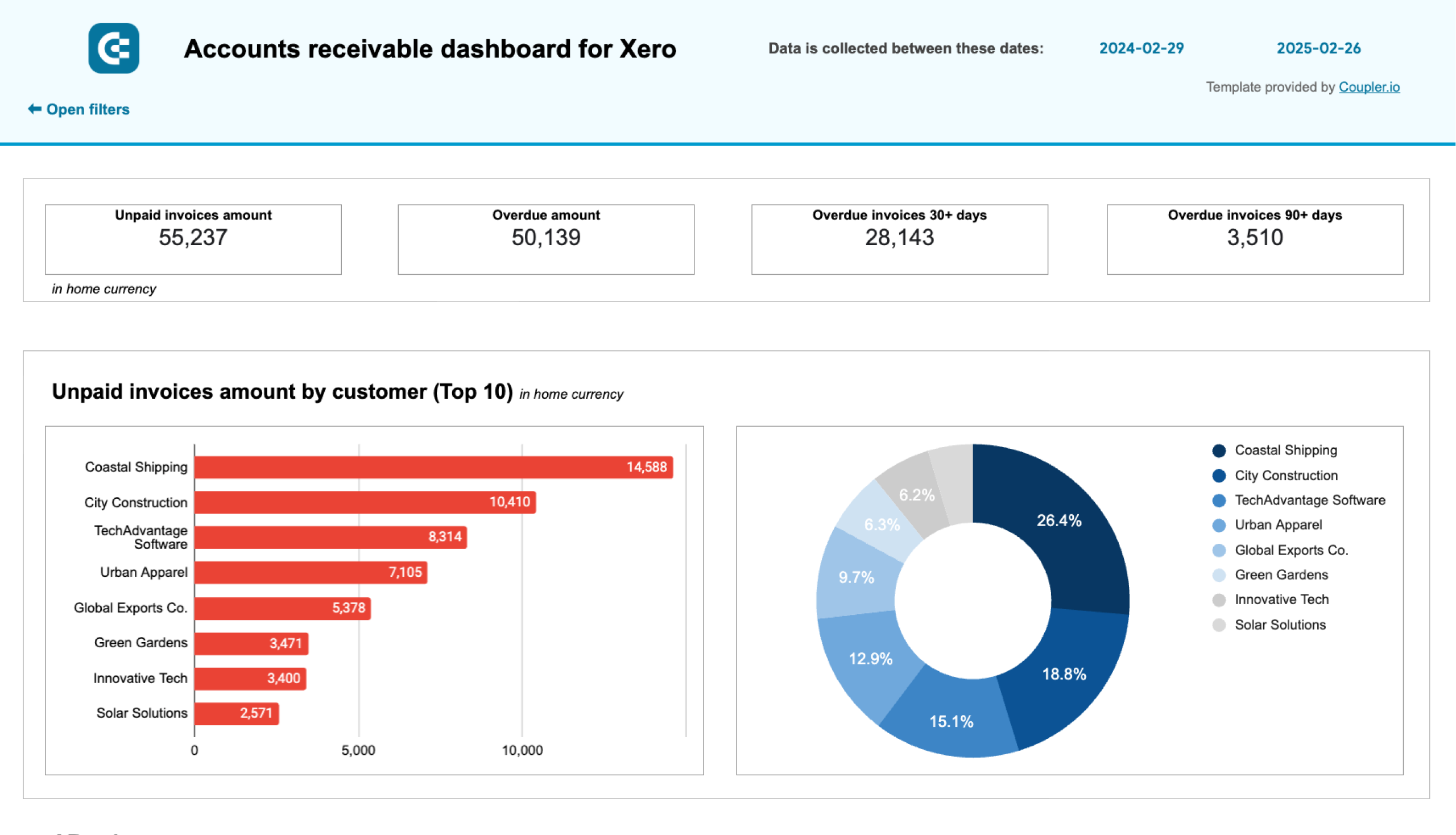
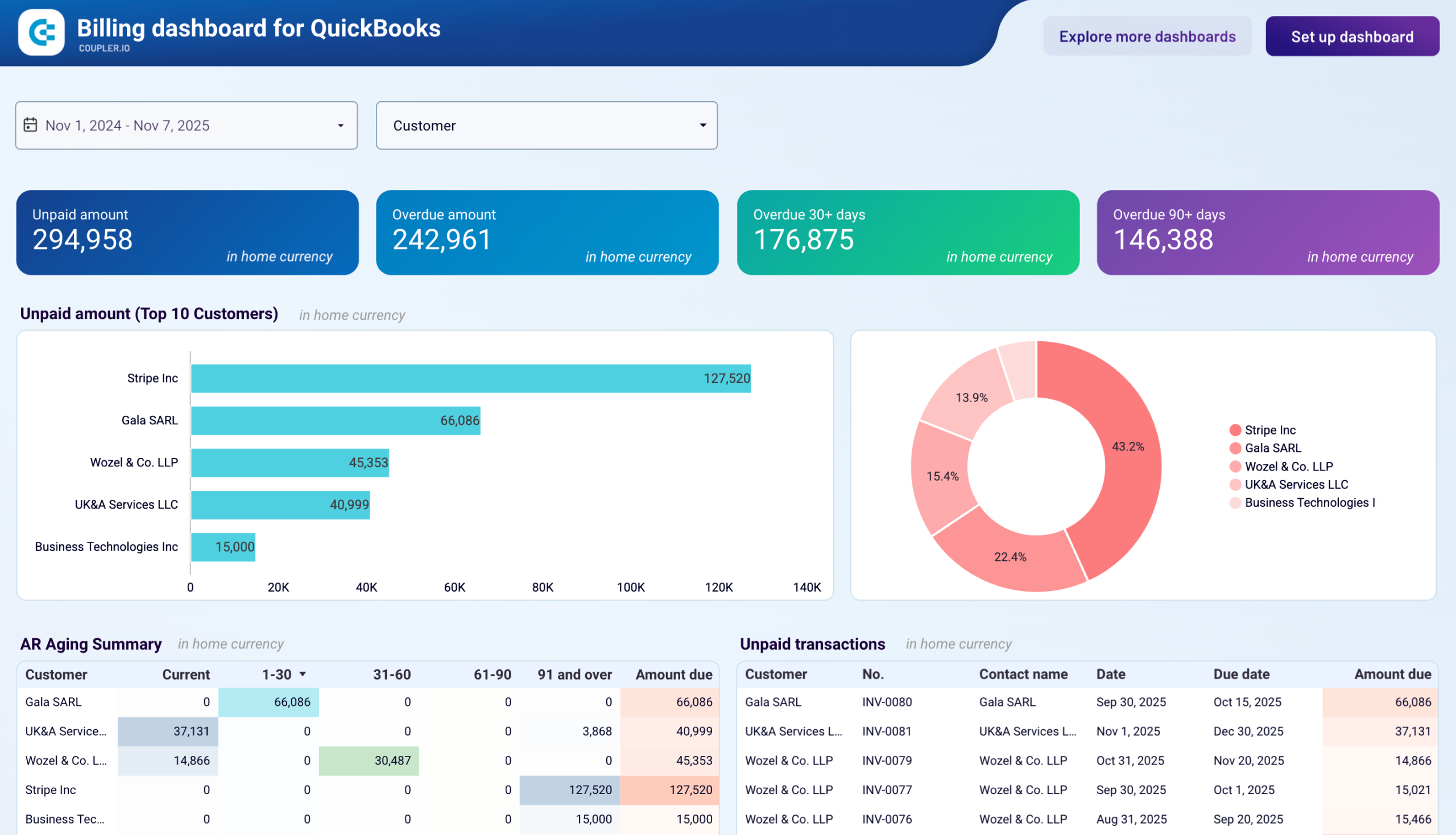
Late payments from a handful of customers can quietly erode your cash position even when revenue looks healthy. An accounts receivable dashboard surfaces the problem by showing total unpaid and overdue amounts, ranking customers by outstanding balances, and breaking down aging by time period (current, 30, 60, 90+ days). The QuickBooks and Xero AR dashboards by Coupler.io give you this view alongside monthly invoice trends and a detailed transaction table, so you can prioritize collection calls based on actual exposure rather than gut feel.
Accounts receivable dashboard for QuickBooks
 Preview dashboard
Accounts receivable dashboard for QuickBooks
Preview dashboardKey KPIs: total unpaid invoice amount, total overdue amount, AR aging breakdown (current through 90+ days), top 10 customers by outstanding balance, paid vs unpaid invoice trends (monthly).
Main decisions it supports: prioritizing which customers to follow up with first, adjusting credit terms for consistently late payers, predicting cash collection timing for liquidity planning, identifying seasonal patterns in payment behavior.
Choose the CEO dashboard template that matches your accounting software and preferred destination.
Explore other Xero report templates for accounting reporting.
8. Accounts payable dashboard
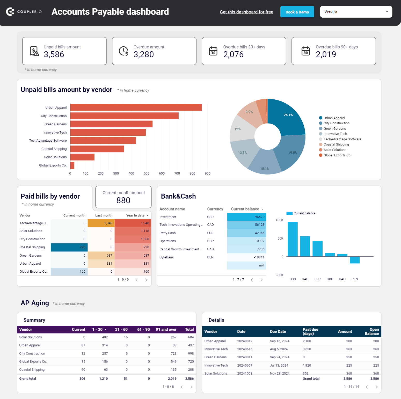
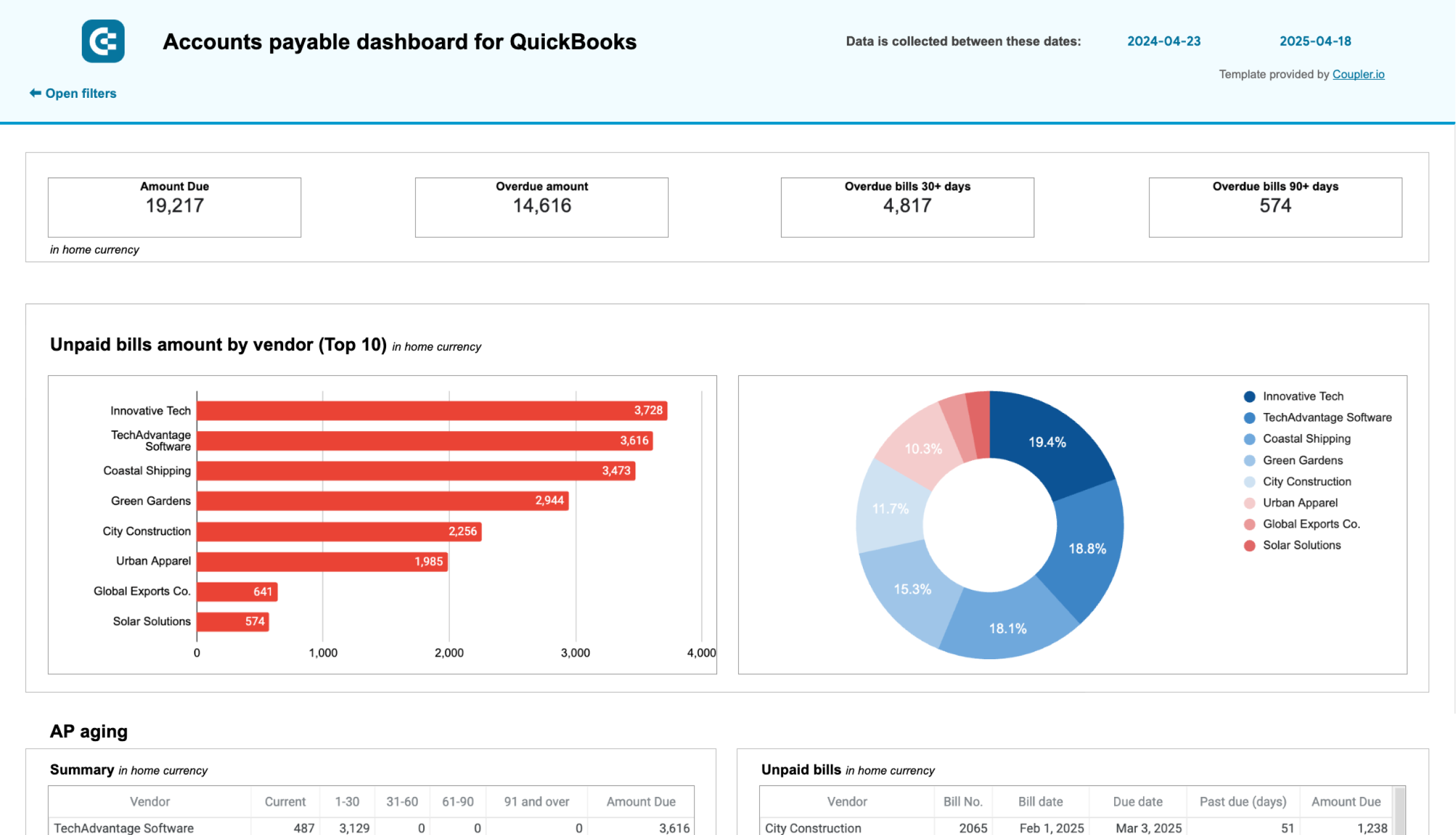
Missing a vendor payment deadline is expensive since it causes late fees, damaged relationships, and so on. An accounts payable dashboard shows total unpaid and overdue bills, ranks vendors by outstanding balances, and breaks down aging by time period so you know which payments need attention first. The QuickBooks and Xero AP dashboards by Coupler.io add vendor payment history and bank balance context, so you can schedule payments based on what you actually have available rather than what you owe on paper.
Accounts payable dashboard for QuickBooks
 Preview dashboard
Accounts payable dashboard for QuickBooks
Preview dashboardKey KPIs: total unpaid bills, total overdue amount, AP aging breakdown (current through 90+ days), top 10 vendors by outstanding balance, paid bills by vendor (monthly and trailing 12 months).
Main decisions it supports: prioritizing which vendor bills to pay first, timing payments to preserve cash without damaging relationships, spotting concentration risk when too much is owed to a single vendor, preparing for contract renewals with accurate spend history.
Choose the standalone AP template that matches your accounting software.
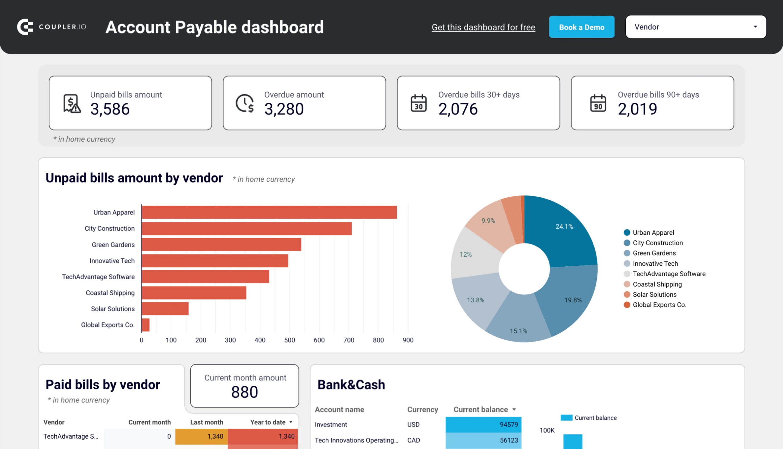
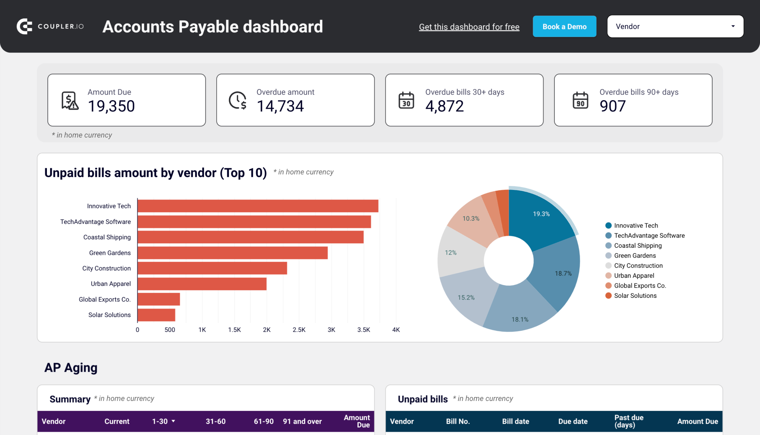
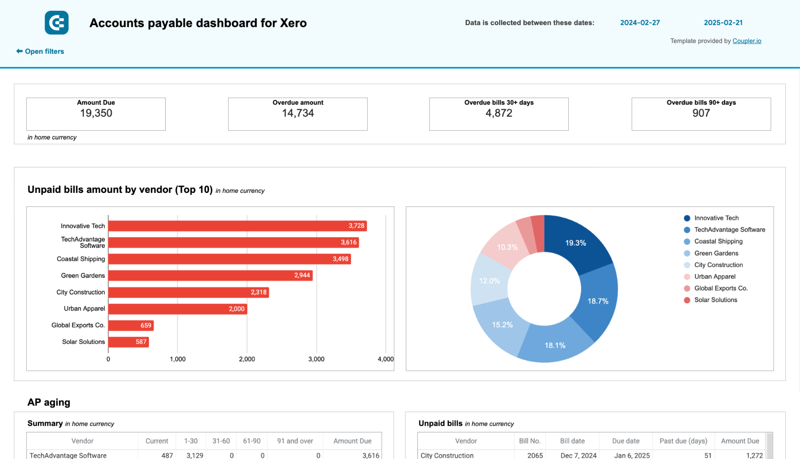
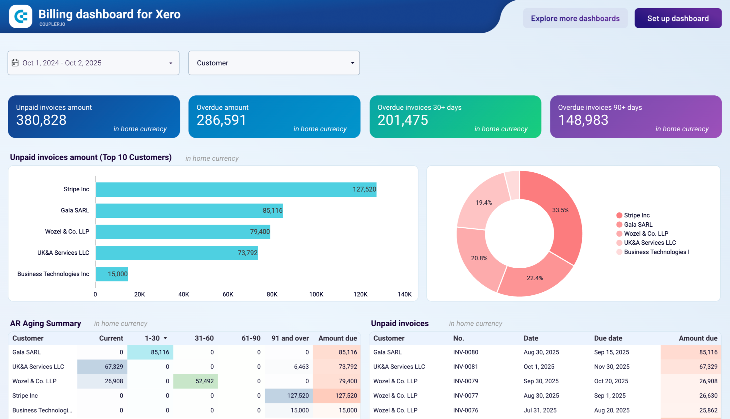
If you need both accounts receivable and accounts payable in a single view, the billing dashboards for QuickBooks and Xero combine AR and AP side by side with comparative aging analysis and bank balance context.
9. Revenue dashboard
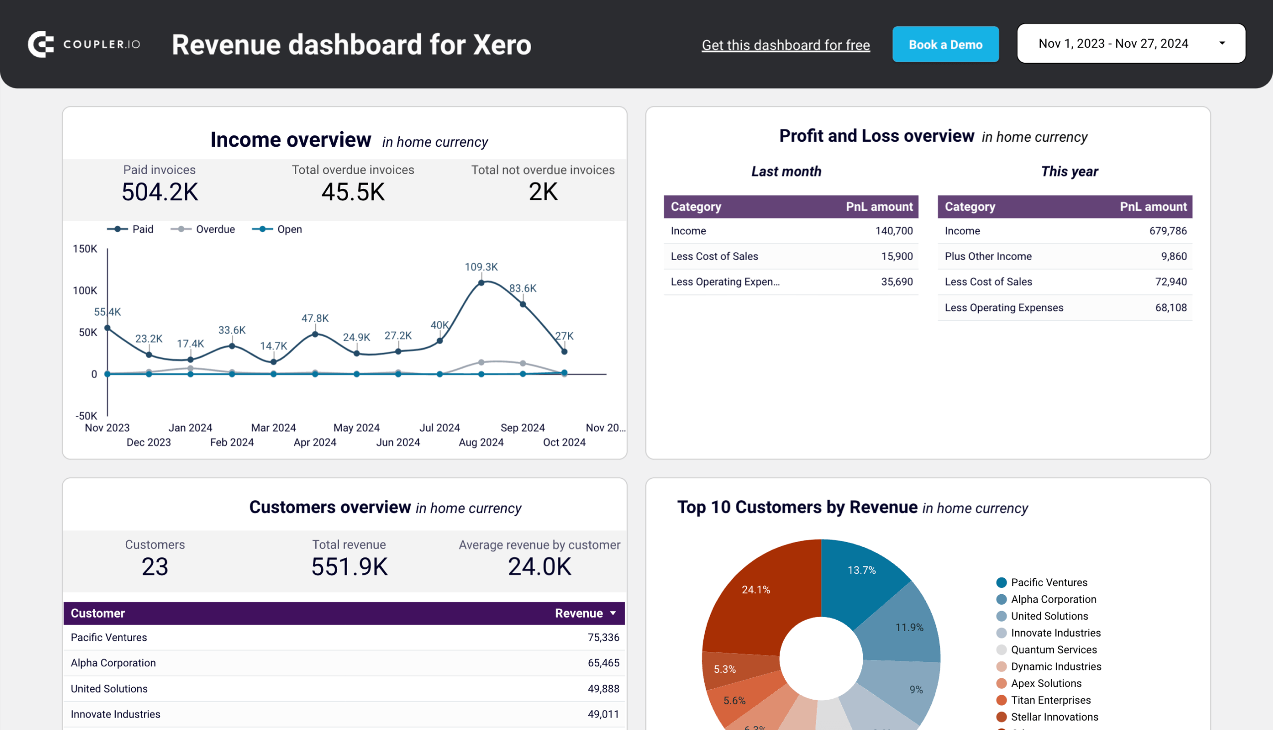
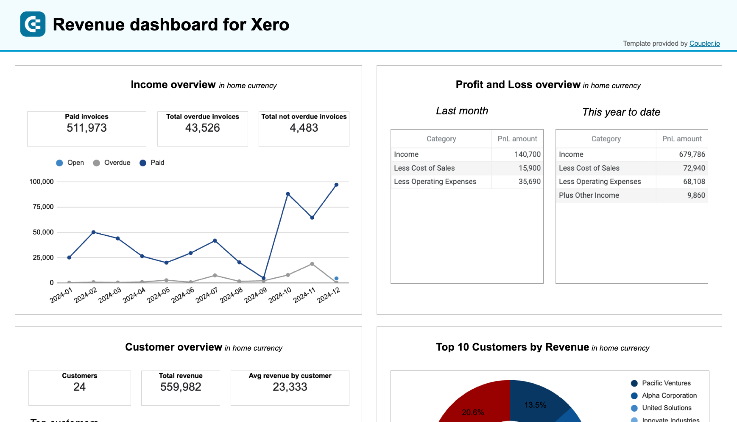
Knowing total revenue is useful, but knowing where it comes from is what drives decisions. A revenue dashboard breaks income down by customer, product, and time period so you can see which accounts generate the most value, which products are growing or declining, and how the P&L splits between income and expenses. The Xero and QuickBooks revenue dashboards by Coupler.io show 12-month revenue trends alongside top customer and product rankings, with a P&L breakdown for context.
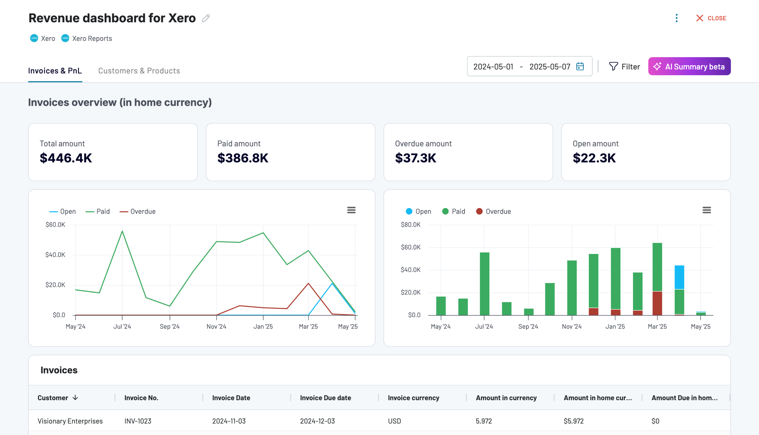
Key KPIs: total revenue (monthly, trailing 12 months), revenue by customer, revenue by product, P&L breakdown (income vs expenses), invoice status and amounts.
Main decisions it supports: identifying your most valuable customers and products, spotting revenue concentration risks, understanding whether income growth is keeping pace with costs, planning pricing or upsell strategies based on customer-level data.
Choose the template that matches your accounting software and preferred destination.
10. Balance sheet dashboard
Investors, auditors, and lenders look at the balance sheet to understand what a company owns, what it owes, and what’s left for shareholders. A balance sheet dashboard makes that snapshot accessible without digging through accounting software. It shows current assets, long-term assets, current liabilities, non-current liabilities, and equity side by side for the last month and today. The QuickBooks and Xero financial dashboards by Coupler.io each include a balance sheet tab with this view, plus charts that visualize how the composition has shifted over time.
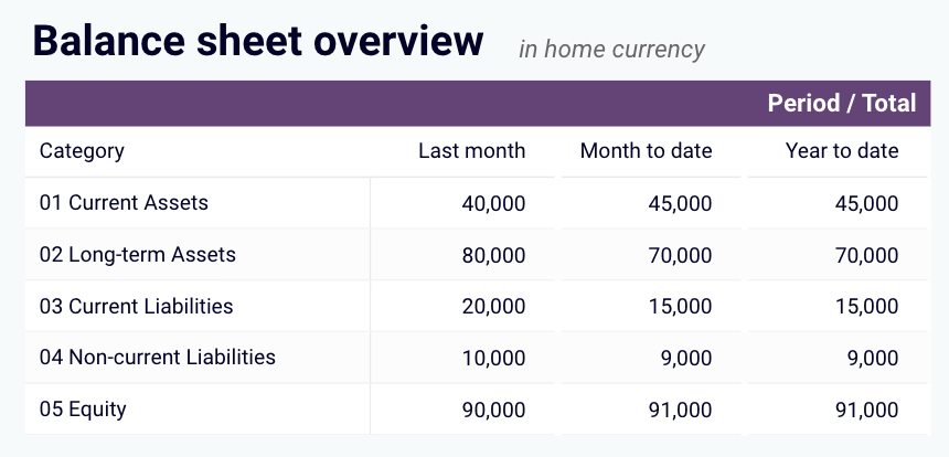
Key KPIs: current assets, long-term assets, current liabilities, non-current liabilities, equity, debt-to-equity ratio, working capital.
Main decisions it supports: assessing financial position before funding rounds or loan applications, verifying that short-term assets cover short-term obligations, tracking how equity changes period over period, preparing audit-ready financial summaries.
The following financial dashboard templates include a balance sheet view. Pick the one that matches your accounting software.
11. SaaS / MRR dashboard
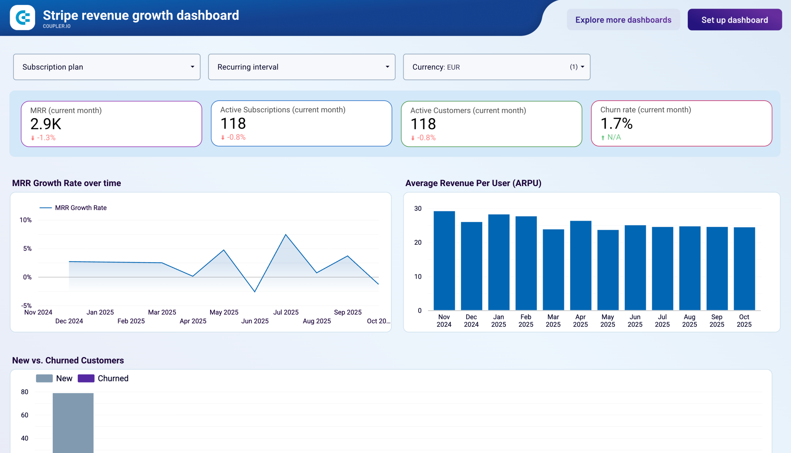
Traditional accounting dashboards show total revenue, but subscription businesses need to see how that revenue recurs, grows, and churns. The Stripe revenue growth dashboard by Coupler.io breaks billing data into MRR, MRR growth rate, ARPU, churn rate, and plan-level distribution. SaaS founders, finance teams, and investors use these metrics to evaluate subscription health. A monthly breakdown table shows whether growth comes from acquiring new customers or increasing the value of existing ones, and a retention chart compares new acquisition against churn month by month.
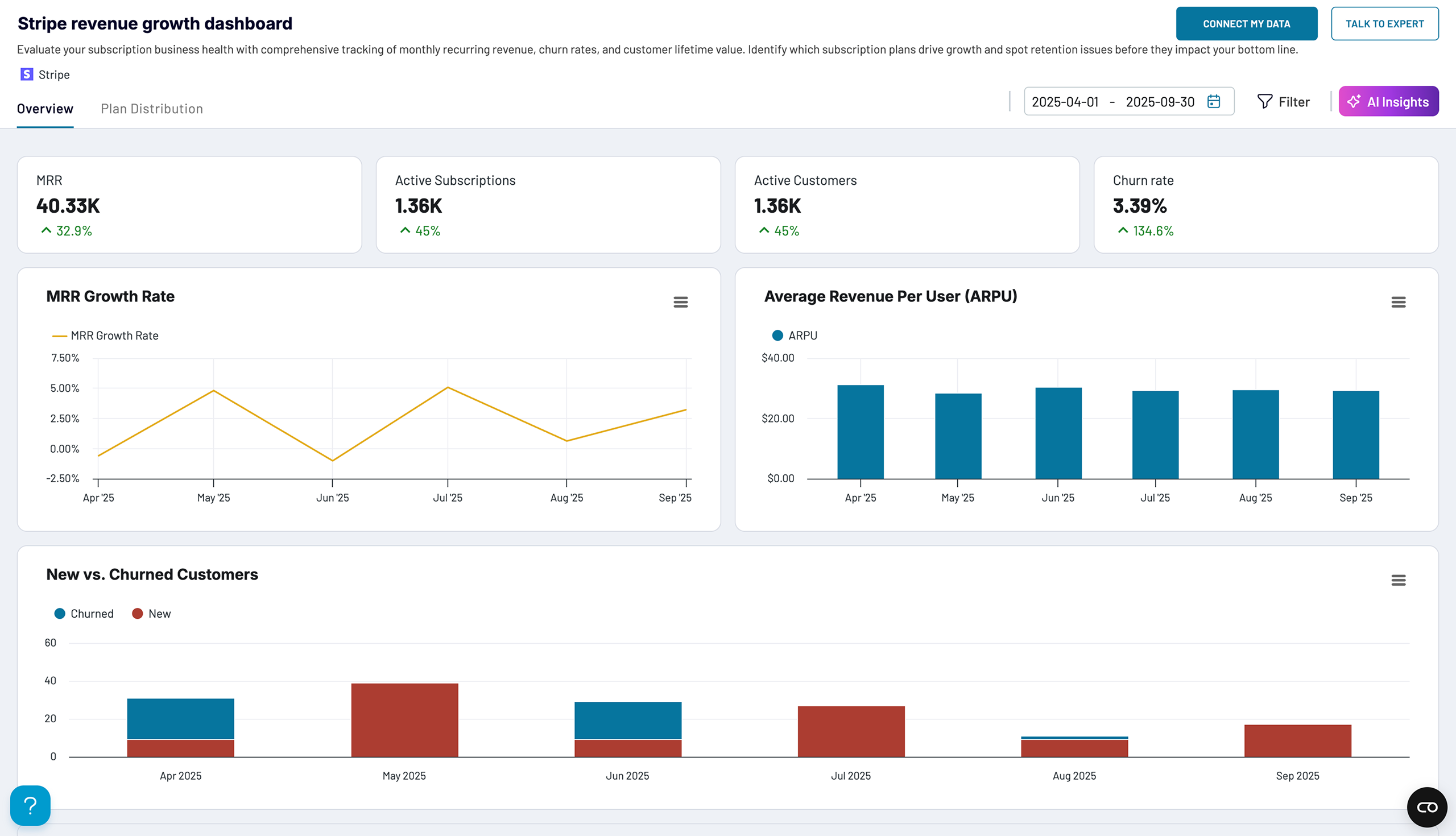
Key KPIs: MRR, MRR growth rate (monthly %), ARPU, active customers, churn rate, new vs churned customers, revenue by subscription plan.
Main decisions it supports: spotting retention problems before they compound, identifying which pricing tiers generate sustainable revenue, determining whether to prioritize acquisition or expansion, preparing investor-ready metrics for fundraising.
Choose the template that matches your preferred destination.

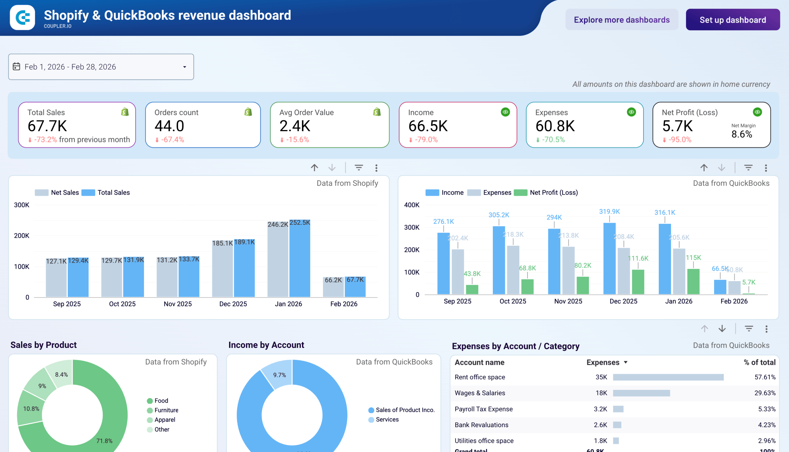
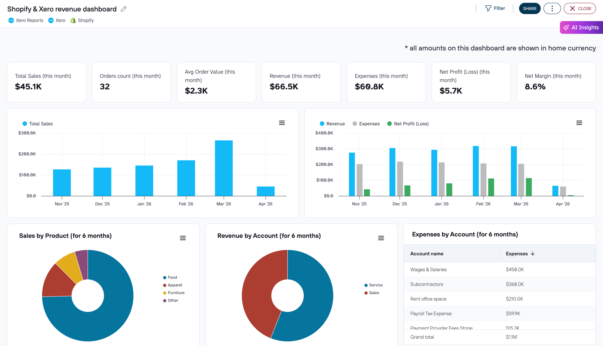
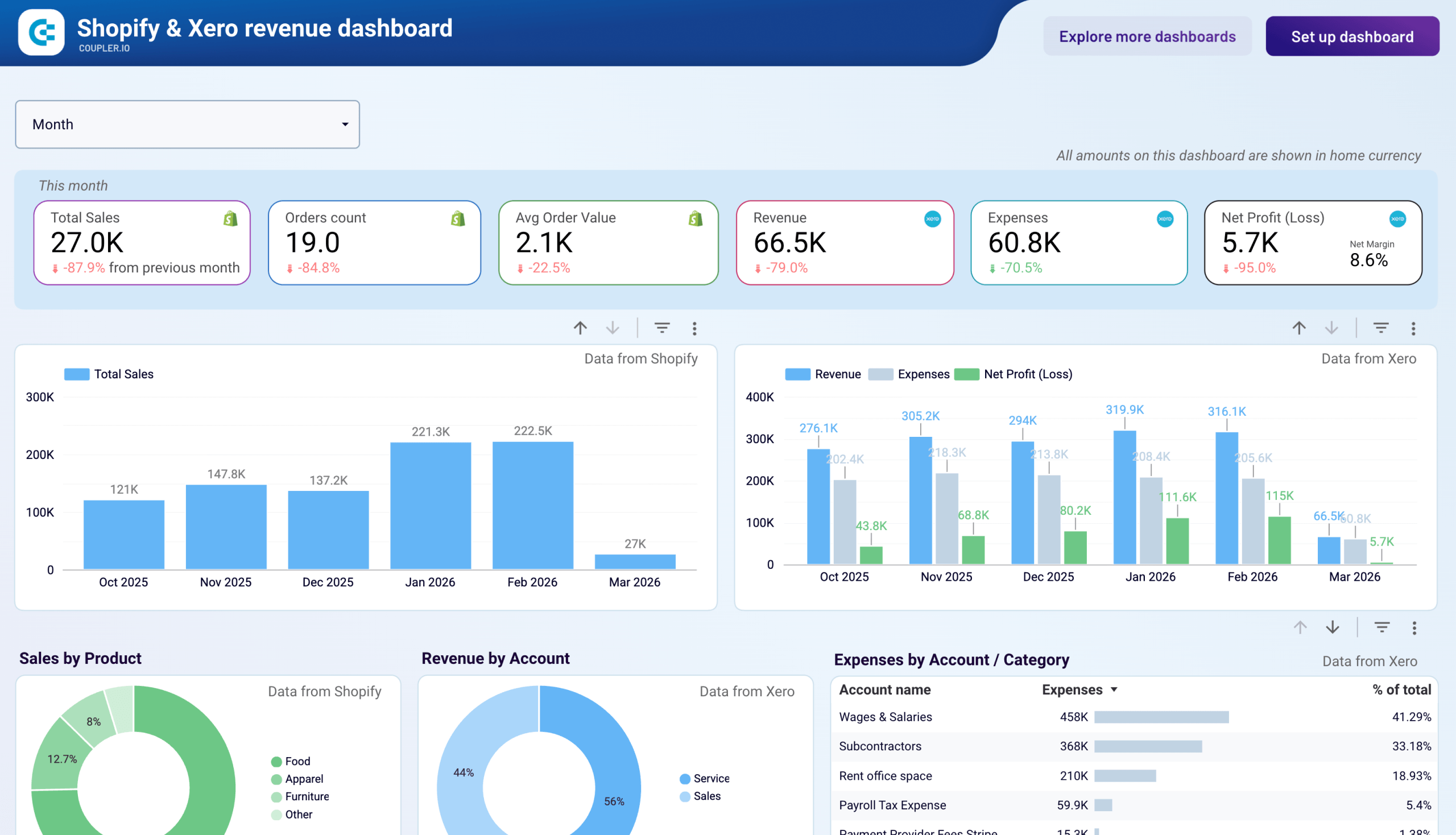
12. Ecommerce finance dashboard
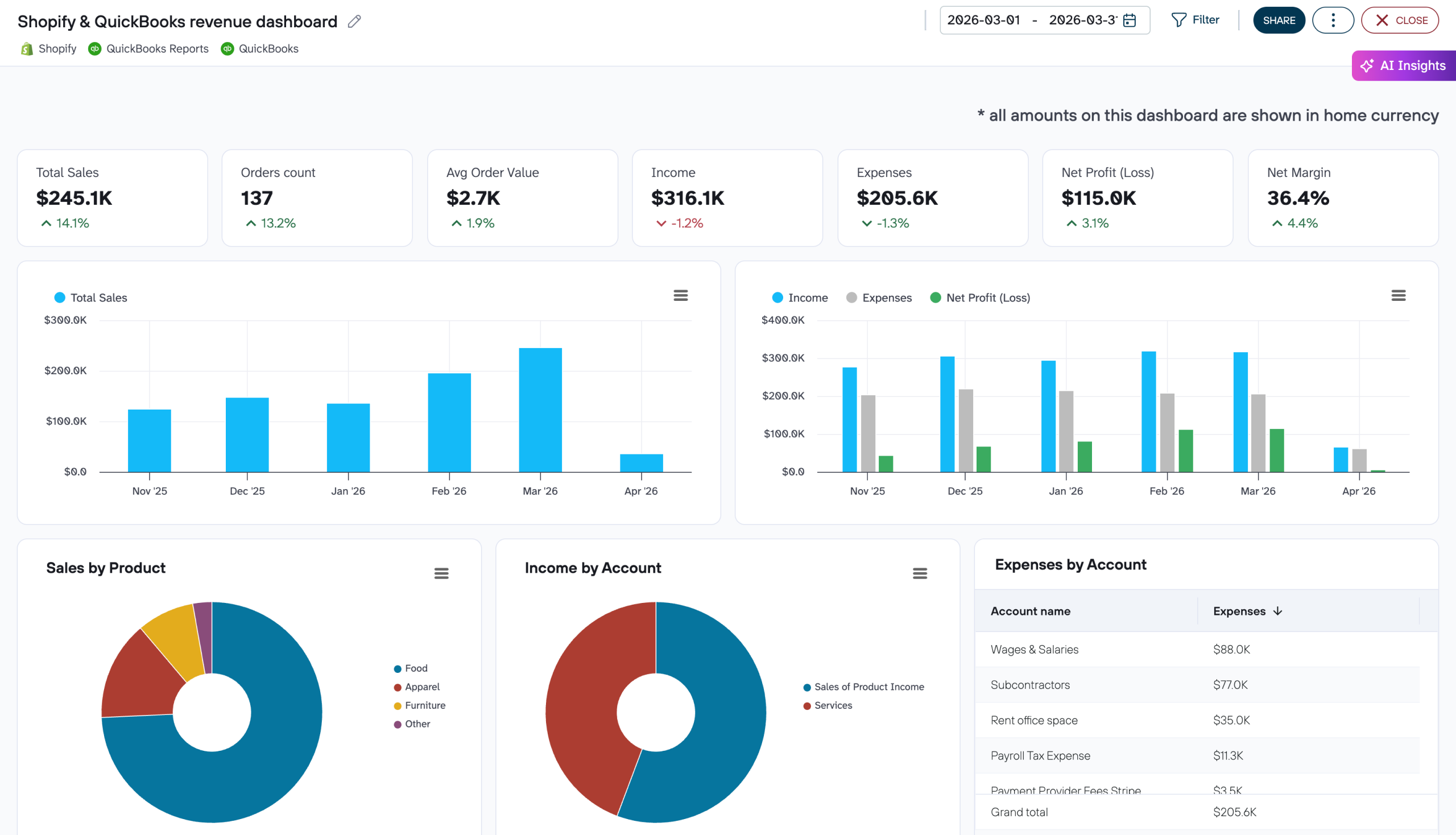
Shopify, WooCommerce, or other ecommerce platforms tell you what sold. QuickBooks or Xero tells you what you earned. Without combining the two, gross sales can look strong while margins quietly erode. An ecommerce finance dashboard places storefront metrics (total sales, order count, average order value, discounts, returns) alongside accounting data (income, COGS, expenses, net profit) on the same timeline. This way, you can see whether a spike in orders actually translated into profit. Coupler.io offers combined dashboards for Shopify + QuickBooks and Shopify + Xero, as well as a standalone Shopify orders dashboard for store-level analysis.
Shopify & QuickBooks revenue dashboard
 Preview dashboard
Shopify & QuickBooks revenue dashboard
Preview dashboardKey KPIs: total sales vs net profit, order count, average order value, COGS, gross margin, net margin, cash balance, expense breakdown by account.
Main decisions it supports: spotting months where costs outpaced revenue growth, reconciling Shopify metrics with accounting financials for period-end reporting, identifying which product lines or expense categories take the largest share of revenue.
Choose the template that matches your accounting software. The Shopify orders dashboard is available separately for store-level analysis without accounting data.

13. Excel financial dashboard
Many finance teams prefer building dashboards in a spreadsheet they already know rather than learning a BI tool. Coupler.io supports Microsoft Excel as a destination, so you can set up a data flow from QuickBooks, Xero, Stripe, or any of the 400+ supported sources and have financial data land directly in an Excel workbook on a schedule. From there, you build the dashboard the way you want it — pivot tables, charts, conditional formatting, custom formulas — with data that refreshes automatically.
If you want to see what a spreadsheet-based financial dashboard looks like before building one from scratch, the Google Sheets templates below follow the same logic. Each connects to your accounting software through Coupler.io and gives you a working P&L, cash flow, balance sheet, revenue, or AR/AP view that you can adapt or replicate in Excel.
Financial dashboard KPIs to track
The right KPIs depend on what you’re trying to manage. A CFO preparing a board deck needs different numbers than a controller closing the month or an AR manager prioritizing collections. The list below groups the most common financial dashboard metrics by function so you can pick the ones that match your dashboard’s purpose.
Profitability: total revenue, cost of goods sold (COGS), gross profit margin, operating expenses, net income, EBITDA. These show whether the business earns more than it spends and where the margin sits. Most useful on P&L, executive, and financial KPI dashboards.
Liquidity: cash balance, net cash flow, operating cash flow, current ratio, quick ratio, months of runway. These answer the question “can we pay our bills?” and belong on cash flow, expenses, and executive dashboards.
Efficiency: days sales outstanding (DSO), days payable outstanding (DPO), expense-to-revenue ratio, budget variance (planned vs actual). These measure how well the business converts activity into results. AR, AP, billing, and expenses dashboards rely on them.
Growth: revenue growth rate, MRR, MRR growth rate, ARPU, customer churn rate, net revenue retention. These track momentum over time and are central to SaaS/MRR and revenue dashboards.
Financial position: total assets, total liabilities, equity, debt-to-equity ratio, working capital. These define what the company owns and owes at a point in time. Balance sheet and financial KPI dashboards feature them.
You don’t need all of these on one dashboard. The examples above each focus on a subset that serves a specific role. Start with the 4-6 KPIs that directly inform the decisions you make most often, and add complexity only when the simpler view stops being enough.
What makes a good financial dashboard?
A dashboard that tries to show everything ends up useful for nothing. The best financial dashboards share a few traits regardless of whether they track P&L, cash flow, or MRR.
A clear focus. Each dashboard should answer one category of questions. A billing dashboard tracks who owes you and who you owe. An expenses dashboard tracks where money goes and whether spending is sustainable. Trying to combine both into one view dilutes the signal. If you need multiple perspectives, build a set of focused dashboards rather than one overloaded one.
The right audience in mind. A CFO reviewing quarterly performance needs high-level scorecards and trend lines. A controller closing the books needs account-level detail and transaction tables. The same data, presented differently, serves both, but a dashboard designed for neither serves no one.
Up-to-date data. A dashboard built on last week’s export is a snapshot, not a monitoring tool. Coupler.io solves this by connecting your dashboard to QuickBooks, Xero, Stripe, or any of the 400+ supported sources through an automated data flow. Set a refresh schedule once, and the numbers update automatically—hourly, daily, or at whatever frequency your decisions require.
Filters and drill-downs. Scorecards and trend lines tell you what changed. Filters and drill-downs tell you why. A good financial dashboard lets you narrow by time period, customer, vendor, account, or product without switching to a different report.
Only the metrics that matter. Adding every available KPI feels thorough but makes the dashboard harder to read. Start with the 4-6 metrics that directly inform your most frequent decisions and start from a template rather than a blank canvas. The dashboard templates in Coupler.io’s library are already built around focused metric sets for specific use cases. Connect your account, and you’ll have a working dashboard in about five minutes. You can always customize from there.

PlumbBooks increased their revenue by 40% with Coupler.io
PlumbBooks used Coupler.io to channel fresh data from QuickBooks and send it to the live dashboard in Google Data Studio (an individual report for each client). Under the hood, Coupler.io data flows automatically comprise 4 different reports from QuickBooks financial statements: Profit & Loss, Balance Sheet, Account Payables (AP), and Account Receivables (AR). Data from these reports is then displayed in the self-updating dashboard.
Ultimately, dashboards were met with an overwhelmingly positive reaction – clients loved it and PlumbBooks’ team freed up a lot of time to focus on growing the business.
Analyze financial data with AI
Dashboards show you what happened, such as revenue grew, expenses spiked, cash flow tightened, etc. AI helps you understand why and decide what to do next. Once your financial data is flowing through Coupler.io, you can ask questions about it in plain language without building new charts or writing formulas.
Coupler AI lets you analyze financial data directly in the platform or with external AI tools via MCP. Whichever question you ask, the Analytical Engine queries your dataset, runs the calculations, validates the results, and passes only confirmed numbers to AI. You get a computed answer, not a guess.
For finance teams working with QuickBooks, Xero, or Stripe data, the finance analytics skill provides a set of pre-built analysis patterns, including profitability breakdowns, expense trend analysis, cash flow comparisons, and more. You don’t need to write prompts from scratch every time. Skills also work in external AI tools through MCP.
If you prefer working in Claude, ChatGPT, Gemini, or another AI tool, AI Integrations connect your Coupler.io data flows to external AI tools through MCP. The same structured, refreshed data that powers your dashboards becomes available for conversation without manual CSV exports or copy-pasting numbers.
In both cases, you control what the AI sees. AI never connects to your QuickBooks, Xero, or Stripe account directly. It works only with the structured dataset you approved in Coupler AI.
Automate financial reporting with Coupler.io
Get a demoFAQ
What is a financial dashboard?
A financial dashboard is a visual report that consolidates key financial metrics into a single interactive view. Instead of switching between tabs in your accounting software or building manual spreadsheet reports, a dashboard pulls the numbers together and updates them automatically. Most financial dashboards include filters and drill-downs so you can narrow by time period, account, customer, or vendor without opening a separate report.
What KPIs should a financial dashboard include?
It depends on the dashboard’s purpose. A P&L dashboard needs revenue, COGS, gross profit, operating expenses, and net income. A cash flow dashboard needs inflows, outflows, net cash change, and closing balance. An AR dashboard needs unpaid invoices, overdue amounts, and aging breakdown. Start with the 4-6 KPIs that directly inform your most frequent decisions. The KPIs section above groups common metrics by function, such as profitability, liquidity, efficiency, growth, and financial position.
How do I automate a financial dashboard?
Connect your data source (QuickBooks, Xero, Stripe, or any of the 400+ apps Coupler.io supports) to your preferred dashboard destination, including Data Studio, Google Sheets, Power BI, Excel, or Coupler.io’s built-in dashboards. Coupler.io handles the data flow: it pulls the data, lets you filter and transform it, loads it into your destination, and refreshes it on a schedule. Once set up, the dashboard updates automatically without any manual export or file upload.
Can I ask AI questions about my financial data?
Yes. Once your financial data flows through Coupler.io, you can use AI Agent to ask questions in plain language directly inside the platform. For teams that prefer external AI tools like Claude or ChatGPT, AI Integrations make the same structured data available through MCP. In both cases, AI works with computed results from your dataset, not raw guesses.