When you’re working with SEO clients, one thing they always expect is clear, regular updates on progress. However, if you’re still sending reports by taking screenshots from multiple tools or copying numbers into spreadsheets, you’re very likely to miss key insights. What’s more, this kind of workflow is hard to scale and often leads to miscommunication or confusion. Over time, your clients may start to feel out of the loop, even when the SEO work itself is solid.
That’s why more agencies and consultants are switching to a custom SEO dashboard for clients, bringing all key metrics into one live, interactive report.
SEO dashboard for Google Search Console
 Preview dashboard
SEO dashboard for Google Search Console
Preview dashboardThey save time, reduce reporting errors, and help clients see exactly what’s working. Most importantly, they improve communication, which directly impacts retention. In fact, 36% of agencies say effective communication and transparency are key reasons clients stick around.
However, not every client needs the same kind of dashboard. An e-commerce brand might focus on search engine rankings for product pages and seasonal traffic, while a SaaS company cares more about international signups and trial conversions.
So, how do you give each client exactly what they need?
In this guide, you’ll learn how to build custom SEO dashboards that align with client goals. We’ll cover which metrics to include, how to tailor dashboards by client type, and how to track dashboard performance and ROI.
What SEO dashboard features should be included in client reports
No two clients have the same needs. To build a SEO dashboard they’ll actually find useful, you need to start by identifying what they care about most. From there, you can surface the right KPIs and organize them in a way that makes performance easy to follow.
To understand which features to add, let’s take a look at these four common client types and the metrics that matter most to each.
1. E-commerce clients
E-commerce clients, such as fashion brands, skincare companies, and electronics retailers, care most about how SEO contributes to revenue. Your dashboard should help them connect organic visibility to product discovery, customer intent, and actual sales.
Landing page performance dashboard
 Preview dashboard
Landing page performance dashboard
Preview dashboardKey metrics to include:
- Organic search traffic to product and category pages – Helps identify which products or collections are gaining traction from organic search and which need optimization, better internal links, or refreshed content.
- Revenue attribution via GA4 or UTM tracking – By tying organic visits directly to purchases, you can clearly demonstrate the return on investment from SEO and help justify the continued budget.
- Conversion rate by landing page – Shows which high-traffic pages aren’t converting, which often signals UX issues or mismatched intent.
- Keyword rankings for transactional queries – Tracks site ranking for high-intent searches like “buy protein powder.” These often signal users ready to purchase.
- Core Web Vitals (especially LCP and CLS) – Monitors performance issues like slow load times or layout shifts on product pages, which can negatively affect mobile conversions.
- Seasonal keyword trends – Shows how certain keywords perform better during specific times of the year. For example, searches for “Christmas gift ideas for coworkers” rise sharply in November. Updating or promoting those pages early helps capture seasonal search traffic before competitors do.
2. Local businesses
Local clients, ranging from dental clinics to gyms and legal services, rely on visibility in local search and real-world actions like calls or visits. Dashboards should center on local rankings, Google Business Profile activity, and user behavior by location.
Google Business Profile dashboard
 Preview dashboard
Google Business Profile dashboard
Preview dashboardKey metrics to include:
- Local keyword rankings – Tracks how the business ranks for location-based searches like “best dentist in New York.” These indicate a strong intent to visit or contact a nearby business.
- Google Business Profile (GBP) insights – Shows how users interact with the listing, including calls, direction requests, website clicks, and photo views.
- Review volume and average rating – Tracks trends in review activity and star ratings over time. This gives a quick view of brand trust and local reputation.
- Traffic by location and device – See where users are coming from and what device they are using. This validates that local targeting is reaching the right audience.
- Core Web Vitals (mobile-first focus) – Highlights slow-loading or poorly designed pages that can lead mobile users to bounce before they book or call.
- Seasonal demand by service – Tracks how interest shifts throughout the year. For example, searches for “gym memberships near me” often rise in January. Use these trends to update landing pages or launch timely local promotions..
3. SaaS companies
SaaS clients care most about qualified traffic, product interest, and signups. Your dashboard should connect SEO metrics to pipeline impact, showing how organic search supports product discovery and conversions across key markets.
Branded organic search vs. paid campaign performance dashboard for Google
 Preview dashboard
Branded organic search vs. paid campaign performance dashboard for Google
Preview dashboardKey metrics to include:
- Organic traffic to product and feature pages – Focuses on sessions to high-intent pages like /pricing, /features, and /integrations. This helps assess which content is bringing in solution-aware users.
- Branded vs non-branded keyword performance – Shows how much traffic comes from searches for the company name versus problem-based queries (e.g., “best payroll software for startups”). This split reveals brand strength versus discoverability.
- Conversion events from organic traffic – Tracks actions like trial signups, demo requests, or contact form submissions from SEO traffic to prove business impact.
- Technical health and Core Web Vitals – Ensures fast load times and a clean site architecture, especially for dynamic or JavaScript-heavy product pages.
- E-E-A-T signals – Tracks supporting indicators like expert bylines on content, backlinks from trusted sources, and content freshness. These help build credibility and align with Google’s quality guidelines, especially in competitive or regulated SaaS sectors.
4. Enterprise clients
Enterprise clients often operate across multiple markets, regions, or business units with longer sales cycles and complex buyer journeys. For them, SEO dashboards need to track performance at scale, surface technical issues quickly, and connect organic visibility to broader business objectives like leads, pipeline, or brand authority.
Global SEO performance dashboard in Looker Studio
 Preview dashboard
Global SEO performance dashboard in Looker Studio
Preview dashboardKey metrics to include:
- Organic traffic by business unit or region – Segment traffic to track how different divisions or regions are performing. This helps identify what’s working at scale and where more support is needed.
- High-value landing page performance – Monitors performance of key pages like product pages, whitepapers, or event hubs often used across campaigns and sales enablement.
- Branded vs non-branded traffic split – Helps assess brand authority versus discoverability across markets, especially important when brand awareness varies by region.
- Conversion events tied to MQLs or pipeline – Track gated content downloads, event signups, or demo requests to show how organic traffic contributes to lead generation and sales enablement.
- International SEO performance – Monitor hreflang setup, country-specific rankings, and traffic by language to ensure localization efforts are paying off.
- Governance and content freshness – Track when key pages were last updated, how often content is duplicated across regions, and flag outdated content. Large organizations often struggle with scale, and stale content can undermine authority.
Metrics to avoid
Not every metric belongs in a client-facing dashboard. Some look impressive at first glance but don’t actually help clients make decisions or understand performance. Others can even lead to misinterpretation. Here’s what to leave out, and why:
Bounce rate: A high bounce rate is often misunderstood. On a blog answering a specific question, a user might bounce after finding exactly what they need, which isn’t a bad thing. Instead of showing the sitewide bounce rate, focus on scroll depth or click-through rate for key CTAs.
Average session duration (sitewide): This number can be inflated by a few long visits or skewed by single-page sessions where no meaningful interaction happens. For example, a user might leave a browser tab open on a blog post while stepping away from their desk; this could register as a 20-minute session even though they only read for one. Instead of relying on this metric, track time on page for high-value URLs or measure specific events (such as “Add to Cart” clicks or CTA interactions) to get a clearer picture of user engagement.
Keyword search volume alone: Saying you rank for a keyword with 20,000 searches might sound impressive, but if it doesn’t bring in qualified traffic or lead to conversions, it’s not useful. For example, ranking for a broad keyword like “marketing” might get traffic, but if users bounce quickly or don’t take action, it’s a vanity metric. Instead, focus on traffic from those keywords, engagement, and conversion rates to understand the true value of the ranking.
Domain Authority / Domain Rating (DA/DR) as standalone metrics: These are third-party scores (from tools like Moz and Ahrefs) and are not part of Google’s algorithm. They help track backlink profile health or spot outreach opportunities, but they shouldn’t be shown as evidence of SEO results. For example, a site’s DR might jump after a few high-authority links, but that doesn’t guarantee better rankings or traffic. Clients often overestimate their importance, so it’s better to pair DA/DR with actual performance data like referral traffic or new linking domains over time.
Ranking position without segmentation: Showing that a site ranks #1 for a brand term is fine, but it doesn’t prove value. A better approach is to track rankings for non-branded, high-intent keywords tied to conversions. Then segment those rankings by page type, funnel stage, or region to give context. This helps clients understand where they’re winning and where optimization is needed.
Too many KPIs at once: Cluttering a dashboard with 25+ charts can overwhelm clients and make it hard to see what matters. For instance, listing your website traffic source, session duration, device types, and 10 technical health metrics on the same page can dilute focus. Instead, group key performance indicators under themes like Visibility (e.g., impressions, rankings), Engagement (e.g., time on page, CTA clicks), and Conversions (e.g., form fills, sales) so clients can quickly understand performance at a glance.
Different ways to create an SEO reporting dashboard
Not every team has the same needs when it comes to SEO reporting. Some just want something fast and ready to share with clients. Others need more control, advanced customization, or support for complex KPIs. The right setup depends on your priorities, like speed, budget, level of customization, and how hands-on you want to be.
For instance, as AI-driven search becomes more common, you’d likely want to track whether a client’s pages are being mentioned in AI-generated answers (e.g., AI Overviews or LLM responses), not just traditional clicks and rankings. So you can complement SEO dashboards with tools like the AI Visibility Checker for that.
Here are three common ways to build a custom SEO dashboard, with examples and trade-offs for each:
Option 1. Use a ready-made SEO dashboard template
This is the fastest way to get a working dashboard live. Coupler.io offers prebuilt SEO templates you can launch in under five minutes. These templates usually include essential metrics like organic traffic, top landing pages, keyword rankings, and CTR and come with built-in filters to help clients explore the data on their own. Most also support automatic data refresh, so reports stay up-to-date without manual updates.
Best for:
- Agencies managing many clients with similar needs
- Solo consultants who want consistent, hands-off reporting
- In-house teams with limited time or technical resources
Trade-offs:
- Limited customization in layout, formulas, or branding
- May not support niche metrics or complex segmentation
Cost:
- Some tools (like Coupler.io) offer free templates
- Others, like Databox, may require a paid plan for SEO features
Option 2. Build your own SEO dashboard from scratch
If you need complete control over layout, data structure, or visual logic, building a custom SEO dashboard gives you that freedom. You can use SEO reporting tools like Looker Studio, Power BI, Tableau, or even a highly customized Google Sheet to design the dashboard and tailor the data visualization to match your exact needs.
The setup process generally takes more time. It can range from a few hours to several days, depending on the number of data sources, destination complexity, and reporting requirements. Ongoing maintenance can also become a challenge, especially if requirements change or key team members leave.
Best for:
- In-house teams with strict reporting standards
- Agencies delivering enterprise-level or tailored insights
- Technical teams that want data control and extensibility
Trade-offs:
- Takes longer to set up (hours to days)
- Steeper learning curve and ongoing maintenance
- Requires internal resources or technical support
Cost:
- Free with tools like Looker Studio and Google Sheets
- Additional cost for premium connectors, BI licenses, or developer hours
Option 3. Use a hybrid approach
Many teams find success with a blended method: start with a template, then customize as needed. You can launch a basic SEO dashboard quickly, then adapt it over time by adding filters, connecting new data sources (like a CRM or PPC platform), or adjusting the layout to suit client feedback.
For example, you might start with a Coupler.io template to track SEO traffic and keyword rankings, then later connect a Facebook Ads integration to compare paid vs. organic performance in one place.
Best for:
- Agencies with different client tiers or service levels
- In-house teams growing their reporting capabilities
- Anyone who wants a fast start without giving up flexibility
Trade-offs:
- Some limitations on advanced logic or branding
- May eventually require paid upgrades or platform migration
Cost:
- Free to start with platforms like Coupler.io
- Paid plans may be needed to unlock more connectors or advanced options

Build dynamic SEO dashboards with Coupler.io
Get started for free5 free custom templates for building an SEO dashboard for clients
If you manage SEO reporting for multiple clients, building dashboards manually can quickly become overwhelming and time-consuming. Instead of starting from scratch every time, you can use prebuilt SEO dashboard templates that do the heavy lifting for you.
Coupler.io has an extensive gallery of free SEO dashboard templates you can start using immediately. Each one comes with built-in automation features to refresh your data and generate reports on a schedule.
Below are five hand-picked templates you can start using to deliver clearer, more impactful reports to your clients.
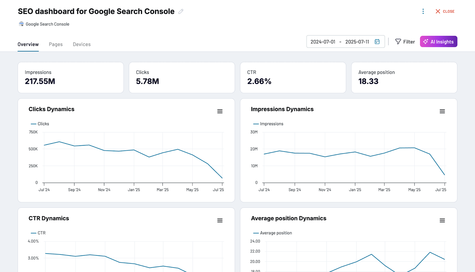
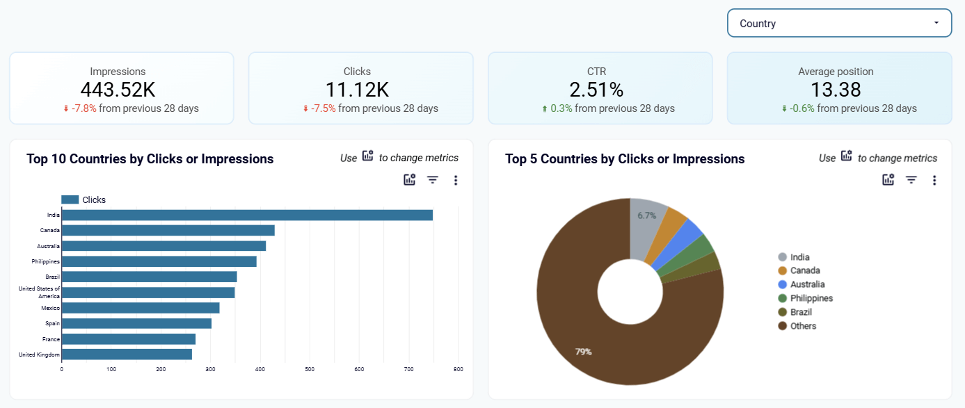
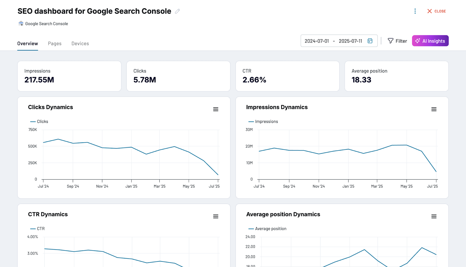
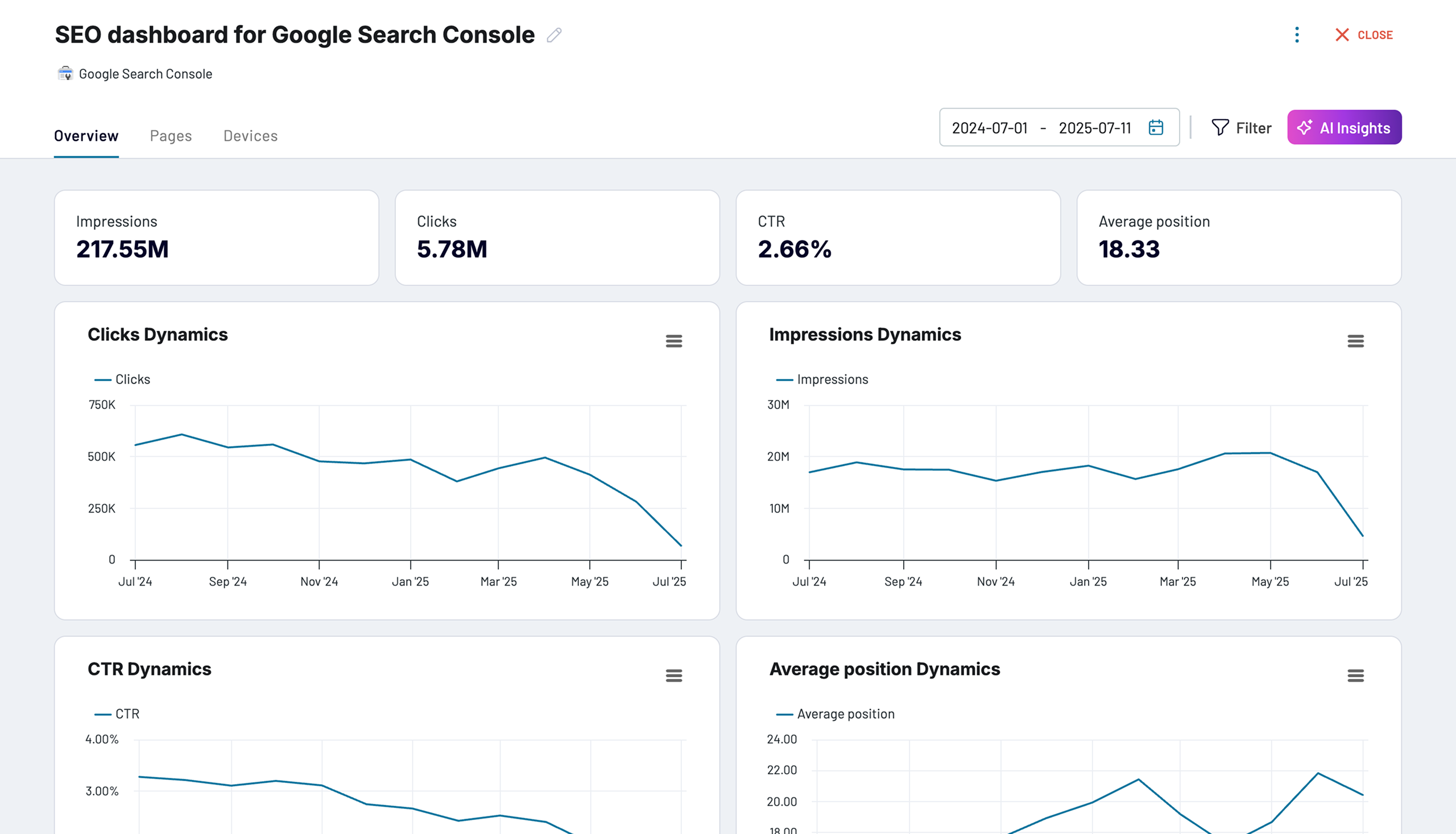
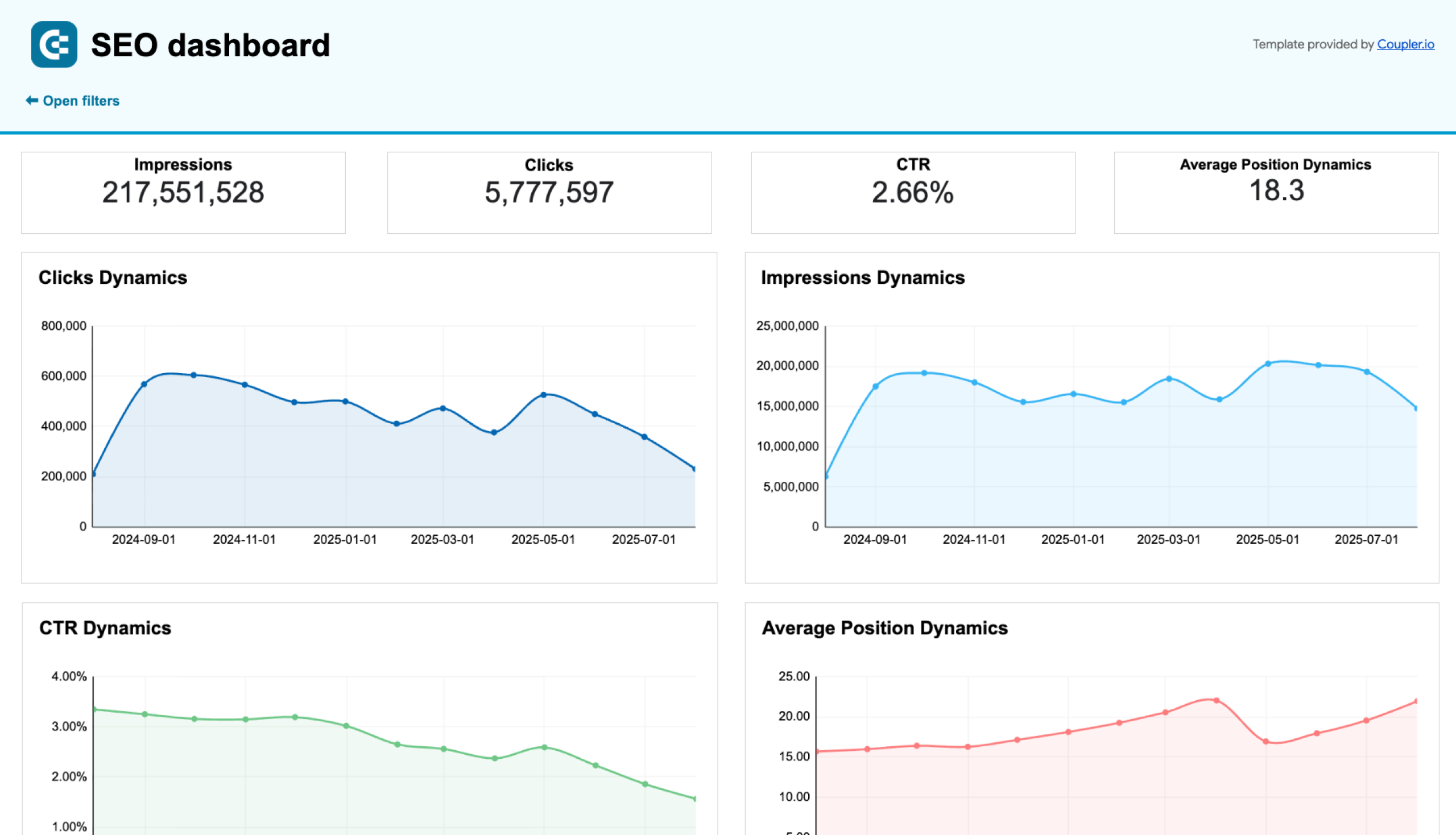
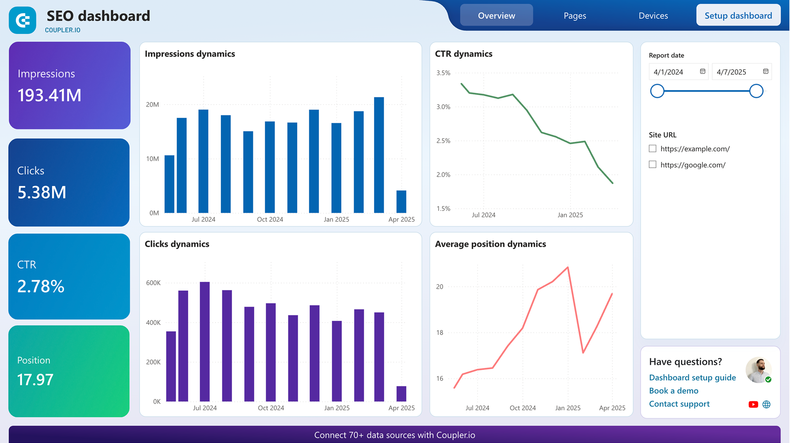
1. SEO dashboard for Google Search Console
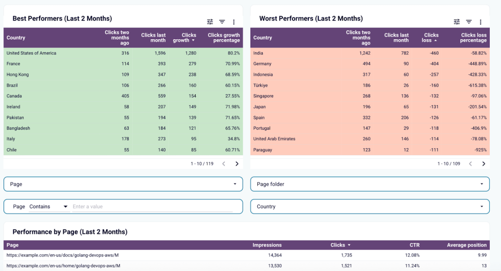
This dashboard gives you a clear view of SEO performance across pages and keywords. You can filter and sort by country, device, and date range to dig into specific insights. Unlike native Google Search Console reports, it offers a more flexible layout and surfaces insights you’d otherwise miss. For example, it shows your best and worst-performing URLs so you can take action faster. This dashboard is best for e-commerce brands or content publishers that rely on search traffic to generate leads or sales.
SEO dashboard for Google Search Console
 Preview dashboard
SEO dashboard for Google Search Console
Preview dashboardWhat you can do with this dashboard:
- Track impressions, clicks, CTR, and average position across all indexed pages
- Identify your top-performing and lowest-performing URLs
- Monitor click dynamics over time to understand seasonal trends or ranking shifts
- Apply filters for country, device type, and date range to refine your analysis
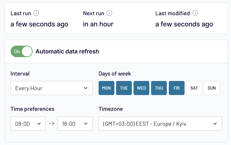
To use the dashboard, simply create a free Coupler.io account and connect your Google Search Console data source. Setup takes less than 3 minutes, and once connected, you can schedule automatic updates as often as every 15 minutes. The dashboard is fully customizable in Looker Studio and can be tailored to reflect your reporting needs.


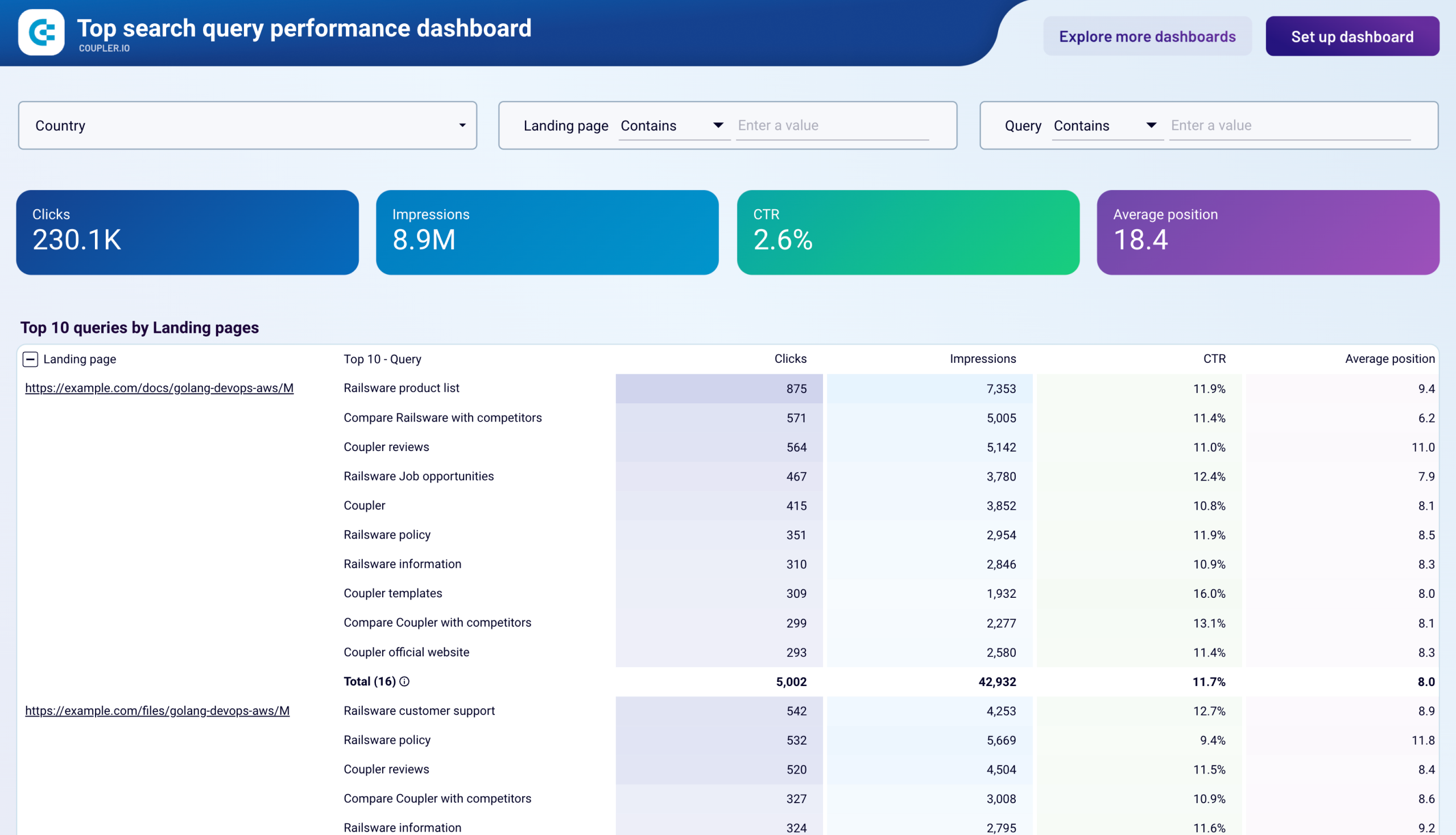
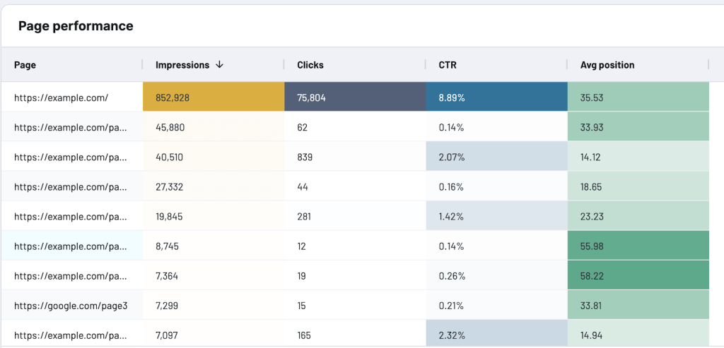
2. Top search query performance dashboard
With this dashboard, you can see which search queries are bringing traffic to your site and how they are performing across your pages. It shows up to 10 keywords per indexed page, lets you sort by clicks or impressions, and helps you quickly spot content gaps or mismatched intent. This dashboard is best for content-heavy clients like publishers, large e-commerce sites, or SaaS companies targeting long-tail SEO.
Top search query performance dashboard
 Preview dashboard
Top search query performance dashboard
Preview dashboardWhat you can do with this dashboard:
- View top-performing search queries across all indexed pages
- Filter data by query, page, or country to analyze keyword performance across markets
- Track impressions, clicks, CTR, and average position for each query
- Assess keyword relevance and identify opportunities to optimize page intent
- Spot underperforming queries and update metadata or content accordingly
The dashboard is built in Looker Studio, and it’s very quick to set up. All you need to do is connect your Google Search Console data source and follow the instructions in the template Readme. Within minutes, you’ll have a fully functional, auto-updating dashboard.
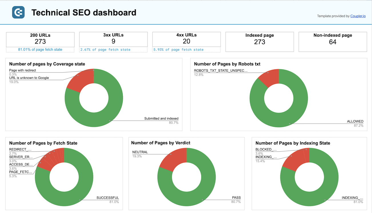
3. Technical SEO dashboard
This dashboard works like a technical health check for your website. It pulls data from Google Search Console to show how your URLs are being indexed and flags issues that might be affecting visibility. You’ll get a quick snapshot of which pages are indexed, which ones aren’t, and how status codes (like 4xx or 3xx) are distributed across your site. This dashboard is best for clients dealing with indexing issues, site migrations, or technical SEO audits.
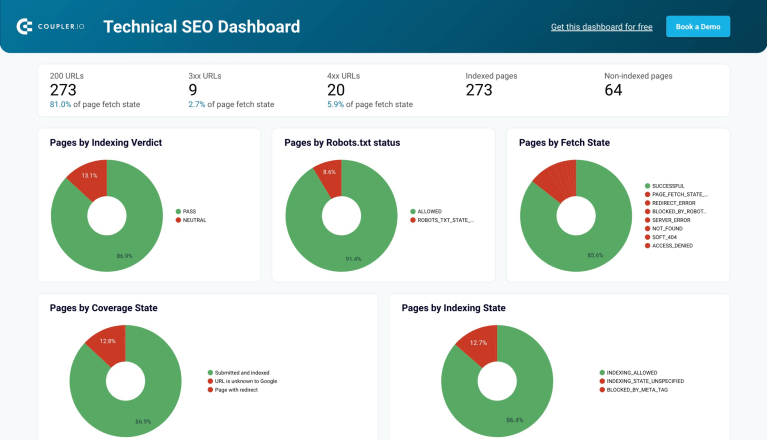
What you can do with this dashboard:
- Track the number of indexed and non-indexed pages
- View total counts of URLs returning 200, 3xx, and 4xx status codes
- Spot technical issues affecting crawlability
- Monitor changes in indexing over time after site updates
This dashboard template is available for free in both Looker Studio and Google Sheets. It takes under 3 minutes to connect your Google Search Console data. Just follow the Readme tab instructions to set up automatic data refresh and get started.


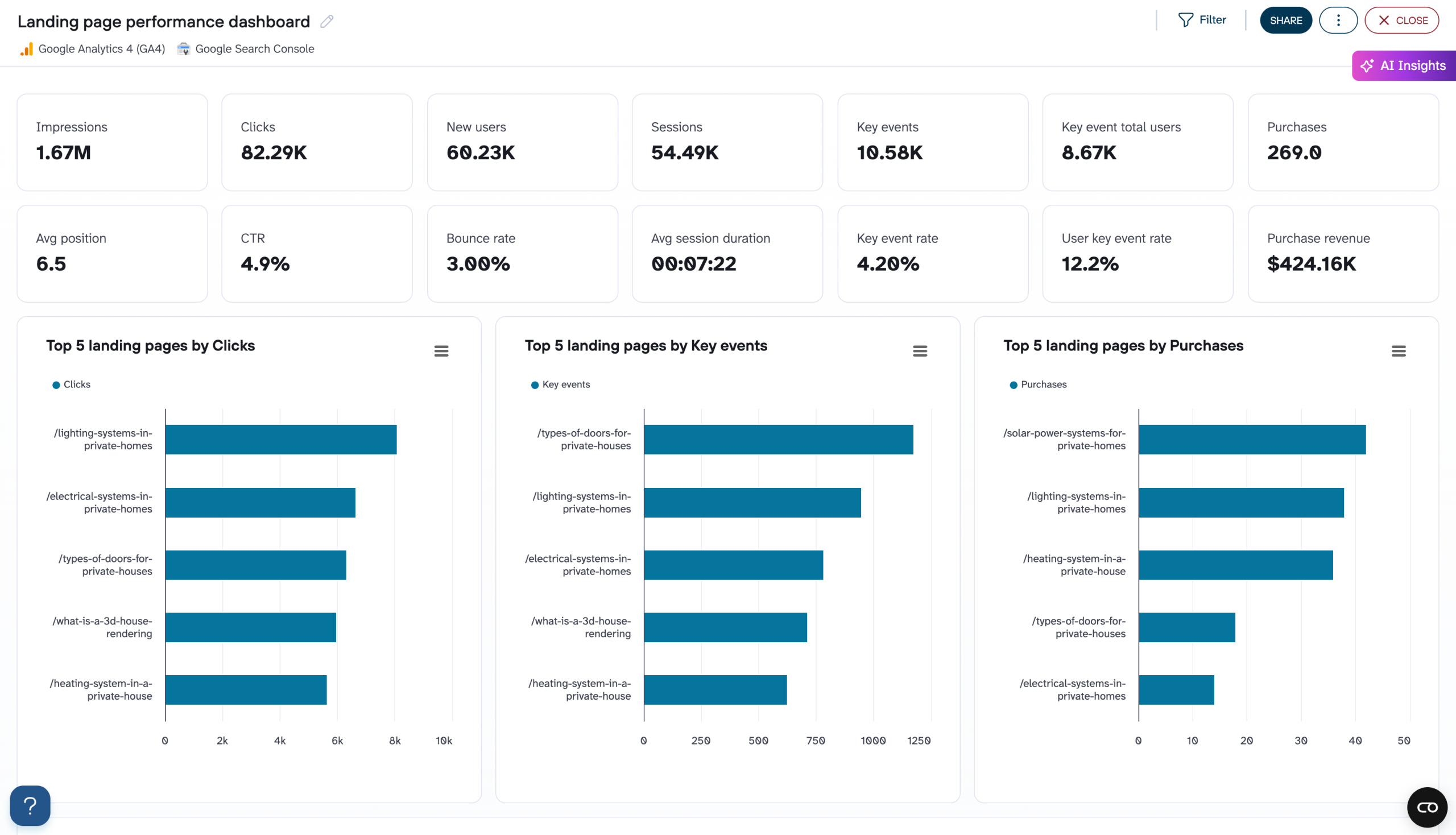
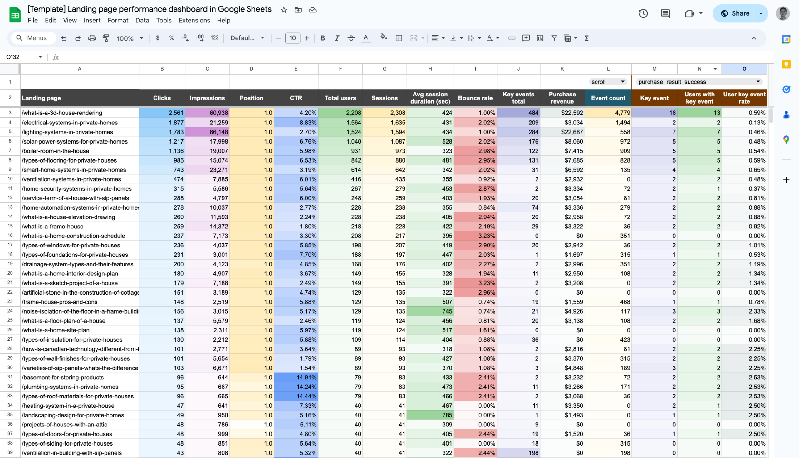
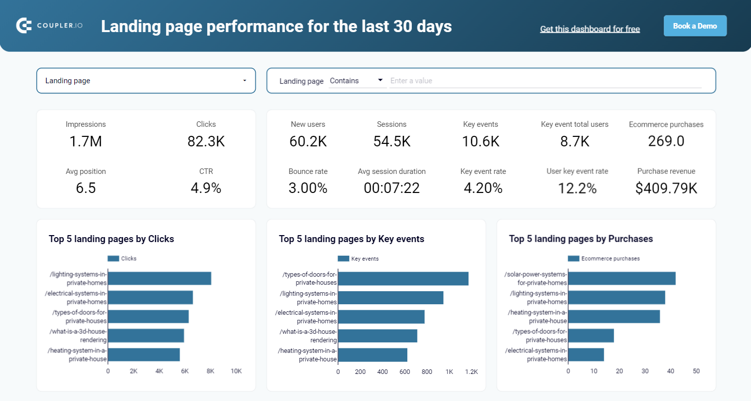
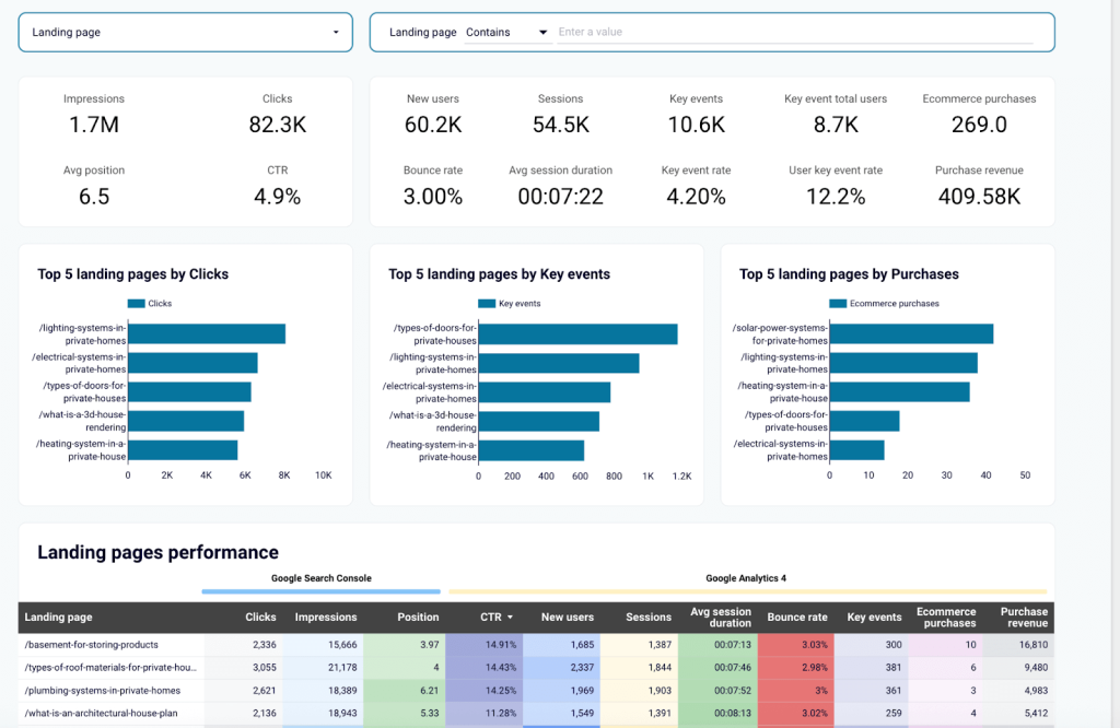
4. Landing page performance dashboard
Landing pages are where SEO results turn into real business outcomes, such as sign-ups, purchases, or downloads. This dashboard combines data from Google Search Console and GA4 to help you monitor how each landing page performs in search results and how users behave once they arrive. You can spot high-performing pages, uncover weak spots, and track how SEO or content changes affect engagement.
This dashboard is best for clients focused on lead generation, e-commerce conversions, and content marketing who want to improve the performance of key entry pages.
Landing page performance dashboard
Preview dashboard
Landing page performance dashboard
Preview dashboardWhat you can do with this dashboard:
- Analyze landing page performance using both GSC and GA4 data
- Spot the top 5 landing pages by clicks, key events, or purchases
- Track search visibility alongside user behavior metrics like sessions, bounce rate, and revenue
- Identify underperforming pages that need SEO or content improvements
- Measure the impact of SEO changes and updates on real user engagement
This dashboard is quick to set up in Coupler.io or via a template in Looker Studio and Google Sheets. Use the instructions to connect your GSC and GA4 accounts. It only takes a few minutes, and your SEO data will begin updating automatically once connected.
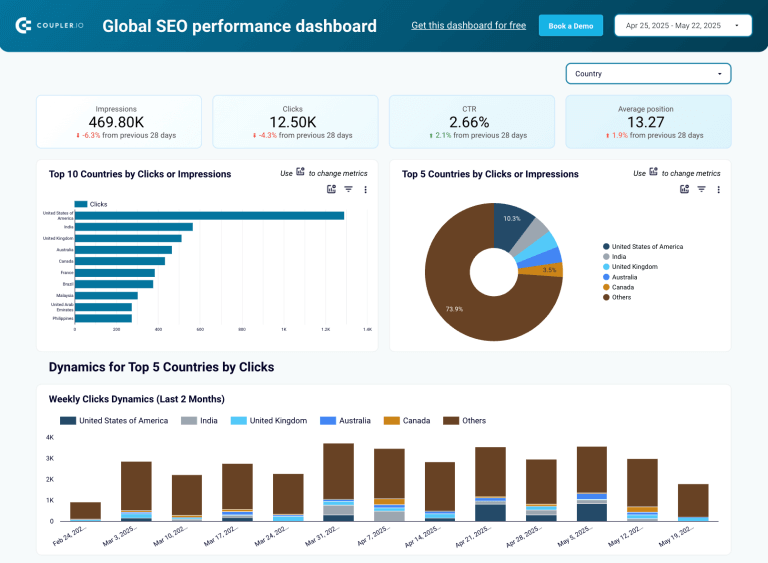
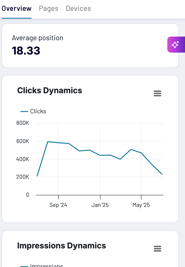
5. Global SEO performance dashboard
If your website gets traffic from multiple countries, this dashboard helps you track how your SEO efforts are performing across different regions. It pulls data from Google Search Console and visualizes key metrics like clicks, impressions, CTR, and average position broken down by country. You can easily compare trends over time and see which markets are driving the most valuable traffic.
This dashboard is best for international brands, multi-region websites, or any client expanding into global markets.
Global SEO performance dashboard
 Preview dashboard
Global SEO performance dashboard
Preview dashboardWhat you can do with this dashboard:
- Monitor search performance by country using key metrics
- Identify the top countries by clicks, impressions, or CTR
- Visualize weekly and monthly trends for regional traffic
- Compare performance across countries to uncover growth opportunities
- Spot which pages perform best with international audiences
Setting up this dashboard takes less than 5 minutes. Head to the Readme tab and follow the instructions to connect your data (no credit card required).
How to build an SEO dashboard from scratch
While templates are a great starting point, you may sometimes need more control, especially if your reporting includes custom KPIs, combines multiple data sources, or needs to match a specific branding or layout.
With Coupler.io, a no-code reporting and automating platform, you can pull data from SEO tools, transform it as needed, and export it to your favorite data viz tool (Google Sheets, Looker Studio, Power BI, etc.) to build a live, automated SEO dashboard. Here’s how to set it up, step by step:
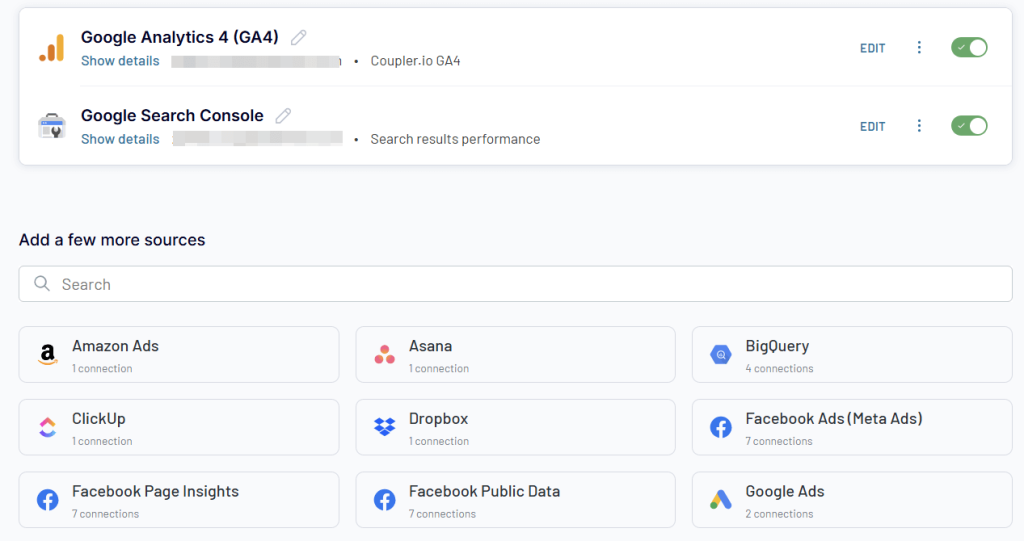
Step 1: Connect your data source
Start by signing up for a free Coupler.io account (no credit card required). Create a data flow from scratch or use a data set template to speed up your workflow. Then, connect your data sources.
Create automated data flows for your SEO dashboards with Coupler.io
Get started for freeAn SEO dashboard is usually based on data from Google Search Console. However, you can also add multiple sources to create a more complete picture of your SEO performance. For example, combine data from GSC with GA4 to monitor landing page performance or blend records with ad performance data from PPC platforms to measure brand awareness campaign impact.
To add other sources, simply use the search bar to find them and follow the on-screen connection steps.
Step 2: Transform your data
The next step is to transform your data. Coupler.io lets you preview and organize it before loading it into your dashboard. Check out this interactive form to explore what data transformation options are available
Once your dataset looks the way you want, you can proceed to load and visualize it.
Step 3. Load the data and schedule a refresh
Connect your destination app account and choose the file or workspace where your dashboard will be built (e.g., a specific Google Sheet or Looker Studio report).
Depending on your destination app, you can either run the data flow immediately and then set the update schedule, or set the schedule first and run it after. Coupler.io supports refresh intervals as frequent as every 15 minutes, so your SEO dashboard stays live and always up to date.
Once your data is loaded, you’re ready to build. You can now start visualizing key SEO metrics using drag and drop elements in your BI tools to create bar charts, line graphs, tables, or scorecards filtered by things like keyword, traffic source, country, or device.
Client onboarding: introducing dashboards to existing accounts
Switching your clients from static reports to an SEO client dashboard must be handled carefully. Most clients don’t like sudden changes, especially if they’ve been doing things a certain way for months or years. Instead of surprising them with a new system, guide them through the transition with small, thoughtful steps. This approach helps them understand the value of the dashboard, feel involved in the process, and increases the likelihood that they will actually use it.
Let’s say you’re managing SEO for an e-commerce client in the smart home or interior systems space. They’ve been receiving monthly email reports in spreadsheet format, but still struggle to see how SEO connects to revenue. Rather than imposing a new reporting system on them, use the rollout plan below to meet them where they are. The goal is to transition them to an SEO client dashboard that helps them make faster, more informed decisions.
Note: This approach works across different industries. You just need to adapt it to the client’s goals and workflows.
Step 1. Audit the current reporting workflow
Before introducing anything new, you need to understand how your client currently receives and reviews reports. Ask questions like:
- How do you currently receive SEO updates?
- What metrics do you usually look at?
- Which part of the report is most useful to your team?
- Is there anything you wish you could see more clearly?
- How often do you actually check the reports?
You can ask these during a kickoff call or send a quick survey using Google Forms or Typeform. The goal is to uncover what’s working, what’s being ignored, and what data they really care about. This step typically takes 1–3 days and gives you a clear baseline to build something they’ll actually use.
Step 2. Build a pilot dashboard
Once you’ve gathered input from your client, use it to build a focused pilot dashboard around the 3 to 5 metrics that matter most to them. The goal is to give them a clear, simple view of what they actually care about.
You don’t need to build it from scratch. Start with a prebuilt template and customize it slightly based on what they said in Step 1. For example, for an e-commerce brand in the smart home or interior systems space, you can use this Landing Page Performance Dashboard that shows:
- Top-performing landing pages ranked by clicks, user actions, and purchases
- Click-through rate (CTR) and average Google Search position for each product or category page
- User engagement metrics like bounce rate, new users, and average session time
- E-commerce purchases and revenue per landing page
This type of dashboard connects SEO work to real outcomes: traffic, engagement, and sales. It gives your client a clear snapshot of what’s working.
Step 3. Schedule a live demo
Once the pilot dashboard is ready, set up a short live demo with your client. Seeing their own data visualized in a clear format is often the moment it clicks.
The demo should last around 20–30 minutes, and walk them through:
- Where to find the metrics they care about
- How to filter by product, time range, or traffic source
- How often the data updates
- What insights they can take action on
Make it interactive. Encourage them to click around and ask questions. If they seem unsure, tie the dashboard back to a challenge they mentioned earlier.
For example:
“You mentioned it’s hard to track which product pages lead to sales, now you can see purchases per landing page here, without needing to dig through GA4 or Shopify reports.”
Record the session if they’re okay with it, and send a quick recap afterward. That gives them something to refer back to or share with other stakeholders who weren’t on the call.
Step 4. Gather feedback and refine
After the demo, give your client a few days to explore the dashboard on their own. You can then check in with a short follow-up message or email. It can be as simple as:
“Hi (add your client’s name), just checking in. How’s the dashboard working for you so far? Anything you’d like to see added or changed?”
If they share suggestions, act on them quickly and highlight what’s changed. By tailoring the dashboard to their actual feedback, you’re reinforcing its value and building trust.
Once the feedback is addressed and the dashboard is aligned with their goals, you’ll be ready for the final step: going live and phasing out static reports.
Step 5. Go live and phase out static reports
Once the dashboard reflects your client’s goals and feedback, it’s time to make it their main reporting tool. This stage is about helping them confidently transition from outdated reports to a live, self-serve view of their SEO performance.
Before going live, double-check that the essentials are in place:
- The dashboard includes all the key metrics they care about
- The client has full access and knows how to navigate it
- Reporting frequency is agreed upon (e.g., weekly views, monthly reviews, etc.
- Stakeholders know where to find the dashboard and how to use it
- You’ve discussed phasing out PDFs or spreadsheet reports
If your client still seems unsure, suggest running the new dashboard alongside the old report for one more reporting cycle. Use that period to highlight how much faster and clearer the new setup is.
Once they’ve had time to adjust and start using it regularly, you can fully phase out static reporting.
How to position SEO dashboards as a strategic value-add
Rolling out a dashboard is only half the job. For it to deliver real impact, your client needs to understand how it supports their goals, saves time, and replaces scattered reports with one clear source of truth.
Some clients will adopt it right away. Others may hesitate, not because the data isn’t useful, but because they haven’t yet connected it to their day-to-day priorities.
That’s where strong positioning comes in. You’ll need to help the client see that the dashboard is a tool for faster decisions, clearer results, and fewer reporting headaches.
Below are four core value areas clients care about most, and how to frame the dashboard around each one during onboarding and early adoption conversations.
1. It saves them time
Clients are busy. If you want them to adopt a dashboard, show how it makes their workflow easier, not more complicated. Highlight that they won’t need to wait for end-of-month PDFs or ping you on Slack just to get basic updates.
You can also position the dashboard as both a time-saver and an early warning system. For example, if traffic to a high-converting product page drops suddenly, the dashboard surfaces it within a day or two, not weeks later when the static report finally lands. That gives them time to react: update content, fix internal links, or launch a quick promo before sales are impacted.
2. It connects SEO to real business outcomes
Many clients struggle to link SEO efforts to revenue. If you want your work to stand out, frame the dashboard as the missing link between rankings and results.
For example: If a client asks, “Is SEO working?”, you can point to their dashboard page and say: “Yes, this page brought in 1,200 organic visitors and generated £1.2k in sales last month alone.”
That’s a far more compelling answer than, “Your keyword moved from #8 to #5.”
Many clients struggle to see how SEO translates into revenue. That’s why you need to position the dashboard as the missing link between traffic and tangible business results.
By framing the dashboard around business outcomes, you help clients view SEO as a revenue driver, not just a marketing report.
3. It reduces internal reporting friction
The dashboard isn’t just for marketing teams; it can also serve as a self-serve reporting tool for the entire team. Position it as a means to reduce reporting workload and eliminate unnecessary back-and-forth. Without a dashboard, teams rely on emails, spreadsheet exports, or custom requests to obtain the answers they need. That slows everyone down. Now with the dashboard, a sales team can check which products are trending, a social media team can align content with organic trends by watching which pages or keywords are gaining traction, leadership can monitor organic growth at a glance, etc. Everyone can easily access the insights they need when they need them.
4. It gives them a competitive edge
In industries like fashion, beauty, and seasonal e-commerce, timing drives performance. Being a week late on a trend can mean missing out on thousands in revenue. With traditional reports, insights often come too late. Position the dashboard as a tool that enables clients to make faster, smarter moves than their competitors. With a live dashboard, clients see changes in real time and can act before their competitors do.
For example, if their partywear collection page starts seeing a spike in clicks a few days before Black Friday, they can immediately boost it with ads, adjust the homepage layout, or add urgency messaging. All of this happens before the peak shopping window, not after.
This kind of responsiveness can’t happen with static reports. The SEO client dashboard gives clients the visibility they need to move quickly, optimize on the fly, and win market share.
Common objections (and how to respond)
Even with strong positioning, some clients may hesitate. That’s normal. The key is to anticipate those concerns and address them convincingly. Here are a few common objections you might hear and how to handle them:
| Client Objection | What they really mean | How to respond |
| I don’t have time to learn a new tool. | They’re worried it’ll slow them down. | Totally fair. This dashboard is designed to be self-explanatory. We’ll walk you through it in under 30 minutes, and I’ll send a quick reference guide after. |
| Can I still get the PDF version? | They’re used to their old format and are afraid of losing it. | Absolutely. We can run both in parallel for the next month, so you’re comfortable. Most clients end up preferring the dashboard because of the extra visibility. |
| How do I know the data is accurate? | They want to be sure they can trust what they’re seeing. | The dashboard pulls directly from tools like GA4 and Search Console. We can even spot-check a few numbers together if that helps build trust. |
| This looks like a lot. I just want the highlights. | They’re overwhelmed by too much data. | We’ll keep it focused. Your main tab shows only the top 3 to 5 metrics. You can dig deeper if needed, but the core insights stay simple. |
| Do I need to check this every day? | They’re unsure how it fits into their routine. | Not at all. It auto-refreshes, so you can check in weekly or monthly, whatever suits your workflow. |
Best practices for creating an SEO reporting dashboard for clients
To build an SEO dashboard for clients that’s actually useful, you need thoughtful design and a layout that makes insights easy to understand and act on. Here are some best practices to help you create a dashboard that’s accessible, actionable, and user-friendly:
Accessibility and Inclusivity
Your dashboard should be usable by everyone, including users with visual impairments, neurodivergence, or color vision deficiencies.
- Use color-blind friendly palettes (avoid red/green-only combinations)
- Include text labels for charts and data points, never rely on color alone
- Support keyboard navigation for screen readers
- Use ARIA labels for interactive elements (e.g., dropdowns, filters)
- Avoid flashing animations or rapid transitions
- Ensure font sizes are legible (min. 14px for body text, 18–20px for headings)
Mobile Responsiveness
Many clients check dashboards on their phones or tablets. Make sure it scales gracefully across devices.
- Use responsive grid layouts (e.g., 2-column layout for desktop, 1-column for mobile)
- Prioritize key metrics at the top
- Ensure buttons and filters are thumb-friendly (minimum 44x44px tap targets)
- Test across breakpoints: mobile (?768px), tablet (768–1024px), and desktop (?1024px)
- Avoid horizontal scrolling and tightly packed tables
User Experience (UX) Principles
A good dashboard reduces friction. Help clients quickly understand what they’re seeing and why it matters.
- Show only the most relevant metrics upfront (use tabs for deeper views)
- Use filters, not endless scrolls, to help clients drill down (e.g., product category, landing page, time range)
- Group-related metrics (e.g., traffic, conversions, revenue) to help clients see context
- Use plain language and avoid technical jargon like “CTR deltas” or “GA4 event mismatches”.
- Make it scannable, include brief tooltips or descriptions for unfamiliar metrics
Visual Hierarchy and Design Guidelines
Clients should be able to glance at the dashboard and immediately spot what matters. Use visual structure to guide their focus
- Stick to 2–3 main brand colors with neutral backgrounds (white/light grey)
- Use font size and weight to create a hierarchy
- Use consistent spacing between elements (e.g., 20px padding between sections)
- Use white space intentionally, don’t clutter the dashboard with too many tiles
- For charts, use bar/line charts for trends, tables for detail, and scorecards for summaries
Measuring dashboard success and ROI
Measuring your dashboard success is not just to justify the time and tools you’ve invested in, but to show your client that the dashboard is actually helping them make faster decisions, save time, and generate revenue.
Let’s say you’ve built an SEO dashboard for a skincare e-commerce brand aiming to grow organic traffic and drive more sales. You used Coupler.io to create the dashboard, pulling data directly from GSC either from scratch or using one of their ready-made templates. The dashboard is up and running, but to prove it’s delivering real value, you need to measure the impact it’s having on the client’s business.
Here are four key areas to focus on when measuring dashboard success and demonstrating its ROI:
1. Client Engagement
Client engagement is the first sign of success. If your clients are not logging in or referencing the dashboard in conversation, no matter how well it’s designed, then it’s not delivering value.
To track engagement, check the access logs within your dashboard platform:
- Looker Studio: Use Log Events to view access activity. If the dashboard is embedded on a site, you can also track interactions using Google Analytics, such as page visits, time on page, and filter clicks.
- Power BI: Check the Power BI Activity Log through Microsoft 365 Audit Logs. You’ll be able to see who viewed the report, when they accessed it, and whether they used features like filters or exports.
- Google Sheets: Go to Tools > Activity dashboard to see who has viewed the file and when. You can also use version history and comments to get a sense of how the client is interacting with the content.
Additionally, you can also gauge engagement by listening for verbal cues during check-ins:
- Are they referencing specific pages or metrics? “I noticed traffic dropped on the skincare quiz page.”
- Are they requesting new views or suggesting improvements? If yes, that’s a sign they’re actively using the dashboard to make decisions.
Even a quick check-in like “Anything you’d like to add or change in the dashboard this month?” can give you valuable feedback and help you spot opportunities to refine.
2. Time Saved = Operational ROI
One of the most immediate forms of ROI is time saved. To measure this, you need to compare how long reporting used to take versus how long it takes now with the dashboard.
Let’s say before the dashboard, you were spending around 4 hours per week manually exporting GSC data, taking screenshots, writing a report, formatting it, and sending it by email. That adds up to 16 hours per month, and most of that time wasn’t analysis or strategy; it was admin work.
Now, using a Coupler.io template, the setup might take 3–5 minutes. That means in under 5 minutes, you’ve replaced an entire month’s worth of reporting work. The data auto-refreshes daily, and the client has real-time access to everything they need. You might still spend 1 hour per month checking filters, making tweaks, or joining a call, but that’s it.
If your hourly rate is $100/hour, then to calculate time saved:
Formula: Time Saved ROI = (Old time – New time) × Hourly rate
15 hours × $100 = $1,500 saved per month
That’s $1,500 in operational ROI every single month, just by cutting down reporting time.
That’s the time you can now reinvest into actual strategy like optimizing pages, running tests, or advising the client directly. And your client benefits from a faster feedback loop and more actionable insights that drive real results.
3. Business Impact = Revenue ROI
A dashboard should help clients move faster in ways that affect actual revenue. This is what makes the dashboard a decision-making tool.
Let’s say it’s the first week of June and summer’s just starting. You notice in the dashboard that the “sunscreen SPF 50” product page is seeing a drop in both clicks and click-through rate (CTR). Maybe rankings slipped, or a competitor pushed a stronger listing.
Because the data is refreshed daily and the client checks regularly, they catch the dip within 1–2 days, not weeks later, like they would if they were waiting for a traditional end-of-month report.
They can act quickly based on this issue spotted by:
- Updating the page title tag and meta description
- Expanding product descriptions, adding FAQs, reviews, or comparisons
- Requesting the page to be indexed, etc.
Because they acted fast, their rankings bounced back before the slump got worse. And the page performs well for the rest of the month. As a result, that one product page brings in $2,900 in sales for June revenue that might’ve been lost if they were still relying on a static monthly report.
4. Total ROI (Return on Investment)
Now that you’ve looked at how the dashboard saves time and helps drive revenue, you can combine those to calculate the total return on investment. This gives your client a full view of what they’re getting back. We’ll break the calculation into three parts:
Assumed values:
- Time saved: 15 hours per month
- Your hourly rate: $100
- Time ROI: 15 × $100 = $1,500/month
- Revenue impact (e.g., SPF 50 page): $2,900/month
- Tool cost (Coupler.io Personal plan): $29/month
1. Total gain: This gives you the total monthly return of what the dashboard is generating.
Formula: Total Gain = Time savings + Revenue impact
?$1,500 + $2,900 = $4,400/month
This combines the time saved and extra revenue earned.
2. Net ROI: This subtracts the cost of the tool to calculate how much value the client actually keeps.
Formula: Net ROI = Total Gain – Tool Cost
Net ROI = $4,400 – $29 = $4,371/month
This is the true monthly return the client sees after paying for the dashboard.
3: ROI multiple: Finally, show how much return they’re getting for every $1 spent.
Formula: ROI multiple = Net ROI ÷ Tool Cost
ROI multiple = $4,371 ÷ $29 ? 151x ROI
That means for every $1 spent on the dashboard, the business gains around $151 in return. This is the kind of number that stands out during client reviews or budget approvals.
Continuous improvement process for SEO dashboards
Dashboards aren’t “set and forget” tools. To keep delivering value over time, you need to evolve them as goals, campaigns, and data sources shift.
Here’s a simple maintenance loop to follow:
- Monthly dashboard reviews: Check if key pages are still performing. Are CTRs improving? Are the right metrics getting attention?
- Client feedback collection: Ask what they want more (or less) of. A one-question form or quick check-in can reveal high-impact changes.
- Template updates based on industry changes: If a new SERP feature rolls out or a seasonal campaign kicks off, update the dashboard to match. That could mean adding a featured snippet tab or surfacing product-specific trends.
Ongoing iteration keeps your custom SEO dashboard relevant and turns it from a monthly report into a real-time decision-making asset your client can’t do without.