Customer Acquisition Analytics: A Practical Playbook to Turn Data Into Revenue

Open your ad dashboard and ask one question: “Which channel actually bought us customers last month?”
If that takes longer than 10 seconds (or sparks a Slack debate) to answer that attribution question, your data isn’t working for you, it’s working against you.
It’s not because teams don’t have the data. They have too much of it, and it’s all over the place.
Ads scream about clicks, CRMs brag about leads, and finance records every dollar spent. But without connecting the dots, these numbers celebrate the wrong wins and hide the true cost of acquiring customers.
In this playbook, we’ll show you how to build a unified customer acquisition analytics workflow using Coupler.io.

Turn customer acquisition data into revenue with Coupler.io
Get started for freeThe problem with customer acquisition data analytics today
A recent study by Vena Solutions found that the average customer acquisition cost (CAC) across industries is $606, but the spread is massive: e-commerce companies average around $70 per customer, while fintech firms spend more than $1,400.
Numbers like these show why so many businesses struggle to measure CAC accurately or design a cost-effective customer acquisition strategy.
The core issue is data fragmentation. Marketing, sales, and finance all track their own numbers, but none of them connect into a single, consistent view.
For example, take a B2B SaaS company.
The marketing team’s dashboard shows $15,000 in ad spend and 500 new leads. The CRM shows 50 opportunities created from those leads, but without personas or demographics, it still lacks clarity. Finance logs another $8,000 in sales salaries and discounts.
But when leadership asks, “What did it cost to acquire each new customer?”, no one has the full answer.
Each dataset tells part of the story, but without stitching them together, the picture is incomplete and misleading. That gap creates three costly problems:
- Incomplete CAC calculations: Marketing costs may be counted, but sales overhead or discounts often get ignored, making CAC look artificially low
- Misleading success signals: Teams celebrate vanity metrics like traffic spikes while ignoring whether those visits turned into paying customers
- Inefficient budget allocation: Without comparing CAC against customer lifetime value (CLV), companies double down on marketing campaigns that don’t actually drive profitable growth
On the surface, CAC looks like a simple formula:
CAC = Spend ÷ New Customers
But without unified analytics, that number can be dangerously wrong. Businesses risk flying blind, underestimating costs, and misreading which acquisition channels actually drive return on investment (ROI).
How to build a customer acquisition analytics workflow
Reliable customer acquisition analytics starts with more than gathering data. You need a connected workflow where every touchpoint, like ads, CRM, ecommerce, web analytics, and finance records, is fed into a single source of truth. When this data is cleaned and refreshed automatically, you can view CAC, conversions, and ROI in one dashboard or database.
With all acquisition metrics in one place, teams can measure efficiency across marketing channels, spot funnel drop-offs quickly, and make budget decisions with confidence.
Here’s a step-by-step guide to set it up.
Step 1: Define KPIs that align with your goals
The first step is deciding what ‘customer acquired’ means for your business.
For a SaaS, it could be a paid subscription.
For e-commerce, a first order.
For B2B, a closed deal logged in the CRM.
Once that definition is clear for your business, you can decide which KPIs matter most.
But KPIs don’t appear fully formed in your tools. You need to know the underlying metrics they are calculated from. Here’s what that looks like in practice:
| Metric | Definition | Formula | Metrics required |
| Customer acquisition cost (CAC) | The average cost of gaining one new customer | (Marketing Costs + Sales Costs) ÷ New Customers | Marketing spend (ads), Sales team costs, Discounts/incentives, Number of new customers |
| Conversion rate | % of leads that become paying customers | (Customers ÷ Leads) × 100 | Number of leads (forms, CRM), Number of converted customers |
| Customer lifetime value (CLV) | Total revenue a customer generates during their relationship with your business | Average Order Value × Purchase Frequency × Retention Time | Avg. order size, Number of repeat purchases, Average customer retention period |
| LTV: CAC ratio | Efficiency of acquisition by comparing lifetime value to acquisition cost | CLV ÷ CAC | CLV calculation, CAC calculation |
| Time to conversion | How long it takes a lead to become a customer | Date of Conversion – Date of First Touch | First touch timestamp (ads, CRM), Conversion timestamp (purchase, deal closed) |
| Return on ad spend (ROAS) | Revenue generated for every $1 spent on advertising | Revenue from Ads ÷ Ad Spend | Ad spend (per platform), Revenue attributed to ads |
| Lead-to-customer ratio | How many leads actually convert into paying customers | Customers ÷ Leads | Total leads, Converted customers |
| Churn rate | % of customers lost in a given period (important for SaaS & subscriptions) | (Customers Lost ÷ Customers at Start) × 100 | Number of active customers at start, Number of lost customers in period |
For more KPIs, check out our article on PPC metrics to track.
Once you know what to measure and how to calculate it, the next challenge is getting all those numbers in one place.
Step 2: Bring all acquisition data into one source of truth
Scattered data is the biggest barrier to understanding what it really costs to acquire customers. Ads highlight clicks, CRMs log leads, and ecommerce tools show sales, but without a single view you only see fragments of the story. The most efficient way is to bring all this data together in one pipeline so you can analyze acquisition costs, funnel performance, and ROI across different channels with consistent messaging, all backed by unified customer data.
This is where Coupler.io provides an advantage. Instead of stitching exports manually, you can connect data from 230+ apps, including ad platforms, CRMs, analytics tools, and ecommerce systems into a single automated pipeline. From there, Coupler.io lets you:
- Align campaign names across platforms: Different tools often label the same campaign in completely different ways (e.g., “FB-Campaign-1” vs. “Facebook Ads – Summer Promo”).
By standardizing these names, you roll up performance into one clear view instead of chasing duplicate entries or guessing which line item belongs where
- Merge marketing, sales, and ecommerce data: A Facebook campaign might generate clicks, your CRM tracks the leads, and Shopify records the sales. Unless you connect these dots, you’ll never know if ad spend actually produced paying customers. Merging these datasets builds the complete customer decision journey in one place
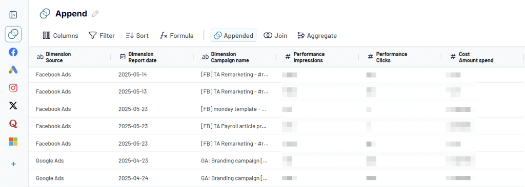
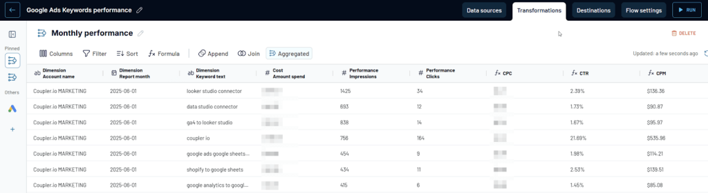
- Group results by campaign, channel, or time period: Looking at daily rows can feel like noise. By rolling up data weekly, monthly, or by channel, you uncover trends like rising CAC, seasonal spikes, or which campaigns are sustaining ROI over time
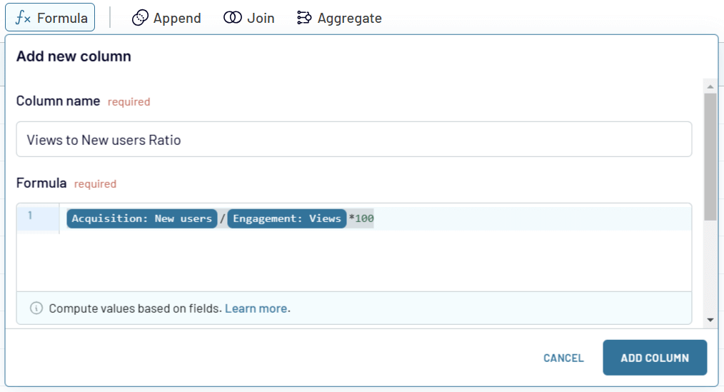
- Create new columns with custom formulas: Raw spend and clicks don’t mean much until you turn them into actionable metrics like CAC, ROAS, or views-to-new-users ratio. Adding these formulas inside your dataset means your dashboards become tools for instant decision-making
By this point, you’ve turned scattered and inconsistent inputs into one reliable data flow that reflects the real cost of acquiring customers.
Now, the next step is automating this data flow.
Step 3: Automate reporting
Customer acquisition metrics shift constantly: ad costs rise overnight, conversion rates dip, and yesterday’s best-performing channel can burn cash tomorrow. If reporting relies on manual exports, you’ll always be reacting to outdated numbers.
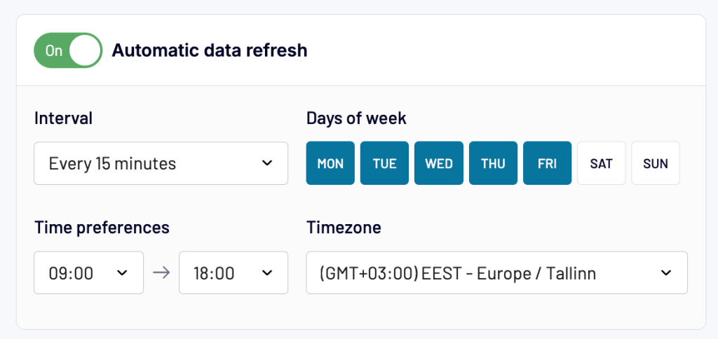
Automating reporting changes that. With Coupler.io, you can schedule acquisition data to refresh automatically and send it straight into your warehouse, spreadsheets, or dashboards. This way, your dashboards and reports are always up-to-date, giving you and your team a live view of what’s happening with CAC, conversions, and channel performance.
And the impact is measurable:
- Massive time savings: Project Alfred cut 20-40 hours of manual reporting each month after unifying their HubSpot + Xero data with Coupler.io
- Big cost and labor efficiency: United Way Northwest Indiana saved about 80 hours per month and $20,000/year, while moving from fragmented reports to real-time dashboards
- High accuracy and fast rollout: Agencies like SellThru achieved 95%+ reporting reliability and reduced dashboard setup time from two weeks to just 2-3 days.
Coupler.io also provides pre-designed dashboard templates. They give you ready-made views of CAC, Google Ads funnel drop-offs, and ROI so you can start analyzing instantly, while still leaving room for customization later.
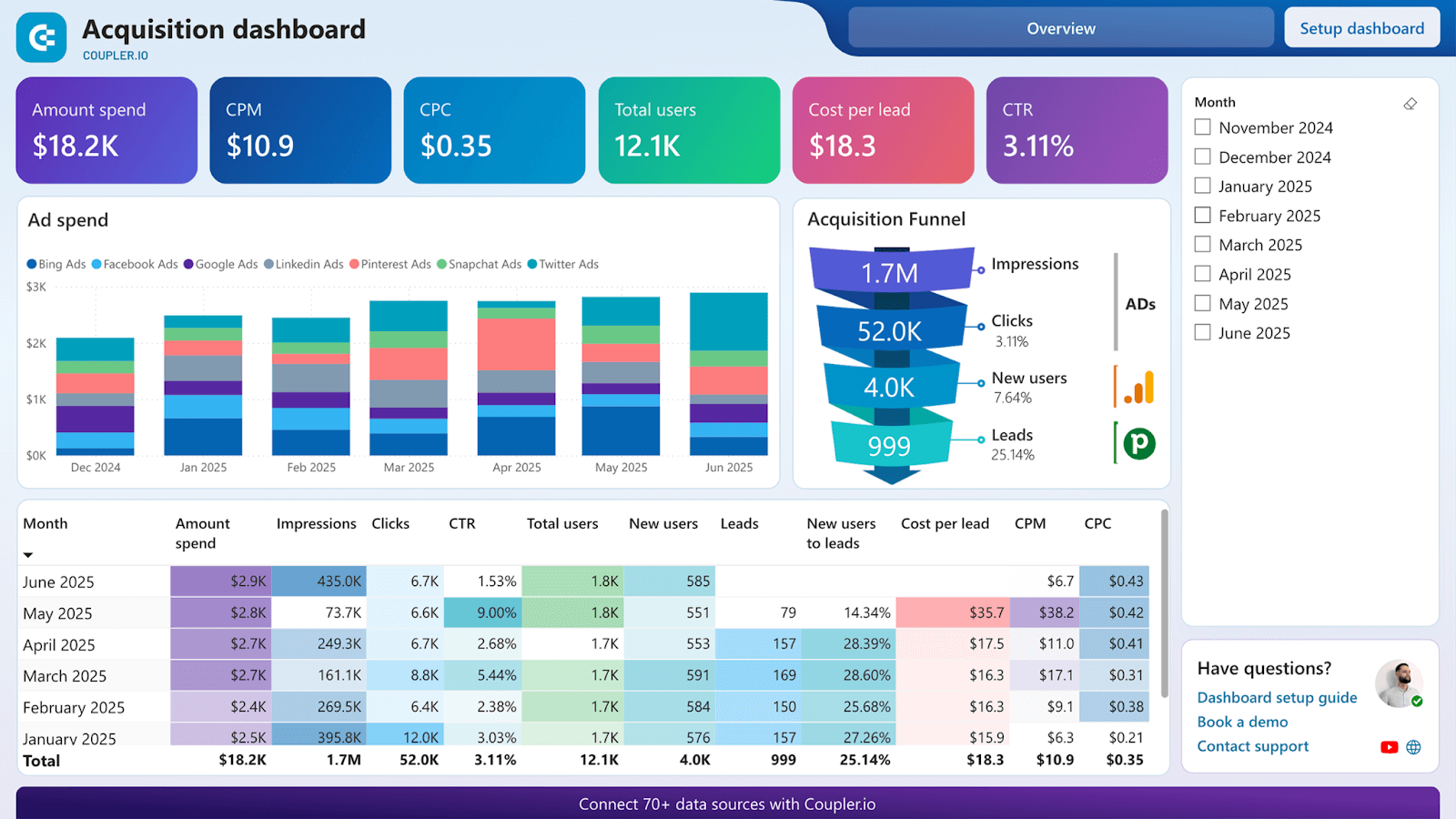
For example, the customer acquisition dashboard helps you see how ad spend turns into clicks, leads, and paying customers in a single view. It shows key metrics like total users, cost per lead, CTR, etc, across different channels to give you clarity on which campaigns are worth scaling.
Customer acquisition dashboard for Pipedrive
 Preview dashboard
Customer acquisition dashboard for Pipedrive
Preview dashboardStep 4: Leverage AI insights
Once your acquisition data is combined and flowing into dashboards or warehouses, the real value comes from what you can do with it. While static reports let you dig through the numbers yourself, AI tools can analyze and give insights.
With Coupler.io, you can send your cleaned and connected datasets directly into AI tools like Claude or ChatGPT. That means instead of digging through endless tables, you can simply ask questions in plain language.
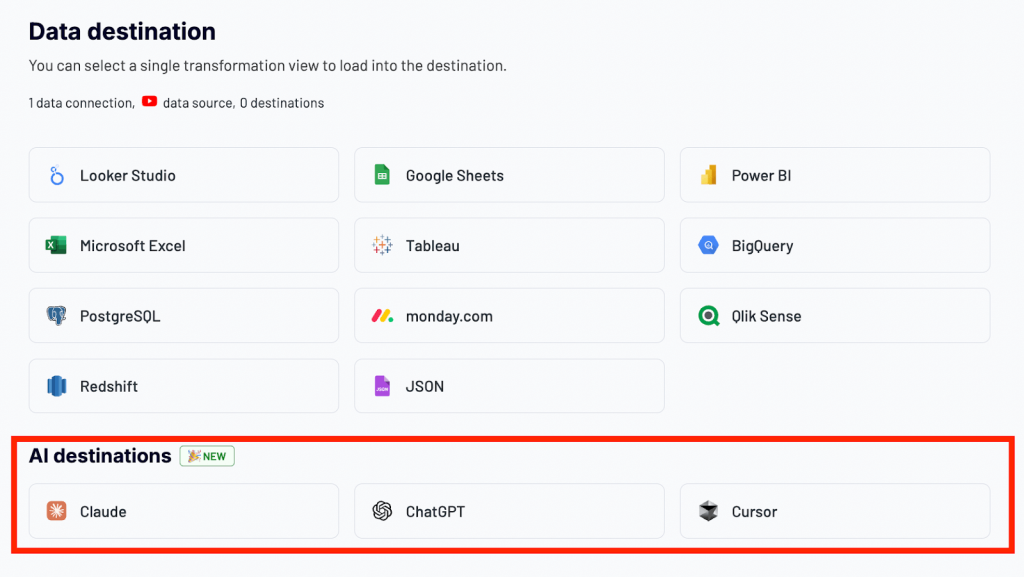
Because these answers come from your live Coupler.io dataflow, they’re grounded in facts and help improve customer experience. This conversational analytics approach saves hours of manual exploration and makes advanced analysis accessible to everyone on the team.
Customer acquisition analysis made easy with Coupler.io
Get started for freeHow to measure customer acquisition: Dashboard examples you can use
Once your acquisition data is connected, the next step is to make it actionable. A dashboard translates ad spend, funnel stages, and CAC trends into a story you can act on.
Pre-built templates help you skip the tedious setup and get straight to insights. They automatically surface key metrics like cost per lead, ROI by channel, and funnel drop-offs, so you can quickly see what’s working and what’s wasting budget.
With templates, you gain the clarity of a custom analytics setup without the overhead, making it easier to optimize campaigns, cut costs, and share results with your team.
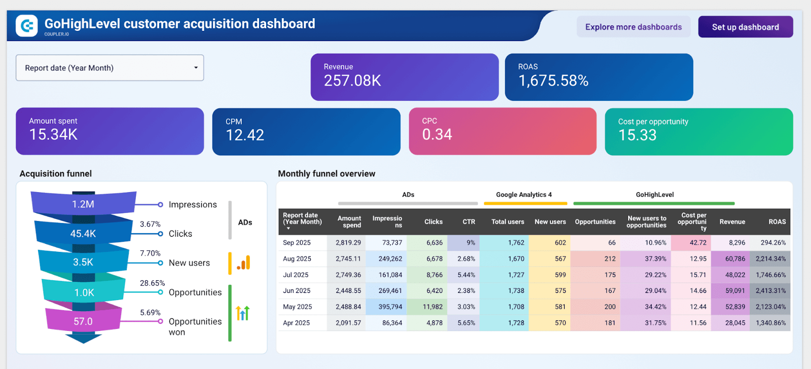
GoHighLevel customer acquisition dashboard
If you want to see exactly how your ad spend translates into new opportunities and revenue, the GoHighLevel customer acquisition dashboard gives you that clarity. It connects GoHighLevel CRM data with ad platform and GA4 metrics, so you can see how interactions move through the funnel into real deals, strengthening customer relationships.
GoHighLevel customer acquisition dashboard
 Preview dashboard
GoHighLevel customer acquisition dashboard
Preview dashboardThis dashboard bridges the gap between marketing and sales. You can follow the journey from spend → impressions → clicks → new users → opportunities won, and compare efficiency across platforms like Facebook, LinkedIn, or Bing Ads. That way, you know which channels are actually producing customers, not just traffic.
It also highlights cost efficiency with metrics like cost per opportunity and ROAS, helping you reallocate budget toward the campaigns that deliver the most value.
Just connect your GoHighLevel account, GA4, and ad sources in Coupler.io, and the dashboard will be ready in minutes with scheduled updates in Looker Studio.
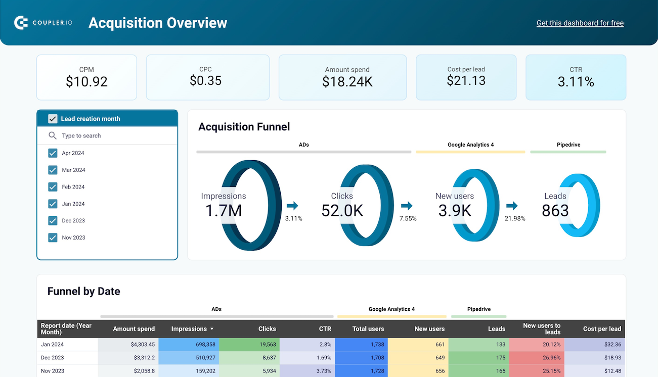
Customer acquisition dashboard for Pipedrive
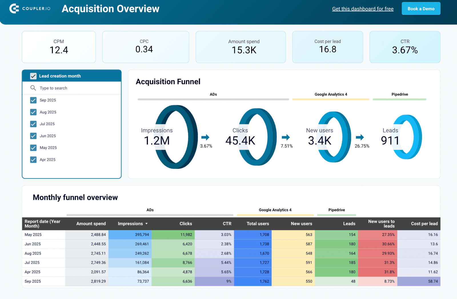
The Pipedrive customer acquisition dashboard shows how your marketing spend translates into leads inside your CRM. Instead of piecing together ad reports, GA4 traffic, and Pipedrive exports, you get a connected view of the entire funnel, from first impression to lead creation.
Customer acquisition dashboard for Pipedrive
 Preview dashboard
Customer acquisition dashboard for Pipedrive
Preview dashboardWhat makes this template especially valuable is how it blends cost data with lead outcomes. By comparing clicks, new users, and CRM leads in one place, you can quickly identify where money is being wasted and which channels consistently deliver qualified prospects and potential customers. The month-over-month views help you spot winning campaigns, while cost-per-lead tracking keeps your budget aligned with acquisition goals.
The setup is fast and code-free. Connect your ad platforms, GA4, and Pipedrive to Coupler.io, and the dashboard will populate automatically in Looker Studio or Power BI. From there, you can customize filters, add comparisons, and more to keep reports up to date without manual effort.


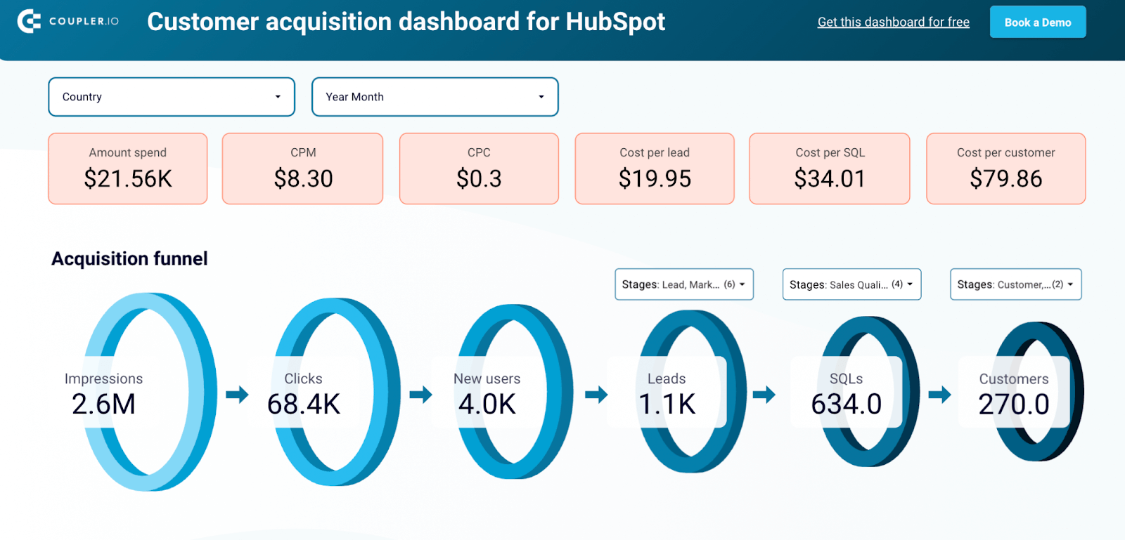
Customer acquisition dashboard for HubSpot
For HubSpot users managing multiple ad channels, this HubSpot customer acquisition dashboard acts like a command center for your funnel. It ties together campaign data, website traffic, and CRM outcomes, giving you a full view of how strangers turn into paying customers inside HubSpot.
Customer acquisition dashboard for HubSpot
 Preview dashboard
Customer acquisition dashboard for HubSpot
Preview dashboardThe real advantage here is how it breaks down a complex, multi-stage funnel into something digestible. From impressions and clicks through to SQLs and closed customers, each stage is clearly laid out with conversion rates, costs, and trends over time, giving you a transparent view of the customer acquisition process. The geo and lifecycle breakdowns add another layer of insight, helping you spot which markets deliver the most efficient leads or where prospects stall in the sales process.
Rather than piecing reports together across platforms, you can plug your data straight into this Looker Studio template and get a ready-to-use visualization in minutes.
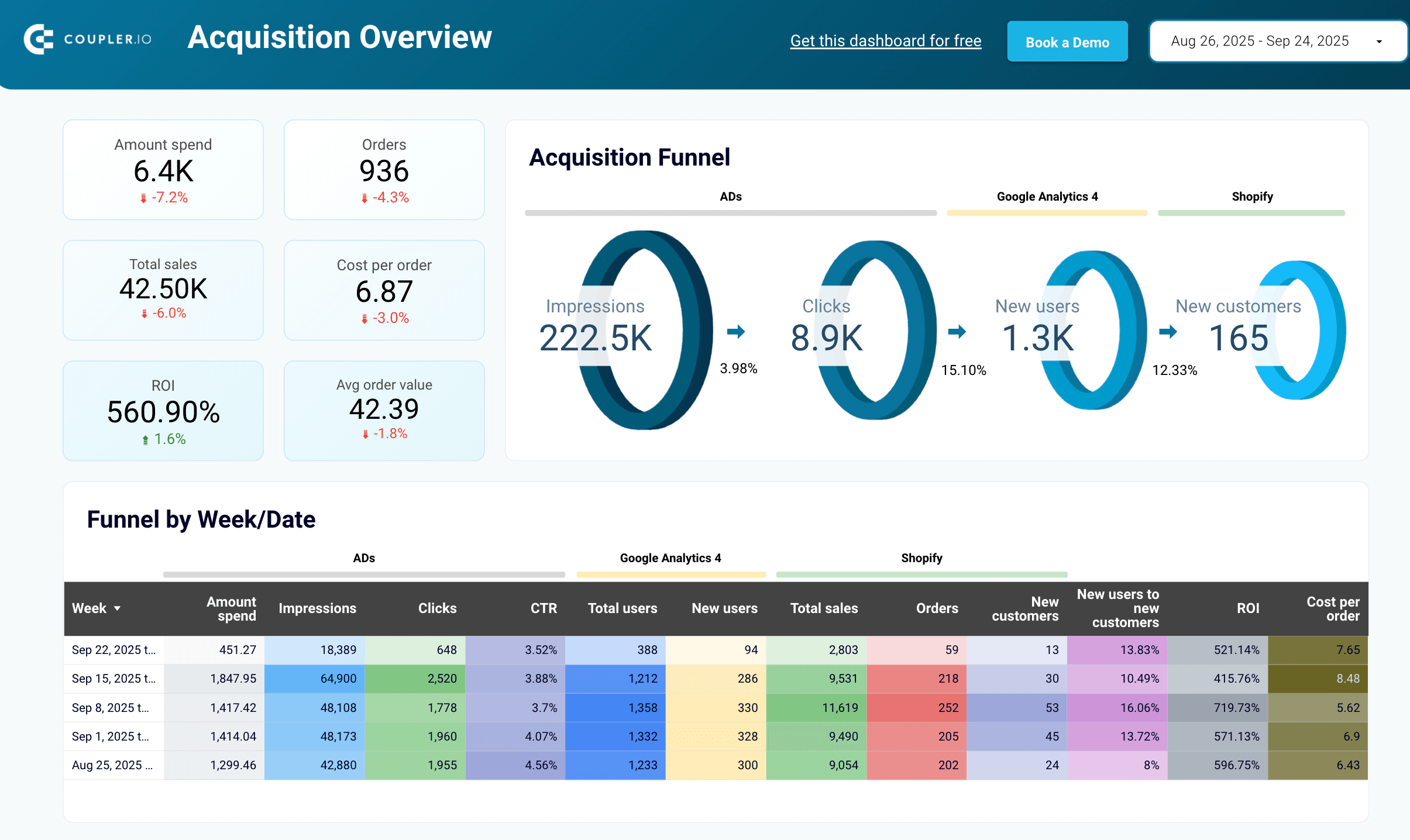
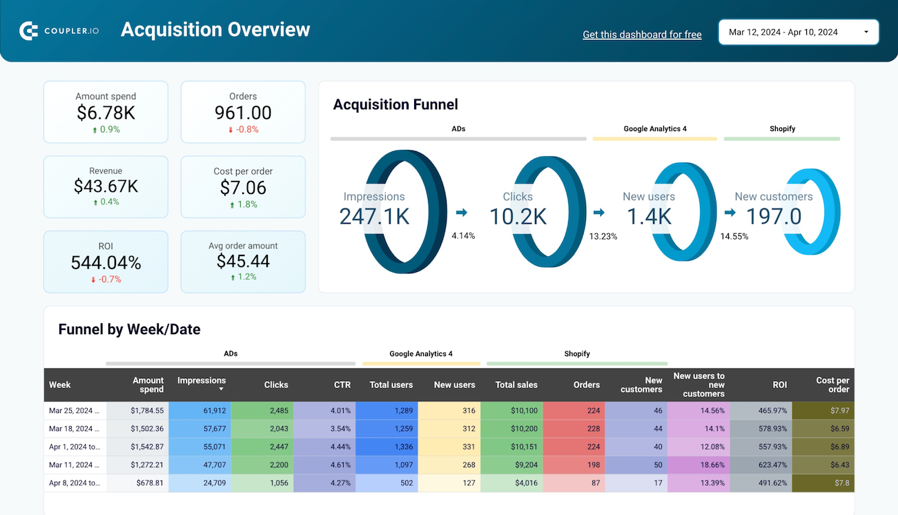
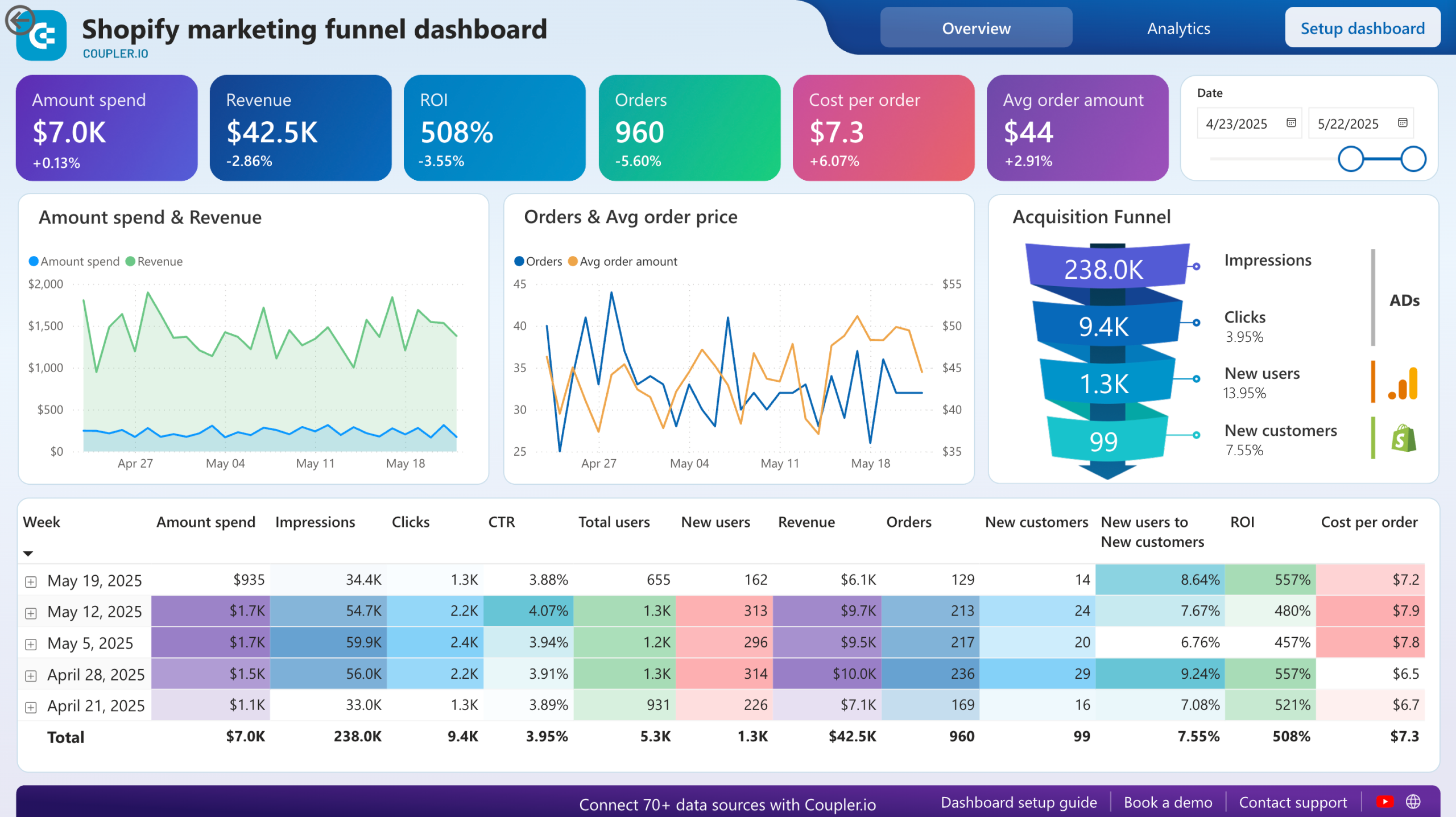
Shopify marketing funnel dashboard
For eCommerce teams, the hardest part isn’t getting traffic. It is proving that traffic turns into paying customers. The Shopify marketing funnel dashboard helps you bridge that gap by blending your Shopify sales with data from ads and GA4, giving you end-to-end visibility into how marketing spend translates into revenue, while testing pricing models and optimizing landing pages.
Shopify marketing funnel analytics
 Preview dashboard
Shopify marketing funnel analytics
Preview dashboardWhat sets this template apart is its ability to connect marketing performance with real business outcomes. Instead of treating clicks and impressions as isolated stats, the dashboard ties them directly to orders, average order value, and ROI.
That means you can finally answer questions like:
- Which ad channel drives the most profitable customers?
- How do search engine results compare with paid ads?
- Is our cost per order trending down or creeping up?
The design also reduces the time you spend on reporting. Rather than pulling spreadsheets from Shopify and matching them with ad reports, you can see the full picture in minutes. This frees up headspace to focus on testing campaigns, refining the target audience, or optimizing product pages.
You can launch the Shopify dashboard instantly in Looker Studio or Power BI. Just connect your store and ad accounts via Coupler.io, and you’ll have a live, automated view of your funnel without writing a line of code.


WooCommerce marketing funnel dashboard
Scaling an online store often means juggling dozens of questions.
- Which campaigns actually bring in buyers?
- Is the budget being used efficiently?
- Where in the funnel are customers dropping off?
The WooCommerce marketing funnel dashboard answers these questions in one place so you can focus on growth instead of guesswork.
The dashboard connects the dots between advertising performance, website engagement, and actual WooCommerce sales. That makes it easier to see the bigger picture and act fast: whether it’s doubling down on a winning campaign, reallocating spend, or troubleshooting a weak conversion stage.
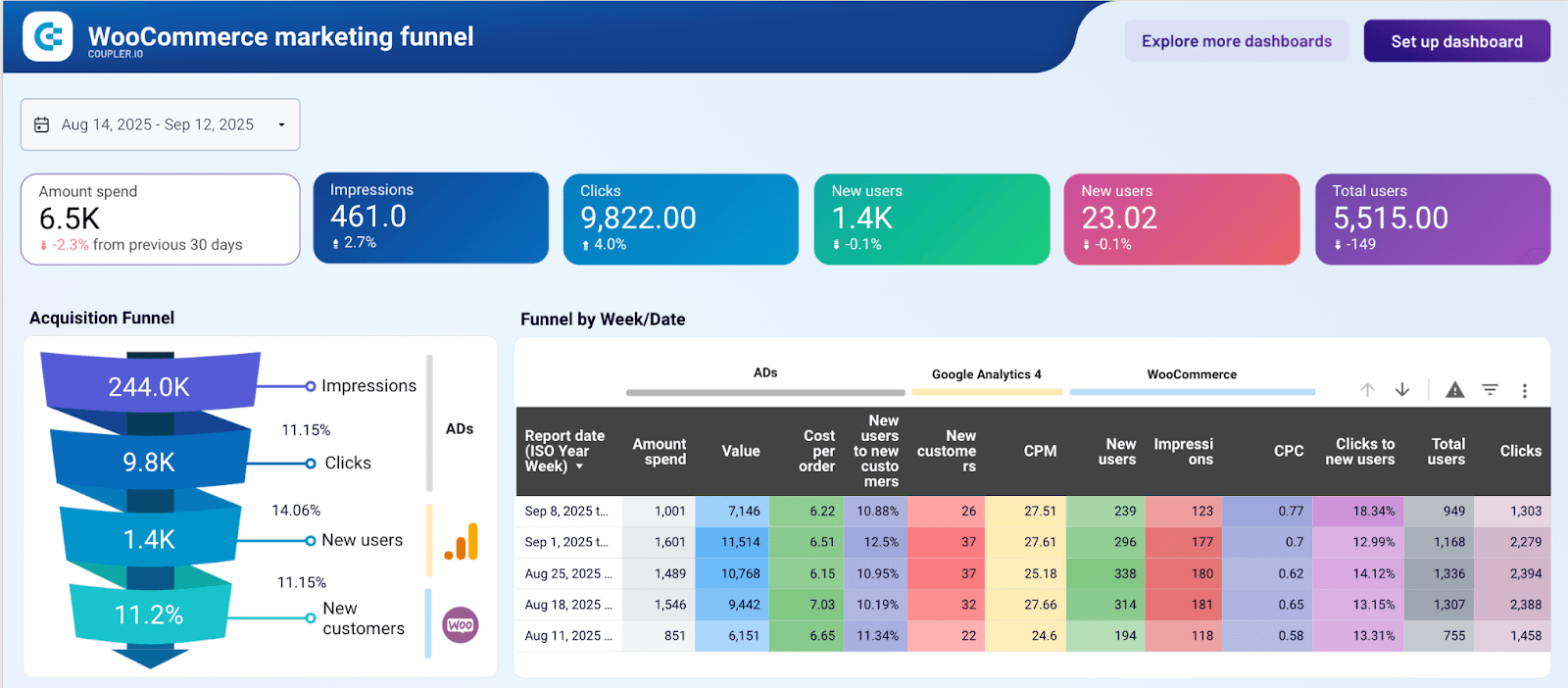
Another advantage is adaptability. The weekly breakdowns let you track how small experiments like adjusting ad creative or targeting play out almost immediately. And since it combines metrics across platforms, you can compare channel efficiency side by side without building complex spreadsheets, while also tracking referral programs and email marketing impact.
Set up takes only a few clicks. Connect your WooCommerce store, GA4, and ad platforms, and the Looker Studio template automatically transforms raw data into a live and decision-ready funnel dashboard.
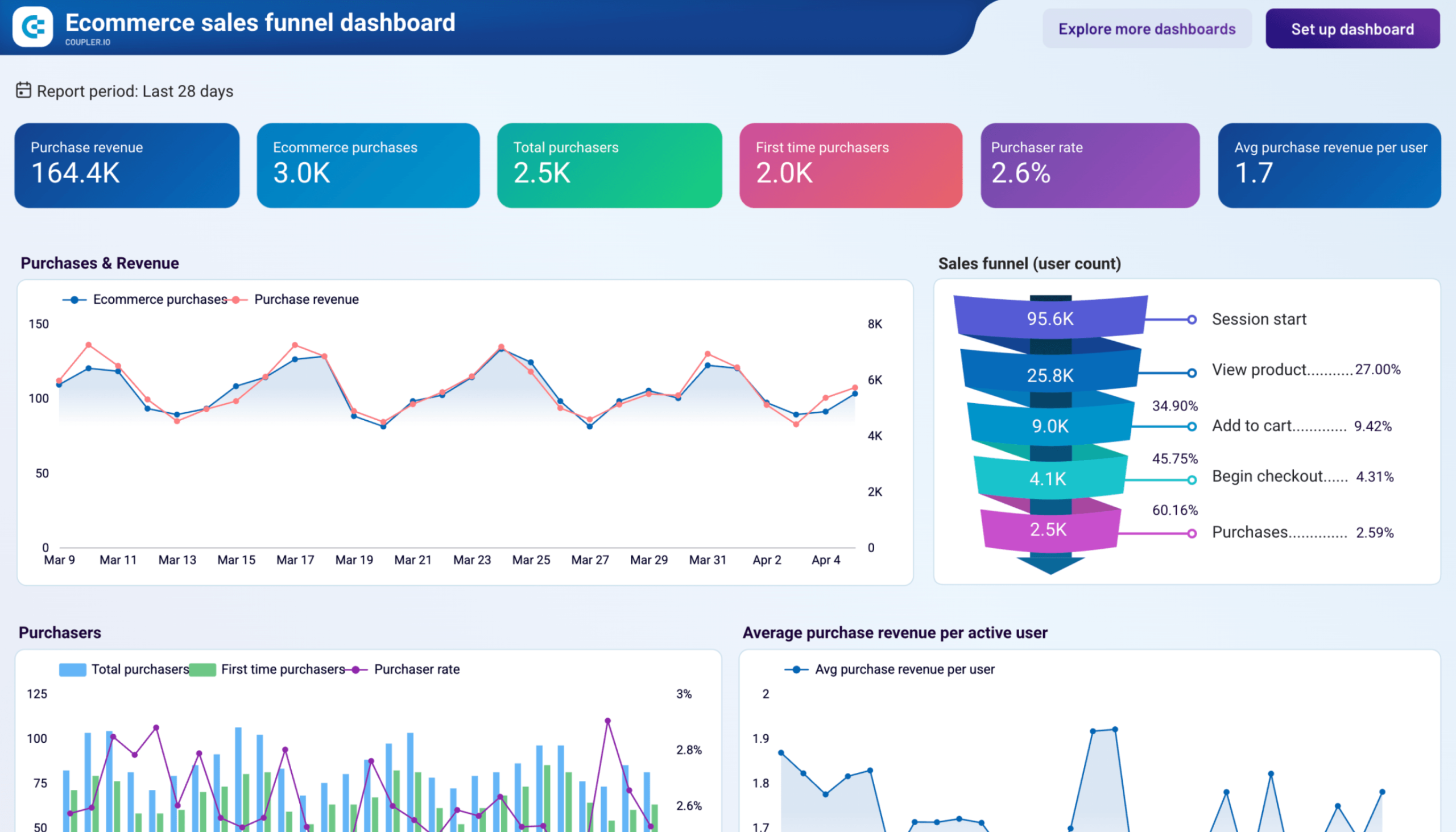
Ecommerce sales funnel dashboard for GA4
The Shopify marketing funnel and WooCommerce marketing funnel dashboards above connect ad spend to orders. The GA4 ecommerce sales funnel dashboard goes a level deeper: it tracks exactly where in the purchase path visitors stop. It maps the five-stage funnel from session start through product view, add to cart, begin checkout, and purchase, with step-to-step conversion rates at each transition, and breaks that analysis down by country, device, and individual product across four dedicated tabs.
GA4 ecommerce sales funnel dashboard
 Preview dashboard
GA4 ecommerce sales funnel dashboard
Preview dashboardFor ecommerce acquisition teams, the most actionable feature is the first-time purchaser metric tracked throughout. Every tab separates new buyers from returning ones, which makes it possible to measure whether a given acquisition channel, market, or campaign is genuinely bringing in new customers, or just re-engaging people who would have bought anyway. A new users by channel breakdown on the overview tab connects acquisition sources directly to that outcome.
The dashboard is a free Data Studio template powered by Coupler.io. Connect your GA4 account, and it refreshes automatically on a schedule.
How to analyze the customer acquisition funnel with AI
Artificial intelligence has changed how teams approach analytics. Instead of spending hours building pivot tables or digging through reports, you can now ask questions in plain language and get instant, data-backed answers. This makes it easier to run quick A/B testing and measure how your content marketing actually impacts potential customers.
According to Gartner, by 2027, AI agents will automate or augment 50% of business decisions, freeing teams to focus on action rather than chasing numbers.
Whether you’re a CMO deciding on budget allocation or a performance marketer optimizing campaigns, AI shortens the gap between raw data and action.
With Coupler.io, you can make this shift by sending your consolidated datasets directly into AI tools like Claude or ChatGPT.
Instead of stitching spreadsheets or exporting reports, you get a real-time analyst you can query in natural language.
This approach delivers two main advantages:
- Speed: Answers in seconds instead of hours spent crunching numbers
- Clarity: Insights grounded in the same unified data you’ve already prepared in Coupler.io, so decisions rest on solid evidence, not guesswork
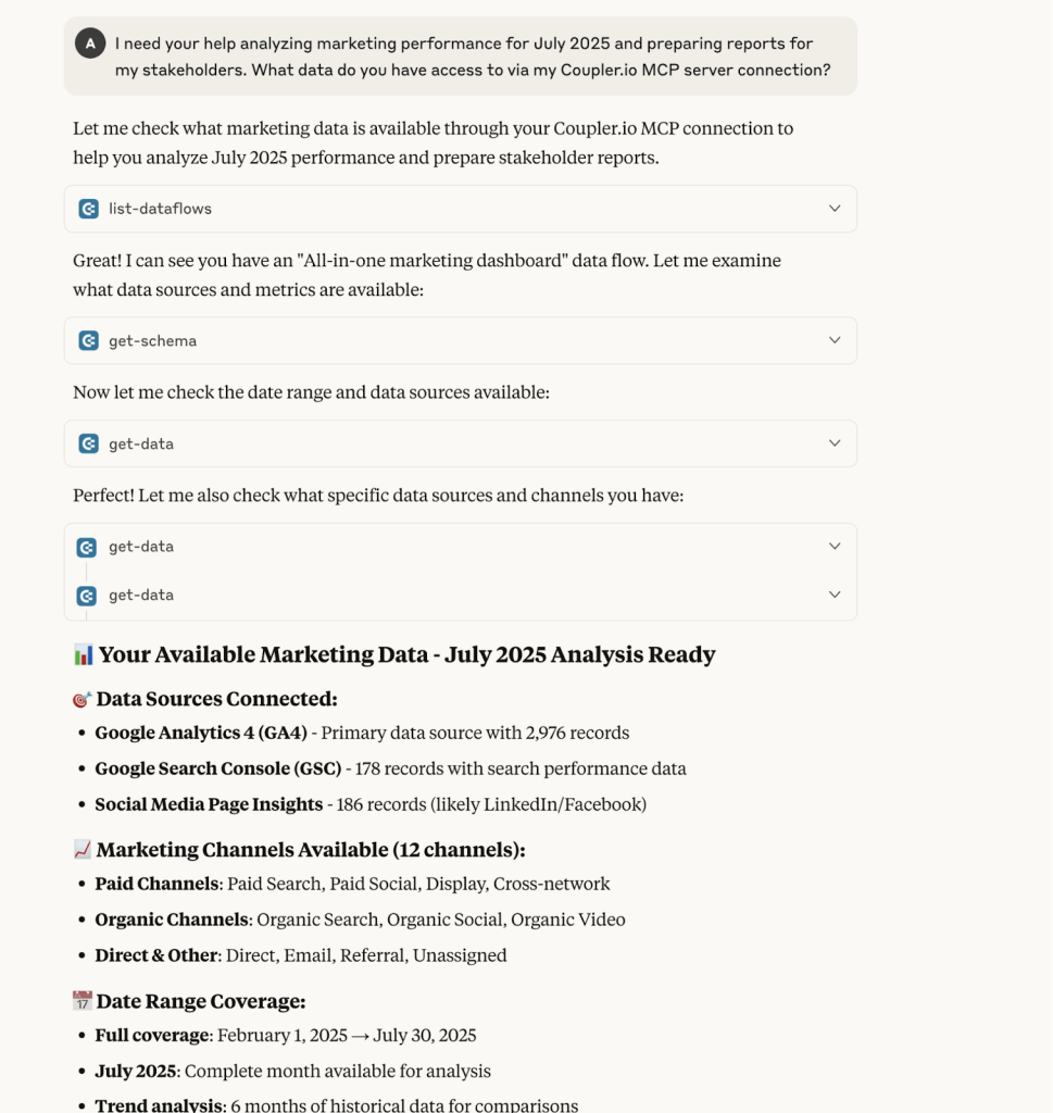
For example, you could ask questions such as:
- Which paid channel (search, social, or display), brought in the most new users in July 2025?
- Were there any noticeable drop-offs between traffic recorded in GA4 and actual conversions?
- What trends stood out in July compared to previous months across organic vs. paid?
These are direct, contextual answers pulled from your live acquisition data. This means faster decision-making, clearer insights, and less dependency on technical reporting skills.
Analyze your customer acquisition funnel with AI
Try Coupler.io for freeMaking customer acquisition analytics work for you
Customer acquisition analytics is about making smarter moves with the data you already have. Once your funnel data is combined, you can:
- Prove ROI with confidence: No more guessing which channel works. A connected view shows exactly where every dollar goes and what it brings back
- Spot inefficiencies early: Rising CAC, underperforming campaigns, or slow lead conversion become visible before they snowball, allowing teams to adjust their marketing strategies quickly
- Align teams on one story: Marketing, sales, and finance stop debating spreadsheets and start working from the same truth
- Act faster with AI: Instead of waiting for end-of-month reports, you get real-time answers to pressing questions like “Which channel is losing efficiency this week?” or “Where should we reallocate budget today?”
The real goal is to turn acquisition data into a competitive advantage. With Coupler.io, you can connect, clean, and activate your data across 300+ sources, then plug it into dashboards or AI tools that deliver insights when you need them.
FAQs
1. What is customer acquisition analytics?
Customer acquisition analytics is the process of using data to measure and improve how you attract, engage, and convert new customers. It connects insights from ads, CRMs, web analytics, and sales data into one story.
Instead of just knowing how many clicks or leads you got, acquisition analytics helps you see:
- Which campaigns drive first discovery (ads, SEO, referrals)
- How users engage along the journey (site visits, leads, trials)
- Where conversions actually happen (purchases, sign-ups, deals)
- The ROI of every dollar spent
Simply put, it tells you not just what happened, but how much it cost but how much it cost, whether it was worth it, and the customer value it created.
2. Why does customer acquisition data analytics matter?
Because acquisition costs have more than tripled over the past eight years, making every new customer significantly more expensive for many businesses. CAC keeps rising while budgets are under pressure. Without the right analytics, businesses risk guessing instead of knowing.
Some of the key reasons are:
- Costs are hidden: Marketing reports may track ad spend, but sales overhead or discounts are often excluded, making CAC look lower than it really is and masking the total cost of acquiring new customers
- Data is fragmented: Ads, CRMs, and analytics tools each show part of the funnel, but none give the full picture
- Decisions get slower: Teams argue over spreadsheets instead of acting on insights
With unified analytics in place:
- CAC is calculated correctly across all touchpoints
- Budgets are allocated where returns are proven
- Leaders can spot drop-offs and optimize campaigns faster
In short, acquisition analytics replaces guesswork with clarity, making every marketing dollar work harder.
3. What are the vanity customer acquisition metrics?
Vanity metrics are numbers that look good on a report but don’t prove real growth or help build a loyal customer base. They can mislead teams into thinking acquisition is working when it’s not.
Here are a few examples of vanity customer acquisition metrics:
- Website traffic – More visits don’t guarantee customers.
- Ad impressions – Visibility without conversions.
- Social likes/follows – Awareness, not revenue.
- Email opens – Engagement, not acquisition.
- App downloads – Empty without active users.
Instead of chasing these, focus on actionable metrics like CAC, conversion rate, ROI, and CLV that show whether marketing efforts actually drive growth.