Think of a table full of numerical values ranging from a few to multi-digit numbers.
Sound familiar?
That’s how large datasets look when presented using a bare table or matrix visual – too hard to interpret and visually dull. If you can relate to this and are looking for a better way, then heatmaps can be the one.
A heatmap in Power BI helps you transform large datasets into vibrant and easily interpretable reports. In this step-by-step guide, we’ll learn what a heatmap is and how you can create one.
What is a heatmap?
This is a type of data visualization that uses various colors based on the magnitude of data points. You can create heatmaps for visuals like maps, tables, and matrices based on your datatype.
Power BI heatmaps can help compare different values, identify patterns, and perform time-based analysis at a glance. For example, here’s what a matrix heatmap looks like in Power BI:
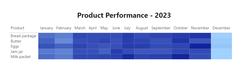
The above heatmap has a white-blue color scale. This means the cell value increases as you move from white to blue and vice versa. This type of heatmap is widely used in business intelligence reporting and analysis.
Different methods to create a Power BI Heatmap
- Conditional formatting: You can apply conditional formatting to tables/matrices to change cell colors based on values to create a heatmap.
- Custom visual: Use custom map visuals from the Microsoft AppSource marketplace to make geographical heatmaps.
The type of heatmap in Power BI you need depends on your reporting and data analysis goals and the dataset you have.
For example, you may showcase business sales performance across regions using a geographical heatmap. Or explore the distribution of product performance over time through a matrix heatmap.
In the methods mentioned below, we assume that you already have data in Power BI. If not, jump to the How to connect data sources section for an easy method to do it.
Method 1: Make a heatmap using conditional formatting
You’ll first need a matrix/table visual with your data. Then, you can apply conditional formatting to create a heatmap in Power BI based on the cells’ values.
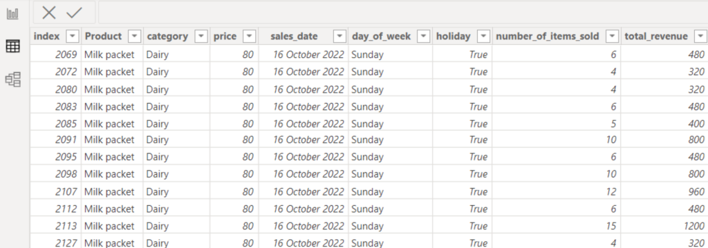
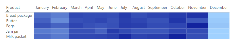
For example, consider the following grocery store sales data, from which we want to find which product sells best/worst by month.
Let’s see how you can do this by creating a matrix heatmap in Power BI Desktop (like the one we showed earlier as an example.)
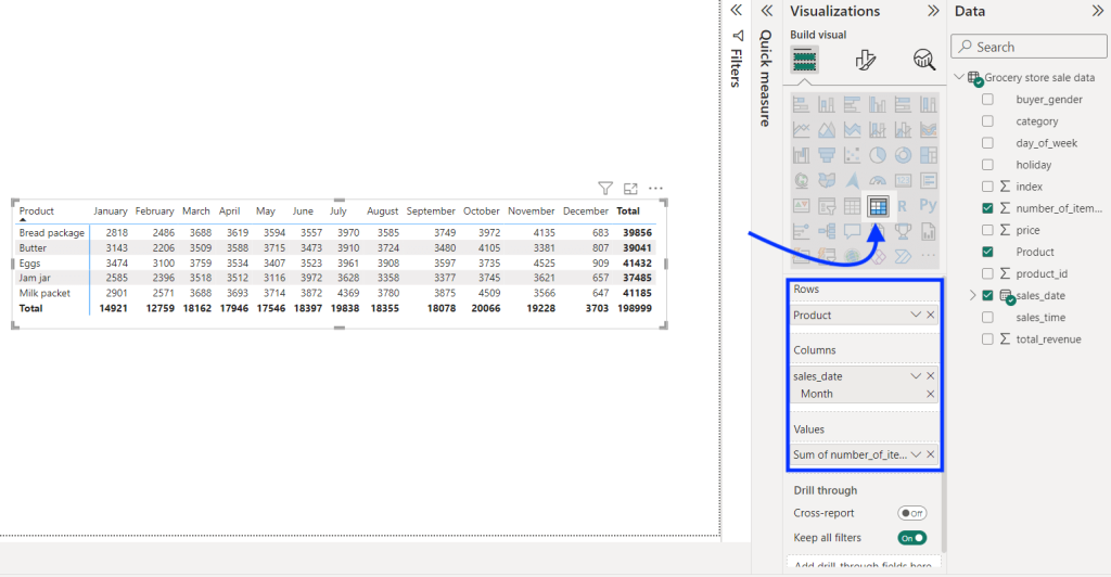
In the Visualizations pane, select the Matrix visual (as shown below) and assign the relevant columns from your data to it. For instance, we’ve selected:
- Product dimension for the rows
- Month dimension for the columns
- Number of Items metric for the values
This will create a matrix that provides valuable insights into the orders for each product by month.
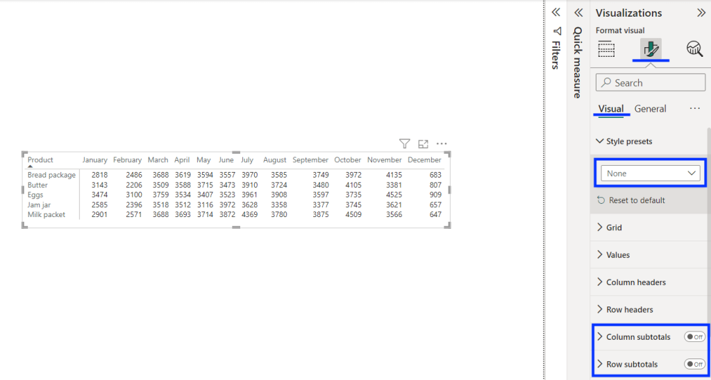
Now, go to Format visual > Visual and set the Style presets as “None.” This will remove the default style added to the matrix and make it look cleaner.
Also, turn off the Column subtotals and Row subtotals options since we don’t need them in a heatmap.
Now, to turn the matrix into a Power BI heatmap, we’ll apply conditional formatting to its cells.
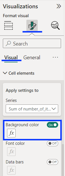
In the same pane, scroll down and click Cell elements to expand it. Enable the Background color option and click the “fx” button to customize it.
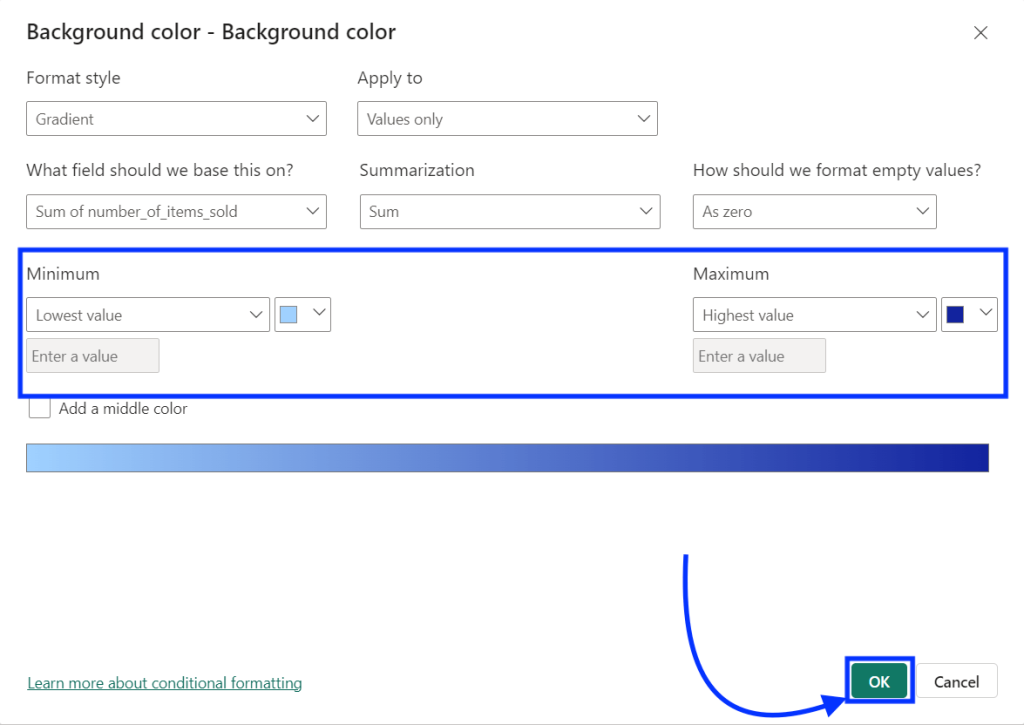
In the Background color popup, set the Power BI heatmap color scale by setting colors for the minimum and maximum values. (Keep the default settings untouched.)
Once done, click “Ok” to apply it.
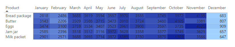
The set color scale will be applied to the Power BI matrix, as shown below.
Now, to make the data values invisible, apply the same color scale to the text font via conditional formatting. In the Cell elements, enable the Font color option and apply conditional formatting like you did earlier.
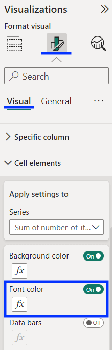
This will merge the text with its background, making it invisible and creating an ideal matrix heatmap. Here’s what the end results look like:
That’s how you can create a matrix/table heatmap in Power BI. You can try different colors in conditional formatting and create vibrant heatmaps to include in your dashboards in Power BI.
Method 2: Install a custom visual to create a Heatmap in Power BI
Geographical heatmaps are an excellent way to derive insights from data spread across regions – for example, a company’s sales data across countries.
Let’s say we have a dataset of the global population by country. We can create a Power BI heatmap to overlay it over the world map.
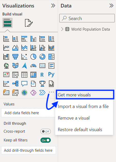
In the Power BI report, open the Visualizations pane, click the three dots (···) at the end of the visuals list, and click “Get more visuals” from the menu. This way, you can also get other visuals like Power BI histogram.
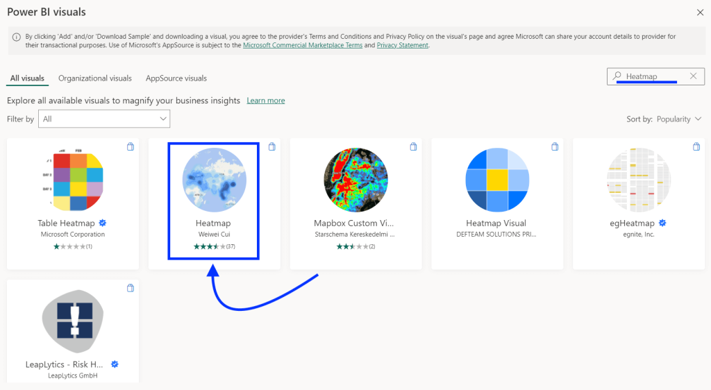
In the Power BI visuals store, search for “Heatmap” and choose any one from the results. In this example, we’re using “Heatmap by Weiwei Cui.”
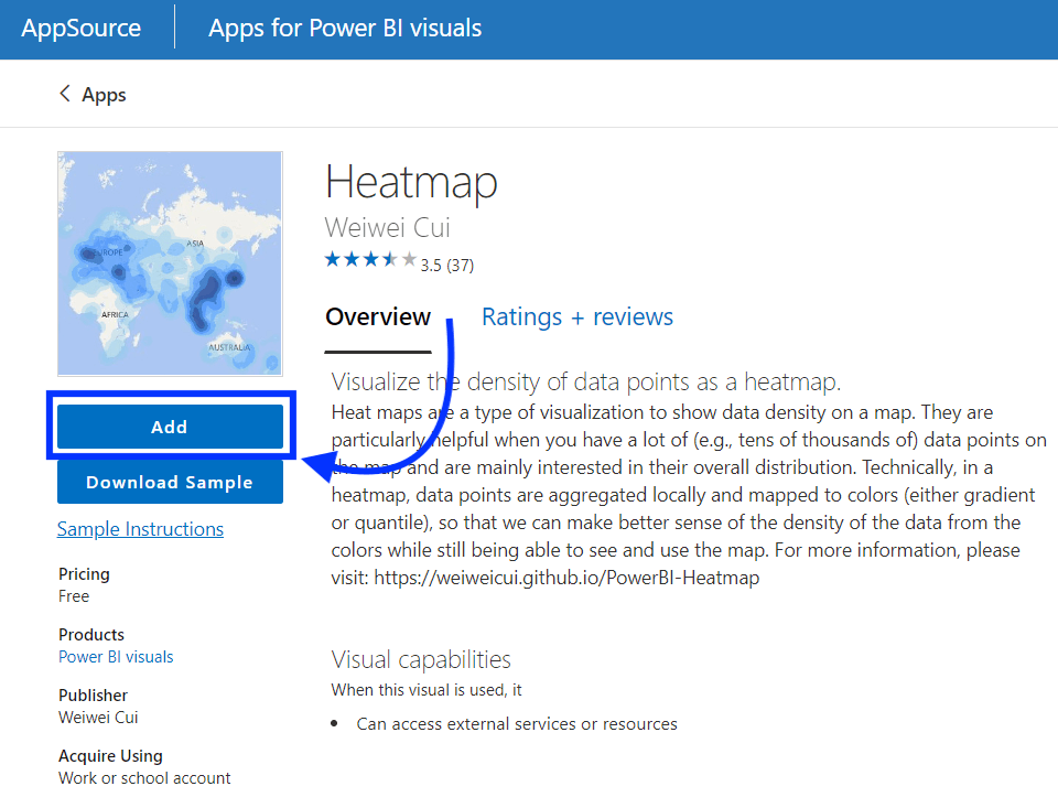
Next, click the “Add” button on the app page to install the custom Power BI heatmap visual.
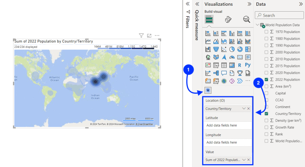
Open the Power BI report and click on the heatmap icon in the Visualizations pane, as shown below. It will create a blank Power BI heatmap. Now, drag and drop the following columns into it:
- Location (ID): It is the column for the location (CountryTerrirory column in this example)
- Value: It is the value/metric that you want to plot on the map (the global population in this example)
Note: You can also add columns for longitudes and latitudes to specify location instead of a single “Location” column, as per your dataset format.
Once you’ve set the location and value, the heatmap will be visible in the report.
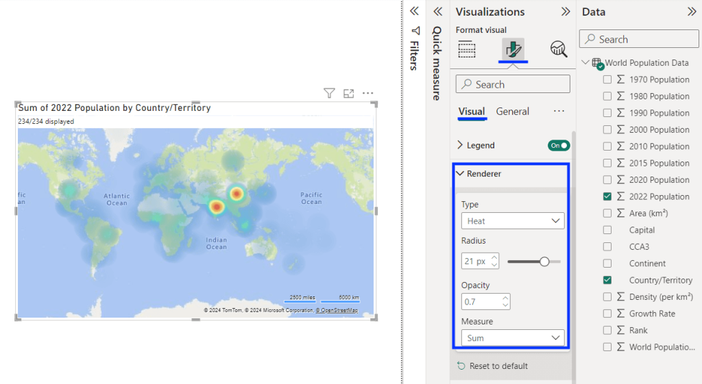
Now, go to Visualization > Format visual and expand the Renderer settings.
Change the Type to “Heat” and adjust other settings like radius, opacity, and measure as per your needs. This will give the visual a proper heatmap look.
That’s how you quickly create a Power BI heatmap using custom visuals. The visual also offers various other formatting options that are worth exploring. You can change map type and language and add/remove various map elements.
You can leverage this type of visualization to take your Power BI reporting to the next level when working with region/location-based data.
It is always a good option to use instead of the plain tables/matrices that can be hard to interpret.
How to connect data sources to Power BI for creating heatmaps?
If you’re making a heatmap, you probably use native Power BI connectors. Typically, each of these connectors only supports one source. But there is a more convenient way to get your data into Power BI.
You can use Coupler.io, a multi-source connector that can transfer your data from 50+ apps. So, with this solution, you can easily manage all your data sources in one place. The tool supports scheduled automatic data refreshes, which make your dashboards and reports live.
To get started, select your preferred data source and click Proceed in the widget below.
It will take you to the app’s interface, where you can plug in your data source account to collect data. In this example, we’re connecting Google Sheets to Power BI.
Next, if you want, you can connect more data sources to the importer. Once you’re done adding all the data sources to the importer, click the “Transform Data” button.
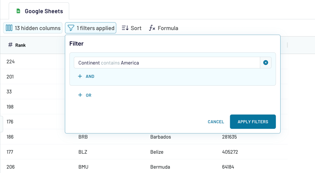
Now, Coupler.io will display a preview of the data from the source on which you can perform transformations and clean your data. In this example, we have:
- Hidden unwanted columns
- Applied filter to get only specific data
You can also create a new calculated column using various formulas. Once you’re done with the transformations, proceed to the next step.
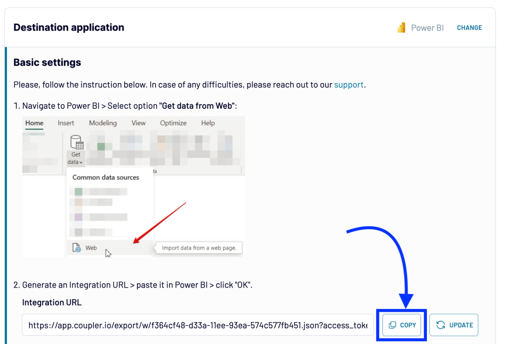
In the next step, generate the integration URL and copy it.
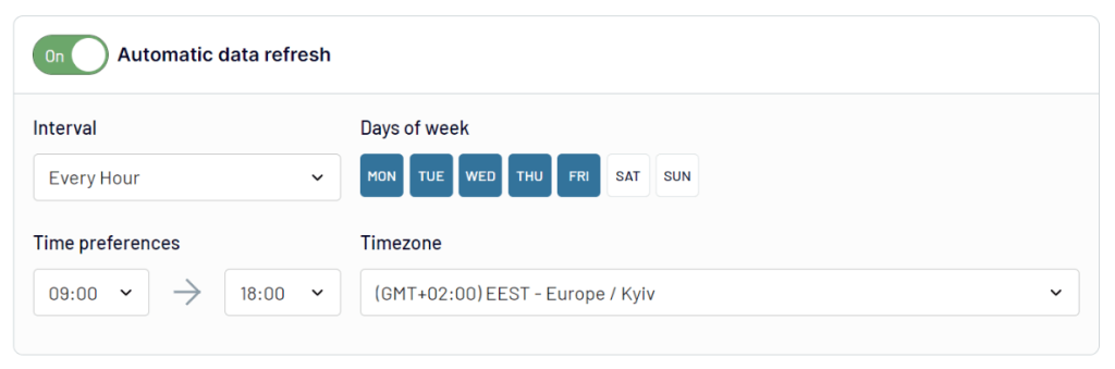
Optionally, you can enable the Automatic data refresh option and set the schedule for automatic updates.
Finally, click the “Run Importer” button to finish the importer setup.
Now, open Power BI and click Get data in the home tab. Select Web from the dropdown and use the copied URL to load data. Then, follow the on-screen instructions to complete the data import.
Coupler.io will run the automatic data refreshes as scheduled and keep your Power BI heatmap updated. On top of that, it can be a convenient option when you want to quickly connect multiple data sources to Power BI.

Connect your data source to Power BI with Coupler.io
Get started for freeSummary: Enhance your visual reports with a Power BI Heatmap
Heatmaps in Power BI are a great way to visualize multiple data points in a digestible manner. And they can help you prevent information overload in the report.
In this article, we’ve learned how to create a Power BI heatmap on a matrix or a geographical map. You can try any of the two methods, depending on your dataset and reporting needs. Here are some additional tips:
- Ensure that you’re using the right values/data and that it is abundant. Power BI heatmaps work well for large datasets.
- Choose appropriate color schemes – generally, it is recommended to use a light-to-dark or cold-to-hot color scale to represent increasing values of data.
- Define what each color intensity means in the heatmap; you can also add a legend for ease of understanding.
- To keep your heatmaps updated with the latest data, ensure that you set up automated refreshes for all the data sources used in it.
Lastly, you can use Coupler.io to integrate all your data sources into Power BI. The tool refreshes data automatically so that the heatmaps always stay up-to-date. You can export and blend data from 50+ data sources, including Google Sheets, Excel, LinkedIn, Facebook, and more. Sign up and start integrating your data for free.
For more on Power BI visuals, check out our article on creating a stacked bar chart in Power BI and Power BI data visualization.