Power BI visuals are most commonly used for creating reports. Creating these assets allows you to make data-driven decisions and gain an overview of where your business stands.
In this article, we are going to focus on Power BI visuals and how to use them for reporting. We will provide tutorials for both standard and custom visuals, as well as a short guide on how to automatically collect data from a preferred data source.
What are Power BI visuals?
Just like any other data visualization and reporting platform, Power BI provides various visuals that can help you compare data or forecast trends. Power BI visuals are graphical representations of data in Microsoft Power BI. As you know, Microsoft Power BI is a business intelligence and data visualisation tool.
Power BI visuals are used to transform raw data into interactive visualizations that will help you analyze data more easily and effectively. In this data visualization tool, you will find a wide range of built-in visuals like pie charts, line charts or maps. These visuals can be customized to the user’s liking.
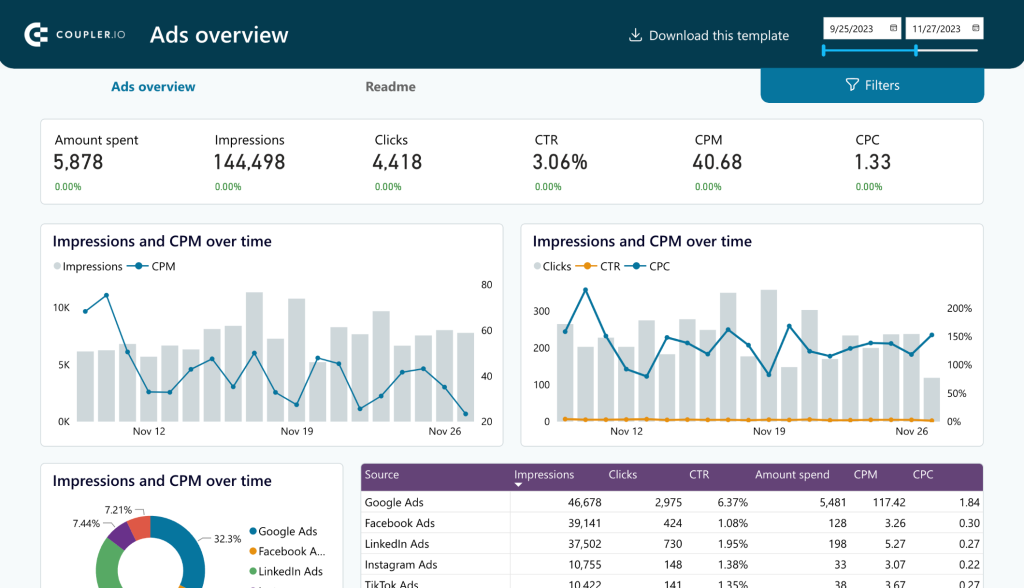
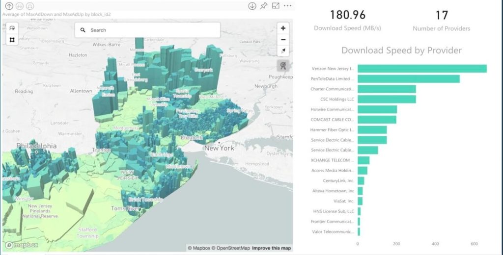
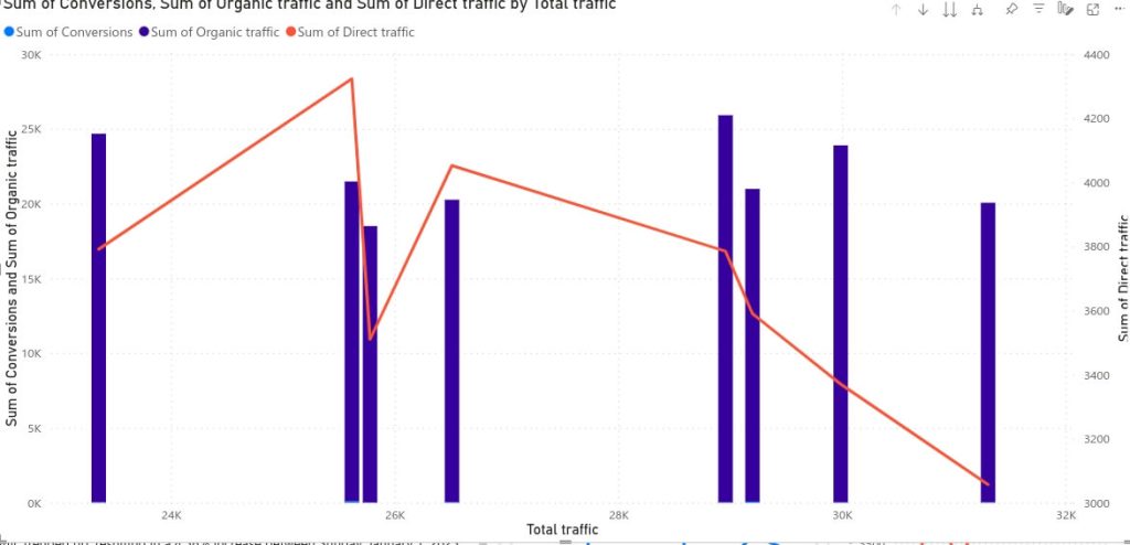
Here’s an example of a Power BI dashboard featuring a variety of different visual types combined in one comprehensive data visualization.
This dashboard is fully automated. In the section below, you will find out how to create an automated dashboard like this one.
Also, Power BI allows users to create custom visuals. Usually, these custom visuals are developed by third-party vendors and are created to expand the range of available graphs and charts.
Power BI visuals are essential for data reporting and analyzing as they can help turn raw data into easy-to-understand graphic visualizations.
Types of visuals in Power BI
As we mentioned in the previous section, there are two types of visuals. Let’s find out more about each one of them.
Standard Power BI visuals
Standard Power BI visuals refer to the built-in visualizations that are available in Microsoft Power BI without the need for third-party plug-ins or customization. Of course, they can be personalized to your liking or needs.
These standard Power BI visuals can be easily integrated into any report directly in the platform. There are various options that you can choose from, depending on what type of data you are analyzing and what you want to find out (comparison, growth, forecasting, etc.). There are over 15 types of standard Power BI visuals, including graphs, charts, maps, and tables.
Power BI custom visuals
If none of the standard Power BI visuals work for you, then you can use custom visuals. To do so, you can either choose from the ones created by a third-party platform or you can create and import your own custom visual. There are a few additional steps, but this allows you to fully personalize your reports and dashboards.
Also, one key benefit of using custom visuals in Power BI is the fact that you can add specialized or domain-specific visualizations that might not be readily available in the platform.
Most used Power BI visuals examples
There are various types of visuals you can use in Power BI. Here are a few examples of Power BI visuals used for reporting. At the end of the article, you will find a full list of standard visuals that are available in Power BI.
Let’s take a look at the most useful types of Power BI visuals and see how they can be integrated.
Maps
One of the most common types of visuals that you are going to find in different data analytics and reporting tools is the map. In Power BI, you have 4 types of standard maps:
- Map (Basic)
- Filled Map
- Azure Map
- Shape Map
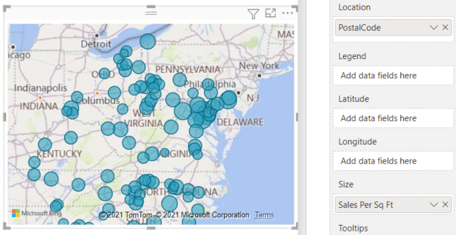
Basic map: This is the type of map that you can use for answering questions related to geospatial or distance between locations. Also, a map can be used in reports to show insight into a quantity or something related to numbers that are connected to certain locations.
Since it’s a built-in, standard Power BI visual, you can find it in the Visualizations menu. After selecting it, you can add the data needed like the location, longitude, and latitude.
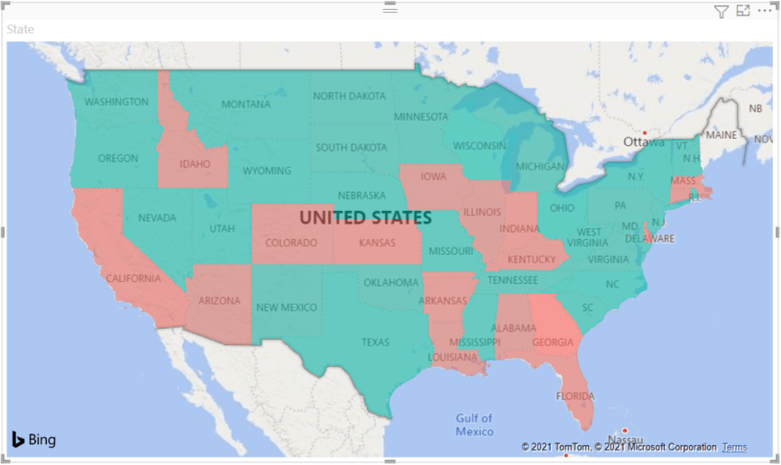
Filled map: A filled map is also known as a choropleth map. It can show shaded geographic areas. This visual displays different values on the map with the help of color scaling and saturation. A filled map is great for data comparison because it enables you to compare data across regions visually.
Just like the regular map, you can insert this standard Power BI visual directly from the Visualization menu.
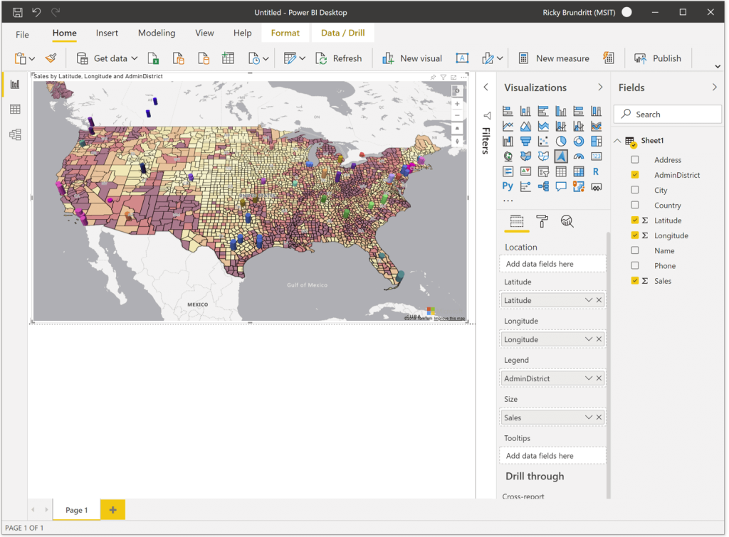
Azure map: This is a more advanced option provided by Power BI. The Azure Maps Power BI visual connects to a cloud service hosted in Azure to retrieve location data, such as map images and coordinates that are used to create the map visualization.
While it is a bit more complex and offers the possibility to retrieve data from Azure Cloud, this visual is a built-in option and can be found in the Visualizations dashboard:
Shape map: Lastly, the shape map is a visualisation type in Power BI that is used to display data on custom or user-defined geographic regions. It is different from a traditional filled map as it allows you to work with your own custom shapes and geographic boundaries.
Unlike the other 3 visuals, this is a custom visual and can’t be found in the Visualization menu. However, there are various third-party providers that offer custom shape maps.
Charts
Charts are definitely the most common type of visual used in reports and dashboards. They allow you to compare data points and spot trends. There are various chart types available in Power BI. Let’s take a look at some of them.
Donut Chart: Just like a pie chart, this is a circular visual that allows displaying the parts of a whole and is often used when you want to emphasize the proportion of different categories within a dataset.
This is a standard visual and you can add it to your report directly from the Visualizations menu:
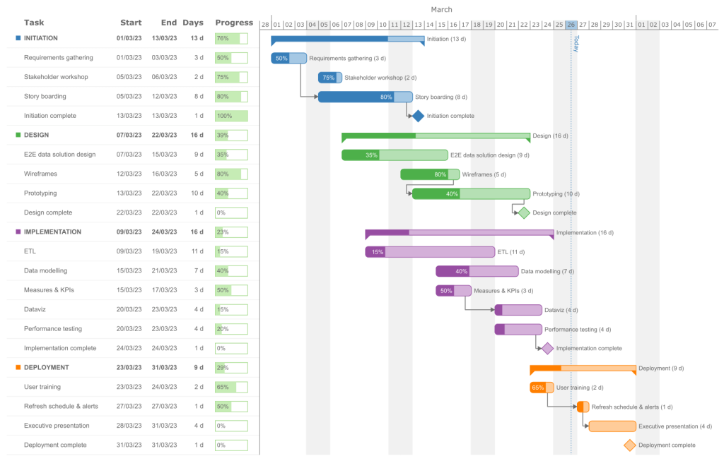
Gantt Chart: A Gantt chart is a popular project management tool that is used to visually represent and schedule tasks and activities over time. It provides a graphical overview of a project’s timeline, showing when tasks are scheduled to begin and end. It’s a very useful visual element because it provides a complete overview of each stage of the project.
While Power BI doesn’t have a built-in Gantt chart in the Visualization menu, you can use one from Microsoft or from a different third-party provider. Go to the Visualizations menu, click on the three dots, and select Get more visuals. At that point, simply search for a Gantt chart and choose the one that’s best for your needs.
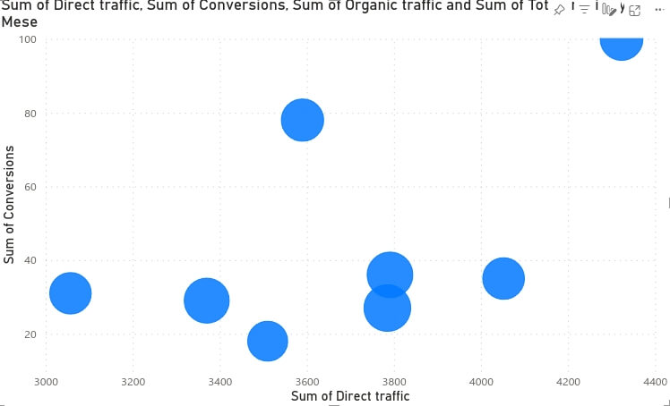
Scatter chart: Also known as a scatter plot or a scattergraph, the scatter chart is a type of data visual that displays individual data points on a two-dimensional plane. Scatter charts are particularly useful for showing the relationship between two variables and identifying patterns or trends. You can place two variables, one on the X-axis and the other on the Y-axis.
To use a scatter chart, you will need to go to the Visualizations menu and select Scatter chart.
KPIs
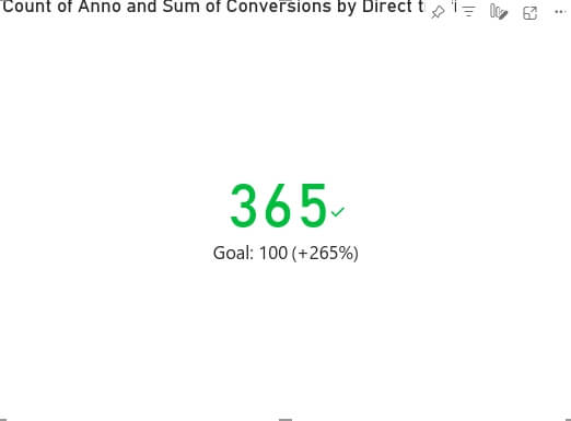
A KPI is a type of data visualization used for monitoring key metrics. While it is not a complex data visualization element, a KPI visual allows you to easily spot the actual state of a metric. It provides a single metric focus which means that you can concentrate your attention on the state of a key metric.
Just like the scatter chart, the KPI visual can be found in the Visualizations menu.
Cards
Cards are another type of visual that you can find in Microsoft Power BI. These visual elements can help you highlight certain key metrics and to draw attention to them. The built-in card options in Power BI are:
- Card (basic)
- Multirow card
Card (basic): This is an easy-to-integrate visual that simply highlights a certain metric or data point you want to focus on. It can be used for summarizing data or presenting a single metric in a visually appealing way.
Simply add your card from the Visualization menu and decide what metric or data point you want to showcase:

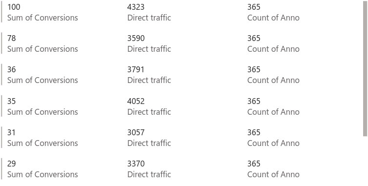
Multi-row cards: If you want to simply showcase more data points in an easy-to-visualize form, you can choose a multi-row card. It is not as visually appealing as a pie chart or bar chart, but you can have a full overview of the metrics you selected. A multi-row card shows you multiple rows of data from a table or dataset in a tabular format. Usually, a multi-row card is used for showing lists of products and their features, and event tracking data set or customer information.
To add the multi-row card go to the Visualizations menu and select it. Include the metrics or information you need to highlight it.
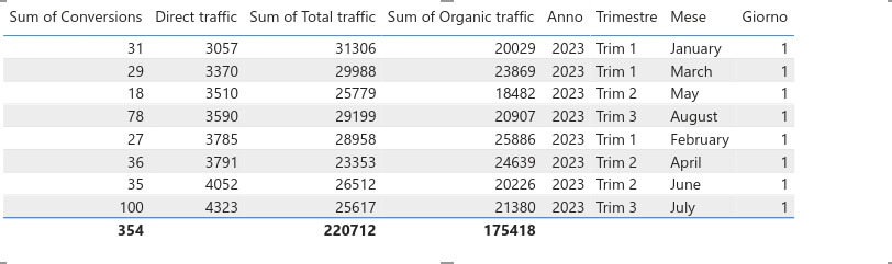
Table
For a more structured view, a table can be the perfect visual in Power BI. A table can display data similar to a spreadsheet or database table. Simple, easy to use, and implement, Power BI offers tables as a built-in visual which you can select from the Visualizations menu.
Comparison
If you are looking for powerful visuals that will help you compare two metrics (or more), then you are in luck. Power BI provides various charts and graphs that can help you compare different data points.
Here are a few examples of comparison visuals you can use:
- Bar charts
- Combo charts
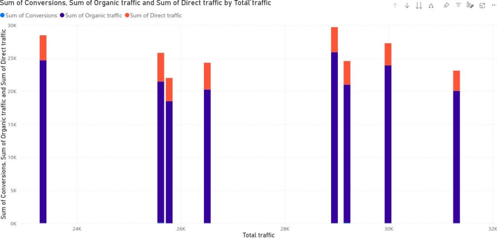
Bar chart: A bar chart is a visual that can be very effective for comparing different metrics or data points. With a bar chart, you can compare things like sales per product/employee, expenses per department, or revenue per location. To include a bar chart in your Power BI report, you will have to add it from the Visualizations menu.
Combo charts: Combo charts combine two different types of charts for a better visualization. For example, you can find a line chart and a bar chart in the same visual. In Power BI you can find line and stacked column charts in the Visualizations menu.
Matrix
A matrix in Power BI is similar to a pivot table. It displays data in rows and columns. It’s suitable for comparing data across dimensions and aggregating values. A matrix can be structured hierarchically, allowing you to drill down into data to view different levels of granularity. For instance, you can have a matrix that shows yearly sales totals, and by expanding a year, you can view quarterly or monthly totals.
To add a matrix to your Power BI report, all you have to do is get it from the Visualizations menu.
Check out our article dedicated to Power BI Matrix.
Forecasting
Forecasting visuals in Power BI are data visualizations that are used to predict or estimate future values based on historical data trends. These visuals can help you make informed decisions and anticipate future developments within their datasets.
Power BI has a few standard visuals that can be “enhanced” with forecasting.
Line chart with forecasting: The standard line chart in Power BI can be enhanced with forecasting capabilities. You can enable forecasting in the chart settings to generate forecasts for a selected data series. The forecasted values are typically displayed as a dotted line extending beyond the actual data points.
Area Chart with forecasting: Like the line chart, the area chart can also be used for forecasting. It shows the historical data in a filled area and uses a dotted line for the forecasted values.
Also, another option is to choose a custom forecasting visual provided by a third-party business. There are plenty of options to choose from. Here’s an example of a forecasting visual:
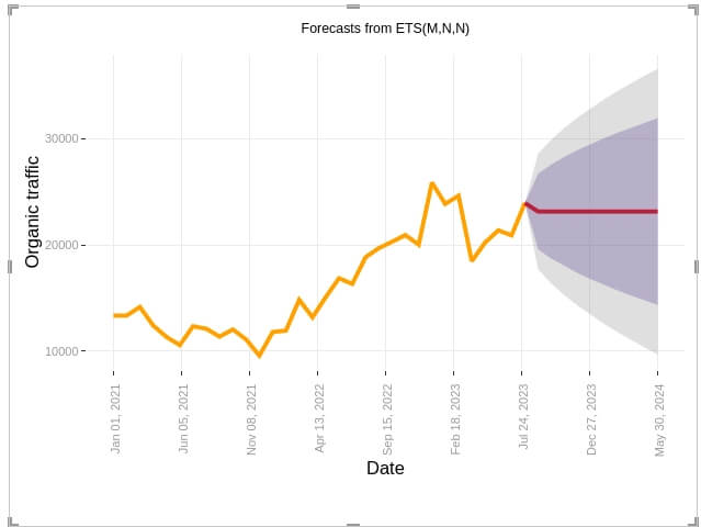
This is a custom line chart with forecasting. In this visual, you can see how your organic traffic has grown over time. Also, you can see a forecast for the next months. Of course, forecasting works for different data types, not just website traffic. However, please take any forecast with a grain of salt, as it is not 100% accurate.
How to create a Power BI visualization?
Now that you’ve seen a few examples of Power BI visuals, let’s see how you create a standard visualization for your report.
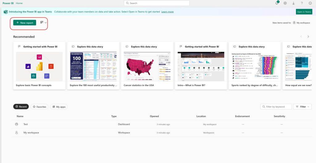
Step 1. Sign in to your Power BI account and click on New report.
Step 2. Next, you will need to add data for your report. You can do so manually, by importing a file, or by picking a dataset available in your organization. Also, a faster and more effective way to import data is by using a data automation platform like Coupler.io. In this case, data can be sent to Power BI repeatedly and on a schedule, with no manual effort. So, the data visualization will always reflect the latest data in near-real time. As we want to create a live dashboard, we are going to use this option to import data into Power BI.
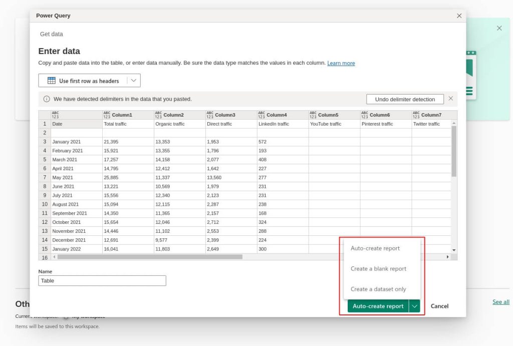
Step 3. If you decide to add data manually, you will see this pop-up. Then, click on Auto-create report, Create a dataset, or Create a blank report, depending on your needs. After you make the selection, Power BI will create your report or dataset.
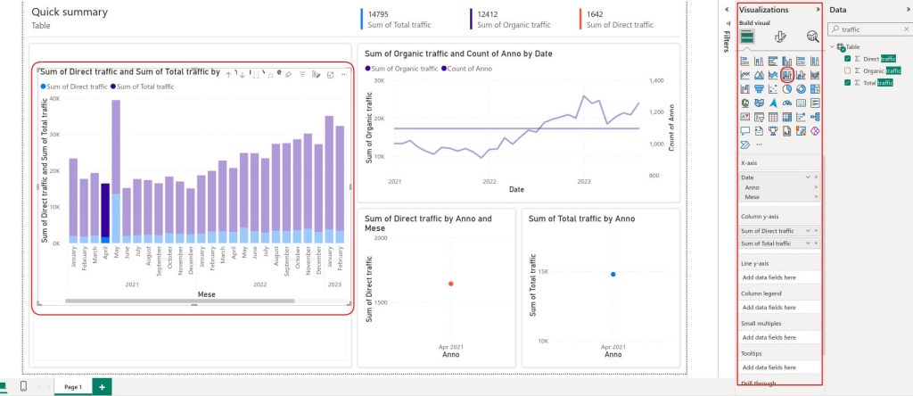
Step 4. Now, it’s time to edit your report. If you have already added data, you can now turn it from raw data to powerful, interactive visuals. If you select an auto-create report, Power BI will add the visuals it considers best to visualize your data. To add your first visual or add a different one than the ones Power BI provided, all you have to do is drag and drop it from the menu situated on the right. For this example, we added a column chart to show how the traffic of the website has increased.
You can experiment with the data fields to see how your data is represented best in the visual.
How to ?reate ?ustom visualizations in Power BI?
If none of the standard Power BI visualizations works for you, then you can choose a custom visual for your report. To do so, you will need to follow these steps.
Step 1. Log into your Power BI account and select New Report.
Step 2. Import data manually or from a dataset available in your workspace, or transfer it automatically with the help of Coupler.io. After that, click on Create a blank report.
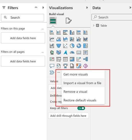
Step 3. From the Visualizations menu on the right, click on the three dots to get more visuals. There, you can see more standard visuals available in Power BI, import your own custom visual, or remove a visual.
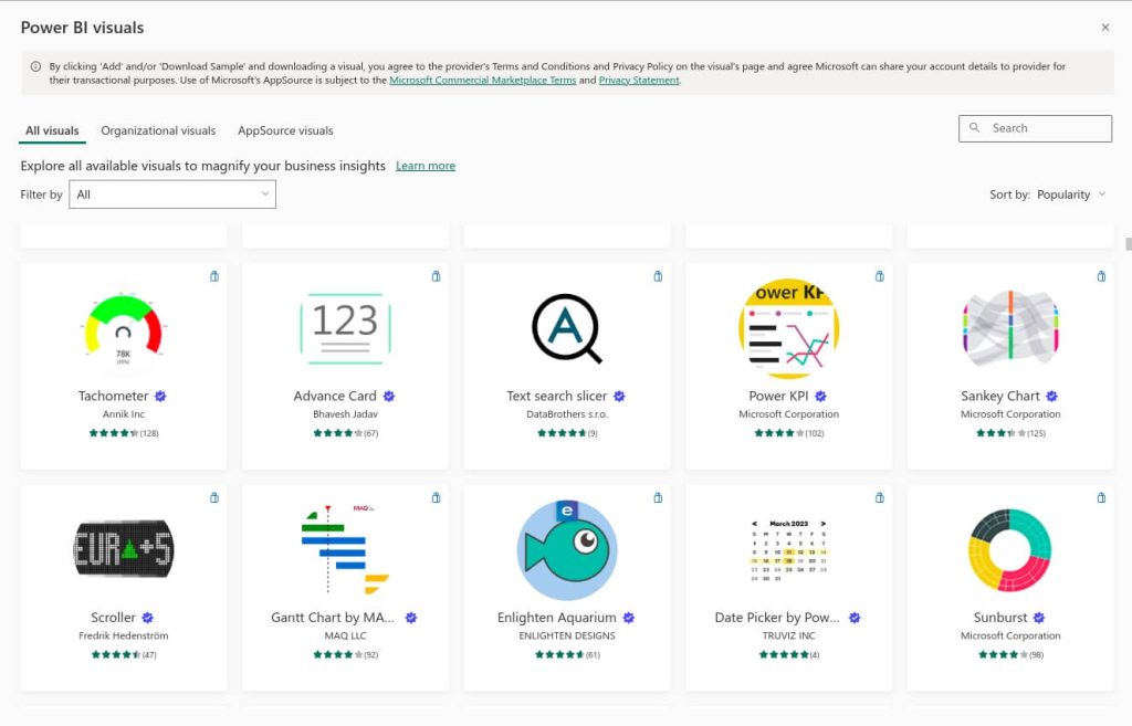
Step 4. If you click on Get more visuals, you will find hundreds of custom visuals from third-party vendors. You can choose from this large variety of graphs, tables, and maps to find the right visual for you. Simply click on the one that you want and check out a sample or use it in your report. It will automatically appear in the Visualizations menu in your Power BI after you select it. Keep in mind that some of the visuals might not be free, so you will need to check the pricing before integrating them into the report.
Also, if you like one of the standard visuals available in Power BI, you can customize and personalize it.
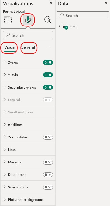
To do so, you select the visual you want to customize and from the Visualizations menu select Format your visual. Also, you can click on “Add further analysis to your visual”. There, you can include more analyses to the graph or chart. For example, you can include forecasting.
In the Format your visual section, you will find 2 sections. One is for general formatting like the title, and properties of the visual or effects. The other section is for formatting the visual. In this section, you can add a legend, add or remove a secondary axis, and add data labels.
If you can’t find the visual you need for your report or dashboard, you can create one from scratch and import it in Power BI. Keep in mind that, to do so, you need to know how to work in Node.js or npm (Node Package Manager), pbiviz, and Powershell to set up the development environment. Then, you can easily import it in Power BI and use it for your reports.
You can find more details about how to create your custom visual in Power BI’s documentation.
It’s important to mention one of Power BI’s most appreciated features: DAX. It is a collection of operators, functions, and constants that can be used in an expression, or formula, to calculate and return one or more values.
While it is not a visual customization tool, DAX can be used to influence how data is displayed and summarized in your visuals. For example, you can create calculated columns, make custom calculations, add dynamic filters and slicers, and define conditional formatting rules for your visuals.
Using Power BI visuals for automated interactive dashboards
Now that you know how to create Power BI visualization and even add a custom visual to your reports, let’s see how to import data faster and on a schedule with Coupler.io.
Step 1: Extract your data
Select your data source in the form below and click Proceed. You’ll be prompted to create a Coupler.io account for free.
After you signed in to Coupler.io, you will need to connect the chosen data source and select the data to export.
Step 2: Preview and transform data
It’s best to preview your data to make sure that there isn’t incorrect or sensitive information that you don’t want to add to your Power BI report. With Coupler.io’s preview and transform capability, you can easily make changes to your data before creating a report or dashboard.
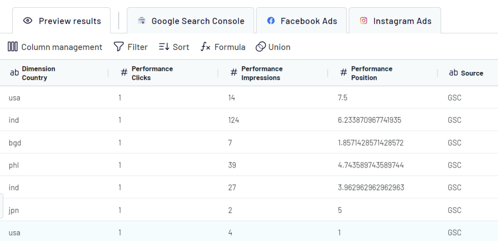
In this step, you can:
- Apply various filters
- Sort your data
- Rearrange, hide, and rename columns
- Use formulas
- Calculate custom metrics
- Merge or split columns
- Combine data from different apps or accounts
Also, you can blend data from multiple sources during this step. For example, if you extract data from different social media platforms like Facebook, LinkedIn, and Instagram, at this stage, you can blend that data into a single dataset to create insightful and easy-to-understand reports.
After you make the changes you want, you can click on the Proceed button to connect to Microsoft Power BI. Follow the in-app instructions to do this.
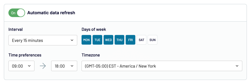
Step 3: Schedule and manage your data
Then, you can edit your connection to export data on a schedule. This way, you will make sure that you have fresh data ready for your reporting.
Here’s an example of a report created in Power BI with data extracted automatically with Coupler.io. This dashboard is also self-updating, and it automatically fetches data from different sources.
See our article on Power BI dashboard examples for more options.
Full list of Power BI visuals
Here is a full list of standard Power BI visuals that you can use for your reports. If none of these visuals work, you can check out custom visuals from third-party vendors, or you can create and import your own visual.
- Area charts: Basic (Layered) and Stacked – Area charts emphasize the magnitude of change over time, and can be used to draw attention to the total value across a trend.
- Bar and column charts – Highlight data in bars. The longer the bar, the larger the value. Bar charts show the data vertically, while column charts are displayed horizontally.
- Bubble chart – This can be seen as an extension to a scatter plot because it shows the relationship between 3 numeric variables.
- Cards – Perfect for summarizing data, cards can be used to showcase one metric or KPI.
- Multi-row card – Designed for multiple metrics, the multi-row card groups your data for easy visualization.
- Combo charts – The charts combine different types of visual elements for better data visualization. For example, line and bar charts.
- Decomposition tree – An interactive visual for ad hoc exploration and conducting root cause analysis.
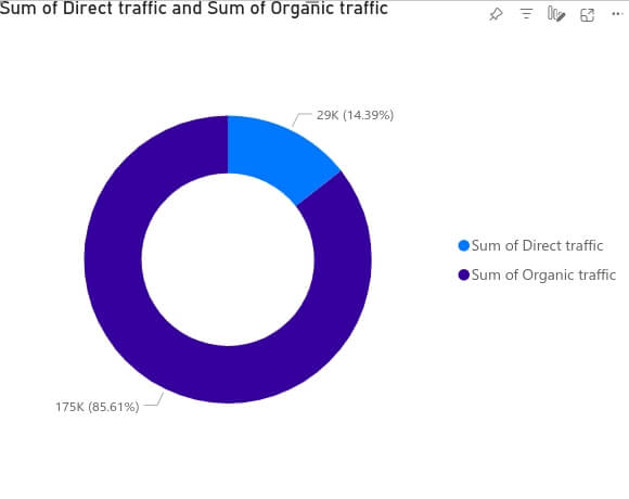
- Donut charts – These charts have a round shape with a hole in the middle (just like a donut) and are best for showing a part of a whole (direct traffic from total traffic).
- Funnel charts – Commonly used in marketing and sales, these charts show you a linear process and how a metric changes from one stage to another. For example, from clicks on the website to actual conversions.
- Gauge charts – Want to stick to a goal? Use a gauge chart because it shows you exactly how close you are to reaching your goal.
- Key influencers chart – This visual is used to spot the factors that drive a metric you’re interested in.
- KPIs (Key Performance Indicators) – This is a visual that communicates the amount of progress made toward a preset goal.
- Line charts – These charts use lines to show how data has changed over time.
- Basic map – Basic maps are great for seeing different locations.
- ArcGIS map – It comes with mapping capabilities, demographic data, location analytics, and spatial analysis tools.
- Azure map – This Power BI visual connects to a cloud service hosted in Azure to retrieve location data, such as map images and coordinates that are used to create the map visualization.
- Filled map (Choropleth) – It shows shaded geographic areas. This visual displays different values on the map with the help of color scaling and saturation.
- Shape map – It is a custom visual used to display data on custom or user-defined geographic regions.
- Matrix – Just like a pivot table, the matrix displays data in rows and columns. It’s suitable for comparing data across dimensions and aggregating values.
- Pie charts – Similar to the donut chart, this visual is used to compare a piece against the whole.
- Q&A visual – This visual has a question field, some suggested questions to get you started, and a link to more suggestions.
- R script visuals – Can present advanced data shaping and analytics such as forecasting.
- Ribbon chart – Illustrates how the value of a data category changes over a visualized time period.
- Scatter plot chart – Displays data along a horizontal (x) and vertical (y) axis. The chart reveals how numerical values along the two axes are related.
- Slicers – Slicers are another way of filtering. They’re displayed on the report page and narrow the portion of the dataset that’s shown in the other report visualizations.
- Smart narrative – Used for reports and dashboards, the smart narrative is a visual that summarizes texts and other visuals.
- Sunburst chart – Great for displaying hierarchical data. Each level of the hierarchy is represented by one ring or circle.
- Tables – A table can display data similar to a spreadsheet or database table and is great for when you are looking for structured data.
- Treemaps – Display hierarchical data as a set of rectangles. Each level of the hierarchy is represented by a colored rectangle called a branch node.
- Waterfall charts – These visuals are great for showing changes in value over time.
For other data visualization options, learn more about types of charts in Tableau.
Using Power BI visuals for reporting
Power BI is a powerful and resourceful data reporting and analytics tool that you can use to create dashboards and other reporting assets. It provides a wide range of visuals that you can choose from to enhance your reports and make them easy to understand. Depending on your needs and requirements you can choose from charts, graphs, maps, and cards to better highlight and analyze your data.
As you’ve read, there are many standard visuals available, but you also have the option to create a custom visual and import it to Power BI. Also, you don’t have to use only the visuals from the Visualizations menu, because there are third-party providers that offer various other visuals.
Creating a report in Power BI shouldn’t be complicated. This is why we recommend using a data automation platform like Coupler.io to connect your data source to Power BI. This way, you make sure that your data is always updated and your reports are always analysis-ready.
For more tips on using Power BI, check our article on building Power BI Gantt chart.