What are different types of graphs marketers use the most?
After talking to our marketing team, we prepared this list of the top 20 types of graphs most frequently used in marketing reports and dashboards. It’s also important to see how these graphs fit in together and help you tell the story with your data.
That’s why we have added hands-on examples with the dashboards and even prepared a set of free marketing templates for you. We will explore them a bit later to help you see in practice how different graphs are used for marketing reporting.
1. Bar chart / Column chart
As the name suggests, this type of chart represents quantities (or other numerical values) with the help of bars. Such charts can be vertical or horizontal and have two axes, x and y. The horizontal (x) axis is often used for reflecting the time range, but can also be used for many other values. The vertical (y) axis usually represents the category that is being measured.
Types of bar graphs:
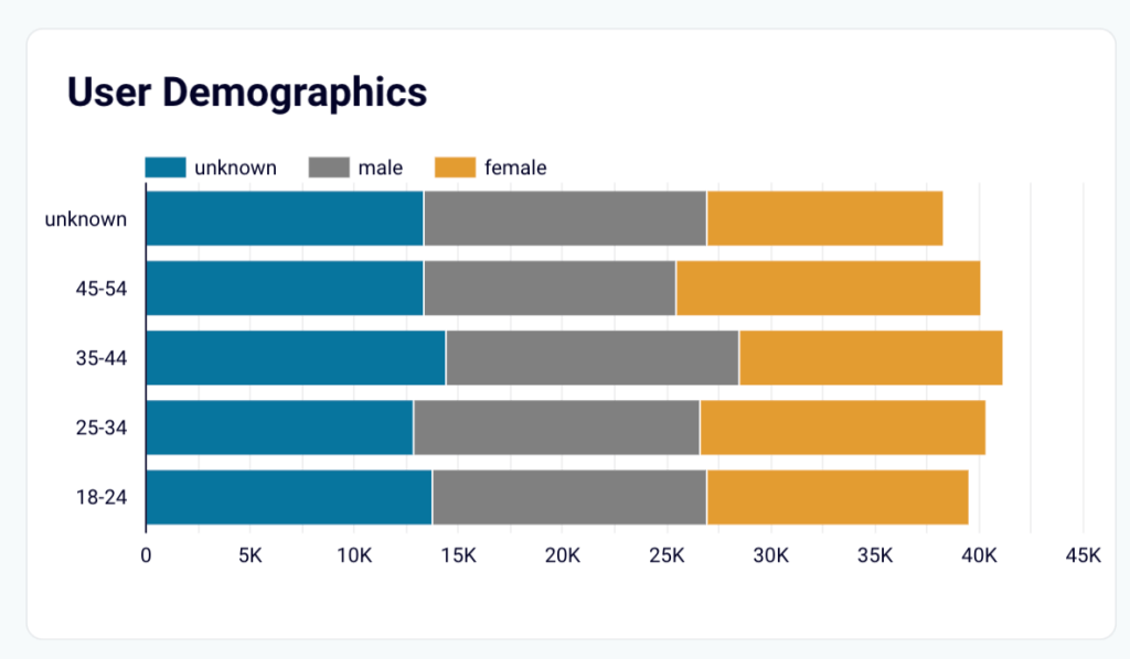
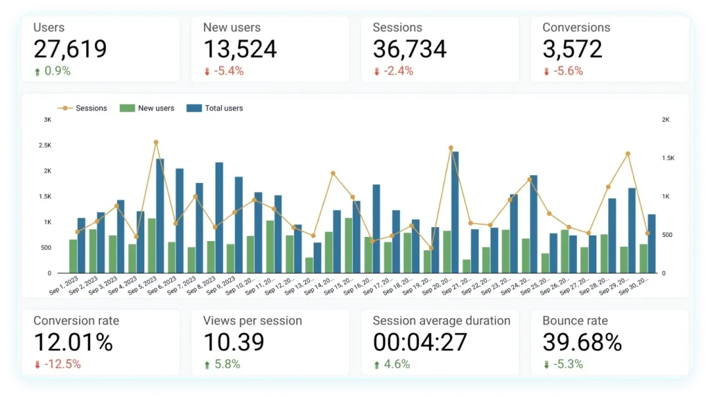
- Stacked bar chart – when bars have several colors showing different subcategories within a category. For example, in the graph below, each bar shows the number of users within a specific age range. Different colors show the number of users with different genders within the category of the bar.
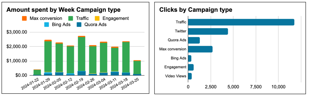
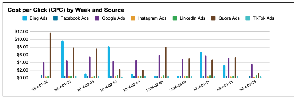
- Grouped bar chart – this is when bars in a graph are combined in clusters. In the example below, bars showing CPC for different channels are grouped this way.
When to use:
- To compare several categories – for instance, different campaigns or several marketing channels
- To track dynamics over a period of time – for example, audience growth or purchases
- To analyze how different categories contribute to the whole
Hands-on examples:
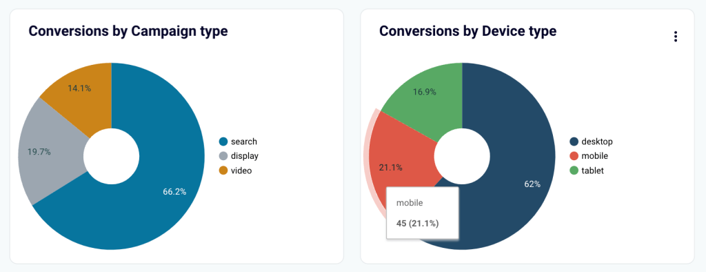
2. Pie chart / donut chart
This is a circular diagram where the whole “pie” represents 100%, and its wedges show the proportion of different categories.
Types of a pie chart:
- 3D pie chart – where the graph is shown as a 3D object. However, you should be careful when using or reading this type of graph. The reason for this is because of the perspective, the wedges in the forefront appear bigger than they really are, and those that are visually “further” appear smaller.
- Donut chart (Doughnut chart) – this is basically the same as a regular pie chart except that it has a hole in the middle.
When to use:
- To show percentages and other numerical data
- To understand how different channels, campaigns, etc. drive results in comparison to each other
- To identify best-performers
Hands-on example:
3. Line graph
In essence, it’s similar to the bar chart as it uses the same system or coordinates (the x and y axes). The obvious difference is that quantities and other values are visualized with a line. Sometimes, it’s also called a line plot.
Types of a line graph:
- Single-line – has only one line and depicts one category.
- Multiple-line – has two or more lines, typically of different colors. It can present several categories and is a good choice for comparisons and in-depth analysis.
When to use:
- To monitor dynamic processes and keep track of the changes
- To conduct over-time analysis
- To compare different variables
Hands-on examples:
4. Combo chart
This type of chart combines bars and lines, which allows you to show more information in one graph and keep it easily readable.
When to use:
- When you need to introduce an additional parameter
- To highlight the correlation between the additional parameter and other metrics
Hands-on examples:
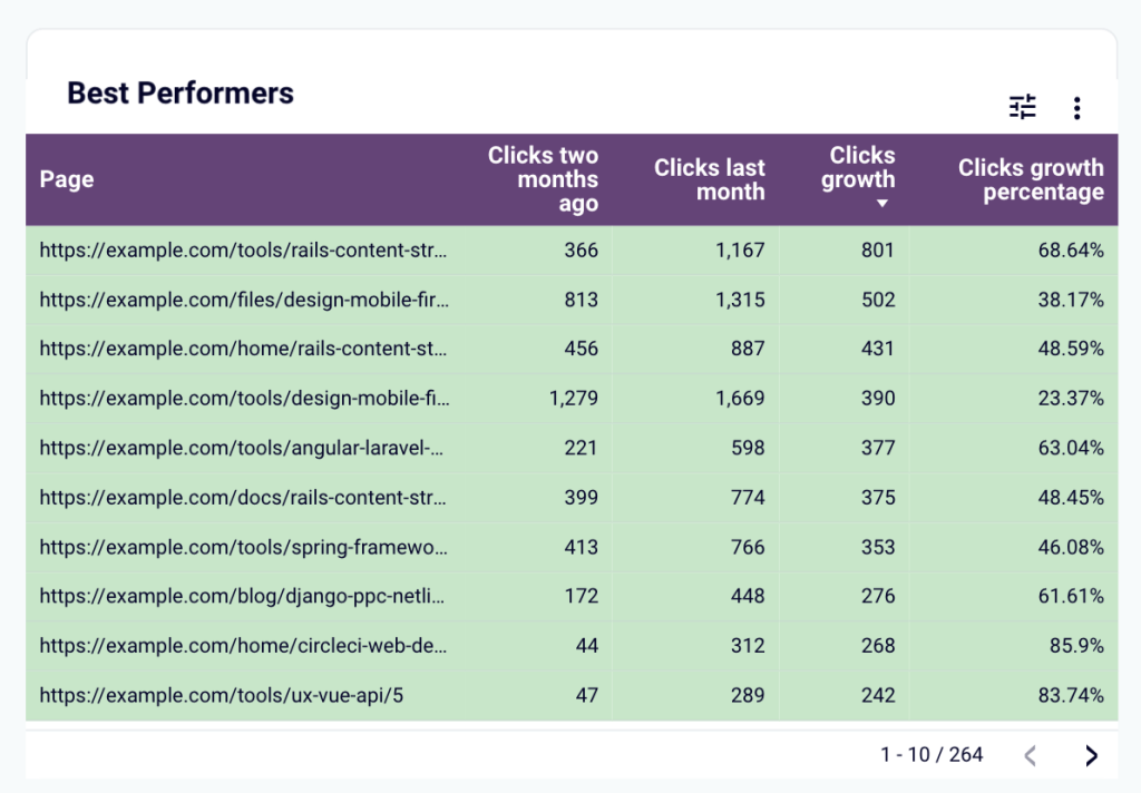
5. Data table
This is another widely used type of graph. It presents data in a tabular format, which makes it convenient for in-depth analysis.
It’s particularly handy when you have too many categories for a simple graph. For example, in the table below, we can see that the blog website has 264 pages. Visualizing this data in a bar or line graph would result in a cumbersome chart that would be very difficult to work with. At the same time, in a table, two hundred pages is not a problem as you can simply scroll, as well as apply filters to narrow results.
When to use:
- To organize big datasets for transparent analysis
- When you have multiple subcategories for each category (i.e., multiple metrics for each of the blog pages)
- To compare multiple positions and explore metrics in detail
- To analyze performance across different channels, pages, etc.
Hands-on examples:
6. Funnel
This chart depicts different stages of a process – a customer journey, acquisition, sales process, and so on. The goal of this graph is to demonstrate how your audience or customers go through different phases of the funnel. Analyzing this data helps you improve conversions.
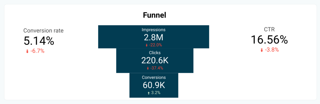
Usually, these types of graphs, indeed, come in the shape of a vertical funnel. A less widespread version is a horizontal funnel chart.
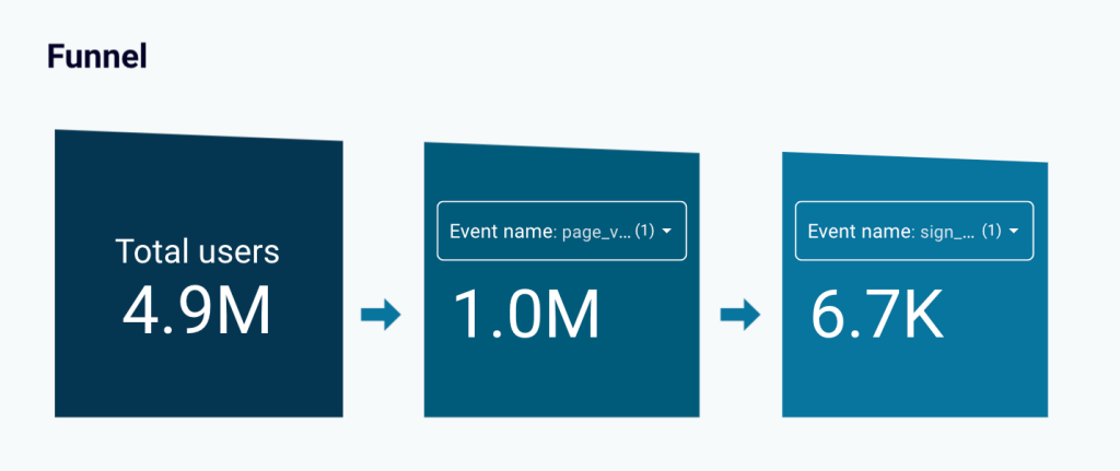
Sometimes, a funnel can also be depicted as a clustered bar chart or set of scorecards, like in the example below.
When to use:
- To analyze how your campaigns translate into financial results
- To check at which stages of the funnel you may be losing customers
- To identify areas of improvement in the customer journey
- To understand what marketing activities drive conversions
Hands-on examples:
7. Scorecard / KPI indicator
It’s nearly impossible to imagine a marketing dashboard without scorecards. This graphical element is typically a rectangle containing information about the most important KPIs. It is usually used in combination with other chart types.
When to use:
- To keep track of the main metrics
- To quickly spot growth or decline
- To have an instant overview of your marketing efforts
Hands-on examples:
8. Geo chart / Map
This type of graph shows your data on a map, helping you understand how your results vary depending on the location.
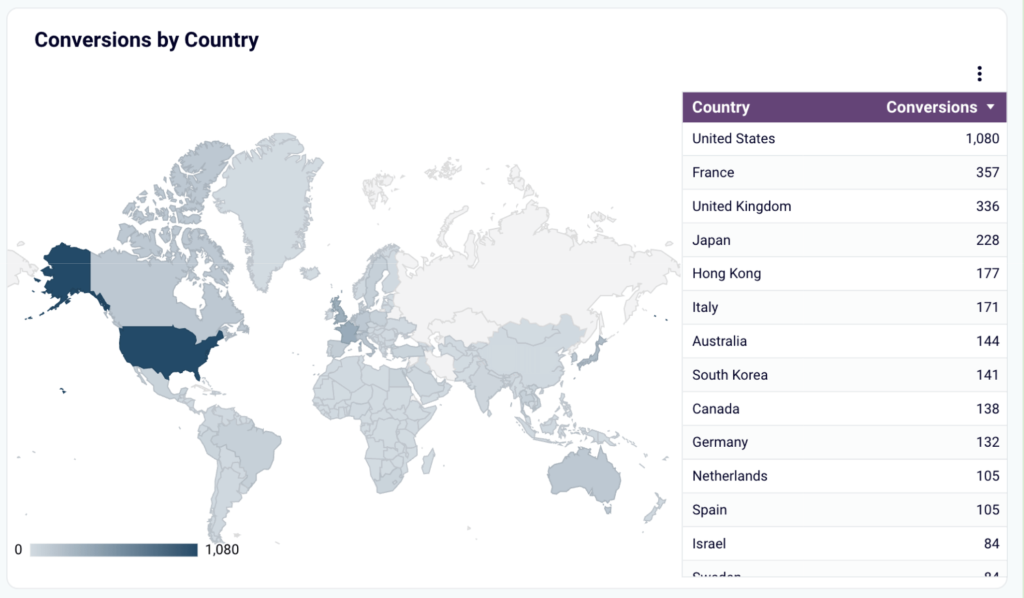
When to use:
- To see how your marketing activities perform in different areas
- To search for new promising audiences and research new markets
- To evaluate and redistribute ad budget in favor of the best-performing regions
- To identify underperforming regions
Hands-on examples:
9. Gauge chart
This chart visualizes your data on a dial showing where you are on a scale from 0 to a max value you set. Gauge charts are often used to track how much of a budget is spent or whether a certain goal is achieved. There can be several such charts in a marketing dashboard for monitoring different KPIs.
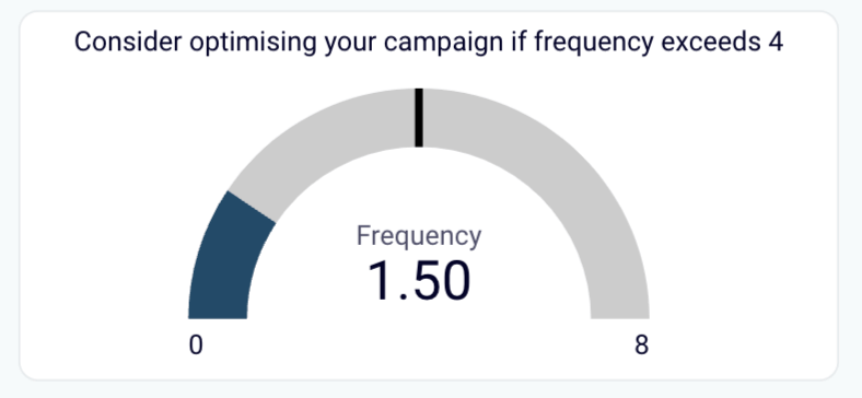
When to use:
- To track progress and see how much of a planned result was achieved
- To check that certain parameters do not exceed the specified benchmark level
- To monitor key KPIs
- To accompany other kinds of graphs for an all-round overview
Hands-on examples:
10. Gantt chart
Such charts are usually used for project management and are quite widespread in marketing. Typically, they list various stages of a project or tasks on the left (the y axis), and days or weeks on the x axis.
They allow you to show dependencies between different stages of a process, allocate resources, plan task completion, and monitor progress.
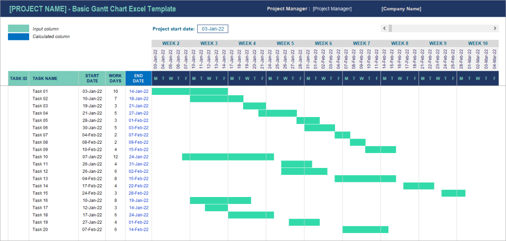
When to use:
- To manage complex projects or processes
- To plan long-term activities and track progress
- To create roadmaps and present them to stakeholders
Hands-on examples:
11. Heatmap
Although this chart can come in the form of an actual map, it doesn’t have to. Quite often, it’s a dataset presented in a table with different values coloured in different shades. For example, green for a high acquisition rate, red for a low one, and shades of yellow and peach for the in-between values.
Thanks to this, you can quickly see what’s going on even without looking at the numbers. With large datasets, this comes in handy and saves a lot of time.
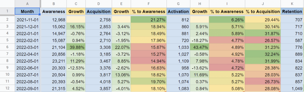
When to use:
- To make detailed datasets easily readable
- To analyze a big set of data with a lot of details
- To assess growth or decline in key metrics across multiple positions, such as campaigns, website pages, or PPC channels
Hands-on examples:
12. Area graph
Basically, this is the same as a line plot, but the space within the linear outlines is filled with color. As a result, your data is presented as a flat shape rather than just a line. This adds emphasis and works especially well for comparisons.
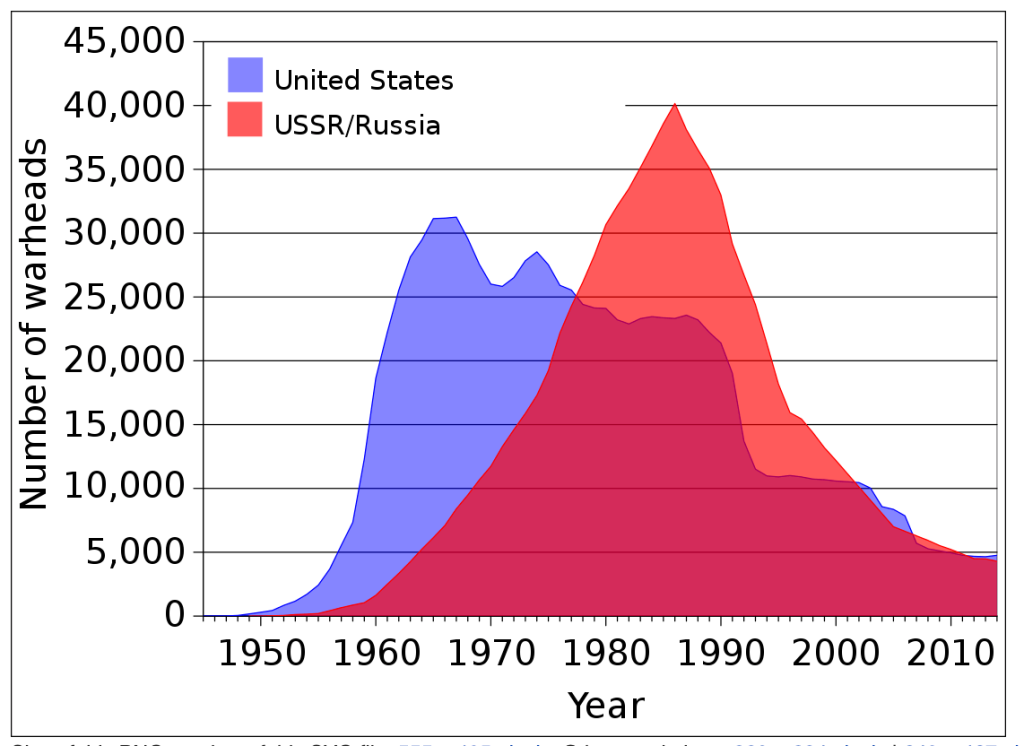
When to use:
- To make your graph more visually appealing
- To add emphasis and make it easier to understand differences in values
13. Stacked area chart
This is another version of the previous type. In this case, you have “layers” showing the proportion of different categories in a whole. In the example below, you can see a chart showing daily website traffic, where different layers show various traffic sources contributing to the total result.
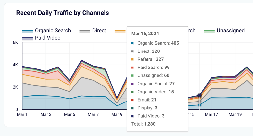
When to use:
- To visualize processes consisting of multiple factors or components with cumulative effect
- To analyze how the end result was achieved
Hands-on examples:
14. Scatter plot / Scatter graph
This chart works similarly to a line graph, but individual data points are shown separately in a scattered manner and are not connected by a line. The main purpose of such types of graphs is to help you understand whether there is a correlation between the factors you are analyzing or not. If not, dots are randomly scattered on the graph. If there is a connection between the two variables, you will see a pattern.
In the example below, there is a visible downward trend. With other types of graphs, such an insight would be unavailable.
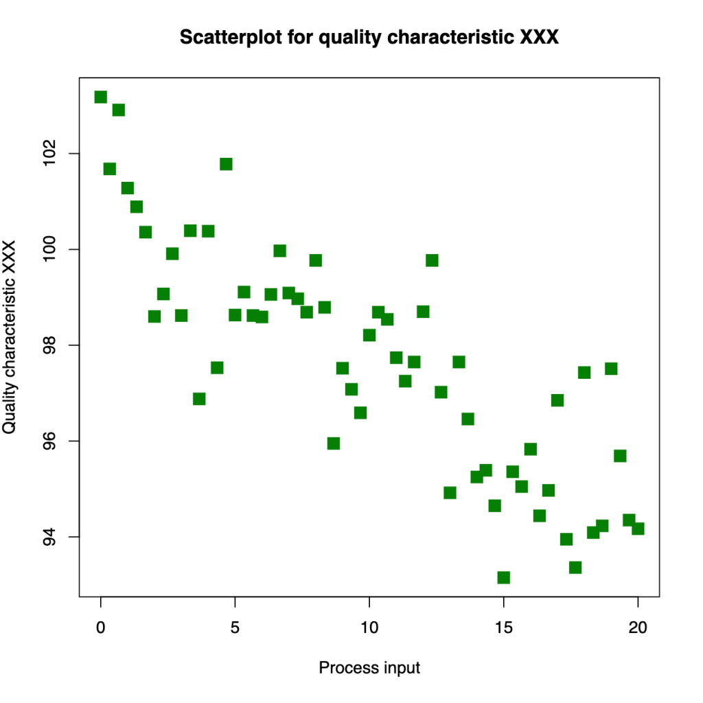
When to use:
- When you need to decide if there is a correlation between two parametres
- To identify patterns and analyze trends
15. Bubble chart
This graph is pretty much the same as the scatter chart, but data points are shown as circles. The size of the circles can represent the magnitude of a factor or its numerical value. For instance, a bigger circle for a bigger number of users, and vice versa. Color-coding can also be helpful if you need to compare several categories of the same type.
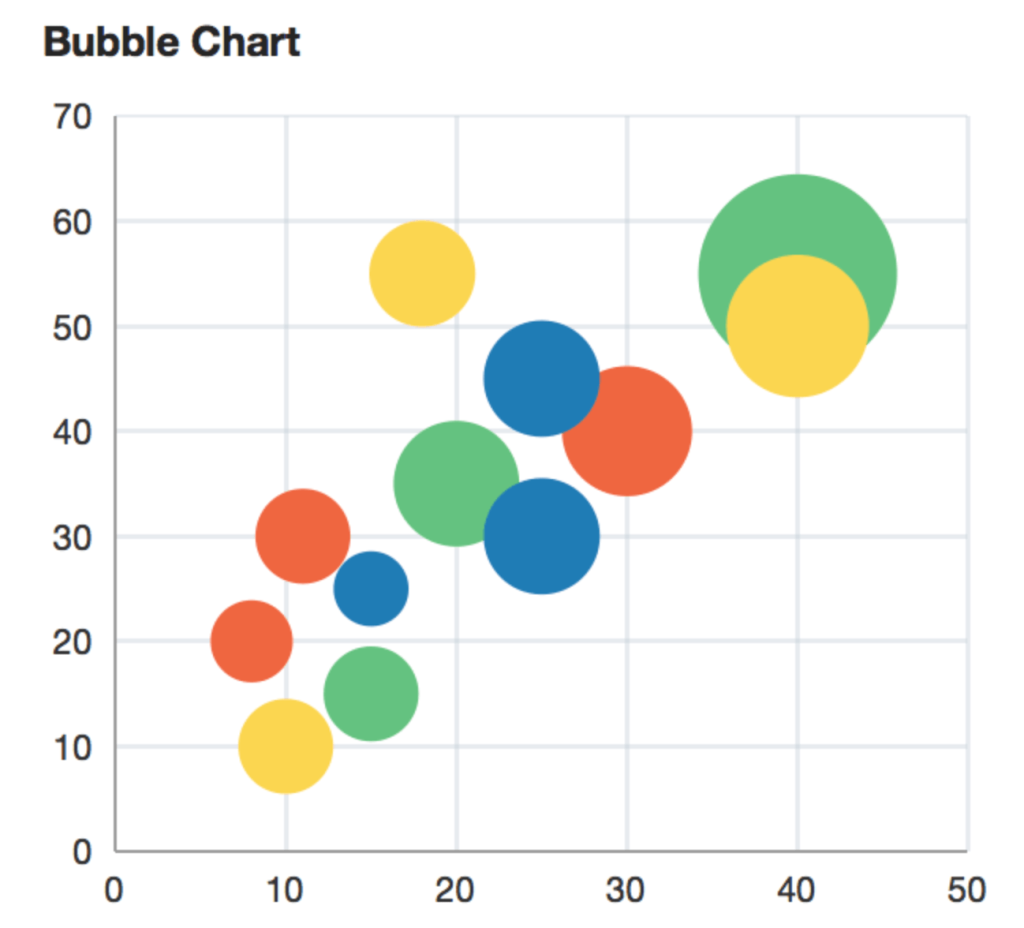
When to use:
- To analyze trends taking into account the intensity of each event’s manifestation
- To introduce the third dimension in addition to the x-axis and y-axis
- To analyze complex processes
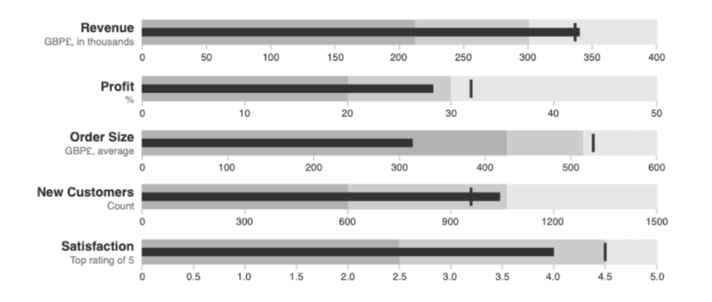
16. Bullet chart
This one is considered a variation of a bar graph, but it also contains the elements of a gauge chart. These graphs typically consist of a horizontal or vertical bar and a line perpendicular to it, which shows the planned value. The background color usually shows a range of the achieved result – satisfactory, average, excellent, and so on.
For instance, in the bullet graph below, you can see that the company met its revenue target but didn’t achieve the profit goal. Likewise, the order size goal is far from being realized.
When to use:
- To track performance towards the planned goals
17. Snakey
This type of graph or diagram uses flexible arrows or lines to show how a process works or how resources are distributed. In essence, it works as an infographic and can often use pictograms. Often, the thickness of the arrow or line represents the magnitude of a factor depicted.
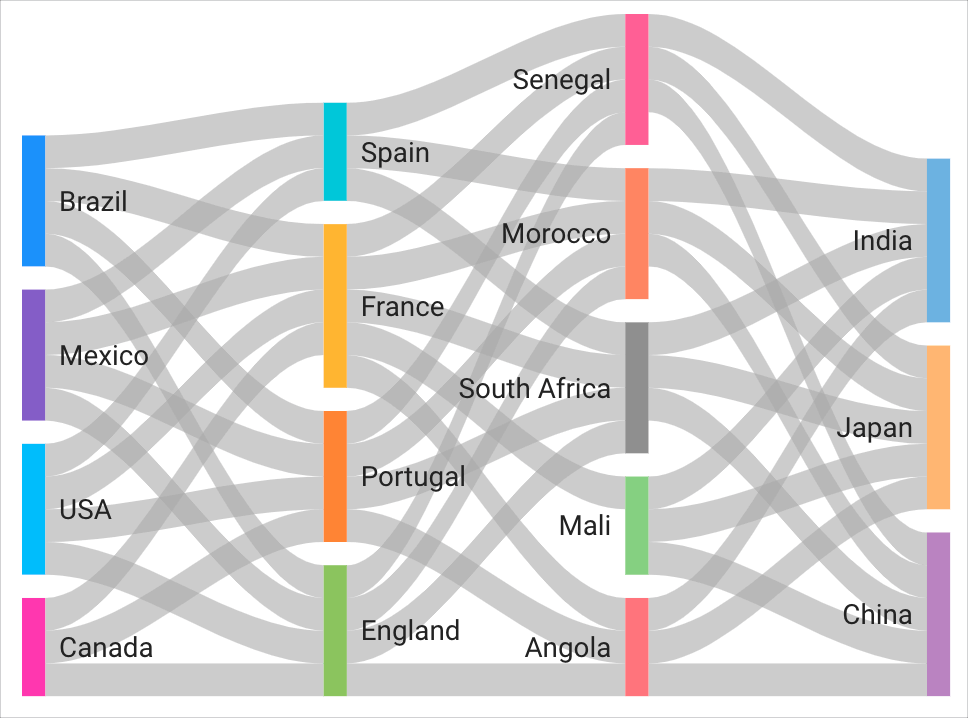
When to use:
- To represent complex relationships between multiple components of a process
- For detailed analysis when you don’t need a quick overview
- To present how different activities contributed to a common result
18. Waterfall chart
These charts demonstrate positive and negative changes in a process and are often used for financial tasks. Such a chart depicts an initial value (in our example, $50), end value (here, $100), and a series of events that happened in between (when the value increases or decreases). In this case, we see that, first, $40 and $120 were added, then $120 spent, and so on.
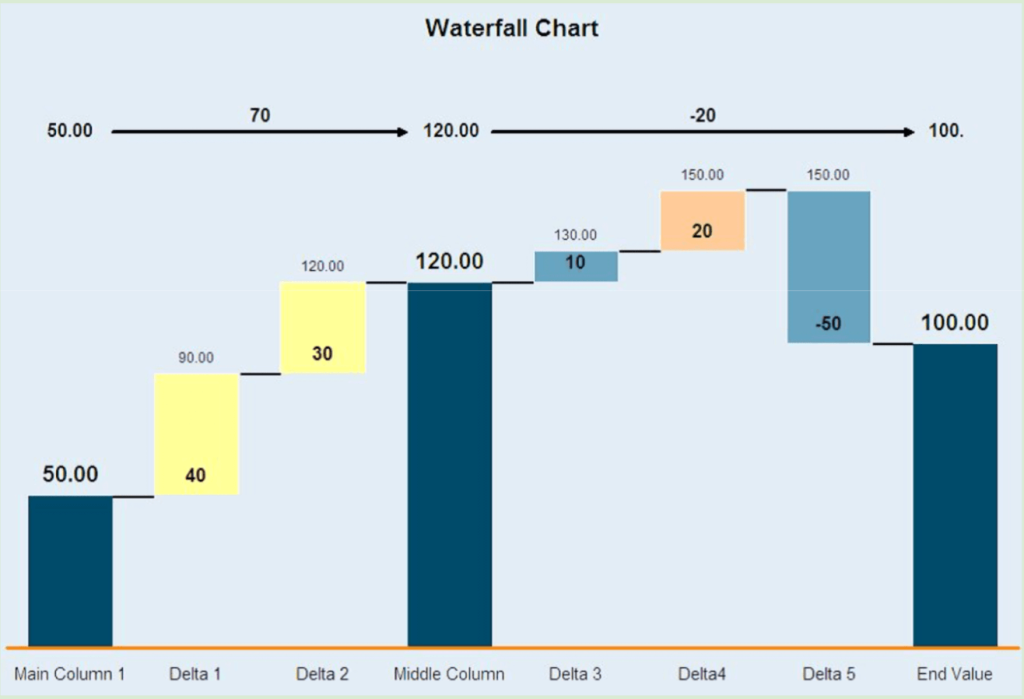
When to use:
- To check how the initial value (for example, ad budget) changed over a given period
- To track the events that contributed to the change (for example, receiving additional ad budget or spending it on an ad campaign)
19. Histogram
It can be seen as a variation of a bar chart, although it has its unique features. A bar chart can have pretty much any values represented by the x and y axis, but for a histogram, that’s not so. The standard values are: the x axis = time/intervals, the y axis = frequency. Another difference is that the bars usually have no spaces between them and are clustered together.
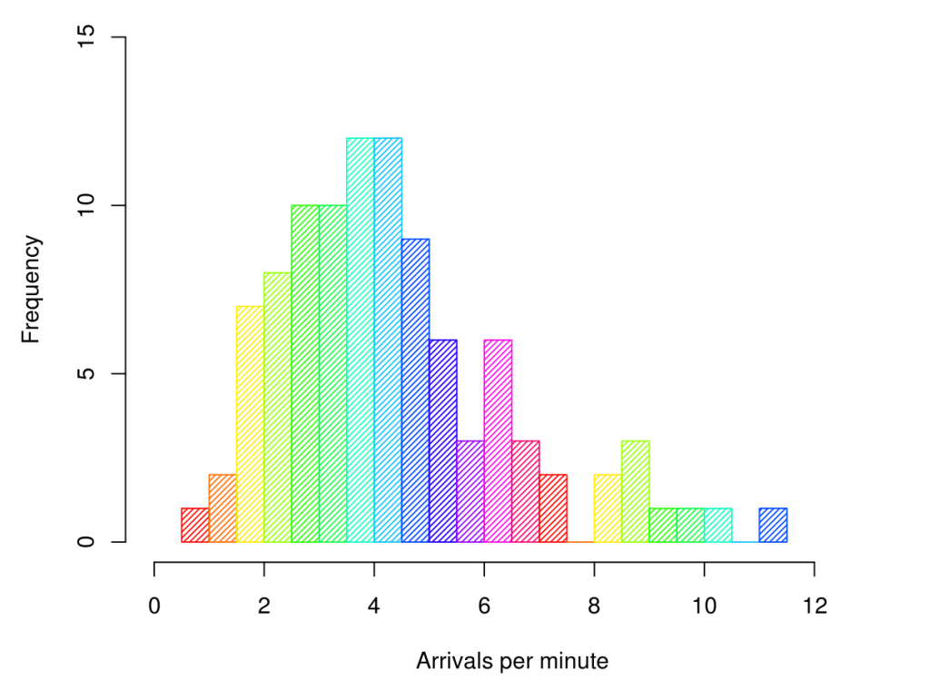
When to use:
- To track processes over time
- To analyze how frequently a certain event occurs in different periods (frequency distribution)
20. Treemap
This type of graph consists of a set of rectangles nested together. The whole treemap shows 100% or a process or entity. The rectangles inside represent different categories it consists of or parts of a whole. The size of each rectangle corresponds to the magnitude of each category. For example, the treemap below shows how many orders came for goods in different categories. We can see that the Home, Men’s apparel, and Groceries were the most popular categories.
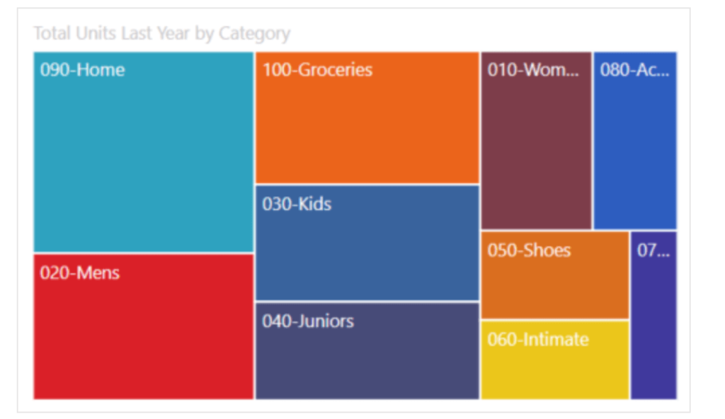
When to use:
- These types of graphs are useful when you need to analyze how the components contributing to a situation correlate with each other in magnitude. For example, the whole chart can represent the marketing budget and individual rectangles represent how much of this budget goes to a certain category.
When to use different types of graphs? A hands-on example
In the previous section, we already explained when each of the graphs on our list can be used. Now, let’s take a look at how all these graphs come together in a marketing dashboard.
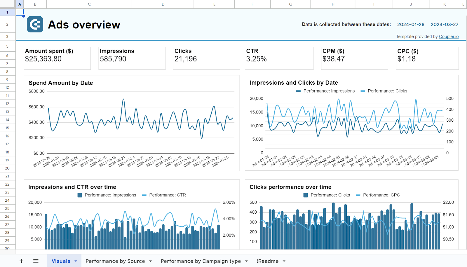
As an example, we will take this Multi-channel PPC dashboard in Looker Studio. It displays ad data from half a dozen ad platforms – Facebook Ads, LinkedIn Ads, Google Ads, and so on. All this data is organized and displayed in various graphs that let you conduct cross-channel analysis:
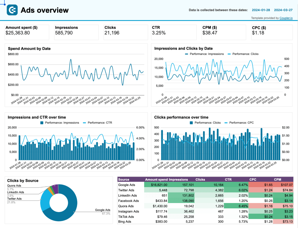
Here are the different types of graphs used in the first part of the dashboard, top to bottom:
- Scorecards. Used to display the key performance indicators (Amount spent, Impressions, Clicks, etc.). Such a representation of these metrics allows you to quickly assess the situation at a glance and to keep your focus on what matters most.
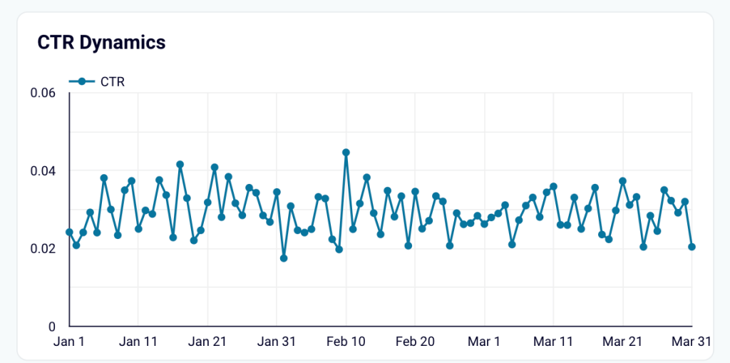
- Single-line chart. Used to show the Spend amount by date. This type of graph makes it easy to track changes over time and keep ad spend under control.
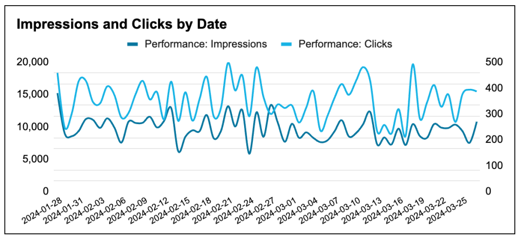
- Multiple-line chart. This chart is used here to show the correlation between two parameters – Impressions and Clicks by date. With two lines in one graph, you can easily analyze these two metrics together.
- Combo chart. Below, there are two combo charts consisting of vertical bars and a line. They also show two variables each, so, strictly speaking, they could have also been multiple-line charts. However, they have a different format – this is necessary for variety and improved readability.
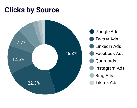
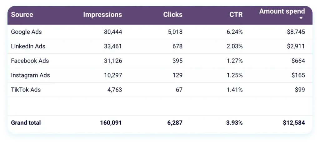
- Donut chart. The circular graph is used to display clicks by source and makes it easy to see which channels perform best.
- Heatmap. This one gives us an overview of the channel performance in more detail. Thanks to the heatmap format, you can easily spot the best and worst results.
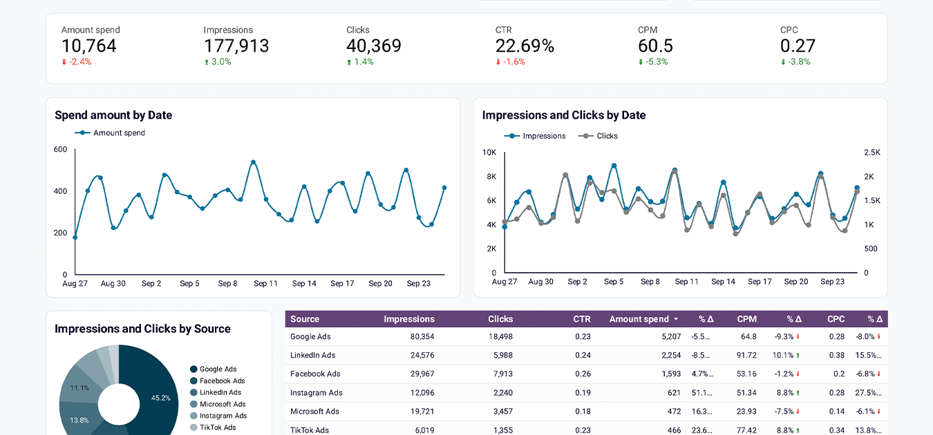
Here’s the second part of this dashboard with some more graphs:
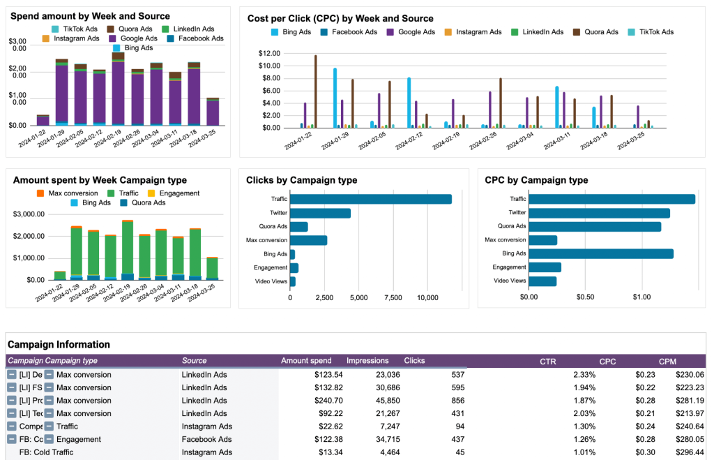
- Stacked column chart. It’s used to show the amount spent and the proportion of the budget that went to each channel.
- Clustered column chart. The goal of this chart is similar as it presents the results of each platform. Clustered bars make it easy to compare CPC for different platforms over time.
- Horizontal bar chart. These are included to show Clicks by campaign type and CPC by campaign type. As the purpose and content here are similar, this data is organized into two identical graphs for easier readability.
- Data table. This chart is used to display a dataset with additional details.
As you can see, there are plenty of different graphs in this marketing dashboard, and they are all tailored to the type of information they represent. In the next section, we give you several free templates for marketing dashboards. You can use them as an example of combining different graphs as well.
Bonus: 5 marketing dashboards – FREE templates
Cross-channel PPC dashboard
With this PPC dashboard, you can visualize data from all your ad platforms in one place. It’s automated thanks to the built-in Coupler.io connector, which allows you to connect the required ad platforms in minutes.
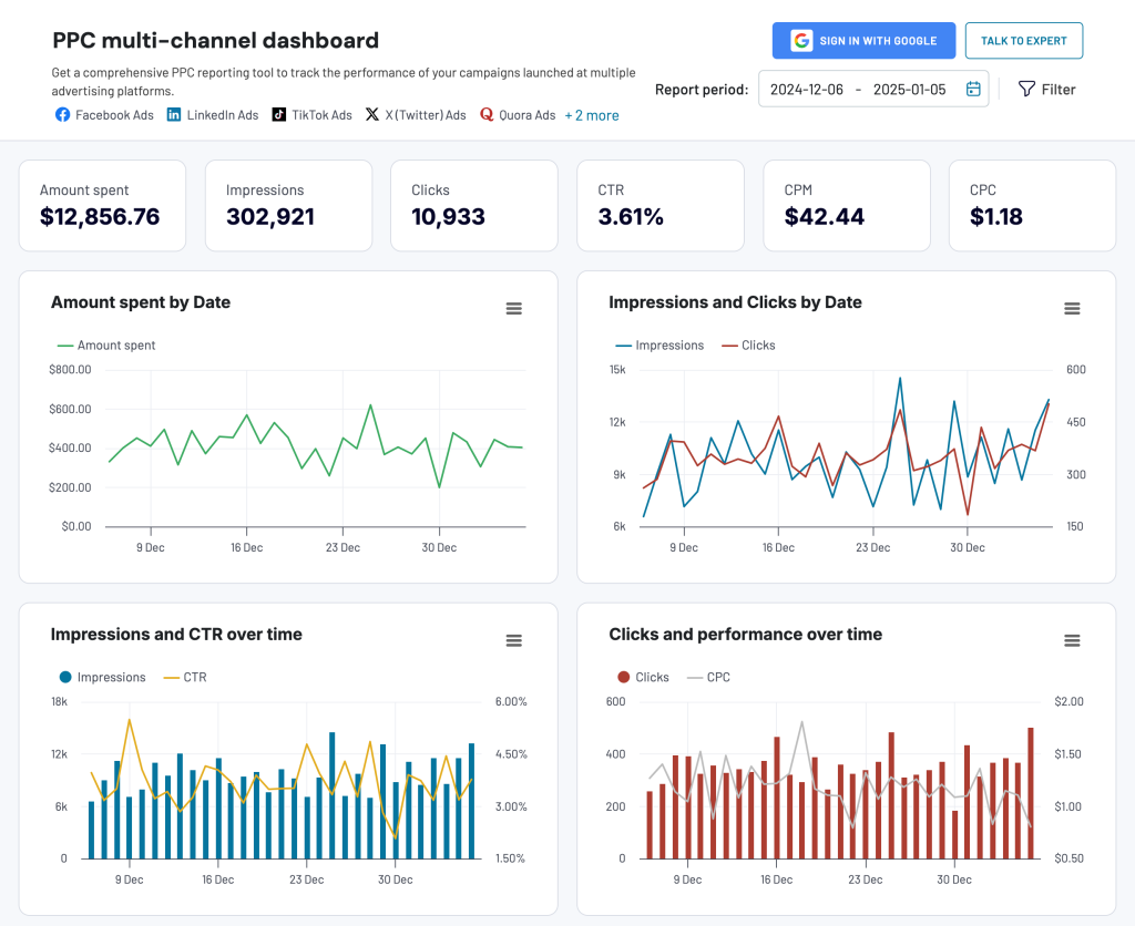
You can add data from Facebook Ads, Google Ads, LinkedIn Ads, Microsoft Ads, and other platforms. This makes it easy to compare what works best and what underperforms.
In addition to the very dashboard, Coupler.io offers it as a template in Google Sheets, Looker Studio, Power BI, and Tableau. If you’re interested in any of those, pick the one you would like to get started.


YouTube analytics dashboard
This YouTube analytics dashboard lets you keep an eye on the essential channel metrics, track content performance, and analyze audience segments.
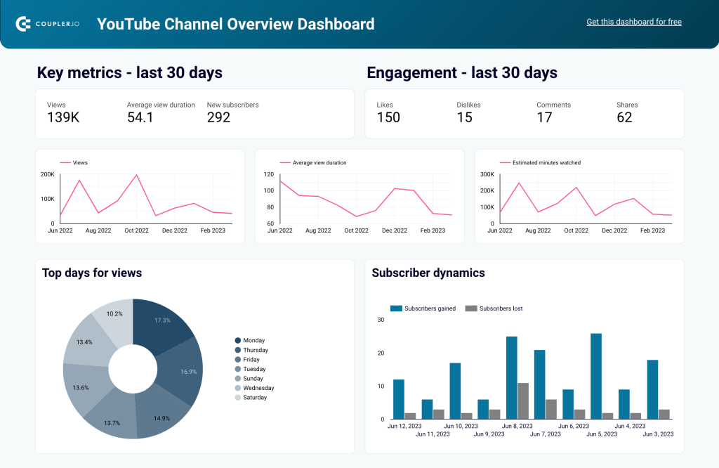
It contains different types of graphs that give an informative overview of channel performance. In particular, you can analyze the performance of each video to understand what content drives engagement and growth.
Brand awareness dashboard
Another useful template is the Facebook Ads and Brand Awareness dashboard. It displays data from Facebook Ads and Google Search Console.
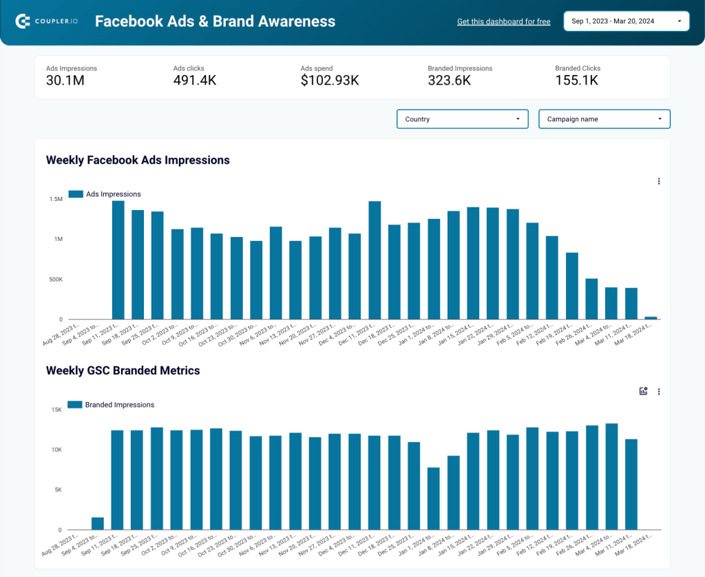
You can analyze brand awareness dynamics by comparing the graphs with Ad impressions and Branded impressions. This shows you how your ad campaigns impact changes in brand awareness.
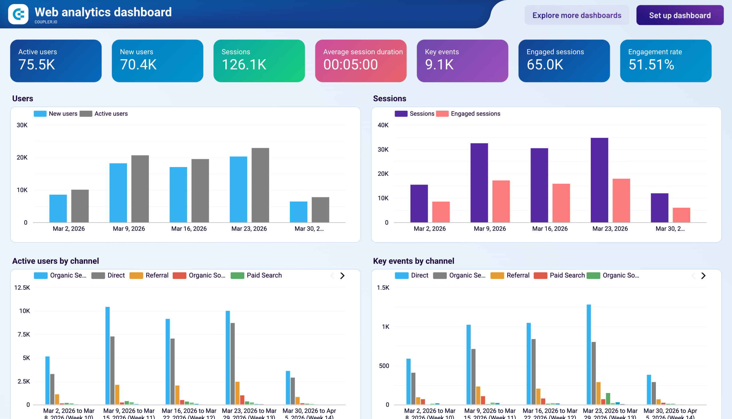
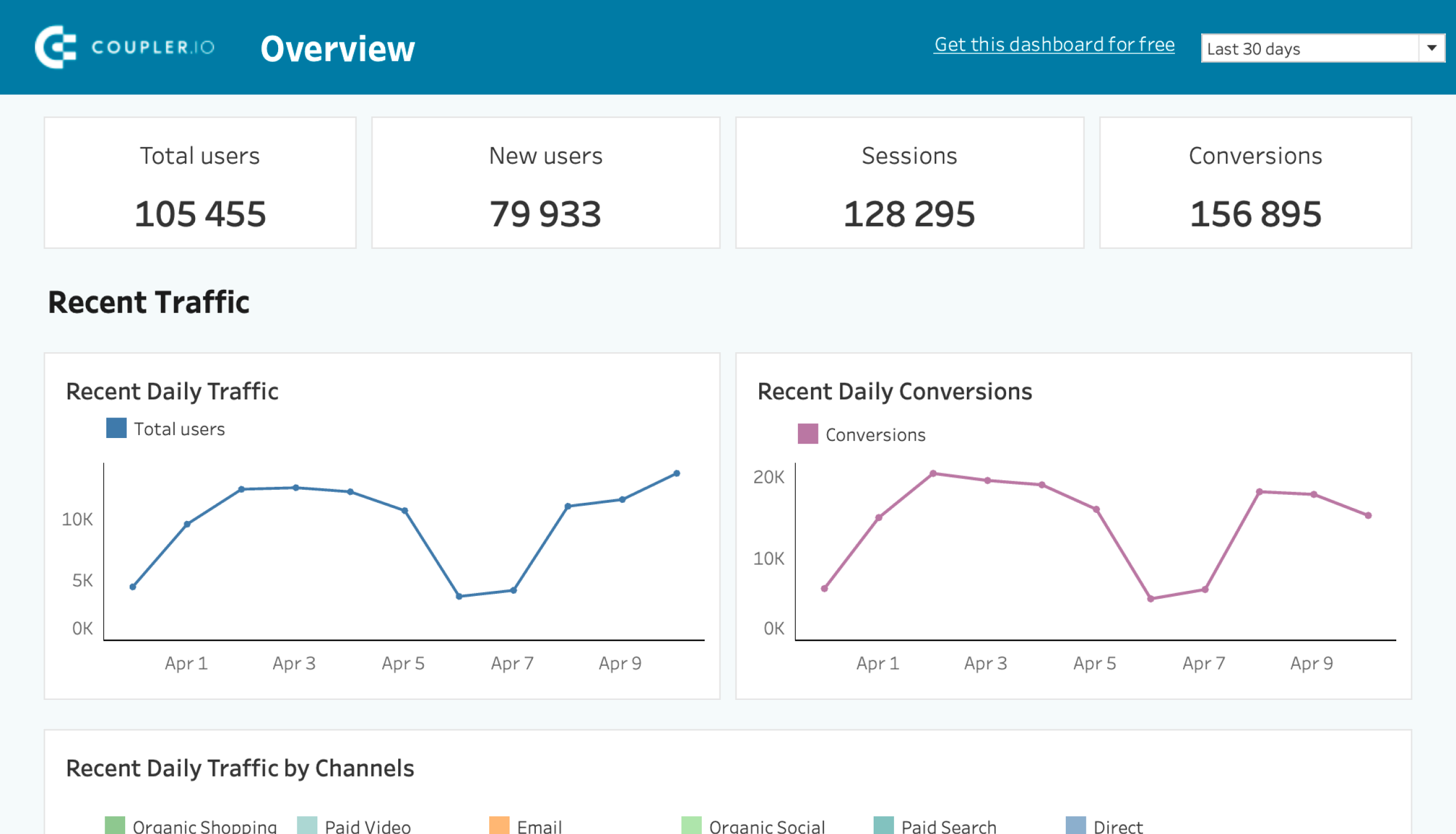
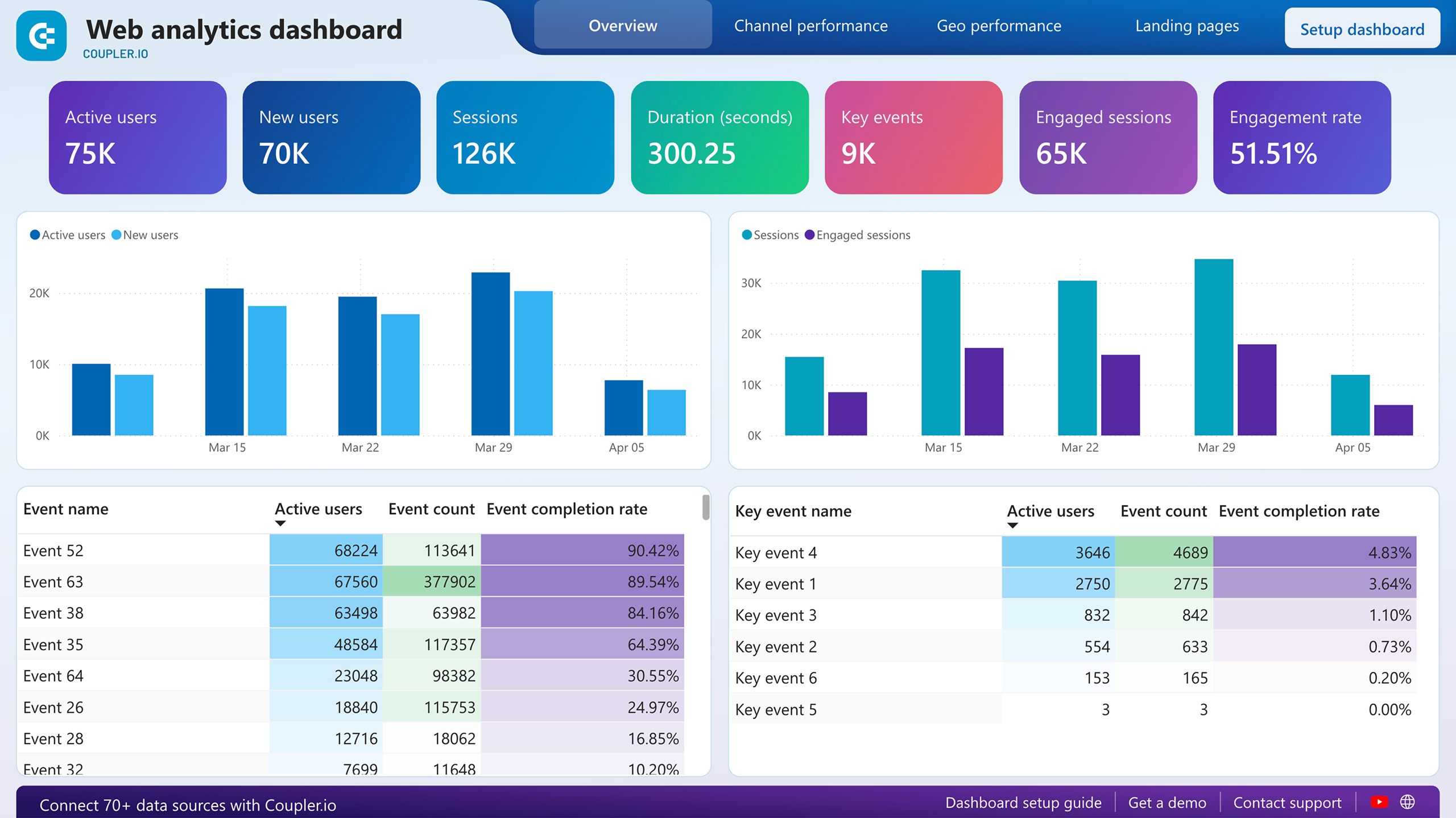
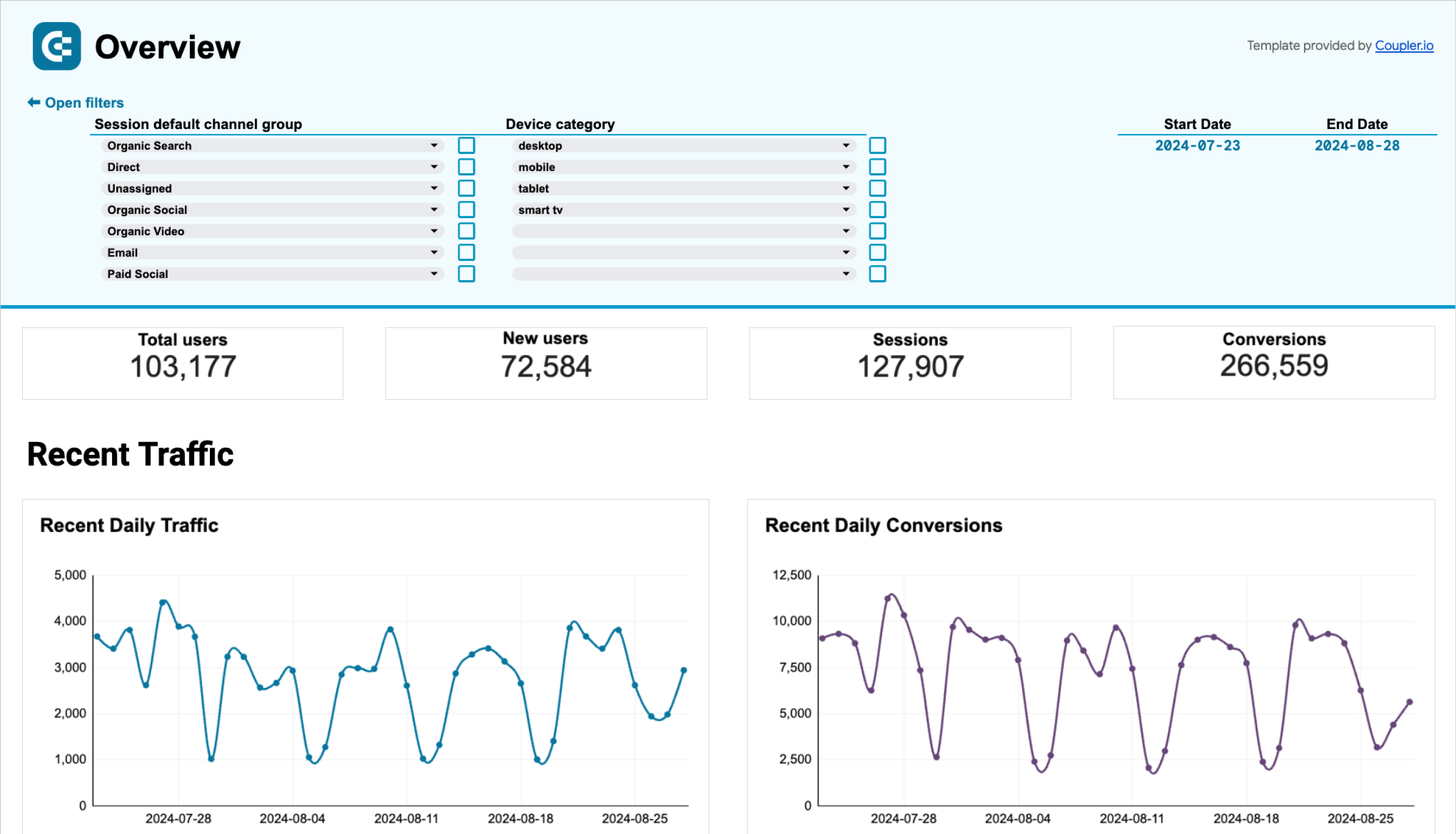
Web analytics dashboard
This template automatically pulls data from Google Analytics 4. It visualizes the most important metrics in an analysis-ready, flexible, and easily customizable report.
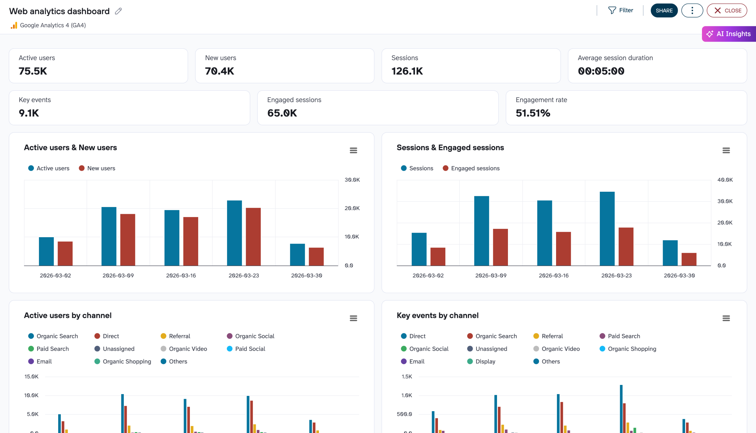
This Web Analytics dashboard allows you to monitor performance and analyze your audience in detail, including their device, location, age, and gender. Apart from that, it offers a useful visualization of the conversion funnel. This helps you understand how users convert at each stage.
The dashboard is available in different versions. Choose the one you like and try it for free.


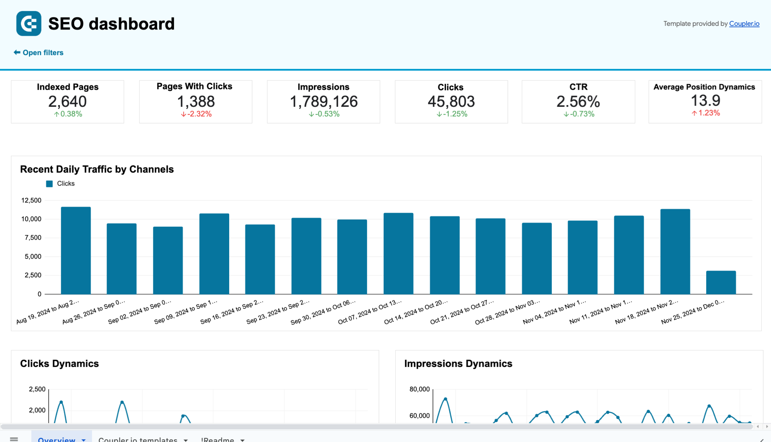
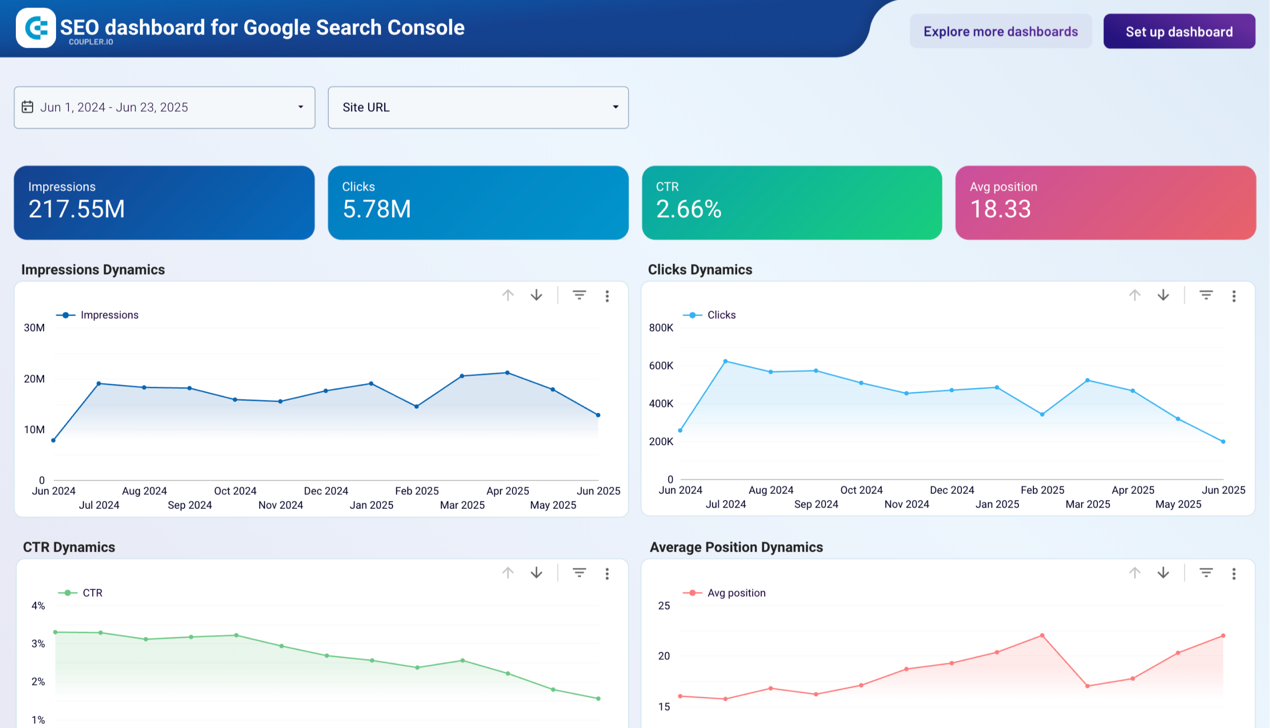
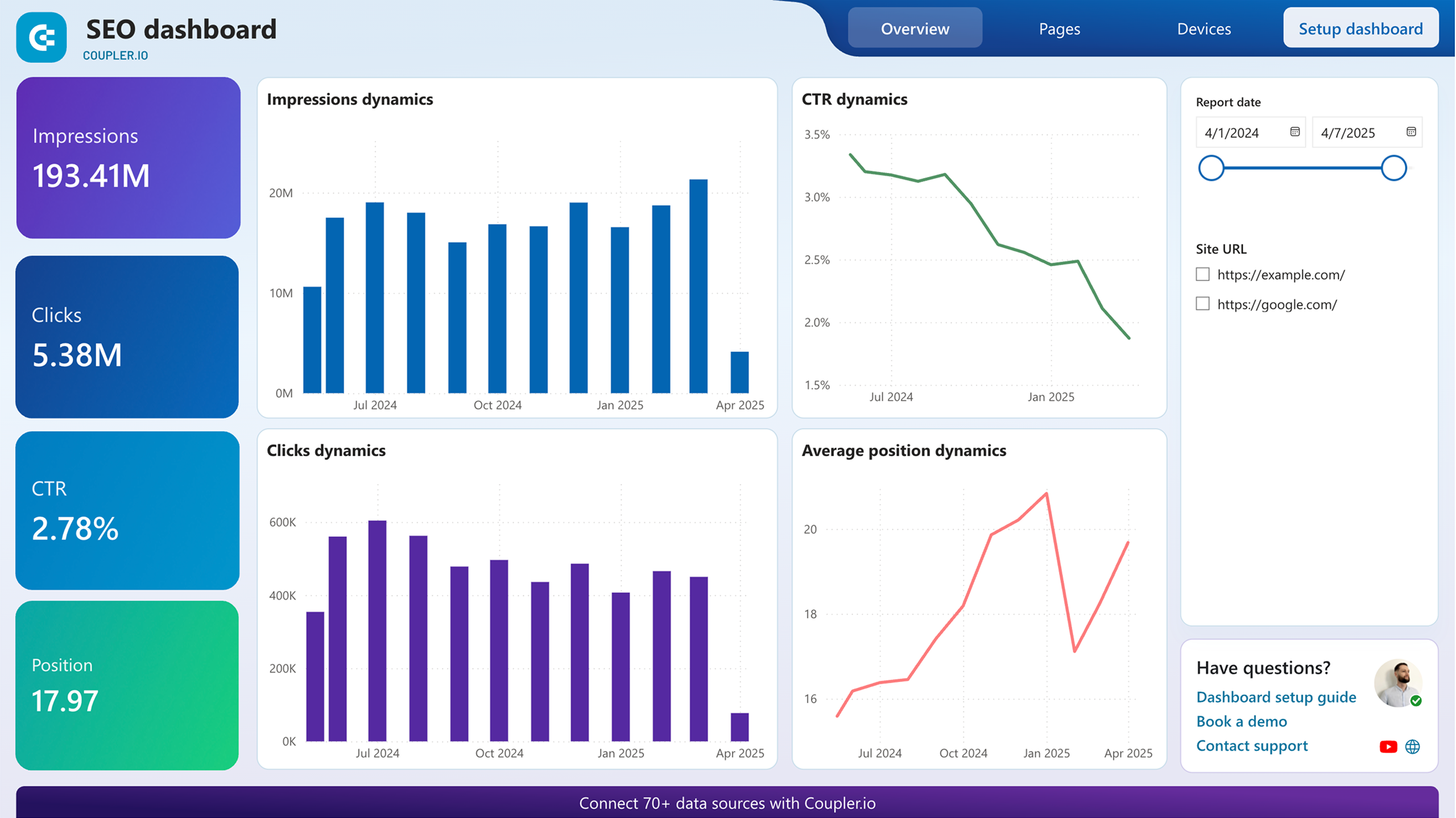
SEO analytics dashboard
This dashboard gives you an overview of the key metrics and allows you to track and analyze click dynamics, impressions, top 10 pages by clicks and impressions, and more. It’s a valuable analytical tool as it contains some information that is not offered in native GSC reports. For example, it provides a summary of best-performing and worst-performing pages, which allows you to monitor changes and swiftly take action.
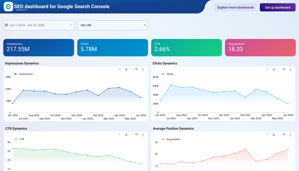
This template is available in a few versions that are available for free!

So, we’ve explored 20… but how many types of graphs are there?
That depends on how you count. Some people say there are just four graph types that you really need (bar chart, line chart, pie chart, and scatter plot). At the same time, others claim there are nearly 50! However, at a closer look, it turns out they are just variations of the most common types.
Either way, you only need to use as many different types of graphs as it takes to visualize your data in a way that makes sense. Sometimes you need a complex dashboard, and sometimes just two bar charts are enough.
For more on this topic, check out our articles on how to make a chart in Google Sheets, Looker Studio charts, and Tableau chart.