Maps are visuals within Microsoft’s Power BI suite to visualize location-based data. Power BI maps are useful for understanding geographical trends or analyzing spatial relationships for better decision-making. With these visuals, you can display sales data, track customer distribution, or monitor infrastructure across locations. Learn how to create and use different types of maps in Power BI.
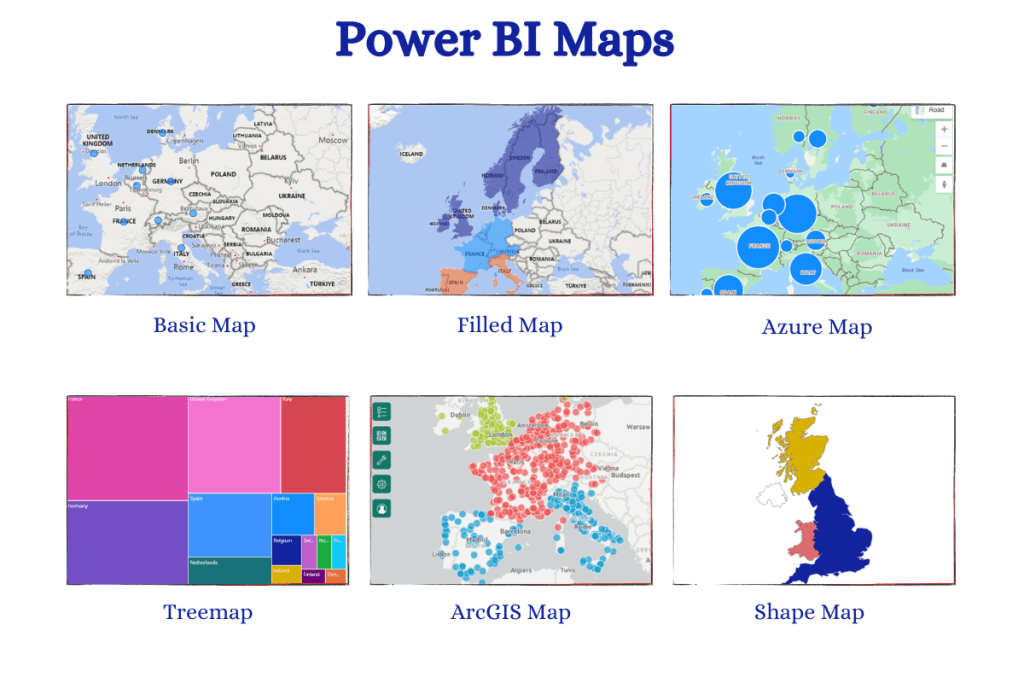
What are the types of Power BI maps
You’ll find 6 in-built mapping options in Power BI to suit various analytical needs, including:
- Basic map
- Filled map
- Azure map
- Treemap
- ArcGIS map
- Shape map (only available in Power BI desktop preview)
How to create maps in Power BI
Step 1. Get and prepare data
To create any map in Power BI, you need to have data with location-based details. For the examples below, we use a sample dataset (AmazingMartEU2Geo). It contains a list of orders from different countries, cities, and regions in Europe along with other information.
You can also automate data load to Power BI from your sources using Coupler.io. It is a reporting automation solution that supports 60+ apps, such as Google Analytics, Hubspot, Google Ads, and more. Simply select your desired source in the form below and click Proceed.
You’ll be offered to create a Coupler.io account for free and set up the connections.
Keep in mind that to create maps in Power BI, your data meets the correct geo-location formatting requirements:
- Ensure your dataset has location-based details, such as country, state, city, postal/ZIP code, or latitude and longitude coordinates.
- Standardize location names, spellings, and formats to prevent discrepancies in your map visualizations.
- Confirm the consistency and accuracy of your location-based data with geographic hierarchies and naming and categories. You can use reliable sources like GeoNames to cross-reference your data.
Step 2. Enable Map Settings
If you are creating maps in Power BI for the first time, you need to enable the map settings from the Power BI service admin portal. Otherwise, you will see a warning ‘Map and Filled Map Visuals aren’t Enabled’.
- To solve this issue, log in to the Power BI desktop and Power BI service using the same email
- Go to your Power BI Service account
- Click on the gear icon i.e. Settings ➡ Admin portal
- Next, select the Tenant settings. Enable the options related to AcrGIS maps, Azure and filled maps.
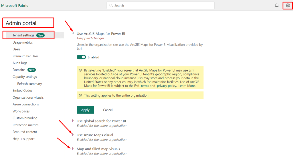
You’ll need to wait for 15 minutes. The same functionalities will be also applied to the Power BI desktop automatically to create a map.
Step 3. Add map visuals and customize them
After preparing and loading the dataset, simply drag-and-drop and customize the preferred map in Power BI.
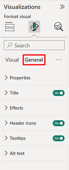
Go to the Visualizations ➡ Format visual. Here you will find 2 options to personalize the map: Visuals and General settings.
The Visual settings are different depending on the type of map you choose.
The General settings include the customization options for titles, effects, header icons, showing/hiding tooltips, using ALT text, etc. These general properties are the same for all types of Power BI maps.
We’ll show how to create different types of Power BI maps and customize them for geographical analytics and reposting in detail in the following section.
Power BI basic maps
Basic Maps in Power BI are a simple and effective way to visualize the geographic distribution of your data. They provide a quick overview to show location-based data without the need for complex configurations.
Key Features:
- Display geographic data (countries, states, cities) on a map.
- Simple drag-and-drop functionality.
- Clear markers or bubbles for data points.
- Interactive zoom, pan, tooltip, and hover features.
Use Cases:
- Sales Analysis: Visualize sales data across different regions to identify high-performing areas or areas for improvement.
- Customer Distribution: Map customer location data to identify geographical clusters and target marketing efforts accordingly.
- Population Demographics: Analyze population demographics by region for market segmentation and targeting.
Limitation(s):
- Limited customization and may not support complex datasets
How to create Power BI basic maps
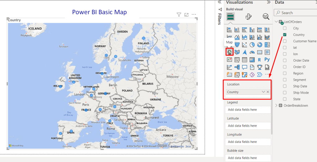
After loading a map dataset inside your Power BI, you can see the Visualizations pane on the right side of the canvas.
Here, you’ll find the icon of Map (basic). Drag and drop the basic map icon inside the Power BI report. You can expand the map for a better view and analytics.
Next, select the country or city and drag it inside the Location tab. Within seconds, you can see the bubbles identifying the European countries.
In the Power BI basic map, you can also show the bubble size of the geographical locations. For instance, drag the Order ID in the bubble Size tab to show how many orders the shop gets from each country.
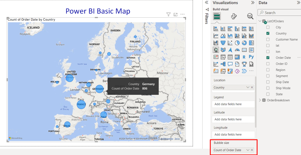
You can see the different sizes of bubbles, depicting the number of orders. Large bubbles mean more orders, and smaller bubbles mean fewer. You can simply hold the cursor over the bubbles, it will show the relevant information e.g. country name and the Count of order in the tooltip.
Customize basic maps in Power BI
You can customize the following styles inside the Visual tab.
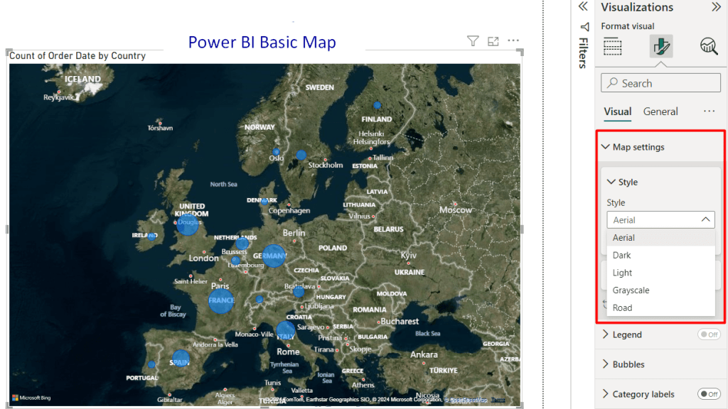
- Map Settings: You can choose the Power BI map styles such as Arial, Dark, Light, Grayscale and Road. Select any of them from the drop-down to change the map theme instantly. You can also show or hide the map labels as well.
- Controls: Enable automatic zoom control and zoom button
- Legend: Turn on/off the legend value
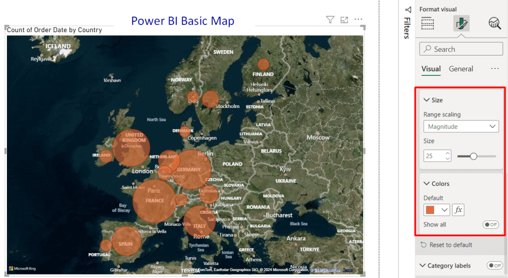
- Bubbles: Select custom bubble scaling, size, and color
- Category labels: Customize the category labels, colors, and background
- Heat map: Enable/disable the heatmap option
Note: Learn more about Power BI heatmap
Power BI filled maps
Filled maps in Power BI go beyond basic location data distribution. They use color intensity to reveal areas with high or low concentrations of your chosen data point. For instance, you can show sales figures using a filled map where red areas represent high-selling regions, while blue areas indicate lower sales.
They provide a visually compelling way to compare data across regions and identify patterns or trends.
Key Features:
- Color gradients highlight data concentrations.
- Pattern identification to spot geographic trends easily.
- Quickly compare data across regions.
Use Cases:
- Sales Performance Analysis: Identify top-performing regions.
- Customer Concentration: Target areas with high customer density.
- Resource Allocation: Visualize and adjust resource distribution.
Limitation(s):
- Need to be concerned while choosing color palettes, especially for those with color vision deficiencies.
How to create Power BI filled maps
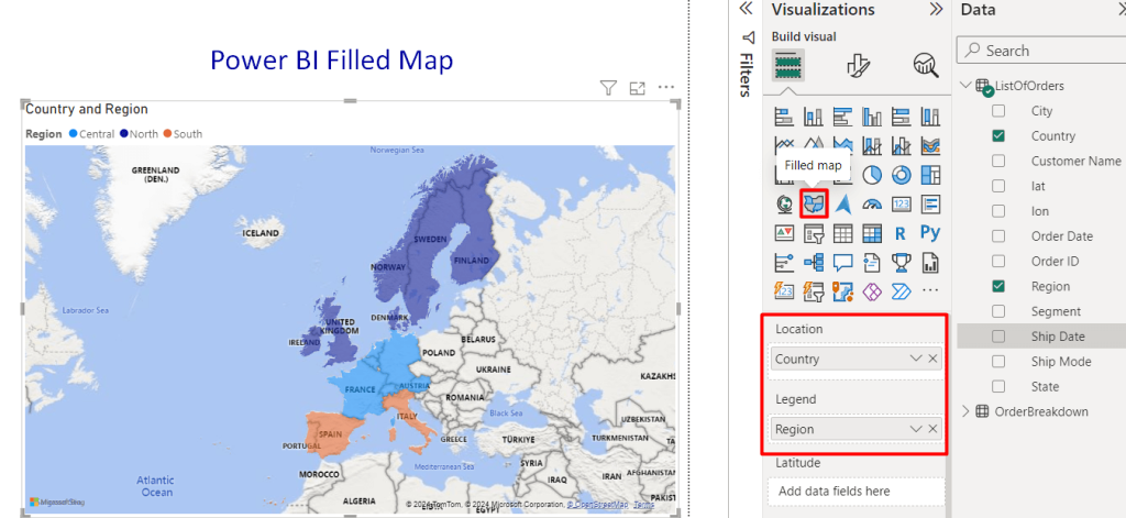
Go to the Visualizations pane. Next, locate the filled map icon and drag it onto your report canvas.
To display the geographical map, assign Location (e.g. country) and data fields such as Legend (Region). The legend in Power BI Filled Map provides a key to interpret the colors representing data categories or ranges.
Here the Central, North, and South regions are categorized by filling 3 different colors.
Customize filled maps in Power BI
To customize filled maps, you need to navigate to the Format visual option. Here, you will find the following options to change the visual styles and general settings.
- Map settings: Customize the filled map theme from the available 5 styles
- Legend: Enable or disable the legend data value
- Fill colors: Select your preferred color to fill the specific areas.
- Tooltips: Add hover tooltips for region-specific data values.
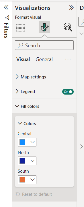
Pro Tip: Use color formatting options to create an effective gradient. Consider using diverging palettes for data with positive and negative values (e.g., green for high, red for low).
Power BI Azure maps
Power BI Azure Maps integrate Microsoft Azure’s cloud-based mapping services into Power BI. This map offers advanced mapping capabilities and access to a wide range of geographical data layers.
These maps enable users to visualize and analyze spatial data with real-time traffic information, weather data, and more.
Key Features:
- 3D view for spatial analysis and visualization.
- Access to real-time traffic, weather, and dynamic geographical information
- Support for routing, geocoding, and spatial analytics.
Use Cases:
- Logistics Optimization: Analyze routes and minimize delivery times with real-time traffic data.
- Location Intelligence: Understand customer demographics and market trends using spatial data.
- Asset Management: Monitor and track the location of assets, vehicles, or equipment using geofencing.
Limitation(s)
- Limited to 30,000 data points (latitude/longitude or locations)
How to create Azure maps Power BI
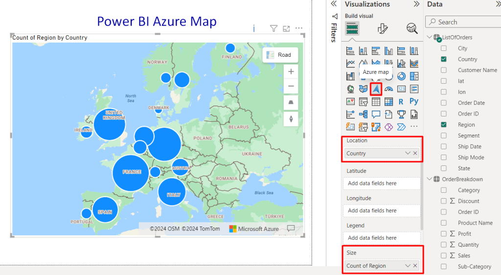
Creating Azure maps in Power BI is similar to the basic/filled maps. You need to drag the Azure map icon and drop it inside the Power BI dashboard.
After that, set the value for geographical presentation such as Country as Location and Count of Region as Size. You can see the bubbles based on the given value. Hover over the bubble-sized to get the associated information of the country and number of regions.
Customize Azure maps in Power BI
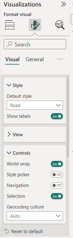
Azure Map offers extensive customization options in Power BI. In addition to the styling options like general settings, and themes, you will find multiple control options. You can turn on/off the controls for World wrap, Style picker, Navigation and Selection.
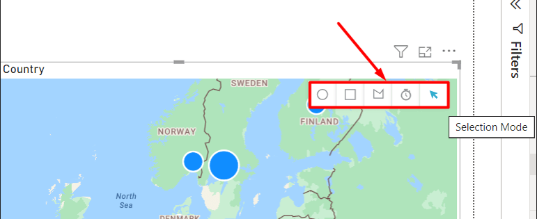
Selection Mode: Selection is an amazing customization option for Azure maps. Click on the icon at the right top corner over the map. You can see 4 options including Range selection. Using this option, you can simply set a custom value for a specific time or distance to search your desired location.
You can also draw a rectangular, circle or polygon area on the map interface to specify a specific geographic region.
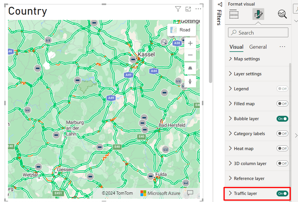
Traffic Layer: Another interesting option in Azure maps is the traffic layer. You can find real-time data on traffic for your specific region. Simply turn on the Traffic layer and zoom in to the desired location. You can see the real-time traffic conditions of the selected area.
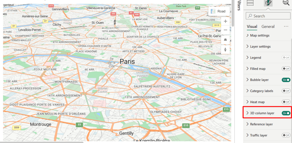
3D Column Layer: Enable the 3D Column Layer on an Azure map to visually present data with vertical columns indicating values or attributes at specific locations.
Power BI treemaps
Power BI Treemaps are visualizations that display hierarchical data using nested rectangles. Each rectangle represents a specific category or subcategory. They provide a compact and efficient way to visualize hierarchical structures and compare data values across different levels.
Key Features:
- Hierarchical data display with customizable formatting.
- Drill down for deeper insights.
- Integrated with Power BI for interactive analysis.
Use Cases:
- Sales Analysis: Visualize product sales by categories for performance insights.
- Organizational Structure: Display departmental hierarchies for resource management.
- Budget Allocation: Analyze expense categories for cost optimization.
Limitation(s)
- Complex and large datasets can clutter treemaps.
How to make Power BI treemaps
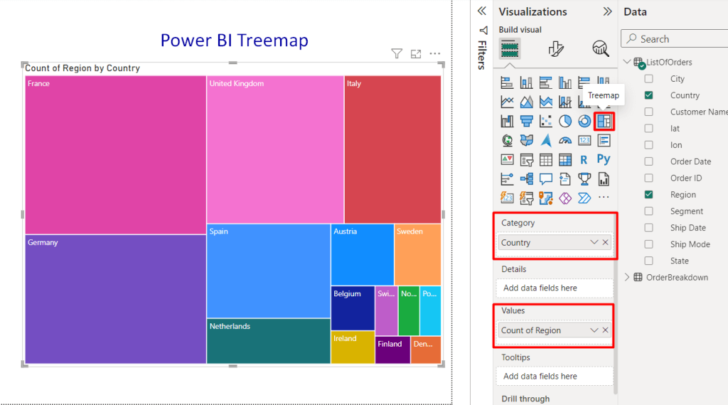
To create a treemap, connect to your data source and load the relevant dataset into Power BI. Next, select the Treemap icon to add a treemap to your report canvas from the Visualizations pane.
Also, drag the desired hierarchical data fields (categories and values) from your dataset into the appropriate fields in the treemap visualization.
Power BI will automatically generate the treemap based on the hierarchical structure of your data, with rectangles representing categories and given values.
For our case, we wanted to depict the regional data of each country. Where the larger the rectangle is, the more regions the country has. You can simply see the exact number via the tooltip by hovering over the particular rectangle.
Customize treemaps in Power BI
In the format Visual tab, you will find treemap customization options such as:
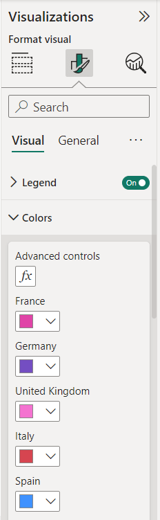
Legend: Customize legend settings for treemaps in Power BI for improved visualization clarity.
Color: Set your preferred color schemes to enhance data representation within treemaps in Power BI.
Data label: Adjust data label appearance and positioning to provide additional insights within treemaps.
Category label: Customize category labels for treemaps in Power BI to improve data categorization and understanding.
Power BI ArcGIS maps
ArcGIS Maps for Power BI is a built-in mapping visualization tool within Microsoft Power BI. It allows you to create interactive maps and leverage spatial analysis to reveal geographic trends and relationships within their data.
Key Features:
- Access to a wide range of geographical data or reference layers.
- Supports complex mapping like heatmaps and clustering.
- Interactivity features such as zoom, pan, and tooltip.
Use Cases:
- Spatial Analysis: Identify spatial patterns, clusters, and relationships.
- Highly Customized Sales Territory Maps: Shows sales territory maps with specific colors, markers, and data overlays for detailed analysis.
- Environmental Monitoring: Track air quality, water pollution, and natural disasters in real-time.
Limitation(s):
- Has a steeper learning curve compared to other mapping options.
How to make ArcGIS maps for Power BI
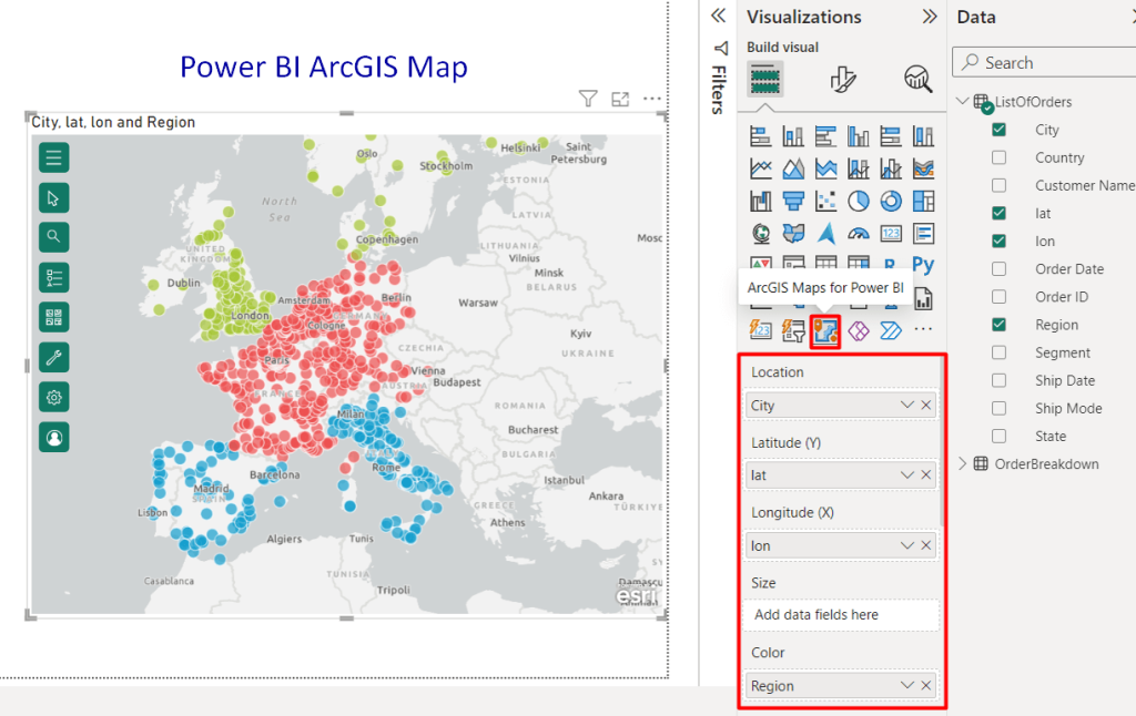
Open an existing report or create a new one in Power BI Desktop. In the Visualizations pane on the right side, find the ArcGIS for Power BI icon and click it. An empty map template will appear on your report canvas.
On the right side, there will be fields for Location and Latitude and Longitude depending on your data format.
Drag and drop your location field into the Location field or enter the appropriate latitude and longitude fields. You can also categorize based on color by adding value in the Color field.
Power BI will automatically populate the map with your data points with spatial data to visualize and gain advanced demographic insights.
Customize ArcGIS maps in Power BI
The customization settings of ArcGIS are different from other Power BI maps. You will find a hamburger menu icon over the created map at the top left corner. Click on it, you can see multiple options to personalize your ArcGIS map, such as:
- Active Layer: Manage which data layer is emphasized on the map i.e. coordinates.
- Search field: Enable search functionality to find specific addresses or locations on the map.
- Coordinates: Display latitude and longitude coordinates for data points.
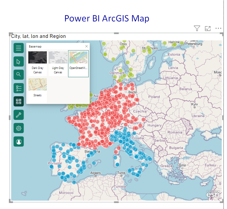
- Basemap: Change the underlying background map style or theme such as Grey Scale Canvas, Light Scale Canvas, Open Street Map, and Streets.
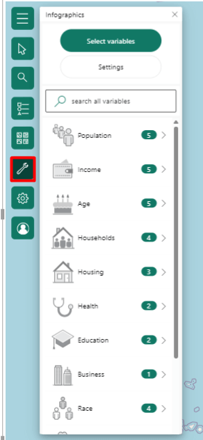
Additional settings: You can also see additional settings for further customization. You can show the selected region with Infographics such as population, age, housing, health, education, etc.
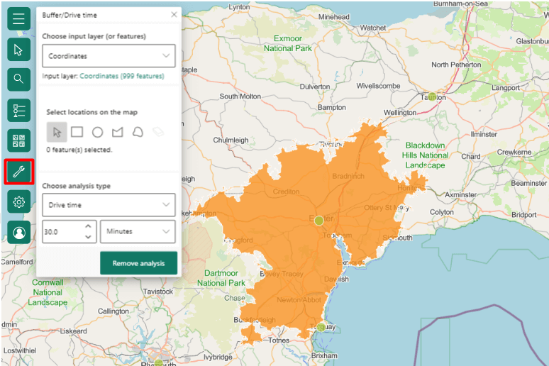
You can also add a reference layer, and find the drive/buffer time in the ArcGIS map. Choose your input layer e.g. Coordinates and then select your location using the selection shape like arrow, circle, rectangle, etc. After that, select the analysis time from the drop-down, including Ring buffer and Drive time. Next, write the time and click on Run Analysis.
For instance, we select the 30-minute distance locations from the city of Exeter. The ArcGIS map shows all the destinations that one can reach within 30 minutes of driving from the city.
Along with these, common customizations are also available for ArcGIS maps in Power BI. You can find the Visual and General settings on the Format Visuals tab. Here you can customize the layout, zoom control, location type, title, effects, header icons, etc.
Power BI shape maps
A Shape map in Power BI is a visualization tool used to compare data across regions using color coding. It focuses on highlighting relative comparisons between different geographic areas rather than displaying precise data points.
Key features:
- Compare data variations across areas.
- Clear insight into geographic trends.
- Adjust colors and highlight regions.
- Works well with large datasets.
- Allows any type of 2D and custom shape
Use cases:
- Custom Geographical Regions: Visualize non-standard maps, like sales territories or custom-defined areas, for data analysis.
- Site Planning: Display zoning districts or land parcels for site development analysis.
- Political Boundaries: Analyze election results or voter demographics using custom political boundaries.
Limitation(s)
- Not available in Power BI service or mobile
How to create Power BI shape maps
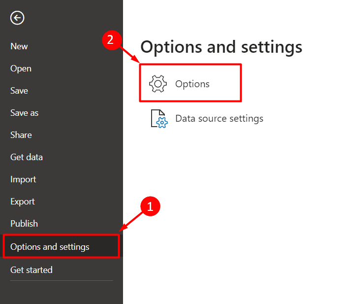
To create a Shape map in Power BI, there’s an initial step since it’s currently a preview feature. First, you’ll need to enable it. Head over to File, then Options and Settings, followed by Options.
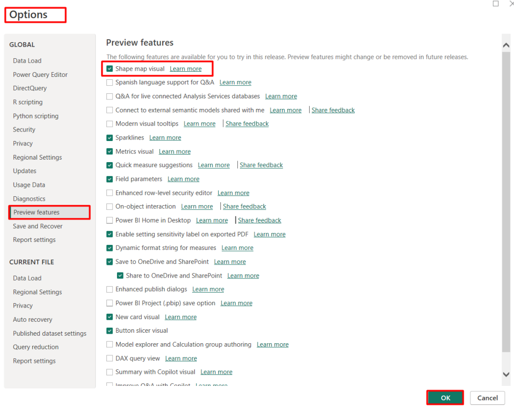
Under Preview features, find the Shape map visual checkbox and tick it. Click OK and don’t forget to restart Power BI Desktop for the changes to take effect.
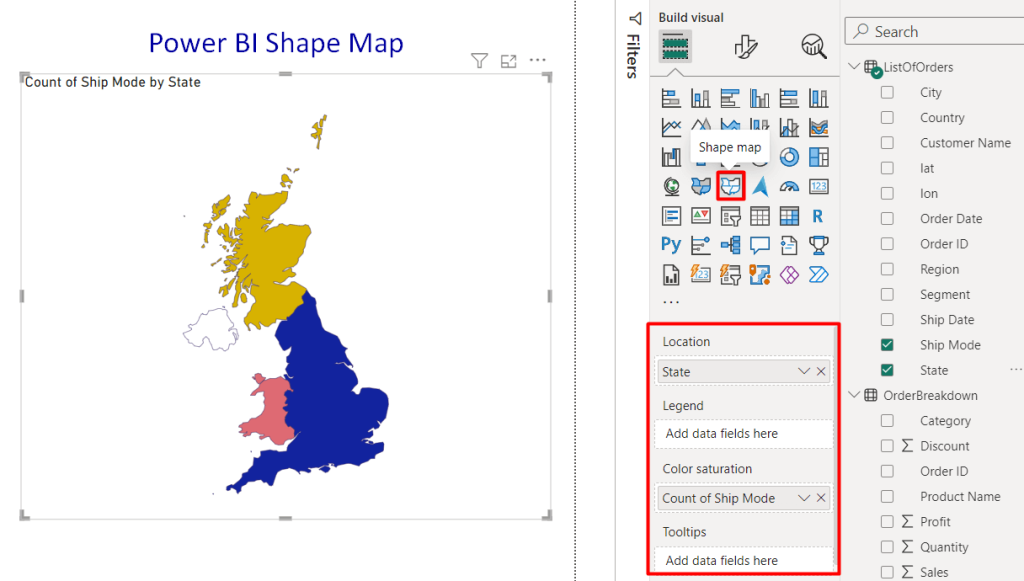
Now you’re ready to build your map! Open your report and navigate to the Visualizations pane. Look for the Shape map icon and select it.
Assigning locations and colors is the same as other Power BI maps. Drag your location field, such as the State names of the UK, to the Location area.
Then, drag your data field, the Ship Mode of the product, to the Color saturation field. Power BI will automatically color each region based on your data values, visually representing your information.
Customize shape map in Power BI
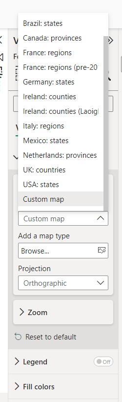
When selecting the location and color saturation value, make sure you have selected the country map that aligns with your dataset.
- Go to the Visual ➡ Map Setting ➡ Map type
- Select the map type from the drop-down e.g. USA: states, Canada: provinces, etc
- If your desired map isn’t in the drop-down, simply browse the JSON file of the custom map type.
- Choose the Projection type such as Orthographic, Equiretancgular, and Mercator. This will help you to adjust the map of how the 3D Earth is flattened onto a 2D map to best represent data.
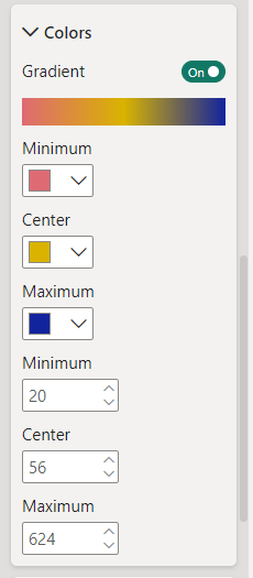
Additionally, you can customize the zoom and legend options for shape maps. You can also set general or gradient colors. Also, select the fill colors to choose the minimum, medium, and maximum values.
How to use maps in Power BI
You can use the Power BI map visualization to enrich your data analysis and drive informed decision-making within your organization. Let’s see how to add more functionalities to use maps in Power BI:
Apply Power BI maps to multiple layers
You can add separate data sources as individual layers on your map. It helps to create a more comprehensive visualization.
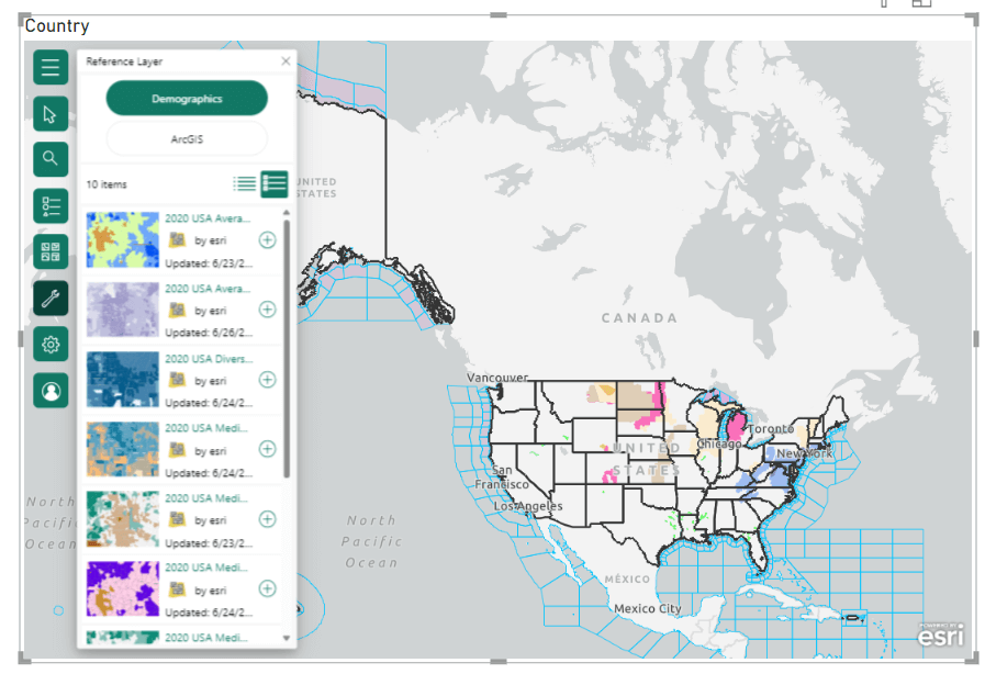
To apply multiple layers, you can take advantage of the ArcGIS map. It offers reference layering functionality. Navigate to the hamburger menu on the ArcGIS map, then click on the Reference Layer option.
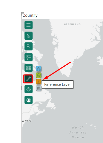
You can see the reference layer suggestions. Choose the preferred data layers and click on the plus (+) sign to add over the map.
If you want to add layers on other types of maps, simply place your main map and create separate Power BI charts or tables for additional data layers. Then, position them strategically to complement the map visually.
Use interactive elements
Power BI maps come alive with interactive elements. These allow you to explore your data dynamically. Here are some ways to enhance interactivity:
- Data Labels: Display data point values directly on the map for quick reference.
- Tooltips: Add informative tooltips that reveal additional details when hovering over data points.
- Map Themes: Change the map theme (e.g., “Road,” “Gray,” or “Dark”) to enhance visual clarity or match your report’s overall aesthetic.
- Color and Styles: Utilize color palettes and marker styles to visually represent data effectively. Consider using diverging palettes for data with positive and negative values, and adjust marker size or color intensity based on data point values.
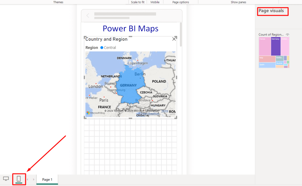
Make your maps mobile device responsive
You can also optimize Power BI maps for mobile by using responsive layouts and testing on different screen sizes. You can find Desktop View Mode and Mobile View Mode at the bottom of the Power BI canvas.
Choose the Mobile View Mode, then simply drag-and-drop the maps and other elements from the page visuals. Adjust the layout size, text size, color and other properties.
FAQs on using maps in Power BI
Are there bubble maps in Power BI?
Yes, you can create bubble maps in Power BI. The basic and Azure maps offer bubble visualization to represent data points with varying sizes and quantitative values.
Can I find the default flow map in Power BI?
No, you cannot find a default flow map functionality within Power BI. You need to use external mapping tools or online mapping platforms that specialize in creating flow maps.
How to create Power BI overlay maps
In Power BI itself, a true overlay map where you visually stack data layers on the same map isn’t currently possible. You need to use third-party apps or custom Power BI visuals to achieve overlay map properties in Power BI.
Which Power BI dashboards can benefit from map visualizations?
Any report that has location-based data can contain map visuals. For instance, here is a Facebook Ads dashboard by Coupler.io with the map visual showing clicks by country.
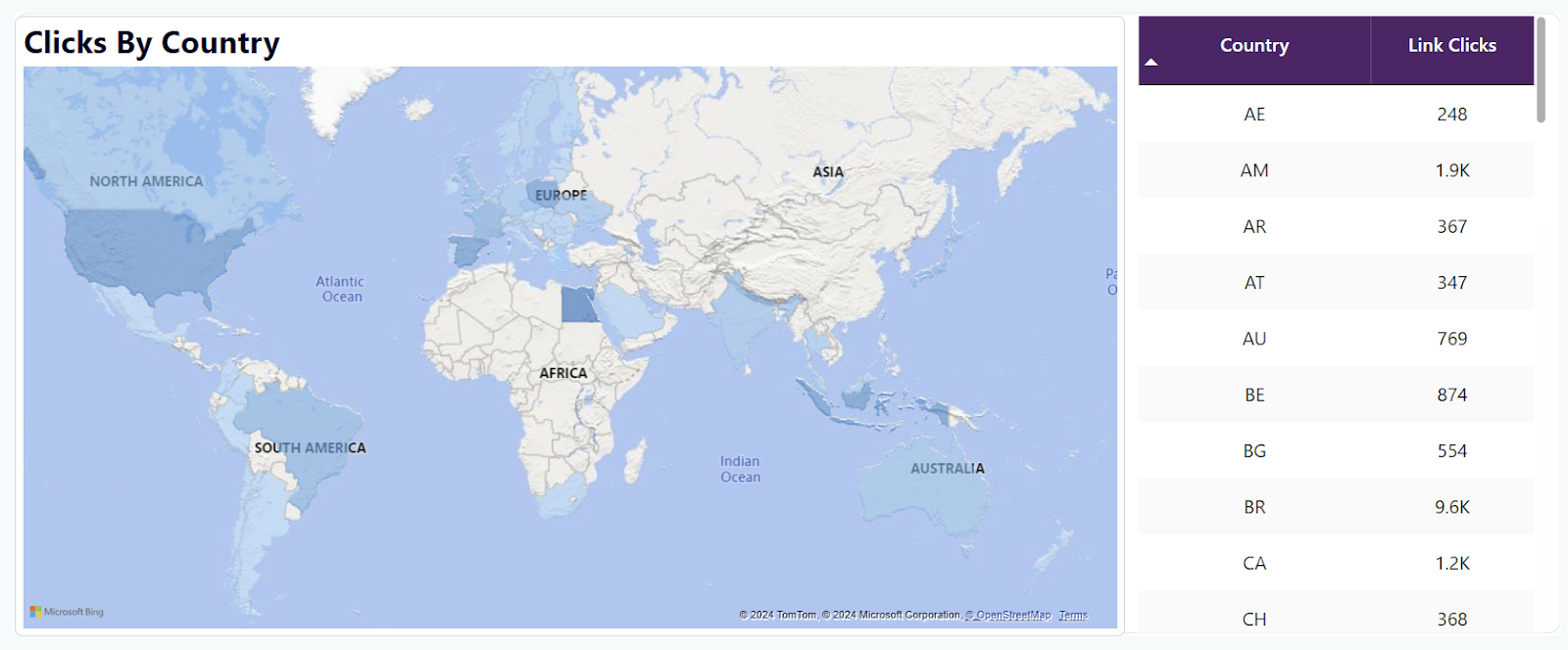
It is a dashboard template meaning you can easily start using it without the need to create visualizations from scratch. Check out other Power BI dashboard templates by Coupler.io
The value of map visualizations for decision-making
Visualizations of data are crucial to bridge the gap between information and decision-making. They are effective communication techniques that help make decisions powered by data. In this regard, map-based dashboards transform location-based raw data into actionable insights. Therefore, combining interactive maps with KPIs lets you visualize research findings in a user-friendly format.
Connect your cloud data sources to Power BI with Coupler.io
Get started for free