The chaos of unstructured marketing data
Imagine thousands of jigsaw puzzle pieces from different sets all mixed together in a single box. Without structure or arrangement, it’s impossible to make sense of what’s in front of you, even when you can see the potential for complete pictures.
That’s what dealing with scattered marketing data is like. Except instead of one disorganized box, you’ve got dozens of them ?
These days, businesses use an average of 112 SaaS apps to manage operations across departments. This creates a problem where marketing data becomes siloed within various tools, such as those for sales, marketing, and customer service. However, it’s not the only reason many organizations struggle to get a clear view of their marketing performance. Centralizing your data is one thing; cleaning and transforming it is another.
Ultimately, when your team can’t easily access or draw insights from available data, it leads to issues like:
- Delayed decision making. You spend more time looking for the right data than making data-driven decisions. Eventually, this analysis paralysis costs your business money, productivity, and competitive advantage.
- Strategy misalignment. When your team has limited access to reliable, high-quality data, they tend to rely on assumptions over facts. This makes it difficult to execute an effective marketing strategy and keep everyone on the same page.
- Missed opportunities. You can’t act on what you don’t see. Without the correct data to guide you, it’s easy to overlook opportunities to re-engage cart abandoners, target emerging audiences, or boost sales based on seasonal purchasing patterns.
What is the role of data management in marketing?
Data management in marketing encompasses more than just cleaning and consolidating data for informed decision-making. It’s about implementing repeatable (or automated) processes that simplify routines and bring a sense of order to your marketing data analytics. For example, you may:
- Transform your data to reveal actionable insights. The goal is to find the most efficient way to analyze and store your data. For instance, instead of tracking daily users in GA4, you could aggregate traffic by week or month to uncover meaningful engagement trends.
- Collect and combine data from different platforms. With tools like Coupler.io, you can easily consolidate data from disconnected sources such as Salesforce and Google Sheets. This allows you to monitor marketing efforts more closely and identify opportunities for optimization. For example, by combining ad campaign results from multiple PPC platforms, you can gain a better understanding of spending patterns and identify which audiences convert most effectively.
- Establish naming conventions for all marketing metrics, which prevents inconsistency in reports. This means choosing ‘cost per lead’ and sticking with it, rather than switching between ‘cost per acquisition’ and ‘lead acquisition cost.’ Consistent naming saves everyone time and confusion in the long run.
- Store historical data for better decision-making. Automating daily or weekly backups of your marketing data helps protect against data security breaches and platform storage limitations. It ensures you always have access to historical data, allowing you to make informed strategic decisions based on annual trends and seasonal patterns.
More broadly, proper marketing data management has several practical benefits for businesses and marketing teams.
Time and cost savings
Organized data is the key to making data-driven decisions in minutes rather than days or weeks. Instead of spending hours searching for insights in a disconnected database or spreadsheet, you can focus on tasks that drive business results.
For example, Sellthru – a client of ours – saved 20 hours of manual labor each month by automating data mapping with Coupler.io. On a similar note, data storage and related costs tend to be lower when your data is well-managed (i.e., no more complex than it needs to be). This is why data management in marketing has become essential for teams looking to maximize their productivity and budget efficiency.
Clearer visibility into marketing performance
Evaluating the impact of marketing channels and campaigns begins with access to fresh, accurate data. The better organized your datasets are, the easier it is to analyze performance and make informed decisions. For instance, if your consolidated data identifies YouTube and TikTok as top-performing channels, that’s a clear indication to increase your marketing investment in video content production.
Improved customer understanding
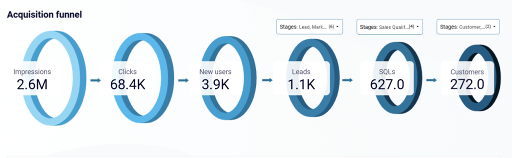
Well-organized data provides insights into customer behavior and purchasing habits. It enables you to map the customer journey, identify new promotional opportunities, improve targeting through segmentation, and address critical leaks in your marketing funnel. This helps you create more effective retention and acquisition strategies.
Campaign optimization
Nuanced, consolidated campaign data helps you quickly identify what’s working – and what’s not. This information allows you to make targeted optimizations over time, such as adapting ad content for higher engagement or creating personalized email campaigns for specific audiences.
Basic organization techniques for marketing data management
To get started, let’s explore some of the most straightforward techniques for data organization:
Data filtering
Filtering is the process of refining a raw dataset by removing irrelevant metrics or dimensions. It allows you to fine-tune the information that appears in a spreadsheet or report, making your data analysis more focused and actionable.
You can filter data after exporting it, but it’s easier to do it on the go. Coupler.io is more than just an ETL for marketing data. It’s a data integration and AI analytics platform that lets you build automated data flows using data connectors for marketing platforms. The preview tool (i.e., Transformations module) also enables you to make strategic changes to your data, such as filtering by date or marketing metric.
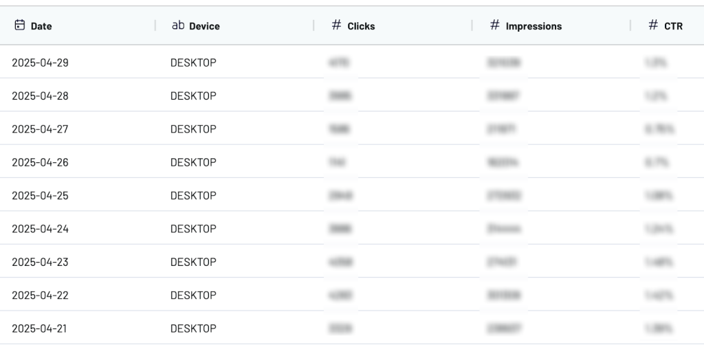
For example, let’s say you are building a report to evaluate last month’s blog traffic and engagement performance. After importing a batch of data from Google Search Console to Coupler.io, you now need to refine the scope by applying filters. In this case, you can adjust the dataset to display one month’s worth of data and filter by device to focus on the traffic generated by desktop users.
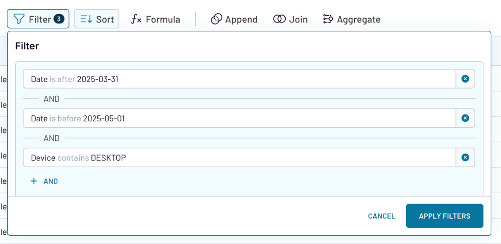
Once the filters have been applied, you’ll get a refined view of your blog performance data. As an added benefit, filtering by month reduced the volume of data from 2500 rows to 30. Here’s a snapshot of how it looks before export:
You can also choose to hide specific columns (e.g., impressions) if they are not relevant to your analysis. In Coupler.io, simply click on the header of the undesired metric/dimension and select ‘hide column’.
Data sorting
Sorting involves arranging data in a meaningful order based on a common attribute. It’s one of the fastest ways to identify patterns and outliers in your data.
For example, sorting email contacts by open rate or clicks can help you segment the list into active vs. inactive subscribers. This way, you can create personalized email marketing campaigns to boost engagement across both segments.
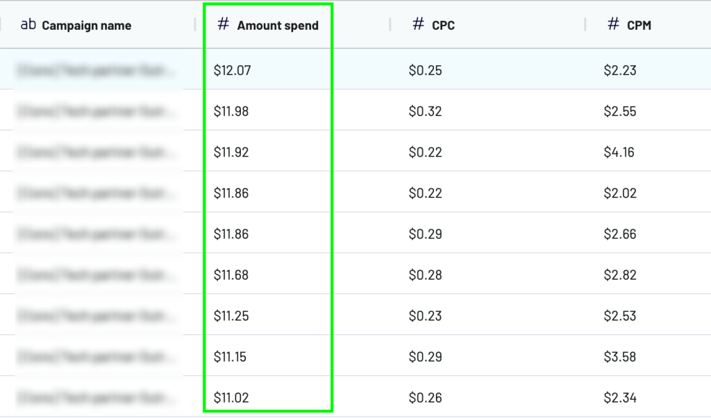
Suppose you want to quickly organize your Facebook ad campaign performance data by the amount spent. This will make it easier to identify which campaigns are consuming the most budget. If you use Coupler.io for reporting, you’ll be able to preview your data from Facebook Ads and sort it from highest to lowest (9?1), choosing Amount Spend as the dimension.
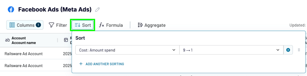
This is how the data preview appears once it’s sorted. As you can see, the campaigns with the highest spend amount are shown first alongside other (unsorted) metrics. Later on, you can load this refined dataset into a spreadsheet or BI tool.
Categorical systems
Categorization involves grouping similar campaigns, audiences, or content types under specific labels. For example, if you collect first-party customer data through a survey, categorization enables you to group the responses by customer characteristics, such as gender, location, role, and how they found your company. This makes retrieving and analyzing data more efficient in general.
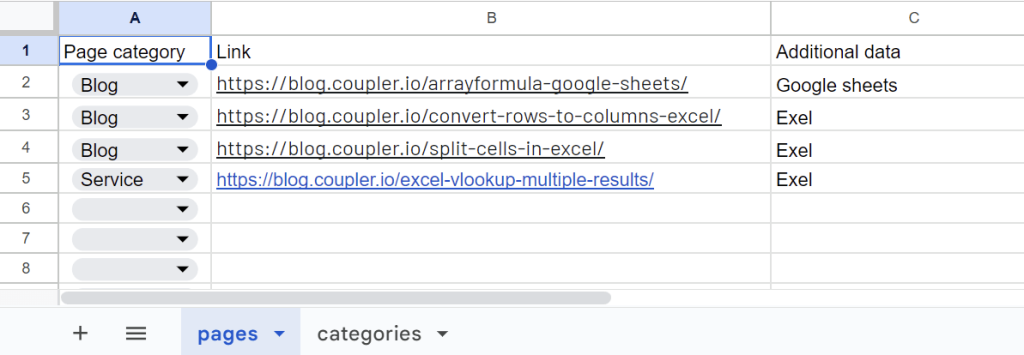
While many marketing platforms have built-in categorical systems, others don’t, and this can make organizing raw data more complicated. For instance, Google Search Console (GSC) lacks a native content grouping functionality. As a result, it’s difficult to evaluate the combined performance of related web pages in a report.
This is where data blending software like Coupler.io can help. In the Transformations module, it’s possible to blend data from various sources, such as a marketing platform and a spreadsheet. In this case, you could create a spreadsheet with custom categories (e.g., Blog, Service, as shown below) and combine it with your GSC data.
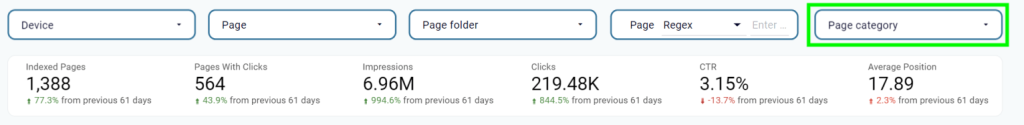
This will allow you to explore and filter your data by page categories in the final report. For example, here’s how the categorization function might appear in a Looker Studio report:
Data consolidation strategies for unified marketing insights
Following on from our previous example, let’s discuss methods for consolidating data from different sources. This organizational technique enables you to draw unified insights from the initiatives you run across various platforms and marketing channels. For instance, by blending data from multiple social media platforms, you can get a clearer picture of overall performance.
There are two main ways to combine datasets:
- Append – stacking two or more similarly-structured datasets on top of each other.
- Join – merging two or more datasets side by side using a common field, such as a campaign name or date period.
Append
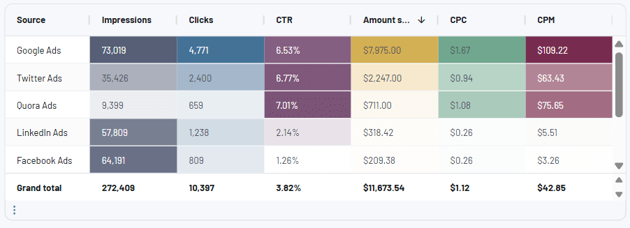
The append method is the most convenient way to combine data from datasets with shared metrics and dimensions. Let’s take an example where you want to review ad campaign performance across Google Ads and Facebook Ads. These sources have several identically-named metrics, so appending the data will be quite straightforward.
Coupler.io not only supports these and numerous other ad sources but also enables you to consolidate data from them in a single view. You only need to click ‘append’ in the Transformations module and select both sources (Facebook and Google). In the new, appended view, we can see the datasets stacked on top of each other and their results based on shared metrics:
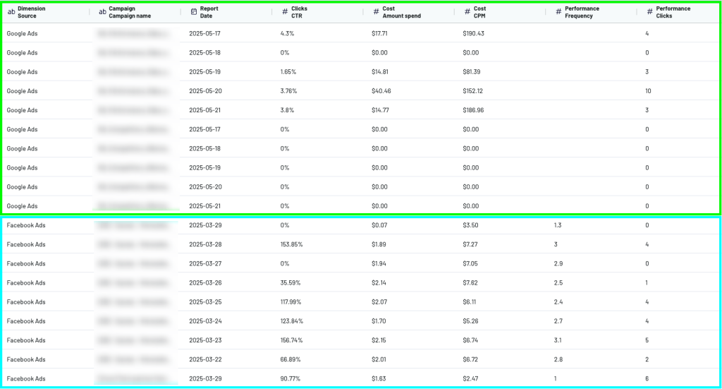
It’s worth noting the empty space in Google Ads under the ‘frequency’ metric. This occurs when one or more metrics or dimensions aren’t present in both datasets. It also occurs when the same metric has different names, for example, ‘CPA’ in Facebook and ‘acquisition cost’ in Google. For the append function to work smoothly, be sure to rename or add new columns based on what’s missing in each dataset. We’ll explain exactly how to do this later on.
Join
The join method is useful when you want to understand how activity on one channel impacts the other. Multi-joins can even give you visibility into the entire marketing funnel, from awareness (e.g., ad campaigns on Facebook) to conversion (e.g., warm leads in HubSpot).
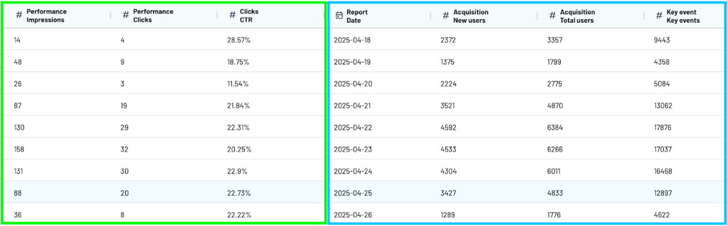
To keep things simple, let’s look at an example of joining data from Google Ads and GA4 using Coupler.io. Imagine you want to understand how your ad campaigns have impacted website traffic and engagement over the past 2 months. You can join data from your ad and GA4 accounts by the ‘report date’ dimension to streamline analysis.
As you can see, the data from Google Ads (left) and GA4 (right) can now be viewed side by side. It will also appear this way in your eventual report.
Methods of consolidating data in visualization tools
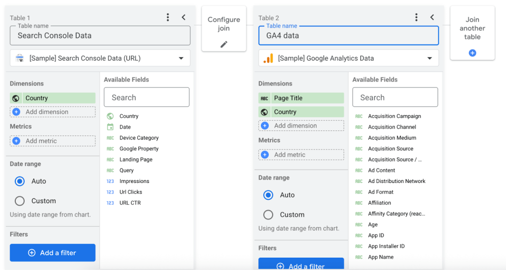
If you decide not to consolidate your data before exporting it, you can occasionally make these changes in the destination reporting tool. For instance, Google Sheets allows you to join data using formulas, whereas Looker Studio features built-in data blending capabilities. On the other hand, platforms like Power BI and Tableau Public are much less flexible in this regard.
If you use Looker Studio as your BI tool, it offers multiple ways to unify your datasets via the Join function. For example, you can choose between a left, right, inner, cross, and full outer join. This means you have complete control over how your records are matched between datasets, whether you want to include all columns from one dataset regardless of matches (like Coupler.io’s left join), only include matching columns, or include everything from both datasets.
However, consolidating data in Looker Studio comes with a catch. It’s notorious for experiencing performance issues, such as freezing and slow loading times. The platform often struggles with large datasets as it processes data blending queries in real-time, calculating joins on the fly each time a report loads. This is something to consider if you don’t plan on using an automation tool like Coupler.io for marketing data management and consolidation.
Aggregation approaches for digital marketing data management
Data aggregation enables you to summarize data by performing calculations like sum, average, count, minimum, or maximum. It helps drill down into your marketing data and reducing the density of your reports. For instance, suppose you have a webpage dataset that shows the number of daily impressions for the past 12 months. Aggregation makes this dataset easier to analyze by decreasing the number of rows from 365 (one per day) to 52 rows (weekly view) or 12 rows (monthly view).

Coupler.io allows you to export the aggregated data to a BI tool or spreadsheet. As a result, you only see the information that matters, and can avoid doing time-consuming calculations in visualization tools like Google Sheets or Power BI.
Let’s explore the different applications of aggregation in more detail:
Time-based aggregation
As we mentioned above, aggregating data by week or month is a handy way to group performance data into manageable chunks. It helps you focus on results from a specific timeframe to spot trends, outliers, and gauge progress toward goals.
Time-based aggregation also minimizes the granularity of your marketing data. Instead of getting bogged down in daily details (e.g., fluctuating engagement rates, random unsubscribes), you can tune into broader performance patterns and make informed decisions based on the big picture. Additionally, archiving weekly or monthly aggregations over daily data is a more efficient way to store and manage data in the long term.
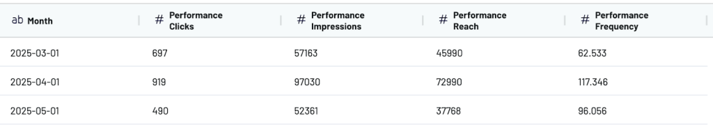
Suppose you wanted to view a performance summary of your Facebook Ads data for the past 3 months. Using the Coupler.io Transformations module, you would need to create a new column (i.e., month), choose it as the dimension in the aggregate function, and select your desired metrics. For demonstration purposes, we used clicks, impressions, reach, and frequency. Here’s how the final aggregated view looks:
Summarization
Large, complex datasets can be two things at once: cluttered and full of valuable information. With aggregation, you can summarize this data and extract key takeaways, such as regional trends or engagement patterns.
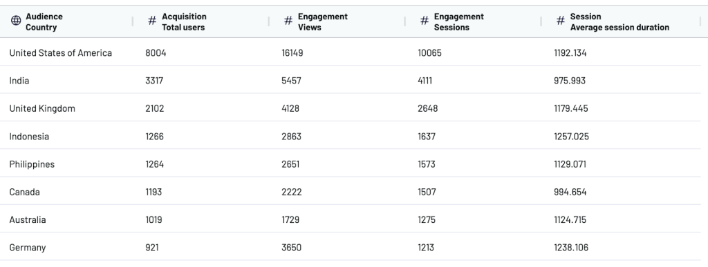
Suppose you are in the early stages of a website localization project. To prioritize your efforts, you need to identify which countries generate the most users and how these audiences interact with your site. This is possible by aggregating demographic and traffic data from GA4.
Coupler.io provides a straightforward approach to performing summarizations outside of GA4’s cluttered interface. After connecting your data and configuring the relevant dimensions/metrics, the aggregate function will appear in the Transformations step. There, you can choose which dimension and metrics to combine for a summary analysis.
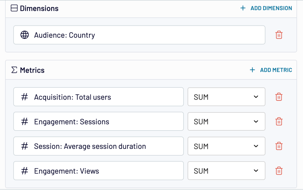
In this localization case, it makes sense to compare the sum of traffic and engagement across countries. Here’s a snapshot of the summarized data:
Periodic archiving of raw data
Aggregation also offers an alternative to storing massive volumes of raw, event-level data in your data management platform. You can use it to summarize metrics and control the depth of information you retain.
For instance, instead of storing every detail of marketing campaign data exported from a platform, aggregation allows you to retain key performance indicators, such as impressions, clicks, and conversions, grouped by campaign type or channel.
On the one hand, this reduces the complexity of your databases, enhancing their searchability and loading speed. On the other hand, it helps you better manage the storage limitations set by certain tools (e.g., 1GB in Power BI’s free plan).
Handy alternative to manual transformations: prebuilt dataset templates
Dataset templates are a convenient option when you want to analyze combined data in a single dashboard, but you don’t want to go through the trouble of joining or aggregating the data yourself. They can also save you time and reduce the risk of error when preparing data for analysis.
Coupler.io provides a selection of these templates as a quick alternative to setting up a data flow from scratch. There are several options for different use cases, such as when you need to analyze audience engagement in Facebook Ads or understand how your PPC campaigns perform week over week.
The dataset templates come with preselected sources and preconfigured transformations. All you need to do is choose the template that best fits your needs, connect your marketing accounts, make any desired tweaks, select an aggregation to export, and load the data to your preferred destination (e.g., Looker Studio, Power BI).
Advanced transformation techniques for data management in digital marketing
Let’s explore a few more advanced approaches to data transformation and how they can help you manage your data needs more efficiently.
Create new calculated columns
If you want to extract deeper insights from your datasets, adding columns with new metrics is a useful workaround. This approach enables you to surpass the metric export restrictions of certain tools (e.g., Facebook Ads’ 10-metric limit) and create custom performance indicators, such as ROAS, engagement rate, or CPL.
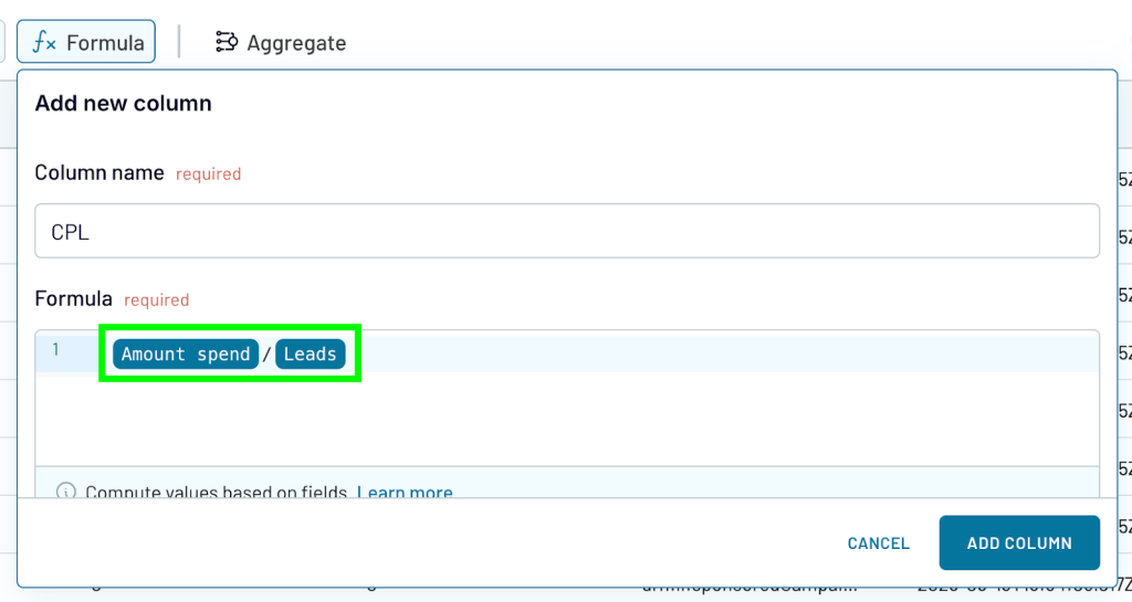
Let’s explore an example of adding a CPL (cost per lead) metric to a LinkedIn Ads dataset. Again, we can do this in Coupler.io using the formula function – it’s quick and easy.
To calculate CPL, we need to divide two existing metric columns: amount spent and number of leads. There’s no need for complex formulas in this case.
When creating calculated metrics, always ensure that your data points share the same time frame. For instance, if you’re calculating CPL using daily data, the metric will be valid for daily analysis only. Weekly or monthly CPLs must be calculated separately.
In the Coupler.io transformations view, the result looks something like this:
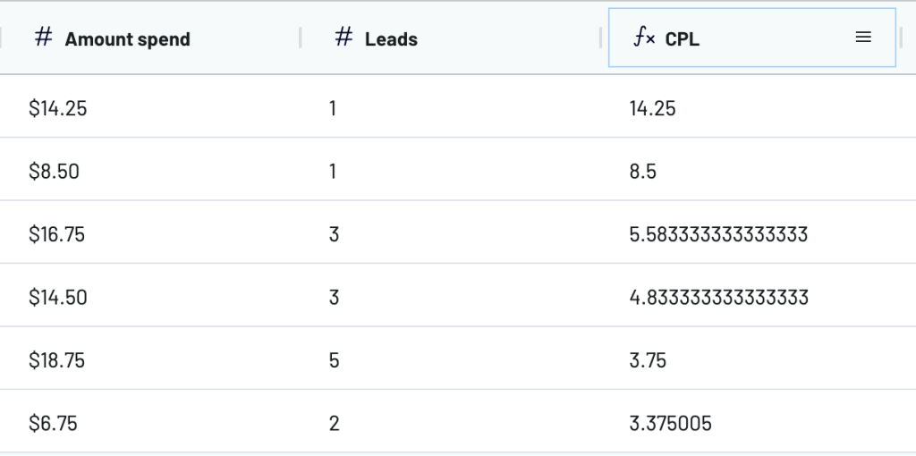
Now you can track how ad spending converts to leads for your business. All in all, adding new calculated columns is a straightforward way to introduce more structure to your data without requiring a significant investment of time.
AI-powered transformations
Generative AI tools like ChatGPT are changing how data management in digital marketing gets done by turning tedious manual work into quick, automated processes. They offer a quick way to summarize or refine datasets, without the need for manual fixes and complex formulas.
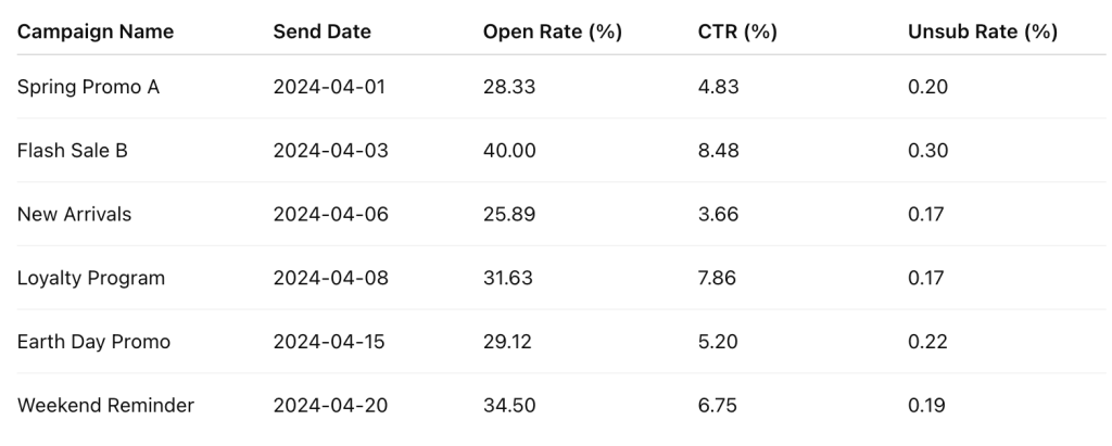
Let’s imagine you want to analyze email campaign data to assess performance for the month. Before sending this data to a report, you need to clean it up and calculate new metrics. First, you download a CSV file from your email marketing platform and upload it to ChatGPT. The prompt might go something like this:
‘Analyze this email campaign data and calculate open rate, click-through rate, and unsubscribe rate for each campaign. Show only the data for April 2024.’
Now, instead of a large raw dataset with several columns (recipients, opens, unsubscribes, subject lines), you get a streamlined overview based on key metrics.
The problem with using Gen AI tools for data organization is that the process is separated from data flow automation. You have to perform several manual downloads and uploads before you can view your prepared data in the final report.
Besides tools like ChatGPT, some data storage solutions and BI platforms provide transformations powered by AI.
For example, Dataprep by Trifacta is a Google Cloud integration that uses machine learning to suggest data cleaning and structuring steps (e.g., removing duplicate leads and grouping data by region). Meanwhile, the CoPilot feature in Microsoft’s Power Query lets you apply transformations through plain-English prompts, for instance: ‘Add a column that averages open rate and click rate.’
Keep in mind that these tools are typically more expensive and complicated to use than AI platforms, however.
Standardize metrics across disparate platforms
Marketing metrics often go by different names on different platforms. For instance, GA4 defines website visitors as ‘users’, while Shopify calls them ‘visitors.’ This can cause problems when your team is preparing reports for analysis and review. It can lead to duplication (in this case, skewed acquisition stats) or time-consuming errors during the data collection and consolidation process.
That’s why it’s better to standardize cross-platform metrics in advance. Here are some suggestions:
- Establish naming conventions. Agree on a common name for metrics that are identical across platforms. For instance, use ‘clicks’ consistently instead of a combination of ‘link clicks’ or ‘click-throughs.’
- Prioritize metrics based on data-driven marketing goals. Focus on the metrics that matter to your specific objectives. For example, if your goal is lead generation, concentrate on form completions and CPL over metrics like reach and impressions.
- Edit metric names or hide columns. When combining data from different sources, it’s best to make sure columns have the same names and structure.
You can edit or hide columns during the transformations step in Coupler.io. For instance, let’s say you connected several ad accounts and wanted to consolidate this data in a single report. First, ensure that metrics are identically named across datasets. Click on the column you wish to amend and select ‘edit column.’ Then enter the new name and apply the change, as shown below:
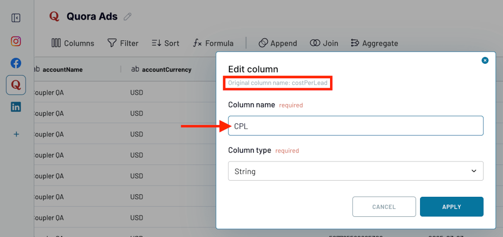
Repeat this process as many times as needed across all your connected sources.
How to build a storage and backup strategy for marketing data management
A solid storage and backup strategy is the foundation of effective digital marketing data management. When your information is properly secured, your team can focus on mapping touchpoints, extracting insights, and making decisions, rather than worrying about potential losses or accessibility issues. Let’s explore the key steps:
1. Audit your data sources
The first step is to determine the scope of your marketing data. Which analytics tools and customer data platforms are you actively using to track performance and customer experience? Which marketing sources do you no longer turn to for insights?
The main goal is to identify the sources (e.g., Google Ads, HubSpot, Mailchimp) that contain relevant and/or sensitive data. It’s important to check the data quality of these sources to ensure you don’t waste time importing incomplete or inaccurate records.
2. Choose the right storage solution
Your next priority is to choose an appropriate location to store data from those sources. The right option will depend on the amount of data you accumulate, the size of your organization, and your level of technical expertise.
For example, marketing data warehouses like BigQuery and RedShift can be pricey and have steep learning curves, but they’re designed to handle the substantial data processing needs of larger enterprises. PostgreSQL offers secure and scalable infrastructure, but you’ll need some technical knowledge to navigate it.
For companies with smaller data needs, platforms like Airtable or Google Sheets are often sufficient. They also don’t require SQL expertise or expensive subscriptions. However, these platforms lack the scalability and security features of purpose-built data management platforms, such as BigQuery.
Read more about the mechanics and nuances of marketing data integration.
As you weigh up your options, it’s also worth considering how features like incremental fetching can help you better manage your storage needs. The feature is available in Coupler.io by default and lets you securely store data based on your import and refresh activity. Instead of reloading the entire dataset with every update, incremental fetching retrieves only the new or updated records. This reduces load times, cuts storage usage, and protects against API limitations or instabilities. For example, if Meta’s systems experience temporary downtime, your existing data will remain secure and accessible.
3. Automate data ingestion
The next step is to automate the flow of data from your sources to your storage solution. This way, you won’t need to perform time-consuming backups by manually exporting records from individual platforms.
Coupler.io enables you to create automated data flows from over 60 sources to destinations such as Google Sheets, Excel, BigQuery, and Redshift. The whole process – from connecting a marketing account to scheduling regular imports – typically takes less than 5 minutes. You can also customize the frequency of data ingestion to suit your storage solution, choosing from hourly, daily, weekly, or monthly intervals. The timezone and time preferences (9 am-5 pm) are also fully configurable.
4. Monitor and review regularly
It’s important to remember that creating a data storage and backup strategy is not a one-time task. As your marketing team and business grow, you will accumulate greater amounts of raw data and face new challenges. This evolution is why data management in digital marketing isn’t a set-it-and-forget-it process — storage costs, security requirements, and marketing data pipelines all become more complex.
Review your data management strategy regularly (every quarter, for example) and make any necessary adjustments. It’s also a good idea to set up alerts so that you’re immediately notified of any issues with data syncing or failed backups.
Marketing data management tips for optimized collaboration
Before we wrap up, here are some tips on how to keep your digital marketing data management processes running smoothly when working as a team.
Track marketing sources over time
A tip to make auditing easier: Keep a clear record of your marketing data sources, from Google Sheets and BigQuery to HubSpot and Ahrefs. This will help you stay on top of accumulating data and ensure you only draw insights from the most up-to-date sources.
Manage access to marketing data sources
Limiting access to marketing platforms helps protect data integrity and mitigate the risk of security breaches. This is a key part of maintaining enterprise data security, ensuring only authorized users touch sensitive information. Role-based access control is the most flexible approach. For instance, in GA4, you can assign roles such as Admin (full account access and editing permissions), Marketer (limited creation and editing permissions), and Viewer (only permitted to read data and adjust reports).
Set up data workflows and templates
Establish and document repeatable workflows for recording, organizing, and analyzing data. This reduces manual effort, prevents duplication, and keeps the team aligned. For example, marketing dashboards templates allow you to save time on structuring data for analysis. They also provide a single source of truth, making it easier to compare KPI performance over time.
When your marketing data is well-organized, you can make decisions more quickly and empower your team to act effectively. We hope that some of the approaches discussed in this article – filtering, blending, categorizing, and aggregating – help you take better control of your data and find structure among the chaos.
If you want to learn more about how Coupler.io can solve your specific marketing data management challenges, don’t hesitate to contact our team. Book a 30-minute call with our experts in a couple of clicks: