
12 Client Reporting Dashboards Every Agency Should Have in Their Stack

Agencies live and die by their reporting. Clients want proof that the budget is working. Account managers want to stop spending half their week assembling spreadsheets. They log into five platforms, cross-reference numbers, reformat the data for different clients, and hope nothing looks off before the weekly call.
A client reporting dashboard gives both sides what they need. Clients get a clear and up-to-date view of performance. Agencies get out of the manual reporting grind without dropping quality.
Coupler.io has built over 200 dashboard templates to automate reporting for agencies, marketers, financial experts, ecommerce businesses, and more. From that library, I’ve put together 12 client reporting dashboards that are most useful for agency reporting. Find the ones that fit your client mix and put them to work.

Get client reports built for your agency by Coupler.io
Book a demoHow dashboards improve communication with clients
Before getting to the dashboards themselves, here’s what makes them worth adding to your stack in the first place.
- Real-time visibility: Clients no longer have to wait for the monthly report or schedule a call to find out how their campaigns are performing. Interactive dashboards give them access to fresh numbers at any point. It reduces back-and-forth and builds trust over time.
- Consistent reporting format: When every client gets a clean and structured view of their data, there’s less room for confusion and fewer questions about what a metric means. Consistency also makes it easier for account managers to spot anomalies.
- Faster performance reviews: When data is already laid out visually, check-in calls are shorter and more focused. Instead of walking clients through raw numbers, account managers can spend that time on what actually matters, like what the data means and what to do next.
- Transparent accountability: Dashboards make performance visible in both directions. When campaigns are working, clients can see it clearly. When something isn’t, there’s no ambiguity. It is easier to have honest conversations and course-correct quickly.
- Scalability across accounts: One well-built dashboard template can be replicated across every client account. As the agency grows, reporting doesn’t become proportionally more expensive in time or effort. The same structure scales with the business.
Types of client reporting dashboards
Not every client needs the same view of their data. A paid social client wants to see platform-level metrics. An SEO client wants traffic and rankings. A client running campaigns across five channels wants everything in one place.
All 12 are ready-to-use report templates organized into three categories.
- Platform-specific
- Channel-specific
- Multi-channel
You can match the right dashboard to your client’s scenarios.
If most of your clients run on a single channel, I’d start with the platform-specific dashboard examples. They’re the fastest to set up and the easiest for clients to understand at a glance.
Platform-specific client reporting dashboards
These dashboards are built around a single ad platform: Facebook, Google, LinkedIn, and more. Platform-specific client reporting dashboards go deeper than a multi-channel view can and surface the metrics that actually matter for that platform. For example, creative frequency on Facebook, Quality Score on Google, and lead form performance on LinkedIn. When a client’s primary budget lives on one platform, and they need more than a top-line summary, these are the dashboards to look for.
1. Facebook Ads dashboard
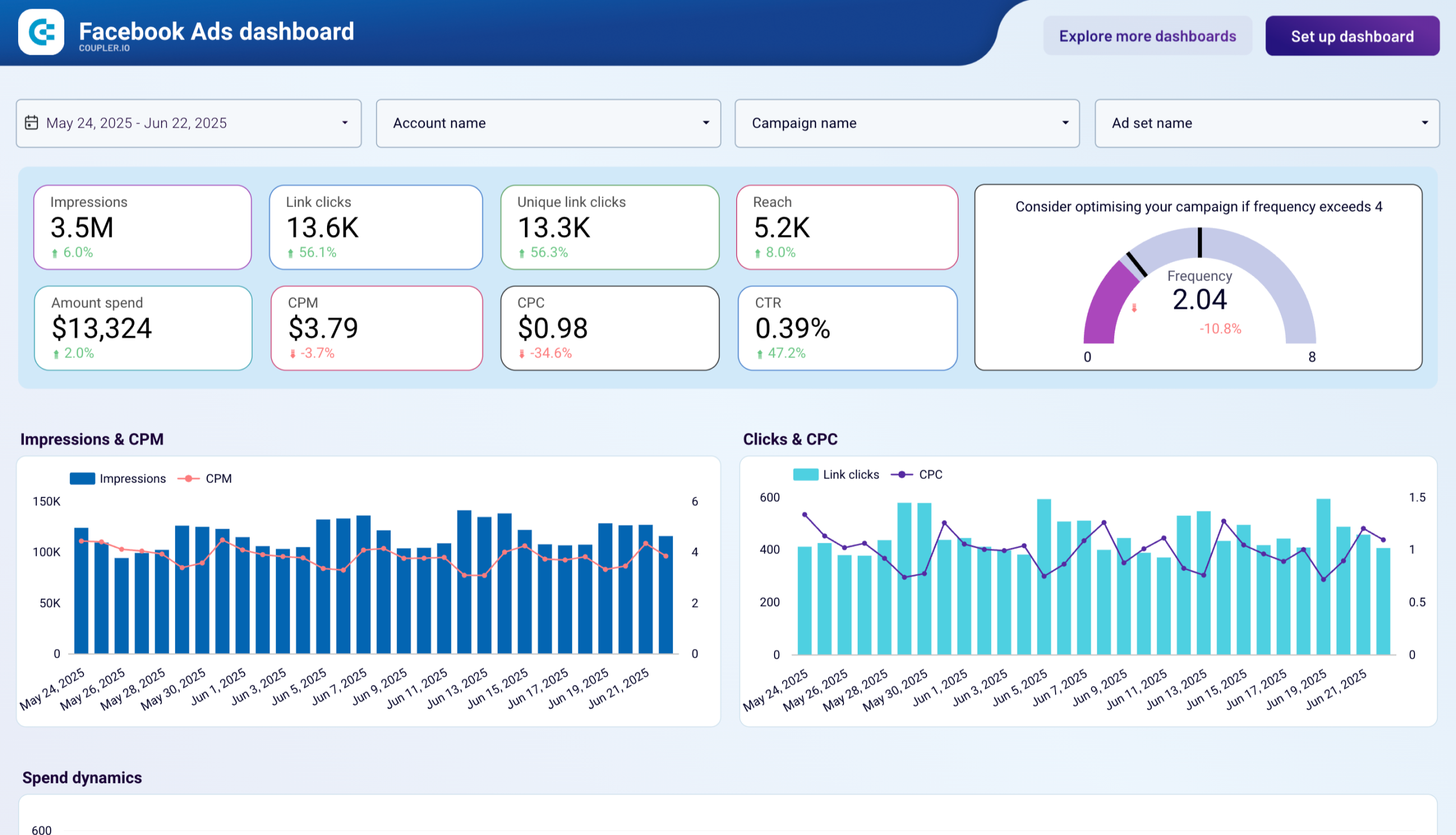
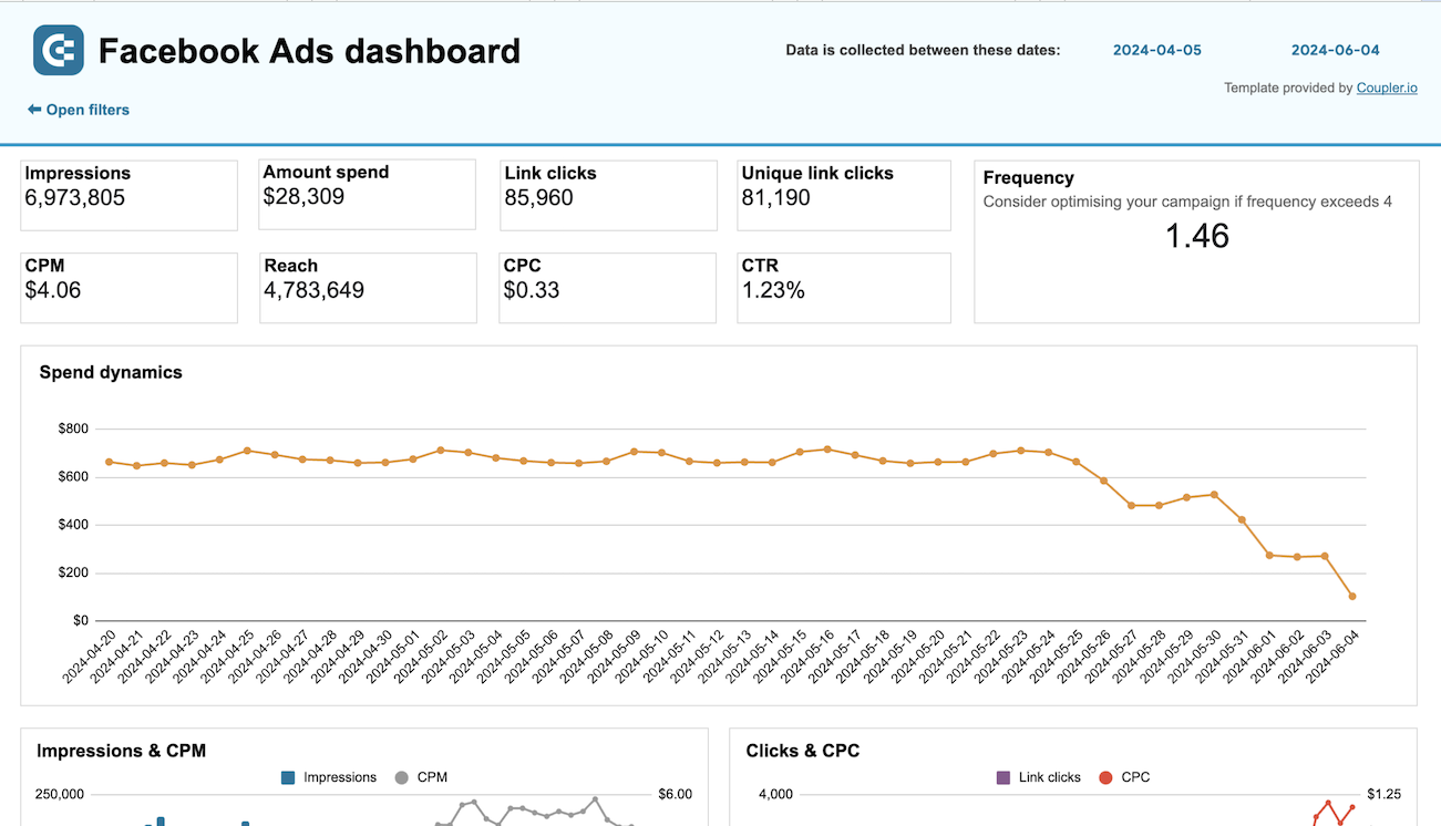
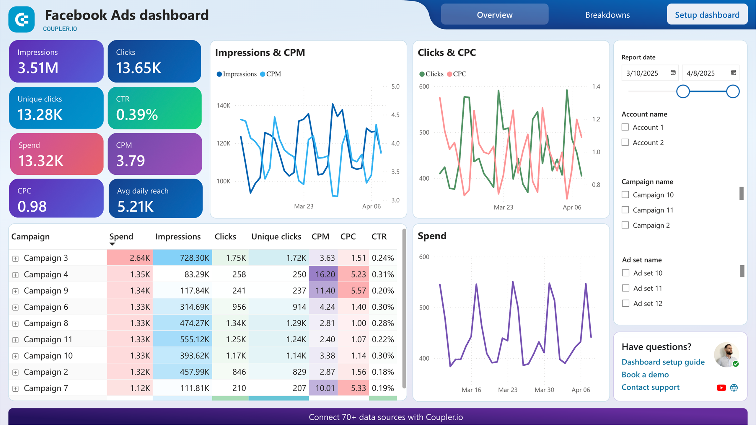
The Facebook Ads dashboard covers everything a paid social client wants to see in one place: impressions, reach, clicks, CTR, CPM, CPC, and spend. Each metric has a period-over-period change so the trend is immediately clear. The frequency gauge flags when ad repetition is climbing toward the point where performance usually starts to slip.
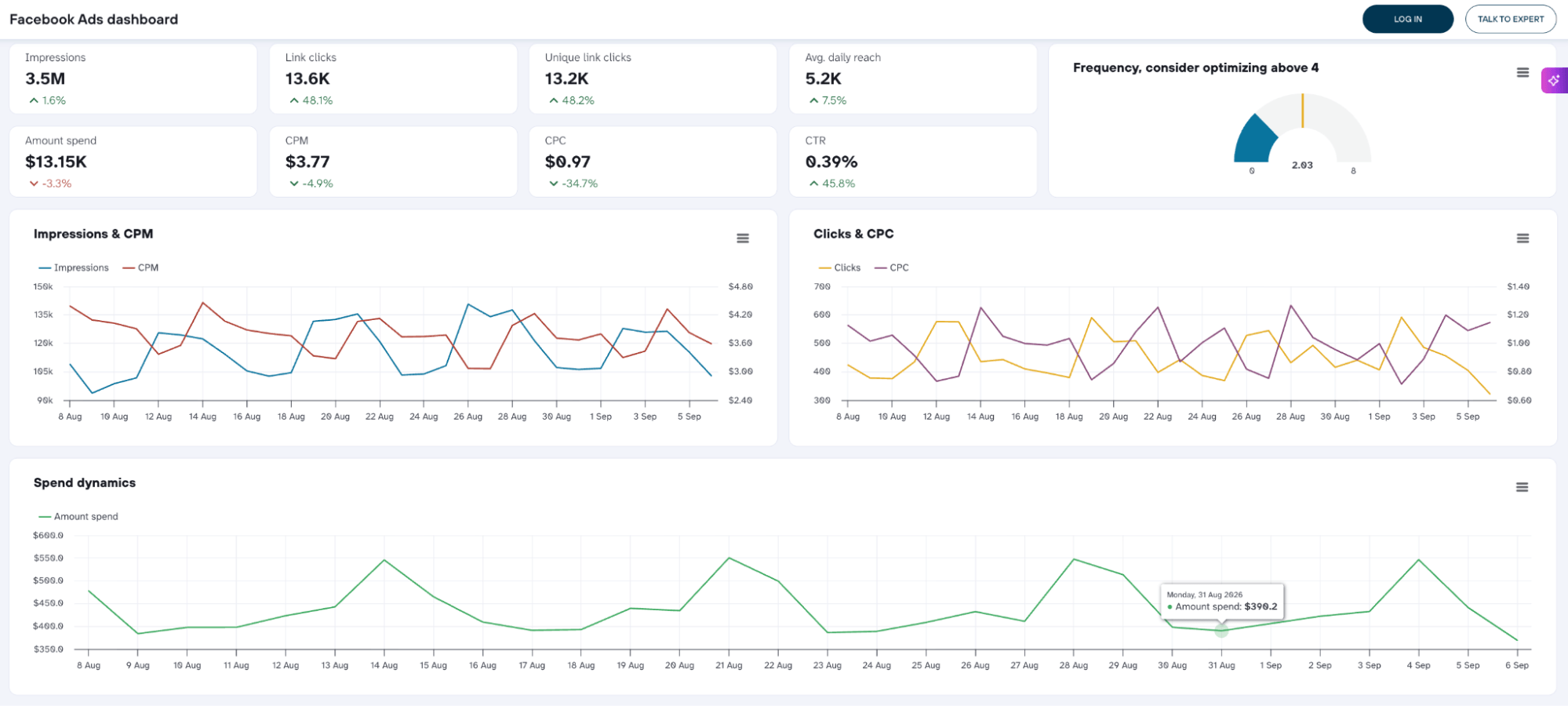
Below the summary, trend charts show how costs and delivery have moved over time, and a spend dynamics chart keeps an eye on daily budget pacing. Scroll further, and the dashboard breaks everything down by campaign and ad set (spend, impressions, clicks, CTR, CPM, and CPC) side by side. Finally, audience data covers demographics, device split, and a geographic breakdown that shows exactly where the clicks are coming from.
Who it’s for and how it helps
Anyone running Facebook Ads: agencies and in-house teams alike. Clients get the headline numbers without logging into Ads Manager. Account managers and media buyers get the campaign-level detail they need to make decisions.
The dashboard is available in Coupler.io, as well as versions for Google Data Studio, Google Sheets, and Power BI.





2. Google Ads dashboard
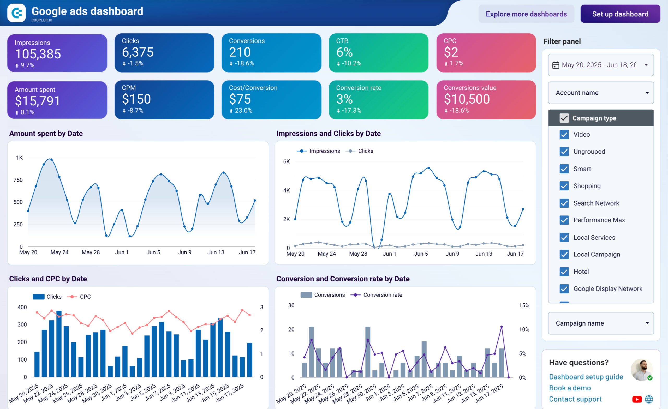
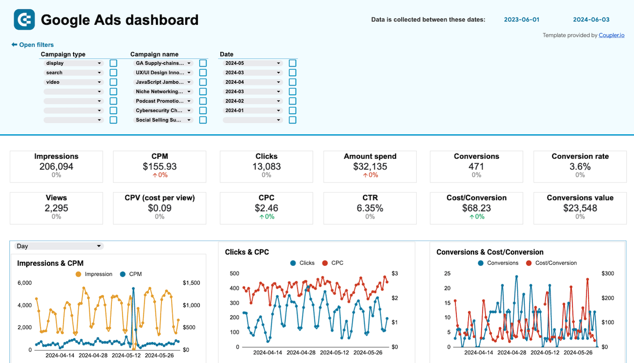
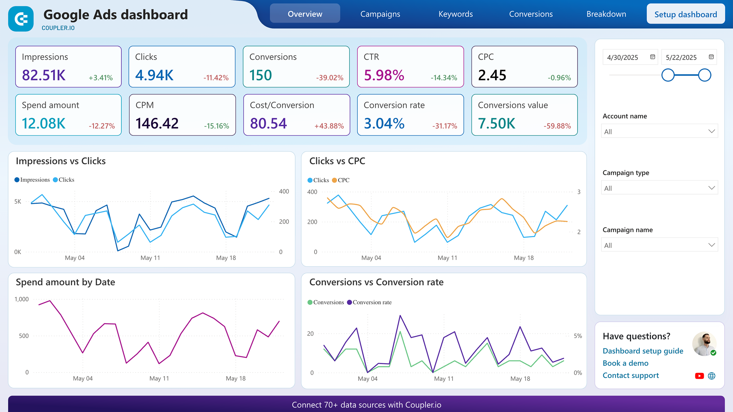
The core metrics are similar to the Facebook Ads dashboard with period-over-period comparisons. What’s different in the Google Ads dashboard is the conversion depth: cost per conversion, conversion rate, and conversion value. All get their own scorecards, and a dedicated conversions vs. conversion rate trend chart tracks how efficiently the budget is turning clicks into results over time.
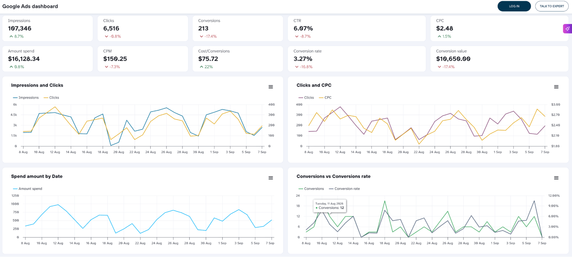
The campaign breakdown goes further to show spend and conversions split by campaign type (Search, Shopping, Display, Video, and more). From there, a ranked table of top campaigns by conversions, keyword-level performance, and a full demographic breakdown gives you the full picture.
Who it’s for and how it helps
Anyone running Google Ads who needs more than the native interface shows in one view. The campaign type split is especially useful for accounts running multiple formats simultaneously. It makes it clear where the budget is converting and where it isn’t.
The dashboard is available in Coupler.io, as well as versions for Google Data Studio, Google Sheets, and Power BI.

3. Facebook Ads Leads dashboard
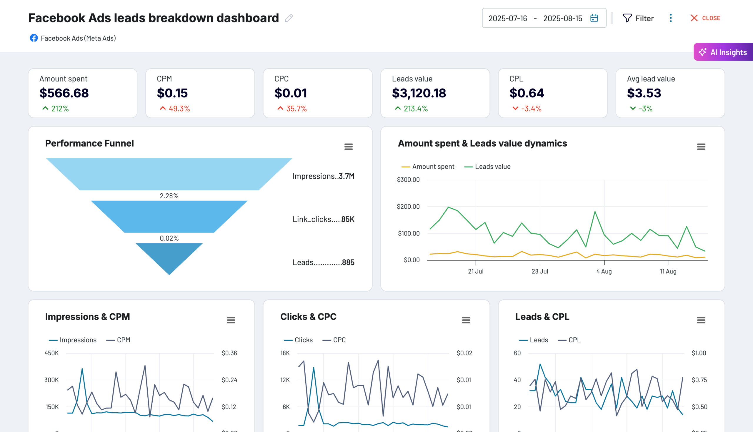
Where the standard Facebook Ads dashboard tracks clicks and reach, this one is built around what comes after the click: leads. The overview page of the Facebook Ads leads dashboard starts with CPM, CPC, leads value, and more. It then maps the full funnel visually: impressions to clicks to leads, with drop-off rates at each stage. The campaign performance table adds leads, CPL, and average lead value alongside the standard spend and click metrics, so you can see the ones actually generating leads at a reasonable cost.
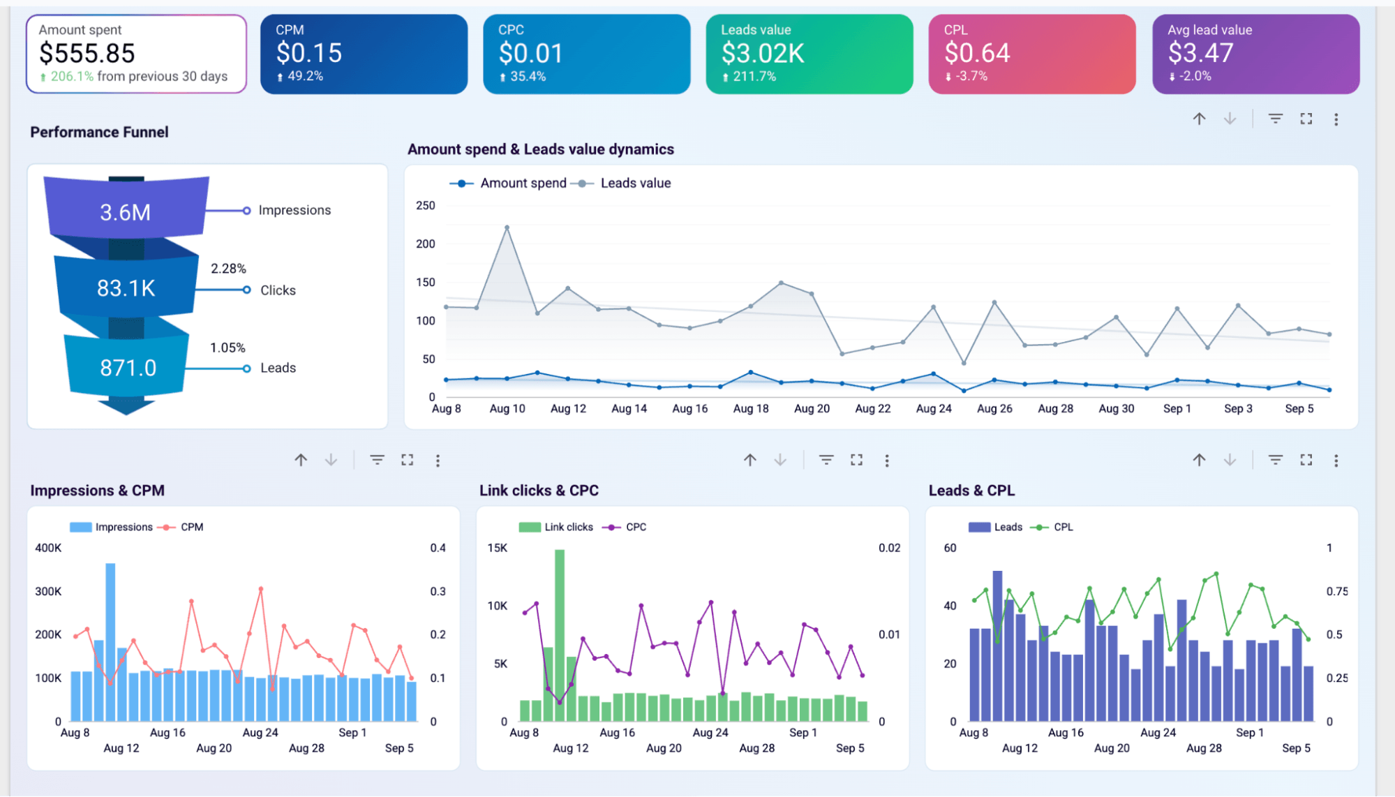
The Monthly Dynamics page shifts the view to longer-term trends: monthly comparisons of spend to lead value, delivery metrics, with demographic and geography breakdown.
Who it’s for and how it helps
For teams running lead generation campaigns on Facebook who need to go beyond click metrics. The funnel visualization makes it easy to show clients exactly where drop-off is happening.
The dashboard is available in Google Data Studio and Coupler.io.
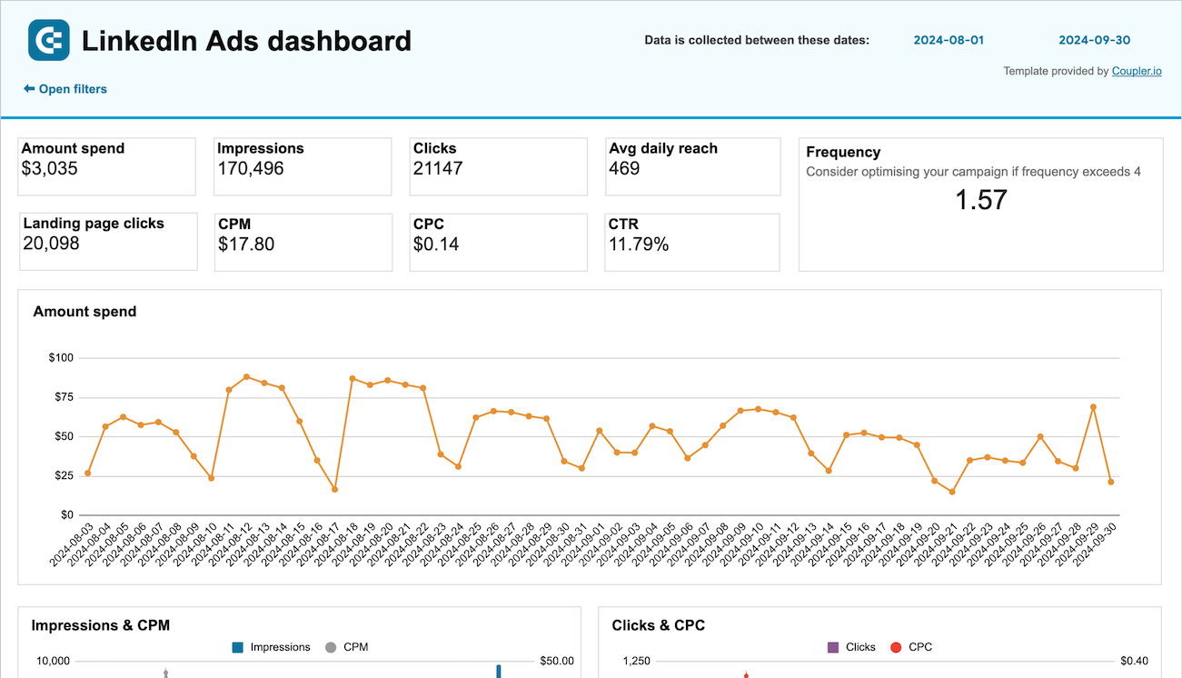
4. LinkedIn Ads dashboard
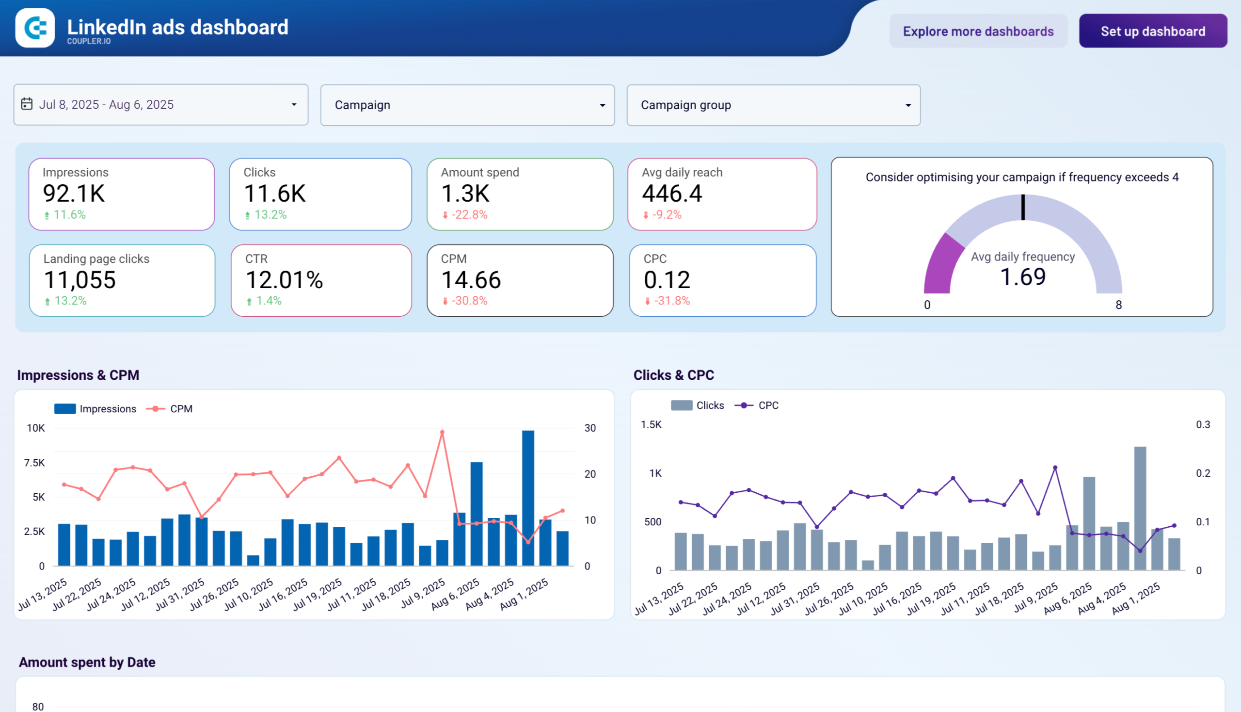
The dashboard has two pages: Overview and Conversions and Leads.
The overview page covers main metrics with period-over-period changes. Like the other dashboards, there’s a frequency gauge that flags when campaigns are hitting the threshold where ad fatigue typically sets in on LinkedIn.
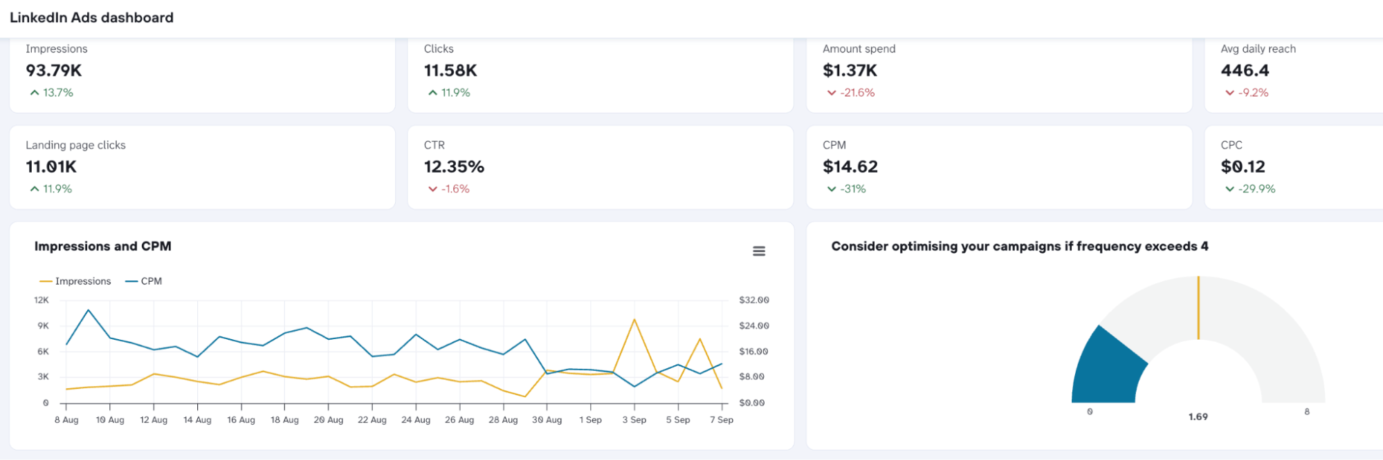
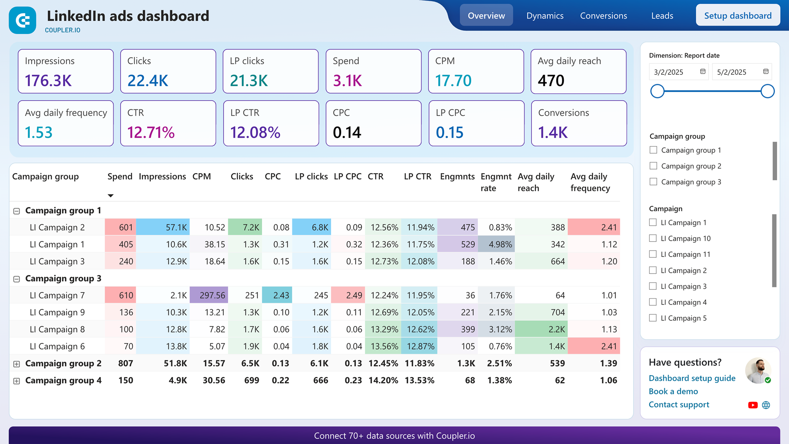
What makes the LinkedIn Ads dashboard distinct is the campaign overview table. It includes engagement rate, reach, and frequency alongside the standard spend and click metrics, as engagement signals carry more weight than on other platforms.
The Conversions and Leads page breaks down impressions, lead form opens, lead form completion rate, leads, and more, so you can see exactly which campaigns are driving form fills and at what cost.
Who it’s for and how it helps
B2B advertisers and agencies running LinkedIn campaigns for clients where lead quality matters as much as volume. The lead form breakdown in particular makes it easy to identify which campaigns are getting form opens but not completions. In my experience working with agency accounts, this is the metric teams miss most often in native LinkedIn reporting. It looks like a lead volume problem when it’s actually a form friction problem. And those two problems have very different fixes.
The dashboard is available in Coupler.io, as well as versions for Google Data Studio, Google Sheets, and Power BI.

Channel-specific client reporting dashboards
Platform-specific dashboards zoom into a single ad platform. Channel-specific dashboards zoom into a single marketing function: web analytics, financials, or organic search. Not every client runs paid ads. Some need to understand how their website is performing, where their revenue is coming from, or how AI-driven traffic is shifting their organic results. The four dashboards below cover those scenarios.
5. Web analytics dashboard
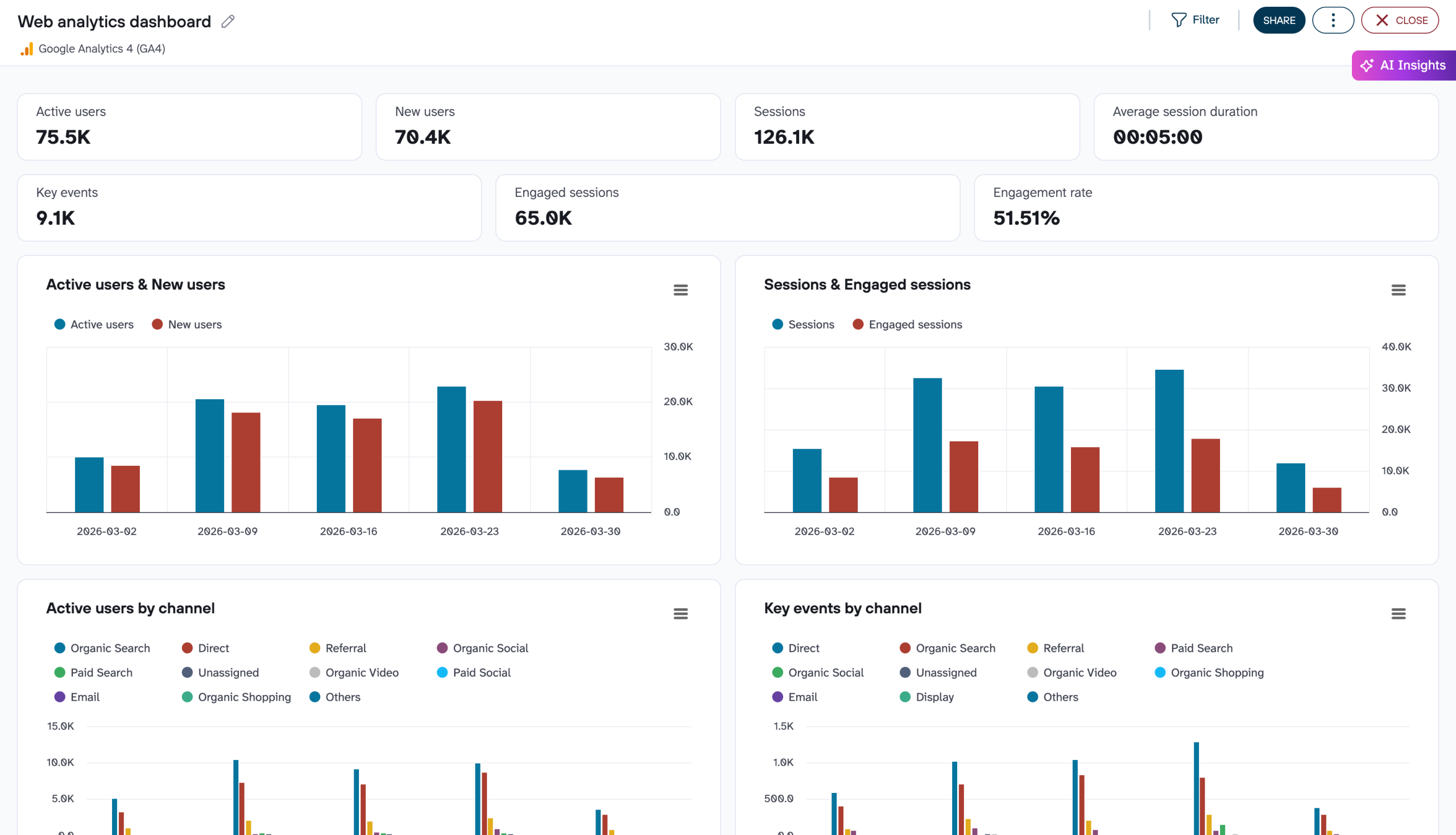
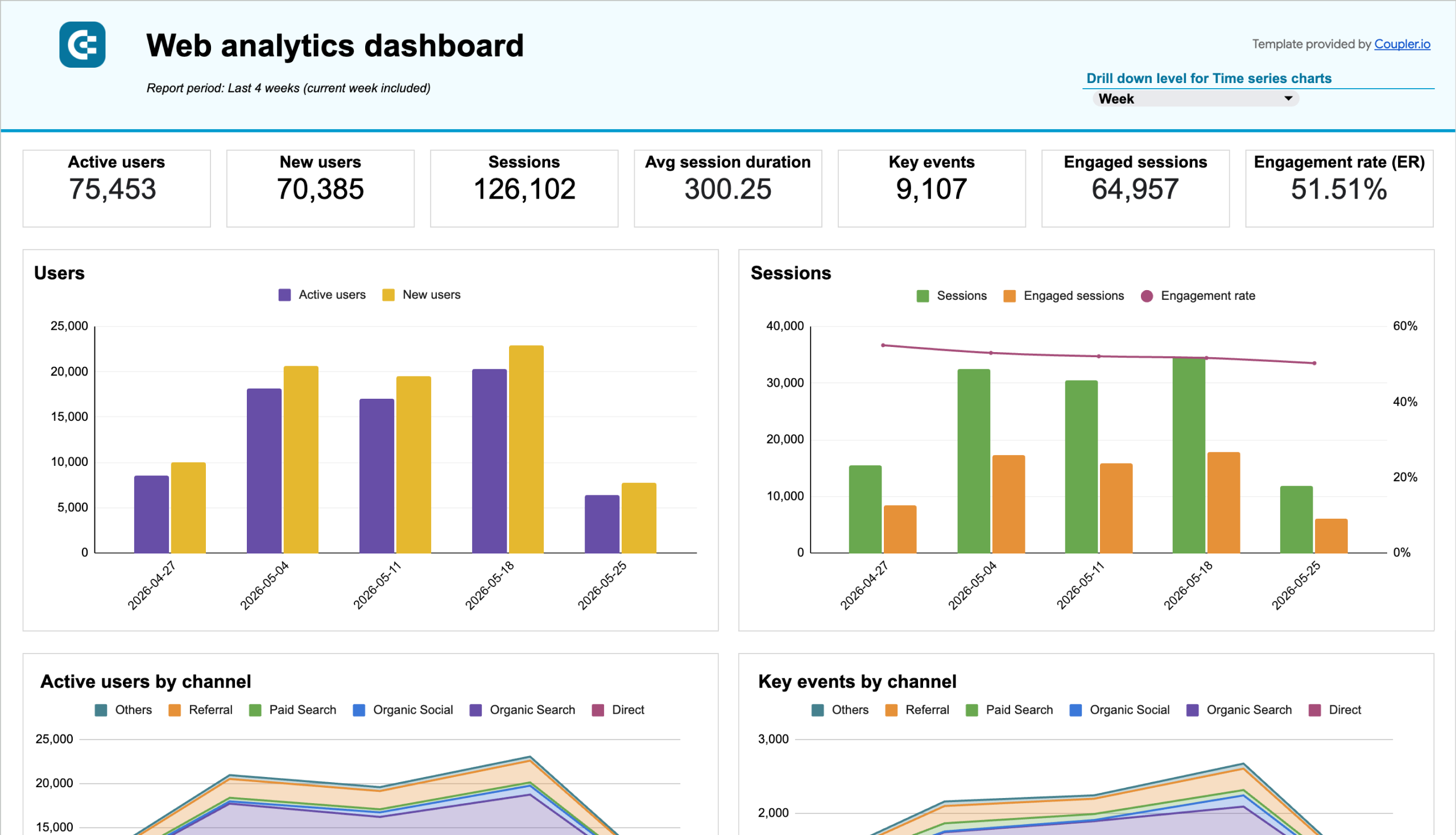
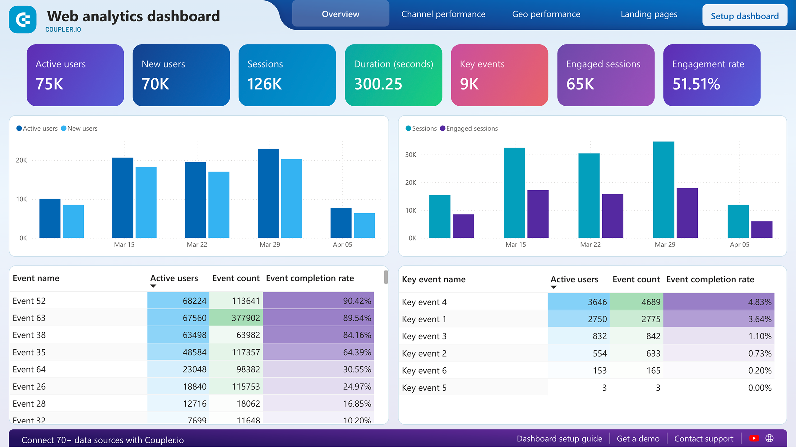
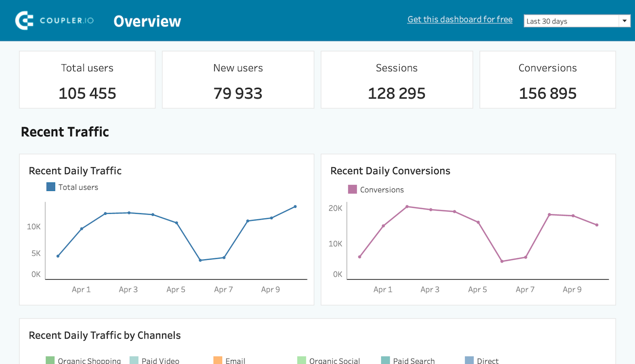
Built on Google Analytics, the dashboard opens with core metrics along with weekly trend charts for users and sessions side by side. What the web analytics dashboard does particularly well is the channel and country breakdown. The channel performance table shows active users, new users, sessions, average session duration, key events, and engagement rate across every traffic source (organic search, direct, referral, paid search, organic social, and more) in one view.
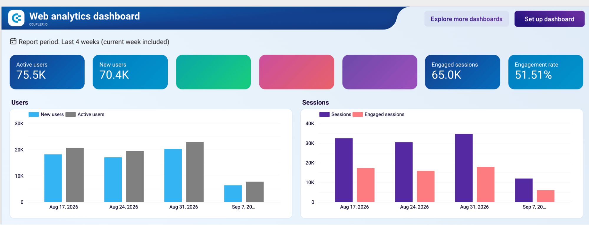
The country performance table adds the same depth by geography. Key events by channel add another layer, showing which traffic sources are actually driving meaningful on-site actions week by week. All metrics can be filtered by country, traffic source, medium, and landing page.
Who it’s for and how it helps
SEO teams using their existing SEO tools alongside the dashboard. Instead of telling a client “traffic went up,” you can show them exactly which channel drove the growth, how engaged those users were, and whether they converted.
The dashboard is designed in Google Data Studio and is also available in Coupler.io, Google Sheets, Power BI, and Tableau.


6. QuickBooks financial dashboard
Getting a full financial picture usually means jumping between reports. The QuickBooks financial dashboard brings profit and loss, cash flow, and balance sheet onto three dedicated pages, all connected directly to QuickBooks.
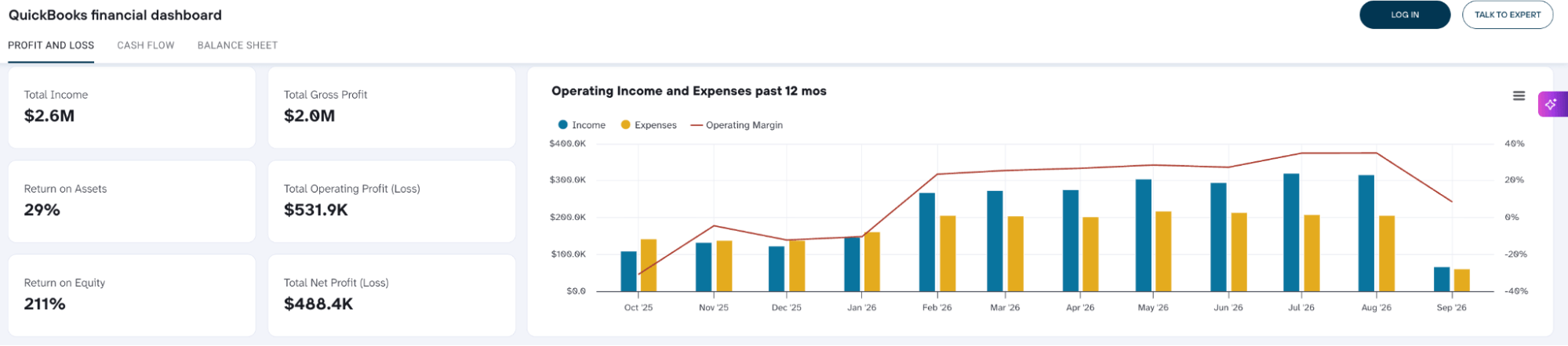
The Profit and Loss page goes beyond a simple income summary. It tracks how gross profit, operating profit, and net profit have moved over 12 months, with expenses broken down by account so you can see exactly where money is going, not just how much.
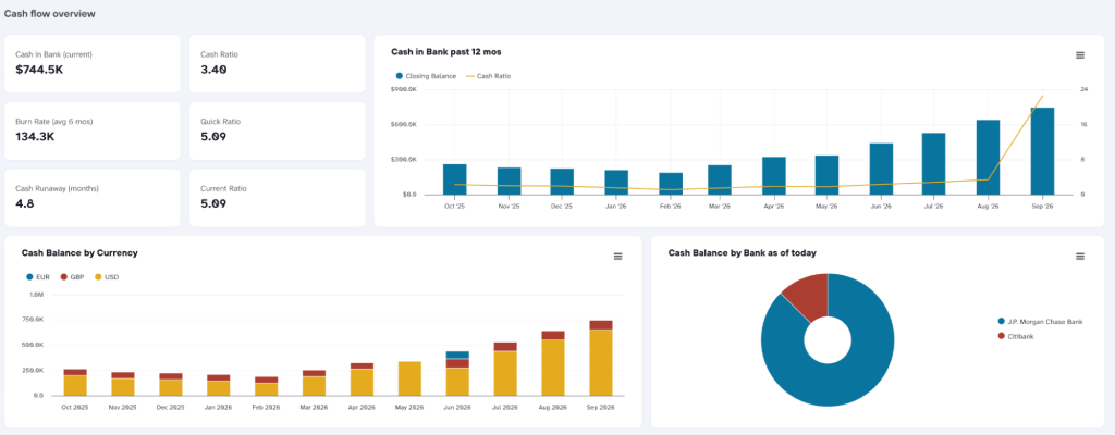
The Cash Flow page adds liquidity context: burn rate, cash runway, and cash ratio alongside how the balance has trended by currency and bank.
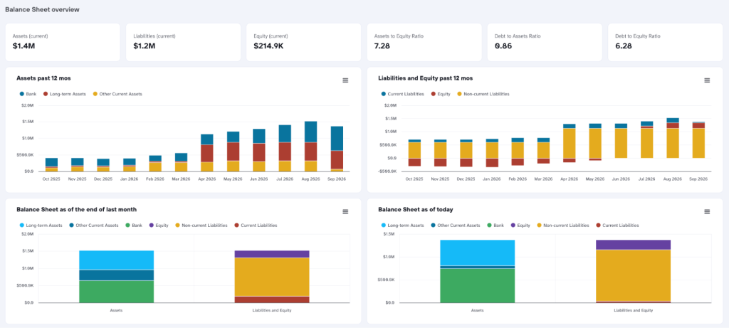
The Balance Sheet page completes the picture with a current snapshot of assets, liabilities, and equity, plus a 12-month trend so shifts in financial position don’t go unnoticed.
Who it’s for and how it helps
Agencies working with clients who need more than marketing metrics. The three-statement structure gives a CFO or business owner everything they need for a review meeting, already visualized.
The dashboard is available in Coupler.io, Google Data Studio, and Google Sheets.
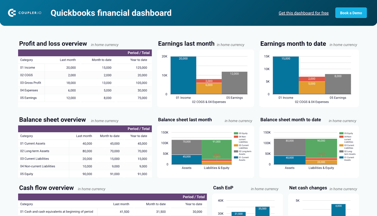

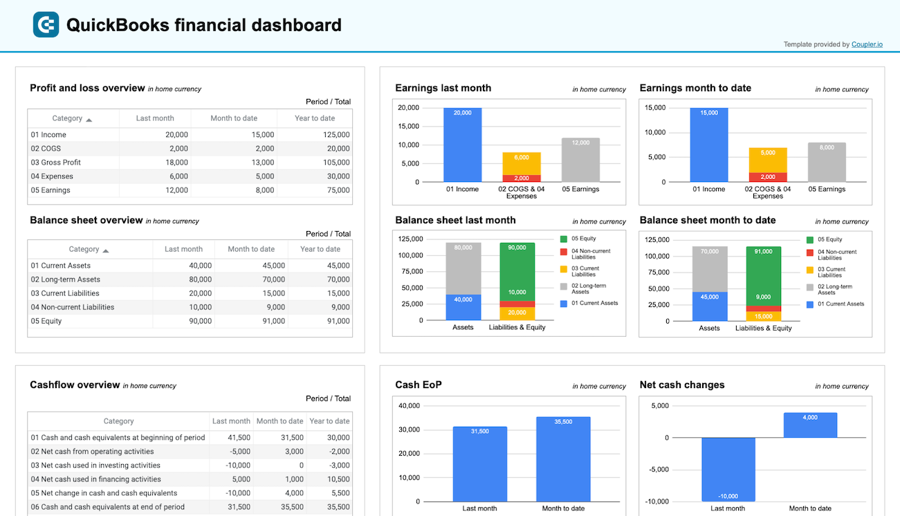
QuickBooks dashboards by Coupler.io are available in versions for single-currency and multi-currency accounts. Check out all QuickBooks dashboard examples.
7. QuickBooks revenue dashboard
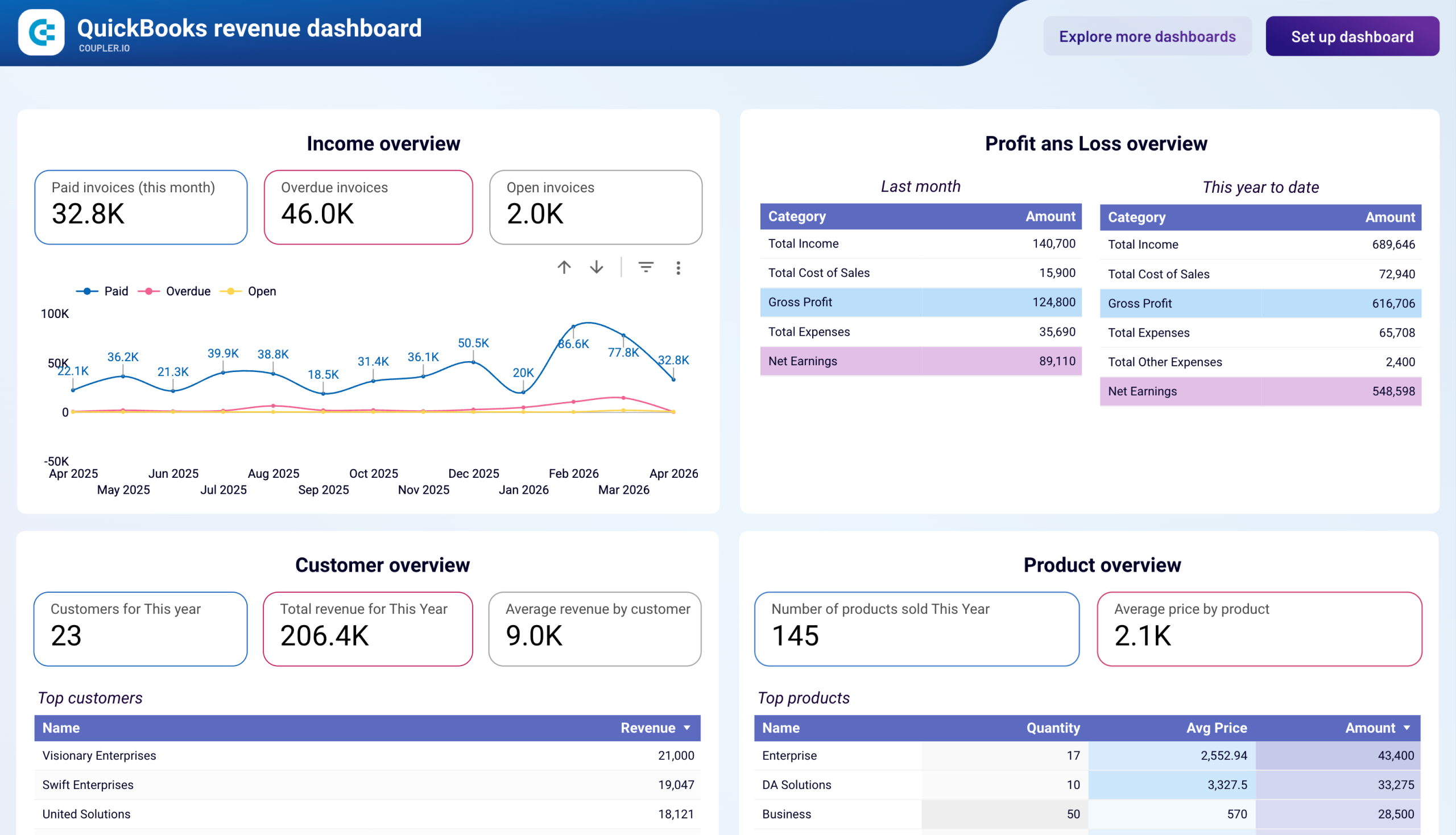
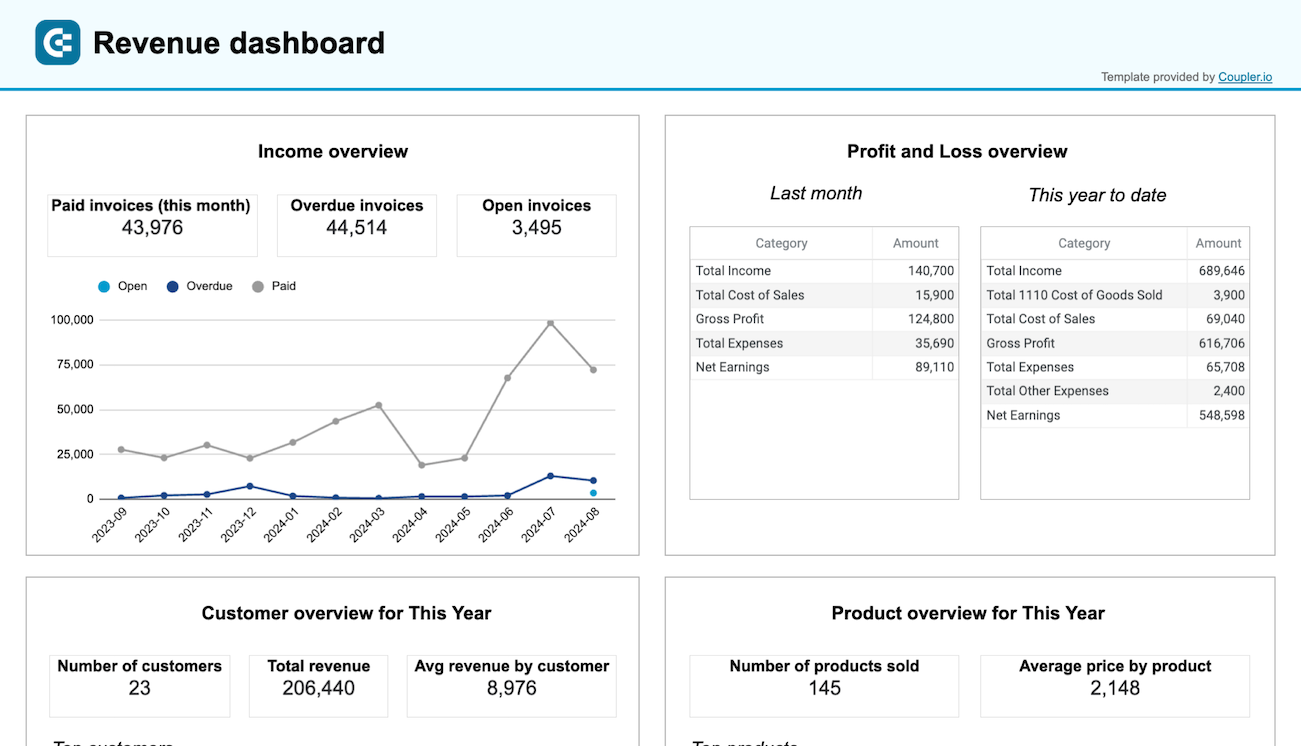
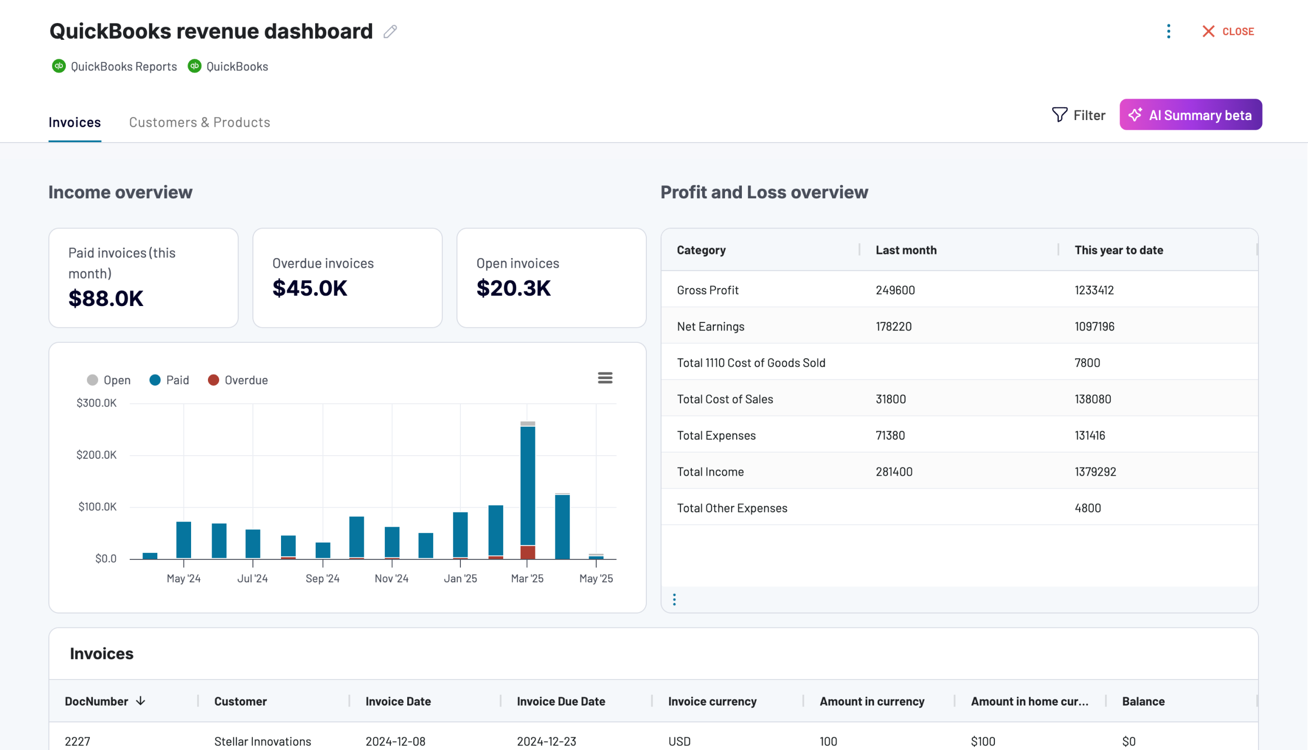
While the financial dashboard covers the full three-statement picture, the QuickBooks revenue dashboard zooms into revenue specifically. It goes deeper into the two things that drive it: customers and products.
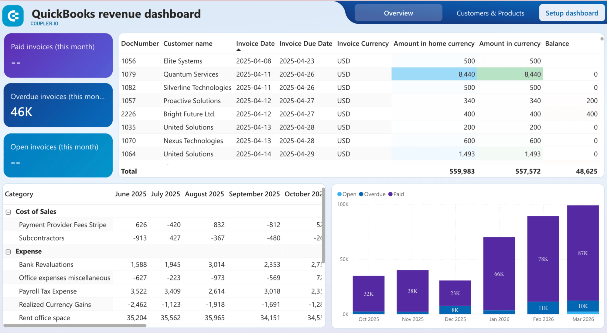
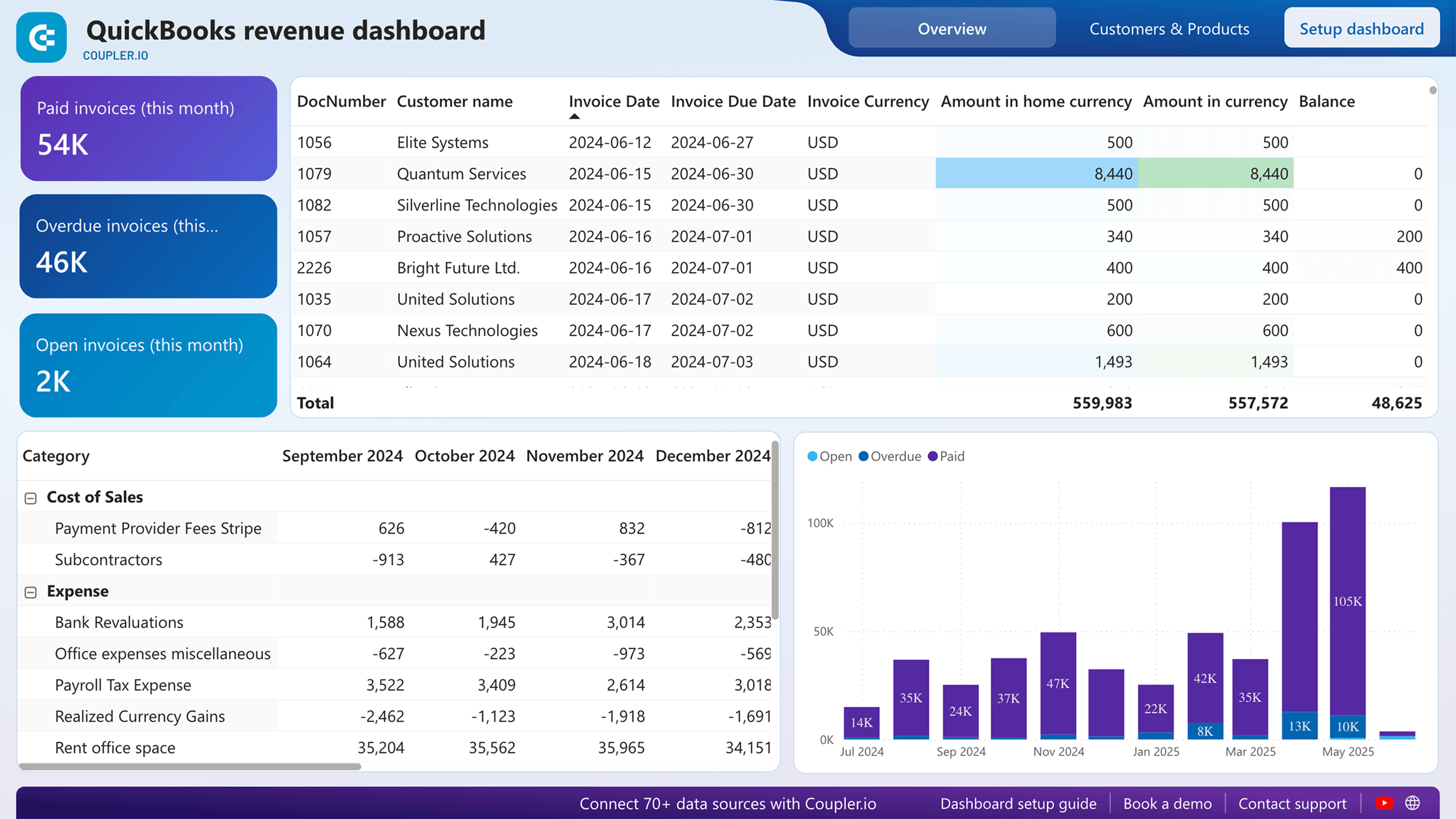
The Overview page tracks paid, overdue, and open invoices for the month, with a detailed invoice table. A month-by-month expense breakdown sits alongside an invoice status chart to get a glance at where cash is flowing and where it’s getting stuck.
The Customers and Products page shifts to the revenue side. A ranked table and bar chart of top 10 customers by revenue and top 10 products by revenue make it easy to see who’s driving the business and what’s selling.
Who it’s for and how it helps
Finance teams and agencies managing clients who want to understand revenue beyond a total figure. The invoice table keeps collections visible, and the customer and product breakdown makes pricing and retention conversations much more grounded.
The dashboard is available in Power BI, Coupler.io, Google Data Studio, and Google Sheets.
8. AI Traffic vs. Organic Traffic Dashboard
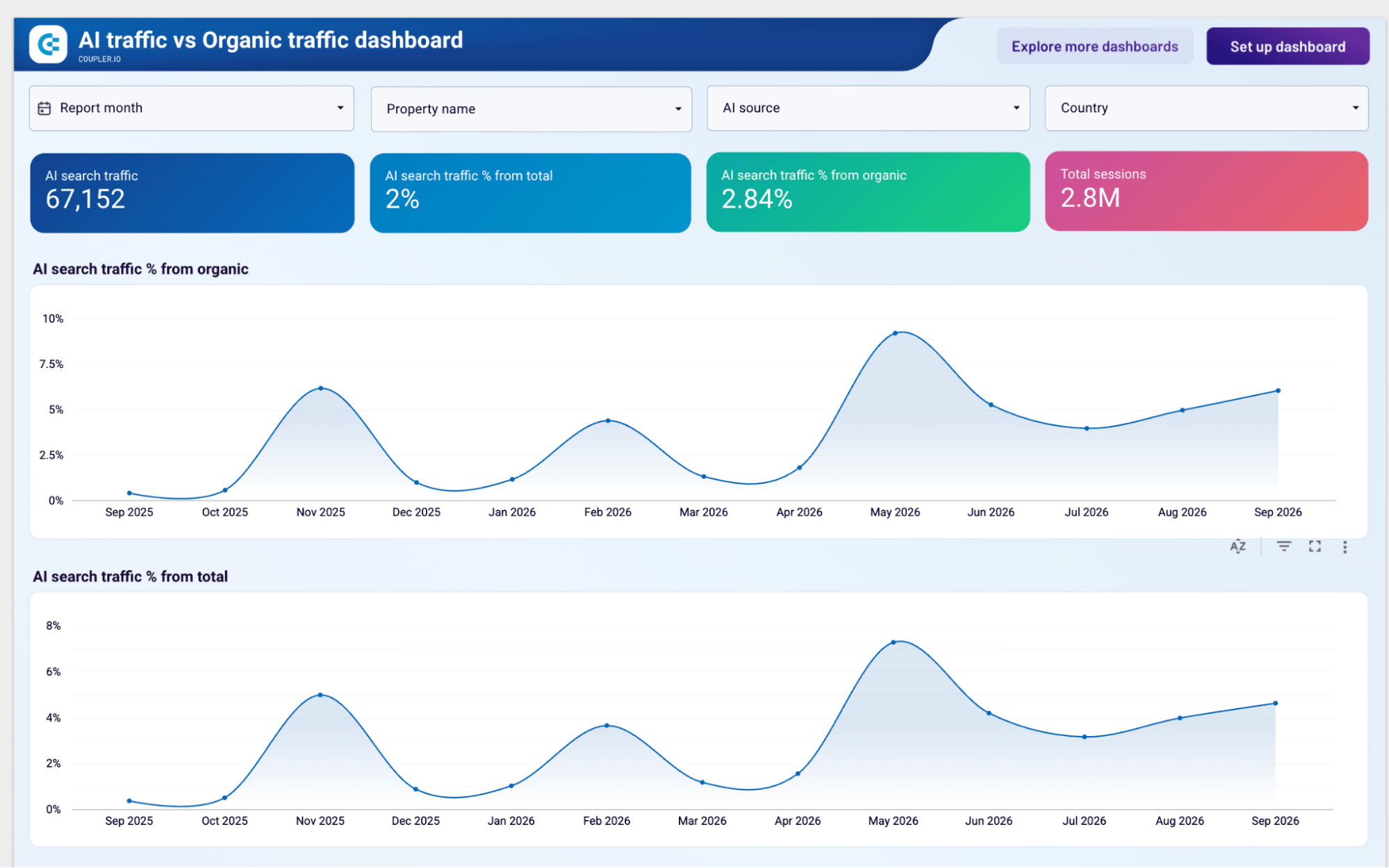
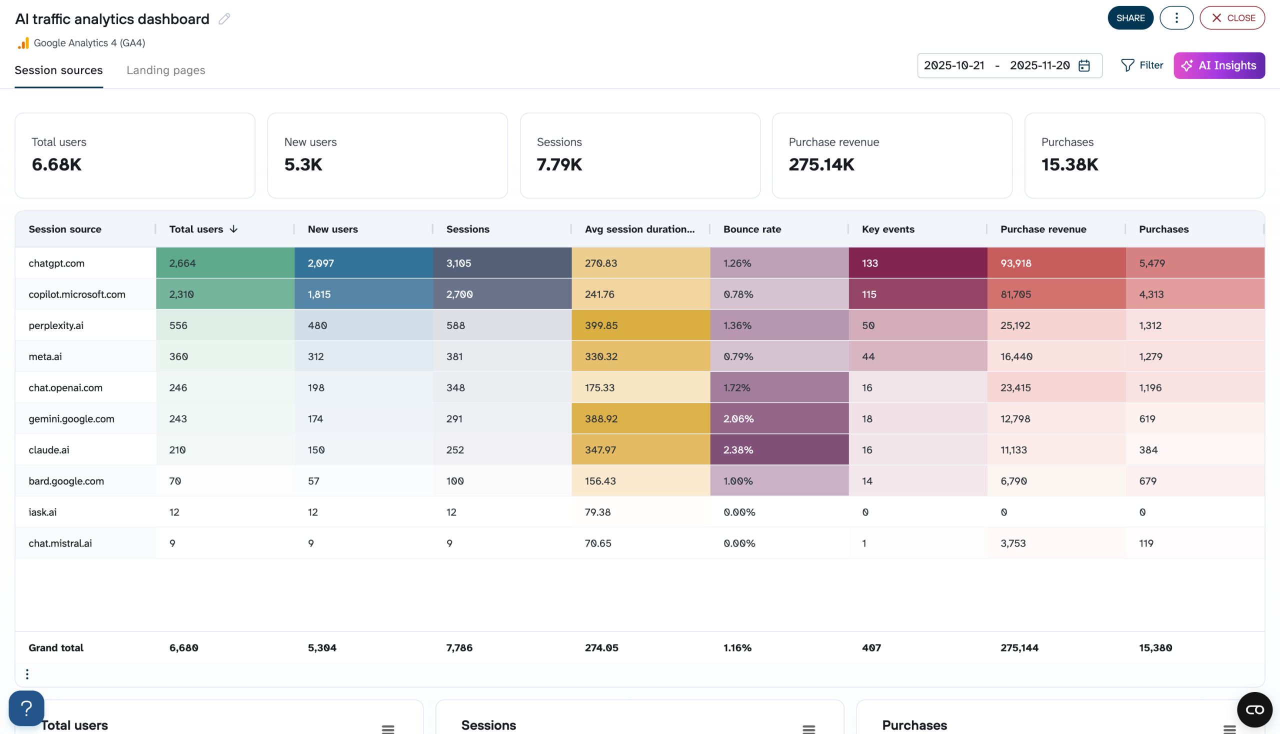
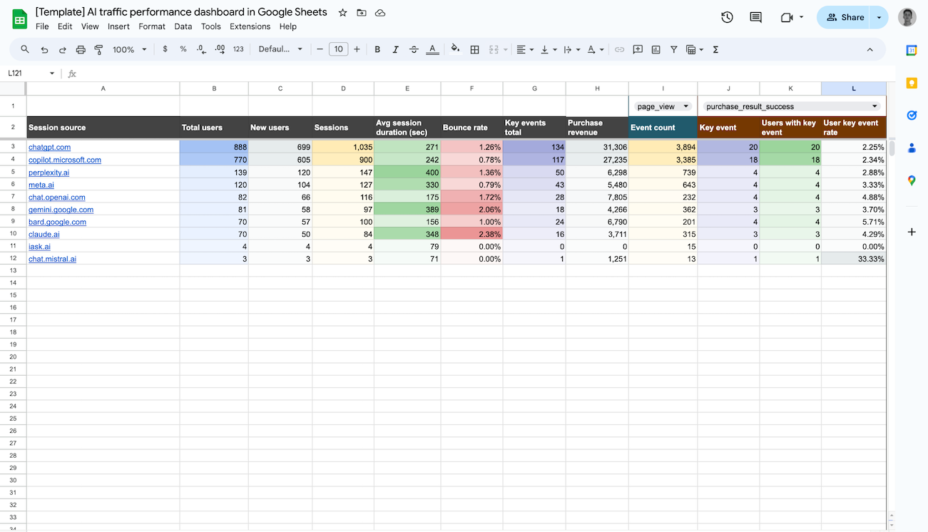
This dashboard exists because GA4 doesn’t make AI traffic easy to track. It buries referrals from ChatGPT, Perplexity, Gemini, and others inside the generic referral bucket. The AI traffic vs. organic traffic dashboard pulls them out and puts them in context.
AI Traffic vs. Organic Traffic Dashboard
 Preview dashboard
AI Traffic vs. Organic Traffic Dashboard
Preview dashboardThe traffic dynamics page opens with AI traffic and percentage metrics. The trend charts track how those percentages have shifted month by month to see whether AI-referred traffic is growing relative to organic or adding marginal volume. A 12-month traffic share chart breaks AI traffic down by source: ChatGPT, Perplexity, Gemini, Claude, Copilot, DeepSeek, and others.
The key events dynamics page mirrors the same structure but focuses on conversions rather than sessions. For example, AI search key events as a share of total and organic key events, with the same monthly table and AI source breakdown.
Who it’s for and how it helps
SEO teams and content agencies managing clients who are starting to ask where their AI traffic is coming from and its conversion. The side-by-side comparison of AI vs. organic sessions and key events makes it straightforward to show whether AI referrals are just adding noise or genuinely contributing to results.
The dashboard is available in Google Data Studio, Coupler.io, and Google Sheets.
Multi-channel client reporting dashboards
Platform-specific dashboards go deep on one platform. Channel-specific dashboards focus on one marketing function. Multi-channel dashboards do neither. They’re built for clients whose activity spans multiple platforms and who need one view that pulls it all together. A multi-client reporting dashboard replaces the five separate custom reports you’d otherwise be sending.
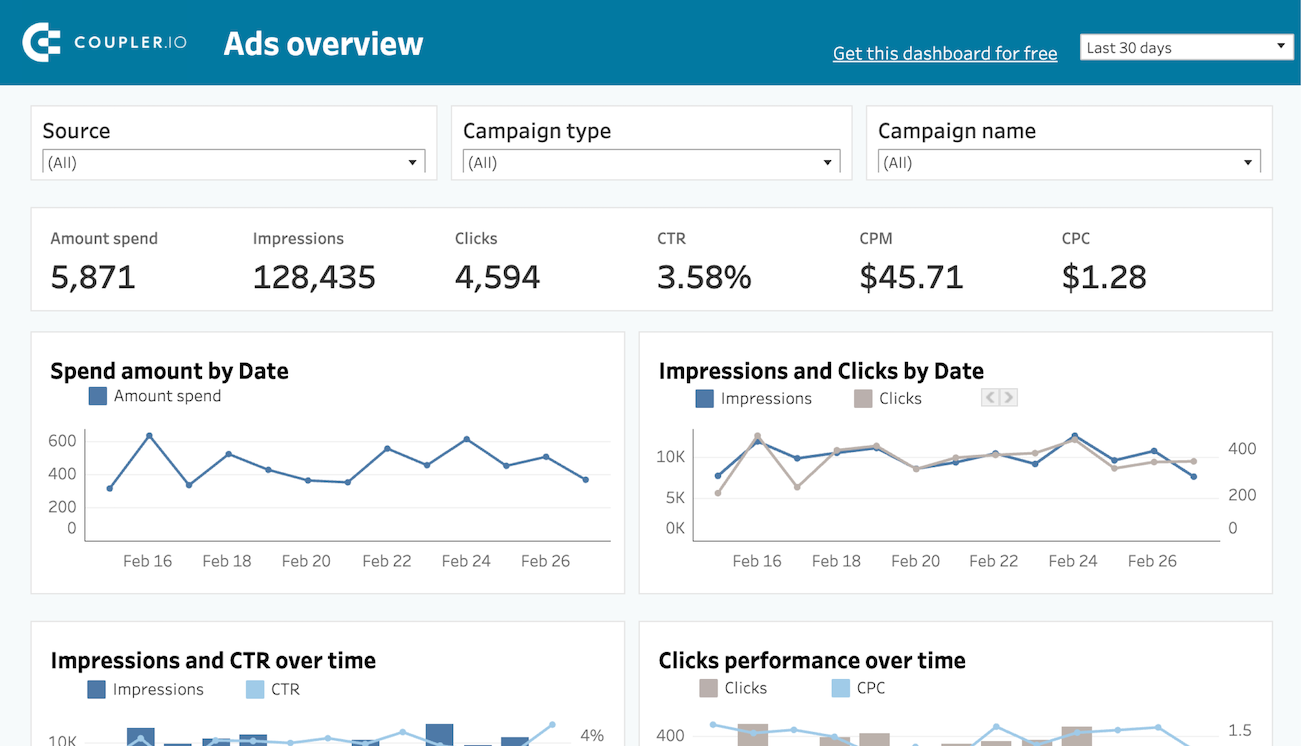
9. PPC multi-channel dashboard
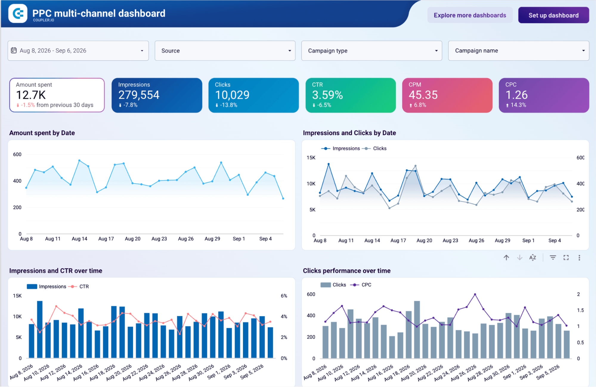
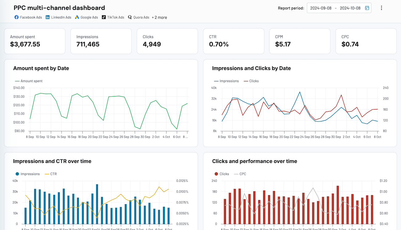
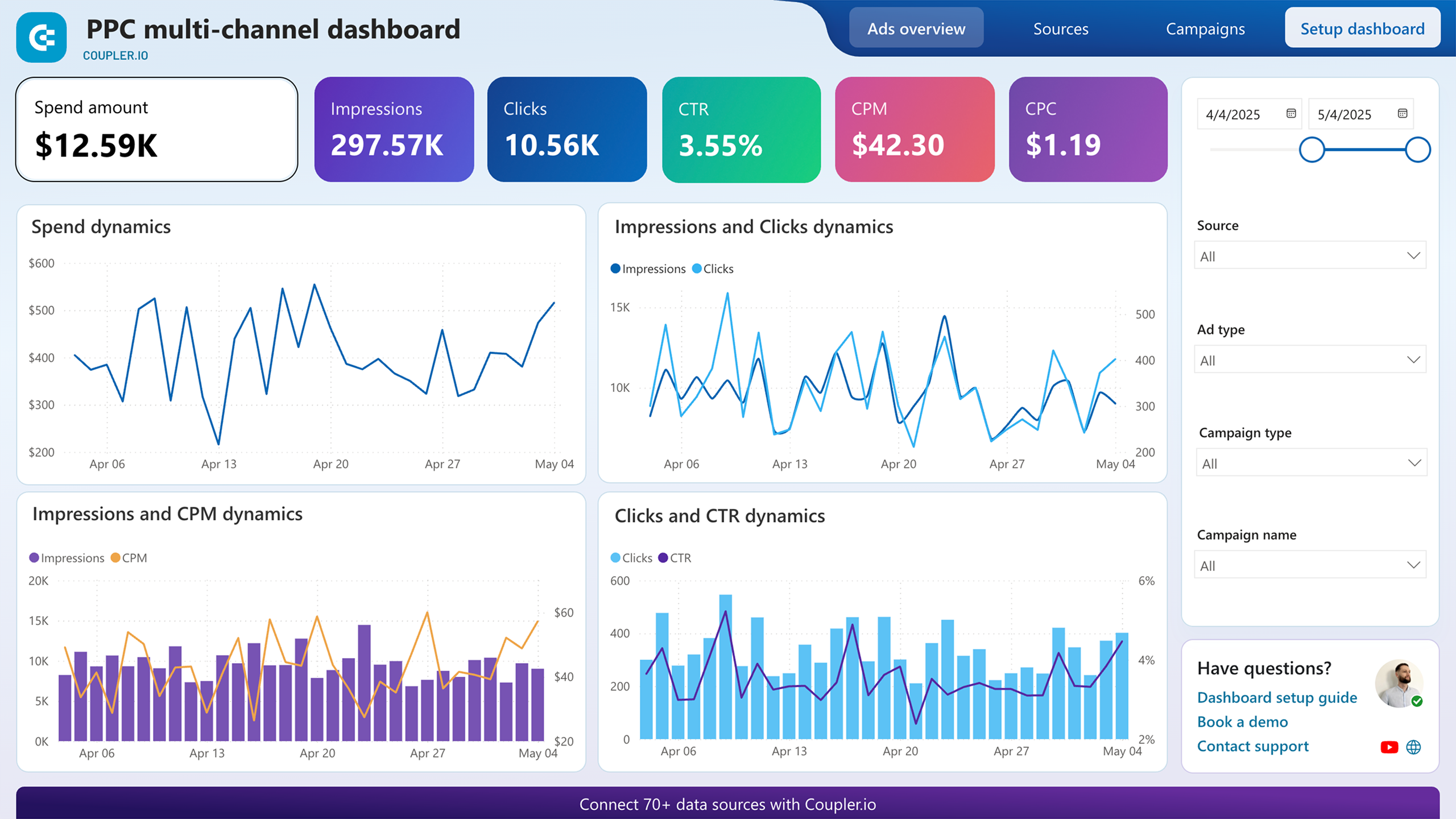
The PPC multi-channel dashboard has three pages: Ads overview, sources, and campaigns.
The Ads overview page gives the combined picture across all connected platforms showing metrics (spend, impressions, clicks, CTR, CPM, and CPC) with period-over-period changes. Trend charts track spend, impressions, clicks, CTR, and CPC day by day so you can spot where performance shifted across the full period.
PPC multi-channel dashboard in Data Studio
 Preview dashboard
PPC multi-channel dashboard in Data Studio
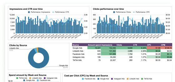
Preview dashboardThe sources page is where the multi-channel value really is. Data blending across Google Ads, Facebook Ads, LinkedIn Ads, Twitter Ads, TikTok Ads, Instagram Ads, Bing Ads, and Quora Ads puts every platform’s metrics side by side in one table. Stacked charts show how spend and CPC have trended by source week over week, so you can see which platforms are becoming more or less efficient over time.
The Campaigns page goes a level deeper. Metrics are broken down by campaign type and by individual campaign, with source and campaign type filters to slice however you need.
Who it’s for and how it helps
Performance teams managing paid campaigns across multiple platforms for one client. The source breakdown eliminates the need to pull separate reports from each ad platform.
The dashboard is available in Google Data Studio, Coupler.io, Google Sheets, Power BI, and Tableau.



10. All-in-one marketing dashboard
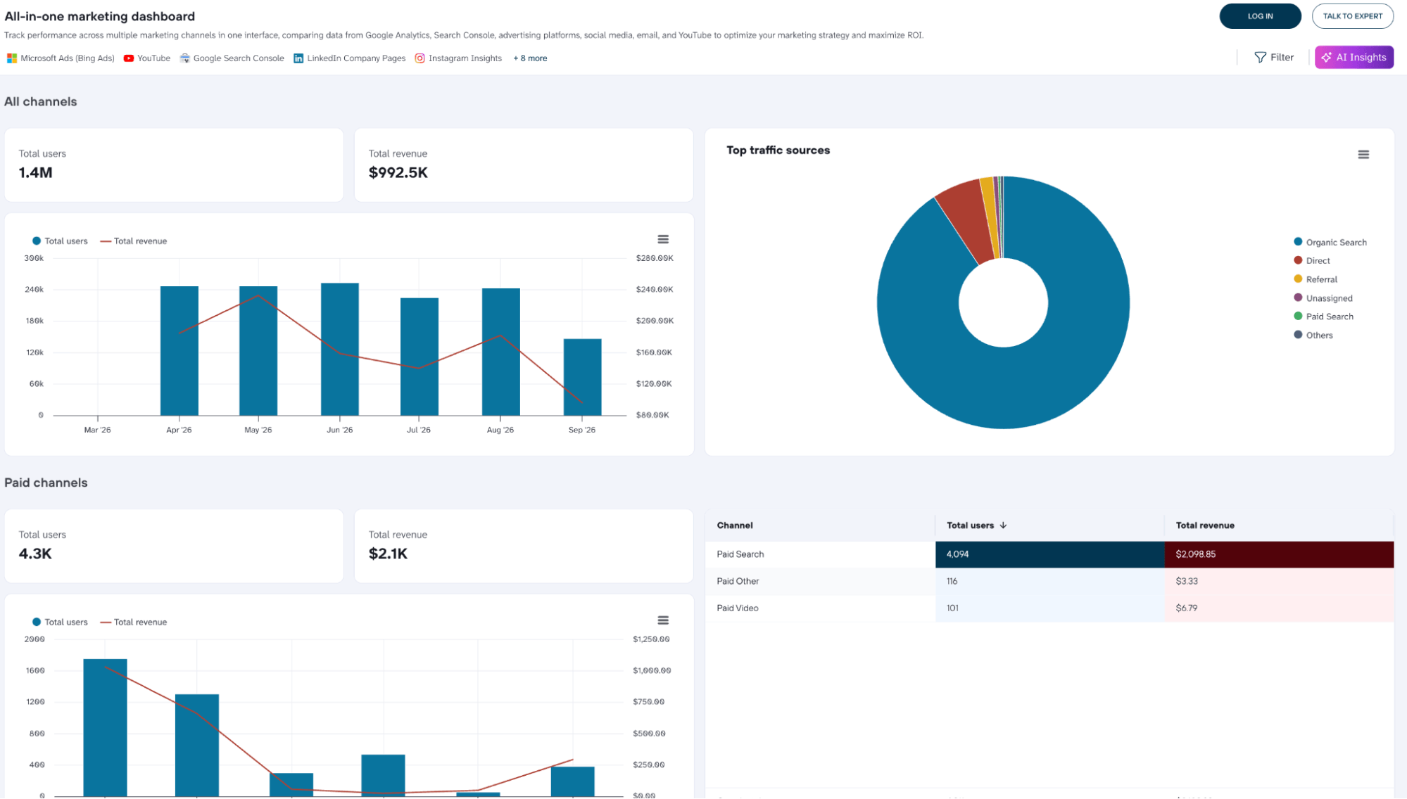
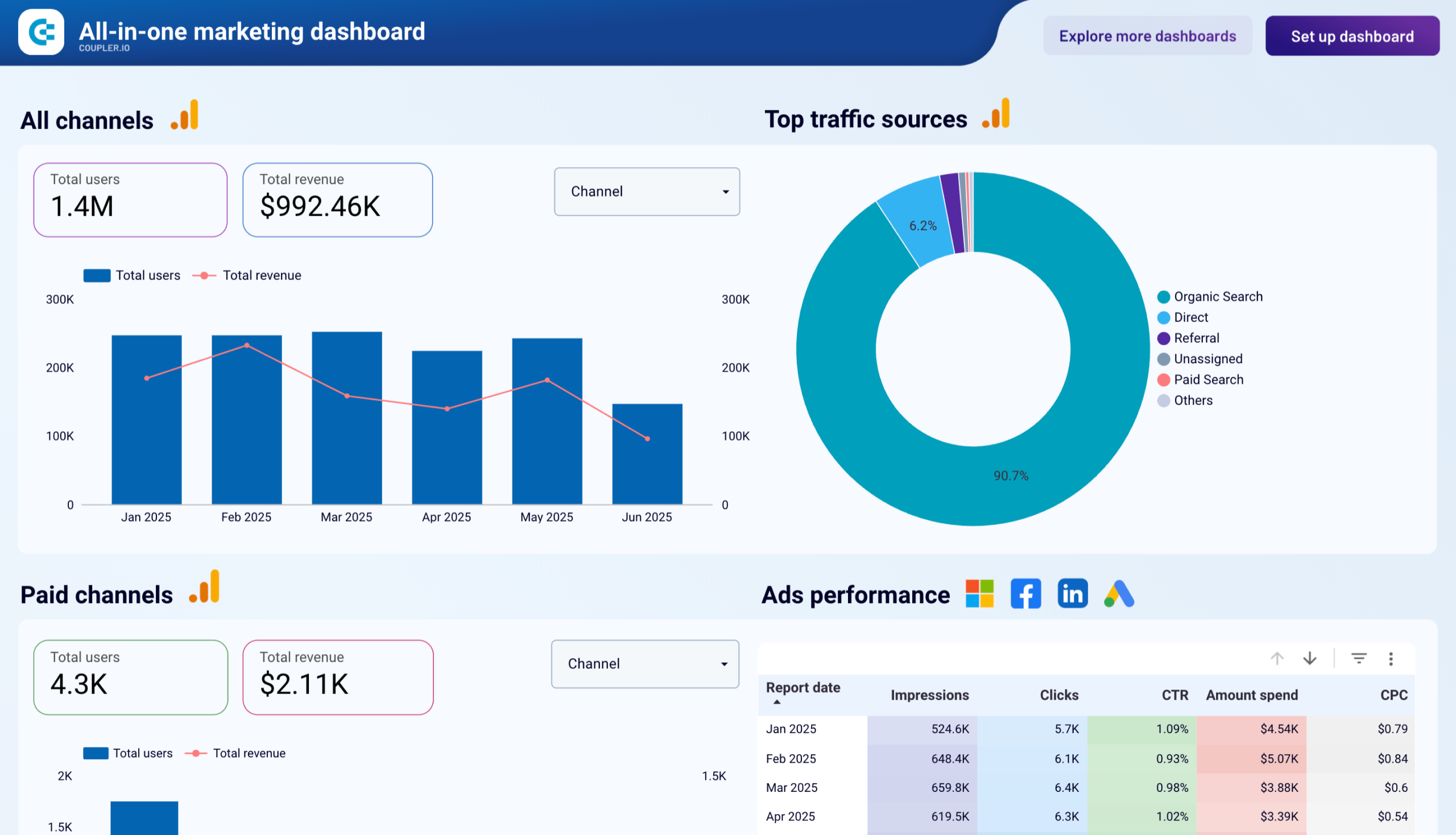
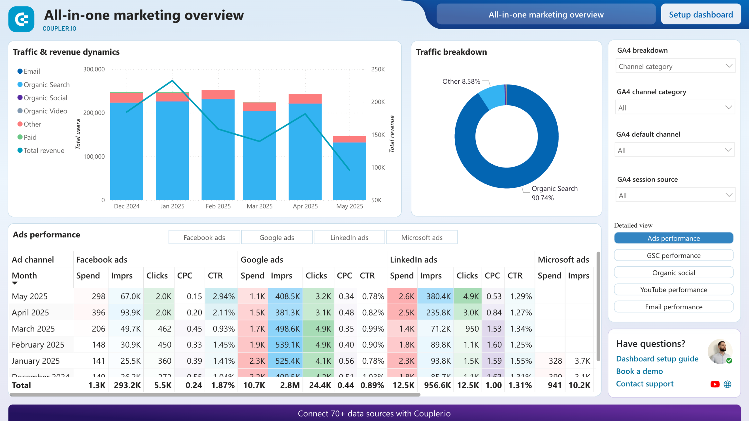
Most dashboards in this list cover one platform or one channel. The all-in-one marketing dashboard covers everything: seamless data integration between GA4, Google Search Console, Google Ads, Microsoft Ads, LinkedIn Ads, Facebook Ads, Instagram Insights, LinkedIn Company Pages, YouTube, Mailchimp, and Klaviyo in a single dashboard.
All-in-one marketing dashboard in Coupler.io
 Preview dashboard
All-in-one marketing dashboard in Coupler.io
Preview dashboardThe structure looks like a full-service marketing operation. The top-level view shows total users and total revenue across all channels, a combined trend chart, and a traffic source breakdown.
From there, the dashboard splits into dedicated sections for each channel type: paid channels with ads performance by report date and by ad type. Organic search with Google Search Console data including impressions, clicks, CTR, and average position by month. Organic social with impressions and reach broken down by platform (Facebook, LinkedIn, Instagram) and by session source. Organic video covering YouTube views, minutes watched, engagements, and performance over time.
Who it’s for and how it helps
Full-service agencies managing multiple marketing functions for one client. Instead of sending separate reports for data from paid, SEO, social, and email, everything is in one place. Each channel’s contribution to total users and revenue is visible alongside the others. It makes the “where is our budget working hardest” conversation much easier to have.
The dashboard is available in Coupler.io, Google Data Studio, and Power BI.



Get your all-in-one marketing dashboard
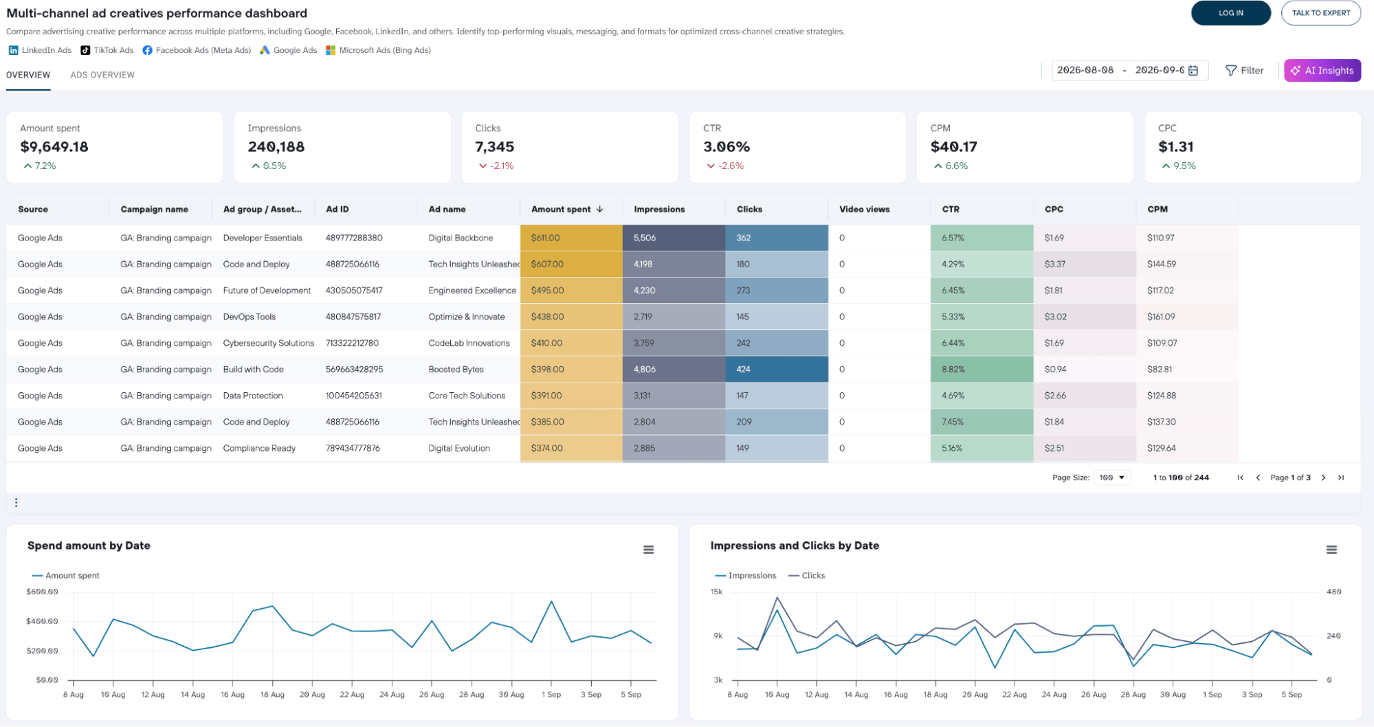
11. Multi-channel ad creatives performance dashboard
The PPC multi-channel dashboard tells you how your campaigns are performing. This one focuses on which specific ads are performing and why.
Multi-channel ad creatives performance dashboard in Coupler.io
 Preview dashboard
Multi-channel ad creatives performance dashboard in Coupler.io
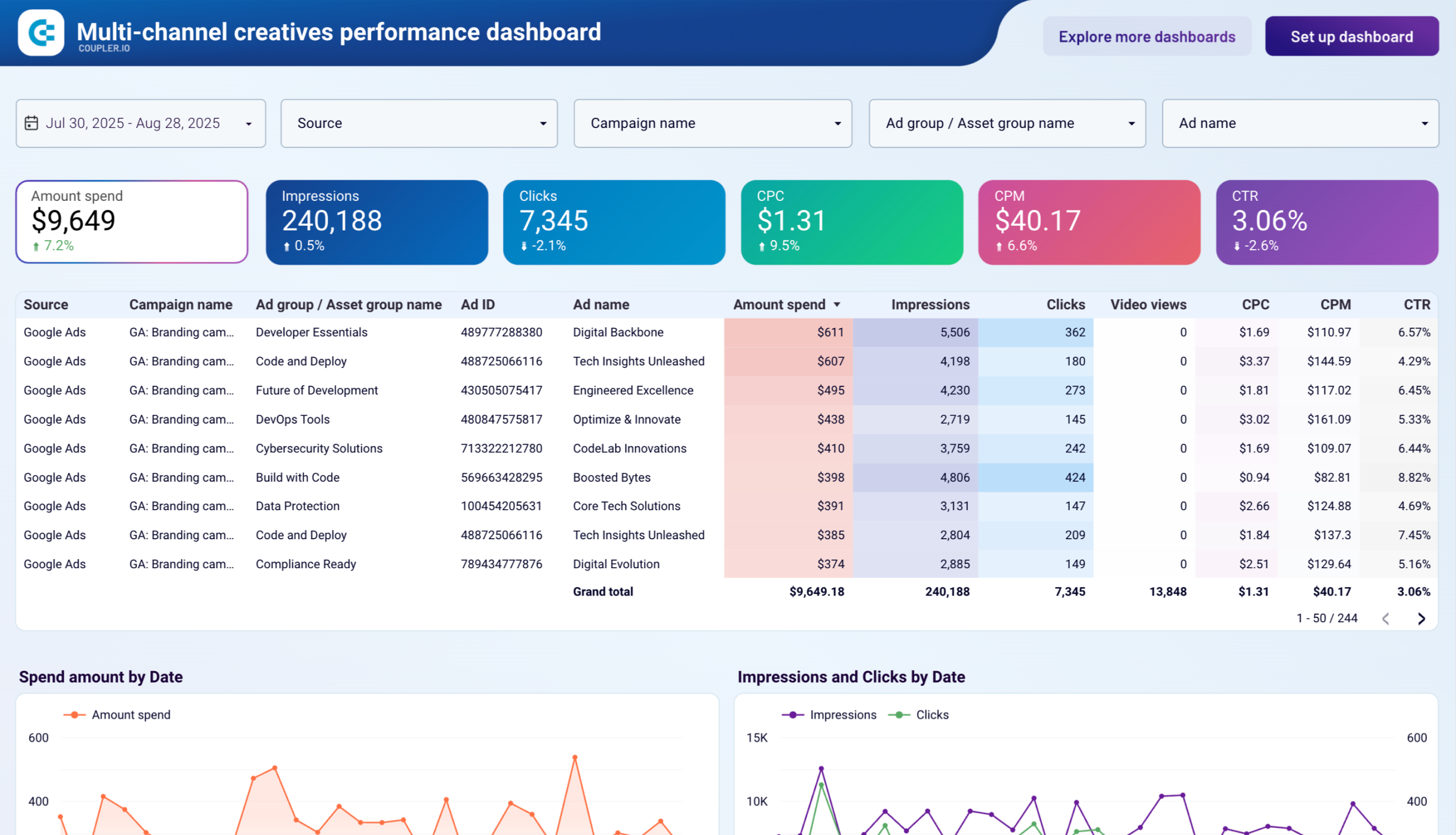
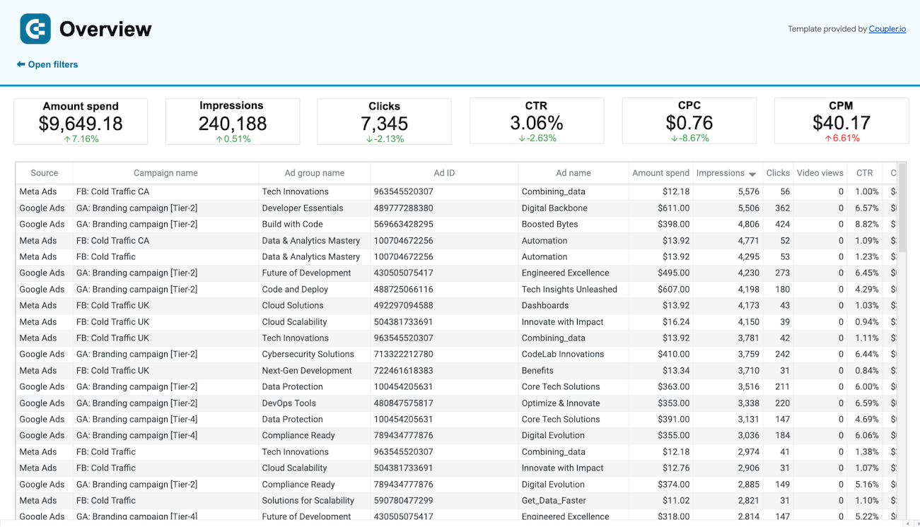
Preview dashboardThe overview page of the multi-channel ad creatives performance dashboard opens with combined metrics across all connected platforms. A granular ad-level table shows every creative by source, campaign, ad group, ad name, and ID alongside its performance metrics. Ranked tables for top-performing creatives by CTR and by clicks help identify what’s working across platforms easily.
The Ads Overview page breaks everything down by platform. LinkedIn Ads, Google Ads, Meta Ads, Bing Ads, and TikTok Ads each get their own section with specific metrics. A daily trend chart and an ad-level performance table show which individual creatives are driving the numbers.
Who it’s for and how it helps
Agencies managing creative strategy across multiple paid platforms. When a client asks why CTR dropped, which ad format is working best, or what ROAS looks like by creative, this dashboard has the answer at the ad level across every platform.
The dashboard is available in Coupler.io, Google Data Studio, and Google Sheets.
12. All-in-one social media analytics dashboard
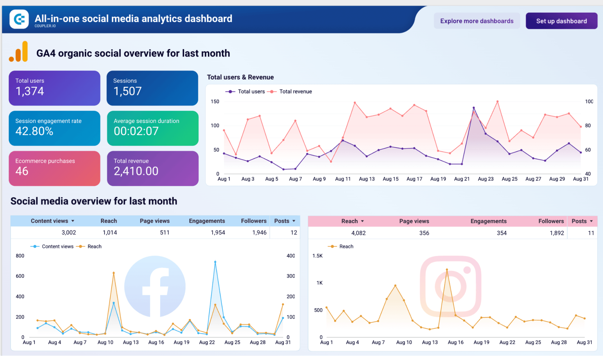
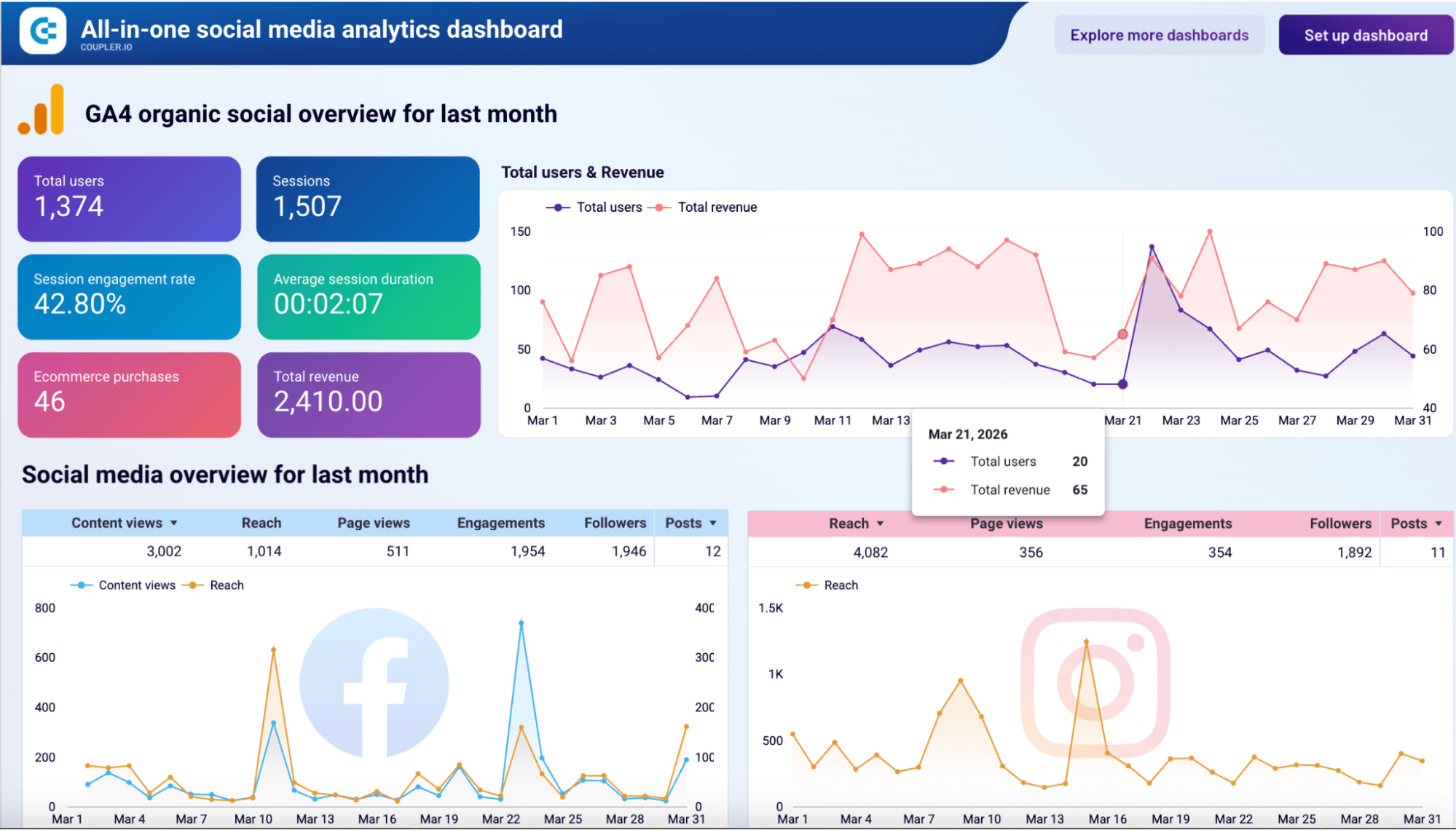
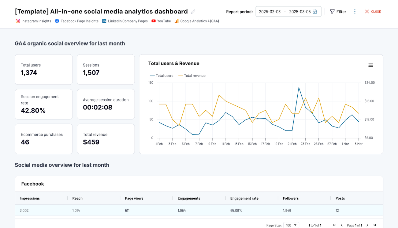
The all-in-one social media analytics dashboard brings organic social performance across Facebook, Instagram, LinkedIn, YouTube with GA4 data into a single view.
All-in-one social media analytics dashboard in Data Studio
 Preview dashboard
All-in-one social media analytics dashboard in Data Studio
Preview dashboardEach platform gets its own section with the metrics that matter for that channel: reach, engagements, and follower growth for Facebook, Instagram, and LinkedIn. Views, watch time, and engagement rate for YouTube. The GA4 section ties it together by showing how organic social traffic converts into sessions, engagement rate, e-commerce purchases, and revenue from social visitors.
Who it’s for and how it helps
Agencies managing organic social for clients who want to see more than vanity metrics. The GA4 integration is what sets this apart. It connects social activity to actual site behavior and revenue, so the conversation shifts from “how many people saw the post” to “what did it actually drive.”
The dashboard is available in Google Data Studio and Coupler.io.
What should a client reporting dashboard include for better efficiency?
A client reporting dashboard is only as useful as what’s in it. Here’s what separates a dashboard clients actually use from one they open once and ignore.
- Clear KPIs front and center: The most important metrics should be visible without scrolling. If a client has to dig to find out whether their campaigns are working, the dashboard isn’t doing its job.
- Date range filters: Clients will always want to look at a different time period than the default. A date filter lets them adjust the view themselves without asking the agency for a new report.
- Goal vs. actual comparisons: Numbers without context are hard to interpret. Showing performance against a target makes it immediately clear whether results are on track or need attention.
- Drill-down capability: A good dashboard works at two levels: a summary view for the client and a detailed view for the account manager. The ability to go from headline numbers to campaign or channel-level data in the same interface saves a lot of back-and-forth.
- Branded and clean design: White-labeled reports that match the agency’s branding look more professional and reinforce trust. A cluttered or generic-looking report sends the wrong signal before anyone reads a single number. Good data visualization makes the difference between a report clients engage with and one they ignore.
- Automated data refresh: A dashboard that requires manual updates isn’t really a dashboard. It’s just another report. Automated refresh means the data is always up-to-date without anyone having to touch it.
- Multiple format options: Different clients have different preferences. Some want Google Data Studio, others are comfortable in Google Sheets or Power BI. Having the same dashboard available across formats means less friction when onboarding new accounts.
All of the dashboards in this guide check those boxes. When off-the-shelf doesn’t fit, custom client reporting and analytics dashboards give agencies full control over metrics, layout, and branding. Explore other dashboard templates by Coupler.io that you can use for client reporting. There are over 200 white-label dashboard examples that are available as native Coupler.io dashboards and versions across leading BI tools: Google Data Studio (Looker Studio), Power BI, and Google Sheets.
Automate reporting across every client with Coupler.io
Get started for freeBonus: Where AI fits into agency client reporting
The 12 client reporting dashboards above give agencies a reliable and structured view of performance. AI adds something different on top of that. The ability to ask questions, generate summaries, and go deeper on demand. It makes them more useful.
Ask cross-client questions in plain language
Managing 10, 15, or 20 client accounts means a lot of tab-switching. Even with dashboards in place, comparing performance across clients still requires someone to log in, look, and piece it together manually.
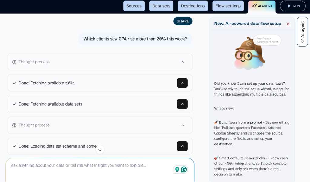
With Coupler AI Agent, you can ask questions directly against your connected data.
“Which clients saw CPA rise more than 20% this week?” or “Which campaigns are overspending relative to last month?” and get an answer without building a new report. The Coupler.io Analytical Engine queries the dataset and runs the calculations. The AI formats the result into a readable response with context.
For teams already working in Claude, ChatGPT, or Gemini, Coupler.io’s MCP server connects those tools directly to your data flows. You can query from whichever AI environment your team prefers.
Auto-generate client-ready summaries
Same structure, different numbers, 15 clients with hours of copy-paste. AI can draft the client-facing narrative from dashboard data by pulling the key movements, flagging what changed, and framing it in plain language. The agency edits and signs off rather than writing from scratch.
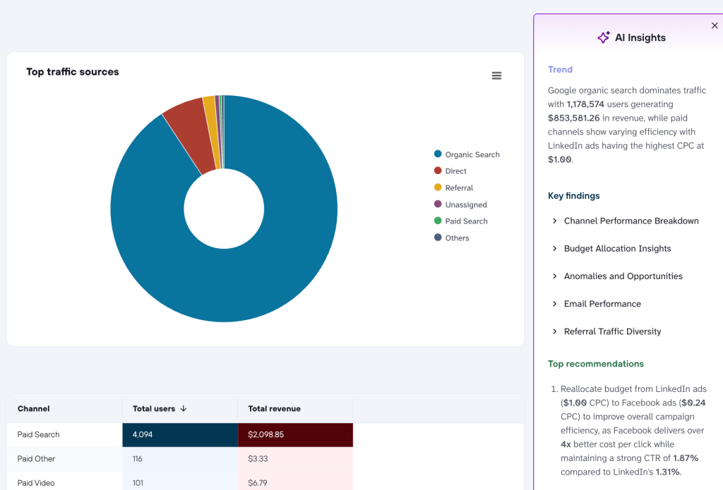
One thing to keep in mind: outputs should always be reviewed before sending. AI summarizes what the data says. The account manager should add the judgment about what it means.
Explore beyond the fixed report
Dashboards answer the questions you anticipated. Clients always ask the ones you didn’t, usually live on a call. Pointing an AI tool at the same connected data lets account managers respond in the moment rather than following up later.
Data stays governed throughout: AI tools query through Coupler.io rather than accessing raw exports, so nothing leaves the pipeline.
When AI helps and when a dashboard is enough
Not every client needs AI on top of a dashboard. For straightforward accounts with predictable reporting needs, a clean weekly dashboard is the deliverable, and that’s perfectly fine.
AI is needed when the account is complex, the client asks a lot of ad-hoc questions, or the agency is scaling reporting across many accounts at once. It’s an addition to the stack, not a replacement for the 12 dashboards above.
Let Coupler AI do the data work for you
Tell Coupler AI what you need to know, from which source, and how often. It connects your account, sets up the data flow, keeps it refreshed, and lets you analyze the results inside Coupler.io or another AI tool.
Try for free
How client reporting dashboards make decision-making easier
Along with making reporting faster, a dashboard changes how decisions get made.
When performance data is always visible, agencies stop reacting to problems and start spotting them. For example, a dip in CTR, a spike in CPA, a drop in organic sessions show up before anyone has to ask. And catching these early is always easier to fix than explaining it after the fact.
Also, clients with self-serve access to data ask fewer check-in questions. They can see where things stand without waiting for a report, which builds confidence in the agency over time.
Budget conversations get easier too. When a client asks whether to shift spend from LinkedIn to Google, the answer is in the dashboard. Not in a spreadsheet someone has to build first.
And when something needs to change fast, the data is already there. There is no more waiting for the next reporting cycle.
Client reporting doesn’t have to be the most time-consuming part of running an agency. The right marketing reporting tool makes data visible, conversations easier, and decisions faster. The 12 dashboards in this guide cover the most common agency reporting scenarios. Start with the ones that fit your current client mix and build from there.
Pick your first dashboard and set it up with Coupler.io in minutes
Get started for free