The evolution from static reports to dynamic delivery systems
Less than 20 years ago, static reporting was the norm for businesses and marketing teams everywhere. Data was presented in primitive charts and graphs, pieced together in PowerPoint or spreadsheets. Standard ‘delivery’ tools included slide decks, PDF attachments, and chaotic email threads titled ‘Q2 results (ver.3).’
Back then, the entire workflow – from data preparation to presentation – was far from efficient. When BI tools like Tableau hit the market, their rapid adoption surprised no one. Now, in 2025:
- Globally, around 67% of organizations use BI tools in their data analytics workflows.
- 50% of business leaders say their company’s reliance on BI has ‘increased a lot’ in recent years.
- Companies that encourage employees to use data for daily decision-making are 3 times as likely to report a 20% increase in earnings.
These numbers highlight the growing importance of accessible data. People prefer to analyze information in dynamic, interactive formats, and static reporting is quickly becoming a thing of the past.
Static reports vs dynamic dashboards – key differences
Before we get into specifics, let’s go over the key differences between static reporting and dynamic reporting:
| Feature | Static reports | Live dashboards |
| Interactivity | None, data is read-only | Users can typically drill down, filter, and explore data on the fly |
| Data freshness | Fixed snapshot at a point in time, data quickly becomes outdated | Continuously updated with fresh data |
| Customization | Rigid format. Making changes requires rebuilding the report | Structure and visualizations can be adapted to team needs |
| Delivery & access | Delivered periodically (e.g., weekly/monthly) via PDF or email | Accessible anytime via cloud dashboards or shared links |
| Automation and AI capabilities | Requires manual updates. No built-in intelligence | Automated data refresh. AI can surface key insights, trends, and concerns |
| Collaboration | No real-time commenting or shared views | Possibility to set up alerts, make annotations, etc. |
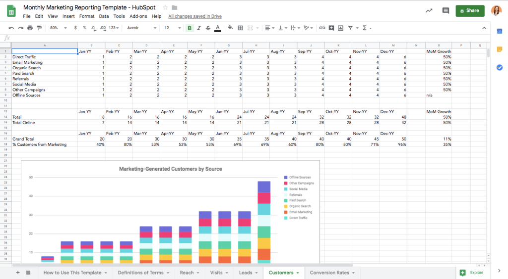
From a visual perspective, a static report typically looks something like this. As you can see, the report has a linear flow, minimal visualizations, and requires manual data input:
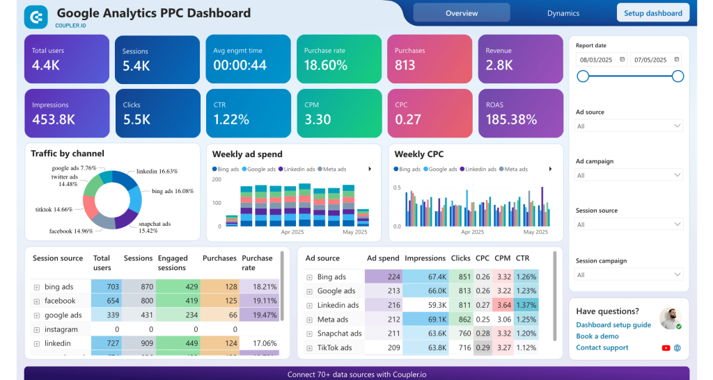
On the other hand, modern, live dashboards often have a seamless design. Here’s an example of a Google Analytics PPC dashboard with a cohesive structure, automated data refresh, and interactive features:
Now that you have an idea of how a ‘dynamic’ dashboard should look, let’s move on to the differences between spreadsheets, self-service BI tools, and templates for marketing data delivery.
Where to build dynamic marketing dashboards: Spreadsheets vs. self-service BI tools vs. templates
With so many business intelligence platforms to choose from, how do you select the proper home – i.e., delivery system – for your marketing data?
Ultimately, it comes down to a few key factors, including the volume of data, budget constraints, and most importantly, the needs of the team and stakeholders. We’ll focus mainly on the latter in this section. So, let’s explore the different types of platforms where you can build or benefit from live, automated dashboards.
Spreadsheets
Spreadsheet applications are one of the most accessible types of data delivery systems. In general, they are easy to use, cost very little to scale, and offer flexible formatting options to present data in different ways.
They are best suited for:
- Internal reporting, e.g., individual project tracking or team productivity evaluation.
- Delivering insights to stakeholders who are familiar with spreadsheet workflows, e.g., finance teams, operations teams, and department heads.
Use spreadsheets for marketing reporting when you need:
A flexible tool with a low learning curve. Spreadsheet apps like Google Sheets and Microsoft Excel offer a familiar environment for data analysis and reporting. They allow you to organize data quickly and create detailed tables, as shown here in this advertising budget forecast dashboard for Facebook Ads:
Accessibility for low-budget, distributed teams. Most organizations already use Google or Microsoft ecosystems, which means your team likely has access to a spreadsheet app. This makes it easy to build marketing dashboards and share them with remote stakeholders – no additional software purchases required.
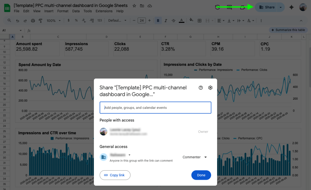
For instance, this PPC multi-channel dashboard for Google Sheets can be shared with stakeholders in a couple of clicks:
Raw data for future consumption. With spreadsheets, you can provide structured data sets that stakeholders can filter, sort, and analyze according to their own needs. It’s also a convenient location to gather historical data for future trend analysis, forecasting, and so on.
Drawbacks of spreadsheets for marketing data delivery:
- Limited visualization options compared to dedicated BI tools make it unsuitable for complex data storytelling.
- Risk of formula errors or accidental data corruption/deletion when multiple people are interacting with the same file.
- Fewer and less sophisticated BI features; not ideal for presenting results to clients or executives who expect a polished dashboard interface.
Self-service BI tools
Purpose-built BI solutions like Looker Studio, Microsoft Power BI, Tableau, and Qlik provide you with a set of components to build dashboards from scratch. These include ready-made charts, preset filters, date range controls, themes, layouts, and data connection capabilities. If you have basic design skills, a strong vision for how a report should look, and time to spare, self-service BI tools can be a good fit for your needs.
In terms of stakeholders, they are well suited for:
- Marketing teams or agencies that want to create custom dashboards for both internal and client reporting.
Use self-service BI for marketing reporting when you need:
A customizable user experience. Self-service BI tools offer the luxury of choice. You get to decide how each type of report is structured and how the data is visualized, color-coded, and distributed across pages. It’s much easier to create dynamic, multi-dimensional views in BI tools than in spreadsheets.
For example, this web analytics dashboard in Power BI has multiple tabs that allow users to switch from a broad performance overview to detailed demographic breakdowns:
Advanced visualizations and interactivity. BI tools let you create interactive charts, clickable filters, drill-down tables, funnels, sliders, gauges, and custom icons. This is ideal when you need to present complex data engagingly. Stakeholders can easily explore the dashboard without the risk of breaking formulas or corrupting underlying data.
This Shopify marketing funnel dashboard, for instance, contains several types of visualizations, drill-down tables, and filters. Here’s a small snapshot:
Multiple perspectives from one dataset. Again, BI tools offer variety and flexibility. You can build different dashboards that connect to the same data source. This comes in handy when you have more than one audience to cater to, such as C-levels looking for high-level summaries, or marketing managers who need detailed breakdowns.
Drawbacks of self-service BI tools for marketing data delivery:
- It can be expensive, depending on the tool, the size of your organization, and your dashboarding needs. For instance, Looker Studio is free, but Tableau’s cheapest annual plan starts at $15 per user.
- Self-service BI tools can often be buggy, especially when handling large datasets. Some (e.g., Looker Studio) are notorious for slow loading and screen freezing, while others, like Power BI, are known for their high learning curve.
- Connecting data from multiple sources can be tricky. Most of these tools only support a limited number of data connectors, so you’ll need the help of other solutions (like Coupler.io) to automate data flows and maintain a live dashboard feed.
Dashboard templates
Dashboard templates are not always separate from self-service BI tools, but the user experience is completely different from the start. Case in point: Templates allow you to visualize your data in minutes compared to the hours or days it can take to build a dashboard from scratch.
Dashboard templates work great when your stakeholders are:
- Your team, but you have limited time, budget, and design resources.
- Clients who expect professional reporting but don’t require any specialized KPIs.
- Management or C-levels who are asking questions and don’t want to wait for custom-built reports.
Use dashboard templates for marketing reporting when you need:
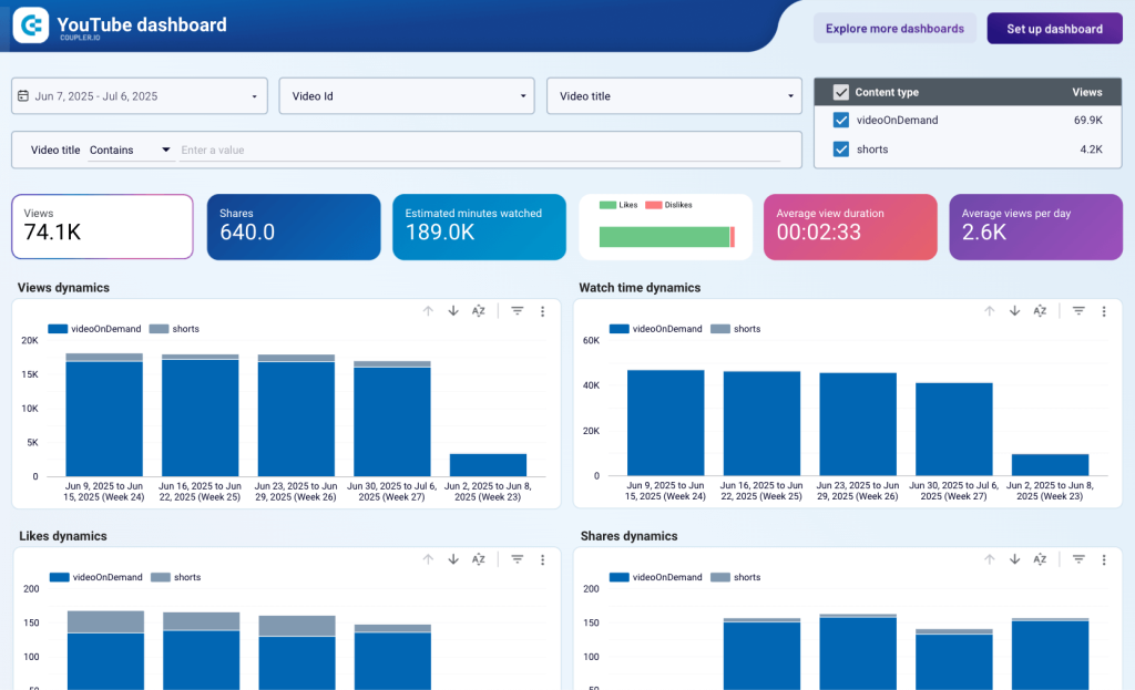
Faster time-to-insight. Templates provide a prebuilt structure and predefined metrics, allowing you to skip the prolonged setup phase and get straight to analysis. Fed up trying to navigate LinkedIn’s clumsy analytics? Confused about how your advertising efforts align across platforms? Dashboard templates can address these pains and answer your questions in minutes.
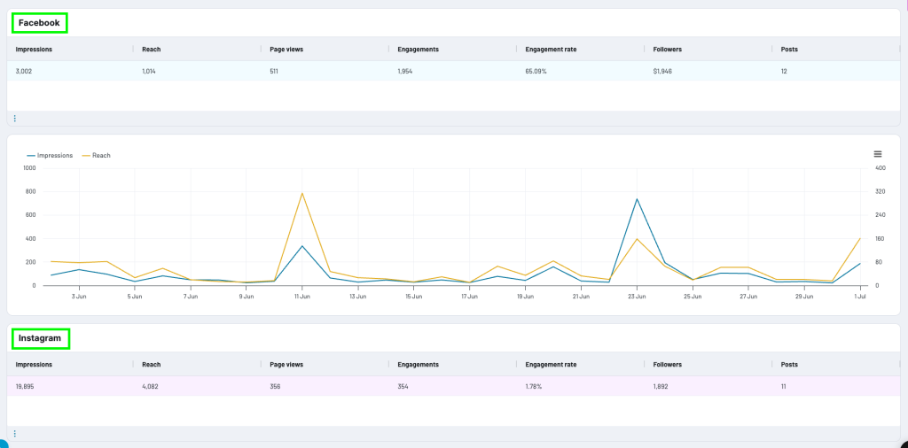
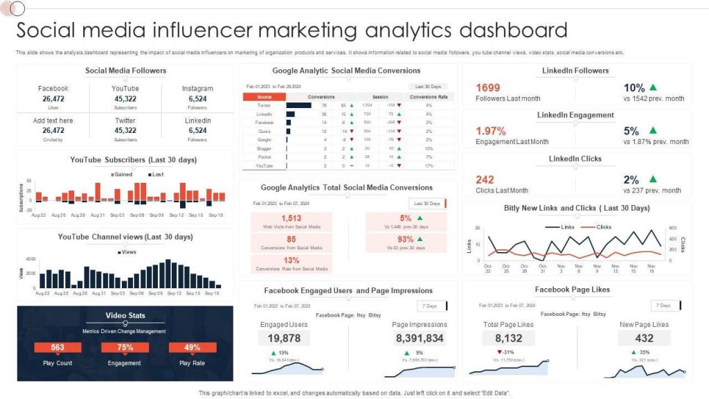
The all-in-one social media analytics dashboard template lets you monitor and compare performance across platforms, for instance:
Consistency. Standardized formats and color palettes ensure all your reports follow a logical structure, metric naming conventions, and branding guidelines. This is crucial when your stakeholders are clients or investors. It shows attention to detail and helps you build trust over time.
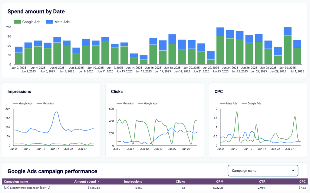
For example, the Google and Meta Ads campaign performance dashboard template has only 2-3 main colors and focuses on 6 common metrics:
To prove value quickly. Templates enable you to demonstrate ROI and marketing impact to stakeholders without needing to prepare custom reports. They are useful when you need to provide concrete answers quickly, respond to urgent budget questions, or pitch a new marketing investment with little time to prepare.
If you need to justify launching a pricey ad campaign on YouTube, you could use a performance dashboard template instead of screenshots from your analytics interface.
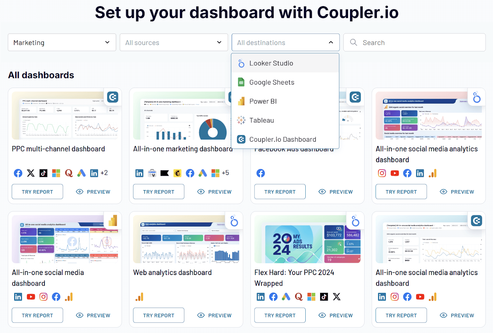
BI tools usually provide a limited number of basic templates, but you can also find free, white-label options from reporting automation solutions like Coupler.io.
For example, our team has designed 150+ marketing dashboard templates compatible with reporting destinations like Looker Studio, Power BI, Tableau, Google Sheets, and the Coupler.io platform. All of the dashboards update automatically on a predefined schedule. You can choose the options that best fit your needs:
Set up your dashboard with Coupler.io
 Try Coupler.io for free
Set up your dashboard with Coupler.io
Try Coupler.io for freeDrawbacks of dashboard templates for marketing data delivery:
- Typically have little to no customization options; what you see is what you get.
- May include metrics that don’t align with your analysis needs, like bounce rate and time on page when you’re focused on lead conversions. This can confuse your stakeholders and distract from your marketing goals.
- Rigid structure makes them unsuitable for marketing teams with rapidly shifting strategies, KPIs, and complex data requirements. For instance, if you want to track LinkedIn, CRM, and web analytics statistics in one dashboard, it will be difficult (or impossible) to find a template that covers your exact needs.
Advanced reporting destinations reshaping marketing intelligence
The future of marketing analytics extends far beyond dashboards. Modern, data-driven teams require access to a wide range of tools that simplify reporting and help them get the most out of raw data. Let’s explore some of these new approaches and emerging data destinations:
AI tools and integration
Artificial intelligence is already beginning to redefine how we analyze and interpret data. In marketing analytics, it helps demystify metrics and trends, connect data points across tools, and create a reliable narrative that simplifies decision-making.
Generative AI tools
One way to use AI for data delivery is to query insights directly from tools like ChatGPT, Gemini, or Claude. For instance, you can upload one month’s worth of Facebook data to ChatGPT and ask it to provide you with actionable recommendations.
While this method is valid, it’s more time-consuming and isolated than using AI-powered dashboards or MCP servers. You need to juggle separate tabs, download data into CSV files, and perform these tasks repeatedly. It’s better to spend 5-10 minutes setting up integrated solutions than to waste hours on ad-hoc querying.
There are also limits on the amount of data you can upload to these tools. This can make it difficult to connect insights from different marketing channels and make decisions based on historical data.
AI-powered dashboards
Gen-AI-enhanced dashboards can significantly speed up your team’s marketing data analytics workflow. Instead of spending hours drawing conclusions from dashboards, you can access those insights with the click of a button.
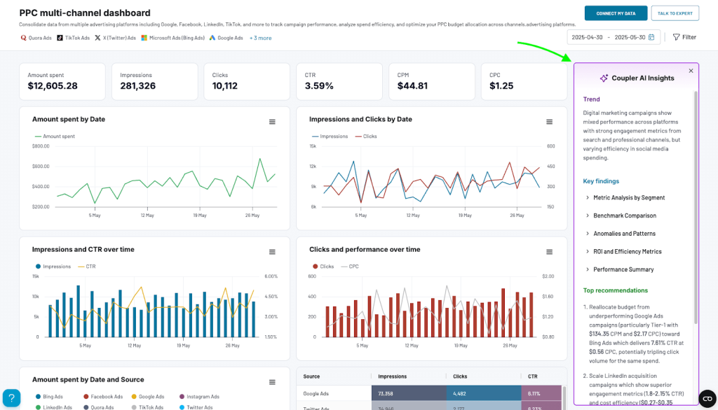
This is the value behind AI Insights by Coupler.io. It’s a feature in our marketing dashboard templates that delivers trends, key findings, and recommendations from your connected data in seconds. You get a detailed summary that makes communicating marketing insights to stakeholders 10 times more efficient.
Read more about this feature and how to access it in our dedicated guide to AI Insights by Coupler.io.
MCP servers
A model context protocol (MCP) server is the next step up from AI-powered dashboards. In a nutshell, an MCP server allows AI tools like Claude to connect to third-party resources like HubSpot, Figma, or Jira, fetch data from them, and analyze the data using natural language. You can query your marketing performance directly in a conversational interface.
For instance, the Coupler.io MCP server allows you to ask Claude questions based on data from your dashboards and data flows. It can analyze historical data from multiple sources and provide detailed breakdowns and predictions. All you need is a specific prompt. Here’s an example:
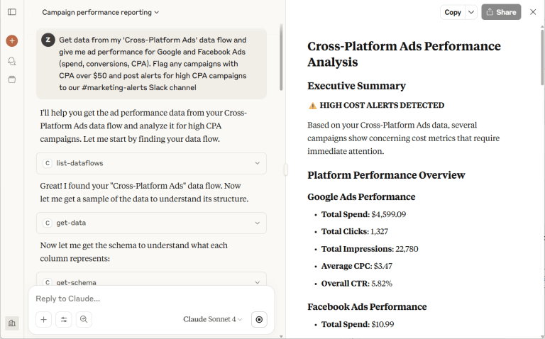
MCPs are especially useful for data delivery as they allow you to ask personalized questions based on stakeholder concerns. You can use the fast-generated insights to build reports that better align with your audience’s needs.
Want to try it for yourself? The initial setup takes 5 minutes tops. It doesn’t require any technical know-how – simply follow the steps in this video tutorial:
Data warehouses
A data warehouse is a curated storage system explicitly built for analytics, where you can consolidate data from multiple business sources like CRMs, analytics tools, and social media platforms. Users can run queries (using SQL) to uncover relationships between different channels, campaigns, and target audience segments.
Data warehouses help you better understand the customer journey. Their core purpose for marketing comes down to this: The quicker you can access nuanced data, the sooner you can make decisions that drive impact for your business or clients.
When it comes to data delivery, the benefits of warehouses include:
- Complex analytics querying. You can get answers to hyper-specific questions that standard dashboards cannot provide. It allows you to dive deeper into your marketing data and provide context in your reports.
- AI-ready datasets. Data warehouses provide an ideal environment to collect clean, structured data for predictive analytics reporting or related tasks. This data can be fed into machine-learning models without much effort.
- Scalability. If your business’s data volume is growing fast, data warehouses are a great investment. You can preserve raw, historical data from multiple tools, which may come in handy for future trend analysis and reporting.
A major downside is that data warehouses aren’t exactly easy to use. They tend to have complex interfaces and high learning curves for non-technical users.
If you’re wondering how to connect data from marketing platforms to data warehouses, Coupler.io handles that. You can easily set up data flows from your favorite tools to warehouses like BigQuery, RedShift, or PostgreSQL.
APIs and JSON delivery
Sometimes, stakeholders want marketing insights delivered directly to the tools they are already using, like a custom CRM, ERP, or team collaboration platform. In this case, a dashboard in Excel won’t cut it. You’ll need to find a way to connect this data to an external tool, and that’s where API connections come in.
APIs act as a bridge between marketing platforms and business applications. JSON is the language the API uses to package your marketing data into a machine-readable structure. Without getting deep into the weeds, this setup allows you to automatically connect data to a specific destination without the need for manual exports and refreshes.
The key advantages for data delivery include:
- Native integration. You can establish data flows and design live dashboards in custom-built tools that stakeholders are already familiar with.
- Automated processes. With an API integration, it’s possible to create automatic triggers or alerts that send performance updates to stakeholders when specific events occur. For example, notifications in Slack when there’s a sudden drop in web traffic.
The challenge with API and JSON data delivery? Technical execution. You’ll need the help of a software engineer or development team to configure the API connection and maintain it over time. The whole process takes money and time to complete – resources you may not have to spare.
Meanwhile, Coupler.io empowers non-technical professionals and marketing teams to connect data from different sources without having to code. You can browse our full list of marketing data sources and start building data flows that fit your reporting needs.
How to design dashboards that translate data into decisions
At the end of the day, marketing dashboards – interactive, automated – are the most effective tools for reporting and acting on your data. While databases and custom solutions have their place, dashboards are more efficient at transforming raw information into actionable insights. Here are a few things to keep in mind when creating one from scratch:
Start with the decision in mind
A clever way to approach dashboard design is to start at the end and work backwards. Ask yourself, ‘What do we actually want to achieve with this tool?’
The answer may seem obvious at first – e.g., ‘track the performance of Facebook Ads creatives’ – but the real question is what action you’ll take based on that tracking. Will you cut spending on ineffective campaigns? Invest more in top performers, or test new creative variations? Structuring your design (metrics choice, visual formatting, etc.) around these questions can simplify analysis and speed up decision-making.
Customize the view for the audience
Put yourself in the shoes of the people who will be opening this dashboard every day, week, or month. What are their key concerns? How familiar are they with marketing jargon and metric abbreviations like ROAS or CPM?
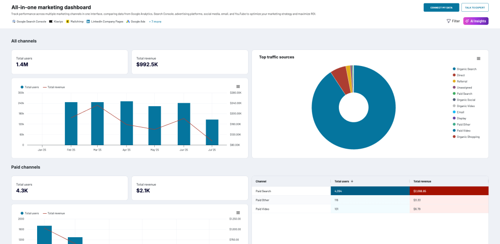
For instance, if your audience mainly consists of C-level executives or non-marketing professionals, the dashboard should reflect their priorities. Stick to accessible language and focus on business outcomes like revenue growth, purchasing trends, high-impact channels, and buyer journey dynamics.
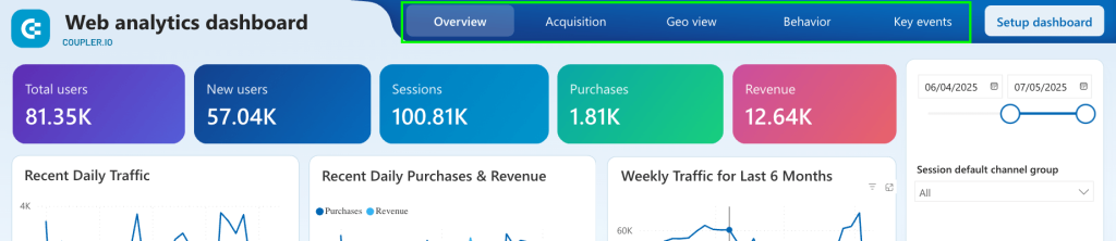
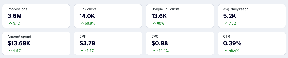
Here’s an example of an all-in-one marketing dashboard that caters to both marketers and non-marketing stakeholders. It focuses primarily on key business metrics like user and revenue growth:
Aim for clarity over complexity
Many marketers feel compelled to create aesthetic, layered dashboards that showcase every possible metric and visualization. While impressive-looking, these kinds of dashboards only overwhelm users and slow down decision-making.
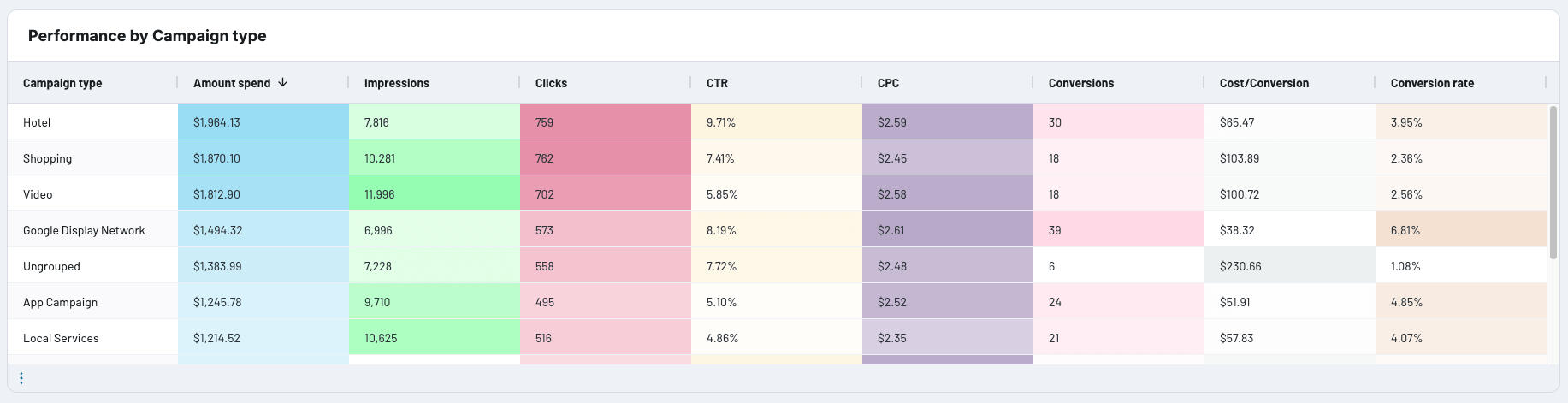
For instance, this template contains an abundance of graphics and is generally hard to read:
You don’t have to compromise style over function, but it’s best to control the number of visualizations in your dashboard view. Limit the variety of chart types and prioritize metrics that directly impact your business decisions.
Tailor visuals to your goals
It’s crucial to choose charts and graphs that answer key business questions and accurately represent the shape of your data. Ideally, each visual should answer a single or a set of related questions. You may pick the following when you want answers to questions like:
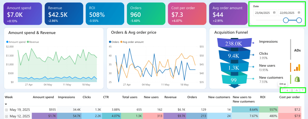
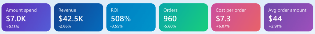
- ‘Are we on track to meet our monthly or quarterly targets?’ ? Scorecards and/or gauges, as shown in this Shopify marketing funnel dashboard.
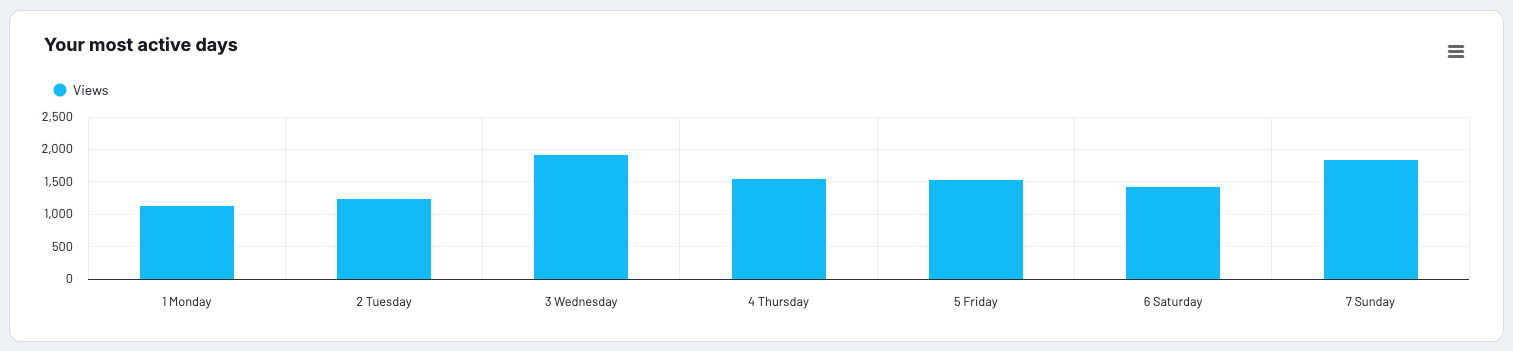
- ‘Which days of the week do our videos receive the most views on TikTok?’ ? Bar chart.
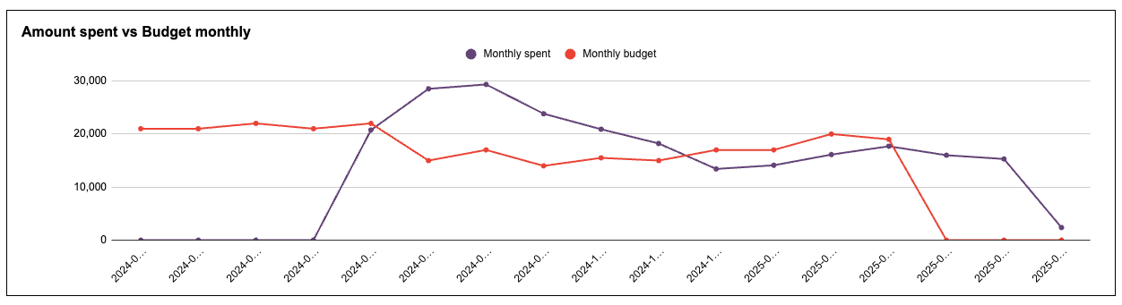
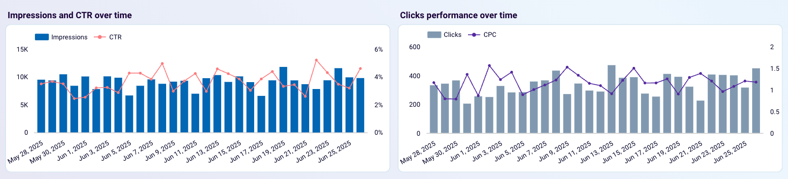
- ‘How has our advertising budget increased week-over-week this month?’ ? Line chart.
- ‘At which stage are we losing the most potential customers in our signup flow?’ ? Funnel chart.
Customer acquisition dashboard for HubSpot
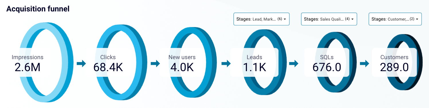 Preview dashboard
Customer acquisition dashboard for HubSpot
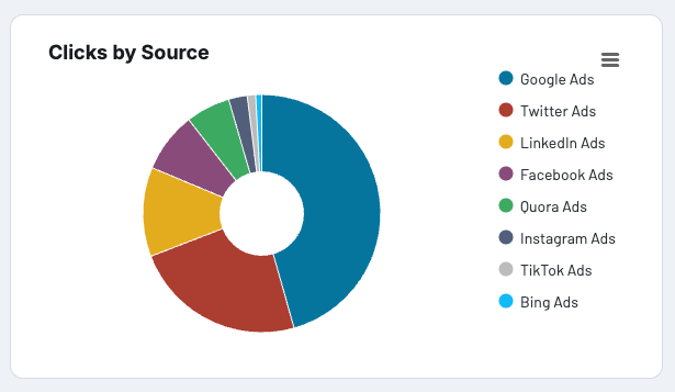
Preview dashboard- ‘Which advertising platforms drive the highest number of clicks?’ ? Pie chart.
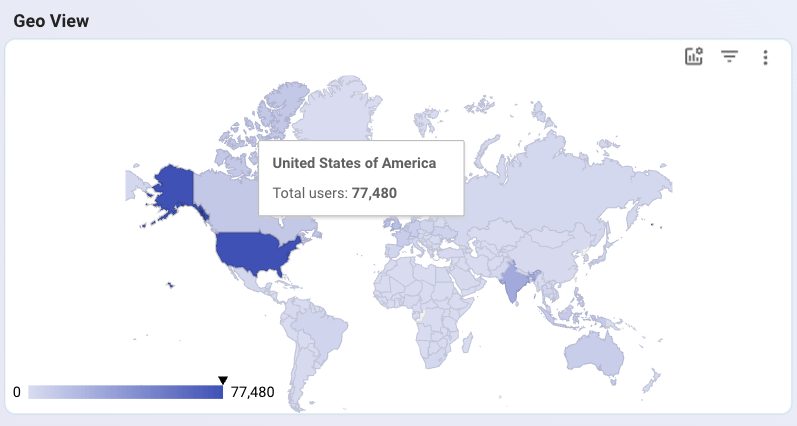
- ‘Which countries or regions generate the most traffic for our website?’ ? Geo map.
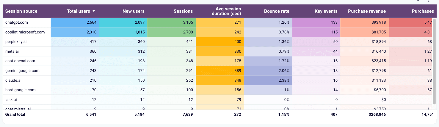
- ‘Which AI tools attract the most visitors and paying customers to our website?’ ? Interactive table.
You can read the guide to marketing data visualization for more examples and inspiration.
Tell a story with your data
A valuable dashboard is more than a collection of numbers, charts, and graphs. It tells a coherent story about how your paid advertising campaigns or YouTube strategies are performing at any given time. Story-driven dashboards typically have a clear beginning, middle, and end:
- Start with high-level information to provide immediate context and attention-grabbing insights. Scorecards work great here as they are easy to digest.
- Use the middle section to explain trends and highlight patterns through visual comparisons. Show performance over time, emphasize best results (top 10 performing channels) and outliers, and demonstrate correlations between different metrics (e.g., impressions & clicks).
- Wrap up with granular insights that allow users to take specific action or drill down into problem areas. For example, a scrollable table with individual campaign performance that enables users to optimize budgets or pause underperforming ads.
Make it interactive
It’s easier to keep your audience engaged when they can click, filter, and drill down into reports. Interactivity adds depth to dashboards, allowing you to squeeze more insights from your connected data.
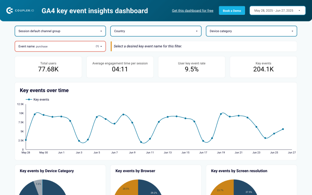
An interactive dashboard can also serve multiple needs, as users can customize views based on what matters to them. For instance, in a GA4 key event insights dashboard, marketers can filter by channel or country to assess performance, while SEO experts can diagnose deeper issues by drilling down into device categories or specific events.
Test and refine
Designing a great dashboard takes time and revision. Like anything creative, it requires planning, experimentation, a first draft, and targeted feedback to evolve into an asset for your team. Start with a basic, functional version and test it among a segment of your target audience. Getting practical feedback from real users – including yourself – can help you identify what’s missing and what needs to go.
Common pitfalls to avoid when creating data delivery systems
Here are a few common mistakes to watch out for when setting up a data delivery workflow:
Relying on manual data refreshes
Automation is the driving force behind reliable dashboard reporting. The golden rule is that you should never spend more time updating dashboards than you do analyzing them. Ideally, you shouldn’t have to do it manually at all, and with Coupler.io, you can schedule data refreshes in a few clicks. Some of our clients have saved 40+ hours a month by automating this part of the analytics process.
Measuring for the sake of measuring
Stuffing your dashboards with metrics won’t make them more insightful, especially if you’re hyperfocusing on stats like follower counts, reach, and views. With marketing analytics, less is usually more.
Choose 3-5 key metrics that align with your business goals for a specific marketing activity – e.g., unique visitors, CTR, product sign-ups – and track their growth over a month/quarter/year. You can still include other relevant KPIs in your reports, but they shouldn’t take centre stage or crowd the main view.
Building without scalability in mind
Any data delivery system worth its salt should adapt to the growing demands of your team. Over time, your marketing data will become more complex, your team will expand, and you’ll need to integrate additional sources. If you stick with scattered Excel or Looker Studio reports – no design rules, no proper automation, no standardized metrics – you’ll end up with a dysfunctional analytics workflow. Choose your BI infrastructure carefully and establish clear guidelines from the start.
Striving for perfection
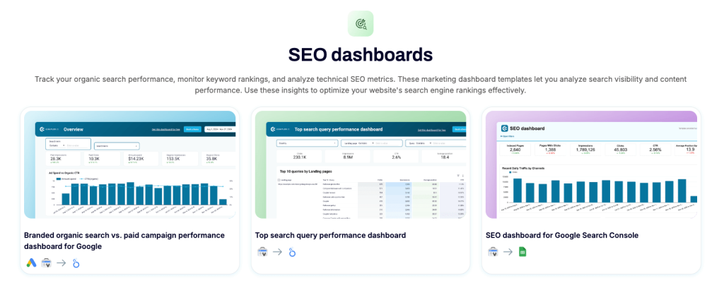
It’s impossible to create a ‘perfect’ dashboard that meets the expectations of everyone on your team, so don’t get caught up in an endless cycle of adding features and swapping out graphs. Instead of building a comprehensive dashboard, create a few for each marketing function (e.g., social media, lead generation) to cover all relevant metrics and projects. Here’s an example of 3 dashboards grouped under an SEO category:
As a general rule, optimize the readability and insightfulness of your reports, but don’t strive for a flawless solution.
Ready to design a data delivery system that works for your marketing and stakeholder needs? With Coupler.io, getting started is easy and affordable. Sign up for free to access the dashboard reporting templates gallery for paid advertising, SEO, social media, email marketing reporting, and more.
If you’re still unsure about how your ideal data delivery system should look, feel free to get in touch with our team of data experts. We can offer tailored advice through a quick consultation:

Book a free 30-minute call
Get started for free