Airtable is much more than a spreadsheet-database hybrid. With its core functionalities, it makes it easy to generate rich Airtable reports and track any kind of data with ease. On top of that, premium apps, scripts, as well as integrations open up opportunities to customize reports and build new ones with just a few clicks.
Learn how to use Airtable to create reports and get the most out of your data.
How to create reports in Airtable – a practical example
You won’t find a separate section in Airtable for reports. This is because you can track so many different types of data on your bases, it would be impossible to create universal and meaningful reports at the same time.
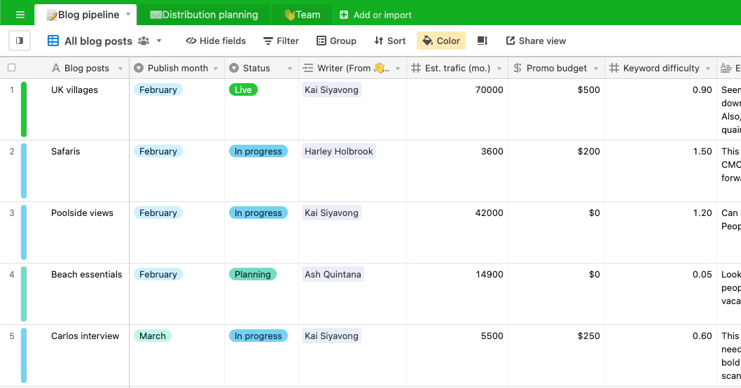
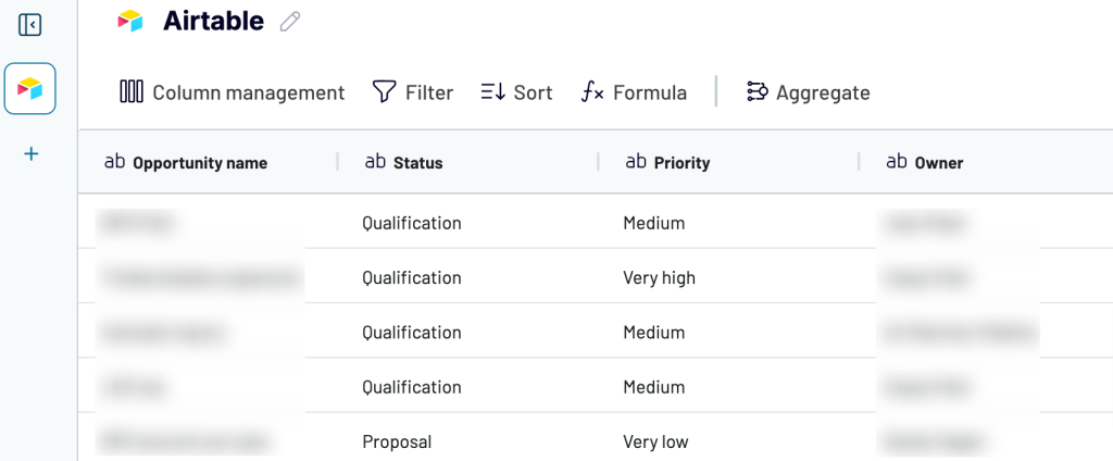
Instead, reporting in Airtable happens directly on individual bases. Let’s see it in an example. We’ve added a sample base using the Blog Editorial Calendar template. It looks like this:
The first thing we can do to aggregate the data is use the grouping feature.
Select Group from the menu on top and choose a grouping criteria. In our case, it would make sense to split the planned articles month by month. So we choose to group by the Publish month column.
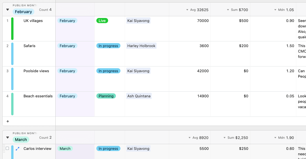
This already looks more like a proper Airtable report. We can quickly see how many articles are planned for each month and can adjust the numerical values as needed. For example, for us, it makes sense to see the average traffic per article, the total budget per month, and the median keyword difficulty.
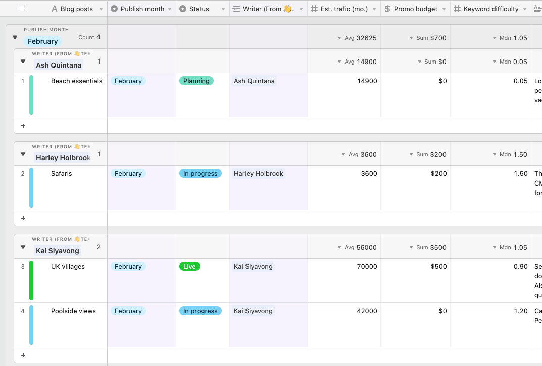
You can also group by multiple columns to dig deeper into your data. For example:
Airtable automated reporting for the best efficiency
Beyond Airtable’s native reporting features, many businesses export their data to build more advanced reports and dashboards externally. This is especially valuable if you’re on a free or Plus plan without access to Airtable Apps, or if you need visualizations that Airtable simply doesn’t offer.
The key to making this work efficiently is automation. ULTRA\OPS, a digital consultancy, faced exactly this challenge when building reporting dashboards for a client’s campaign management app in Airtable. They needed to pull data from multiple advertising platforms (DV360, Meta, TikTok) into sophisticated analytics dashboards—something Airtable’s native tools couldn’t handle. Using Coupler.io to automate the data export, they had the entire reporting system up and running in just one day, cutting typical development time by 90%. The automated pipeline has been running reliably ever since, keeping their dashboards in Looker Studio updated without any manual work.
Coupler.io makes this kind of automated reporting accessible to anyone. It exports data from Airtable to spreadsheets (Google Sheets, Excel), BI tools (LS, Power BI), data warehouses (BigQuery, PostgreSQL), and even AI tools (Claude, ChatGPT). It runs automatically, on your schedule, with no coding required. The setup is also speedy; here’s how to run an Airtable export to Excel:
Select the needed destination in the form below and click Proceed. You’ll be offered to create a Coupler.io account for free.
1. Extract data from Airtable
To start, select the destination for your Airtable data in the form below and click Proceed:
If you haven’t decided on the destination app yet, use another path to create an Airtable data flow from scratch.
Whichever option you choose, you’ll be offered to create a Coupler.io account for free with no credit card required.
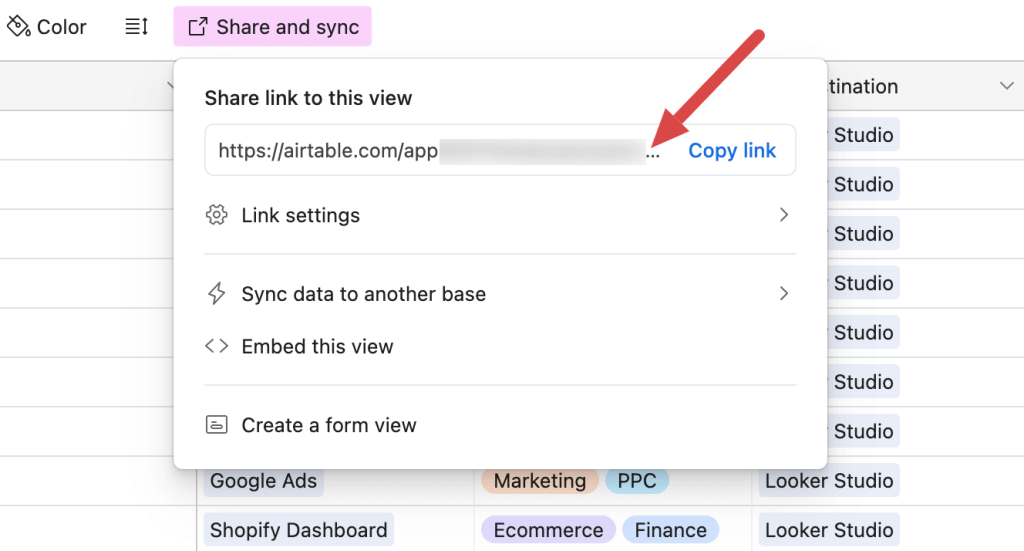
To load data from Airtable, you must provide a shared URL for the view you want to export. With Coupler.io, you can load a specific Airtable dashboard view one at a time – a limitation of the Airtable API.
To get a shared URL of a particular Airtable view, click on Share and sync in the menu and copy the URL you’ll see below.
Paste the URL into the respective field in Coupler.io.
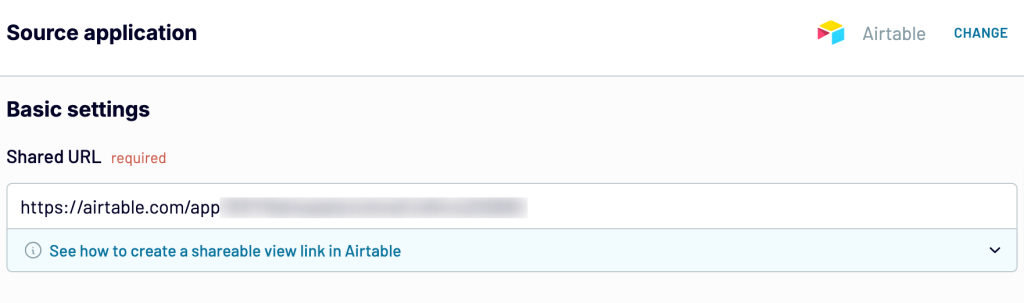
If your view is password-protected, move forward and type in the password into the corresponding field.
2. Organize and transform data
At this point, you can preview your data and transform it if needed:
- Rename, rearrange, hide, or add columns.
- Sort data in ascending or descending order.
- Filter data to extract it based on specific criteria.
- Create new columns with custom formulas.
- Aggregate data using operations like sum, avg., count, min., or max. to columns.
Once everything is ready, move forward.
3. Load data and schedule updates
Now, you must load your data into the destination according to in-app instructions and run the data flow.
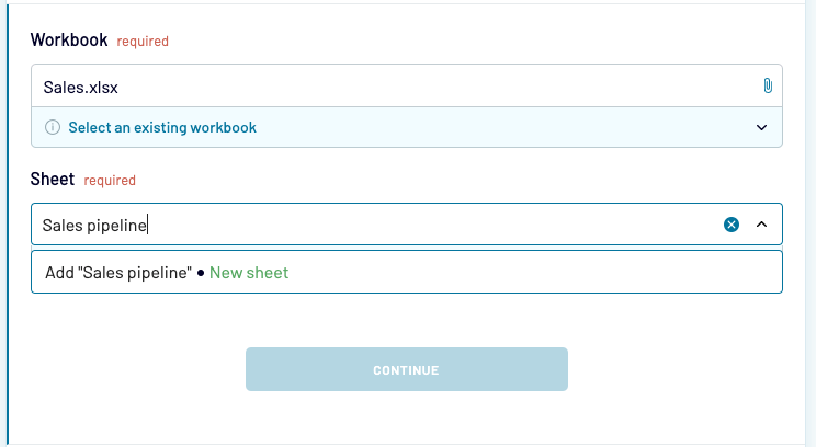
For instance, if you chose Excel, log in to your OneDrive account. Then, select the workbook and worksheet where you want your data imported. If the worksheet doesn’t exist yet, you may also type in its name, and Coupler.io will create it for you.
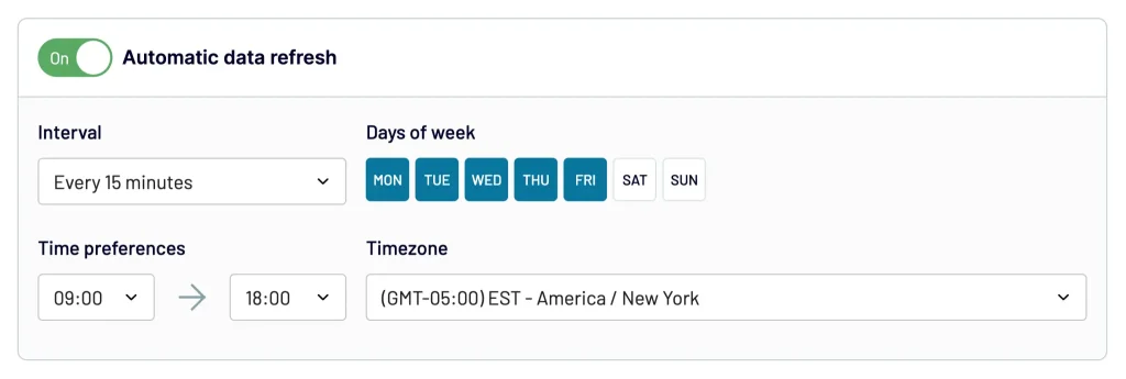
- Change any optional fields if you’d like and then jump to the last step to schedule reports. Enable Automatic data refresh. Then, decide how often the new data should be pulled from Airtable, on which days, hours, etc. When finished, press the Save and run button.
Congratulations! Your data is now in the destination and set to auto-update. You can proceed to turning the exported data into your report by adding charts, pivots, aggregations, etc.
Create Airtable fields report with Apps – step-by-step
To create more sophisticated reports and dashboards, you’ll need to dive into Airtable Apps. They’re available for all users on the Pro plan or higher.
You’ll find apps in the top-right corner of your view.
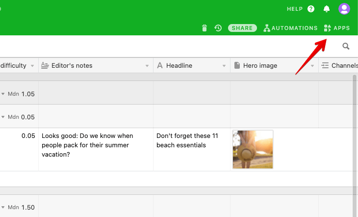
Click on Apps and then Add an app.
Airtable features an extensive marketplace with dozens of its own apps as well as many from third-party developers. They can be used for visualizing the Airtable data in many creative ways, importing data into Airtable, bulk updating records, or even sending emails.
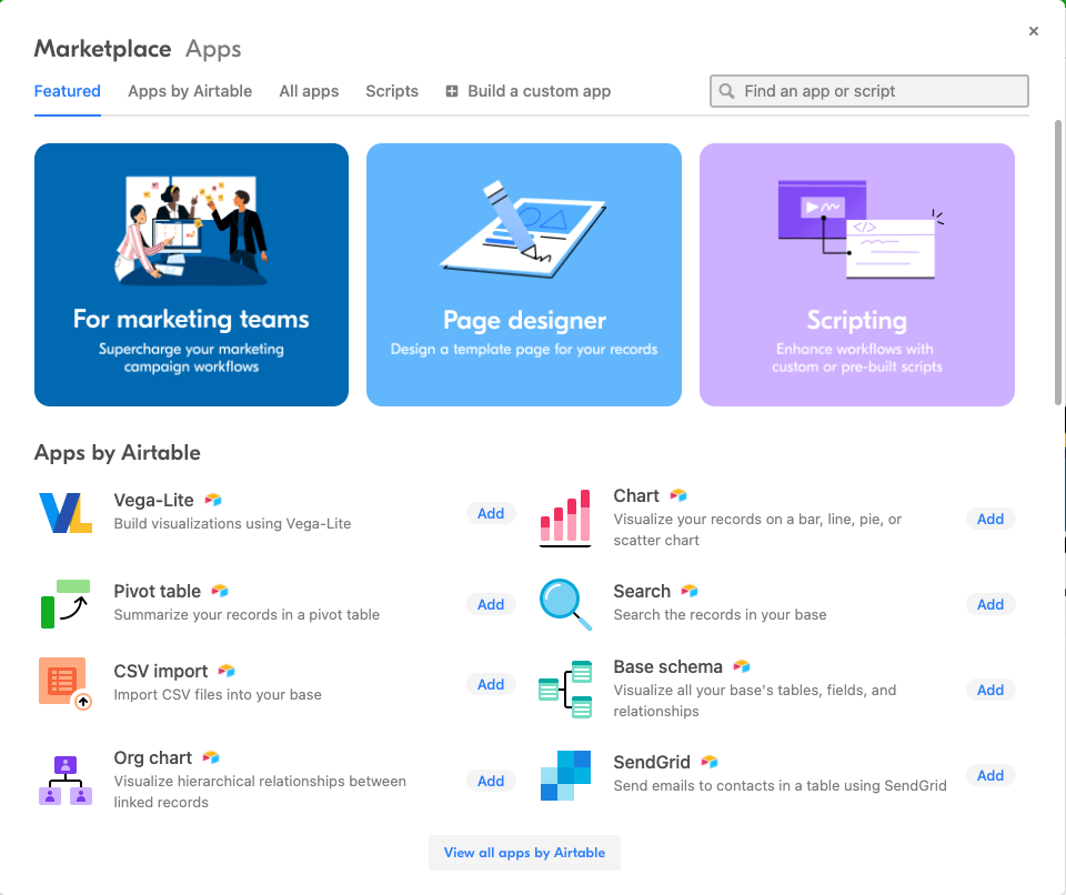
If you can’t find what you are looking for and you happen to know JavaScript, from this area you can also get started with building your own app. Alternatively, take advantage of the available scripts or write your own to automate dull processes.
When it comes to building reports in Airtable, there’s plenty of handy apps you can add to your base with just a few clicks.
To do so, click on any app and its details will automatically load. Press Add app and then configure what exactly should be displayed on a chart. You’ll immediately see the preview of your changes. When you’re happy with the outcome, click Done and close the window.
All charts that you add will appear to the right of the screen. In our case, we chose to add a pivot table demonstrating our pipeline as well as a pie chart showing the current workload of our writers.
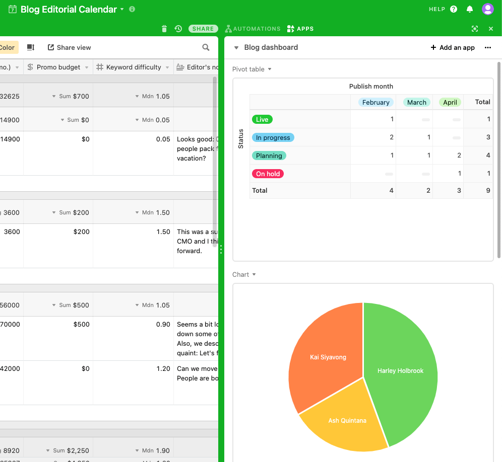
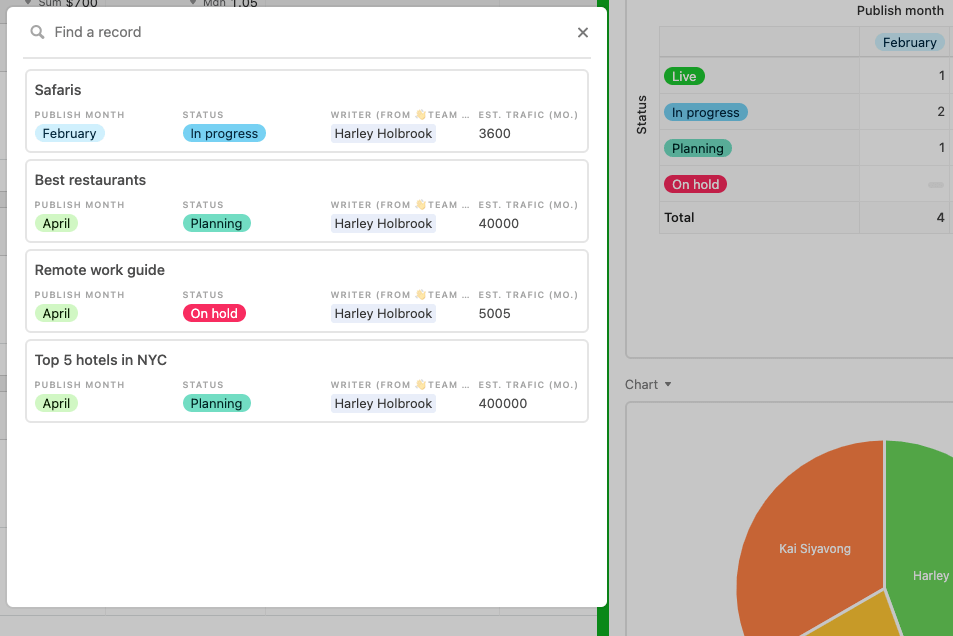
Many apps will display additional, relevant information when you click on their elements. For example, clicking on an author’s name on the pie chart displays the articles they’re currently writing. That’s something many content managers would really appreciate.
Some common examples of reports in Airtable
Airtable can be used for so many different things so there’s no one standard way of building reports in Airtable. Here are, however, two common use cases.
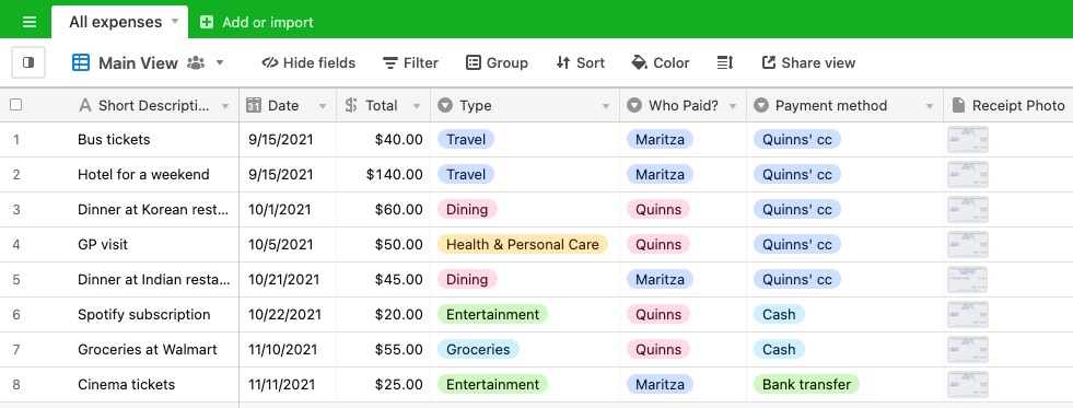
Airtable expense report
Airtable can be excellent for tracking expenses. It’s true whether you’re an operations manager at a company or just someone who wants to figure out why their last salary disappeared so fast. No kidding – Airtable is fantastic for tracking personal expenses too.
Here’s a sample base we set up:
Let’s say we want to automatically sum up the expenses for each month and break them down into different types of expenses. We can do it by grouping records but first we need to transform the date field. After all, we don’t want to get the totals for October 1st or 5th – we want to see the numbers for the whole month of October.
To do so, we need to extract the month from a date. We can do that by creating a new field in the table with the formula type. Then, we insert the following formula:
IF(Date, MONTH(Date))
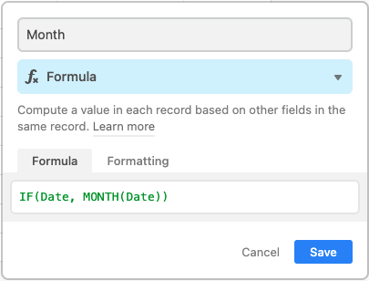
When saved, the field will return the number for each month. We can safely right-click on this column and hide it to avoid cluttering the table.
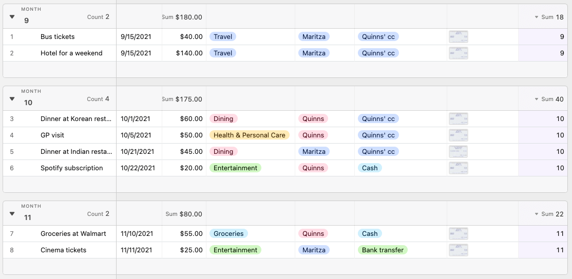
Then, we choose to group the table the same way we did before. We group by the Month field we just added and get a nicely sorted table, with expenses for each month.
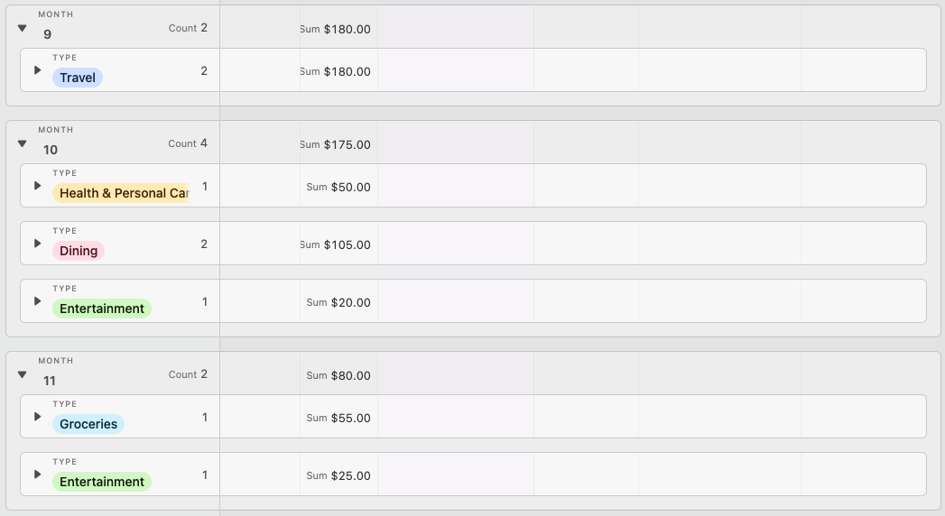
We can further group the table by type of expense and then collapse all of the records for better readability.
Airtable financial report
Let’s now look at how to build a financial Airtable report. We’ve set up a sample sales pipeline report using the default template. It looks like this:
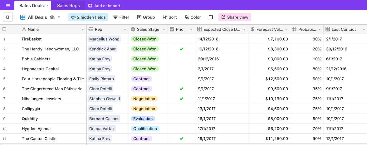
We could group the records by months and get all the totals, averages, etc. this way but instead let’s try a more sophisticated method and use the Apps. As a reminder, they’re only available on the Pro plan and higher.
For starters, we need to extract the month from the dates because we want to show the sales for each month. We’ll do it in the same way as we did in the previous example. This time the date field is named Expected Close Date so the formula looks as follows:
IF({Expected Close Date},MONTH({Expected Close Date}))
Add a new field with the ‘formula’ type and insert the formula above, adjusted for your naming.
If you’d like to also extract the year from the date, add another formula field and simply swap MONTH with YEAR in the formula.
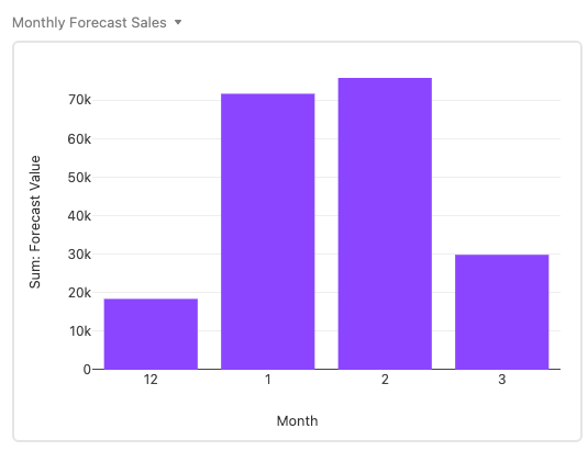
Then, click Apps in the top-right corner and choose the apps that will best display your data. We picked a table to demonstrate the monthly forecasted sales:
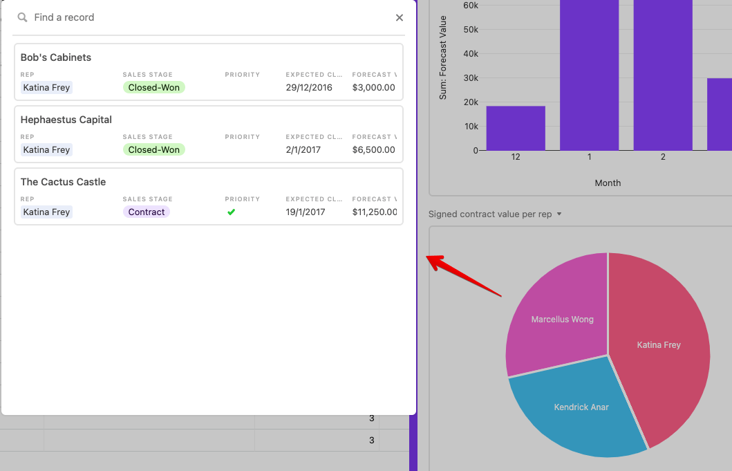
We also chose a pie chart again to see clearly which of our reps have secured the best deals.
An alternative approach – export from Airtable to a report in external tools
If Airtable doesn’t offer the visualization capacity that you require, you may need to resort to some real specialists in the area – data visualization tools.
As we explained in the previous chapter, it’s very easy to run automated exports of Airtable data into a spreadsheet or a database, such as BigQuery. From there, you can take it further – connect to a tool like Power BI or Data Studio and build some interactive reports for Airtable there.

Automate data export with Coupler.io
Get started for freeIf you’re a Google Sheets or BigQuery user, Google Data Studio will probably be your best choice. It’s very easy to connect all of these services and move the data from your Airtable views on an automated basis.
Learn how to set it up using our Data Studio tutorial.
Excel users will probably favor Microsoft Power BI because the data migration is so smooth as well. It’s more powerful than Data Studio, but there’s also a larger learning curve.
Learn how to connect Excel to Power BI using our guide.
Reports for Airtable – recap
When it comes to reporting in Airtable, you’ve got plenty of available options.
On the free and Plus plans, you can use the core functionalities to group items, sum up values, extract monthly or yearly reports, and more. Those on Pro and Enterprise plan will be able to use Apps, Scripts, and write their own solution if they can’t find the right fit.
Everyone can also easily export data out of Airtable. You can extract Airtable views into an Excel or Google Sheets file or send it to a data warehouse such as BigQuery. If you prefer, you can also display the data using data visualization tools and do some proper reporting there.
It’s up to you. Have a wonderful day, and thanks for reading!