According to a survey conducted by Better Cloud, in 2017, companies used an average of 16 tools. Today, that number has exploded to over 100, each generating massive amounts of data. To make sense of it all, businesses need to bring this fragmented data together.
Combining data from multiple sources isn’t just a nice thing anymore. It is essential for accurate data, cross-channel reporting, insights, and faster decisions. In this article, we’ll explain how to combine data using manual and automated methods and share real-life examples to show how it works in practice.
What are the methods of combining data from different sources?
There are two main ways to combine data from multiple sources: manually or automatically.
Manual methods: They include basic techniques like copy-pasting data between files or exporting and importing CSV files. This approach can work if you’re handling just a few sources and don’t need to update data frequently. But as the number of sources grows, manual methods take up a lot of time and are error-prone.
Automated methods: If you work with multiple sources and want to save time, you can automate the data combination process. Tools like Looker Studio and Power Query offer built-in connectors to blend data from different sources. However, the number of native connectors is usually quite limited. Another issue is that the combined datasets affect the performance of your reports and dashboards, making them very slow.
To overcome these issues, you can use Coupler.io. This data integration and AI analytics solution allows you to create cross- and multi-channel reports with a few clicks. It supports over 400 data connectors for marketers, finance experts, analysts, and entrepreneurs. So, you can easily consolidate data from marketing apps, finance software, CRM tools, and more. The combined data can be loaded into spreadsheets, BI tools, databases, and even shared with AI tools.
Collect and combine data from multiple sources with Coupler.io
Manual data handling is tedious, error-prone, and simply doesn’t scale. Automating your data flows saves time and ensures your reports stay accurate, consistent, and up to date without repetitive work.
With Coupler.io, you can automate the entire process of connecting, combining, and sending data from over 400+ sources to a destination of your choice. It lets you consolidate spreadsheets, align cross-channel campaign performance, and blend analytics metrics from multiple platforms.
Let’s explore practical examples of the two ways to combine data automatically using Coupler.io:
Example 1: Append method – combine data sets from multiple sources vertically
The Append function stacks data from multiple sources that share a similar structure. It places one dataset directly below another in the same table. It is useful when you want to merge campaign metrics, leads, or sales data collected from different platforms into a single report.
In this example, let’s combine Google Ads and Facebook Ads data to create a performance report of advertising campaigns in Google Sheets.
Step 1. Connect data sources
Start by signing up for Coupler.io (no credit card required).
In our example, we’re collecting data from Google Ads first. But if you want to work with another app, like a finance tool or CRM, you can easily select a different source and destination in the form below.
Once connected, select the report you want to extract. For Google Ads, it’s the Campaign performance report, and set the reporting period.
Then select the next source in the Add a few more sources section.
In this example, we’ll connect Facebook Ads and select a similar report type – Reports and Insights. Again, feel free to select the data source of your choice.
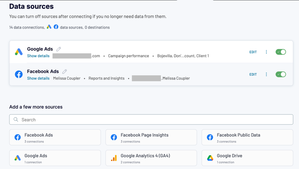
Once both sources are connected, you’re ready to move on to combining your data.
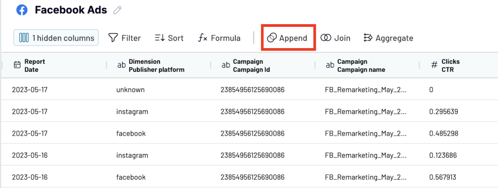
Step 2. Transform and append data
After the sources are connected, move to transformations. This is where you define how your data should be combined and cleaned before it’s sent to your destination.
Since both Google Ads and Facebook Ads have similar structures, we’ll use the Append method.
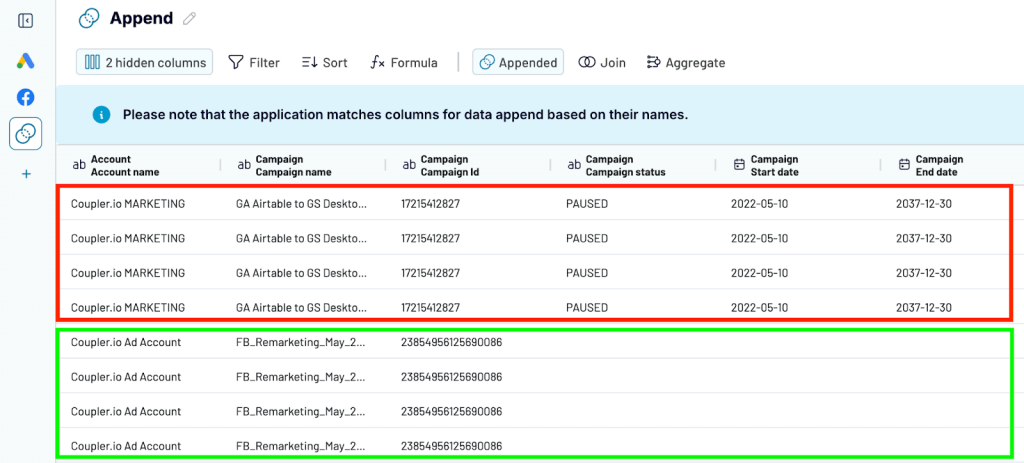
Coupler.io automatically detects and matches columns by name across data sources. If both platforms use the same column headers (like Campaign Name or Impressions), they’ll be merged into one. If the names don’t match, they’ll appear as separate columns in the final dataset.
To avoid any mistakes, rename columns that have the same data but different names.
Once the data is appended, you’ll see rows from Facebook Ads added below the Google Ads dataset. You can also use other data transformation features like filter, sort, and custom formulas to organize the data.
Step 3. Load the appended data into the destination app
Once your appended dataset is ready, the final step is to send it to a destination where you can work with it. With Coupler.io, you can export the combined data to any of the supported destinations:
- Spreadsheets – Google Sheets and Microsoft Excel
- Data warehouses – BigQuery, PostgreSQL, Redshift
- Business Intelligence (BI) tools – Looker Studio, Power BI, Tableau, Qlik
- Others – Monday.com, JSON
Connect your destination account and follow the in-app instructions to configure the settings. In this example, we are sending it to Google Sheets.
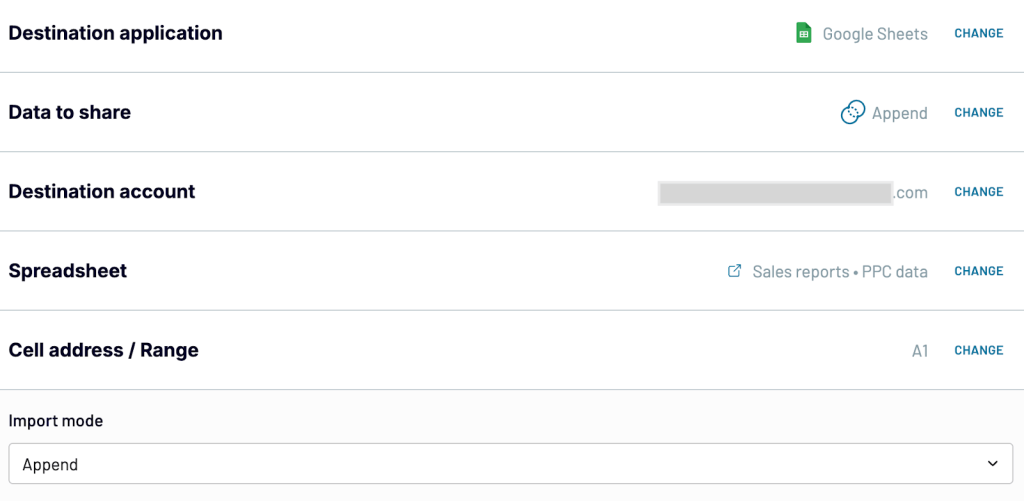
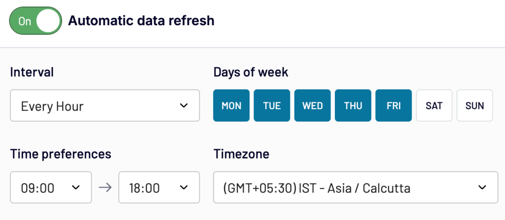
Finally, turn on automatic refresh to keep your data live and up to date. Coupler.io can automatically pull fresh data on a schedule you choose (hourly, daily, hourly, weekly, and more).
This way, you don’t have to manually update reports or re-blend datasets. Your combined view is always updated to monitor trends, track performance, and make faster, informed decisions without any extra effort.
Example 2: Join method – Combine data from various sources in a cross-channel report
The Join method is great when you’re working with data from different tools that don’t share the same structure but have a common dimension like a shared date, page URL, or product ID.
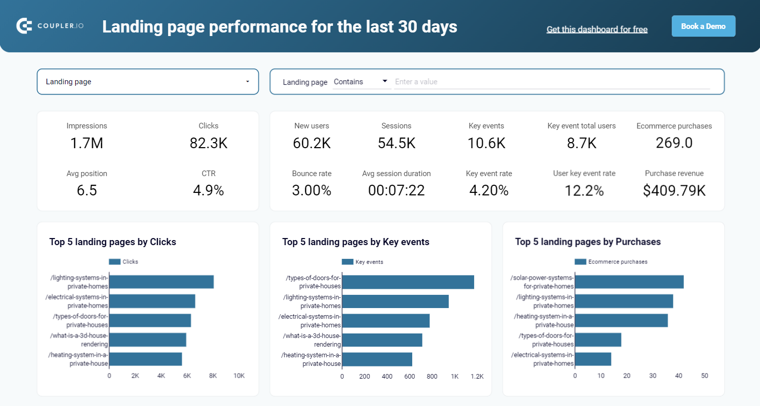
In this example, we’ll combine Google Search Console (GSC) and Google Analytics 4 (GA4) data using the Join method to create a landing page performance report. With this, you can track how each landing page ranks in search results (data from GSC) and how users engage with the page after visiting it (data from GA4).
Step 1. Connect data sources
First, sign up for Coupler.io (no credit card required) to connect your data sources.
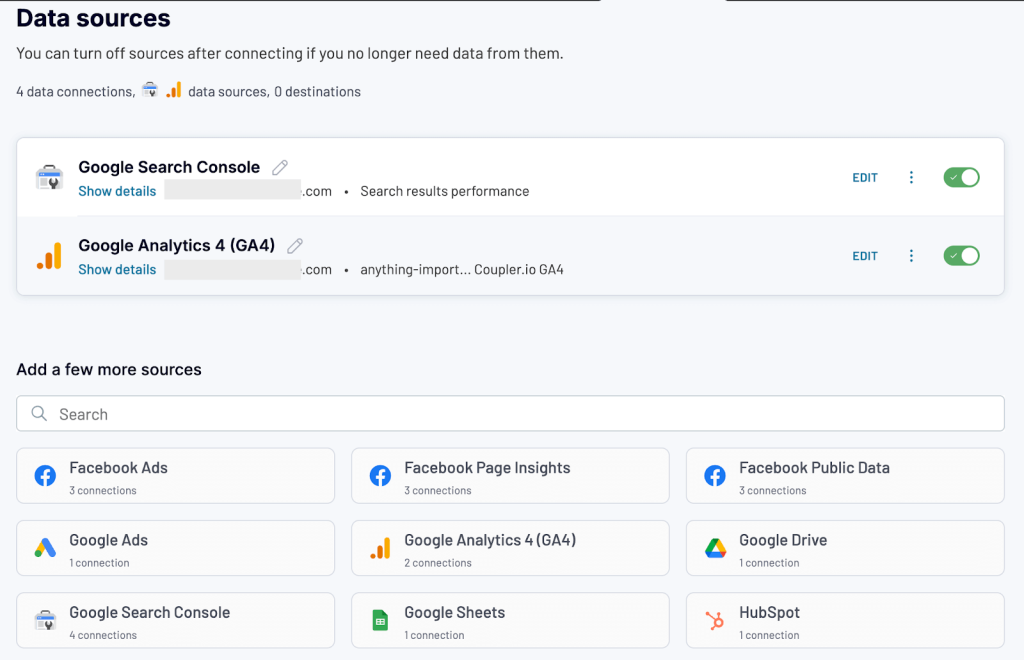
We are selecting Google Search Console as the first source. But you can always choose a different source (advertising platform, finance tool, or CRM) and destination that works for you in the form below.
Connect the source account and configure the settings. For Google Search Console, select the report type and dimensions.
Now, add another source. We are choosing Google Analytics 4. Again, configure the source settings. For GA4, choose matching dimensions along with metrics.
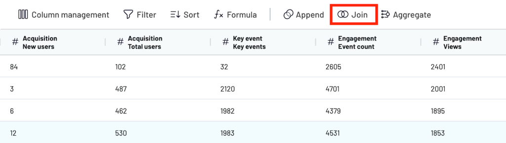
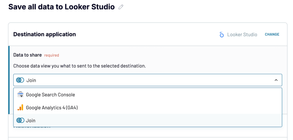
Step 2. Transform and join data
Once both sources are connected, go to the Transformations step. Select the Join method to merge datasets.
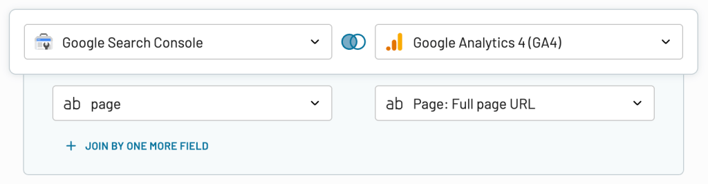
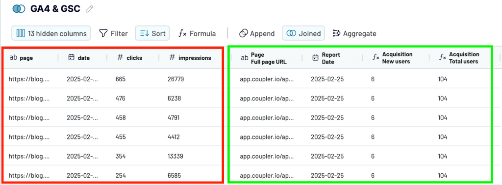
Coupler.io uses a left join where it keeps all rows from your primary source (GSC) and only pulls in matching data from the secondary source (GA4). Choose the shared column to join by. In this case, that’s the Page.
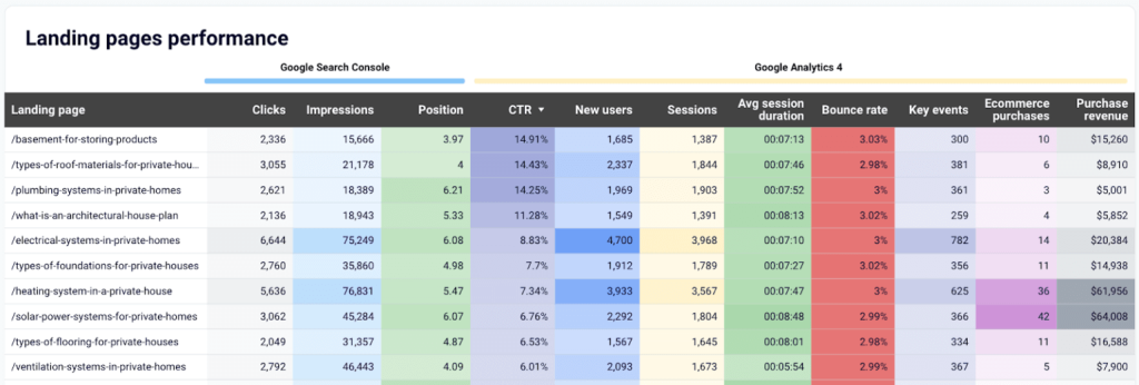
You’ll see a single table with joined data showing GSC metrics like Impressions, Clicks, and Average Position alongside GA4 metrics like sessions, engagement, and new users, all tied to the same page.
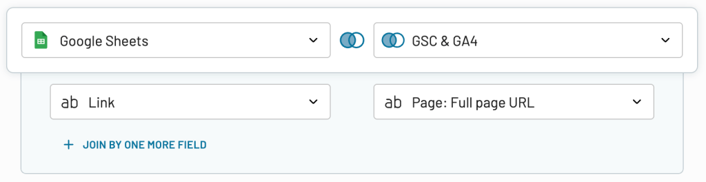
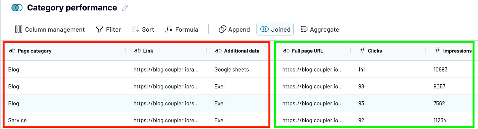
You can also add a second join. For example, you want to see the performance of groups of your web content. For this, you need to join data from a spreadsheet where URLs are grouped into content categories like Blog, Product pages, Service, etc.
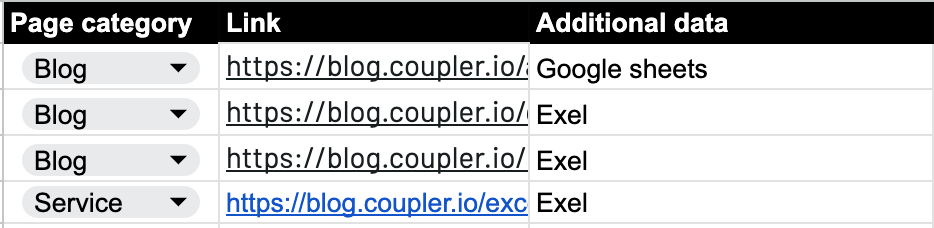
To do this, perform a second join by matching the Link column in your Google Sheets with the Page column from the GA4+GSC dataset. This allows you to group performance metrics by category instead of individual URLs.
As a result, you get a broader view of the performance of each content type.
Learn more about content grouping for Google Search Console in our blog post.
You can also organize your dataset before sending it to your destination by:
- Hiding columns you don’t need
- Filtering the data by page category and aggregate key metrics like clicks and impressions
- Rearranging or renaming fields
- Using formulas to create custom metrics
Step 3. Load the joined data into the destination app
Once your joined dataset is ready, you can export it to any destination supported by Coupler.io.
- Spreadsheets – Google Sheets and Microsoft Excel
- Data warehouses – BigQuery, PostgreSQL, Redshift
- Business Intelligence (BI) tools – Looker Studio, Power BI, Tableau
- Others – Monday.com, Qlik.
Select your destination app and follow the in-app instructions to configure it. In our example, we’re sending the joined data to Looker Studio.
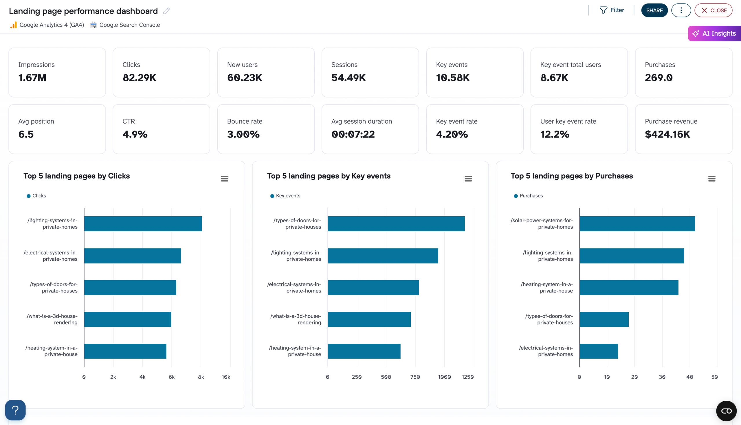
With this joined data, you can build reports that combine insights from multiple sources in one place. In our case, we created a landing page performance report to analyze how each page ranks in search results (GSC) and how users engage with it once they land (GA4).
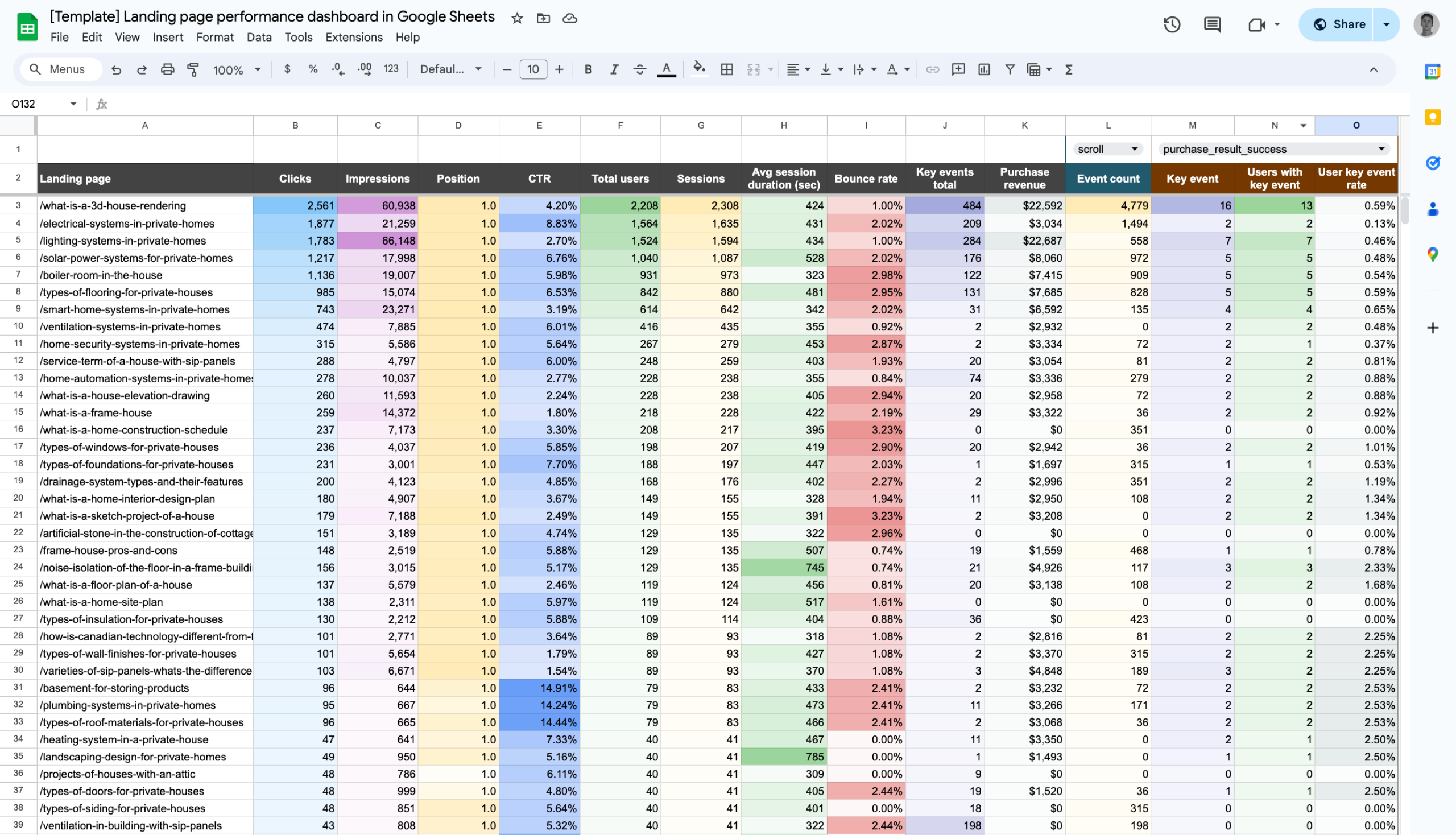
This report is available as a Coupler.io dashboard and a template in Google Sheets and Looker Studio. Try it yourself for free!


Finally, turn on automatic data refresh. Coupler.io will pull updated data from both GSC and GA4 and send it to Looker Studio on your set schedule.
Examples of reports with data collected from multiple sources
Coupler.io offers several ready-made dashboard templates that combine data from multiple tools like CRMs, ad platforms, ecommerce apps, and more. These dashboards are helpful to track performance, spot trends, and make data-driven decisions.
Below are some of the most popular dashboard templates and its use cases, showing what’s possible when you bring data together in one place.
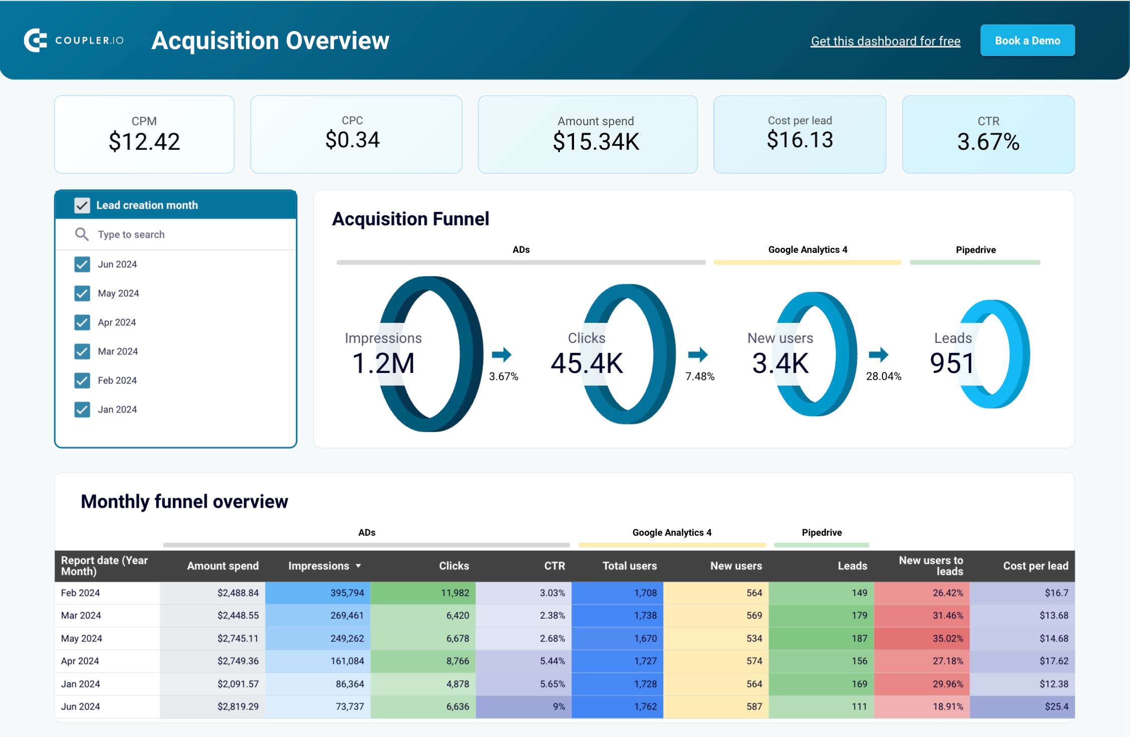
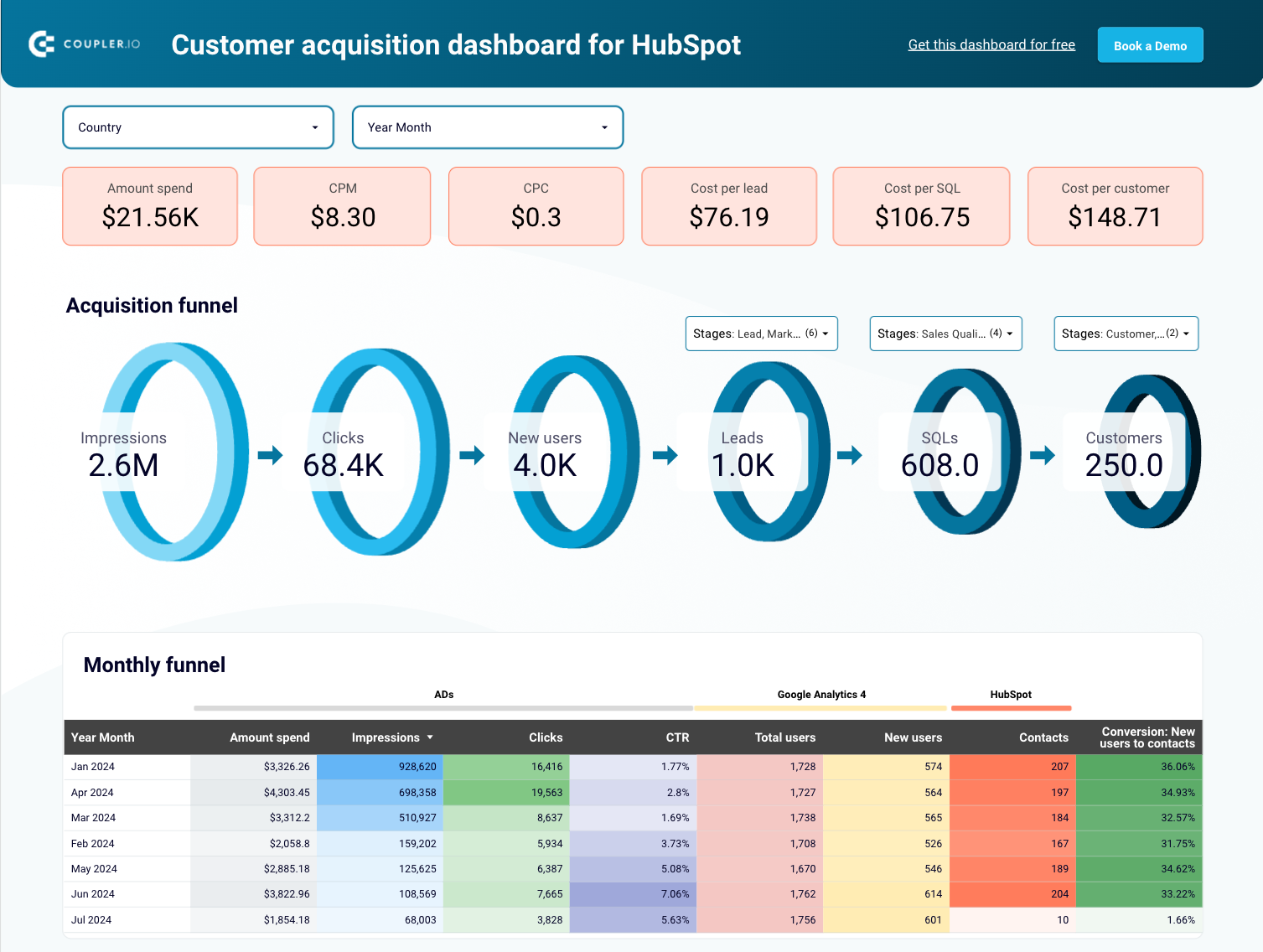
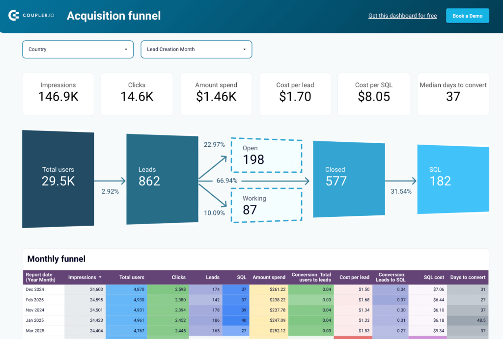
1. Customer acquisition dashboard for HubSpot or Pipedrive
This dashboard is a perfect example of multi-source reporting. It gives you a complete view of your lead generation funnel from ad impressions to CRM conversions by blending data from Google Ads, Facebook Ads, LinkedIn Ads, GA4, and Pipedrive/HubSpot.
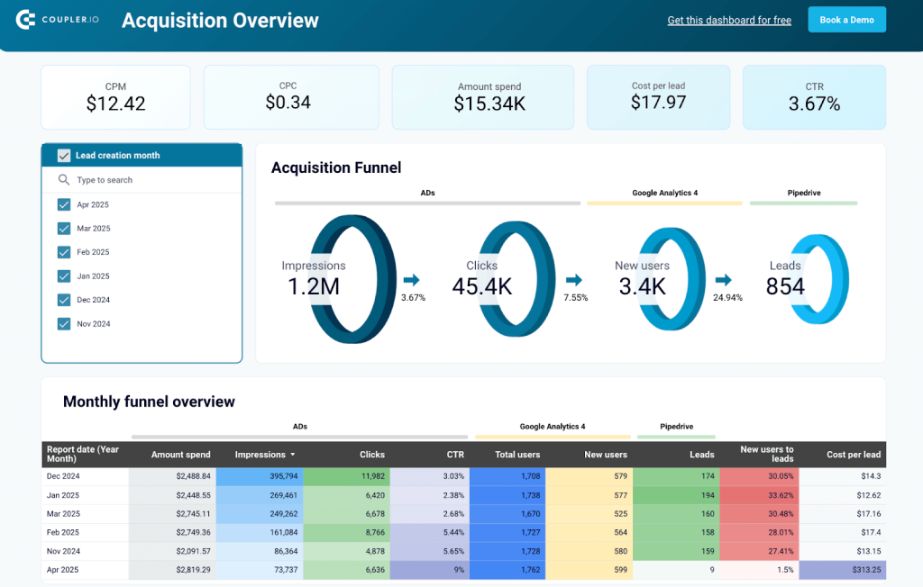
Instead of moving between platforms to track campaign metrics, website activity, and CRM leads, the customer acquisition dashboard pulls everything into one place. You can instantly visualize how many impressions and clicks your ads received, how many users landed on your website, and how many became leads. The dashboard allows you to:
- Map your entire acquisition funnel across platforms and channels
- Identify bottlenecks in the funnel by comparing conversion rates between each stage
- Analyze trends using month-over-month data to link campaign performance with marketing efforts
- Track ad spend vs lead quality to optimize where your budget goes
To use this Looker Studio dashboard template with your own data, sign up for a free Coupler.io account, follow the instructions in the Readme tab to load data from Pipedrive or HubSpot in minutes.


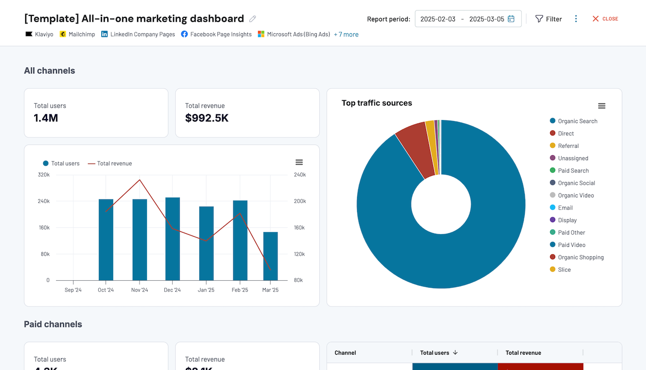
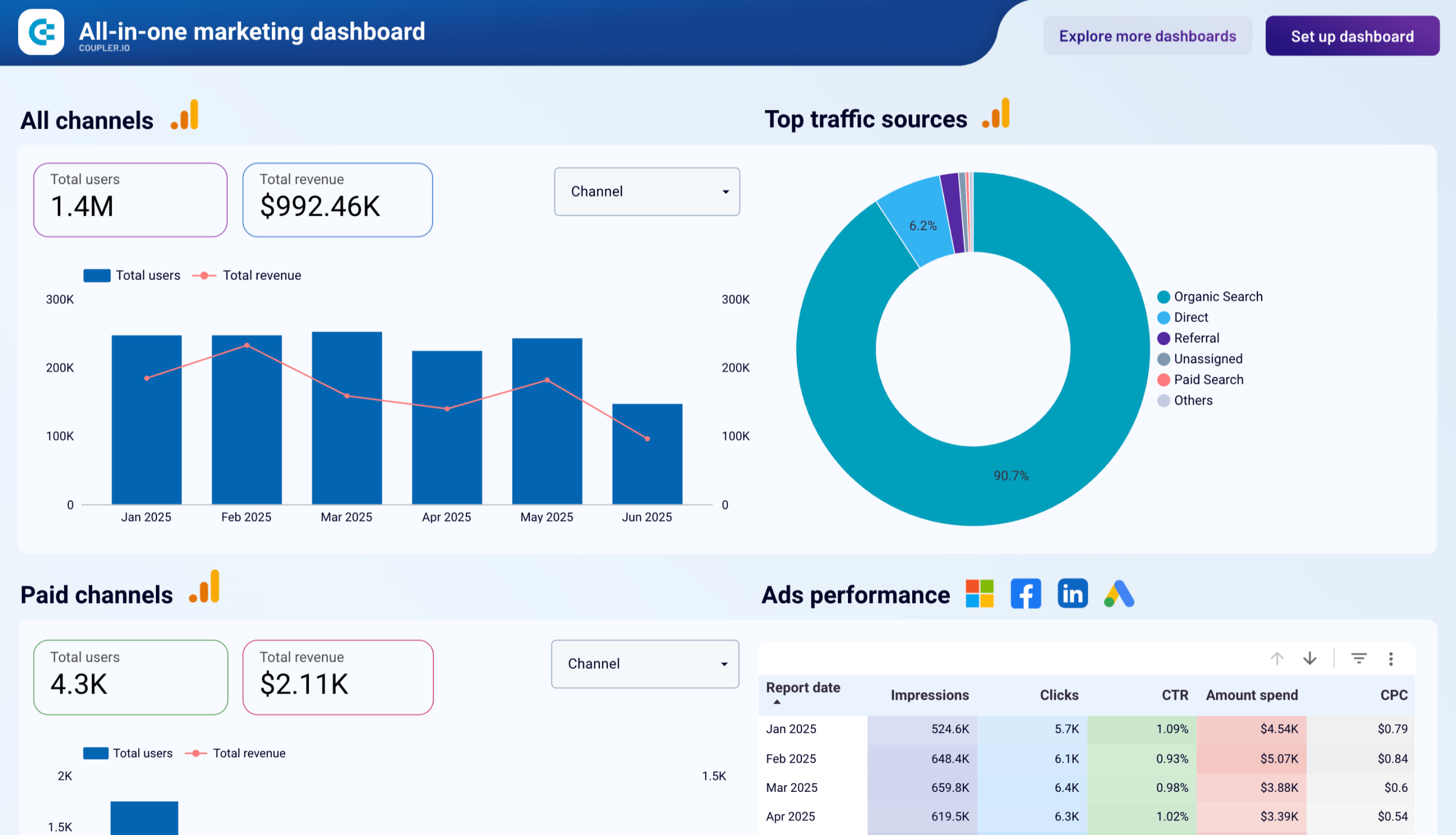
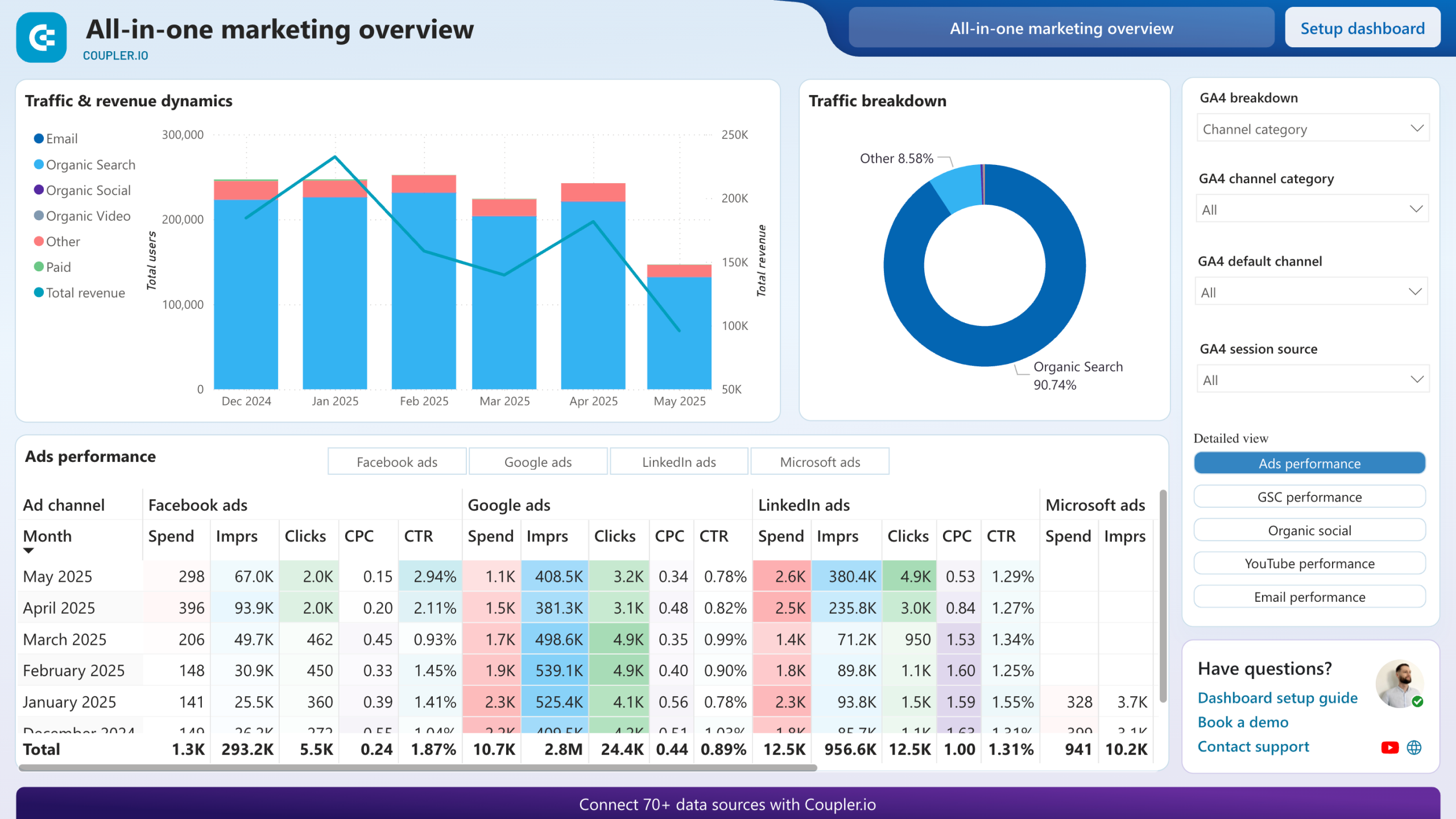
2. All-in-one marketing dashboard
When you’re running campaigns across multiple marketing platforms, tracking performance in silos doesn’t cut it anymore. You need a single view to understand what’s working and what’s not across paid, organic, email, video, and social media channels. That’s exactly what the All-in-one marketing dashboard helps you do.

It pulls together data from Google Analytics 4, Google Search Console, LinkedIn Ads, Google Ads, Facebook Ads, YouTube, Mailchimp, and more into a single interface.
With this dashboard, you can monitor:
- Total users and revenue by channel
- Paid campaign metrics like impressions, clicks, CPC, and CTR
- Organic search stats from GSC, like average position and search CTR
- Social and video engagement data, including reach, views, and minutes watched
- Email performance metrics like open rate, bounce rate, and link clicks
To analyze your marketing data with this dashboard, follow the Readme instructions to connect the required data sources. Also, the dashboard is available in Coupler.io UI and as a template in Looker Studio and Power BI. So, choose your version and try it out for free.


3. PPC monthly budget dashboard
Managing ad spend across platforms is a constant juggle when budgets, timelines, and platform rules keep changing. The PPC monthly budget dashboard is designed specifically to help you stay on top of your budget distribution and spending patterns without switching between multiple ad managers.
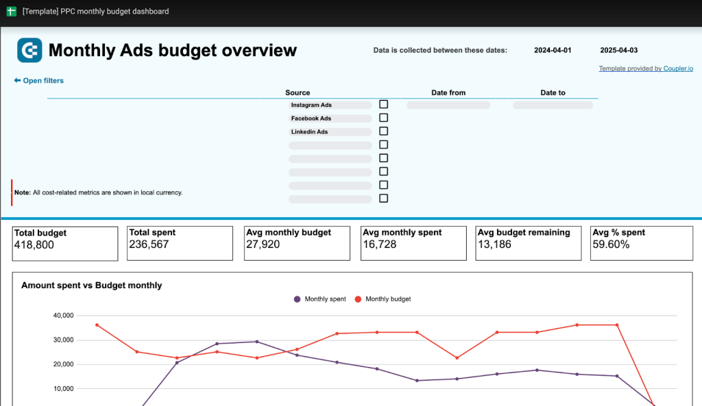
Unlike performance-focused dashboards, this one is purely financial. It connects data from platforms like Facebook Ads, LinkedIn Ads, Instagram Ads, Google Ads, TikTok, and more, and gives you a clean financial summary that answers questions like:
- What’s my total budget vs. actual spend across platforms?
- Which channels are underspending or overspending?
- How much budget do I have left this month?
- Am I pacing my spend correctly over time?
A detailed budget breakdown by platform and month makes sure all the leadership teams are on the same page.
And like all Coupler.io dashboards, it updates automatically on your preferred schedule. To analyze your budget with this Google Sheets dashboard, follow the instructions in the Readme tab, and connect the necessary PPC sources.
4. Mailchimp email marketing analytics dashboard
Email campaigns don’t end at clicking “Send.” You need to know what happens after that—how many users opened your email, clicked the link, visited your landing page, and eventually made a purchase. The email marketing analytics dashboard combines Mailchimp and Google Analytics 4 (GA4) data into a single view.
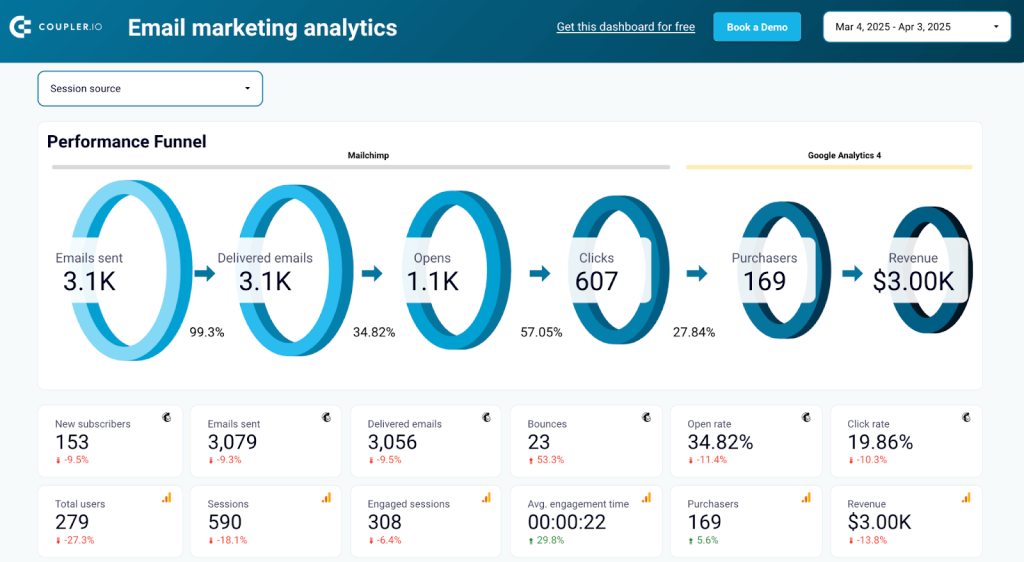
It shows you the full performance funnel from emails sent, delivered, opened, and clicked (Mailchimp) to sessions, purchases, and revenue (GA4).
Here’s what you can track with this dashboard:
- Visualize the drop-offs and conversion rates at each step—right from delivery to purchase.
- Bounce rates, open and click rates, unsubscribes, spam reports, and more.
- See which pages generate the most engaged traffic and revenue.
- Evaluate how each email contributes to sessions, engagement, and conversions.
- Understand where your best-performing email contacts are located.
- Spot trends and track performance over time to optimize future campaigns.
This Looker Studio report helps you spot patterns, prioritize high-performing content, and fix underperforming elements.
To use it with your data, follow the instructions in the Readme tab to connect the sources and populate the dashboard with your email campaign data.
5. Salesforce sales analytics dashboard
If you’ve ever tried to align your marketing and sales data manually, you know the struggle. Different formats, missing fields, and insights slipping through the cracks. The Salesforce sales analytics dashboard puts an end to that by combining data from Salesforce, ad platforms (like Google Ads, Facebook Ads), and GA4 into one cohesive sales performance view.
With this dashboard, you can:
- Understand how impressions and clicks from multiple ad platforms translate into leads, SQLs, and closed deals in Salesforce.
- Track key metrics like cost per lead, cost per SQL, and average time to close across campaigns and regions.
- Compare performance across countries to identify high-performing markets and optimize spend accordingly.
- Monitor open opportunities and close rates by stage, lead source, or owner to improve sales forecasting and prioritization.
To understand your sales analytics with this Looker Studio dashboard, follow the instructions in the Readme tab.
How to integrate data from multiple sources using CSV files
CSV is one of the most commonly used data formats: most apps allow you to easily export and import data from CSV files. Let’s see how we can use this to merge data from two different sources into one place.
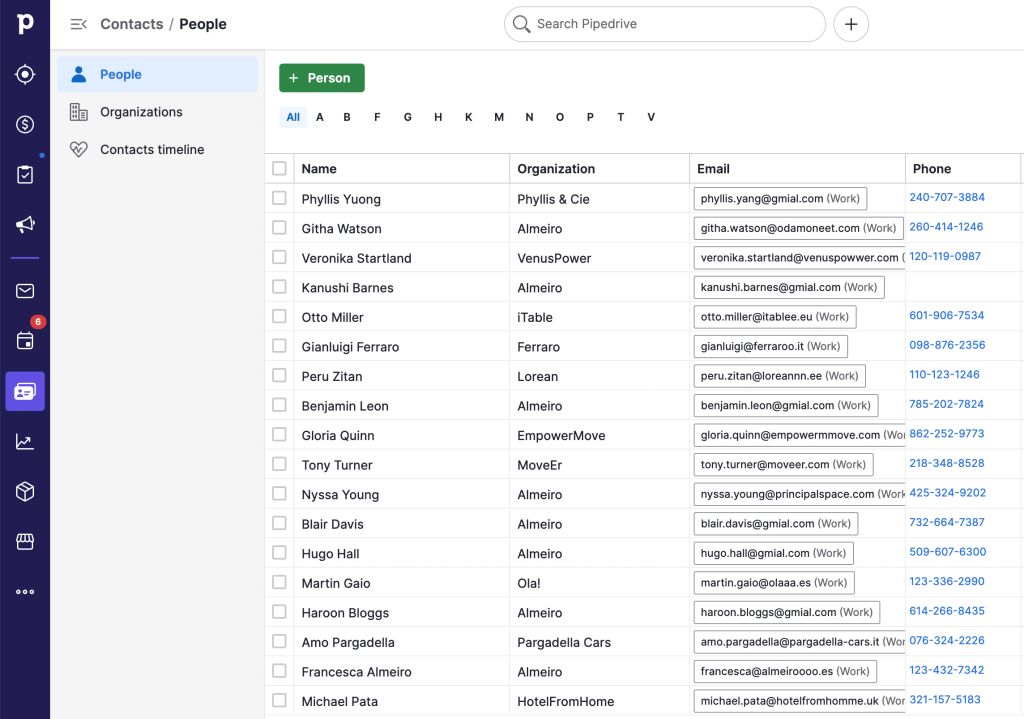
In our example, we will combine data from Pipedrive and Airtable in Excel, but the process is more or less the same with other apps as well. To combine data from different sources successfully, first of all, make sure that the column order and names correspond in both sources. And, of course, it’s best to combine data of the same type.
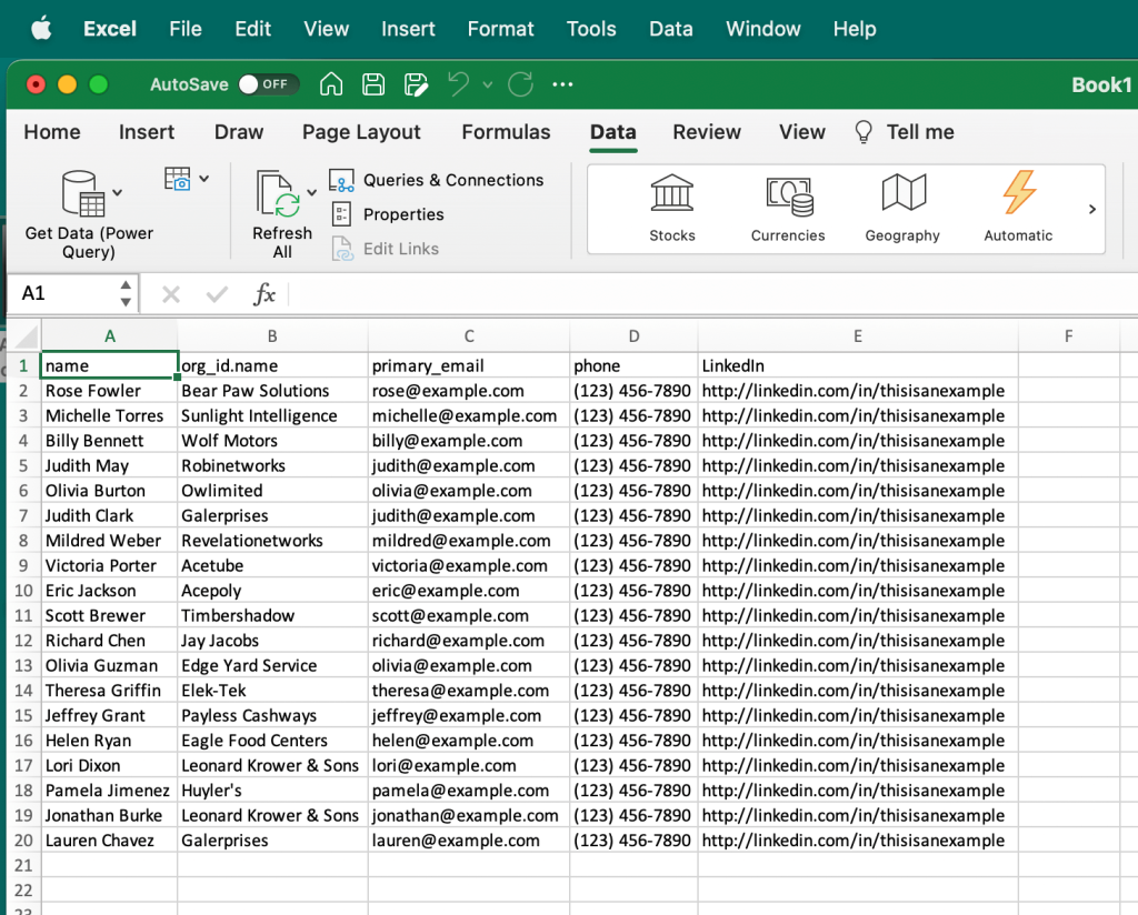
Here, we have a dataset in Airtable. It contains a list of contacts with various information, such as name, organization, phone, etc.
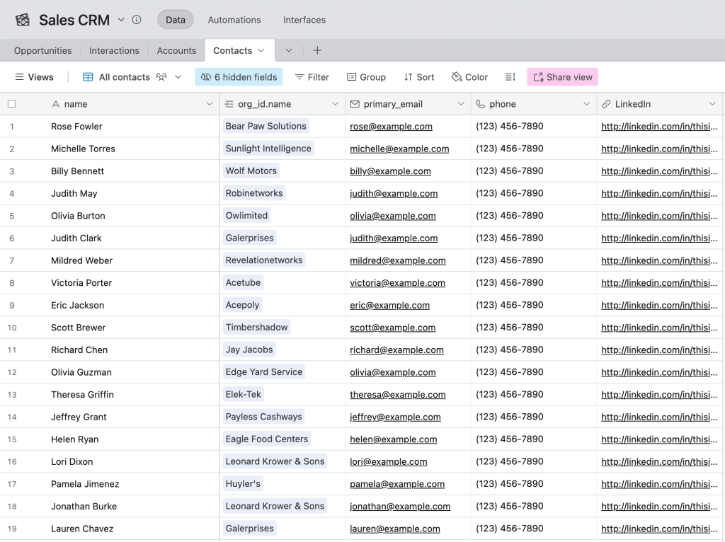
And we have a similar dataset with contact information in Pipedrive.
First, we need to export both datasets in the CSV format.
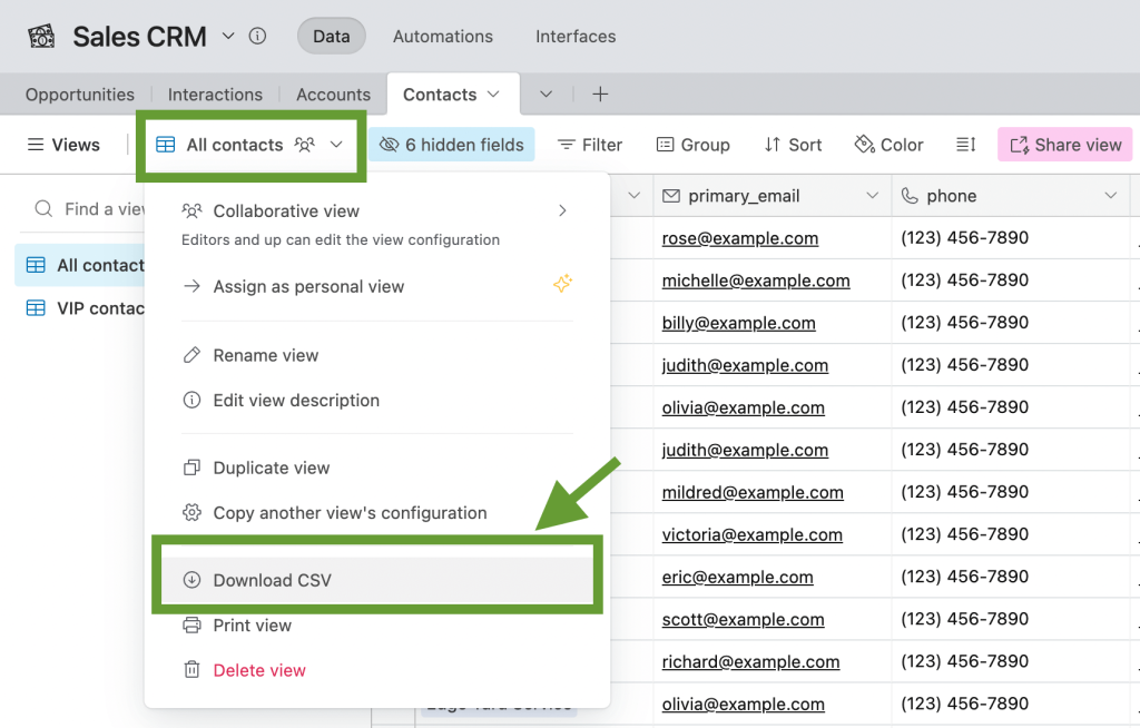
In Airtable, we go to the view menu and select Download CSV. The file will then be saved to the computer.
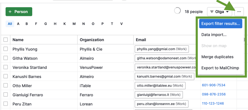
In Pipedrive, we also need to go to the settings of the corresponding page, press Export filter results, and select CSV from the suggested formats.
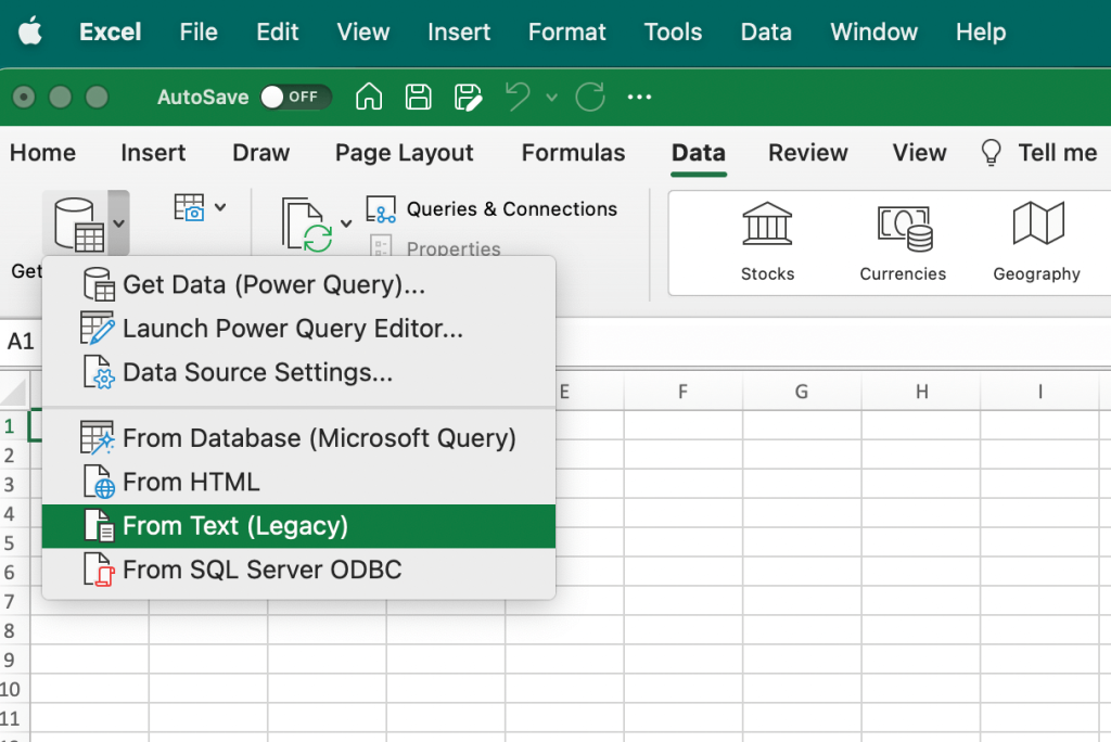
Now, we have two CSV files with the exported data. Let’s merge them into a spreadsheet. In Excel, go to the Data tab, then select Get data, From text.
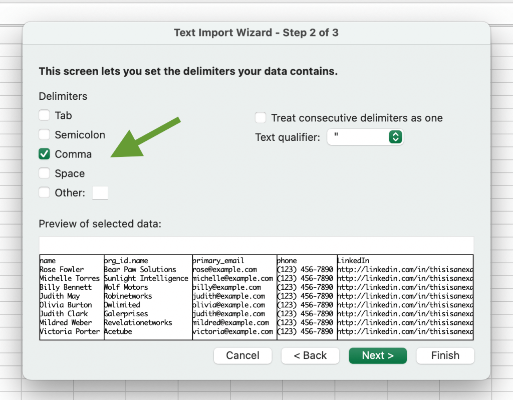
In the next step, select your first CSV file and press Get data. Then, select Delimited -> Next. Specify the delimiter type. In our case, it’s Comma.
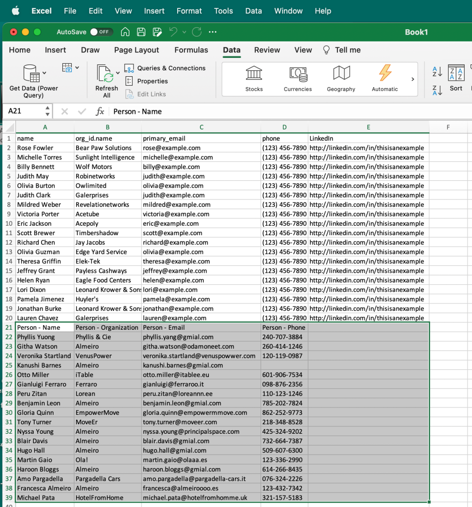
Then, press Next -> Finish, and select the cell where your data should be inserted, and press Import. Data from Airtable has been imported.
Now, we need to repeat the same process for the second CSV file. The only difference is that the cell for importing should be different in order to keep the previously imported data. In our case, we can select A21.
Now, Pipedrive data has been imported as well, so we have a single dataset.
At this point, you might need to edit your data manually – for example, to remove duplication or edit the format of some information. You can also add data from other sources to this combined dataset.
However, as we’ve already mentioned, this method is not very efficient if you need to extract data from many different applications and/or if you need to do this regularly. In this case, you can consider automation.
Tools you can use for combining data from multiple sources
Building cross-platform reports and dashboards often requires pulling data from CRMs, ad networks, ecommerce platforms, and analytics tools. To do this efficiently, you need the right set of tools depending on your technical background and the scale of your operations.
Here’s a breakdown of what you might need:
1. For non-technical users
If you’re a marketer, analyst, or business user looking to create reports without writing code:
- Spreadsheets and BI tools: Use tools like Google Sheets, Excel, or Looker Studio to build simple reports and dashboards. You can organize, filter, and visualize your data manually or using built-in functions.
- Coupler.io: This is your automation layer. It helps you pull data from 60+ apps, such as HubSpot, Shopify, Google Ads, and GA4, and combine it in one place. You can append similar data or join datasets and set automatic refreshes to keep everything updated.
Together, this setup works great if you’re looking for no-code and simple reporting workflows.
2. For technical users and data-savvy teams
If you’re comfortable writing code or want more control over your data flows:
- Python / R: You can use pandas, NumPy, or dplyr to wrangle and combine datasets from multiple APIs or local files. This is ideal for creating custom workflows, running data transformations, or building statistical models.
- BI tools: Tools like Power BI, Tableau, or Looker Studio can then be used to visualize and share your output.
- Coupler.io: Even for technical users, Coupler.io can save hours by automating routine imports and cleaning steps, when dealing with recurring reports or dashboards.
This is best for semi-automated workflows, where a mix of scripting and automation happens.
3. For large-scale data operations
For teams dealing with high data volumes, complex integrations, or enterprise-level reporting:
- ETL platforms: Tools like Coupler.io, with its ETL (Extract, Transform, Load) capabilities, help build robust pipelines without needing a full data engineering team.
- Data warehouses: Store and manage large datasets in platforms like BigQuery, Snowflake, or Redshift. These are great for centralizing and scaling your data before analysis.
- BI tools: Once your data lives in a warehouse, plug it into BI tools to build dynamic, organization-wide dashboards.
This stack is ideal for data engineering teams and businesses scaling their analytics infrastructure.
Combining data from multiple sources: manually or automatically?
Till now, we’ve explored different ways to bring data together from simple CSV imports to fully automated, cross-platform dashboards.
Manual methods can work for quick, one-off reports. But if you’re dealing with multiple tools and need consistent updates, then automation is the smarter choice.
Using the data blending software by Coupler.io, you can combine data from 390+ sources, apply transformations, and keep your dashboards up to date without manual work. It’s a scalable way to stay on top of your data and make faster, more informed decisions.

Combine data from multiple sources with Coupler.io
Get started for free