The State of Marketing Data Destinations: Trends and Benchmarks in Analytics Infrastructure

Marketers sit on mountains of data. But still don’t have enough answers.
Nearly 7 out of 10 marketing leaders say data integration is their biggest martech headache.
This gap drains budgets, blindsides campaigns, and hands the competitive edge to faster-moving teams. Closing this divide means cutting wasted costs, automating data flows, and choosing the right tools to stay efficient and agile.
So, what’s the reality of marketing data infrastructure today?
The trends and benchmarks below reveal where marketing data really lives, how it’s used, and how Coupler.io makes it simple to stay ahead.
Which platforms rule marketing analytics right now?
It depends who you ask.
There’s no definitive ranking. One report puts a tool at the top. Another barely gives it a mention. And many of these sources come from the platforms themselves. Surprise, surprise, each one conveniently names itself the market leader.
But even with all that noise, a few patterns stand out.
Google Analytics still dominates
Whether it’s GA4 or what came before, it’s used by over half the world’s websites. Market share estimates range from 70% to nearly 80%, especially among small businesses (under 50 employees), where nearly 80% rely on it for data-backed decisions.
It’s free, familiar, and widely supported, so it makes sense.
Adobe Analytics comes next but with just over 1%.
W3techs reports even say less than that.
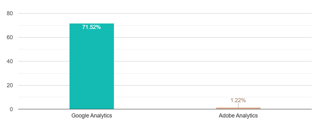
So why is it still considered a serious player?
Simple: it’s built for a different crowd.
Adobe aims high. Large enterprises with deep pockets and long approval chains.
It clicks best with teams already locked into Adobe’s ecosystem. If you need deep segmentation, real-time dashboards, and knobs for every detail, this one’s for you.
Of course, with power comes great…complexity.
Plus, the learning curve is steep. It’s not always the most intuitive tool. But for big organizations with the resources to make it work, it still earns its place.
HubSpot and Mixpanel compete for spot #3
HubSpot isn’t a dedicated analytics tool, but its built-in dashboards for emails, forms, and customer journeys make it a go-to for small to mid-sized businesses using it as a CRM.
Mixpanel, conversely, is more technical and privacy-focused, with event-based tracking and session recordings out of the box. It’s paid and used mainly by startups and SaaS teams that need detailed product analytics without compromising privacy.
So, while the top spot is clear, the runner-up seats are shared. However, it all depends on what you’re tracking, how technical your team is, and your financial threshold.
But collecting data is one thing. Getting it out is another.
Marketers rely on these tools to track performance. However, pulling raw data is where things can break down
Most platforms tap out somewhere between 50,000 and 100,000 rows. APIs give you more wiggle room. But they come with quotas. And most of the time, you’re getting aggregates, not the full picture.
That gives you the details but also brings complexity with SQL, nested schemas, and cloud costs before analysis even begins.
The real integration challenge
Beyond export limitations, teams face deeper integration hurdles:
- API rate limits: Google Analytics 4 allows 100,000 requests per day, but complex queries can exhaust this quickly
- Schema changes: Platform updates can break existing connections without warning
- Data freshness: Native exports are often 24-48 hours behind real-time
- Attribution gaps: Cross-platform tracking requires complex identity resolution
That’s why teams turn to Coupler.io, especially for GA4 and HubSpot. It automates clean, structured data that flows straight into dashboards or warehouses.
No scripts, no copy-paste, no headaches.
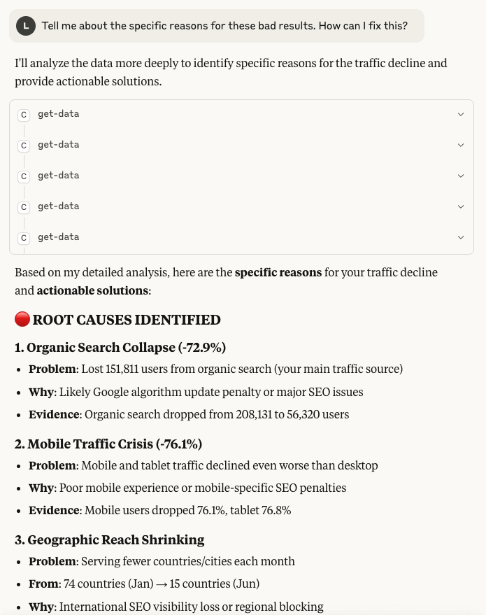
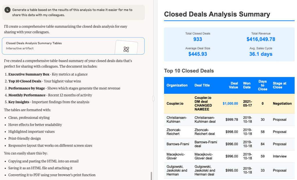
It also provides an MCP server to connect your data to AI agents like Claude.ai. As a result, you can ask it to query data, derive insights, and even turn into reports with no SQL or coding needed. Simply connect GA4 and ask:
Tell me about the specific reasons for these bad results. How can I fix this?
And get an answer why your website is performing much worse than in the previous month.
Inside the data warehouse wars: who’s ahead?
Snowflake, BigQuery, and Redshift lead the market by a long shot.
Snowflake holds around 35% of the cloud warehouse market, with Amazon Redshift close behind at 20%.
BigQuery’s numbers are fuzzier, landing somewhere between 12% and 28%, depending on the source. (Strange gap, but we’ll explain why in a second.)
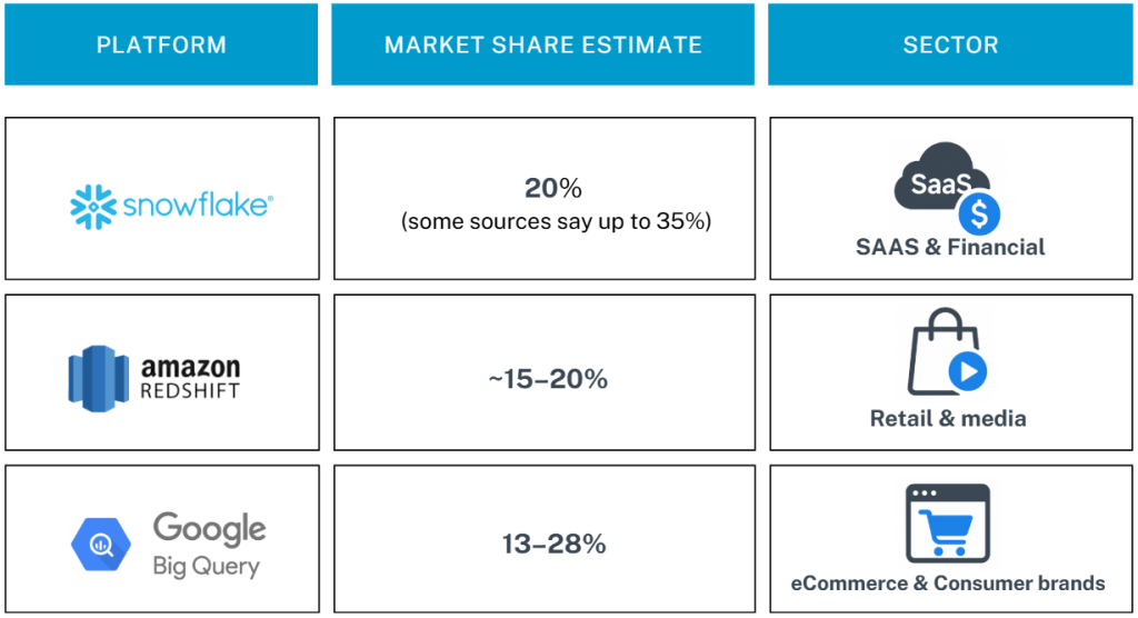
Google Cloud’s overall market share sits at 28%, but BigQuery itself accounts for just 11% globally, according to the 2024 GCP Market Report. That number climbs when looking specifically at analytics usage or regions with strong Google Cloud adoption.
Regardless of the variation, these three platforms dominate the space. Azure Synapse, Databricks, and others are gaining ground but still lag behind in adoption among marketing teams.
Who’s using what?
- SaaS and financial services often lean toward Snowflake. They like its cross-cloud flexibility and machine learning capabilities.
- Retail and media gravitate toward BigQuery. They benefit from native tie-ins with GA4, Looker Studio, and Google Ads.
- Redshift remains the top pick for AWS-heavy stacks, particularly in eCommerce and direct-to-consumer brands.
No matter which warehouse you choose, the bottleneck usually isn’t the platform. It’s the pipelines.
Loading data from multiple sources for multichannel marketing, managing ETL workflows, and keeping everything reliably updated is where most teams get stuck. Manual exports, delicate scripts, and patchy integrations slow things down and create blind spots in reporting.
Teams building custom integrations face:
- Development time: 40-80 hours per connector
- Maintenance overhead: 5-10 hours per month per integration
- Failure rate: 15-25% of custom scripts break monthly
Choosing the right warehouse matters, but keeping it consistently fed is what makes it actually work.
Coupler.io handles that hard part.
It connects to your favorite digital marketing tools. Then it sends clean, updated data into Snowflake, BigQuery, or Redshift.
No custom scripts, no engineering required. Check out how easy it is to automate a data flow from your sources into the desired data destinations in this interactive form:
Where are marketers really building their dashboards?
Your usual suspects, like Looker Studio, Tableau, and Power?BI, still lead the way in marketing analytics.
They’re everywhere. Simple to use. Easy to plug in.
However, they also come with trade-offs. Some feel like plug-and-play. Others feel more like assembling furniture.
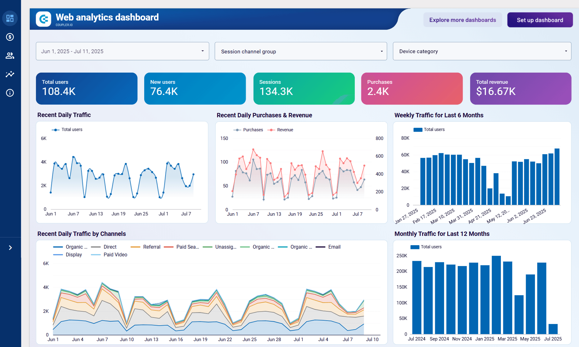
At the same time, each of these tools are supported by Coupler.io. This means you can easily connect your data source from over 70 provided to the preferred BI tool and create a report. Coupler.io handles connection, auto refresh, and data organization, and the BI tool is responsible for fancy visualizations. Below, we’ve shown examples of the same web analytics dashboard designed by Coupler.io for each BI tool.
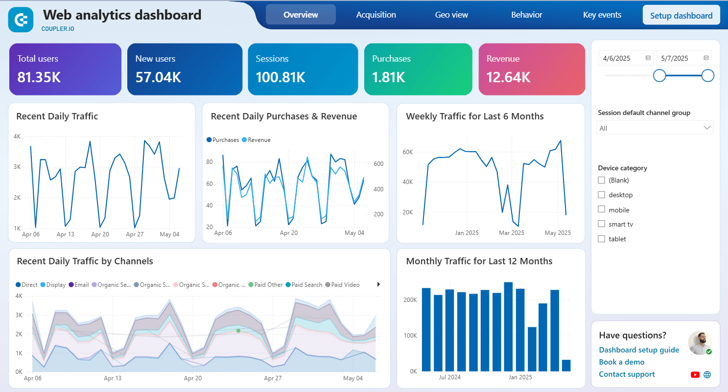
Looker Studio: Friendly, familiar, and… sometimes limited
Looker Studio is Google’s answer to drag-and-drop dashboard creation. The price is also right since it’s free for most usage. The tool looks good enough out of the box and integrates effortlessly with GA4, Google Ads, BigQuery, and Sheets.
Web analytics dashboard in Looker Studio
 Preview dashboard
Web analytics dashboard in Looker Studio
Preview dashboardWhy marketers love it:
- Great for speed. You can build something decent before your coffee gets cold.
- The learning curve is gentle. Anyone who’s used Google Docs can figure it out.
- Plenty of community templates and connectors to get started fast.
However, here’s the catch:
- Performance tanks with large datasets or too many blended sources. The latter, however, is easily solved with Coupler.io, which does not limit the number of joined data sources. And hence you won’t have glitches or slow response of your dashboards. Learn how you can connect multiple data sources to Looker Studio.
- Limited support for things like complex funnel attribution or modeling.
- API quota limits (especially with GA4) can lead to broken or partial data.
Usage statistics and limitations
- Market share: 34% of small businesses, 18% of enterprises
- Performance ceiling: Reports with 100,000+ rows experience 3-5 second load times
- Connector limits: Maximum 5 data blends per report
- User satisfaction: 72% rate it “good” for basic reporting, only 31% for advanced analytics
Looker Studio is ideal for quick wins and simple reporting. Just don’t expect it to scale with complexity.
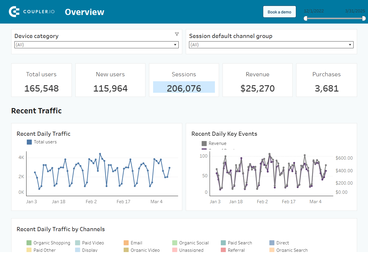
Power BI: The business intelligence powerhouse. Capable but occasionally cumbersome
Power BI is beloved in IT and finance circles, and for good reason. It’s feature-rich, secure, and deeply customizable.
Web analytics dashboard in Power BI
 Preview dashboard
Web analytics dashboard in Power BI
Preview dashboardWhy marketers might pick it:
- Amazing flexibility. You can model just about anything.
- Works well with large datasets, especially when paired with data warehouses.
- Strong role-based access and governance features.
Yet here’s what marketers struggle with:
- Steep learning curve. It’s not exactly marketer-friendly..
- Many teams need IT or data analysts to maintain reports.
- The choice overload can easily get you stuck without a roadmap.
If you have the skills or the support, Power BI is incredibly powerful. If not, it can become a parking lot of half-built marketing dashboards.
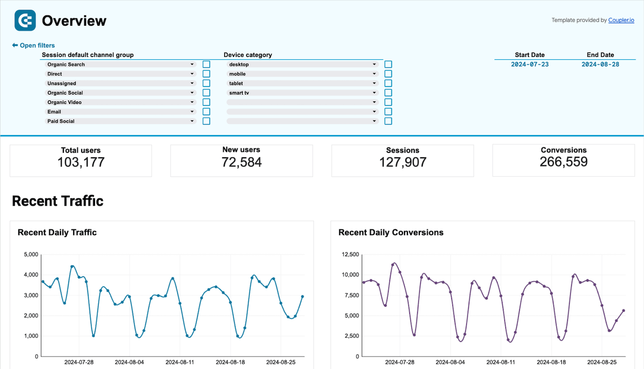
Tableau: Beautiful visuals, powerful logic. If you can afford it
Tableau shines where storytelling and design matter. It’s used heavily in data-driven orgs that need to impress as much as they inform.
Web analytics dashboard in Tableau
 Preview dashboard
Web analytics dashboard in Tableau
Preview dashboardWhy marketers choose it:
- Stunning visualizations that can actually make people want to look at reports.
- Advanced calculations, interactivity, and drilldowns for serious exploration.
- Strong support for multiple data sources and large volumes for efficient cross-channel marketing analytics.
But it’s not all smooth sailing:
- Cost can be a blocker, especially for smaller teams.
- Requires training or a dedicated analyst to get the most out of it.
- Doesn’t integrate quite as seamlessly with Google products out of the box.
Tableau is great for seasoned teams with resources and capacity to build complex visualizations.
Spreadsheets still run the world
Excel and Google Sheets may not be glamorous, but they’re still everywhere. Especially when dashboards fail to answer the real question.
Web analytics dashboard in Google Sheets
 Preview dashboard
Web analytics dashboard in Google Sheets
Preview dashboardWhy they stick around:
- Zero learning curve. Everyone knows how to tweak a sheet.
- Great for interim tracking, planning, and ad hoc reports.
- Can double as lightweight dashboards with conditional formatting or charts.
- Most BI tools have an “Export to CSV” button for a reason.
The persistent power of spreadsheets
- Usage rate: 89% of marketing teams still use spreadsheets for some analytics
- Primary use cases: Ad-hoc analysis (76%), budget planning (68%), data validation (54%)
- Automation rate: Only 23% use automated data feeds to spreadsheets
Where spreadsheets fall short is in version control; it’s easy to break, and manual refreshes eat up time unless you pair it with automation tools like Coupler.io.
Spreadsheets are still holding strong in marketing analytics. Don’t underestimate them.
Tools to keep an eye on
Platforms like Qlik Sense, Sisense, and Domo are seeing growing interest.
While exact adoption figures are difficult to quantify, usage is clearly trending upward, especially among teams seeking no-code setups, faster deployments, or embedded analytics.
Sisense is popular in SaaS products for embedded reporting, Qlik Sense is known for self-service BI, and Domo is appreciated for its no-code dashboard creation and extensive connectors.
The main trade-off is pricing, which can be a blocker for smaller teams.
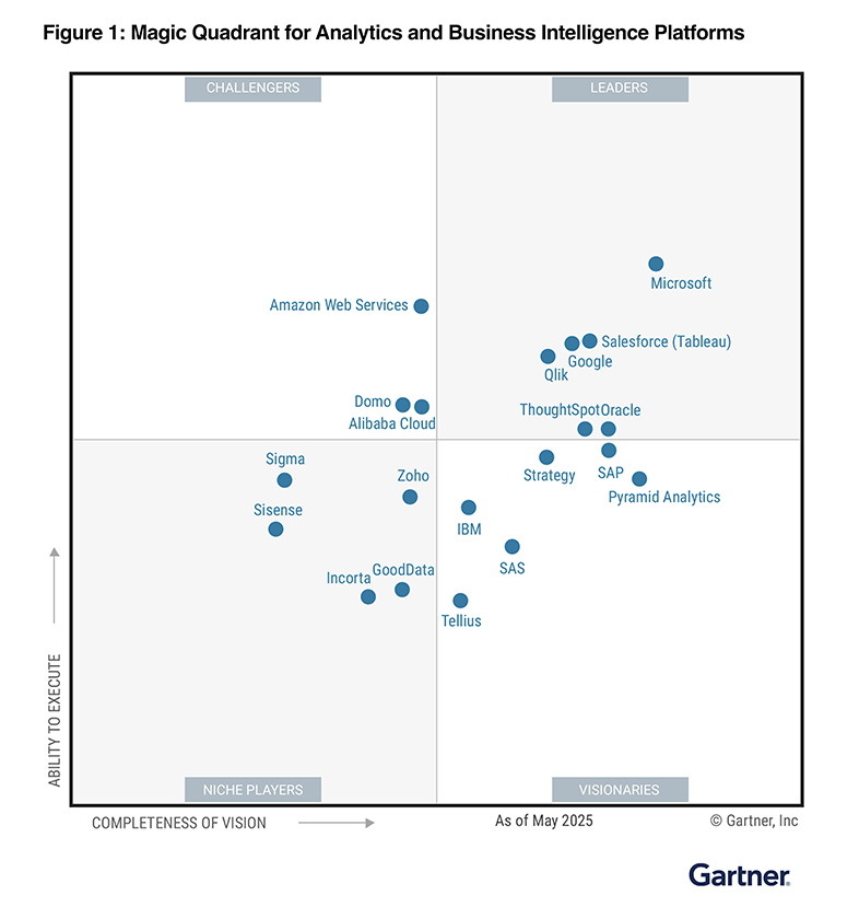
In the Gartner Magic Quadrant, Domo is listed as a challenger, while Sisense is considered a niche player.
It also comes with a library of ready-made dashboards, so teams can skip the setup and get to insights faster.
Everyone’s going Cloud-First. But that’s not the whole story
Cloud-first data stacks are now the norm. It’s clear when you see that almost half of all organizations are prioritizing cloud strategies, with a good 60% running the bulk of their work in the cloud.
Yet, even with this massive shift, on-premise setups aren’t going anywhere fast. In regulated industries, it still holds the line. These setups are absolutely crucial for businesses grappling with strict security and compliance rules – think industries like finance, healthcare, and government.
Given that reality, it’s hardly a shock that many teams are opting for hybrid models.
These clever setups let them enjoy the cloud’s speed and scale, while still keeping that vital on-site control they need. Indeed, hybrid environments now cover around 86% of enterprises.
While offering these benefits, hybrid setups are not without their drawbacks.
They often introduce hidden costs from middleware, monitoring, and integration complexities. Compounding these challenges, a 2025 security survey found that over half of companies struggle significantly with compliance within their hybrid cloud environments.
How company size shapes data infrastructure choices
There’s not a standard data stack that fits everyone. The situation is completely different when you look at the scale. The tools you select, the way you link them, and the location of your data. It all depends on the size of your team and the rate at which it’s growing.
Smaller teams, often under 50 people, prioritize speed over structure.
They don’t have time for long implementation cycles or complicated ETL pipelines. Most choose plug-and-play marketing analytics tools that get the job done now.
Think spreadsheets, native connectors, and tools like Looker Studio that are quick to set up and easy to use right away. It’s all about speed and minimal setup.
As data grows, these tools begin to show their limits. This happens especially when teams try to blend sources or expand reporting.
Mid-sized companies (typically those with 50 to 500 employees) are navigating a kind of middle ground.
They require flexibility but also need control.
They start layering in CRMs, warehouses, and BI tools. However, stitching them together is another story.
Common evolution path:
- Phase 1: Spreadsheets + basic BI tool
- Phase 2: Add CRM/marketing automation
- Phase 3: Introduce data warehouse
- Phase 4: Implement advanced analytics/AI
Marketing, sales, and finance data often run their own systems. With these different stacks comes inconsistent reporting and the difficulty of getting clean data between them.
This is where hybrid approaches become common. Useful, but messy.
Enterprise stacks are another world entirely
The infrastructure for larger organizations (usually with 500+ employees) is heavier. They rely on custom-built pipelines, internal data teams, and vendor contracts.
It sounds powerful, and it sure can be. But it is also complex and hard to maintain.
Teams often end up with overlapping tools and fragmented workflows. So, data is everywhere. But insight is harder to reach.
Coupler.io keeps things simple at every stage and scales up or down depending on the team. Start with a few no-code data connectors for marketers. Grow into scheduled syncs with BigQuery or Snowflake.
No need for full dev teams. No need to rip and replace what’s already working.
What companies actually spend on data infrastructure?
There’s a reason budgets get fuzzy fast.
Ask five companies what they spend on their data stack, and you’ll get five answers. Not because they’re hiding something but because infrastructure spending is a moving target. Usage models shift. Headcount changes. Tools scale with volume.
So, it’s no wonder most estimates are all over the place.
What companies spend
Still, if you want a grounded baseline, you can work with ranges like these:
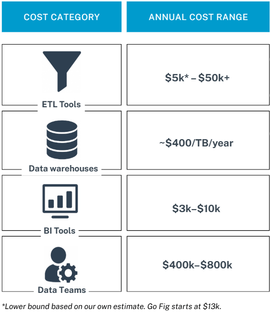
- ETL tools: $13k–$50k+ per year
- Data warehousing: ~$400 per TB per year
- BI tools: $3k–$10k per year
- Data team (4 FTEs): $400k–$800k per year
These figures come from Go Fig and others like them, who’ve published examples based on typical mid-market setups.
For instance, they walk through scenarios where a 50-person team spends around $13k/year on software, while a 200-person company (with in-house analysts) can hit $560k/year all-in.
It’s not exhaustive, but it gives you a realistic anchor, especially if you’re mid-sized and scaling.
Cost breakdown by company size
Smaller teams lean heavily on plug-and-play tools and fractional support.
Their infrastructure costs often stay modest. According to GoFig, many spend between $10,000 and $30,000 annually, excluding staffing.
We believe this number can be even lower, given that many teams rely on free or low-cost tools like Google Sheets and Looker Studio, thanks to their accessibility and native integrations with platforms these teams already use.
Mid-market companies with in-house teams usually spend 10x that. And not just on tools but also on the people and processes that tie them together.
Enterprise budgets?
They vary wildly depending on compliance, hybrid infra, and scale (often crossing into the millions).
Total cost of ownership (TCO)
Most teams focus on upfront costs (tools, storage, salaries) and miss the hidden ones:
- Onboarding and training
- Vendor lock-in or switching costs
- Data downtime and recovery
- Shadow IT
- Tool overlap or underuse
Few resources model these out over a 3–5 year window. So, while pricing sheets tell part of the story, they rarely capture how cost behaves over time.
Budget allocation trends are: The real blind spot
Surprisingly, there’s not a lot of public data on how companies divide their spending between data warehousing, analytics, and dashboards. Let alone how that mix is shifting.
But third-party research fills some gaps:
McKinsey (2025): In sectors like banking, 6–12% of IT budgets now go to data infrastructure, with warehousing and governance topping the list.
6sense: 52% of companies have separate data/AI budgets, and many are expanding, not just reallocating.
S&P Global: Enterprise AI investment is accelerating, while small and mid-sized firms lag. This points to a maturity gap.
How often should you refresh your data? The benchmark
Weekly updates are still common, but they’re starting to fall short.
Many teams continue to update dashboards on a weekly cadence. It’s familiar. It’s easy. It fits neatly into reporting cycles. But for many teams, weekly just isn’t fast enough anymore.
Current refresh frequency distribution
- Real-time/hourly: 18% of teams
- Daily: 34% of teams
- Weekly: 41% of teams
- Monthly or less: 7% of teams
Modern dashboard tools like Power BI support refreshes as often as every few minutes. Near real-time updates are now the expectation, not the exception, for teams managing high-frequency campaigns.
So why are weekly refreshes still around? It’s rarely a technical limitation.
Most platforms allow up to 48 updates per day or more. The real blockers are internal: convenience, outdated processes, ingrained reporting habits, and lean teams juggling competing priorities.
And the cost of slow refresh cycles? Stale data. Delayed decisions. Reduced agility.
In fast-moving environments, even a one-day delay can mean missed opportunities and wasted spend.
Use case refresh requirements
- Paid advertising: Every 1-4 hours
- Email marketing: Daily
- Content marketing: Weekly
- Brand awareness: Monthly
- Executive reporting: Weekly to monthly
Infrastructure requirements for different refresh frequencies
The faster you want your data to refresh, the more infrastructure you need behind it. Here’s how the requirements stack up across different update speeds.
| Frequency | Infrastructure Needs | Estimated Cost | Trade-offs & Use Cases |
|---|---|---|---|
| Weekly | Simple scheduled exports or connector-based syncs | $500-$2K/month | Low cost, low complexity. Suitable for slower-paced reporting. |
| Daily | Automated ETL tools with schedulers, basic error handling | $1K-$5K/month | Requires stable infrastructure. Ideal for teams needing fresh data daily. |
| Hourly or faster | Robust orchestration (e.g., streaming ETL), API rate management, higher compute demand | $3K-$15K/month | Complex and costly. Necessary for real-time monitoring or high-frequency campaign testing. |
| Real-time | Streaming ETL, complex event processing, high availability | $10K-$50K/month | Complex and costly. Necessary for real-time bidding, live events. |
Impact on decision-making speed and business outcomes
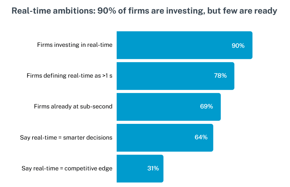
Faster data means faster decisions. 90% of companies say they plan to invest more in real-time analytics over the next few years.
That’s not a nice-to-have anymore. It’s what keeps teams competitive.
But here’s where it gets tricky:
69% still define “real-time” as anything over one second.
COnly 31% are truly operating at sub-second speed, and for them, smarter decision-making is the whole point.
So what’s holding everyone else back?
It’s not just the tools. It’s the skills to use them. The biggest blockers are access to the right tech and people who know how to manage and build fast-moving pipelines.
When those two things are missing, teams fall behind. They rely on outdated dashboards. They miss the window to optimize campaigns or shift budgets. And decisions that should happen in minutes stretch out over days.
Coupler.io simplifies the refresh cycle.
You can schedule data updates as frequently as every 15 minutes. No manual coding. No maintenance stress. For teams that need speed without infrastructure bloat, it keeps dashboards current and decision-making sharp.
This might be the real reason your reports lag
Buying the right tools isn’t the hard part. Using them well is. Many teams invest in advanced platforms like BigQuery, Snowflake, and Power BI, expecting faster insights and better reporting. But performance doesn’t always follow.
Why? Because the tools are ahead of the teams.
Most platforms offer incredible depth. But without proper setup, clear data models, and user training, they’re just expensive placeholders. Many marketers only use a small fraction of what the tool can do. Dashboards get built once, then abandoned. Teams fall back to spreadsheets. And the result? Reporting that’s slow, shallow, or just plain wrong.
Common pitfalls and why projects fail
It’s rarely the tech itself that breaks.
- No clear plan for implementation or ownership
- Too much tooling, not enough alignment
- Failure to define what “good data” actually looks like
Research shows that 50% to 80% of analytics projects don’t deliver expected results because people didn’t adopt the tools or the data wasn’t ready to use.
In fact, studies found that 87% of companies still struggle with basic analytics, meaning most organizations haven’t developed the expertise and workflows needed to succeed with these platforms.
What makes it work
The best outcomes don’t come from the fanciest tools. They come when capability, training, and clean pipelines work together.
But there’s one more piece teams often skip: a shared definition of success, grounded in real user problems. It sounds obvious, but it rarely happens.
Too many data products are built in isolation. This is far from the people who actually need them.
The result?
Misaligned KPIs, half-finished dashboards, and data pipelines that quietly rot in the background.
Before you launch your next dashboard, pause:
- Have you spoken with the actual users, one-on-one?
- Did leadership agree on what success actually means before the pipelines were built?
- Are business questions driving the model, or is it just “what the platform can do”?
Failure rates for digital initiatives, data products, and AI/ML projects still hover around 70–80%.
So it’s not just a tooling issue. It’s a strategy gap. And if you skip that part, you don’t just risk “underdelivering.”
You become just another line in a sobering statistic.
Meet the next wave: APIs, AI pipelines and embedded analytics
API-based data flows. AI-ready connectors. Dashboards that live inside the tools your teams already use. This is where analytics is heading, and it’s gaining ground fast.
The promise? Real-time insights, delivered right where work happens. No more switching tabs. No more waiting for a weekly export. Just decision-ready data, always on.
But there’s a catch.
Poorly managed endpoints can quietly wreck your reporting. One schema change, one expired token, and suddenly your dashboards go dark. Or worse, they show the wrong thing.
The solution isn’t just better connectors. It’s reliable, scheduled API pipelines that keep your data flows clean, consistent, and low-maintenance. That’s exactly what Coupler.io delivers.
Because shiny connectors are only half the battle. Stability is what actually scales.
However, here’s where Coupler.io goes further:
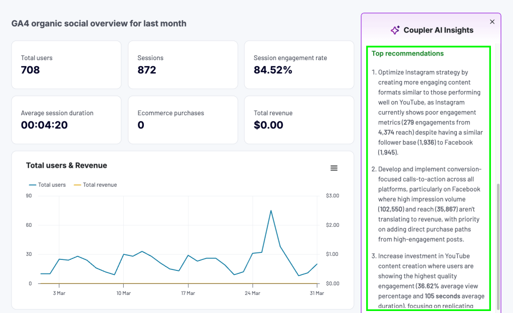
AI-Powered analysis, built right-in
In its mission to make reporting effortless, Coupler.io built a marketing advisor right into your dashboard. AI Insights highlights top and bottom performers, benchmarks your data against industry averages, spots anomalies, and delivers 3-6 actionable recommendations in seconds.
Dashboards aren’t just for displaying data anymore. With AI-powered insights and stable pipelines, they’ve become decision engines with the following capabilities:
- Automated anomaly detection: Alerts for unusual patterns
- Predictive modeling: Forecast campaign performance
- Optimization recommendations: Suggest budget reallocation
- Competitive benchmarking: Compare against industry standards
- Risk assessment: Identify potential issues before they impact performance
- Marketing funnel analytics: Analysis of the customer acquisition efficiency
You no longer just see what’s happening. You know exactly what to do next.
Get insights into your data via natural conversations with AI
The Coupler.io MCP server connects your data flows to AI tools like Claude, enabling natural-language queries and insights on demand.
It’s the closest thing to having a friendly analyst who knows your data inside and out, ready to answer questions about performance dips, upcoming trends, or budget suggestions.
Natural language query examples
- “Why did our conversion rate drop last week?”
- “Which campaigns should we pause to optimize budget?”
- “What’s the predicted impact of increasing our Google Ads spend by 20%?”
- “Show me attribution paths for our highest-value customers”
The shift toward AI-powered analytics isn’t just about better tools—it’s about fundamentally changing how marketing teams make decisions:
- Speed: From weekly reviews to real-time optimization
- Accuracy: From gut-feeling to data-driven recommendations
- Scale: From managing 5 campaigns to optimizing 500
- Sophistication: From basic metrics to predictive insights
As AI capabilities mature, the platforms that combine stable data pipelines with intelligent analysis will define the next generation of marketing analytics. The question isn’t whether to adopt AI-powered analytics—it’s how quickly you can implement it effectively.
Automate data flows and connect them to AI with Coupler.io
Get started for freeWhy marketing teams choose certain platforms (and regret others)
Most teams don’t start with the wrong tools on purpose. They choose based on what sounds good: cost, speed, and ticking the right compliance boxes.
But 72% of marketing teams end up regretting those choices, calling them wasted investments when tools don’t live up to the promise.
Not because the tools were bad, but because expectations didn’t match reality. The platform looked powerful in the demo. The pricing made sense on paper. The integration was supposed to be straightforward.
Then reality sets in. Manual workarounds pile up. Data silos creep in. And the stack that was meant to save time starts draining it instead.
Some teams find themselves stuck with slow reporting, broken connectors, and a migration project they never budgeted for. And they’re not alone. Platform migration failures and overruns are more common than not, especially when the planning phase gets skipped.
The real solution isn’t glamorous. It’s smart planning and reliable infrastructure that fits into your ecosystem today, while still scaling for what’s next.
That’s how you keep your tools working for you, not the other way around.