Dashboards! Everyone loves having a clear, interactive dashboard to play with. They make it much easier to see trends, compare different items or approaches, visualize vital business metrics, and much more. With the amount and complexity of data often stored in Airtable, visualizing what’s up there often becomes a must. Luckily, creating an Airtable dashboard is easy, and often requires no technical background or particular analytical skills.
In this tutorial, we’ll show you three different approaches to building a perfect dashboard in Airtable.
Why build a dashboard in Airtable?
There can be many different reasons for building dashboards because there are so many benefits of having one. Here are some top reasons:
- Better monitoring of business metrics – With thousands of records on your bases, it’s hard to see the big picture. Aggregating that data and putting it on an Airtable reporting dashboard as scorecards or charts gives you a quick overview of how a business or a project performs. This, as a result, streamlines decision-making and makes the company more data-driven.
- Spotting trends, opportunities, and bottlenecks – Raw data won’t tell you everything. Often, you need to draw a good-looking chart to spot what didn’t seem that obvious before. It could be sales or response time suddenly deteriorating, an increased engagement from a particular user segment, or a sudden roadblock you may have missed before. Staying on top of such events with the help of an Airtable dashboard template will allow you to react faster and capitalize on arising opportunities.
- Better transparency – dashboards are invaluable when working with multiple stakeholders, including those that don’t even use Airtable. They keep everyone in the loop, answer questions before they arise, and make every discussion more factual. Every stakeholder can find the information they need quickly, without the need to distract anyone from their work.
Three approaches to building an Airtable reporting dashboard
We’ve tried various ways of building Airtable dashboards and have come up with three viable methods. Each is a bit different and will suit a slightly different audience from beginners to experienced analysts. The first two approaches are available within Airtable and are accessible, to some extent, even on the free tier.
- The first method relies on Extensions (previously known as Apps) that you can add to your bases. There are many available options, the majority focus purely on helping you make more sense of your data.
You’ll read more about it in the How to create a dashboard in Airtable using Extensions? chapter.
- The other native method is with the recently launched Interface Designer. It’s a feature built specifically with dashboards in mind. It offers drag-and-drop functionality for adding new elements to your Airtable dashboards and can be customized to a great extent.
We talk more about it in the How to create a dashboard in Airtable using Interface Designer? chapter.
- The third option relies on the automation of the Airtable data export into a spreadsheet. It could be a final destination where you’ll build any custom dashboard or just the start of the data journey. Many Airtable users choose to plug in such data into DataViz tools like Tableau or Looker and end up with a wonderful, interactive Airtable dashboard template for their data. We’ve covered this approach in detail in the How to build Airtable dashboards outside the platform? chapter.
Which of these options works best for you to build an Airtable reporting dashboard? Let’s find it out!
How to create a dashboard in Airtable using Extensions?
Extensions (known as Apps until early 2022) are excellent for adding charts or scorecards to your base in just a few clicks.
It could be a bar or line chart demonstrating the revenues and expenses. Others could think of deploying a pie chart to showcase the content distribution among writers or a traffic split among sources. Extensions are also great for displaying metrics – MRR, total sales, goal completion %, and much more.
Each table can have a separate Airtable dashboard, demonstrating only the relevant stats. You can’t, however, display data from outside of a base and mix data from several different bases using the conventional method.
A workaround would be to sync data between bases using Airtable Sync. If you, however, don’t want to do that, you’ll need to settle with a dashboard outside of Airtable that lets you tap into data from any sources, even from other apps you use. More on that later.
To add an extension in Airtable or to have a look at your dashboard, click the Extensions button in the top-right part of the screen.
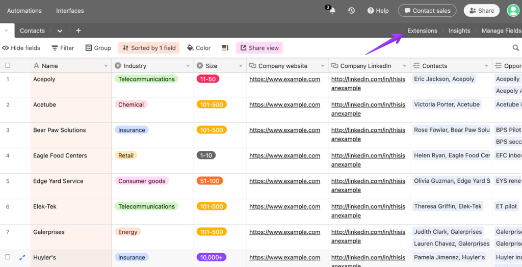
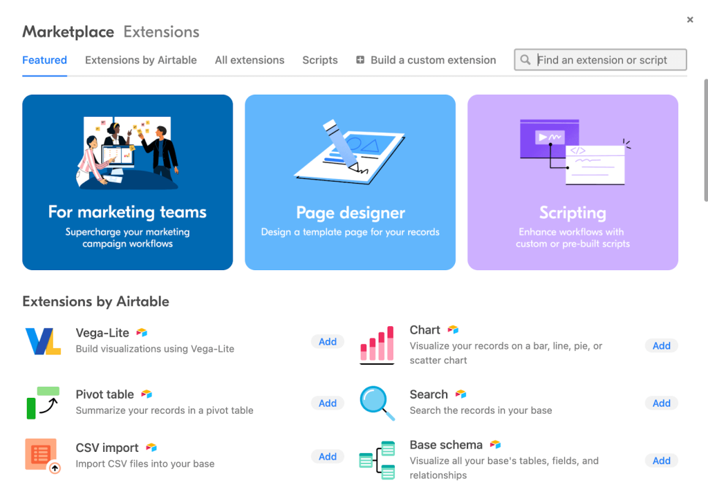
Then, use the Add an extension button to jump to the Airtable Marketplace. There, you’ll find lots of ready extensions built by their team themselves as well as by external developers. If you can’t find anything suitable, you can even build an extension using the available templates or write a script to pull up the desired data.
Airtable dashboard examples built with extensions
Let’s now look at a few examples of Airtable dashboards suitable for different kinds of projects.
Airtable sales dashboard
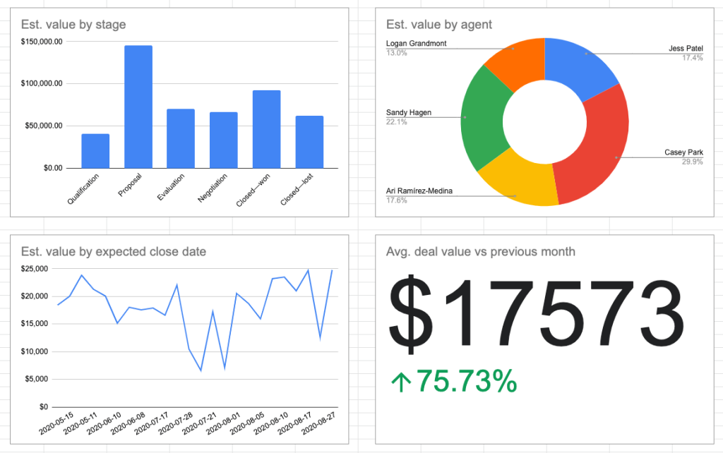
If you use Airtable for tracking your ongoing and closed sales deals, demonstrating them on a bar chart may be a suitable approach. In the example of an Airtable sales dashboard below, you can see a summary of the estimated deal values for each agent split for different funnel stages. The chart below displays the total value of all closed deals.
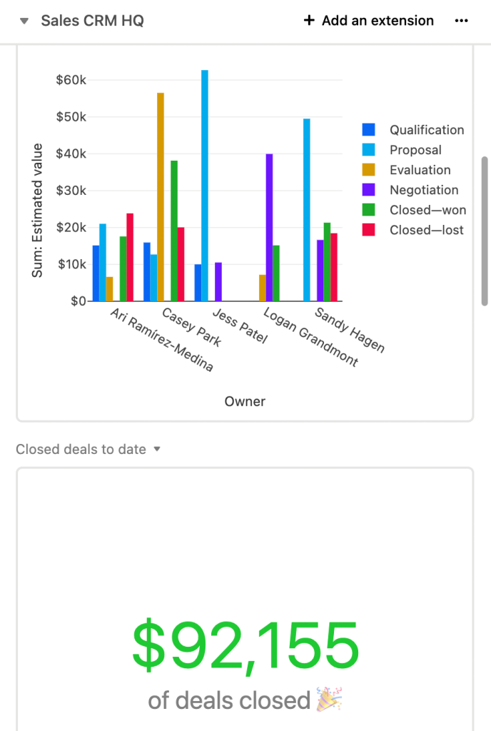
Both graphs and numbers are refreshed automatically as the new data flows in, or any changes are made to the records. This Airtable sales dashboard may look pretty shallow but still it’s capable to provide you with actionable insights.
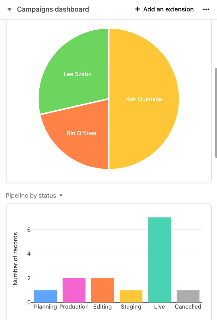
Airtable KPI dashboard for a content team
Content teams want to stay on top of the content in their pipeline. A manager will want to see how the workload is split among their team members. Separately, they will appreciate a quick overview of where in the funnel the articles are. An Airtable KPI dashboard will be helpful for this purpose.
Of course, it does not resemble advanced KPI dashboards built in Tableau or another BI tool. However, you can customize your Airtable KPI dashboard to your requirements for design and metrics.
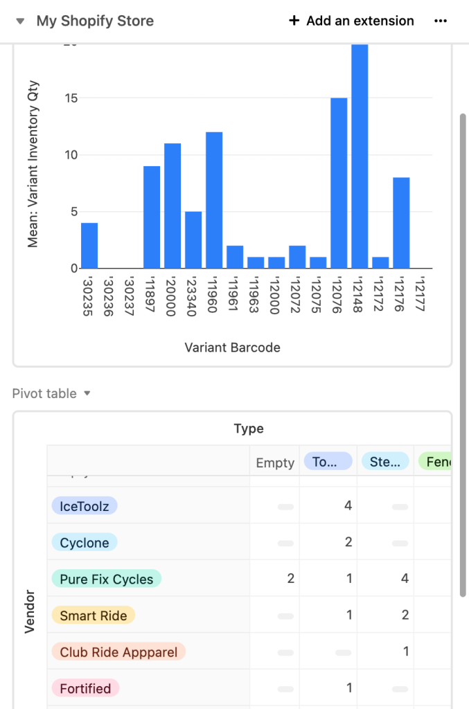
Airtable inventory dashboard
Online stores using Airtable to manage their inventory will have completely different needs. They will certainly want to keep track of their inventory levels so that they always know when there’s a need to re-supply. They can do it with another bar chart, as shown below.
On the other hand, a pivot table may prove useful for monitoring vendors and the types of products they offer.
These are just a few very basic examples of what an Airtable dashboard may look like. Try the extensions yourself and see if they deliver what you need.
How to create a dashboard in Airtable using Interface Designer
Back in November 2021, Airtable released the beta version of a long-anticipated Interface Designer. The goals were to make your data more accessible, streamline the workflows, and foster making data-driven decisions.
Many people use Interfaces to build and share an Airtable dashboard with their stakeholders. It’s not the only use case, though.
The content teams can use an Interface to access the articles or videos next up in the publishing queue and publish them with a single click. The sales team may use the Interface to look up only the essential information about their clients without the need to scroll through dozens of irrelevant columns.
To create an Interface, jump into the base you want to build it for and click the Interfaces button on top.
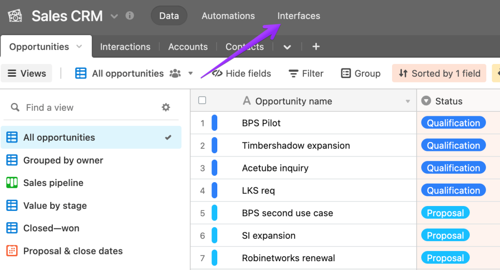
As was the case for Extensions, Interfaces are also relevant only for the base they’re created for.
If you haven’t built an interface before, you’ll want to click on Start building which will take you to an intro sequence for this feature.
However, since we’re here to talk about Airtable dashboards, the aptly named Dashboard template is probably a good start.
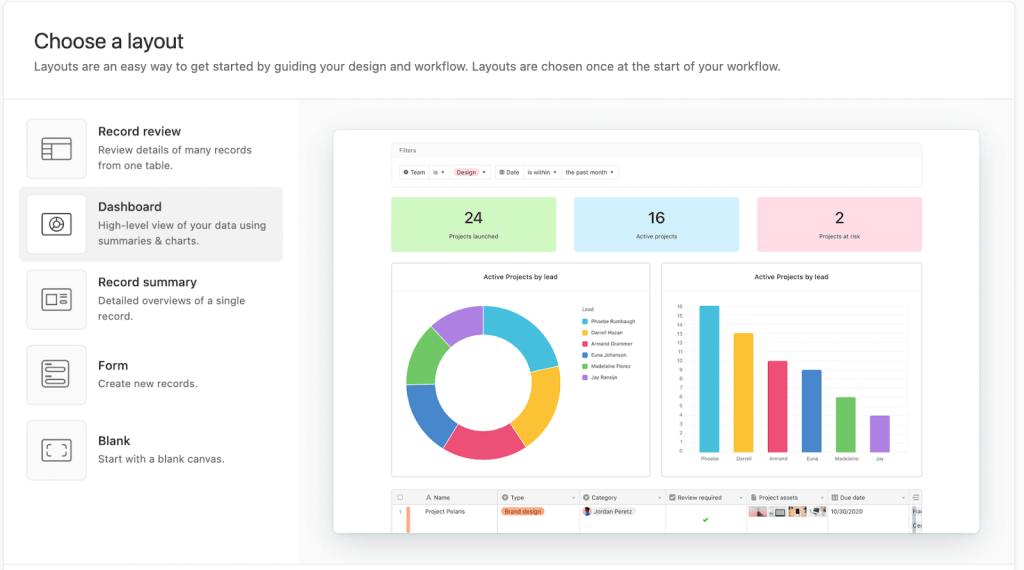
Next, you’ll choose the table to fetch the data from and the types of elements to add to an Airtable reporting dashboard right away. Of course, you’ll be able to add or remove any later too.
From our experience, the template helps a lot to get started. Not having any previous experience with Interfaces, we were able to build the following dashboard in less than five minutes. But even starting from a blank Airtable dashboard template but having an idea of what you want to visualize, it won’t take you much longer to bring this to fruition.
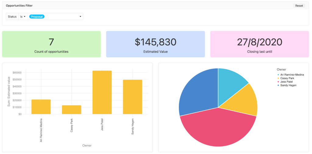
We’ve built a sales dashboard in Airtable. It features:
- Status selector so that one can quickly check how deals on each stage perform.
- Scorecards that demonstrate the number of deals on a particular stage, their estimated value as well as the latest data when each is set to close.
- Bar and pie charts that tell us the value of deals that agents work with and the numerical split of opportunities on their hand.


When editing, the Interfaces are not yet visible to the public. You can name and publish them using the button on top of the screen. Once you do that, Airtable will encourage you to share the dashboard with your stakeholders.
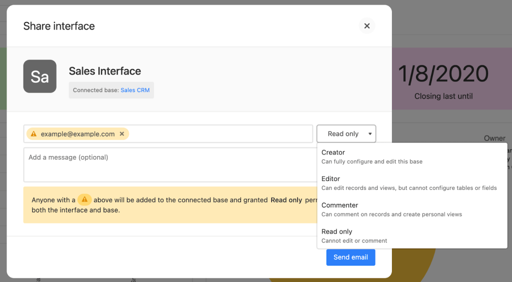
Any person you invite must create an Airtable account if they don’t have one yet. They’ll also be added to the base you’ve created the Interface for. Using the drop-down menu, you can decide on their permissions level.
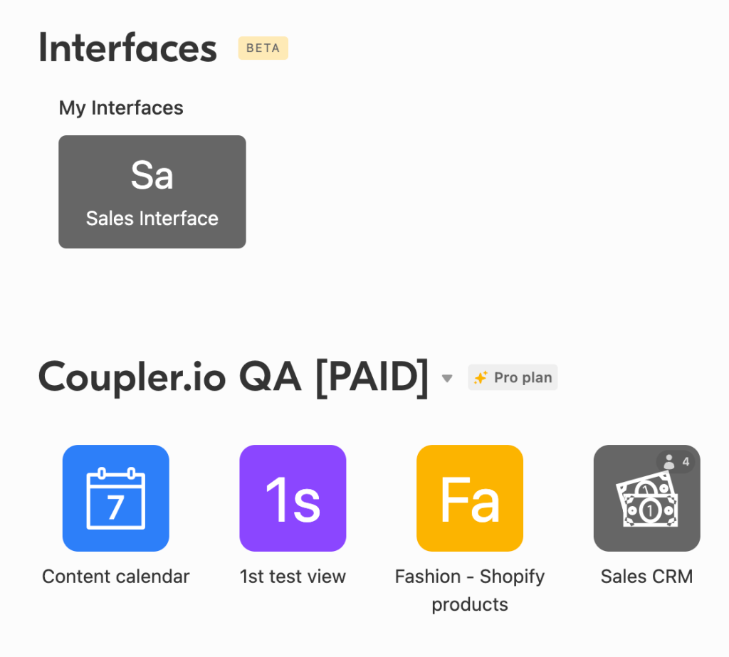
Once you’ve saved your Interface, you’ll be able to access it from the Airtable home screen. Alternatively, you can enter your base and click the Interfaces menu on the top as you did when creating the Airtable reporting dashboard in the first place.
How to build Airtable dashboards outside the platform?
And now onto the third available method that relies on automatically exporting data from Airtable and building an Airtable dashboard template in the tools most suitable for it. This approach is particularly beneficial when:
- You want to calculate advanced metrics, build forecasts, or perform other complex operations on your data before you display it on charts.
- You wish to combine data from different bases or even from different apps. An example would be blending Airtable data with your apps for sales, marketing, accounting, advertising, and more.
- The dashboard or a report needs to be shared with external stakeholders who don’t have an Airtable account.

Automate data export with Coupler.io
Get started for freeLet’s look at an example of how it can be done with the help of Coupler.io, a data automation and analytics platform. Coupler.io provides a no-code ETL tool that supports a number of integrations, including the one to automatically export the data from Airtable. We are going to pull the Airtable records to Google Sheets where we can build a simple Airtable sales dashboard. If you prefer, you may also do the same in Excel.
A spreadsheet doesn’t, however, need to be a final destination for your data. For example, it’s common to export the data from Airtable to BigQuery and then plug it into data visualization tools, such as Tableau, Looker, or Data Studio. On the other hand, those that opt to export Airtable to Excel may be more inclined to connect their data to Power BI. To get started, select the needed destination in the form below and click Proceed.
- You’ll be offered to create a Coupler.io account for free.
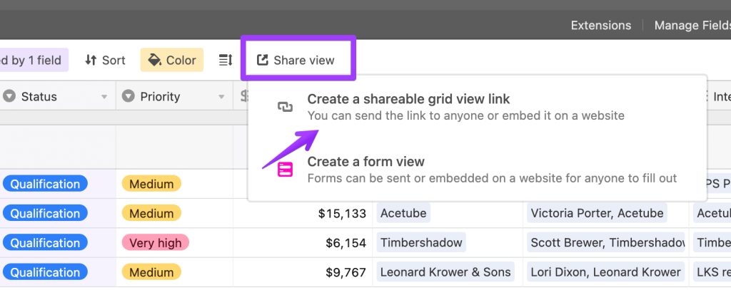
- Now, jump into your Airtable base and pick the view you want to export first. You’ll also be able to export other views from this or any other base later in just a few clicks.
- From the menu, select Share view and then Create a shareable grid view link (if you export other types of views, the text will look slightly different).
- Copy your view address and optionally add a password. Then, paste it into the respective field in Coupler.io.
- If your view is password-protected, type in the password in the following window. Jump to the destination settings.
- Here, connect your Google or Microsoft account (in case you’re exporting to Excel). Authorize Coupler.io to import the data on your behalf. Also decide where to export the data.
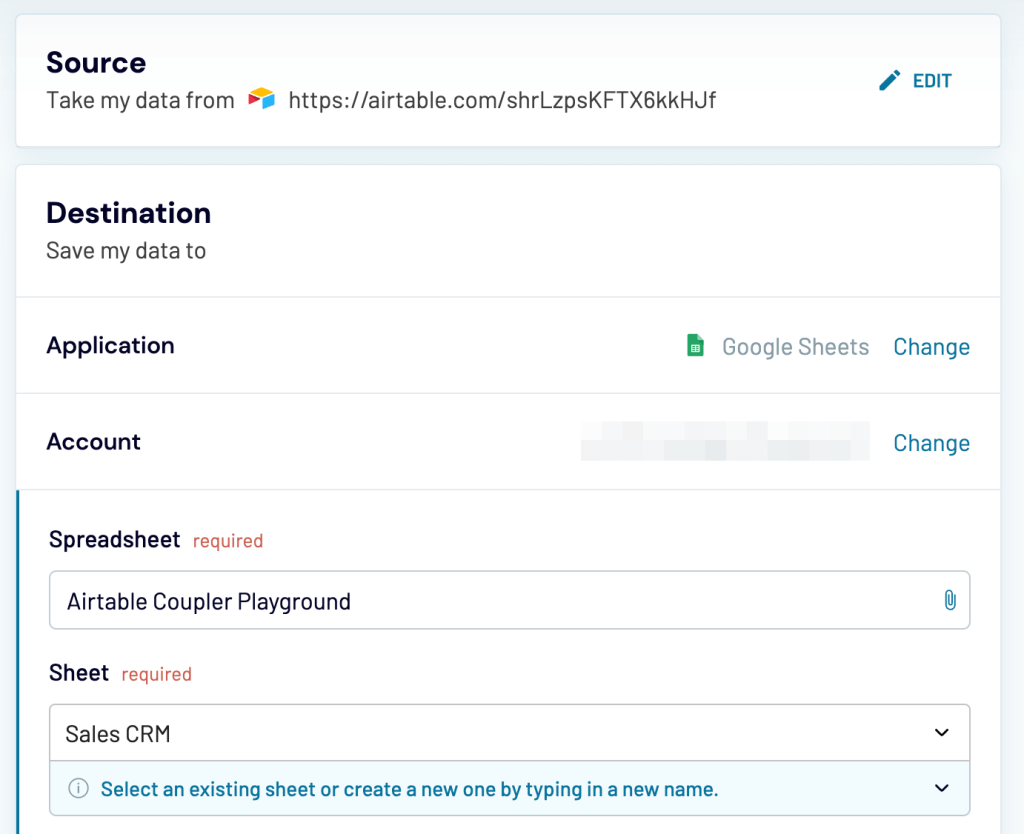
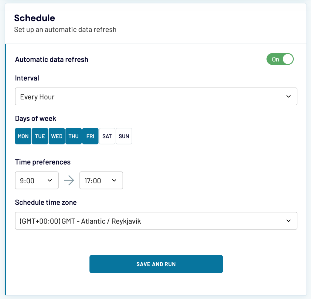
- Since you’re building an Airtable reporting dashboard, you want your data to be always fresh. In the Schedule part of the setup, you can choose how frequently the fresh data should be fetched from Airtable. For example, it can happen hourly, between 9 am and 5 pm, on weekdays.
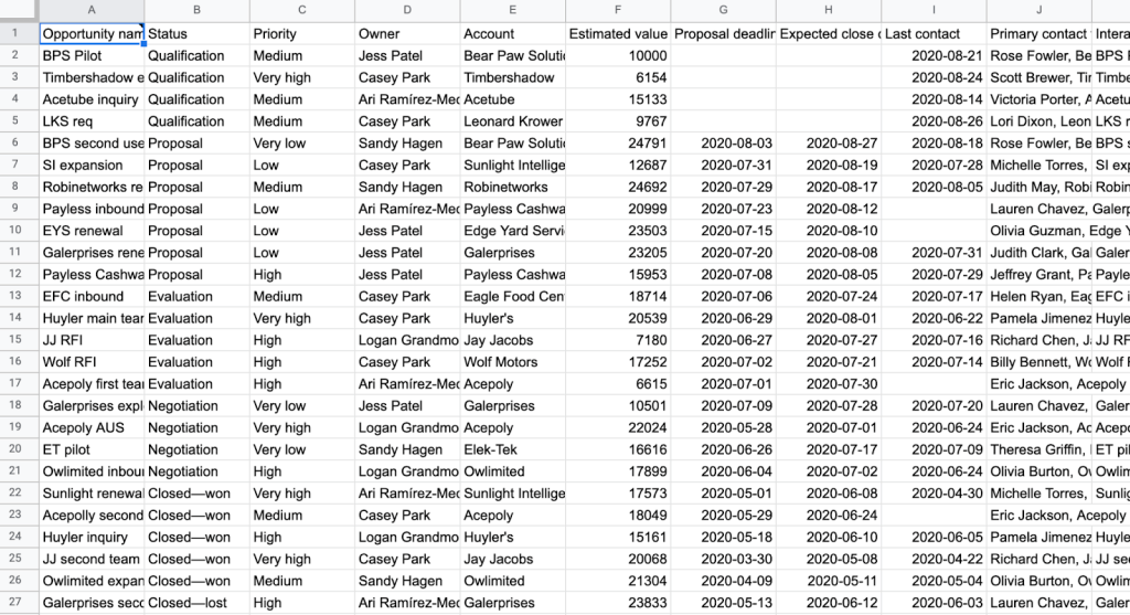
- Finally, click the Save and Run button to launch the importer. Once it’s finished, your data will look quite raw:
- But with just a little effort, you can turn it into a colorful and meaningful Airtable dashboard template:
Now, it’s time to share the Airtable dashboard with your stakeholders!
Which option is best to make an Airtable dashboard template?
As you can see, there’s not one, not even two, but three excellent approaches to building an Airtable dashboard. The choice really comes down to your needs.
- Go with Extensions if you just wish to add a few charts to a table you work with. The split-screen interface will make it convenient to work with your data and simultaneously watch how the metrics change.
- Go with Interfaces if you want a dedicated dashboard within Airtable with many more options and a straightforward setup.
- Go with Coupler.io and a dashboard outside of Airtable if you need more customization, wish to combine data from different sources, or want to process your data before it’s put on a dashboard.
You can’t go wrong with any of these methods. Good luck, and thanks for reading!