Do you remember the days when a simple calculator and a bunch of paper sheets were used for reports? People often spent days gathering data, and much of the time some data would be missing. However, situations like that are in the past!
Such tools as Tableau incredibly facilitate the reporting workflow today, and Tableau dashboards take it to the next level. They are dynamic and interactive, providing quick insights into the business areas of interest. We have gathered 11 exceptional dashboard examples that you can freely use to track your business performance in real time and advance your decision-making processes.
Tableau dashboard examples for your reporting and inspiration
1. Tableau PPC multi-channel dashboard
This Tableau dashboard is a must-have for those who run online ad campaigns regularly or occasionally. It provides performance insights for principal media channels used in modern ad campaigns (Google Ads, Facebook Ads, LinkedIn Ads, etc.). Having such a PPC multi-channel dashboard at hand allows marketers to understand which channels are best-performing and worth further investment. What’s more, they can observe and compare the results of different channels in one table.

This PPC dashboard contains pre-built connectors to Facebook Ads, Google Ads, LinkedIn Ads, X Ads, Bing Ads, TikTok Ads, and Quora Ads along with detailed instructions on how to set everything up. It can also be easily customized to meet the particular needs of your business.
Dashboard key metrics:
- Amount spent: Shows how much money was already invested in the ad campaign.
- Impressions: Depicts how many times the ad was displayed.
- Clicks: Shows how many times users clicked on the ad and proceeded to the landing page.
- CTR: The click-through rate for the chosen channel(s).
- CPM: The cost paid for 1000 ad views.
- CPC: The cost paid for each click on the ad. One CPM is equal to 1000 CPC.
Dashboard pros:
- Provides additional charts with metrics detailing over time. You can observe the peak periods when most impressions and clicks were registered. This helps to plan ad marketing campaigns in advance to ensure their effectiveness.
- White-label template. It’s possible to customize the dashboard by adding or removing the ad channels.
- Contains pre-built connectors for 7 ad sources (search engines and social media channels).
- This dashboard template is also available for Looker Studio and Google Sheets
Dashboard cons:
- It does not have pre-set goals, as they are unique to every project. So, if you want to monitor specific goals, you’ll need to customize the dashboard.
2. Web analytics dashboard for GA4 in Tableau
This dashboard collects data from Google Analytics 4 to provide an overview of your web traffic performance. You can get insights into traffic acquisition, the behavior of your audience, and how well your users convert into customers.
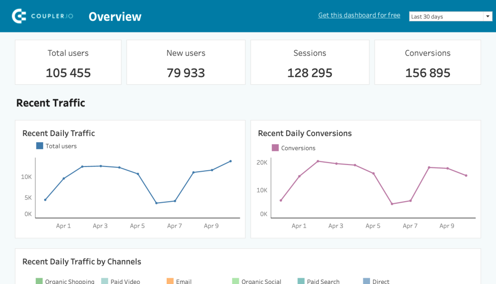
You won’t need to manually upload data from Google Analytics to this dashboard since it’s equipped with a GA4 connector by Coupler.io. Follow the enclosed instructions to connect the dashboard to your GA4 account and load the recent data.
Dashboard key metrics:
- Total users: The total number of unique visitors to your website during a specified time period.
- Active users: The number of users who have interacted with your website in a given period.
- New users: The number of first-time visitors to your site during a specified time period.
- Sessions: The total number of individual visits to your website, including all interactions during each visit.
- Average engagement time per session: The average amount of time users spend actively engaging with your website during a session.
- Conversions: The total number of completed actions that are valuable to your business, such as form submissions, sign-ups, or purchases.
- Conversion rate: The percentage of sessions that resulted in a conversion.
- Total purchases: The total number of purchase transactions completed on your website within a specified period.
- Total revenue: The total amount of money generated from purchases on your website during the selected timeframe.
Dashboard pros:
- The dashboard consists of 4 reports: overview, acquisition, behavior & audience, and conversions. This way it’s more efficient for users to focus on insights specific to their marketing efforts.
- White-label template. It’s possible to customize the dashboard by adding or removing the ad channels.
- Contains a pre-built connector to Google Analytics 4 to eliminate any manual data upload to the dashboard.
- This dashboard template is also available for Looker Studio and Power BI
Dashboard cons:
- The conversion goals are unique to every project. So, you’ll likely need to customize the dashboard to monitor your specific conversions.
3. Tableau KPI dashboard
The key performance indicators for the financial department are presented in this Tableau dashboard. They could be particularly useful for those eager to observe the current financial landscape at a glance. The ongoing financial KPIs can be compared with the results of the previous month/year. Also, the dashboard depicts the profit values for each state, which might be useful for businesses operating nationwide in the US.
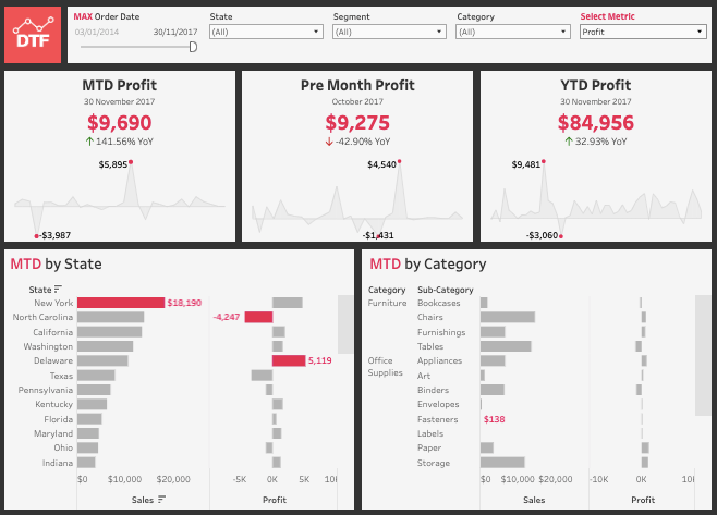
Even though the above-mentioned example contains financially oriented metrics, the KPI dashboards can be implemented in various departments. The main thing is to know the KPIs needed to design a Tableau dashboard.
Dashboard key metrics:
- Month-to-date (MTD) profit: The profit gained from the start of the current calendar month until today.
- Pre-month profit: The profit of the last month, along with the comparison of the current month’s KPIs.
- Year-to-date (YTD) profit: The profit from the first day of the calendar or fiscal year until today.
- MTD by state: Disseminates the total MTD over each state in the US.
- MTD by category: Disseminates the total MTD for each specified product type.
Dashboard pros:
- Provides a comprehensive overview of the financial performance in real-time.
- Compares the current financial KPIs with those in previous fiscal periods.
- Presents the drop-down of profits across territories.
Dashboard cons:
- It’s applicable mostly to companies operating in the US territory.
- It doesn’t allow users to compare the KPIs of the same months of different years.
4. Tableau executive dashboard for the hospitality industry
This sample provides an overview of the overall performance of the hotel chain operating in different countries. Such an executive Tableau dashboard depicts the revenue for a chosen period, the number of guests, the hotel occupancy rate, etc., for each country where the hotels are located. These indicators help executives, investors, and other stakeholders in the hospitality industry make data-driven decisions.
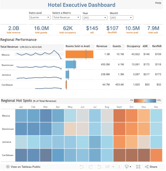
Dashboard key metrics:
- Rooms sold vs available: Depicts a colored quadrangle with the bar dividing it into rooms sold on the left and rooms available on the right. This indicator shows the ratio of the occupied and free rooms for the selected period (year, quarter, or month).
- Revenue: The amount of money earned in each region and in total for the selected timeframe.
- Guests: The number of people who visited hotels in each region and in total for the selected timeframe.
- Occupancy rate: The ratio of used rooms to the total amount of rooms.
- Revenue per available room (RevPAR): The result of the average daily room rate multiplied by its occupancy rate.
- Regional hot spots: The monthly breakdown for each region, depending on the metrics chosen in the top menu.
Dashboard pros:
- Shows both the total overview of the hotel chain’s performance as well as the individual hotel performance.
- Provides a monthly breakdown of each metric for every region.
- Has colored quadrangles with a color palette from blue to red, which adds an intuitive insight for poor and excellent performance, respectively.
Dashboard cons:
- Applicable only to companies operating in the hospitality industry.
5. Tableau sales dashboard
This sales dashboard example provides a complete overview of the superstore sales. It contains several blocks for total sales, profits, sales per customer, and monthly sales, with the charts containing 2-year data. Using this Tableau dashboard helps sales team managers and sales executives in analyzing sales growth over time. It also facilitates an understanding of whether the implemented sales pipeline results in a sales boost.
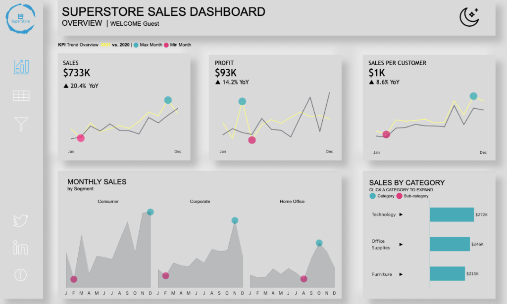
- Sales: The total amount of sales in the previous and current year. The graphs point out the peak and low sales performance times.
- Profit: The net profit generated by the sales team for each year.
- Sales by category: The number of sales for each product type.
- Sales by customer: The average number of sales for a customer during a calendar year.
- Monthly sales: Contains three graphs, each for the dedicated customer segment: individual customers, home office, and corporations.
Dashboard pros:
- This sales analytics dashboard is visually appealing as it contains additional colored elements allowing everyone to grasp complex statistical information.
- Provides all the necessary metrics for obtaining a comprehensive sales overview.
Dashboard cons:
- Doesn’t allow you to change the reporting time period, which makes it a one-time seasonal dashboard.
6. Tableau marketing dashboard
This Tableau dashboard example could be compared to the marketing cockpit display. It brings enormous value to any marketing professional as it aggregates all crucial data from such tools as Salesforce, CRM systems, etc. These graphs, numbers, and charts allow marketers to assess their ad campaigns’ current performance and general marketing strategies.
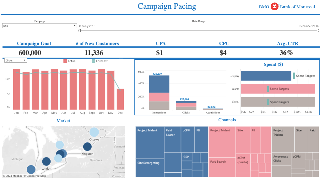
- Campaign goals: The expected number of impressions for the indicated time period.
- Number of new customers: The precise number of new customers acquired during the reporting period.
- CPA: The average cost-per-acquisition rate across different channels.
- CPC: The average cost-per-click rate across the marketing channels used in the campaign.
- Average CTR
- Impressions: The number of impressions for the display, search, and social ad channels.
- Clicks: The number of clicks for the display, search, and social ad channels.
- Acquisitions: The number of acquired customers resulting from the display, search, and social ad channels.
Dashboard pros:
- Contains all the principal metrics along with the additional graphs that help to grasp the results and assess the performance of each particular channel. For instance, it shows a graph with the breakdown of spending for ads on social networks, display, and search engine channels.
- Shows the saturation of the geographical markets, giving marketers a hint about where a great part of the target audience resides.
- This dashboard is applicable across different industries.
Dashboard cons:
- Some graphs and charts are very complex and populated with multiple details and need to be magnified or dispersed into several separate graphs.
7. Tableau call center dashboard
Analysis of the call center performance is something that needs to be done on a regular basis. Use this Tableau dashboard to get a general overview of call center activities, including the number of calls, average answer speed, and abandonment rate for the entire department as well as for the concrete agent. Such information helps managers understand whether extra human power is needed to cover the incoming requests or whether it’s worth providing additional training for existing personnel.
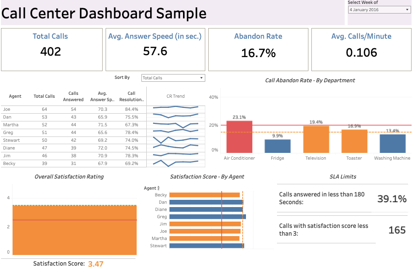
- Total calls: The total number of calls during the chosen week.
- Average answer speed: Seconds from the first ring to the call answer.
- Abandon rate: The ratio of the non-answered calls and the general number of incoming calls.
- Satisfaction score: The average rating for all calls during the week.
Dashboard pros:
- Provides the detailed characteristics necessary to evaluate the general performance of the call center as well as that of each individual agent.
- This dashboard is applicable in various industries and departments with the onsite call center.
Dashboard cons:
- This dashboard may not be applicable to those support centers that deal with incoming chats and emails.
8. Tableau HR dashboard
Having a comprehensive overview of the human resources department is essential. This Tableau dashboard example provides all essential metrics helping HR and hiring professionals to design an average employee profile and grasp the dynamics of turnover in the company over the years. The particular value of this dashboard is that it’s suitable for companies operating in different geographical zones.
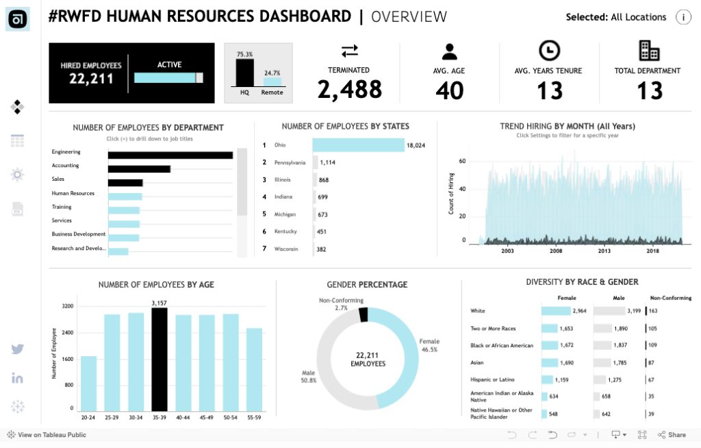
- Hired employees: The total number of people hired during the chosen period. There’s also the number of active and terminated employees along with the percentage of the workforce operating in the headquarters office and remote locations.
- Average age: The medium age of all employees in the company.
- Average years tenure: The average retention rate in the company.
- Total departments: The number of departments currently present in the company. The additional graph also demonstrates how many employees are there in each department and in which location.
Dashboard pros:
- Provides a detailed overview of the human resources landscape, including monthly hiring trends, the number of employees in each location, staff breakdown by demographic characteristics, etc.
- This dashboard is applicable to any company.
Dashboard cons:
- It doesn’t allow to change the time period on the go.
9. Tableau project management dashboard
Project and product managers can greatly benefit from this Tableau dashboard. It grants an in-depth overview of all the project management processes and activities. This dashboard can also be highly informative for executives, financial department representatives, and the company’s board of directors.
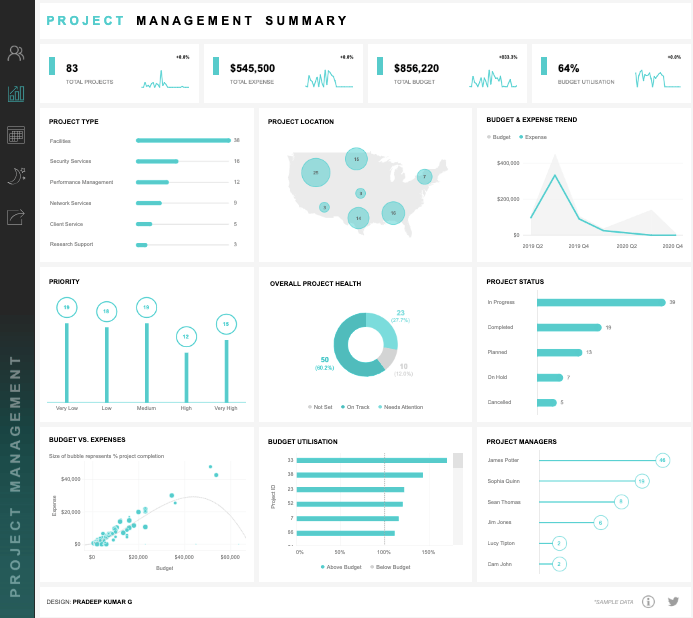
- Total projects: The number of active and frozen projects in all locations.
- Total expense: The amount of money spent on all projects in general.
- Total budget: The amount of money allocated for projects and project management activities.
- Budget utilization: The ratio of the previous two metrics: division of total expense by total budget. This indicator is crucial for project managers to understand whether they can add more workforce and tools to the project or if they’re running out of budget.
Dashboard pros:
- A great benefit of this dashboard is that it implements additional graphs and charts complementing the metrics. For instance, there are charts showing the number of projects by category, location, priority, project status, budget utilization, etc.
- Another advantage of this dashboard is that it shows the workload for each project manager.
Dashboard cons:
- It’s applicable for companies administrating multiple projects of different types.
10. Tableau financial dashboard
This Tableau dashboard is a top-notch informative desk for financial specialists. It contains all the important metrics a financial department uses for regular statements and reports.
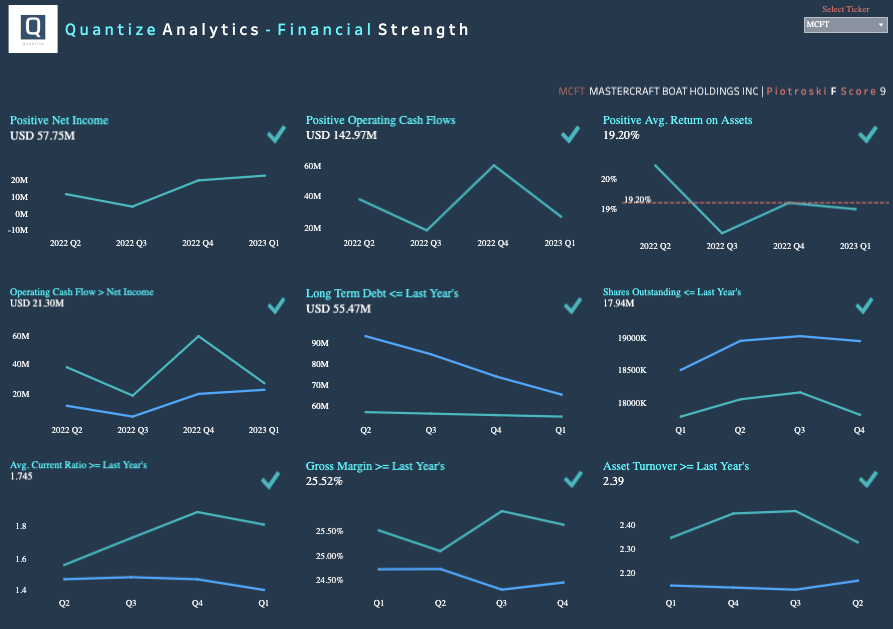
- Positive net income: The curve line for income after taxation during the fiscal year.
- Positive operating cash flows: The curve line for the cash generated by the business during each month of the fiscal year.
- Positive average return on assets: Profit generated using the company assets.
Dashboard pros:
- Provides additional changes that confront two metrics in the same space. For instance, there’s a graph comparing cash flow with net income and another graph juxtaposing current asset turnover with those of the previous years. etc.
- It contains a great variety of metrics used by financial departments.
Dashboard cons:
- This dashboard might be unclear to non-financial professionals as they would need an extra explanation of the graphs.
11. Tableau e-commerce dashboard
Given that an e-commerce sphere contains many things to think over, a good Tableau dashboard like the one provided below may come in handy. It’s ideal for the marketplace as it provides a complete landscape of e-commerce operations of different online shops. It might be useful not only for retailers but also for supply chain managers as they could predict demand and organize product supplies in a timely manner.
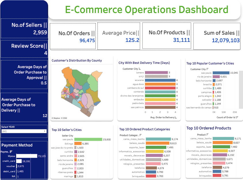
- Number of orders: The total number of completed orders for the selected fiscal period.
- Average price: The average price of all the products sold.
- Number of products: The actual number of product items sold during the selected period.
- Sum of sales: The total amount of money generated from all the completed orders.
- Number of sellers: The total supplier count presenting products on the marketplace.
- Review score: The average customer satisfaction rate for all products purchased.
Dashboard pros:
- Provides useful additional charts, showing the top 10 classifications for the most popular cities, ordered products, delivery times, etc.
- Has a very appealing color palette, which helps to intuitively understand the state of things.
Dashboard cons:
- Being designed for compound marketplaces and multiple sellers, it doesn’t make much sense for individual online retailers.
Types of Tableau dashboards
We’ve observed the top 10 examples of dashboards that assist professionals in various departments. You can explore much more depending on what type of dashboard you need.
Operational dashboards
This is a general category of business dashboards showing the operational state of a certain business area. This kind of dashboard is commonly used in marketing, sales, HR, inventory management, etc.
Executive dashboards
Such dashboards are also known as performance dashboards and contain all the necessary KPIs. They help the board of directors and department heads get an overview of business health and understand whether a company is moving towards its strategic goals.
KPI dashboards
This dashboard type is similar to the executive one, but it contains a slightly broader range of key performance indicators for the particular department. The main thing is to know the exact KPIs that interest you and understand how to collect and extract data for KPI checks.
Project dashboards
This kind of dashboard is prevalently used by project managers. However, it also benefits financial and IT departments and directors. It contains all the necessary information about the projects’ ongoing status, budgets, responsible people, and some other crucial indicators.
Website dashboards
This kind of dashboard is dedicated to the performance description of a website and other online channels. Such dashboards provide a complete overview of the target audience’s interaction with the brand and thus present deep insights into the ideal customer profile, which is a cornerstone of any digital marketing strategy.
How to automate your Tableau dashboard?
You may decide to make a copy of a pre-configured automated dashboard and slightly customize it on the go. Otherwise, create a completely new dashboard in Tableau from scratch. Which option to choose is entirely up to you.
Create interactive dashboards in Tableau with Coupler.io
Get started for freeUse Tableau dashboard templates by Coupler.io
Coupler.io offers a library of automated dashboard templates for different BI tools including Tableau. Check out the steps to start using one of them – the PPC multi-channel dashboard.
Step 1. Set up importer
Follow the in-app instructions to connect all the sources where you run the ad campaigns. Include only those sources that you actually use and ignore the rest. Once all the required social media channels are connected, click Proceed.
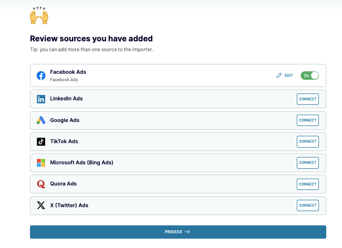
The data is fetched from the selected sources, and you’ll be able to preview it. Once the preparations on data are complete, click Proceed in the upper-right corner.
Step 2. Load data to the dashboard in Tableau
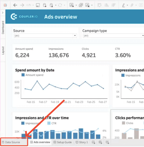
- Copy the integration URL and click Run Importer.
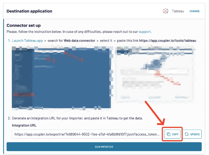
- Then, download the template and open it in Tableau Desktop.
- Click Data Source in the bottom-left corner to configure the data source.
How to create custom Tableau dashboards and automate them with Coupler.io
If you want to create your own dashboard in Tableau, you’ll need to supply it with data by uploading CSV files or by connecting to the supported sources. Note that Tableau doesn’t support ad marketing channels and social media platforms, so populating it with data might be a tedious job. But, with Coupler.io you can automate everything and schedule regular data transfers to Tableau to have a near-real-time overview of ad campaigns.
Step 1. Collect data
Select the preferred source in the drop-down in the form below and click Proceed. You’ll need to create a Coupler.io account first, which is free without any credit card required.
After that, you will need to connect your data source and specify which data to export. For example, here is the interface to connect to the LinkedIn Ads account and configure your data source.
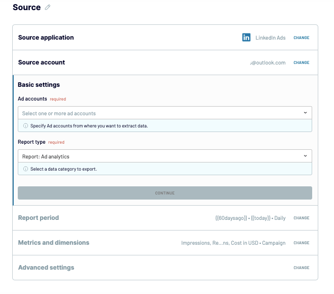
To add data from other ad tools, click + Connect one more source in the upper-left corner to connect other ad channels. Otherwise, click Transform data to proceed further.
Step 2. Organize and transform data
To prepare data for Tableau, take advantage of the data management and transformation options:
- Column management: Select only those columns that are important for your specific objective.
- Filtering: Indicate criteria for picking up specific items for analysis.
- Sorting: Select how to sort the data.
- Formula: Create new columns using mathematical operands and functions (for instance, a column that shows the relation of likes and shares).
Once all the transformations, filtering, and other data preparation tasks are done, click Proceed.
Step 3. Load data and schedule refresh
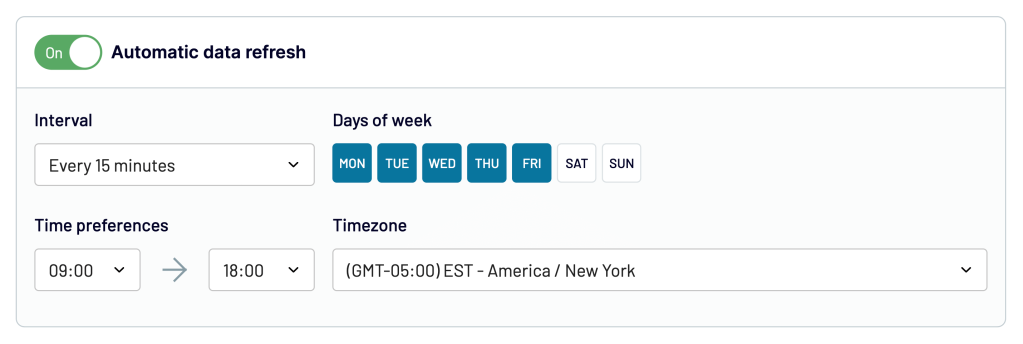
- In the window that appears, click Generate link.
- Then, go to the next step by clicking on Set up a schedule. Toggle on the Automatic data refresh button if you need to regularly supply Tableau with fresh data. You can specify frequency from monthly to daily or even every 15 minutes, keeping your report live.
- Click Save and Run importer.

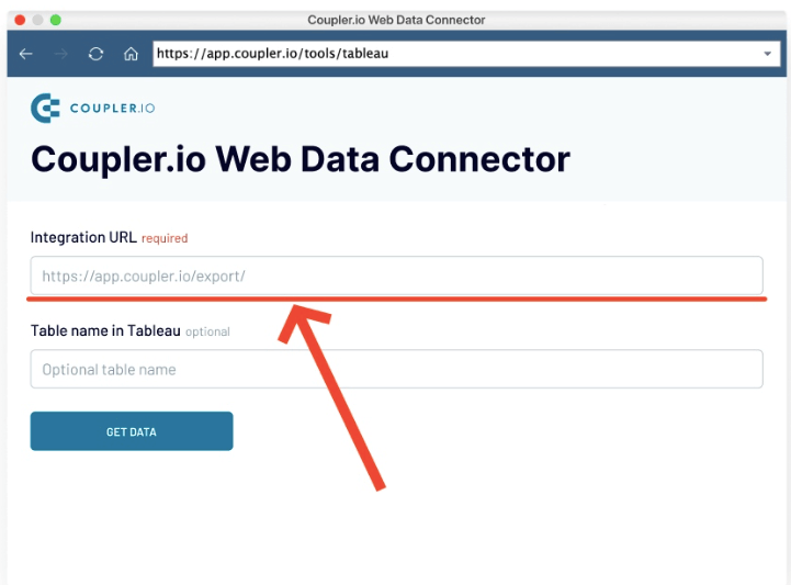
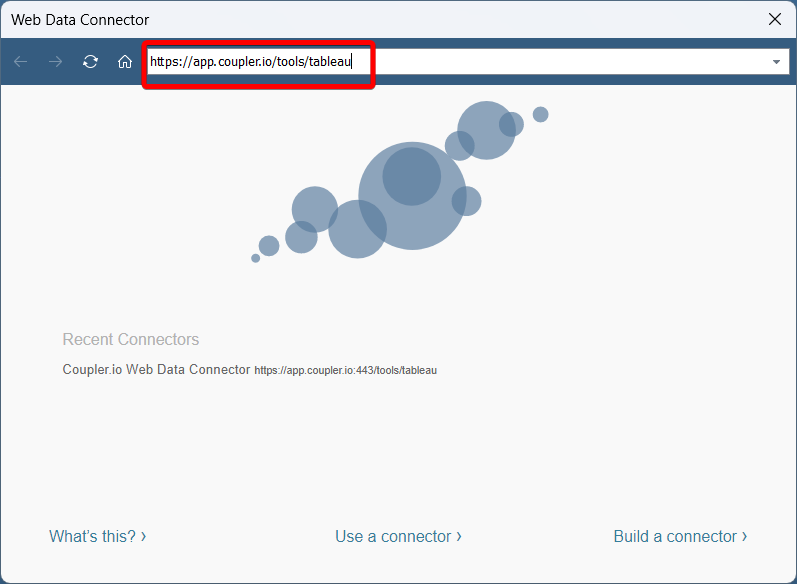
- Insert the following URL and press Enter.
https://app.coupler.io/tools/tableau
- Copy the generated integration URL and paste it into the respective field.
- Then, click Get Data, and the data will be loaded to Tableau. After that, you can realize your Tableau dashboard ideas to turn your raw data into meaningful insights.
Tableau dashboards from scratch or template – which is the best?
You may copy any dashboard sample presented in this article, make the necessary changes to it, and supply it with the ad marketing data. It’s rather fast and easy, so you can start tracking your ad campaign results right away.
However, if there is no suitable template that matches your expectations and contains the exact particular metrics of interest, it makes sense to create a new dashboard in Tableau. It will certainly take some time and effort at first, but the overall overview of your marketing campaigns will be exactly what you expect and worth it. Moreover, Coupler.io can help automate data transfer from ad sources to the Tableau dashboard.
To sum up, choose the Tableau dashboard that facilitates your daily operations and promotes data-driven decisions.