Creating reports from scratch in spreadsheets is tedious and error-prone. Therefore, consider using pre-configured Google Sheets report templates to manage your PPC campaigns, keep track of your budget, and monitor other business processes effectively.
We’ve collected actionable templates to analyze PPC campaigns, monitor marketing channels, evaluate SEO performance, track financial operations, and more. Let’s explore them.
The best Google Sheets report templates for PPC budget management and forecasting
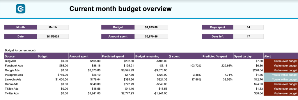
1. PPC monthly budget report template in Google Sheets
This template offers a comprehensive summary of ad campaign expenditures across various channels. It aids marketers involved in targeted advertising to monitor the distribution of financial resources for ads and assess their alignment with the allocated budget.
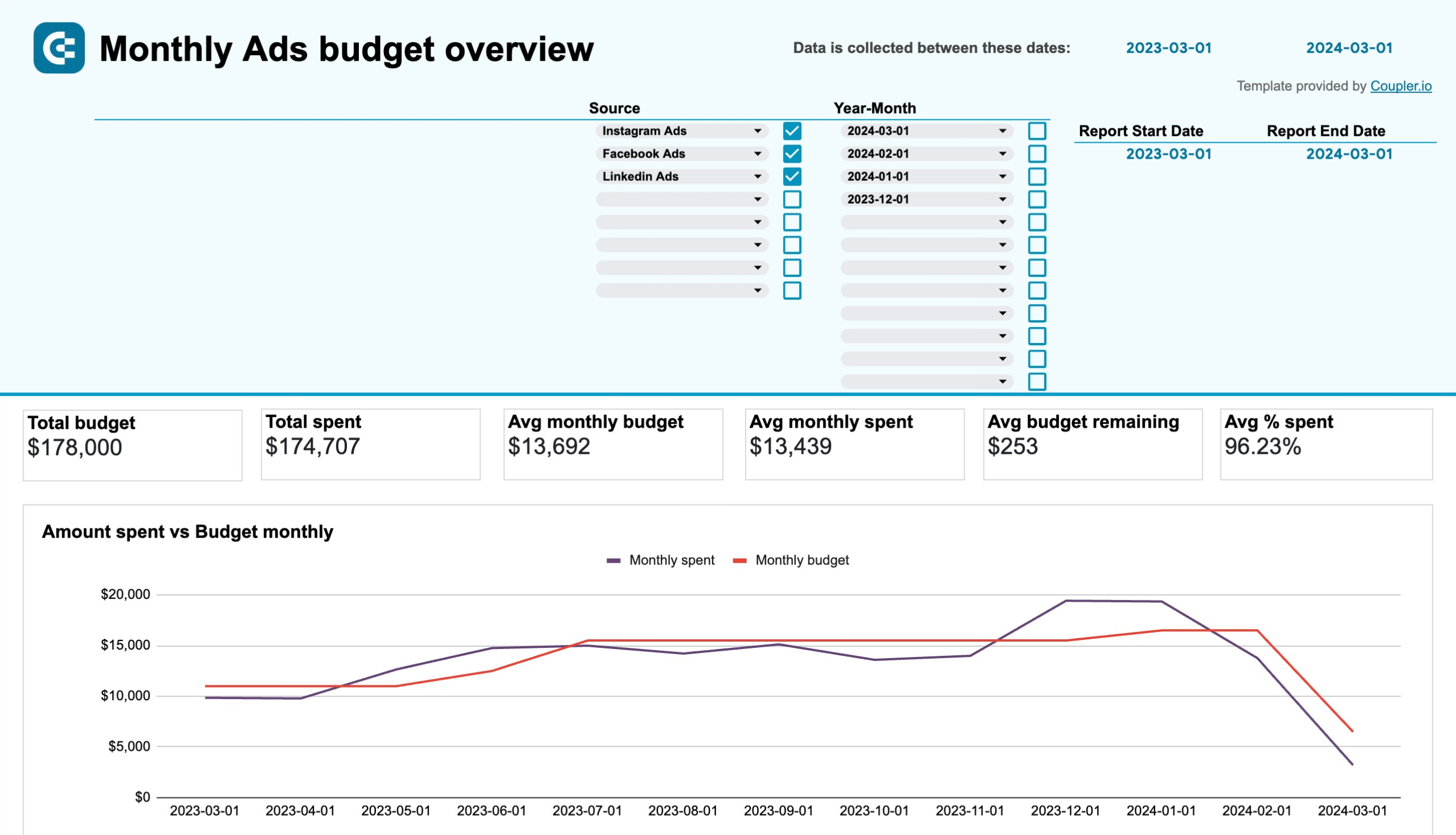
The PPC monthly budget report template allows you to analyze data from the following ad platforms:
- Facebook Ads
- LinkedIn Ads
- Google Ads
- TikTok Ads
- Microsoft Ads
- Quora Ads
- Twitter Ads
What you can do with this report:
- Get an overview of this month’s budget with spending predictions and alerts to prevent going over budget.
- Analyze the average monthly budget and amount spent, budget remaining, total spent, daily spent, or your ad campaign for different channels to see whether you are under or over the allocated budget.
- Monitor the monthly dynamics of your advertising spend and how it collates to your budget. Use this information to optimize future allocations and maximize your return on investment.
Coupler.io provides a built-in Google Sheets connector that allows you to automate data imports for multiple sources. Sign up for a free account to start using this template right away.
2. PPC monthly budget by campaign group report template in Google Sheets
This template provides a granular view of your advertising budget allocation across different campaign groups. Unlike the standard PPC monthly budget template, this version breaks down spending by campaign groups, making it ideal for marketers managing complex advertising structures with multiple campaigns organized into strategic groups.
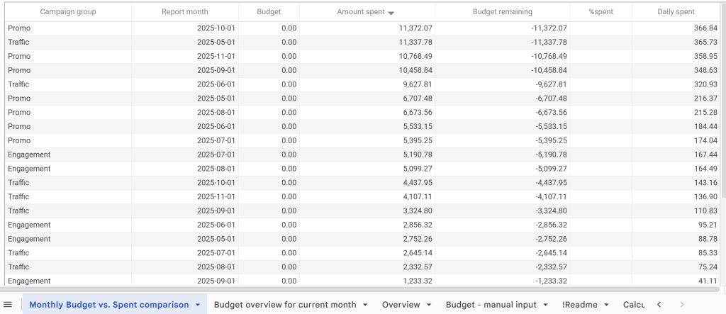
What you can do with this report:
- Track monthly spending dynamics across different campaign groups to understand which strategic initiatives consume the most budget.
- Monitor budget remaining for each campaign group with color-coded alerts that warn you when specific groups are approaching or exceeding their allocated budget.
- Compare average daily spend by campaign group to identify which groups require budget adjustments or reallocation.
- Analyze the distribution of your total advertising spend across campaign groups to ensure budget alignment with your marketing priorities.
This template supports the same advertising platforms as the standard PPC monthly budget report:
- Facebook Ads
- LinkedIn Ads
- Google Ads
- TikTok Ads
- Microsoft Ads
- Quora Ads
- Twitter Ads
Coupler.io’s built-in Google Sheets connector automatically loads data from multiple ad platforms. Sign up for a free account to start tracking your campaign group budgets.
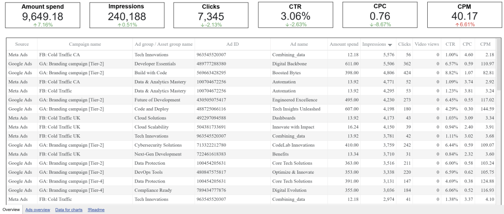
3. Advertising budget forecast dashboard in Google Sheets
This 4-page report is designed for marketing teams that regularly run paid advertising campaigns on platforms like Facebook Ads, Google Ads, LinkedIn Ads, TikTok Ads, and more. It’s a budget management tool that provides an overview of spending across multiple platforms. It also allows you to track performance metrics (e.g., clicks, CPC, CTR), control budget allocation, and predict future advertising outcomes.
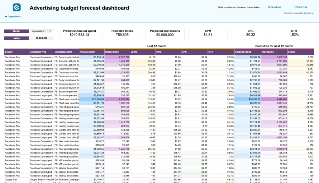
What you can do with this report:
- The dashboard uses historical data to calculate future spending and the number of impressions + clicks your campaigns may receive. Use these forecasts to set realistic goals and inform budget allocation for the next 12 months.
- Compare month-by-month planned vs. actual spend to identify overspending or seasonal patterns. By tracking budget efficiency across all platforms, you can pinpoint underperformers and adjust spending accordingly.
- View key performance metrics across all advertising platforms in one place, including impressions, clicks, CTR, CPC, and CPM.
- Quickly see how much you’ve spent this month, how much is left, the daily amount spent, and the predicted total spend. Color-coded alerts indicate whether you’re at risk of overspending, allowing you to take timely corrective actions.
A free copy of this template is available with a Coupler.io account. Generate a personalized forecast in minutes by connecting your ads data and automating the flow!
Multi-channel performance tracking report templates in Google Sheets
4. PPC multi-channel report template in Google Sheets
This PPC multi-channel template allows you to track the results of your ad campaigns across several channels, such as Google and Facebook. It’s valuable for marketers, sales teams, and executives to analyze how ads perform and which platforms are worth investment.
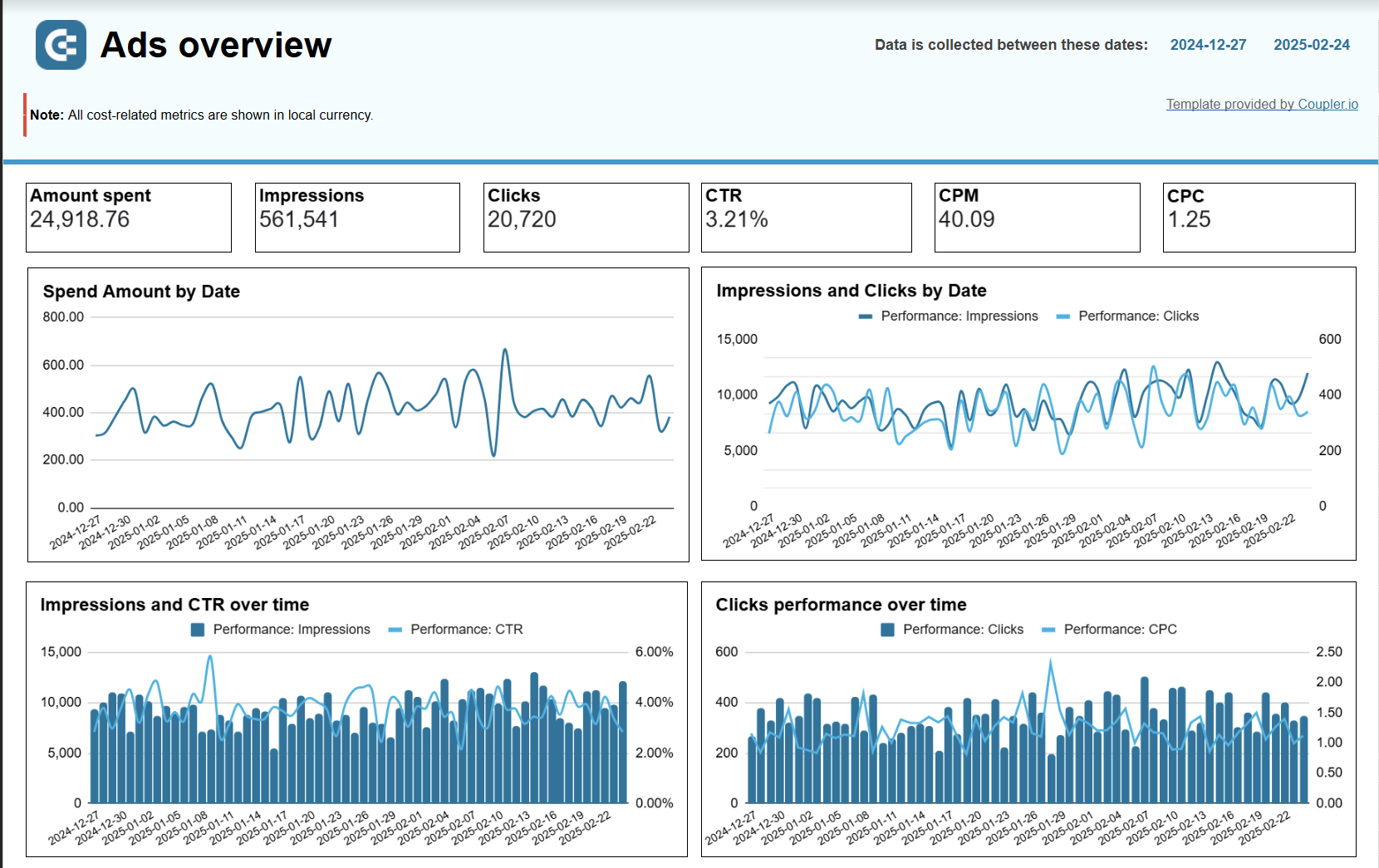
What you can do with this report:
- Get a detailed breakdown of performance by source and campaign type to understand which ads/platforms best support your strategy.
- Visualize ad performance metrics, such as impressions, clicks, CTR, CPC, and CPM. This data helps you identify the best-performing ads and focus on them in your campaign.
- Monitor the number of clicks over time to determine which social media platform is most popular among your audience.
- Track weekly ad spending for each source and assess how the invested funds relate to user engagement.
- Analyze impressions and clicks by date to observe changes in user engagement rates over time and identify the most active day.
This template lets you monitor the performance across the following sources:
- Google Ads
- Twitter Ads
- LinkedIn Ads
- Facebook Ads
- Quora Ads
- Instagram Ads
- TikTok Ads
- Bing Ads
To get a copy of this report template for your PPC data, simply sign up for Coupelr.io – no credit card required. It only takes a few minutes to create a free account and automatically load your data into the dashboard.
5. PPC multi-channel report template with budget in Google Sheets
This template is very similar to the one provided above, though it has an additional tab for budget management. Having both performance KPIs and budget at your disposal ensures better control over ad campaigns. That way, you can make sure that ad spending doesn’t exceed the allocated financial resources.
What you can do with this report:
- Analyze future spending predictions (based on custom formulas) to maximize the impact of next month’s budget.
- Monitor alerts that tell you when you are about to exceed your allocated budget for each campaign. This can help you reduce spending before it’s too late or quickly shut down campaigns you can no longer afford.
This report template contains two categories of metrics: ad performance and budget management. Campaign performance data is readily available by clicking into the other dashboard tabs.
| Ad performance | Budget management |
|---|---|
| – Amount spent – Impressions – Clicks – CTR – CPM – CPC | – Budget – Amount spent – Predicted spent – Budget remaining – Spend by day – % spent – Predicted % spent |
It takes less than 5 minutes to create a copy of this template with Coupler.io. Log in or sign up for an account, and use our inbuilt connectors to visualize your data in Google Sheets.
6. Multi-channel creatives performance dashboard in Google Sheets
This dashboard consolidates creative performance data from multiple advertising platforms, allowing you to compare how different ad creatives perform across Facebook, Google, LinkedIn, TikTok, and other channels. It’s designed for marketers who need to identify top-performing creatives and optimize their ad content based on engagement metrics.
What you can do with this report:
- Compare creative performance across platforms to identify which ad formats and messaging work best on each channel.
- Track impressions, clicks, CTR, CPM, and CPC for each creative to understand both reach and cost efficiency.
- Identify your top-performing creatives based on CTR and total clicks to replicate successful elements in future campaigns.
- Monitor spending trends by creative over time to ensure budget allocation aligns with performance.
- Analyze cost efficiency by tracking CPC and CPM dynamics for different creatives across platforms.
The dashboard supports data from major advertising platforms including Facebook Ads, Google Ads, LinkedIn Ads, TikTok Ads, and Microsoft Ads. Use Coupler.io’s connector to automatically sync your creative performance data.
Platform-specific advertising report templates in Google Sheets
7. Facebook Ads report template in Google Sheets
This report template is useful for marketers who regularly run ad campaigns on Facebook. It provides a complete overview of your ad campaign performance from the clicks they receive to the costs you incur. The report focuses on key metrics such as impressions, link clicks, amount spent, CTR, CPM, CPC, and average daily reach.
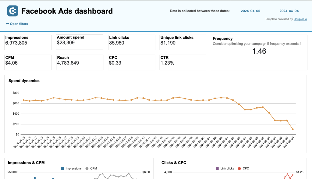
What you can do with this report:
- Monitor daily spending dynamics to optimize your budget based on days with the best ROAS.
- Track ad frequency to control the amount of times people see your ads. Aim for a score of 3-5 to prevent spamming your audience.
- Gain insights into your target audience with a detailed breakdown of clicks by demographic (age & gender), device (desktop, phone, etc.), and country. This can help you customize ad content and boost user engagement.
The template is equipped with the Coupler.io connector that automates data loading from Facebook Ads to Google Sheets. Set up your free report at the link below:
8. LinkedIn Ads report template in Google Sheets
Designed as a single-source dashboard for LinkedIn Ads, this report template offers a concise summary of your key metric dynamics. You can analyze campaign performance more efficiently and conveniently compared with the native LinkedIn campaign manager.
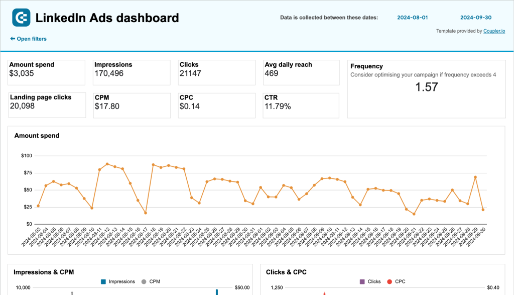
What you can do with this report:
- Track the dynamics of your key metrics (impressions, clicks, amount spend, CTR, etc.) to identify trends or bottlenecks in your ads funnel.
- Keep an eye on the frequency meter to optimize campaigns for engagement and prevent spamming your audience.
- Improve budget planning by comparing campaigns (in a detailed table) against key performance indicators.
- On separate pages, analyze your impressions ? leads funnel to understand how effectively you capture the audience’s attention. Check your conversion dynamics to assess the cost efficiency of those campaigns.
Get a free copy of this Google Sheets template with a Coupler.io account. You can also schedule automatic data refreshes to ensure your LinkedIn Ads data is always up-to-date.
9. LinkedIn Ads companies reach report template in Google Sheets
LinkedIn’s native reporting limits you to viewing only the first 50 companies that saw your ads, making it difficult to assess your full B2B audience reach. This dashboard removes that limitation by pulling complete company reach data from LinkedIn’s API, giving you visibility into all companies that engaged with your campaigns.
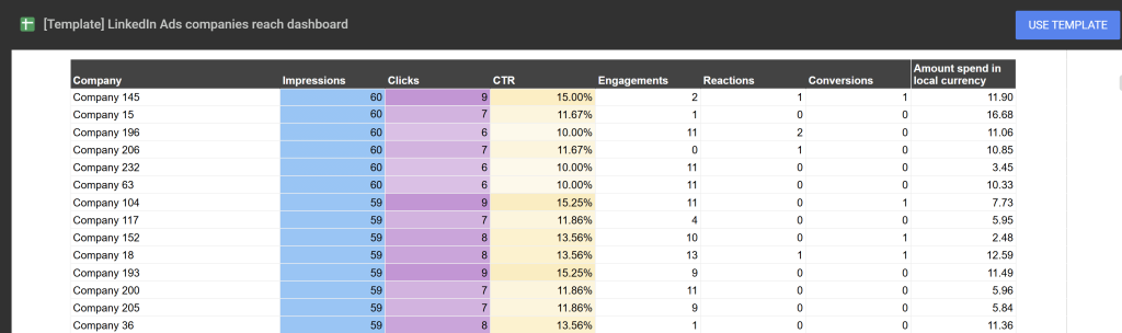
What you can do with this report:
- Access reach data for all companies that saw your ads, not just the top 50 shown in LinkedIn’s interface.
- Identify high-engagement companies based on impressions, clicks, and interaction metrics for targeted sales follow-up.
- Track which industries and company sizes interact most with your ads to refine targeting strategies.
- Export company engagement data to share with sales teams for direct outreach to interested prospects.
- Measure ad performance at the company level to understand which organizations show genuine interest in your offerings.
This template connects directly to your LinkedIn Ads account through Coupler.io. Set up your free dashboard to unlock complete company reach insights.
10. Google Ads report template in Google Sheets
The Google Ads dashboard offers a quick overview of your campaigns’ performance. It allows you to analyze several key metrics in one place, such as your conversion rate, number of impressions, clicks, and CPC value. The report is ideal for marketers who want to check the progress of campaigns without having to dig around in Google Ads Manager.
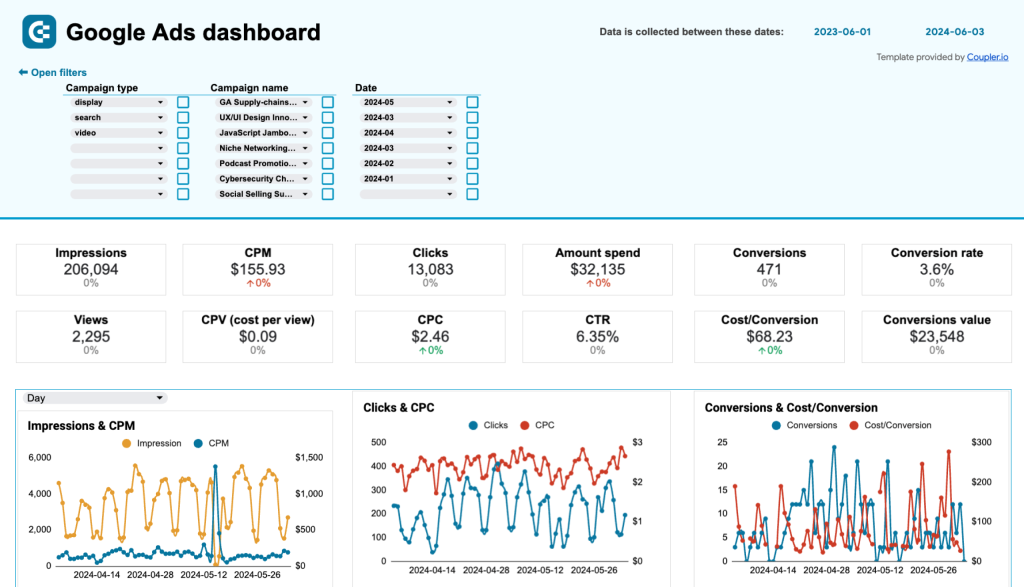
What you can do with this report:
- Compare each campaign’s performance against key metrics (e.g., amount spent) and filter by campaign name/type to understand what’s resonating with your audience.
- Analyze the top campaigns chart and conversions breakdown funnel to identify high-performing campaigns and where leads drop off.
- Find out which audience segments are most likely to convert based on demographic data (age & gender). The insights are visualized with easy-to-read charts instead of clunky tables.
- Review the monthly dynamics tab to get a sense of how your campaigns perform over time. Use the interactive map to pinpoint locations with the most conversions and refine your targeting strategies to capture more leads.
To make a copy of this template for your Google Ads data, set up a free account with Coupler.io. It only takes 5 minutes to get started:
11. Google Search Ads performance tracker + editor in Google Sheets
Managing Google Search Ads often requires tracking performance and preparing bulk edits simultaneously. This unique template combines ad performance analysis with an integrated editing tool, allowing you to monitor campaign metrics and create ready-to-upload ad variations in one place.
What you can do with this report:
- Track ad performance across campaigns and ad groups with key metrics like impressions, clicks, CTR, and conversions.
- Identify underperforming ads that need optimization based on low click-through rates or conversion volumes.
- Rewrite and format ads directly in the dashboard with built-in character limit tracking to meet Google’s requirements.
- Create multiple ad variations for testing different messaging approaches without leaving the spreadsheet.
- Export formatted ads ready for direct upload to Google Ads Editor, eliminating manual formatting work.
The dashboard includes both performance tracking and bulk editing capabilities. Sign up for Coupler.io to start optimizing your Google Search Ads workflow.
SEO report templates in Google Sheets
12. Technical SEO report template Google Sheets
This Google Sheets report template helps you assess the overall health of your website and the state of individual pages. SEO specialists can perform regular technical audits with ease. Marketers will find this template useful to explore underperforming content and decide what can be done about it.

What you can do with this report:
- Quickly diagnose SEO issues with key metrics for URLs and indexed/unindexed pages.
- Analyze the share of webpages suffering from indexing, fetch, or coverage issues. Investigate the underlying causes and make targeted changes to your technical SEO strategy.
- Use the selection of filters to identify specific pages blocked by robots.txt or robot meta tags. Track rendering status and unindexed pages to consistently optimize page visibility.
This free report template connects to your Google Search Console account. You can easily automate data loading with Coupler.io and schedule regular data refreshes (as frequently as every 15 minutes).
13. SEO report template for Google Search Console in Google Sheets
This report template connects to your GSC account to provide a bird’s-eye view of SEO performance. It displays key metrics such as indexed pages, impressions, and average position dynamics. The report is designed for SEO specialists and marketers who need to regularly assess strategy effectiveness and content engagement.
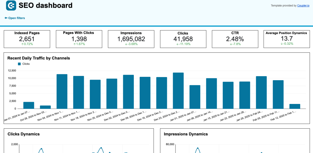
What you can do with this report:
- Monitor daily traffic and the amount of engagement your content receives.
- Track weekly trends in content performance by analyzing metrics like clicks, impressions, and average position dynamics. Discover where your SEO strategy excels and where it needs refinement.
- Identify the best and worst performing pages on your website by comparing pages by click growth/loss. Use this information to make targeted improvements to individual pages.
- Optimize the user experience by understanding how visitors access and engage with your content. Compare CTR, clicks, and impressions generated by your mobile or desktop users.
Create a free copy of this template for your GSC data. Preview the full template below and set up your Coupler.io account in minutes.
14. Landing page performance report template in Google Sheets
Continuing with the theme of simple yet powerful SEO reports, this template helps you understand how effectively your landing pages drive traffic, engage visitors, and convert them into customers. It combines data from GA4 and GSC to provide a detailed overview of landing page performance. You can analyze key metrics such as clicks, impressions, total users, CTR, sessions, and much more.
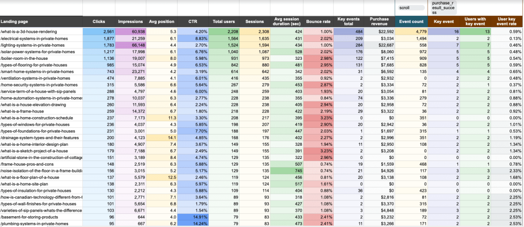
What you can do with this report:
- Identify pages with low clicks but high conversions to find growth opportunities in SEO (and improve each page’s average position).
- Track the behavior of your landing page visitors via the number of clicks, average session duration, and bounce rate. Pinpoint the pages that best capture your audience’s attention and optimize accordingly.
- Analyze user engagement. Filter by key event (e.g., form submissions, downloads) to understand if the CTAs on your pages are prompting visitors to convert.
- Evaluate how landing page performance contributes to business success by monitoring metrics like users with key events, user key event rate, and purchase revenue.
- Address bottlenecks in pages with high traffic but low conversions. Refine the user experience to prevent visitors from dropping off too soon.
To get a free copy of this report template for your GA4 and GSC data, log in or sign up for a Coupler.io account. Remember to schedule regular data refreshes to keep your landing page data up-to-date.
Website traffic analysis report templates in Google Sheets
15. AI traffic performance report template in Google Sheets
Ever wondered if generative AI tools such as ChatGPT or Claude drive traffic to your website? The answers are in this simple, one-page report. It pulls data from your GA4 account to show how different AI tools bring visitors to your site. The value of this traffic is measured through metrics such as total users, avg. sessions duration, bounce rate, purchase revenue, and more.
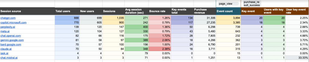
What you can do with this report:
- Compare traffic volume across AI tools to understand which ones generate the most visitors for your site.
- Track conversions from AI tools with the event count and key event filters. Use this information to enhance your marketing strategy and find ways to increase traffic from high-value sources.
- Assess the quality of traffic from different tools by analyzing metrics such as average session duration and bounce rate.
- Explore the Landing Page tab to determine which pages receive the biggest share of AI-driven traffic. Look for patterns and opportunities to scale content that attracts attention.
- Analyze the purchase revenue metric to see which tools generate sales for your product. Use those insights to guide your marketing investments for AI sources.
This Google Sheets report template is free with a Coupler.io account. Check it out:
16. Referral traffic performance report template in Google Sheets
This is another one-page report that helps marketing teams identify the key external sources driving visitors to their website. You can better understand referral traffic performance by analyzing metrics like total users, sessions, key events total, and purchase revenue. The template pulls all of this data from your GA4 account.
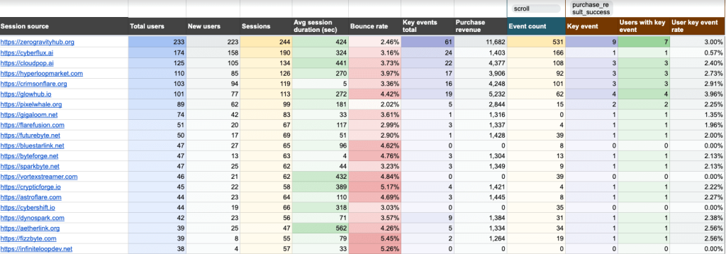
What you can do with this report:
- Identify which sources are most effective at acquiring new visitors for your website. Tailor your referral marketing strategy to attract more first-time visitors from top-performing sources.
- Compare average session duration and bounce rate to determine which sources are underperforming. Use this data to refine content or adjust your outreach strategy.
- Optimize your marketing budget to focus on the referral sources (e.g. a software review site like G2) that bring you the most valuable conversions, such as sign ups or purchases.
- Filter by key event to investigate user behavior and personalize content for different segments and top referral sources.
Once again, this template is available for free with a Coupler.io account. Sign up, automate your GA4 data flow, and visualize your SEO data in Google Sheets – all in a matter of minutes.
17. Web analytics report template in Google Sheets
This web analytics dashboard provides a daily overview of your website’s performance across traffic, engagement, and conversion metrics. It pulls data from Google Analytics 4 to give you a morning snapshot of how your site performed, with additional pages diving into acquisition sources, user behavior, and conversion details.
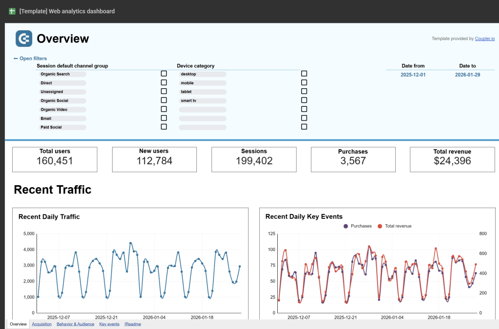
What you can do with this report:
- Monitor daily updates on total users, new users, sessions, conversions, and revenue to stay informed about site performance.
- Analyze acquisition sources to understand where your traffic comes from, including countries, channels, and referring sites.
- Track user behavior and engagement metrics like session duration, views per user, and engaged sessions per user.
- Review conversion performance with detailed breakdowns of total purchases, revenue, and conversion rates.
- Access four separate report pages covering overview, acquisition, behavior, and conversions for comprehensive analysis.
This template connects to your Google Analytics 4 property through Coupler.io. Get your free dashboard and schedule automatic data refreshes.
Finance report templates in Google Sheets
(18-21) Financial and accounting reports for QuickBooks
18. QuickBooks financial report template in Google Sheets
This report is designed for small business owners, financial managers, accountants, and bookkeepers who use QuickBooks Online to manage their finances. It offers a convenient way to analyze different types of financial statements (cash flow, balance sheet, etc.) in one place – ideal for at-a-glance insights into your company’s liquidity and profitability.
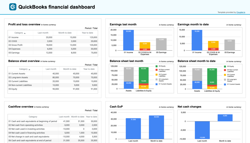
What you can do with this report:
- Explore your company’s revenue, expenses, and net income for the last month, month-to-date, and year-to-date. Compare earning trends to spot growth patterns or areas needing improvement, and take steps to scale or rectify them.
- Analyze the cash flow overview to assess how your cash position evolves over time. This can help you identify potential gaps in your revenue acquisition strategy and optimize financial planning.
- Get a snapshot of your assets, liabilities, and equity with the balance sheet overview. Quickly understand your company’s liquidity and use the bar charts to track monthly changes or pinpoint trends.
- Review the bank & cash charts to ensure your bank accounts are reconciled. Check available cash and your balance by currency (EUR, USD).
This Google Sheets report template is available for free. To get started, set up a Coupler.io account and load your QuickBooks data with the automated connector.
19. Revenue report template for QuickBooks in Google Sheets
This revenue dashboard template helps you monitor your income and expenses. Similar to the previous example, it displays data from your financial statements and highlights company liquidity. The report pulls data from your QuickBooks account. It allows you to track key revenue metrics, evaluate revenue distribution by customers and products, and more.
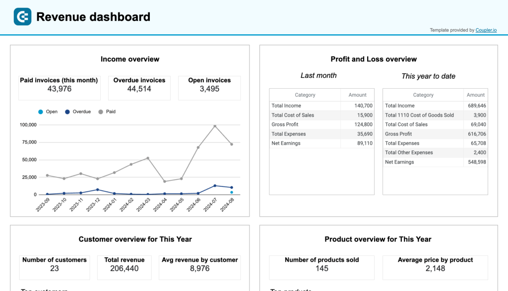
What you can do with this report:
- Track overall revenue trends for the last 12 months. Identify seasonal fluctuations, peak revenue periods, and any unexpected dips.
- Comparing revenue and expenses to assess how well your business is managing costs relative to income. Use these insights to optimize budget allocation and financial planning.
- Identify your most valuable customers by revenue contribution. This information can be helpful in designing targeted marketing efforts and customer retention strategies.
- Find out which products or services generate the most revenue for your company. With this data, you can adjust your sales strategies to elevate low-performing products and create more targeted product promotions.
- In the Invoices tab, perform a detailed analysis of your invoices to pinpoint your most reliable clients. Check due dates, amounts, and status to make timely follow-ups and prevent cash flow gaps.
This template is equipped with Coupler.io’s built-in connector that allows you to automate data transfers from your QuickBooks Online account to the Google Sheets report. Choose your preferred version:
20. Accounts receivable report template for QuickBooks in Google Sheets
This accounts receivable dashboard provides small business owners and accounting teams with detailed visibility into outstanding customer payments. It shows exactly who owes you money, how long invoices have been unpaid, and which customers represent your biggest collection opportunities.
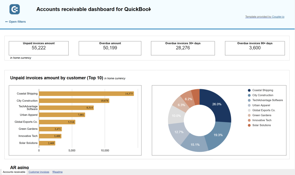
What you can do with this report:
- Track outstanding customer payments with clear breakdowns showing total unpaid amounts and overdue balances.
- Identify collection priorities through AR aging analysis categorized by current, 1-30 days, 31-60 days, 61-90 days, and 91+ days overdue.
- Analyze customer payment behavior by reviewing historical payment data across current month, last month, and last 12 months.
- Compare paid versus unpaid invoice trends to understand billing and collection efficiency over time.
- Access complete invoice-level transaction details for customer inquiries, dispute resolution, and accounting reconciliation.
This template connects to your QuickBooks Online account through Coupler.io. Set up automatic data refreshes to keep your receivables tracking up to date.
21. Accounts payable report template for QuickBooks in Google Sheets
The accounts payable dashboard gives you a complete view of money you owe to vendors, helping you prioritize payments, maintain vendor relationships, and optimize cash flow management. It’s designed for business owners who need to balance payment obligations against available cash.
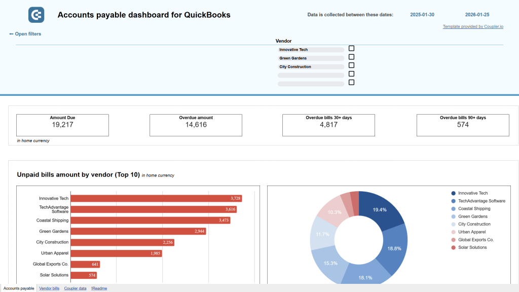
What you can do with this report:
- Monitor vendor payment obligations with breakdowns showing total unpaid amounts, overdue bills, and aging periods.
- Prioritize payments using AP aging analysis organized by vendor across current, 1-30, 31-60, 61-90, and 91+ day periods.
- Understand vendor spending patterns by analyzing payment history across current month, last month, and last 12 months.
- Assess payment capacity by comparing your current bank balances across all accounts against total bills due.
- Access detailed vendor bill records with payment status, due dates, and amounts for all currencies.
This dashboard helps you make strategic decisions about which vendors to pay immediately versus which payments can be delayed. Get your free QuickBooks payables dashboard with Coupler.io.
(22-25) Financial and accounting reports for Xero
22. Xero financial report template in Google Sheets
This Xero financial dashboard delivers insights into your company’s overall financial health through three key reports: profit and loss, balance sheet, and cash flow. It’s designed for small business owners, financial managers, and accountants who need an at-a-glance understanding of their company’s financial position.
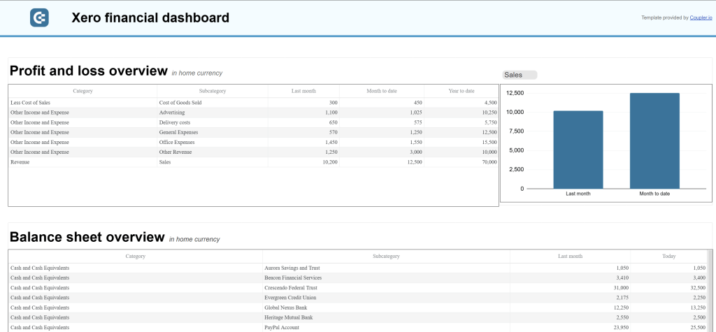
What you can do with this report:
- Monitor profitability through profit and loss overview showing revenue, expenses, and net income for last month, month-to-date, and year-to-date.
- Assess your company’s financial position with balance sheet snapshots displaying assets, liabilities, and equity.
- Track liquidity through cash flow overview highlighting net cash changes over the reporting period.
- Identify trends by comparing financial metrics between last month and current month through side-by-side visualizations.
- Understand how your cash position evolves to ensure effective liquidity management.
This dashboard provides three separate report sections, each with accompanying charts for visual analysis. Connect your Xero account with Coupler.io to automate your financial reporting.
23. Xero revenue report template in Google Sheets
This revenue dashboard helps you monitor income streams and expense management through comprehensive tracking of customer contributions and product performance. It connects to your Xero account to provide revenue distribution analysis, customer value insights, and product profitability metrics that inform strategic business decisions.
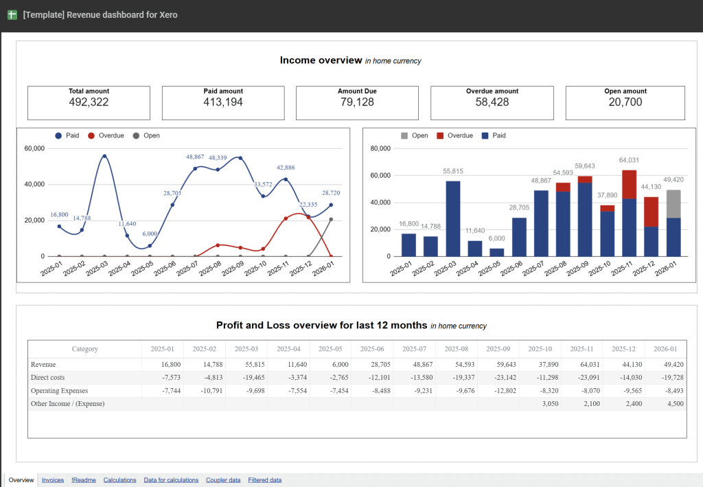
What you can do with this report:
- Track overall revenue trends for the last 12 months to identify seasonal fluctuations, peak revenue periods, and unexpected dips.
- Compare revenue against expenses through profit and loss overview to assess how effectively your business manages costs relative to income.
- Identify your most valuable customers by revenue contribution to design targeted marketing efforts and customer retention strategies.
- Analyze which products or services generate the most revenue to adjust sales strategies and optimize inventory management.
- Review top 10 products and customers by revenue in dedicated visualizations that highlight your primary income sources.
This template includes four distinct report sections: income overview, profit and loss comparison, customer analysis, and product performance. Each section provides both tabular data and visual charts for easier interpretation. Connect your Xero account through Coupler.io to start tracking revenue dynamics.
24. Accounts receivable report template for Xero in Google Sheets
The Xero accounts receivable dashboard shows exactly who owes you money and helps you prioritize collection activities. It provides an overview of unpaid and overdue invoices with detailed aging analysis to prevent cash flow gaps.
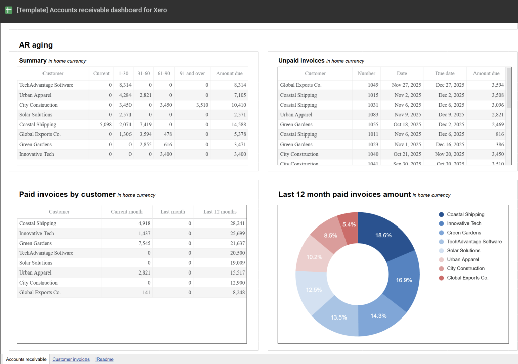
What you can do with this report:
- Identify your top 10 customers by outstanding debt to focus collection efforts on high-value accounts.
- Analyze AR aging with breakdowns showing overdue amounts by customer across current, 1-30, 31-60, 61-90, and 90+ day periods.
- Review payment history to evaluate customers by the amount of previously paid invoices and make informed decisions about debt recovery.
- Track monthly dynamics of both paid and unpaid invoices to understand billing and collection patterns over time.
- Access detailed customer invoice records for the last 12 months, including both paid and unpaid invoices across all currencies.
This template connects to your Xero account through Coupler.io’s built-in connector. Start tracking your receivables with automatic data updates.
25. Accounts payable report template for Xero in Google Sheets
This accounts payable dashboard helps you understand who your main creditors are and prioritize vendor payments effectively. It provides visibility into unpaid bills, overdue amounts, and payment obligations to maintain healthy vendor relationships.
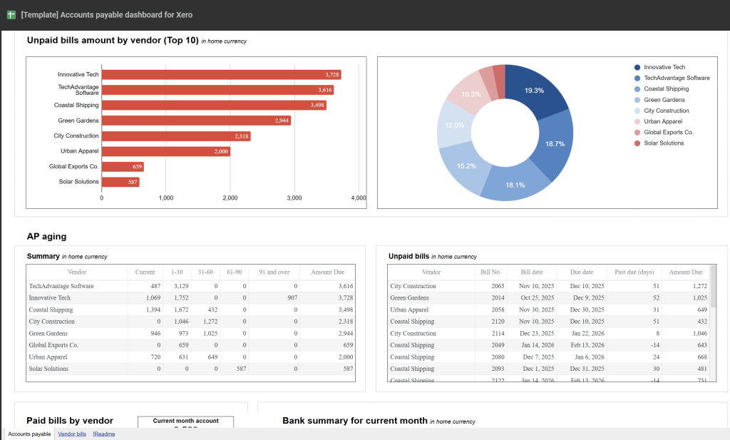
What you can do with this report:
- Track your top 10 vendors by credit debt to identify major creditors requiring priority attention.
- Review AP aging summary showing distribution of overdue amounts by vendor across current, 1-30, 31-60, 61-90, and 90+ day periods.
- Analyze paid bills by vendor to evaluate payment history and make informed decisions about payment prioritization.
- Monitor vendor bill details for the last 12 months, including both paid and unpaid bills across all currencies.
- Filter the dashboard by specific vendors to drill down into individual creditor relationships.
This dashboard complements the accounts receivable template for complete cash flow management. Connect your Xero account with Coupler.io.
26. General financial reporting templates – Balance sheet report template in Google Sheets (Treasurer report template)
Smart management of a company’s financial resources is essential for maintaining its long-term stability. This balance sheet dashboard template is ideal for accountants and other finance specialists who need a quick overview of the company’s assets and liabilities, so they can make informed decisions at any given moment.

What you can do with this report:
- Analyze your balance sheet in a simplified, side-by-side view with a YoY comparison.
- Evaluate cash, short-term and long-term loans, deferred income tax, retained earnings, etc. to understand your company’s liquidity and address any risks.
- Better manage spending to ensure it doesn’t exceed the available assets.
Remember, you will need to input data manually for this kind of report. Refer to the instructions in the sheet:
Sales and CRM report templates in Google Sheets
27. Sales team performance report template for Salesforce in Google Sheets
This report template is a powerful tool for sales managers who need to closely track the performance of their team. It has several tabs, each with a selection of charts that allow you to explore various aspects of team productivity. The report automatically loads data from your Salesforce CRM and highlights sales key metrics such as win/loss rate, won amount, lost opportunities, etc.
What you can do with this report:
- Identify the top performers from your team by opportunity types, win rates, and amounts won or lost. Figure out what each sales rep is good at and assign them the right opportunities based on previous successes.
- Get a complete overview of team performance. Compare your targets with completed amounts to check if you will meet quarterly or yearly goals.
- Analyze each team member’s sales funnel to assess efficiency and address common bottlenecks.
- Find out who your most productive team members are by analyzing how many tasks they closed and the median time to completion. You can also use this information to check in with underperformers and offer guidance to improve results.
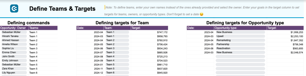
As a bonus, the report comes with a template for defining sales targets. It’s helpful for keeping track of your monthly goals for teams and opportunity types.
Sign up to Coupler.io for free and generate a copy of this report template for your sales data. You can get started in less than 5 minutes:
28. Salesforce CRM report template in Google Sheets
The Salesforce CRM dashboard provides an overview of your sales pipeline with detailed insights into opportunities, revenue trends, and team performance. It’s designed for sales managers who need to track deal progression, analyze pipeline health, and monitor sales team effectiveness without constantly switching between Salesforce interfaces.
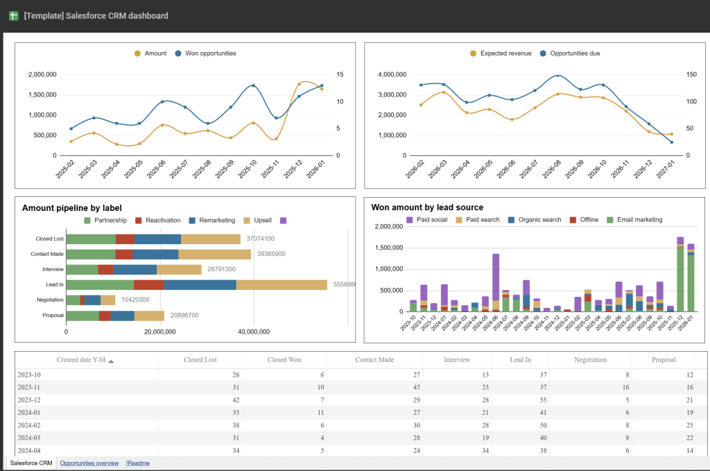
What you can do with this report:
- Filter sales opportunities by owner, stage, campaign name, and deal type to drill down into specific scenarios.
- Track the correlation between generated revenue and won opportunities alongside projected revenue for upcoming deals.
- Analyze deal stage distribution to identify pipeline bottlenecks where opportunities get stuck before closing.
- Compare sales team member performance through win rates, close rates, and time-to-close metrics.
- Access detailed opportunity breakdowns including top open and won deals, stalled opportunities, and accounts overview.
The dashboard includes a comprehensive opportunities page with additional insights into deal types, revenue analysis, and campaign performance. Connect your Salesforce account with Coupler.io to start tracking your pipeline.
Ecommerce report templates in Google Sheets
29. Shopify inventory report template in Google Sheets
This Shopify inventory dashboard gives you clear visibility into product stock levels, order patterns, and return rates across all warehouse locations. It combines inventory and sales data to help you maintain optimal stock levels, identify products with high return rates, and ensure the right products are available in the right locations.
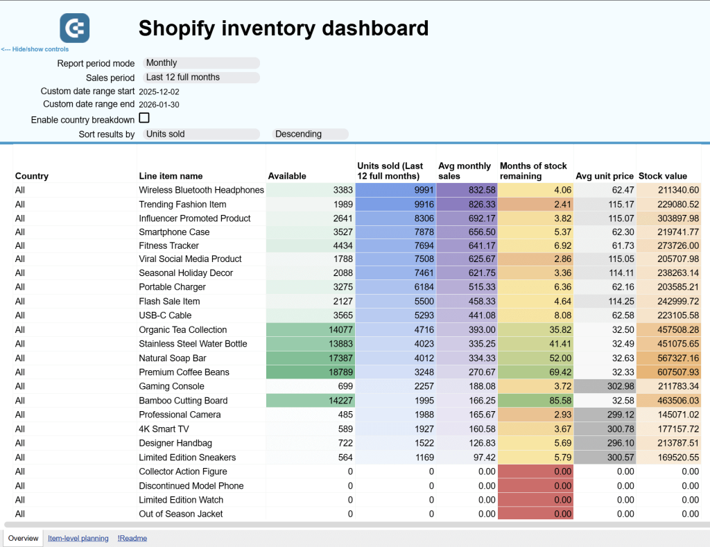
What you can do with this report:
- Track inventory performance by product (SKU) with key metrics including stock value, availability, order volumes, and daily turnover rates.
- Calculate days of stock remaining for each product to plan procurement and logistics effectively, predicting shortages before they happen.
- Identify countries with the highest return rates to address region-specific product or shipping issues.
- Monitor daily order volumes to understand sales patterns, evaluate promotional effectiveness, and adjust advertising strategies.
- Compare stock availability across all warehouse locations to optimize product distribution and prevent stockouts.
- Analyze what happens to returned items with breakdowns of restocked, discarded, and resold merchandise.
This template is particularly valuable for multi-location operations. Sign up for Coupler.io to automate your Shopify inventory tracking.
30. Shopify orders report template in Google Sheets
This dashboard focuses specifically on order management and fulfillment performance for your Shopify store. It tracks order completion, customer segments, fulfillment efficiency, and geographic distribution to help you optimize operations and identify revenue opportunities across different markets.
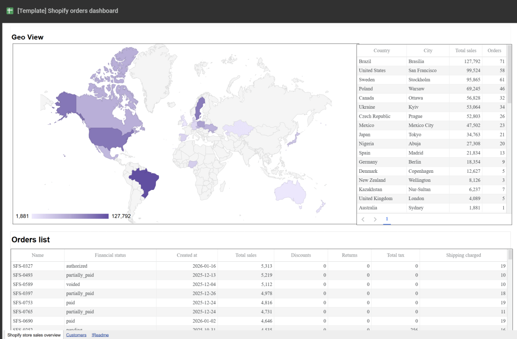
What you can do with this report:
- Analyze order trends by customer segment to understand the split between registered customers and guest purchases.
- Track average completed order value and average hours to complete for insights into pricing trends and operational efficiency.
- Monitor order status distribution to see what percentage of orders are completed, pending, on-hold, or refunded.
- Evaluate geographic revenue distribution through a color-coded map showing completed order value by shipping country.
- Access detailed customer and order records with billing information, order totals, fulfillment times, shipping costs, and tax data.
This template works well alongside the inventory dashboard for complete Shopify operations visibility. Connect your Shopify store with Coupler.io.
Productivity and operations report templates in Google Sheets
31. Time tracking report template Google Sheets for Clockify
This time-tracking report template allows you to evaluate the efficiency of your team and identify trends in productivity. It connects to your Clockify account to display data for key metrics such as billable hours, billable amount, and posted hours.

What can you do with report:
- Quickly assess team productivity and the clients that consume most of your billable time.
- Compare the number of posted hours with the billable hours to detect mismatches and ensure accurate invoicing.
- Tackle absenteeism and labor gaps by identifying underperformers (users with the least hours).
- Use the Calendar View tab for a detailed overview of each employee’s working hours. It can help pinpoint overperformers (e.g., someone working 48 hours a week) who might be at risk of burnout, so you can take steps to mitigate the issue and establish a more sustainable work-life balance.
You can get a free copy of this template with a Coupler.io account. Remember, it only takes a few minutes to set everything up, and you can automate data refreshes for maximum convenience – no manual data entry required.
32. Google Calendar availability & meeting hours report template in Google Sheets
This report template is perfect for analyzing your productivity based on Google Calendar data. It breaks down your availability and meeting hours to provide a complete overview of your schedule dynamics. You can use it to identify the activities consuming the majority of your time and take back control of your work week.
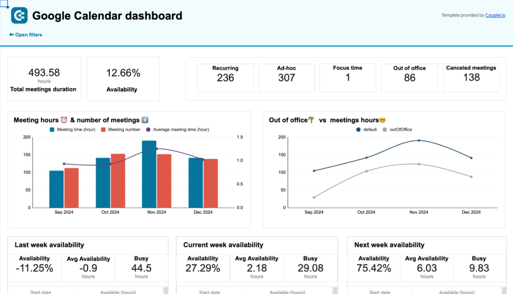
What you can do with this dashboard:
- Review key productivity metrics such as total meetings duration, availability, and the number of meetings by type (recurring, ad-hoc, etc.). Use the comparison charts to uncover patterns in your workload and highlight opportunities for optimization.
- Check your availability dynamics for the past three weeks. These insights can help you plan ahead and block time for future meetings/projects.
- Get a high-level view of how your time is distributed across the week. Pinpoint weekdays with the most meetings and adjust your recurring commitments to improve balance.
- Analyze all of your meetings in a single table, with information on their time, status, your response, and who created them. Use this data to identify troubling patterns in your schedule.
Like all the others on this list, you can get a free copy of this Google Sheets template by quickly signing up for Coupler.io. Don’t forget to schedule data refreshes to ensure you always have the most up-to-date information at your fingertips.
Marketing report templates in Google Sheets
33. YouTube traffic performance report template in Google Sheets
This template is valuable for bloggers or businesses looking to scale their YouTube content strategy. It pulls data from Google Analytics 4 to summarize the traffic your website receives from YouTube videos. You can estimate how well your video content drives users to your website and how much revenue you generate from this traffic.

What you can do with this dashboard:
- Identify best-performing landing pages and check (in the YouTube interface) which of those links appear in your videos. Use this information to adjust your content strategy and launch targeted campaigns to drive more clicks.
- Analyze metrics like total users, avg. session duration, event count, and purchase revenue to understand which type of content prompts users to engage and convert.
Connect your GA4 account with Coupler.io’s built-in connector and automate data load into this free Google Sheets report. Check it out:
34. Social media analytics report template in Google Sheets
This spreadsheet template provides a comprehensive overview of how marketing campaigns perform across different social media platforms. It has a unified view that combines all platforms and metrics, as well as individual reports for each social media channel. Marketers can use this template to measure the performance of their campaigns across platforms like YouTube, Instagram, Facebook, and more.

What you can do with this dashboard:
- Analyze results from each channel by month and quarter in a single, organized view.
- Track metrics for each channel, such as engagement rates, likes, traffic, reach, interactions, and link clicks. Measure those results against your marketing goals for a specific period.
- Compare performance data from different channels to understand where your audience interacts with your brand the most. With this information, you can adjust your content strategies and invest in the social media platforms that deliver the highest returns.
Keep in mind that you will need to manually input data into this report. Find set-up instructions by clicking on the button below:
35. Email marketing report in Google Sheets
This Google Sheets report template enables marketers to assess and compare the effectiveness of their email marketing campaigns. It includes tables containing essential metrics for email campaign analysis. The report features histograms for each metric, as well as line charts illustrating subscriptions for different campaigns, and comparison tables for deeper insights.

What you can do with this report:
- Evaluate email campaign performance through metrics like subscriptions, unsubscribe rate, and bounce growth. Understand what’s working and identify areas for improvement.
- Analyze email list data for the last 30 days, with detailed breakdowns by campaign and month. Use these insights to optimize your campaign content and refine your audience targeting parameters.
Unlike Coupler.io templates, you will need to insert data manually for this report. Follow the steps outlined in the sheet to get started:
How to create a custom self-updating report in Google Sheets
You’ve probably noticed that most of the reports from the list are equipped with Coupler.io connectors. This reporting automation platform offers many Google Sheets marketing dashboard templates and allows you to create custom reports in Google Sheets and BI tools.
All you need to do is select a needed data source in the form below and click Proceed. Get started with Coupler.io for free, no credit card is required.
If you want to create a cross-channel report, you can add other source apps later during the setup process.
After that, take a 3-step journey to create self-updating reports.
Step 1. Extract data from the source
- Connect to the selected data source to authorize access to Coupler.io.
- Select and configure the data essential for your report. For example, here is what it looks like for Google Analytics data source.

Step 2. Transform and organize your data
Go to the Transformation tab to prepare your data for the report. Coupler.io offers the following data cleansing and management options:
- Edit, hide, and rearrange columns.
- Add new columns using mathematical expressions to calculate custom metrics.
- Filter and sort data to order it the way you want.
- Append or join data if you’ve connected multiple accounts or data sources.
Again, here is an example of a data transformation step for Google Analytics.

Step 3. Load data to the report sheet
- Go to the Destination tab to set up the Google Sheets connection. Connect to your Google account.
- Select the needed file for your Google Drive account. Choose the sheet to load data for your report or create a new one.
- Specify the import mode: Append for adding data at the end of the table or Replace for substituting the existing data with new data.

To regularly update your report with new data, activate the Automatic data refresh option. Specify the data refresh interval or indicate the exact date and time for data to flow into the spreadsheet.

Once everything is ready, click Save and run importer to start transferring data from your preferred sources to the Google Sheets report.
Note: You can also use Coupler.io as an add-on for Google Sheets. For this, you need to install it from the Google Workspace Marketplace and launch it from the Extensions menu. That way, you can set up the importer without switching from your Google Sheets document.
Platform-specific advertising reports
Financial and accounting reports for Xero
Google Sheets report templates vs. self-made reports
Using templates for reporting can streamline daily workflows for users. They are convenient and can even be automatically populated with data. However, there are still situations where creating custom reports is necessary.
Let’s compare self-made and pre-configured reports by using certain criteria.
| Report templates | Self-made reports | |
|---|---|---|
| Resource requirement | Templates for reports usually come pre-configured, so they require less time and human power for creation and management. | As a rule, self-made reports are made from scratch. This usually requires lots of time and elaboration at the initial stage. |
| Metrics | They contain a set of essential metrics necessary for evaluating a definite aspect of business performance. There is no need to specify complex formulas for the metric creation. | When specifying metrics for a particular report, it’s necessary to use complex mathematical formulas and expressions. This certainly requires a lot of expertise in Google Sheets. |
| Customizability | Pre-configured templates are still customizable, but they are intended for use as they are. | Self-made reports offer a high degree of customizability, so new metrics and graphs can be created at any time. |
| Data population | When using Coupler.io’s templates, the data can be sent automatically from data sources to reports. | It’s necessary to insert data manually, which might cause errors and inconsistencies. |
| Connectivity | With Coupler.io, you can connect all popular sources to your Google Sheet report and populate it with data on schedule. | |
| Sharing | Thanks to the SaaS nature of Google Sheets, you can share any kinds of reports and documents from your account. This is convenient if you need to share insights and findings with your stakeholders. | |
To sum up, Google Sheets report templates are the right choice for creating subject reports with generic metrics. If you need to make specific reports with custom metrics, then it’s worth crafting them from scratch.