Dashboards are the voice of your analytics process. They speak about how you’re doing in terms of performance, growth potential, or health risks. With data-driven insights, they help make informed decisions about where things need improvement.
Google Sheets is one of the excellent tools you may choose to create dashboards, and this guide will show you how to create a Google Sheets dashboard. We’ll also provide some tips on what makes a good one.
Let’s begin by discussing the benefits of creating a dashboard in Google Sheets or you can check out our video tutorial on how to create a dashboard in Google Sheets in 5 minutes!
Why create a dashboard in Google Sheets, anyway?
Google Sheets is a great tool for all sorts of things. Businesses can use it for many purposes, including creating dashboards to visualize your business’ KPIs.
With Google Sheets’ robust feature set, you can quickly turn raw data into charts, graphs, tables, and other visuals to help you make better decisions faster.
Google Sheets is also extremely easy to use. Even if you have never used it before, you can create a dashboard in Google Sheets in just a few minutes.
You can share your dashboard with colleagues or customers without formatting it for every platform. Your dashboards can be accessed from everywhere with an internet connection because Google Sheets is cloud-based.
Another reason for using a dashboard in Google Sheets is that it is very cost-effective. Unlike other BI tools that can cost hundreds of dollars per month, a dashboard in Google Sheets is completely free. This makes it an ideal solution for small businesses working with limited budgets.
Dynamic dashboard in Google Sheets
What does “dynamic dashboard” mean? Can I create one in Google Sheets? Read on to find out!
What is a dynamic dashboard in Google Sheets?
Dynamic dashboards provide a real-time view of data, which changes frequently. Imagine a car dashboard that gives you real-time data for speed, fuel level, and more. Just like this one in your car, a dynamic dashboard shows real-time insights into how well you’re doing. It helps you monitor key metrics so you can make informed decisions about where to go next toward achieving goals—safely and efficiently.
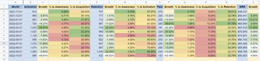
In addition, dynamic dashboards are typically interactive. They usually have a set of filters that are used to slice and dice the data by different dimensions. This allows users to view different subsets of data efficiently, all within one dashboard. Here is an example of a dynamic dashboard in Google Sheets that was designed by the Coupler.io analytics team. It’s a product funnel dashboard that allows you to track SaaS metrics (based on the AARRR framework) and their correlation to full product-led growth.
Need help to create a dashboard in Google Sheets? Coupler.io is the perfect company to call. They offer professional services, such as a data analytics consulting service, customized auto-updating dashboards creation, data automation, and more. You can also use Coupler.io’s marketing dashboard templates in Google Sheets.
Google Sheets is a powerful tool you can use to create a dynamic dashboard. Of course, challenges are involved, but we’ll also discuss how to get it done later.
Challenges in making a real-time dashboard in Google Sheets
One challenge is the integration with data sources. Data in your Google Sheets dashboard can come from various sources. It requires some work to get data from multiple sources and refresh it frequently, so you should set up the process automatically.
Another challenge is that combining real-time data from many sources into a sheet can easily exceed Google Sheets’ capacity. As of this writing, Google Sheets is limited to 10 million cells. This is a lot of cells, but the more cells you use to store data for your dashboard, the slower your dashboard will become.
Despite these challenges, real-time dashboards in Google Sheets can be a potent tool for better decision-making. By designing creative solutions, it is possible to overcome these challenges and create a dashboard for Google Sheets that provides valuable insights in real-time.
Data flow for an automated Google Sheets dashboard
Dashboards are usually set up to pull in new data at a high frequency automatically. That’s because manually refreshing your dashboard with up-to-date data is a tedious process. Automating it can help you streamline your process and save time.
Here are a few ways to automate your data flow:
- Google Apps Scripts
One way to automate data flow into a Google Sheets dashboard is to use Google Apps Scripts. With Apps Scripts, you can write code to automate tasks such as data entry and retrieval.
- Coupler.io
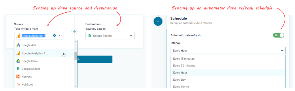
Another way to automate data flows into a Google Sheets dashboard is to use Coupler.io. It’s a web-based data automation and analytics platform that provides an ETL tool to automatically pull data from multiple apps such as MailChimp, Jira, Shopify, and many other sources into Google Sheets. You can then set up an automatic data refresh on your desired schedule.
- Google Sheets API
Developers can use the Google Sheets API to programmatically import data into a sheet. The API allows you to specify the URL of the data you want to import, as well as the specific cells where it should be imported.
Before you create a dashboard in Google Sheets
Don’t jump right away to add charts. You need planning, and there are important things you should pay attention to. Let’s take a look at them one by one.
Getting started
Firstly, it’s crucial to identify the metrics to use. Don’t let the availability of data overly influence what gets measured. Be mindful and measure what you should measure. Once this has been done, figure out how to get all the data you need.
It is also important to spend some time designing your dashboard. You don’t need detailed planning, but at least decide what chart to use to visualize each metric and how it’s displayed on the screen.
Collect your data
The next step is collecting reliable data for the analytics process.
Your dashboard may need data from multiple sources. For example, building a sales dashboard may need data from Google Analytics, Airtable, MailChimp, and other apps.
As explained previously, Coupler.io can be a great choice to automate the data import process from multiple sources. Setting up the import process using Coupler.io’s Google Sheets connector is easy. Their user interface makes it simple to follow with a wizard that guides you through setting up your data source and destination. You can easily enable an auto-refresh schedule to ensure your data is always up-to-date.
Prepare your data
Before creating any charts with your raw data, consider doing some cleanups first. This can involve anything from adding new columns, reformatting data, etc. to make sense for charting. It’s worth taking extra time to ensure that your dashboard is as accurate and informative as possible.
How to create a dashboard in Google Sheets (Step-by-step)
After you identify metrics and collect data, the next step is creating the dashboard based on your design. In this section, we’re going to build a dashboard in Google Sheets with a few charts in it.
Simple Google Sheets dashboard example
The following is a simple sales dashboard we are going to make:
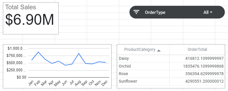
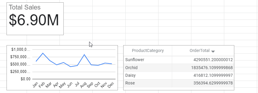
We’ll build a dashboard in Google Sheets to help viewers understand the total sales and their trends over time. Moreover, the dashboard will show a simple indicator to determine which product categories have low or high sales.
Visualization is an invaluable tool in understanding your company’s performance. For this reason, we will be using a scorecard, a line chart, and a table for the following purposes:
- Scorecard — to display the total sales.
- Line chart — to show the monthly sales value.
- Table — to show the total sales grouped by product categories.
In addition, you will learn how to make a dashboard in Google Sheets interactive by adding a slicer to filter the charts.
If you wish to follow along, first, make a copy of this file by clicking on File > Make a copy and save it to your Google Drive.
Next, follow the steps below to build a dashboard in Google Sheets from scratch.
Step 1: Add charts to your Google Sheets dashboard
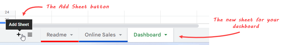
Let’s first add a new sheet to place all charts we’re going to create. Click the Add Sheet button at the bottom. After a new sheet is created, rename it to Dashboard.
Now, let’s add the charts to this Dashboard sheet.
How to create a scorecard
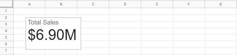
A scorecard is a great start. You can think of it as choosing a headline for your dashboard.
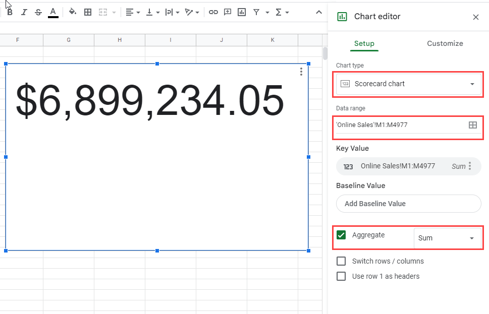
To add a scorecard that shows the total sales to your dashboard:
- Click Insert > Chart from the menu.
- In the Chart Editor, ensure you’re on the Setup tab and configure the following things:
- Chart type: Scorecard chart.
- Data range: ‘Online Sales’!M1:M4977 (the TotalOrder column).
- Tick Aggregate and select Sum for the aggregate value.
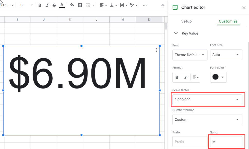
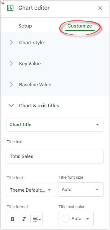
- Since the number looks too long, customize the scorecard to display a compact number. To do that, select the Customize tab and select 1,000,000 for the scale factor and M for the suffix.
- Scroll down, then enter Total Sales as your chart title.
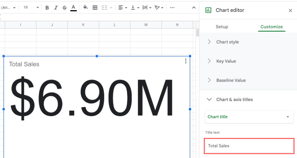
- Resize and place the scorecard in the top left of the screen.
How to create a line chart
To create a line chart that shows sales over months:
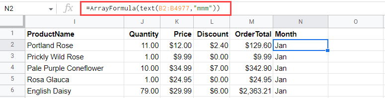
- Add a new column in the last for the month name. Use Month for the header and apply the following formula in N2:
=ArrayFormula(text(B2:B4977,"mmm"))
- Add a chart by clicking Insert > Chart from the menu
- In the Chart editor, configure the following:
- Chart type: Line chart
- Data range: ‘Online Sales’!M1:N4977
- X-axis: Month
- Aggregate: Yes
- Series: OrderTotal
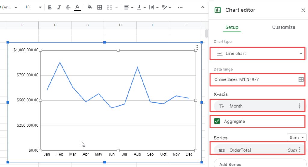
- Resize and place the line chart under the scorecard.
How to create a table chart
To add a table that shows total sales by product category:
- Click Insert > Chart.
- In the Chart editor, configure the following:
- Chart type: Table chart.
- Data range: ‘Online Sales’!G1:G4977,’Online Sales’!M1:M4977 (ProductCategory and OrderTotal columns).
- Aggregate: Yes
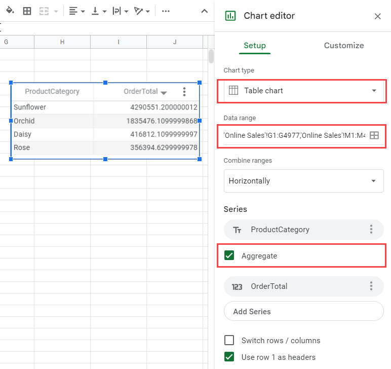
- Resize and place the table chart next to the line chart.
Step 2: Customize your charts
You can add more customizations to your charts using the Chart editor if you want. The editor has two tabs: Setup and Customize. There are many options available in the Customize tab to edit your chart.
You can customize many things here. For example, you can change the colors and fonts of your charts, add titles or legends on axes, display error bars for data points along with their labels if needed, and more. Don’t be afraid to experiment with your charts.
If you accidentally closed the Chart editor, don’t worry! Just double-click on the chart to open it again.
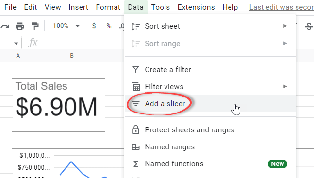
Step 3: Make a dashboard in Google Sheets interactive
Optionally, you can make a dashboard in Google Sheets interactive by adding a slicer to filter your tables and charts.
To add a slicer, click Data > Add a slicer.
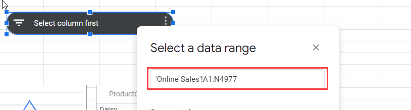
Select a data range to filter. In our case, we enter ‘Online Sales’!A1:N4977, which is the cell range used by the charts.
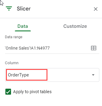
To filter by order type, select the Data tab on the right pane and choose the OrderType column to filter by.
Step 4: Make a dashboard in Google Sheets visible to others
To make a dashboard in Google Sheets accessible to others, click File > Share. Here you’ll see two options: Share with others and Publish to web.
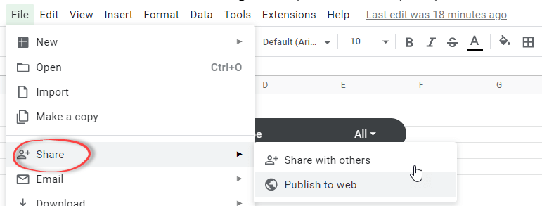
Choose Share with others if you want to share it with specific people or groups. You can also share with broader people using a link.
Choose Publish to web if you want the dashboard visible to anyone on the web. With this option, you can select only one sheet to publish. However, as of writing, the slicer won’t work if you share your dashboard using this option.
Build an advanced dashboard in Google Sheets & other BI tools
Building complex dashboards requires a certain level of expertise in data analytics. However, you don’t have to be a data analyst or dashboard designer yourself if you want your company’s metrics analyzed and displayed in an interesting way. Leave the task to professionals who can handle all aspects from start to finish.
Coupler.io is the best company to call when you need an expert data analytics consulting service to help you build a dashboard in Google Sheets. They have a team of highly skilled data analysts who are happy to help you solve any problems that come up along the way. Couplers’ experts will take care of everything you need, whether building auto-updating dashboards in Google Sheets or BI tools such as Power BI and Data Studio, setting up data infrastructure, establishing data automation, and more.
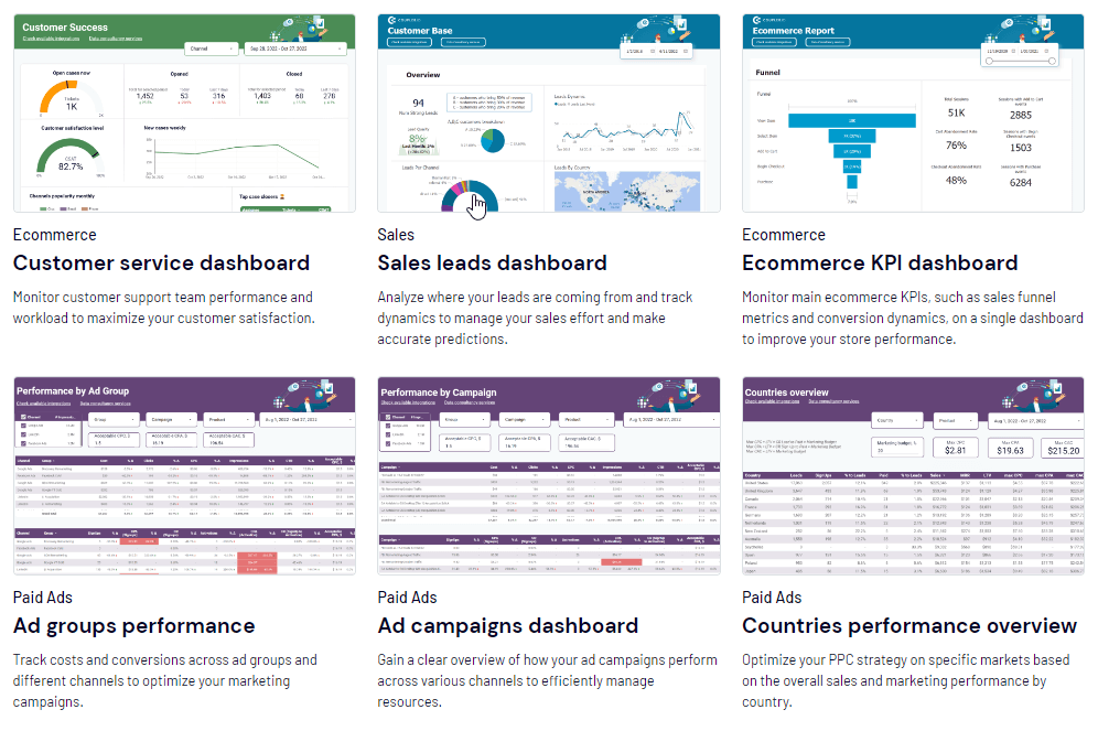
Examples of Coupler.io’s dashboard for Google Sheets, Power BI, and other BI tools.
Coupler.io’s team will also be able to guide you through the decision-making process, no matter what your business goal may be. If this sounds like something that would benefit your business, click on our link below to request more information about how we can help make it happen.
Tips for making an effective dashboard in Google Sheets
- Keep it Simple
When it comes to dashboards, less is more. You want to quickly and easily see the information you need without being overwhelmed by too much data. That’s why it’s important to only include the most important information on your dashboard.
- Choose the right chart
There are a variety of different chart types that you can use on your dashboard, and each one conveys information differently. That’s why choosing the right chart type for the data you want to display is important. For example, a scatter plot would be a good choice if you want to show how two variables are related. But if you want to show a trend over time, a line chart would be a better option.
- Use colors, fonts, and layout effectively
A well-crafted dashboard can be a great way to keep an eye on things. When you create a dashboard in Google Sheets, ensure you care about details such as color and font because they could significantly impact your dashboard’s effectiveness.
- Make it interactive
Make a dashboard in Google Sheets more interactive by adding links, buttons, and drop-down menus. This will allow your audience to explore the data more deeply and find the information they’re looking for more easily.
By following these tips, you can create a dashboard in Google Sheets that will help you keep track of your progress and achieve your goals. We hope that the process can even be an enjoyable experience!
Conclusion: Create a dashboard in Google Sheets
Dashboards in Google Sheets are not only possible but can be extremely useful for displaying key business metrics using data from various sources. By following the step-by-step guide above, we hope you will be able to create your own Google Sheets dashboard that is both informative and visually appealing.
However, if at any point you find yourself stuck or need help bringing your dashboard for Google Sheets to the next level, don’t hesitate to reach out to us here at Coupler.io. We offer a data analytics consulting service that covers everything from start to finish. We’ll work with you to figure out the best way to visualize your data so that you can make better decisions about your business.