Project managers usually export data from Jira to create custom reports beyond the platform’s native capabilities. This enables them to share insights with stakeholders who don’t have Jira access, perform advanced analytics, or automate backup.
In this guide, you’ll explore efficient methods to export Jira data and issues over 50 different data entities, and even how to interact with your data through AI-powered conversations.
How you can export Jira data – all methods introduced
When you want to export data from Jira, there are two main methods. You can either use the built-in export options or automate data flows with Coupler.io.
Coupler.io is a data integration platform & AI analytics that lets you get data from Jira in two ways:
- Jira Issues – Export custom JQL queries with full flexibility.
- Jira Data Entities – Access over 50 different data types, including Boards, Groups, Filters, Issue Fields, Projects, Users, Workflows, and more.
Whichever way to export Jira data you choose, Coupler.io provides you with a number of capabilities:
- Automated scheduling: Set up exports to run automatically from every 15 minutes to monthly intervals.
- Multiple destinations: Export to spreadsheets (Excel, Google Sheets), BI tools (Power BI, Looker Studio), data warehouses (BigQuery, PostgreSQL), AI chatbots (Claude, ChatGPT), and other platforms.
- No export limits: Unlike Jira’s 1,000 issue limit, Coupler.io can handle unlimited data volumes.
- Advanced transformations: Filter, sort, rename, and combine data from multiple sources.
- AI integration: Using AI tools as destinations enables conversational analytics of your Jira data with AI assistants like Claude or ChatGPT.
The built-in options provide a good starting point for simple, one-time export of Jira data. However, the manual export has significant limitations:
- Time-consuming for large volumes of data
- Limited to 1,000 issues per export
- Requires regular manual intervention
- No scheduling capabilities
- Limited format options (primarily CSV)
- No data transformation capabilities

Automate Jira data export with Coupler.io
Get started for freeThe choice between manual and automated approaches depends on your specific needs. Automating the process of exporting data can save you human effort and time.
With Coupler.io, you can schedule data flows from Jira and handle advanced data management cases such as visualization, custom reporting, and analytics. It eliminates the need to do any manual work yourself—it’s all done automatically!
How to automate Jira data export with Coupler.io
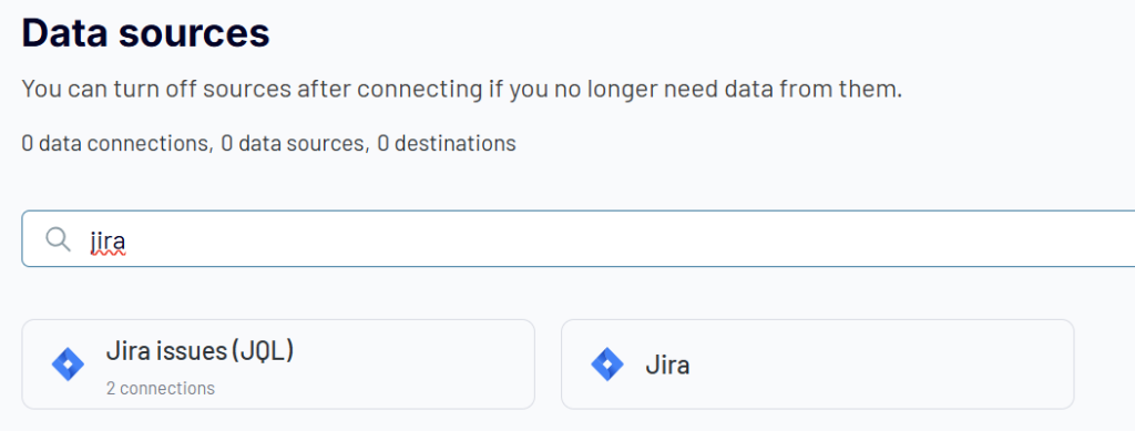
Sign up for Coupler.io for free to get started with the platform. Then you need to create a new data flow and choose Jira as a data source. Coupler.io enables you to create Jira data flows through two connection types:
- Jira issues – to export filtered project data using JQL queries
- Jira – to export data entities of system configuration and operational information
Choose whichever option you need and complete three simple steps.
Step 1: Collect your Jira data
This step differs depending on whether you export JQL queries or data entities from Jira
Export Jira data via JQL
Connect your Jira account, then enter the address of your Jira project in the Site field (e.g., yourprojecturl.atlassian.net). You can optionally enter a specific JQL to get the desired data from Jira. If you leave this field empty, Coupler.io will load all issues.
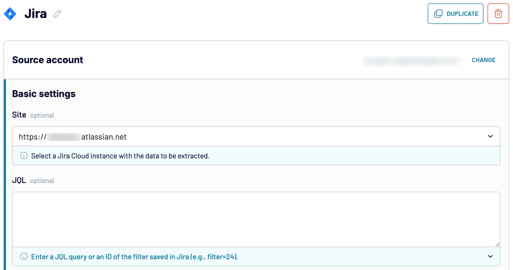
Choose the data export format:
- Jira CSV export – to collect data in the default Jira format used for its own CSV export.
- Detailed data – to pull all data as is, including IDs, URLs, and other metadata to be placed in separate columns.
Export Jira data entities
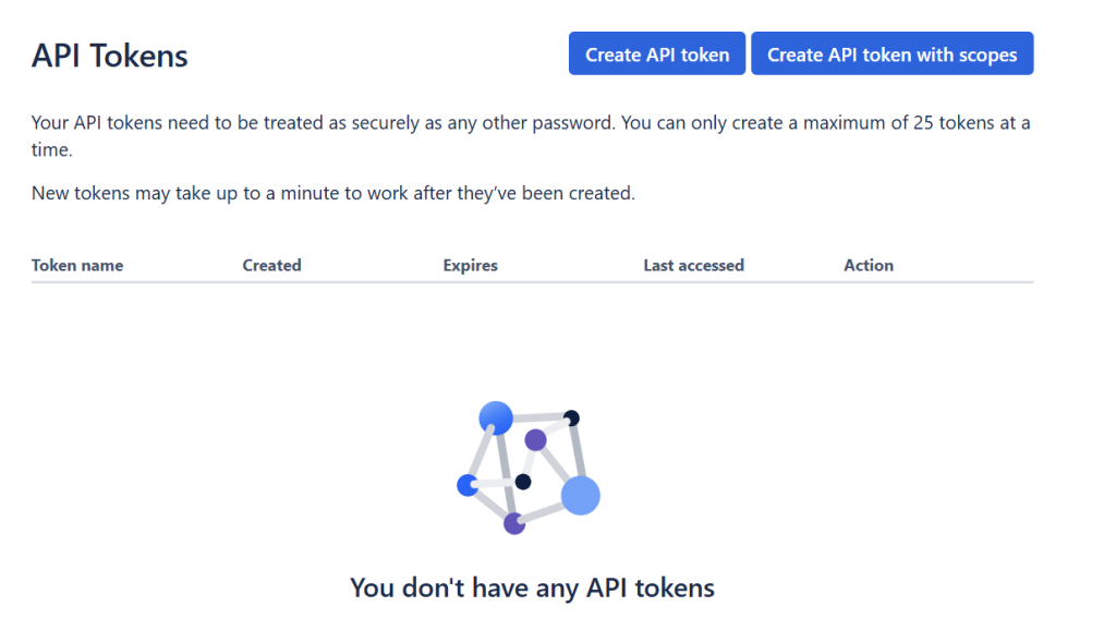
For this option, the Jira account connection is different. You need to create an API access token first and enter it in the authentication window.
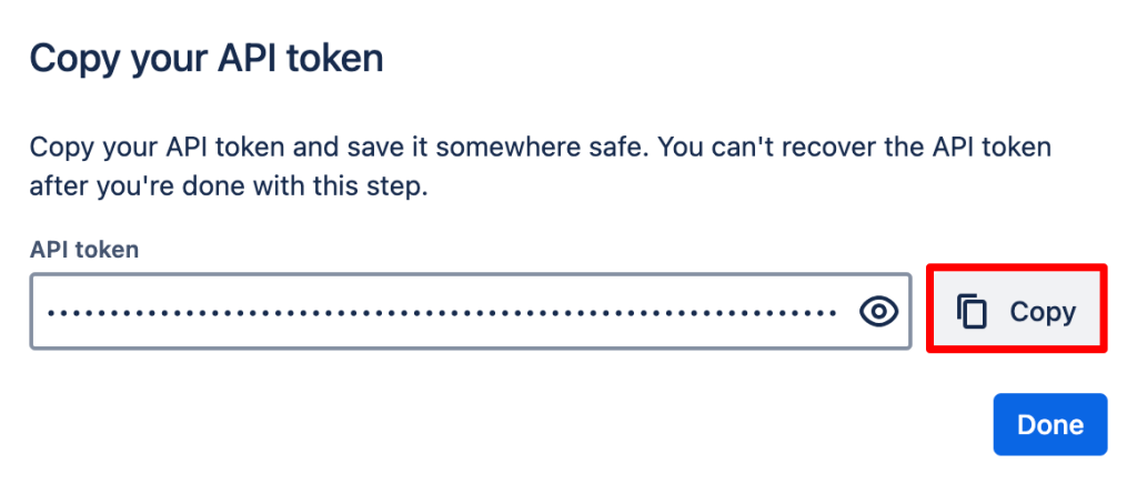
To generate the Jira API key, go to Atlassian API Tokens and click Create API token.
Provide a descriptive name for reference and set an appropriate expiration date, then click Create. The name serves as your personal identifier for this token.
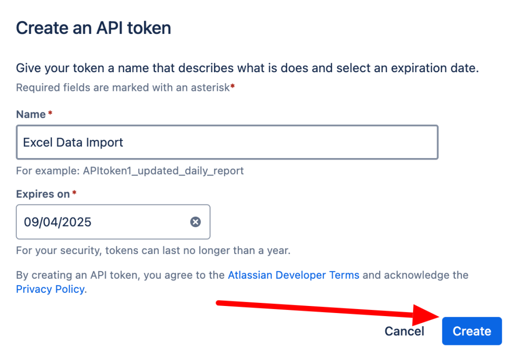
Your new API token appears in a pop-up window. Copy this token immediately and store it securely.
Once you have the API key ready, you can use it to connect your Jira account to Coupler.io.
- Enter your Jira domain using one of these patterns:
<company-name>.atlassian.net,<company-name>.jira.com, orjira.<company-name>.com - Provide the email address associated with your Jira account and API token generation.
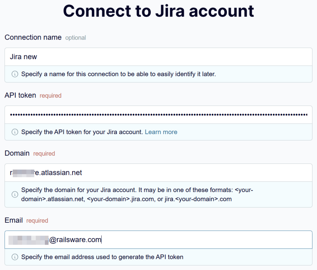
After a successful connection, choose your desired data entity from the available options.
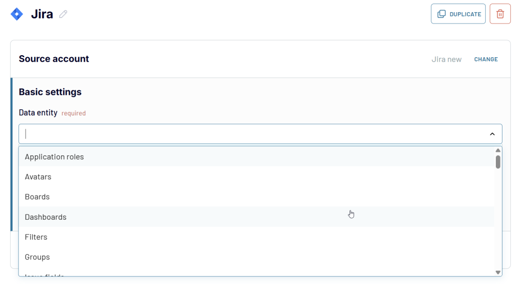
Once your primary data source is connected, you can add more data sources to your data flow. Coupler.io allows you to combine data from multiple projects, accounts, data entities, and even applications. Select the needed source and follow the instructions to connect it. After completing your source setup, proceed to the next step.
Step 2: Organize and transform your data
At this step, you can preview and transform the data to export from Jira:
- Modify column names, order, or visibility
- Apply ascending or descending sort orders
- Create filters based on specific conditions (example: issues by category)
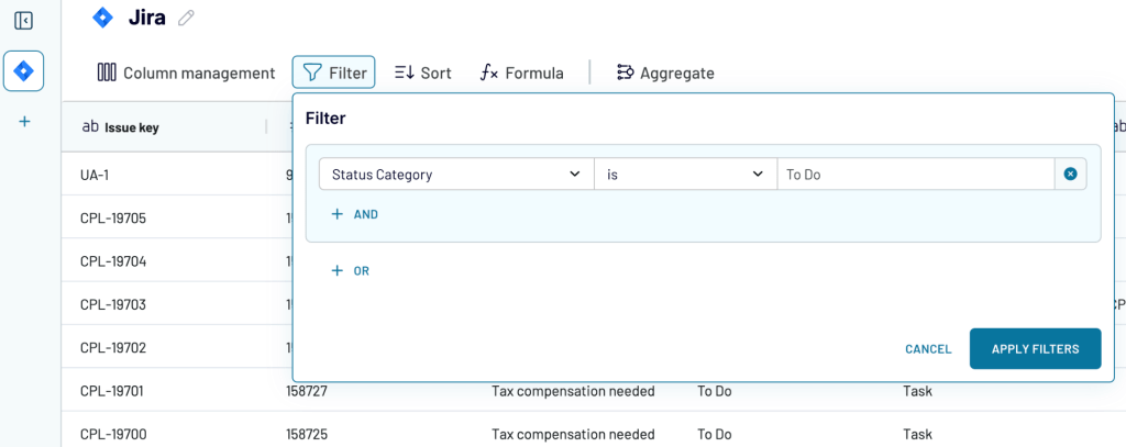
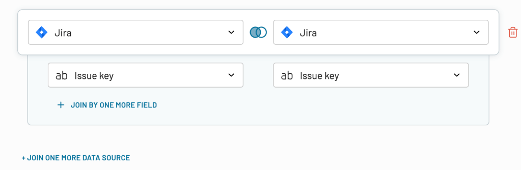
- When using multiple data sources, combine information through:
- Append – stack datasets with matching column structures
- Join – merge different datasets using common identifier columns
After preparing your dataset, move forward to the destination export configuration.
Step 3: Load data and schedule refresh
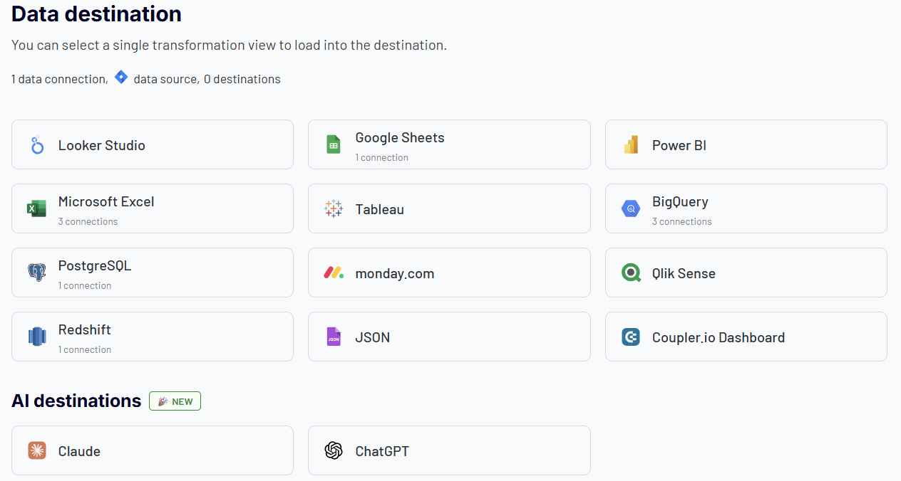
Choose the target platform for your Jira data from over 10 supported destinations:
- Spreadsheet apps – Jira export to Excel or Jira to Google Sheets for quick ad-hoc analysis and presentation-ready reports that can be easily distributed across your organization.
- Business Intelligence tools – Platforms like Power BI, Tableau, Jira to Looker Studio, and Qlik Sense enable you to transform your Jira data into interactive dashboards and sophisticated visualizations.
- Data warehouses – Store Jira data in structured databases, such as Jira to BigQuery, Amazon Redshift, or PostgreSQL, for custom applications and large-scale analytics.
- AI tools – Leverage artificial intelligence for deeper insights into your project data. Export Jira data to AI tools, such as Claude and ChatGPT, using the Jira MCP server and enable conversational queries such as “Identify all critical bugs from the past month” or “Create a summary of team productivity metrics” for instant analytical results.
Enable the Automatic data refresh to schedule your exports of Jira data. The available update intervals range from every month to every 15 minutes (that will make your report live).
Which Jira data can be exported?
It’s important to know which Jira data can be exported so that you don’t miss out on any information that might be vital for your project. The scope of exportable data varies significantly depending on the method you choose.
Manual export options (built-in Jira functionality)
With Jira’s built-in export features, you can export:
- Users – a list of all users in your account or a list of specific users (like the ones you’ve assigned to certain projects).
- Groups– a list of all groups in your account, or you can export a list of specific groups (like those that have been assigned to certain projects).
- Issues – a list of issues from your Jira instance by searching for them by name or status, or by choosing specific projects or fields to search by. This can be used for archiving purposes or for reporting purposes. Jira can export issue data stored in one of two ways: CSV or XML file format. The issue data includes basic information such as a list of issues and their status (e.g., open), it also includes additional details such as who created an issue and when it was created, who last edited an issue’s text and when it was last edited, as well as how many comments there are on a particular issue, etc.
Data you can export with Coupler.io
With Coupler.io, you can export custom JQL queries with full flexibility to filter and customize your issue data exactly as needed. The second Jira connector provides you with access to a much broader range of Jira data, including Boards, Board Issues, Groups, and so on.
Coupler.io maintains your Jira exports according to your schedule, ensuring your data stays synchronized automatically across all your chosen platforms.
Steps on how to export Jira data manually
Jira has a few different formats for exporting data, and the way you want to go depends on what you’re trying to do with the data. Here, we’ll talk about two of the most common formats: Jira export to CSV and Jira export to PDF.
Example of a Jira export to CSV
Jira allows you to export users, groups of users, and issues from your project to a CSV file.
The export of users and groups is only available for Jira admin users. However, the export of issues can be done by both admins and other users.
Export users from Jira
Jira users is what makes up a team. Each user can have a unique username, email address, and user ID. Here are the steps on how to export a list of all the users:
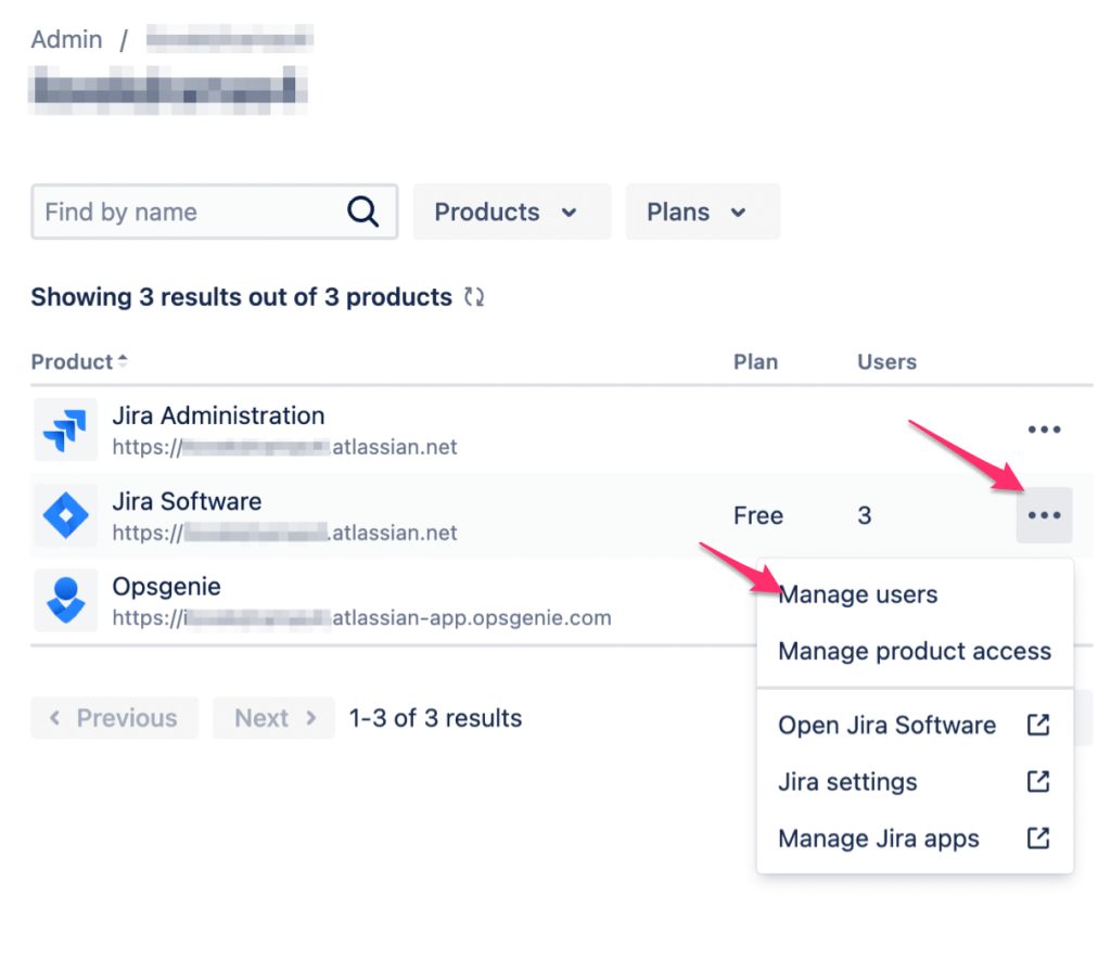
- When you log in to Jira Software, click on the grid menu on the top left-hand side.
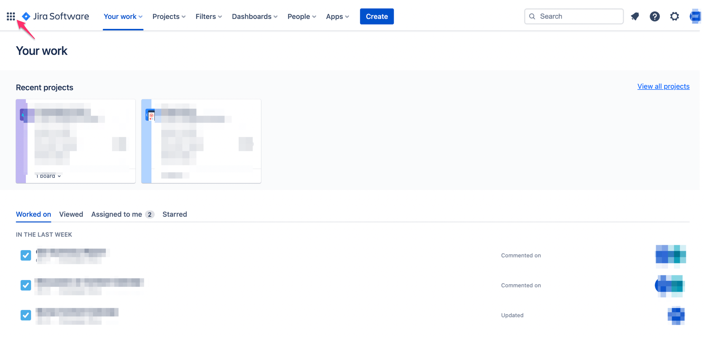
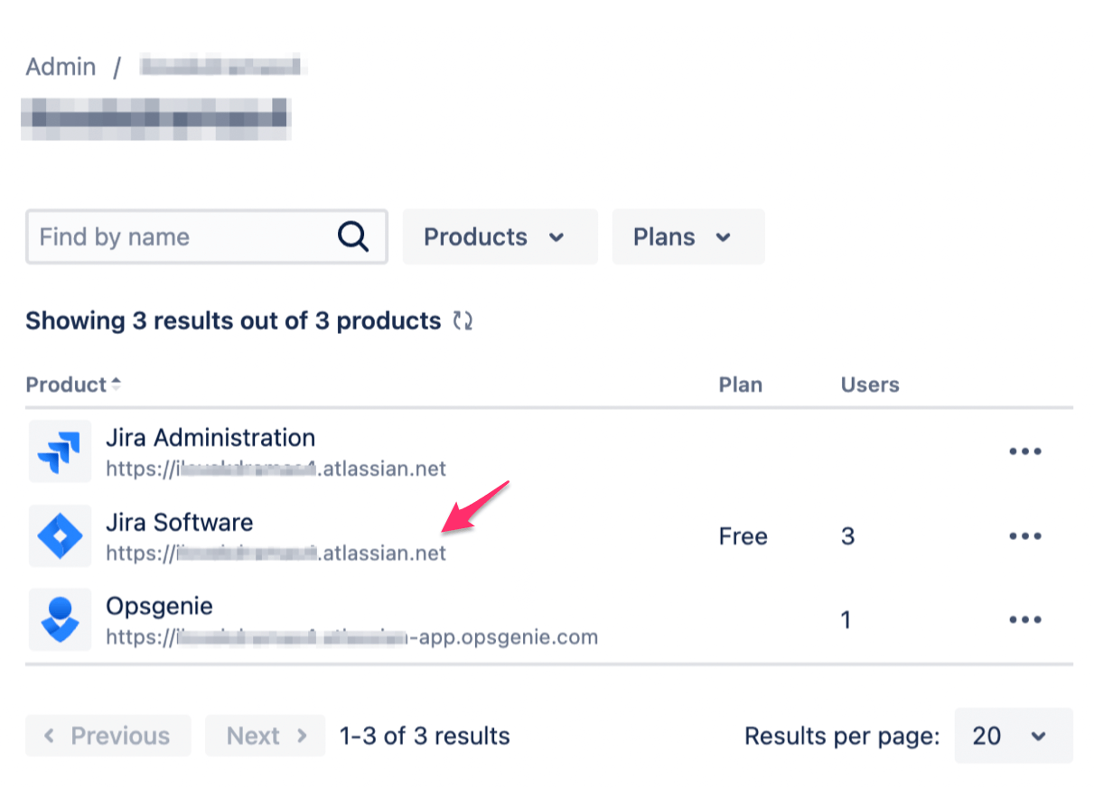
- You will see your products listed on the next page, all you have to do is select the project from which you wish to export the list of users. Here, we are going with Jira Software.
- Click on the three dots and select Manage users.
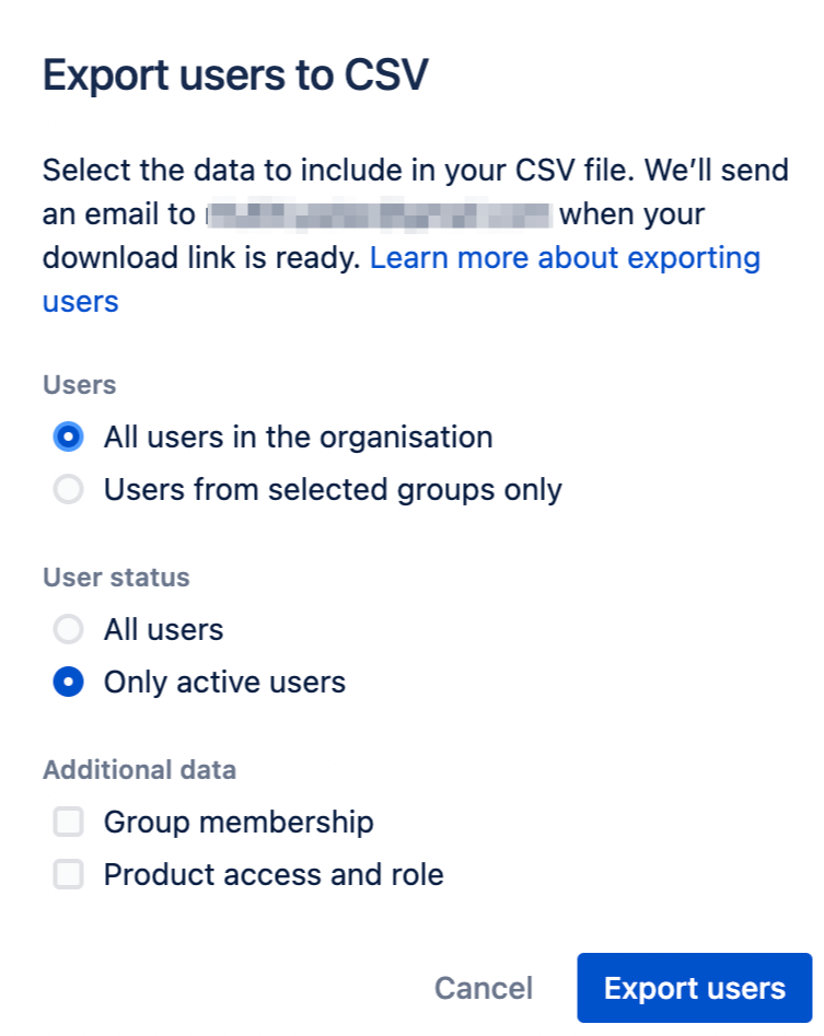
- You will see the list of users on the next page. Now, to export this list all you have to do is click on the three dots on the top right-hand side and select Export users.
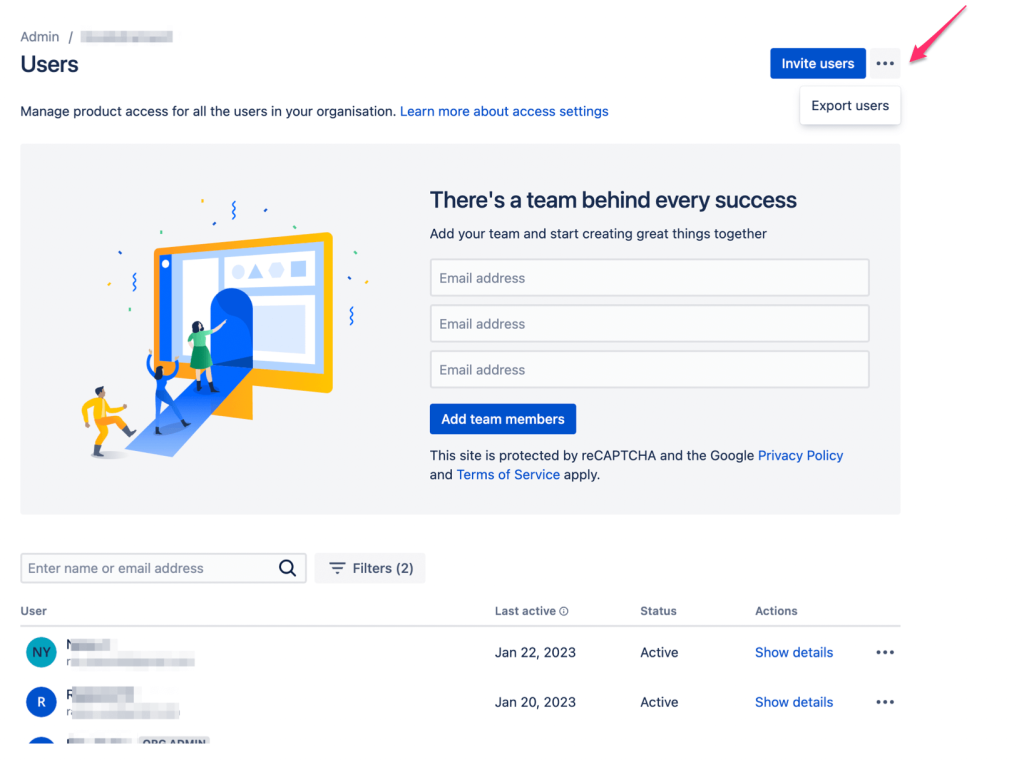
- Next, a pop-up will appear, asking to make any (if required) changes to the list.
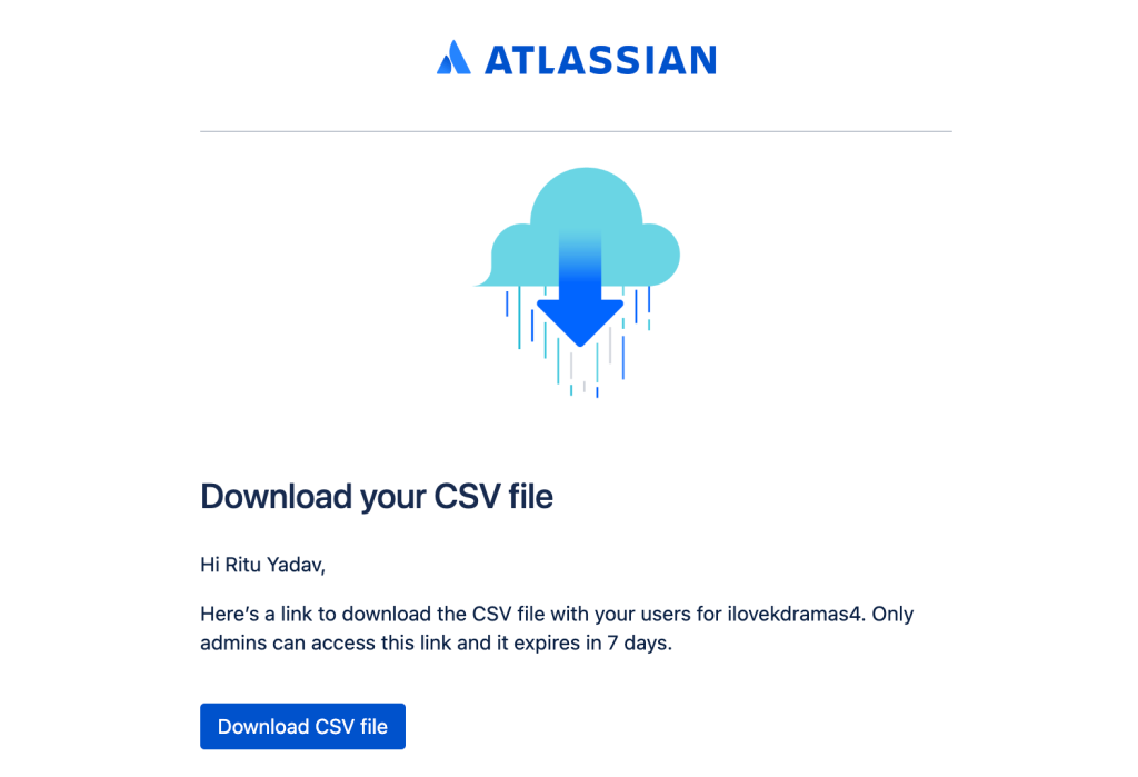
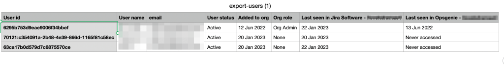
- Click on Download CSV file to access it. The CSV file includes information about each user such as their roles, status, user id, etc. This is how the file looks:
Export groups of users from Jira
There may be times when you only need a list of users from a certain group. To export such a list, follow these steps:
- As mentioned in the Users section above, follow all those steps until you reach the Export users pop-up. Here, select Users from selected groups only and then select the group from which you wish to export the list.
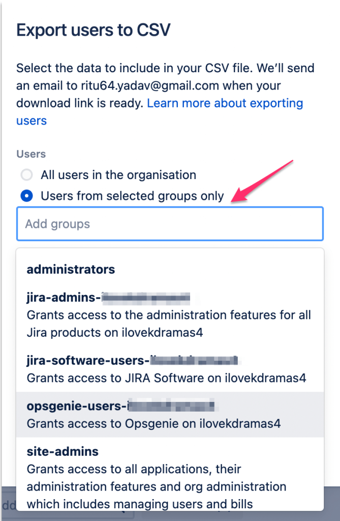
- Once you’ve selected the group, click on Export users. Just like how we exported users, the list will be sent to your email.
- When you’re done making these changes, click on Export users. The list will be sent to your registered email.
Export issues from Jira
We have a detailed guide on exporting Jira issues and in this section, we’ll introduce a brief example.
Exporting issues with all fields is pretty easy. If you’re an admin user, all you have to do is follow these steps:
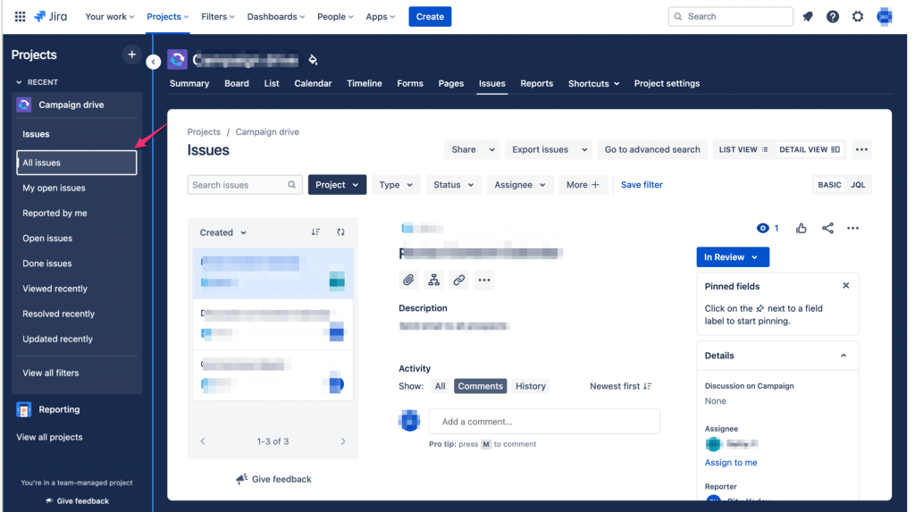
- Go to a project from which you want to export issues and click on Issues from the menu at the top.
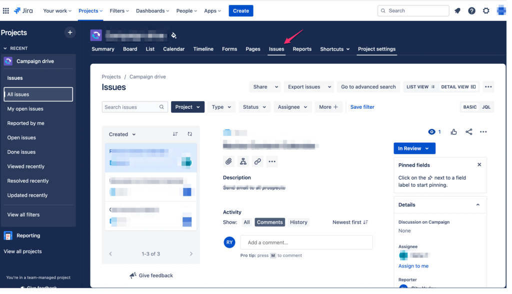
- In the screenshot below, you will see the project has 3 issues. From the right side, you can select the type of issues such as All issues, My open issues, Done issues, etc. In our case, we’ve selected All issues. Now, we want to export these issues.
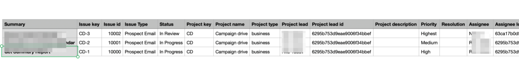
- Click on Export issues from the top menu and then select Export Excel CSV (all fields).
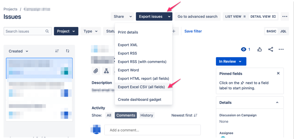
- The list will begin to download and it will include all the custom fields such as comments.
For other users, the steps to export issues are slightly different. Here they are:
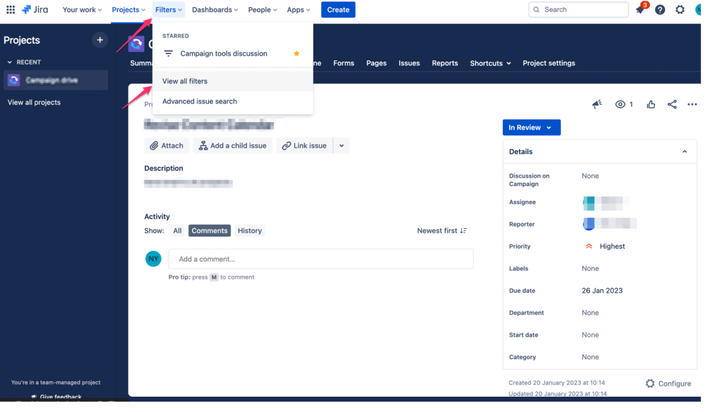
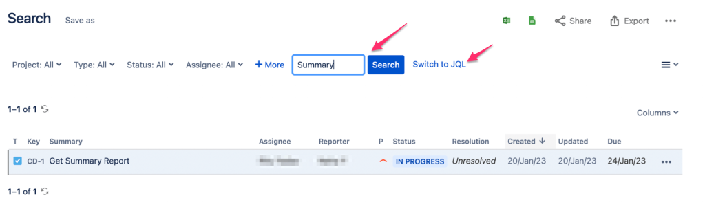
- Go to Filters from the top menu and then click on View all filters.
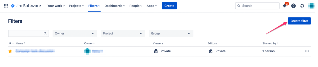
- Click on the Create Filter button.
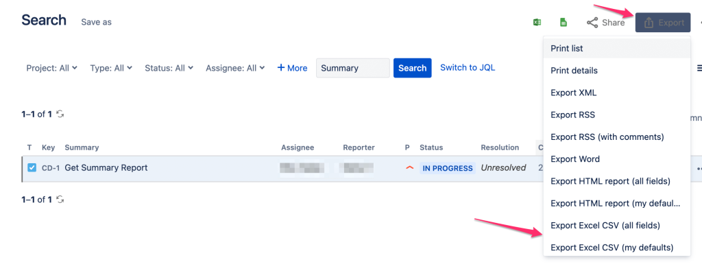
- You can enter keywords (our keyword here is Summary) in the search bar or click Switch to JQL and enter a JQL query here to search for the issues.
- When you have your issues listed, click on Export and then Export Excel CSV (all fields) or Export Excel CSV (my defaults).
- The CSV file will be downloaded to your computer.
Example of a Jira export to PDF
Although there’s no native method to export data from Jira to PDF, there is a workaround. Follow these steps to do this:
- Again, go to Filters from the top menu and click on View all filters.
- Then, click on Create Filter.
- Enter a keyword in the search bar or Switch to JQL and enter a JQL Query to bring up the issues. Once, they’re up, click on Export and then Print details.
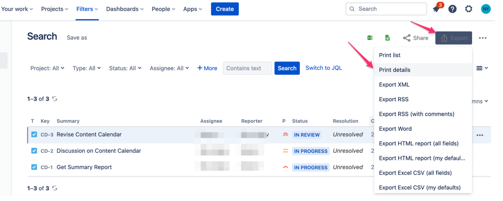
- All the issues with details will be listed on the next page.
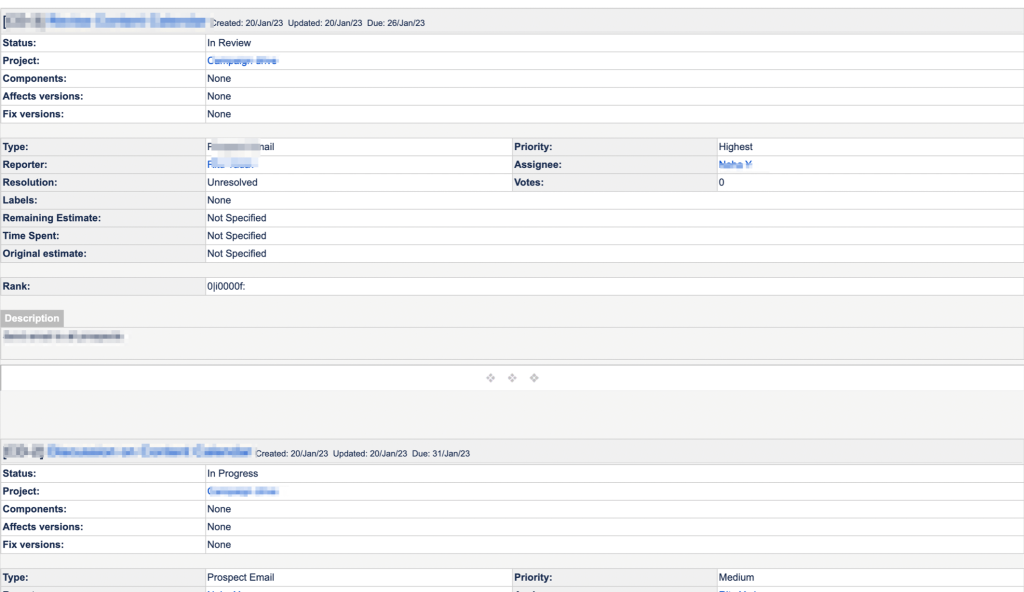
- Now, if you’re using a Windows system, CTRL+P and select Destination as Save as PDF. If you’re using a Mac, Command+P to print, select Destination as Save as PDF. Finally, click on the Save button.
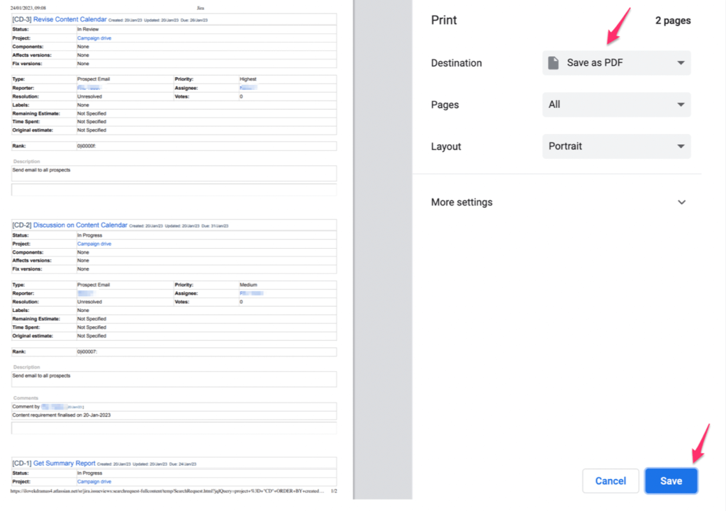
Voila! There you go, your Jira issues are listed in a PDF with all the details.
What is the Jira export limit?
The Jira issue export limit is 1,000 search results, which means you can only export up to 1,000 issues at a time. This limitation, however, is not applicable if you export data from Jira using Coupler.io. All you have to do is enter a JQL Query when you’re setting up your importer in Coupler.io. We’ve provided a detailed explanation here – Jira – Excel more than 1,000 issues.
Jira export: make your life easier
Exporting Jira issues is an excellent way to present your issues to colleagues and clients. You can export the data in various formats, and adjust the columns accordingly depending on what categories you want to show from Jira.
When you export data from Jira online, you make your life easier! If you’re looking to move to another platform, build custom reporting dashboards or just have a backup, Jira export will allow you to take all of your existing data with you. It’s easy, quick, and hassle-free—allowing you to spend less time worrying about data migration, and more time doing the real work!