Power BI Multiple Data Sources: How to Combine Them in One Report

Your sales numbers live in Salesforce, financials in QuickBooks, and ad performance is split across Google Ads, Facebook Ads, and LinkedIn Ads. When data is scattered like this, reports only tell part of the story. The fix is to combine multiple data sources in Power BI into one report or dashboard that will provide the full story.
Can Power BI connect to multiple data sources across your tools?
Yes. Power BI supports 190+ native connectors across several categories, from flat files to cloud services. If you work with Microsoft tools or widely used data platforms, most of your sources are covered out of the box.
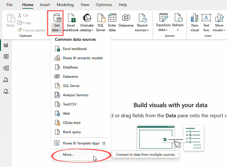
To see all available connectors, select More from the Get Data menu in Power BI Desktop.
Here are the main categories and examples.
| Category | Example data sources |
|---|---|
| Files | Excel, CSV, JSON, XML, PDF, Parquet |
| Databases | SQL Server, MySQL, PostgreSQL, Snowflake, Oracle, Google BigQuery |
| Microsoft Fabric | KQL Databases, Lakehouses, Warehouses, Dataflows |
| Power Platform | Dataverse, Dataflows |
| Azure | Azure SQL, Azure Blob Storage, Azure Data Lake |
| Online services | Salesforce, Google Analytics, Adobe Analytics, SharePoint list, Dynamics 365, Smartsheet, Zendesk, and many more |
| Other | OData Feed, ODBC, OLE DB, Web, R Script, Python Script, Active Directory |
For most setups, you can connect to your main sources directly and start building without extra tools. If your data lives on-premises (say, a SQL Server inside your company network), you’ll need the on-premises data gateway to bridge the data connections between your internal systems and the Power BI Service.
What Power BI does not cover natively
Not every tool has a Power BI connector. Several popular SaaS platforms for marketing, ecommerce, and finance are missing: Shopify, Google Ads, Facebook Ads, HubSpot, LinkedIn Ads, TikTok Ads, and QuickBooks Online.
QuickBooks Online is worth calling out as it had a native connector, but it was removed in 2025 due to authentication changes. Microsoft has no plans to restore it, and if your reports relied on that connector, they’ve stopped refreshing.
You can still connect Power BI to multiple data sources that don’t have native connectors through APIs (using the Web connector) or Python scripts. But if you’d rather skip the code, Coupler.io handles it without any. It supports 400+ data sources, including the aforementioned ones, and allows you to blend and transform data before it reaches Power BI.
Connect your data to Power BI with Coupler.io
Get started for freeMethod 1: Create a Power BI dashboard with multiple data sources using Coupler.io
Coupler.io is a no-code data integration and AI analytics platform that connects to your tools, combines and transforms the data, and delivers it to Microsoft Power BI on a schedule. It’s a practical way to manage Power BI multiple data sources in one place. You load one ready dataset instead of wrangling multiple raw sources in Power Query.
How it works
Step 1: Connect your data sources
Start by selecting a data source in the form below and click Proceed. You’ll be offered to create a Coupler.io account for free with no credit card required.
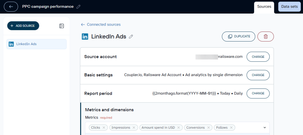
Link your source account and specify what data you need. With LinkedIn Ads, for example, you connect your ad account, pick the metrics, and set the date range.
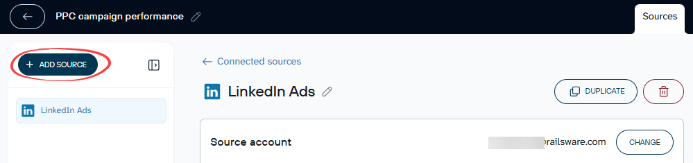
You can add Power BI multiple data sources in one flow. Click the Add source button and connect the next platform the same way.
Step 2: Combine your data
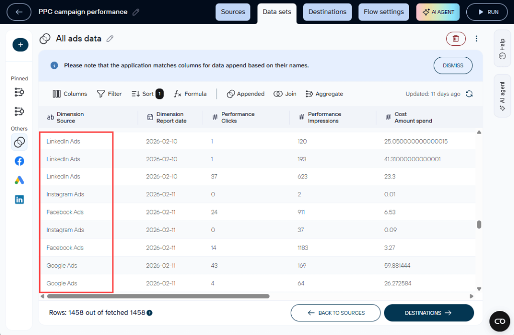
In the Data sets tab, preview your data and apply transformations — filtering, sorting, adding columns, grouping.
To combine data from multiple sources, use Append or Join.
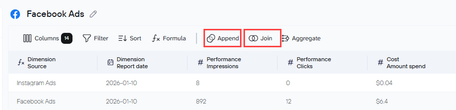
Append stacks rows from different sources into one table. Use it when you want a unified view across similar datasets, for example, ad campaign data from Google Ads, Facebook Ads, and LinkedIn Ads in a single table.
Join matches rows from two datasets based on a shared field (like an ID). Use it when you want to enrich one dataset with data from another, for example, connecting account details with financial results.
Step 3: Load combined data to Power BI
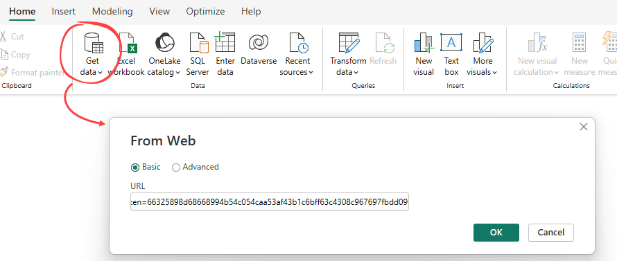
Follow the instructions to generate an Integration URL for your output dataset. Copy this URL to be used in Power BI later.
Set a refresh schedule to enable automation (options range from monthly to every 15 minutes).
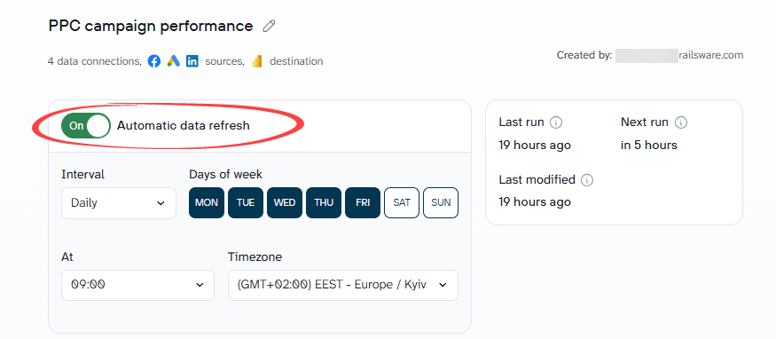
Save and Run your data flow.
In Power BI Desktop, go to Get Data, select Web, and paste the Integration URL.
Your data loads into Power Query Editor. Click Close & Apply and you’re ready to build reports.
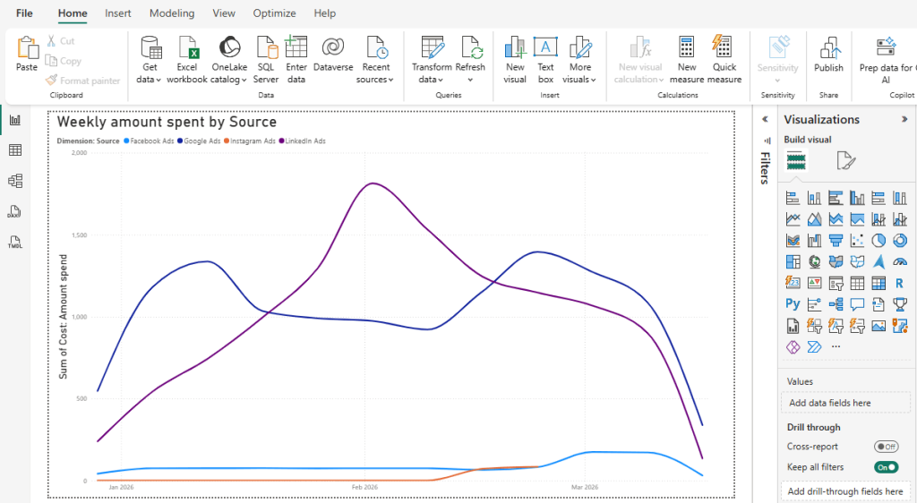
Example 1: Append
Say you run paid campaigns across Google Ads, Facebook Ads, and LinkedIn Ads and want all campaign performance in one table (total spend, clicks, impressions) without jumping between platforms.
In Coupler.io, connect all three sources and apply the Append transformation. It stacks every row from each source into a single unified table.
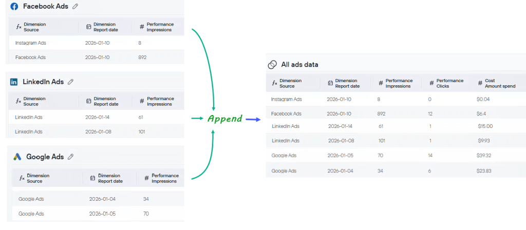
Append works on the UNION principle: Coupler.io matches column names across your sources and places each row under the corresponding columns.
Important thing to keep in mind: Your column names need to match across sources for Append to work properly. If Facebook Ads calls it Amount spend and Google Ads labels it cost_micros, the data won’t line up the way you want. Rename the columns first, for example, rename both to Cost: Amount spend using Coupler.io’s transformation feature, and you’re good to go.
The output is a single ad performance table covering all three platforms.
Once your dataset is ready, load it into Power BI. From there, you can build visuals like:
- Total spend by source: a bar or pie chart to compare Google Ads, Facebook Ads, and LinkedIn Ads side by side
- Engagement trends over time: a line chart to spot which platform is actually pulling its weight
- Campaign-level breakdown: filter by ad source to see clicks, impressions, and spend per campaign
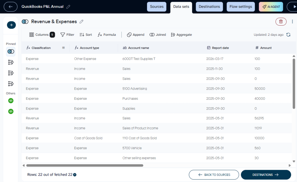
Example 2: Join
Say you want a financial report in Power BI using two QuickBooks entities: Account Types and Profit & Loss. Both share an Account ID field, and your goal is to see each profit and loss amount alongside its category (income, expense, cost of goods sold) in one table.
Connect both sources in Coupler.io and use the Join feature to match them by Account ID.
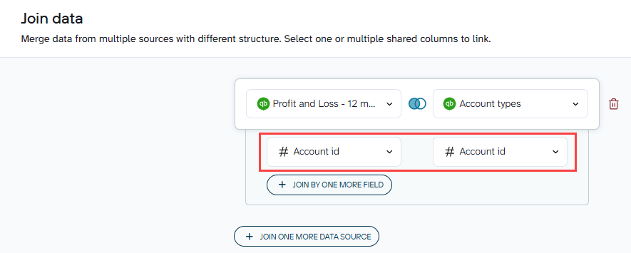
The result is one dataset where each row includes both the financial amount and the account classification.
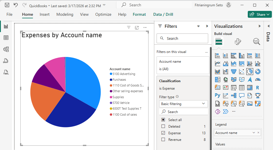
In Power BI, you can use this to build visuals like a pie chart breaking down expenses by account name.
Combine data sources using the AI agent
If you want quick answers from your connected data before building a full dashboard, Coupler.io’s AI Agent lets you query your sources in plain language.
Ask something like:
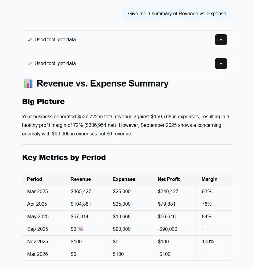
- “
Give me a summary of Revenue vs. Expense“. - “
Which ad platform had the lowest cost per click last month?“

The Agent passes your query to Coupler.io’s Analytical Engine, which runs the calculation and validates the result before returning it. No joins or appends to set up beforehand. Just connect your sources and start asking. You can ask follow-up questions in the same session, and it works across all 400+ sources Coupler.io supports.
This isn’t a replacement for a Power BI report. Think of it as a way to explore and sanity-check your data before committing to a full build.
Combine data from 400+ sources in Power BI with Coupler.io
Get started for freePower BI multiple data sources in one report using templates
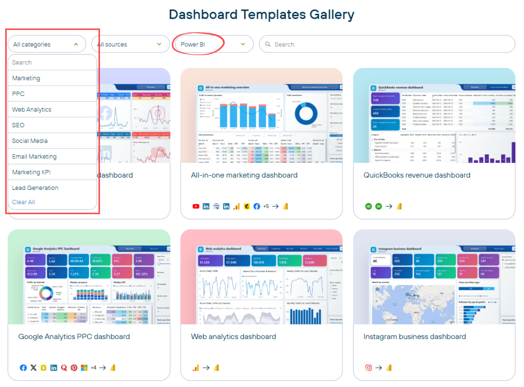
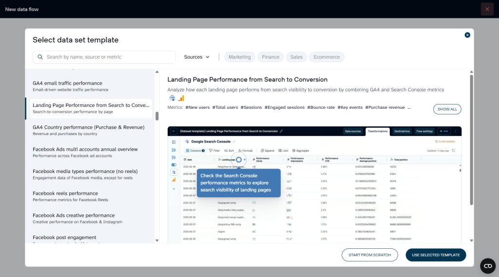
Building a dashboard in Power BI with multiple data sources from scratch takes time. You connect sources, clean the data, configure the model, design the visuals, and make sure everything adds up. Coupler.io offers templates that skip most of that work. You pick a template that fits your use case, connect your accounts, and get a working report or a ready-to-use dataset without the manual setup.
Two types of templates are available: dashboard templates (complete reports with visuals in Power BI) and dataset templates (pre-configured data pipelines).
Dashboard templates
Dashboard templates come with charts, KPIs, and layouts already built. You connect your data sources and get a working report you can use right away or customize to fit your needs.
There are dashboard templates for different categories of data and reports. For example, a PPC multi-channel dashboard solves a common marketing problem: each ad platform (Google Ads, Facebook Ads, LinkedIn Ads) reports its own metrics in its own format. So comparing channel performance means manual exports and spreadsheet gymnastics.
This template combines campaign data from all three platforms into one report. You see total spend, impressions, clicks, and CTR side by side, broken down by channel and time period. That makes it possible to spot which platform is actually delivering results and reallocate budget accordingly.
PPC multi-channel dashboard in Power BI
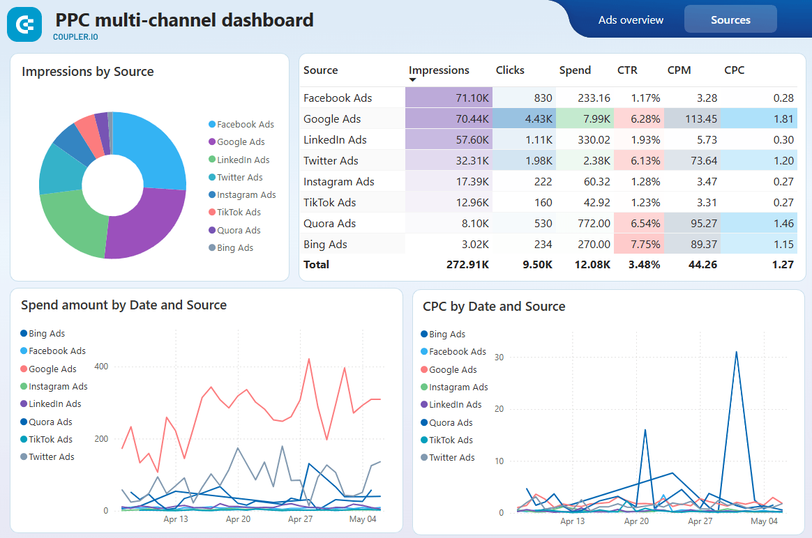 Preview dashboard
PPC multi-channel dashboard in Power BI
Preview dashboardA QuickBooks Revenue dashboard brings together data that QuickBooks splits across separate reports: revenue by customer, revenue by product, and revenue over time. On their own, these are three different views. Combined into one dashboard, they let a finance team see which customers drive the most revenue, which products are growing or declining, and how the overall trend is moving. The template joins these QuickBooks entities so you don’t have to set up the relationships yourself.
QuickBooks Revenue dashboard in Power BI
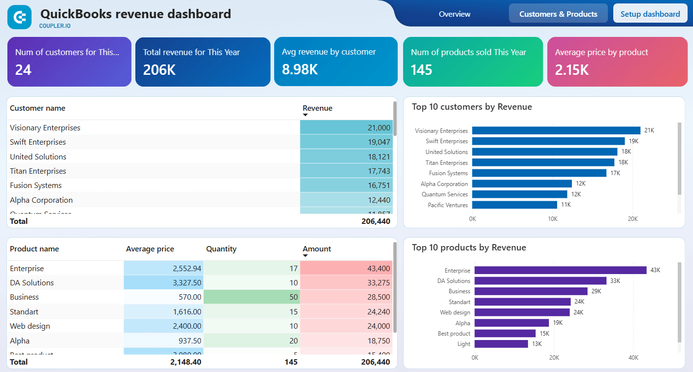 Preview dashboard
QuickBooks Revenue dashboard in Power BI
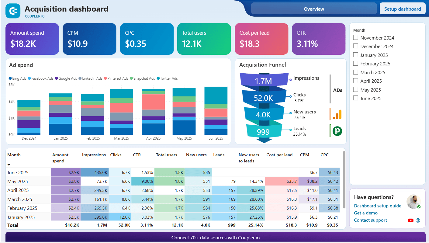
Preview dashboardAn acquisition dashboard connects marketing spend data with CRM pipeline data. Without this combination, marketing sees cost per click and sales sees lead counts, but nobody sees the full funnel.
This template merges both sides so you can track how leads grow over time, what it costs to acquire them, and which channels produce leads that actually convert. That’s the kind of view that only exists when you combine sources.
Templates are available across marketing, finance, sales, and other use cases. You can use any of them as-is or adjust the metrics, charts, and date ranges.
Explore all dashboard templates
Get started for freeData set templates
Dataset templates handle the data preparation side. Source connections, field mappings, data transformations, and calculations are pre-configured. You connect your account and the data flows into Power BI already structured and ready to visualize.
Available templates include:
- PPC campaign performance — Weekly and monthly campaign analytics across platforms
- Multi-channel creatives performance — How your ad creatives perform across sources
- Multi-channel Ad group performance — An overview of ad groups across platforms
- Multi-channel Age and Gender performance — Compare advertising performance across platforms by audience demographics
- Multi-channel Geo performance — Evaluate geographic performance across platforms to identify which countries generate the best results for your advertising campaigns
- Multi-channel Device performance — Analyze how your ads perform across devices—desktop, mobile, tablet—on multiple platforms to refine targeting and user experience strategies
- And more.
Once your dataset is ready, send it to Power BI and build your visuals from clean data. No column renaming, no data type fixes, no manual blending.
Create self-updating dashboards in Power BI with Coupler.io
Get started for freeMethod 2: How to connect multiple data sources in Power BI with Power Query
Power Query is the native tool for combining multiple data sources in Power BI. If your sources already have Power BI connectors, you can bring them together directly — no external tools needed.
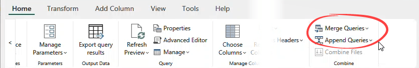
Click Get Data, connect each source, and once they’re loaded as separate queries, combine them in Power Query Editor using Append Queries or Merge Queries.
Both techniques here map to what you already saw in Method 1. Append Queries works like Coupler.io’s Append, and Merge Queries works like Coupler.io’s Join. The difference is that here, the combining happens inside Power BI rather than before the data arrives.
Append Queries
Use Append when your tables share a similar structure and you want to stack their rows into one table. Say you manage leads from two sources:
- An internal SQL Server table
- An Excel file of leads collected through a recent event.
You want one unified table instead of two separate ones.
Connect both sources via Get Data, then use Append Queries. The result is a single table with all leads stacked together.
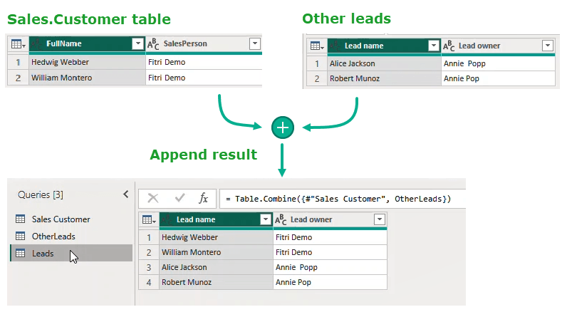
Column names need to match exactly across both sources before you append.
In the example above, the SQL Server table uses “FullName” and “SalesPerson” while the Excel file uses “Lead name” and “Lead owner”. Power Query treats each variation as a separate column. Instead of two clean columns, you end up with four half-empty ones, as shown in the screenshot below:
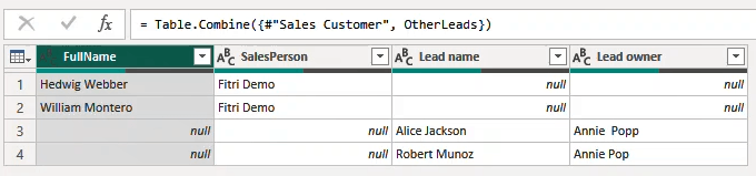
Rename the columns to be identical across both sources first. Once the names align, the append produces a clean unified table with no gaps.
Merge Queries
Merge links rows from two tables based on a shared column, the join key. The result is one table where related data from both sources sits in the same row.
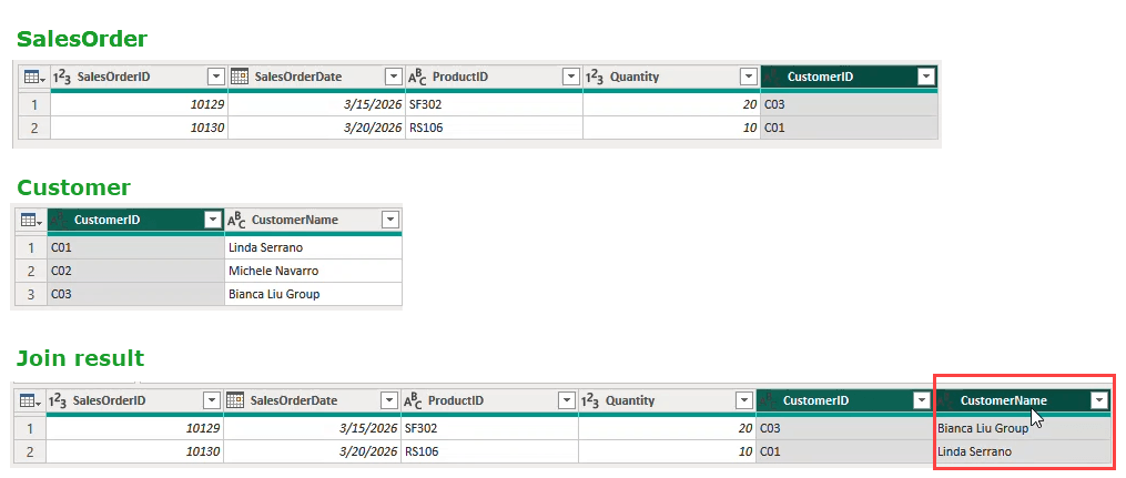
Say you have two SQL Server tables: one with customer details, one with order history. Both include a customer ID. Merge on that field, and each order row now carries the customer details with it.
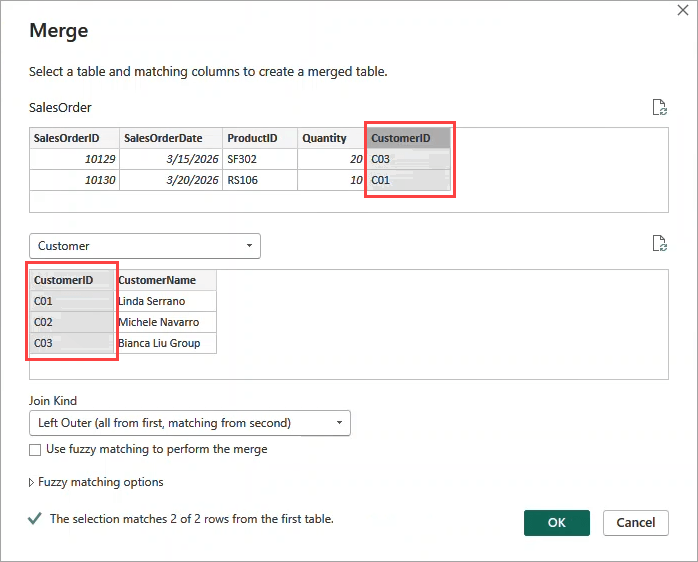
Power Query gives you six join types to work with: Inner, Left Outer, Right Outer, Full Outer, Left Anti, and Right Anti.
For most reporting purposes, Left Outer is the one you will reach for most often. It keeps every row from your main table and pulls in matching data from the second one. Rows without a match still appear, just with blank values in the joined columns.
In our example, the merged result gives a complete picture of who bought what:
Watch for data type mismatches on the join key. If the customer ID is stored as a number in one table and as text in another, the merge returns no matches even though the values look identical. Check that the join key is the same data type in both tables before running the merge.
Recommendations on combining multiple data sources in Power BI
Now that you know how to combine multiple data sources in Power BI, there are a few things worth checking before you start building visualizations.
Verify column names and data types before you append
You already saw this come up in both methods above, so this is a quick reminder rather than a new concept. Before any append operation, make sure the column names across your sources are identical and that the data types match.
If they do not, Power BI treats mismatched columns as separate fields and fills in the gaps with empty values. The result is a wider table with a lot of blanks where real data should be.
A quick check in Power Query or Coupler.io before you append keeps your output clean and your totals accurate.
Choose your join key carefully before you merge
A join key is the shared column that links rows between two tables. The quality of your join key directly affects the accuracy of your merged data.
The safest join keys are unique IDs such as a customer ID, an order number, or a product code. They are consistent, they do not change over time, and each value appears only once in the reference table.
Avoid joining on names or labels if you can. A product named “Ox Eye Daisy” in one source and “Ox-Eye Daisy” in another will not match, and the merge will silently drop those rows without any warning.
Also check that the join key column is the same data type in both tables. A customer ID stored as a number in one table and as text in another will return zero matches even when the values look exactly the same. Fix the data type first, then run the merge.
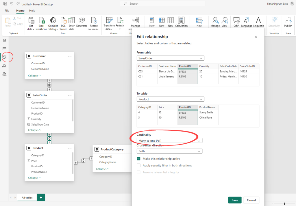
Review your relationships manually after loading data
When you load Power BI multiple data sources, the tool automatically detects relationships between your tables. It looks for columns with matching names and draws connections between them. It is a helpful starting point, but it is not always right.
After loading your data, go to the Model view and check every relationship Power BI created. Confirm that the connected columns actually belong together and that the direction of each relationship makes sense for your report.
A well-structured data model is what keeps your report accurate and your visuals consistent. It also gives you a solid foundation for writing DAX measures later. DAX is the formula language Power BI uses to create custom calculations like totals, averages, year-over-year growth, and other metrics your report needs.
Wrong relationships can produce totals that look believable but are quietly inflated or incorrect. It is the kind of mistake that only surfaces when someone questions a number in a meeting.
Pick the right connection mode
When you connect a data source in Power BI, you choose how the data gets loaded. The two main options are Import mode and DirectQuery.
Import mode pulls a snapshot of your data into the report. Visuals load fast, and you set a refresh schedule to keep things up to date. For the majority of reports, this is the right choice.
DirectQuery keeps a live connection to your source for real-time data access. Data reflects what’s in your source at the time of each query.
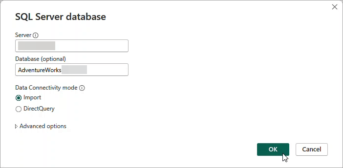
A practical rule of thumb is to start with Import mode to optimize performance. Switch to DirectQuery only if your team genuinely needs live data, your data source supports it, and it can handle the extra query load. Keep in mind that DirectQuery has some limitations around certain calculations and features, so it is worth checking those before committing.
For a more detailed breakdown, check out this guide on DirectQuery vs Import in Power BI.